SET50 Insights: ส่องทิศทาง S50H26 ผ่านเลนส์ Data&AI | 5 ก.พ. 69🔥🔥900 แค่เอื้อม! พี่หรั่งลุยต่อ เหมาทั้งหุ้นทั้งเฟค วันนี้ลุ้น New High
⸻⸻
📌Data Checkpoints - เหตุการณ์สำคัญวันก่อน ที่ส่งผลต่อวันนี้
🟢 กราฟสวย! S50H26 เลี้ยงตัวเหนือ 890 พร้อมยก High วัน สะท้อนความมั่นใจ
***🟢3 รุม 1 แล้วไง? ต่างชาติซื้อกลุ่มเดียว 2,163 ล้านบาท Long เฟค 7,055 สัญญา
***🟢หาดูยาก!


Scott "Kidd" Poteetนักบินอวกาศภารกิจ Polaris Dawn

สถานที่ในโลกสร้างตลาด
เข้าร่วมกับเทรดเดอร์และนักลงทุน 100 ล้านคนที่กำหนดอนาคตด้วยมือของพวกเขาเอง

ทองคำปรับสมดุลเมื่อเฟดผันผวนสูงขึ้นXAUUSD | แผนเงินอัจฉริยะระหว่างวัน – H1
ทองคำไม่ได้อยู่ในโหมดขยายตัวอีกต่อไป หลังจากช่วงขาขึ้นที่แข็งแกร่งจากช่วงสะสม ราคาได้ส่งสภาพคล่องฝั่งซื้อเข้าสู่ระดับสูงสุดก่อนหน้านี้และแสดงสัญญาณการขายของสถาบันทันที การปฏิเสธอย่างรวดเร็วจาก FVG + โซนขาย OB ก่อนหน้ายืนยันการกระจายมากกว่าการต่อเนื่อง
การเคล

ความผันผวนสูงหลังเทขาย ตลาดอยู่ในช่วงปรับสมดุลตลาดบริบท
ราคาทองคำเพิ่งประสบกับการขายที่รุนแรงและดุดันในกรอบเวลา H1 ทำลายโครงสร้างขาขึ้นระยะสั้นหลังจากการดีดตัวที่มีแรงกระตุ้นเป็นเวลานาน การเคลื่อนไหวประเภทนี้มักสะท้อนถึงการกระจายสภาพคล่องและการปรับสมดุลทุน ซึ่งเป็นเรื่องปกติในช่วงเวลาที่มีความผันผวนจากปัจจัยมหภาคที่สูงขึ้น
จากมุมมองมหภาค:
คว

ทองคำร่วงหลังพุ่งกว่า 25% ต้นเดือน แตะ $5,594 ก่อนถูกขายทำกำไร## วิเคราะห์: ราคาทองคำปรับตัวลง หลังดีลจัดสรรงบประมาณรัฐบาลหนุนดอลลาร์แข็งค่าและเกิดแรงขายทำกำไร
* ราคาทองคำปรับตัวลงในวันศุกร์ โดยมีแรงขายรอบใหม่เข้ามาหลังมีข่าวบรรลุข้อตกลงเพื่อหลีกเลี่ยงการปิดหน่วยงานรัฐบาลสหรัฐฯ (Government Shutdown)
* ค่าเงินดอลลาร์สหรัฐ (USD) กลับมาแข็งค่าขึ้นเล็กน้อย และเป็

การวิเคราะห์ Elliott Wave XAUUSD – 30 มกราคม 2025
1. โมเมนตัม
กรอบเวลา Weekly (W1)
โมเมนตัมในกรอบเวลา W1 ปัจจุบันยังคงเป็นขาขึ้น ดังนั้นมีความเป็นไปได้สูงที่ตลาดจะ ปรับตัวขึ้นต่อหรือเคลื่อนไหวในลักษณะ Sideway อย่างน้อย 1–2 สัปดาห์ข้างหน้า
กรอบเวลา Daily (D1)
โมเมนตัม D1 ขณะนี้กำลังปรับตัวลง ซึ่งบ่งชี้ว่าในช่วง 1–2 วันถัดไป ราคาอาจ ปรับตัวลงต่อหร

GMT วิเคราะห์ทองคำ (XAUUSD) ประจำวันที่ 29 มกราคม 2569🟡 วิเคราะห์ทองคำ (XAUUSD) ประจำวันที่ 29 มกราคม 2569
💹 ภาพรวมตลาดทองคำ
ราคาทองคำปรับตัวขึ้นอย่าง ร้อนแรงต่อเนื่องในช่วงเช้าวันนี้ โดย Gold Spot ทำสถิติสูงสุดใหม่ และเคลื่อนไหวในทิศทางเดียวกับราคาทองคำในประเทศ สะท้อนแรงซื้อทองคำในฐานะ สินทรัพย์ปลอดภัย (Safe Haven) จากความตึงเครียดด้านภูมิรัฐศาสตร์ที

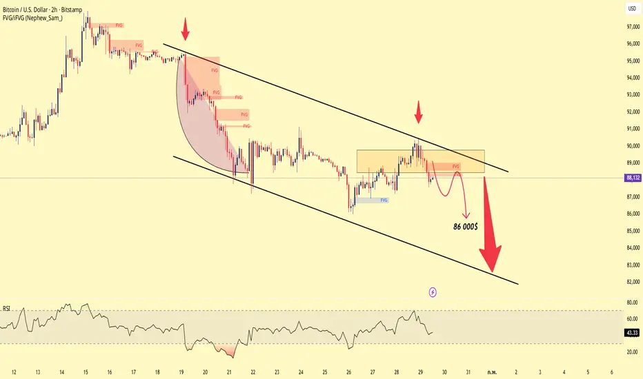
BTC (2H) – สถานการณ์แนวโน้มขาลงในระยะสั้นราคากำลังเคลื่อนไหวอยู่ภายในช่องแนวโน้มขาลง โดยมีการดีดกลับซ้ำๆ แต่ถูกปฏิเสธที่เส้นแนวโน้มบนและโซนอุปทาน/FVG → แรงขายยังคงมีอิทธิพลเหนือกว่า
การดีดกลับในปัจจุบันเป็นเพียงปัจจัยทางเทคนิคเท่านั้น ไม่มีสัญญาณของการกลับตัวเชิงโครงสร้าง
ให้ความสำคัญกับการขายตามแนวโน้ม โดยมองหาปฏิกิริยาที่อ่อนแอที่โซนแน
Gold Trading Plan – 30-01-2026Gold Trading Plan – 30-01-2026 👇👇
🔹 Trend
D1: Uptrend / H4: Uptrend / H1: Downtrend
🔹 Overview
On higher timeframes, gold remains in an uptrend. However, on the H1 timeframe, the price is currently in a downtrend. Therefore, there is a strong possibility of further downside continuation. As long a

ราคาทองคำปรับฐาน - ย่อตัวลงระยะสั้น🔥ทรัมป์เตรียม "เชือด" พาวเวล? จ่อประกาศชื่อประธานเฟดคนใหม่วันนี้! ทองคำผันผวนหนัก!
ข่าวใหญ่รับเช้าวันศุกร์! Bloomberg รายงานว่า ประธานาธิบดีโดนัลด์ ทรัมป์ เตรียมประกาศรายชื่อผู้ที่จะมาดำรงตำแหน่ง "ประธานธนาคารกลางสหรัฐ (Fed Chair)" คนใหม่ แทนที่ Jerome Powell ในช่วงเช้าวันศุกร์นี้ (ตามเวลาสหรัฐ

XAUUSD – ความผันผวนชั่วโมงที่ 1 | การปรับสภาพคล่องบริบทของตลาด
ทองคำกำลังเข้าสู่ช่วงความผันผวนสูงหลังจากการขึ้นราคาในแนวโน้มขาขึ้นที่ยาวนาน การเคลื่อนไหวลงอย่างเฉียบพลันล่าสุดจากโซนบนไม่ใช่เรื่องบังเอิญ — มันสะท้อนถึงการกระจายสภาพคล่องและการทำกำไรอย่างเข้มข้นใกล้จุดสูงสุด ซึ่งมีการเร่งด่วนจากการไหลของ USD ที่รวดเร็วและการตั้งสถานะที่ขับเคลื่อนด้ว

ดูไอเดียที่คัดสรรโดยบรรณาธิการทั้งหมด
Smart Trader, Episode 03, by Ata Sabanci, Candles and TradelinesA volume-based multi-block analysis system designed for educational purposes. This indicator helps traders understand their current market situation through aggregated block analysis, volumetric calculations, trend detection, and an AI-style narrative engine.
━━━━━━━━━━━━━━━━━━━━━━━━━━━━━━━━━━━━━━━

Asset Drift ModelThis Asset Drift Model is a statistical tool designed to detect whether an asset exhibits a systematic directional tendency in its historical returns. Unlike traditional momentum indicators that react to price movements, this indicator performs a formal hypothesis test to determine if the observed d

Hyperfork Matrix🔱 Hyperfork Matrix 🔱 A manual Andrews Pitchfork tool with action/reaction propagation lines and lattice matrix functionality. This indicator extends Dr. Alan Andrews' and Patrick Mikula's median line methodology by automating the projection of reaction and action lines at equidistant intervals, cr

Arbitrage Matrix [LuxAlgo]The Arbitrage Matrix is a follow-up to our Arbitrage Detector that compares the spreads in price and volume between all the major crypto exchanges and forex brokers for any given asset.
It provides traders with a comprehensive view of the entire marketplace, revealing hidden relationships among d

Wyckoff Schematic by Kingshuk GhoshThe "Wyckoff Schematic" is a Pine Script indicator that automatically detects and visualizes Wyckoff Method accumulation and distribution patterns in real-time. This professional tool helps traders identify smart money movements, phase transitions, and critical market structure points.
Key Features

Volume Cluster Profile [VCP] (Zeiierman)█ Overview
Volume Cluster Profile (Zeiierman) is a volume profile tool that builds cluster-enhanced volume-by-price maps for both the current market window and prior swing segments.
Instead of treating the profile as a raw histogram only, VCP detects the dominant volume peaks (clusters) insid

DeeptestDeeptest: Quantitative Backtesting Library for Pine Script
━━━━━━━━━━━━━━━━━━━━━━━━━━━━━━━━━━
█ OVERVIEW
Deeptest is a Pine Script library that provides quantitative analysis tools for strategy backtesting. It calculates over 100 statistical metrics including risk-adjusted return ratios (Sharpe

Arbitrage Detector [LuxAlgo]The Arbitrage Detector unveils hidden spreads in the crypto and forex markets. It compares the same asset on the main crypto exchanges and forex brokers and displays both prices and volumes on a dashboard, as well as the maximum spread detected on a histogram divided by four user-selected percenti

Multi-Distribution Volume Profile (Zeiierman)█ Overview
Multi-Distribution Volume Profile (Zeiierman) is a flexible, structure-first volume profile tool that lets you reshape how volume is distributed across price, from classic uniform profiles to advanced statistical curves like Gaussian, Lognormal, Student-t, and more.
Instead of forcin

Multi-Ticker Anchored CandlesMulti-Ticker Anchored Candles (MTAC) is a simple tool for overlaying up to 3 tickers onto the same chart. This is achieved by interpreting each symbol's OHLC data as percentages, then plotting their candle points relative to the main chart's open. This allows for a simple comparison of tickers to tr
ดูอินดิเคเตอร์และกลยุทธ์ทั้งหมด
เทรนของชุมชน
ฝึกอ่านกราฟหาจุดเข้าให้คมที่สุดกำหนดแผนสร้างรูปแบบการเทรดสัปดาห์หน้าของตัวเองแล้วเริ่มเดินตามแผนที่วางไว้
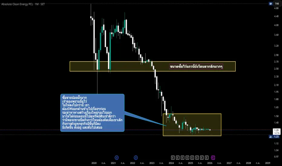
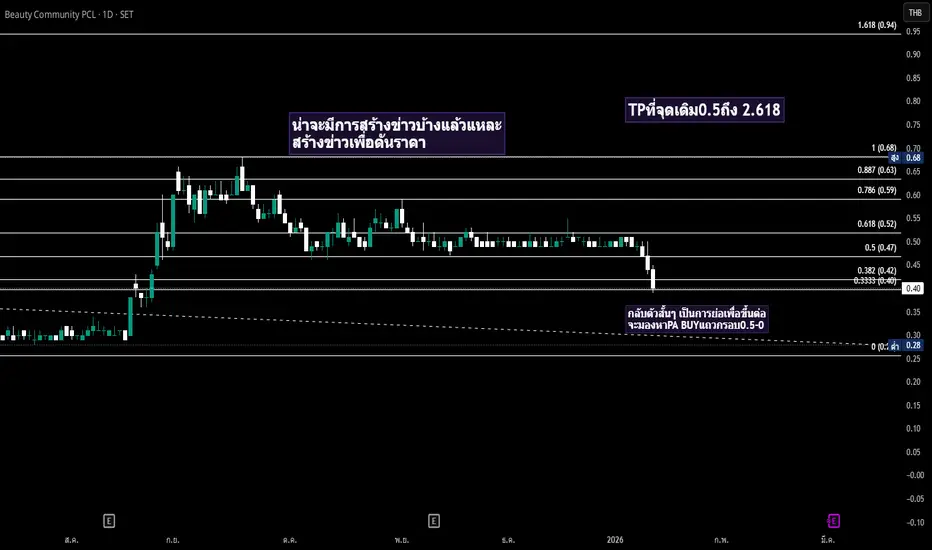
หุ้น ACE คือ บริษัท แอ๊บโซลูท คลีน เอ็นเนอร์จี้ จำกัด (มหาชน) ผู้ประกอบธุรกิจโรงไฟฟ้าพลังงานสะอาดชั้นนำในรูปแบบโฮลดิ้ง (Holding Company) โดยเน้นผลิตและจำหน่ายไฟฟ้าจากพลังงานหมุนเวียน เช่น ชีวมวล ขยะ ก๊าซธรรมชาติ และแสงอาทิตย์
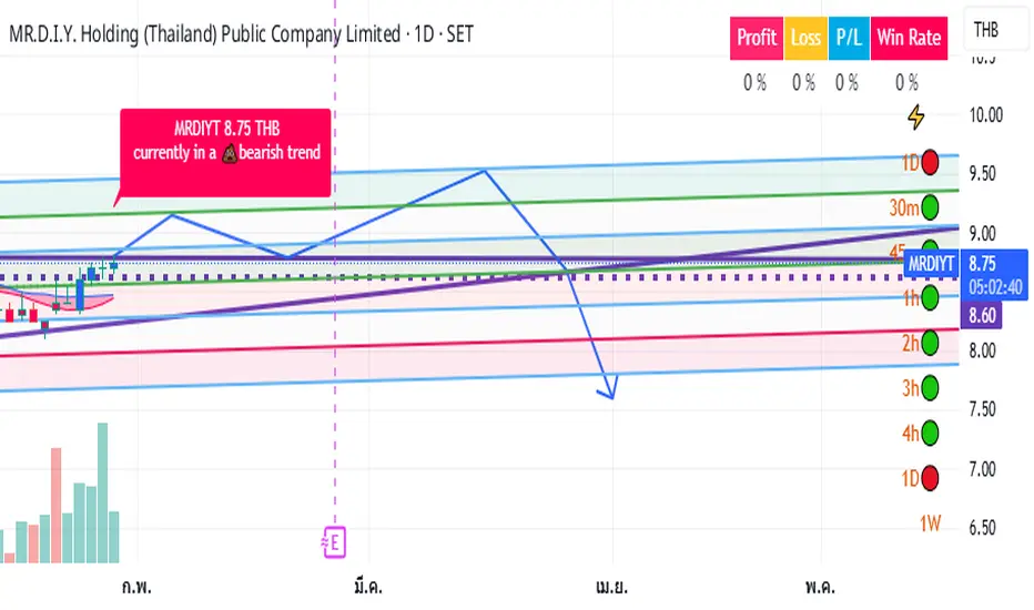
MRDIYtMRDIYt Sell All @ Q3/2026
ตลาดหุ้นไทยตัวปรับขึ้นเล็กน้อย
*ระวังอย่าโอนทรัพย์สินของท่านให้คนไม่รู้จักโดยเด็ดขาด
เติบโตอย่างโดดเด่นจากการรุกตลาด ที่มีคนเข้าน้อย
SINGER | วิเคราะห์คลื่นปรับฐานเป้าหมายกลับตัว Ending Diagonalวิเคราะห์คลื่นปรับฐานและเป้าหมายกลับตัว
รูปแบบการปรับฐานเป็น 5 คลื่นแบบรุนแรงอิมพัส มีโอกาสเป็นคลื่น A
คลื่น 1 ย่อ 38% ของคลื่นอิมพัสก่อนหน้า
คลื่น 2 รีบาวน์ 50% ของคลื่น 1
คลื่น 3 ปรับฐานที่โซน 161.8%+/- ของคลื่น 1
คลื่น 4 ชนเป้าหมาย 38% ของคลื่น 3 พอดี
กรณีกระทิง: ราคาคลื่น 5 ของขา a กำลังย่อร


GULFถ้าทะลุเส้นแนวโน้มสีเหลืองที่กดอยู่ได้จะวิ่งขึ้นได้ดีSET:GULF ถ้าทะลุเส้นแนวโน้มสีเหลืองที่กดอยู่ได้จะวิ่งขึ้นได้ดีราคาโซนนี้ถือว่าไม่แพงครับ
ข้อมูลสรุปงบการเงินและสถานะล่าสุดของ **บริษัท กัลฟ์ ดีเวลลอปเมนท์ จำกัด (มหาชน) หรือ GULF** สำหรับงวด 9 เดือน ปี 2568 และแนวโน้มปี 2569 มีประเด็นสำคัญดังนี้ครับ
1. ผลประกอบการ (งวด 9 เดือน ปี 2568)
ภาพรวมแข็ง

SISบริษัท เอสไอเอส ดิสทริบิวชั่น (ประเทศไทย) จำกัด (มหาชน
..................
ขายส่งคอมพิวเตอร์ ซอฟท์แวร์ อุปกรณ์ต่อพ่วง สมาร์ทโฟน และอุปกรณ์สำนักงานอัตโนมัติต่าง ๆ ในประเทศไทย โดยเป็นตัวแทนจำหน่ายให้กับผู้ผลิตชั้นนำระดับโลก เช่น Asus, Acer, Brother, Dell, Fortinet, Hewlett Packard Enterprise, HP Inc, L

ฝึกอ่านกราฟหาจุดเข้าให้คมที่สุดกำหนดแผนสร้างรูปแบบการเทรดสัปดาห์หน้าของตัวเองแล้วเริ่มเดินตามแผนที่วางไว้
รูปแบบกราฟตอนนี้มันก็มองได้หลายมุมมองบางคนมองโน้มลงบางคนมองโน้มขึ้นบางคนมองไซด์เวย์เป็นรูปแบบของแต่ละคนคนละมุมมองคนละเหตุปัจจัยคนละเหตุผลกำหนดแผนหา PAของตัวเองให้เจอ
ดูไอเดียเกี่ยวกับหุ้นทั้งหมด
11 ก.พ.
GPSCGlobal Power Synergy Public Company Ltd
ตามจริง
—
ประมาณการ
0.53
THB
12 ก.พ.
AMARCAsia Medical and Agricultural Laboratory and Research Center PCL
ตามจริง
—
ประมาณการ
0.03
THB
12 ก.พ.
LPNL.P.N. Development Public Co., Ltd.
ตามจริง
—
ประมาณการ
−0.01
THB
12 ก.พ.
SCSC Asset Corp. Public Co., Ltd.
ตามจริง
—
ประมาณการ
0.15
THB
12 ก.พ.
ZIGAZiga Innovation Public Co. Ltd.
ตามจริง
—
ประมาณการ
—
12 ก.พ.
SPVIS P V I Public Company Ltd
ตามจริง
—
ประมาณการ
—
12 ก.พ.
JMTJMT Network Services Public Co. Ltd.
ตามจริง
—
ประมาณการ
—
12 ก.พ.
SVISVI Public Co., Ltd.
ตามจริง
—
ประมาณการ
—
ดูเหตุการณ์เพิ่มเติม
เทรนของชุมชน
BTC ขาลง - ให้ความสำคัญกับการขายเมื่อราคาดีดตัวขึ้นมุมมองทางเทคนิค
ราคายังคงเคลื่อนไหวอยู่ภายในช่องขาลงที่ชัดเจน
เส้น EMA20 และ EMA50 มีแนวโน้มลาดลงและทำหน้าที่เป็นแนวต้านแบบไดนามิก
การกลับตัวเป็นเพียงการดึงกลับทางเทคนิคเท่านั้น ยังไม่มีสัญญาณการกลับตัวใดๆ
สถานการณ์หลัก:
ให้ความสำคัญกับการขายเมื่อราคาดีดตัวกลับไปยังโซนอุปทาน (กรอบสีเหลือง)
เป้าหมาย

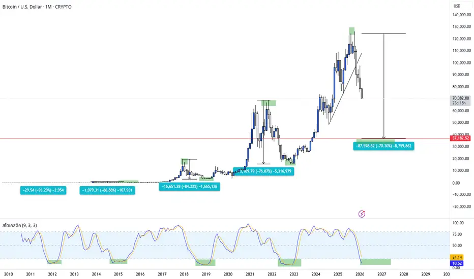
BTC CycleOverview The image displays a monthly timeframe chart of Bitcoin against the U.S. Dollar (BTC/USD) on TradingView. The analysis focuses on historical market cycles, specifically measuring the percentage of drawdowns (price declines) from All-Time Highs to cycle bottoms.
Key Technical Observations:
BTC: ใกล้ถึง 100K📢 หลังจากปรับตัวลดลง BTC ได้ยืนยันแรงสนับสนุนที่แข็งแกร่งที่ 74K เราได้สะสมตำแหน่งซื้อ (long) ที่จุดต่ำ และตลาดขณะนี้เริ่มมีอาการฟื้นคืน แม้ว่าตลาดขาขึ้น (bull market) ที่สมบูรณ์จะยังต้องใช้เวลาในการเติบโต เราควรเตรียมตัวไว้ใต้ระดับ 80K และรอคอยที่ตลาดจะพุ่งขึ้น
💡 กลยุทธ์การเทรด BTC วันนี้:
💰 ซื้

BTCUSD – ความต่อเนื่องแบบหมีต่ำกว่าโซนอุปทานBTC ยังอยู่ภายใต้เมฆ Ichimoku โครงสร้างสูงต่ำ-ล่างยังไม่พัง
การดึงกลับในปัจจุบันเป็นเพียงการดึงกลับเข้าสู่โซนอุปทาน/แนวต้านแบบไดนามิก ซึ่งแสดงให้เห็นว่าแรงกดดันในการขายยังคงควบคุมแนวโน้ม
สถานการณ์สำคัญ: การสะสมสั้น ๆ ไซด์เวย์ → การพังทลายของแนวรับ
หากราคาไม่เรียกคืนโซนอุปทาน BTC มีแนวโน้มที่จะยังค

BTC (1H) - ดีดตัวกลับสู่จุดต่ำสุดของขาขึ้นหลังจากที่ราคาร่วงลงอย่างรวดเร็วในครั้งก่อน BTC กำลังตอบสนองในโซนแรงขายขนาดใหญ่และสร้างการดีดตัวทางเทคนิค
อย่างไรก็ตาม โครงสร้างปัจจุบันบ่งชี้ว่าการดีดตัวกลับเป็นเพียงการปรับฐานและยังไม่เพียงพอที่จะยืนยันการกลับตัวของแนวโน้ม
ราคากำลังกลับไปยังโซน FVG ด้านบน ซึ่งเป็นบริเวณที่มักเกิดแรงขายจากการกระจ

BTC – โครงสร้างขาลงต่อเนื่องราคาปัจจุบันอยู่ต่ำกว่าโซนอุปทาน 79,000-80,000 ซึ่งเคยเกิดการร่วงลงอย่างรวดเร็วก่อนหน้านี้
การทดสอบล่าสุดล้มเหลวในการทะลุผ่านโซนอุปทาน แสดงให้เห็นว่าแรงขายยังคงมีอิทธิพลอยู่
โครงสร้างราคาปัจจุบันยังคงรักษารูปแบบจุดสูงสุดต่ำ – จุดต่ำสุดต่ำ
หาก BTC ยังคงถูกปฏิเสธที่ระดับนี้ สถานการณ์ที่เป็นไปได้มากที

อัพเดทBTC นะจ๊ะเตงงงตามกราฟ ขี้เกียจอธิบาย เอาง่ายๆก็ยอยซื้อเก็บ หลับตาซื้อสะสมไป ราคาไหนก็ซื้อ วันละ100 200 ต่ำกว่าแสนถือว่าถูกหมด! มองว่าน้องทำ2ย่อยของW3 ลงมาได้ถึงกรอบล่าง แต่ก็นะ 1BTC =1BTC

GMT วิเคราะห์ทองคำ (XAUUSD) ประจำวันที่ 2 กุมภาพันธ์ 2569🟡 วิเคราะห์ทองคำ (XAUUSD) ประจำวันที่ 2 กุมภาพันธ์ 2569
💹 ภาพรวมตลาดทองคำ
ราคาทองคำตลาดโลกปรับตัวขึ้นทำ สถิติสูงสุดใหม่ (All-Time High) บริเวณ 5,600 ดอลลาร์ ขณะที่ราคาทองคำในประเทศทำจุดสูงสุดใหม่ที่ระดับ 82,000 บาท ก่อนจะเผชิญ แรงขายทำกำไรอย่างรุนแรงในตลาด COMEX ส่งผลให้ราคาทองคำโลกปรับตัวลงมากกว่า

BTCUSD Daily Analysis 1/2/2026 by AlphaQuantXBINANCE:BTCUSDT ข้อมูลข่าวสาร:
CZ อดีต CEO และผู้ก่อตั้ง Binance ระบุว่า ในช่วงที่ความตึงเครียดทางภูมิรัฐศาสตร์เพิ่มสูงขึ้น เงินทุนมักจะไหลเข้าสู่สินทรัพย์ที่ถูกมองว่า “ปลอดภัย” อย่างทองคำและเงินเป็นอันดับแรก เนื่องจากนักลงทุนต้องการลดความเสี่ยงจากความไม่แน่นอนของโลก
เขาชี้ว่าช่วงเวลานี้จึงเป็นจั


ดูไอเดียเกี่ยวกับคริปโตทั้งหมด
SET50 Insights: ส่องทิศทาง S50H26 ผ่านเลนส์ Data&AI | 6 ก.พ. 69🔥🔥ต่างชาติสั่งลุย! S50H26 บีบหัวใจเลือกทางก่อนเลือกตั้ง แต่มีสัญญาณลบ...
⸻⸻
📌Data Checkpoints - เหตุการณ์สำคัญวันก่อน ที่ส่งผลต่อวันนี้
🟢 ครั้งแรกยังไม่ผ่าน! S50H26 แตะ 900 จุด ก่อนโดนทุบทันทีบอกความแข็งแนวต้านนี้
🟢 ตั้งหลักได้... ฟอร์มราคากลับมาเข้าแพทเทิลสามเหลี่ยม ลุ้น break ต่อ
***🟢 ดีใจเลือ

XAUUSD Daily Analysis 5/2/2026 by AlphaQuantXTrading note: XAUUSD / GOLD
นักลงทุนยังคงเดินหน้าช้อนซื้อทองคำหลังจากราคาร่วงลงอย่างหนักก่อนหน้านี้ ขณะที่นักวิเคราะห์ยังคงมีมุมมองบวกต่อแนวโน้มราคาทองคำ โดย JPMorgan คาดการณ์ว่า ราคาทองคำจะพุ่งขึ้นแตะระดับ 6,300 ดอลลาร์/ออนซ์ ภายในสิ้นปี 2569 โดยได้แรงหนุนจากการที่ธนาคารกลางและนักลงทุนยังคงต้องกา

ทองคำปรับสมดุลเมื่อเฟดผันผวนสูงขึ้นXAUUSD | แผนเงินอัจฉริยะระหว่างวัน – H1
ทองคำไม่ได้อยู่ในโหมดขยายตัวอีกต่อไป หลังจากช่วงขาขึ้นที่แข็งแกร่งจากช่วงสะสม ราคาได้ส่งสภาพคล่องฝั่งซื้อเข้าสู่ระดับสูงสุดก่อนหน้านี้และแสดงสัญญาณการขายของสถาบันทันที การปฏิเสธอย่างรวดเร็วจาก FVG + โซนขาย OB ก่อนหน้ายืนยันการกระจายมากกว่าการต่อเนื่อง
การเคล
ทองคำซื้อขายในระดับสุดขั้วเมื่อข่าวกระตุ้นเกมสภาพคล่อง🟡 XAUUSD – แผนเงินฉลาดระหว่างวัน (H1)
📈 บริบทตลาด
ทองคำยังคงไวต่อการเปลี่ยนแปลงในวันนี้เมื่อตลาดตอบสนองต่อการประกาศของประธานาธิบดีทรัมป์ ทำให้การไหลของ USD ไม่เสถียรและความรู้สึกเสี่ยงผสมผสาน สภาพแวดล้อมนี้สนับสนุนการจัดการสภาพคล่อง ไม่ใช่การไล่ตามแนวโน้ม สถาบันต่างๆ กำลังใช้ประโยชน์จากอารมณ์ที่ขั

XTB – แรงขายยังเข้มงวด เมื่อไหร่โครงสร้างขาลงถึงจะถูกทำลาย?!กราฟราคาทองคำ กรอบเวลา H1
หลังจากราคาฟื้นตัวขึ้นไปที่ 5,100 USD/oz ราคากลับเผชิญ แรงขายรุนแรง และปรับตัวลงทันที การปรับตัวลงปัจจุบันค่อนข้างชัดเจน สังเกตจากแท่งเทียนสีแดงขนาดยาว แสดงว่าแรงขายยังครองตลาดอยู่
ในด้าน โครงสร้างทางเทคนิค แนวโน้มขาลงยังคงอยู่ โดยราคาทำ จุดสูงสุดและจุดต่ำสุดต่ำลงตามลำดั

Gold Trading Plan – 06-02-2026Gold Trading Plan – 06-02-2026 👇👇
🔹 Trend
D1: Uptrend / H4: Sideways / H1: Downtrend / M15: Downtrend / M5: Uptrend
🔹 Overview
Although the H1 and M15 timeframes are currently in a downtrend, the M5 timeframe has formed an uptrend structure. Therefore, today’s bias leans toward a potential upside
การวิเคราะห์ Elliott Wave XAUUSD – 5 กุมภาพันธ์ 2026
1. โมเมนตัม
โมเมนตัมกรอบสัปดาห์ (W1)
– โมเมนตัมกรอบสัปดาห์ขณะนี้เริ่มแสดงสัญญาณการกลับตัวลง
– อย่างไรก็ตาม จำเป็นต้องรอให้แท่งเทียนสัปดาห์ปิดก่อน เพื่อยืนยันการกลับตัวดังกล่าว
– หากการกลับตัวได้รับการยืนยัน ตลาดมีแนวโน้มเข้าสู่ช่วงปรับตัวลงหรือเคลื่อนไหวในกรอบ Sideway อย่างน้อยหลายสัปดาห์
โมเมนตั

ราคาทองคำทะลุแนวต้านสำคัญ – สัญญาณกลับตัวบริบทราคา
XAUUSD เพิ่งแตะแนวต้านสำคัญและตอบสนองอย่างแข็งแกร่ง: ไส้เทียนล่างยาว + แรงซื้อดันราคาขึ้น
โมเมนตัมขาลงก่อนหน้านี้กำลังชะลอตัวลง บ่งชี้ว่าผู้ซื้อกำลังกลับเข้ามา
สถานการณ์ – ความคาดหวังขาขึ้น
หากราคายังคงอยู่เหนือแนวรับและทดสอบซ้ำได้สำเร็จ ราคาทองคำอาจฟื้นตัวต่อไปสู่บริเวณ 5,150+ ซึ่งเป็น

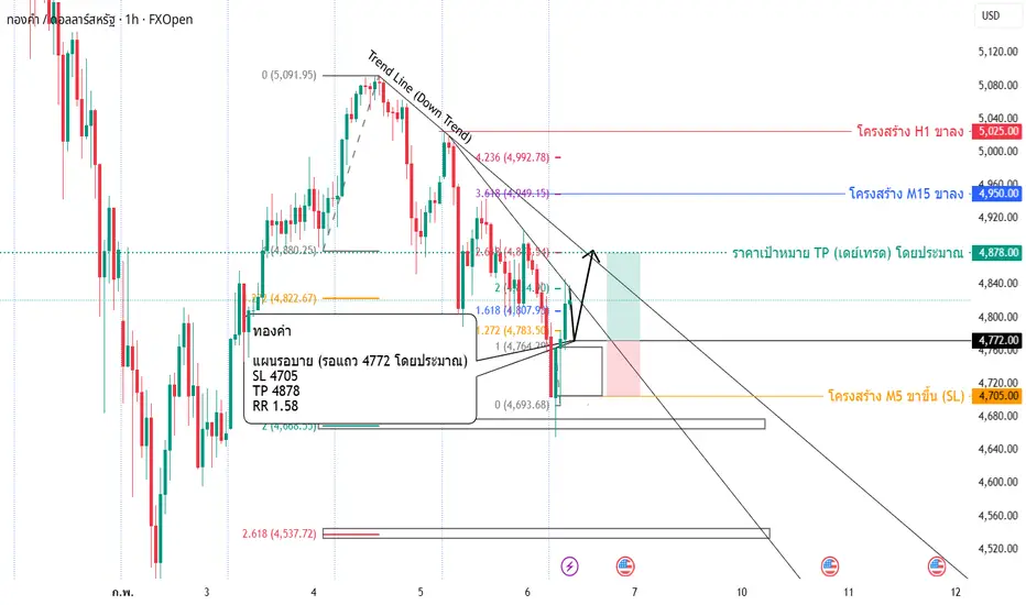
XAUUSD 02/02/26 4750 กดหลุดลงต่อ ไม่หลุดดีด test 5092กรอบการแกว่ง 4750-5092
มองลง
- D ค้าง os / 240 TSD / 60 LHLL
- 15 หลุด 4750 / 60 หลุด 4402
มองขึ้น
- 15 ไม่หลุด 4750 ดีดเบรค 5092
- 60 จะพา 240 D test 5602
D : ob will os
- กรอบ 4274-5602
240 : ob LH
- กรอบ 4402-5602
- มี TSD อยาก os
60 : LH LL os
- กรอบ 4402-5092
- os test 4402
- ถ้าหลุด 4402 พ

ทองคำยังคงผันผวนอย่างหนัก และเทรดเดอร์กำลังเผชิญกับความยากลำบาก📈 1️⃣ เส้นแนวโน้ม (Trendline)
🔹 เส้นแนวโน้มขาขึ้นระยะกลาง (เส้นประสีดำ)
ราคายังคงเคลื่อนไหวอยู่เหนือเส้นแนวโน้มขาขึ้นหลักที่ลากจากจุดต่ำก่อนหน้า → โครงสร้างขาขึ้นระยะกลางยังไม่ถูกทำลายอย่างสมบูรณ์
🔹 อย่างไรก็ตาม:
การร่วงลงอย่างรุนแรงล่าสุดแสดงให้เห็นว่าโมเมนตัมขาลงระยะสั้นกำลังมีอิทธิพล และราคากำล

ดูไอเดียเกี่ยวกับฟิวเจอร์สทั้งหมด
AUD/USD ถูกกดดันต่ำกว่า 0.7000 ท่ามกลางแรงขายสินทรัพย์เสี่ยง**AUD/USD ยังคงถูกกดดันต่ำกว่าระดับ 0.7000**
เงินดอลลาร์ออสเตรเลียเผชิญแรงขายในวงกว้างในวันพฤหัสบดี ท่ามกลางบรรยากาศการลดความเสี่ยง (risk-off) ในสินทรัพย์ที่อ่อนไหวต่อความเสี่ยง ส่งผลให้คู่ AUD/USD ปรับตัวลดลงต่อเนื่องจากวันพุธ และหลุดกลับลงมาต่ำกว่าระดับจิตวิทยาสำคัญที่ 0.7000 ขณะที่เงินดอลลาร์สหรั

XTB – ทดสอบแนวรับสำคัญ คู่เงินจะรีบาวด์หรือไม่?กราฟราคา EURUSD กรอบเวลา H1:
การฟื้นตัวของดอลลาร์สหรัฐ (USD) ได้สร้างแรงกดดันต่อคู่เงินนี้ ทำให้อัตราแลกเปลี่ยนกำลังเข้าใกล้โซนแนวรับสำคัญบริเวณ 1.1750. ในระยะสั้น แรงขายมีแนวโน้มยังคงกดดันราคาให้ทดสอบระดับแนวรับดังกล่าว และมีความเป็นไปได้ที่จะเกิดการรีบาวด์จากโซนนี้ภายใต้สภาวะตลาดปัจจุบัน
อย่างไรก

ฝึกอ่านกราฟเพื่อหาจุดเข้าซื้อให้แม่นยำยิ่งขึ้นไม่ได้พูดนานแล้ว การวิเคราะห์นี้คือบันทึกการฝึกหาจุดเข้าส่วนตัวไม่ใช่การส่งซิกแนลการเทรดใดๆทั้งสิ้นเป็บสมุดบันทึกการเทรดส่วนตัวเพียงแต่นำมาเพื่อให้ผู้ที่ได้เห็นได้ไปฝึกใช้ให้เข้ากับแนวทางการเทรดของตนเองหรือผู้เรียนรู้ใหม่ได้รู้จักตั้งไข่แบบใดยืนให้ได้ด้วยตนเองควรเริ่มเรียนรู้สิ่งใด ควรฝึกตั้งคำถามแล

EURUSD 1R Trading Analysis Summary (SELL) Context:
- Price pushed into the upper range after a short-term rebound.
- Overall structure remains range-bound with no valid upside breakout.
- KZ21 is acting as dynamic resistance within the current range.
Signal:
- Clear rejection at KZ21 and the upper range boundary.
- Buyers failed to hold ab

เลิกฝันกลางวัน! ใครรอเก็บดอลลาร์ 25 บาท ระวัง "ตกรถ"🛑 เลิกฝันกลางวัน! ใครรอเก็บดอลลาร์ 25 บาท ระวัง "ตกรถ" ...กราฟเฉลยแล้ว "ของจริง" อยู่ตรงนี้!
ช่วงนี้กระแส "บาทแข็งหลุดโลก" มาแรงมาก กูรูหลายสำนักขู่กันไปถึง 25-28 บาทต่อดอลลาร์ เล่นเอาคนถือ USD หรือคนเทรดทองขวัญเสียกันเป็นแถว
แต่เดี๋ยวก่อน... ก่อนที่คุณจะแพนิคตามข่าวลือ ผมอยากให้วางถุงกาว แล้วมาดู "

GBPUSD 5/01/2026Fzone Demand Supply H4
T1 H4
T2 Rejection
TP แท่งเทียน
buy zone H1,m15
1.3373-1.33648
tp1 1.34562

ดูไอเดียเกี่ยวกับฟอเร็กซ์ทั้งหมด
ซื้อขายโดยตรงบน Superchart ผ่านโบรกเกอร์ที่ผ่านการรองรับของเรา ผ่านการตรวจสอบอย่างครบถ้วน และถูกรีวิวโดยผู้ใช้งาน


