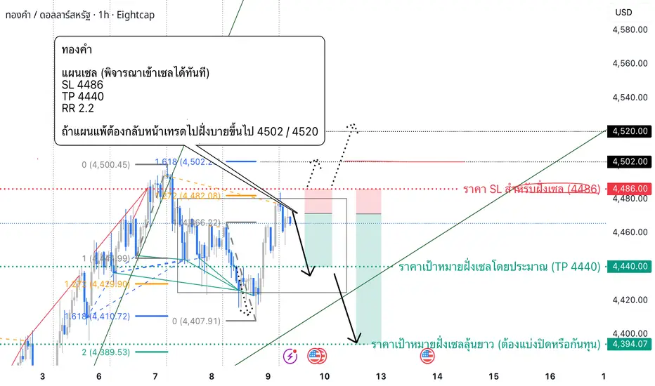
Gold Trading Plan – NON-FARM PAYROLLS | 09-01-2025Gold Trading Plan – NON-FARM PAYROLLS | 09-01-2025 👇👇
🔹 Trend
D1: Uptrend / H4: Uptrend / H1: Uptrend
🔹 Overview
Although all timeframes are in an uptrend, the current price on the H1 timeframe has not yet broken above a key resistance level that would confirm further upside. Therefore, there is s


Scott "Kidd" Poteetนักบินอวกาศที่ไม่คิดว่าจะได้เป็น

สถานที่ในโลกสร้างตลาด
เข้าร่วมกับเทรดเดอร์และนักลงทุน 100 ล้านคนที่กำหนดอนาคตด้วยมือของพวกเขาเอง
ทองทะลุกรอบ H1 การทดสอบใหม่คือจุดสำคัญต่อไป✨ XAUUSD (H1) – หลุดจากช่องทางขาลง รอการทดสอบกลับเพื่อต่อเนื่อง 🌸
🌸 1) มุมมองตลาด
บน H1, ทองคำได้หลุดจากช่องทางขาลงและกำลังปรับตัวขึ้นอย่างราบรื่น ด้วยโครงสร้างนี้ ฉันชอบแผนการซื้อเมื่อราคากลับตัวลงในจุดที่มีความต้องการ แทนที่จะไล่ตามราคาในขณะที่มันลอยอยู่ในช่วงกลาง
ข้อควรทราบหนึ่ง: ตลาดยังคงชอบท

ทองคำก่อน NFP วันนี้: ระดับสำคัญที่ต้องจับตาบริบทตลาด – NFP วันนี้
วันนี้เป็นการประกาศ Non-Farm Payrolls ครั้งแรกของปี และทองคำกำลังเข้าใกล้ในโครงสร้างที่มีสภาพคล่องสูงและอ่อนไหว
ก่อน NFP ราคามักไม่แสดงเจตนาที่แท้จริง — แต่จะสร้างกับดักและดึงดูดสภาพคล่อง
จากมุมมองของ Smart Money ช่วง NFP มักจะตามลำดับที่คุ้นเคย:
กวาดสภาพคล่อง → ปฏิกิริยาที่โ

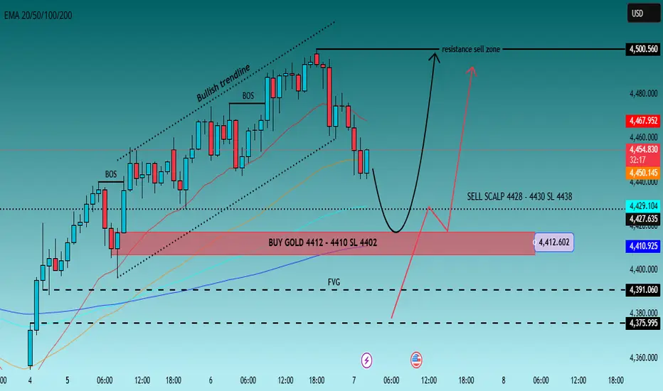
ทองหยุดหลังขยาย — หมุนเวียน ไม่ต่อเนื่อง🟡 XAUUSD – แผนการเงินอัจฉริยะภายในวัน | โดย Ryan_TitanTrader (07/01)
📈 สถานการณ์ตลาด
ทองคำนั้นยังคงมีโครงสร้างที่ bullish ในกรอบเวลาที่สูงขึ้น ตามการขยายตัวที่มีแรงกระตุ้นอย่างมากซึ่งทำให้ราคาลงลึกเข้าสู่ระดับพรีเมียม อย่างไรก็ตาม การเคลื่อนไหวราคาล่าสุดสัญญาณการเปลี่ยนแปลงจากการขยายตัวไปสู่การกระจ
บิตคอยน์ — การรวมตัวในแดนขาขึ้นยังคงดำเนินต่อไปBTC ยังคงเคลื่อนไหวอยู่ภายในช่องราคาขาขึ้น โดยการปรับฐานเป็นเพียงการดึงกลับทางเทคนิคเท่านั้น ราคาทรงตัวอยู่ในโซนแรงซื้อและเมฆอิจิโมกุ บ่งชี้ว่าแรงซื้อยังคงควบคุมแนวโน้มอยู่
สถานการณ์:
คาดว่าจะมีการรวมตัวในแนวนอน/การดึงกลับเล็กน้อยภายในโซนแนวรับ ตามด้วยการต่อเนื่องของแนวโน้มขาขึ้น โดยมีเป้าหมายที่ 9

การพักฐานขาขึ้น → แนวรับเส้นเทรนด์ไลน์ยังอยู่ เตรียมขึ้นรอบใหม่🔍 ประเด็นทางเทคนิคสำคัญ
หลังจากเกิด การเบรกลงอย่างรุนแรง (Bearish Breakout) ราคาได้ดีดตัวกลับจาก โซนดีมานด์ / POI สำคัญ 🔄
ตลาดเคลื่อนไหวอยู่ภายใน ช่องขาขึ้นที่ชัดเจน, ยืนยันโครงสร้างขาขึ้นในระยะกลาง 📈
Break of Structure (BOS) ขึ้นด้านบน บ่งชี้ถึงการเปลี่ยนโมเมนตัมจากขาลงเป็นขาขึ้น ✅
การย่อตัวในป

DAOYoudao เป็นบริษัทเทคโนโลยีอินเทอร์เน็ตของจีนที่เชี่ยวชาญด้านบริการออนไลน์ในด้านเนื้อหา ชุมชน การสื่อสาร และการค้า โดยมุ่งเน้นหลักไปที่ตลาดเทคโนโลยีการศึกษา (EdTech) บริษัทนี้เป็นบริษัทในเครือของ NetEase
กิจกรรมของบริษัทแบ่งออกเป็นสามส่วนหลัก ได้แก่:
บริการการเรียนรู้: รวมถึงบริการติวเตอร์และบริการ

DUSITถ้าเราตัดกราฟ w ดูรอบ เราจะเห็นว่า W กำลังจะยกโลแล้ว เป้าให้อยู่แถว 18 บาท พอย่อมาดู D Dก็ยกโล ถ้าเราเข้าแถวนี้ หลุดโลออก เป้า 18 แล้วการขึ้นของ w ใช้ D เป็นตัวยกสต็อป ไฮโล

แนวโน้มทองคำสำหรับ วันที่6/1/69DAY
ถ้าราคาปิดเหนือ 4480ได้ ราคาจะวิ่งไปหา4550 แต่ถ้าปิดไส้แล้วต่ำกว่า4480 ราคามีโอกาสกลับลงมาหา4280
รายชั่วโมง
ราคาในH1เริ่มกลับตัวเป็นขาขึ้น จะมีต้าน 4459 4495 ราคาตอนนี้ทำได้แค่การย่อยกLOWเท่านั้น
*** H1 กลับเป็นเทรนด์ขาลงได้ ราคามีโอกาสกลับไปหา4280
หน้าSELL
ต้าน 4459 4495 ราคามีโอกาสย่อพักตัวใ

คลื่นยืด5มากกว่า 1.382ดังนั้นเป็นไปได้ว่ากราฟยังคงทำคลื่น3ขยายยังไม่จบ. คลื่นยืด3นี้น่าจะมีสัดส่วนการยืดถึง 5.618-6.000.

ดูไอเดียที่คัดสรรโดยบรรณาธิการทั้งหมด
Arbitrage Detector [LuxAlgo]The Arbitrage Detector unveils hidden spreads in the crypto and forex markets. It compares the same asset on the main crypto exchanges and forex brokers and displays both prices and volumes on a dashboard, as well as the maximum spread detected on a histogram divided by four user-selected percenti

Multi-Distribution Volume Profile (Zeiierman)█ Overview
Multi-Distribution Volume Profile (Zeiierman) is a flexible, structure-first volume profile tool that lets you reshape how volume is distributed across price, from classic uniform profiles to advanced statistical curves like Gaussian, Lognormal, Student-t, and more.
Instead of forcin

Multi-Ticker Anchored CandlesMulti-Ticker Anchored Candles (MTAC) is a simple tool for overlaying up to 3 tickers onto the same chart. This is achieved by interpreting each symbol's OHLC data as percentages, then plotting their candle points relative to the main chart's open. This allows for a simple comparison of tickers to tr
Vdubus Divergence Wave Pattern Generator V1The Vdubus Divergence Wave Theory
10 years in the making & now finally thanks to AI I have attempted to put my Trading strategy & logic into a visual representation of how I analyse and project market using Core price action & MacD. Enjoy :)
A Proprietary Structural & Momentum Confluence System

Per Bak Self-Organized CriticalityTL;DR: This indicator measures market fragility. It measures the system's vulnerability to cascade failures and phase transitions. I've added four independent stress vectors: tail risk, volatility regime, credit stress, and positioning extremes. This allows us to quantify how susceptible markets are

Volatility Risk PremiumTHE INSURANCE PREMIUM OF THE STOCK MARKET
Every day, millions of investors face a fundamental question that has puzzled economists for decades: how much should protection against market crashes cost? The answer lies in a phenomenon called the Volatility Risk Premium, and understanding it may fundam

Volume Gaps & Imbalances (Zeiierman)█ Overview
Volume Gaps & Imbalances (Zeiierman) is an advanced market-structure and order-flow visualizer that maps where the market traded, where it did not, and how buyer-vs-seller pressure accumulated across the entire price range.
The core of the indicator is a price-by-price volume prof

Match Finder [theUltimator5]Match Finder is the dating app of indicators. It takes your current ticker and finds the most compatible match over a recent time period. The match may not be Mr. right, but it is Mr. right now. It doesn't forecast future connection, but it tells you current compatibility for today.
Jokes aside,

Trend Line Methods (TLM)Trend Line Methods (TLM)
Overview
Trend Line Methods (TLM) is a visual study designed to help traders explore trend structure using two complementary, auto-drawn trend channels. The script focuses on how price interacts with rising or falling boundaries over time. It does not generate trade sign

Breakouts & Pullbacks [Trendoscope®]🎲 Breakouts & Pullbacks - All-Time High Breakout Analyzer
Probability-Based Post-Breakout Behavior Statistics | Real-Time Pullback & Runup Tracker
A professional-grade Pine Script v6 indicator designed specifically for analyzing the historical and real-time behavior of price after strong All-Ti

ดูอินดิเคเตอร์และกลยุทธ์ทั้งหมด
เทรนของชุมชน
WHAUP ท่านใดที่ชอบเล่นปันผลและเล่นตรีม DATA CENTER มองเป็นตัวที่SET:WHAUP 1. บทบาทของ WHAUP ในระบบนิเวศ Data Center
WHAUP ไม่ได้สร้าง Data Center เองโดยตรง แต่เป็น "ผู้ส่งกำลังบำรุง" หลักให้กับบริษัทเทคโนโลยียักษ์ใหญ่ที่เข้ามาตั้งฐานในนิคมอุตสาหกรรมของ WHA (เช่น Google, Microsoft และ AWS) ผ่าน 2 ธุรกิจหลัก:
ธุรกิจน้ำ (Utilities): Data Center ต้องการระบบหล่อเย็

SAWADบริษัท ศรีสวัสดิ์ คอร์ปอเรชั่น จำกัด (มหาชน)
..................
กลุ่มบริษัทประกอบธุรกิจให้บริการสินเชื่อรายย่อย ภายใต้เครื่องหมายบริการ "ศรีสวัสดิ์ เงินสดทันใจ" ซึ่งประกอบด้วย 5 ธุรกิจหลัก ได้แก่ 1) สินเชื่อรายย่อยแบบมีหลักประกันประเภท ทะเบียนรถเก่าทุกประเภท บ้านและโฉนดที่ดิน 2) สินเชื่อรายย่อยแบบไม

ฝึกอ่านกราฟเพื่อหาจุดเข้าซื้อให้แม่นยำยิ่งขึ้นไม่ได้พูดนานแล้ว การวิเคราะห์นี้คือบันทึกการฝึกหาจุดเข้าส่วนตัวไม่ใช่การส่งซิกแนลการเทรดใดๆทั้งสิ้นเป็บสมุดบันทึกการเทรดส่วนตัวเพียงแต่นำมาเพื่อให้ผู้ที่ได้เห็นได้ไปฝึกใช้ให้เข้ากับแนวทางการเทรดของตนเองหรือผู้เรียนรู้ใหม่ได้รู้จักตั้งไข่แบบใดยืนให้ได้ด้วยตนเองควรเริ่มเรียนรู้สิ่งใด ควรฝึกตั้งคำถามแล
ยังไม่มีสัญญาณ เปลี่ยนแนวโน้มQH ยังไม่มีสัญญาณ เปลี่ยนแนวโน้ม
-ราคาปรับขึ่นจริงแจ่งปริมาณยังน้อย
-มีความเห็นว่า ราคายังออกข้าง

DUSITถ้าเราตัดกราฟ w ดูรอบ เราจะเห็นว่า W กำลังจะยกโลแล้ว เป้าให้อยู่แถว 18 บาท พอย่อมาดู D Dก็ยกโล ถ้าเราเข้าแถวนี้ หลุดโลออก เป้า 18 แล้วการขึ้นของ w ใช้ D เป็นตัวยกสต็อป ไฮโล
ควาย: การเดินขบวนของไทยยังคงดำเนินต่อไปRedoubling เป็นโครงการวิจัยของฉันเองบน TradingView ซึ่งออกแบบมาเพื่อตอบคำถามต่อไปนี้: ฉันจะใช้เวลานานแค่ไหนในการเพิ่มเงินทุนเป็นสองเท่า? แต่ละบทความจะเน้นไปที่บริษัทต่างๆ ที่ฉันจะพยายามเพิ่มเข้าไปในพอร์ตโฟลิโอจำลองของฉัน ฉันจะใช้ราคาปิดของแท่งเทียนรายวันสุดท้ายในวันที่บทความเผยแพร่เป็นราคาซื้อจำก

ดูไอเดียเกี่ยวกับหุ้นทั้งหมด
ไม่มีรายงานตามกำหนดเวลา
เทรนของชุมชน
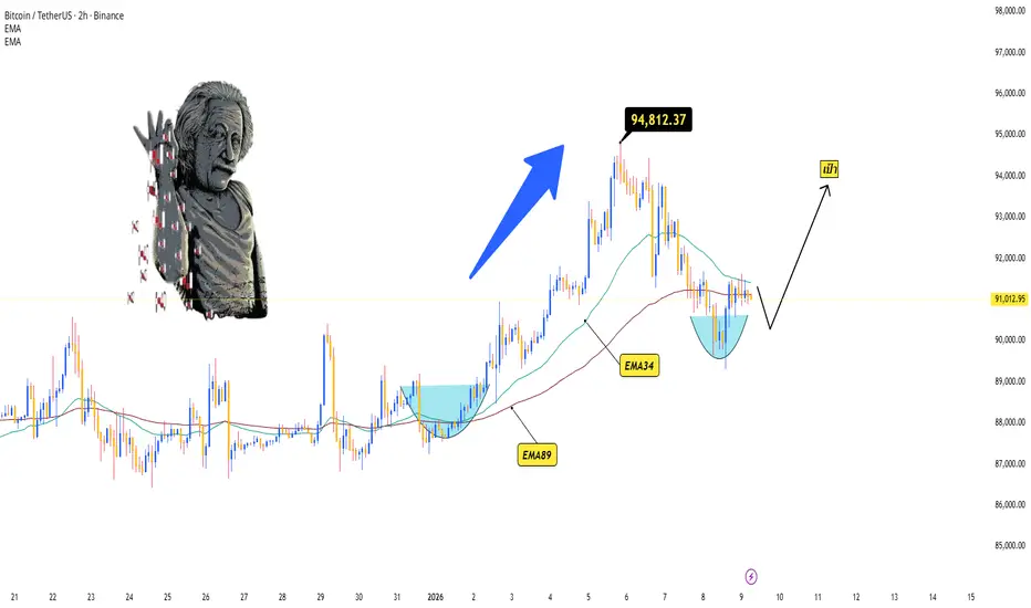
BTC/USDT - รีเซ็ตก่อนพุ่งขึ้นรอบต่อไปBTC กำลังปรับฐานอย่างเหมาะสมหลังจากแตะจุดสูงสุดที่ประมาณ 94.8K ราคาดีดตัวลงมาที่บริเวณ EMA34/89 และสร้างโครงสร้างฐานกลม/จุดต่ำสุดที่สูงขึ้น บ่งชี้ว่าผู้ซื้อยังคงควบคุมแนวโน้มหลักอยู่
การรักษาระดับเหนือ EMA และจุดต่ำสุดที่ใกล้ที่สุด → คาดว่าจะมีการต่อเนื่องเป็นขาขึ้น
คาดการณ์ว่า BTC จะเสร็จสิ้นช่วงส
BTC แสดงสัญญาณการกระจายตัว — แนวโน้มขาลงยังคงดำเนินอยู่BTCUSDT ได้สร้างรูปแบบการกระจายตัว (ยอดโค้งมน/การกระจายตัว) เสร็จสมบูรณ์แล้ว และกำลังเคลื่อนไหวอยู่ภายในช่องขาลงที่ชัดเจน ราคาได้สร้างจุดสูงสุดและจุดต่ำสุดที่ต่ำลงอย่างต่อเนื่อง ยืนยันว่าแรงขายยังคงมีอิทธิพลเหนือกว่า
สถานการณ์ที่คาดการณ์ไว้คือการดีดตัวทางเทคนิคไปยังเส้นแนวโน้ม/ช่องด้านบน ตามด้วยการ

BTCUSD Daily Analysis 10/1/2026 by AlphaQuantXBINANCE:BTCUSDT ข้อมูลข่าวสาร:
ผู้ถือครอง Bitcoin รายใหญ่ของโลกช้อน Bitcoin รวมกว่า 40,000 ล้านดอลลาร์ในปี 2025 ข่าว Bitcoin
ข้อมูลจาก River ระบุว่า ในปี 2025 ผู้ถือครอง Bitcoin รายใหญ่ที่สุด 21 อันดับแรกของโลก ได้ทำการสะสม BTC เพิ่มรวมกันมูลค่ากว่า 40,000 ล้านดอลลาร์ สะท้อนแรงซื้อจากกลุ่มทุนขนาด

บิตคอยน์ — การรวมตัวในแดนขาขึ้นยังคงดำเนินต่อไปBTC ยังคงเคลื่อนไหวอยู่ภายในช่องราคาขาขึ้น โดยการปรับฐานเป็นเพียงการดึงกลับทางเทคนิคเท่านั้น ราคาทรงตัวอยู่ในโซนแรงซื้อและเมฆอิจิโมกุ บ่งชี้ว่าแรงซื้อยังคงควบคุมแนวโน้มอยู่
สถานการณ์:
คาดว่าจะมีการรวมตัวในแนวนอน/การดึงกลับเล็กน้อยภายในโซนแนวรับ ตามด้วยการต่อเนื่องของแนวโน้มขาขึ้น โดยมีเป้าหมายที่ 9
ภาพรวมของ #BTCUSD ปี 2026 ภาพรวมของ BTCUSD ... แม้ว่าช่วงที่กราฟขึ้นทำ ATH ผมจะมีความคาดหวัง และ ติด Bias ว่ากราฟจะปรับตัวขึ้นไปได้อีก และคลื่นชุดสุดท้ายก่อนปรับตัวลง ก็ยังภาพของความเป็น Expanded Flat ซึ่งปัจจุบัน กราฟก็ปรับตัวลงมาที่สัดส่วน คลื่น C of Expanded Flat ที่ 261.8% พอดี (เป็นสัดส่วนที่เกิดไม่บ่อย ) ซึ่งผมจะขอทดม

BTCUSD 1H “ดีดกลับแรงแต่ยังติดเพดาน! 07.01.2569# 🚀 BTCUSD 1H “ดีดกลับแรงแต่ยังติดเพดาน!” โซนนี้ถ้าผ่านได้…มีสิทธิ์วิ่งยาว แต่ถ้าถูกทุบซ้ำ ระวังไหลกลับทันที ⚠️
📅 **วิเคราะห์วันที่ 07 มกราคม พ.ศ. 2569**
⏰ **เวลา 07:44 น. (UTC+7)**
📷 **แนบภาพกราฟเพื่อให้เติมราคา R/S และ Entry/SL/TP**
! (sandbox:/mnt/data/BTCUSD_2026-01-07_07-44-50.png)
📣 *เพื่อก

BTCUSD : ระบบ MACD ตัด 0 (ActionZone) มีสัญญาณ "ซื้อ" 6/1/2026อธิบาย :
ระบบ Action Zone หรือ MACD ตัดศูนย์ คือระบบที่ใช้หลักการดูเส้น MACD ว่า เส้นนี้จะตัดกับเส้นศูนย์เมื่อไหร่ โดย ถ้าตัดขึ้นก็จะเป็นสัญญาณซื้อ ถ้าตัดลงก็จะเป็นสัญญาณขาย ถือเป็นระบบ Trend Following ที่ใช้ได้ดีกับตลาดที่มีเทรนจ๋าๆ เช่น BTC
แต่ระบบนี้ก็จะมีจุดอ่อนอยู่หลายจุดเช่นกัน คือ ในช่วงตลาด

BTCUSD 1H โครงสร้างตลาดและระดับราคาสำคัญBTCUSD ในกรอบเวลา 1 ชั่วโมงแสดงโครงสร้างตลาดที่มั่นคงหลังจากการปรับฐานสิ้นสุดลง การย่อตัวล่าสุดพบแนวรับใกล้ระดับ 86,500 ซึ่งแรงขายเริ่มชะลอตัวและราคาทรงตัว จากบริเวณนี้ราคาฟื้นตัวกลับเหนือระดับ 90,000
เหนือระดับดังกล่าว ราคากำลังก่อตัวเป็นจุดสูงและจุดต่ำที่สูงขึ้น แสดงถึงโครงสร้างระยะสั้นที่ดีขึ้น

ฝึกอ่านกราฟหาจุดเข้าให้คมที่สุดกำหนดแผนสร้างรูปแบบการเทรดสัปดาห์หน้าของตัวเองแล้วเริ่มเดินตามแผนที่วางไว้
รูปแบบกราฟตอนนี้มันก็มองได้หลายมุมมองบางคนมองโน้มลงบางคนมองโน้มขึ้นบางคนมองไซด์เวย์เป็นรูปแบบของแต่ละคนคนละมุมมองคนละเหตุปัจจัยคนละเหตุผลกำหนดแผนหา PAของตัวเองให้เจอ

smc📊 SMC Ultra-Fast: ALL-IN & Auto-Signal - Pine Script V5 Code Analysis
This code is a TradingView indicator designed to identify accurate and fast trading signals, specifically "ALL-IN" signals generated by pivot point breakouts combined with unusually high volume. It also automatically sets Take P
ดูไอเดียเกี่ยวกับคริปโตทั้งหมด
XAUUSD Daily Analysis 9/1/2026 by AlphaQuantXTrading note: XAUUSD / GOLD
สัญญาทองคำตลาดนิวยอร์กปิดขยับลงเล็กน้อยในวันพฤหัสบดี (8 ม.ค.) ขณะที่นักลงทุนจับตาการเปิดเผยตัวเลขจ้างงานนอกภาคเกษตรของสหรัฐฯ ในวันนี้ เพื่อประเมินแนวโน้มนโยบายการเงินของธนาคารกลางสหรัฐฯ (เฟด)
นักวิเคราะห์จาก HSBC คาดการณ์ว่า ราคาทองคำมีแนวโน้มพุ่งแตะระดับ 5,000 ดอลลาร์

การพักฐานขาขึ้น → แนวรับเส้นเทรนด์ไลน์ยังอยู่ เตรียมขึ้นรอบใหม่🔍 ประเด็นทางเทคนิคสำคัญ
หลังจากเกิด การเบรกลงอย่างรุนแรง (Bearish Breakout) ราคาได้ดีดตัวกลับจาก โซนดีมานด์ / POI สำคัญ 🔄
ตลาดเคลื่อนไหวอยู่ภายใน ช่องขาขึ้นที่ชัดเจน, ยืนยันโครงสร้างขาขึ้นในระยะกลาง 📈
Break of Structure (BOS) ขึ้นด้านบน บ่งชี้ถึงการเปลี่ยนโมเมนตัมจากขาลงเป็นขาขึ้น ✅
การย่อตัวในป
การวิเคราะห์ Elliott Wave XAUUSD – 9 มกราคม 2025
1. โมเมนตัม (Momentum)
กรอบวัน (D1)
– โมเมนตัม D1 ขณะนี้ได้ กลับตัวเป็นขาลง แล้ว
– คาดว่าราคาจะยังคง ปรับตัวลงต่อไปอีกหลายวัน จนกว่าโมเมนตัม D1 จะเข้าสู่โซน Oversold
– แสดงให้เห็นว่าแรงกดดันขาลงในระยะกลางยังคงครอบงำตลาด
กรอบ H4
– โมเมนตัม H4 กำลัง เตรียมกลับตัวลง
– จำเป็นต้องรอ การยืนยันจากการปิด

อัปเดต XAUUSD 09/01/69จากสถานการณ์ล่าสุดคิดว่า segment ที่ 2 ยังไม่จบ ราคาล่าสุดอาจจะมีการย้อนกลับลงมาต่ำกว่า 61.8% ก่อนค่อยกลับขึ้นไปเป็น segment ที่ 3

Gold Trading Plan – NON-FARM PAYROLLS | 09-01-2025Gold Trading Plan – NON-FARM PAYROLLS | 09-01-2025 👇👇
🔹 Trend
D1: Uptrend / H4: Uptrend / H1: Uptrend
🔹 Overview
Although all timeframes are in an uptrend, the current price on the H1 timeframe has not yet broken above a key resistance level that would confirm further upside. Therefore, there is s
XAUUSD M30 – ซื้อในจุดต่ำระหว่างการดึงกลับ🔍 โครงสร้างตลาด (SMC)
• แนวโน้มใหญ่ก่อนหน้านี้เป็นขาขึ้น แต่ปัจจุบันราคากำลังปรับตัวในช่องทางขาลง
• จุดสูงสุดล่าสุดเป็นจุดสูงที่อ่อนแอ → แรงกดดันการขายระยะสั้นยังคงมีอยู่
• ภายในช่องทางขาลง ราคาสร้าง BOS เล็ก ๆ แสดงให้เห็นว่าฝ่ายขายกำลังควบคุมจังหวะระยะสั้น
• โครงสร้างขาขึ้นยังไม่ถูกทำลายทั้งหมด ดั

SET50 Insights: ส่องทิศทาง S50H26 ผ่านเลนส์ Data&AI | 9 ม.ค. 69🔥🔥 DELTA Index! ตัวเดียวทุบ SET เละ วันนี้สำคัญทดสอบกรอบ Sideway 2 เดือน
⸻⸻
📌 Data Checkpoints - เหตุการณ์สำคัญวันก่อน ที่ส่งผลต่อวันนี้
🔴ทั้งปิดและเปิด gap... SET เปิดโดดลงข้าม 83x ทำเทรนขาลงทางเทคนิคชัด
🔴กลต อยู่ไหน? DELTA ตัวเดียว Impact กดดัชนี 80%
***🔴 ผลงานเขาล่ะ... ต่างชาติโกยกำไร Short

ราคาทองคำปรับตัวลง ผู้ซื้อยังคงควบคุมตลาดอยู่XAUUSD กำลังปรับตัวลงมายังโซนแรงซื้อ/แนวรับที่แข็งแกร่ง หลังจากทะลุออกจากช่องแนวโน้มขาขึ้น โครงสร้างโดยรวมยังคงรักษาระดับต่ำสุดที่สูงขึ้น และราคามีการตอบสนองในเชิงบวกที่โซนแนวรับที่บรรจบกัน แสดงให้เห็นว่าแรงซื้อยังไม่ถูกทำลาย
หากโซนแนวรับปัจจุบันยังคงอยู่ ราคาทองคำอาจทรงตัวชั่วครู่ก่อนที่จะดีดตัวกล

มุมมองทองคำ 9 / 1 / 2569มุมมองทองคำ 9 / 1 / 2569
ระยะสั้นของมองไว้แบบนี้ก่อนนะครับ ถ้าหลุด 4441-43 ลงได้ก็อาจจะลึกถึง 4404 ได้นะครับ

XAUUSD 08/01/25 120 240 กำลังย่อ test os ไม่หลุดดีดขึ้นได้ แกว่งในกรอบ 4274-4500.5
กำลังย่อ test 4310 4274
มองลง
- 120 240 จะย่อ test 4310 4274
- 30 15 พา 120 240 ย่อ os
- เป้าย่อ 4395.5 4387 4378 4360
- ถ้าลงไม่ต่ำกว่า 4310 ทรง HL ยังค้างดีดขึ้นได้
มองขึ้น
- แนวโน้มหลักยังเป็นขาขึ้น
- 60 ย่อ HL ดีดขึ้นได้
- รอให้ 30 15 ฟอร์มทรง HH HL การกลับขึ้นถึงจะ

ดูไอเดียเกี่ยวกับฟิวเจอร์สทั้งหมด
EUR/USD อ่อนค่าต่ำกว่า 1.1700 ท่ามกลางตลาดหลีกเลี่ยงความเสี่ยง### EUR/USD เคลื่อนไหวในกรอบจำกัดต่ำกว่า 1.1700 ท่ามกลางบรรยากาศการลงทุนที่หลีกเลี่ยงความเสี่ยง
คู่เงิน EUR/USD ยังคงเผชิญแรงกดดันและไม่สามารถฟื้นตัวได้อย่างชัดเจน โดยเคลื่อนไหวใกล้กรอบล่างของช่วงการซื้อขายประจำสัปดาห์ ต่ำกว่าระดับ 1.1700 ในวันพฤหัสบดี ค่าเงินดอลลาร์สหรัฐได้รับแรงหนุนจากท่าทีระมัดร

GBPUSD 1H “ไหลลงไม่หยุด! วิเคราะห์วันที่ 9 ม.ค. 2569 🚨 **GBPUSD 1H “ไหลลงไม่หยุด!” โซน 1.3456 คือด่านวัดใจ—เด้งแล้วโดนทุบ หรือกลับตัวจริง?**
📅 **วิเคราะห์วันที่ 9 ม.ค. 2569 เวลา 13:03 น. (UTC+7)**
📣 เพื่อการศึกษา ไม่ใช่คำแนะนำลงทุน
🪙 **สินทรัพย์: GBPUSD** | ⏱️ **TF: 1H**
📷 **แนบภาพกราฟ (ไว้เติมราคา R/S และ Entry/SL/TP ได้เลย)**
! (sandbox:/mnt/data

เลิกฝันกลางวัน! ใครรอเก็บดอลลาร์ 25 บาท ระวัง "ตกรถ"🛑 เลิกฝันกลางวัน! ใครรอเก็บดอลลาร์ 25 บาท ระวัง "ตกรถ" ...กราฟเฉลยแล้ว "ของจริง" อยู่ตรงนี้!
ช่วงนี้กระแส "บาทแข็งหลุดโลก" มาแรงมาก กูรูหลายสำนักขู่กันไปถึง 25-28 บาทต่อดอลลาร์ เล่นเอาคนถือ USD หรือคนเทรดทองขวัญเสียกันเป็นแถว
แต่เดี๋ยวก่อน... ก่อนที่คุณจะแพนิคตามข่าวลือ ผมอยากให้วางถุงกาว แล้วมาดู "

GBPUSD 5/01/2026Fzone Demand Supply H4
T1 H4
T2 Rejection
TP แท่งเทียน
buy zone H1,m15
1.3373-1.33648
tp1 1.34562

ฝึกอ่านกราฟหาจุดเข้าให้คมที่สุดกำหนดแผนสร้างรูปแบบการเทรดของตัวเองแล้วเริ่มเดินตามแผนที่วางไว้
จะทำอะไรต้องมีรูปแบบตัวเองนะครับ อย่าเห็นแต่ภาพที่ตีไว้พอกราฟถึงแถบที่ตีปุ๊บกดปั๊บโดนลากปั๊บเลยนะจะบอกให้
ฉะนั้นแนวทางไม่ใช่จุดเข้าแนวทางใช้เพื่อเตรียมหาจุดเข้า

โอกาสในการซื้อขายคริสต์มาสแปดครั้งข้อมูลสัปดาห์หนักอยู่ข้างหน้าสำหรับตลาดโลกมุ่งหน้าเข้าสู่คริสมาสต์
ในสหรัฐอเมริกากรมแรงงานจะปล่อยล่าช้าข้อมูลการจ้างงานนอกภาคเกษตรในเดือนตุลา 2 เอ็นเอฟพีเอสสำหรับราคาหนึ่งสามารถสะกดความผันผวนสำหรับตลาด
ร้อยละ 3.2 ยังคงดีเหนือธนาคารกลางของเป้าหมายร้อยละ 2
ในเม็กซิโก,ธนาคารกลางจะประกาศการตัดสินใ

ดูไอเดียเกี่ยวกับฟอเร็กซ์ทั้งหมด
| - | - | - | - | - | - | - | - | ||
| - | - | - | - | - | - | - | - | ||
| - | - | - | - | - | - | - | - | ||
| - | - | - | - | - | - | - | - | ||
| - | - | - | - | - | - | - | - | ||
| - | - | - | - | - | - | - | - | ||
| - | - | - | - | - | - | - | - | ||
| - | - | - | - | - | - | - | - | ||
| - | - | - | - | - | - | - | - |
ซื้อขายโดยตรงบน Superchart ผ่านโบรกเกอร์ที่ผ่านการรองรับของเรา ผ่านการตรวจสอบอย่างครบถ้วน และถูกรีวิวโดยผู้ใช้งาน


