Reversal Candlestick Setups (Doji, Outside, Extreme, Wick)Reversal Candlestick Setups – Doji, Outside, Extreme & Wick
This indicator identifies four high-probability reversal candlestick patterns across all timeframes: Doji Reversals, Outside Reversals, Extreme Reversals, and Wick Reversals. Each setup is based on clearly defined quantitative rules, allowing traders to filter noise and focus on strong reversal signals instead of relying on subjective visual interpretation.
The tool automatically scans every candle, highlights qualifying patterns on the chart, and provides alert options for both bullish and bearish versions of all four setups. This makes it suitable for intraday traders, swing traders, and positional traders seeking early reversal confirmation.
Included Setups
1. Doji Reversal Setup
Identifies candles with extremely small bodies relative to their range, combined with a smaller-than-average bar size. Useful for spotting market indecision before a directional shift.
2. Outside Reversal Setup
Flags candles that engulf the previous candle’s high–low range and exceed the average range by a multiplier. This is designed to capture strong momentum reversals driven by aggressive buying or selling.
3. Extreme Reversal Setup
Highlights large-bodied candles that dominate their overall range and exceed twice the average bar size. These signals aim to catch climactic exhaustion and institutional-level reversals.
4. Wick Reversal Setup
Detects candles with long rejection wicks, small bodies, and closes near an extreme of the range, supported by above-average bar size. Ideal for identifying sharp intrabar rejections.
Key Features
• Automatically detects all four reversal setups
• Works on all timeframes and symbols
• Customizable variables for deeper testing and optimization
• Clear bullish and bearish labels directly on the chart
• Fully integrated alert conditions for real-time notifications
• Suitable for crypto, stocks, indices, forex, and commodities
Who This Indicator Is For
• Traders who want objective, rule-based reversal detection
• Price action traders looking to enhance accuracy
• Systematic traders wanting quantifiable candlestick criteria
• Beginners learning reversal structures with visual guidance
• Professionals integrating reversal patterns into algorithmic or discretionary systems
How to Use
Add the indicator to your chart and enable alerts for the specific setups you want to track (e.g., “Bullish Wick Reversal”). Combine these signals with market structure, trend filters, volume analysis, or momentum indicators for increased conviction.
Forecasting

[NBK] Cover Buy Sell for BTC Cover Buy Sell for BTC— Engulfing Reversals with EMA/ATR Trend & Quality Filters
{Update for BTC}
What it does
This indicator flags high-quality bullish/bearish reversal candles only when they align with a short-term trend and pass several objective quality filters. It is not a simple mashup: each component serves a distinct role and they work together to keep early/low-quality signals out.
How it works (components & interaction)
Pattern engine (entry candidates)
Bullish side (Cover Buy):
Body Engulf: current green body fully covers the prior red body, or
Piercing (relaxed): prior red → current green closes above the prior body’s midpoint (not beyond prior open).
Bearish side (Cover Sell):
Full-candle Engulf: current red candle (body + wicks) covers the entire prior candle, or
Body Engulf: current red body fully covers the prior body, or
Dark-Cloud (relaxed): prior green → current red closes below the prior body’s midpoint.
Short-term trend gate (non-repainting)
Trend is defined by the EMA slope between bar-1 and bar-2, scaled by ATR to require minimum strength.
Slope < 0 → only bullish candidates pass. Slope > 0 → only bearish candidates pass.
Body-size filter (noise control)
Rejects tiny candles: each body is compared with the lookback average body size.
For bearish candidates an additional ratio check requires current body ≥ a fraction of the prior body (to avoid weak top-ticks).
Peak filters for bearish signals (late, cleaner tops)
Distance above EMA: the high must be at least X × ATR above EMA (avoids mid-range noise).
Near local high: the high of the current bar (or bar-1) must be close to the highest high in a recent window.
Break confirmation: close must break low by at least Y × ATR (filters shallow dark-clouds).
Only when a candidate satisfies the pattern ➝ trend ➝ size ➝ peak sequence is a signal printed/alerted.
Inputs (key parameters)
EMA length, Min EMA slope vs ATR, ATR length: trend strength.
Lookback for average body, Min body vs average, Bear body ratio: body-quality filters.
High distance above EMA (×ATR), Local high lookback, Tolerance to local high (×ATR), Min break of low (×ATR): bearish peak confirmation.
Alerts
Built-in alerts fire on bar close for both Cover Buy and Cover Sell.
How to use
Increase High distance above EMA / Local high lookback / Min break of low to reduce early Cover Sell in ranges.
If you miss good tops, ease those thresholds slightly.
Works across symbols/timeframes; evaluated on bar close; no repaint from the trend gate.
Notes
This tool is a signal screener, not financial advice. For best results, combine with your structure/SR zones, risk management, and execution rules.
13 thg 10
Phát hành các Ghi chú
Cover Buy Sell — Engulfing Reversals with EMA/ATR Trend & Quality/Peak Filters
What this script does
Flags high-quality bullish/bearish engulfing reversals only when short-term trend and price-action quality conditions are met. Signals evaluate on bar close. No promotions, no links, no external calls.
Why this is an original combination (mashup justification)
Raw engulfing patterns are noisy in ranges. This script is a pipeline where each module solves a specific failure mode, not a simple merge of indicators:
Pattern engine (candidates):
Bullish (Cover Buy): body-engulf of prior red body, or relaxed Piercing (close above prior body midpoint, not beyond prior open).
Bearish (Cover Sell): full-candle engulf (body+wicks), body-engulf, or relaxed Dark-Cloud (close below prior body midpoint).
Short-term trend gate (non-repainting):
EMA slope is measured between bar-1 and bar-2 and must exceed an ATR-scaled threshold (slopeAtrPct).
Slope < 0 → only bullish candidates pass.
Slope > 0 → only bearish candidates pass.
Body-size filter (noise control):
Bodies must not be tiny vs the average over lenBodyRef. For bearish candidates, an alternate check allows current body ≥ bearRatioMin × prior body to keep decisive tops.
Bearish peak filters (late, cleaner tops):
High must be far above EMA (≥ emaDistAtrMin × ATR), near the local high (current or prior bar within nearHighLen & nearHighTol × ATR), and the close must break prior low by ≥ breakAtrMin × ATR.
These remove premature Cover Sell flags in chop and keep the later, higher-quality reversal.
Only candidates that pass Pattern → Trend → Size → Peak become signals. This staged design is the core originality.
How to use (practical guidance)
To reduce early Cover Sell in ranges: raise emaDistAtrMin, raise nearHighLen, and/or raise breakAtrMin.
If you miss clean tops: slightly lower those thresholds.
Typical starting points: lenTrend=4–6, slopeAtrPct=0.03–0.06, atrLen=14; adjust to instrument/TF volatility.
Combine with structure/SR zones and your risk rules. This tool is for analysis only and is not investment advice.
Alerts
Two alert conditions are included: Cover Buy and Cover Sell, both evaluated on bar close.
Non-repainting note
The trend gate uses confirmed data (EMA slope from bar-1 vs bar-2). Pattern and filters also use confirmed values; no forward-looking references.
English translations of UI strings (if your on-chart UI uses another language)
“Strict engulf (không cho bằng nhau)” → Strict engulf (no equality)
“EMA length (trend ngắn hạn)” → EMA length (short-term trend)
“Lookback tính thân trung bình” → Lookback for average body size
“Ngưỡng thân tối thiểu vs trung bình” → Min body vs average (ratio)
“Bear: thân hiện tại ≥ rRatio * thân trước” → Bear: current body ≥ rRatio × prior body
“Bear: HIGH cách EMA tối thiểu (x ATR)” → Bear: HIGH distance above EMA (× ATR) min
“Bear: cửa sổ đỉnh cục bộ (bars)” → Bear: local high lookback (bars)
“Bear: dung sai tới đỉnh (x ATR)” → Bear: tolerance to local high (× ATR)
“Bear: mức phá LOW tối thiểu (x ATR)” → Bear: min break of LOW (× ATR)
Compliance notes
English-only title, English appears first in this description; no ads, logos, links, or solicitations.
This is an original, closed-source script with a meaningful explanation of what, how, why, and how to use.
(Vietnamese short summary)
Chỉ báo bắt tín hiệu engulfing chất lượng cao khi có xu hướng EMA ngắn hạn (đo bằng độ dốc/ATR) và vượt qua lọc kích thước thân + điều kiện đỉnh cho tín hiệu bán. Chuỗi xử lý Mẫu → Xu hướng → Kích thước → Đỉnh giúp loại tín hiệu sớm trong vùng đi ngang. Có alert Cover Buy/Sell, đánh giá theo bar close, không quảng cáo/đường link, và không phải khuyến nghị đầu tư.

[NBK] Cover Buy Sell for XAU Cover Buy Sell for XAU — Engulfing Reversals with EMA/ATR Trend & Quality Filters
{Update for XAU}
What it does
This indicator flags high-quality bullish/bearish reversal candles only when they align with a short-term trend and pass several objective quality filters. It is not a simple mashup: each component serves a distinct role and they work together to keep early/low-quality signals out.
How it works (components & interaction)
Pattern engine (entry candidates)
Bullish side (Cover Buy):
Body Engulf: current green body fully covers the prior red body, or
Piercing (relaxed): prior red → current green closes above the prior body’s midpoint (not beyond prior open).
Bearish side (Cover Sell):
Full-candle Engulf: current red candle (body + wicks) covers the entire prior candle, or
Body Engulf: current red body fully covers the prior body, or
Dark-Cloud (relaxed): prior green → current red closes below the prior body’s midpoint.
Short-term trend gate (non-repainting)
Trend is defined by the EMA slope between bar-1 and bar-2, scaled by ATR to require minimum strength.
Slope < 0 → only bullish candidates pass. Slope > 0 → only bearish candidates pass.
Body-size filter (noise control)
Rejects tiny candles: each body is compared with the lookback average body size.
For bearish candidates an additional ratio check requires current body ≥ a fraction of the prior body (to avoid weak top-ticks).
Peak filters for bearish signals (late, cleaner tops)
Distance above EMA: the high must be at least X × ATR above EMA (avoids mid-range noise).
Near local high: the high of the current bar (or bar-1) must be close to the highest high in a recent window.
Break confirmation: close must break low by at least Y × ATR (filters shallow dark-clouds).
Only when a candidate satisfies the pattern ➝ trend ➝ size ➝ peak sequence is a signal printed/alerted.
Inputs (key parameters)
EMA length, Min EMA slope vs ATR, ATR length: trend strength.
Lookback for average body, Min body vs average, Bear body ratio: body-quality filters.
High distance above EMA (×ATR), Local high lookback, Tolerance to local high (×ATR), Min break of low (×ATR): bearish peak confirmation.
Alerts
Built-in alerts fire on bar close for both Cover Buy and Cover Sell.
How to use
Increase High distance above EMA / Local high lookback / Min break of low to reduce early Cover Sell in ranges.
If you miss good tops, ease those thresholds slightly.
Works across symbols/timeframes; evaluated on bar close; no repaint from the trend gate.
Notes
This tool is a signal screener, not financial advice. For best results, combine with your structure/SR zones, risk management, and execution rules.
13 thg 10
Phát hành các Ghi chú
Cover Buy Sell — Engulfing Reversals with EMA/ATR Trend & Quality/Peak Filters
What this script does
Flags high-quality bullish/bearish engulfing reversals only when short-term trend and price-action quality conditions are met. Signals evaluate on bar close. No promotions, no links, no external calls.
Why this is an original combination (mashup justification)
Raw engulfing patterns are noisy in ranges. This script is a pipeline where each module solves a specific failure mode, not a simple merge of indicators:
Pattern engine (candidates):
Bullish (Cover Buy): body-engulf of prior red body, or relaxed Piercing (close above prior body midpoint, not beyond prior open).
Bearish (Cover Sell): full-candle engulf (body+wicks), body-engulf, or relaxed Dark-Cloud (close below prior body midpoint).
Short-term trend gate (non-repainting):
EMA slope is measured between bar-1 and bar-2 and must exceed an ATR-scaled threshold (slopeAtrPct).
Slope < 0 → only bullish candidates pass.
Slope > 0 → only bearish candidates pass.
Body-size filter (noise control):
Bodies must not be tiny vs the average over lenBodyRef. For bearish candidates, an alternate check allows current body ≥ bearRatioMin × prior body to keep decisive tops.
Bearish peak filters (late, cleaner tops):
High must be far above EMA (≥ emaDistAtrMin × ATR), near the local high (current or prior bar within nearHighLen & nearHighTol × ATR), and the close must break prior low by ≥ breakAtrMin × ATR.
These remove premature Cover Sell flags in chop and keep the later, higher-quality reversal.
Only candidates that pass Pattern → Trend → Size → Peak become signals. This staged design is the core originality.
How to use (practical guidance)
To reduce early Cover Sell in ranges: raise emaDistAtrMin, raise nearHighLen, and/or raise breakAtrMin.
If you miss clean tops: slightly lower those thresholds.
Typical starting points: lenTrend=4–6, slopeAtrPct=0.03–0.06, atrLen=14; adjust to instrument/TF volatility.
Combine with structure/SR zones and your risk rules. This tool is for analysis only and is not investment advice.
Alerts
Two alert conditions are included: Cover Buy and Cover Sell, both evaluated on bar close.
Non-repainting note
The trend gate uses confirmed data (EMA slope from bar-1 vs bar-2). Pattern and filters also use confirmed values; no forward-looking references.
English translations of UI strings (if your on-chart UI uses another language)
“Strict engulf (không cho bằng nhau)” → Strict engulf (no equality)
“EMA length (trend ngắn hạn)” → EMA length (short-term trend)
“Lookback tính thân trung bình” → Lookback for average body size
“Ngưỡng thân tối thiểu vs trung bình” → Min body vs average (ratio)
“Bear: thân hiện tại ≥ rRatio * thân trước” → Bear: current body ≥ rRatio × prior body
“Bear: HIGH cách EMA tối thiểu (x ATR)” → Bear: HIGH distance above EMA (× ATR) min
“Bear: cửa sổ đỉnh cục bộ (bars)” → Bear: local high lookback (bars)
“Bear: dung sai tới đỉnh (x ATR)” → Bear: tolerance to local high (× ATR)
“Bear: mức phá LOW tối thiểu (x ATR)” → Bear: min break of LOW (× ATR)
Compliance notes
English-only title, English appears first in this description; no ads, logos, links, or solicitations.
This is an original, closed-source script with a meaningful explanation of what, how, why, and how to use.
(Vietnamese short summary)
Chỉ báo bắt tín hiệu engulfing chất lượng cao khi có xu hướng EMA ngắn hạn (đo bằng độ dốc/ATR) và vượt qua lọc kích thước thân + điều kiện đỉnh cho tín hiệu bán. Chuỗi xử lý Mẫu → Xu hướng → Kích thước → Đỉnh giúp loại tín hiệu sớm trong vùng đi ngang. Có alert Cover Buy/Sell, đánh giá theo bar close, không quảng cáo/đường link, và không phải khuyến nghị đầu tư.

COT Net Positions by Luis TrompeterCOT Net Positions by Luis Trompeter visualizes the net positioning of different trader groups based on the weekly Commitments of Traders (COT) reports published by the CFTC every Friday.
The indicator processes the raw COT data by calculating Long positions minus Short positions for each trader category. This results in the net position of every group per report.
The script then plots these net positions continuously over time, based on every available COT release. This creates a clear and easy-to-read visualization of how different market participants are positioned.
The indicator displays the three primary COT categories:
• Commercials
• Non-Commercials
• Non-Reportables
By observing how these trader groups shift their positioning, traders can better understand market sentiment and identify potential directional biases or changes in underlying market pressure.
This tool is designed to help traders incorporate positioning data into their analysis and to better interpret how institutional and speculative flows evolve over time.
This indicator is intended to be used exclusively on the weekly timeframe.
COT data is published once per week by the CFTC and therefore only updates weekly.
Using this script on lower timeframes may result in misleading visualization or irregular spacing between data points.
For correct interpretation, please apply it on 1W charts only.

IBD Style - EPS & SalesPurpose
Brings MarketSmith/MarketSurge-style fundamentals directly into TradingView.
Designed for growth traders using EPS, sales, and acceleration as core criteria.
Data & Detection
Automatically detects earnings events from TradingView data.
Reconstructs up to 8 quarters of EPS and revenue.
Distinguishes actual vs. standardized EPS, fills missing values, fixes irregularities.
Weekly Earnings Table
Shows EPS, YoY & QoQ growth, EPS surprises, sales, sales growth, margin, ROE.
Dynamically scales revenue (millions/billions).
Alternating row colours + MarketSmith / MarketSurge themes.
Daily HeadBand Table
Condensed view of last 4 quarters.
Shows growth metrics + next earnings date.
Chart Annotations
Optional earnings arrows with EPS% (and sales%).
MarketSmith-style coloring and ±999% limits.
“Digits-only” mode for clean charts.
Data Safeguards
Handles negative EPS cases (#), duplicated values, missing quarters, and reporting irregularities.
Overall
Not a signal tool—an integrated fundamental visualization framework.
Lets traders see earnings acceleration, revenue strength, and profitability without leaving the chart.

BTC Halving Cycle SignalsBTC Halving Cycle Signals
What signals does this script give in real history (2011-2025):
2015 → BUY (bear market bottom)
2019 → BUY (post-2018 bottom)
October 2020 → BUY
November 2023 → BUY
And right now (Nov 2025) → green bottom + price above weekly EMA200 → about to give a buy signal if it breaks $72k strongly.
BUY signal: ~500 days pre-halving + price > weekly EMA200 + monthly RSI <60 (accumulation).
SELL signal: ~1064 days post-halving + RSI >75 or close < SuperTrend (distribution).
Hardcoded halving dates (can be edited). Works on BTCUSD weekly/monthly, gives 1-2 signals per cycle.

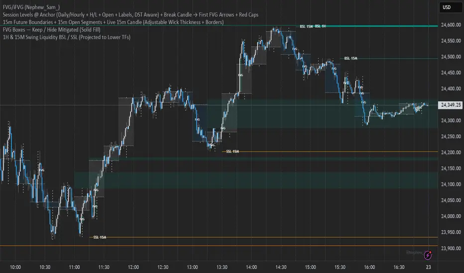
15m Open Segments + Live 15m Candle I created this script for so you can add a 15m candle overlay on your lower timeframes, to better view the price action of the 15m candle.
Cloud MasterSwap Between Traditional, Crypto and AI Ichimoko Cloud Settings with one Indicator. You can also input your own custom settings if you're a brainiac.

Market Range OracleMarket Range Oracle is an advanced volatility-adaptive projection tool designed to help traders anticipate future price behaviour, identify probabilistic ranges, and understand how markets historically expand or contract from the price open.
📊 By analysing historical bar-to-bar performance, ATR-filtered volatility, and fast-RSI momentum, the indicator creates a complete forward-looking range map for any timeframe.
📈 What Market Range Oracle Does
Calculates Expected Price Movement From the Open for any selected timeframe, the indicator measures thousands of past bars (or your chosen lookback) to determine:
Average % Gain
Average % Loss
Max Adjusted Gain (ATR-filtered projected peaks)
Max Adjusted Loss (ATR-filtered projected troughs)
Rate of green and red candle closes in the selected lookback period
Projected price levels for all of the above
These projections are then plotted directly on the chart or drawn as offset lines with detailed labels, all the colours, text size, show/hide elements are customisable from the indicator dashboard.
🧠 How does work and how to use it
The indicator computes projections across three independent timeframes:
Plots Timeframe — where visual projection bands are drawn
Lines & Labels Timeframe — creates separate-TF projection levels & labels
Forecast Timeframe — allows forward bar forecasting for the next candle
Forecast projections (when enabled) can be used to show the next future candle of any timeframe.
Example 1: Plots Timeframe set to current timeframe and the Forecast Timeframe option to the same timeframe, this will show an adaptive range moving with the price for current timeframe.
Example 2 : Find the potential Future range long term, the current timeframe is an weekly and we set the Forecast Timeframe to 2 weeks, as want to see potential top and bottom range for the next 2 weeks
Example 3 : Scalping with Market Range Oracle - Set the Bands to current timeframe and set the Projections lines and labels to a higher timeframe (in our case 15 minutes and a 4h)
⚡ Momentum Overlay (Fast RSI Hybrid)
A fast-RSI (RSI-2) colour code system measures short-term momentum and the top and bottom of the ranges display momentum.
Also the middle RSI 50 value equivalent EMA shows directional bias visualized with colour-shifting dashed line on the chart to help traders with clear trend direction.
🔔 Built-In Alert System
Alerts trigger on Price-Level Events and on momentum shift:
Price reaches projected Avg Loss
Price reaches projected Max Gain
Price reaches projected Max Loss
Midpoint Cross Events
Price crosses above mid-range
Price crosses below mid-range
Fast RSI bullish momentum
Fast RSI bearish momentum
Fast RSI strong bullish spike
Fast RSI strong bearish spike
🧩 Market Range Oracle is ideal for scalping, day-trading, swing trading, and position traders.
💬 Notes
Market Range Oracle does not predict future price — it projects statistically probable ranges based on historical behaviour and volatility. It is a decision-support tool to help traders navigate expected expansion from the open.

Multiple Cross Signals (Predictive)The indicator calculates and displays the Golden/Death Cross signals and the buy/sell signals from the following oscillators on the chart:
MACD (Moving Average Convergence Divergence)
RSI (Relative Strength Index)
Stochastic (Stochastic Oscillator)
In addition to the actual cross signals (shown with arrows), it incorporates two key features:
Cross Prediction (Predictive): Identifies when the oscillator lines (MACD, RSI, Stochastic) are very close and converging towards a cross, suggesting that a real signal might occur soon.
False Signal Detection: Attempts to identify when an initial buy/sell signal fails when the low/high of the signal candle is broken within a confirmation period.


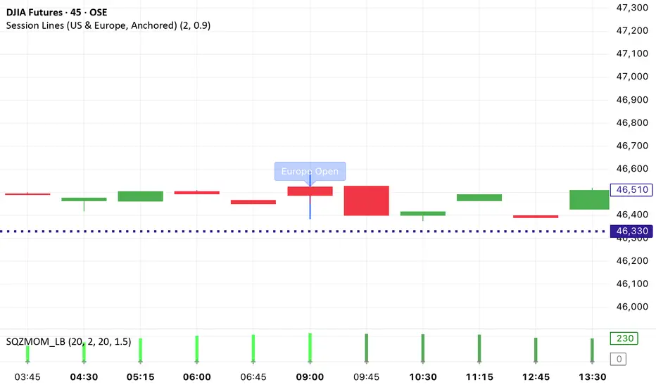
Session Lines (US & Europe, Anchored and Adaptive)A sleek indicator that marks the London (blue) and New York (red) trading sessions with perfectly aligned vertical lines both open and close times.
Lines automatically scale with your chart, adapt to any timeframe, and fade smoothly on higher intervals to keep your layout clean and professional.
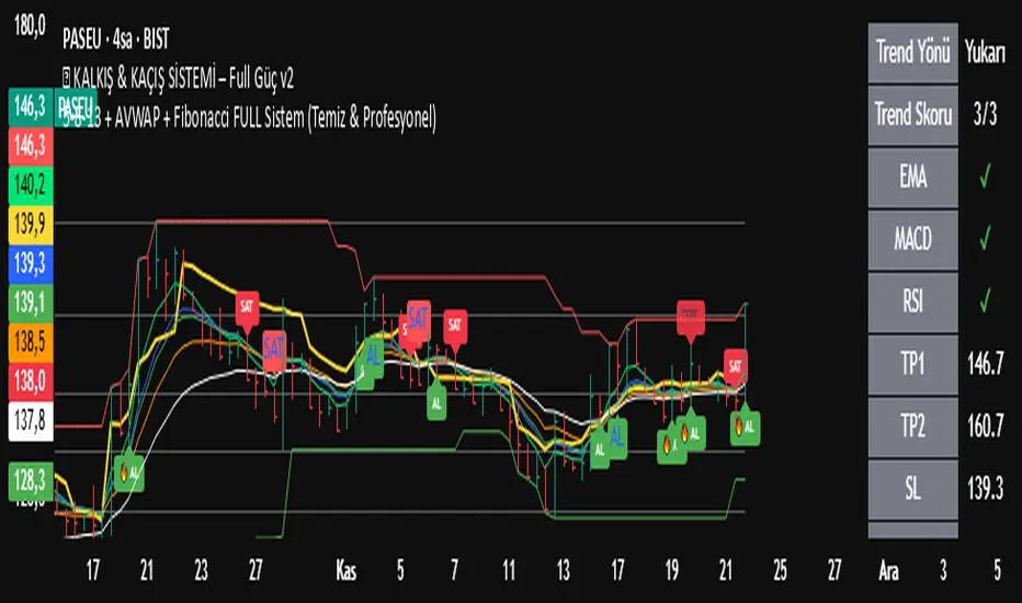
5-8-13 + AVWAP + Fibonacci FULL Sistem (Temiz & Profesyonel)✅ What This Indicator Is Doing (Full Explanation in English)
Your custom system combines several powerful components:
EMA 5-8-13,
AVWAP,
Auto Fibonacci,
Triple-Confirmation Buy/Sell Signals,
Background Trend Coloring.
Below is the complete breakdown.
🟩 1. Trend Detection with EMA 5-8-13
The indicator colors the background based on the alignment of:
EMA 5
EMA 8
EMA 13
Trend logic:
Uptrend (Green background):
EMA5 > EMA8 > EMA13
Downtrend (Red background):
EMA5 < EMA8 < EMA13
Caution Zone (Brown/Orange):
EMA5 < EMA8 but EMA8 > EMA13
→ Trend weakening, prepare for reversal.
🟩 2. Classic Buy/Sell Signals (EMA Cross)
These labels are the small “AL” and “SAT” signals.
BUY: EMA 5 crosses above EMA 13
SELL: EMA 5 crosses below EMA 13
This captures basic trend reversals.
🟩 3. AVWAP Dip/Peak Detection
The indicator automatically finds significant swing points:
AVWAP DIP (Green small label)
AVWAP PEAK (Red small label)
It then launches a new AVWAP line starting from that pivot.
So the yellow line is always the current Anchored VWAP starting from the most recent important DIP or PEAK.
🟩 4. Auto Fibonacci Levels (Clean Version)
The indicator calculates Fibonacci levels based on the last N bars (120 by default):
0.0
0.236
0.382
0.500
0.618
0.786
1.0
You now use the clean version, meaning:
✔ Only one set of Fibonacci lines appears
✔ No overlapping lines
✔ No chart clutter
✔ Always readable and minimal
🟩 5. Triple-Confirmation Buy/Sell Signals (Strong Signals)
These are the more important green/red labels (“🔥 AL” / “⚠️ SAT”).
A TRIPLE BUY (AL) happens when:
Price breaks above AVWAP
EMA 5-8-13 are aligned upward (trendUp)
Price is above Fibonacci 0.382
A TRIPLE SELL (SAT) happens when:
Price breaks below AVWAP
EMA 5-8-13 aligned downward (trendDown)
Price is below Fibonacci 0.382
This removes weak signals and gives high-quality entries and exits.
🟩 Summary of What You Saw on the Chart
Trend shifted to caution zone
Then EMA trend fully turned bearish
Price broke below AVWAP
Price dropped below Fibonacci 0.382
Triple Confirmation Sell appeared
Downtrend continued strongly afterward
Your indicator correctly identified:
👉 Trend weakening
👉 Bearish reversal
👉 Strong Sell zone
👉 Final drop
Chop + MSS/FVG Retest (Ace v1.6) – IndicatorWhat this indicator does
Name: Chop + MSS/FVG Retest (Ace v1.6) – Indicator
This is an entry model helper, not just a BOS/MSS marker.
It looks for clean trend-side setups by combining:
MSS (Market Structure Shift) using swing highs/lows
3-bar ICT Fair Value Gaps (FVG)
First retest back into the FVG
A built-in chop / trend filter based on ATR and a moving average
When everything lines up, it plots:
L below the candle = Long candidate
S above the candle = Short candidate
You pair this with a higher-timeframe filter (like the Chop Meter 1H/30M/15M) to avoid pressing the button in garbage environments.
How it works (simple explanation)
Chop / Trend filter
Computes ATR and compares each bar’s range to ATR.
If the bar is small vs ATR → more likely CHOP.
If the bar is big vs ATR → more likely TREND.
Uses a moving average:
Above MA + TREND → trendLong zone
Below MA + TREND → trendShort zone
MSS (Market Structure Shift)
Uses swing highs/lows (left/right bars) to track the last significant high/low.
Bullish MSS: close breaks above last swing high with displacement.
Bearish MSS: close breaks below last swing low with displacement.
Those events are marked as tiny triangles (MSS up/down).
A MSS only stays “valid” for a certain number of bars (Bars after MSS allowed).
3-bar ICT FVG
Bullish FVG: low > high
→ gap between bar 3 high and bar 2 low.
Bearish FVG: high < low
→ gap between bar 3 low and bar 2 high.
The indicator stores the FVG boundaries (top/bottom).
Retest of FVG
Watches for price to trade back into that gap (first touch).
That retest is the “entry zone” after the MSS.
Final Long / Short condition
Long (L) prints when:
Recent bullish MSS
Bullish FVG has formed
Price retests the bullish FVG
Environment = trendLong (ATR + above MA)
Not CHOP
Short (S) prints when:
Recent bearish MSS
Bearish FVG has formed
Price retests the bearish FVG
Environment = trendShort (ATR + below MA)
Not CHOP
So the L/S markers are “model-approved entry candles”, not just any random BOS.
Inputs / Settings
Key inputs you’ll see:
ATR length (chop filter)
How many bars to use for ATR in the chop / trend filter.
Lower = more sensitive, twitchy
Higher = smoother, slower to change
Max chop ratio
If barRange / ATR is below this → treat as CHOP.
Min trend ratio
If barRange / ATR is above this → treat as TREND.
Hide MSS/BOS marks in CHOP?
ON = MSS triangles disappear when the bar is classified as CHOP
Keeps your chart cleaner in consolidation
Swing left / right bars
Controls how tight or wide the swing highs/lows are for MSS:
Smaller = more sensitive, more MSS points
Larger = fewer, more significant swings
Bars after MSS allowed
How many bars after a MSS the indicator will still allow FVG entries.
Small value (e.g. 10) = MSS must deliver quickly or it’s ignored.
Larger (e.g. 20) = MSS idea stays “in play” longer.
Visual RR (for info only)
Just for plotting relative risk-reward in your head.
This is not a strategy tester; it doesn’t manage positions.
What you see on the chart
Small green triangle up = Bullish MSS
Small red triangle down = Bearish MSS
“L” triangle below a bar = Long idea (MSS + FVG retest + trendLong + not chop)
“S” triangle above a bar = Short idea (MSS + FVG retest + trendShort + not chop)
Faint circle plots on price:
When the filter sees CHOP
When it sees Trend Long zone
When it sees Trend Short zone
You do not have to trade every L or S.
They’re there to show “this is where the model would have considered an entry.”
How to use it in your trading
1. Use it with a higher-timeframe filter
Best practice:
Use this with the Chop Meter 1H/30M/15M or some other HTF filter.
Only consider L/S when:
Chop Meter = TRADE / NORMAL, and
This indicator prints L or S in the right location (premium/discount, near OB/FVG, etc.)
If higher-timeframe says NO TRADE, you ignore all L/S.
2. Location > Signal
Treat L/S as confirmation, not the whole story.
For shorts (S):
Look for premium zones (previous highs, OBs, fair value ranges above mid).
Want purge / raid of liquidity + MSS down + bearish FVG retest → then S.
For longs (L):
Look for discount zones (previous lows, OBs/FVGs below mid).
Want stop raid / purge low + MSS up + bullish FVG retest → then L.
If you see L/S firing in the middle of a bigger range, that’s where you skip and let it go.
3. Instrument presets (example)
You can tune the ATR/chop settings per instrument:
MNQ (noisy, 1m chart):
ATR length: 21
Max chop ratio: 0.90
Min trend ratio: 1.40
Bars after MSS allowed: 10
GOLD (cleaner, 3m chart):
ATR length: 14
Max chop ratio: 0.80
Min trend ratio: 1.30
Bars after MSS allowed: 20
You can save those as presets in the TV settings for quick switching.
4. How to practice with it
Open replay on a couple of days.
Check Chop Meter → if NO TRADE, just observe.
When Chop Meter says TRADE:
Mark where L/S printed.
Ask:
Was this in premium/discount?
Was there SMT / purge on HTF?
Did the move actually deliver, or did it die?
Screenshot the A+ L/S and the ugly ones; refine:
ATR length
Chop / trend thresholds
MSS lookback
Your goal is to get it to where:
The L/S marks show up mostly in the same places your eye already likes,
and you ignore the rest.
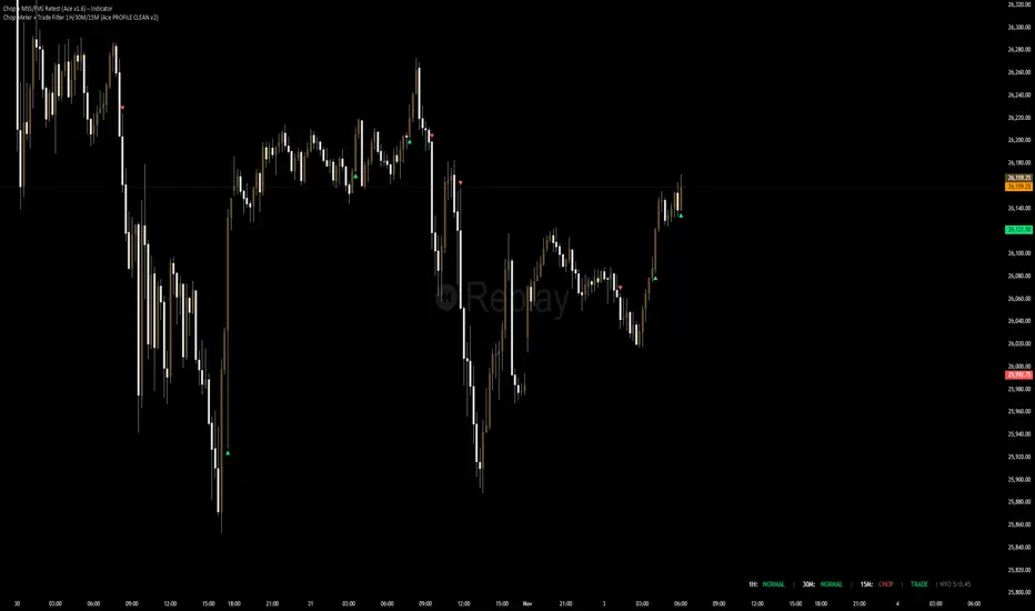
Chop Meter + Trade Filter 1H/30M/15M (Ace PROFILE CLEAN v2)What this indicator does
Name: Chop Meter + Trade Filter 1H/30M/15M (Ace PROFILE CLEAN v2)
This is not an entry signal indicator. It’s a market condition filter:
It checks how compressed or expanded price is on
1H, 30M, and 15M.
It labels each TF as CHOP or NORMAL.
If 2 or more of those are in CHOP, it prints NO TRADE.
If 0 or 1 are in CHOP, it prints TRADE.
You use it to answer one question:
“Is this a session I should be pushing the button,
or is this a day to sit on my hands?”
How it works (simple version)
For each timeframe (1H, 30M, 15M), the script:
Looks back N bars (ATR length).
Measures:
ATR over N bars
Price range over N bars (highest high − lowest low)
Computes a compression value:
compression = ATR / range.
Then it compares that to the Threshold:
If compression > threshold → CHOP (market boxed / compressed)
If compression ≤ threshold → NORMAL (market expanded / trending)
Finally:
It counts how many TFs are CHOP.
If 2 or 3 TFs are CHOP → NO TRADE.
If 0 or 1 TFs are CHOP → TRADE.
Inputs / Profiles
At the top you see:
Profile
Overnight 4/0.40 – for Asia / London / overnight sessions
NYO 5/0.45 – for New York Open profile (default)
Custom – lets you type your own values
When Custom is selected, you can set:
ATR Length (Custom) – how many bars to use in the compression calc
Chop Threshold (ATR ÷ Range) (Custom) – where you cut between CHOP vs NORMAL
Higher threshold → more bars counted as NORMAL, less CHOP
Lower threshold → more bars counted as CHOP, fewer TRADE environments
For NYO, you normally keep:
Profile = NYO 5/0.45
(ATR over 5 bars, threshold 0.45)
What you see on the chart
A single line panel at the bottom-right, like:
1H: NORMAL | 30M: CHOP | 15M: NORMAL | TRADE | NYO 5/0.45
Meaning:
1H: NORMAL → the last 1H window is expanded enough (not boxed).
30M: CHOP → 30M is compressed (inside a tighter range).
15M: NORMAL → 15M has opened up.
TRADE → Only 1 TF is CHOP, so the majority says OK to trade.
NYO 5/0.45 → just a tag to remind which profile you’re using.
If instead you see:
1H: CHOP | 30M: CHOP | 15M: NORMAL | NO TRADE | NYO 5/0.45
That means:
1H and 30M are boxed
15M opened a bit, but 2 TFs are CHOP
Final verdict: NO TRADE environment
How to use it in your trading
1. As a gatekeeper before any entry model
No matter what entry you use (MSS + FVG, OB, purge setups, etc.):
If the panel says NO TRADE →
You do not open new positions.
You’re in “observe only” mode.
You can still study price, mark levels, and journal, but you’re not pressing the button.
If the panel says TRADE →
The environment is acceptable.
Now you can look for your entry model (e.g. MSS + FVG retest, SMT, OB, etc.).
Think of it as your first filter every session:
“Panel says NO TRADE? I don’t care how good the candle looks – I’m waiting.”
2. Reading each timeframe
1H: CHOP → Day is still boxed on the higher frame; big expansion hasn’t kicked in.
30M: CHOP → Classic 30M dealing range; many fake breaks and wicks likely.
15M: CHOP → Intraday still coiling; scalping environment at best.
When 2 or 3 say CHOP, expect:
Whipsaw
MSS both ways
Failed FVGs
News spikes that die in the box
Perfect time to protect your psychology and capital.
When 2 or 3 say NORMAL, expect:
Cleaner swings
Better follow-through after MSS / FVG
Easier to hold for targets
3. How it pairs with your MSS/FVG indicator
With your Chop + MSS/FVG Retest indicator:
Chop meter = environment filter
MSS/FVG indicator = entry trigger
Your process becomes:
Check chop meter:
If NO TRADE → hands off.
If TRADE → go to step 2.
On your chart, wait for:
Purge / SMT at the edges
MSS in the right direction
FVG + retest
Only take L/S when both:
Chop meter = TRADE, and
Entry model = L/S signal in the right area (premium/discount).
That way, you’re not just trading every L/S the MSS script spits out—you’re trading L/S only when the higher-timeframe environment is worth it.


MTF EMA Directional Bias -1hr and 4hr A compact, fixed-position table (bottom-right corner) that shows the current slope direction of two higher-timeframe EMAs:
4H EMA 50 → direction over the last 2 bars (UP ↑, DOWN ↓, or FLAT ⏸)
1H EMA 21 → direction over the last 2 bars (UP ↑, DOWN ↓, or FLAT ⏸)
Background color logic:
Green → both 4H and 1H EMAs are sloping upward
Red → both 4H and 1H EMAs are sloping downward
Gray → mixed or flat directions (no confluence)
Additionally draws the actual 1H EMA-21 (purple) and 4H EMA-50 (red) as step-lines on the chart.

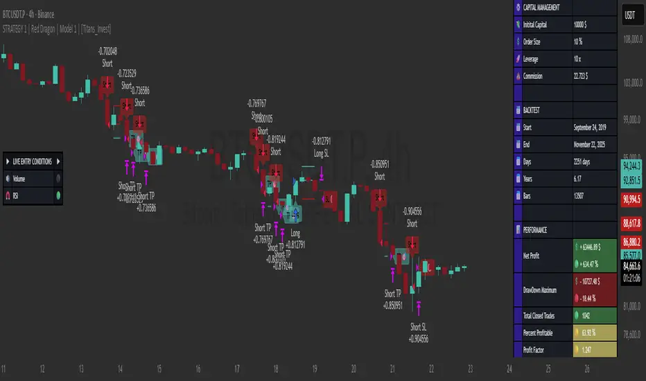
STRATEGY 1 │ Red Dragon │ Model 1 │ [Titans_Invest]The Red Dragon Model 1 is a fully automated trading strategy designed to operate BTC/USDT.P on the 4-hour chart with precision, stability, and consistency. It was built to deliver reliable behavior even during strong market movements, maintaining operational discipline and avoiding abrupt variations that could interfere with the trader’s decision-making.
Its core is based on a professionally engineered logical structure that combines trend filters, confirmation criteria, and balanced risk management. Every component was designed to work in an integrated way, eliminating noise, avoiding unnecessary trades, and protecting capital in critical moments. There are no secret mechanisms or hidden logic: everything is built to be objective, clean, and efficient.
Even though it is based on professional quantitative engineering, Red Dragon Model 1 remains extremely simple to operate. All logic is clearly displayed and fully accessible within TradingView itself, making it easy to understand for both beginners and experienced traders. The structure is organized so that any user can quickly view entry conditions, exit criteria, additional filters, adjustable parameters, and the full mechanics behind the strategy’s behavior.
In addition, the architecture was built to minimize unnecessary complexity. Parameters are straightforward, intuitive, and operate in a balanced way without requiring deep adjustments or advanced knowledge. Traders have full freedom to analyze the strategy, understand the logic, and make personal adaptations if desired—always with total transparency inside TradingView.
The strategy was also designed to deliver consistent operational behavior over the long term. Its confirmation criteria reduce impulsive trades; its filters isolate noise; and its overall logic prioritizes high-quality entries in structured market movements. The goal is to provide a stable, clear, and repeatable flow—essential characteristics for any medium-term quantitative approach.
Combining clarity, professional structure, and ease of use, Red Dragon Model 1 offers a solid foundation both for users who want a ready-to-use automated strategy and for those looking to study quantitative models in greater depth.
This entire project was built with extreme dedication, backed by more than 14,000 hours of hands-on experience in Pine Script, continuously refining patterns, techniques, and structures until reaching its current level of maturity. Every line of code reflects this long process of improvement, resulting in a strategy that unites professional engineering, transparency, accessibility, and reliable execution.
🔶 MAIN FEATURES
• Fully automated and robust: Operates without manual intervention, ideal for traders seeking consistency and stability. It delivers reliable performance even in volatile markets thanks to the solid quantitative engineering behind the system.
• Multiple layers of confirmation: Combines 10 key technical indicators with 15 adaptive filters to avoid false signals. It only triggers entries when all trend, market strength, and contextual criteria align.
• Configurable and adaptable filters: Each of the 15 filters can be enabled, disabled, or adjusted by the user, allowing the creation of personalized statistical models for different assets and timeframes. This flexibility gives full freedom to optimize the strategy according to individual preferences.
• Clear and accessible logic: All entry and exit conditions are explicitly shown within the TradingView parameters. The strategy has no hidden components—any user can quickly analyze and understand each part of the system.
• Integrated exclusive tools: Includes complete backtest tables (desktop and mobile versions) with annualized statistics, along with real-time entry conditions displayed directly on the chart. These tools help monitor the strategy across devices and track performance and risk metrics.
• No repaint: All signals are static and do not change after being plotted. This ensures the trader can trust every entry shown without worrying about indicators rewriting past values.
🔷 ENTRY CONDITIONS & RISK MANAGEMENT
Red Dragon Model 1 triggers buy (long) or sell (short) signals only when all configured conditions are satisfied. For example:
• Volume:
• The system only trades when current volume exceeds the volume moving average multiplied by a user-defined factor, indicating meaningful market participation.
• RSI:
• Confirms bullish bias when RSI crosses above its moving average, and bearish bias when crossing below.
• ADX:
• Enters long when +DI is above –DI with ADX above a defined threshold, indicating directional strength to the upside (and the opposite conditions for shorts).
• Other indicators (MACD, SAR, Ichimoku, Support/Resistance, etc.)
Each one must confirm the expected direction before a final signal is allowed.
When all bullish criteria are met simultaneously, the system enters Long; when all criteria indicate a bearish environment, the system enters Short.
In addition, the strategy uses fixed Take Profit and Stop Loss targets for risk control:
Currently: TP around 1.5% and SL around 2.0% per trade, ensuring consistent and transparent risk management on every position.
⚙️ INDICATORS
__________________________________________________________
1) 🔊 Volume: Avoids trading on flat charts.
2) 🍟 MACD: Tracks momentum through moving averages.
3) 🧲 RSI: Indicates overbought or oversold conditions.
4) 🅰️ ADX: Measures trend strength and potential entry points.
5) 🥊 SAR: Identifies changes in price direction.
6) ☁️ Cloud: Accurately detects changes in market trends.
7) 🌡️ R/F: Improves trend visualization and helps avoid pitfalls.
8) 📐 S/R: Fixed support and resistance levels.
9)╭╯MA: Moving Averages.
10) 🔮 LR: Forecasting using Linear Regression.
__________________________________________________________
🟢 ENTRY CONDITIONS 🔴
__________________________________________________________
IF all conditions are 🟢 = 📈 Long
IF all conditions are 🔴 = 📉 Short
__________________________________________________________
🚨 CURRENT TRIGGER SIGNAL 🚨
__________________________________________________________
🔊 Volume
🟢 LONG = (volume) > (MA_volume) * (Volume Mult)
🔴 SHORT = (volume) > (MA_volume) * (Volume Mult)
🧲 RSI
🟢 LONG = (RSI) > (RSI_MA)
🔴 SHORT = (RSI) < (RSI_MA)
🟢 ALL ENTRY CONDITIONS AVAILABLE 🔴
__________________________________________________________
🔊 Volume
🟢 LONG = (volume) > (MA_volume) * (Volume Mult)
🔴 SHORT = (volume) > (MA_volume) * (Volume Mult)
🔊 Volume
🟢 LONG = (volume) > (MA_volume) * (Volume Mult) and (close) > (open)
🔴 SHORT = (volume) > (MA_volume) * (Volume Mult) and (close) < (open)
🍟 MACD
🟢 LONG = (MACD) > (Signal Smoothing)
🔴 SHORT = (MACD) < (Signal Smoothing)
🧲 RSI
🟢 LONG = (RSI) < (Upper)
🔴 SHORT = (RSI) > (Lower)
🧲 RSI
🟢 LONG = (RSI) > (RSI_MA)
🔴 SHORT = (RSI) < (RSI_MA)
🅰️ ADX
🟢 LONG = (+DI) > (-DI) and (ADX) > (Treshold)
🔴 SHORT = (+DI) < (-DI) and (ADX) > (Treshold)
🥊 SAR
🟢 LONG = (close) > (SAR)
🔴 SHORT = (close) < (SAR)
☁️ Cloud
🟢 LONG = (Cloud A) > (Cloud B)
🔴 SHORT = (Cloud A) < (Cloud B)
☁️ Cloud
🟢 LONG = (Kama) > (Kama )
🔴 SHORT = (Kama) < (Kama )
🌡️ R/F
🟢 LONG = (high) > (UP Range) and (upward) > (0)
🔴 SHORT = (low) < (DOWN Range) and (downward) > (0)
🌡️ R/F
🟢 LONG = (high) > (UP Range)
🔴 SHORT = (low) < (DOWN Range)
📐 S/R
🟢 LONG = (close) > (Resistance)
🔴 SHORT = (close) < (Support)
╭╯MA2️⃣
🟢 LONG = (Cyan Bar MA2️⃣)
🔴 SHORT = (Red Bar MA2️⃣)
╭╯MA2️⃣
🟢 LONG = (close) > (MA2️⃣)
🔴 SHORT = (close) < (MA2️⃣)
╭╯MA2️⃣
🟢 LONG = (Positive MA2️⃣)
🔴 SHORT = (Negative MA2️⃣)
__________________________________________________________
🎯 TP / SL 🛑
__________________________________________________________
🎯 TP: 1.5 %
🛑 SL: 2.0 %
__________________________________________________________
🪄 UNIQUE FEATURES OF THIS STRATEGY
____________________________________
1) 𝄜 Table Backtest for Mobile.
2) 𝄜 Table Backtest for Computer.
3) 𝄜 Table Backtest for Computer & Annual Performance.
4) 𝄜 Live Entry Conditions.
1) 𝄜 Table Backtest for Mobile.
2) 𝄜 Table Backtest for Computer.
3) 𝄜 Table Backtest for Computer & Annual Performance.
4) 𝄜 Live Entry Conditions.
_____________________________
𝄜 BACKTEST / PERFORMANCE 𝄜
_____________________________
• Net Profit: +634.47%, Maximum Drawdown: -18.44%.
🪙 PAIR / TIMEFRAME ⏳
🪙 PAIR: BINANCE:BTCUSDT.P
⏳ TIME: 4 hours (240m)
✅ ON ☑️ OFF
✅ LONG
✅ SHORT
🎯 TP / SL 🛑
🎯 TP: 1.5 (%)
🛑 SL: 2.0 (%)
⚙️ CAPITAL MANAGEMENT
💸 Initial Capital: 10000 $ (TradingView)
💲 Order Size: 10 % (Of Equity)
🚀 Leverage: 10 x (Exchange)
💩 Commission: 0.03 % (Exchange)
📆 BACKTEST
🗓️ Start: Setember 24, 2019
🗓️ End: November 21, 2025
🗓️ Days: 2250
🗓️ Yers: 6.17
🗓️ Bars: 13502
📊 PERFORMANCE
💲 Net Profit: + 63446.89 $
🟢 Net Profit: + 634.47 %
💲 DrawDown Maximum: - 10727.48 $
🔴 DrawDown Maximum: - 18.44 %
🟢 Total Closed Trades: 1042
🟡 Percent Profitable: 63.92 %
🟡 Profit Factor: 1.247
💲 Avg Trade: + 60.89 $
⏱️ Avg # Bars in Trades
🕯️ Avg # Bars: 4
⏳ Avg # Hrs: 15
✔️ Trades Winning: 666
❌ Trades Losing: 376
✔️ Maximum Consecutive Wins: 11
❌ Maximum Consecutive Losses: 7
📺 Live Performance : br.tradingview.com
• Use this strategy on the recommended pair and timeframe above to replicate the tested results.
• Feel free to experiment and explore other settings, assets, and timeframes.
DeltaATR + VWAP DIF + MA'sI attempted to create an indicator using a different approach to analyzing potential trend reversals, and although it is still a work in progress, it is already fully functional. The indicator combines the price relative to VWAP with ATR normalization, providing a way to measure deviations in terms of market volatility.
How the indicator works:
Delta Calculation:
The core of the indicator calculates the difference between the current price and the VWAP (Volume Weighted Average Price), then normalizes this difference by the ATR (Average True Range). This provides a volatility-adjusted measure of how far the price has moved relative to its typical range.
Histogram Visualization:
The deltaATR is displayed as a histogram, where positive values indicate the price is above VWAP and negative values indicate it is below. The histogram is color-coded for easy interpretation: typically red for above VWAP and green for below, with configurable transparency.
Dual Moving Averages:
Two moving averages (fast and slow) are applied to the deltaATR. This creates a crossover system:
When the fast average crosses above the slow average, it may indicate an upcoming bullish reversal.
When the fast average crosses below the slow average, it may indicate a potential bearish reversal.
Zero Line Reference:
A reference line at zero corresponds to VWAP, helping traders see whether price is generally above or below the average volume-weighted level.
Alert Lines (Optional Panel):
A second panel provides four configurable alert lines, allowing users to set key thresholds to monitor extreme deltaATR values. These lines are thin, dashed, and fully customizable in terms of color and thickness.
Panel for Values and Signals:
The indicator includes a side panel showing:
Current deltaATR
Fast and slow averages
Current trend signal (Bullish, Bearish, or Neutral)
How it can be used:
Identify potential trend reversals by monitoring the crossover between the fast and slow averages of deltaATR.
Use the histogram to observe when the price is deviating significantly from VWAP in terms of ATR.
Set alert lines for specific thresholds to highlight overextended conditions or significant volatility moves.
Combine with other technical indicators for confirmation before entering or exiting trades.
This indicator is particularly useful for traders looking to anticipate reversals in volatile markets, as it adapts the delta measure to the current market conditions using ATR normalization, making it more responsive and robust than raw price deviations alone.

Trend Rider EMA9/21 + SuperTrend (EN)Trend Rider EMA9/21 + SuperTrend (EN) helps you watch ema 9 and 21 together for a trend.

Gabbie - Sweep SignalsGabbie – Sweep Signals highlights fractal swing candles on any timeframe. These fractal levels often represent areas where liquidity may rest above highs or below lows.
The indicator’s main use is on the 4-hour timeframe , where it detects the most recent sweep of a fractal level. After a sweep occurs, the script evaluates the next candle close to suggest the likely short-term momentum direction following that liquidity event.
Use this tool as confluence for:
Identifying recent liquidity sweeps on 4H
Anticipating potential continuation or reversal momentum
Projecting nearby liquidity targets
How to use
Apply on any chart (works on all symbols).
For best results, use on 4H and align with your higher-timeframe bias.
Treat signals as context, not standalone entries.
Settings
No changes are required to use the indicator immediately. Default settings display standard fractal sweep behavior.
Limitations / reminder
This is a discretionary confluence tool. It does not predict future price with certainty and should be used alongside your own risk management and strategy.

FVG – (auto close + age) GR V1.0FVG – Fair Value Gaps (auto close + age counter)
Short Description
Automatically detects Fair Value Gaps (FVGs) on the current timeframe, keeps them open until price fully fills the gap or a maximum bar age is reached, and shows how many candles have passed since each FVG was created.
Full Description
This indicator automatically finds and visualizes Fair Value Gaps (FVGs) using the classic 3-candle ICT logic on any timeframe.
It works on whatever timeframe you apply it to (M1, M5, H1, H4, etc.) and adapts to the current chart.
FVG detection logic
The script uses a 3-candle pattern:
Bullish FVG
Condition:
low > high
Gap zone:
Lower boundary: high
Upper boundary: low
Bearish FVG
Condition:
high < low
Gap zone:
Lower boundary: high
Upper boundary: low
Each detected FVG is drawn as a colored box (green for bullish, red for bearish in this version, but you can adjust colors in the inputs).
Auto-close rules
An FVG remains on the chart until one of the following happens:
Full fill / mitigation
A bullish FVG closes when any candle’s low goes down to or below the lower boundary of the gap.
A bearish FVG closes when any candle’s high goes up to or above the upper boundary of the gap.
Maximum bar age reached
Each FVG has a maximum lifetime measured in candles.
When the number of candles since its creation reaches the configured maximum (default: 200 bars), the FVG is automatically removed even if it has not been fully filled.
This keeps the chart cleaner and prevents very old gaps from cluttering the view.
Age counter (labels inside the boxes)
Inside every FVG box there is a small label that:
Shows how many bars have passed since the FVG was created.
Moves together with the right edge of the box and stays vertically centered in the gap.
This makes it easy to distinguish fresh gaps from older ones and prioritize which zones you want to pay attention to.
Inputs
FVG color – Main fill color for all FVG boxes.
Show bullish FVGs – Turn bullish gaps on/off.
Show bearish FVGs – Turn bearish gaps on/off.
Max bar age – Maximum number of candles an FVG is allowed to stay on the chart before it is removed.
Usage
Works on any symbol and any timeframe.
Can be combined with your own ICT / SMC concepts, order blocks, session ranges, market structure, etc.
You can also choose to only display bullish or only bearish FVGs depending on your directional bias.
Disclaimer
This script is for educational and informational purposes only and is not financial advice. Always do your own research and use proper risk management when trading.

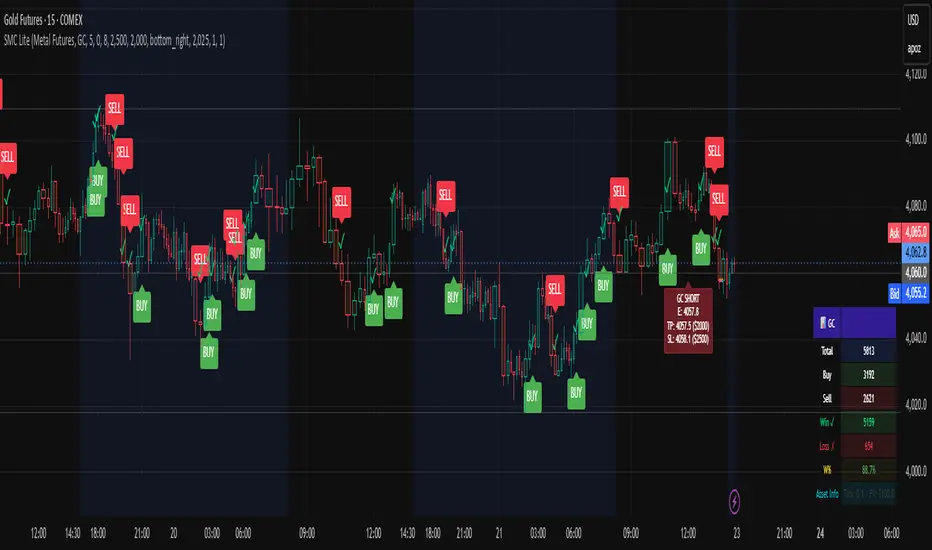
RAFA's SMC Killer LITEWhat is the SMC Killer?
The Smart Money Concepts (SMC) Killer is a trading indicator that identifies high-probability entry points using three proven strategies:
Break of Structure (BOS) - Trades when price breaks key support/resistance levels
Fair Value Gap (FVG) - Enters when price fills gaps in the market
Order Blocks (OB) - Entry from institutional order clusters (optional display)
This indicator automatically:
✅ Calculates correct entry, take-profit, and stop-loss levels for your asset
✅ Tracks win/loss statistics in real-time
✅ Works on 30+ different futures contracts
✅ Adapts tick size and point value automatically
Asset Selection
Supported Assets
The indicator supports all major futures contracts:
Equity Futures:
ES (E-mini S&P 500)
NQ (E-mini NASDAQ 100)
YM (Mini Dow Jones)
NKD (Nikkei 225)
EMD (E-mini Midcap 400)
RTY (Russell 2000)
Currency Futures:
6A (Australian Dollar)
6B (British Pound)
6C (Canadian Dollar)
6E (Euro FX)
6J (Japanese Yen)
6S (Swiss Franc)
6N (New Zealand Dollar)
Agricultural Futures:
HE (Lean Hogs)
LE (Live Cattle)
GF (Feeder Cattle)
ZC (Corn)
ZW (Wheat)
ZS (Soybeans)
ZM (Soybean Meal)
ZL (Soybean Oil)
Energy Futures:
CL (Crude Oil)
QM (Mini Crude Oil)
NG (Natural Gas)
QG (E-mini Natural Gas)
HO (Heating Oil)
RB (RBOB Gasoline)
Metal Futures:
GC (Gold)
SI (Silver)
HG (Copper)
PL (Platinum)
PA (Palladium)
QI (E-mini Silver)
QO (E-mini Gold)
Micro Futures:
MES (Micro E-mini S&P 500)
MYM (Micro E-mini Dow Jones)
MNQ (Micro E-mini NASDAQ)
M2K (Micro Russell 2000)
MGC (E-Micro Gold)
M6A (E-Micro AUD/USD)
M6E (E-Micro EUR/USD)
MCL (Micro Crude Oil)
How to Select Your Asset
Open the indicator settings (click ⚙️)
Go to ASSET SELECT section
Select Asset Category (e.g., "Metal Futures")
Enter Select Asset Symbol (e.g., "GC" for Gold)
Click OK
The indicator will automatically load the correct:
✅ Tick size
✅ Point value
✅ Risk/reward calculations
Settings Configuration
ASSET SELECT Group
Asset Category: Choose from 6 categories
Select Asset Symbol: Enter symbol (ES, GC, CL, etc.)
STRUCTURE Group
Show Swing Structure: Display swing highs/lows
Swing Length: Bars used for pivot detection (default: 5)
Build Sweep: Show sweep formations (default: ON)
What it does: Identifies the market trend and key turning points
Teal/Green bars = Uptrend
Orange/Red bars = Downtrend
FVG Group
Enable FVG Entry: Use Fair Value Gap strategy
FVG Threshold: Sensitivity filter (default: 0)
What it does: Detects gaps in price action that indicate imbalance
Lower threshold = More signals
Higher threshold = Fewer, high-quality signals
RISK Group
Show Bracket: Display entry/TP/SL lines
Units/Contracts: Number of contracts to trade (default: 6)
Stop Loss ($): Risk amount per trade (default: $250)
Target ($): Profit target per trade (default: $1,000)
Example: If you select ES with $250 stop loss:
The indicator calculates: 250 ÷ (6 contracts × $50 per point) = 0.83 points
Your stop loss line appears 0.83 points below entry
TABLE Group
Show Statistics: Display results table
Position: Table location (default: top_right)
Year: Start tracking from this year
Month: Start tracking from this month
Day: Start tracking from this day
Trading Signals
BUY Signal 🟢
When you see a green "BUY" label below a candle:
Price is breaking higher (Break of Structure)
OR price is filling a gap (Fair Value Gap)
The indicator plots three lines:
Green line = Entry price
Lime/bright green line = Take Profit level
Red line = Stop Loss level
Action: Consider entering a LONG position at market or entry price
SELL Signal 🔴
When you see a red "SELL" label above a candle:
Price is breaking lower (Break of Structure)
OR price is filling a gap (Fair Value Gap)
The indicator plots three lines:
Red line = Entry price
Magenta/pink line = Take Profit level
Orange line = Stop Loss level
Action: Consider entering a SHORT position at market or entry price
Signal Confirmation
✅ Wait for confirmation - Only trade signals on confirmed (closed) bars
✅ Check the trend - Look at candle colors (green uptrend, orange downtrend)
✅ Risk/reward ratio - TP should be at least 2x your SL risk
Risk Management
Position Sizing Example
Trading Gold (GC) with ES Settings:
Units: 6 contracts
Stop Loss: $250
Target: $1,000
Tick Size: 0.1 (automatic for GC)
Point Value: $100 per point (automatic for GC)
Risk per trade: $250
Reward per trade: $1,000
Risk/Reward Ratio: 1:4 (Excellent!)
Stop Loss Strategy
Always place your stop loss below/above the entry lines
The red/orange line shows exactly where to place SL
Never move your stop loss against the trade (unless scaling)
Use hard stops - set them immediately upon entry
Take Profit Strategy
Take profits at the lime/magenta line (TP level)
Consider taking partial profits at 50% of target
Let remaining 50% run to full target
Use trailing stops if price moves in your favor
Risk Per Trade
Formula: (Stop Loss $) ÷ (Units × Point Value)
Example for ES:
Stop Loss: $250
Units: 6
Point Value: $50
Risk per point: 250 ÷ (6 × 50) = 0.83 points
Reading the Chart
Visual Elements
Candle Colors:
🟩 Green/Teal = Uptrend (higher highs and higher lows)
🟥 Orange/Red = Downtrend (lower highs and lower lows)
Signal Labels:
BUY (Green) = Long entry opportunity
SELL (Red) = Short entry opportunity
Bracket Lines:
Entry Line (Solid) = Your entry price
TP Line (Bright color) = Take profit target
SL Line (Red/Orange) = Stop loss level
Success Markers:
✓ (Green checkmark) = Trade hit TP (WIN)
✗ (Red X) = Trade hit SL (LOSS)
Statistics Table
What Each Column Means
📊 ← Current asset being traded
├── Total: Total signals generated (buys + sells)
├── Buy: Number of buy signals
├── Sell: Number of sell signals
├── Win ✓: Trades that hit take profit
├── Loss ✗: Trades that hit stop loss
├── W%: Win rate percentage (wins ÷ total trades)
└── Asset Info: Tick size and point value
Example Reading
📊 ES
Total: 15
Buy: 8
Sell: 7
Win ✓: 10
Loss ✗: 5
W%: 66.7%
Asset Info: Tick: 0.25 | PV: $50
This means:
15 total signals since tracking started
10 wins, 5 losses
66.7% win rate (Professional level!)
Trading ES with 0.25 tick and $50 point value
Trading Examples
Example 1: Gold (GC) Long Trade
Setup:
Asset: Metal Futures → GC
Stop Loss: $150
Target: $600
Units: 2 contracts
What happens:
You see a BUY label on a green candle
Entry line at 2050.0
TP line at 2050.6 (0.6 points higher = $600 profit)
SL line at 2049.85 (0.15 points lower = $150 loss)
Risk/Reward: 1:4 ✅
Trade Result:
Price moves to 2050.6 → Label shows ✓ = WIN
Table updates: Wins increases by 1, Win% increases
Example 2: Crude Oil (CL) Short Trade
Setup:
Asset: Energy Futures → CL
Stop Loss: $500
Target: $2,000
Units: 1 contract
What happens:
You see a SELL label on a red candle
Entry line at 78.50
TP line at 77.50 (1.00 lower = $1,000 profit)
SL line at 79.00 (0.50 higher = $500 loss)
Risk/Reward: 1:2 ✅
Trade Result:
Price drops to 77.50 → Label shows ✓ = WIN
Table updates: Wins increases by 1, Win% increases
Example 3: E-mini S&P (ES) Day Trading
Setup:
Asset: Equity Futures → ES
Stop Loss: $250
Target: $1,000
Units: 6 contracts
Swap Length: 5 (default)
Enable FVG: ON
Morning Session:
See BUY at 5860.25 (swing break)
Hit TP at 5861.08 = WIN ✓
Table shows: Total 1, Buy 1, Win 1, W% 100%
See SELL at 5861.50 (FVG entry)
Hit SL at 5860.67 = LOSS ✗
Table shows: Total 2, Sell 1, Win 1, L% 50%
By end of day: 4 wins, 1 loss, 80% win rate
Troubleshooting
Issue 1: No signals appearing
Solution:
Check if both Show Bracket is ON
Check if Enable FVG Entry is ON
Try changing Swing Length (lower = more signals)
Ensure you're on a 1-hour or higher timeframe
Check chart has enough data (scroll left to see history)
Issue 2: Signals appear but no entry lines
Solution:
Confirm Show Bracket is toggled ON
Check Stop Loss ()andTarget() and Target (
)andTarget() are reasonable amounts
Ensure your Units value is not 0
Try refreshing the chart
Issue 3: Asset not recognized
Solution:
Check spelling of symbol (ES, not E-S)
Verify asset is in the supported list
Check you're in the correct category
Try closing and reopening the chart
Issue 4: Wrong stop loss/target levels
Solution:
Verify correct asset is selected
Check Units setting matches your position size
Verify Stop Loss ($) and Target ($) amounts
Look at Asset Info in table to confirm tick size
Manually calculate: SL $ ÷ (Units × Point Value) = Points
Issue 5: Statistics table not showing
Solution:
Toggle Show Statistics OFF then back ON
Try changing Table Position
Refresh the chart
Check that Show Table is enabled in settings
Issue 6: Indicator acting "heavy" or laggy
Solution:
Turn off Show Swing Structure if not needed
Turn off Show Bracket if reviewing historical trades
Reduce chart's data window (don't load entire years)
Refresh the chart
Pro Tips 🚀
Tip 1: Start with Micro Futures
Micro contracts (MES, MNQ, MCL) have lower cost
Perfect for learning the strategy
Same quality signals, smaller risk
Tip 2: Trade During Peak Hours
Equity Futures: 9:30-16:00 ET (Regular session)
Energy: 18:00-16:00 CT (After hours active)
Metals: 18:00-17:00 CT (Most liquid)
Currencies: 5:00 PM - 4:00 PM ET (24-5 market)
Tip 3: Combine Timeframes
Look for entry on 1-hour chart
Confirm on 15-minute chart
Execute on 5-minute breakout
More confluence = higher probability
Tip 4: Track Your Trades
Keep notes on WIN/LOSS trades
Identify patterns in your losses
Adjust settings based on performance
Use Win% table to monitor improvement
Tip 5: Risk Management First
Never risk more than 2% of account per trade
Respect your stop loss (don't move it)
Take profits when levels are hit
Be patient for high-probability setups
Tip 6: Adjust for Market Conditions
Trending markets: Increase Swing Length (6-8)
Choppy markets: Decrease Swing Length (2-4)
Low volatility: Reduce Stop Loss $
High volatility: Increase Target $
Quick Reference Card
────────────────────────────────────────────────────
SMC KILLER QUICK START ─────────────────────────────────────────────────────
│ 1. Select Asset Category & Symbol
│ 2. Set Units (contracts)
│ 3. Set Stop Loss ($) - your max risk
│ 4. Set Target ($) - your profit goal
│ 5. Wait for BUY (green) or SELL (red) signal
│ 6. Place entry at the entry line
│ 7. Place stop at the red/orange line
│ 8. Place take-profit at the lime/magenta line
│ 9. Close trade when line closes (✓ or ✗)
│ 10. Review statistics and adjust next trade
└─────────────────────────────────────────────────────
BUY Signal = Break Higher OR Fill Gap = LONG
SELL Signal = Break Lower OR Fill Gap = SHORT
Green candles = Uptrend
Orange candles = Downtrend
✓ = Win (took profit)
✗ = Loss (hit stop)
Support & Updates
Check settings are correct for your asset
Ensure adequate chart data is loaded
Test on demo account first
Start with smallest position size
Track performance over 20+ trades