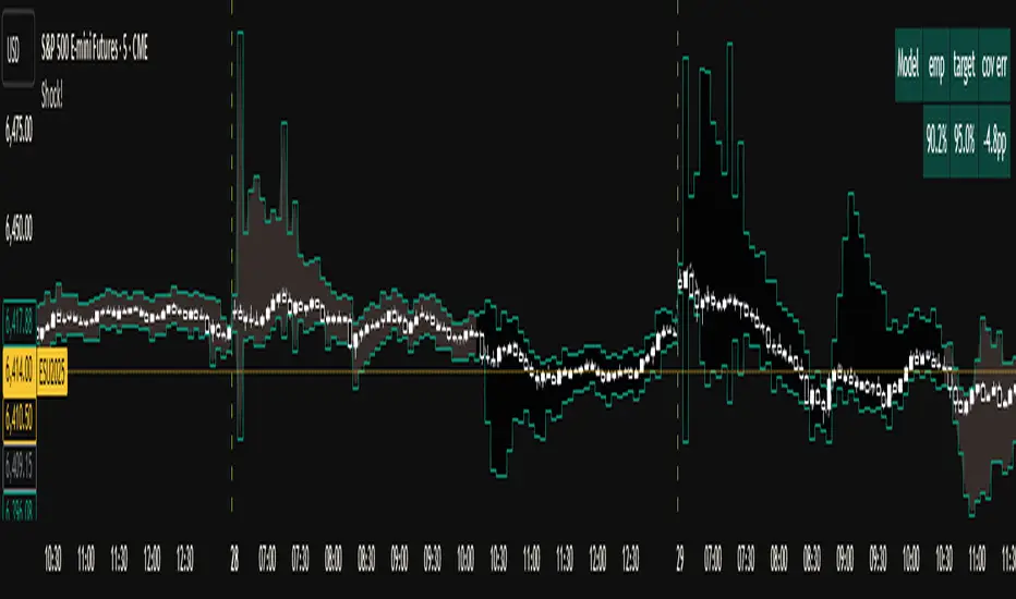
Shock!The Shock Indicator is a volatility-banding model that forecasts price ranges with a dynamically widening/shrinking system. Fundamentally, it uses an exponentially weighted moving average of returns, adjusting for time-of-day patterns, to estimate a baseline volatility (i.e. The ‘prior’ in Bayesian theory). It detects jumps by comparing realized variance with “bipower variation”, temporarily widening the bands when shocks occur, and decaying the width of the bands as the shock subsides. In order to keep the coverage as calibrated and honest as possible, it continuously checks how often each bar’s closing prices stay inside the predicted bands, and adapts tail multipliers using a “scoring” system, avoiding the “cheat” of inflating bands everywhere to include as many candles as possible. It also uses a simple decaying mechanism to shrink bands exponentially faster when realized ranges are calm, preventing long periods of unjustified overshooting. In practice, this design keeps the empirical coverage probability close to a user-selected target. By default, the target is set to 95%. Across various 5 minute, 10 minute, 15 minute, and 30 minute timeframes on assets such as USDJPY, ES and NQ Futures, QQQ, NVDA, TSLA, BTCUSD, the empirical coverage consistently stays within -10%/+4% of the default 95% target coverage, while staying extremely responsive to shocks.
At the open of each candle, the range is drawn. The range is “frozen” the moment it is drawn, meaning it cannot utilize “cheating” methods such as repainting or future-looking to artificially inflate the accuracy and calibration. The indicator then tracks how accurate and well-calibrated it was for that given candle, optimizing the bands for future bars.
Forecasting

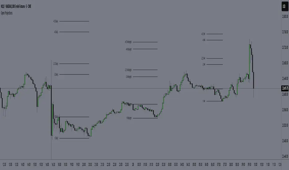
Time-Based Manipulation ProjectionsThis indicator automatically plots custom projection levels based on session and timeframe opening prices, utilizing the AMD/PO3 concept (Accumulation, Manipulation, Distribution / Power of Three). The theory suggests that price typically opens, creates an initial manipulation move to hunt liquidity, then reverses for distribution.
By measuring the distance from the open to the initial high/low manipulation, the indicator projects potential targets and reversal zones at customizable ratios, with the 2-2.5x and 4-4.5x extensions often serving as key areas.
Features:
Session-Based Projections: 4 custom session-based projections with full control over the opening time and the time when the projections stop updating with new manipulation highs/lows (Midnight, Daily, NY Open, etc)
Timeframe-Based Projections: 4 custom timeframe-based projections (H1, H4, Daily, Weekly, etc.)
Dynamic Anchoring: In line with AMD/PO3 logic, the indicator automatically locks to the correct manipulation leg (high or low) based on price position relative to the open
Custom Projections: Define your own projection levels
Custom Labels: Assign your own names to each projection, making it easy to identify and organize levels on the chart
Historical Levels: Option to display past projections
Styling Options: Choose line style, thickness, colors, label size, font, and positioning
Extend Lines: Option to extend projections forward to current price
Delayed Plotting: Set a delay (in minutes) after open before projections appear, useful to avoid false early swings
Note: These projections are most effective when the manipulation leg is clean and well-defined. If the manipulation is shallow, standard projections like 2–2.5x or 4–4.5x may not provide useful levels. In such cases, try experimenting with larger custom projections.
Position Size Calculator MKThis indicator uses for automating your trading very good for taking position with tension free
also have touch entry of price or closing basis entry and stop loss and also show live position

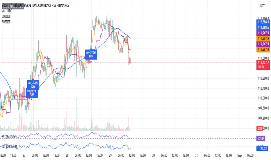
60 신저가 숏“60-Day New Low Short” is a momentum breakdown setup that sells short when price prints a fresh 60-day low, betting that failed support will extend the downtrend.
Entries are usually taken on the breakdown close (or next open) with confirmation like rising volume, relative weakness, and price below the 50/200-day MAs.
Manage risk with a stop above the recent swing high or 20-day high; take profits via ATR-based targets or a trailing stop, and avoid trades near major catalysts (earnings/news).
Futures Rotation Strategy - Overlay (Tables & Signals)This strategy focuses on the laggards and leaders of the market indices and does some weird stuff and determines which to long or short.

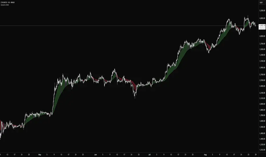
Dynamic EMADynamic EMA — Flexible Trend Indicator
Dynamic EMA is a clean and universal indicator that uses two Exponential Moving Averages to highlight market direction. By default, it applies the popular EMA 14/50 setup, but both EMA lengths can be freely customized.
Why EMA 14 and EMA 50?
The 14-period EMA is commonly used to capture short-term price momentum, making it sensitive to quick market moves.
The 50-period EMA reflects the medium-term trend and is widely recognized by traders and institutions.
Together, EMA 14/50 provide a balanced view: fast enough to react to price changes, yet smooth enough to filter out noise.
Key Features
Two EMAs (fast and slow) with fully adjustable lengths
Automatic dynamic coloring for bullish, bearish, and neutral conditions
Optional fill between EMAs for improved visualization
Adjustable opacity to control chart clarity
Why use it?
Dynamic EMA offers a reliable way to read market trends, spot momentum shifts, and confirm entries or exits. It works across all asset classes and timeframes, while allowing traders to adjust EMA settings to their own strategy.
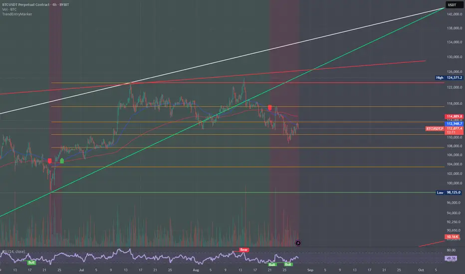
Trend and Entry Marker with MA, Supports, Fib, and Trend LinesJust a little indicator I made when I was bored ...
Helps you find entries for trades!
Secret bubbleSecret bubble
Why Might It Be Called "Bubbles"?
Although not officially named so, some traders or platforms might refer to Bollinger Bands as "bubbles" because:
The bands visually surround the price like a bubble.
During low volatility, the bands form a tight "bubble" around price.
Breakouts look like the price "popping out" of a bubble.
Hence, the nickname "пузырьки" (bubbles) could be a colloquial or visual metaphor for Bollinger Bands in Russian-speaking trading communities.
Conclusion
While there is no official technical indicator called "Bubbles", the term likely refers to Bollinger Bands due to their visual appearance and function. This powerful tool helps traders assess volatility, spot potential reversals, and time entries and exits. When combined with other analysis methods, Bollinger Bands remain a cornerstone of modern technical trading.
🔧 Tip: You can find Bollinger Bands on almost every trading platform (TradingView, MetaTrader, ThinkorSwim) by searching "Bollinger Bands" in the indicators list.

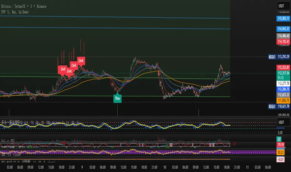
Cryptocurrency Short-Term Trading SignalsThis script integrates years of trading experience and is based on the 5-minute K-line. It comprehensively analyzes multiple classic trading signals (such as trend and reversal signals) and generates short-term trading entry and exit points through multi-condition judgment.
The script will generate simple and intuitive buy/sell prompt labels on the main chart, which can be used as a reference. Please note that all prompt indicators are for reference only, and you should make trading decisions after careful consideration.
Statistical FootprintStatistical Footprint - Behavioral Support & Resistance
This indicator identifies key price levels based on actual market behavior rather than traditional pivot calculations. It analyzes how bulls and bears have historically moved price from session opens, creating statistical zones where future reactions are most likely.
The concept is simple: track how far bullish candles typically push above the open versus how far bearish candles drop below it. These patterns reveal the market's behavioral "footprint" - showing where momentum typically stalls and reverses.
Key Features:
- Separate analysis for daily and weekly timeframes
- Smart zone merging when levels cluster together (within 5 points)
- Uses both mean and median calculations for more robust levels
- XGBoost-optimized lookback periods for maximum statistical significance
- Clean zone-only display focused on actionable price areas
How it Works:
The code separates bullish and bearish sessions, measuring their typical range extensions from the open. It then projects these statistical ranges forward from current session opens, creating "behavioral zones" where the market has historically shown consistent reactions.
When daily and weekly levels align closely, they merge into combined zones with enhanced significance. Labels show both the mean and median values when they differ meaningfully.
Best Used For:
- Identifying high-probability reversal zones
- Setting profit targets based on historical behavior
- Understanding market sentiment shifts at key levels
- Confluence analysis between different timeframes
The lookback periods have been optimized using machine learning to find the most predictive historical sample sizes for current market conditions.
Prev RTH FibsThis study captures the previous day’s Regular Trading Hours (RTH) range (default 09:30–16:00 America/New_York), then projects it onto the current session. It draws HIGH, LOW, and an optional 50% midpoint, plus a configurable set of inside fib-style percentages measured from the HIGH downward. Every level extends a short distance to the right of the current price and shows a clean numeric label (no box) on the right edge.
Key features
Prev-day RTH range tracked automatically; plotted each new session.
Inside levels (from HIGH ↓): 11%, 25%, 29.5%, 38.2%, 45%, 55%, 62% (OTE), 70.5%, 75%, 78.6%, 85% (toggle any on/off).
Clean right-side labels: numbers only, resizable (Tiny → Huge) with transparent background.
Line styling: HIGH/LOW and 50% are solid; inside levels can be Solid/Dashed/Dotted with independent color/width.
Smart right padding: lines/labels extend a few bars past the latest candle, so annotations stay beside price without violating TradingView’s “>500 bars in future” rule.
Works on any symbol/timeframe; RTH window and timezone are adjustable.
Inputs you control
Session: RTH session string and timezone.
Right-side padding (bars) and number size.
Visibility & style for HIGH, LOW, and 50%.
Which inside levels to show, plus their style/color/width.

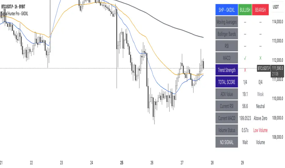
Signal Hunter Pro - GKDXLSignal Hunter Pro - GKDXL combines four powerful technical indicators with trend strength filtering and volume confirmation to generate reliable BUY/SELL signals. This indicator is perfect for traders who want a systematic approach to market analysis without the noise of conflicting signals.
🔧 Core Features
📈 Multi-Indicator Signal System
Moving Averages: EMA 20, EMA 50, and SMA 200 for trend analysis
Bollinger Bands: Dynamic support/resistance with price momentum detection
RSI: Enhanced RSI logic with smoothing and multi-zone analysis
MACD: Traditional MACD with signal line crossovers and zero-line analysis
🎛️ Advanced Filtering System
ADX Trend Strength Filter: Only signals when trend strength exceeds threshold
Volume Confirmation: Ensures signals occur with adequate volume participation
Multi-Timeframe Logic: Works on any timeframe from 1m to 1D and beyond
🚨 Intelligent Signal Generation
Requires 3 out of 4 indicators to align for signal confirmation
Separate bullish and bearish signal conditions
Real-time signal strength scoring (1/4 to 4/4)
Built-in alert system for automated notifications
⚙️ Customizable Parameters
📊 Technical Settings
Moving Averages: Adjustable EMA and SMA periods
Bollinger Bands: Configurable length and multiplier
RSI: Customizable length, smoothing, and overbought/oversold levels
MACD: Flexible fast, slow, and signal line settings
🎯 Risk Management
Risk Percentage: Set your risk per trade (0.1% to 10%)
Reward Ratio: Configure risk-to-reward ratios (1:1 to 1:5)
ADX Threshold: Control minimum trend strength requirements
🖥️ Display Options
Indicator Visibility: Toggle individual indicators on/off
Information Table: Optional detailed status table (off by default)
Volume Analysis: Real-time volume vs. average comparison
🎨 Visual Elements
📈 Chart Indicators
EMA Lines: Blue (20) and Orange (50) exponential moving averages
SMA 200: Gray long-term trend line
Bollinger Bands: Upper/lower bands with semi-transparent fill
Clean Interface: Minimal visual clutter for clear analysis
📋 Information Table (Optional)
Real-time indicator status with ✓/✗/— symbols
Current signal strength and direction
ADX trend strength measurement
Volume confirmation status
No-signal reasons when conditions aren't met
🔔 Alert System
📢 Three Alert Types
BUY Signal: Triggered when 3+ indicators align bullishly
SELL Signal: Triggered when 3+ indicators align bearishly
General Alert: Any signal detection for broader monitoring
📱 Alert Messages
Clear, actionable alert text
Includes indicator name for easy identification
Compatible with webhook integrations
🎯 How It Works
📊 Signal Logic
Indicator Assessment: Each of the 4 indicators is evaluated as Bullish/Bearish/Neutral
Consensus Building: Counts aligned indicators (minimum 3 required)
Filter Application: Applies trend strength and volume filters
Signal Generation: Generates BUY/SELL when all conditions are met
🔍 Indicator States
Moving Averages: Price position, EMA alignment, and crossovers
Bollinger Bands: Price relative to bands and momentum shifts
RSI: Multi-zone analysis with momentum and crossover detection
MACD: Signal line crossovers and zero-line positioning
🎉 Why Choose Signal Hunter Pro?
✅ Multi-Indicator Confirmation reduces false signals
✅ Trend Strength Filtering improves win rate
✅ Volume Confirmation ensures market participation
✅ Customizable Parameters adapt to any trading style
✅ Clean Visual Design doesn't clutter your charts
✅ Professional Alert System for automated trading
✅ No Repainting - reliable historical signals
✅ Works on All Timeframes from scalping to investing
HTF Dealing Range & FibsKey Features:
Premium & Discount Zone Visualization: Clear, color-coded boxes are drawn to represent the Premium (sell zone), Discount (buy zone), and the crucial Equilibrium (50%) level. These boxes extend into the future so you can anticipate future price action.
Customizable Fibonacci Levels: Plot key Fibonacci retracement levels within the defined range. You can customize which levels you want to see (e.g., 0.62, 0.79, etc.) to pinpoint specific points of interest.
Multi-Timeframe Confluence Table: A powerful, on-screen dashboard that shows you the status of the current price relative to the P&D zones on up to 5 different timeframes simultaneously. Instantly see if the price is in a Premium or Discount zone on the 15m, 1H, 4H, and Daily charts at a single glance.
Built-in Alerts: Never miss an opportunity. Set up alerts to be notified the moment the price enters the Premium or Discount zone on your chosen HTF, allowing you to prepare for potential trade setups.
Fully Customizable: Take full control over the indicator's appearance. Adjust pivot lookback periods, colors of the zones and Fibs, and select which timeframes appear in your dashboard to match your personal trading plan.
Disclaimer:
This indicator is provided for educational and informational purposes only and should not be considered as financial or investment advice. Trading and investing in financial markets, including but not limited to stocks, forex, and cryptocurrencies, involves a substantial risk of loss and is not suitable for every investor.

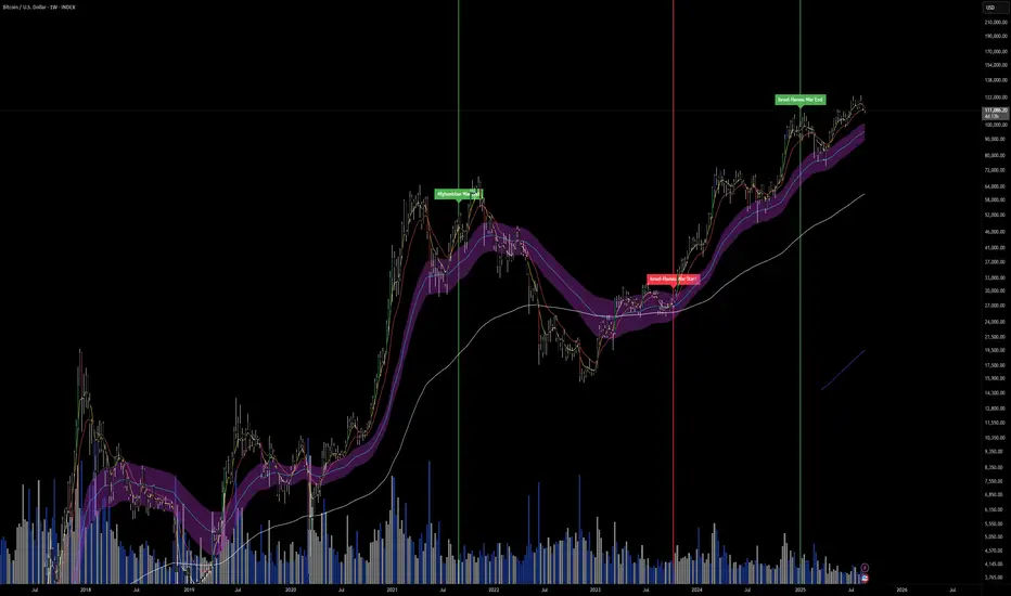
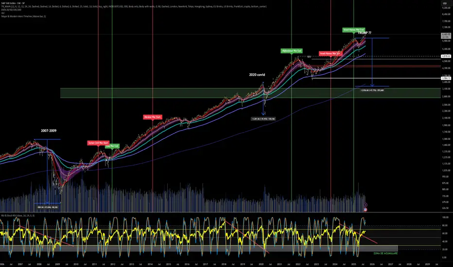
Major & Modern Wars TimelineDescription:
This indicator overlays vertical lines and labels on your chart to mark the start and end dates of major global wars and modern conflicts.
Features:
Displays start (red line + label) and end (green line + label) for each war.
Covers 20th century wars (World War I, World War II, Korean War, Vietnam War, Gulf War, Afghanistan, Iraq).
Includes modern conflicts: Syrian Civil War, Ukraine War, and Israel–Hamas War.
For ongoing conflicts, the end date is set to 2025 for timeline visualization.
Customizable: label position (above/below bar), line width.
Works on any chart timeframe, overlaying events on financial data.
Use case:
Useful for historical market analysis (e.g., gold, oil, S&P 500), helping traders and researchers see how wars and conflicts align with market movements.
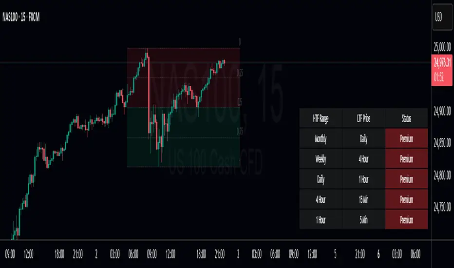
Premium Discount Range ProPremium Discount Range Pro
Short Description / Summary:
An advanced, all-in-one toolkit for traders who utilize Smart Money Concepts (SMC) and institutional price action analysis. The "Premium Discount Range Pro" automatically identifies the current higher timeframe (HTF) dealing range, visualizes the Premium, Discount, and Equilibrium zones, and provides a multi-timeframe dashboard to see where the current price stands across the market.
This indicator is built to streamline your analysis, helping you to quickly identify high-probability areas for entries by adhering to the core institutional principle: look for buys in a discount and sells in a premium.
Key Features:
Automatic HTF Range Detection: The indicator automatically detects the most recent significant swing high and swing low on your chosen Higher Timeframe (e.g., 4H, Daily) to define the current dealing range.
Premium & Discount Zone Visualization: Clear, color-coded boxes are drawn to represent the Premium (sell zone), Discount (buy zone), and the crucial Equilibrium (50%) level. These boxes extend into the future so you can anticipate future price action.
Customizable Fibonacci Levels: Plot key Fibonacci retracement levels within the defined range. You can customize which levels you want to see (e.g., 0.62, 0.79, etc.) to pinpoint specific points of interest.
Multi-Timeframe Confluence Table: A powerful, on-screen dashboard that shows you the status of the current price relative to the P&D zones on up to 5 different timeframes simultaneously. Instantly see if the price is in a Premium or Discount zone on the 15m, 1H, 4H, and Daily charts at a single glance.
Built-in Alerts: Never miss an opportunity. Set up alerts to be notified the moment the price enters the Premium or Discount zone on your chosen HTF, allowing you to prepare for potential trade setups.
Fully Customizable: Take full control over the indicator's appearance. Adjust pivot lookback periods, colors of the zones and Fibs, and select which timeframes appear in your dashboard to match your personal trading plan.
Disclaimer
This indicator is provided for educational and informational purposes only and should not be considered as financial or investment advice. Trading and investing in financial markets, including but not limited to stocks, forex, and cryptocurrencies, involves a substantial risk of loss and is not suitable for every investor.
US Presidents 1789–1916Description:
This indicator displays all U.S. presidential elections from 1789 to 1916 on your chart.
Features:
Vertical lines at the date of each presidential election.
Line color by party:
Red = Republican
Blue = Democrat
Gray = Other/None
Labels showing the name of each president.
Historical flag style: All presidents before 1900 are considered historical, providing visual distinction.
Fully overlayed on the price chart for timeline context.
Customizable: Label position (above/below bar) and line width.
Use case: Great for studying historical market behavior around elections or for general reference of U.S. presidents during the early history of the country.
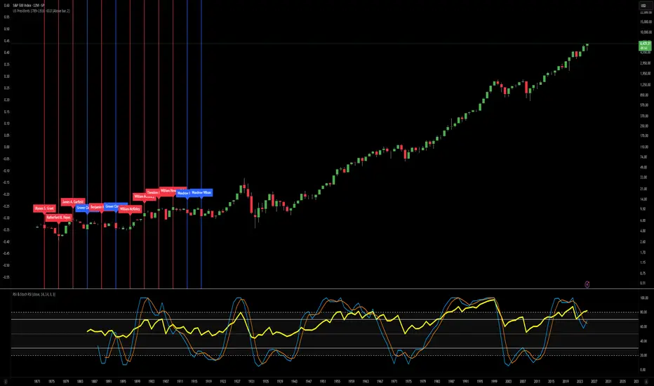
US Presidents 1920–2024Description:
This indicator displays all U.S. presidential elections from 1920 to 2024 on your chart.
Features:
Vertical lines at the date of each presidential election.
Line color by party:
Red = Republican
Blue = Democrat
Gray = Other/None
Labels showing the name of each president.
Modern flag style: Presidents from 1900 onward are highlighted as modern, giving clear historical separation.
Fully overlayed on the price chart for timeline context.
Customizable: Label position (above/below bar) and line width.
Use case: Useful for analyzing modern U.S. presidential cycles, market reactions to elections, or quickly referencing recent presidents directly on charts.

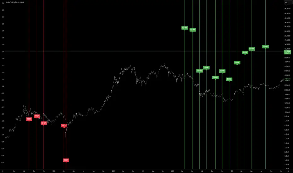
FED Rate Decisions (Cuts & Hikes)This indicator highlights key moments in U.S. monetary policy by plotting vertical lines on the chart for Federal Reserve interest rate decisions.
Features:
Rate Cuts (red): Marks dates when the Fed reduced interest rates.
Rate Hikes (green): Marks dates when the Fed increased interest rates.
Configurable view: Choose between showing all historical decisions or only those from 2019 onwards.
Labels: Each event is tagged with “FED CUT” or “FED HIKE” above or below the bar (adjustable).
Alerts: You can set TradingView alerts to be notified when the chart reaches a Fed decision day.
🔧 Inputs:
Show decisions: Switch between All or 2019+ events.
Show rate cuts / hikes: Toggle visibility separately.
Colors: Customize line and label colors.
Label position: Place labels above or below the bar.
📈 Usage:
This tool helps traders and investors visualize how Fed policy shifts align with market movements. Rate cuts often signal economic easing, while hikes suggest tightening monetary policy. By overlaying these events on price charts, you can analyze historical reactions and prepare for similar scenarios.
Dual 4/8 MTFInspired on multi-timeframe Murrey’s Math Lines Channel.
Using the 4/8 , 2 times with different fractal multipliers to follow the trend
Lines and fill in between then can be =
-dynamic :(turn green/red/grey depending on price)
-static : fixed colour that wont change depending on trend

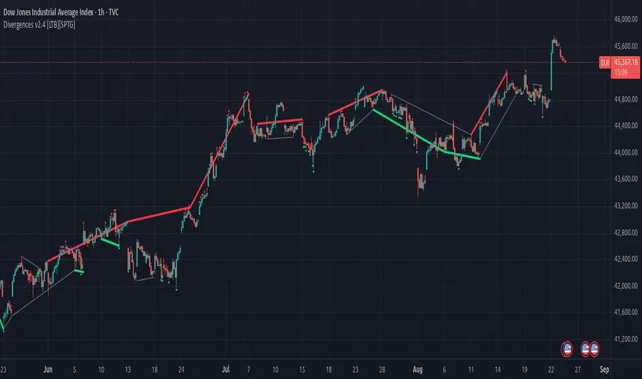
Divergences v2.4 [LTB][SPTG]Open-source credit & license
Original author: LonesomeTheBlue.
This fork by: sirpipthegreat — with attribution to the original work.
License: Open-source, published under the MPL-2.0 (same license header in the code).
I am publishing this open-source in accordance with TradingView’s Open-source reuse rules.
What’s new:
- Fixes & stability (addresses “historical offset beyond buffer” errors)
- Capped and validated all historical indexing with guarded lookbacks (e.g., min(…, 200) style limits) to prevent referencing data beyond the buffer on shorter histories/thin symbols.
- Refactored highest/lowest bars scans to obey the cap and avoid cumulative overflows on long sessions.
- Added per-bar counters with safety clamps to ensure it never exceeds available history.
- Ensured HTF switching doesn’t create invalid offsets when the higher timeframe compresses history.
Modernization & user control:
- Pine v6 upgrade and re-organization of logic for clarity/performance.
- More predictable tops/bottoms detection.
What it does:
- Detects regular (trend-reversal) and optional hidden (trend-continuation) divergences between price swing tops/bottoms and the selected oscillator(s).
- Computes candidate pivots with a light HTF alignment to reduce micro-noise; validates divergence when oscillator and price move in opposite directions across those pivots.
- Plots colored lines/labels on price to highlight bearish (regular & hidden) and bullish (regular & hidden) patterns.
How to use:
- Choose the oscillator set you trust (start with RSI + MACD).
- Consider confluence (S/R, volume, trend filters). This tool only identifies conditions
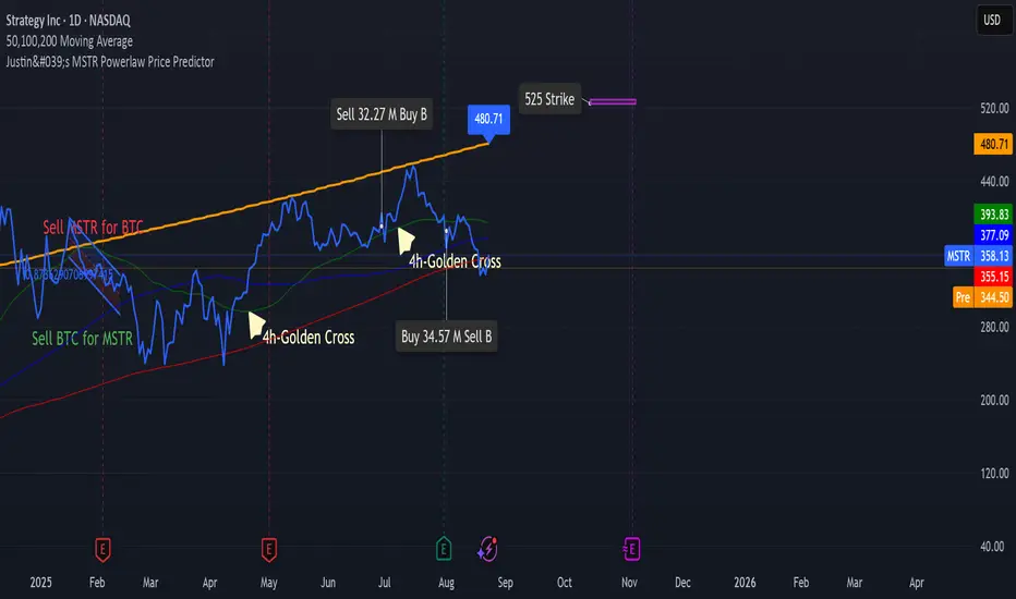
Justin's MSTR Powerlaw Price PredictorJustin's MSTR Powerlaw Price Predictor is a Pine Script v6 indicator for TradingView that adapts Giovanni Santostasi’s Bitcoin power law model to forecast MicroStrategy (MSTR) stock prices. The price prediction is based on the the formula published in this article:
www.ccn.com