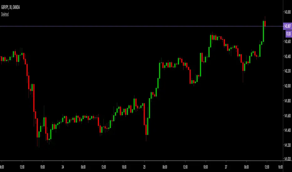
MultiWave v2 | CryptoProToolsThis is a release highly requested in our Discord server.
Finally we have an update / official release of our original MultiWave indicator
On top of the standard signals (displayed as the dots on chart) and alerts we now also have "trend signals" with various options (displayed as the triangles on chart).
These new trend signals still use the same multi wave algorithm but trigger differently for some quite nice results.
Also added the option for smoothing on all three wave plots. There are 10 levels of smoothing to choose from and each plot can be tuned with different levels of smoothing.
For access and further information about this or any of our other indicators please click the link to our website below.
ค้นหาในสคริปต์สำหรับ "wave"

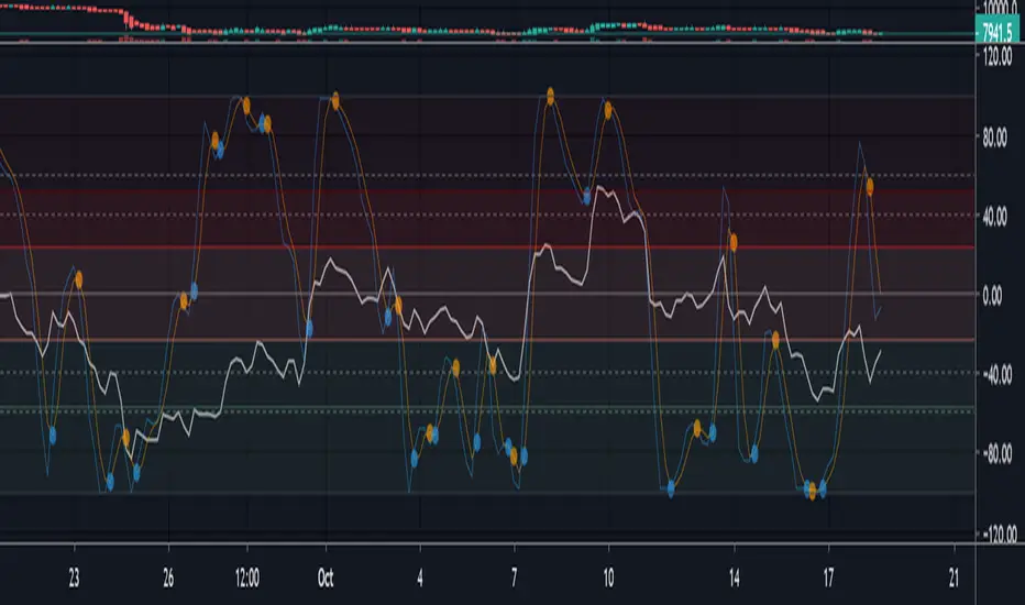
Frontrow SniperThe Sniper indicator combines various indicators together in an effort to predict accurate money making signals. The indicator lets you know when to long or short. So that your trades are spot on and there is no more need for FOMO. The Sniper indicator is the secret weapon you need to give you an edge to win in this market.
Frontrow Sniper is an all-in-one oscillator, allowing for more quality indications on your chart. It combines five well known algorithms (VWAP, MFI, RSI, Stochastic RSI, Wave Trend) which have all been fine-tuned for optimal results. When all of these indicators converge, sniper projects a green dot buy signal. The green dot is characterized by extreme sell momentum. In other words, it tells you to long when price is at the bottom. Making it extremely powerful.
the indicator is a wavetrend indicator
Whenever the 2 lines converge on each other a red sell signal or green buy singal will be created.
When the market is really overbought/oversold it will create a big buy or sell signal

AIMS Purple MagicThe Alligator is a Very Powerful Indicator
Some people think it's just 3 moving averages. But in reality, it is far more than that.
Read more about Alligator and Bill Williams
The Purple Magic Line has been derived from Bill Williams Alligator. Together the Alligator we call the AIMS Gator.
It is a smooth moving average based on the Chaos Red Line of the 5 times higher time frame.
Our Mantra: If you trade in line with the trend of the 5 times higher time frame, you will have a higher chance of catching breakouts in the direction of the trend.
So we have this rule, Always Trade when Price is Going Away from The Purple Line. Simple as that.
Buy Only: Price above the Purple Line
Sell Only: Price below the Purple Line.
What is The Alligator?
The Alligator Indicator was developed by Bill Williams and combines moving averages with fractal geometry.
The indicator helps traders to identify if the market is trending.
It consists of 3 lines: the blue line (aka the Alligator's Jaw),
the red Line (aka the Alligator's Teeth) and
the green Line (aka the Alligator's Lips).
Each has different lookback periods and offsets that can be set by the user.
The alligator is easy to use and can find trade setups, based on how close together or how far apart the lines are, resembling an alligator opening and closing his mouth. This indicator can be used in combination with other analysis techniques.
Based on calculations of Non-Linear mathematical formula we have arrived at a way to calculate the Trend of the 5 times higher time frame
The Purple Magic Indicates :
The Trend of Current and 5 times higher time frame
It helps prevent trading into Wave 4
It helps with counting Wave 3 and 4
You can use it to time early entry into Wave 5
The bounce of Purple after a wave 3 is often a 50% fib retracement.
Examples:
In the picture below you see an M5 chart and M1 chart.
On the left side, you see Alligator Red Line on the 5-minute chart
on the right side, you see The Purple Magic line. Which depicts the same price regions.
This is the Sweet Spot where we take trades.
In line with The Awesome oscillator if you time your entries based on a pullback towards the purple, it can be a system on its own. Nothing else required. But we have a better method.
When we put together, AIMS The Box, AIMS The Gator, and AIMS The Wave indicators, things work even smoother.
For more information visit the link below.

Parametric Oscillator (Zeiierman)█ Overview
The Parametric Oscillator (Zeiierman) transforms price movement into a structure-aware momentum field, a flowing wave of oscillator-candles wrapped around a smooth Quick Price Action line. Instead of reading raw closes, it constructs a multi-lane view from open, high, low, and close data to capture how price pressure expands, contracts, and shifts through time. These relationships are then projected into a bounded oscillator domain, creating a dynamic visualization of momentum and market balance.
The oscillator-candles flip green or red to signal shifts in buying or selling strength, while the Quick Line tracks underlying momentum on a 0–100 scale. Together, they reveal where pressure is forming, how quickly it’s changing, and whether that change is sustainable, helping traders spot momentum swings, stretched zones, and directional bias across any timeframe.
⚪ What Makes It Unique
The oscillator’s uniqueness lies in how it constructs and interprets price structure. It builds four independent lanes of open, high, low, and close to measure wave relationships and capture micro-drift, wick aggression, and full price behavior rather than relying solely on closing data.
Beneath the surface, the oscillator runs on a balanced motion function that translates market volatility into a clear rhythm of momentum and structure. Each change in color and gradient reflects the balance between acceleration and stability, revealing the underlying pulse of market behavior.
█ Main features
⚪ Parametric Oscillator
The Parametric Oscillator turns market movement into a visual map of buying and selling pressure. Its oscillator-candles reveal how momentum builds, compresses, and releases, showing the balance between strength and exhaustion in real time. As candles shift color and gradient, traders can instantly read acceleration, fading energy, or volatility spikes, allowing for quick interpretation of trend health and potential reversals.
The display captures both immediate bursts of momentum and the underlying trend’s persistence, giving a continuous view of how pressure evolves across market phases. It can be used to spot areas of buildup before breakouts, early signs of compression before expansion, and the transition points where control shifts from buyers to sellers.
⚪ Quick Price Action
The Quick Price Action line provides a smooth, real-time read of market momentum that often shifts before price itself reacts. Acting as a leading momentum gauge, it highlights subtle changes in strength and direction, helping traders anticipate moves rather than chase them.
When the line begins to turn, it frequently does so well ahead of price, signaling acceleration, exhaustion, or an early phase of reversal. A rise toward higher levels reflects building bullish pressure, while a downturn from elevated zones shows fading strength or emerging sell bias.
It adapts smoothly across symbols and timeframes, the Quick Price Action line gives traders a consistent, early warning system and a clear visual cue of when momentum is starting to shift and where the next meaningful move may form.
█ How to Use
⚪ Trend Following
The Momentum Candle Line helps define the underlying directional bias by measuring the strength and persistence of momentum. When momentum holds above or below the midline (50), it reflects whether buyers or sellers maintain control of the trend. Watching how the candles form relative to that level helps identify continuation or potential shifts in direction.
Maintain a bullish bias when the Momentum Candles stay above 50 and candles form higher lows.
Maintain a bearish bias when they stay below 50 and candles form lower highs.
⚪ Detect Leading Momentum
The Quick Price Line helps identify leading momentum moves that often precede price action. These can signal the start of a new move in that direction or the early stages of a reversal.
When the Quick Line peaks above 80, it indicates strong positive momentum.
When it peaks below 30, it signals strong negative momentum.
By observing how the momentum candles behave around these levels, traders can determine whether the move is likely a continuation or a reversal.
⚪ Fading Price Moves
Momentum drives price to new highs and lows, but when that momentum fades, reversals often follow. The Quick Price Line or the Parametric Oscillator candles can reveal weakening momentum before price reacts, giving traders an early signal. When the Quick Line peaks and then begins to fade, it indicates that momentum is losing strength. This can precede a pause, a range, or a full reversal in price. Likewise, if the Parametric Oscillator starts to fade while price continues to move, it suggests that momentum is weakening and a reversal or pullback may be approaching.
█ How It Works
⚪ Dual-Lane Displacement
Price is decomposed into trend and fast components across the open, high, low, and close. These relationships form four signed streams that describe body drive and wick aggression.
Calculation: Builds relative spreads between the trend and fast components, creating a multi-dimensional price-flow state.
⚪ Parametric Mapping
Each data stream is passed through a parametric transform (defaulting to a momentum-sensitive map) and assembled into synthetic OHLC in oscillator space.
Calculation: Applies a state transform over the data, aggregates into oscillator OHLC, and exponentially smooths for stability.
⚪ Quick Price Action
A companion line extracts recent trend displacement, normalizes it in a rolling window around the local mid, and passes it through a smoothing process controlled by Price Trend (softness). This yields a stable 0–100 scale that reacts quickly yet remains consistent across assets and timeframes.
Calculation: Windowed normalization around a dynamic midpoint with adjustable softness to balance responsiveness and stability.
-----------------
Disclaimer
The content provided in my scripts, indicators, ideas, algorithms, and systems is for educational and informational purposes only. It does not constitute financial advice, investment recommendations, or a solicitation to buy or sell any financial instruments. I will not accept liability for any loss or damage, including without limitation any loss of profit, which may arise directly or indirectly from the use of or reliance on such information.
All investments involve risk, and the past performance of a security, industry, sector, market, financial product, trading strategy, backtest, or individual's trading does not guarantee future results or returns. Investors are fully responsible for any investment decisions they make. Such decisions should be based solely on an evaluation of their financial circumstances, investment objectives, risk tolerance, and liquidity needs.

Hashem Helper -OneHashem Helper One
This indicator is mixture of WaveTrend and RSI with EMA Crosses.
There are 8 EMA (Ribbon) which in confluence of RSI and WaveTrend gives shapes above the candles.
SHAPES:
Red Diamond = Bearish Momentum in the trend.
Orange Cross = Probability of the following candles to be reverse back to the candle which has orange cross above it, is High. (Current price likely doesn't match up with the Statistics)
Purple Cross = Bearish Indication on the Candle. ( Should be used in confluence of other Indications)
Aqua Circle = Bullish indication. (Based on EMA Crosses)
Purple Circle = Bearish Indication. (Based on EMA Crosses)
Blue Triangle = The EMA Ribbon is Recovering. Basically means a Probable Trend Change.
Note that this is a Helper Indicator, NOT a Short/Long Signal Indicator. This should be used alongside with your TA.
Multi momentum indicatorScript contains couple momentum oscillators all in one pane
List of indicators:
RSI
Stochastic RSI
MACD
CCI
WaveTrend by LazyBear
MFI
Default active indicators are RSI and Stochastic RSI
Other indicators are disabled by default
RSI, StochRSI and MFI are modified to be bounded to range from 100 to -100. That's why overbought is 40 and 60 instead 70 and 80 while oversold -40 and -60 instead 30 and 20.
MACD and CCI as they are not bounded to 100 or 200 range, they are limited to 100 - -100 by default when activated (extras are simply hidden) but there is an option to show full indicator.
In settings there are couple more options like show crosses or show only histogram.
Default source for all indicators is close (except WaveTrend and MFI which use hlc3) and it could be changed but for all indicators.
There is an option for 2nd RSI which can be set for any timeframe and background calculated by Fibonacci levels.
Riptide - Loki (Market Cipher B / WaveTrend)Hey guys,
Just a free version of LazyBears WaveTrend indicator - modified to be a bit more reactive with MFI added for open use. This is a slightly stripped down version but the original is open and wanted to keep it that way.
Behind the wave I've added an RSI and Stochastic for those on free plans to allow you saving some indicator space and find confluence on two pretty common indicators.
If you are interested in some of the other indicators you can.

BreakingDawn [JackTz]Designed for 4 hour charts - No repaint.
BreakingDawn tries to anticipate the trend change before the actual break from one trend to another. This is an extenstion to WaveTrend from LazyBear.
Cudos to LazyBear for his awesome WaveTrend script!
//Jack

[SignalFI] VolumeFI (Weiss Wave)
VolumeFI uses our proprietary DynaFIB EMA Moving average to create a unified volume trend that leverages Weiss Wave mechanics. There are a few items to note with the use of this tool:
1) The Volume wave created can be customized, becoming more sensitive if the EMA Length is changed in the settings. By default the value is 6, and I would not go below 3 or above 9 for this setting to remain relevant to the trend.
2) By default background coloring is disabled. If enabled, the background color of the indicator will correspond to the trend squares that are presented at the top of the Wave bars. This does not show any additional functionality other than presenting the Rising and Falling effect of volume in a more pronounced way. This is simply to please some traders that would like a more "obvious" representation of the current trend presented by VolumeFI.
3) Small up and down labels are presented which indicate bull and bear volume spikes. These signals can be categorized into to two forms. When the signal presents itself at the start or in the middle of trend, the signal can be considered "supportive" of the trend. When the signal presents itself at the "top" or "bottom" of a trend (based on other confluence), it can be interpreted as "non-supportive" of the trend.
Said another simpler way, the small up/down labels represents impulses of positive trend supporting volume, or can indicate "exhaustion" of the trend when seen after a longer volume wave.
These bars can also provide notice of a reversal when opposite colored signals are presented on Volume Wave bars. When you see a "Blue" (Bull) volume spike on a red wave, and in succession that would indicate that volume is attempting to reverse the downward trend. The same goes for multiple "Red" (Bear) volume spikes seen on a blue wave.

Multiple WaveTrend with Ribbons [CryptoFarian]This is based on LazyBear's WaveTrend Oscillator . I get the idea from klov's Kite Crossing Oscillator which adds support for multiple time frames and what I have done here is to add support for Heikin Ashi candles, ribbons and mark bars for long/short opportunities.
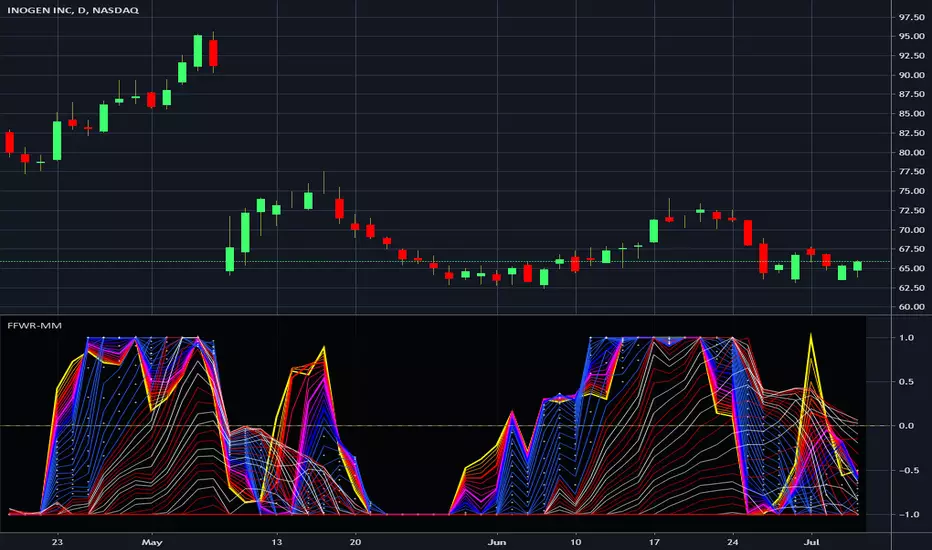
Financial Freedom WaveRipper - Momentum MulticatorIn the Spirit of '76 commemorating this day on July 4th, this is my third indicator released using Pine Script version 4.0, something I contributed to often in a small role, and will continue to do, in my free time. Without revealing my American secret sauce ingenuity excessively, this indicator uses a high performance momentum algorithm that blows most momentum algorithms out the water. It's characteristics display blatantly the swift momentum at which directional high speed wind driven swells create rip tides in an asset. Not being drug out to sea and quickly going "under water" so to speak, is best mitigated by very timely, accurate information. Regarding the use of this script, the bright yellow line has a damping factor of 4 and the longest adjustable damping factor is 66.
My idea initially was... while there is great "one liner indicators" to use, I thought, why not multi-line "multicators" with little to adjust concerning dominant cycle fluctuations in the market. And voila, another radical experiment, turned visually compelling, similar to tumultuous ocean waves and how incredibly fast turning points can wax and wane, yet be anticipated. Living in America, I was once again determined to attain a replica of "Old Glory" in this companion multicator as well. It's embedded artwork makes it an articator too. Which is why I waited to release this sibling appropriately on July 4th too, a day of celebration of freedom, an empowering idea that has reached dessimenation world wide to so many other nations and peoples.
I once again would personally like to thank the talented individuals at TV for providing a platform that embraces an initial free membership, which I first obtained myself, for people like me to freely code in Pine with mathemagical ideas and mental wizardry, creating ultimately, inventions like this eye candy display above.
Features List Includes:
"Source" Selection
Enable/disable dark background for enhanced visibility
Longest period adjustment providing any adjustable period setting
A subtly adjustable multiplier tweak
Minimalized enable/disable adjustment for the theme
This is not a freely available indicator, FYI. To witness my Pine poetry in action, properly negotiated requests for unlimited access, per indicator, may ONLY be obtained by direct contact with me using TV's "Private Chats" or by "Message" in my member name above. The comments section below is solely just for commenting and other remarks, ideas, compliments, etc... If you do have any questions or comments regarding this indicator, I will consider your inquiries, thoughts, and ideas presented below in the comments section, when time provides it. As always, "Like" it if you like it, and also return to my scripts list occasionally for additional postings. Have a profitable future everyone!
OJLJ Elliott Waves DetectorThis script is made to identify Elliot Waves by setting a zigzag line as principal source, it identifies patterns with the most common rules, in the chart you will see a number in each wave detected, a wave could have the characteristics to be two different waves so it will be plotted the options that could be, To identify which one is most trustable I suggest to use the Fibonacci levels options.
Features:
+ All waves ? (Option to show just the 5 Wave patterns recognition)
+ Draw zigzag line (Option to show the zigzag line)
+ Supports Multiple instruments, from FOREX to Stocks
+ It works on all the timeframes
+ Show Fib levels (Option to show the Fibonacci levels)
+ Fibonacci levels fit test (Green crosses mark were should a Bull wave be to fit with a Fibonacci Level While the purple crosses show were should the wave fit to be a bear trend, the more closer with the point of the wave the most trustable Example, a 5 Wave Bull could also be a 2 Bear Wave, if the green cross is closer to the orange point of the wave then is a 5 Wave Bull, if the purple cross is closer to the orange point)
+ A background color also show when a 5 pattern is identified
+ The way to plot the zigzag can be changed with 3 Input options
Characteristics to add in future updates:
+ Detect more than 1 cycle at the same time
+ Use a volume indicator to identify how many volume was traded in each wave
+ Implement the use of the EWO (Elliot Wave Oscillator)
+ Improve the display
+ Identify ABC patterns
+ Add triangles and Zigzag formations
To have access to this script please send me a message ;D

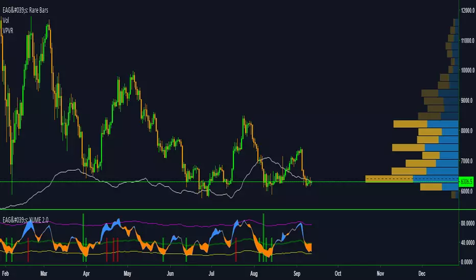
EdgeAnalysisGroup: Yume Wave 2.0This is a upgraded version of the wave with modified parameters for a higher success rate. 3 New Lengths and 75 more lines of code added to the overall algorithm. Also included are 2 sublevel signals based on the Fib MA and pattern trading.
The Wave:
+ The Yume is the Fast length
+ The Akume is the Slow length
+ The Miaku is a median weighted length
+ The Upper Limit is an overbought asset indication
+ The Lower Limit is an oversold asset indication
+ The Wave is the spread between Yume and Miaku
Bullish Indications:
+ The Yume is above the Akume
+ The Yume is above the Miaku
+ The Yume is below the Lower Limit
Bearish Indications:
+ The Yume is below the Akume
+ The Yume is below the Miaku
+ The Yume is above the Upper Limit
Signal Strength Weights:
+ 50 = Yume Wave crossed a Limit Line
+ 100 = Yume Wave crossed a Limit Line + Close to a Fib Moving Average
+ 100 = Edge's Market Bottom/Top Algorithm is marked 'True'
Setting up Signals (Based on a 100 Signal Height):
+ Set the "Bull Signal" to be at 50 or 100
+ Set the "Bear Signal" to be at 50 or 100
+ 50 is Agressive, 100 is Conservative.
+ Bull/Bear are separate so you can play conservative bull with aggressive bear.
TTM Wave C by DreckenThis is one of five indicators created to identify periods of consolidation and watch the overall market momentum to help forecast the market direction and await a release of market energy.
TTM Squeeze Overlay shows Bollinger Bands and Keltner Channels. When the Bollinger Bands (purple) go inside of the Keltner Channel (yellow), the market is said to be in a squeeze.
The dots across the zero line of the TTM Squeeze & Momentum indicator will turn red, signifying this period market compression. Once the Bollinger Bands move outside of the Keltner Channel, a squeeze has “fired”. In order to determine the direction of the move, look at the histogram of the TTM Squeeze & Momentum . If it is above zero, the squeeze has fired long, otherwise short.
The A, B and C Waves use various moving averages and oscillators to visualize the overall strength and direction of the market on short, medium and long time frames. The C Wave is often viewed as the “anchor” for the market. If this wave is clearly positive with all bars above the zero line, we would avoid short trades as this is an indication that the overall momentum of the market is long. The opposite would also be true if the wave was clearly negative. When a squeeze fires, we want to see that Waves are in agreement with the direction of the signal. If a squeeze fires short but the waves are clearly positive and showing bullish momentum, we may opt not to take the signal since it would be fighting the overall market trend.

TTM Wave A by DreckenThis is one of five indicators created to identify periods of consolidation and watch the overall market momentum to help forecast the market direction and await a release of market energy.
TTM Squeeze Overlay shows Bollinger Bands and Keltner Channels. When the Bollinger Bands (purple) go inside of the Keltner Channel (yellow), the market is said to be in a squeeze.
The dots across the zero line of the TTM Squeeze & Momentum indicator will turn red, signifying this period market compression. Once the Bollinger Bands move outside of the Keltner Channel, a squeeze has “fired”. In order to determine the direction of the move, look at the histogram of the TTM Squeeze & Momentum . If it is above zero, the squeeze has fired long, otherwise short.
The A, B and C Waves use various moving averages and oscillators to visualize the overall strength and direction of the market on short, medium and long time frames. The C Wave is often viewed as the “anchor” for the market. If this wave is clearly positive with all bars above the zero line, we would avoid short trades as this is an indication that the overall momentum of the market is long. The opposite would also be true if the wave was clearly negative. When a squeeze fires, we want to see that Waves are in agreement with the direction of the signal. If a squeeze fires short but the waves are clearly positive and showing bullish momentum, we may opt not to take the signal since it would be fighting the overall market trend.

TTM Wave B by DreckenThis is one of five indicators created to identify periods of consolidation and watch the overall market momentum to help forecast the market direction and await a release of market energy.
TTM Squeeze Overlay shows Bollinger Bands and Keltner Channels. When the Bollinger Bands (purple) go inside of the Keltner Channel (yellow), the market is said to be in a squeeze.
The dots across the zero line of the TTM Squeeze & Momentum indicator will turn red, signifying this period market compression. Once the Bollinger Bands move outside of the Keltner Channel, a squeeze has “fired”. In order to determine the direction of the move, look at the histogram of the TTM Squeeze & Momentum . If it is above zero, the squeeze has fired long, otherwise short.
The A, B and C Waves use various moving averages and oscillators to visualize the overall strength and direction of the market on short, medium and long time frames. The C Wave is often viewed as the “anchor” for the market. If this wave is clearly positive with all bars above the zero line, we would avoid short trades as this is an indication that the overall momentum of the market is long. The opposite would also be true if the wave was clearly negative. When a squeeze fires, we want to see that Waves are in agreement with the direction of the signal. If a squeeze fires short but the waves are clearly positive and showing bullish momentum, we may opt not to take the signal since it would be fighting the overall market trend.


CryptoWave ProProps to Lazy Bear for his WaveTrend Oscillator which I've used as the basis of this indicator.
Whats changed?
Tweaked values for crypto markets - Working well on the 1h chart but can be used on essentially any time frame.
- Added visual buy sell signals
- Colored Arrow
- Bar Colors On Chart
Added alert syntax to easy TradingView alerts
Access given to all CryptoProTools members

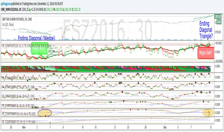
Fractal Resonance CompositeFractal Resonance Composite compresses 8 timescales of stochastic oscillators into just 3 color-coded composite lines: fast, medium and slow. Fast emphasizes the shorter timescale oscillators, medium considers all 8 timescales evenly, and slow emphasizes the longer timeframe oscillators. The composite lines indicate how overbought/sold the market is relative to the size of its recent movements. Major buys occur when all three composites enter the Oversold (green shaded) range and turn up, and major sells when all three reach the Overbought (red shaded) range and turn down. The fast line's quicker reversals and exaggerated alternations on smaller price moves makes it more fit for scalping. Notice the fast and medium lines tend to snap back toward the slow line like stretched rubber bands.
As is particularly apparent in the slow line, the nifty mathematics of the compositing process reconstruct the topology (peaks and valleys) of the underlying price curve in a smoothly distorted "cartoon" form that has a very useful property: the composite lines are confined to +-100% Extreme Overbought/sold oscillatory ranges. (By definition, only extremely rare "parabolic" moves can push all 3 composites beyond +-100%). If we knew that price would always stay confined to a certain range, trading would be much easier, no? Always buy the bottom of the range and sell the top!
How it works
To understand what's behind this nifty property, consider the mathematics of LazyBear's WaveTrend port .
The formula is fairly simple as indicators go yet statistically fundamental in a way that suggests it should have been the grandfather of all market stochastic oscillators. It's just a running average of the ratio:
(price's current deviation from it's mean)
-----------------------------------------------------------
(running average of absolute |price deviation from the mean| )
In formal statistics notation this is written:
E{ (X - E{X}) / E{|X-E{X}|} }
Where X is the price random variable and E{} the averaging or Expectation operator, implemented in this oscillator as exponential moving averages.
Conceptually, the denominator measures and normalizes by the typical size of recent price moves. This normalization process is what stretches or compresses the local price movements such that the whole composite curve can stay within the oscillatory range.
Attributes
The default fast=.6, medium=1, slow=1.4 compositing factors give each line visually distinct behavior, but can be tweaked to emphasize different oscillator "speeds".
Particular lines can be disabled by setting their line width to 0.
LL-HL PivotThis indicator scans for the bullish structure known as a Higher Low (HL) across multiple lengths simultaneously, automatically selects the most suitable pattern, and plots it on the chart.
Below is a detailed explanation of how it works.
1. Basic Calculation Method (Definition of LL and HL)
This indicator is built on TradingView’s ta.pivotlow function.
Detecting Pivot Lows
For a given length, a Pivot Low is identified as the lowest point among the candles within the specified range to the left and right.
LL and HL Determination
LL (Lowest Low): The most recent Pivot Low is treated as the previous low.
HL (Higher Low): When a new Pivot Low forms above the previous LL, it is recognized as an HL, and the setup is considered “complete.”
Identifying the Pivot Line
During the LL–HL structure, the highest high between them is identified and used as the breakout level (Pivot Line / resistance), where a horizontal line is drawn.
2. Multi-Length Scanning
Unlike standard indicators that use only one length (e.g., Length = 5), this indicator evaluates a full range of lengths.
Min Length to Max Length
Example: Min = 2, Max = 10
Internally, it functions as if nine separate indicators (Length 2, 3, 4 … 10) are running simultaneously.
This allows the indicator to capture:
Small waves (short-term pullbacks)
Larger waves (broader structural moves)
3. Priority Mode System
Because multiple lengths are calculated at the same time, different LL–HL patterns may appear simultaneously.Priority Mode determines which setup is selected and displayed.
A. Lowest LH
Selects the pattern with the lowest pivot line (intermediate high).
Advantages:
Produces the lowest possible entry price
B. Longest Length
Selects the pattern with the longest length.
Advantages:
Focuses on larger structures and broader waves
Filters out noise
C. Shortest Length
Selects the pattern with the shortest length.
Advantages:
Reacts quickly to small moves
Useful for scalping or fast trend-following
Captures very short-term pullbacks
4. Additional Behavior and Features
Real-Time Invalidation
If price breaks below the confirmed HL, the structure is immediately considered invalid.
All previously drawn lines and labels are removed instantly, preventing outdated structures from remaining on the chart.
Pivot Line Extension
As long as the HL remains intact, the Pivot Line (breakout level) continues extending to the right.
Alerts
An alert can be triggered the moment price breaks above the Pivot Line on a closing basis.
