ai cruhsera pullback strategy to donchain lower and upperbands.. best for cypro lower timeframe scalping..
ค้นหาในสคริปต์สำหรับ "scalping"
XAUMO MEGABAR Detector]XAUMO MegaBar Detector – Breakout Candle Identification Tool
Purpose:
The XAUMO MegaBar Detector is built to highlight rare, high-impact candles where strong price movement and high trading volume occur together. These moments often reflect aggressive market activity and can be used to confirm potential breakouts or reversals.
How It Works (High-Level Overview)
The tool continuously monitors two primary conditions:
Price Expansion – Identifies large-bodied candles compared to recent averages.
Volume Expansion – Confirms that the move is supported by above-average trading activity.
When both conditions are present, the candle is marked:
🟢 Mega Bull – Strong bullish pressure.
🔴 Mega Bear – Strong bearish pressure.
Key Features
Automatic Timeframe Adjustment – Detection sensitivity changes based on chart timeframe, so results stay relevant from 1-minute scalps to multi-day swing setups.
Clear Visual Output – Significant candles are highlighted directly on the chart for easy recognition.
Optional Labels – Toggle on/off text labels (“Mega Bull” / “Mega Bear”) for a cleaner chart view.
Alert Integration – Set TradingView alerts to be notified immediately when a qualifying candle appears.
Universal Compatibility – Works on Forex, Commodities, Indices, Crypto, Stocks, ETFs, and Futures.
Practical Uses for Traders
As a confirmation tool when price approaches support/resistance or Fibonacci levels.
To filter low-quality setups by focusing only on moments where both price and volume confirm the move.
As part of a trend-following or breakout strategy when combined with other analysis methods.
Using the Indicator
Add the indicator to any chart and select your preferred timeframe.
Watch for highlighted candles – they indicate significant combined momentum and liquidity.
Use as a signal filter or confirmation alongside your existing trading system.
Optional: Set alerts to receive push/email/webhook notifications.
===================================
📌 MEGA BAR TRADING CHEAT SHEET
Spot Big Money. Ride the Move.
===================================
🧠 WHAT’S A MEGA BAR?
A Mega Bar is a candle so big it makes the rest look tiny — and it often means institutions are making a move.
Check the 4 Rules:
✅ Body size ≥ 2x average
✅ High relative volume (vs. last 20 bars)
✅ Closes near high (bull) or low (bear)
✅ Comes after sideways chop or price squeeze
📈 WHY IT MATTERS
Mega Bars = intent, not random spikes.
🟢 Mega Bull near support/Fib pullback → Likely accumulation
🔴 Mega Bear near resistance/Fib extension → Likely distribution or trap
🔧 HOW TO TRADE IT
1. WAIT FOR IT
No Mega Bar → No trade.
Mega Bull (big green) → BUY bias.
Mega Bear (big red) → SELL bias.
2. FIND THE SPOT
Fib levels: 61.8% / 78.6% / 138.2%
Major Support/Resistance
3. CONFIRM ON BIGGER TIMEFRAME
Example: 15M Mega Bar → Check 1H trend direction.
4. SET YOUR LEVELS
Stop-Loss:
Long → Below Mega Bull low (+0.2×ATR)
Short → Above Mega Bear high (+0.2×ATR)
Take-Profit:
Fib extensions: 127.2% / 161.8% / 261.8%
Prior highs/lows
5. RISK SMART
Risk 1–2% max per trade
Aim for 2:1+ R:R
🌍 WORKS ON:
Forex • Commodities • Stocks • Crypto • Indices
THE RETAILER’S FORMULA:
🟢 Big Green → Buy
🔴 Big Red → Sell
🎯 Fibs = Payday
One setup. One signal. Discipline = profit.

Swing High/Low Scalper(Mastersinnifty)Overview
The Swing High/Low Scalper is designed for traders seeking structured entries and disciplined stop-loss planning during momentum shifts. It combines smoothed Force Index readings with swing high/low analysis to identify moments where both momentum and structural price levels align.
When a new directional bias is confirmed, the indicator plots clear entry signals and dynamically calculates the nearest logical stop-loss level based on recent swing points.
---
Core Logic
- Force Index Bias Detection
- The Force Index (price × volume change) is smoothed with an EMA to determine sustained bullish or bearish momentum.
- Signal Memory and Noise Reduction
- The indicator remembers the last signal (buy/sell) and only triggers a new signal when the bias changes, helping avoid redundant entries in sideways or noisy conditions.
- Swing-based Stop-Loss Calculation
- Upon signal confirmation, the script automatically plots a stop-loss label near the most recent swing low (for buys) or swing high (for sells).
- If conditions are extreme, fallback safety checks are used to validate the stop-loss placement.
---
Key Features
- Dynamic, structure-based stop-loss plots at every trade signal.
- Visual background bias:
- Green tint = Bullish bias
- Red tint = Bearish bias
- Minimalist and clean chart visualization for easy interpretation.
- Designed for scalability across timeframes (from 1-minutes to daily charts).
---
Why It’s Unique
- Unlike simple momentum oscillators or swing indicators, this tool integrates a state-tracking mechanism.
- A signal is only generated when a true shift in directional force occurs and swing structure supports the move, seeking to catch only meaningful changes rather than every minor fluctuation.
- This dual-filter approach emphasizes quality over quantity, aiming for disciplined entries with risk levels derived from actual price behavior, not arbitrary formulas.
---
How to Use
- Apply the Script to your desired chart and timeframe.
- Look for Signals:
- Green Up Arrow = Buy Signal
- Red Down Arrow = Sell Signal
- Observe Stop-Loss Labels
- Use the plotted SL labels for setting exit points based on recent swing structure.
- Monitor Background Bias:
- Green or Red background hints at prevailing directional momentum.
---
Important Disclaimer
This tool is intended to assist technical analysis and trade planning.
It does not provide financial advice or guarantee any future performance.
Always use additional risk management practices when trading.

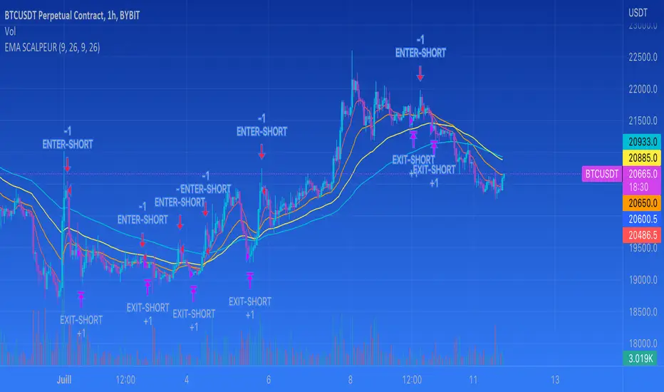
EMA SCALPEUR SHORTI'm trying to find the best EMA's for scalpingm you are able to choose 2 differents EMAs for your enter and 2 differents EMAs for you exit.
It's putting entry and exit on the graph
Supply and Demand Zone IndicatorOVERVIEW
The supply and demand zone indicator shows real-time supply and demand zones on the chart. It also plots a table including the high and low values of the zones. The last row of the table also shows the daily trend in the market.
CONCEPTS
What is Supply & Demand?
Supply and Demand represent the two most powerful forces of the forex market. Demand means the number of buyers buying a security in the market. Supply means the number of sellers selling a security in the market.
How to identify supply and demand zones?
Supply and Demand zones are formed on the base region of price on the chart. There are two types of movement of price in technical analysis.
Impulsive wave
Retracement wave
The impulsive wave represents the price movement of market makers. The Retracement wave indicates base regions where market makers decide their next direction to go up or down.
There are four fundamental concepts of Demand and supply in forex.
Rally Base Rally (RBR)
Rally Base Drop (RBD)
Drop Base Rally (DBR)
Drop Base Drop (DBD)
How does supply & demand indicator work?
Our supply & demand indicator will use a simple formula based on price action to plot the zones. It will plot the zone on the base candles using the high and low of the base zone.
Base candle = a candlestick that has a small body and big shadows like a Doji candlestick.
Big candle = a candlestick with a large body and small shadows.
The zone will be drawn on the high and low of the base candlestick. There can be more than one base candlesticks in the base zone, but our indicator will identify the maximum of 4 base candlesticks.
FEATURES
Specify desired Big Body Candle Size Percentage
Specify desired Small Body Candle Size Percentage
Change the Colors of Zones at your own will
The Indicator Draws the latest zones and puts a label on historical Zones
The Indicator Draws real-time Zones under specified conditions of candle body sizes. The Zone will stop once the candlestick closes above the supply zone or below demand zones.
Recommended Timeframe
Above 30 Minutes

Volatility Detector by AjeetThis indicator is used for detecting Volatility
To be applied only on 15 mins chart
As soon as you spot a circle (Inc. in Volatility) then high movement is
expected in further 5-6 candles
Movement can be up or down
Its can be best used for scalping...
Run a chart on 15 mins, detect a candle with an indication of high movement ahead
shift to smaller timeframe like 3 mins
apply lower setting supertrend like 11,2
and take benefit of the move

Capns Bollinger Bands MTF This Simple Script display higher time frame Bollinger Band on current resolution . Etc : On 1 Minutes chart BB Band is 5 Minutes Band. I use this code on my pc for scalping...Hope You like the idea
CRSI-TSA Colored RSI Entry Exit Signals [TheScalpingAnt]
CRSI-TSA – Colored RSI Entry/Exit Signals
Credit: LuxAlgo (Original RSI Concept & Foundation)
Developed / Implemented by: The Scalping Ant
Overview
CRSI-TSA is a professional momentum-based trading tool designed to visually enhance RSI-based trading and simplify decision-making. Built for traders who want clear directional bias, clean entry/exit signals, and a premium institutional look, this indicator transforms traditional RSI into a structured, actionable trading system.
Whether you scalp, day trade, or swing trade, CRSI-TSA helps you quickly identify momentum shifts, trend continuation, and exhaustion points with intuitive visual cues and highly optimized design logic.
Concepts
This indicator is built on the enhanced RSI framework conceptualized by LuxAlgo, then strategically implemented and redesigned by The Scalping Ant to improve:
• Readability
• Practical trade execution usability
• Signal visual clarity
• Professional presentation quality
CRSI-TSA blends:
• RSI momentum evaluation
• Signal line smoothing
• Mid-zone structure analysis
• Visual confidence zones
• Entry/Exit trigger confirmations
The result: A clearer RSI designed for real trading, not just analysis.
Features
✔️ Advanced RSI Momentum Engine
✔️ Dynamic Signal Line with Multiple MA Options
✔️ Bull/Bear Ribbon Fill for Instant Bias Recognition
✔️ Clean Mid-Zone Structure for Market Phase Clarity
✔️ Entry & Exit Markers with Optimized Visibility
✔️ Optional Top/Bottom Panel Background
✔️ Fully Adaptive to Any Asset / Any Timeframe
✔️ Alerts for Bullish & Bearish Cross Conditions
✔️ Minimalistic Yet Highly Informative Design
Customization
CRSI-TSA is intentionally flexible while remaining structured.
You can customize:
• RSI Length
• Source Input
• Signal Method (EMA / SMA / RMA / TMA)
• Ribbon Colors (Bullish & Bearish)
• Background Panel Visibility & Colors
• Default Visual Preferences
This allows full personalization without breaking the core logic.
Usage
Recommendation for:
• Scalping
• Day Trading
• Swing Trading
• Trend Confirmation
• Momentum Trading
• Pullback Entries
• Reversal Timing
Bullish Bias
When RSI crosses above the Signal Line → Momentum Strengthening
Bullish background ribbon turns active → Buy Bias
Bearish Bias
When RSI crosses below Signal Line → Momentum Weakening
Bearish ribbon activates → Sell Bias
Use additional confluence such as:
• Price structure
• Key levels
• Market session behavior
• Trend direction
Example Trading Logic
Simple Strategy Concept
1️⃣ Wait for signal cross
2️⃣ Confirm ribbon color bias
3️⃣ Enter in direction of signal
4️⃣ Manage position per your own risk model
This indicator is NOT a “magic arrow”. It is a professional trading tool to support disciplined strategy execution.
Settings
Inputs
• RSI Length (default 21)
• Signal Length (default 14)
• Signal Type: EMA / SMA / RMA / TMA
Visual
• Bull Ribbon Color
• Bear Ribbon Color
• Optional Top/Bottom Panel Background
Alerts
• Bullish RSI Crossover
• Bearish RSI Crossunder
Conclusion
CRSI-TSA delivers:
• Simplicity
• Professional execution clarity
• Enhanced RSI visualization
• Powerful trading confidence
Built for traders who demand precision and a visually refined interface.
If you value structured charts, cleaner decision-making, and professional-grade trading tools, this indicator belongs in your toolkit.
Disclaimer
This tool does NOT guarantee profits. It is an analytical decision-support tool.
Trading involves risk. Past performance does not guarantee future results.
Always use risk management and proper trading discipline.
You alone are responsible for trading decisions.

MTF Key Levels Pro [Confluence & Flow]MTF Key Levels Pro is an all-in-one market structure and context toolkit designed to reduce chart noise and surface the price levels that matter most. It combines multi-timeframe trend alignment, institutional-style reference levels (VWAP anchors, pivots, volume POC, prior day levels), and confluence detection so you can quickly identify where price is likely to react—and whether the broader flow supports continuation or reversal.
This script is intentionally modular: you can enable only what you trade (scalping, day trading, swing, position) while keeping the chart readable via selective plotting and a compact MTF dashboard.
What It Does
1) Key Levels Engine (Core Map)
The indicator plots a “key-level stack” from multiple methodologies so you are not relying on a single lens:
Volume Profile POC (Point of Control) over a configurable lookback (highest traded activity zone).
Daily Pivot Levels calculated from prior day H/L/C (PP, R1, S1 and extended levels in the logic).
Fibonacci Retracements from recent swing range (38.2 / 50 / 61.8).
Moving Averages (three configurable MAs for trend structure).
Previous Day High/Low (PDH/PDL) for intraday reference points.
ATH/ATL tracking (optional) for macro context.
2) Anchored VWAP Suite (Flow Anchors)
A multi-anchor VWAP system that resets and recalculates at the start of each period:
Hourly VWAP (scalping / micro-structure)
Daily VWAP (day trading standard reference)
Weekly VWAP (swing context)
Monthly VWAP (position context)
3) Multi-Timeframe Alignment Dashboard (Trend Consensus)
The dashboard pulls 5 configurable timeframes (defaults: 5m, 30m, 1h, 4h, D) and displays:
Price snapshot per timeframe
Trend direction (simple momentum/trend comparison vs lookback)
Volume
% change
Alignment status (BULL ALIGNED / BEAR ALIGNED / MIXED), including bars since alignment began
Use this to avoid trading against higher timeframe pressure and to time entries when multiple timeframes agree.
4) Order-Flow Lite (Volume & Delta)
A practical “flow confirmation” layer using candle-based volume classification:
Buy vs sell volume approximation (close vs open)
Delta strength label (Strong Buy / Strong Sell / Neutral)
Volume surge detection vs SMA(volume) with a configurable multiplier
Optional background shading on surge events
5) Confluence Zones (Signal Compression)
Confluence zones automatically form when multiple independent levels cluster together within a configurable tolerance:
You choose tolerance % and minimum levels required (e.g., 3+).
Zones are plotted as highlighted regions and listed in the dashboard with proximity markers (AT / NEAR).
This is the “decision layer”: the script doesn’t just draw levels—it tells you where multiple reasons to react overlap.
How to Use It (Practical Outline)
Typical Workflow
Check dashboard alignment: trade with alignment for continuation setups; treat MIXED as caution/mean-reversion regime.
Identify nearest confluence zones: prioritize trades at/near zones versus isolated single levels.
Use VWAP anchor + PDH/PDL + Pivot as the intraday framework, then confirm with volume surge/delta bias.
Manage risk around zones: zones are natural areas for rejection, breakout, or retest logic.
Recommended Configurations (Quick Start)
Scalping (1m–5m chart): Hourly VWAP + Daily VWAP + Daily Pivots + Confluence
Day Trading (5m–1h): Daily VWAP + Pivots + PDH/PDL + Confluence + Alignment dashboard
Swing (1h–4h): Weekly VWAP + MA50/MA200 + Confluence + Alignment
Position (D/W): Monthly VWAP + MA200 + ATH/ATL + Confluence
Alerts Included
Confluence Touch: triggers when price is within proximity of a confluence zone.
Trend Change: triggers when the alignment state changes (e.g., MIXED → BULL ALIGNED).
Volume Spike: triggers on surge events versus the configured baseline.
Notes / Intended Use
This indicator is built for context and decision support (key levels + trend consensus + flow cues). It is not a standalone “buy/sell system” by design; instead, it provides a structured map for entries, invalidation, and target planning around areas of highest market agreement.
If you want, I can also produce a TradingView-ready “Description + Feature bullets + How to trade + Settings guide + Alert guide” in the exact formatting style commonly used on public TradingView scripts (including a short disclaimer and a clean feature list).

PFA_PahadiPFA Pahadi Indicator
Market Structure through Swing Triangles
What is the PFA Pahadi Indicator?
The **PFA Pahadi Indicator** is a *price-structure visualization tool* that converts raw market movement into a series of **connected swing triangles**. By linking **Pivot Low → Pivot High → Pivot Low** and additionally connecting the **bases (Low → Low)**, the indicator visually resembles a *mountain (pahadi) range*—hence the name.
It focuses purely on **market structure**, not prediction, helping traders and analysts understand how price is *actually climbing, resting, and declining* over time.
Key Benefits
• Clear Market Structure
The indicator highlights **higher highs, higher lows, lower highs, and lower lows** in a clean, uncluttered way, making trend identification intuitive even on higher timeframes.
• Noise Reduction
By relying only on **confirmed pivots**, minor fluctuations are filtered out. This helps traders avoid reacting to short-term volatility and focus on meaningful swings.
• Visual Trend Strength Assessment
The *slope and shape* of the triangles reveal whether the trend is:
* Expanding (strong trend)
* Contracting (distribution / accumulation)
* Flattening (range / base building)
• Excellent for Positional & Swing Trading
Works particularly well on **weekly and daily charts**, where price structure matters more than intraday noise.
• No Repainting
All lines are drawn only after pivot confirmation. Once plotted, the structure does **not change retroactively**, ensuring analytical integrity.
• Complements Moving Averages & Volume
When combined with long-term averages or volume trends, the PFA Pahadi Indicator helps identify:
* Healthy pullbacks
* Structural breakdowns
* Failed rallies
Practical Use-Cases
• Trend Continuation Analysis
Higher base lines (Low → Low) indicate sustained accumulation and trend continuation.
• Structural Weakness Detection
Flattening or declining bases despite new highs may indicate **distribution** or **trend exhaustion**.
• Long-Term Support Mapping
The connected bases often act as *dynamic structural support zones* rather than exact price levels.
Limitations
• Not a Timing Indicator
The PFA Pahadi Indicator does **not provide entry or exit signals** on its own. It is a *context tool*, not a trigger.
• Lag Due to Confirmation
Because pivots require confirmation, the structure appears **after the move has occurred**. This is intentional for accuracy but unsuitable for scalping.
• Sensitive to Pivot Length Settings
Short pivot lengths may create too many triangles; longer lengths may miss smaller but tradable swings.
• Works Best in Trending Markets
In sideways or choppy conditions, the structure may appear flat and less informative.
Disclaimer
The PFA Pahadi Indicator is a market structure visualization tool and does not constitute investment advice, trading recommendations, or a guarantee of future performance. It is designed for educational and analytical purposes only.
All market decisions should be taken in conjunction with other tools such as volume analysis, risk management rules, broader market context, and individual financial suitability. Past price structures do not ensure future outcomes. Users are advised to validate the indicator across multiple securities and timeframes before applying it in live trading.
Philosophy Behind the Name
Markets don’t move in straight lines. They climb, pause, retrace, and climb again—just like a pahadi path. This indicator simply helps you see that path clearly.

BALANCED Strategy: Intraday Pro + Smart DashboardWelcome to the BALANCED Strategy: Intraday Pro.
This all-in-one indicator is designed for Intraday traders looking to capture trend movements while effectively filtering out sideways market noise. It combines the power of Supertrend for direction, EMA 100 for the baseline trend, and rigorous validation via RSI and ADX.
The script also integrates a complete Risk Management system with targets based on the Golden Ratio (Fibonacci) and a real-time Dashboard.
⏳ Recommended Timeframes
This algorithm is optimized for Intraday volatility:
M5 (5 Minutes) ⭐️: Ideal for quick Scalping. The ADX filter is crucial here to avoid false signals.
M15 (15 Minutes) 🏆: The "Sweet Spot." It offers the best balance between signal frequency and trend reliability.
M30 / H1: For a "Swing Intraday" approach—calmer, fewer signals, but higher precision.
Not recommended for M1 (1 Minute) with default settings (too much noise).
🚀 How It Works
The algorithm follows a strict 3-step logic to generate high-quality signals:
1. Trend Identification (The Engine)
Supertrend: Determines the immediate direction.
EMA 100: Acts as a background trend filter. We only buy above and sell below the EMA.
2. Noise Filtering (Safety)
ADX (Average Directional Index): The signal is only validated if there is sufficient volatility (Configurable threshold, default 12) to avoid "chop markets" (flat markets).
RSI (Relative Strength Index): Strict momentum filter. Buy only if RSI > 50, Sell if RSI < 50.
3. Entry Confirmation (The Trigger)
The script doesn't just rely on a crossover. It waits for "Price Action" confirmation: the candle must close higher than the previous one (for Long) or lower (for Short) to validate the entry.
🛡️ Risk Management (Money Management)
This is the core strength of this tool. Upon signal validation, the script automatically calculates and plots:
Stop Loss (SL): Based on volatility (ATR). It places the stop at the recent Low/High with a safety padding.
Take Profit (TP): Two modes available:
Fibonacci Mode (Default): Targets the 1.618 extension (Golden Ratio) of the risk taken.
Fixed Ratio Mode: Targets a manual Risk/Reward ratio (e.g., 2.0).
📊 The Dashboard
Located at the bottom right, the smart dashboard provides vital info at a glance:
Signal Time: To check if the alert is fresh.
Type (LONG/SHORT): Color-coded (Green/Pink).
Tech Data: RSI and ADX values at the moment of the signal.
Exact Prices: Entry Level, Target (TP), and Stop Loss (SL).
⚙️ Configurable Settings
Sensitivity: Adjust the Supertrend factor (Default 2.0).
Filters: Toggle the RSI filter ON/OFF or adjust the ADX threshold.
Execution: Choose between Fibonacci Target (1.618) or a Manual Ratio.
⚠️ Disclaimer: This tool is a technical decision aid and does not constitute financial investment advice. Always use prudent risk management and backtest the indicator on your preferred assets before live use.

Volume and Volatility Crisis Detector Volume + Volatility Crisis Detector Pro
Created by Alphaomega18
🎯 What is the Crisis Detector Pro?
The Volume + Volatility Crisis Detector Pro is an advanced indicator that combines:
8-Level Volume Analysis: Progressive detection of volume anomalies
Hedging Index: Measurement of institutional fear and protection activity
Progressive Crisis Detection: Identification of pre-crisis patterns like 1987 and 2008
📊 Indicator Components
1️⃣ Volume Ratio
Description:
Compares current volume to its 20-period moving average
Normal value: ~1.0 (volume = average)
High value: >2.0 (volume double the average)
Extreme value: >3.0 (volume triple the average)
8-Level Classification:
LevelRatioColorMeaning1< 1.25x⚪ GrayNormal volume21.25-1.5x🟢 GreenEarly alert31.5-1.75x🟡 Light YellowLight increase41.75-2.0x🟡 YellowModerate52.0-2.25x🟠 OrangeSignificant62.25-2.5x🟠 Dark OrangeVery high72.5-3.0x🔴 RedExtreme8> 3.0x🔴 Bright RedCRISIS
2️⃣ Hedging Index
Description:
Estimates institutional hedging activity (protection buying)
Based on: Weighted bearish volume + ATR volatility
Scale: 0.3 to 2.5 (like a Put/Call ratio)
Hedging Levels:
ValueColorMeaning< 0.7🟢 GreenNormal hedging0.7-1.0🟡 YellowElevated hedging1.0-1.3🟠 OrangeHigh hedging> 1.3🔴 RedPANIC - Extreme hedging
Interpretation:
Rising hedging = Institutions protecting → Market fear
Falling hedging = Confidence returning → Possible rebound
⚙️ Main Parameters
Calculations:
Moving Average Period: 20 (reference period for averages)
Volume Classification (8 Levels):
Level 1: 1.25x (early alert)
Level 2: 1.5x (light increase)
Level 3: 1.75x (moderate)
Level 4: 2.0x (significant)
Level 5: 2.25x (high)
Level 6: 2.5x (very high)
Level 7: 3.0x (extreme)
Level 8: > 3.0x (crisis)
Hedging:
Enable Hedging Detection: Enable/disable hedging index
Hedging Period: 14 (smoothing period)
Display:
Show Signals: Display visual signals
📈 Visual Elements
Main Lines:
Volume Ratio (thick colored line): Current volume ratio vs average
🛡️ Hedging Index (thick colored line): Institutional hedging index
Horizontal Threshold Lines:
For Volume:
1.0 = Normal (thick gray line)
1.25 = Level 1 (green dashed)
1.5 = Level 2 (yellow dashed)
2.0 = Level 4 (orange dashed)
3.0 = Level 7 (red dashed)
For Hedging:
0.7 = Normal (thin green dashed)
1.0 = High (thin orange dashed)
1.3 = PANIC (thin red dashed)
Visual Signals:
🔴 Red triangle: Extreme volume (level 7-8)
🟠 Orange triangle: High volume (level 5-6)
🟡 Yellow triangle: Moderate volume (level 3-4)
Colored Background:
Transparent red: Extreme volume or panic hedging
🎯 How to Use the Indicator
1. Installation
Open TradingView
Click "Indicators" at top of chart
Click "Pine Editor" at bottom
Paste the code
Click "Add to Chart"
2. Reading the Chart
Volume Ratio (main line):
Around 1.0 = Normal volume, no alert
Between 1.25 and 2.0 = Volume increasing, watch closely
Above 2.0 = Abnormal volume, strong activity
Above 3.0 = CRISIS - Extreme volume
Hedging Index (hedging line):
Around 0.7 = Calm market
Rising toward 1.0 = Growing nervousness
Above 1.3 = Institutional PANIC
3. Trading Strategies
🟢 Scalping/Day Trading:
Volume Ratio > 2.0:
Scalping opportunity in direction of movement
Quick entries with tight stops
Exit on activity spikes
Hedging Index > 1.0:
Nervous market = bounce opportunities
Wait for confirmation before entering
🟠 Swing Trading:
Volume Ratio > 2.5:
Avoid opening new swing positions
Protect existing positions (trailing stops)
Wait for return to normal (< 1.5)
Hedging Index > 1.3:
Panic = possible capitulation
Look for reversal opportunities
Wait for hedging to drop
🔴 Risk Management:
Volume RatioHedging IndexRecommended Action< 1.5< 0.7Normal trading1.5-2.00.7-1.0Increased monitoring2.0-3.01.0-1.3Reduce exposure 50%> 3.0> 1.3STOP trading / Protection
4. Crisis Patterns (1987/2008 Style)
Pre-Crisis Pattern:
Volume staying above 1.5x for 5+ days
With 3+ days above 2.0x
= Stress accumulation before explosion
Crisis Building Pattern:
5+ consecutive days above 2.0x
Hedging rising progressively
= Crisis is building
Immediate Crisis Pattern:
Volume > 3.0x
Hedging > 1.3
= Widespread PANIC
🔔 Configurable Alerts
The indicator includes 6 main alerts:
🟢 Level 1: First volume anomaly (1.25x)
🔴 Level 6+: Very high volume (2.25x+)
🔴🔴 CRISIS: Extreme volume (3.0x+)
🛡️ PANIC HEDGING: Panic hedging (1.3+)
Configuration:
Right-click on chart
"Create Alert"
Condition: Select desired alert
Options: Set frequency
Actions: Email, notification, webhook, etc.
💡 Real Use Cases
Example 1: Flash Crash
Volume Ratio: 4.5 (🔴)
Hedging Index: 1.8 (🔴)
Signal: EXTREME CRISIS
Action: Full protection, no new trades
Example 2: Fed Announcement
Volume Ratio: 2.3 (🟠)
Hedging Index: 1.1 (🟠)
Signal: High volume and hedging
Action: Reduce positions, wide stops
Example 3: Technical Squeeze
Volume Ratio: 2.8 (🔴)
Hedging Index: 0.9 (🟡)
Signal: Breakout without panic
Action: Follow movement with confirmation
Example 4: Capitulation
Volume Ratio: 3.5 (🔴)
Hedging Index: 1.5 → 0.8 (rapid drop)
Signal: Panic then relief
Action: Look for bounce opportunities
🔧 Parameter Optimization
Scalping (1-5 min):
Moving Average Period: 10
Level 1: 1.2x
Level 4: 1.8x
Level 7: 2.5x
Hedging Period: 7
Day Trading (15min-1H):
Moving Average Period: 20 (default)
All thresholds: Default
Hedging Period: 14 (default)
Swing Trading (4H-Daily):
Moving Average Period: 30-50
Level 1: 1.3x
Level 4: 2.2x
Level 7: 3.5x
Hedging Period: 20
Crypto (Very volatile):
Moving Average Period: 20
Level 1: 1.5x
Level 4: 2.5x
Level 7: 4.0x
Hedging Period: 14
⚠️ Limitations and Best Practices
❌ Limitations:
Hedging is estimated, not based on real Put/Call data
May give false signals in very volatile markets
Requires significant volume to be reliable
✅ Best Practices:
Always combine with classic technical analysis
Never trade solely on alerts
Adapt thresholds to your asset and timeframe
Backtest before using live
Respect your risk management plan
Golden Rule:
"The indicator detects anomalies, not direction. Always wait for confirmation before entering positions."
📈 Performance and Compatibility
✅ Real-time: Instant detection (0 lag)
✅ All markets: Stocks, Futures, Forex, Crypto
✅ All timeframes: 1min to Monthly
✅ Lightweight: Optimized, no slowdown
✅ Multi-platform: TradingView web, mobile, desktop
🎓 Historical Crises
1987 - Black Monday:
Volume Ratio: x5-x10 for several days
Pattern: Progressive increase then explosion
2008 - Lehman Brothers:
Volume Ratio: x3-x7 for weeks
Hedging: Historical record
Pattern: Prolonged stress then panic
2020 - COVID Crash:
Volume Ratio: x4-x8 in few days
Pattern: Rapid fall with intense panic
2022 - Crypto Winter:
Volume Ratio: x2-x4 over several months
Pattern: Successive capitulations
VWAP Pullback + BOS + OBV v2 (Crypto Futures 15m)This strategy combines VWAP pullbacks, break-of-structure entries, and OBV confirmation to catch high-quality trend continuation moves on crypto futures. It waits for price to trend above or below the 200 EMA, then pulls back into the VWAP band, signaling a potential reload zone. A trade only triggers when price breaks recent structure in the direction of the trend and OBV shows supportive volume flow. An ATR volatility filter blocks entries during choppy, low-energy periods, and all trades use an ATR stop-loss with fixed reward-to-risk targeting. The result is a cleaner, more disciplined trend-following system designed for 15m–30m BTC/ETH scalping.

BB/KC Squeeze Channels (v6)Technical Specification for the BB/KC Squeeze Volatility Indicator in Algorithmic Cryptocurrency Trading
I. Theoretical Foundations of Volatility Dynamics
The "Contraction-Expansion" Principle (Volatility Contraction/Expansion)
The fundamental analysis of market volatility dynamics relies on the principle popularized by John Bollinger: periods of low volatility are inevitably followed by periods of high volatility. This phenomenon, known as the cyclical nature of volatility, is the cornerstone of trading strategies based on range breakouts (Breakout Strategy). In the context of technical analysis, volatility contraction manifests as a consolidation phase where the trading range narrows, preceding a strong, directional price impulse.
The essence of volatility contraction lies in a phase of market equilibrium that is inherently unstable. Most often, this reflects the covert activities of large market participants who are either accumulating or distributing a significant volume of the asset. These actions occur within a narrow price corridor to avoid sharp price movements until the entire position is acquired. As a result, activity decreases, the range narrows, and the market accumulates "energy" for the subsequent large-scale expansion. For the cryptocurrency market, characterized by high impulsivity and a tendency toward sharp trending moves, accurately identifying the deep contraction phase becomes a powerful algorithmic predictor.
Identifying Prerequisites: Distinguishing Pre-Breakout Contraction
To build a reliable indicator, it is crucial to distinguish a true pre-breakout squeeze from other types of volatility reduction that do not lead to a strong impulse. Specifically, volatility, measured by the Average True Range (ATR), will always decline after the completion of a strong vertical movement, as the market enters a pullback or deceleration phase. Such a decline is post-impulse and does not necessarily signal an imminent breakout.
It is necessary to find signs of abnormally low volatility that occurs precisely in the consolidation phase. The optimal time to look for a Squeeze signal is the formation of a distinct sideways channel. In this phase, the middle line of the channel indicator (e.g., EMA or SMA) should be relatively horizontal. This confirms that the market is currently in a ranging state (absence of a strong current trend), not in a deceleration phase after a trend. Therefore, the Squeeze indicator algorithm must include a check for confirmed sideways movement (e.g., through analyzing the slope of the middle line or its statistical deviation from the horizontal over the last X periods). Only abnormally low volatility during a range can be classified as a high-confidence pre-breakout contraction.
II. Instrument Selection: Justification for the Composite BB/KC Squeeze Approach
For effective algorithmic determination of the extreme contraction phase, it is necessary to use an indicator that combines the advantages of the two most reliable methods for measuring volatility: Bollinger Bands and Keltner Channels.
Comparative Analysis of Volatility Indicators
| Indicator | Base Metric | Volatility Response | Primary Role in Squeeze |
|---|---|---|---|
| Bollinger Bands (BB) | Standard Deviation (SD) | Fast, Highly Sensitive | Contraction sensor, Early breakout signal |
| Keltner Channels (KC) | Average True Range (ATR) | Smooth, Noise Filtering | Defines stable range, Filters false signals |
Bollinger Bands (BB)
Bollinger Bands are based on the Standard Deviation (SD) of the price from a moving average. This statistical metric makes BB highly sensitive, as they quickly react to sudden changes in volatility. Due to this sensitivity, BB are ideal for early registration of a contraction and for generating the breakout signal. However, their high sensitivity is also a drawback, as it can lead to false signals and premature expansion during market noise.
Keltner Channels (KC)
Keltner Channels, in the modern version developed by Linda Raschke, use the Average True Range (ATR) to calculate the channel width. ATR represents the averaged true range of fluctuations, which provides a smoother and more stable measure of volatility. KC react to market changes slower than BB, but their smoothness allows for better filtering of false signals and determination of the true direction of movement. Unlike fixed-width price channels or percentage envelopes, which perform poorly in dynamic environments, BB and KC automatically adapt to market conditions.
The Squeeze Mechanism: Synergy of Instruments
The BB/KC Squeeze indicator uses the synergy of BB and KC to achieve maximum accuracy in identifying the accumulation phase.
The technical Squeeze condition (Squeeze ON) is defined when the fast and statistically-oriented Bollinger Bands (BB) are inside the wider and smoother Keltner Channels (KC). This state represents quantitative confirmation of extremely low volatility.
In standard settings, BB use a multiplier of 2.0 for Standard Deviation (SD), and KC use a multiplier of 1.5 for ATR. For the statistical width of BB (based on price deviation from the average) to narrow inside the width of KC (based on the averaged range), the current statistical deviation of the price must fall to abnormally low values relative to the historical average range of fluctuations. This is not just low volatility, but its extreme contraction, indicating maximum accumulation of potential energy before an impulse.
III. Quantitative Analysis: How Much, Why, and How Volatility Contracts
How Much: Mathematical Definition of the Degree of Contraction
The degree of volatility contraction before a breakout is measured through a strict mathematical condition that ensures the current volatility is significantly below its averaged historical value.
The Squeeze Condition (Squeeze ON) requires both of the following mathematical formulas to be true :
To understand how much the movement should contract, we must consider the channel width formulas:
* Bollinger Bands Width (\text{BB}_{\text{Width}}):
\text{KC}_{\text{Width}} = 2 \times (\text{ATR} \times 1.5) = 3.0 \times \text{ATR}$$
The Squeeze ON state means that \text{BB}_{\text{Width}} < \text{KC}_{\text{Width}}. This condition is equivalent to \text{SD} \times 4.0 < \text{ATR} \times 3.0. As a result, the current Standard Deviation (SD) must fall below 75% of the Average True Range (ATR) for the contraction to be registered. This requirement for SD to decrease to a level significantly below ATR is the criterion for identifying the deep market calm that serves as the energy base for the subsequent directional movement.
Why and How: Qualitative Signs
Volatility decreases because large market participants are slowly and covertly accumulating positions. They keep the price within a narrow range to fully acquire the necessary volume before allowing the price to impulsively exit consolidation. This creates a sideways movement phase, minimizing risks for the trader and enabling timely tracking of a bullish or bearish breakout.
To enhance the algorithm's reliability and prevent entry into false ranges, the following qualitative signs accompanying a true squeeze must be considered:
* Squeeze Duration: The longer the price remains in the Squeeze ON state, the more energy is accumulated. Experience suggests a minimum duration of 4–8 periods. Extended contraction periods (over 10–12 bars) often precede the strongest impulsive movements in the crypto market.
* Price Position: During the contraction phase, the price should remain close to the middle line (EMA/SMA). This confirms that the market is in equilibrium, and accumulation is occurring around the "fair" price of the current range.
* Momentum Context: The volatility indicator (BB/KC) determines when a move will happen, but not its direction. To predict the direction (prerequisite), a momentum component must be used (e.g., a histogram, as in the TTM Squeeze variant ). The appearance of positive momentum during the contraction, even without price movement, signals potential bullish strength, increasing the likelihood of an upward breakout.
Squeeze State Logic Table
| State | Mathematical Condition (BB vs KC) | Market Interpretation |
|---|---|---|
| Squeeze ON | (\text{BB}_{\text{Upper}} < \text{KC}_{\text{Upper}}) AND (\text{BB}_{\text{Lower}} > \text{KC}_{\text{Lower}}) | Extreme volatility contraction, accumulation phase, breakout pending. |
| Squeeze OFF | \text{BB}_{\text{Upper}} \ge \text{KC}_{\text{Upper}} OR \text{BB}_{\text{Lower}} \le \text{KC}_{\text{Lower}} | Normal volatility, trending movement, or unstable range. |
IV. Technical Specification: Step-by-Step Algorithm for the Squeeze Indicator (BB/KC)
This algorithm represents the sequence of steps required to code the indicator, which captures the contraction state and generates breakout signals.
1. Initialization and Calculation of Basic Values
* Define Period N: Determine the period N (recommended value N=20) for calculating the moving averages, ATR, and Standard Deviation (SD).
* Calculate True Range (TR): For each bar, calculate \text{TR} as the maximum value of three metrics: (High – Low), \text{Abs}(\text{High} - \text{Close}_{\text{prev}}), \text{Abs}(\text{Low} - \text{Close}_{\text{prev}}).
2. Calculation of Keltner Channel (KC) Components
* Calculate KC Middle Line (EMA): Calculate the Exponential Moving Average (EMA) of the closing price (\text{Close}) over period N.
* Calculate ATR: Calculate the Average True Range (ATR) as the moving average of \text{TR} over period N.
* Calculate KC Boundaries: Calculate the Upper and Lower KC lines, using the ATR multiplier Y (recommended Y=1.5 ):
* * 3. Calculation of Bollinger Band (BB) Components
* Calculate BB Middle Line (SMA): Calculate the Simple Moving Average (SMA) of the closing price (\text{Close}) over period N.
* Calculate SD: Calculate the Standard Deviation (SD) of the closing price over period N.
* Calculate BB Boundaries: Calculate the Upper and Lower BB, using the SD multiplier X (recommended X=2.0 ):
* * 4. Algorithm for Determining the "Squeeze" State
* Check Squeeze ON Condition: For the current bar, check if both conditions are met: \text{BB}_{\text{Upper}} < \text{KC}_{\text{Upper}} AND \text{BB}_{\text{Lower}} > \text{KC}_{\text{Lower}}.
* Assign State: IF both conditions in step 9 are true, THEN assign the variable \text{SqueezeState} the value \text{ON} (e.g., 1). ELSE assign the value \text{OFF} (e.g., 0).
5. Algorithm for Generating Breakout Signals
* Identify Trigger: Check if \text{SqueezeState} has changed from \text{ON} to \text{OFF} on the current bar. This signifies that volatility has expanded after the contraction period.
* Bullish Breakout Signal: IF \text{SqueezeState}_{\text{prev}} = \text{ON} AND \text{SqueezeState}_{\text{current}} = \text{OFF}, AND the closing price (\text{Close}) of the current bar is above \text{BB}_{\text{Upper}}, THEN generate a BUY (Breakout Long) signal.
* Bearish Breakout Signal: IF \text{SqueezeState}_{\text{prev}} = \tex (start_span) (end_span)t{ON} AND \text{SqueezeState}_{\text{current}} = \text{OFF}, AND the closing price (\text{Close}) of the current bar is below \text{BB}_{\text{Lower}}, THEN generate a SELL (Breakout Short) signal.
* Additional Momentum Filtering: To increase reliability, the breakout signal should be valid only IF the breakout occurs in the direction confirmed by a momentum indicator (e.g., if Momentum > 0 for a Bullish breakout, and Momentum < 0 for a Bearish breakout).
The Role of Momentum in the Algorithm
A key addition to the volatility indicator is the momentum component. Defining the Squeeze ON/OFF state helps understand the potential for movement, but not its direction. The momentum indicator (often implemented as a histogram, as in TTM Squeeze ) measures whether accumulation of buying or selling pressure occurs during the contraction phase. Therefore, the indicator must include a sub-component that measures this pressure. Using momentum in conjunction with the BB breakout ensures that entry occurs not just after volatility expansion, but after expansion in a confirmed direction, significantly reducing the number of false breakouts.
V. Parameters, Optimization, and Nuances for the Cryptocurrency Market
Adapting Standard Settings (20, 2.0, 1.5)
The standard parameters N=20, X_{\text{BB}}=2.0, and Y_{\text{KC}}=1.5 are designed for stock markets and provide a reliable starting point. However, the high volatility and dynamics of the cryptocurrency market require fine-tuning to optimize performance.
1. Optimization of Period N
Reducing the period N (e.g., to 18 or 14) on lower timeframes (1-hour and below) increases the indicator's sensitivity to local, fast contractions, which is useful for scalping. However, this may also generate more signals, including false ones. For medium-term trading strategies (4h, Daily), a period of N=20 or N=21 provides an optimal balance between sensitivity and noise filtering.
2. Optimization of Multiplier Y_{\text{KC}}
The Keltner Channel multiplier (Y) defaults to 1.5. KC are smoother and more stable due to the use of ATR. If backtesting shows the indicator generates too many false Squeeze ON signals, it may indicate that the KC channel is too narrow. In this case, a slight increase in multiplier Y (e.g., to 1.6 or 1.7) widens the KC. This requires an even more extreme drop in Standard Deviation for the BB to narrow inside the KC, thereby increasing the strictness and reliability of the Squeeze ON signal.
Importance of Timeframe Selection
While some indicators like KC and BB show higher effectiveness in trending conditions for trading off channel boundaries , the Squeeze Play strategy is fundamentally different. It deliberately seeks a range (volatility contraction) with the goal of catching the start of a new strong trend.
In the cryptocurrency market, false breakouts and market noise (chop) can be particularly intense on low timeframes. Therefore, for the Squeeze strategy, it is recommended to use timeframes where consolidation is cleanest: 4-hour, Daily, or Weekly charts for major crypto pairs like BTC/USD or ETH/USD. On lower timeframes, multi-timeframe confirmation must be implemented, for example, using a trend filter from a higher timeframe.
VI. Strategic Application of Squeeze Play and Filtering
Using Momentum for Direction Determination
As noted, the volatility indicator (BB/KC) is not a directional indicator. The squeeze function (Squeeze ON) only identifies a high probability of a strong movement. Therefore, successful trading requires the integration of Momentum.
The breakout should be used as a trigger, but the direction must be confirmed by Momentum. For example, a BUY signal should only be generated if two conditions are met:
* Exit from the Squeeze ON state and the closing price breaking above the upper BB (\text{Close} > \text{BB}_{\text{Upper}}).
* The momentum indicator confirms upward pressure (Momentum value is positive).
This approach prevents entries into false breakouts where volatility expands but not in the direction of the accumulated market pressure.
Risk and Position Management
Since the Keltner Channel is based on ATR, which is a dynamic measure of volatility , ATR should be used for setting the Stop-Loss (SL) in the algorithmic strategy.
* Stop-Loss (SL) Setting: It is recommended to set the SL at a level determined by 1 \times \text{ATR} below the middle line (EMA/SMA) or beyond the KC boundary opposite the breakout. Using ATR ensures that the SL dynamically adapts to the current volatility, avoiding overly tight stops during periods of normal range.
* Take-Profit (TP) Setting: Since the goal of Squeeze Play is to catch a strong directional movement, the take-profit can be set based on a fixed Risk/Reward ratio (e.g., 2:1 or 3:1) or based on the price exiting the KC boundaries. Breaking the KC often indicates an extreme price move and can serve as a point for partial or full profit taking.
Filtering Against False Signals in a Range
The main drawback of breakout trading is the high percentage of false signals in wide but non-directional ranges. Using the composite BB/KC Squeeze indicator effectively addresses this problem.
KC, being based on smoothed ATR, is less susceptible to short-term volatility spikes than BB. The Squeeze filter requires the sensitive BB to narrow inside the smoothed KC. This ensures that we enter only those breakouts that were preceded by a prolonged and abnormally low volatility phase. The breakout must be confirmed by the price breaking the BB after the Squeeze ON state ends, signaling a sustained volatility expansion rather than a brief price spike.
VII. Conclusion
The analysis confirms that the user's observation about the relationship between volatility contraction and subsequent strong movements is a fundamentally sound principle, the best implementation of which in the cryptocurrency market is achieved using the composite BB/KC Squeeze indicator.
This indicator provides a precise quantitative definition of "how much" volatility must contract (SD must fall below 75% of ATR) and includes the necessary qualitative prerequisites ("why and how" — consolidation, confirmed by momentum). The presented step-by-step algorithm provides the technical foundation for coding a highly effective tool that identifies accumulation phases and generates breakout signals, adapted to the dynamics of the crypto market. The inclusion of momentum-based filtering and proper risk management tied to ATR are key factors for transitioning from a pure indicator to a profitable trading strategy.
Техническая Спецификация Индикатора Волатильности BB/KC Squeeze для Алгоритмической Торговли Криптовалютами
I. Теоретические Основы Динамики Волатильности
Принцип "Сжатие-Расширение" (Volatility Contraction/Expansion)
Фундаментальный анализ динамики рыночной волатильности опирается на принцип, популяризированный Джоном Боллинджером: периоды низкой волатильности неизбежно сменяются периодами высокой волатильности. Это явление, известное как цикличность волатильности, является краеугольным камнем торговых стратегий, основанных на пробое диапазона (Breakout Strategy). В контексте технического анализа сжатие волатильности проявляется как фаза консолидации, в которой торговый диапазон сужается, предшествуя сильному, направленному ценовому импульсу.
Смысл контракции волатильности заключается в фазе рыночного равновесия, которое, однако, является неустойчивым. Чаще всего это отражает скрытую деятельность крупных участников, которые либо накапливают (аккумуляция), либо распределяют (дистрибуция) значительный объем актива. Эти действия происходят в узком ценовом коридоре, чтобы избежать резкого движения цены, пока позиция не будет полностью набрана. В результате активность падает, диапазон сужается, и рынок накапливает «энергию» для последующего масштабного расширения. Для криптовалютного рынка, который характеризуется высокой импульсивностью и склонностью к резким трендовым движениям, точная идентификация фазы глубокого сжатия становится мощным алгоритмическим предиктором.
Идентификация Предпосылок: Отличие Пред-пробойного Сжатия
Для построения надежного индикатора критически важно уметь отличать истинное пред-пробойное сжатие от других типов снижения волатильности, которые не ведут к сильному импульсу. В частности, волатильность, измеряемая, например, индикатором Average True Range (ATR), всегда будет снижаться после завершения сильного вертикального движения, поскольку рынок переходит в фазу отката или замедления. Такое снижение является пост-импульсным и не обязательно сигнализирует о скором пробое.
Требуется найти признаки аномально низкой волатильности, которая возникает именно в фазе консолидации. Оптимальный момент для поиска сигнала Сжатия — это возникновение четкого бокового канала. В этой фазе средняя линия канального индикатора (например, EMA или SMA) должна быть относительно горизонтальной. Это подтверждает, что рынок в данный момент находится в состоянии рейнджа (отсутствие сильного текущего тренда), а не в фазе замедления после тренда. Таким образом, в алгоритм индикатора Squeeze необходимо заложить проверку на подтверждение бокового движения (например, через анализ наклона средней линии или ее статистического отклонения от горизонтали за последние X периодов). Только аномально низкая волатильность в фазе рейнджа может быть квалифицирована как высоконадежное пред-пробойное сжатие.
II. Выбор Инструмента: Обоснование Композитного Подхода BB/KC Squeeze
Для эффективного алгоритмического определения фазы экстремального сжатия необходимо использовать индикатор, который комбинирует преимущества двух наиболее надежных методов измерения волатильности: Полос Боллинджера и Каналов Кельтнера.
Сравнительный Анализ Индикаторов Волатильности
Полосы Боллинджера (Bollinger Bands, BB)
Полосы Боллинджера основаны на Стандартном Отклонении (SD) цены от скользящей средней. Эта статистическая метрика делает BB высокочувствительными, поскольку они быстро реагируют на внезапные изменения волатильности. Благодаря этой чувствительности, BB идеально подходят для ранней регистрации начавшегося сжатия и для генерации сигнала пробоя. Однако их высокая чувствительность также является недостатком, так как она может приводить к ложным срабатываниям и преждевременному расширению в условиях рыночного шума.
Каналы Кельтнера (Keltner Channels, KC)
Каналы Кельтнера, в современной версии, разработанной Линдой Рашке, используют Average True Range (ATR) для расчета ширины канала. ATR представляет собой усредненный истинный диапазон колебаний, что обеспечивает более сглаженную и устойчивую меру волатильности. KC реагируют на изменения рынка медленнее, чем BB, но их плавность позволяет лучше фильтровать ложные сигналы и определять истинное направление движения. В отличие от ценовых каналов с фиксированной шириной или процентными конвертами, которые плохо работают в динамичных средах, BB и KC автоматически адаптируются к рыночным условиям.
Механизм Squeeze: Синергия Инструментов
Индикатор BB/KC Squeeze использует синергию BB и KC для достижения максимальной точности в идентификации фазы накопления.
Техническое условие Сжатия (Squeeze ON) определяется, когда быстрые и статистически ориентированные Полосы Боллинджера (BB) оказываются внутри более широких и сглаженных Каналов Кельтнера (KC). Это состояние представляет собой количественное подтверждение экстремально низкой волатильности.
В стандартных настройках BB используют множитель 2.0 от Стандартного Отклонения (SD), а KC используют множитель 1.5 от ATR. Для того чтобы статистическая ширина BB (основанная на отклонении цены от средней) сузилась внутрь ширины KC (основанной на усредненном диапазоне), текущее статистическое отклонение цены должно упасть до аномально низких значений по отношению к историческому среднему диапазону колебаний. Это не просто низкая волатильность, а ее экстремальное сокращение, указывающее на максимальное накопление потенциальной энергии перед импульсом.
Таблица Сравнения Ключевых Индикаторов Волатильности
| Индикатор | Базовая Метрика | Реакция на Волатильность | Основная Роль в Squeeze |
|---|---|---|---|
| Bollinger Bands (BB) | Стандартное Отклонение (SD) | Быстрая, Высокочувствительная | Датчик сжатия, Ранний сигнал пробоя |
| Keltner Channels (KC) | Average True Range (ATR) | Плавная, Фильтрация шума | Определение устойчивого диапазона, Фильтр ложных сигналов |
III. Количественный Анализ: На Сколько, Почему и Как Сокращается Волатильность
На Сколько: Математическое Определение Степени Сжатия
Степень сокращения волатильности перед пробоем измеряется через строгое математическое условие, которое обеспечивает, что текущая волатильность значительно ниже ее усредненного исторического значения.
Условие Сжатия (Squeeze ON) требует выполнения обеих следующих математических формул :
Для понимания того, на сколько должно сократиться движение, необходимо рассмотреть формулы ширины каналов:
* Ширина Полос Боллинджера (\text{BB}_{\text{Width}}):
\text{KC}_{\text{Width}} = 2 \times (\text{ATR} \times 1.5) = 3.0 \times \text{ATR}$$
Состояние Squeeze ON означает, что \text{BB}_{\text{Width}} < \text{KC}_{\text{Width}}. Это условие эквивалентно \text{SD} \times 4.0 < \text{ATR} \times 3.0. В результате, текущее стандартное отклонение (SD) должно упасть ниже 75% от усредненного истинного диапазона (ATR), чтобы сжатие было зарегистрировано. Такое требование к снижению SD до уровня, значительно ниже ATR, является критерием для идентификации глубокого покоя рынка, который служит энергетической базой для последующего направленного движения.
Почему и Как: Качественные Признаки
Снижение волатильности происходит потому, что крупные участники рынка медленно и скрытно накапливают позиции. Они поддерживают цену в узком диапазоне, чтобы полностью набрать необходимый объем, прежде чем позволить цене импульсивно выйти из консолидации. Это создает фазу бокового движения, минимизируя риски для трейдера и позволяя оперативно отследить «бычий» или «медвежий» прорыв.
Для повышения надежности алгоритма и предотвращения входа в ложные диапазоны, необходимо учитывать следующие качественные признаки, сопровождающие истинное сжатие:
* Длительность Сжатия: Чем дольше цена находится в состоянии Squeeze ON, тем больше энергии накапливается. Опыт показывает, что минимальная длительность должна составлять 4–8 периодов. Длительные периоды сжатия (более 10–12 баров) часто предшествуют наиболее сильным импульсным движениям на крипторынке.
* Положение Цены: Во время фазы сжатия цена должна находиться в непосредственной близости к средней линии (EMA/SMA). Это подтверждает, что рынок находится в состоянии равновесия, и накопление происходит вокруг "справедливой" цены текущего диапазона.
* Контекст Моментума: Индикатор волатильности (BB/KC) определяет когда произойдет движение, но не его направление. Для предсказания направления (признак) необходимо использовать компонент моментума (например, гистограмму, как в варианте TTM Squeeze ). Появление положительного моментума во время сжатия, даже при отсутствии движения цены, является признаком потенциальной бычьей силы, усиливающей вероятность пробоя вверх.
Логика Определения Состояния "Сжатия" (Squeeze State Logic)
| Состояние | Математическое Условие (BB vs KC) | Интерпретация Рынка |
|---|---|---|
| Squeeze ON | (\text{BB}_{\text{Upper}} < \text{KC}_{\text{Upper}}) И (\text{BB}_{\text{Lower}} > \text{KC}_{\text{Lower}}) | Экстремальная контракция волатильности, фаза накопления, ожидание прорыва. |
| Squeeze OFF | \text{BB}_{\text{Upper}} \ge \text{KC}_{\text{Upper}} ИЛИ \text{BB}_{\text{Lower}} \le \text{KC}_{\text{Lower}} | Нормальная волатильность, трендовое движение или неустойчивый диапазон. |
IV. Техническая Спецификация: Пошаговый Алгоритм Индикатора Squeeze (BB/KC)
Данный алгоритм представляет собой последовательность шагов, необходимых для кодирования индикатора, фиксирующего состояние сжатия и генерирующего сигналы пробоя.
1. Инициализация и Расчет Базовых Величин
* Определение Периода N: Определить период N (рекомендуемое значение N=20) для расчета скользящих средних, ATR и Стандартного Отклонения (SD).
* Расчет Истинного Диапазона (True Range, TR): Для каждого бара рассчитать \text{TR} как максимальное значение из трех метрик: (High – Low), \text{Abs}(\text{High} - \text{Close}_{\text{prev}}), \text{Abs}(\text{Low} - \text{Close}_{\text{prev}}).
2. Расчет Компонентов Канала Кельтнера (KC)
* Расчет Средней Линии KC (EMA): Рассчитать экспоненциальную скользящую среднюю (EMA) цены закрытия (\text{Close}) за период N.
* Расчет ATR: Рассчитать Средний Истинный Диапазон (ATR) как скользящую среднюю \text{TR} за период N.
* Расчет Границ KC: Рассчитать Верхнюю и Нижнюю линии KC, используя множитель ATR Y (рекомендуется Y=1.5 ):
* * 3. Расчет Компонентов Полос Боллинджера (BB)
* Расчет Средней Линии BB (SMA): Рассчитать простую скользящую среднюю (SMA) цены закрытия (\text{Close}) за период N.
* Расчет SD: Рассчитать Стандартное Отклонение (SD) цены закрытия за период N.
* Расчет Границ BB: Рассчитать Верхнюю и Нижнюю полосы BB, используя множитель SD X (рекомендуется X=2.0 ):
* * 4. Алгоритм Определения Состояния "Squeeze"
* Проверка Условия Squeeze ON: Для текущего бара проверить, выполняются ли оба условия: \text{BB}_{\text{Upper}} < \text{KC}_{\text{Upper}} И \text{BB}_{\text{Lower}} > \text{KC}_{\text{Lower}}.
* Присвоение Состояния: ЕСЛИ оба условия в шаге 9 истинны, ТО присвоить переменной \text{SqueezeState} значение \text{ON} (например, 1). ИНАЧЕ присвоить значение \text{OFF} (например, 0).
5. Алгоритм Генерации Сигналов Пробоя
* Идентификация Триггера: Проверить, что \text{SqueezeState} изменился с \text{ON} на \text{OFF} на текущем баре. Это означает, что волатильность расширилась после периода сжатия.
* Сигнал Бычьего Пробоя: ЕСЛИ \text{SqueezeState}_{\text{prev}} = \text{ON} И \text{SqueezeState}_{\text{current}} = \text{OFF}, И цена закрытия (\text{Close}) текущего бара выше \text{BB}_{\text{Upper}}, ТО генерировать сигнал ПОКУПКА (Breakout Long).
* Сигнал Медвежьего Пробоя: ЕСЛИ \text{SqueezeState}_{\text{prev}} (start_span) (end_span)= \text{ON} И \text{SqueezeState}_{\text{current}} = \text{OFF}, И цена закрытия (\text{Close}) текущего бара ниже \text{BB}_{\text{Lower}}, ТО генерировать сигнал ПРОДАЖА (Breakout Short).
* Дополнительная Фильтрация Моментумом: Для повышения надежности, сигнал пробоя должен быть действителен только ЕСЛИ пробой происходит в направлении, подтвержденном моментум-индикатором (например, если Моментум > 0 для Бычьего пробоя, и Моментум < 0 для Медвежьего пробоя).
Роль Моментума в Алгоритме
Ключевым дополнением к индикатору волатильности является компонент моментума. Определение состояния Squeeze ON/OFF позволяет понять потенциал движения, но не его направление. Моментум-индикатор (часто реализованный в виде гистограммы, как в TTM Squeeze ) позволяет измерить, происходит ли накопление давления покупателей или продавцов во время фазы сжатия. Следовательно, индикатор должен включать подкомпонент, который измеряет это давление. Использование моментума в сочетании с пробоем BB гарантирует, что вход в позицию происходит не просто после расширения волатильности, а после ее расширения в подтвержденном направлении, что существенно снижает количество ложных пробоев.
V. Параметры, Оптимизация и Нюансы для Криптовалютного Рынка
Адаптация Стандартных Настроек (20, 2.0, 1.5)
Стандартные параметры N=20, X_{\text{BB}}=2.0 и Y_{\text{KC}}=1.5 разработаны для фондовых рынков и являются надежной отправной точкой. Однако высокая волатильность и динамика криптовалютного рынка требуют тонкой настройки для оптимизации производительности.
1. Оптимизация Периода N
Уменьшение периода N (например, до 18 или 14) на более низких таймфреймах (1-часовой и ниже) увеличит чувствительность индикатора к локальным, быстрым сжатиям, что полезно для скальпинга. Однако, это также может привести к генерации большего количества сигналов, в том числе ложных. Для среднесрочных торговых стратегий (4h, Daily) период N=20 или N=21 обеспечивает оптимальный баланс между чувствительностью и фильтрацией шума.
2. Оптимизация Множителя Y_{\text{KC}}
Множитель Каналов Кельтнера (Y) по умолчанию равен 1.5. KC более плавные и устойчивые благодаря использованию ATR. Если в процессе тестирования индикатор генерирует слишком много ложных сигналов Squeeze ON, это может указывать на то, что канал KC слишком узок. В этом случае, небольшое увеличение множителя Y (например, до 1.6 или 1.7) расширит KC. Это потребует еще более экстремального падения Стандартного Отклонения, чтобы BB сузились внутрь KC, тем самым повышая строгость и надежность сигнала Squeeze ON.
Важность Выбора Таймфрейма
Хотя некоторые индикаторы, такие как KC и BB, показывают более высокую эффективность в трендовом состоянии для торговли отскоками от границ , стратегия Squeeze Play принципиально иная. Она целенаправленно ищет рейндж (контракцию волатильности) с целью поймать начало нового сильного тренда.
На рынке криптовалют ложные пробои и рыночный шум (chop) могут быть особенно интенсивными на низких таймфреймах. Поэтому для стратегии Squeeze рекомендуется использовать таймфреймы, на которых консолидация наиболее чиста: 4-часовой, Daily или Weekly графики для основных криптопар, таких как BTC/USD или ETH/USD. На более низких таймфреймах необходимо внедрять мультитаймфреймовое подтверждение, используя, например, фильтр тренда с более высокого таймфрейма.
VI. Стратегическое Применение Squeeze Play и Фильтрация
Использование Momentum для Определения Направления
Как уже было отмечено, индикатор волатильности (BB/KC) не является индикатором направления. Функция сжатия (Squeeze ON) лишь идентифицирует высокую вероятность сильного движения. Следовательно, для успешной торговли необходимо интегрировать Моментум.
Прорыв следует использовать как триггер, но направление должно быть подтверждено Моментумом. Например, сигнал ПОКУПКА должен быть сгенерирован, только если соблюдены два условия:
* Выход из состояния Squeeze ON и пробитие ценой закрытия верхней полосы BB (\text{Close} > \text{BB}_{\text{Upper}}).
* Моментум-индикатор подтверждает восходящее давление (значение Моментума положительно).
Такой подход предотвращает входы в ложные пробои, когда волатильность расширяется, но не в направлении накопленного рыночного давления.
Управление Рисками и Позицией
Поскольку Канал Кельтнера основан на ATR, который является динамической мерой волатильности , именно ATR следует использовать для установки стоп-лосса (SL) в алгоритмической стратегии.
* Установка Стоп-Лосса (SL): Рекомендуется устанавливать SL на уровне, определяемом 1 \times \text{ATR} ниже средней линии (EMA/SMA) или за границей канала KC, противоположной пробою. Использование ATR обеспечивает, что SL динамически адаптируется к текущей волатильности, избегая слишком узких стопов в периоды нормального диапазона.
* Установка Тейк-Профита (TP): Поскольку цель Squeeze Play — поймать сильное направленное движение, тейк-профит может быть установлен на основе фиксированного соотношения Риск/Прибыль (например, 2:1 или 3:1) или на основе выхода цены за пределы KC. Пробитие KC часто указывает на экстремальное ценовое движение и может служить точкой для частичной или полной фиксации прибыли.
Фильтрация Против Ложных Сигналов в Рейндже
Основной недостаток торговли на пробой — высокий процент ложных сигналов в широких, но не направленных диапазонах. Использование композитного индикатора BB/KC Squeeze эффективно решает эту проблему.
KC, будучи основанным на сглаженном ATR, менее подвержен краткосрочным всплескам волатильности, чем BB. Фильтр Сжатия требует, чтобы чувствительные BB сузились внутрь сглаженных KC. Это гарантирует, что мы входим только в те прорывы, которым предшествовала длительная и аномально низкая фаза волатильности. Пробой должен быть подтвержден тем, что цена пробивает BB после завершения состояния Squeeze ON, что сигнализирует об устойчивом расширении волатильности, а не о кратковременном ценовом всплеске.
VII. Заключение
Анализ подтверждает, что наблюдение пользователя о связи между сокращением волатильности и последующими сильными движениями является фундаментально верным принципом, наилучшая реализация которого на рынке криптовалют достигается с помощью композитного индикатора BB/KC Squeeze.
Этот индикатор предоставляет точное количественное определение "на сколько" волатильность должна сократиться (SD должно упасть ниже 75% от ATR) и включает необходимые качественные предпосылки ("почему и как" — консолидация, подтвержденная моментумом). Представленный пошаговый алгоритм обеспечивает техническую основу для кодирования высокоэффективного инструмента, который идентифицирует фазы аккумуляции и генерирует сигналы пробоя, адаптированные к динамике крипторынка. Включение фильтрации на основе моментума и надлежащее управление риском, привязанное к ATR, являются ключевыми факторами для перехода от чистого индикатора к прибыльной торговой стратегии.

Hyper Insight MA Strategy [Universal]Hyper Insight MA Strategy ** is a comprehensive trend-following engine designed for traders who require precision and flexibility. Unlike standard indicators that lock you into a single calculation method, this strategy serves as a "Universal Adapter," allowing you to **Mix & Match 13 different Moving Average types** for both the Fast and Slow trend lines independently.
Whether you need the smoothness of T3, the responsiveness of HMA, or the classic reliability of SMA, this script enables you to backtest thousands of combinations to find the perfect edge for your specific asset class.
---
🔬 Deep Dive: Calculation Logic of Included MAs
This strategy includes 13 distinct calculation methods. Understanding the math behind them will help you choose the right tool for your specific market conditions.
#### 1. Standard Averages
* **SMA (Simple Moving Average):** The unweighted mean of the previous $n$ data points.
* *Logic:* Treats every price point in the period with equal importance. Good for identifying long-term macro trends but reacts slowly to recent volatility.
* **WMA (Weighted Moving Average):** A linear weighted average.
* *Logic:* Assigns heavier weight to current data linearly (e.g., $1, 2, 3... n$). It reacts faster than SMA but is still relatively smooth.
* **SWMA (Symmetrically Weighted Moving Average):**
* *Logic:* Uses a fixed-length window (usually 4 bars) with symmetrical weights $ $. It prioritizes the center of the recent data window.
#### 2. Exponential & Lag-Reducing Averages
* **EMA (Exponential Moving Average):**
* *Logic:* Applies an exponential decay weighting factor. Recent prices have significantly more impact on the average than older prices, reducing lag compared to SMA.
* **RMA (Running Moving Average):** Also known as Wilder's Smoothing (used in RSI).
* *Logic:* It is essentially an EMA but with a slower alpha weight of $1/length$. It provides a very smooth, stable line that filters out noise effectively.
* **DEMA (Double Exponential Moving Average):**
* *Logic:* Calculated as $2 \times EMA - EMA(EMA)$. By subtracting the "lag" (the smoothed EMA) from the original EMA, DEMA provides a much faster reaction to price changes with less noise than a standard EMA.
* **TEMA (Triple Exponential Moving Average):**
* *Logic:* Calculated as $3 \times EMA - 3 \times EMA(EMA) + EMA(EMA(EMA))$. This effectively eliminates the lag inherent in single and double EMAs, making it an extremely fast-tracking indicator for scalping.
#### 3. Advanced & Adaptive Averages
* **HMA (Hull Moving Average):**
* *Logic:* A composite formula involving Weighted Moving Averages: ASX:WMA (2 \times Integer(n/2)) - WMA(n)$. The result is then smoothed by a $\sqrt{n}$ WMA.
* *Effect:* It eliminates lag almost entirely while managing to improve curve smoothness, solving the traditional trade-off between speed and noise.
* **ZLEMA (Zero Lag Exponential Moving Average):**
* *Logic:* This calculation attempts to remove lag by modifying the data source before smoothing. It calculates a "lag" value $(length-1)/2$ and applies an EMA to the data: $Source + (Source - Source )$. This creates a projection effect that tracks price tightly.
* **T3 (Tillson T3 Moving Average):**
* *Logic:* A complex smoothing technique that runs an EMA through a filter multiple times using a "Volume Factor" (set to 0.7 in this script).
* *Effect:* It produces a curve that is incredibly smooth and free of "overshoot," making it excellent for filtering out market chop.
* **ALMA (Arnaud Legoux Moving Average):**
* *Logic:* Uses a Gaussian distribution (bell curve) to assign weights. It allows the user to offset the moving average (moving the peak of the weight) to align it perfectly with the price, balancing smoothness and responsiveness.
* **LSMA (Least Squares Moving Average):**
* *Logic:* Calculates the endpoint of a Linear Regression line for the lookback period. It essentially guesses where the price "should" be based on the best-fit line of the recent trend.
* **VWMA (Volume Weighted Moving Average):**
* *Logic:* Weights the closing price by the volume of that bar.
* *Effect:* Prices on high volume days pull the MA harder than prices on low volume days. This is excellent for validating true trend strength (i.e., a breakout on high volume will move the VWMA significantly).
---
### 🛠 Features & Settings
* **Universal Switching:** Change the `Fast MA` and `Slow MA` types instantly via the settings menu.
* **Trend Cloud:** A dynamic background fill (Green/Red) highlights the crossover zone for immediate visual trend identification.
* **Strategy Mode:** Built-in Backtesting logic triggers `LONG` entries when Fast MA crosses over Slow MA, and `EXIT` when Fast MA crosses under.
### ⚠️ Disclaimer
This script is intended for educational and research purposes. The wide variety of MA combinations can produce vastly different results. Past performance is not indicative of future results. Please use proper risk management.

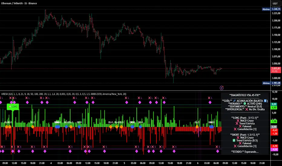
HRESH Pro Dashboard 🦅 HRESH (The Beast) — BTC Specialized System V56.45
This is the fully unlocked, 24-hour version of the HRESH System. It has been mathematically tuned and calibrated specifically for Bitcoin volatility.
🛑 CRITICAL RULES FOR USE (PLEASE READ):
1. STRICT ASSET SELECTION:
BTC (Bitcoin): This is the primary asset for this indicator.
ETH (Ethereum): Allowed ONLY on the 15-Minute timeframe.
❌ DO NOT USE on other assets (Forex, Altcoins, Stocks). The internal logic is unique to BTC/ETH structure.
2. TIMEFRAME STRATEGY:
⏱️ 1 MINUTE (Daily Operations): Use this for intraday scalping.
⏱️ 15 MINUTES (Sniper Mode): Use this for Swing Trading. Expect only 1 or 2 high-precision signals PER MONTH. This mode requires extreme patience.
❌ OTHER TIMEFRAMES: Do not operate. The calculations will be incorrect.
🌍 TRADING SESSIONS & VOLUME: While this version functions 24 hours a day, I strongly advise AGAINST trading during low-volume hours (such as late Asian session or weekends).
✅ RECOMMENDED: London & New York Sessions.
⚠️ HIGH RISK: Trading off-hours increases the risk of market manipulation and fakeouts.
🔴🔴🔴 RISK DISCLAIMER & WARNING 🔴🔴🔴
YOU ARE RESPONSIBLE FOR YOUR CAPITAL. This indicator is a powerful analytical tool, but it does not guarantee profits.
MARKET RISK: Trading cryptocurrency involves substantial risk of loss and is not suitable for every investor.
NO FINANCIAL ADVICE: Always manage your risk properly. If you trade outside the recommended hours or assets, you accept 100% of the risk.
Trade wisely and respect the algorithm.
By Lendrush Margaryan