Auto Trendline PRO [KEKG]Auto Trendline PRO (KEKG)
Auto Trendline PRO is an automatic trendline indicator that dynamically adapts to your chart timeframe. It detects real market structure using optimized pivot settings and draws clean bullish and bearish trendlines in real time.
This indicator is designed for traders who focus on price action, momentum and market structure across multiple timeframes without needing to manually adjust settings.
✅ Automatic pivot adjustment for M5, M15, H1 and H4
✅ Clean and dynamic trendlines
✅ Noise filtering for better structure clarity
✅ Manual pivot override available
✅ Perfect for scalping, intraday and swing trading
Use it to identify true trend direction, structure shifts and high-probability trading zones with precision.
ค้นหาในสคริปต์สำหรับ "trendline"

AI Trend Signal + Auto TrendLines [NinjADeviL]📈 AI Trend Signal + Auto TrendLines
The AI Trend Signal + Auto TrendLines indicator combines smart automatic trendline detection with AI-based market structure analysis to deliver precise real-time entry and exit signals.
🧠 Key Features:
🔹 Automatically detects upward and downward trendlines based on dynamic swing analysis.
🔹 Highlights breakout zones with clear visual alerts.
🔹 Built-in AI engine to forecast early trend reversals.
🔹 Integrates Smart Money Concepts (BOS / CHoCH).
🔹 Dynamic background and color-coded visualization for bullish/bearish trends.
🔹 Works across all timeframes and asset classes — stocks, forex, indices, and crypto.
⚙️ Fully Customizable:
Adjust colors, sensitivity, line styles, and alerts to fit your personal trading strategy and chart style.
💡 Perfect For:
Traders looking to identify high-probability breakouts, trend reversals, and key structural points in the market with clarity and accuracy.

📱 Mobile EMA + Trendline Bias (edegrano)📱 Mobile EMA + Trendline Bias (edegrano) — User Manual
What It Does
This indicator helps you spot strong bullish or bearish trends by combining:
EMA Bias: Using the relationship between EMA 50 and EMA 200 on your chosen timeframe.
Trendline Slope Bias: Using linear regression trendlines on fixed 1-minute, 3-minute, and 5-minute charts.
Signal Dots: Visual buy/sell signals limited to the first 3 occurrences after the last opposite signal to avoid noise.
Summary Table: Shows the current trend bias and final suggestion.
EMA Plots: Shows EMA 50, EMA 100, and EMA 200 lines on your chart.
Tag Label: Displays a small signature tag “📱 edegrano Mobile” on the chart.
Inputs
Input Name Description Default Notes
Custom EMA Timeframe (userTF) Timeframe used to calculate EMAs "1" (1 min) Choose your preferred timeframe (e.g., 1, 3, 5, 15, 60 minutes, etc.)
Show EMAs on Chart (showEMA) Toggle EMA lines visibility true Show or hide EMA 50, 100, and 200 lines
Linear Regression Length (regLen) Length of bars used in regression 20 Adjusts sensitivity of regression trendlines (lower = more responsive)
Show EMA Bias Row (showRowEMA50) Show/hide EMA bias row in the table true Display the EMA 50 > EMA 200 bias status in table
Show Trendline Bias Row (showRowTrend) Show/hide trendline slope row in table true Display the trendline slope bias status in table
How to Use
Set Your Timeframe:
Choose the timeframe for EMA calculations (userTF) depending on your trading style.
Scalpers might use 1-5 minute charts.
Day traders might choose 5-30 minutes.
Swing traders could go 1 hour or more.
Watch the EMA Lines:
EMA 50 (blue), EMA 100 (black), and EMA 200 (red) are plotted on your chart.
These lines help you visualize trend direction and momentum.
Understand the Bias Conditions:
EMA Bias:
Bullish: EMA 50 > EMA 200
Bearish: EMA 50 < EMA 200
Trendline Slope Bias:
Calculated on fixed 1m, 3m, and 5m charts.
Bullish if slope of all 3 regression lines is up (current value > previous).
Bearish if slope of all 3 regression lines is down.
Look for Signal Dots:
Green (lime) dots below bars: Strong Buy signals (first 3 occurrences only after last sell).
Red dots above bars: Strong Sell signals (first 3 occurrences only after last buy).
This limitation helps reduce noise from too many signals.
Check the Table (Bottom Left):
Shows EMA bias and trendline slope status.
Displays overall final suggestion:
Strong Buy 💎
Strong Sell 💎
Mixed / Neutral
Tag Label:
A small label "📱 edegrano Mobile" appears on the chart for easy identification.
Tips & Best Practices
Adjust Regression Length (regLen):
Lower values (e.g., 15-20) react faster but may generate false signals.
Higher values (30-50) smooth noise but react slower — better for longer-term trades.
Combine with Other Indicators:
Use volume, candlestick patterns, or support/resistance to confirm signals.
Don’t Trade Against the Signal:
Avoid entering buy trades during a “Strong Sell” phase and vice versa.
Monitor Multiple Timeframes:
Consider confirming trends on higher timeframes.
Parameter Suggestions by Trading Style
Style EMA Timeframe Regression Length (regLen)
Scalping 1 min 15 - 20
Day Trading 5 - 15 min 20 - 30
Swing Trading 1 hour or higher 30 - 50
Position Trading 4 hour, Daily, Weekly 50 - 100

📱 Mobile EMA + Trendline Bias (edegrano)📱 Mobile EMA + Trendline Bias (edegrano) — User Manual
Purpose
This indicator provides a simplified, mobile-friendly overview of trend bias using EMA and multi-timeframe regression trendline confluences, plus plots EMA lines and a small info table on the chart.
Inputs Explained
Input Name Description
Custom EMA Timeframe The timeframe on which the EMA 50 and EMA 200 calculations are based (e.g., 1, 3, 5 minutes). This lets you choose which timeframe to analyze EMA trend bias.
Show EMAs on Chart Toggle to show or hide EMA 50 (blue) and EMA 200 (red) lines on your chart.
Regression Length The length (number of bars) used for calculating the linear regression trendlines on fixed 1m, 3m, and 5m timeframes. Lower values make trendlines more reactive, higher values smooth out noise.
Show EMA 50 Bias Row Show or hide the EMA 50 vs EMA 200 bias row in the info table.
Show Trendline Slope Row Show or hide the multi-timeframe trendline slope bias row in the info table.
What It Shows
EMA Lines: EMA 50 (blue) and EMA 200 (red) based on your selected timeframe.
Trendline Slopes: Using linear regression on 1-minute, 3-minute, and 5-minute charts to gauge short-term trend direction.
Info Table (Bottom Left):
EMA 50 > EMA 200 status on your selected timeframe (Bullish/Bearish)
Trendline slope bias combining the 3 fixed timeframes (Bullish/Bearish/Neutral)
Final Suggestion showing overall bias:
Strong Buy 💎 if both EMA and trendline biases are bullish
Strong Sell 💎 if both are bearish
Mixed / Neutral otherwise
Tag on Chart Corner: Displays “📱 edegrano Mobile” label for quick identification.
How To Use
Set the Custom EMA Timeframe:
Choose a timeframe that fits your trading style (e.g., 1m for scalping, 5m for day trading).
Adjust Regression Length:
For faster signals, lower the regression length (e.g., 15).
For smoother, less noisy signals, increase it (e.g., 30 or higher).
Toggle EMA Lines Display:
Show or hide EMA lines based on your preference for chart clarity.
Use the Info Table:
Quickly glance at EMA and trendline bias across timeframes for confluence confirmation.
Interpret the Final Suggestion:
Follow “Strong Buy” or “Strong Sell” signals for potential entry points. If “Mixed / Neutral,” wait for stronger confirmation.
Suggested Parameters by Trading Style
Style EMA Timeframe Regression Length Notes
Scalping 1 min 15-20 Responsive, fast reaction to price
Day Trading 3-5 min 20-30 Balanced sensitivity
Swing Trading 15-30 min 30-50 Smoother trend detection
Position Trading 1 hr+ 50-100 Very smooth, low noise
Tips
Combine this indicator with volume or other indicators for stronger confirmation.
Use the EMA lines on chart visually to confirm trend direction.
The info table updates in real-time, making it easy for quick decisions on mobile.
Adjust inputs and observe how the final suggestion changes to tune for your asset and timeframe.

Auto Trendlines with Break AlertsIdentify the two most recent significant swing highs and swing lows based on a customizable pivot length.
Draw trendlines extending from these points.
Provide an optional visual signal (a small diamond on the chart) and a alertcondition for sound/push notifications when a trendline is broken.
Configure: Once the indicator is on your chart, you can click on the gear icon (⚙️) next to its name to adjust the settings. You will see a checkbox to enable/disable alerts and a slider to change the pivot length.
Configuring Alerts in TradingView
The alertcondition lines in the code allow you to set up official TradingView alerts for sound and push notifications.
Create an Alert: Click the clock icon (⏰) on the right-side toolbar of your TradingView chart.
Set the Condition: In the "Condition" field, select the name of the indicator: "Auto Trendlines with Break Alerts".
Choose the Alert Type: A second dropdown will appear. Select either "High Trendline Broken" or "Low Trendline Broken" to specify which break you want to be alerted for.
Select Notification Options: In the "Notifications" section, you can check the boxes for "Play sound," "Send email," "Send push notification," etc.
Create the Alert: Click "Create" to save your alert.
MTF Stochastic Trendline Drawing Trendlines Using Stochastic on Multi-Timeframes (MTF)
Instead of drawing trendlines directly on price charts, this method focuses on drawing trendlines on the Stochastic Oscillator (%K line) to analyze momentum trends across different timeframes.
The Stochastic Oscillator measures momentum — how strong or weak price movements are. By analyzing its shape and direction across multiple timeframes, and drawing trendlines on the %K line, you can better understand potential market reversals, continuation points, or breakout signals.

Historical Volatility with HV Average & High/Low Trendlines
### 📊 **Indicator Title**: Historical Volatility with HV Average & High/Low Trendlines
**Version**: Pine Script v5
**Purpose**:
This script visualizes market volatility using **Historical Volatility (HV)** and enhances analysis by:
* Showing a **moving average** of HV to identify volatility trends.
* Marking **high and low trendlines** to highlight extremes in volatility over a selected period.
---
### 🔧 **Inputs**:
1. **HV Length (`length`)**:
Controls how many bars are used to calculate Historical Volatility.
*(Default: 10)*
2. **Average Length (`avgLength`)**:
Number of bars used for calculating the moving average of HV.
*(Default: 20)*
3. **Trendline Lookback Period (`trendLookback`)**:
Number of bars to look back for calculating the highest and lowest values of HV.
*(Default: 100)*
---
### 📈 **Core Calculations**:
1. **Historical Volatility (`hv`)**:
$$
HV = 100 \times \text{stdev}\left(\ln\left(\frac{\text{close}}{\text{close} }\right), \text{length}\right) \times \sqrt{\frac{365}{\text{period}}}
$$
* Measures how much the stock price fluctuates.
* Adjusts annualization factor depending on whether it's intraday or daily.
2. **HV Moving Average (`hvAvg`)**:
A simple moving average (SMA) of HV over the selected `avgLength`.
3. **HV High & Low Trendlines**:
* `hvHigh`: Highest HV value over the last `trendLookback` bars.
* `hvLow`: Lowest HV value over the last `trendLookback` bars.
---
### 🖍️ **Visual Plots**:
* 🔵 **HV**: Blue line showing raw Historical Volatility.
* 🔴 **HV Average**: Red line (thicker) indicating smoothed HV trend.
* 🟢 **HV High**: Green horizontal line marking volatility peaks.
* 🟠 **HV Low**: Orange horizontal line marking volatility lows.
---
### ✅ **Usage**:
* **High HV**: Indicates increased risk or potential breakout conditions.
* **Low HV**: Suggests consolidation or calm markets.
* **Cross of HV above Average**: May signal rising volatility (e.g., before breakout).
* **Touching High/Low Levels**: Helps identify volatility extremes and possible reversal zones.
XGBoost Approximation Indicator with HTF Filter Ver. 3.2XGBoost Approx Indicator with Higher Timeframe Filter Ver. 3.2
What It Is
The XGBoost Approx Indicator is a technical analysis tool designed to generate trading signals based on a composite of multiple indicators. It combines Simple Moving Average (SMA), Relative Strength Index (RSI), MACD, Rate of Change (ROC), and Volume to create a composite indicator score. Additionally, it incorporates a higher timeframe filter (HTF) to enhance trend confirmation and reduce false signals.
This indicator helps traders identify long (buy) and short (sell) opportunities based on a weighted combination of trend-following and momentum indicators.
How to Use It Properly
Setup and Configuration:
Add the indicator to your TradingView chart.
Customize input settings based on your trading strategy. Key configurable inputs include:
HTF filter (default: 1-hour)
SMA, RSI, MACD, and ROC lengths
Custom weightings for each component
Thresholds for buy and sell signals
Understanding the Signals:
Green "Long" Label: Appears when the composite indicator crosses above the buy threshold, signaling a potential buy opportunity.
Red "Short" Label: Appears when the composite indicator crosses below the sell threshold, signaling a potential sell opportunity.
These signals are filtered by a higher timeframe SMA trend to improve accuracy.
Alerts:
The indicator provides alert conditions for long and short entries.
Traders can enable alerts in TradingView to receive real-time notifications when a new signal is triggered.
Safety and Best Practices
Use in Conjunction with Other Analysis: Do not rely solely on this indicator. Combine it with price action, support/resistance levels, and fundamental analysis for better decision-making.
Adjust Settings for Your Strategy: The default settings may not suit all markets or timeframes. Test different configurations before trading live.
Backtest Before Using in Live Trading: Evaluate the indicator’s past performance on historical data to assess its effectiveness in different market conditions.
Avoid Overtrading: False signals can occur, especially in low volatility or choppy markets. Use additional confirmation (e.g., trendlines or moving averages).
Risk Management: Always set stop-loss levels and position sizes to limit potential losses.
Ehlers Instantaneous Trendline ATR LevelsOverview
This sophisticated technical analysis tool merges John Ehlers' cutting-edge Instantaneous Trendline methodology with a dynamic ATR-based bands system. The indicator is designed to provide traders with a comprehensive view of market trends while accounting for volatility, making it suitable for both trending and ranging markets. Works on all timeframes and chart types.
Key Features in Detail
1. Ehlers Instantaneous Trendline Implementation
- Advanced algorithm that reduces lag typically associated with moving averages
- Built-in volatility filtering system to minimize false signals
- Adaptive to market conditions through dynamic calculations
- Real-time trend direction identification
2. Multi-layered ATR Band System
- Hierarchical band structure with 18 total bands (9 upper, 9 lower)
- Color-coded visualization system:
Upper bands: Red gradient (darker = further from trendline)
Lower bands: Green gradient (darker = further from trendline)
Central trendline: Yellow for optimal visibility
- Customizable multipliers for each band level
- Independent visibility controls for each band
Configuration Options
Trendline Settings:
- Lower values: More responsive to price changes and faster reacting to break in ATR filter
- Higher values: Smoother trendline with less noise and slower reacting to break in ATR filter
ATR Configuration:
Period: Customizable from 1 to any positive integer
- Longer periods: More stable volatility measurement
- Shorter periods: More reactive to recent volatility changes
Filter Multiplier: Fine-tune volatility filtering
- Higher values: More filtered signals leading to less shift in bands
- Lower values: More sensitive to price movements leading to more band shifts
Practical Applications
1. Trend Analysis
Use the central trendline for primary trend direction
Monitor band crossovers for trend strength confirmation
Track price position relative to bands for trend context
2. Volatility Assessment
Band spacing indicates current market volatility
Width between bands helps identify consolidation vs. expansion phases
Price Extremes
3. Support and Resistance
Each band acts as a dynamic support/resistance level
Multiple timeframe analysis possible adjusting for different timeframe ATR

Linear Regression Trendline - Log, R-Squared, Dynamic RangeDescription:
This Pine Script tool is specifically crafted for in-depth technical analysis, integrating a logarithmic regression trendline with standard deviation (STDV) channel bands and the R-squared coefficient of determination. This sophisticated tool is tailored to provide a nuanced perspective on trend dynamics and volatility, particularly suitable for markets where changes are exponential rather than linear.
Key Features:
Logarithmic Regression Trendline: Uniquely employs a logarithmic approach to regression analysis, ideal for data that grows exponentially. This method emphasizes proportional changes and offers a more accurate fit for certain types of financial data.
STDV Channel Bands: Incorporates channel bands set at one or more standard deviations from the regression line. These bands offer insights into the volatility and relative price movements, aiding in the identification of potential buy and sell zones.
R-squared Coefficient: This tool differentiates itself by focusing on the R-squared coefficient of determination rather than Pearson's correlation coefficient. The R-squared value measures the proportion of variance in the dependent variable that is predictable from the independent variable, offering a more precise evaluation of the trendline’s effectiveness.
Flexible Period Settings: Unlike traditional tools, this script allows users to specify exact start and end points for the trendline analysis, either through direct date selection or by choosing specific bars. This flexibility facilitates precise modifications and adaptations to various analytical needs.
Interactive Usability: Features interactive capabilities allowing users to manually adjust the coordinates of the trendline’s start and end points during active sessions. This feature ensures that analysts can dynamically respond to market movements and adjust their analyses in real time.
Logarithmic Scaling: Specifically designed for logarithmic scaling, this tool is adept at handling data where growth rates are multiplicative, making it exceptionally useful in sectors like cryptocurrencies and rapidly growing stocks.
Usage:
This tool is ideal for traders and financial analysts who deal with high growth markets or any datasets where growth is exponential rather than linear. The focus on the R-squared coefficient enhances its utility by providing a critical assessment tool for evaluating the predictive strength and reliability of trends under logarithmic transformations.

[S] Rolling TrendlineThe Rolling Linear Regression Trendline is a sophisticated technical analysis tool designed to offer traders a dynamic view of market trends over a selectable period. This indicator employs linear regression to calculate and plot a trendline that best fits the closing prices within a specified window, either defined by a number of bars or a set period in days, independent of the chart's timeframe.
Key Features:
Dynamic Window Selection: Users can choose the calculation window based on a fixed number of bars or days, providing flexibility to adapt to different trading strategies and timeframes. For the 'days' option, the indicator calculates the equivalent number of bars based on the chart's timeframe, ensuring relevance across various market conditions and trading sessions.
Linear Regression Analysis: At its core, the indicator uses linear regression to identify the trend direction by calculating the slope and intercept of the trendline. This method offers a statistical approach to trend analysis, highlighting potential uptrends or downtrends based on the positioning and direction of the trendline.
Customizable Period: Traders can input their desired period (N), allowing for tailored analysis. Whether it's short-term movements or longer-term trends, the indicator can adjust to focus on specific time horizons, enhancing its utility across different trading styles and objectives.
Applications:
Trend Identification: By plotting a trendline that mathematically fits the closing prices over the chosen period, traders can quickly identify the prevailing market trend, aiding in bullish or bearish decision-making.
Support and Resistance: The trendline can also serve as a dynamic level of support or resistance, offering potential entry or exit points based on the price's interaction with the trendline.
Strategic Planning: With the ability to adjust the calculation window, traders can align the indicator with their trading strategy, whether focusing on intraday movements or broader swings.
Using this indicator with other parameters can widen you view of the market and help identifying trends
Market Dynamics Pro [ChartPrime]ChartPrime Market Dynamics Pro is designed to cater to those traders who are more interested in market structures, price action and fundermentals. Analysing volume, key levels in the market, market phases and multi-timeframe can help a trader build a clearer and more actionable view of the market. ChartPrime performs analysis on data in a unique way therefore attempting to give insights into the market otherwise unseen.
Major Features:
Order blocks: The ChartPrime order blocks provide sleek and clear levels in the market where the price might find support and resistance. It is important to note this data isn't availible currently therefore these are derived from data outside of order books. Order blocks are segmented into 4 sections reflecting the volume at a given levels. Low, Medium, High and very high based on relevant and dynamic averages. This allows a trader to identify how significant a level is in the market in a simpler method. Bearish order blocks have a red color bias and bullish order blocks have a green color bias allowing a trader to identify what type of order block it is. The order blocks also dynamically show the remaining volume at that given level.
Pattern Detection: ChartPrime leverages unique pattern identification methods providing earlier and cleaner chart formations. Patterns are commonly used in trading to assess whether bulls or bears are performing optimally in a market or losing strength. ChartPrime identifies; Ascending wedges, descending wedges, symmetrical Triangles, H&S, iH&S, broadening wedges and double tops/bottoms. Patterns often have associated theory behind them for entries and targets that we suggest a trader covers before using this feature. ChartPrime also allow for the user to adjust where a pattern is drawn from. In pattern theory there are 2 main approaches to drawing a formation; from candle body and candle wick. ChartPrime allows for this to be adjusted by a user and also allow for alerts to be set on these patterns.
MTF SR: Taking into account multi timeframes when trading is a key idea. Having ideas of the larger market moves can provide deeper context when trading. ChartPrime Market Dynamics Pro allows for 3 varying SR plots from 3 varying user desired timeframes. These are graded via pivot analysis and grid analysis. This rank is on a 1-10 scale with 1 being the highest rank and 10 is the lowest.
Market Stucutures : These labels are commonly found and used by the Smart Money community. They denote a break of stucture and a chance of character. BOS are labelled when the price breaks a lower low or higher high (in the trending markets) and a CoC occurs when price breaks a trending market pivot. These break a market into clearer breakouts of price action and can help a trader deduce relevant moves. The indicator allows for the user to adjust the detection length of these structures.
Premium and Discount Zones: Premium and Discount zones are underpinned by a simple piece of logic. A premium zone is taken from a higher swing point and the discount from a lower swing point. Although a very generic approach this can show areas in the market that could see a reaction. An asset being in a discount zone implies the price is undervalued. An asset being in a premium zone implies the asset is overpriced or overextended. These are excellent when used in confluence with other SR methods. These naturally will have a delay as they are derived from swing points in a market but still are extremely relevant levels.
Fair Value Gaps: These are gaps in the market where price has seen a highly volatile move and they are assumed to act as magnets in the market. The price may come back and visit these 'gaps' after the move has occured. These are a common technique now used by traders and added to this toolkit for convinience.
Settings:
Order Blocks: Select the scale of the order blocks displayed
BoS/CoC: Toggle these on/off and adjust the lookback on these market structures
Premium/Discount Zones: Toggle on/off and adjust lookback
Enable FVG: Toggle on/off FVGs
Swing Levels: Enable basic swing levels in market
MTF Support/Resistance: Enable and select the relevant timeframe to obtain MTF SR levels on your chart. Up to 3 timeframes at a time.
Predictive Ranges: Toggle on/off
Trend Lines Detection: Toggle on/off trendlines
Wedge Detection: Adjust how patterns are detected; whether from wick or candle body
Toggles provided for relevant patterns.
Example usecases:
ChartPrime order blocks give a deeper insight into market support and resistance levels. Looking for order blocks labelled with High can indicate this level being a significant support or resistance in the market. Adding in further confluences here can assist further in deciding where the price may see a reaction. Take the screenshot below:
Adding in confluences from other timeframes can also help give a broader view. Using the multi time frame graded frame support and resistance levels we can use these to further assist us in finding significant levels in the market.
ChartPrime also provides breaker blocks. These are still significant levels in the market despite being "broken" prior. These too can be used in a classical manor and act as relevant areas in the market. These are particularly effective when used in confluence with Premium and discount zones. We can see in the example below price sees a strong reaction and bounces at these levels.
Market Dynamics Pro provides a comprehensive toolkit of unique features and mixes in the classical concepts allowing for a cleaner charting experience.
All content and indicators provided by ChartPrime are purely for informational & educational purposes only. Past performance does not guarantee future results.
สคริปต์แบบชำระเงิน

Fibonacci + Support/Resistant + Trendline (Price action)This is opening source code version: Fibonacci + Support/Resistant + Trendline (One of Advanced Price action Analysis).
How it works:
It find entry Long/Short by combining: Fibonacci + Support/Resistant + Trendline
1. Find Impulse wave:
To findind Impulse wave, It uses Pivot High/Low to find Impulse wave. In case find entry Long, If having Pivot High higher Pivot High before, it will draw an Impulse wave.
2. Find entry at Fibonacci levels:
Draw Fibonacci fibonacci retracement from Pivot Low to Pivot High. A Fibonacci retracement forecast is created by taking two extreme points on a chart and dividing the vertical distance by important Fibonacci ratios. 0% is considered to be the start of the retracement, while 100% is a complete reversal to the original price before the move. Horizontal lines are drawn in the chart for these price levels to provide support and resistance levels. Common levels are 23.6%, 38.2%, 50%, and 61.8%
3. Find entry at Support/Resistant Zone:
Support/Resistant Zone drawed from Pivot High before, which price just breaken and return to retest.
4. Find entry at Trendline:
Trendline drawed from Pivot High/Low before, which price just breaken and return to retest.
How do use it:
+ You can customize the thickness of the lines.
+ You can set up an alert when the price touchs important areas.

dize Multi-Timeframe TrendHi Trader,
the "Multi-Timeframe Trend" indicator is one part of our holistic approach to identifying trading setups. It is one of many indcators of our dize indicator package and should always be used in conjunction with the other dize indicators.
💡 What is the MTF Trend indicator?
Our "Multi-Timeframe Trend" indicator allows to view the trend on different timeframes. The multi-timeframe approach helps us to filter out noise from the market and to find the overarching trend. In addition to the trend, the indicator also shows the percentage change for each up and down movement, which is an expression of the trend strength. We use a proprietary approach to identifying turning points, which will be used for trend recognition.
Furthermore, we connect the most recent dominating highs and lows to create two trendlines at the most right side of the chart.
💡 How to use it?
Using the "Multi-Timeframe Trend" indicator is pretty straight forward. After applying it to your chart you will have to adjust the "Resolution" parameter in the settings. Please be aware, that the selected resolution should always be higher than the displayed chart timeframe. Once that is done, the indicator will show the up- and downmovements of the higher timeframe on your chart.
To fine-tune the trendlines, you should first activate the "Show Trendlines" checkbox. After that we will use the "Trendlines Depth" parameter to detect the most optimal trendlines out of the latest "n" up and down turning points.
Let's have a look:
In the above example you can see a daily Bitcoin chart with a weekly MTF Trend configuration. Initially it shows an uptrend. You will notice how the up- and downswing percentages change over time and move into favor of the bears. The red numbers (downmovement) increase, while the green number (upmovement) decrease. It's easy to identify the sentiment shift. Lastly, the indicator shows two trendlines, which both indicate the current direction of the market.
🔓 To gain access to this indicator, please read the signature field.

Price action: Fibonacci + Support/Resistant + TrendlinePrice action: Fibonacci + Support/Resistant + Trendline
In this indicator, I find entry long/Short by combining: Fibonacci + Support/Resistant + Trendline (One of Advanced Price action Analysis).
How it works:
1. Find Impulse wave:
To findind Impulse wave, It uses Pivot High/Low to find Impulse wave. In case find entry Long, If having Pivot High higher Pivot High before, it will draw an Impulse wave.
2. Find entry at Fibonacci levels:
Draw Fibonacci fibonacci retracement from Pivot Low to Pivot High. A Fibonacci retracement forecast is created by taking two extreme points on a chart and dividing the vertical distance by important Fibonacci ratios. 0% is considered to be the start of the retracement, while 100% is a complete reversal to the original price before the move. Horizontal lines are drawn in the chart for these price levels to provide support and resistance levels. Common levels are 23.6%, 38.2%, 50%, and 61.8%
3. Find entry at Support/Resistant Zone:
Support/Resistant Zone drawed from Pivot High before, which price just breaken and return to retest.
4. Find entry at Trendline:
Trendline drawed from Pivot High/Low before, which price just breaken and return to retest.
This is study version. Having strategy version to backtesting.

StDev Based Trendlines - JDAs a second alternatively based trendline script this is the Standard Deviation vesrion.
This script draws trendlines from the pivot points in the price chart.
The angle of the trendlines is determined by (a percentage of) the Standard Deviation.
The angle follows the change in price, compared to the StDev at the moment where the pivot point is detected
The StDev percentage determines if the trendline follows the rate of change of the StDev or a fraction ( value < 100) or a multiple ( value > 100) of that
JD.
#NotTradingAdvice #DYOR
Disclaimer.
I AM NOT A FINANCIAL ADVISOR.
THESE IDEAS ARE NOT ADVICE AND ARE FOR EDUCATION PURPOSES ONLY.
ALWAYS DO YOUR OWN RESEARCH!

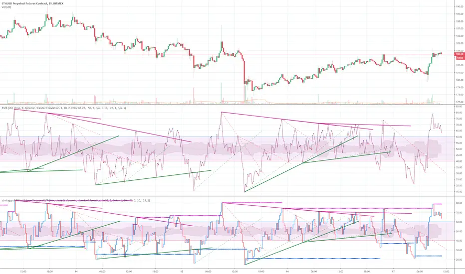
strategy of RSI with trendlines and S/RBefore I go through this chart I want to acknowledge the great programmers who spent much of their time and effort to assist many TV users and traders.
Thank you to LunaOwl for the RSI American lines her script made me realize the need to have trendlines, supports, and resistance on RSI charts.
Also, a copy of Lij_MC code from was taken which had been credited to Duyck. Thank you Duyck.
The BB was copied from morpheus747
As I researched different strategies one strategy seemed to assist the trader for entry and exits. It was the combination of Support and resistance on the RSI. In addition, diagonal lines (Recently introduced in pine script V4) assists in the direction and reversals that may occur. What is supplied is only a graphical representation and no trade entry or exit points are selected.
On the chart you can use;
• RSI line or bar;
• Bollinger High / Low support line;
• Diagonal trend lines. A primary and a secondary group of trendlines; and
• Trendline candle highlighter.
I am hoping people with great skills could assist to develop this to the next level.
I hope this graphical strategy may help until further development. Enjoy.
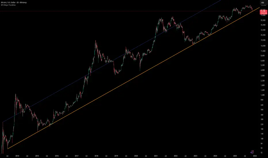
[Algoros] BTC Major Trendline# BTC Major Trendline - Long-Term Bitcoin Trend Analysis
## Overview
BTC Major Trendline is a comprehensive technical analysis tool designed to track Bitcoin's long-term bullish trajectory using historically significant price points. This indicator establishes a primary upward trendline anchored to two major Bitcoin cycle lows, along with optional parallel channels and Fibonacci-based price projections.
## ⚠️ Important Requirements
**This indicator requires a Bitcoin chart with sufficient historical data dating back to at least April 2013.**
**✅ Recommended Charts:**
- `INDEX:BTCUSD` - Bitcoin Index (comprehensive history)
- `BITSTAMP:BTCUSD` - Bitstamp Bitcoin (default setting)
**❌ Will NOT work properly on:**
- Charts with limited history (Like hourly charts)
- Exchanges that launched after 2013
- Altcoin pairs or other cryptocurrencies
If the indicator doesn't display correctly, switch to one of the recommended Bitcoin charts above.
## Key Features
### 📈 Primary Trendline
- Anchored to two historically significant lows:
- **Start Point**: July 6, 2013 - Early Bitcoin accumulation phase
- **End Point**: November 21, 2022 - FTX collapse bottom
- Automatically calculates and extends the trendline based on these anchor points
- Displayed as a solid orange line
### 🔷 Parallel Channel Line (Optional)
- Creates an upper boundary by connecting historical high points:
- April 10, 2013 and June 11, 2017
- Helps identify potential resistance zones and channel breakouts
- Displayed as a blue dotted line for easy distinction
### 🎯 Fibonacci Trendline Multipliers (Optional)
- Seven Fibonacci-based projection lines: **1.6x, 2x, 3x, 5x, 8x, 13x, and 21x**
- Each multiplier creates a parallel trendline above the main trend
- Color-coded from teal to maroon for clear visual separation
- Useful for identifying potential profit-taking zones and long-term price targets
### 📉 Negative Fibonacci Trendlines (Optional)
- Seven division-based support lines: **÷1.6, ÷2, ÷3, ÷5, ÷8, ÷13, and ÷21**
- Projects downward channels below the main trendline
- Displayed in yellow tones for easy identification
- Helps identify extreme oversold conditions and potential bounce zones
## Customization Options
- **Symbol Input**: Track any Bitcoin pair with sufficient history (default: BITSTAMP:BTCUSD)
- **Show/Hide Components**: Toggle parallel line, Fibonacci multipliers, and negative Fibonacci lines independently
- **Line Extension**: Extend lines right, left, both directions, or none
- **Multi-Timeframe Compatible**: View on any timeframe once loaded on a compatible chart
## How to Use
1. **Setup**: First, open a Bitcoin chart with sufficient history (INDEX:BTCUSD or BITSTAMP:BTCUSD recommended)
2. **Trend Confirmation**: The main orange trendline represents the long-term bullish trajectory. Price staying above this line suggests the bull market remains intact.
3. **Channel Trading**: Use the parallel line (blue dotted) as a potential upper boundary for the long-term channel.
4. **Price Targets**: Enable Fibonacci multiplier lines to identify ambitious long-term price targets during bull runs. Higher multipliers (13x, 21x) represent parabolic extension zones.
5. **Support Identification**: Enable negative Fibonacci lines to spot potential support zones during corrections or bear markets.
6. **Risk Management**: Breaking below the main trendline could signal a shift in long-term trend, warranting caution.
## Technical Implementation
- Uses `request.security()` to fetch precise daily prices at historical timestamps
- Requires access to Bitcoin price data from April 2013 onwards
- Calculates slope dynamically based on anchor points
- All lines update in real-time as new price data emerges
- Efficient rendering system minimizes performance impact
## Best Used For
✅ Long-term Bitcoin investors and HODLers
✅ Identifying major trend direction
✅ Setting realistic long-term price targets
✅ Spotting potential support/resistance zones
✅ Multi-timeframe analysis (on compatible charts)
✅ Educational purposes (understanding logarithmic growth)
## Troubleshooting
**Lines not appearing?**
- Ensure you're viewing INDEX:BTCUSD or BITSTAMP:BTCUSD
- Check that the chart has data back to April 2013
- Verify the symbol input matches your chart
- Try switching to a daily or weekly timeframe first
Mitsos4 RSI + BB + Dispersion + Trendlines + VIX Fix Mitsos4 RSI + BB + Dispersion + Trendlines + VIX Fix
This powerful custom indicator combines two analytical tools into one view:
RSI-based Bollinger Bands with Dispersion and the Vix Fix volatility spike detector.
It is designed for traders who want early volatility signals and precision RSI insights, all in a single pane.
🧩 What's Included:
✅ 1. RSI + BB (EMA) + Dispersion
RSI-Based Bollinger Bands: Tracks the RSI with Bollinger Bands using an EMA as the basis.
Dispersion Zone: A buffer zone around the moving average band for more sensitive overbought/oversold detection.
Dynamic RSI Coloring:
🟢 Green: RSI breaks above the dispersion zone.
🔴 Red: RSI breaks below the dispersion zone.
🟡 Yellow: RSI inside the zone (neutral).
Trendlines at RSI levels: 40 (green), 50 (yellow), 60 (red).
Alerts when RSI crosses dispersion zones.
✅ 2. CM_Williams_Vix_Fix
Designed to simulate VIX-like volatility spikes on non-VIX instruments.
Detects potential market bottoms by measuring price deviation from recent highs.
Includes:
Bollinger Band range on WVF.
Percentile high/low zones to detect significant volatility moves.
Histogram plot of WVF for quick visual alerts.
Color-coded spikes (green when above upper thresholds).
⚙️ User Controls:
Adjustable RSI, Bollinger Band, and dispersion settings.
Toggle options for:
Viewing high/low VIX percentiles.
Showing standard deviation bands for WVF.
Custom trendline display levels at RSI key areas.
📌 Best Use Cases:
Detect early market reversals and volatility spikes.
Combine RSI strength with volatility-based bottom signals.
Layer dispersion-based logic on top of classic RSI strategies.

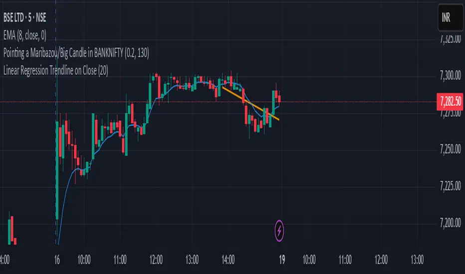
Linear Regression Trendline on Close
This indicator draws a linear regression trendline that connects the closing prices of the last N candles, where N is a user-defined input.
🔹 Key Features:
Uses least-squares linear regression to fit a straight line to recent closes
Automatically adapts to any timeframe (5min, 1h, daily, etc.)
Input lets you select how many recent candles to include
Helps identify short-term trend direction and momentum
🔸 How to Use:
Set the "Number of Candles" input to choose how far back the regression line should look
The line updates in real time as new candles form
Use it to gauge short-term bias, or combine with support/resistance/zones for confirmation
🧠 Tip: Increase the number of candles for smoother trends; decrease for more reactive trendlines.
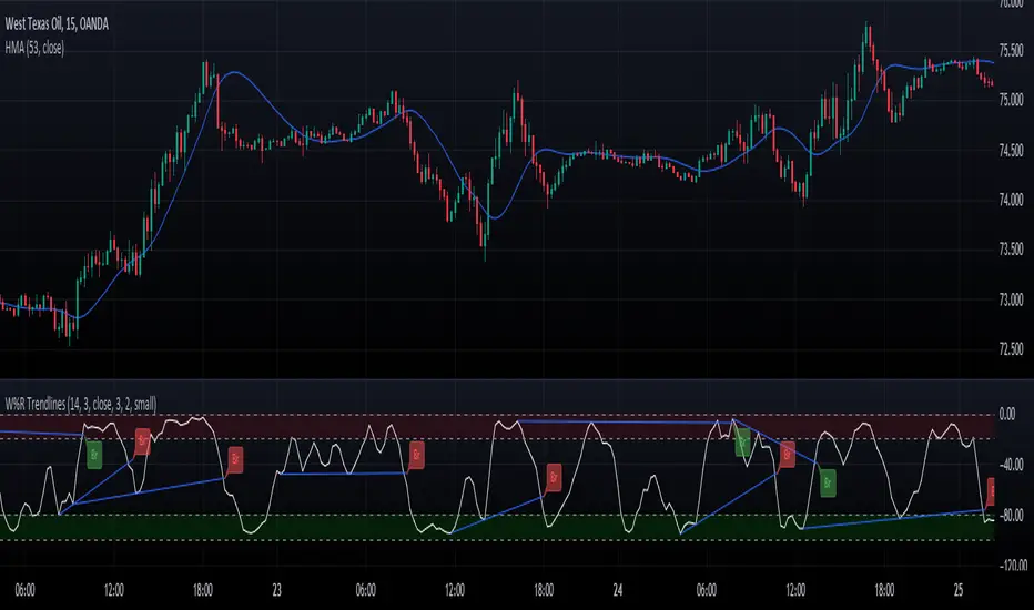
Williams Percent Range with Trendlines and BreakoutsHere is my "Williams Percent Range with Trendlines and Breakouts" indicator, a simple yet powerful tool for traders. This indicator combines the classic Williams %R oscillator, which helps identify overbought and oversold levels, with added trendlines for easier trend analysis at a glance.
It's designed to make spotting potential breakouts easier by drawing attention to significant price movements. With customizable settings for the Williams %R period and trendline sensitivity, it's a flexible tool for various symbols and trading styles.
Whether you're looking to refine your trading strategy or just need a clearer view of market trends, this indicator should offer a straight forward approach to hopefully enhance your trading decisions.
Disclaimer: This indicator is intended for educational and informational purposes only. Always conduct your own research and analysis before making trading decisions.
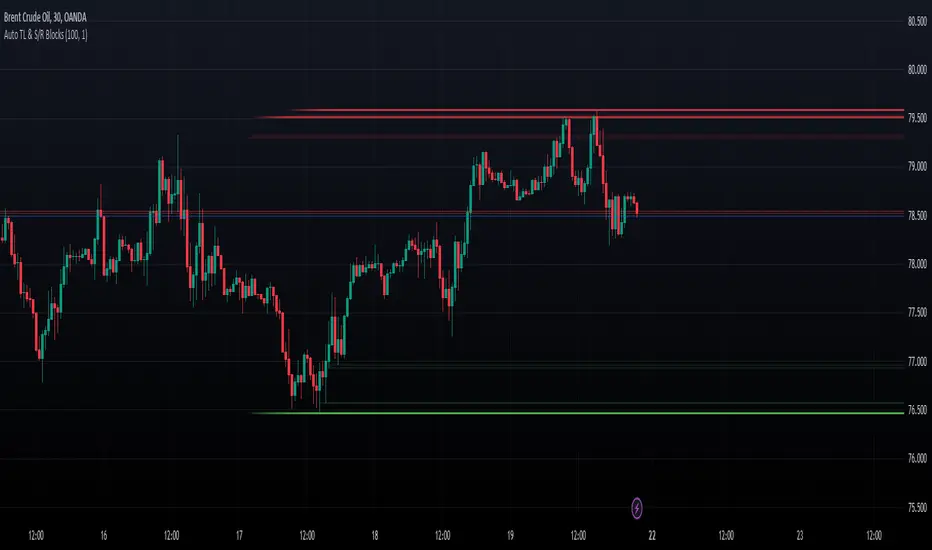
Dynamic Auto Trendline and S/R BlocksAuto TL & S/R Blocks by Nostalgic_92
This powerful TradingView indicator automatically identifies trendlines and support/resistance levels with dynamic transparency blocks, helping traders make informed decisions. Easily customizable, it offers adjustable parameters for lookback periods and transparency, allowing you to adapt it to your trading style.
Key Features:
Lookback Period for Extremes: The lookback period for identifying highs and lows is adjustable, allowing you to fine-tune the indicator to suit your trading strategy.
Maximum Transparency: Set the maximum transparency level to control the visibility of dynamic blocks, ensuring they adapt to market volatility.
Trend Block Color: Choose your preferred color for trendline blocks to visually highlight trend direction.
Support/Resistance Block Color: Customize the color for support and resistance blocks, making them easily distinguishable on your chart.
How it Works:
This indicator calculates the highest high and lowest low over the specified lookback period. It then draws dynamic blocks on your chart with changing transparency levels, depending on the proximity of the current price to these extremes. This visual representation helps you identify trend changes and key support/resistance levels at a glance.
Usage:
Use it in conjunction with your existing trading strategy to confirm trends and support/resistance levels.
Adjust the input parameters to match your preferred trading style and time frame.
Enhance your trading experience with the Auto Trendlines and Support/Resistance with Dynamic Blocks indicator. It's a valuable tool for traders seeking an edge in the market.
Disclaimer: This indicator is intended for educational and informational purposes only. Always conduct your own research and analysis before making trading decisions.
[TT] Entry ProIndicators doesnt make money, it is the concept behind the indicator that makes money. Please read and understand before contact. This is not for beginners or people who are looking for Buy Sell signals. Purely for those who can understand the concept of confluence.
This indicator will help you identify the Entry candle with confluence of SMC or Pivots or any other analysis that you use.
Rules to follow :-
1. Identify Support Resistance (Smart Money Concept), Pivots, Trendlines (Choice is Yours)
2. Once Identified S&R Look for Bearish Candle at resistance or Bullish signal at Support, mark the areas
NSE:NIFTY
3. At Support as shown above in examples if the pink candle or the confirmation candle doesnt close break the support but closes above the support area, we do not consider it as break down. Some time breakdown happens and then at retest we get the bearish signal, that will be a good entry.
4. Like wise at resistance if you cant see a bullish signal breaking the resistance area, we do not consider break out. Same as above sometimes we get a signal after breakout and while retesting. Bullish SIgnal At support example is given below
NSE:BANKNIFTY
5. Enter in to a trade right when you get the signal use less lot size when you do and once you see price coming in to the range of the colored candle keep accumulating more at OHLC areas, first at high of colored candle and then close and then HL2 areas likewise, this helps to reduce your SL.
Note:
Areas to remember and not to get confused. At Important levels (Support or Resistance) once you get a relavent signal while retesting that signal you get a counter signal do not get confused by that and exit the trade. once you enter a trade you have to remain there as long as your SL is not hit. Remember that You have to use this retest candles to enter in to a trade, but not to get scared.
How to Use this in Swing or Long term trading? Futures or Stocks !!!
Look at the setup below Use weekly Chart to analyze for investment. In the below chart you can see there is a breakout of Swing high with candle and then a retest happened Twice but that area is intact. The best strategy to consider confluence is SMC. Thats what my perfect Setup is. You can use Orderblock to see if that orderblock is valid or not. Below you can see NSE:BANKNIFTY
Few more Stocks for Example. NSE:AXISBANK
BITSTAMP:BTCUSD
OANDA:EURUSD
Strictly Not assuring any 100% results. You need to least be confident on one concept of trading to aquire results.
