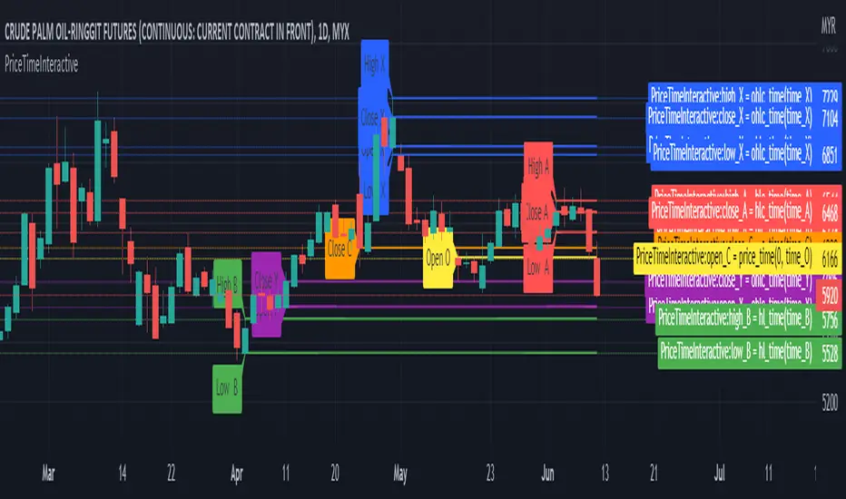
PriceTimeInteractive█ OVERVIEW
This library was intended to Get price of given time.input
█ CREDITS
Credits to TradingView for CAGR Custom Range.
█ FUNCTIONS
ohlc_time()
: Get OHLC price of given time.input
Parameters:
: : Time (t) must be using time.input
Returns: : OHLC
hlc_time()
: Get HLC price of given time.input
Parameters:
: : Time (t) must be using time.input
Returns: : HLC
hl_time()
: Get HL price of given time.input
Parameters:
: : Time (t) must be using time.input
Returns: : HL
ค้นหาในสคริปต์สำหรับ "N+credit最新动态"
Pivot Points Standard Higher Timeframe█ OVERVIEW
This indicator was intended as educational purpose only and alternative way to write pine script in version 5 for Pivot Points Standard.
█ CREDITS
Credits to TradingView for original built-in source code.
█ FEATURES
Display price or percentage.
Change color for labels and lines.
█ USAGE EXAMPLES

[HELPER] Math Constant Helper█ OVERVIEW
This indicator is to show constant in table using built-in math name space, coded in latest Pine Script version 5.
█ CREDITS
Credits to PineCoders.
█ FEATURES
- Display table by changing table position, font size and color.

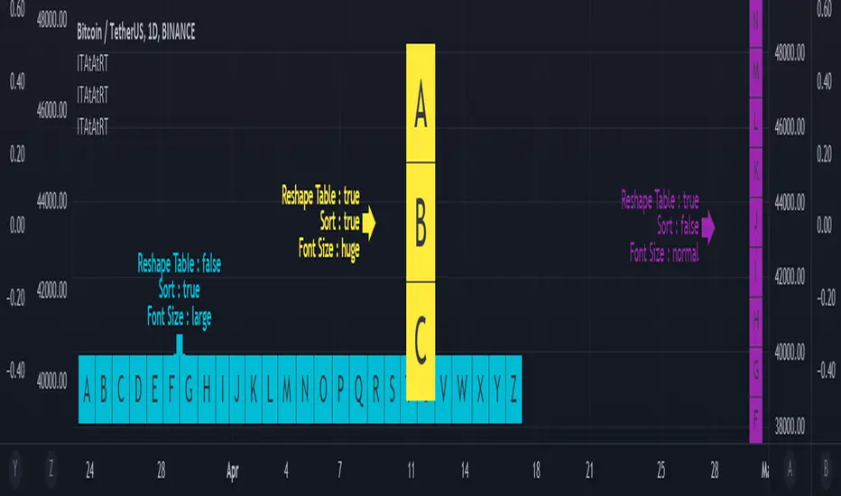
Input Text Area to Array then Reshape Table█ OVERVIEW
Simple method to convert from input.text_area to array using str.split.
Reshape table using switch, not necessary must use matrix.reshape.
Might be useful pine script to replace input.symbol.
█ FEATURES
Table can positioned by any position and font size can be resized.
Reshape table and sorting array if necessary.
█ CREDITS
Credits to TradingView for new update of input.text_area.
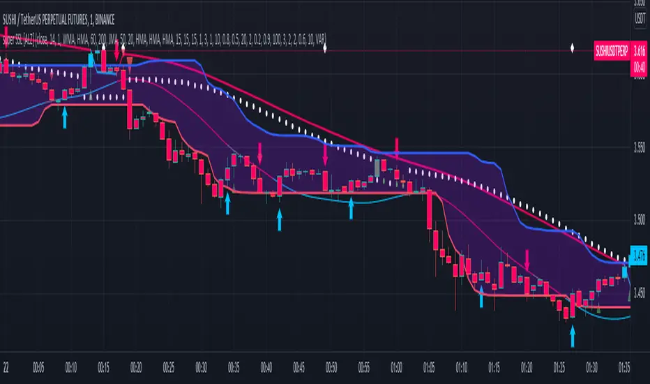
super SSL [ALZ]This script is designed and optimized for MULTI TIME
by Ali Zebardast (ALZ)
1.in part of ssl
Original Version credits to Mihkel00
Actual Version i just set alerts and change the parameters for BTCUSDT 1min Chart.
He designed for daily time. I tried to optimize 1 min time-frame .
And fix the errors with OTT
"This script has a SSL / Baseline (you can choose between the SSL or MA), a secondary SSL for continiuation trades and a third SSL for exit trades.
Alerts added for Baseline entries, SSL2 continuations, Exits.
Baseline has a Keltner Channel setting for "in zone" Gray Candles
Added "Candle Size > 1 ATR" Diamonds from my old script with the criteria of being within Baseline ATR range."
2.in part of Range
two Filter Buy and Sell for 3min
Wait For Bar close
ssl2 :Be under the candle for buy
and The bar color must confirm the order of purchase (Blue)
3.in part of OTT
when candles close over HOTT, means an UPTREND SIGNAL
and to Fuchia when candles begin closing under LOTT line to indicate a DOWNTREND SIGNAL.
FLAT ZONE is highlighted also to have the maximum concentration on sideways market conditions.
There are three quantitative parameters in this indicator:
The first parameter in the OTT indicator set by the two parameters is the period/length.
OTT lines will be much sensitive to trend movements if it is smaller.
And vice versa, will be less sensitive when it is longer.
As the period increases it will become less sensitive to little trends and price actions.
In this way, your choice of period, will be closely related to which of the sort of trends you are interested in.
The OTT percent parameter in OTT is an optimization coefficient. Just like in the period
small values are better at capturing short term fluctuations, while large values
will be more suitable for long-term trends.
The final adjustable quantitative parameter is HIGHEST and LOWEST length which is the source of calculations.
Credits go to:
SSL Hybrid www.tradingview.com
HIGH and LOW OTT : www.tradingview.com
Range Filter www.tradingview.com
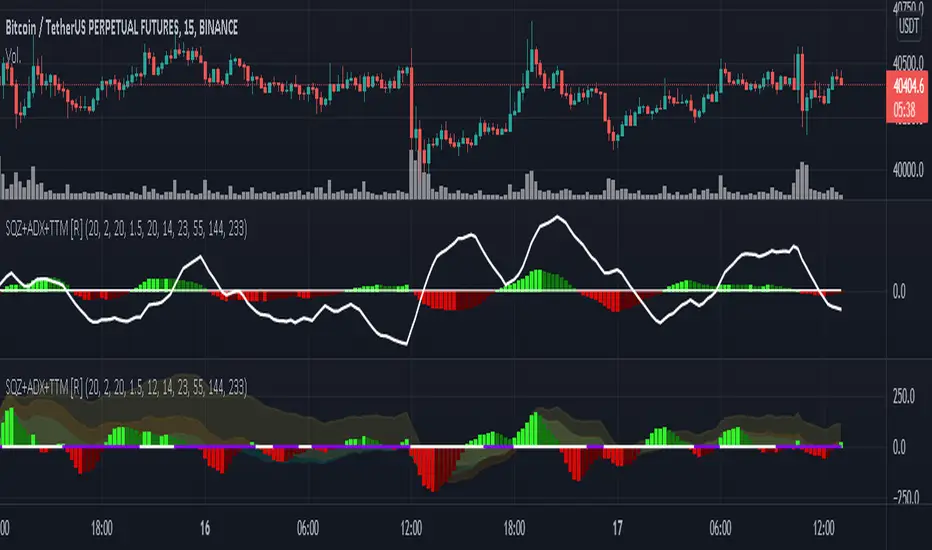
Squeeze M + ADX + TTM (Trading Latino & John Carter) by [Rolgui]About this indicator:
This indicator aims to combine two good performing strategies, which can be used separately or together, mainly for investment positions, although it can also be used for intraday trading.
Strategy 1) Squeeze Oscillator and Average Directional Index:
This strategy is taught by Jaime Aibsai, which determines market entries based on reading the direction of the price movement (Directionality of the Oscillator) along with the strength of the Oscillator (Slope of the ADX).
Both tools are configured according to Jaime Abisai's strategy, by default (note that point 23 of the ADX is represented by point 0 on the panel, to make reading easier, its interpretation is not affected). Anyway you can adjust the input data according to your interest.
*You can see this setting in the first panel.
Strategy 2) Squeeze Momentum and Trade The Market Waves:
This strategy can be consulted either in John F. Carter's books or on his website.
This market reading is based on Price Volatility (Bollinger Bands and Keltner Channels interaction) and its Trend (Exponential Moving Averages), showing entries at times when price volatility is low and taking filtering active trend using T.T.M. Waves.
To configure the indicator in the same way that Carter does, it would be enough to turn off the ADX, turn on the Squeeze Momentum signals along with the T.T.M. Waves, and importantly, change the Linear Momentum value to 12 (this configuration can be found in his book).
*You can see this setting in the second panel.
Why this indicator?
I've added and removed the above flags as I needed to query them (which became tedious for me). The main objective of having merged them into one is to make their reading more agile and comfortable and thus improve the decision-making capacity of the trader who wishes to use them.
Credits and Acknowledgments:
I would like to give credits to other authors, for the sections of code that I have used to make this technical indicator. Thanks to @LazyBear, @matetaronna, @jombie and @joren for contributing to the community and keeping their code open. It is priceless!
Feel free to combine and practice your trading with both strategies, personally, they improved my profitability and this is why I recommend researching more about them. I've been using it for crypto investing, let me know if it's worth for you on stock market!
If you have any questions or suggestions you can leave it in the comments!
Greetings!
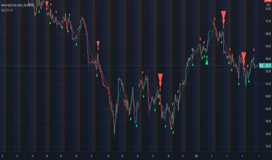
Multiple Timeframe continuity with Crossover Alerts█ OVERVIEW
This Indicator calculates the EMA 9/20 and the RSI with its SMA on multiple timeframes and indicates their crossings. In addition this script alerts the user when crossings appear.
█ USAGE
Use the checkboxes to activate different timeframes. With the dropdown menu you can select the timeframe in minutes.
Furthermroie use the checkboxes to activate different crossovers. At the end of the settings you can find the same options for the RSI.
You can also let the script indicate only the overlapping of both indicator crossovers by using the combination option.
█ KNOWLEDGE
EMA: The ema function returns the exponentially weighted moving average. In ema weighting factors decrease exponentially. It calculates by using a formula: EMA = alpha * source + (1 - alpha) * EMA , where alpha = 2 / (length + 1).
SMA: The sma function returns the moving average, that is the sum of last y values of x, divided by y.
RSI: The RSI is classified as a momentum oscillator, measuring the velocity and magnitude of price movements. Momentum is the rate of the rise or fall in price. The RSI computes momentum as the ratio of higher closes to lower closes: stocks which have had more or stronger positive changes have a higher RSI than stocks which have had more or stronger negative changes.
RMA: Moving average used in RSI. It is the exponentially weighted moving average with alpha = 1 / length.
(Source: TradingView PineScript reference & en.wikipedia.org)
█ Credits
Thanks to @KhanPhelan with his EMA 9/20 trading idea
Credits to TradingView for their RSI function
█ Disclaimer
This is my first Script, any feedback is welcome.
XABCD Harmonic Pattern Custom Range Interactive█ OVERVIEW
This indicator was designed based on Harmonic Pattern Book written by Scott Carney. It was simplified to user who may always used tools such as XABCD Pattern and Long Position / Short Position, which consume a lot of time, recommended for both beginner and expert of Harmonic Pattern Traders. XABCD Pattern require tool usage of Magnet tool either Strong Magnet, Week Magnet or none, which cause error or human mistake especially daily practice.
Simplified Guideline by sequence for Harmonic Pattern if using manual tools :
Step 1 : Trade Identification - XABCD Pattern
Step 2 : Trade Execution - Any manual tools of your choice
Step 3 : Trade Management - Position / Short Position
█ INSPIRATION
Inspired by design, code and usage of CAGR. Basic usage of custom range / interactive, pretty much explained here . Credits to TradingView.
I use a lot of XABCD Pattern and Long Position / Short Position, require 5 to 10 minutes on average, upon determine the validity of harmonic pattern.
Upon creating this indicator, I believed that time can be reduced, gain more confidence, reduce error during drawing XABCD, which helps most of harmonic pattern users.
█ FEATURES
Table can positioned by any postion and font size can be resized.
Table can be display through optimized display or manual control.
Validility of harmonic pattern depends on BC ratio.
Harmonic pattern can be displayed fully or optimized while showing BC ratio validity.
Trade Execution at point D can be displayed on / off.
Stop Loss and Take Profit can be calculated automatically or manually.
Optimized table display based extend line setup and profit and loss setup.
Execution zone can be offset to Point C, by default using Point D.
Currency can be show or hide.
Profit and Loss can be displayed on axis once line is extended.
█ HOW TO USE
Step 1 : Trade Identification - Draw points from Point X to Point C. Dont worry about magnet, point will attached depends on High or Low of the candle.
Step 2 : Trade Execution - Check the validity of BC to determine the validity of harmonic pattern generated. Pattern only generate 1 pattern upon success. Otherwise, redraw to other points.
Step 3 : Trade Management - Determine the current candle either reach Point D or Potential Reversal Zone (PRZ). Check for Profit & Loss once reach PRZ.
█ USAGE LIMITATIONS
Harmonic Patterns only limits to patterns mentioned in Harmonic Trading Volume 3 due to other pattern may have other or different philosophy.
Only can be used for Daily timeframe and below due to bar_time is based on minutes by default.
Not recommended for Weekly and Monthly timeframe.
If Point X, A, B, C and D is next to each other, it is recommend to use lower timeframe.
Automated alert is not supported for this release. However, alert can be done manually. Alert will updated on the version.
█ PINE SCRIPT LIMITATIONS
Known bug for when calculate time in array, causing label may not appeared or offset.
Unable to convert to library due to usage of array.get(). I prefer usage for a combination of array.get(id, 0), array.get(id, 1), array.get(id, 2) into custom function, however I faced this issue during make arrays of label. Index can be simply refered as int, for id, i not sure, already try id refered as simple, nothing happens.
linefill.new() will appeared as diamond box if overused.
Text in box.new() unable to use ternary condition or switch to change color. Bgcolor also affected.
Label display is larger than XABCD tool. Hopefully in future, have function to resize label similar to XABCD tools.
█ IMPORTANTS
Trade Management (Profit & Loss) is calculated from Point A to D.
Take Profit is calculated based on ratio 0.382 and 0.618 of Point A to D.
Always check BC validity before proceed to Trade Management.
Length of XABCD is equal to XAB plus BCD, where XAB and BCD are one to one ratio. Length is measured in time.
Use other oscillator to countercheck. Normally use built-in Relative Strength Index (RSI) and Divergence Indicator to determine starting point of Point X and A.
█ HARMONIC PATTERNS SUPPORTED
// Credits to Scott M Carney, author of Harmonic Trading Volume 3: Reaction vs. Reversal
Alt Bat - Page 101
Bat - Page 98
Crab - Page 104
Gartley - Page 92
Butterfly - Page 113
Deep Crab - Page 107
Shark - Page 119 - 220
█ FAQ
Pattern such as 5-0, perfect XABCD and ABCD that not included, will updated on either next version or new release.
Point D time is for approximation only, not including holidays and extended session.
Basic explaination for Harmonic Trading System (Trade Identification, Trade Execution and Trade Management).
Harmonic Patterns values is pretty much summarized here including Stop Loss.
Basic explanation for Alt Bat, Bat, Crab, Gartley, Deep Crab and Butterfly.
█ USAGE / TIPS EXAMPLES (Description explained in each image)

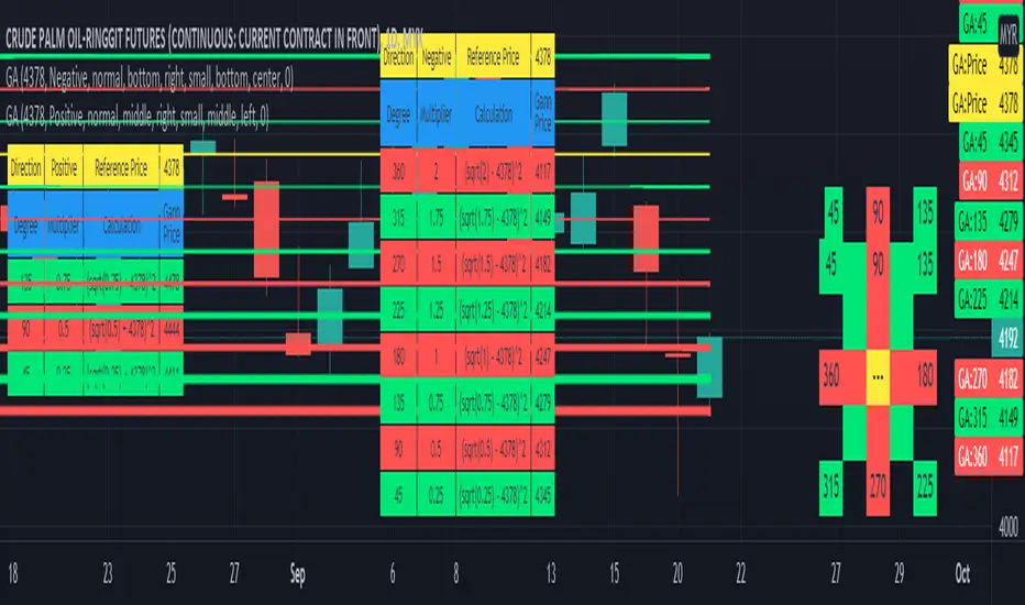
Gann Angle Table Calculator PlotterThis indicator was build upon based on Gann Angle and Gann Multiplier as refered of The Tunnel Thru The Air Or Looking Back From 1940, written by WD Gann .
Credits to FaizHebat for calculation.
Indicator features :
1. Font size from tiny to huge.
2. Table position.
3. Color for cell table and plot can be input or reversed.
4. Plot can be show or hide and also price can be track.
5. Able show currency and decimal price.
6. Gann table and Calculation table can show or hide.
7. Each Gann point can be hide including plot and calculation.
8. For desktop display only, not for mobile.
Pros :
1. Can be used as single or more indicator. (Chart show 2 same indicator with different setup)
Cons :
1. Price must be input before selecting any Gann Point.
FAQ
1. Credits
WD Gann , The Tunnel Thru The Air Or Looking Back From 1940
FaizHebat
2. Code Usage
Free to use for personal usage.
Positive direction with Currency and Decimal
Positive direction with Currency and Decimal
VPA - 5.0 This is a upgraded version of the vpa analysis script which basically implements Volume Spread Analysis (aka Volume Price analysis). It has been rechristened as VPA 5.0 to be inline with version released for Amiboker package so that all future upgrades will go hand in hand. All most all featured of the Amibroker version has been incorporated in this version. Some important additions are as follows
1. A status window for the bar and Trend Description added. No need to plot the trend bands or additional trend Indicator any more.
2. The most important upgrade would be the addition of a Alert window which provides description of the VSA signals. It is also a log window which provides up to 10 last signals
(Credits to Quantnomad for this wonderful piece of code. This feature is an adaptation of his public code)
3. Added facility to plot EMAs / PEMAs with changable parameters
4. Added facility to plot VWAP
5. Facility to switch on and Off the VSA signals. Also tool tip provides description of the signals
6. Facility to plot Resistance and Volume Lines (Credits to @margepadu)
Hope this script will be helpful to everyone. Please do provide your feedback and suggestions for improvements

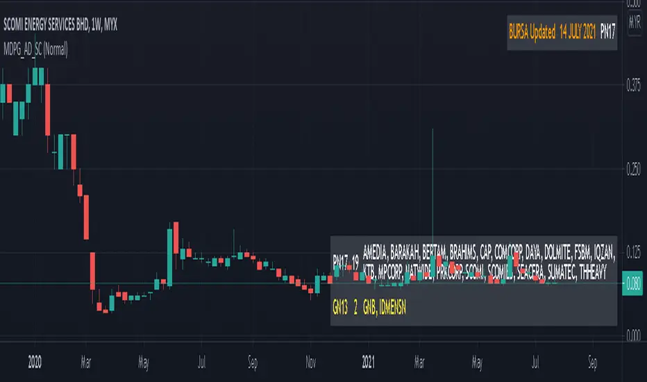
MYX Delisted PN17 GN13 Auto Detect (Source Code)This indicator intended for Malaysia Market only for auto detect delisted companies (PN17, GN13) refer to Bursa Malaysia
Indikator ini adalah untuk pasaran Malaysia sahaja untuk automatik mengenalpasti senarai syarikat terkeluar rujuk kepada Bursa Malaysia
Indicator features :
1. Able to detect stock and warrant.
2. List similar symbol or counter including total.
3. Font size small for mobile app and font size normal for desktop.
4. Show date updated by Bursa Malaysia.
Kemampuan indikator :
1. Boleh mengenal pasti saham dan waran.
2. Senarai simbol atau kaunter yang terlibat termasuk jumlah.
3. Saiz font kecil untuk mobile app dan saiz size normal untuk desktop.
4. Memaparkan tarikh kemaskini oleh Bursa Malaysia.
Date Updated / Tarikh Kemaskini : 14/7/2021
FAQ
1. Credits / Kredit
LucF & PineCoders
2. Code Usage / Penggunaan Kod
Free to use for personal usage but credits are most welcomed.
Not for business / comercial usage, any damage or lialibity are not my resposibility.
Bebas untuk kegunaan peribadi tetapi kredit adalah amat dialu-alukan.
Bukan untuk kegunaan perniagaan / komersil, sebarang kerosakan atau liability adalah di luar tanggungjawab saya.
3. Update Frequency / Frekuensi
Anytime after official update by Bursa Malaysia.
Bila-bila masa selepas kemaskini rasmi oleh Bursa Malaysia
4. Symbol/Counter not showing / Simbol/kaunter tiada
Symbol/counter not longer exist or not yet updated.
Simbol/kaunter telah tersenarai keluar atau belum dikemaskini.
Single layout with font size normal
Satu layout dengan saiz font normal
Double layout with small font size (Left : Stock, Right : Warrant)
Dua layout dengan font saiz normal (Kiri : Saham, Kanan : Waran)
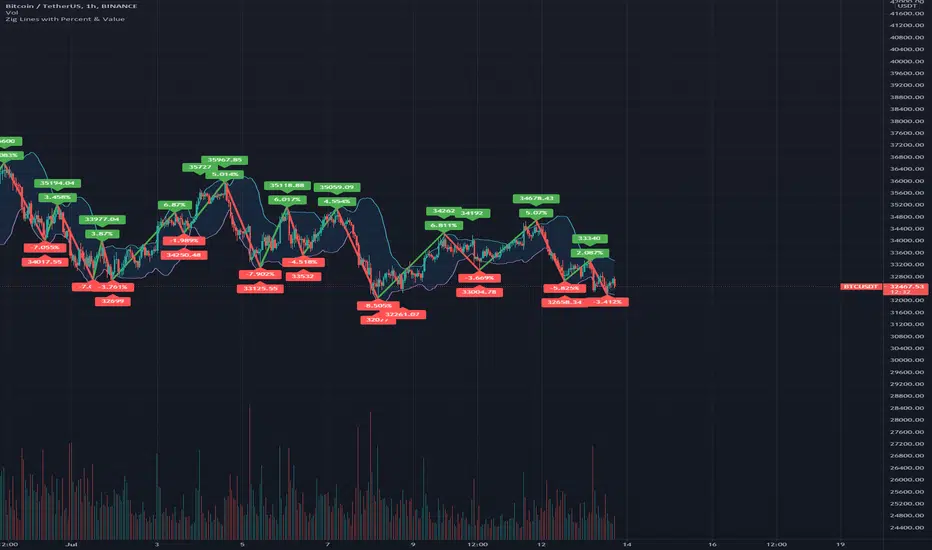
Zig Lines with Percent & ValueOverview, Features, and Usage:
The Zig Lines with Percent & Value is an indicator that highlights the highest and lowest points of the market from pivot points and zigzag lines based on the ZigZag Period setting. By a default value of 13 for the ZigZag Period this works well on Bitcoin or other alt coins on the 1 hour or higher timeframe charts.
What makes this indicator unique is that it draws a green line to signify an uptrend or a red line to signify a down trend. It will also show the percent difference between the previous point/line, for example: If you see a -negative percentage point with a red line drawn to it, then you are looking at a low pivot point and then as the green line is drawn to a +positive percentage value the percentage you see is the difference between the two points. This is great to see a trend reversal as you can look at previous pivot points and notice about how far the price moves before it changes direction (trend reversal).
There is an invisible EMA line that is used to assist with coloring the negative vs positive values. The value above or below the percentage is the lowest or highest price at that pivot point . The display of the price at the pivot point depends on your ZigZag Period setting and the timeframe of your chart.
Added Bollinger Bands as it fits perfectly with the visuals of the Zig Lines & Pivots.
Usage of Bollinger Bands:
~As the price or candle gets close to the top or bottom of the Bollinger band it can give you a better confirmation that the pivot location is at it's final place, and the trend is more likely to switch directions.
It’s important to know this indicator should not be used for alerts of any type it does repaint as the green or red line is drawing based on live chart data and it can change depending on the direction of the market. This is a great visual tool for trend analysis or to be used with other indicators as a confirmation for a possible good entry or exit position.
Credits ( and consent to use ):
Credits go to user LonesomeTheBlue for creation of this 'Double Zig Zag with HHLL' script.
The addition of the Value above/below the Percentages is from user Noldo and that script is found here:
The Bollinger Bands setup was suggested by user countseven12 and his script that uses the same BB setup is found here:
References:
1. Chen, James. (2021 March 15). Zig Zag Indicator . Received from http: www.investopedia.com
2. Mitchell, Cory. (2021 April 30). Pivot Points . Received from http: www.investopedia.com
Lines and DiagonalHere we have 2x Codes Together.
A) Volume-based S/R Levels >>> Credits for the creator @wugamlo
B) Support Resistance Diagonal >>> Credits fo the creator @pikusov
I Just mix them in one code.
This indicators are the best ones in tradingview to confirm Supports and Resistances.
it's a good way to help us to check the trend and gives an idea to get in or get out.
You can also use this together with the another indicators that i publish.
It's my setup today:

Price-Line Channels MultipleThis code was created by @Alexgrove and I asked @Fleite28 to make a multiple price line code based on it.
@Alexgrove have all the credits for the code, and @Fleite28 have the credits for this modification. I just have the idea to multiply it.
It`s an experimental indicator that gives you trend lines and triangle patterns.
When the triangles reach the end you can have more chances to take spike trends.
This is a good setup to try.

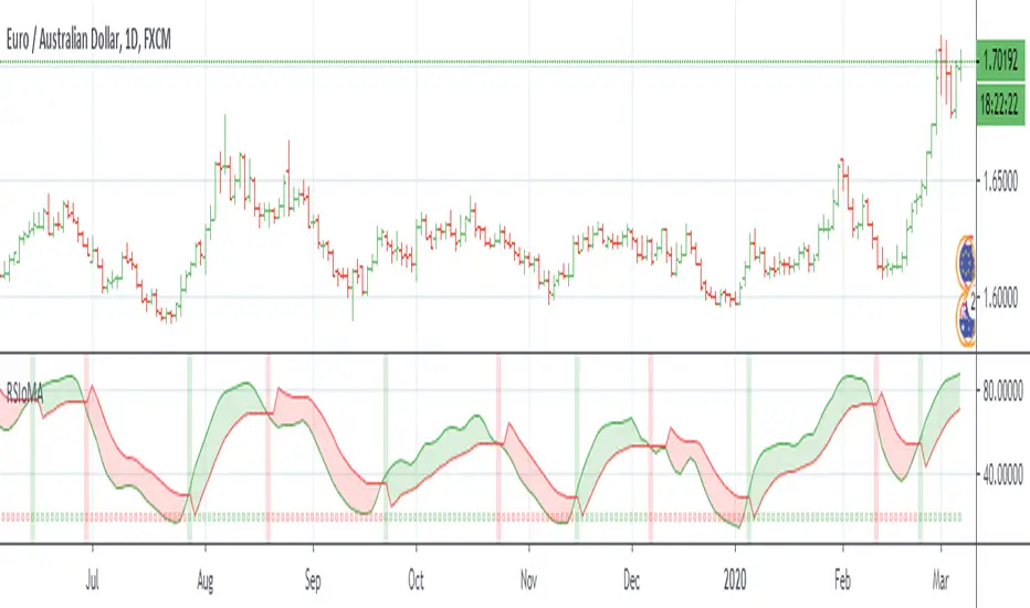
RSI of MAsRSI of MAs is designed to calculate the moving average for a specific period, and then take the RSI of that value. This script allows the user to select which moving average they would like to utilize for the calculation, as well as customizing how the Signal Line is calculated. There are many combinations available and you will need to tune the indicator to fit your trading style. The Signal Line is designed to indicate when there is a potential change in price action. If the Signal Line is below RSIoMA, price is bullish. If the Signal Line is above RSIoMA, price is bearish.
MA Period is the length/period the moving average is calculated with
RSI Period is the length/period the RSI is calculated with
RSI MA Mode determines which moving average is applied to the MA period
Signal Line determines which moving average or QQE is used to calculate the signal line
Signal Line Period is the length/period the Signal Line is calculated with
As always, trade at your own risk.
Multiple MA Options Credits to @Fractured
Signal Line Options Credits to @lejmer
Bits and Pieces from @AlexGrover, @Montyjus, and @Jiehonglim
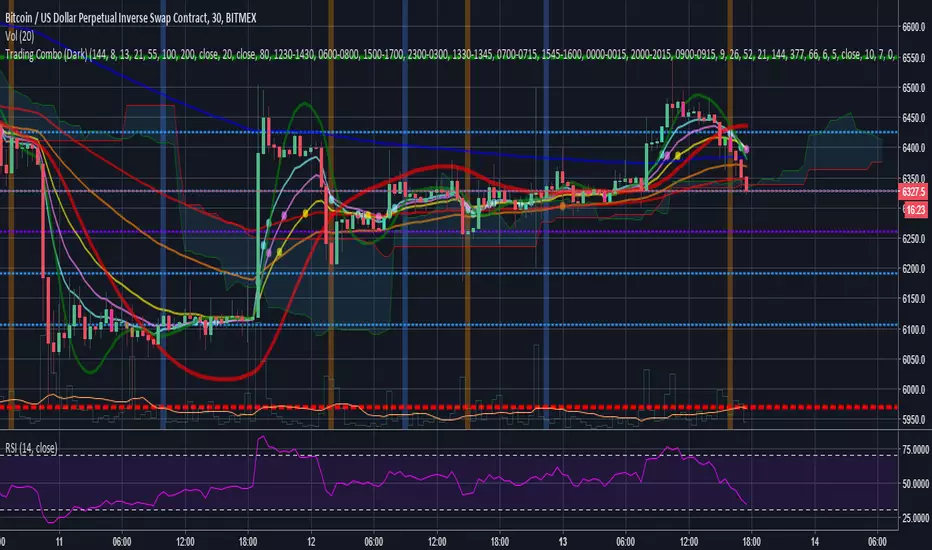
Trading Combo (Dark)This is a combo of many indicators including :
Ichimoku Cloud (With Buy and Sell Signals)
EMA
MA
HULL MA
Fibonacci Lines
Bitcoin 0.57% Kill Zones(Turned off by Default)
MA Turning Points
Reversal(Pin) Bars and Upshaved and Downshaved Bars(Inside and Outside Bars Disabled By default)
Credits to revanchdg for creating the script!
Credits for the source code go to:
Lazybear
ChrisMoody
100kiwi
Gesundheit
Updates:
- Removed all black colors so the script also works fine on the Dark theme
- Changed EMA9 to EMA8 and added EMA13
- Updated some labels for ease of configuration
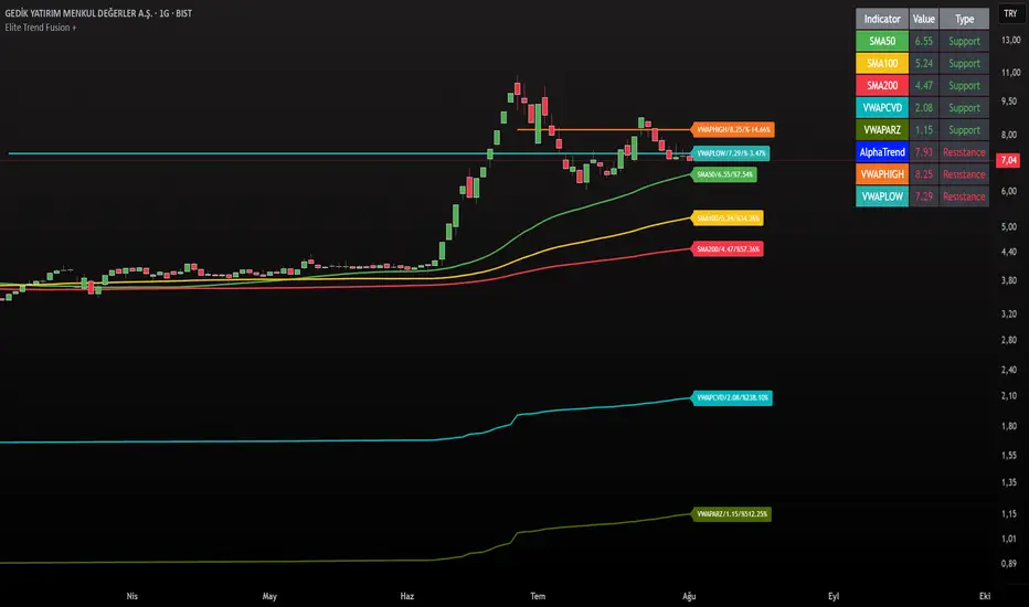
Elite Trend FusionThis indicator combines multiple technical analysis tools to assist traders in identifying trends, support/resistance levels, and potential trading opportunities. Developed by @IQ-TRADER with contributions to the Alpha Section by @KivancOzbilgic, this script overlays the following components on your chart:
EMA1: A customizable Exponential Moving Average for short-term trend analysis.
SMA Cluster (50, 100, 200): Simple Moving Averages on daily timeframes to identify long-term trends and key support/resistance zones.
Anchored VWAP x2 (VWAPCVD & VWAPARZ): Two Volume Weighted Average Price lines anchored to user-defined dates, providing insights into price levels relative to volume from specific points in time.
AlphaTrend: A custom trend-following indicator based on ATR and MFI, helping to gauge market direction and volatility.
Usage InstructionsInstallation:
Copy and paste the script into the Pine Script editor on TradingView, then add it to your chart.
Customization:Adjust the periods for EMA, SMA50, SMA100, and SMA200 under the "Inputs" tab.
Set the anchor dates for VWAPCVD and VWAPARZ to analyze specific historical periods.
Enable or disable individual components (EMA1, SMA50, SMA100, SMA200, VWAPCVD, VWAPARZ, AlphaTrend) and toggle labels via the settings.
Customize colors and line thickness to suit your preferences.
Modify the AlphaTrend multiplier and period for tailored sensitivity.
Interpretation:
Use the EMA1 for short-term momentum and crossovers with SMAs.
Monitor SMA crossovers (e.g., SMA50 crossing SMA200) for trend changes.
The Anchored VWAPs act as dynamic support/resistance levels based on the selected anchor dates.
AlphaTrend provides a visual guide for trend direction; use it alongside other indicators for confirmation.
Labels on the last bar show the current value and percentage distance from the price for each enabled indicator.
Pine Screener Module Usage:
Add this indicator to the Pine Screener to filter stocks, forex pairs, or other instruments based on the calculated distances (in percentage) between the close price and SMA50, SMA100, SMA200, VWAPCVD, and VWAPARZ.
In the Screener, use the "SMA50 Distance (%)", "SMA100 Distance (%)", "SMA200 Distance (%)", "VWAPCVD Distance (%)", and "VWAPARZ Distance (%)" columns to identify overbought/oversold conditions or potential reversal points.
Example filters: Set conditions like "SMA50 Distance (%) > 5" to find stocks trading significantly above the 50-day SMA, or "VWAPCVD Distance (%) < -2" to spot assets below the anchored VWAP, indicating potential support levels.
Combine multiple conditions (e.g., SMA50 Distance (%) > 5 AND AlphaTrend > previous AlphaTrend) to refine your scan for bullish trends.
Note: Ensure the indicator is applied to the chart or screener with the desired timeframe for accurate results.
Notes
This is an overlay indicator, meaning it plots directly on the price chart.
The script uses daily SMA calculations for consistency across timeframes.
Labels appear only on the last bar and are customizable.
This tool is for educational and informational purposes only. Trading involves risks, and it is recommended to consult a financial advisor before making decisions.
The script is credited to @IQ-TRADER with acknowledgment to @KivancOzbilgic for the Alpha Section contribution, adhering to intellectual property guidelines.
No Financial Advice: The description explicitly states that the indicator is for educational use and not financial advice, complying with TradingView's policy against promoting trading signals as guarantees.
Clear Usage: Step-by-step instructions are provided to ensure users can apply the indicator effectively, including screener usage.
No External Links or Promotions: No external links or promotional content is included, aligning with platform rules.
ALP AT + KAMA Crossover This indicator is a powerful combination of two adaptive trend-following concepts: the AlphaTrend by Kivanc Ozbilgic and the Kaufman's Adaptive Moving Average (KAMA), often credited to Perry Kaufman (with the specific implementation based on HPotter's interpretation of KAMA).
The primary goal of this indicator is to provide a robust trend detection and dynamic support/resistance system, adapting to market volatility.
How it Works:
AlphaTrend Component: The green/red line is the AlphaTrend. It dynamically adjusts to market volatility (using ATR) and momentum (using MFI or RSI, configurable). It provides faster signals for trend changes.
KAMA Component: The black line is the Kaufman's Adaptive Moving Average. KAMA is designed to filter out market noise during choppy periods and follow the price closely during trending periods, making it a smoother and more reliable long-term trend indicator.
Color-Coded Trend Zones: The AlphaTrend line is color-coded to visually represent the current market condition based on the price's position relative to both AlphaTrend and KAMA:
Strong Uptrend (Lime Green): Price is above both AlphaTrend and KAMA.
Strong Downtrend (Red): Price is below both AlphaTrend and KAMA.
Uptrend Uncertainty (Orange): Price is above KAMA but below AlphaTrend (suggests consolidation or weakening uptrend).
Downtrend Uncertainty (Blue): Price is below KAMA but above AlphaTrend (suggests consolidation or strengthening downtrend within a downtrend).
Gray: Default/unclassified state.
The underlying logic is based on:
Bullish Crossover (Potential Buy Signal): When the AlphaTrend line crosses above the KAMA line.
Bearish Crossover (Potential Sell Signal): When the AlphaTrend line crosses below the KAMA line.
These crossovers indicate a shift in the adaptive trend momentum.
Customization:
Users can customize various parameters in the indicator's settings, including:
AlphaTrend Multiplier and Common Period.
KAMA Lengths and Alpha values.
All the color codes for different trend zones and lines, allowing for full personalization of the visual output.
Disclaimer:
This indicator is for informational and educational purposes only and should not be considered as financial advice. Trading involves substantial risk, and past performance is not indicative of future results. Always conduct your own thorough research and analysis before making any trading or investment decisions. This indicator is NOT a buy/sell/hold recommendation. Use it as a tool to aid your analysis, not as a sole basis for your trades.

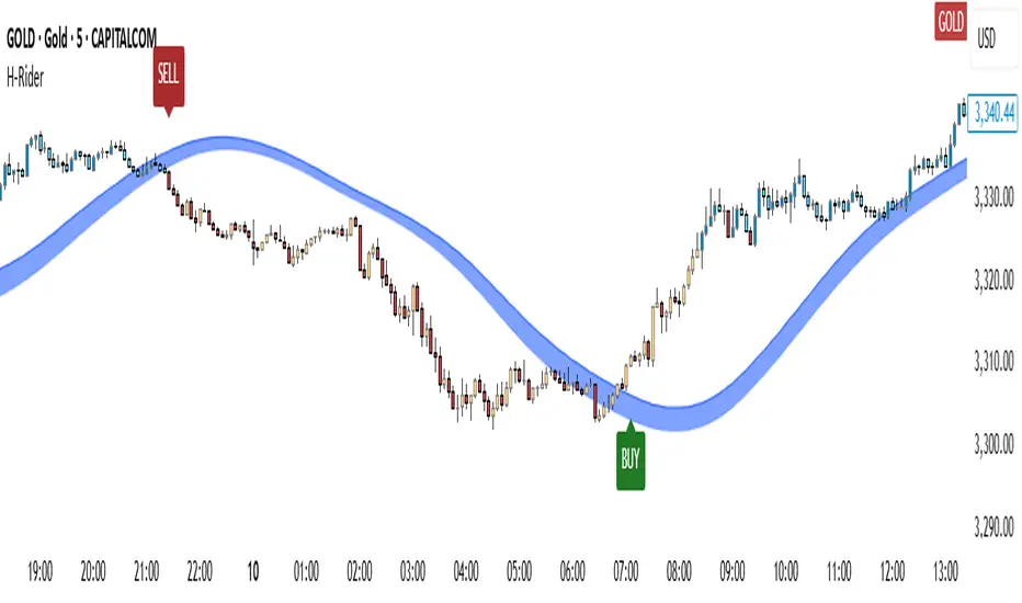
Heikin RiderHeikin Rider
Smoothed Heikin Ashi Breakout Signals with Flow Confirmation
by Ben Deharde, 2025
Overview:
Heikin Rider is a trend-following indicator that detects clean breakout signals using a custom smoothed Heikin Ashi wave (the H-Wave) with optional confirmation from a flow-based filter. It's designed for traders who want precise, momentum-aligned entries.
What It Does:
Plots dynamic high/low bands from smoothed Heikin Ashi candles.
Triggers Buy/Sell signals on full candle breakouts above/below the wave.
Colors bars based on price position and momentum relative to a custom flow line.
Optionally filters signals based on flow direction.
How the H-Wave Works:
The H-Wave is a two-stage smoothed Heikin Ashi construction:
Pre-smoothing: Price is smoothed using a short-length MA (SMA, EMA, or HMA).
HA Calculation: Heikin Ashi values are calculated from the smoothed data.
Post-smoothing: A second, longer MA is applied to the HA values.
Wave Envelope: The high and low wicks of the final smoothed HA candles form the H-Wave envelope.
Signals are generated when price fully breaks this envelope, with optional confirmation from the flow color.
Inputs:
Trend timeframe
Pre/Post smoothing type and length
Flow MA type and length
Toggle for bar coloring and signal filtering
Notes:
Built with original logic, using the open-source TAExt library (credited).
No repainting — all signals are confirmed at close.
For use on standard candles only (not HA or Renko).
Alerts:
Long Signal (Buy)
Short Signal (Sell)
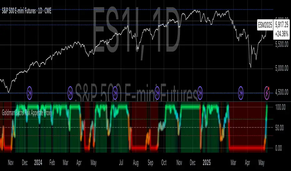
Goldman Sachs Risk Appetite ProxyRisk appetite indicators serve as barometers of market psychology, measuring investors' collective willingness to engage in risk-taking behavior. According to Mosley & Singer (2008), "cross-asset risk sentiment indicators provide valuable leading signals for market direction by capturing the underlying psychological state of market participants before it fully manifests in price action."
The GSRAI methodology aligns with modern portfolio theory, which emphasizes the importance of cross-asset correlations during different market regimes. As noted by Ang & Bekaert (2002), "asset correlations tend to increase during market stress, exhibiting asymmetric patterns that can be captured through multi-asset sentiment indicators."
Implementation Methodology
Component Selection
Our implementation follows the core framework outlined by Goldman Sachs research, focusing on four key components:
Credit Spreads (High Yield Credit Spread)
As noted by Duca et al. (2016), "credit spreads provide a market-based assessment of default risk and function as an effective barometer of economic uncertainty." Higher spreads generally indicate deteriorating risk appetite.
Volatility Measures (VIX)
Baker & Wurgler (2006) established that "implied volatility serves as a direct measure of market fear and uncertainty." The VIX, often called the "fear gauge," maintains an inverse relationship with risk appetite.
Equity/Bond Performance Ratio (SPY/IEF)
According to Connolly et al. (2005), "the relative performance of stocks versus bonds offers significant insight into market participants' risk preferences and flight-to-safety behavior."
Commodity Ratio (Oil/Gold)
Baur & McDermott (2010) demonstrated that "gold often functions as a safe haven during market turbulence, while oil typically performs better during risk-on environments, making their ratio an effective risk sentiment indicator."
Standardization Process
Each component undergoes z-score normalization to enable cross-asset comparisons, following the statistical approach advocated by Burdekin & Siklos (2012). The z-score transformation standardizes each variable by subtracting its mean and dividing by its standard deviation: Z = (X - μ) / σ
This approach allows for meaningful aggregation of different market signals regardless of their native scales or volatility characteristics.
Signal Integration
The four standardized components are equally weighted and combined to form a composite score. This democratic weighting approach is supported by Rapach et al. (2010), who found that "simple averaging often outperforms more complex weighting schemes in financial applications due to estimation error in the optimization process."
The final index is scaled to a 0-100 range, with:
Values above 70 indicating "Risk-On" market conditions
Values below 30 indicating "Risk-Off" market conditions
Values between 30-70 representing neutral risk sentiment
Limitations and Differences from Original Implementation
Proprietary Components
The original Goldman Sachs indicator incorporates additional proprietary elements not publicly disclosed. As Goldman Sachs Global Investment Research (2019) notes, "our comprehensive risk appetite framework incorporates proprietary positioning data and internal liquidity metrics that enhance predictive capability."
Technical Limitations
Pine Script v6 imposes certain constraints that prevent full replication:
Structural Limitations: Functions like plot, hline, and bgcolor must be defined in the global scope rather than conditionally, requiring workarounds for dynamic visualization.
Statistical Processing: Advanced statistical methods used in the original model, such as Kalman filtering or regime-switching models described by Ang & Timmermann (2012), cannot be fully implemented within Pine Script's constraints.
Data Availability: As noted by Kilian & Park (2009), "the quality and frequency of market data significantly impacts the effectiveness of sentiment indicators." Our implementation relies on publicly available data sources that may differ from Goldman Sachs' institutional data feeds.
Empirical Performance
While a formal backtest comparison with the original GSRAI is beyond the scope of this implementation, research by Froot & Ramadorai (2005) suggests that "publicly accessible proxies of proprietary sentiment indicators can capture a significant portion of their predictive power, particularly during major market turning points."
References
Ang, A., & Bekaert, G. (2002). "International Asset Allocation with Regime Shifts." Review of Financial Studies, 15(4), 1137-1187.
Ang, A., & Timmermann, A. (2012). "Regime Changes and Financial Markets." Annual Review of Financial Economics, 4(1), 313-337.
Baker, M., & Wurgler, J. (2006). "Investor Sentiment and the Cross-Section of Stock Returns." Journal of Finance, 61(4), 1645-1680.
Baur, D. G., & McDermott, T. K. (2010). "Is Gold a Safe Haven? International Evidence." Journal of Banking & Finance, 34(8), 1886-1898.
Burdekin, R. C., & Siklos, P. L. (2012). "Enter the Dragon: Interactions between Chinese, US and Asia-Pacific Equity Markets, 1995-2010." Pacific-Basin Finance Journal, 20(3), 521-541.
Connolly, R., Stivers, C., & Sun, L. (2005). "Stock Market Uncertainty and the Stock-Bond Return Relation." Journal of Financial and Quantitative Analysis, 40(1), 161-194.
Duca, M. L., Nicoletti, G., & Martinez, A. V. (2016). "Global Corporate Bond Issuance: What Role for US Quantitative Easing?" Journal of International Money and Finance, 60, 114-150.
Froot, K. A., & Ramadorai, T. (2005). "Currency Returns, Intrinsic Value, and Institutional-Investor Flows." Journal of Finance, 60(3), 1535-1566.
Goldman Sachs Global Investment Research (2019). "Risk Appetite Framework: A Practitioner's Guide."
Kilian, L., & Park, C. (2009). "The Impact of Oil Price Shocks on the U.S. Stock Market." International Economic Review, 50(4), 1267-1287.
Mosley, L., & Singer, D. A. (2008). "Taking Stock Seriously: Equity Market Performance, Government Policy, and Financial Globalization." International Studies Quarterly, 52(2), 405-425.
Oppenheimer, P. (2007). "A Framework for Financial Market Risk Appetite." Goldman Sachs Global Economics Paper.
Rapach, D. E., Strauss, J. K., & Zhou, G. (2010). "Out-of-Sample Equity Premium Prediction: Combination Forecasts and Links to the Real Economy." Review of Financial Studies, 23(2), 821-862.
Liquidity Stress Index SOFR - IORBLiquidity Stress Index (SOFR - IORB)
This indicator tracks the spread between the Secured Overnight Financing Rate (SOFR) and the Interest on Reserve Balances (IORB) set by the Federal Reserve.
A persistently positive spread may indicate funding stress or liquidity shortages in the repo market, as it suggests overnight lending rates exceed the risk-free rate banks earn at the Fed.
Useful for monitoring monetary policy transmission or market/liquidity stress.

SemaforThis is the 4 Level Semafor indicator with Daily Open Line and Average Session Range. Also on the chart is the EMA Ribbon indicator.
Credit to:
Devlucem for the Semafor indicator
Quantvue for the Average Session Range
Shusterivi for the Daily Open Line
MYNAMEISBRANDON for the EMA Ribbon
The Semafors are based on the ZigZag indicator and show higher highs/lower lows of a specified period, determined by the user and applied in settings.
The default periods I use are:
10 period (hidden on this chart)
50 period-blue dots
250 period-white dots
615 period-black dots
Just as the ZigZag indicator will recalculate so to will the semafors, as additional candles are built. The semafor indicator is never to be used as a stand alone signal. It must be combined with other indicators to be used effectively. What we look for are the semafor patterns of a large white dot followed by a 1st blue dot opposite of the white. Then a 2nd blue dot in agreement with the white dot. In theory, the 2nd blue dot is seen as confirmation of the establishment of the white semafor..
When combined with Daily Open Line, ADR (Average Sessions Range), EMA cross and VWAP anchored to your 250 semafors, your odds are greatly increased. Add to that the knowledge of basic market structure and the wisdom that comes from patience and you have a very powerful weapon.
The Daily Open...I trade the M1 chart and also draw a H4 Open Line on my chart for the smaller time frames. Price will tend to trade away from the Daily Open Line. In many cases until it reaches certain levels...Fib, Gann, ADR, etc., then runs through a pullback cycle. I like the ADR levels. The ADR can give clues when entering a consolidation phase, ie trading between the buy side and sell side 15% levels. Trading away from the Daily Open(or H4 open) along with breaking the 15% level, while in agreement with a semafor pattern is a good sign.
Add to that confluence the agreement of your MA cross and the 250 semafor Anchored VWAP and you have a solid signal to help determine your actions. This trend following layout will work on any time frame. I just really like the M1 for its precision, not for crazy back and forth all day. With the exception of some strong pull back signals, I don't enter any more trades on the M1 than on M5, 15 or 30.
This is based on and follows the teachings of Xard and his trading strategy. Just as I don't want to take anyone's credit for these indicators, I won't take credit for what I have been taught either.
The trader can obviously use their favorite MA cross indicator. But this one is visually beautiful AND displays the current time frame and 1 time frame higher on the chart...awesome!
Of note, I do run into trouble at times with the 615 period semafor. I have been told it is because TradingView has trouble with extended period indicators. As a matter of fact, I would like a much higher period for my biggest semafor. I would like it set at 1250, but that seems to be a no starter. If anyone has a solution, that would be welcomed news.

Best Buffett Ratio w/ Std-Dev Offset + Conditional PlotSummary:
This script provides a visually clear way to track the so-called “Buffett Ratio,”
a popular market valuation gauge which compares the total US stock market cap
to the country’s GDP. In addition, it plots a “hardcoded” long-term trend line,
along with fixed standard-deviation bands (in log space), and uses background colors
to signal potentially overvalued or undervalued zones.
What Is the Buffett Ratio?
Often credited to Warren Buffett, the Buffett Ratio (or Buffett Indicator) measures:
(Total US Stock Market Capitalization) / (US GDP)
• A higher ratio typically means equities are more expensive relative to the size of the economy.
• A lower ratio suggests equities may be more attractively valued compared to GDP.
Historically, the ratio has tended to drift upward over many decades,
as the US economy and stock markets grow, but it still oscillates around some trend over time.
How to Use
1) Add to Chart:
- In TradingView, simply apply the indicator (it internally fetches CRSPTM1 & GDP data).
2) Tweak Inputs:
- Log Offset for 1σ: Adjust how wide the ±1σ/±2σ bands appear around the trend.
- Anchor Points: Edit startYear , endYear , startRatio , endRatio
if you want a different slope or different “fair value” anchors.
3) Interpretation:
- If the indicator is above +2σ (red line) , it’s historically “very expensive,”
often leading to lower future returns over the long term.
- If it’s below –2σ (green line) , it’s historically “deep undervaluation,”
often pointing to better future returns over time.
- The intermediate zones show degrees of mild over- or undervaluation.
How This Script Works
1) Buffett Ratio Calculation:
- The script requests data from TradingView’s built-in CRSPTM1 index (total US market cap).
- It also requests US GDP data via request.economic("US", "GDP") .
- If GDP data is missing, the ratio becomes na on that bar.
2) Hardcoded Trend Line:
- Rather than a rolling average, the script uses two “anchors” (e.g. 1950 → 0.30 ratio, 2024 → 1.25 ratio)
and solves for a single log-growth rate to produce a steady upward slope.
3) Fixed Standard Deviations in Log Space:
- The script takes the log of the trend line, then applies a fixed offset for ±1σ and ±2σ,
creating proportional bands that do not “expand/contract” from a rolling window.
4) Conditional Plotting:
- The script only begins plotting once the Buffett Ratio actually has data (around 2011).
5) Color-Coded Zones:
- Above +2σ: red background (historically very expensive)
- Between +1σ and +2σ: yellow background (moderately expensive)
- Between –1σ and +1σ: no background color (around normal)
- Between –2σ and –1σ: aqua background (moderately undervalued)
- Below –2σ: green background (historically deep undervaluation)
Final Notes
• Data Limitations: US GDP data and CRSPTM1 only go back so far, so this starts around 2011.
• Long-Term vs. Short-Term: Best viewed on monthly/quarterly charts and interpreted over years.
• Tuning: If you believe structural changes have shifted the ratio’s fair slope,
adjust the code’s anchors or log offsets.
Enjoy, and use responsibly!
