GridMap PRO by TradeAkademiGridMap PRO – Structural Price Mapping Framework
GridMap PRO is a price-mapping framework designed to visualize repeatable price reaction zones, based on the observation that price tends to evolve within specific percentage-based bands over time.
Despite its name, GridMap PRO is not a traditional grid trading indicator; it does not generate signals, predict direction, or provide automated trade execution. Its purpose is to segment price into logical and structurally consistent zones, offering a map that supports the decision-making process rather than replacing it.
This framework is not built on randomly drawn support and resistance levels, but on long-term observations, reverse-engineering studies, and the analysis of recurring price behavior across different market conditions.
Core Concept: Percentage-Based Scaling and Structural Bands
At the core of GridMap PRO lies a percentage-based scaling model centered around a 33% expansion ratio.
This ratio was not selected as a theoretical or mathematical constant. Instead, it emerged empirically through extensive analysis across multiple asset classes (including cryptocurrencies and traditional market instruments), by examining the percentage moves from significant price lows to areas where major price reactions frequently occurred.
Long-term observations have highlighted the following patterns:
In many upward price movements originating from a low, the first major price reaction often occurs within the 30–35% range
The midpoint of this range, 33%, has shown a recurring tendency to produce meaningful price reactions
Similar behavior can be observed not only when projecting from local lows, but also when applying the same ratio from the asset’s historical low
These findings suggest that the 33% ratio may reflect an aspect of price’s intrinsic scaling behavior, rather than representing a singular or “special” level.
Why the Historical Low (All-Time / Structural Low)?
GridMap PRO does not rely on dynamic or constantly shifting reference points when performing its calculations. Instead, it uses the historical lowest price as the most objective and indisputable anchor point available.
This design choice is intentional:
Dynamic lows:
introduce visual noise
require frequent redrawing of levels
reduce long-term structural consistency
The historical low:
is singular and fixed
does not repaint
preserves long-term perspective
By anchoring calculations to this structural low, GridMap PRO prioritizes stability and consistency over attempting to identify the “perfect” level at every moment. The goal is not precision through constant adjustment, but a coherent and durable price map.
Calculation Logic
The historical lowest price is used as the reference point
From this level, price levels are projected upward using a 33% multiplicative expansion
The resulting levels form long-term structural reference zones
Calculations are logarithmic, preserving the proportional nature of price scaling
Unlike traditional horizontal support and resistance tools, this approach allows price to expand while maintaining consistent relative distances as it grows.
Map Resolution: Long Term & Short Term
GridMap PRO offers two map resolution options, both derived from the same underlying structure and calculations.
Long Term
Displays only the primary 33% levels
Produces wider, more spaced structural bands
Suitable for macro structure analysis, swing trading, and position trading
Provides a clean and simplified view in high-volatility environments
Short Term
Retains the same primary levels
Adds logarithmic sub-levels between them
Produces denser and more precise reaction zones
Suitable for intraday analysis, short-term trade planning, and micro-structure evaluation
The underlying calculations remain unchanged; only the visual resolution and level density differ.
Visual Context & Supporting Tools
GridMap PRO also provides several optional visual tools that are not included in the core level calculations and are intended purely for visual support. These elements are designed to help interpret the price map more clearly and to provide additional contextual awareness.
The available visual components may include:
Moving Averages (EMA)
Used to provide contextual insight into the general price direction. They do not generate any entry or exit signals.
RSI Overbought / Oversold Zones
Displayed solely as background shading based on RSI values from the current timeframe and, optionally, from higher timeframes (e.g., 4H).
RSI Divergence Zones
Visual markers used to highlight potential momentum discrepancies, incorporating filters to limit repetitive signals.
None of these visual elements affect GridMap PRO’s level calculations, nor are they designed to serve as standalone trading signals. All visual settings are optional and can be enabled or disabled by the user.
What GridMap PRO Does – and Does Not Do
What It Does
Segments price into meaningful structural zones
Visualizes areas where price reactions are statistically more likely to occur
Provides reference regions for limit orders, grid-based approaches, or DCA planning
Helps identify whether price is trading within an active zone or moving through low-interaction space
What It Does Not Do
Generate long or short trade signals
Predict future price direction
Provide standalone buy or sell decisions
Offer any form of performance or outcome guarantee
GridMap PRO is not a signal generator, but a decision-support map.
Relationship to DCA and Grid Approaches
GridMap PRO is not a grid or DCA strategy by itself. However, when price fails to react at a given level, the next calculated percentage band naturally becomes a potential area of interest, offering a logical framework for DCA or layered position management.
In this context, GridMap PRO is particularly suitable for traders who favor process-driven and structured position management, rather than relying on single-point entries.
Final Note
Although the levels displayed by GridMap PRO have historically produced meaningful price reactions across many markets, no level can guarantee future price behavior. Market conditions, volatility, liquidity, and news flow should always be taken into account.
This tool is not designed to suggest that “price will definitely reverse here,” but rather that “price may pause, struggle, or change direction in this area.”
Because each market exhibits its own unique dynamics, the relevance of individual levels may vary by asset. Users are encouraged to validate all levels through their own historical observation and analysis.
Resistence

Reverse/BounceReverse/Bounce Indicator
(EN) Indicator shows expected price rebound/reverse positions.
(RU) Индикатор показывает ожидаемые места отбоя/отскока цены.

Ryan-Trend PulseOverview
Ryan-Trend Pulse is a volatility-adjusted trend-following indicator designed to identify institutional-grade shifts in market momentum. Unlike static moving averages that lag significantly, This indicator utilizes a modified ATR-based trailing logic to create dynamic ranges. This allows the indicator to remain stable during consolidation but react decisively when a genuine trend breakout occurs.
The core philosophy of this tool is to provide traders with clear, visual "Zones of Interest" (Target and Stoploss) that adapt in real-time to current market volatility.
How It Works: The Logic
The indicator is built around a proprietary Adaptive Average function. Here is the technical breakdown:
1. Volatility Anchoring : The script calculates a base ATR (Average True Range) multiplied by a user-defined factor. This creates a "volatility buffer" around the price.
2. Range Displacement : The center line (Trend Average) only moves when the price closes outside of the volatility buffer. This filtering mechanism eliminates market noise and "whipsaws" often found in standard trend-following tools.
3. Dynamic Band Scaling : Once a new range is established, the upper and lower bands are calculated based on 50% of the current volatility. This provides a mathematically consistent frame for potential price action.
Indicator Specifications & Features
- Zero-Lag Range Shifts: The range updates instantly upon a confirmed break, providing the trader with immediate feedback on trend direction.
- Multi-Timeframe Compatible: Users can pull data from higher timeframes (HTF) to filter lower timeframe noise via the built-in Timeframe input.
How to Trade with Ryan-Trend Pulse
The indicator features a Dual-State Dynamic Coloring System:
1. 🔵 The Blue Center channel: This is your Trend Pivot. As long as price remains within the current range, the trend is considered stable.
2. 🟢 Bullish Breakout (Long): When price breaks the upper channel and shifts the range upward:
- The Upper channel turns Green, representing your primary Target Zone.
- The Lower channel turns Red, representing your Logical Stop Loss.
3. 🔴 Bearish Breakout (Short) : When price breaks the lower channel and shifts the range downward:
- The Lower channel turns Green, representing your primary Target Zone.
- The Upper channel turns Red, representing your Logical Stop Loss.
Settings Guidance
- Length (Default 200): Optimized for long-term trend health. Lowering this to 50-100 will make the indicator more aggressive for scalping.
- Factor (Default 5.0): This controls the "tightness" of the range. A higher factor requires a more significant move to trigger a trend change, suitable for volatile assets like Crypto or Indices.
Disclaimer: Past performance does not guarantee future results. This indicator is a tool for technical analysis and should be used in conjunction with a complete trading plan and proper risk management.

landraid supertrend EMA indicatorsmart supertrend and EMA indicator
fit any chart
fit any time frame
trade with it
stay with the trend

Teemo Support and Demand ZoneTeemo Support and Demand Zone
Description:
The Teemo Support and Demand Zone indicator is a powerful tool designed to automatically identify and visualize key market structure levels. By detecting significant swing highs and lows, it draws Supply (resistance) and Demand (support) zones on your chart, helping traders spot potential reversal or continuation areas with precision.
This indicator is part of the Teemo™ Trading Systems suite, featuring a clean, professional visual style and robust logic optimized for real-time trading.
Key Features:
Automated Zone Detection: Automatically plots Supply and Demand zones based on customizable swing lengths.
Dynamic Zone Extension: Active zones extend to the current time, ensuring you always see relevant levels.
BOS (Break of Structure) Tracking: When a zone is broken by price action, it is visually marked as a "Break of Structure," helping you track market momentum changes.
ZigZag Visualization (Optional): Overlay ZigZag lines to clearly see market waves and trends.
Market Structure Labels (Optional): Displays HH (Higher High), LH (Lower High), HL (Higher Low), and LL (Lower Low) labels for detailed price action analysis.
Teemo Color System: Uses a standardized, professional color palette (Teemo Mint for Demand, Teemo Purple for Supply) for a consistent and clean look.
Optimized Performance: Built with Pine Script v6, utilizing efficient array management and drawing limits for smooth performance on all timeframes.
How to Use:
Supply Zones (Purple): These areas represent potential resistance where selling pressure may increase. Look for bearish reversal signals or price rejection when the price enters these zones.
Demand Zones (Mint): These areas represent potential support where buying interest may rise. Look for bullish reversal setups or bounces when the price approaches these zones.
Break of Structure: When a zone is invalidated (broken), it indicates a potential shift in trend or momentum. The indicator will automatically update the zone to reflect this break.
Customization: Adjust the "Swing Length" to tune the sensitivity of zone detection. Increase "Zone Width Factor" to adjust the vertical size of the zones based on ATR.
Settings:
Swing Length: Determines the lookback period for identifying pivot points (default: 10).
Max History Zones: Sets the maximum number of past zones to keep on the chart (default: 20).
Zone Width Factor: Multiplier for ATR to calculate the height of the zones (default: 2.5).
Visual Styles: Toggle ZigZag lines and HH/LL labels on or off according to your preference.
Teemo Support and Demand Zone
설명:
Teemo Support and Demand Zone 지표는 시장의 주요 구조적 레벨을 자동으로 식별하고 시각화해 주는 강력한 도구입니다. 의미 있는 스윙 고점과 저점을 감지하여 차트에 공급(저항) 구간과 수요(지지) 구간을 그려줌으로써, 트레이더가 잠재적인 반전이나 추세 지속 지점을 정확하게 포착할 수 있도록 돕습니다.
이 지표는 Teemo™ Trading Systems 제품군의 일부로, 깔끔하고 전문적인 시각 스타일과 실전 트레이딩에 최적화된 견고한 로직을 자랑합니다.
주요 기능:
자동 구간 감지: 설정 가능한 스윙 길이를 기반으로 공급 및 수요 구간을 자동으로 표시합니다.
동적 구간 확장: 현재 유효한 구간은 현재 시점까지 자동으로 확장되어, 항상 최신의 레벨을 확인할 수 있습니다.
BOS (구조 돌파) 추적: 가격 움직임에 의해 구간이 돌파되면 해당 지점을 "구조 돌파(Break of Structure)"로 시각적으로 표시하여 모멘텀 변화를 추적합니다.
ZigZag 시각화 (옵션): ZigZag 라인을 오버레이하여 시장의 파동과 추세를 명확하게 볼 수 있습니다.
시장 구조 라벨 (옵션): HH(고점 갱신), LH(고점 하락), HL(저점 상승), LL(저점 갱신) 라벨을 표시하여 상세한 프라이스 액션 분석을 지원합니다.
Teemo 컬러 시스템: 표준화된 전문 컬러 팔레트(수요 구간: 티모 민트, 공급 구간: 티모 퍼플)를 사용하여 일관되고 깔끔한 차트 환경을 제공합니다.
최적화된 성능: Pine Script v6로 제작되었으며, 효율적인 배열 관리와 드로잉 한도 설정을 통해 모든 타임프레임에서 부드러운 성능을 보장합니다.
사용 방법:
공급 구간 (보라색): 매도 압력이 증가할 수 있는 잠재적 저항 영역입니다. 가격이 이 구간에 진입할 때 하락 반전 신호나 거부 반응을 주시하세요.
수요 구간 (민트색): 매수세가 유입될 수 있는 잠재적 지지 영역입니다. 가격이 이 구간에 접근할 때 상승 반전 셋업이나 반등을 확인하세요.
구조 돌파 (BOS): 구간이 무효화(돌파)되면 추세나 모멘텀의 변화를 암시합니다. 지표는 이러한 돌파를 반영하여 자동으로 구간 표시를 업데이트합니다.
사용자 설정: "Swing Length"를 조절하여 구간 감지의 민감도를 설정할 수 있습니다. "Zone Width Factor"를 통해 ATR 기반의 구간 높이를 조절하세요.
설정 항목:
Swing Length (스윙 길이): 피벗 포인트를 식별하기 위한 기간을 설정합니다 (기본값: 10).
Max History Zones (히스토리 유지 개수): 차트에 유지할 과거 구간의 최대 개수를 설정합니다 (기본값: 20).
Zone Width Factor (구간 너비 계수): ATR을 기반으로 구간의 높이를 계산하는 배수입니다 (기본값: 2.5).
Visual Styles (시각 효과): ZigZag 라인과 HH/LL 라벨 표시 여부를 켜거나 끌 수 있습니다.

Major S/R Levels Filtered v.1 BETA
This indicator automatically identifies and plots major support and resistance (S/R) levels on your chart based on swing highs and swing lows across multiple timeframes. It also intelligently merges nearby levels to avoid clutter and displays price labels to the right of the levels.
Features:
Detects monthly, weekly, and daily swing highs and lows.
Merges nearby levels automatically based on a customizable minimum distance (%), producing cleaner and more meaningful S/R zones.
Daily levels can be filtered by the number of touches to ensure significance.
Lines are drawn fully extended to the right, providing a clear view of historical S/R.
Price labels are displayed to the right of each level, stacked to prevent overlapping. Labels include the timeframe and price, with customizable text templates.
Transparent label backgrounds improve visibility without cluttering the chart.
Customizable parameters: pivot length, minimum touches, label offset, minimum distance for merging, and label text template.
Usage:
Select which timeframes to display: Monthly, Weekly, Daily.
Adjust pivot length and filter settings to match your trading style.
Observe merged S/R levels with clearly labeled prices on the right side of the chart.
This indicator is perfect for traders who want a clean, historical S/R framework for intraday, swing, and long-term analysis.

Support & Resistance Detector [PRO]Professional Support & Resistance Detector 🟠
Executive Summary 🟠
The **Professional Support & Resistance Detector ** is an institutional-grade technical analysis instrument built for precision traders. It automates the complex task of identifying significant market structure by detecting valid Swing Highs (Resistance) and Swing Lows (Support) using a customizable dynamic lookback algorithm. Unlike basic indicators that clutter the chart with irrelevant lines, this tool employs smart filtration and FIFO (First-In, First-Out) logic to present only the most actionable price levels.
Whether you are a scalper needing real-time feedback or a swing trader looking for confirmed structural levels, this indicator adapts to your workflow with "Confirmed Only" and "Realtime" calculation modes.
Why Standard Indicators Fail 🟠
Most Support & Resistance indicators suffer from two major problems:
1. **Noise**: They identify too many insignificant levels, making the chart unreadable.
2. **Rigidity**: They fail to account for "Role Reversal" (where old Resistance becomes new Support).
The Solution: Advanced Feature Set 🟠
This script addresses these issues with a suite of advanced features designed for the modern market environment:
1. **Dynamic Algorithmic Detection**:
* The core engine uses a user-defined `Left` and `Right` bar lookback system. This allows you to differentiate between "Major" structural pivots (high lookback) and "Minor" intraday levels (low lookback).
* **Zone Visualization**: Prices rarely turn at an exact micro-level. The indicator draws a transparent "Zone" around the key level to visualize the area of liquidity, helping you avoid premature entries during wick tests.
2. **Smart Breakout Logic (The "Brain" of the Indicator)**:
* **History Mode (Faded)**: When a level is broken, it doesn't just vanish. It stays on the chart but fades out. This is critical for backtesting to see how price reacted to past levels.
* **Role Reversal (Flip) Mode**: This is for active trading. When price breaks Resistance, the line automatically flips color to Support (and vice versa). This allows you to trade the "Break & Retest" strategy effortlessly.
3. **Active Chart Management**:
* Markets evolve. Old levels become irrelevant. The built-in **FIFO Memory System** ensures that you never have more than your specified limit (e.g., 25 lines) on the chart. As new structure forms, the oldest irrelevant data is recycled, keeping your workspace pristine.
4. **Multi-Mode Calculation Engine**:
* **Confirmed Only (Default)**: The professional standard. Levels are only drawn/updated when the candle closes. This guarantees zero repainting and reliable signals.
* **Realtime (Tick-by-Tick)**: Designed for aggressive scalpers who need to see potential pivots forming before the candle closes.
Comprehensive Settings & Customization 🟠
Every aspect of the indicator is customizable to fit your trading style.
Logic & Calculation 🟠
* **Max Active Lines**: Set the buffer size for active levels. Recommended: 20-30 for clean analysis.
* **Line Extension**: Choose "Right" (standard), "Both" (chart-wide context), or "Segment Only" (local structure).
Pivot Identification 🟠
* **Lookback Left/Right**: The sensitivity dial.
* *Scalping Setup*: Left 10 / Right 5.
* *Swing Setup*: Left 50 / Right 25.
* **Zone Width**: Controls the vertical thickness of the S/R zone.
Visual Aesthetics 🟠
* **Markers**: Select from a library of professionally designed Unicode symbols (Diamonds ◈, Arrows ⯅/⯆, Stars ★, etc.) to mark the exact pivot candle.
* **Breakout Markers**: Visual confirmation icons (Crosses ✖, Checks ✔) appear exactly where the breakout occurred.
Professional Trading Strategies 🟠
**Strategy 1: The S/R Flip (Break & Retest)**
1. Set **Breakout Behavior** to "Role Reversal (Flip)".
2. Wait for price to break a **Red Resistance Zone**.
3. Watch the Zone turn **Blue (Support)**.
4. **Entry**: Wait for price to pull back and touch the new Blue Support zone. Look for a rejection wick.
5. **Stop Loss**: Just below the zone.
Strategy 2: Range Containment
1. Identify a market moving sideways between a parallel Blue Support and Red Resistance.
2. **Sell** at the Red Zone touch (Resistance).
3. **Buy** at the Blue Zone touch (Support).
4. **Filter**: Use the "Confirmed Only" mode to ensure the candle closes inside the range before taking a trade.
Alert System 🟠
Never miss a move. The indicator offers fully integrated alerts for automation:
* **New Level Found**: Instant notification when fresh structure is identified.
* **Breakout Alert**: When a level is breached.
* **Flip Alert**: Specific notification when Resistance becomes Support (or vice versa).
Disclaimer 🟠
This tool is provided for educational and analytical purposes. Financial trading carries a high level of risk. Past performance of any trading system is not indicative of future results. Please trade responsibly.

DuoBlocks - ICT Order Block detectorDuoBlocks (ICT Order Block Detector)
(An ICT(Inner Circle Trading)-style Order Block(OB) tool that highlights only the most relevant and recent Demand/Supply zones using FVG and Engulfing based OB sources.)
Overview
DuoBlocks is an ICT-inspired Order Block detector that uses the mostly used two major order block types: FVG(Fair Value Gap) or Engulfing. There are many Order Block indicators out there, but I couldn’t find one that consistently highlights the most relevant, most recent OB relative to the current price without making the chart a mess and that's why so I built this script.
FVG-based OB (FVG-OB): OBs derived from 3-candle fair value gap logic.
Engulfing-based OB (Engulfing-OB): OBs derived from strong 2-candle reversal/displacement (engulf) logic.
Usage
FVG-OB (Fair Value Gap Order Blocks)
This script finds bullish/bearish FVGs and draws an Order Block zone from the candle that created the move. Think of these zones as your potential next support (bullish) and resistance (bearish) levels.
Engulfing-OB (Engulfing Order Blocks)
This script also finds strong bullish/bearish engulfing candles and draws an Order Block zone from the candle that got engulfed.
Same idea: treat them as potential next support (bullish) and resistance (bearish) levels.
**Use these zones like “next level” support/resistance areas. Don’t blindly buy/sell—wait for your own confirmation and manage risk properly.
Settings
Show FVG-OB
Toggle display of the selected FVG-based bullish/bearish OB (one per side).
Show Engulfing-OB
Toggle display of the selected Engulfing-based bullish/bearish OB (one per side).
Max Invalidation Attempts (FVG OB or Engulf OB)
Controls how many separate breach events a stored OB can absorb before it is marked invalid (discarded). The counting happens when either of below occurs.
Bullish OB: price prints a low below the OB bottom.
Bearish OB: price prints a high above the OB top.
Each time this happens, the OB’s invalidation counter increments by +1.
Once the counter reaches your Max Attempts, that OB is flagged as no longer live, so it will stop being eligible for selection. Then the script automatically falls through to the next best/next nearest valid OB in memory.
Right Extend (bars)
How far to extend the selected OB boxes to the right.
Lookback bars
Maximum historical bars scanned for detection. Lower values = faster/cleaner, higher values = more history retained.
Max stored OB per side
Maximum stored bullish and bearish OBs in memory (per source).
Bullish/Bearish OB Color
Controls border/midline coloring for bullish and bearish zones.
Disclaimer
This script is for educational and informational purposes only and does not constitute financial advice or investment recommendations. Trading cryptocurrencies and other financial instruments involves significant risk, and you are solely responsible for your own decisions based on your financial situation, objectives, and risk tolerance. The author assumes no liability for losses arising from the use of this indicator.

Support and Resistance Breakout Signals [MarkitTick]💡 This indicator provides a comprehensive, automated system for identifying, tracking, and trading Support and Resistance (S/R) breakouts. By synthesizing classic Swing High and Swing Low pivot analysis with Multi-Timeframe (HTF) capabilities and Volume confirmation, it transforms raw price action into actionable structural data. It is designed to declutter charts by automatically managing active levels and highlighting significant market structure shifts (Higher Highs, Lower Lows) alongside verified breakout signals.
✨ Originality and Utility
While many indicators draw static pivot points, this tool distinguishes itself through "State Management." It treats Support and Resistance not just as historical markers, but as active zones that evolve.
Dynamic Level Management: Instead of flooding the chart with infinite lines, the script uses arrays to store a specific number of recent levels. As price action progresses, invalid or broken levels are removed or updated, keeping the analysis focused on current relevance.
Multi-Timeframe Confluence: Uniquely, it allows you to overlay higher timeframe support and resistance levels (e.g., Daily levels on a 4-hours chart) without changing your chart view, enabling top-down analysis instantly.
Market Structure Labeling: It automatically tags pivot points with Dow Theory labels (HH, LH, LL, HL), aiding traders in instantly recognizing trend direction without manual charting.
🔬 Methodology and Concepts
The script operates on three core technical pillars:
● Swing Pivot Detection
The foundation is the detection of local extrema using a "Left/Right" bar lookback mechanism. A Swing High is identified when a high is greater than the L bars preceding it and the R bars following it. This confirms a fractal peak or valley.
Note on Confirmation: Because the script waits for R bars to close to confirm a pivot, the lines appear retroactively. However, the extension of these lines and subsequent breakout signals occur in real-time.
● Breakout Logic with Volume Integration
A breakout is triggered when the Close price crosses an active S/R line.
Resistance Break: Current Close > Resistance Level (and Previous Close ≤ Level).
Support Break: Current Close < Support Level (and Previous Close ≥ Level).
Volume Confirmation: An optional filter requires the breakout bar's volume to exceed a Moving Average of volume, ensuring momentum backs the move.
● Time Decay
To mimic the reduced relevance of stale levels, the script includes a "Time Decay" feature. If a level is not interacted with for a user-defined number of bars, it is automatically purged from the system, ensuring the chart reflects only fresh interest levels.
🎨 Visual Guide
The indicator uses a specific color-coding and labeling system to convey information quickly:
● Support & Resistance Lines
Red Lines (Thin): Represent active Resistance levels on the current timeframe.
Green Lines (Thin): Represent active Support levels on the current timeframe.
Fuchsia Lines (Thick): Represent Higher Timeframe (HTF) Resistance levels.
Aqua Lines (Thick): Represent Higher Timeframe (HTF) Support levels.
● Market Structure Labels
Located at the pivot points, these text labels define the trend structure:
HH / LH: Higher High / Lower High (Red Text).
LL / HL: Lower Low / Higher Low (Green/Aqua Text).
HTF-R / HTF-S: Indicates major structural pivots from the higher timeframe.
● Breakout Signals
When a valid break occurs, a label appears above or below the bar:
Blue Triangle Up (▲): Bullish breakout through resistance.
Blue Triangle Down (▼): Bearish breakout through support.
Number in Label: Indicates the cumulative count of breaks for that specific trend sequence (e.g., "1" is the first break, "2" is the second).
The breakout count represents the intensity of the move. A reading greater than 1 signals exceptional market strength, indicating the penetration of multiple Key Levels (Support or Resistance) within a single candle.
📖 How to Use
Trend Continuation: In an uptrend (sequence of HH/HL), wait for a Blue Triangle Up (▲) occurring at a Red Resistance line. This signals the continuation of the trend.
Trend Reversal: Watch for a "Structure Break." If price is making Higher Highs, but then breaks a Green Support line (generating a ▼ signal) and forms a Lower Low (LL), the trend may be reversing.
HTF "Bounce" Plays: Use the thick Fuchsia/Aqua lines as major zones. If price approaches a thick Aqua line (HTF Support) and fails to break it, look for LTF bullish structure (HH/HL) to form for an entry.
Volume Filtering: Enable the "Volume Confirmation" setting to filter out "fakeouts" (breaks on low volume).
⚙️ Inputs and Settings
● Swing Settings
Left/Right Bars: Determines the sensitivity of the pivot detection. Higher numbers = fewer, more significant pivots.
Max Stored Levels: How many S/R lines to keep in memory at once.
Max Break Labels: Limits visual clutter by capping the number of signal labels.
● Usability & HTF
Enable Time Decay: If true, deletes lines that are older than "Decay Period" bars.
Enable HTF Levels: Toggles the display of higher timeframe pivots.
HTF Timeframe: Select the specific timeframe for the macro view (e.g., "D" for Daily).
● Analysis
Volume Confirmation: Toggles the requirement for volume to be above its average for a signal to fire.
Show Market Structure: Toggles the HH/LL text labels.
🔍 Deconstruction of the Underlying Scientific and Academic Framework
The script's logic is rooted in Fractal Geometry and Auction Market Theory .
● Mandelbrot's Fractals: The use of `leftBars` and `rightBars` is a direct application of identifying market fractals. Markets are self-similar across timeframes; a pivot on a 5-minute chart is structurally identical to one on a Weekly chart. This script exploits this property by allowing nested timeframe analysis (LTF inside HTF).
● Memory of Price (Behavioral Finance): Support and resistance lines represent zones where market participants have previously established value (Price Memory). The "Breakout" signal is mathematically significant because it represents a shift in the supply/demand equilibrium. When price closes beyond a stored array value (the pivot price), it signifies that the aggressive limit orders that created the pivot have been exhausted or withdrawn, validating a new search for value.
⚠️ Disclaimer
All provided scripts and indicators are strictly for educational exploration and must not be interpreted as financial advice or a recommendation to execute trades. I expressly disclaim all liability for any financial losses or damages that may result, directly or indirectly, from the reliance on or application of these tools. Market participation carries inherent risk where past performance never guarantees future returns, leaving all investment decisions and due diligence solely at your own discretion.

Adaptive Support & Resistance ProAdaptive Support & Resistance Pro – Description
Adaptive Support & Resistance Pro is an advanced S/R tool designed to automatically identify key support and resistance zones based on a combination of RSI, CMO dynamics, and pivot logic. This indicator provides precise and reactive levels that form only when specific technical conditions are met, filtering out noise and delivering more reliable S/R signals.
It is ideal for technical traders who want to understand where price naturally pauses, reverses, or consolidates—without the need to manually draw lines on every chart.
🔍 Key Features
1. Automatic Support & Resistance Detection
The indicator uses:
RSI (9)
CMO logic based on HMA
Pivot structure (len = 2)
to generate valid Support and Resistance zones.
A level is drawn only when all required conditions align, preventing false or weak signals.
2. Multi-Timeframe Analysis (MTF)
You can view the chart on one timeframe (e.g., 5m)
and display Support/Resistance levels from another timeframe (e.g., 1H, 4H, D) at the same time.
This allows for:
viewing higher-timeframe structures on lower charts,
better planning of entries and exits,
avoiding trades inside strong zones that may not be visible on the current timeframe.
All of this is controlled through the input:
S/R Timeframe
3. Adjustable Line Thickness (visual enhancement)
Using the input:
Line Width
you can increase the thickness of support/resistance lines to:
make important zones more visible,
improve chart readability,
emphasize S/R levels according to your visual preference.
This is especially useful on fast markets (Forex, Crypto) and on higher timeframes where clarity of levels is essential.
4. Clear distinction between Support and Resistance
Support lines have their own customizable color (default: green)
Resistance lines have their own customizable color (default: red)
You can freely adjust the colors to match your personal TradingView layout or theme.
5. Alerts (Notification System)
The built-in alert:
"New S/R line"
triggers whenever a new support or resistance level is detected.
This helps you:
monitor important levels without constantly watching the chart,
react quickly to new structure signals,
stay aware of market changes in real time.
🎯 How to Use the Indicator
Support levels often indicate potential reversals or long-entry opportunities.
Resistance levels highlight areas where price may reverse downward or form short setups.
The best performance is achieved when combining this indicator with:
price action,
EMA structure,
confirmation zones,
breakout logic,
trend filters.
MTF usage is highly recommended:
Analyze higher-timeframe S/R while trading lower-timeframe setups.
⚠️ Disclaimer
This indicator does not generate direct buy or sell signals.
Its purpose is to assist in market analysis and highlight areas where price is likely to react.
📌 Conclusion
Adaptive Support & Resistance Pro combines the strongest elements of automated S/R mapping: precision, reduced noise, multi-timeframe flexibility, and advanced logic based on RSI, CMO, and pivot structure.
It is perfect for traders who want:
clean and accurate S/R levels,
higher-timeframe insight while trading lower charts,
customizable and visually enhanced structure mapping.

Confirmed Pivots + MACD Signals (with BOS Lines)Confirmed Pivots + MACD Signals
This indicator combines confirmed swing highs/lows (pivots) with MACD-based momentum signals to highlight key reversal and continuation points on the chart.
Core Logic
Confirmed Pivots:
The script identifies swing highs and lows using the user-defined pivot confirmation length.
Once a structure is broken beyond the last pivot, that level becomes a confirmed support (CL) or resistance (CH) line.
These levels are plotted as dashed horizontal rays and labeled directly on the chart.
MACD Integration:
The classic MACD crossover/under logic is used:
Bullish Crossover: MACD line crosses above the Signal line.
Bearish Crossunder: MACD line crosses below the Signal line.
Signal Filtering by Proximity:
A Proximity Zone (%) defines how close price must be to an active support or resistance to trigger a signal.
Buy Signal: When price is within the support zone and a bullish MACD crossover occurs.
Sell Signal: When price is within the resistance zone and a bearish MACD crossunder occurs.
Inputs
Pivot Confirmation Length: Bars used to confirm swing points.
MACD Fast/Slow/Signal Lengths: Standard MACD settings.
Proximity Zone (%): Defines zone width (e.g., 1% around active level).
Output
Labels: "CH" (Confirmed High) and "CL" (Confirmed Low) with color-coded dashed lines.
Signals: "BUY" and "SELL" markers appear when both pivot and MACD conditions align.
Tips
Works best on higher timeframes (H1 and above).
Combine with price action or trend filters for confirmation.
Use proximity percentage according to volatility (e.g., smaller % for low-vol assets).
⚠️ Disclaimer:
This script is provided for educational and informational purposes only.
It does not constitute financial or investment advice, and the author is not responsible for any financial losses that may occur from its use.
Always perform your own analysis and use this indicator together with other technical and risk management tools before making trading decisions.
---------------------------------------------------------------------------------------------
سقف و کف تاییدشده + سیگنالهای MACD
این اندیکاتور ترکیبی از شناسایی سقفها و کفهای تاییدشده (Pivot High/Low) به همراه سیگنالهای مومنتوم MACD است که نقاط برگشت یا ادامهی روند را روی چارت مشخص میکند.
🔹 منطق عملکرد
تایید سقف و کفها:
ابتدا سقف و کفهای محلی بر اساس تعداد کندلهای تنظیمشده شناسایی میشوند.
وقتی ساختار قیمتی از آخرین سقف یا کف عبور کند، آن سطح به عنوان حمایت یا مقاومت تاییدشده در نظر گرفته شده و با برچسبهای “CL” (کف تاییدشده) و “CH” (سقف تاییدشده) و خطوط نقطهچین رسم میشود.
ادغام با MACD:
از منطق کلاسیک کراساور/کراسآندر MACD استفاده شده است:
کراس صعودی: عبور خط MACD از بالای خط سیگنال.
کراس نزولی: عبور خط MACD از زیر خط سیگنال.
فیلتر سیگنال با ناحیه مجاور:
با استفاده از درصد ناحیه مجاور (Proximity Zone %)، فقط زمانی سیگنال صادر میشود که قیمت نزدیک حمایت یا مقاومت فعال باشد.
سیگنال خرید: وقتی قیمت در ناحیهی حمایت و همزمان MACD صعودی شود.
سیگنال فروش: وقتی قیمت در ناحیهی مقاومت و همزمان MACD نزولی شود.
تنظیمات ورودی
طول تأیید پیوتها
تنظیمات MACD (Fast, Slow, Signal)
درصد ناحیه مجاور برای فعال شدن سیگنالها
خروجیها
برچسبهای “CL” و “CH” برای سطوح تاییدشده
نشانگرهای “BUY” و “SELL” در محل صدور سیگنال
نکات کاربردی
بهترین عملکرد در تایمفریمهای بالاتر (۱ ساعته به بالا)
برای دقت بیشتر، آن را با فیلتر روند یا پرایساکشن ترکیب کنید
درصد ناحیه مجاور را با توجه به نوسانات دارایی تنظیم کنید

Kalman Trend Sniper# KALMAN TREND SNIPER
## ORIGINALITY STATEMENT
The Kalman Trend Sniper combines adaptive trend detection with precision entry validation to identify high-probability trading opportunities. Unlike static moving averages that use fixed parameters, this indicator adapts to changing market volatility through ATR-based gain adjustment and distinguishes trending from ranging markets using ADX regime detection.
The indicator's unique contribution is its three-phase entry validation system: signals must hold for three bars, undergo a pullback test to the signal level, and receive confirmation through price action before generating an entry. This structured approach helps traders enter established trends at favorable retracement levels rather than chasing momentum.
---
## TECHNICAL METHODOLOGY
### Kalman Filter Implementation
This indicator implements an Alpha-Beta variant of the Kalman filter, a recursive algorithm that estimates trend from noisy price data:
1. Prediction: kf = kf + velocity
2. Error calculation: error = price - kf
3. Correction: kf = kf + gain * error
4. Velocity update: velocity = velocity + (gain * error) / 2
The gain parameter determines filter responsiveness. Higher gain values track price more closely but increase noise sensitivity, while lower values provide smoother output but lag price changes.
### Adaptive Gain Mechanism
The indicator adjusts gain dynamically based on volatility:
Volatility Factor = Current ATR / Long-term ATR
Adaptive Gain = Base Gain * (0.7 + 0.6 * Volatility Factor)
This ATR ratio increases responsiveness during high-volatility periods and reduces sensitivity during consolidations, addressing the fixed-parameter limitation of traditional moving averages. The volatility factor is bounded between configurable minimum and maximum values to prevent extreme adjustments.
### Regime Detection
The indicator uses the Average Directional Index (ADX) to distinguish market conditions:
- Trending markets (ADX above threshold): Full gain applied, signals generated
- Ranging markets (ADX below threshold): Gain reduced 25%, fewer signals
This regime awareness helps reduce whipsaw signals during sideways consolidation periods.
### Signal Line Validation System
When the Kalman line changes direction in trending conditions, the indicator draws a horizontal signal line at the low (for long signals) or high (for short signals) of the signal candle. This line represents a potential support or resistance level.
The validation system then monitors three phases:
Phase 1 - Hold Period: Price must remain above (long) or below (short) the signal line for three consecutive bars. This requirement filters weak signals where price immediately violates the signal level.
Phase 2 - Test: After the hold period, the system waits for price to pull back and touch the signal line, with configurable tolerance for volatile instruments.
Phase 3 - Confirmation: Within eight bars of the test, a confirmation candle must close above (long) or below (short) the test candle's body, demonstrating renewed momentum. If confirmation does not occur within eight bars, the validation attempt expires.
Successful validation generates an R label at the entry point. This three-phase structure helps identify entries where trend direction and support/resistance validation align.
---
## USAGE INSTRUCTIONS
### Signal Interpretation
Triangle Signals:
- Upward triangle (teal): Kalman line turns bullish in trending market (ADX above threshold)
- Downward triangle (red): Kalman line turns bearish in trending market
Signal Lines (horizontal):
- Teal line: Potential long support level at signal candle low
- Red line: Potential short resistance level at signal candle high
- Gray line: First opposite-color candle after signal (initial reversal pressure)
R Labels (optional, disabled by default):
- Green R below price: Validation complete for long entry
- Red R above price: Validation complete for short entry
Stop Levels:
- Red dots: Long stop level (Kalman line minus ATR multiplier)
- Teal dots: Short stop level (Kalman line plus ATR multiplier)
### Dashboard Information
The dashboard displays real-time indicator state:
- Trend: Current Kalman direction (BULL/BEAR)
- Regime: Market classification (Trending when ADX exceeds threshold, Ranging otherwise)
- Gain: Current adaptive gain value
- Vol Factor: Volatility ratio (current ATR / long-term ATR)
- ADX: Trend strength (higher values indicate stronger trends)
- Z-Score: Standard deviation distance from Kalman line (when enabled)
- Stop Dist: Current ATR-based stop distance
- Lines: Number of active signal lines displayed
- R-Status: Validation system state (Idle / Waiting / Testing)
### Trading Applications
Trend Following Approach:
1. Wait for triangle signal in trending market (ADX above threshold)
2. Enter immediately at signal candle close or wait for pullback
3. Place stop at displayed stop level
4. Trail stop using Kalman line as dynamic support/resistance
Validation Entry Approach (conservative):
1. After triangle signal, observe three-bar hold period
2. Wait for pullback to signal line (test phase)
3. Enter on R label confirmation
4. Place stop below/above signal line
5. Provides higher probability entries but reduces trade frequency
Z-Score Mean Reversion (when enabled):
1. Watch for Z-Score exceeding entry threshold (default +/-2.0)
2. Consider counter-trend entries when price touches Kalman line
3. Target return to Kalman line (Z-Score near zero)
4. Use Z-Score threshold as stop level for extreme continuation
### Optimal Conditions
The indicator performs optimally in clearly trending markets where ADX consistently exceeds the threshold. Performance degrades in sideways, choppy conditions.
Recommended timeframes:
- 1-5 minute charts: Use Crypto_1M preset (faster adaptation)
- 15-60 minute charts: Use Crypto_15M preset (balanced)
- Hourly charts: Use Forex preset (smoother)
- Daily charts: Use Stocks_Daily preset (long-term trends)
Market conditions:
- High volatility (Vol Factor above 1.5): Expect faster adaptation, wider stops needed
- Normal volatility (Vol Factor 0.7-1.5): Standard behavior
- Low volatility (Vol Factor below 0.7): Expect slower adaptation, tighter stops possible
---
## PARAMETER DOCUMENTATION
### Kalman Filter Settings
Preset Mode: Select optimized configuration for specific markets
- Custom: Manual parameter control
- Crypto_1M: Base Gain 0.05, ATR 7 (fast response for 1-5 minute crypto charts)
- Crypto_15M: Base Gain 0.03, ATR 14 (balanced for 15-60 minute crypto charts)
- Forex: Base Gain 0.02, ATR 14 (standard for forex pairs)
- Stocks_Daily: Base Gain 0.01, ATR 20 (smooth for daily stock charts)
Base Gain (0.001-0.2): Core Kalman filter responsiveness parameter. Higher values increase sensitivity to price changes. Low values (0.01-0.02) provide smooth output with fewer whipsaws but slower trend changes. High values (0.06-0.08) offer fast response with more signals but increased whipsaw risk.
Adaptive (checkbox): When enabled, automatically adjusts gain based on ATR ratio. Recommended to keep enabled for dynamic volatility adaptation.
ATR (5-50): Short-term Average True Range period for current volatility measurement. Default 14 is industry standard. Lower values respond faster to volatility changes.
Long ATR (20-200): Long-term ATR period for baseline volatility comparison. Default 50 provides stable reference. The ratio between ATR and Long ATR determines adaptive adjustment magnitude.
Regime Filter (checkbox): Enables ADX-based trending/ranging detection. When enabled, reduces gain by 25 percent during ranging markets to minimize false signals.
ADX Period (7-30): Period for ADX calculation. Default 14 is standard. Lower values respond faster to trend strength changes.
Threshold (15-40): ADX level distinguishing trending from ranging markets. Default 25. Above threshold: trending (generate signals normally). Below threshold: ranging (reduce sensitivity).
Min Vol / Max Vol (0.3-3.0): Bounds for volatility factor adjustment. Prevents extreme gain changes during unusual volatility spikes or quiet periods. Default minimum 0.5, maximum 2.0.
Stop ATR x (1.0-3.0): Multiplier for ATR-based stop loss distance. Default 2.0 places stops two ATRs from Kalman line. Use 1.5 for tight stops (intraday), 2.5-3.0 for wide stops (swing trading).
Show Signals (checkbox): Displays triangle signals when Kalman changes direction in trending markets. Disable to use indicator purely as dynamic support/resistance without signals.
Z-Score (checkbox): Enables mean-reversion signal generation based on statistical deviation from Kalman line.
Period (10-100): Lookback period for Z-Score standard deviation calculation. Default 20 bars. Longer periods produce smoother, less sensitive readings.
Entry (1.5-3.5): Standard deviation threshold for Z-Score signals. Default 2.0 generates signals at plus/minus two standard deviations (approximately 95th percentile moves).
Bull / Bear Colors: Customize Kalman line colors for uptrend (default teal) and downtrend (default red).
Fill (checkbox): Shows semi-transparent fill between price and Kalman line for visual trend emphasis.
### Signal Line System Settings
Signal Lines (checkbox): Displays horizontal signal lines at low (long) or high (short) of signal candles. These function as dynamic support/resistance levels.
Reverse Lines (checkbox): Shows gray horizontal lines at first opposite-colored candle after signal. Helps identify initial resistance points in new trends.
Max Lines (0-20): Maximum number of signal lines to display simultaneously. Older lines are removed as new signals appear. Use 1-2 for clean charts, 3-5 for recent support/resistance history.
Style (Solid/Dotted/Dashed): Visual style for signal and reverse lines. Dotted provides subtle appearance, solid is most prominent.
Line % / Label % (0-100): Transparency percentage for lines and labels. Zero is fully opaque, 100 is invisible.
R Labels (checkbox): Shows R labels when validation confirmation occurs. Default disabled. Enable if you want visual confirmation of successful pullback entries.
Tolerance % (0-1.0): Price deviation tolerance for test candle detection. Zero requires exact touch. 0.5 allows 0.5 percent deviation for volatile instruments.
### Dashboard Settings
Show Dashboard (checkbox): Toggles visibility of information panel. Disable for clean chart presentation.
Position: Choose dashboard location from nine positions (Top/Middle/Bottom combined with Left/Center/Right).
---
## LIMITATIONS AND WARNINGS
This indicator is a technical analysis tool that processes historical price data. It does not predict future price movements.
Inherent limitations:
1. Lagging nature: Like all trend indicators, the Kalman filter lags price. Signals occur after trend changes begin, not before.
2. Ranging markets: Generates fewer signals and reduced performance when ADX falls below threshold. Not optimized for sideways consolidation.
3. Whipsaw risk: In choppy, indecisive markets near ADX threshold, signals may reverse quickly despite regime filtering.
4. Parameter sensitivity: Inappropriate Base Gain settings can cause over-trading (too high) or missed trends (too low).
5. Validation requirement: The three-phase confirmation system provides higher accuracy but significantly reduces trade frequency. Not all trends produce valid pullback entries.
Not suitable for:
- Scalping strategies requiring instant signals (Kalman filter has intentional smoothing)
- Ultra-high frequency trading (indicator updates once per bar close)
- Markets with extreme overnight gaps (stops may be exceeded)
- Strategies requiring signals on Heikin Ashi, Renko, Kagi, Point and Figure, or Range charts
Risk management requirements:
This indicator provides trend direction and signal levels but does not incorporate position sizing, risk management, or account balance considerations. Users must implement appropriate position sizing, maximum daily loss limits, and portfolio diversification. Past performance does not indicate future results.
Optimal usage:
- Works optimally in clearly trending markets where ADX consistently exceeds threshold
- Performance degrades in sideways, choppy conditions
- Designed for swing trading and position trading timeframes (15-minute and above)
- Requires confirmation from price action or additional technical analysis
---
## NO REPAINT GUARANTEE
This indicator operates on bar close confirmation only. All signals, signal lines, and validation labels appear exclusively when candles close. Historical signals remain exactly where they appeared. This makes the indicator suitable for automated trading and reliable backtesting. What you see in historical data matches what appeared in real-time.
---
## ALERTS
The indicator provides eight alert conditions:
1. Kalman Buy Signal: Fires when upward triangle appears (bullish trend change in trending market)
2. Kalman Sell Signal: Fires when downward triangle appears (bearish trend change in trending market)
3. Trend Change to Bullish: Fires whenever Kalman line changes to bullish (regardless of ADX)
4. Trend Change to Bearish: Fires whenever Kalman line changes to bearish (regardless of ADX)
5. SCT-R Long Retest Confirmed: Fires when green R label appears for long validation
6. SCT-R Short Retest Confirmed: Fires when red R label appears for short validation
7. SCT Test Long Detected: Fires when test candle appears for long signal (before confirmation)
8. SCT Test Short Detected: Fires when test candle appears for short signal (before confirmation)
Alert messages include context about bar close confirmation and current price levels.
---
## CALCULATION TRANSPARENCY
While complete proprietary optimization methodology is not disclosed, the core technical approach is fully explained: Alpha-Beta Kalman filter with ATR-based adaptive gain adjustment and ADX regime detection. The signal line validation system uses a three-phase structure (hold, test, confirmation) with configurable parameters. Users can understand indicator functionality and make informed decisions about application.
---
## DISCLAIMER
This indicator is provided as a technical analysis tool. It does not constitute financial advice, trading recommendations, or performance guarantees. All trading decisions carry risk. Users are responsible for their own trading decisions and risk management. Past results do not indicate future performance.

TCP DMITCP DMI - Advanced Technical Indicator
This advanced DMI (Directional Movement Index) indicator enhances the traditional DMI by adding intelligent dynamic support and resistance levels based on historical price action analysis.
KEY FEATURES:
1. Standard DMI Components:
- DI+ (Directional Indicator Positive): Measures upward price movement
- DI- (Directional Indicator Negative): Measures downward price movement
- ADX (Average Directional Index): Measures trend strength
- Middle line at 20 for reference
2. Dynamic Support & Resistance Levels:
The indicator automatically identifies the most significant support and resistance levels by analyzing the last 400 candles (customizable) and detecting where DI lines have been rejected most frequently.
TWO TIERS OF LEVELS:
A) Normal Levels (Solid Lines):
- Support: Below 15
- Resistance: Above 25
- Style: Solid lines with 60% transparency
- These represent moderate support/resistance zones
B) Strong Levels (Dashed Lines):
- Strong Support: Below 10
- Strong Resistance: Above 30
- Style: Dashed lines with 40% transparency (more visible)
- These represent critical support/resistance zones
3. Intelligent Display Logic:
- When DI is ABOVE 20: Shows resistance levels (where price might face selling pressure)
- When DI is BELOW 20: Shows support levels (where price might find buying support)
- Each DI line (+ and -) has its own color-coded support/resistance levels for easy identification
4. Color Coding:
- DI+ levels use GREEN (customizable)
- DI- levels use RED/ORANGE (customizable)
- Support/Resistance lines match their respective DI colors but with reduced opacity
- This makes it instantly clear which DI the support/resistance belongs to
5. Rejection Detection Algorithm:
The indicator scans historical data to find peaks and troughs at specific levels, counting how many times price was rejected at each level. The level with the most rejections becomes the displayed support or resistance.
CUSTOMIZABLE PARAMETERS:
- ADX Smoothing: Default 14
- DI Length: Default 14
- Lookback Period: 400 candles (range: 50-500)
- Line Length: 15 candles forward + 15 candles back = 30 candle span
- DI+ Color: Customizable (default green)
- DI- Color: Customizable (default red)
- ADX Color: Customizable (default blue)
- Normal S/R Transparency: Default 60%
- Strong S/R Transparency: Default 40%
HOW TO USE:
1. Trend Identification:
- When DI+ crosses above DI-: Potential uptrend
- When DI- crosses above DI+: Potential downtrend
- ADX above 25: Strong trend
- ADX below 20: Weak trend or ranging market
2. Support/Resistance Trading:
- Watch for price reaction when DI approaches displayed support/resistance levels
- Solid lines = moderate levels
- Dashed lines = strong levels (more significant)
- The more rejections at a level, the more significant it becomes
3. Entry/Exit Signals:
- Entry: When DI bounces off support (below 20) or resistance (above 20)
- Exit: When DI breaks through major support/resistance levels
- Strong levels (dashed) are more reliable for major decisions
ADVANTAGES:
✓ Reduces chart clutter by only showing relevant levels based on current DI position
✓ Automatically adapts to changing market conditions
✓ Color-coded for instant visual recognition
✓ Two-tier system helps prioritize trading decisions
✓ Historical rejection analysis provides data-backed levels
✓ Fully customizable to match any trading style
BEST USED FOR:
- Swing trading
- Trend following
- Support/resistance trading strategies
- Identifying potential reversal zones
- Confirming breakout validity
- Risk management (stop-loss placement)
This indicator combines the power of traditional DMI with smart support/resistance detection, giving traders a comprehensive tool for technical analysis without overwhelming the chart with excessive information.

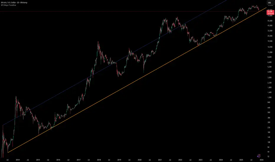
[Algoros] BTC Major Trendline# BTC Major Trendline - Long-Term Bitcoin Trend Analysis
## Overview
BTC Major Trendline is a comprehensive technical analysis tool designed to track Bitcoin's long-term bullish trajectory using historically significant price points. This indicator establishes a primary upward trendline anchored to two major Bitcoin cycle lows, along with optional parallel channels and Fibonacci-based price projections.
## ⚠️ Important Requirements
**This indicator requires a Bitcoin chart with sufficient historical data dating back to at least April 2013.**
**✅ Recommended Charts:**
- `INDEX:BTCUSD` - Bitcoin Index (comprehensive history)
- `BITSTAMP:BTCUSD` - Bitstamp Bitcoin (default setting)
**❌ Will NOT work properly on:**
- Charts with limited history (Like hourly charts)
- Exchanges that launched after 2013
- Altcoin pairs or other cryptocurrencies
If the indicator doesn't display correctly, switch to one of the recommended Bitcoin charts above.
## Key Features
### 📈 Primary Trendline
- Anchored to two historically significant lows:
- **Start Point**: July 6, 2013 - Early Bitcoin accumulation phase
- **End Point**: November 21, 2022 - FTX collapse bottom
- Automatically calculates and extends the trendline based on these anchor points
- Displayed as a solid orange line
### 🔷 Parallel Channel Line (Optional)
- Creates an upper boundary by connecting historical high points:
- April 10, 2013 and June 11, 2017
- Helps identify potential resistance zones and channel breakouts
- Displayed as a blue dotted line for easy distinction
### 🎯 Fibonacci Trendline Multipliers (Optional)
- Seven Fibonacci-based projection lines: **1.6x, 2x, 3x, 5x, 8x, 13x, and 21x**
- Each multiplier creates a parallel trendline above the main trend
- Color-coded from teal to maroon for clear visual separation
- Useful for identifying potential profit-taking zones and long-term price targets
### 📉 Negative Fibonacci Trendlines (Optional)
- Seven division-based support lines: **÷1.6, ÷2, ÷3, ÷5, ÷8, ÷13, and ÷21**
- Projects downward channels below the main trendline
- Displayed in yellow tones for easy identification
- Helps identify extreme oversold conditions and potential bounce zones
## Customization Options
- **Symbol Input**: Track any Bitcoin pair with sufficient history (default: BITSTAMP:BTCUSD)
- **Show/Hide Components**: Toggle parallel line, Fibonacci multipliers, and negative Fibonacci lines independently
- **Line Extension**: Extend lines right, left, both directions, or none
- **Multi-Timeframe Compatible**: View on any timeframe once loaded on a compatible chart
## How to Use
1. **Setup**: First, open a Bitcoin chart with sufficient history (INDEX:BTCUSD or BITSTAMP:BTCUSD recommended)
2. **Trend Confirmation**: The main orange trendline represents the long-term bullish trajectory. Price staying above this line suggests the bull market remains intact.
3. **Channel Trading**: Use the parallel line (blue dotted) as a potential upper boundary for the long-term channel.
4. **Price Targets**: Enable Fibonacci multiplier lines to identify ambitious long-term price targets during bull runs. Higher multipliers (13x, 21x) represent parabolic extension zones.
5. **Support Identification**: Enable negative Fibonacci lines to spot potential support zones during corrections or bear markets.
6. **Risk Management**: Breaking below the main trendline could signal a shift in long-term trend, warranting caution.
## Technical Implementation
- Uses `request.security()` to fetch precise daily prices at historical timestamps
- Requires access to Bitcoin price data from April 2013 onwards
- Calculates slope dynamically based on anchor points
- All lines update in real-time as new price data emerges
- Efficient rendering system minimizes performance impact
## Best Used For
✅ Long-term Bitcoin investors and HODLers
✅ Identifying major trend direction
✅ Setting realistic long-term price targets
✅ Spotting potential support/resistance zones
✅ Multi-timeframe analysis (on compatible charts)
✅ Educational purposes (understanding logarithmic growth)
## Troubleshooting
**Lines not appearing?**
- Ensure you're viewing INDEX:BTCUSD or BITSTAMP:BTCUSD
- Check that the chart has data back to April 2013
- Verify the symbol input matches your chart
- Try switching to a daily or weekly timeframe first
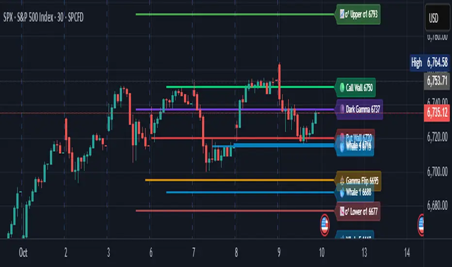
Options levelsOverview
Options Levels 🎯 plots 13 key institutional and options-based levels directly on your chart — including Call Wall, Put Wall, Gamma Flip, Whales Pivot, five Whale levels, and Sigma deviation bands (σ¹ / σ²).
It’s designed for both intraday and swing traders, offering a clean visual structure with elegant emoji labels, flexible visibility controls, and precise right-edge extensions for each line.
✨ Key Features
Single structured input with 13 ordered levels:
CallWall, PutWall, GammaFlip, Whales Pivot, Whale1..Whale5, Upperσ1, Upperσ2, Lowerσ1, Lowerσ2
Expressive emoji labels (🟢, 🔴, ⚖️, 🌑, 🐋, σ¹/σ²) optimized for dark themes.
Right-edge alignment: each line extends exactly to its label — no infinite lines.
Group visibility toggles:
• Critical Levels → Call Wall, Put Wall, Gamma Flip, Whales Pivot
• Whale Levels → Whale 1–5
• Sigma Bands → Upper/Lower σ¹ and σ²
Dynamic line-length multipliers that emphasize key levels.
Built-in alert conditions:
• Price crossing above the Call Wall
• Price crossing below the Put Wall
⚙️ Inputs & Settings
📋 Level List (string) : comma-separated list of 13 numeric values.
Example:
🎨 Appearance
• Base line length (bars)
• Label visibility toggle
• Line thickness
• Extend line and label to the right
• Distance (bars) between last candle and label
👁️ Visibility Controls
• Toggle Critical, Whale, or Sigma levels independently
🚀 How to Use
Paste your list of 13 ordered levels into the input field.
Adjust base length and thickness according to your timeframe.
Enable “Extend to the right” to position labels neatly beyond the last candle.
Use visibility toggles to focus on specific level groups (e.g., hide Whale Levels for short-term setups).
Optionally enable alerts to track price breakouts above/below Call and Put Walls.
The plotted levels are derived from aggregated options flow data, institutional positioning, and volatility-based deviations (σ). They serve as reference zones rather than predictive signals, helping visualize where liquidity and dealer hedging pressure may cluster.
📖 Level Definitions
Call Wall 🟢 — The strike with the highest call open interest; potential resistance area.
Put Wall 🔴 — The strike with the highest put open interest; potential support area.
Gamma Flip ⚖️ — Level where total gamma exposure changes sign; may reflect a shift in dealer hedging behavior.
Whales Pivot 🌑 — Represents the average institutional positioning from the previous trading day, reflecting where large option flows were most concentrated.
Whale Levels 🐋 — High-premium or large-volume strikes typically linked to institutional activity.
Upper σ¹ / σ² 📈 — One and two standard deviations above spot; potential overextension zones.
Lower σ¹ / σ² 📉 — One and two standard deviations below spot; potential mean-reversion zones.
Levels are manually input by the user. This script is a visual reference, not a predictive model.
⚠️ Notes
Levels are user-provided (not calculated by this script).
The indicator does not issue buy/sell signals or provide performance guarantees.
Designed purely as a visual aid for contextual market reference.
Optimized with barstate.islast for performance (draws only at the latest bar).
Disclaimer:
This indicator is for educational and visual purposes only. It does not generate buy/sell signals or guarantee future results. User-provided levels are meant for contextual reference only.
Developed for traders who rely on market structure and options flow context. Feedback and suggestions are welcome.
Piano Frequency LevelsPiano Frequency Levels
This indicator applies the mathematical principles of musical harmony to market analysis, creating support and resistance levels based on authentic piano frequency ratios. Drawing from centuries-old musical theory, it maps the precise mathematical relationships between piano keys to price levels.
How It Works: The indicator uses the exact frequency ratios from equal temperament tuning - the same mathematical system that makes pianos sound harmonious. Each level represents an actual piano key frequency, scaled proportionally to your chosen anchor price.
Key Features:
• Piano-Based Ratios: Uses authentic 12-tone equal temperament frequency relationships (1.05946 ratio between semitones)
• Directional Intelligence: Automatically creates ascending levels from lows (resistance) or descending levels from highs (support)
• Musical Note Labels: Optional display of actual piano key names (C4, D#5, F6, etc.) alongside price levels
• Black Key Subdivisions: Toggle authentic sharp/flat keys between natural notes for additional precision
• Octave Color Coding: Each musical octave displays in a different color for easy visual identification
• Anchor Reference: Bright green line clearly marks your C-note reference point
Musical Foundation: Every level corresponds to an actual piano key. The anchor point represents "C" (the musical root), with levels progressing through the natural musical sequence: C, D, E, F, G, A, B, then repeating in higher octaves. This creates proportional spacing that mirrors the harmonic relationships musicians have used for centuries.
Usage:
1. Set your anchor to a significant market high or low
2. Choose your desired number of levels (typically 12-24 for 1-2 octaves)
3. Enable "Add Black Keys" for additional intermediate levels
4. Enable "Show Note Names" to see which piano key each level represents
The Theory: Musical harmony is based on precise mathematical ratios that create pleasing relationships between frequencies. These same mathematical principles may manifest in market movements, as price action often exhibits proportional relationships similar to musical intervals.
Unique Advantages:
• Based on established mathematical principles rather than arbitrary ratios
• Provides both major levels (white keys) and intermediate levels (black keys)
• Automatically adapts direction based on anchor type (high vs low)
• Maintains authentic musical relationships across all timeframes and price ranges
Important Note: This indicator presents a theoretical framework for market analysis. Like all technical analysis tools, it should be used in conjunction with other forms of analysis and proper risk management. The musical ratios provide a unique perspective on potential support and resistance levels, but past performance does not guarantee future results.
Transform your charts into a musical instrument and discover the hidden harmonies in market movements.

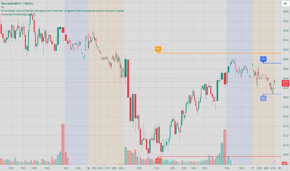
Previous Day & Premarket High/Low# Previous Day & Premarket High/Low Indicator
## Overview
This TradingView Pine Script indicator displays previous day's high/low levels and premarket high/low levels (HOD/LOD) directly on your chart. It helps traders identify key support and resistance levels from the previous trading day and track premarket price action.
## Features
### 📊 Previous Day Levels
- **Previous Day High (PDH)**: Shows the highest price from the previous trading day
- **Previous Day Low (PDL)**: Shows the lowest price from the previous trading day
- **Dynamic lines**: Automatically update each day with new previous day levels
- **Customizable colors**: Green for high, red for low (configurable)
### 🌅 Premarket Levels
- **Live Premarket HOD/LOD**: Real-time tracking of premarket high and low during premarket hours (4:00 AM - 9:30 AM)
- **Static Premarket Levels**: Frozen levels captured at 9:29 AM that persist throughout the trading day
- **Automatic session detection**: Identifies premarket vs regular trading hours
- **Time-based extension**: Lines extend to 4:00 PM end of trading day
## Time Sessions
### Premarket Session
- **Time**: 4:00 AM - 9:30 AM ET
- **Live tracking**: HOD/LOD update in real-time during premarket
- **Capture time**: Final values captured at 9:29 AM for static display
### Regular Trading Session
- **Time**: 9:30 AM - 4:00 PM ET
- **Static display**: Shows frozen premarket levels from 9:29 AM
- **Previous day levels**: Displays levels from the prior trading day
## Visual Elements
### Line Types
1. **Previous Day High**: Solid green line (customizable color)
2. **Previous Day Low**: Solid red line (customizable color)
3. **Live Premarket HOD**: Solid blue line (updates during premarket only)
4. **Live Premarket LOD**: Solid orange line (updates during premarket only)
5. **Static Premarket HOD**: Dashed blue line (frozen at 9:29 AM)
6. **Static Premarket LOD**: Dashed orange line (frozen at 9:29 AM)
### Labels
- **PDH/PDL**: Previous day high/low labels on the right side
- **PreMarket HOD/LOD**: Live premarket labels (during premarket hours)
- **Static Pre HOD/LOD**: Static premarket labels (after 9:29 AM)
## Input Settings
### Display Options
- **Show Previous Day High/Low**: Toggle previous day levels on/off
- **Show Premarket High/Low**: Toggle premarket levels on/off
- **Line Width**: Adjust thickness of all lines (1-5)
### Color Customization
- **Previous Day High Color**: Default green
- **Previous Day Low Color**: Default red
- **Premarket High Color**: Default blue
- **Premarket Low Color**: Default orange
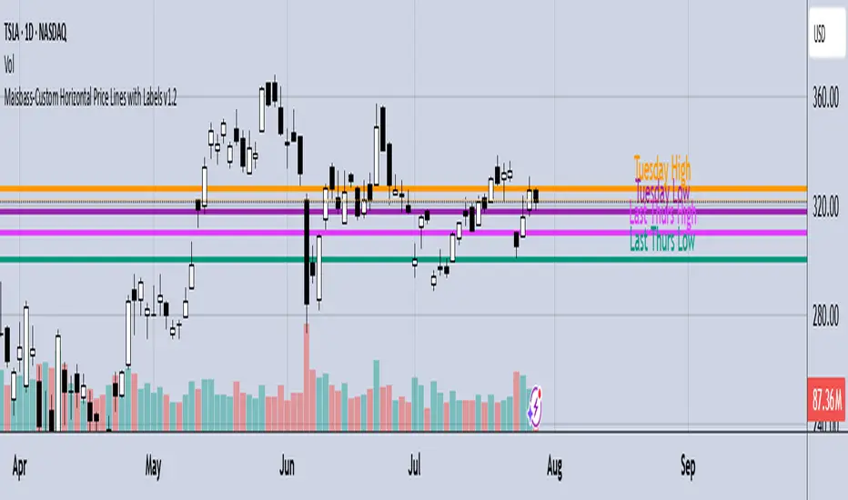
Maisbass-Custom Horizontal Price Lines with Labels v1.2Beta. I'm a noob at this.
This script will allow you to manually input price and create a horizontal line with text. It was created primarily for manually entering price of daily high and daily low over a two week period. However you do have the ability to edit the text plotted from the input tab, change color and style of horizontal lines, text size and position, etc. if you input price on the style tab, text won't be plotted, just the line. It's important if you want the text showing as well, you must use the input tab to do so. I plan on correcting this in the future.
Round Number Levels ProRound Number Levels Pro is a powerful support and resistance indicator that automatically plots psychological price levels on your chart.
What it does:
- Displays major round number levels (100, 200, 300, etc.) with prominent lines
- Shows mid-level lines (50, 150, 250, etc.) for additional reference points
- All lines extend across the entire chart for maximum visibility
- Automatically adjusts levels based on current price action
Key Features:
- Customizable Font Sizes - Large text for main levels, normal for mid-levels
- Clean Black Styling - Professional appearance that works on any chart background
- Flexible Line Styles - Choose solid, dashed, or dotted lines for main and mid levels
- Adjustable Parameters - Control number of levels, rounding increments, and label positioning
- Full Chart Extension - Lines extend both directions for complete price reference
Perfect for:
- Day traders looking for key psychological support/resistance levels
- Swing traders identifying major price zones
- Any trader who uses round numbers as decision points
How to use:
Simply add to your chart and the indicator will automatically plot relevant round number levels. Customize the settings to match your trading style and timeframe.
These psychological levels are where many traders make decisions, often creating natural support and resistance zones in the market.
Vera Support Resistance FinderVera Support & Resistance Zones is an educational technical analysis tool that automatically detects potential support and resistance levels based on pivot highs and lows.
Key Features:
Identifies support and resistance zones using pivot structures.
Marks previously broken levels and displays how many times each level has been broken. (This feature can be toggled on or off.)
Shows the distance from current price to each level with dynamic labels.
Groups nearby levels within a user-defined percentage range and shows how many points are merged into each zone. (This percentage is adjustable and the feature can be enabled/disabled.)
Optimization is possible through adjustable depth and level count parameters.
Each timeframe and each chart may require different settings. It’s recommended to adjust the depth, point count, and percentage settings depending on the structure of the asset and timeframe being analyzed.
Color Coding:
Green: Support
Red: Resistance
Navy Blue: Levels acting as both support and resistance
Important Note:
This indicator is developed for educational and visual assistance purposes only.
While it helps identify price reaction zones, manual drawing and validation are strongly recommended.
Since it works based on a defined algorithm, it may not capture critical levels as precisely as the human eye and experience can.
— Developer: C. İnanç ÖZYALIM | Dedicated to Vera 💜

Support & Resistance External/Internal & BoS [sgbpulse]Market Structure Support & Resistance External/Internal & BoS
Overview: Smart & Fast Market Structure Analysis
The Market Structure "Support & Resistance External/Internal & BoS " indicator is designed to empower your technical analysis by automatically and precisely identifying significant support and resistance levels. It achieves this by pinpointing high and low Pivot Points, plus key Pre-Market High/Low levels.
Its unique strength lies in its dynamic adaptability to any timeframe and any asset you choose. This tool analyzes the relevant market structure for the current timeframe and asset, providing you with accurate and relevant levels in real-time. The indicator maintains a clean chart and swiftly displays all support, resistance, and Pre-Market levels for any asset, saving valuable analysis time and enabling you to get a clear and quick snapshot of the market.
How the Indicator Works
The indicator identifies and displays three critical types of key levels:
External Pivots: These are more significant pivot points, indicating important reversal points across a broader range of price movement, considering the current timeframe. The indicator draws dark green support lines (for low pivots) and dark red resistance lines (for high pivots) from these points.
Internal Pivots: These are shorter-term pivot points, signifying smaller corrections or reversals within the overall structure of the current timeframe. These lines provide additional areas of interest within the ranges of the External Pivots.
Pre-Market High/Low Levels: The indicator displays the High and Low reached during pre-market hours as distinct lines on the chart. Please note: These levels will only appear when the selected timeframe is lower than one day (e.g., 1-hour, 15-minute) and provided that the "Session extended trading hours" option is enabled in your TradingView chart settings. These levels are crucial for identifying potential opening ranges and critical support/resistance areas upon regular market open, especially for intraday trading.
Break of Structure (BoS) Identification
A key feature of this indicator is its ability to identify Break of Structure (BoS). When a support or resistance line is breached, the indicator changes the line's color to gray and displays a "Break of Structure" label, indicating a potential trend change or continuation:
External BoS: When an external support/resistance line is broken, a "BoS" label in red will appear. This is a strong signal for a potential shift in the primary market structure or a strong trend continuation.
Internal BoS: When an internal support/resistance line is broken, an "iBoS" label in green will appear. This indicates a break within the existing market structure, which can be used to confirm direction or identify shorter-term entry/exit opportunities.
Full Indicator Customization
The indicator provides maximum flexibility to suit any trading style and timeframe:
Number of Lines Displayed: You can choose how many support and resistance lines you want to see on your chart. The default is 15 lines, but you can increase or decrease this number according to your needs and desired level of detail.
External Pivot Settings: Define the number of bars before and after a pivot point required for External Pivot identification.
Internal Pivot Settings: Define the number of bars before and after a pivot point required for Internal Pivot identification.
Color Customization: Full control over colors! You can change the colors of the support and resistance lines, the colors of the Pre-Market levels, and also the colors of the BoS and iBoS labels to create a visual appearance that perfectly matches your personal preferences.
This flexibility allows you to adapt the indicator to your trading style and any timeframe you operate in, without needing to manually change settings each time.
Recommended Uses
Clean Chart & Quick Analysis: The indicator displays important levels clearly, enabling quick identification of areas of interest without visual clutter on the chart. This significantly saves analysis time and allows you to make faster decisions.
Critical Levels for Any Timeframe & Asset: Get precise and adaptive support and resistance, plus essential Pre-Market levels (in relevant timeframes), for any timeframe and on any asset you choose.
Trend Direction Identification: Clear support and resistance lines help understand market structure.
Breakout Confirmation: The BoS label provides visual confirmation of key level breaches, helping to confirm potential trend changes.
Locating Entry & Exit Points: Use these levels as potential areas of interest for trades, after confirming a breakout or reversal.
Finding Stop-Loss & Take-Profit Points: Strategically place protective stops and profit targets around these support and resistance levels.
Important Note
Like any technical indicator, Market Structure "Support & Resistance External/Internal & BoS " is a supplementary tool. It's highly recommended to use it in conjunction with additional analysis methods (such as price action analysis, other indicators, and fundamental analysis) for informed trading decisions. Financial markets are dynamic, and trading always carries inherent risk.
Protected Pivots Points by RiotwolftradingProtected Pivots Points by Riotwolftrading
---
You have an advanced visual tool designed for traders who want to identify and manage key price levels with maximum precision.
This script detects protected pivots (significant highs and lows) and marks them with horizontal lines on the chart. These lines automatically extend for a fixed number of bars or until price invalidates the level with a closing break.
---
🚀 What makes this indicator special?
---
✅ Protected pivot detection:
The indicator identifies protected highs and lows using a fixed pivot strength
✅ Wick break detection (liquidity sweep visualization):
When a wick crosses the pivot level **without the candle closing beyond the level, the indicator automatically changes the line’s color and style.
👉 This immediately shows the trader that the level was tested but remains structurally valid.
✅ Highly customizable visuals:
* Choose whether to show color for protected highs, lows, or wick break levels.
* Set your own colors, line styles (solid, dashed, dotted), and line widths.
---
### 🌟 Why is wick break detection so valuable?
---
💡 Instant context on price action:
No need to manually check every candle to see if a level was barely tested. The indicator changes the line’s appearance automatically, so you can focus on decisions.
💡 Clear distinction between untouched levels and tested levels:
* A level with no wick test is pristine support/resistance.
* A level tested by a wick but not invalidated is still valid — but may have been swept for liquidity.
💡 Crucial for precision trading strategies:
This is particularly important for strategies that rely on:
✅ Liquidity sweeps / stop hunts.
✅ Reversals from tested zones.
✅ Smart Money Concepts (SMC).
✅ ICT concepts, breakers, Quasimodo, BOS/MSS.
The wick break visualization helps filter false breakouts and highlights areas where institutional players may have stepped in.
💡 Avoid premature exits or entries:**
The color/style change tells you a level was tested but not broken, so you avoid overreacting to wick activity.
---
### ⚡ Example use case**
Imagine a protected low line:
🔹 Price dips and its wick touches the level — the line changes color (e.g. violet solid line).
🔹 The level is still valid because the close didn’t break it.
🔹 This could signal a stop hunt or liquidity grab, with a possible reversal opportunity right at that level.
---
### 🧭 **Why most pivot indicators don’t offer this**
Most pivot indicators:
❌ Simply mark the level and remove it after a close break.
❌ Don’t distinguish between a wick test and a true break.
🌟 **This indicator does — giving traders an extra layer of market insight.**
---
### ⚠ **Disclaimer**
This indicator is a visual aid to help identify key levels and price reactions. It does **not** generate buy or sell signals and should be used alongside your trading analysis and strategy.
---
Breakout of inclined trendline [Drobode]█ DESCRIPTION
The script is designed to automatically detect a possible trendline breakout under the conditions of the popular "Slanted Trendline Breakout" strategy. The algorithm assumes that during the movement the price approaches the slanted (trend) line several times. With each subsequent approach (touch) to the trend line, the price consolidates more and more near this line, the distances between the extremes (touches) decrease, which indicates a high probability of a breakout of this line. The script checks the number of touches (approaches) of the extremes and the distances between the extremes. If all conditions are met, the script draws a slanted (trend) line in the corresponding area and an arrow with a possible price breakout direction. The length of the arrow is half the height of the slanted (trend) line and may indicate the level (price) at which it is advisable to fix the profit. In the script, you can enable or disable additional analysis periods (history length, number of bars), the more periods are enabled, the slower the script may load. For example, when placing the script on M-15, we can additionally enable the period 300 or 500, which will allow us to take into account a larger number of historical bars, and this can be considered as the extremes of the older timeframe. The script calculates each period separately, so one large period will not be able to take into account and analyze smaller periods. You can set the percentage deviation of the distance of the extremes from the trend line that touch the inclined line, depending on your needs and style of technical analysis. The smaller the percentage, the more accurate and closer to the inclined line the price extreme should be and vice versa. The main goal of the script is to facilitate the trader's routine work of identifying a possible trend line breakout. However, it should be understood that the script is not a full-fledged self-sufficient strategy, in case of receiving a signal, it is recommended to additionally conduct a comprehensive thorough analysis before taking trading actions. The script can be useful for traders of all levels, both beginners and experienced analysts. Like any other strategy or script, this script can work better on some instruments than on others. When analyzing trading setups, it is desirable to have a clear trend, it is recommended to take into account the signal of this script with a small period when the arrow shows the direction of the trend. However, at the same time, it is necessary to deeply analyze many other factors at this stage, in particular, such as volumes, consolidation, volatility, candlestick patterns, etc.
█ SCRIPT SETTINGS
By default, the script was developed and tested on medium timeframes with cryptocurrency futures instruments USDT.P
Alert
The Alert function in the script is enabled by default, you just need to activate Alert in the TradingView window and select the signal source - Breakout of inclined trendline .
The notification provides the following information (example):
Possible breakout to the upside
Ticker- DOGEUSDT.P
Price- 0.15844
Timeframe- 30
Period length- 377
Periods length
The script allows you to set the length of the period (number of bars) for which the calculation will be performed. Different periods allow you to cover more timeframes (in particular, larger timeframes). You can change up to 4 periods at a time. However, if you choose too large periods, the script may slow down and the loading time will increase. To increase the loading speed of the script, disable additional periods 3, 4, i.e. uncheck the corresponding checkboxes and use only fields 1 and 2 for periods, where you can also set the period length you need.
Percentage deviation of extremes from the trend line
The next settings are the percentage deviation of the extremes from the sloping line. The smaller the deviation, the more accurate and closer to the line the extreme bars should be, however, in this case the number of identification signals will be smaller. By default, the rejection zone is - 0.15%. On larger timeframes, the deviation can be set to be larger.