SHUBHAM 50000 ULTRA OPTIONSHUBHAM 50000 ULTRA OPTION
OptionFlow Pro: Smart Money & Anomaly Detection Indicator
Tagline: Don't just follow the flow. Understand it.
Core Concept:
OptionFlow Pro is an advanced, real-time market scanner and visual indicator that transforms raw options chain data into actionable trading intelligence. It goes beyond simple volume and open interest by identifying Unusual Options Activity (UOA), tracking Sweep Orders, and calculating the Volume-Weighted Put/Call Ratio to highlight where institutional "smart money" is placing its bets.
Key Features for Traders:
Unusual Activity & Sweep Detector:
What it does: Scans every tick for orders that significantly deviate from normal trading patterns—large block trades executed at the ask (for calls) or bid (for puts), and "sweep" orders that clean out multiple price levels instantly.
Trader Benefit: Pinpoints potential breakout or breakdown candidates before major moves occur in the underlying stock. Alerts you to aggressive, high-conviction buying or selling that retail traders often miss.
Volume-Weighted Put/Call Ratio (with Trend):
What it does: Calculates the put/call ratio not just by volume, but by the premium spent. A high premium-weighted put/call ratio shows bears are putting serious money behind their bets, making it a stronger signal.
Trader Benefit: Offers a more nuanced view of market sentiment than standard PCR. Helps gauge extreme fear (potential oversold bounce) or complacency (overbought top) in a specific stock or index (SPX/SPY).
Max Pain & Gamma Exposure (GEX) Visualizer:
What it does: Dynamically calculates the "Max Pain" strike (where option sellers face minimal losses) and estimates Gamma Exposure levels. Visual overlays on the chart show key pin levels and large gamma walls.
Trader Benefit: Identifies potential price magnets for weekly/monthly expiry. Understand where hedging activity by market makers may amplify volatility (negative gamma) or suppress it (positive gamma), aiding in entry/exit planning.
Implied Volatility (IV) Rank & Skew Analysis:
What it does: Compares current IV to its historical range (IV Rank) and visualizes the volatility smile/skew across strikes. Highlights expensive vs. cheap option premiums.
Trader Benefit: Empowers you to sell overpriced volatility (high IV Rank) and buy underpriced volatility (low IV Rank). Skew anomalies can signal asymmetric risk/reward opportunities or market fears about a sharp directional move.
Customizable Alerts & Heatmaps:
What it does: Set alerts for specific UOA criteria, PCR spikes, or IV changes. The platform-wide heatmap aggregates flow data across all symbols to show sector-level money movement.
Trader Benefit: Saves hours of manual scanning. Focus only on the setups that match your strategy (e.g., "Alert me for any $1M+ call sweeps in tech stocks").
Who Is It For?
Active Options Traders & Scalpers: Find high-probability directional plays with institutional confirmation.
Hedgers & Portfolio Managers: Identify tail-risk hedging activity and gauge overall market dealer positioning.
Volatility Traders: Precisely time entries for strangles, straddles, or iron condors based on IV regime and gamma.
Swing Traders & Technical Analysts: Confirms or diverges from classic chart patterns (e.g., breakout with strong call flow = higher conviction).
Why It's Different:
Most indicators look backward at price. OptionFlow Pro looks forward at market structure, liquidity, and dealer hedging flows. It doesn't predict the future; it reveals the present positioning that will influence future price action.
Platform Integration: Available as a standalone web platform, a TradingView custom script, and a direct data feed into thinkorswim, Interactive Brokers, and other major brokerages.
Oscillators

TradePulse ProTradepulse is a proprietary trading tool that combines a directional signal engine, a trend-adaptive trailing stop system, and a momentum confirmation oscillator into a unified decision framework. Instead of simply stacking separate indicators on a chart, TradePulse integrates these components into a single rules-based system designed to help traders act with structure rather than emotion by identifying conditions where trend and momentum are aligning.
How It Works:
Directional Signals - TradePulse uses a custom price-average model with ATR-based volatility thresholds to detect transitions between bullish and bearish environments. Buy and Sell markers appear only when price strength and volatility conditions confirm a shift. Reducing noise and late entries.
Trend-Adaptive Trailing Stop - A dynamic trailing system combines smoothed moving averages with ATR expansion logic. As price develops, the trailing level adjusts automatically and target projections update based on symmetry extensions. Helping guide structured exits and trade management.
Momentum Confirmation - A proprietary oscillator blends stochastic positioning with center-of-gravity transformation and dual smoothing. It highlights whether momentum aligns with the directional shift, helping traders avoid weaker setups and focus on higher-quality conditions.
Key Features:
- Clear Buy/Sell transitions based on multi-factor confluence
- Adaptive trailing stop + projected targets for structured management
- Momentum filtering to support higher-quality opportunities
- Sensitivity adjustments to suit different markets & styles
TradePulse is original work protected under invite-only access. It is provided for educational and informational purposes only. Trading involves risk, and signals should always be validated with your own analysis and risk management.

Setup Keltner Banda 3 e 5 - MMS + RSI + Distância Tabela
📊 Indicator Overview: Keltner Bands + RSI + Distance Table
This custom TradingView indicator combines three powerful tools into a single, visually intuitive setup:
Keltner Channels (Bands 3x and 5x ATR)
Relative Strength Index (RSI)
Dynamic Table Displaying RSI and Price Distance from Moving Average (MMS)
🔧 Components and Functions
1. Keltner Channels (3x and 5x ATR)
Based on a Simple Moving Average (MMS) and Average True Range (ATR).
Two sets of bands are plotted:
3x ATR Bands: Used for moderate volatility signals.
5x ATR Bands: Used for high volatility extremes.
Visual fills between bands help identify overextended price zones.
2. RSI (Relative Strength Index)
Measures momentum and potential reversal zones.
Customizable overbought (default 70) and oversold (default 30) levels.
RSI values are color-coded in the table:
Green for RSI ≤ 30 (oversold)
Blue for 30 < RSI ≤ 70 (neutral)
Red for RSI > 70 (overbought)
3. Distance Table (Price vs. MMS)
Displays the real-time distance between the current price and the MMS:
In points (absolute difference)
In percentage (relative to MMS)
Helps traders assess how far price has deviated from its mean.
📈 How to Use
Trend Reversal Signals
Look for price crossing back inside the 3x or 5x Keltner Bands.
Confirm with RSI:
RSI > 70 + price re-entering from above = potential short
RSI < 30 + price re-entering from below = potential long
Volatility Zones
Price outside the 5x band indicates extreme movement.
Use this to anticipate mean reversion or breakout continuation.
Table Insights
Monitor RSI and price distance in real time.
Use color cues to quickly assess momentum and stretch.
⚙️ Customization
Adjustable parameters for:
MMS period
ATR multipliers
RSI period and thresholds
Table position on chart
Fill colors between bands
This indicator is ideal for traders who want a clean, data-rich visual tool to track volatility, momentum, and price deviation in one place.

**MACD + RSI + MFI by IspatialResources – Multi-Tool Indicator**
This indicator is a **multi-functional technical analysis tool** that combines the following professional oscillators into a single panel:
* ✅ **Customizable MACD**
* ✅ **Advanced RSI with Moving Average and Bollinger Bands**
* ✅ **Money Flow Index (MFI)**
* ✅ **Module-based enable/disable system**
* ✅ **Fully configurable alerts**
It is designed to help identify **overbought and oversold conditions, trend strength, and momentum shifts**, improving market reading across multiple assets.
---
### 🔹 INCLUDED MODULES
**1️⃣ MACD**
* Fast and slow moving average settings
* Selectable MA type (SMA / EMA)
* Dynamic histogram
* Momentum change alerts
**2️⃣ Advanced RSI**
* Classic RSI with dynamic levels
* Moving average applied to RSI
* Optional **Bollinger Bands on RSI**
* Visual overbought and oversold signals
* Extreme condition alerts
**3️⃣ MFI (Money Flow Index)**
* Buying and selling pressure detection
* Overbought and oversold zones
* Ideal for volume and strength analysis
---
### 🔹 SUPPORTED MARKETS
This indicator can be used on:
* 📈 Cryptocurrencies
* 📊 Stock Indices
* 💱 Forex
* 📉 Stocks
It works on **all timeframes**: intraday, swing trading, and long-term analysis.
---
### 🔹 HOW TO USE IT
* Enable or disable each module from the settings panel.
* Use the **RSI with bands** to detect extreme zones.
* Confirm potential entries with the **MACD**.
* Filter false signals with the **MFI**.
* Combine it with market structure, support, and resistance.
---
### ⚠️ RISK DISCLAIMER
This indicator is **for educational and technical analysis purposes only**.
**It does not constitute financial advice and does not guarantee results.**
Trading involves risk, and each user is responsible for their own decisions.
---
### 👤 AUTHOR
Created by **Ismael** as a personal tool for market analysis and study.
---
🚀 If you find this indicator useful, feel free to support it with a “like” for future updates.

UDL Matrix: MTF Divergence System [WangBlack]【使用說明 / How to Use】
多頭訊號 (Long Signal):出現綠色「多」標籤。
條件:UDL 進入超賣區 + K線出現反轉型態 + 趨勢過濾通過。
空頭訊號 (Short Signal):出現紅色「空」標籤。
條件:UDL 進入超買區 + K線出現反轉型態 + 趨勢過濾通過。
背離線 (Divergence Lines):
綠色實線:底背離(看漲)。
紅色實線:頂背離(看跌)。
背景色 (Background):
綠色背景:HTF(大級別)處於低位,適合做多。
紅色背景:HTF(大級別)處於高位,適合做空。
【適用市場】 加密貨幣、外匯(黃金 XAUUSD)、指數期貨。適合 1分/5分/15分/1小時 級別操作。
Here is the English translation for the "How to Use" section, optimized for TradingView descriptions:
【How to Use】
Long Signal:
Indicator: A Green label with the text "多" (Long) appears.
Conditions: UDL enters the Oversold zone + Candlestick Reversal Pattern detected + Trend Filter validation passed.
Short Signal:
Indicator: A Red label with the text "空" (Short) appears.
Conditions: UDL enters the Overbought zone + Candlestick Reversal Pattern detected + Trend Filter validation passed.
Divergence Lines:
Green Solid Line: Regular Bullish Divergence (Signal to Buy).
Red Solid Line: Regular Bearish Divergence (Signal to Sell).
Background Color (HTF Context):
Green Background: HTF (Higher Timeframe) is in a low zone; favorable for Long positions.
Red Background: HTF (Higher Timeframe) is in a high zone; favorable for Short positions.
【Applicable Markets】 Cryptocurrencies, Forex (specifically Gold/XAUUSD), and Index Futures. Recommended Timeframes: 1-minute, 5-minute, 15-minute, and 1-hour charts.

Setup Keltner BandS MMS + RSI SIGNALS
📊 Keltner Bands with RSI Confirmation – TradingView Script
Introduction
This script combines Keltner Channel logic with Relative Strength Index (RSI) confirmation to provide traders with visual signals and alerts for potential reversals. It is designed for scalping and short-term trading strategies, where precision and quick decision-making are essential.
🔧 How It Works
• Keltner Bands (ATR-based):
• Two sets of bands are plotted around a moving average:
• Band 3 (ATR × 3) – more sensitive, suitable for aggressive entries.
• Band 5 (ATR × 5) – wider, used as a filter or confirmation zone.
• Signals are generated when the price crosses back inside the bands from outside.
• RSI Confirmation:
• RSI is calculated with a customizable period (default: 14).
• Overbought and oversold levels (default: 70/30) are used to filter signals.
• A bearish reversal is confirmed only if RSI is above the overbought level.
• A bullish reversal is confirmed only if RSI is below the oversold level.
📌 Functions and Features
• Visual Signals:
• Triangles plotted above/below candles for Keltner-only signals.
• Additional colored triangles for Keltner + RSI confirmed signals.
• Alerts:
• Configurable alerts for both Keltner-only and RSI-confirmed conditions.
• Messages include the type of reversal and the band level.
• Customizable Parameters:
• Moving average length.
• ATR multipliers (3 and 5).
• RSI length and thresholds.
• Colors for band fills and signals.
🎯 Usage
1. Apply the script to your chart in TradingView.
2. Adjust parameters to fit your trading style (scalping, intraday, swing).
3. Watch for signals:
• Red/green/orange/teal triangles → Keltner-only reversals.
• Maroon/lime/purple/blue triangles → RSI-confirmed reversals.
4. Set alerts to receive notifications when conditions are met.
5. Use RSI confirmation to filter out false signals and increase accuracy.
✅ Benefits
• Clear visualization of reversal zones.
• Dual-layer confirmation (Keltner + RSI).
• Flexible for different timeframes and trading styles.
• Ready-to-use alerts for automation or manual trading.

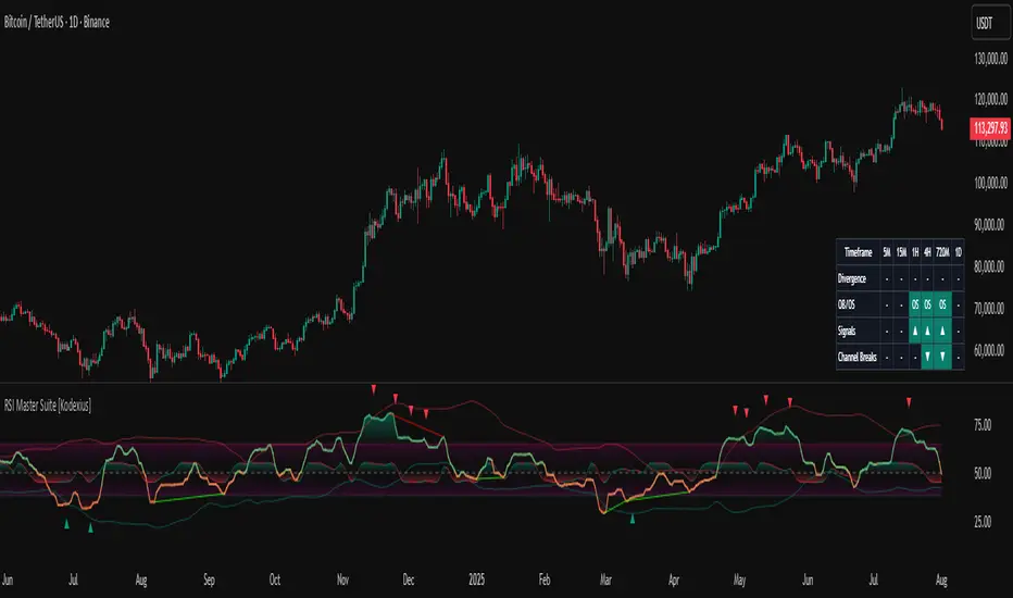
RSI Master Suite [Kodexius]RSI Master Suite is a custom momentum engine built around a proprietary RSI style oscillator, designed to go far beyond a simple overbought and oversold line. The core calculation uses internal smoothing and optional adaptive logic to create a cleaner, more stable signal that is still responsive to real time price action. On top of that engine, the script adds structure, context and visual layers that turn the oscillator into a complete decision support panel.
Instead of watching a single line cross fixed levels, you get dynamic channels, gradient zones, reversal markers, divergence mapping, multi timeframe readings, a compressed stochastic flow and automated RSI based trendlines. The goal is to let you read the state of momentum at a glance: where it is stretched, where it is reverting, how different timeframes align and where conditions may support a potential shift in direction.
This is not ordinary RSI. It is a complete momentum intelligence engine that is designed to help you identify trend strength, exhaustion, breakout style conditions and potential reversal points with a structured and visually guided approach.
⚠️ Note:
This suite builds on a custom RSI engine and enhances it with an MTF dashboard, dynamic channels, divergence and deviation logic, stochastic flow and smart alerting. It is suitable for traders who rely on price action and momentum context, from short term scalpers to swing traders and more systematic trend followers.
🔹 Features
🔸 Enhanced RSI Core
- Custom RSI style oscillator with optional adaptive smoothing that aims to reduce noise while keeping momentum turns visible in real time.
- Configurable source and oscillator length to adapt the tool to different markets, assets and styles.
- Optional RSI moving average for an extra layer of confirmation on crosses and reversals.
♦️ Adaptiveness Logic - Heart of the Oscillator
The adaptive RSI engine continuously measures how efficiently price has been moving over a recent window comparing net directional movement to the total back-and-forth volatility.
When price is trending cleanly, the engine behaves closer to a fast response, allowing the oscillator to track momentum shifts more aggressively. In choppy or noisy phases, it automatically slows down and applies a heavier smoothing profile, down-weighting random fluctuations while preserving the larger structural swings.
🔸 Dynamic Channel Suite
- Multiple channel modes (Bollinger-style, Keltner-style or Donchian-style) applied directly to RSI, giving a clear view of volatility and expansion/contraction phases in momentum.
- Upper and lower channel bands highlight when RSI is pressing into extreme territory or breaking out of its usual range.
- Channel touches and breaks can be used as an additional filter for exhaustion or continuation behavior.
🔸 Gradient Overbought/Oversold Zones
- Customizable OB/OS levels with gradient fills, making it easy to see when RSI is entering, residing in, or exiting critical zones.
- Smooth shading between overbought, oversold and midline areas provides instant visual context instead of relying on hard lines alone.
- Midline (50) is clearly marked, helping to distinguish between bullish and bearish momentum regimes.
🔸 Reversal Signal Markers
- Bullish and bearish reversal markers are plotted when RSI conditions suggest a potential shift after reaching OB/OS zones.
- Signals rely on interactions between Enhanced RSI and its internal smoothing, reducing noise compared to raw threshold crosses.
- Markers are placed directly on the RSI line for quick recognition without cluttering the price chart.
🔸 Divergence Mapping (Regular & Hidden)
- Detects regular bullish/bearish divergences as well as hidden bullish/bearish divergences between price and RSI.
- Optional “wait for candle close” behavior, giving you the choice between more reactive or more conservative confirmations.
- Separate visibility toggles for each divergence type so you can focus only on the signals that fit your approach.
🔸 Compressed Stochastic “Flow” Overlay
- Built-in adaptive and normalized Stochastic RSI layer, normalized into a compact band around the midline to avoid overcrowding the panel.
- The design focuses on direction and pressure rather than raw values: the flow band shows whether short-term momentum is actively feeding into the current RSI regime or fading against it, giving an immediate read on micro-structure underneath the main signal.
- Visual emphasis on whether the stochastic flow is leaning bullish or bearish, rather than on exact numeric values.
- Filled zones above/below the midline help to quickly gauge short-term momentum thrusts within the broader RSI context.
🔸 Multi-Timeframe (MTF) Dashboard
- Compact dashboard table that summarizes RSI conditions across multiple user-defined timeframes.
Per-timeframe cells show:
- Divergence bias (bullish/bearish/none),
- OB/OS state,
- Basic directional “signal” hints,
- RSI channel breaks (upside/downside).
Makes it easy to see alignment or conflict between intraday and higher-timeframe momentum without changing charts.
Timeframe labels auto-format into familiar units (e.g., 1H, 4H, 1D) for readability.
🔸 Oscillator-Based Trendlines & Break Detection
- Automatic drawing of oscillator trendlines derived from swing pivots on the oscillator, not just on price.
- Lines adapt to bullish or bearish structures, focusing on clean slopes with minimal internal violations.
- Breaks of these RSI trendlines are highlighted with labels, providing an additional structural confirmation of potential momentum shifts.
🔸 Alert-Ready Event Logic
- Integrated alert conditions for RSI-based reversals and all four divergence types (regular/hidden, bullish/bearish).
- Designed so you can create alerts directly from the indicator, turning key RSI events into actionable notifications.
Altogether, RSI Master Suite consolidates multiple momentum tools into one cohesive interface, helping you read the “story” of RSI and its derivatives more intuitively and efficiently.
🔹 How To Use
▶ Reading the Core Momentum Engine
- The main line represents the custom momentum engine: values sustained above the midline indicate a bullish-leaning regime, while values below it point to a more bearish-leaning backdrop. Gradient OB/OS zones make it easy to see where conditions are stretched or rotating out of extremes instead of behaving like simple on/off thresholds.
- The dynamic channel adds a second layer of structure:
• When the engine is pressing into or outside the outer channel, momentum is extended relative to its recent behaviour.
• When it oscillates closer to the mid-area of the channel, conditions are more neutral or mean-reverting.
- If the internal moving average is enabled, crosses between the engine and its average can highlight transitions between phases rather than just single-bar spikes, especially around overbought/oversold zones.
▶ Working With Reversals & Divergences
- Reversal markers appear when the engine has pushed into OB/OS regions and then begins to turn with confirmation from its internal smoothing. They are meant as attention points around potential inflection zones in momentum, not as blind entry or exit signals on their own.
- Divergence mapping compares the structure of price swings with the structure of the engine:
• Regular bullish/bearish divergences highlight potential exhaustion when price makes a new extreme but momentum does not confirm.
• Hidden bullish/bearish divergences highlight potential continuation when price pulls back but the engine remains relatively strong (or weak) underneath.
- You can choose which divergence types to display and whether they should only confirm on candle close. Keeping “wait for close” enabled generally provides a more conservative, less noisy view of divergence structure.
▶ Using the Compressed Stochastic “Flow” Overlay
- The Stochastic flow band is designed as a micro-structure layer on top of the main engine, compressed into a tight band around the midzone so it doesn’t require a separate oscillator panel.
- When the flow spends more time in the upper side of its band, short-term impulse is aligning with bullish pressure; when it leans to the lower side, short-term activity is skewed bearish. This makes it easier to judge whether recent pushes are driving with, or fading against, the current momentum regime.
- Filled areas above and below the central line turn this overlay into a quick visual gauge of short-term thrust inside the broader momentum context, especially when viewed together with reversals and divergences.
▶ Reading the Multi-Timeframe Dashboard
- The MTF dashboard compresses multiple timeframes into a small table so you can see cross-timeframe alignment without changing charts. Each column corresponds to one timeframe from your list, and each row represents a different aspect of the engine: divergence bias, OB/OS status, directional hint and channel break state.
- A practical approach is to:
• Scan for alignment, where several higher timeframes show similar momentum regimes or biases.
• Note areas of conflict, where lower timeframes are diverging or reverting while higher timeframes remain extended.
- Used this way, the dashboard acts as a context map you glance at before drilling into any individual setup.
▶ Trendlines, Breaks & Structure
- The oscillator-based trendlines are drawn from swing pivots on the engine itself. This can reveal underlying momentum structure that does not always appear clearly on raw price swings.
- Rising lines typically reflect underlying strength, while falling lines reflect underlying weakness. When these lines are broken and annotated on the panel, they can serve as structural confirmation that a prior momentum phase is weakening or transitioning into something new.
- Many users keep this component off for day-to-day monitoring and switch it on when they want a more detailed structural read on momentum phases.
ADX Trend VisualizerThis is an enhanced version of the excellent indicator created by ⓒ BeikabuOyaji (Thank You!).
I've made it more visually intuitive by improving the ADX DI line crossover visualization and adding signal alerts.
This indicator utilizes standard ADX calculations and focuses on intuitive visual separation of signals.
It serves as an excellent reference tool for comparison with existing indicators.

👑Relative Strength Index Beast Mode👑 Relative Strength Index – Beast Mode
Key Features:
- Smooth, bold purple RSI line (14-period by default, fully customizable)
- Unique 8-level octave grid (0 to 100) with permanent side labels:
→ bottom (0) • strong oversold (12.5) • oversold (30)
→ middle (50) • overbought (70) • strong overbought (87.5) • top (100)
- Color-coded zones:
• Green zone = Strong buying pressure building
• Red zone = Extreme selling pressure / distribution
• Thick black midline at 50
- Extra reference lines: 80 (strong momentum), dashed 70/30 levels
- Clean, always-visible labels that stay fixed on the right side
Ideal for traders who:
- Want deeper insight than basic overbought/oversold
- Trade RSI divergence, failure swings, or hidden zones
- Love clean, professional, and informative charts
This isn’t just an RSI plot.
This is the King of RSI indicators.
Coded in Pine Script™ v6 | Super lightweight & fast | Made by KULDEEP157

Value Charts by Mark Helweg1. Introduction
This script is a simplified implementation of the Value Charts concept introduced by Mark Helweg and David Stendahl in their work on “Dynamic Trading Indicators”. It converts raw price into value units by normalizing distance from a dynamic fair‑value line, making it easier to see when price is relatively overvalued or undervalued across different markets and timeframes. The code focuses on plotting Value Chart candlesticks and clean visual bands, keeping the logic close to the original idea while remaining lightweight for intraday and swing trading.
2. Key Features
- Dynamic fair‑value axis
Uses a moving average of the chosen price source as the fair‑value line and a volatility‑based deviation (smoothed True Range) to scale all price moves into comparable value units.
- Normalized Value Chart candlesticks
OHLC prices are transformed into value units and displayed as a dedicated candlestick panel, visually similar to standard candles but detached from raw price, highlighting relative extremes instead of absolute levels.
- Custom upper and lower visual limits
User‑defined upper and lower bands frame the majority of action and emphasize extreme value zones, helping the trader spot potential exhaustion or mean‑reversion conditions at a glance.
- Clean, publishing‑friendly layout
Only the normalized candles and three simple reference lines (top, bottom, zero) are plotted, keeping the chart uncluttered and compliant with presentation standards for published scripts.
3. How to Use
1. Attach the indicator to a separate pane (overlay = false) on any market and timeframe you trade.
2. Set the “Period (Value Chart)” to control how fast the fair‑value line adapts: shorter values react more quickly, longer values smooth more.
3. Adjust the “Volatility Factor” so that most candles stay between the upper and lower limits, with only true extremes touching or exceeding them.
4. Use the Value Chart candlesticks as a relative overbought/oversold tool:
- Candles pressing into the Top band suggest overvalued conditions and potential for pullbacks or reversions.
- Candles pressing into the Bottom band suggest undervalued conditions and potential for bounces.
5. Combine the signals with your existing price‑action, volume, or trend‑filter rules on the main chart; the Value Chart panel is designed as a context and timing tool, not a standalone trading system.

Combined: Net Volume, RSI & ATR# Combined: Net Volume, RSI & ATR Indicator
## Overview
This custom TradingView indicator overlays **Net Volume** and **RSI (Relative Strength Index)** on the same chart panel, with RSI scaled to match the visual range of volume spikes. It also displays **ATR (Average True Range)** values in a table.
## Key Features
### Net Volume
- Calculates buying vs selling pressure by analyzing lower timeframe data
- Displays as a **yellow line** centered around zero
- Automatically selects optimal timeframe or allows manual override
- Shows net buying pressure (positive values) and selling pressure (negative values)
### RSI (Relative Strength Index)
- Traditional 14-period RSI displayed as a **blue line**
- **Overlays directly on the volume chart** - scaled to match volume spike heights
- Includes **70/30 overbought/oversold levels** (shown as dotted red/green lines)
- Adjustable scale factor to fine-tune visual sizing relative to volume
- Optional **smoothing** with multiple moving average types (SMA, EMA, RMA, WMA, VWMA)
- Optional **Bollinger Bands** around RSI smoothing line
- **Divergence detection** - identifies regular bullish/bearish divergences with labels
### ATR (Average True Range)
- Displays current ATR value in a **table at top-right corner**
- Configurable period length (default: 50)
- Multiple smoothing methods: RMA, SMA, EMA, or WMA
- Helps assess current market volatility
## Use Cases
- **Momentum & Volume Confirmation**: See if RSI trends align with net volume flows
- **Divergence Trading**: Automatically spots when price makes new highs/lows but RSI doesn't
- **Volatility Assessment**: Monitor ATR for position sizing and stop-loss placement
- **Overbought/Oversold + Volume**: Identify exhaustion when RSI hits extremes with volume spikes
## Customization
All components can be toggled on/off independently. RSI scale factor allows you to adjust how prominent the RSI line appears relative to volume bars.

Trend Finder - Buy/Sell (Anuj Edition)Renko Trend Finder – Anuj Edition is a powerful trend-following tool designed to detect market direction using Renko logic instead of traditional candlesticks.
Renko filtering removes market noise, making trends clearer and reversals easier to identify.
This indicator internally builds Renko-style price movement and generates clean, high-quality Buy and Sell signals without repainting.

ZENADX Flow DI+ DI-ZENADX Flow Di+ Di- — Modified ADX/DI Trend Structure
This indicator is a refined and brand-aligned enhancement of the classic ADX, +DI, and –DI system, inspired by the original open-source work of Gustavo Cardelle (Gu5).
The ZENADX Flow version focuses on clear trend interpretation, minimal visual noise, and stable performance for discretionary and algorithmic traders.
🔍 What This Indicator Does
ADX Line (White Base Tone)
Shows overall trend strength. Rising ADX = strengthening trend.
Color-Coded ADX Flow
Green shades → Bullish directional strength
Red shades → Bearish directional strength
White → Low ADX / ranging market
+DI and –DI Structure
Helps identify which side (buyers or sellers) currently controls momentum.
DI Cross (Yellow Signal Marker)
Highlights potential trend-shift zones where +DI and –DI intersect.
Trend Markers Above the Indicator
Bullish Trend
Bearish Trend
Strong Bullish
Strong Bearish
End Trend (trend exhaustion)
✨ Improvements in the ZENADX Flow Edition
New optimized defaults: DI Length = 8, Range Level = 25, Trend Level = 25
Cleaned color logic for clarity and emotional neutrality
Removed bar-coloring to keep price action clean
Alerts remain always available (no toggle required)
Fully rewritten into safe, stable Pine formatting to avoid syntax issues
📌 Recommended For
Trend-followers
Momentum traders
Algo developers using DI/ADX states
Reversal detection (via DI Cross)
🧭 ZENADX Flow Research
Developed and refined under the ZENADX Flow Research methodology, focusing on:
Simplicity
Psychological clarity
Consistency
Actionable trend structure
📝 License
This work extends the original script by Gustavo Cardelle (Gu5) and follows the same license:
Attribution–NonCommercial 4.0 International (CC BY-NC 4.0)
-------------------------------------------------------------------
ZENADX Flow Di+ Di- — ระบบวิเคราะห์เทรนด์ ADX/DI เวอร์ชันปรับปรุง
อินดิเคเตอร์ตัวนี้เป็นการพัฒนาและปรับปรุงจากโครงสร้างดั้งเดิมของ ADX / +DI / –DI โดยอ้างอิงจากงานต้นฉบับของ Gustavo Cardelle (Gu5)
เวอร์ชัน ZENADX Flow ถูกออกแบบให้ อ่านง่าย ชัดเจน และรองรับการใช้งานทั้งเทรดมืออาชีพและระบบอัตโนมัติ
🔍 สิ่งที่อินดิเคเตอร์นี้ช่วยให้เห็น
ADX สีขาวเป็นฐาน
แสดง “ความแข็งแรงของเทรนด์” (ไม่ใช่ทิศทาง)
โทนสีบอกพลังเทรนด์
เขียวเข้ม/อ่อน → เทรนด์ขาขึ้นกำลังแข็งแรง/อ่อน
แดงเข้ม/อ่อน → เทรนด์ขาลงกำลังแข็งแรง/อ่อน
ขาว → ช่วงตลาด Sideway / เทรนด์อ่อน
+DI / –DI
ช่วยบอกว่าซื้อหรือขายกำลังคุมตลาดอยู่
DI Cross (จุดสีเหลือง)
เป็นสัญญาณเปลี่ยนโมเมนตัมที่สำคัญ
สัญลักษณ์เหนืออินดิเคเตอร์
Bullish Trend
Bearish Trend
Strong Bullish
Strong Bearish
End Trend (จบเทรนด์)
✨ สิ่งที่ปรับปรุงในเวอร์ชัน ZENADX Flow
ค่าเริ่มต้นใหม่ที่เหมาะกับ Flow Trading: DI = 8, Range = 25, Trend = 25
ลบ bar-coloring เพื่อให้กราฟสะอาด
ระบบสีอ่านง่าย ไม่ปนกัน
Alerts ทำงานพร้อมใช้ทันที
จัด Code Format แบบ “Safe Format” เพื่อป้องกัน error ขณะแก้ไข
🧭 พัฒนาโดย ZENADX Flow Research
ยึดหลักสำคัญของ ZENADX คือ
ความเรียบง่าย
ความชัดเจนทางจิตวิทยา
ความสม่ำเสมอ
มุ่งเน้นเทรนด์ที่ “ไหล” ตามโครงสร้างตลาดจริง
📝 License
สคริปต์นี้พัฒนาต่อยอดจากอินดิเคเตอร์ต้นฉบับของ Gustavo Cardelle (Gu5)
และยังใช้สัญญาอนุญาตเดียวกัน:
Attribution–NonCommercial 4.0 International (CC BY-NC 4.0)

MR GenericA clean Z-score oscillator that measures how far price has stretched from its rolling regression mean.
Green zones is oversold, red zones is overbought. Small circles flag normal reversals; tiny diamonds mark rare extreme levels (±2.8σ+). Works on any asset, any timeframe.

Session Volume Profile – Asia, London, NYSession Volume Profile – Asia, London, New York
Product Description
This tool displays intraday volume distribution for the Asian, London, and New York trading sessions.
It provides a visual breakdown of where trading activity concentrated during each session, helping users study volume structure across global market phases.
What the Tool Shows
1. Session Levels
Each session plots three main reference levels:
Point of Control (POC) — the price level with the highest volume traded during that session
Value Area High (VAH) — upper boundary of the primary volume region
Value Area Low (VAL) — lower boundary of the primary volume region
Each session is assigned its own color for easier differentiation.
2. Session Volume Histogram
A horizontal volume histogram displays how activity is distributed within each session.
Longer bars indicate higher relative volume at that price.
3. Session Highlighting (Optional)
Background shading can be enabled to visually identify the current active session.
4. Session Countdown (Optional)
A small text label shows how much time is left in the current session. This is for chart awareness only.
How to Read the Display (Educational Use Only)
POC is often viewed by many traders as a key reference point when studying intraday balance or activity clusters.
VAH / VAL can help users observe where the majority of volume occurred within a session.
Comparing session profiles may help identify how participation shifts from Asia → London → New York.
Observing how price interacts with these historical volume areas can provide context when studying intraday structure.
This panel does not generate trading signals. It is intended for chart analysis, market study, and understanding how volume distributes across global sessions.
Customization Options
Accessible via Settings → Inputs:
Enable/disable any session
Adjust value area percentage
Modify histogram density
Adjust visual opacity
Toggle countdown timer or session shading
These options allow users to tailor the display to different chart styles and timeframes.
Notes
This tool is for educational and informational purposes only.
It does not provide trading or financial advice.
No signals are produced; all outputs are historical/analytical.
Code is published as protected/closed-source to preserve the structure of the underlying calculations.

Options Fusion Core - Lite v6Options Fusion Core – Lite v6
A dual-engine oscillator designed to provide clear, confidence-driven market reads. OFC – Lite v6 combines two high-signal components into a single 0–100 panel to help traders interpret momentum strength and liquidity flow at a glance.
Core Components
Momentum Engine (Solid Line)
Above 50: Bullish bias (green shades)
Below 50: Bearish bias (red shades)
Near 20 or 80: Potential exhaustion zones where trends may pause or reverse
Liquidity Gauge (Dotted Line)
Above 55: Strong buying pressure
Below 45: Selling pressure
Around 50: Neutral flow
How to Use (Educational Purpose Only)
Alignment Signals: Watch for Momentum Engine and Liquidity Gauge moving in the same direction.
Example: Momentum >50 and Liquidity >55 → constructive environment
Example: Momentum <50 and Liquidity <45 → weakening conditions
Extremes: Momentum near 20 or 80 indicates potential trend exhaustion. Paired with strong Liquidity changes, these zones may highlight possible reversals or pauses.
Neutral Line (50): Many false moves occur around 50. Wait for a clear break above or below before interpreting as a signal.
Use in Context: Combine with price action, volume, or other indicators for confirmation.
User Inputs
Fast Momentum Length — controls how quickly Momentum reacts
VFI Length — smooths the Liquidity Gauge
VFI Cutoff — adjusts sensitivity to flow spikes
Lite Version:
Oscillator panel only
No automated signals or multi-ticker table
Educational and visualization purposes only
Important Notice
This script is educational and informational only. Not trading, financial, or investment advice.
Calculations are proprietary and protected to safeguard intellectual property.
No repainting; all results reflect real-time calculation.

Gamma Conviction Oscillator LiteGamma Conviction Oscillator Lite
A volume-weighted momentum oscillator designed to help traders visualize conviction in gamma-heavy instruments (SPY, TSLA, NVDA, MSTR, COIN, HOOD, etc.). This LITE edition is fully functional and educational, focusing on reading market momentum without offering trading signals.
Core Features (LITE Version):
Dynamic oscillator panel with volatility-adjusted overbought/oversold levels
Long-term trend filter: 200-period moving average selectable as SMA, EMA, or HMA
Conviction-based coloring system:
Bright Lime → high-conviction oversold (price above long-term MA)
Bright Red → high-conviction overbought (price below long-term MA)
Teal / Maroon → low-conviction extremes (counter-trend)
User Inputs:
Base Oscillator Length, Volatility Smoothing Length, and Sensitivity Factor are adjustable in Settings → Inputs
Long-Term Trend Length and MA Type are selectable for trend confirmation
How to Read Signals (Educational Use Only):
Oscillator Level: Observe the main VWPS line relative to overbought/oversold levels:
Above the red overbought line → price may be stretched
Below the green oversold line → price may be compressed
Trend Context: Compare the oscillator reading to the long-term MA:
Oscillator above oversold + price above MA → potential bullish conviction
Oscillator below overbought + price below MA → potential bearish conviction
Color Coding: The line color communicates conviction strength and trend alignment:
Bright Lime / Bright Red indicate strong alignment with trend extremes
Teal / Maroon indicate weaker, counter-trend extremes
Use the oscillator in conjunction with your own analysis; consider confirming with price action, volume, or other indicators.
LITE Version:
Oscillator panel only
No divergence detection
No multi-ticker gamma table
Important Notice:
This script is educational and informational only. Not trading, financial, or investment advice.
All calculations are proprietary and protected to preserve intellectual property.
No repainting: results reflect real-time calculations.
Source Code:
This script is published as protected/closed-source to safeguard GammaBulldog intellectual property.

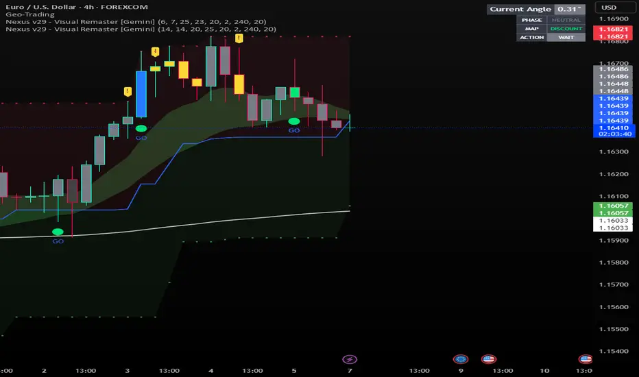
Nexus v29 - Visual Remaster- The Unified Physics EngineTitle: Nexus v29 - Visual Remaster :The Unified Physics Engine
Description:
The Physics of Price Movement
Most indicators fail because they look at only one dimension of the market. They might show you price direction (RSI) or activity (Volume), but they rarely tell you if the move has actual power behind it.
Nexus v29 is built on a "Unified Physics" philosophy. Just as an object in the physical world needs Mass, Acceleration, and Energy to move effectively, a price trend needs Volume, Force, and Trend Strength to sustain a run.
This indicator visualizes the "Life Cycle" of a trend, filtering out the noise (churn) to highlight only the high-probability explosion points where physics aligns in your favor.
How It Works: The 3 Components
1. The Energy (ADX Filter)
The White Line: This is your master switch. It measures the total energy in the system.
The Logic: When the white line is below the threshold (25), the market is in a "Dead Zone." No matter how good the candle looks, there is no kinetic energy to sustain a move. We stay flat.
The Signal: When the line crosses above 25, the engine is on.
2. The Mass (Volume Fuel)
The Background Bars: These represent the market participation.
Grey Bars: Wasted fuel. High volume in a low-energy market is just churn/absorption.
Silver/Blue Bars: Active fuel. Volume that is successfully converting into price movement.
3. The Vector (Force Histogram)
The Colored Bars: This represents the immediate directional force (Momentum).
Lime Green: Explosion. Price is pushing up, Volume is supporting it, and ADX confirms the energy. This is a valid Long environment.
Red: Crash. Price is pushing down with supported volume and high energy. This is a valid Short environment.
Orange/Maroon: Fakeout/Churn. Divergences where price and volume disagree.
The "Equation" Strategy
This script is not just a visualizer; it implements a strict "Physics Equation" to filter trades. A signal is only valid if ALL of the following conditions are met simultaneously:
Trend Alignment: Price must be on the correct side of the 200 SMA (Long > 200, Short < 200).
Volatility Gate: The market must be expanding (ATR > Baseline).
Force Threshold: The momentum impulse must be significant (Force Histogram > 100), ensuring we are catching a runaway train, not a bicycle.
Active Energy: ADX must be > 25.
How to Trade It
Entry: Wait for a Lime Green (Long) or Red (Short) bar that breaks out while the White Line (ADX) is rising. This confirms "Unified Physics"—Mass, Force, and Energy are all aligned.
The Lifecycle Exit: Do not wait for the trend to reverse. Exit when the "physics" break.
Look for the Force Histogram bars to start shrinking for 2 consecutive candles. This indicates momentum is fading (deceleration).
Exit immediately on the close of the second shrinking bar to capture the bulk of the impulsive move (The "Meat" of the trade) before the inevitable pullback.
Indicator Settings
RSI Length: Standard 14 (The Speed).
Volume Lookback: 100 (For relative scaling).
ADX Threshold: 25 (The "Go/No-Go" Line).
Trend Filter: 200 Period SMA.
Disclaimer: Trading involves high risk. This tool helps visualize market conditions based on historical physics but does not guarantee future performance. Always use proper risk management.
EMA + RSI Signal ProKey Features & Logic:
Market Structure Analysis:
Detects bullish and bearish trends based on market structure.
Suggests LONG trades in bullish trends and SHORT trades in bearish trends.
EMA Cross Confirmation:
Signals potential changes in trend momentum using fast and slow EMA crossovers.
Adds an extra layer of confirmation before entering a trade.
RSI Overbought/Oversold Filter:
Ensures entries only occur under optimal conditions:
Buy signals trigger only when the market is oversold.
Sell signals trigger only when the market is overbought.
This reduces false signals and increases the probability of success.
Clear Entry Signals:
Buy and Sell signals are displayed as labels directly on the chart, making them easy to follow.
Optional alert notifications can be set up for instant trade alerts.
Customizable Settings:
Adjustable EMA periods
Adjustable RSI length and overbought/oversold thresholds
Optional trend filtering for even more precise entries
Why this indicator is different:
Unlike basic EMA crossover or RSI indicators, this tool combines three layers of confirmation:
Trend direction from market structure
Momentum change via EMA cross
Optimal entry conditions via RSI
This makes it a complete trading decision tool suitable for Forex, Stocks, Crypto, and other markets.
Disclaimer:
This indicator is for educational purposes only and does not guarantee profits. Always use proper risk management.

Dynamic 15-Ticker Multi-Symbol Table 2025 EditionTitle:
Dynamic 15-Ticker Multi-Symbol Table 2025 Edition
Description:
This script provides a multi-ticker table for TradingView charts. It is fully open-source and free to use. The table displays up to 15 tickers, including SPY as the baseline symbol. The script updates in real-time on any timeframe.
Features:
SPY baseline: The first row always shows SPY for reference.
Custom tickers: Add up to 14 additional tickers via the input settings. Rows without tickers remain hidden.
Price and direction: Each ticker row displays the current price and an indicator of direction based on recent price movement.
RSI (14) indicator: Shows the current relative strength index value with a simple directional marker.
Volume formatting: Displays volume values in thousands, millions, or billions automatically. Volume change is indicated with directional markers.
Stable layout: The table uses alternating row colors for readability and maintains consistent row count without collapsing or disappearing rows.
Real-time updates: All displayed values refresh automatically on any chart timeframe.
How to use:
Add the script to your chart.
Enter your chosen tickers in the input settings. SPY will remain as the first ticker automatically.
Tickers not entered will remain hidden. When a ticker is removed, the row will be removed-dynamically.
Observe live prices, RSI values, and volume changes directly on your chart without switching symbols.
Additional notes:
The script is fully open-source; users are encouraged to modify or improve it.
No external links or references are required to understand its function.
This script does not repaint and does not require additional requests to update values.

ACCDv3# ACCDv3 - Accumulation/Distribution MACD with Divergence Detection
## Overview
**ACCDv3** (Accumulation/Distribution MACD Version 3) is an advanced volume-weighted momentum indicator that combines the Accumulation/Distribution (A/D) line with MACD methodology and divergence detection. It helps identify trend strength, momentum shifts, and potential reversals by analyzing volume-weighted price movements.
## Key Features
- **Volume-Weighted MACD**: Applies MACD calculation to volume-weighted A/D values for earlier, more reliable signals
- **Divergence Detection**: Identifies when A/D trend diverges from MACD momentum
- **Volume Strength Filtering**: Distinguishes high-volume confirmations from low-volume noise
- **Color-Coded Histogram**: 4-color system showing momentum direction and volume strength
- **Real-Time Alerts**: Background colors and alert conditions for bullish/bearish divergences
## Components
### 1. Accumulation/Distribution (A/D) Line
The A/D line measures buying and selling pressure by comparing the close price to the trading range, weighted by volume:
```
A/D = Σ ((2 × Close - Low - High) / (High - Low)) × Volume
```
- **Rising A/D**: More accumulation (buying pressure)
- **Falling A/D**: More distribution (selling pressure)
- **Doji Handling**: When High = Low, contribution is zero (avoids division errors)
### 2. Volume-Weighted MACD
Instead of simple EMAs, the indicator weights A/D values by volume:
- **Fast Line** (default 12): `EMA(A/D × Volume, 12) / EMA(Volume, 12)`
- **Slow Line** (default 26): `EMA(A/D × Volume, 26) / EMA(Volume, 26)`
- **MACD Line**: Fast Line - Slow Line (green line)
- **Signal Line** (default 9): EMA or SMA of MACD (orange line)
- **Histogram**: MACD - Signal (color-coded columns)
This volume-weighting ensures that periods with higher volume have greater influence on the indicator values.
### 3. Histogram Color System
The histogram uses 4 distinct colors based on **direction** and **volume strength**:
| Condition | Color | Meaning |
|-----------|-------|---------|
| Rising + High Volume | **Dark Green** (#1B5E20) | Strong bullish momentum with volume confirmation |
| Rising + Low Volume | **Light Teal** (#26A69A) | Bullish momentum but weak volume (less reliable) |
| Falling + High Volume | **Dark Red** (#B71C1C) | Strong bearish momentum with volume confirmation |
| Falling + Low Volume | **Light Red/Pink** (#FFCDD2) | Bearish momentum but weak volume (less reliable) |
Additional shading:
- **Light Cyan** (#B2DFDB): Positive but not rising (momentum stalling)
- **Bright Red** (#FF5252): Negative and accelerating down
### 4. Divergence Detection
Divergence occurs when A/D trend and MACD momentum move in opposite directions:
#### Bullish Divergence (Green Background)
- **Condition**: A/D is trending up BUT MACD is negative and trending down
- **Interpretation**: Accumulation increasing while momentum appears weak
- **Signal**: Potential bullish reversal or continuation
- **Action**: Look for entry opportunities or hold long positions
#### Bearish Divergence (Red Background)
- **Condition**: A/D is trending down BUT MACD is positive and trending up
- **Interpretation**: Distribution increasing while momentum appears strong
- **Signal**: Potential bearish reversal or weakening uptrend
- **Action**: Consider exits, tighten stops, or prepare for reversal
## Parameters
| Parameter | Default | Range | Description |
|-----------|---------|-------|-------------|
| **Fast Length** | 12 | 1-50 | Period for fast EMA (shorter = more sensitive) |
| **Slow Length** | 26 | 1-100 | Period for slow EMA (longer = smoother) |
| **Signal Smoothing** | 9 | 1-50 | Period for signal line (MACD smoothing) |
| **Signal Line MA Type** | EMA | SMA/EMA | Moving average type for signal calculation |
| **Volume MA Length** | 20 | 5-100 | Period for volume average (strength filter) |
## Usage Guide
### Reading the Indicator
1. **MACD Lines (Green & Orange)**
- **Crossovers**: When green crosses above orange = bullish, below = bearish
- **Distance**: Wider gap = stronger momentum
- **Zero Line**: Above = bullish bias, below = bearish bias
2. **Histogram Colors**
- Focus on **dark colors** (dark green/red) for high-confidence signals
- Be cautious with **light colors** (teal/pink) - wait for volume confirmation
- Watch for **rising red bars** (V-bottom pattern) = potential bullish reversal
- Watch for **falling green bars** (Λ-top pattern) = potential bearish reversal
3. **Background Divergence Alerts**
- **Green background**: Bullish divergence - consider long entries
- **Red background**: Bearish divergence - consider exits or shorts
- Best used in combination with price action and support/resistance levels
### Trading Strategies
#### Trend Following
1. Wait for MACD to cross above zero line with dark green histogram
2. Enter long when histogram shows consecutive dark green bars
3. Exit when histogram turns light green or red appears
#### Divergence Trading
1. Wait for background divergence alert (green or red)
2. Confirm with price action (support/resistance, candlestick patterns)
3. Enter on next dark-colored histogram bar in divergence direction
4. Set stops beyond recent swing high/low
#### Volume Confirmation
1. Ignore signals during low-volume periods (light colors)
2. Take aggressive positions during high-volume confirmations (dark colors)
3. Use volume strength as position sizing guide (larger size on dark bars)
### Best Practices
✓ **Combine with price action**: Don't rely on indicator alone
✓ **Wait for dark colors**: High-volume bars are more reliable
✓ **Watch for divergences**: Early warning signs of reversals
✓ **Use multiple timeframes**: Confirm signals across 1m, 5m, 15m
✓ **Respect zero line**: Trading direction should align with MACD side
✗ **Don't chase light-colored signals**: Low volume = lower reliability
✗ **Don't ignore context**: Market structure and levels matter
✗ **Don't over-trade**: Wait for clear, high-volume setups
✗ **Don't ignore alerts**: Divergences are early warnings
## Technical Details
### Volume-Weighted Calculation Method
Traditional MACD uses simple price EMAs. ACCDv3 weights each A/D value by its corresponding volume:
```pine
// Volume-weighted fast EMA
close_vol_fast = ta.ema(ad × volume, fast_length)
vol_fast = ta.ema(volume, fast_length)
vw_ad_fast = close_vol_fast / vol_fast
// Same for slow EMA
close_vol_slow = ta.ema(ad × volume, slow_length)
vol_slow = ta.ema(volume, slow_length)
vw_ad_slow = close_vol_slow / vol_slow
// MACD is the difference
macd = vw_ad_fast - vw_ad_slow
```
This ensures high-volume periods have proportionally more impact on the indicator.
### Volume Strength Filter
Determines whether current volume is above or below average:
```pine
vol_avg = ta.sma(volume, vol_length)
vol_strength = volume > vol_avg
```
Used to select dark (high volume) vs light (low volume) histogram colors.
### Divergence Logic
```pine
// A/D trending up if above its 5-period SMA
ad_trend = ad > ta.sma(ad, 5)
// MACD trending up if above zero
macd_trend = macd > 0
// Divergence when trends oppose
divergence = ad_trend != macd_trend
// Specific conditions
bullish_divergence = ad_trend and not macd_trend and macd < 0
bearish_divergence = not ad_trend and macd_trend and macd > 0
```
## Alerts
The indicator includes built-in alert conditions:
- **Bullish Divergence**: "Bullish Divergence: A/D trending up but MACD trending down"
- **Bearish Divergence**: "Bearish Divergence: A/D trending down but MACD trending up"
To enable:
1. Click "Create Alert" button in TradingView
2. Select "ACCDv3" as condition
3. Choose "Bullish Divergence" or "Bearish Divergence"
4. Configure notification method (popup, email, webhook, etc.)
## Comparison with Standard MACD
| Feature | Standard MACD | ACCDv3 |
|---------|---------------|---------|
| **Input** | Close price | Accumulation/Distribution line |
| **Weighting** | Simple EMA | Volume-weighted EMA |
| **Divergence** | Price vs MACD | A/D vs MACD |
| **Volume Analysis** | None | Built-in strength filter |
| **Color System** | 2 colors (up/down) | 4+ colors (direction + volume) |
| **Leading/Lagging** | Lagging | More leading (volume-weighted) |
## Example Scenarios
### Scenario 1: Strong Bullish Signal
- **Chart**: MACD crosses above zero line
- **Histogram**: Dark green bars (#1B5E20) appearing
- **Volume**: Above 20-period average
- **Action**: Enter long, strong momentum with volume confirmation
### Scenario 2: Weak Bearish Signal
- **Chart**: MACD crosses below zero line
- **Histogram**: Light pink bars (#FFCDD2) appearing
- **Volume**: Below 20-period average
- **Action**: Avoid shorting, low volume = unreliable signal
### Scenario 3: Bullish Divergence Reversal
- **Chart**: Price making lower lows
- **Indicator**: A/D line trending up, MACD negative
- **Background**: Green shading appears
- **Histogram**: Transitions from red to dark green
- **Action**: Look for long entry on next dark green bar
### Scenario 4: V-Bottom Reversal
- **Chart**: Downtrend in place
- **Histogram**: Red bars start rising (becoming less negative)
- **Pattern**: Forms "V" shape at bottom
- **Confirmation**: Transitions to dark green bars
- **Action**: Bullish reversal signal, consider long entry
## Timeframe Recommendations
- **1-minute**: Scalping, very fast signals (noisy, use with caution)
- **5-minute**: Intraday momentum trading (recommended)
- **15-minute**: Swing entries, clearer trend signals
- **1-hour+**: Position trading, major trend identification
## Limitations
- **Requires volume data**: Will not work on instruments without volume
- **Lag during consolidation**: MACD is inherently trend-following
- **False signals in chop**: Sideways markets generate noise
- **Not a standalone system**: Should be combined with price action and risk management
## Version History
- **v3**: Removed traditional price MACD, using only volume-weighted A/D MACD with A/D divergence
- **v2**: Added A/D divergence detection, volume strength filtering, enhanced histogram colors
- **v1**: Basic MACD on A/D line with volume-weighted calculation
## Support & Further Reading
For questions, updates, or to report issues, refer to the main project documentation or contact the developer.
**Related Indicators in Suite:**
- **VMACDv3**: Volume-weighted MACD on price (not A/D)
- **RSIv2**: RSI with A/D divergence
- **DMI**: Directional Movement Index with A/D divergence
- **Elder Impulse**: Bar coloring system using volume-weighted MACD
---
*This indicator is for educational purposes. Always practice proper risk management and never risk more than you can afford to lose.*

RSI & Bull Bear Power ProRSI & Bull Bear Power Pro
RSI & Bull Bear Power Pro is an advanced momentum confirmation indicator that combines RSI behavior with real Bull–Bear market pressure. It detects strong reversals, trend continuation setups, exhaustion zones, and divergence, helping you filter noise and avoid weak entry signals. Works on all markets and timeframes and includes strong buy/sell alerts with non-repainting logic.
FEATURE HIGHLIGHTS
• RSI + Bull/Bear pressure
• Strong Buy / Strong Sell alerts
• Divergence detection
• Trend confirmation
• Exhaustion zones
• No repaint
• Works on every market & timeframe
WHY USE IT
Traditional RSI often gives late or weak signals. By confirming momentum with directional power, this tool shows when buyers or sellers actually take control, improving entry timing and filtering false setups.
WHO IS IT FOR
Scalpers, day traders, swing traders, and anyone who needs high-probability reversal and momentum confirmation signals.
INDICATOR DEFINITIONS (Short Technical Notes)
RSI (Relative Strength Index)
Measures momentum by comparing recent gains and losses. It helps identify overbought/oversold conditions and momentum shifts.
Smoothed RSI
A moving average applied to RSI to reduce noise and provide a clearer momentum reading.
RSI Momentum
Shows whether momentum is increasing or decreasing by comparing current RSI to its previous value.
RSI Trend Condition
Defines trend direction by comparing RSI to its short moving average, helping identify bullish or bearish momentum phases.
Bull Power
Measures how far the high price is above the EMA. Indicates bullish pressure and buyer strength.
Bear Power
Measures how far the low price is below the EMA. Indicates bearish pressure and seller strength.
Bull/Bear Power (BBP Combined)
Combines bull and bear power into one value, showing the balance between buying and selling pressure.
BBP Increasing Trend
Checks if power is rising compared to the previous bar, confirming strength in the current direction.
BBP Positive/Negative Zone
Indicates if the market power is dominated by buyers (positive) or sellers (negative).
Strong Buy Signal
Triggered when RSI exits oversold AND Bull/Bear Power turns positive at the same time.
Strong Sell Signal
Triggered when RSI exits overbought AND Bull/Bear Power turns negative at the same time.
Normal Buy / Sell Signals
Conditional mid-level signals based on momentum changes without full confirmation.
Bullish Divergence
Price makes a lower low while RSI makes a higher low, indicating a potential bullish reversal.
Bearish Divergence
Price makes a higher high while RSI makes a lower high, indicating a potential bearish reversal.
Stop guessing momentum strength. Trade with real confirmation and see who truly controls the market.

Sniper Perfect ProtectedOverview Sometimes, the simplest strategies are the deadliest. This indicator brings the legendary "EMA 50 Strategy" to your chart in its purest form. It is designed to capture major market trends and reversals immediately as they happen, stripping away complex filters that often cause lag.
Why the EMA 50? The 50-period Exponential Moving Average is widely regarded by institutional traders as the primary divider between bullish and bearish territory. This tool automates the monitoring of this key level.
How It Works The logic is raw and direct:
BUY Signal: Triggered immediately when the candle closes ABOVE the EMA 50.
SELL Signal: Triggered immediately when the candle closes BELOW the EMA 50.
Key Features
Zero Noise Technology: Includes a built-in state machine that prevents repetitive signals. You will receive exactly ONE signal when the trend flips, and silence until the next reversal.
Dynamic Visuals: The EMA line changes color (Green for Bullish, Red for Bearish) to give you instant context.
Lag-Free: unlike other tools that wait for multiple confirmations, this tool prioritizes speed to catch sharp moves (like sudden crashes or rallies).
Best For
Trend Following
Swing Trading (Crypto & Stocks)
Catching rapid reversals that complex indicators might miss.
