VWAP Tension Bands + Osc Sigma Gap [MAXmks]Hello Traders,
This indicator started as an accident. I was building a different tool — a multi-metric dashboard — and added VWAP deviation as one of the components. I expected it to help catch falling knives. It didn't.
But I noticed something else. During cooling-off periods — when volatility fades and price just sits there, not really going anywhere — VWAP deviation on lower timeframes would start climbing quietly. And more often than not, a pullback followed. Sometimes a liquidity sweep first, then a pullback. I watched this pattern for months before deciding to build a dedicated tool around it, adding oscillator confirmation to filter the noise.
This is that tool.
The core idea
Markets act like a rubber band around VWAP — the further price stretches, the higher the tension. But raw deviation isn't enough. The real question: is momentum confirming the stretch, or lagging behind?
The σ-Gap captures when these two disagree — price pushed hard, but internals haven't caught up. That's where mean-reversion setups tend to appear.
The indicator tracks VWAP deviation across 2m / 5m / 15m simultaneously and compares it against a composite of momentum oscillators (Williams %R, CVD-based metrics). Signals require multi-timeframe consensus — no single timeframe can trigger alone.
Adaptive thresholds
What counts as "extreme" isn't fixed. Distance is measured in standard deviations (σ) , not pips or percentages — so the indicator adapts to volatility automatically. Thresholds scale with regime and historical distribution, adjusting to current market conditions in real time.
Two modes
Standard — adaptive thresholds, more signals. Good for active sessions and exploration.
High Precision — adds divergence confirmation from multiple oscillators (MFI, Delta RSI, CVD Z-Score). Fewer signals, higher selectivity.
Extreme Tension
When σ-Gap exceeds 1.6× the threshold, the indicator can fire without full confirmation. Rare, but these are the "overstretched" moments worth watching.
Filters (so you don't trade ghosts)
RVOL filter blocks signals during low activity. Session close filter avoids entries near VWAP reset. 24h volume filter skips illiquid instruments. Cooldown prevents signal clustering in the same direction.
Best use case
Built for short-term mean-reversion — quick snapback plays on 5m–15m charts where price overextends and reverts within a few candles. The engine is optimized for this rhythm, not for trend-following or swings.
On-chart
Tension Bands show dynamic threshold zones around VWAP. Signals are non-repainting and confirmed on bar close. Compact HUD displays all metrics, filter states, and signal status in real time.
Alerts
Pre-signal alerts when conditions start forming. Confirmed signal alerts with full breakdown: VWAP deviation values, σ-Gap readings, divergences detected, current mode.
Volume matters
This is a VWAP-based indicator. No volume data = no signal. If your instrument shows "No Volume" in the dashboard, switch to a data feed that provides it (crypto spot, futures, stocks with real volume).
A note on expectations
I use this logic in my own research and it has shown useful results for me in my backtesting scenarios. But this is an indicator for analysis , not a magic button. Your execution, fees, slippage, and market regime all matter. Treat signals as context, not commands. DYOR.
Feedback welcome.
For educational and analysis purposes only. Not financial advice.
Mtfanalysis

Multi-Timeframe Order BlocksDesigned to identify and visualize key supply and demand zones based on order block theory across multiple timeframes. The indicator detects order blocks by analyzing sequential candle patterns and price movement thresholds to highlight potential reversal or continuation zones where institutional buying or selling activity may have occurred.
The indicator works by scanning for clusters of consecutive bullish or bearish candles followed by a significant price move, which signals the formation of an order block. It then plots these zones as colored boxes on the chart—green for demand (bullish order blocks) and red for supply (bearish order blocks). The zones can be based on candle bodies or wicks, depending on user preference, and the indicator supports multi-timeframe analysis by allowing optional higher timeframe inputs.
How It Works:
Sequential Candle Detection: The indicator looks for a specified number of consecutive bullish or bearish candles (configurable by the user) to identify potential order blocks.
Price Movement Threshold: It checks if the price movement after the order block formation exceeds a user-defined percentage threshold, ensuring only significant zones are marked.
Zone Plotting: Once an order block is confirmed, the indicator draws a supply or demand zone as a box on the chart, using either candle bodies or wicks for zone boundaries.
Multi-Timeframe Support: Users can optionally specify higher timeframes to incorporate broader market context, enhancing the reliability of the zones.
Zone Management: The indicator limits the number of zones displayed to avoid clutter, automatically removing the oldest zones when the maximum count is exceeded.
How to Interpret:
Demand Zones (Green Boxes): These represent areas where buying pressure was strong enough to create a bullish order block. Price often finds support here, making these zones potential entry points for long trades or areas to watch for price bounces.
Supply Zones (Red Boxes): These indicate areas of strong selling pressure forming bearish order blocks. Price may face resistance in these zones, which can be used as potential exit points for longs or entry points for shorts.
Multi-Timeframe Confirmation: Zones identified on higher timeframes tend to be stronger and more reliable. Use the optional higher timeframe inputs to align your trades with broader market trends.
Use with Other Indicators: Combine order block zones with volume, momentum, or trend indicators to improve trade confirmation and risk management.
Zone Breaks: A decisive break and close beyond a supply or demand zone may signal a shift in market sentiment and potential trend continuation or reversal.
Disclaimer
This indicator is provided for educational and informational purposes only and does not constitute financial advice. Trading involves significant risk, and it is possible to lose more than your initial investment. Users should conduct their own research and consider their financial situation carefully before making any trading decisions. The developer and publisher of this indicator are not responsible for any trading losses or damages incurred. Always use proper risk management and consult with a licensed financial advisor if needed.

Blockcircle Heikin-Ashi Multi-TimeframeThe BLOCKCIRCLE HEIKIN-ASHI MULTI-TIMEFRAME indicator displays Heikin-Ashi price data across multiple timeframes simultaneously, giving you a clear picture of trend direction from your current chart all the way up to monthly views.
Instead of flipping between charts to check if higher timeframes agree with your trade idea, everything sits right in front of you on a single unified view.
The core concept is simple: when multiple timeframes show the same trend direction, the probability of a successful trade increases. When they disagree, you might want to wait for better alignment or reduce your position size.
WHAT MAKES THIS INDICATOR ORIGINAL AND DIFFERENT
While Heikin-Ashi candles and multi-timeframe analysis are established concepts, this indicator extends beyond simple HA plotting in several ways that justify its protected source status.
First, the summary scoring algorithm calculates a directional score from 0 to 100 that quantifies trend alignment across all enabled timeframes. This is not simply counting bullish versus bearish readings. The score incorporates the current timeframe alongside higher timeframes, weights each contribution, and produces a single metric that represents overall market structure bias.
Second, the indicator includes an intelligent auto-timeframe system that dynamically selects appropriate higher timeframes based on your current chart. Rather than requiring manual configuration, the algorithm maps each chart timeframe to a logical hierarchy of higher timeframes. A 15-minute chart automatically receives 30-minute, 1-hour, 2-hour, 4-hour, and 8-hour references. A daily chart receives 3-day, weekly, 2-week, monthly, and quarterly references. This mapping logic ensures meaningful timeframe relationships regardless of where you trade.
Third, the alignment quality calculation measures how decisive the current trend reading is, regardless of direction. A score where 80 percent of timeframes agree in either direction produces a high alignment quality rating, while a 50/50 split produces low quality. This helps traders distinguish between strong conviction setups and ambiguous market conditions.
Fourth, the stability factor tracks how many timeframes have recently changed direction. Markets where multiple timeframes are actively flipping carry different risk characteristics than markets where all timeframes have maintained their direction for extended periods. The stability calculation converts recent change counts into a percentage that feeds into the overall assessment.
Fifth, the confidence rating system interprets the raw data and translates it into actionable guidance. High confidence requires near-complete alignment across timeframes. Medium confidence requires majority agreement. Low confidence indicates mixed conditions. This interpretation layer helps traders who prefer clear guidance over raw numbers.
These proprietary elements, particularly the auto-timeframe mapping, the multi-factor scoring system, and the stability tracking, represent original development work that extends meaningfully beyond standard Heikin-Ashi MTF implementations available elsewhere.
KEY FEATURES
Multi-Timeframe Heikin-Ashi Display: View up to five higher timeframes plotted directly on your chart alongside the current timeframe
Each timeframe shows both the open and close values as separate lines, with optional fill between them
Heikin-Ashi smoothing filters out market noise better than standard candlesticks, making trend direction easier to identify
All timeframe data updates in real-time as new bars form
Professional Dashboard Panel
Summary score from 0 to 100 that quantifies overall trend alignment at a glance
Individual timeframe breakdown showing exact open and close prices, trend direction, and whether a change just occurred
Statistics section with trend strength percentage, timeframe alignment count, and recent change tracking
Signal status that interprets the data and suggests whether conditions favour buying, selling, or staying neutral
Confidence rating based on how many timeframes agree with each other
Compact mode option for traders who prefer a smaller footprint on their charts
Visual Customisation Options
Three display modes: lines only for a clean look, lines with fill for easier trend visualisation, or cloud style for a more distinct separation between levels
Full colour control for each timeframe so you can match your existing chart theme
Adjustable line widths and optional midline display showing the average of open and close
Background colour shading that changes based on overall trend alignment
Trend change arrows that appear automatically when a timeframe flips direction
Practical Alert System
Individual alerts for each timeframe when it switches from bullish to bearish or vice versa
Combined alert when all enabled timeframes align in the same direction
Single master alert that fires whenever any timeframe changes, useful for staying informed without setting up multiple notifications
Strong trend detection alert when alignment score crosses above key thresholds
HOW TO USE
Setting Up Your Timeframes
Start by choosing timeframes that match your trading style. If you trade the 15-minute chart, enable the 1-hour, 4-hour, and daily timeframes. If you swing trade on the daily, consider the 3-day, weekly, and monthly timeframes.
Give each timeframe a custom label that makes sense to you. The dashboard will display these labels, so use whatever helps you read the information quickly.
You do not need to enable all five timeframes. Many traders find that three or four provide enough context without cluttering the chart.
How to Read the Dashboard
Check the summary row first. A score above 70 with a clear bullish or bearish bias suggests strong alignment. Scores between 40 and 70 indicate mixed conditions where caution is warranted.
Look at the alignment count to see exactly how many timeframes agree. Four out of five being bullish is more convincing than two out of five.
Pay attention to the change indicator, shown as a yellow dot next to any timeframe that just flipped. Recent changes often signal the start of a new move but can also be false signals that reverse quickly.
The confidence rating helps newer traders interpret the data. High confidence means most or all timeframes agree, while low confidence suggests waiting for better conditions.
Identifying Trade Opportunities
The strongest signals occur when all enabled timeframes show the same direction. If you see all green across the board, bullish setups are more likely to succeed. The opposite applies when everything points to bearishness.
When the current timeframe flips to match the higher timeframes, this often marks a good entry point. The lower timeframe is now in agreement with the bigger picture.
Avoid trading against multiple higher timeframes. If the 4-hour, daily, and weekly are all bearish, taking long positions on the 15-minute chart is fighting the overall trend.
Use divergences between timeframes as warning signs. If lower timeframes turn bullish but higher timeframes remain bearish, the rally may be a pullback within a larger downtrend rather than a true reversal.
Managing Risk with Timeframe Analysis
Consider position sizing based on alignment. Full positions when alignment is strong, reduced size when conditions are mixed.
Place stops beyond the higher timeframe structure. If the daily Heikin-Ashi open sits at a certain level, that level often acts as support or resistance.
When higher timeframes start changing direction one by one, this often signals a larger trend shift developing. Take profits or tighten stops on existing positions.
The trend strength percentage gives you a quick read on momentum. Above 80 percent suggests strong conviction in one direction. Below 40 percent suggests the opposite direction dominates.
Combining with Other Analysis
This indicator works well alongside volume analysis. Strong trend alignment with increasing volume adds confidence to the signal.
You can see use the trend change arrows as added confluence towards a trend break as you see below
Support and resistance levels from higher timeframes carry more weight. Use the higher timeframe Heikin-Ashi values as dynamic support and resistance zones.
Combine with momentum oscillators for timing. When the indicator shows alignment and an oscillator shows oversold or overbought conditions, the setup becomes more compelling.
Price action patterns that form in the direction of multi-timeframe alignment have better follow-through than those forming against it.
LIMITATIONS
This indicator uses Heikin-Ashi calculations, which by design lag behind standard price action. Signals confirm trends rather than predict them, and early entries require additional confirmation from other methods.
The auto-timeframe feature selects higher timeframes based on predefined mappings. These mappings work well for most trading styles but may not suit every specific use case. Manual override is available for traders who prefer custom timeframe combinations.
During extended consolidation periods, the summary score may oscillate around 50 percent and produce mixed readings. The indicator performs best when markets exhibit clear directional movement.
Multi-timeframe alignment does not guarantee trade success. Markets can and do reverse even when multiple timeframes agree. Proper risk management and position sizing remain essential regardless of alignment score.
This indicator should be used as part of a complete trading approach. It provides trend context and alignment analysis but does not replace fundamental analysis, risk management, or trading discipline.

Linear Regression Channel with Multi Sigma and Multi Time FrameThis indicator applies multi-sigma linear regression across multiple institutional time horizons to quantify the line of best fit in equities and index markets. By combining multi-timeframe presets with statistically derived deviation bands, it highlights trend structure, volatility expansion, and regime transitions with clarity.
Features
Auto-Multi-Timeframe presets map directly to institutional trend horizons (daily, weekly, monthly) for accurate regime detection.
Multi-Sigma bands (+/-1, +/-2, +/-3) reveal volatility structure, trend strength, and statistical extremes.
The regression line uses a true least-squares calculation, recalculated each bar for precise trend alignment.
Deviation mode allows switching between standard deviation and max deviation to support different volatility models.
A linked PDF on GitHub provides full documentation, derivations, and institutional use-case examples.
More Information Can Be Found Here:
github.com

Relative Strength Index (RSI) w/ Multi Time Frame w/ DivergencesThis indicator is an advanced evolution of the classic Relative Strength Index (RSI), designed to provide deeper market context by combining Momentum, Multi-Timeframe (MTF) analysis, and Divergences into a single, clean visual tool.
Unlike standard indicators, RSI MTF Pro v2 allows you to configure the Main RSI and the Background Trend Zone independently, giving you full control over your strategy (e.g., watching a 15m RSI while monitoring the 4H trend).
Key Features:
🚀 Dual MTF Engine: Completely independent settings for the Main RSI Line and the Background Zone. You can choose different Timeframes, Lengths, and Levels for each.
heatmap Style Background: The indicator background changes color (Red/Green) based on the MTF RSI trend, helping you filter out bad trades and stick to the dominant trend.
🎨 Smart Gradient Fills: To keep your chart clean, the gradient colors (Red/Green fills) only appear when the RSI breaches the Overbought or Oversold levels.
🎯 Divergence Detector: Automatically spots and marks Regular Bullish and Bearish divergences with pivot-based logic.
How to Use:
Trend Confirmation: Use the Background Color to determine the higher timeframe direction (e.g., Red Background = Uptrend).
Entry Signals: Look for RSI signals that align with the background color (e.g., RSI Oversold/Green Gradient + Green Background).
Reversals: Use the built-in Divergence circles to spot potential trend reversals.
Settings:
Main RSI: Customizable Timeframe, Length, OB/OS Levels.
MTF Background: Independent Timeframe, Length, and Zone thresholds (e.g., >60 Red, <40 Green).
Divergences: Toggle On/Off and adjust Pivot lookback periods.
Disclaimer: This tool is for informational purposes only and does not constitute financial advice.

Money Flow Index (MFI) w/ Multi Time Frame DivergencesBack color MTF
Money Flow Index (MFI) w/ Multi Time Frame Divergences

Scalping Dashboard by Jitendra396Scalping Dashboard with Multi Time Frame Signal
Overview Summary of This Indicator
Scalping Dashboard is an advanced multi timeframe Trading Dashboard designed for scalpers, intraday traders, and swing traders.
It combines trend, momentum, volatility, volume, and sniper-entry logic into a single clean panel — helping traders make faster and more confident decisions.
This indicator works on any market (Stocks, Indices, Futures, Crypto, Forex)
Key Features / What This Indicator Does
View market strength across multiple timeframes in one table:
5m, 15m, 30m, 60m, 120m, 240m, Daily (customizable)
Each timeframe shows:
VWAP Position (Above / Below)
MACD Momentum
RSI Strength
ADX Trend Power
Stochastic Direction
EMA 5 / 13 / 21 Position
Final Trade Bias (BUY / SELL / WAIT)
Smart Sniper Entry System
High-probability entry signals based on:
RSI breakout confirmation
Stochastic reversal zone
MACD crossover
Pivot bottom/top confirmation
Multi-Timeframe validation (15m / 60m / Both)
Entry Mode: ANY or ALL conditions
BUY arrows at demand zones
SELL arrows at supply zones
Sniper Entry Logic (Chart Signals)
BUY Triggered only when:
RSI crosses above 40 (coming out of oversold)
RSI is above RSI 14 SMA
Stochastic %K crosses above %D from oversold (<20)
MACD line crosses above signal
Signal occurs at a confirmed swing bottom (pivot low)
Confirmed on 15-minute, 1-hour, or both (user-selectable)
Sniper SELL Triggered only when:
RSI crosses below 60 (coming down from overbought)
RSI is below RSI 14 SMA
Stochastic %K crosses below %D from overbought (>80)
MACD line crosses below signal
Signal occurs at a confirmed swing top (pivot high)
Confirmed on 15-minute, 1-hour, or both
Supertrend Trend Filter
Visual trend confirmation directly on chart:
Helps avoid counter-trend trades
Green = Uptrend
Red = Downtrend
High Volume Candle Detection
Highlights High activity:
Blue candle → Strong buying volume
Black candle → Strong selling volume
Great for spotting breakout & trap moves.
Fully Customizable Dashboard UI
Enable / Disable any column
Enable / Disable any timeframe
Table size: Small / Medium / Large
Table position:
Top / Middle / Bottom
Left / Center / Right
Setting Details
Snapshot/ Image to Understand Changes after Enabling Setting
Snapshot/ Image to Understand Changes after Disabling Setting
Code Summary How This Script Fetches and Calculates Data
High Volume Candle Detection
volMA = ta.sma(volume, volMaLen)
isHighVol = volume > volMA * volMultiplier
barcolor(
enableHighVol and isHighVol and close > open ? color.blue :
enableHighVol and isHighVol and close < open ? color.black :
na)
Sniper BUY / SELL Engine
c1 = ta.crossover(rsi,40)
c2 = rsi > rsiS
c3 = ta.crossover(k,d) and k < 20
c4 = ta.crossover(m,s)
Pivot Confirmation Filter
isBottom = not na(ta.pivotlow(low,pivotLen,pivotLen))
isTop = not na(ta.pivothigh(high,pivotLen,pivotLen))
Thanks
Trading View Community

VDUB Bands - MTF WMA+ATR Volatility Lanes (6 Alerts)VDUB Bands draws volatility-scaled “trend lanes” around a Weighted Moving Average (WMA) using ATR (or a WMA of True Range). It can display up to four tiers (L1–L4), with higher tiers sourced from higher timeframes to show local structure → higher-timeframe structure on a single chart.
────────────────────────────────────────
1. What it does (plain English)
────────────────────────────────────────
Think of each tier as a lane system around the trend:
• Inner rails = “normal volatility lane” around the WMA
• Outer rails = “extension / extreme zone” for that tier
• Higher tiers (L3/L4) show bigger structure
• Lower tiers (L1/L2) show active lane behavior
Typical interpretation:
• Price inside inner rails → normal variance around the trend lane
• Between inner and outer → stretched, but not extreme
• Outside outer rails → extended vs that tier’s volatility band
────────────────────────────────────────
2) Why it’s useful (and why it’s not a mashup)
────────────────────────────────────────
This is not a bundle of unrelated indicators. Everything serves one cohesive purpose:
• Visualize trend + volatility lanes across multiple time horizons
• Keep rails consistent and readable (levels, fills, outlines)
• Optional multi-timeframe aggregation for structure context
• A compact 6-alert set to catch key transitions without alert spam
────────────────────────────────────────
3) What you see on the chart
────────────────────────────────────────
For each level (L1–L4), you can show:
• Upper/Lower Inner rails
• Upper/Lower Outer rails
• Optional center fill (between outer rails) = operating range
• Optional MA line per tier (off by default to reduce clutter)
• Base WMA line (L1 MA) if enabled
Suggested workflow:
• Start with L1 + L2 only
• Add L3/L4 once you like the structure view
• Use Dynamic Opacity if the chart feels crowded
────────────────────────────────────────
4) How it works (transparent formula)
────────────────────────────────────────
For each tier:
• MA = WMA(source, baseLen × levelMultiplier)
• ATR_like = Wilder ATR (default)
OR WMA(TrueRange, atrLen × levelMultiplier)
Inner rails:
• upperInner = MA + ATR_like × innerMult
• lowerInner = MA - ATR_like × innerMult
Outer rails:
• upperOuter = MA + ATR_like × outerMult
• lowerOuter = MA - ATR_like × outerMult
Tier behavior:
• L1 uses the chart timeframe
• L2–L4 can use user-selected HTFs (defaults: 4H / D / W)
or optional auto-selection
────────────────────────────────────────
5) Multi-timeframe behavior + interpolation
────────────────────────────────────────
• L2–L4 use request.security() with lookahead OFF (no future data).
• HTF bands naturally “step” when the HTF candle confirms.
• Interpolate HTF Bands (optional): visually blends from the prior confirmed HTF value to the current confirmed HTF value to reduce stepping. This is display smoothing, not prediction.
Repaint note:
• If Live Interp (Repaints) is enabled, the HTF lines can update intrabar and may repaint. Keep it OFF for strict non-repainting behavior.
────────────────────────────────────────
6) Auto-select L2/L3/L4 (optional)
────────────────────────────────────────
Two modes:
A) Ladder (deterministic)
• Picks “bigger” timeframes relative to the chart (simple and fast).
B) Score (data-driven)
• Tests candidate timeframes and scores them using:
• Coverage: % of closes inside the OUTER band over Score Lookback
• Width: average outer-band width as a fraction of MA
• Targets: Target Coverage + Target Width
• Weights: Coverage Weight + Width Weight
Performance notes:
• Score mode is heavier (many candidates).
• “Lock auto-select after first pick” is recommended to reduce load and avoid platform limits.
────────────────────────────────────────
7) Alerts (6 total, aggregated across L1–L4)
────────────────────────────────────────
Alerts trigger if ANY tier meets the condition:
• Cross ABOVE an OUTER band
• Cross BELOW an OUTER band
• Cross ABOVE an INNER band
• Cross BELOW an INNER band
• Price is OUTSIDE ABOVE an OUTER band
• Price is OUTSIDE BELOW an OUTER band
These are intentionally aggregated to keep the alert count small while catching meaningful transitions.
────────────────────────────────────────
8) Limitations & transparency
────────────────────────────────────────
• Indicator only (not a strategy). No performance claims.
• MTF values update when the higher timeframe candle confirms.
• Interpolation is visual smoothing; it does not forecast.
• Non-standard chart types (Heikin Ashi/Renko/etc) may behave differently from standard candles.
• If you enable repainting options, signals/levels may change intrabar.
────────────────────────────────────────
9) Credits/reuse disclosure
────────────────────────────────────────
• Conceptual inspiration: VDUB and the community “VDUB_BINARY_PRO_3_V2” idea of WMA ± TR/ATR × multipliers.
• This version is a reimplementation + extension, adding:
o Multi-tier architecture (L1–L4)
o Higher-timeframe sourcing + optional interpolation
o Optional scoring-based timeframe selection
o Dynamic opacity + streamlined plotting
o Aggregated 6-alert set
No code was copied directly from the older script; this is a rewritten implementation with additional features and different structure.
www.tradingview.com

EDUVEST QQE Signal v3.0 - Multi-Timeframe Scoring SystemEDUVEST QQE Signal v3.0 - Multi-Timeframe Scoring System
━━━━━━━━━━━━━━━━━━━━━━━━━━━━━━━━━━━━━━━━━━━━━━━━
█ ORIGINALITY
This indicator combines QQE (Quantitative Qualitative Estimation) with HMA (Hull Moving Average) and introduces a unique AI-based scoring system that rates signal quality from 0-100. Unlike traditional QQE indicators that show simple buy/sell signals, this version categorizes signals into four strength levels: BIG CHANCE, SUPER, POWER, and STRONG.
━━━━━━━━━━━━━━━━━━━━━━━━━━━━━━━━━━━━━━━━━━━━━━━━
█ WHAT IT DOES
- Generates scored BUY/SELL signals with quality ratings (60-100 points)
- Categorizes signals into 4 strength levels for easy decision making
- Supports Multi-Timeframe (MTF) analysis
- Auto-detects asset type and applies optimized QQE factors
- Provides customizable alerts based on score thresholds
Signal Hierarchy:
- 💰 BIG CHANCE (90-100): Highest probability setups
- ⚡ SUPER (80-89): Very strong signals
- 🚀 POWER (70-79): Strong signals with HMA confluence
- 💪 STRONG (60-69): Standard quality signals
━━━━━━━━━━━━━━━━━━━━━━━━━━━━━━━━━━━━━━━━━━━━━━━━
█ HOW IT WORKS
【QQE Calculation】
QQE is based on a smoothed RSI with dynamic bands:
1. Calculate RSI with specified period (default: 14)
2. Apply EMA smoothing to RSI (Smoothing Factor, default: 5)
3. Calculate ATR of the smoothed RSI
4. Create dynamic bands: RSI ± (ATR × QQE Factor)
The QQE Factor is automatically adjusted per asset:
- Forex (USDJPY, EURUSD): 3.8 - 4.238
- Gold (XAUUSD): 8.0
- Crypto (BTC): 12.0, (ETH): 10.0
- Indices (NASDAQ): 4.238
【HMA Calculation】
Hull Moving Average for trend confirmation:
HMA = WMA(2 × WMA(price, n/2) - WMA(price, n), √n)
【Signal Generation】
- BUY: QQE crosses above its band (QQExlong == 1)
- SELL: QQE crosses below its band (QQExshort == 1)
【AI Scoring System】
The score is calculated from multiple factors:
Signal Base (0-35 points):
- QQE + HMA confluence: +35
- QQE or HMA alone: +25
QQE Strength (10-25 points):
- RSI distance from 50 (momentum strength)
- >30 distance: +25, >20: +20, >10: +15, else: +10
Volatility Score (-10 to +15 points):
- ATR ratio 1.1-2.0: +15 (optimal volatility)
- ATR ratio <0.8: -10 (low volatility warning)
Volume Confirmation (-5 to +15 points):
- Volume > 120% of average: +15
- Volume < 80% of average: -5
Base Points: +15
Final Score = Clamped(0, 100, sum of all factors)
━━━━━━━━━━━━━━━━━━━━━━━━━━━━━━━━━━━━━━━━━━━━━━━━
█ HOW TO USE
【Recommended Settings】
- Timeframe: 5M, 15M, 1H, 4H
- Best on: Forex, Gold, NASDAQ, BTC/ETH
- Minimum Score: 60 (adjustable)
【Reading Signals】
- BIG CHANCE (Gold label, 90+): Highest conviction - consider larger position
- SUPER (Yellow label, 80-89): Very strong - standard position
- POWER (Cyan/Magenta label, 70-79): Strong with trend confirmation
- STRONG (Green/Red label, 60-69): Valid but use additional confirmation
【MTF Feature】
Enable MTF to analyze signals from a higher timeframe while viewing lower timeframe charts. The indicator auto-selects 5-minute as the analysis timeframe, or you can set it manually.
【Alert Setup】
1. Enable alerts in settings
2. Set minimum score threshold (default: 60)
3. Create alert with "Any alert() function call"
【Important Notes】
- Signals are confirmed at bar close (no repainting)
- Higher scores = higher probability, not guaranteed profits
- Always use proper risk management
- Consider market context and support/resistance levels
━━━━━━━━━━━━━━━━━━━━━━━━━━━━━━━━━━━━━━━━━━━━━━━━
█ SETTINGS
⏱️ MTF Settings
- MTF Use: Enable multi-timeframe analysis
- Manual Timeframe: Override auto-detection
- Show Panel: Display info panel (default: OFF)
🎨 Design
- Neon Colors: Vibrant color scheme
- Show HMA Line: Display HMA on chart
- Minimum Score: Filter weak signals
- Label Transparency: Adjust label opacity
- Large Labels: Mobile-friendly sizing
🔧 QQE Settings
- RSI Period: RSI calculation period
- Smoothing: EMA smoothing factor
- AI Score: Enable scoring system
🔔 Alerts
- Enable Alerts: Turn on/off notifications
- Minimum Score: Alert threshold
━━━━━━━━━━━━━━━━━━━━━━━━━━━━━━━━━━━━━━━━━━━━━━━━
█ CREDITS
QQE concept originally developed by John Ehlers.
HMA (Hull Moving Average) by Alan Hull.
Enhanced with scoring system and MTF support by EduVest.
License: Mozilla Public License 2.0


HTF Balanced Price RangeThis script is based off of TradeForOpp's BPR indicator, but I adapted it to work on higher timeframes

BBands + Overbought/Oversold MarkersAdvanced Bollinger Bands indicator with overbought/oversold signals, automatic squeeze detection, and multi-timeframe (MTF) capabilities.
Retains all functions of the original Bollinger Bands indicator from TradingView with a few added features:
Overbought/Oversold Markers: Visual signals when price opens and closes outside the bands
🔴 Red Highlight & Arrow → Price opens & closes above the upper BB (potential overbought/excess momentum).
🟢 Green Highlight & Arrow → Price opens & closes below the lower BB (potential oversold/reversal).
Squeeze Detection: Automatically highlights when bandwidth reaches its lowest point (narrowest BB width) in the lookback period, signalling potential breakout zones
Multi-Timeframe Bands: Display Bollinger Bands from any timeframe on your current chart (e.g., weekly bands on a daily chart), including markers and squeeze zones
Dual Rendering MTF Modes: Choose between traditional plots (unlimited history) or smooth line drawing (~125-165 MTF bars of history)
Built-in Alerts: Set alerts for overbought conditions, oversold conditions, squeeze detection, or any combination
Fully Customizable: Adjust MA type (SMA/EMA/RMA/WMA/VWMA), standard deviation multiplier, colors, and marker styles
Perfect for: Swing traders, MTF analysis, volatility-based entries, and identifying consolidation/expansion cycles.

Cave Diving 3 Lines System
🤿 Cave Diving Dashboard - A Deep Dive into Market Structure
## The Cave Diving Analogy
Imagine you're a cave diver exploring underwater caverns. As you descend deeper, you encounter different layers of the cave system:
- **The Surface (Internal Levels)** - Where you currently are, constantly shifting with each breath
- **The First Chamber (De Novo Levels)** - Your last known safe position, recently established
- **Deep Caverns (External Levels)** - Ancient, untouched chambers deeper in the system
Just as a cave diver must constantly monitor their position relative to these reference points, traders must track price action against key structural levels.
---
## 🎯 Understanding the Three-Tiered System
### 📍 **INTERNAL LEVELS** (Current 15m Candle)
*Your real-time position in the market*
**Internal High** 🟡 - The highest point reached in the current unfinished 15-minute candle
**Internal Low** 🟢 - The lowest point reached in the current unfinished 15-minute candle
**Think of these as:**
- Your current depth while actively diving
- They update continuously as price moves
- Status shows "Updating" when actively changing, "Intact" when stable
- These are NOT trade levels—they're awareness zones
**Key Insight:** When Internal Low drops below De Novo Low, you're in **Situation A** (bearish pressure building)—the indicator highlights this with red coloring.
---
### 🎯 **DE NOVO LEVELS** (Previous Closed 15m Candle)
*Your most recent confirmed safe zone*
**De Novo High** 🔵 - The high of the last completed 15-minute candle
**De Novo Low** 🟣 - The low of the last completed 15-minute candle
**Etymology:** "De Novo" = Latin for "from new" or "anew"—these are freshly established reference points
**Think of these as:**
- The last solid ground you stood on
- Your most recent confirmed position
- The bridge between where you are (Internal) and where you've been (External)
**Status Tracking:**
- **⬆️ Upgrade** - Level moved favorably (Higher high for resistance, Higher low for support)
- **⬇️ Downgrade** - Level moved unfavorably (Lower high, Lower low)
- **= Same** - No structural change from previous candle
**Trading Significance:**
- Primary reference points for intraday structure
- Breaking De Novo levels often signals directional commitment
- Can merge with External Level 1 when they align (shown as "DN🟰Ext1")
---
### ⛽🤿 **EXTERNAL LEVELS** (Unmitigated Historical 15m Levels)
*Deep liquidity pools waiting to be discovered*
**External High 1 & 2** 🟢🔵 - The two most recent unmitigated 15m highs
**External Low 1 & 2** 🟠🌸 - The two most recent unmitigated 15m lows
**Think of these as:**
- Untouched chambers in the cave system
- Liquidity pools that smart money is targeting
- Levels that "remember" and attract price
**What Makes a Level "Unmitigated"?**
- **Highs**: Price has NOT yet traded through them (broken above)
- **Lows**: Price has NOT yet swept them (broken below)
- Once touched, they're "mitigated" and removed from tracking
- The indicator automatically maintains the two most recent unmitigated levels
**Why "External"?**
They exist outside your current candle structure—historical reference points that institutions use for:
- Stop loss placement
- Profit taking targets
- Liquidity hunting zones
---
## 🎨 Color Coding System
### HIGHS (Resistance/Targets) - Cool Colors
- 🔵 **Ext High 2** - Light Blue (Distant target)
- 🟢 **Ext High 1** - Lime Green (Primary target)
- 🔵 **De Novo High** - Cyan (Recent resistance)
- 🟡 **Internal High** - Lemon Yellow (Current ceiling)
### LOWS (Support/Stops) - Warm Colors
- 🟢 **Internal Low** - Lime (Current floor)
- 🟣 **De Novo Low** - Purple (Recent support)
- 🟠 **Ext Low 1** - Orange-Red (Primary stop zone)
- 🌸 **Ext Low 2** - Pink (Distant support)
---
## 📊 Dashboard Breakdown
### The Table Shows:
1. **Level** - Which level you're tracking
2. **Price** - Exact price of the level
3. **Pts** - Distance from current price (+ above, - below)
4. **Status** - Current state or role of the level
### Special Features:
- **⏰ Countdown Timer** - Shows time remaining until next 15m candle close (next De Novo update)
- **⚠️ Proximity Alerts** - Bottom row warns when within threshold distance of key levels (default: 25 points, adjustable)
---
## 🎯 Trading Applications
### **For Buyers (Going Long):**
- **Entry Zone**: Between De Novo Low and Ext Low 1
- **Stops**: Below Ext Low 1 (or Ext Low 2 for wider stops)
- **Targets**: De Novo High → Ext High 1 → Ext High 2
- **Confirmation**: Internal Low holds above De Novo Low
### **For Sellers (Going Short):**
- **Entry Zone**: Between De Novo High and Ext High 1
- **Stops**: Above Ext High 1 (or Ext High 2 for wider stops)
- **Targets**: De Novo Low → Ext Low 1 → Ext Low 2
- **Warning**: Watch for Situation A (Internal Low < De Novo Low)
### **Risk Management:**
- **DN🟰Ext1** status means De Novo = External 1 (tighter range, use caution)
- Proximity alerts help you avoid chasing price into resistance/support
- "Updating" status on Internal levels = active volatility
- "Upgrade/Downgrade" signals = structural shift in progress
---
## ⚙️ Customization Options
### Lookback Period
- Default: 500 candles (searches 125 hours of 15m data)
- Increase for more historical External levels
- Decrease for focus on recent structure
### Proximity Threshold
- Default: 25 points
- Set based on your instrument's average range
- Lower = tighter alerts (for scalping)
- Higher = strategic warnings (for swing trading)
### Visual Customization
- Line thickness (1-5)
- Line style (Solid/Dashed/Dotted)
- All colors fully customizable
- Show/hide lines independently
---
## 🧭 The Cave Diving Mindset
**Never dive deeper than you can safely return from.**
In trading terms:
- Know your Internal position (real-time awareness)
- Respect your De Novo levels (recent structure)
- Hunt for External liquidity (where the targets are)
- Always have an exit plan (stops below Ext Lows, above Ext Highs)
The market, like a cave, has structure. This indicator illuminates that structure across three timeframes of reference, helping you navigate with precision rather than guessing in the dark.
---
## 🎓 Key Takeaways
1. **Internal** = Real-time, unfinished, awareness only
2. **De Novo** = Just confirmed, primary reference, updates every 15m
3. **External** = Historical, unmitigated, high-probability targets/stops
4. **Upgrades/Downgrades** = Trend signals
5. **DN🟰Ext1** = Structural alignment (tighter range)
6. **Situation A** = Bearish warning (Internal < De Novo Low)
---
## 📝 Credits
*"In cave diving, you plan your dive and dive your plan. In trading, you plan your levels and trade your levels."*
**Indicator:** Cave Diving Dashboard - Part 1: Price Levels
**Timeframe:** Optimized for 15-minute structure on any chart timeframe
**Philosophy:** Structure first, price second. Know where you are, where you've been, and where the liquidity waits.
---
Happy Diving! 🤿📈

Advanced custom multi MA signals (EMA/SMA/VWMA/VWAP) Features of Multi Moving Averages
The biggest enemy in trading is "Noise." If you get swayed by minute fluctuations on the chart, you end up missing the forest for the trees.
This indicator (Advanced Custom Multi MA Signals) is not just a simple line. By combining the three core elements of Price, Time, and Volume, it acts as a navigation system that visualizes the market's "true trend." In particular, the ability to analyze 5 moving averages simultaneously across various timeframes is akin to viewing a 3D map of the battlefield.
Understanding Core Concepts
This indicator supports 4 types of moving averages. It is crucial to clearly understand the nature of each tool.
SMA (Simple Moving Average): The most basic average value. Since it produces fewer whipsaws (false signals), it is used as a baseline to judge the "long-term trend."
EMA (Exponential Moving Average): Places more weight on recent prices. It reacts sensitively to market changes, making it advantageous for identifying "entry points."
VWMA (Volume Weighted Moving Average): Incorporates "volume" into the price calculation. It acts as a "false signal filter," weeding out price moves that aren't backed by trading volume.
VWAP (Volume Weighted Average Price): The benchmark price used by institutional investors for daily trading. It is calculated based on the session, regardless of the period settings. It is considered the "lifeline" of day trading.
Indicator Settings Guide
Open the settings window and tune it to fit your trading style.
MA 01 ~ 05 (Moving Average Settings)
MA Type: Select according to your purpose. (Generally, EMA is recommended for short-term analysis, SMA/VWMA for long-term).
Length: Enter the period you wish to analyze (e.g., 20, 60, 120, 200).
Timeframe: This is the core feature. It allows you to overlay moving averages from a higher timeframe (e.g., 4-hour, Daily) onto the chart you are currently viewing (e.g., 15-minute).
Signal Option (Trading Signals)
Golden Cross (GC) / Death Cross (DC): Captures the moment the short-term line breaks through the long-term line. You can run up to 3 strategies simultaneously.
Ribbon Gradient (Trend Visualization)
Represents the gap between two moving averages with color. As the color deepens and the width expands, it indicates a powerful trend; if the width narrows, it suggests a high probability of a trend reversal.
5 Usage Strategies
The highlight of this indicator is the cross strategy utilizing the "Multi-Timeframe (MTF)" feature. Familiarize yourself with the 5 example strategies below and set up your own strategy based on your expertise.
💡 Tip 1. Do not go against the "Major Trend" (The Authority of the Weekly Candle)
Settings: Set MA5 to .
Interpretation: The Weekly 50 line is the "major trend line" managed by institutions and market makers. If the current price is above this line, maintain only a "Buy (Long)" bias; if below, maintain only a "Sell (Short)" bias. Adhering to this rule alone can help you avoid massive losses.
💡 Tip 2. Highly Reliable "Swing Signal" (Daily Golden Cross)
Settings: In Signal 1, configure the Short MA to and the Long MA to .
Interpretation: A Golden Cross where the 4-Hour 50 EMA breaks above the Daily 50 EMA often signifies a major "trend reversal" rather than a temporary rebound. This provides an ideal entry signal for office workers or swing traders who need high reliability.
💡 Tip 3. 4-Hour Candle as the Standard for "Precision Entry"
Situation: When the Daily trend is rising (Bullish alignment).
Strategy: While watching the 15-minute or 1-hour chart, set the indicator's Signal 2 to the cross of and .
Interpretation: When the Daily chart is in an uptrend, a Golden Cross occurring on the 4-Hour chart marks "the point where a correction (pullback) ends and the rise resumes." This is the entry point with the best risk-to-reward ratio.
💡 Tip 4. Filtering Out "Fake Signals" (The Secret of Volume)
Strategy: When creating a cross signal, try using VWMA (Volume Weighted) for the Long MA, even if you use EMA for the Short MA.
Reason: A Golden Cross caused simply by a rise in price can be a trap. However, if it breaks through the heavy VWMA line accompanied by volume, it is strong evidence that "genuine liquidity" has entered.
💡 Tip 5. Remember the "Hierarchy" (Higher Timeframe Priority Rule)
Principle: If a Golden Cross (Buy Signal) appears on the 4-Hour chart, but the Daily chart is in a Death Cross (Sell Signal) state, do not enter.
Interpretation: A signal from a lower timeframe cannot overcome the power of a higher timeframe. The professional approach is to trade with significant volume only when signals align (Sync) in the order of Weekly > Daily > 4-Hour. Keep this indicator's dashboard feature on and always check the status of higher timeframes.
Signal Generation Principle (Operating Mechanism)
Signals are generated when the set short-term moving average and long-term moving average cross each other.
📈 1. Golden Cross (BUY = Buy Signal)
Situation: The moment the short-term MA crosses upward from below the long-term MA.
Principle: It implies that recent buying pressure has broken through the resistance level accumulated over a long period.
📉 2. Death Cross (SELL = Sell Signal)
Situation: The moment the short-term MA crosses downward from above the long-term MA.
Principle: It implies that recent selling pressure has collapsed the long-term support line.
※ If the candles are not displaying correctly or are flickering, please set the indicator's 'Visual order' to 'Bring to front' as shown in the image below.
Investment Caution and Disclaimer
Before using this indicator for actual trading, please strictly read the contents below.
① Auxiliary indicators are a "Compass," not a "Book of Prophecy."
This indicator is merely a tool that mathematically calculates and visualizes past price data. A "magic indicator" that predicts future price fluctuations 100% accurately or guarantees profit does not exist. The signals provided are for reference only and must never be the sole basis for entry/exit decisions.
② The responsibility for all investments lies with "Yourself."
Financial investment (Cryptocurrencies, Stocks, Futures, etc.) involves high volatility and is a risky activity that can result in the loss of some or all of the principal. The final responsibility for all trading results (profits and losses) incurred by utilizing this indicator lies entirely with the investor. The distributor and developer accept no legal responsibility for investment results under any circumstances.
③ Past data does not guarantee the future.
Even a Golden Cross that fit perfectly in backtesting or past charts may operate differently in tomorrow's market situation (News, Macroeconomics, Unexpected Variables, etc.). Do not rely solely on technical analysis; you must conduct fundamental analysis and risk management in parallel.
④ Risk management is the top priority.
No matter how promising a signal appears, "all-in trading" (investing all assets in a single trade) is a shortcut to bankruptcy. More important than the indicator itself is adhering to the principles of strict scaling in (split buying) and Stop-Loss.

Symbol Magnifier & MTF Clock# Symbol Magnifier & MTF Clock
Shows your symbol, price, and countdown timers for multiple timeframes on one chart.
## What It Does
**Symbol Display:**
- Big, easy-to-read symbol and price
- Shows time left until current candle closes
- Green for bullish, red for bearish
- Put it anywhere on your chart
**Multi-Timeframe Clock:**
- Track up to 6 timeframes at once: D1, H4, H1, M30, M15, M5
- See exactly when each candle will close
- Turns orange/red in the last 5 minutes as a warning
- Choose which timeframes to show
## Why Use It?
Never miss important candle closes across multiple timeframes. Perfect if you trade using multiple timeframe analysis or need to time your entries better.
## Settings
- Move displays to any corner
- Change text size
- Pick your colors
- Show only the timeframes you care about
That's it. Simple timing tool for multi-timeframe traders.

FVG / Imbalance MTF Pro (4 HTFs + Alerts) - (@JP7FX)FVG / Imbalance MTF Pro (@JP7FX)
This indicator finds and plots Fair Value Gaps across up to four higher timeframes on a single chart. It shows them as lines, zones, 50 percent levels and labels, and can fire alerts when new gaps form or when price mitigates them.
Core logic
The script detects bullish and bearish FVGs using the classic three candle logic:
• Bullish FVG when high is below the current low.
• Bearish FVG when low is above the current high.
All logic runs on the selected higher timeframes through request.security, then projects the zones down onto your current chart timeframe. The script also checks that your chart timeframe is equal to or lower than the selected HTFs so the plots stay meaningful.
Multi timeframe control
You can configure up to four separate FVG layers: TF1, TF2, TF3 and TF4.
For each TF you can choose:
• Timeframe (or link it to the chart).
• Display mode, Lines and Zones, Zones Only, Lines Only, or Disable.
• Whether to show the 50 percent line.
• Whether to show a label with the TF name next to each FVG.
Inputs also convert the timeframe into minutes and hours so labels can show clear tags such as “15m”, “1h” and so on.
Visuals per timeframe
For every timeframe you can set:
• Entry and stop FVG line colours.
• 50 percent line colour and line style.
• Bullish and bearish zone fill colours.
• Separate colours for mitigated bullish and mitigated bearish zones.
• Label text colours for demand and supply.
Each FVG can draw:
• Two lines for the “entry” and “stop” edges of the gap.
• An optional 50 percent line through the zone.
• A shaded box that tracks the zone as price trades into it.
• A label that shows the originating timeframe.
Line and zone behaviour
Global settings let you control:
• Maximum number of FVG lines and zones kept on the chart.
• Line style for FVG edges and 50 percent lines.
• Whether lines and zones extend to the right.
• Whether zones update with price movement as price trades deeper.
• Whether the zone colour changes once the FVG has been mitigated.
• Label offset so you can push the TF labels to the right of price.
• An option to avoid overlapping zones per timeframe by checking for box overlap.
The script uses arrays of lines, boxes and labels for each TF and for demand and supply separately. It removes the oldest objects once the max count is hit and deletes or recolours zones when price reaches them.
Bar colouring
You can optionally colour the bar that creates the chart timeframe FVG.
• Bullish FVG origin bar can show as green.
• Bearish FVG origin bar can show as red.
Alerts
The indicator exposes alertcondition signals for both creation and mitigation. For each timeframe it supports:
• FVG zone created, bullish or bearish.
• Bullish FVG mitigated.
• Bearish FVG mitigated.
You choose the alert pack per TF through the inputs, then set the alert from the chart by right clicking the indicator and adding an alert.
Use case
This tool is for traders who map and trade Fair Value Gaps across multiple higher timeframes and want clean, configurable MTF FVG zones with clear labels, mitigation behaviour and alerts all in one script.

Oscillator Matrix ScreenerOscillator Matrix Screener
Oscillator Matrix Screener is a multi asset, multi timeframe dashboard that lets you quickly compare momentum, money flow, and exhaustion conditions across up to 10 symbols in a single table. It is designed as a visual screener so you can spot strength, weakness, reversals, and confluence at a glance without flipping charts.
Core Logic
For each enabled ticker and timeframe the script calculates:
Money Flow
Uses MFI to estimate buying vs selling pressure relative to volume and price movement.
HyperWave Oscillator
Uses RSI to classify the market into regimes such as Overbought Down, Oversold Up, and intermediate up or down states.
Overflow Oscillator
Uses Stochastic to show how extended price is within its recent range.
Reversal Signals
Detects potential bullish and bearish reversal events using RSI crossovers around key zones.
Strong Reversal Up
Reversal Up
Strong Reversal Down
Reversal Down
Divergence
Flags simple bullish or bearish divergence between price and RSI.
Composite Rating and Confluence
Combines multiple components into a single rating:
Strong Bullish
Bullish
Neutral
Bearish
Strong Bearish
That rating is then translated into a confluence label such as Strong, Weak or Mixed to summarize overall pressure.
Table Layout
All results are displayed in a compact table:
Ticker
Last price
Volume
Percent change from the current daily open
Absolute change from the current daily open
Rating
HyperWave signal text
Money Flow value
Overflow value
HyperWave value
Reversal status
Divergence status
Confluence status
Rows alternate background colors for readability, and key cells use context based coloring. For example:
HyperWave cell background shifts between red and green families depending on overbought or oversold states.
Percent change and change columns are green for positive moves and red for negative moves.
Bullish and bearish conditions use distinct color accents so you can scan quickly.
Filters and Controls
You can tailor what appears in the table with several filters:
Rating Filter
Show only symbols that match a chosen rating band such as Strong Bullish, Any Bullish, Bearish, or Strong Bearish.
Money Flow Filter
Restrict results to Money Flow values above, below, or very close to a chosen level.
Ticker and Timeframe Selection
Enable or disable up to 10 tickers, each with its own timeframe input. Examples of lists could be any of these for example:
Same symbol across multiple timeframes
A watchlist of different symbols on the same timeframe
Mixed layout that matches your personal workflow
Display Settings
Choose table position, text size, background and header colors to fit your chart layout.
How to Use
Add your preferred tickers and timeframes.
Optionally apply rating or money flow filters to focus on only the strongest or weakest setups.
Use the table as a top down scanner to:
Find symbols with strong bullish or bearish confluence.
Spot reversals that align with oversold or overbought zones.
Identify divergence backed by supportive money flow or overflow readings.
Oscillator Matrix Screener is intended as a decision support tool. It does not generate direct buy or sell signals by itself. Always combine it with your own technical knowledge and risk mitigation skills

Aarika MultiTimeFrame (AMTF)Hello Traders,
In this indicator, we're using MTF concept. I have kept the same MA type (you have option to choose type like EMA, SMA, HMA, etc from dropdown list) for both the MA length (choose your both lengths wisely to get the maximum output).
You must backtest different lengths, timeframe and MA type that suits your trading style. Given here is the default settings which i think works excellent on BTC. But again i'm not a financial advisor so please check-back and look for this indicator as a trend finder. Trade only if you have sufficiently backtested, watched their live moves and if suits your trading style!
✅ Pros of MTF (Why Traders Use It)
1. Trend clarity: The higher timeframe filters out noise and shows the real direction of the market.
2. Reduced false signals: Lower timeframe indicators often give too many signals.
MTF keeps you trading only in the higher timeframe direction.
3. Better entries: You can align HTF trend, LTF trigger, This results in higher-quality trades.
4. Helps avoid chop: Markets are usually messy on lower charts. HTF trends cut through the noise.
5. Works across all markets: Crypto, forex, stocks — MTF improves signal reliability everywhere.
❌ Cons of MTF (What You Must Be Aware of)
1. Signals come late: Since HTF candles take longer to form, signals may lag.
2. Fewer trade opportunities: Filtering signals reduces frequency. High accuracy but lower quantity.
3. Beginners may find multi-timeframe correlation harder to learn.
4. Wrong TF combinations may give bad results: Not all timeframe pairs work well.
Example: 1D + 5m is too far apart; the trend becomes irrelevant.
Happy trading!
#ShareMarketSaga

LockedEye MTF CRT Map SentinelOverview
This script provides a structured multi-timeframe display of market conditions.
It summarizes key elements from M1 up to D1 using five components:
- CRT (Continuation/Reversal Trigger)
- MA6 micro-trend filter
- Candle-close direction
- MA250 macro trend filter
- Sentiment percentage computed from the above signals
The panel is designed to present information at a glance, allowing traders to understand how different timeframes align or disagree.
The purpose is not to merge random indicators. Each row uses a specific rule-based calculation that contributes to an integrated multi-timeframe read. The focus is on market structure, micro-trend, and directional pressure as expressed across several intervals.
How the Script Works
The script does not rely on external indicators. All calculations are performed internally through candle relationships, moving averages, MTF requests, and simple classification logic.
1. CRT Logic (Continuation and Reversal)
CRT identifies two types of behavior in each timeframe:
Continuation: The current candle closes outside the previous candle’s high or low.
Reversal after a sweep: Price takes the previous high or low but closes back inside the range.
A close outside the previous range suggests continuation.
A sweep followed by a close back inside suggests a shift in pressure or reversal .
The CRT row labels these conditions as Bull, Bear, or Wait.
2. MA6 Micro-Trend
The script uses a 6-period simple moving average to understand immediate trend pressure.
Close and open both above the MA6 = Bull
Close and open both below the MA6 = Bear
Mixed = Wait
This gives a quick view of short-term momentum without repainting.
3. Candle-Close Direction
This uses a simple comparison:
Close > Open = Bull
Close < Open = Bear
Equal = Neutral
It is a raw directional signal without interpretation.
4. MA250 Macro Filter
The script applies a 250-period MA to understand the broader trend.
Break above the MA250 = BR (BullRun)
Break below the MA250 = BC(BearCrash)
Inside range = Neutral
This acts as a long-term directional filter .
5. Sentiment Computation
The script aggregates CRT, MA6, and Candle-Close across all timeframes.
Each timeframe contributes a value.
The script then calculates the percentage of bull, bear, and neutral signals.
A short text summary explains whether signals are aligned or mixed.
How to Use the Panel
Multi-Timeframe Alignment
The panel is most useful when interpreting how lower and higher timeframes behave together:
When many timeframes show the same direction, it reflects stronger alignment.
When timeframes disagree, market conditions are more mixed or range-bound.
Users can watch for shifts when multiple rows turn from mixed to aligned.
Trend-Following Context
If higher timeframes (H2–D1) show consistent directional readings in CRT, MA6, and MA250, users may treat that as broader structural context.
Lower timeframes (M1–M15) can then be used to observe pullbacks or shifts within that larger trend.
Counter-Trend Context
If higher timeframes show one direction but lower timeframes show the opposite, this may indicate short-term reactions or pullbacks.
The script does not assume these reactions will continue; it only shows the multi-frame condition so users can decide how to interpret it.
Liquidity Sweep Context
CRT will classify moments when price takes a previous high or low and re-enters the range.
This is included so users can detect areas where the market moves beyond a level and immediately rejects it.
Alerts
The script includes alert conditions for:
CRT Bull or Bear flips on the chart’s timeframe
Multi-timeframe consensus reaching a user-defined threshold
Users can create alerts through the TradingView alert menu once the indicator is added to the chart.
Note:
The script includes a non-repaint mode for alert stability. This mode ensures only confirmed candle closes are used in calculations.
Chart Use
The script displays a fixed panel on the chart.
Users may select the panel’s position to avoid covering price action.
Users are advised to publish with a clean chart where only this script is active, unless pairing is required for explanation.
Toggles:
Close Candle(Non Repaint)
Monitor: BTCUSD along w RSI
Monitor 2: Any Coin
Flip M1-D1
Fast CRT
Final Notes
This script does not forecast future price movement and does not claim accuracy, profitability, or performance results.
It is a diagnostic tool that organizes real-time price behavior across multiple timeframes.
Users should apply their own judgment and risk management.

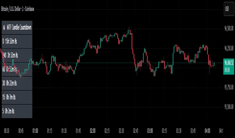
MTF Candle Countdown — HUD V1 (By Price-Action-Art)
MTF Candle Countdown — HUD V1 (By Price-Action-Art)
A clean, lightweight HUD that shows you exactly how much time is left in multiple higher-timeframe candles — all in one place.
This tool is designed for traders who rely on multi-timeframe precision.
Instead of constantly switching charts or checking timers, the HUD gives you a real-time countdown for up to six timeframes (Daily, 4H, 1H, 30m, 15m, 5m by default).
You can fully customize the timeframes, text size, and HUD position on your chart.
Perfect for:
Intraday and scalping timing
Swing traders waiting for HTF candle closes
ICT / SMC structure-based traders
Anyone who needs exact candle close timing without distractions
Features:
Real-time multi-timeframe candle countdown
Fully adjustable HUD placement (all corners)
Customizable timeframes and text size
Clean, minimal, and non-intrusive design
Updates only on the last bar for performance efficiency
Optional border for a sharper HUD look
Whether you’re waiting for a Daily close to confirm structure or timing your entries around 5m/15m candles, this HUD keeps everything visible and precise at a glance.
If you find this tool helpful, feel free to like, comment, and follow — it motivates me to keep releasing more tools for the community.
Rolling VWAP Indicator🧭 Rolling VWAP Indicator
Overview
The Rolling VWAP Signals indicator offers a clean, real-time view of price behavior relative to its volume-weighted fair value.
It extends the traditional VWAP concept by introducing a Rolling VWAP that continuously adapts over a dynamic window of recent bars, allowing traders to visualize evolving equilibrium zones without being limited to daily or session resets.
Additionally, it includes a Multi-Timeframe (MTF) Trend Bias Filter — designed not to recalculate VWAP across timeframes, but to confirm directional alignment with higher-timeframe momentum. This ensures that short-term signals are traded only when the broader bias agrees, reducing false reversals and improving signal quality.
VWAP vs Rolling VWAP
The Volume-Weighted Average Price (VWAP) is one of the most widely used institutional benchmarks.
It represents the average traded price weighted by volume — effectively the market’s “fair value.”
However, standard VWAP resets each day or session, losing continuity across time and ignoring cumulative order flow beyond that session.
The Rolling VWAP used here continuously recalculates over a moving window of the most recent bars:
• It adapts naturally to 24×7 markets such as crypto and indices.
• It reflects the current consensus of price and volume rather than starting from zero each morning.
• It acts as a dynamic fair-value magnet, showing when price deviates too far from equilibrium.
In short:
• Standard VWAP → resets daily, suited for intraday benchmarks.
• Rolling VWAP → continuous measure of short-term market balance and sentiment.
How It Works
1. Rolling VWAP Calculation
Uses the last N bars (auto-adjusted by timeframe: e.g., 288 for 5-min, 96 for 15-min, 24 for 1-hour) to compute the continuously weighted mean price:
RVWAP = \frac{\sum(Price \times Volume)}{\sum(Volume)}
2. VWAP Bands
Three deviation envelopes are plotted above and below RVWAP at user-defined percentages — visual zones of overbought/oversold or expansion/compression.
3. Signal Logic
• Buy Signal: price closes above the Rolling VWAP after being below (bullish reclaim).
• Sell Signal: price closes below the Rolling VWAP after being above (bearish rejection).
• Cooldown Period: blocks repeated signals within a set bar interval to avoid whipsaws.
4. MTF Trend Bias
• Pulls higher-timeframe trend direction (e.g., from 1-hour while trading 5-min).
• Signals are confirmed only when short-term cross aligns with higher-timeframe bias.
• This filter does not modify or recalculate the VWAP — it purely acts as a directional validator.
5. Session Filter
Restrict signal generation to defined trading hours and timezone (e.g., 09:30–13:00 NY). Its for US market positional traders.
6. Dashboard Panel
Displays system states: data sufficiency, session activity, VWAP bias, cooldown status, and Buy/Sell signal triggers.
Why It’s Useful
• Provides a real-time adaptive fair-value anchor instead of static daily VWAP.
• Highlights both trend continuation and mean-reversion zones.
• Integrates MTF bias confirmation to trade only in line with higher-timeframe flow.
• Eliminates clutter — no oscillators or complex models, just price vs volume behavior.
How to Use
1. Apply on any timeframe (5M–4H).
2. Observe Buy (green) and Sell (red) signals relative to the blue Rolling VWAP line.
3. Enable MTF Trend Bias to confirm signals with higher-timeframe direction.
4. Use deviation bands for identifying overextended conditions or pullback opportunities.
5. Monitor the dashboard for live system feedback.
Customization
• Auto or manual Rolling VWAP window.
• Adjustable band multipliers.
• MTF bias confirmation toggle.
• Session and timezone settings.
• Dashboard size and placement.
Conceptual Takeaway
The Rolling VWAP Simple Signals indicator combines the strength of volume-weighted mean reversion with higher-timeframe directional filtering, producing clear, context-aware entries and exits.
It answers two critical trader questions:
“Where is the real, volume-based fair value right now?”
“Does my signal align with the larger trend?”
⚠️ Disclaimer
This indicator is designed s olely for educational and analytical purposes . It does not constitute financial advice, investment recommendation, or trading signal service. Trading involves substantial risk and may not be suitable for all investors. Always perform your own analysis and use proper risk management before taking any trade. The author assumes no liability for financial losses resulting from the use or interpretation of this tool.

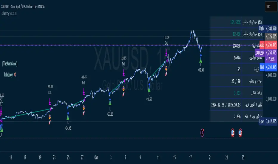
TalaJooy V1.31 𓅂💎 استراتژی معاملاتی TalaJooy V1.31 𓅂
TalaJooy (طلاجوی) یک چارچوب معاملاتی حرفهای و کامل برای TradingView است که برای حذف حدس و گمان، احساسات و تصمیمگیریهای هیجانی از فرآیند معاملات طراحی شده است.
این محصول یک «اندیکاتور سیگنالدهی» ساده نیست؛ بلکه یک استراتژی (Strategy) کامل است که چهار وظیفه کلیدی را به صورت خودکار انجام میدهد:
تحلیل بازار (بر اساس یک موتور امتیازدهی کمی)
صدور سیگنال (ورود و خروج شفاف)
مدیریت ریسک پویا (محاسبه خودکار حد ضرر)
مدیریت حجم پوزیشن (محاسبه خودکار حجم بر اساس ریسک)
هدف «طلاجوی» تبدیل معاملهگری شهودی به یک فرآیند مکانیکی، مبتنی بر داده و مدیریت ریسک است.
⚙️ قابلیتهای کلیدی (آنچه دریافت میکنید)
این استراتژی مجهز به مجموعهای از ابزارهای حرفهای است که مستقیماً روی چارت شما اجرا میشوند:
🎯 ۱. سیگنالهای ورود و خروج شفاف
فلشهای واضح خرید (▲) و فروش (▼) که نقاط دقیق ورود بر اساس منطق استراتژی را مشخص میکنند. این سیستم تنها زمانی سیگنال صادر میکند که فیلترهای روند، همسویی لازم را تایید کنند.
🛡️ ۲. مدیریت ریسک پویای ATR
بزرگترین چالش معاملهگران، تعیین حد ضرر (SL) مناسب است. این استراتژی حد ضرر را به صورت خودکار و پویا بر اساس نوسانات واقعی بازار (با استفاده از ATR) محاسبه میکند.
نتیجه: در بازارهای پرنوسان، استاپ شما برای جلوگیری از استاپهانت شدن، فاصله ایمنتری میگیرد و در بازارهای آرام، بهینهتر و نزدیکتر تنظیم میشود.
💰 ۳. محاسبه خودکار حجم پوزیشن
دیگر نیازی به «ماشین حساب پوزیشن» ندارید. استراتژی به صورت اتوماتیک، حجم دقیق هر معامله را بر اساس درصد ریسک ثابتی که شما از کل سرمایهتان تعیین میکنید، محاسبه مینماید. این ویژگی، مدیریت سرمایه حرفهای را در تمام معاملات شما تضمین میکند.
🎨 ۴. نواحی بصری سود و زیان (TP/SL)
هنگامی که یک معامله باز است، این ابزار به صورت زنده، نواحی حد سود (سبز) و حد ضرر (قرمز) را مشابه ابزار پوزیشن خود تریدینگ ویو، مستقیماً روی چارت برای شما رسم میکند.
📈 ۵. پنل آمار عملکرد پیشرفته
یک جدول آماری جامع که تمام معیارهای کلیدی عملکرد شما را به صورت زنده نمایش میدهد:
سود و زیان خالص (دلاری و درصدی)
ضریب سود (Profit Factor)
نرخ موفقیت (Win Rate)
تعداد معاملات سودده / زیانده
حداکثر افت سرمایه (Max Drawdown)
و موارد دیگر...
🚦 ۶. آیکونهای بازخورد معامله
با آیکونهای هوشمند، فوراً کیفیت معاملات بسته شده خود را ارزیابی کنید:
😎🚀 (سود ویژه و قابل توجه)
💰 (سود عادی)
🙈 (زیان)
📈 چگونه از این ابزار استفاده کنید؟
«طلاجوی» یک 'ماشین چاپ پول' جادویی نیست، بلکه یک ابزار تست و اجرای حرفهای است.
۱. بکتست و بهینهسازی (Backtesting)
مهمترین قدرت این اسکریپت، قابلیت Strategy بودن آن است. شما میتوانید این استراتژی را روی هر جفتارز و تایم فریمی که معامله میکنید (طلا، کریپتو، جفتارزها و...) بکتست بگیرید تا آمار عملکرد آن را مشاهده کنید.
۲. تنظیم پارامترها
از طریق منوی تنظیمات، پارامترهای کلیدی مانند درصد ریسک، نسبت ریسک به ریوارد (R:R)، و فیلترهای زمانی را مطابق با سبک معاملاتی و دارایی مورد نظر خود بهینهسازی کنید.
۳. اجرای سیستماتیک
پس از یافتن تنظیمات بهینه در بکتست، در معاملات زنده به سیگنالها پایبند بمانید و اجازه دهید منطق مکانیکی، معاملات شما را مدیریت کند.
⚠️ سلب مسئولیت مهم (مطابق با قوانین TradingView)
این اسکریپت صرفاً یک ابزار تحلیلی و معاملاتی است و نباید به عنوان سیگنال مالی یا توصیهای برای خرید و فروش تلقی شود. تمام معاملات دارای ریسک هستند و نتایج گذشته تضمینکننده عملکرد آینده نمیباشد.
لطفاً قبل از استفاده از این استراتژی در حساب واقعی، آن را به طور کامل در حالت دمو یا بکتست ارزیابی کنید. مسئولیت تمامی سودها و زیانها بر عهده خود معاملهگر است.
💎 TalaJooy V1.31 𓅂 Trading Strategy
TalaJooy (meaning "Gold Seeker") is a complete, professional trading framework for TradingView, designed to remove guesswork, emotion, and impulsive decisions from your trading process.
This is not a simple signal indicator; it is a complete Strategy script that automates four key tasks:
Market Analysis (Based on a quantitative scoring engine)
Signal Generation (Clear entries and exits)
Dynamic Risk Management (Automated Stop Loss calculation)
Position Sizing (Automated trade sizing based on risk)
The goal of "TalaJooy" is to transform intuitive trading into a mechanical, data-driven, and risk-managed process.
⚙️ Key Features (What You Get)
This strategy comes equipped with a suite of professional tools that run directly on your chart:
🎯 1. Clear Entry & Exit Signals
Receive unambiguous Buy (▲) and Sell (▼) arrows identifying precise entry points based on the strategy's logic. The system only generates signals when its trend-confirmation filters are aligned.
🛡️ 2. Dynamic ATR Risk Management
A trader's biggest challenge is setting a proper Stop Loss (SL). This strategy calculates your SL automatically and dynamically based on real-time market volatility (using ATR).
The Benefit: In volatile markets, your stop is placed at a safer distance to avoid being "stopped out" by noise. In calm markets, it's set tighter and more efficiently.
💰 3. Automated Position Sizing
Stop using external "position size calculators." The strategy automatically calculates the exact trade size for every position based on a fixed risk percentage of your total equity (which you define). This enforces professional money management on every trade.
🎨 4. Visual Profit & Loss (TP/SL) Zones
While a trade is active, this tool plots live, visual zones for your Take Profit (green) and Stop Loss (red) targets, similar to TradingView's native "Long/Short Position" tool.
📈 5. Advanced Performance Stats Panel
A comprehensive statistics table displays all your key performance metrics in real-time:
Net Profit (% and $)
Profit Factor
Win Rate
Win / Loss Trade Count
Max Drawdown
And more...
🚦 6. Smart Trade Feedback Icons
Instantly review the quality of your closed trades with intelligent emoji feedback:
😎🚀 (Exceptional Profit)
💰 (Standard Profit)
🙈 (Loss)
📈 How to Use This Tool
"TalaJooy" is not a "magic money machine"; it is a professional-grade tool for testing and execution.
1. Backtesting & Optimization
The most powerful feature of this script is its Strategy component. You can backtest it on any asset or timeframe you trade (Gold, Crypto, Forex, etc.) to see its historical performance data.
2. Parameter Tuning
Use the settings menu to optimize key parameters—such as Risk Percentage, Risk:Reward Ratio, and core filter settings—to match your personal trading style and preferred assets.
3. Systematic Execution
After identifying optimal settings via backtesting, adhere to the signals in your live trading and let the mechanical logic manage your trades.
⚠️ Important Disclaimer (TradingView Compliant)
This script is provided for educational and analytical purposes only. It is not financial advice or a recommendation to buy or sell any asset. All trading involves substantial risk. Past performance is not indicative of future results.
Please thoroughly evaluate this strategy via backtesting or paper trading before deploying it with real funds. The user assumes full responsibility for all profits and losses incurred.
Fair Value Gaps by DGTFair Value Gaps
A refined, multi-timeframe Fair Value Gap (FVG) detection tool that brings institutional imbalance zones to life directly on your chart.
Designed for precision, it visualizes how price delivers into inefficiencies across chart, higher, and lower (intrabar) timeframes — offering a fluid, structural view of liquidity displacement and market flow.
The script continuously tracks unfilled, partially repaired, and fully resolved imbalances, revealing where liquidity inefficiencies concentrate and where price may seek rebalancing.
Overlapping zones naturally expose institutional footprints, potential liquidity targets, and key re-pricing regions within the broader market structure.
KEY FEATURES
⯌ Multi-Timeframe Detection
Detect and display FVGs from the current chart, higher timeframes (HTF), or lower timeframes (LTF)
⯌ Smart Fill Tracking
Automatic real-time monitoring of each FVG’s fill progress with live percentage updates
⯌ Custom Fill Logic
Choose your preferred definition of when a gap is considered filled: Any Touch
Midpoint Reached
Wick Sweep
Body Beyond
⯌ Dynamic Labels & Tooltips
Labels can be toggled on/off. Even when hidden, detailed tooltips remain available by hovering over the FVG midpoint.
⯌ Adaptive Lower-Timeframe Mode
When set to “Auto,” the script intelligently selects the optimal lower timeframe based on the chart resolution.
DISCLAIMER
This script is intended for informational and educational purposes only. It does not constitute financial, investment, or trading advice. All trading decisions made based on its output are solely the responsibility of the user.
