Centered Oscillators
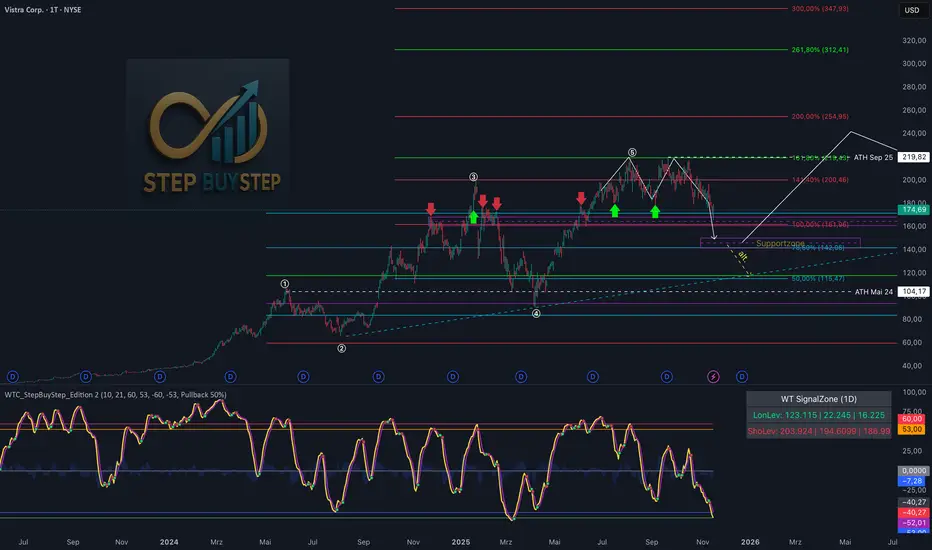
WTC Step Buy Step Edition CbyCarlo📊 WT Cross Modified – Step Buy Step Edition (v4)
WTC_StepBuyStep_Edition is an enhanced, practical, and optimized version of the classic WaveTrend (WT) Cross Indicator.
Developed for the Step Buy Step project, this tool helps traders identify market momentum shifts, structural price zones, and potential reversal areas with high clarity and precision.
🔍 Concept & Purpose
This indicator builds upon the established WaveTrend / LazyBear logic and extends it with additional structural intelligence.
The goal is to make overbought/oversold phases and trend reversals easier to spot — while also highlighting historically validated price zones where the market has previously reacted strongly.
⚙️ Key Features
1️⃣ WT Cross Signals
WT1 (yellow) and WT2 (purple) visualize market momentum.
A WT1 cross above WT2 while below the Oversold zone (−53) can indicate potential Long opportunities.
A WT1 cross below WT2 while above the Overbought zone (+53) can indicate potential Short opportunities.
Signals only confirm after candle close to prevent repainting.
2️⃣ Dynamic “WT SignalZone” Panel
Displayed in the top-right corner, this panel shows the last three valid price levels derived from WT signals:
🟢 LonLev – Buy support levels from previous WT Long signals
🔴 ShoLev – Sell resistance levels from previous WT Short signals
These zones act as objective support/resistance structures, based on historical momentum turning points — not subjective lines.
3️⃣ Flexible Calculation Modes
Choose how levels are derived from each WT signal:
Pullback 50% → Midpoint of the signal candle (high+low)/2
Close → Close price of the signal candle
Next Open → Open of the following bar (ideal for system testing)
📈 How to Interpret the Indicator
Market Condition WT Event Meaning
WT1 < −53 & CrossUp Long Signal Potential reversal / buy zone
WT1 > +53 & CrossDown Short Signal Potential exhaustion / sell zone
Price revisits LonLev Support Re-entry or bounce zone
Price revisits ShoLev Resistance Profit-taking or short setup zone
This makes the tool highly effective for:
Swing traders
Zone-based trading strategies
Systematic re-entries
Identifying structural turning points
🧠 Advantages
No repainting (signals confirmed only after bar close)
Works on all timeframes (from intraday to weekly)
Clean overview without clutter or excessive chart markers
Excellent as a filter to confirm market context
💬 Best Use Case
Use WTC_StepBuyStep_Edition as a contextual confirmation tool.
It does not replace a full trading system — but it gives you objective, repeatable, and statistically relevant zones where the market has reacted before.
Combine it with price action, volume analysis, or trend tools for even stronger setups.
© Step Buy Step • Step-Buy-Step.com
Educational trading tool intended for market analysis.
Not financial advice.
COT Pressure Morpheus
Starting from the TradingView COT Report indicator, I developed an oscillator to make the data visualization more quantitative. My only goal was to obtain a Percent Rank Oscillator (ranging from 0 to 100) that would allow the identification of peaks in the COT releases.
It is especially useful for agricultural commodities. You can choose to monitor Large Traders, Small Traders, or Commercial Hedgers.
It MUST be used exclusively on FUTURES tickers; otherwise, it will not work. In particular, the setup I recommend for commodities is the following:
INPUT:
Auto
Futures
Long - Short
CFTC Code: Empty
104
5
When the indicator rises above 80 or falls below 20, we can identify an overexposure. By observing the behavior of Commercial Hedgers in particular, we can detect when they reach extreme LONG exposure (>80) or SHORT exposure (<20) and use this as an operational signal.
It MUST be analyzed only on the WEEKLY chart to allow proper normalization.

GTI - Overbought and Oversold indicatorFor this indicator I've merged 6 indicators (RSI, Stochastic, CCI, MFI, UO and William %R) that are decent to spot overbought and oversold conditions into one indicator.
The idea is the more indicators that agree on overbought and oversold conditions, the better chance that the condition is correct.
Possible input settings
Set your own values for the overbought and oversold bands.
Noise suppression (On/Off)
Length for noise suppression calculations
Overbought noise suppression
Oversold noise suppression
Plot divergences (On/Off)
Left/Right lookback settings for finding pivot highs/lows
Min/Max lookback range to compare pivots for divergences
Style settings
Enabled/Disable the line for reversal value
Set the color for the line (default is 100% transparent value)
Enable/Disable fill color between reversal value and the 0 line
Set the fill color
Precision for reversal value, default is 2
Explanations
The scale goes from 100 to -100, where outliners above 85 or below -85 is expected to be extremely rare. The overbought and oversold bands are calculated from the typical values from each indicator used in the calculation.
The noise suppression is a percentile calculation from the last X bars back, where X is the length you set in the settings. 100 is the default value. This is very good to use in strong trends as an asset in a strong bullish trend tend to not touch/breach the oversold band and vise versa. The percentile calculation might still be able to catch the overbought/oversold condition in a strong opposite trending asset. 85 is a default value, but keep in mind that every asset moves differently due to their liquidity pool. The default is only a guide line.
The divergence settings only plots normal divergences. Hidden divergences are not calculated.
If you want the possibility to plot/see hidden divergences too, let me know in the comments. If enough people wants it I'll consider adding them.
when it comes to the style, you might be a bit confused at first. The reversal value is enabled, but not showing. That's because it's enabled with 100% transparency as I like using the fill more than just a line.
If you want to use a line instead of the fill, Disable the fill -> edit reversal value color -> set your chosen color and make sure to remove the transparency to make it visible.
Exmaple, ticker NOVO_B
In the example ticker I've enabled "Noise suppression", using the default 100 length and set noise suppression for both OB and OS to 90.
The green and red circles are plotted when the "reversal value" falls below the percentile set, indicating that a possible top was just formed.
Keep in mind that strong bullish or bearish trends tend to stay overbought/oversold for a longer time and are likely to print several false signals before the eventual reversal. If a divergences is printed, normally that is either the bottom or close to the bottom before a stronger reversal.
Suggestion
As all other indicators, don't use this indicator alone to spot reversals. Use it together with 1-3 other indicators like MACD, ADX and OBV. I like to use MACD as a confirmation tool after this tool starts indicating overbought/oversold conditions.
For an overbought condition, wait for MACD to cross below the signal line.
For an oversold condition, wait for the MACD to cross above the signal line.
This way you don't act on false signal.
Another way would be to use a DCA strategy, where you buy on each signal. In such a situation I suggest starting small enough to be able to double the total for each time, example below.
First signal: $100, then another $100 on second signal, $200 on third signal, $400 on fourth signal and so on. The amounts are an example, find what works for you.

RSI Maniac
RSI Maniac
A powerful, fully-customizable RSI indicator designed for traders who want deeper insight into momentum across multiple timeframes. This indicator enhances the traditional RSI by adding multi-timeframe analysis, multi-timeframe moving averages, and optional Bollinger Bands applied directly on the RSI curve.
----- Key Features -----
1️⃣ Multi-Timeframe RSI (HTF RSI) : Analyse higher-timeframe momentum while staying on your current chart.
Enable/Disable HTF RSI
Select any timeframe (1m → 1M)
Dedicated RSI length & source for HTF
Great for spotting:
Trend confirmation or divergence between LTF & HTF momentum
2️⃣ Multi-Timeframe Moving Averages : A powerful addition for traders using higher timeframe confirmation.
Enable/Disable HTF MAs
Independent Fast & Slow MA settings
Separate HTF timeframe
Separate MA type for HTF (EMA or HMA)
Great for spotting:
HTF RSI trend direction
HTF momentum overlays on LTF RSI
Cross-timeframe momentum alignment
🎛️ Clean & Organized User Interface : The indicator organizes settings into intuitive groups.
Current Timeframe RSI
Current Timeframe MA
Higher Timeframe RSI
Higher Timeframe MA
Bollinger Bands Settings
Traders can toggle any component independently.
How to trade ?
Based on my approach, I don’t use RSI to catch reversals. Instead, I use it to trade continuations—when the lower timeframe (LTF) RSI aligns with the higher timeframe (HTF) trend. I simply wait for the LTF RSI to move in the same direction as the HTF RSI and then take the continuation trade. Please check the snapshots for a clearer understanding of how these trades work.
Trade less, trade better!

CandelaCharts - Trend Oscillator 📝 Overview
Trend Oscillator is a simple yet effective trend identification tool that uses the relationship between two exponential moving averages (EMAs) to determine market direction. It calculates the spread between a fast and slow EMA, applies a bias multiplier, and smooths the result to produce a clean oscillator that oscillates above and below a zero line. When the oscillator is above zero, the trend is considered bullish (upward); when below zero, it's bearish (downward). The indicator provides clear visual feedback through color-coded plots and optional price bar coloring, making it easy to identify trend direction at a glance.
📦 Features
This section highlights the core capabilities you'll rely on most.
Dual EMA system — Uses a fast EMA (default 9) and slow EMA (default 21) to capture trend momentum and direction.
Bias multiplier — Applies a small multiplier (default 1.001) to the EMA spread, providing a slight bias that helps filter noise and confirm trend strength.
Smoothed output — Applies an additional EMA smoothing (default 5 periods) to the raw spread, creating a cleaner, less choppy oscillator line.
Zero-line reference — Plots a horizontal zero line that serves as the critical threshold between bullish and bearish conditions.
Color-coded visualization — Automatically colors the oscillator line green/lime when bullish (above zero) and red when bearish (below zero).
Price bar coloring — Optional feature to color price bars based on the current trend direction, providing immediate visual context on the main chart.
Customizable parameters — Adjust EMA lengths, bias multiplier, smoothing period, and colors to match your trading style and timeframe.
⚙️ Settings
Use these controls to fine-tune the oscillator's sensitivity, appearance, and behavior.
Fast EMA Length — Period for the fast exponential moving average (default: 9). Lower values make the indicator more responsive to price changes.
Slow EMA Length — Period for the slow exponential moving average (default: 21). Higher values create a smoother baseline for trend identification.
Bias Multiplier — Multiplier applied to the EMA spread (default: 1.001). Small adjustments can help filter minor whipsaws and confirm trend strength.
Smoothing Length — Period for smoothing the raw spread calculation (default: 5). Higher values create a smoother oscillator line but may lag price action.
Colors — Set the bullish (default: lime) and bearish (default: red) colors for the oscillator line.
Color Price Bars — Toggle to enable/disable coloring of price bars based on the current trend direction.
⚡️ Showcase
Oscillator Line
Bar Coloring
Divergences
📒 Usage
Follow these steps to effectively use Trend Oscillator for trend identification and trading decisions.
1) Select your timeframe — The indicator works across all timeframes, but higher timeframes (daily, weekly, monthly) typically provide more reliable trend signals with less noise. Lower timeframes (1m, 5m, 15m) may produce more frequent but potentially less reliable signals. Consider your trading style: swing traders benefit from daily/weekly charts, while day traders can use 15m/1h timeframes. Always align the indicator's sensitivity with your timeframe choice.
2) Adjust EMA lengths — The default 9/21 combination works well for most cases. For faster signals, try 5/13; for slower, more conservative signals, try 12/26 or 20/50. Match the lengths to your trading style and timeframe.
3) Interpret the zero line — When the oscillator is above zero (green/lime), the trend is bullish. When below zero (red), the trend is bearish. The further from zero, the stronger the trend.
4) Watch for crossovers — Trend changes occur when the oscillator crosses the zero line. A cross from below to above indicates a shift to bullish; from above to below indicates a shift to bearish.
5) Identify divergences — Divergences can signal potential trend reversals. Bullish divergence : price makes lower lows while the oscillator makes higher lows (suggests weakening bearish momentum). Bearish divergence : price makes higher highs while the oscillator makes lower highs (suggests weakening bullish momentum). Divergences are most reliable when they occur near extreme levels and should be confirmed with price action before taking trades.
6) Use smoothing wisely — The smoothing parameter helps reduce noise but adds lag. Lower smoothing (3-5) is more responsive; higher smoothing (7-10) is more stable but slower to react.
7) Combine with price action — Use the oscillator to confirm trend direction, then look for entry opportunities when price pulls back in the direction of the trend. The optional price bar coloring helps visualize trend alignment on the main chart.
8) Filter with bias multiplier — The bias multiplier can help reduce false signals. Experiment with values between 1.000 and 1.005 to find the sweet spot for your instrument and timeframe.
🚨 Alerts
There are no built-in alerts in this version.
⚠️ Disclaimer
Trading involves significant risk, and many participants may incur losses. The content on this site is not intended as financial advice and should not be interpreted as such. Decisions to buy, sell, hold, or trade securities, commodities, or other financial instruments carry inherent risks and are best made with guidance from qualified financial professionals. Past performance is not indicative of future results.

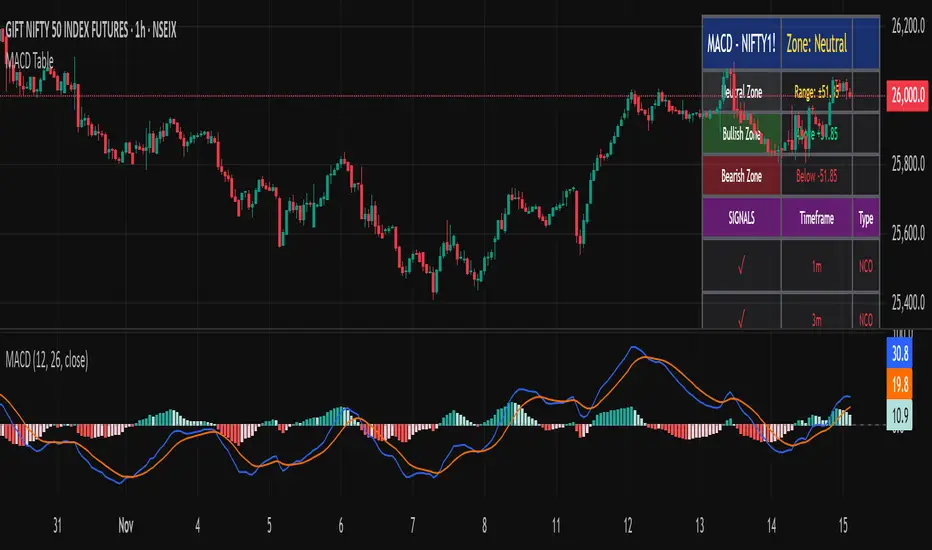
MTF MACD – 1m / 15m / 1D / 1W//@version=6
indicator("MTF MACD – 1m / 15m / 1D / 1W", overlay=false)
// MACD inputs
fastLen = input.int(12, "Fast length")
slowLen = input.int(26, "Slow length")
signalLen = input.int(9, "Signal length")
// Multi-timeframe MACD using built-in ta.macd()
= request.security(syminfo.tickerid, "1", ta.macd(close, fastLen, slowLen, signalLen))
= request.security(syminfo.tickerid, "15", ta.macd(close, fastLen, slowLen, signalLen))
= request.security(syminfo.tickerid, "D", ta.macd(close, fastLen, slowLen, signalLen))
= request.security(syminfo.tickerid, "W", ta.macd(close, fastLen, slowLen, signalLen))
// Plot MACD lines for each timeframe
plot(macd_1m, title="MACD 1m", color=color.red, linewidth=2)
plot(macd_15m, title="MACD 15m", color=color.blue, linewidth=2)
plot(macd_1d, title="MACD 1D", color=color.green, linewidth=2)
plot(macd_1w, title="MACD 1W", color=color.orange, linewidth=2)
// (Optional) you can uncomment these if you also want signals/histograms:
// plot(signal_1m, title="Signal 1m", color=color.new(color.red, 50), style=plot.style_dotted)
// plot(signal_15m, title="Signal 15m", color=color.new(color.blue, 50), style=plot.style_dotted)
// plot(signal_1d, title="Signal 1D", color=color.new(color.green, 50), style=plot.style_dotted)
// plot(signal_1w, title="Signal 1W", color=color.new(color.orange, 50), style=plot.style_dotted)
// plot(hist_1m, title="Hist 1m", color=color.red, style=plot.style_histogram)
// plot(hist_15m, title="Hist 15m", color=color.blue, style=plot.style_histogram)
// plot(hist_1d, title="Hist 1D", color=color.green, style=plot.style_histogram)
// plot(hist_1w, title="Hist 1W", color=color.orange, style=plot.style_histogram)

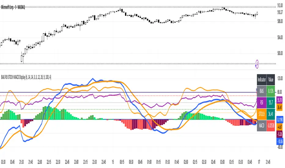
BIAS RSI STOCH MACD Displaysimple but effective to prevent chart clutter.
Hi Traders! Today I’m showing you a **custom indicator** that combines **BIAS, RSI, Stochastic, and MACD** in one easy-to-read panel. Let’s break it down:
1️⃣ **BIAS** – Shows how far the price is from its moving average.
* Positive BIAS → price is above the average.
* Negative BIAS → price is below the average.
2️⃣ **RSI (Relative Strength Index)** – Measures momentum.
* Above 70 → overbought
* Below 30 → oversold
* **50 line added** → midpoint for trend direction
3️⃣ **Stochastic (STOCH)** – Confirms momentum like RSI.
* Above 80 → overbought
* Below 20 → oversold
4️⃣ **MACD (Moving Average Convergence Divergence)** – Shows trend and momentum.
* Histogram colors indicate strength
* Lines show trend direction
5️⃣ **Visual Table** – On the top right, you can see all current indicator values at a glance, with color coding for easy interpretation.
6️⃣ **Plots & Levels** –
* BIAS, RSI, Stoch are plotted clearly
* RSI has **midline at 50** for trend reference
* Standard overbought/oversold levels highlighted
✅ **How to Use:**
* Look for RSI or Stoch crossing midline or extreme levels for potential entries.
* Check MACD histogram and lines for confirmation of trend strength.
* Use BIAS to see if price is stretched from the moving average.
This indicator is perfect for **momentum, trend, and mean-reversion traders**, giving multiple signals in one pane without clutter.
---
MACD Trend & Momentum Dashboard (Weighted, 3 TFs)This indicator provides a multi-timeframe MACD trend and momentum dashboard that works independently of your current chart timeframe. It displays MACD zero-line bias and MACD-vs-Signal trend state across three user-selectable timeframes, using clear color-coded cells for instant visual interpretation. A weighted scoring system combines all six signals into a single market bias classification (Strong Bullish → Strong Bearish). This helps traders quickly understand higher- and lower-timeframe alignment, market regime, and overall trend quality. Ideal for trend- and momentum-followers who want a clean, actionable market overview at a glance.

Multi-Confluence Signal System📊 OPTIMIZED MULTI-CONFLUENCE SIGNAL SYSTEM
A professional-grade trading indicator that combines multiple technical analysis methods to generate high-probability buy and sell signals. Designed for daily timeframe Bitcoin/crypto trading with optimized parameters based on real market backtesting.
🎯 KEY FEATURES:
- Multi-Confluence Scoring (8 components) - Each signal shows strength rating
- Smart Top & Bottom Detection - Catches reversals using price action patterns
- Ichimoku Cloud Integration - Dynamic support/resistance visualization
- Dual EMA System (20/50) - Clear trend identification
- RSI + MACD + Volume Confirmation - Multi-indicator validation
- Signal Alternation - Only shows directional changes (no repeated signals)
- Minimal Bar Spacing - Prevents signal clustering and overtrading
✅ OPTIMIZED FOR:
- Catching parabolic tops with rejection wicks
- Identifying capitulation bottoms in downtrends
- Avoiding false signals during consolidation
- 4-8 quality signals per 4-month period on daily charts
- Works in both trending and volatile markets
🔧 TECHNICAL COMPONENTS:
- EMA 20/50 trend system
- RSI (14) with adjusted overbought/oversold levels (68/32)
- MACD for momentum confirmation
- Ichimoku Cloud for trend context
- Volume analysis (1.3x threshold)
- Candlestick pattern recognition (engulfing, hammers, shooting stars)
- Capitulation detection for extreme moves
- Price extension filters (±5-10% from EMAs)
⚠️ BEST PRACTICES:
- Optimized for Daily timeframe
- Combine with your own risk management
- Higher scores = higher probability trades
- Wait for signal confirmation on candle close
- Use in conjunction with key support/resistance levels
💡 SIGNAL LOGIC:
BUY signals trigger on: Capitulation candles, extreme oversold + reversal patterns, MACD turnarounds in downtrends, or high confluence scores with bullish patterns
SELL signals trigger on: Rejection wicks at tops, bearish engulfings with overbought RSI, parabolic extensions, MACD reversals, or high confluence scores with bearish patterns
📈 Created through iterative backtesting and optimization on Bitcoin price action from 2024-2025.
⭐ Free to use • Leave feedback • Happy trading!

GSC MACD by TejasThis script is based Mr. Saleel Choudhary, GSC Academy MACD Concepts. This indicator is available only for the GSC Students and No one else.
GSC MACD by TejasThis is an indicator based on Mr. Saleel Choudhary, GSC Academy MACD signals. This indicator is only and only available to GSC Students and Nobody else.
Adaptive Trend & Momentum [ATM] - All-in-One Confirmation Tired of Cluttered Charts and Conflicting Signals? This All-in-One Indicator is Your Solution.
The Adaptive Trend & Momentum (ATM) indicator is a powerful, next-generation trading tool designed to eliminate chart clutter and provide clear, high-conviction signals. Instead of using multiple conflicting indicators, the ATM system combines trend, momentum, and volatility into a single, cohesive, and adaptive framework. It automatically adjusts to changing market conditions, giving you a reliable edge in any environment.
This is not just another moving average crossover. It is a complete trading system that helps you identify the trend, confirm its strength, and time your entries with precision.
Key Features
•
Adaptive Moving Average (AMA): The core of the system. The AMA automatically adjusts its length based on market volatility (using the Average True Range). It becomes faster and more responsive in volatile markets to catch moves early, and smoother in calm markets to avoid noise and false signals.
•
Dynamic Volatility Bands: These bands expand and contract based on market volatility, providing a dynamic map of support and resistance. They are crucial for identifying pullback opportunities and setting effective stop-loss levels.
•
Integrated Momentum Oscillator: A smoothed RSI-based oscillator that runs in a separate pane. It is designed to confirm the signals from the main chart. The oscillator and its histogram are color-coded to show whether bullish or bearish momentum is in control, giving you an instant read on market strength.
•
Clear Consensus Signals: The ATM indicator provides four distinct, easy-to-read signals directly on your chart:
•
STRONG BUY: The highest-conviction signal, appearing when the trend is bullish, momentum is bullish, and the price has pulled back to a strategic entry zone near the AMA.
•
BUY: A standard confirmation signal when both trend and momentum are aligned to the upside.
•
STRONG SELL: The highest-conviction short signal, appearing when the trend is bearish, momentum is bearish, and the price has rallied to a strategic entry zone.
•
SELL: A standard confirmation signal when both trend and momentum are aligned to the downside.
•
Real-Time Dashboard: A convenient on-chart table that provides a complete overview of the market at a glance. It shows the current adaptive length, trend direction, momentum status, consensus signal, and volatility percentage, so you always know what the indicator is thinking.
How It Works: The Adaptive Engine
The magic of the ATM indicator lies in its adaptive engine. Traditional moving averages use a fixed length (e.g., 50-period MA), which can be too slow in a fast market or too sensitive in a choppy one. The ATM’s Adaptive Moving Average solves this by dynamically adjusting its calculation period in real-time:
When volatility increases, the AMA shortens its length to react more quickly to price changes. When volatility decreases, it lengthens its period to smooth out noise and prevent false signals.
This adaptive nature ensures that the indicator remains relevant and effective across different assets and timeframes, from scalping to swing trading.
How to Use This Indicator: A Simple Trading Strategy
The ATM indicator is designed for clarity and ease of use. Here is a basic framework for trading with it:
For Long (Buy) Positions:
1.
Identify the Trend: Wait for the Adaptive Moving Average (AMA) line to turn green, indicating a confirmed uptrend.
2.
Confirm with Momentum: Check that the momentum oscillator is above 50 and preferably rising, confirming bullish strength.
3.
Find Your Entry: The best entry is a "STRONG BUY" signal. This tells you that the price has pulled back to a value area within the uptrend, offering a high-probability entry. A standard "BUY" signal can also be used, but the conviction is higher on "STRONG" signals.
4.
Set Your Stop-Loss: A logical place for a stop-loss is just below the lower volatility band.
5.
Take Profit: Consider taking profits when an opposing "SELL" or "STRONG SELL" signal appears, or when the price reaches a key resistance level.
For Short (Sell) Positions:
1.
Identify the Trend: Wait for the Adaptive Moving Average (AMA) line to turn red, indicating a confirmed downtrend.
2.
Confirm with Momentum: Check that the momentum oscillator is below 50 and preferably falling, confirming bearish strength.
3.
Find Your Entry: The best entry is a "STRONG SELL" signal. This indicates the price has rallied to a resistance area within the downtrend, offering a prime shorting opportunity. A standard "SELL" signal can also be used.
4.
Set Your Stop-Loss: A logical place for a stop-loss is just above the upper volatility band.
5.
Take Profit: Consider taking profits when an opposing "BUY" or "STRONG BUY" signal appears, or when the price reaches a key support level.
Customization and Settings
The indicator is fully customizable to fit your trading style and the asset you are trading. You can adjust:
•
AMA Settings: Control the base length and the volatility multiplier to make the indicator more or less sensitive.
•
Momentum Settings: Adjust the RSI length and smoothing for the oscillator.
•
Volatility Bands: Change the multiplier to widen or narrow the bands.
•
Visuals: Toggle signals, labels, and the dashboard on or off, and customize all colors to your preference.
Summary
The Adaptive Trend & Momentum (ATM) indicator is more than just a tool; it is a complete system for making more confident trading decisions. By adapting to the market and combining trend, momentum, and volatility, it provides a clear, uncluttered, and powerful view of price action.
Add it to your chart today and experience the clarity of adaptive trading!
Disclaimer: This indicator is a tool for technical analysis and should not be considered financial advice. Trading involves risk, and you should always use proper risk management. Past performance is not indicative of future results. Practice on a demo account before trading with real capital.
Keywords: Adaptive, Moving Average, Trend, Momentum, Volatility, RSI, Bands, Signal, Confirmation, All-in-One, System, Strategy, ATR, Volatility, Dashboard, Alert

CryptoSmart Momentum Engine1. Core Concept
The "CryptoSmart Momentum Engine" is an advanced, regime-filtered momentum dashboard. It is designed to solve the single biggest problem with oscillators: false signals during sideways, "chop" markets.
This indicator is not just a MACD and a Stochastic; it's a complete system that combines three elements in one panel:
Momentum (MACD): Measures the primary momentum and trend direction.
Overbought/Oversold (Stochastic): Measures short-term price exhaustion.
Volatility (Bollinger Band Width): Acts as a "Regime Filter" to determine if the market is in a volatile "Trend Mode" or a quiet "Chop Mode".
The indicator's primary function is to visually disable itself—turning the background gray and hiding all signals—during low-volatility chop, forcing you to trade only when the market has enough volatility to be predictable.
2. Key Features
Hybrid Oscillator: A normalized MACD (line, signal, and histogram) and a full Stochastic oscillator (%K and %D) are plotted in a single 0-100 pane.
Volatility "Regime" Filter: Using a Bollinger Band Width (BBW) filter, the indicator automatically detects the difference between a high-volatility Trend Mode (signal-on) and a low-volatility Chop Mode (signal-off).
Filtered Arrow Signals: The primary buy/sell signals (arrows) are only permitted to appear when the indicator is in "Trend Mode." All signals are automatically hidden during "Chop Mode" to prevent you from trading in sideways markets.
Centralized Histogram: The MACD histogram (the difference between the MACD and Signal lines) is visually centered at the 50-line, allowing it to oscillate in the middle of the 0-100 range.
Comprehensive Visuals: The indicator is a full dashboard with fill-shading for the MACD/Signal shadow, the Stochastic K/D spread, and the OB/OS background zones.
3. How It Works: The "Engine" Logic
The indicator's logic is based on its three main components:
Part 1: The Oscillators (MACD & Stochastic)
Normalized MACD: To make the MACD and Stochastic compatible, the MACD's value is "normalized" (mathematically compressed) to fit on the same 0-100 scale as the Stochastic.
Histogram: The histogram is calculated as MACD - Signal but is visually plotted relative to the 50-line (the new "zero").
Stochastic: This is a standard %K and %D oscillator used to identify short-term overbought/oversold levels.
Part 2: The Volatility Filter (The "Brain") This is the most important feature. The indicator calculates the Bollinger Band Width (BBW) and a moving average of that width (bbw_ma).
if bbw > bbw_ma → "Trend Mode" (Current volatility is expanding and higher than average).
if bbw <= bbw_ma → "Chop Mode" (Current volatility is contracting and lower than average).
Part 3: The Filtered Output (The "Result") The indicator's entire visual display is controlled by the Volatility Filter (use_vol_filter):
When in "Chop Mode" (Low Volatility):
All background color fills (for both MACD and Stochastic OB/OS zones) are disabled and replaced by the single, neutral chop_bg_color (Gray).
All arrow signals (longSignal and shortSignal) are disabled.
Meaning: The indicator is visually telling you: "Do not trade. The market is sideways and signals are unreliable."
When in "Trend Mode" (High Volatility):
The indicator "turns on."
The background colors for MACD and Stochastic OB/OS zones become visible.
The arrow signals are enabled and will appear if their conditions are met.
4. How to Read & Use It (Strategy)
The Gray Background (Chop Mode) is the most important signal. It means "Do nothing. Ignore all oscillator crosses. Wait for volatility to return."
The Colored Background (Trend Mode) means the indicator is "armed." You can now look for its signals.
Signal Definitions:
Buy Signal (Up Arrow ⬆️):
The Volatility Filter must be in "Trend Mode" (background is not gray).
The normalized MACD line (blue) crosses UP over the Oversold Level (20).
Interpretation: This is a "recovering from panic" signal. Momentum is returning to the market after an extreme oversold condition, and the market has enough volatility to trend.
Sell Signal (Down Arrow ⬇️):
The Volatility Filter must be in "Trend Mode".
The normalized MACD line (blue) crosses DOWN below the Overbought Level (80).
Interpretation: This is an "exiting from euphoria" signal. Momentum is failing after an extreme overbought condition, and the market has enough volatility to trend downwards.
Secondary Confirmation:
Histogram: Use the histogram (centered at 50) to gauge the speed of momentum. A growing histogram confirms the strength of your signal. A shrinking (diverging) histogram warns that the move is losing strength.
Stochastic: Use the %K and %D lines for faster, shorter-term confirmation or to identify additional entries/exits within the larger trend defined by the MACD and the Volatility Filter.
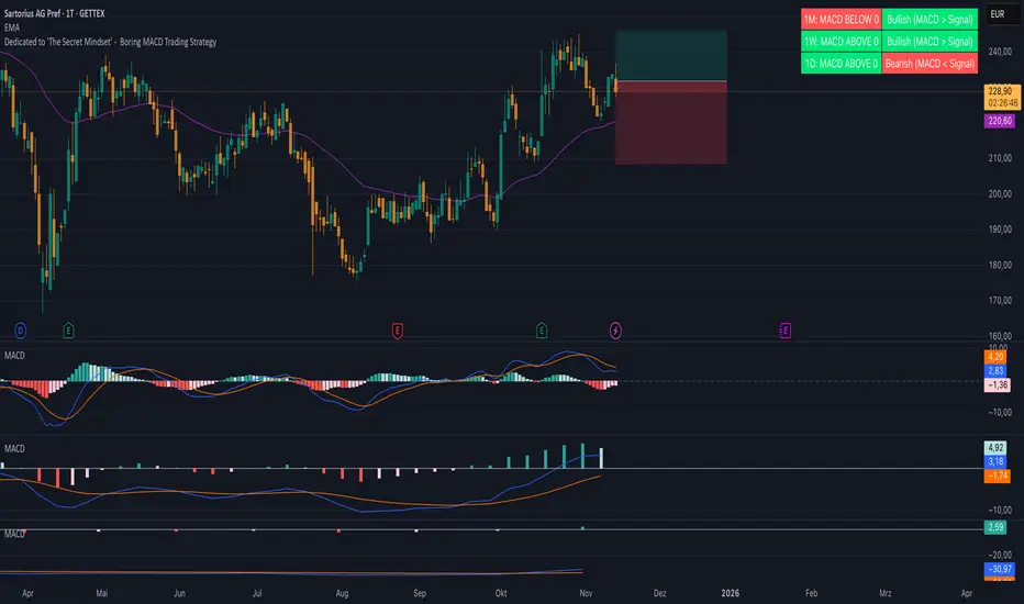
Boring MACD Trading Strategy - Dedicated to 'The Secret Mindset'This indicator displays the MACD status across three selectable timeframes, regardless of the chart timeframe you are currently viewing.
For each timeframe, it shows whether the MACD line is above or below the zero line, indicating bullish or bearish momentum.
It also shows whether the MACD line is above or below the signal line, revealing the current trend condition as bullish, bearish, or neutral.
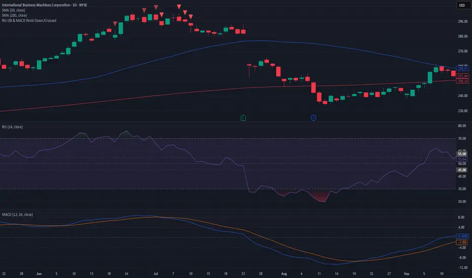
RSI OB & MACD Point Down or Crossed - PSPine script screener indicator for RSI OB and MACD point down or cross.
XAUUSD Fisher Transform Dashboard — Trend & Momentum InsightsThe script offers an educational visualization of trend and momentum on XAUUSD by combining the Fisher Transform with EMA direction. It plots momentum shifts, trend alignment, and includes a concise dashboard showing trend bias, the latest crossover event, and customizable percentage-based reference markers.
This tool is for market analysis and study purposes only and does not provide trading advice.

Adaptive Momentum Pressure (AMP)🔹 Adaptive Momentum Pressure (AMP)
A hybrid momentum oscillator that adapts to volatility and trend dynamics.
AMP measures the rate of change of price pressure and automatically adjusts its sensitivity based on market volatility.
It reacts faster in trending markets and smooths out noise during consolidation — helping traders identify genuine momentum shifts early while avoiding whipsaws.
🧠 Core Concept
AMP fuses three elements into one adaptive momentum model:
Normalized Momentum (ROC) – captures directional acceleration of price.
Adaptive Smoothing – the smoothing length dynamically contracts when volatility rises and expands when it falls.
Directional Bias – derived from the short-term EMA slope to weight momentum toward the prevailing trend.
Combined, these form a pressure value oscillating between –100 and +100, revealing when momentum expands or fades.
⚙️ How It Works
Calculates a normalized rate of change (ROC) relative to recent volatility.
Adjusts its effective length using the ATR — more volatile periods shorten the lookback for quicker reaction.
Applies a custom EMA that adapts in real time.
Modulates momentum by a normalized EMA slope (“trend bias”).
Produces a smoothed AMP line with a Signal line and crossover markers.
🔍 How to Read It
Green AMP line rising above Signal → Building bullish momentum.
Red AMP line falling below Signal → Fading or bearish momentum.
White Signal line = smoothed confirmation of trend energy.
Green dots = early bullish crossovers.
Red dots = early bearish crossovers.
Typical interpretations:
AMP crossing above 0 from below → early bullish impulse.
AMP peaking near +50–100 and curling down → potential momentum exhaustion.
Crosses below 0 with red pressure → bearish confirmation.
⚡ Advantages
✅ Adaptive across all markets and timeframes
✅ Built-in trend bias filters false signals
✅ Reacts earlier than RSI/MACD while reducing noise
✅ No manual retuning required
🧩 Suggested Use
Combine with structure or volume tools to confirm breakouts.
Works well as a momentum confirmation filter for entries/exits.
Optimal display: separate oscillator pane (not overlay).
Use it responsibly — AMP is an analytical tool, not financial advice.

True Trend OscillatorCore Concept: The Range Filter
The main purpose of this indicator is not just to show the trend, but to actively filter out "noise" or sideways (ranging) markets.
It doesn't give you a buy or sell signal simply because a fast line crosses a slow one. Instead, it tells you if the market has sufficient strength to sustain a trend. If it doesn't, it signals this by painting the line gray, suggesting it's better to stay out.
How It Works: The 3 Key Components
Your indicator works by fusing three concepts: Price Momentum, Volatility Momentum, and a Threshold Filter.
1. Price Momentum Component (RSI)
What it does: It uses a standard RSI (14-period) to measure the internal strength of the price.
How it's used:
If the RSI is high (e.g., > 50), the "Bulls" have the momentum.
If the RSI is low (e.g., < 50), the "Bears" have the momentum.
2. "Energy" Component (Stochastic ATR)
What it does: This is the most advanced part of the indicator. It doesn't measure price; it measures volatility.
How it's used:
It calculates the ATR (Average True Range) to measure volatility.
It then calculates a Stochastic of the ATR. This measures where the current volatility is relative to its recent range (highs and lows of volatility).
The result is the value k, which represents the market's "energy" or "conviction".
3. The Fusion: Creating the Bull and Bear Lines
This is where the magic happens. The indicator combines price momentum (RSI) with energy (k) using a geometric mean (math.sqrt):
bull = math.sqrt(RSI * k)
bear = math.sqrt((100 - RSI) * k)
This means a strong "Bull" line needs not only a high RSI but also high "energy" (k).
The Visual Logic: How to Read the Oscillator
You have modified the indicator to display a single line (trendStrength) whose value is the strength of the dominant trend (math.max(bull, bear)).
The color of this line is the most important signal and is based on the Threshold Filter:
🟩 Green Color (Strong Bullish Trend)
The line is painted green (lime) only if TWO conditions are met:
Bullish strength is greater than bearish strength (bull > bear).
AND the bearish strength (the weaker side) is still above the threshold (math.min(bull, bear) > threshold).
Meaning: The bulls are winning, but the bears are still putting up a fight. This is a "true trend," not just a weak, random move.
🟥 Red Color (Strong Bearish Trend)
The line is painted red only if TWO conditions are met:
Bearish strength is greater than bullish strength (bear > bull).
AND the bullish strength (the weaker side) is still above the threshold (math.min(bull, bear) > threshold).
Meaning: The bears are winning in a real, strong trend.
⬜ Gray Color (Range-Bound or "Chop" Market)
The line is painted gray if either of the two forces (bullish or bearish) drops below the threshold.
Meaning: This is the filter signal. The indicator is telling you that the market has lost its directional energy. The trend has either exhausted itself, or the market is in a sideways chop. It's a "do not trade" or "take profits" signal.
Visual Summary
Main Line (and Area Fill): Shows the strength of the dominant trend. Its color (green, red, or gray) tells you the state of that trend.
Bar Coloring: You have the option (showBarColors) to have your main price chart candles painted the same color as the oscillator, allowing you to see the trend without looking at the panel below.
Background Lines (threshold, 80, 0): These are fixed reference levels. The threshold line (green by default) is the most important, as it's the filter that decides if you are in a trend or a range.

volume cryptosmart v2Visual Components: The 3 Layers of Information
To understand the indicator, you must see it as three layers of information superimposed on a single panel.
Layer 1: The Background Color (The "Tide" or Market Regime)
The background color of the entire panel tells you the general market condition, using an ADX/DMI filter:
Green Background: ADX is above 23 (there is a trend) and DI+ is above DI-. Regime: Bullish Trend.
Red Background: ADX is above 23 (there is a trend) and DI- is above DI+. Regime: Bearish Trend.
Black Background: ADX is below 23. Regime: Range or Consolidation.
Layer 2: The Threshold Lines (The Filters)
There are two key horizontal lines that act as filters:
"Dead Zone" Line (Dotted Blue): This is your noise filter line. It is based on the ATR. Any momentum impulse that is weaker (lower) than this line is considered irrelevant noise.
"Explosion" Line (Brown): This line is based on Bollinger Bands. It measures "normal" volatility. When a histogram impulse breaks above this line, it means the acceleration is statistically large and could be a range breakout.
Layer 3: The Histogram (The "Wave" or Acceleration)
The histogram bars (trendUp and trendDown) do not measure price or volume. They measure the acceleration of momentum (specifically, the difference between today's MACD and yesterday's MACD, multiplied by sensitivity).
The Brain: The Histogram's Color Logic
This is where the true intelligence of your indicator lies. The color of each histogram bar is decided by following a series of 4 strict rules, designed to show only high-quality signals.
Rule 1: GRAY (Dead Zone)
If the impulse (trendUp or trendDown) is weaker than the "Dead Zone" line...
Then it is painted GRAY.
Meaning: The momentum is too weak to be considered. It is noise.
Rule 2: GREEN / RED (Trend Impulse)
If the impulse exceeds the Dead Zone (Gray)...
AND the panel background is Green (bullish trend) or Red (bearish trend)...
Then the histogram is painted GREEN (for trendUp) or RED (for trendDown).
Meaning: It is a valid momentum impulse that is in favor of the main trend. These are trend continuation signals.
Rule 3: BLUE (Range Breakout)
If the impulse exceeds the Dead Zone (Gray)...
AND the panel background is Black (range-bound market)...
BUT the impulse is so strong that it breaks above the "Explosion Line" (Brown)...
Then the histogram is painted BLUE.
Meaning: This is a range breakout signal. The price is exploding from a consolidation.
Rule 4: WHITE ("Chop" or Noise)
If the impulse exceeds the Dead Zone (Gray)...
BUT it does not meet the requirements of Rule 2 (no trend) or Rule 3 (not a breakout)...
Then it is painted WHITE.
Meaning: It is a momentum impulse without a clear trend and without the strength of a breakout. It is usually "noise" or market chop and should be ignored.
The Final Confirmation: The Volume Filter
In addition to the 4 rules above, you have added a final layer of conviction:
If a signal is Green, Red, or Blue (Rules 2 or 3) and occurs with high volume (volume > 20-period MA)...
...it is painted with an intense and transparent color (High Conviction).
If it occurs with low volume...
...it is painted with a light and opaque color (Low Conviction).
How to Use: Signal Summary
Background Color Histogram Color Shade Meaning
Green Green Intense (High Vol) Strong Buy Signal (Bullish impulse with trend and volume)
Red Red Intense (High Vol) Strong Sell Signal (Bearish impulse with trend and volume)
Black Blue Intense (High Vol) Breakout Signal (The range is breaking with force)
Any White or Gray - Ignore. Noise, chop, or "dead zone".
Green/Red Green/Red Light (Low Vol) Trend signal, but with low conviction. Proceed with caution.

RSI Regime: Continuation vs Reversal Indicator Description: RSI Regime (Continuation vs. Reversal)
This indicator uses the standard Relative Strength Index (RSI) to analyze market momentum and categorize it into three "regimes." Its primary goal is to help you determine if an overbought (OB) or oversold (OS) signal is likely to be a continuation of the current trend or a reversal point.
It also identifies "Fast Trend Starts," which are exceptionally fast and powerful moves from one extreme to the other.
Core Features & How to Read It
1. The Three RSI Regimes (Background Color) The script calculates a moving average (SMA) of the RSI to determine the dominant medium-term momentum. This is shown as the background color:
Bull Regime (Green Background): The RSI's average is high (e.g., above 55). The market is in a clear uptrend.
Bear Regime (Red Background): The RSI's average is low (e.g., below 45). The market is in a clear downtrend.
Range Regime (Orange Background): The RSI's average is in the middle. The market is consolidating or undecided.
2. Overbought (OB) & Oversold (OS) Signals
When the RSI line crosses into the overbought (e.g., >70) or oversold (e.g., <30) zones, the indicator generates one of two types of signals:
A) Continuation Signals (Small Triangles: ►)
These signals suggest an OB/OS reading is just a "pause" and the main trend will likely continue.
Orange ► (at the top): Appears when RSI becomes overbought while the market is already in a Bull Regime. This suggests the uptrend is strong, and this OB signal may not lead to a big drop.
Teal ► (at the bottom): Appears when RSI becomes oversold while the market is already in a Bear Regime. This suggests the downtrend is strong, and this OS signal may not lead to a big bounce.
(Note: An optional Price EMA filter can be enabled to make these signals more strict.)
B) Reversal Signals (Small Labels: "OS→>50" / "OB→<50")
These labels appear after an OB/OS signal to confirm that a reversal has actually occurred.
"OS→>50 Reversal" (Aqua Label): Appears if the RSI becomes oversold and then recovers back above the 50 midline within a set number of bars. This confirms the oversold dip was a reversal point.
"OB→<50 Reversal" (Orange Label): Appears if the RSI becomes overbought and then falls back below the 50 midline within a set number of bars. This confirms the overbought peak was a reversal point.
3. "Fast Trend Starts" (Large Labels)
This is a unique feature that identifies the fastest percentile of market moves. It measures how many bars it takes for the RSI to go from one extreme to the other and flags when a move is in the top 5% (default) of all historical moves.
"Long Pullbacks (Fast OS→BullRange)" (Large Green Label): This powerful signal appears when the RSI moves from oversold (<30) all the way up to the bull range (>60) exceptionally fast. It identifies a very strong, fast, and decisive bounce that could signal the start of a new uptrend.
"Short Pumps (Fast OB→BearRange)" (Large Red Label): This appears when the RSI moves from overbought (>70) all the way down to the bear range (<40) exceptionally fast. It identifies a very sharp, fast rejection or "pump-and-dump" that could signal the start of a new downtrend.
Key User Inputs
RSI Length (14): The lookback period for the main RSI calculation.
OB (70) / OS (30): The standard overbought and oversold levels.
Bull/Bear Range Threshold (60/40): These are the levels used to confirm the "Fast Trend Starts." They are separate from the OB/OS levels.
RSI Regime SMA Length (21): The lookback period for the moving average that determines the background regime.
Use Price EMA filter (true): If checked, the small "Continuation" triangles will only appear if the price is also above (for bulls) or below (for bears) its own 50-period EMA.
Fastest X% duration (5.0): This sets the percentile for the "Fast Trend Start" labels. 5.0 means it only flags moves that are in the fastest 5% of all recorded moves.

Liquidity Absorption OscillatorDescription:
The Liquidity Absorption Oscillator (LAO) is a sophisticated momentum indicator that measures how efficiently price moves relative to trading range while confirming momentum with volume-based liquidity flows. By combining price efficiency analysis with volume velocity, the LAO provides earlier and more reliable signals than traditional price-only oscillators, helping traders identify high-probability trend initiations and reversals.
🔍 Core Technology & Innovation:
Tri-Component Signal Processing:
Price Efficiency Ratio (PER): Measures how "cleanly" price moves by comparing net displacement to total trading range over the lookback period. High PER indicates trending markets with directional conviction.
Volume Velocity Ratio (VVR): Combines price momentum with volume confirmation, normalized by ATR to ensure consistent behavior across different instruments and volatility regimes.
Adaptive Smoothing: Dynamically adjusts responsiveness based on market conditions - becoming more stable during noisy periods and more responsive in clean trends.
Multi-Layer Signal Detection:
Confirmed Crossovers: Traditional zero-line crosses filtered by efficiency thresholds
Early Momentum Signals: Detects momentum shifts BEFORE zero-line crosses for optimal entry timing
Smart Divergence Detection: Identifies hidden bullish/bearish divergences with built-in quality filters
🎯 Trading Signals & Interpretation:
🟢 BULLISH SIGNALS:
Strong Buy: LAO crosses above zero line with medium/high efficiency (PER)
Early Buy: Momentum accelerates while LAO is still negative (anticipates reversal)
Divergence Buy: Price makes lower low while LAO forms higher low
🔴 BEARISH SIGNALS:
Strong Sell: LAO crosses below zero line with medium/high efficiency
Early Sell: Momentum decelerates while LAO is still positive (anticipates top)
Divergence Sell: Price makes higher high while LAO forms lower high
⚪ SIGNAL QUALITY FILTERING:
Automatic signal suppression during low-efficiency (choppy) market conditions
Configurable PER threshold ensures only high-quality signals are considered
📊 Visual Features:
Clean Oscillator Display: Smooth line plot with gradient fills above/below zero line
Multiple Coloring Options: Choose between no coloring, trend-based, or slope-based bar coloring
Professional Styling: Inspired by institutional-grade indicator design with subtle visual cues
Non-Repainting Logic: All signals confirmed on bar close for reliable backtesting
⚙️ Input Parameters:
Core Settings:
Lookback Period: Base period for efficiency and velocity calculations (default: 24)
Base Smooth Period: Starting point for adaptive smoothing (default: 8)
Min Efficiency for Signals: PER threshold for signal validation (default: 35)
Divergence Lookback: Bars to search for divergence patterns (default: 5)
UI Options:
Bar Coloring: Choose visual style (None, Trend, Slope)
🔔 Alert Conditions:
Buy/Sell Signal: Traditional zero-line crosses with quality filtering
Early Buy/Early Sell: Momentum-based signals before traditional crosses
All alerts use confirmed, non-repainting logic
