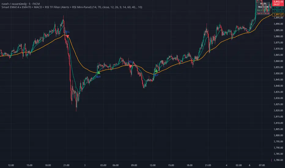
WHANG EMA-MACD🔥 Smart EMA14 x EMA70 + MACD Trend Alert System
Description:
Tired of chasing false signals?
This simple but powerful indicator helps you catch real trend moves — not the noise.
When EMA14 crosses EMA70 with MACD confirmation, and both EMAs point the same way, you’ll get a clean Buy or Sell alert right on your chart.
No messy settings, no guessing — just clear signals in strong trends.
✨ Features:
🔔 Real-time alerts via “Any alert() function call”
🟢 Buy when EMA14 crosses above EMA70 + MACD > 0
🔴 Sell when EMA14 crosses below EMA70 + MACD < 0
📈 Trades only when both EMAs slope in the same direction
⚙️ Customizable inputs for any market or timeframe
How to use:
Add the indicator to your chart
Create an alert → choose Any alert() function call
Relax and wait for your signals — no need to watch every candle!
Perfect for traders who want to follow the trend, avoid sideways traps, and get early alerts when momentum kicks in 🚀
Breadth Indicators
Futures Correlation Dashboard# 📊 Futures Correlation Dashboard
## Track Multiple Market Indicators in One View
Monitor ES, NQ, YM, VIX, USI:ADD , and USI:TICK simultaneously to see how the futures markets are moving together in real-time.
---
## 🎯 What's Included
**6 Market Instruments:**
- **ES** - S&P 500 Futures
- **NQ** - Nasdaq 100 Futures
- **YM** - Dow Jones Futures
- **VIX** - Volatility Index
- ** USI:ADD ** - NYSE Advance-Decline Line
- ** USI:TICK ** - NYSE Tick Index
**Live Data Table:**
- Current prices and percentage changes
- Real-time status indicators
- Market sentiment overview
---
## 📈 Features
✅ Multi-panel layout showing all 6 instruments simultaneously
✅ Customizable alert thresholds for USI:ADD and USI:TICK
✅ Color-coded visual indicators
✅ Works on any timeframe
✅ Live updates with market data
---
## 🔔 Alert Conditions
Set alerts for:
- USI:ADD crossing your custom thresholds
- USI:TICK extreme readings
- VIX movement patterns
- Confluence between multiple indicators
*Configure alert levels in the indicator settings.*
---
## ⚙️ Customizable Settings
Adjust thresholds for:
- USI:ADD bullish/bearish levels
- USI:TICK bullish/bearish levels
- USI:TICK extreme readings
- Display options for each instrument
---
## 💡 Use Cases
**Monitoring Market Activity:**
See multiple futures contracts and market internals without switching between charts.
**Correlation Analysis:**
Watch how different instruments move relative to each other throughout the trading session.
**Data Aggregation:**
Consolidate key market data into a single, organized view for faster decision-making.
---
## ⚠️ Requirements
- TradingView Premium or higher (for real-time multi-symbol data)
- Data subscriptions for: CME futures, CBOE VIX, and NYSE internals ( USI:ADD , USI:TICK )
- Compatible with all timeframes
---
## 📊 Who Is This For?
- Futures traders wanting consolidated market data
- Day traders monitoring multiple instruments
- Anyone interested in tracking market breadth alongside price action
- Traders who want to see correlations between ES, NQ, YM and market internals
---
## Technical Specifications
- Built with Pine Script v5
- Uses `request.security()` for multi-symbol data
- Real-time calculations and updates
- Minimal chart space usage with organized panel layout
---
*This indicator displays market data and calculated values. It does not provide trading signals or recommendations. Use at your own risk and always practice proper risk management.*

Quanloki v6OANDA:XAUUSD based on qqe trading on m15 or m10 is fine. Quick and concise trading with 6-10 prices with xauusd is too simple. Korean guys who need any code, just message me Quanloki xomgakorea

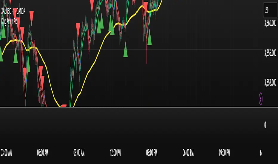
King Amun KING XAUUSD Pro Key Features of the Integrated Indicator:
1. Enhanced Moving Average System
EMA and SMA with Dynamic Colors
Buy/Sell Signals Based on Crossovers
Clear Visual Indicators
2. Advanced Kalman Filter
Advanced Noise Reduction
Multiple Models (Standard, Volume-Adjusted, Parkinson's Average)
Trend Strength with Color Gradient
3. Global Trading Sessions
Tokyo, London, New York Sessions
Open, Close, and Average Lines
Moving Range for Each Session
4. Smart Integration
All Signals Work in Harmony
Consistent Colors Across All Components
Unified Alerts
5. Ease of Use
Settings Organized into Groups
Helpful Hints
Flexible Customization
This integrated indicator provides a comprehensive trading system that can help you make more accurate decisions based on a multidimensional market analysis.
10/21 EMA + 50/200 Daily SMAAll four relevant moving averages in one script to allow you to add move indicators.

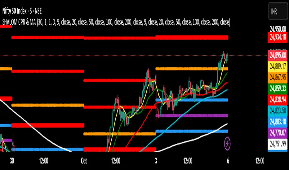
SHALOM TRADING HUB – CPR Camarilla & MASHALOM TRADING HUB – CPR Camarilla & MA (v4)
All-in-One Intraday & Swing Toolkit
Daily CPR (Prev Day), Weekly/Monthly Pivots, Prev Day/Week/Month High–Low, EMA/SMA pack, and Camarilla (H1–H4 & L1–L4). Plus Tomorrow CPR preview for next-session planning. 🔥
Features
Daily CPR: TC / PP / BC from previous day (value area & bias).
Floor Pivots: Daily/Weekly/Monthly R1–R4, S1–S4.
Previous High/Low: PDH/PDL, PWH/PWL, PMH/PML lines for breakout/mean-revert reads.
Camarilla Levels: H1–H4 & L1–L4 (popular 1.1 factor variant).
Moving Averages: EMA(9/20/50/100/200) & SMA(9/20/50/100/200) toggles.
Tomorrow CPR (Preview): Next session Pivot / BC / TC / R1 / S1 (D/W/M selectable).
Inputs (Settings)
Number of Daily/Weekly/Monthly pivots – show last N periods.
Show toggles – Daily CPR, Weekly/Monthly pivots, Prev H/L, Camarilla, Inner Camarilla, EMA/SMA.
Tomorrow CPR Type – D / W / M.
MA Lengths – fully customizable.
How to Use (Quick)
Trend bias: Price vs. CPR band & 20/50/200 MA stack.
Value zone: Inside TC–BC → balance; clean break & hold outside → trend continuation.
Reaction zones: Camarilla H3/L3 = bounce areas; H4/L4 = breakout/ breakdown lines.
Higher timeframe confluence: Add Weekly/Monthly pivots for swing levels.
Best Practices
Works on any timeframe; intraday (3–15m) recommended for CPR action.
Lines are derived using security(..., lookahead_on) on previous completed period → no forward repainting of those levels.
If too many lines: reduce “Number of … pivots” or turn off inner Camarilla/extra S/R.
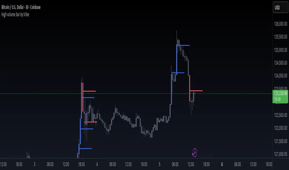
High volume bar by VibieHigh Volume Bar with Extended vPOC (Aggregation Enabled)
🧠 Concept
This indicator is designed to detect institutional activity and large traders by using statistical volume analysis and identifying key intrabar liquidity levels.
It applies Z-Score volume analysis to highlight unusually high volume candles and marks the Volume Point of Control (vPOC) inside each detected bar — the price level where the most volume was transacted.
⸻
⚙️ How It Works
1. Z-Score Volume Analysis
• The indicator calculates how far current volume deviates from its historical average using standard deviations (Z-Score).
• When the Z-Score exceeds the user-defined threshold, the candle is flagged as a High Volume Bar (HVB).
2. Multi-Exchange Aggregation
• Volumes from Binance, Bybit, and Coinbase can be aggregated into a composite volume metric.
• This provides a broader and more accurate market perspective, minimizing anomalies from individual exchanges.
3. Candle Coloring
• Bullish HVB → entire candle (body + wicks) is colored blue.
• Bearish HVB → entire candle is colored red.
• This makes large volume events immediately visible on the chart.
4. vPOC Detection
• The script examines a lower timeframe (e.g., 1 minute) within the HVB to find the price level with the highest traded volume.
• A horizontal line is drawn at that price and can be extended for multiple bars, marking a short-term liquidity zone that often acts as support or resistance.
⸻
🧭 How to Use
• vPOC levels frequently act as liquidity magnets and are often retested after the HVB appears.
• Bullish HVB + vPOC below current price = potential long entry zone.
• Bearish HVB + vPOC above price = potential short entry zone.
• Useful for identifying institutional absorption, stop runs, or hidden accumulation/distribution.
⸻
🌟 Why It’s Original and Useful
• Combines statistical volume analysis (Z-Score) with intrabar volume profiling.
• Aggregates multiple exchanges for broader accuracy.
• Offers precise liquidity levels that classic indicators don’t provide.
• Especially valuable for advanced traders looking for institutional footprints.
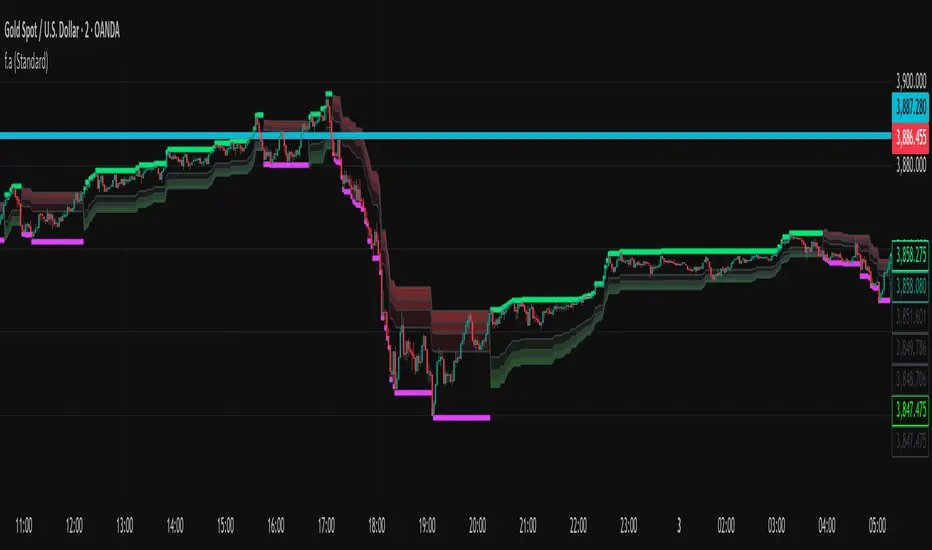
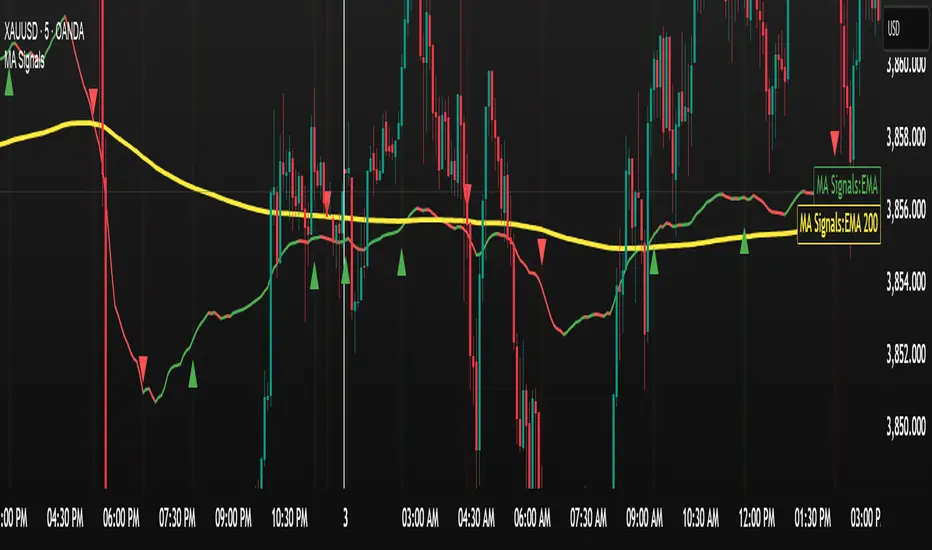
f.aYou can use it for Dow Jones as well. For gold at the 4:30 timeframe, you can occasionally enter with confirmation from liquidity and numeric signals—just follow the bars until you reach the target.
Euro Area vs US10YThe Euro Area GDP-Weighted Yield vs US10Y Spread is a macroeconomic indicator designed for forex traders and institutional investors who want to monitor the fundamental interest rate differential between the Eurozone and the United States. This tool aggregates sovereign bond yields from the major Eurozone member states using a weighted methodology based on outstanding government debt, providing a comprehensive view of the Euro Area’s fixed income market dynamics.
This indicator calculates a composite 10-year government bond yield for the Eurozone by combining data from seven major member countries: Germany, France, Italy, Spain, Netherlands, Belgium, and Austria. The weights are based on the proportion of government debt outstanding in each country, reflecting the actual composition of the European sovereign bond market rather than just GDP size.
The indicator then compares this Euro Area weighted yield against the US 10-Year Treasury yield (US10Y), producing a yield spread that serves as a powerful leading indicator for EUR/USD price movements.

9:30 USA OPENEasy if it go up it will turn green and you can lng if it goes down it will turn red and you can short

MACD / AO Alineación (V21) PublicA long or short indicator for any timeframe. It's important to consider volatility and ADX to find the most appropriate momentum. There are also other details to consider.
Volume Aggregated Spot & Futures -- Crypto (by plyst & more)📊 Volume Aggregated Spot & Futures - Enhanced Edition
🎯 Overview
Advanced volume aggregation indicator that combines spot and perpetual futures volume across the top 10 cryptocurrency exchanges. This enhanced version builds upon the original work by @HALDRO Project with optimized calculations and expanded functionality.
✨ Key Features
- 📈 Real-time aggregated volume from 10 major exchanges (Binance, Bybit, OKX, Coinbase, Bitget, KuCoin, Kraken, MEXC, Gate.io, HTX)
- 🔄 Multiple visualization modes: Volume, Delta, Cumulative Delta, Spot vs Perp analysis, Liquidations, OBV, and MFI
- 💱 Multi-currency support: Display volume in COIN, USD, or EUR
- 🎨 Clean, single-color bar chart showing total cumulative volume
- 📊 Multiple calculation methods: SUM, AVG, MEDIAN, VARIANCE
- 🎯 Separate spot (USDT, USD, USDC, etc.) and perpetual futures (.P contracts) tracking
🔧 Technical Improvements
✓ Corrected MFI formula for accurate money flow calculations
✓ Optimized volume aggregation logic with proper NA handling
✓ Support for 10 exchanges (up from 9)
✓ Streamlined codebase for better performance
✓ Updated perpetual contract naming conventions (.P format)
📖 Usage
Perfect for analyzing total market volume, identifying liquidation events, tracking buyer/seller pressure through delta analysis, and understanding the spot vs futures market dynamics.
🙏 Credits
Original concept and framework by @HALDRO Project. This version includes mathematical corrections, code optimizations, and expanded exchange support.
⚠️ Note
Aggregated volume is calculated from external exchange data using request.security(). Ensure your plan supports the necessary security calls for optimal performance.
Secret strategy[Smartalgo]We are revealing our secret trading strategy through Tradingview indicator
FEATURES
Trend Detection: Automatically identifies trend direction using a smoothed Supertrend (WMA + EMA), with shape markers on trend shifts and color-coded bars for clarity.
snapshot
Rejection Signals: Detects price rejections at the trend line after a user-defined number of consolidation bars; plots ▲/▼ icons to highlight strong continuation setups.
snapshot
Target Projection: On trend confirmation, plots entry, stop-loss (ATR-based), and three dynamic take-profit levels based on customizable
snapshot
multiples.
Dynamic Updates: All levels (entry, SL, TP1–TP3) auto-adjust based on volatility and are labeled in real time on the chart.
Customization: Users can tweak trend parameters, rejection confirmation count, SL/TP ratios, smoothing lengths, and appearance settings.
Alerts: Built-in alerts for trend changes, rejection events, and when TP1, TP2, or TP3 are reached.
Chart Overlay: Plots directly on price chart with minimal clutter and clearly labeled levels for easy trading.
king amun king gold**Features:**
- ✓ Ability to enable/disable each indicator individually
- ✓ Colors that change depending on the indicator's direction
- ✓ Different line thicknesses (EMA: thick, SMA: thin)
- ✓ Fully customizable settings
ATH Line with Date (Editable)Overview:
This indicator draws a continuous horizontal line at the instrument’s All-Time High (ATH) and annotates it with a label that shows the date the ATH was set in dd-mmm-yyyy format. The label is fully configurable (text prefix, side, position, colors, vertical offset), and you can optionally append the ATH price formatted as $ 1.234,56. Built for Pine Script™ v6 and works on any symbol or timeframe.
How it works
• Maintains a running maximum of high.
• Detects the bar where the current ATH occurred and extracts its date.
• Renders a horizontal line extended both sides at the ATH level.
• Places an optional label on the last bar or on the ATH bar.
• Triggers an optional alert when a new ATH is printed.
Inputs
• Line color / width / style – customize the ATH line appearance.
• Show label – toggle label on/off.
• Label text (prefix) – default ATH ►.
• Label text color / background – visual customization for the tag.
• Label side – left or right-anchored label.
• X location – Last bar or ATH bar.
• Label vertical offset (%) – moves the label above/below the line.
• Show price – appends the ATH price in the format $ 1.234,56
Notes & behavior:
• Repainting: The ATH level is stable until a higher high appears. When a new ATH is set, the line and date update accordingly—this is expected behavior.
• The ATH is computed from the chart’s current timeframe/history. If the symbol has limited history on your chart, the ATH reflects only the available data.
• No external libraries; no user data is collected.
Alerts:
• Includes New ATH alert condition. Fire it to be notified when price sets a new all-time high.
Tips:
• Use Last bar placement to keep the label visible at the right edge while scrolling.
• If the label overlaps candles or drawings, add a small positive vertical offset.
Version:
• Pine Script™ v6. Indicator only; no trading signals or orders.
Disclaimer:
For educational purposes only. This script does not constitute financial advice or a recommendation to buy or sell any security. Always do your own research and manage risk appropriately.

3SMA (1H only) by tophengzkyThis script plots three Simple Moving Averages (SMA 10, 20, 50), but they are only visible when the chart timeframe is set to 1 hour (1H).
It helps traders focus on higher timeframe trend direction without cluttering charts on other timeframes.
SMA1 = 10 (white)
SMA2 = 20 (yellow)
SMA3 = 200 (red)
Works only on 1H timeframe
Useful for swing traders and intraday traders who rely on hourly trend confirmation.
why 1 hr only? the only purpose of this is just to know the bias of the market weather it will reverse or it will continue the trend. As long as the price action did not cross this 3 SMA's the trend will continue.
as a trend trader it is very useful this strategy.. make it simple!

EBCLUB 📌 Indicator Summary – XAUUSD (Fano Chart)
This indicator is designed for traders who work with Smart Money (SMC/ICT) concepts and need a clear reading of key levels and market imbalances.
🔑 Key Features:
Daily and Weekly Levels:
Open Day: Opens the daily session to clearly define the range reference.
PDL/PDH (Previous Day Low/High): High-impact levels used as liquidity magnets.
Current Day High (H4 or Intraday): Tracks short-term structures.
Market Sessions (UTC):
Visualizes which session is active (London, New York, Tokyo, Sydney).
Helps identify when volatility tends to increase.
Liquidity Blocks and Institutional Zones:
Indicates areas of imbalance and accumulation (colored rectangles).
Facilitates the identification of possible entries or continuations.

Sentiment Navigator|SuperFundedSentiment Navigator — Momentum × Volatility Heatmap
What it is
Sentiment Navigator blends momentum (RSI) with volatility (ATR normalized by price) to visualize market psychology using a background heatmap and a lower oscillator.
・Background: quick read of the market’s “temperature” → Extreme Greed / Greed / Neutral / Fear / Extreme Fear.
・Oscillator: a bounded sentiment score from -100 to +100 showing bias strength and potential extremes.
Why this is not a simple mashup
Instead of showing RSI and ATR separately, this tool integrates them into a single, weighted score and a state machine:
・Context-aware weighting: When volatility is high (ATR vs its SMA baseline), the score is amplified, reflecting that momentum matters more in turbulent regimes.
・Unified states: RSI thresholds classify regimes (Greed/Fear) and are conditioned by volatility to promote Extreme states only when justified.
・Actionable cues: Reversal labels appear at the extreme levels with candle confirmation to reduce noise.
How it works (concise)
1. Momentum: RSI(len) (default 21).
2. Volatility: ATR(len)/close*100 (default ATR=14), smoothed by SMA(volSmaLen) and compared using volMultiplier.
3. Sentiment score: transform RSI to (-100..+100) via (RSI-50)*2, then amplify ×1.5 when high volatility. Finally clamp to .
4. States:
・RSI > greedLevel → Greed (upgraded to Extreme Greed if high vol)
・RSI < fearLevel → Fear (upgraded to Extreme Fear if high vol)
・else Neutral
5. Plotting:
・Oscillator (area) with 0-line and dotted extreme bands.
・Background color by state (greens for Greed, reds for Fear, gray for Neutral).
6. Signals (optional):
・Buy: crossover(score, -extremeGreedLevel) and close > open → prints ▲ at -extremeGreedLevel
・Sell: crossunder(score, extremeGreedLevel) and close < open → prints ▼ at +extremeGreedLevel
Parameters (UI mapping)
Core
・RSI Length (rsiLen)
・ATR Length (atrLen)
・Volatility SMA Length (volSmaLen)
・High-Vol Multiplier (volMultiplier)
State thresholds
・Extreme Greed (extremeGreedLevel)
・Greed (greedLevel)
・Fear (fearLevel)
・Extreme Fear (extremeFearLevel)
Display
・Show Background (showBgColor)
・Show Reversal Signals (showSignals)
Practical usage
・Regime read: Treat greens as risk-on bias, reds as risk-off, gray as indecision.
・Entries: Use ▲/▼ as triggers, not commands—wait for price action (wicks/engulfings) at structure.
・Extreme management: At Extreme states, favor mean-reversion tactics; in plain Greed/Fear with low vol, trends may persist longer.
・Tuning:
・Raise greedLevel/fearLevel to reduce signals.
・Increase volMultiplier to demand stronger vol for “Extreme” states.
Repainting & confirmation
Signals rely on cross events of the oscillator; judge on bar close for stricter rules. Background/state can change intrabar as RSI/ATR evolve.
Disclaimer
No indicator guarantees outcomes. News/liquidity can override signals. Trade responsibly with proper risk controls.
SuperFunded invite-only
To obtain access, please DM me on TradingView or use the link in my profile.
Sentiment Navigator — クイックガイド(日本語)
概要
本インジは RSI(モメンタム) と ATR/価格(ボラティリティ) を統合し、背景のヒートマップと下部オシレーターで市場心理を可視化します。
・背景色:極度の強欲 / 強欲 / 中立 / 恐怖 / 極度の恐怖 を直感表示。
・オシレーター:-100〜+100 のスコアでバイアスの強さと過熱を示します。
独自性・新規性
・高ボラ状態ではスコアを増幅し、同じRSIでも環境次第で体感インパクトを反映。
・RSIしきい値×ボラで極端ゾーンの発生を制御し、意義のあるExtremeのみ点灯。
・反転ラベルは極端レベルのクロス+ローソク条件で点灯し、ノイズを抑制。
仕組み(要点)
1. RSI を算出。
2. ATR/close*100 を SMA と比較し、しきい値倍率で高ボラを判定。
3. score = (RSI-50)*2 を 高ボラで×1.5、 にクランプ。
4. 状態:RSI>Greed → Greed/Extreme Greed、RSI

Wolfhis code is a Range Filter with entry signals.
How it works:
It calculates the average candle range (the difference between the price and its previous value) using EMA.
Based on this range, it builds a filter — a “smoothed line” (central level) along with upper and lower bands.
If the price moves above the filter → uptrend (green zone). If it moves below → downtrend (red zone).
Trade conditions:
longCondition (buy): price is above the filter and the filter has turned upward.
shortCondition (sell): price is below the filter and the filter has turned downward.
On the chart it displays:
the filter (line),
upper/lower bands,
colored candles (if enabled),
BUY/SELL labels and alerts.
In simple terms: it’s an indicator that filters out market noise and shows when the price changes trend direction, giving entry signals.

Horizontal Lines [White]The Horizontal Lines indicator is a simple yet powerful visual tool designed for traders in forex, options, and other financial markets. It allows users to mark and track key price levels directly on their chart with clear, bright yellow lines.

BTC Pro – Modular v6 (Final Version with Clean Labels)A complete Bitcoin charting toolkit built for clarity and decision-making.
✅ EMA levels (21, 50, 200, 800)
✅ Daily EMA 50 (constant across timeframes)
✅ SuperTrend for directional bias
✅ Liquidity zones based on ±2×ATR around SMA50
✅ On-Balance Volume (manual calculation)
✅ ADX trend strength with threshold labeling
✅ RSI divergence detection (bullish/bearish)
✅ Market structure: HH/LL breaks
✅ Entry zones with auto-generated SL/TP boxes
✅ Clean right-side labels (stacked)
✅ Modular toggles for full control via settings
Created by WhyPhy – modular, readable, and ready for live use.

Horizontal Lines [Yellow]The Horizontal Lines indicator is a simple yet powerful visual tool designed for traders in forex, options, and other financial markets. It allows users to mark and track key price levels directly on their chart with clear, bright yellow lines.

VWAP Trio: Continuous + London-anchored + NY-anchoredThis indicator plots three different VWAPs at once so you can see how price behaves against:
Continuous VWAP
Starts from the beginning of the whole chart / instrument history and keeps going.
Acts like a long-term “fair value” line.
London-anchored VWAP
Resets (anchors) at the London session open (usually 08:00 London).
Shows the average price paid during the current London session.
Day traders use it to see if price is trending or mean-reverting during the EU morning.
NY-anchored VWAP
Resets at the New York session open (usually 08:00 NY / 13:00–14:30 London depending on DST).
Shows the average price for the U.S. session.
