SMC Pro: Real-Time Final**Description:**
This comprehensive SMC indicator is designed to automatically visualize major **Trading Sessions** and **Killzones**, alongside Fair Value Gaps (FVG). It helps traders identify high-probability setups by correlating time and price, specifically during key market hours (London, New York, Asia).
**Key Features:**
1. **Trading Sessions & Killzones:** The indicator clearly highlights the open and duration of major sessions (Asia, London, New York), allowing traders to spot volatility injections and "Judas Swings."
2. **Automated FVG Detection:** Scans price action to locate valid Fair Value Gaps and Imbalances within these sessions.
3. **Entry Logic:** Marks potential entry zones at the 50% retracement level of the identified FVG.
4. **Risk Management:** Projects a fixed Risk-to-Reward ratio (e.g., 1:3) with automatic Stop Loss and Take Profit levels.
5. **Clean Visualization:** Color-coded boxes for sessions and gaps keep the chart organized.
**How to Use:**
* **Time Analysis:** Watch for price action as the London or NY session opens (highlighted by the indicator).
* **Signal:** Wait for an Imbalance/FVG to form during these high-volume times.
* **Entry:** Set a limit order at the 50% mark of the gap.
* **Exit:** Use the projected TP levels.
**Disclaimer:**
This tool is for educational purposes and technical analysis assistance only. Past performance does not guarantee future results.
Trendlinestructure

Trend Catcher - Alpha v2 - by Crypto_Dan_CroIf you want to get this indicator, contact me on
X handle: @crypto_dan_cro
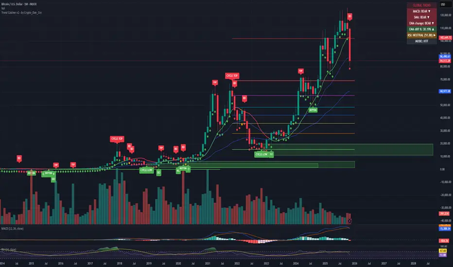
What is Trend Catcher v2?
This is the only indicator you need ;)
This indicator is a proprietary market analysis system designed to identify high-probability trading zones by synchronizing multiple layers of market structure, momentum behaviour and cyclical dynamics.
It dynamically adapts to changing market conditions by evaluating:
- macro trend alignment
- structural price positioning
- momentum acceleration & deceleration
- volatility-based reaction zones
- cycle maturity levels
The system filters out low-quality setups and highlights only areas where multiple hidden conditions align, providing:
- trend continuation signals
- structural shift detection
- cycle-based expansion targets
- adaptive support & resistance mapping
Rather than reacting to price alone, the indicator anticipates areas where market psychology historically shifts, allowing traders to position themselves ahead of major moves.
Core philosophy:
This tool does not attempt to predict the market — it tracks the underlying pressure points where probability favours expansion or exhaustion.
It functions as:
- a trend alignment engine
- a cycle decoder
- a volatility interpreter
- a structure validation system
What it gives the user:
- Clear visual guidance without overloading the chart
- Objective market context independent of emotion
- Early trend recognition
- Cycle-aware price targeting
- Decision zones instead of random entries
Ideal for:
- traders who trade structure, not noise
- investors who respect market cycles
- strategists focused on probability over prediction
- disciplined entries & exits
In short:
It is a market interpretation framework built for traders who think two steps ahead.
Contains:
1. Higher Timeframe mode (Monthly / Weekly) on all timeframes
2. Current Chart Timeframe mode
3. Global Trend via BTC MACD
4. SMA
5. EMA
6. BO (Break Out), BD (Break Down) signals
7. TOP & BOTTOM Detection
8. Support & Resistance Zones
9. RSI confirmation
10. Smart Info Panel (Global trend, MACD, SMA, EMA, RSI statuses - Bull, Bear, Neutral)
11. Monthly timeframe (Fibbonaci Retracement levels)
12. Monthly timeframe (all Cycle tops, and Cycle bottoms)
Crypto markets are volatile, if you choose to use this indicator for trading, you are doing it on your own. Crypto_dan_cro is not responsible for any profits or losses created by using this Indicator.
Trend lines indicator by ForexBeeEnhanced 3-Swing Trendline Zones - Complete Feature Guide
WHAT THIS INDICATOR DOES
This indicator automatically draws trendline zones on your chart using a 3-point validation system. Instead of just connecting any two price points like basic trendline tools, it waits for three swing points to confirm the trendline is valid before drawing it.
FEATURE 1: SWING POINT DETECTION
What it detects:
Swing highs: Price points where the high is higher than surrounding candles
Swing lows: Price points where the low is lower than surrounding candles
These show up as small arrows on your chart labeled "SH" (swing high) and "SL" (swing low)
Settings that control this:
Swing Length : Default is 6, range 1-20
Higher numbers = fewer, more significant swing points
Lower numbers = more swing points, including minor ones
Example: Setting 5 means each swing point must be higher/lower than 5 candles on each side
How to use this setting:
On 1-minute charts: Use 5-10 to filter out noise
On daily charts: Use 2-3 for more sensitivity
Volatile markets: Increase the number
Quiet markets: Decrease the number
Please See the Below Images To See the difference of swing length of 6 and 8
Display control:
Show Swing Points : Turn the arrows on/off
Default: ON (you'll see the arrows)
Turn OFF if arrows clutter your chart
FEATURE 2: RETRACEMENT VALIDATION SYSTEM
What this does:
After finding two swing points, the system checks if the second swing represents a proper market retracement, not just random price movement.
How it works:
Finds the highest point between two swing lows (or lowest point between two swing highs)
Calculates how much the second swing retraced from this extreme point
Only accepts swings that retrace between your set percentages
Settings that control this:
Lower Limit % : Default 50%, range 0-100%
Upper Limit % : Default 90%, range 0-100%
These create a "valid retracement zone"
Why this matters:
Eliminates random trendlines that don't follow market structure
Ensures trendlines represent actual retracement patterns
Based on Elliott Wave and Fibonacci principles
FEATURE 3: ATR-BASED ZONE WIDTH
What ATR means:
Average True Range measures how much price typically moves in a given period. Instead of fixed-width trendlines, this creates zones that adapt to market volatility.
Settings that control this:
Zone Width (ATR Multiple) : Default 0.3, range 0.1-1.0
ATR Length : Default 14, range 1-50 periods
How zone width works:
Multiplier 0.1 = Very narrow zones (tight around trendline)
Multiplier 0.5 = Medium zones
Multiplier 1.0 = Wide zones (accommodates more price movement)
ATR Length explained:
14 periods = Uses last 14 candles to calculate average volatility
Shorter periods (7) = More sensitive to recent volatility changes
Longer periods (21) = Smoother, less sensitive to volatility spikes
Practical impact:
During high volatility: Zones automatically become wider
During low volatility: Zones automatically become narrower
Prevents false breakouts during normal market noise
Creates realistic support/resistance areas instead of precise lines
FEATURE 4: VISUAL ZONE SYSTEM
Active Uptrend Zones:
Green upper boundary line (solid, thick)
Lime green lower boundary line (solid, thick)
Green fill between lines (80% transparency)
These represent dynamic support levels
Active Downtrend Zones:
Blue upper boundary line (solid, thick)
Navy blue lower boundary line (solid, thick)
Red fill between lines (80% transparency)
These represent dynamic resistance levels
Broken/Expired Zones:
Gray/silver boundary lines (dashed, thick)
Original fill color maintained (green for uptrend zones, red for downtrend zones)
Shows historical trendlines that are no longer active
FEATURE 5: BREAK DETECTION SYSTEM
How breaks are detected:
The system monitors when price violates the zone boundaries, indicating the trendline structure has failed.
Settings that control this:
Use Wick Break : True/False toggle
TRUE: Break occurs when candle high/low touches zone boundary
FALSE: Break occurs when candle close price crosses zone boundary
Conservative vs Aggressive approach:
Wick Break = TRUE (Aggressive) :
- More sensitive, earlier signals
- May produce more false breaks during volatile periods
- Good for scalping and short-term trading
Wick Break = FALSE (Conservative) :
- Requires candle to close beyond zone
- Fewer false signals, more reliable breaks
- Better for swing trading and position trading
What happens when zone breaks:
Zone lines change from solid to dashed
Zone lines change color to gray/silver
Fill color remains original (green/red) for identification
Zone stops extending forward
Zone is removed from active monitoring
FEATURE 6: ZONE EXPIRATION SYSTEM
What expiration does:
Allows trendlines to automatically become inactive after a set number of bars, even if they haven't been broken.
Settings that control this:
Use Zone Expiration : True/False toggle
Zone Expiration (Bars) : Default 500, range 1-1000
FALSE: Zones run indefinitely until broken
TRUE: Zones expire after specified number of bars
Visual result:
Expired zones look identical to broken zones
Lines become dashed and gray/silver
Fill colors remain original (green/red)
FEATURE 7: MULTI-TIMEFRAME TREND ANALYSIS TABLE
What the table shows:
A small table on your chart that monitors trend conditions across four different timeframes simultaneously.
Settings that control this:
TF1, TF2, TF3, TF4 : Four customizable timeframes
Default: 4H, 8H, 1D, 1W
Table Position : 9 positions (top/middle/bottom + left/center/right)
Text Size : Tiny, Small, Normal, Large, Huge
How trend detection works:
Uptrend Pattern : Current candle's high AND low are both higher than previous candle's high AND low on specified timeframes
This creates higher highs and higher lows
Shows consistent buying pressure
Table displays green background with upward arrow (▲)
Downtrend Pattern : Current candle's high AND low are both lower than previous candle's high AND low on specified timeframes
This creates lower highs and lower lows
Shows consistent selling pressure
Table displays red background with downward arrow (▼)
Range/Sideways Pattern : Current candle creates either inside bar or outside bar
Inside bar: Current range smaller than previous candle
Outside bar: Current range larger than previous candle
Shows market indecision or consolidation
Table displays orange background with diamond symbol (◆)
No Clear Pattern : None of the above conditions are met
Table displays gray background with horizontal line (⎯)
How to interpret the table:
All timeframes green (uptrend): Strong bullish alignment
All timeframes red (downtrend): Strong bearish alignment
Mixed colors: Conflicting timeframes, exercise caution
Mostly orange: Market in consolidation phase
Tooltip explanations: Hover over each cell for detailed description
FEATURE 8: BACKGROUND COLOR SYSTEM
What background colors show:
Optional feature that colors your chart background based on the current timeframe's trend condition.
Settings that control this:
Show Background Colors : True/False toggle
Background Transparency : 80-98% range
Default: OFF (no background colors)
Color scheme:
Green background: Current timeframe showing uptrend
Red background: Current timeframe showing downtrend
Orange background: Current timeframe showing range/consolidation
No background: No clear trend pattern
Transparency levels:
80%: More visible background color
95%: Subtle background hint
98%: Very subtle background tint

Linear Regression Trendlines & ChannelsThis new script came to me one night all of a sudden and it seems to be common knowledge for how good it works.
The script utilizes linear regression to determine trendlines and channels, identifying instances where closing prices closely align with the regression line. When a significant number of closing prices fall within proximity to the regression line, trendlines are displayed or generated.
Users have the flexibility to customize the proximity criteria by adjusting the margin and percentage thresholds. These parameters allow for precise control over how closely the closing prices should adhere to the regression line, as well as the minimum percentage of closing prices required to fit within the specified margin.
Moreover, the script is adaptable to logarithmic scales, ensuring compatibility with various chart configurations. Additionally, it stores all relevant data in an array for convenient access in future scripts or analyses.

Pivot Point Trend LineThis Indicator simply draw lines between high pivot points and low points.
in the code by default its used tradingview default ta.pivothigh and ta.pivotlow function to get the high and low points.
it will generate recent 4 lines of high and low pivot points.
you can change the no of days for both highs and lows pivot points.
this script is not generating any buy or sell signals its just autodraw and connect 2 pivot points. so you dont have to do it manually.

BE-TrendLines & Price SentimentsOverview
The trendline is one of the most potent and flexible tools in trading. A rising trendline indicates an upward trend, a falling trendline indicates a downward trend, and a flat trendline indicates a range-bound bond market.
Breakouts, price bounces, and reversal / Retest tactics are all types of trades that may be made using a trendline. Additionally, stop-loss and profit-trailing orders can be based on trendlines as support and resistance levels, appropriately.
Technical Calculations for Trendlines & Price Sentiments:
Pivot points for a specified time frame and the Prevailing High/Low for the most recent bars are used to derive trendlines. While Pivot Points alert us to price movements, High/Low tells us where Bulls and Bears find a middle ground. This provides a remarkable set of conditions from which to extrapolate the efficacy of the Trendlines.
The term "price sensitivity" refers to how much a change in the price of a product causes consumers to alter their purchase habits. It's the relationship between price shifts and shifts in consumer demand. So, for example, if a 30% jump in the cost of a product leads to a 10% drop in purchases, we can conclude that the item has a price sensitivity of 0.33%.
Basis the above theoretical statement, If the underlying asset's price drops, the indicator shall compute data on the amount of volume being pumped (Inflow vs Outflow) into the market (if available), or the percentage by which the price has changed. This will be compared to the recent drop rate to see if the behavior has changed at the similar value zone and non similar value zone. similar calculation shall be done if the price of the underlying rises.
Traders may benefit from hearing about Trendlines in their "Story Telling" form, which we now present. To help you comprehend it better, candles are divided into three Sentiment groups based on their color. Colors: Green (with its shades), Silver, and Red (including its shades). Green signifies a Bullish Trend, Silver a neutral trend, and Red a Brearish Trend.
Bullish Trend
Bearish Trend
Neutral Trend
Sentiment Price Cycle in Trending Market: Green (Directional Bullish), Dark Green (Bullish Trend Loosing its Strength), Silver (Neutral Trend), Red (Directional Bearish), Dark Red (Bearish Trend Loosing its Strength)
Sentiment Price Cycle in RangeBound Market: Green (Over Brought), Silver (Neutral) & Red (Over Sold)
How to Initiate Trade when price is within TL:
Fake Break Out Trade:
BreakDown Trade:
BreakOut Trade:
Couple of Other Features in the Indicator:
Single Alerts = These are the alerts where in, as and when the Event happens Alerts shall the trigerred. like On BreakOut, BreakDown, TouchOf Up TrendLine, TouchOf DownTrendLine, Retest Of Up TrendLine, Retest of DownTrendLine.
Conditional Alerts = These are those type of Alerts where in you can combine 2 or 3 conditions to trigger an Alert. Like
Sample 1 - After Down TL is tested for 3 times, If BreakOut happens and the setiment turns Bullish within 5 Candles.
Sample 2 - After Up TL is tested for 2 times, If Price Bounces backUp from TL and the setiment turns Bullish within 5 Candles.
Similarly you can customize the combination of events for getting the alert.
DISCLAIMER: No sharing, copying, reselling, modifying, or any other forms of use are authorized for our documents, script / strategy, and the information published with them. This informational planning script / strategy is strictly for individual use and educational purposes only. This is not financial or investment advice. Investments are always made at your own risk and are based on your personal judgement. I am not responsible for any losses you may incur. Please invest wisely.
Happy to receive suggestions and feedback in order to improve the performance of the indicator better.
Donchian Channels [Gu5]█ OVERVIEW
I changed the design of the classic indicator "Donchian Channels", for easy reading.
█ CONCEPTS
Donchian Channels is an indicator made up of upper and lower bands around a mid-band or Basis.
The upper band marks the highest price of a security for N periods, while the lower band marks the lowest price of a security for N periods. The area between the upper and lower bands.
In this version, when there are new Higher High (HH), the trend is Bullish and the channel is painted green.
When there are new Lower Low (LL), the trend is Bearish and the channel is painted Red
█ OTHER SECTIONS
A plus in this script: When there are no new highs or new lows, there is no certain trend
The channel is painted yellow
www.tradingview.com
• HOW TO USE
Menu "Display"
• '■ Basis On/Off': Shows the midline Basis
• '■ Alert On/Off': Shows alerts labels
• '■ Fill On/Off': Paint the entire channel the color of the trend
• '■ Bar Color On/Off': Paint the candle the color of the trend
• '■ Close Alert On/Off': Shows alerts end of trend
• NOTES:
This code was written using the recommendations from the Pine Script™ User Manual's Style Guide
• RAMBLINGS:
You can use the "Basis" line as Trailing Stop.
• THANKS:
Donchian Channels developed by Richard Donchian
and many MANY thanks to @PineCoders

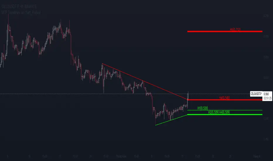
MTF Trendlines on chart_Pro[vn]Hello Traders .
👉This is an indicator of the trendlines in the analysis series with my trendlines.
- It statistics the upper and lower trend lines of the current Time Frame.
- Pine Script strategy draws pivot points and trendlines on the chart.
- This strategy allows the user to specify the interval to calculate the pivot points and the number of pivot points used to generate the trend lines.
- In the process of trading with the trendline, I see different timeframes showing each trendline differently, many times the trendline in the 15m frame has been broken but I don't know where the price is going, and it takes a lot of time to find support points, resistance to entry or take profit, So I came up with the idea of drawing different timeframes on the same chart in a specified timeframe, and I found it shortened the time to find support and resistance points in trading without having to switch back and forth between timeframes.
- For example, when the H1 trendline breaks downwards, we can determine a high probability that the price will be supported by the trendlines below it. for us to find entry points or exit orders effectively. Or when the price breaks the H1 trendline to go up, the chart shows us the trend lines above that broken H1 line so that we have a more effective entry or take profit point because it is a resistance zone....
- It can shows 7 pairs of trendlines during different times in the chart.
- each timeframe will display two trendlines, one up, and one down.When the price crosses a trendline, only one valid trendline is displayed, while the line crossed is not displayed.
- The upper trendline (down trend) is a red horizontal line, with the timeframe name and the value of its trendline, for example 4H(1.234) means timeframe = H4, the current value of the trendline is 1.234.
- The trendline below (up trend) is the blue horizontal line that also represents the same value as the line above.
- In the Settings section, up to 6 different timeframes can be selected to display those trendlines on the chart.
- Small timeframes such as m1, m3, m5 or D1 I leave the default (cannot be changed) in the 'Length' setting = 50, timeframe is H6, H8, H12 'Length' = 30, the rest of the time can be changed, the default is 20 ...
- Some cases I have applied with this indicator to look for entry points and take profit ...
Xin chào Trader Việt nam.
- Đây là chỉ báo về các đường xu hướng trendline trong chuỗi phân tích với đường xu hướng của tôi. Chỉ báo này là muti trendlines trên biểu đồ , nó hiển thị được tối da 7 cặp đường xu hướng trong các thời gian khác nhau trên 1 biểu đồ.Dựa vào đó các trader có cái nhìn trực quan nhất không phải thay đổi qua lại các thời gian để tìm các đường trendlines, và có thể tìm được những cú hồi hoặc phá ngưỡng để vào lệnh hoặc chốt lời .
- Thực ra trong quá trình giao dịch với đường xu hướng, tôi thấy các khung thời gian khác nhau thì hiển thị mỗi đường xu hướng khác nhau, nhiều khi đường xu hướng trong khung 15m đã bị phá nhưng không biết giá đi đến đâu, và mất rất nhiều thời gian để tìm các điểm hỗ trợ, kháng cự để vào lệnh hoặc chốt lời, nên tôi nảy ra ý tưởng vẽ ra các khung thời gian khác nhau trên cùng 1 biểu đồ trong một khung thời gian được chỉ định, và tôi thấy rút ngắn được thời gian để tìm các điểm hõ trợ , kháng cự trong giao dịch mà không cần phải chuyển qua lại giữa các khung thời gian .
- Chẳng hạn ,khi đường xu hướng H1 bị phá vỡ xuống dưới thì ta có thể xác định được khả năng cao giá sẽ được hỗ trợ bởi những đường xu hướng bên dưới nó. để ta tìm điểm vào lệnh hoặc thoát lệnh cho hiệu quả.Hoặc khi giá phá vỡ đường xu hướng H1 để đi lên , thì trên biểu đồ đã hiện cho ta các đường trendline bên trên đường H1 bị phá vỡ đó để ta có điểm vào hoặc chốt lời hiệu quả hơn vì đó là vùng kháng cự....
- Đường xu hướng bên trên(down trend) là đường kẻ ngang màu đỏ ,có kèm tên timeframe và giá trị của đường xu hướng của nó,ví dụ 4H(1.234) nghĩa là timeframe=4H, giá trị hiện tại đường trendline là 1.234.
- Đường xu hướng bên dưới (up trend) là đường ngang màu xanh cũng thể hiện giá trị như đường bên trên.
- Các timeframe nhỏ như 1m, 3m, 5m hoặc 1D tôi để mặc định (không thay đổi được) trong setting mục 'Length' = 50, timeframe là 6H,8H,12H 'Length' = 30, các thời gian còn lại có thể thay đổi được ,mặc định là 20
- Để điều chỉnh có thể vào setting để thiết lập các thời gian theo nhu cầu.
Faytterro Market Structerethis indicator creates the market structure with a little delay but perfectly. each zigzag is always drawn from highest to lowest. It also signals when the market structure is broken. signals fade over time.
The table above shows the percentage distance of the price from the last high and the last low.
zigzags are painted green when making higher peaks, while lower peaks are considered downtrends and are painted red. In fact, the indicator is quite simple to understand and use.
"length" is used to change the frequency of the signal.
"go to past" is used to see historical data.
Please review the examples:

Bounce Manager 20 TrendlinesThe trendline script is made for manual input of trendlines using point clicks on the chart. The script will then see if price respects these lines by the parameters you input in settings panel. On a respectable bounce it will print buy/sell arrows. The script also has functionality to send alerts, this is helpful if you want to automate trendlines. I created this script and many others under the bounce manager toolkit to expand on the signalling capabilities of popular drawing tools as I find using just a crossover to be lacking especialy for full automation.
components:
- Line respect: When price moves past this the script will no longer look for entry until a new trend has been established. The line can also be used as a stop loss.
- Confirmation: When price touches the line during a trend it
will wait to cross over this line to confirm a reaction from the line.
- Consolidation filter: A trend filtering system, this is a distance from
the line price has to break to confirm trend direction.
- Stop loss: This can be set to a percentage distance from the low after
bounce. Or it can be set to the line respect line
- Take profit: This can be a fixed take profit target or a risk to reward
based take profit. With risk to reward it will multiply the stop loss
distance by the input and use that to create target (green cross)
- ATR based or % based: there are 2 versions of the script, one for strict
percentage based logic and another one based on ATR values
If you are having problems figuring out which settings to use I recommend you check the Bounce Manager ATR script for reference as this script plots the components:
Zignaly automation settings:
zignaly integration, you can use the settings panel to decide your risk management. Option to use a fixed take profit % or an automatic risk to reward calculation based on the stop loss. Stop loss can get calculated using the max violation setting as a stop loss (this will put stop loss below line respect level) or when not checked it will use 0.01% below the low of the signal candle as stop loss. Just add your zignaly private key in the settings and use any alert function call as alert. Make sure to use zignaly.com as your webhook url.
The trendlines you see in preview are based on a long term pitchfork on BTCUSDT 10H chart
If 20 trendlines are too much I will be releasing a 5 line input version, this script is more to be used to automate pitchforks, gann boxes etc.
Part of the Honest Algo indicator suite
