#BLTA - CARE 7891🔷 #BLTA - CARE 7891 is an overlay toolkit designed to support structured trading preparation and chart reading. It combines a manual Trade Box + Lot Size/Risk panel, session background highlights (NY time), confirmed Previous Day/Week High-Low levels, an Asian range liquidity box, a 1H ZigZag market-structure projection, and an imbalance map (FVG / OG / VI) with an optional dashboard.
This script is an indicator (not a strategy). It does not place orders and is intended for planning, risk visualization, and market context.
✅ Main Modules
1) 💸 Risk Module (Trade Box + Lot Calculation + Table)
A complete manual trade-planning tool:
Pick an Entry Point (EP) and Stop Loss (SL) directly on the chart using input.price(..., confirm=true).
Automatically calculates:
Cash at Risk
SL distance (pips) (Forex-aware)
Lot size based on your:
Account balance
Risk %
Units per lot
Account base currency (with conversion if needed)
Draws:
Risk box (EP ↔ SL)
Target box (RR-based TP)
Displays a clean table panel with the key values.
🔁 Re-confirm Mode (Wizard)
Use “Re-confirm Trade Box Points” to force a clean logical reset and re-pick EP/SL/time anchors:
Shows temporary EP/SL labels
Shows a small wizard table guiding you step-by-step
Turn it OFF to return to normal risk table + boxes
Tip: If your chart timeframe changes or you want a fresh selection, Re-confirm mode is the safest way to reset everything cleanly.
2) 🎨 Session Visualization (New York Time)
Highlights chart background for these windows:
Day Division (17:00–17:01 NY)
London (03:00–05:00 NY) + sub-windows
New York (08:00–10:30 NY) + sub-windows
Colors are fully configurable from inputs.
3) 📰 Confirmed PDH/PDL (Previous Days)
Optional module that plots confirmed Previous Day High (PDH) and Previous Day Low (PDL):
Trading day is defined as 17:00 → 17:00 NY
Lines start exactly at the candle where the high/low occurred
Lines extend forward and can freeze when price touches them
Configurable: days to keep, style, width, and “stop on hit”
4) 📅 Confirmed Weekly High/Low (Previous Weeks)
Optional module that plots confirmed Weekly High/Low:
Confirmation occurs at Sunday 17:00 NY (typical FX week boundary)
Lines begin at the candle where the weekly extremes formed
Extends forward and can freeze on touch
Configurable: weeks to keep, style, width, stop-on-hit
5) 🈵 Asian Range Liquidity Box
Draws a session box that tracks high/low and optional midline (50%):
Uses New York time
Dynamic updates while session is active
Optional mid label and configurable line style/width
6) 📈 Market Structure - ZigZag (1H projected)
A ZigZag structure engine calculated on 1H and projected onto any timeframe:
Configurable:
Length
Source type (High/Low or Open/Close)
Colors and width
Opacity when viewing non-1H charts
Optional live extension of the last leg
Includes safe cleanup when toggling OFF (no leftover objects)
7) 📊 Imbalance Detector (FVG / OG / VI) + Dashboard
Detects and draws:
Fair Value Gaps (FVG)
Opening Gaps (OG)
Volume Imbalances (VI)
Optional dashboard shows frequencies and fill rates.
Attribution / Credits
This module is inspired by / adapted from the public concept widely known as “Imbalance Detector” (LuxAlgo-style logic). This script is independently packaged and integrated as part of the toolkit with additional modules and custom structure.
⚙️ How to Use (Quick Steps)
Add the indicator to the chart (overlay).
Enable 💸 Risk Module if you want trade planning.
Go to Trade Box Location and pick:
Entry Point (EP)
Stop Loss (SL)
Time anchors for box edges
Adjust:
Account balance, risk %, units per lot, RR target
Enable additional modules as needed:
Session backgrounds
PDH/PDL
Weekly High/Low
Asian range box
ZigZag
Imbalances + dashboard
🔎 Notes & Limitations
This script is for visual planning and context, not trade execution.
Lot sizing is based on the selected EP/SL and your inputs; always double-check broker rules, symbol specifications, and contract size.
Object-heavy features (boxes/lines/tables) may increase load on lower-end devices or very small timeframes.
การวิเคราะห์แนวโน้ม

Zippo Traffic v3Zippo Traffic v3
Zippo Traffic v3 is an advanced trend-following system that analyzes price movements to determine market direction. Not only does it generate buy and sell signals, but it also highlights uncertain market periods with yellow bars, signaling when new positions should not be opened.
How It Works
This system operates on a traffic light principle:
🟡 Yellow Bars: Indicate market uncertainty – refrain from opening new positions and exercise caution if you are already in a trade.
🟢 Green Bars: Signal a Long/Buy – indicating an uptrend.
🔴 Red Bars: Signal a Short/Sell – indicating a downtrend.
The Alligator (3 EMA) parameters (JawLen, TeethLen, LipsLen) are the only inputs that users can modify; all other technical indicators and calculations are fixed. This minimizes the risk of over-optimization and false signals, preserving the system’s core methodology.
Key Features
Neutral Zones: Unlike conventional trend-following indicators that only provide buy and sell signals, this indicator also identifies neutral areas (yellow bars) in the market.
Momentum + Trend Analysis: It combines multiple criteria to more accurately analyze the market direction.
Standard Price Data: All calculations are based on standard OHLC values. While Heikin Ashi or other candlestick styles may be used solely for enhanced visual clarity, they do not affect signal generation.
How to Use
🟢 Green Bars: Indicate a strong uptrend (Long).
🔴 Red Bars: Indicate a downtrend (Short).
🟡 Yellow Bars: Represent uncertain market conditions; avoid opening new positions during these periods.
Timeframe and Usage Recommendations
Signal quality may be poor in low-volume or illiquid securities.
For optimal results, it is recommended to use timeframes of 30 minutes or higher.
It has proven particularly effective on 4-hour, 8-hour, and daily charts.
Although it can be applied to shorter timeframes, increased price volatility may reduce signal accuracy.
Important Notice
This indicator is developed solely for technical analysis purposes and does not constitute investment advice. Market conditions can change rapidly— even a single candle can break through support or resistance levels. Yellow bars indicate that you should close your existing position and wait, or monitor for trend clarification, but do not necessarily signal an imminent trend reversal. All investment decisions should be made based on your own research and risk management strategies.

ACT Professional SuiteThis is a proprietary system architecture designed to calculate structural capacity in financial markets.
PAPER TRADING / TESTING IS RECOMMENDED BEFORE LIVE DEPLOYMENT.
█ WHAT IT IS - ONE SCRIPT; TWO ENGINES
1. TRD Engine (Macro Trend)
• BUY (Green)
• SELL (Red)
2. OPT Engine (Micro Timing)
• HOLD (Grey)
• GROWTH (Green)
• LIMIT (Orange)
• SURFING (Orange)
• SELL (Red)
█ HOW TO USE
MODE A: PASSIVE SCANNING (Default)
Use this to identify potential entries.
• WAIT: System is stable.
• LONG/SHORT: Momentum is building in a specific direction.
MODE B: ACTIVE TRADE MANAGEMENT (The Core Feature)
Once you have entered a position, check the "Activate Management Mode" box in settings. The system will now guide your exit strategy based on your defined risk parameters.
The Status Sequence:
1. HOLD: Price is moving within safe limits. (Safe)
2. STRONG GROWTH: Price movement is increasing. (Profitable)
3. LIMIT REACHED: Your defined % target is hit. (Decision Point)
4. SURFING...: The system is moving beyond the limit.
5. SELL / BREACH: The structural limit is reached. Probability of collapse is critical. Immediate exit recommended.
█ ACCESS & AUTHORIZATION
This is an Invite-Only script. Access is automated via our central hub.
whop.com
Disclaimer: This tool provides structural analysis, not financial advice. Use rationally.

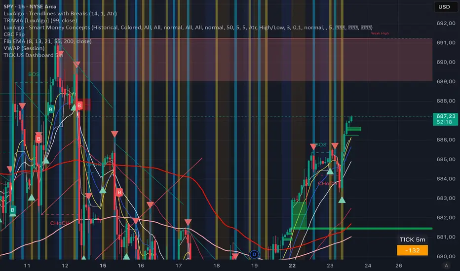
TICK.US Dashboard 5mIt's a very simple script, It displays the TICK.US Timeframe 5 mn on your template
Box Theory [Interactive Zones] PyraTimeThis script combines Nicholas Darvas’s "Box Theory" with modern Supply and Demand (Premium/Discount) concepts. It automatically identifies the most recent Swing High and Swing Low to delineate the current trading range.
The purpose of this tool is to visualize market structure and help traders identify when price is relatively expensive (Premium) or cheap (Discount) within a defined range.
Visual Guide: What You Are Seeing
The Box: Represents the active trading range defined by the most recent significant Swing High and Swing Low.
Red Zone (Premium): The top 25% of the range. Mathematically, prices here are considered "expensive" relative to the current structure.
Green Zone (Discount): The bottom 25% of the range. Prices here are considered "cheap" relative to the current structure.
Grey Zone (Equilibrium): The middle 50% of the range. This is the area of fair value where price often consolidates.
Dashed Line (EQ): The exact 50% midpoint of the range.
Tutorial: How to Trade Using This Indicator
Method 1: Mean Reversion (Range Trading) This method applies when the market is moving sideways.
Identify Structure: Wait for a box to form.
Wait for Extremes: Do not trade when price is in the middle (Grey/White area). Wait for price to enter the Red or Green zones.
Entry Trigger:
Shorts: When price enters the Red Zone, look for a rejection (wicks leaving the zone) or a lower timeframe breakdown. Target the EQ (Midline) as your first take profit.
Longs: When price enters the Green Zone, look for support formation. Target the EQ (Midline) as your first take profit.
Method 2: Trend Continuation (Breakouts) This method applies when the market is trending strongly.
Breakout: Monitor the alerts. A close outside the box indicates a potential shift in market structure.
Retest: After a breakout up, the old "Red Zone" (Resistance) often flips to become new Support. Wait for price to pull back to the top of the old box before entering.
Configuration Guide (Settings)
Pivot Left/Right Bars (Sensitivity):
Default (20/20): Best for Swing Trading. It filters out market noise and only draws boxes based on major structural points.
Lower (5/5): Best for Scalping. It will create smaller, more frequent boxes but increases the risk of false signals.
Zone Percentage:
Default (25%): Standard deviation for Supply/Demand zones.
Alternative (15%): Use this for "sniping" entries at the absolute extremes of the range.
Multi-Timeframe (MTF):
Enable "Use Higher Timeframe" to see Daily or Weekly ranges while trading on lower timeframes (like the 15m or 1H). This helps keep your intraday trades aligned with the major trend.
Technical Note on "Lag" This indicator uses Pivots to draw the box. A pivot is only confirmed after a certain number of bars have passed (the "Pivot Right Bars" setting).
Example: If "Pivot Right Bars" is set to 20, the box will update 20 bars after the actual high or low occurred. This is necessary to confirm that the point was indeed a Swing High/Low. Do not treat the box lines as predictive; they are reactive to confirmed structure.

ICT FINATIC🇮🇹 Descrizione (Italiano)
ICT FINATIC è un indicatore di supporto operativo basato su concetti ICT, progettato per aiutare il trader nella preparazione delle sessioni e nella lettura del contesto intraday.
Funzioni principali:
Bias multi-timeframe manuale (Daily, H4, H1, M15, M5) con calcolo automatico del bias prevalente e visualizzazione in tabella.
Linee verticali temporanee pre-sessione: vengono disegnate 5 minuti prima di orari chiave (09:45, 10:15, 10:45, 11:15, 11:45, 12:15 NY) e rimosse automaticamente all’orario target.
Notifiche automatiche 5 minuti prima delle sessioni principali (09:45, 10:45, 11:45 NY).
Gestione avanzata del timing intraday in fuso orario New York.
L’indicatore non genera segnali di ingresso o uscita: è pensato come strumento di contesto, disciplina e preparazione, ideale per chi segue un approccio ICT discrezionale.
🇬🇧 Description (English)
ICT FINATIC is a session-based intraday support indicator inspired by ICT concepts, designed to help traders prepare and manage key moments of the trading day.
Main features:
Manual multi-timeframe bias selection (Daily, H4, H1, M15, M5) with automatic dominant bias calculation displayed in a table.
Temporary pre-session vertical lines: drawn 5 minutes before key New York times (09:45, 10:15, 10:45, 11:15, 11:45, 12:15) and automatically removed at the target time.
Automatic alerts 5 minutes before major sessions (09:45, 10:45, 11:45 NY).
Precise intraday timing management using New York timezone.
This indicator does not generate entry or exit signals.
It is designed as a context, discipline, and preparation tool for discretionary traders following an ICT-style approach.

Trend Stress Quant [MarkitTick]💡This indicator combines a liquidity-based stress model with a dynamic linear regression channel to identify potential market exhaustion points and assess trend quality. By merging volume impact analysis with statistical deviation, this tool aims to highlight moments where price action may be overextended relative to the underlying liquidity conditions.
● Originality and Utility
Standard volatility indicators often rely solely on price range (like Bollinger Bands). This script introduces a Stress Engine that normalizes the relationship between Price Range (True Range) and Volume. This helps distinguish between healthy price movements and liquidity-stress events (illiquidity). Furthermore, instead of using a fixed-length channel, this tool offers a Dynamic Mode that anchors the regression channel to recent pivot points, ensuring the statistical analysis aligns with the current market structure rather than an arbitrary timeframe.
● Methodology
The script operates on two distinct mathematical models:
• Illiquidity Stress Engine
The core formula calculates a raw illiquidity metric based on the log-normal distribution of the ratio between True Range and Volume. A Z-Score (standard score) is then derived from this data over a specific lookback period. High Z-Scores indicate that price is moving disproportionately fast relative to the available volume, often a signature of panic selling or euphoric buying (exhaustion).
• Linear Regression Channel
The script calculates an Ordinary Least Squares (OLS) regression line (the line of best fit) to determine the mean price trend.
Standard Deviation Bands are plotted parallel to this mean.
Pearson Correlation Coefficient (R) is calculated to quantify the strength of the linear trend. Values closer to 1 or -1 indicate a strong trend, while values near 0 indicate a chaotic or ranging market.
📑 How to Use
Traders can utilize the visual outputs for mean reversion or trend continuation context:
• Exhaustion Signals (SE / BE Labels)
SE (Seller Exhaustion): Appears when the market is in a downtrend, but the Stress Engine detects a statistical anomaly (High Z-Score) on a down candle. This suggests panic selling may be peaking.
BE (Buyer Exhaustion): Appears when the market is in an uptrend, but the Stress Engine detects high stress on an up candle, suggesting a potential blow-off top.
• Regression Channel
The dashed middle line represents the fair value (mean) of the current trend.
The outer bands represent statistical extremes. Price interacting with the outer bands (default 2 Standard Deviations) while coincident with an Exhaustion Signal provides a high-confluence area of interest.
• Metrics Dashboard
A dashboard displays the current Trend Regime, Exhaustion Status, and Channel Width (volatility percentage).
● Settings
• Exhaustion Model
Trend Filter Length: Sets the baseline EMA to determine if the market is bullish or bearish.
Stress Threshold (Sigma): The Z-Score required to trigger an exhaustion signal (default is 2.0).
• Channel Configuration
Dynamic Pivot Mode: If enabled, automatically calculates the channel length based on recent pivots. If disabled, uses the Fixed Length.
Standard Deviations: Controls the width of the inner and outer channel bands.
📖This guide explains how to interpret and utilize signals for trading:
The script is designed primarily for Mean Reversion and Exhaustion trading strategies.
● The Core Strategy: Volatility Exhaustion
The script uses a "Stress Engine" to identify when price movement is statistically overextended relative to the available liquidity (Volume).
• Setup A: The "Seller Exhaustion" (Bullish Bounce)
Look for this setup during a downtrend to catch a temporary bottom or a reversal.
Trend Condition: The dashboard shows Bearish (Price is below the trend filter).
Trigger: The label SE (Seller Exhaustion) appears below a candle.
Why? This indicates that selling pressure was intense but likely panic-driven (High Z-Score/Stress) and may be drying up.
Confluence: Ideally, this signal appears when the price is touching or piercing the Lower Channel Band (dotted or solid lines).
Action: Traders often use this as a signal to close Short positions or enter a speculative Long (counter-trend) targeting the middle line.
• Setup B: The "Buyer Exhaustion" (Bearish Pullback)
Look for this setup during an uptrend to catch a local top.
Trend Condition: The dashboard shows Bullish .
Trigger: The label BE (Buyer Exhaustion) appears above a candle.
Why? This indicates euphoric buying on low liquidity or extreme volatility that is statistically unsustainable.
Confluence: Look for price rejection at the Upper Channel Band.
Action: Traders often use this to close Long positions or enter a Short targeting the mean.
● The Filter: Trend & Correlation
The script includes a Linear Regression Channel that quantifies the quality of the trend.
• Channel Slope
If the channel is angling steeply up or down, the trend is strong.
• Pearson R (Correlation)
The script calculates the Pearson R coefficient.
Weak Correlation: If the channel turns Gray/Neutral (or the fill becomes weak), it means the correlation is below the threshold (default 0.5).
Trading Rule: Avoid trading exhaustion signals when the channel is Gray/Neutral, as the market is likely chopping sideways with no clear direction.
● Risk Management & Targets
• Stop Loss
Since this is a volatility tool, a common technique is to place stops just outside the Outer Deviation Band (the widest line). If price expands beyond the outer band with no exhaustion signal, the trend may be entering a "runaway" phase.
• Take Profit
Target 1: The Middle Regression Line (The dashed center line). Prices tend to revert to this mean after an exhaustion event.
Target 2: The opposite channel band (e.g., if you bought at the bottom, hold until the top).
● Summary of Dashboard Metrics
The table on your chart provides a quick snapshot:
Trend Regime: Tells you if you should fundamentally look for Shorts (Bearish) or Longs (Bullish).
Seller/Buyer Status: Alerts you if the current bar is EXHAUSTED or Normal .
Channel Width %: Indicates volatility. If the width is very low (percentage is small), a breakout might be imminent (squeezing). If high, be careful of chop.
⚙️ Indicator settings
• Signal Parameters
Exhaustion & Stress Model: Controls signal sensitivity.
Trend Filter: Decides if the market is Bullish or Bearish.
Stress Threshold (Sigma): Higher values (e.g., 2.5) make the script stricter, showing fewer but potentially stronger signals.
• Channel Configuration
Dynamic Pivot Mode: If ON, the channel length auto-adjusts to recent market pivots. If OFF, it uses the Fixed Length you set.
Channel Bands: Adjusts the channel width.
Outer Deviation: The boundary for "extreme" moves. Price hitting this often signals a reversal.
• Quality Filter
Filter Weak Correlations: If enabled, the channel turns gray during choppy/sideways markets to warn you not to trust trend signals.
• Visuals
Display Options: Toggles the "Stats" dashboard and adjusts volatility coloring.
● Disclaimer
All provided scripts and indicators are strictly for educational exploration and must not be interpreted as financial advice or a recommendation to execute trades. I expressly disclaim all liability for any financial losses or damages that may result, directly or indirectly, from the reliance on or application of these tools. Market participation carries inherent risk where past performance never guarantees future returns, leaving all investment decisions and due diligence solely at your own discretion.

Gann Odd-Number Levels (Raw Scale)Gann Odd‑Number Levels (Raw Scale)
A clean, purpose‑built pane that visualizes Gann’s odd‑number sequence (1, 5, 9, 17, 25, 37, 49, 65, 81…) on its native scale, while syncing to price via an adaptive anchor. The result: raw Gann structure is easy to read, and you can quickly see how price reacts around each level.
Key features
Raw Gann scale in its own pane (no distortion from price scale)
Pan/zoom aware anchoring via Visible Range or Follow Price
Center level toggle to show the exact midpoint Gann
Readable labels like G17(4) with optional price mapping
Fine UX control for line widths, opacity, colors, label size & offset
Label format
G17(4) = Gann integer 17, sequence index/root 4
Optional | price lets you see the mapped price level
How to use
Default mode tracks price so you always see the nearest Gann structure.
Switch to Visible Range to analyze structure based on what’s on screen.
Increase label offset if you stack multiple indicators.
If you find it useful, leave a like and let me know what you’d like to see next!
A.I. Optimus Prime [RubiXalgo]A.I. 👑 Optimus Prime – Advanced AI-Driven Trend Indicator
**Inspired by the Rubik's Cube**: Just as speed cubers execute precise, rapid rotations to solve complex puzzles — even while juggling — this indicator mimics market dynamics through adaptive "rotations" of trend, volume, and momentum data. Powered by machine learning, Kalman filters, k-NN predictions, and dynamic scaling, it visualizes market "solutions" with intuitive color gradients and overlays.
**Core Features**:
- **Dual Kalman Trend Lines**: Fast (reactive) and Slow (stable) lines for trend direction, smoothed with adaptive noise filtering (volume or volatility models).
- **AI Candle Coloring**: Gradient-based bar colors for bullish/bearish bias (Classic: green/red; Crypto: teal/purple).
- **Multi-Timeframe Moving Averages**: Up to 5 customizable MAs (SMA/DEMA/TEMA/VWMA) with on-chart lines and trend table.
- **Volume Profit-Trend Polyline**: Forward-projected volume delta prediction for potential price targets.
- **Liquidation Window (LiqD)**: Dynamic trade setup with entry, stop loss, and multiple profit targets based on momentum and liquidations.
- **Dynamic Volume Profile**: Linear regression-based channel with VPOC, highlighting high-volume nodes and liquidation zones.
**Key Settings**:
- VSQC Dynamic Scaling Lookback (default: 9) – Core speed for fast adaptations.
- Maximum Length (default: 188) – Controls slower trend calculations.
- Accelerator Multiplier (default: 6.6) – Adjusts responsiveness.
- Trend Momentum Window & k-Neighbors – Fine-tune ML predictions.
- Color Themes: Classic or Crypto.
**Trading Signals** (High-Probability Setups):
- **Longs**: Green fast/slow lines, price above dynamic EMA, green volume polyline up, bullish liquidation window active. Enter at green entry/target alignment; aim for 3:1+ RR.
- **Shorts**: Red lines, price below EMA, red volume polyline down. Mirror for bearish setups.
- Confluence: Combine with MTF table (green arrows dominant = bullish bias) and volume profile bounces.
**Disclaimer**: For educational purposes only. Not financial advice. Trading involves risk; use at your own discretion. Past performance is not indicative of future results.

TradeAxis Trendlines [BTCUSD]TradeAxis Trendlines is a rule-based trendline analysis indicator for TradingView. It automatically detects and plots filtered trendlines to help you monitor evolving structure on BTCUSD without manual drawing.
What it plots
Automatically mapped trendlines (with filtering to reduce noise)
Optional higher-timeframe structure overlays (if enabled)
Optional Position Tools
Recommended baseline
Designed/tuned for BTCUSD on the 15-minute timeframe as the baseline setup
Alerts
Built-in alert conditions are provided (configured in TradingView), including:
New trendline created
Trendline touch / interaction
Additional structure/tool events (when enabled in settings)
Inputs
Line filtering controls (e.g., slope/steepness constraints)
Visibility toggles for structure overlays
Additional parameters to help adapt the display to your workflow

Crypto Compass | QuantEdgeBIntroducing Crypto Compass | QuantEdgeB
Overview
Crypto Compass | QuantEdgeB is a multi-asset market regime indicator that decodes the collective momentum and sentiment of the cryptocurrency space. By computing correlation-adjusted valuation across a basket of major tokens and blending them with the chart’s own momentum pulse, it delivers a real-time “compass” of risk-on/off regimes. Plotted as dual EMAs and color-coded candles, and accompanied by a comprehensive dashboard table, Crypto Compass guides traders through broad market cycles instead of isolated price swings.
Key Features
• Correlation-Adjusted Valuation Aggregation
Computes individual valuation for the top 30 Market Cap tokens plus total-market indices; weights each by its correlation to Bitcoin, then averages.
• Large-Cap-Only Mode
Optionally restricts the basket to the top 10 by market cap for a streamlined “blue-chip” sentiment readout.
• Composite Momentum Blend
Mixes the basket average with the chart’s own valuation to capture both cross-asset and local momentum.
• Dual EMA Overlay & Candle Coloring
Plots 12- and 21-period EMAs colored by the composite valuation gradient; candles are likewise color-filled to reflect regime strength.
• Interactive Dashboard Table
Live “Crypto Compass Dashboard” shows, for each asset:
o Current value & prior bar value
o Rate of Change (direction arrow)
o Duration since last EMA crossover
o Current trend state (“Bullish” / “Bearish”)
• Regime Labels & Risk-On/Off Signal
Translates the composite valuation into four regimes—Contraction, Weak, Recovery, Strong—with a clear risk-on/off indicator banner.
How It Works
1. Data Fetch & Valuation Computation
o Retrieves price and a simple TPI (12 vs 21 EMA cross) for each symbol via request.security.
o Calculates a rolling standard deviation over a lookback (length) for each asset and the chart.
2. Correlation Weighting
o Measures each asset’s correlation to Bitcoin
o Multiplies each asset’s value by its correlation coefficient to emphasize high-beta relationships.
3. Basket Averaging
o Averages the top-N weighted value (10 if “Large Cap Only” is true, else all )
o Blends the final average with the chart’s own valuation
4. Visual & Table Overlays
o EMAs (12, 21) and candles are colored via a gradient tied to zsumad thresholds.
o A table grid at the bottom-right displays per-asset metrics and computes duration since TPI crossovers to flag trend longevity.
5. Regime Mapping
≤ –1.5 ⇒ Contraction (Risk Off)
–1.5 to 0 ⇒ Weak (Risk Off)
0 to 1.5 ⇒ Recovery (Risk On)
1.5 ⇒ Strong (Risk On)
How to Use / Who Should Use It
• Crypto Portfolio Managers seeking a holistic market-wide directional bias before allocating capital.
• Swing & Position Traders looking to confirm if cross-asset strength aligns with their primary coin.
• Systematic Strategy Developers integrating regime filters into algorithmic models.
• Risk-Conscious Allocators wanting an early warning on risk-off contractions vs. risk-on expansions.
Default Settings
• Plot EMA: On
• Value Lookback Length: 90
• BTC Correlation Length: 195
• Large Cap Only: True
Conclusion
Crypto Compass distills complex cross-asset dynamics into a single, actionable gauge. By combining correlation-weighted valuation, blended momentum, and dynamic regime mapping—visualized through color-coded EMAs, candles, and a rich dashboard—it empowers traders to navigate the broader crypto market cycle with clarity and confidence.
🔹 Disclaimer : Past performance is not indicative of future results. No trading strategy can guarantee success in financial markets.
🔹 Strategic Advice : Always backtest, optimize, and align parameters with your trading objectives and risk tolerance before live trading.

TriPulse Volume Bounds | QuantEdgeBTriPulse Volume Bounds | QuantEdgeB
🔍 Overview
TriPulse Volume Bounds | QuantEdgeB (𝓣𝓟𝓥𝓞) is a volume-weighted, volatility-adaptive oscillator built to spot high-conviction expansion moves. It first applies a triple-smooth price engine as a refined input, then computes a VWMA anchored to volume participation and measures how far price deviates from it (in %). Dynamic upper/lower bounds are then generated from the oscillator’s own volatility (standard deviation), creating a self-adjusting channel. When the oscillator breaks above/below these bounds, 𝓣𝓟𝓥𝓞 flips into clear Long / Short regimes—supported by rich visuals, alerts, optional backtest tables, and a dedicated TPVO Sensor table that grades momentum/impulse/drive and conviction strength.
✨ Key Features
1. 🧠 TriPulse Source Engine (Triple-Smooth Input)
- Uses a triple-smoothed price series as the oscillator’s “signal-grade” input to reduce noise while staying responsive.
2. 📊 Volume-Weighted Anchor (VWMA)
- Builds a VWMA baseline using volume as weight, so moves backed by participation matter more than thin-market drift.
3. 📏 Percent Deviation Oscillator
- Computes oscillator value as: 100 × (close − VWMA) / VWMA, producing a clean “distance-from-value” readout.
4. ⚡ Dynamic Volatility Bounds
- Upper/lower thresholds are derived from stdev(avwo) over a lookback length and scaled by:
– Adaptive Multiplier (volatility scaling)
– Upper/Lower multipliers (asymmetric sensitivity)
5. 🎯 Regime Signals
- Long when AVWO > Upper Bound
- Short when AVWO < Lower Bound
- Neutral otherwise (inside bounds)
6. 🎨 Visual & Alerts
- Plots the oscillator with regime-sensitive coloring and fill behavior.
- Highlights the active bound when a long/short is triggered.
- Colors candles to match the current regime.
- Optional Long/Short labels on confirmed flips.
- Alert conditions on regime crossovers.
7- 📊 Backtest Table (Optional)
- Built-in backtest table from a chosen start date.
- Two display modes: standard table or overlaid table.
8. ♞ TPVO Sensor Table (Built-In Intelligence Layer)
- A dedicated on-chart dashboard that summarizes direction + quality of the current move using strength bars and momentum staging.
💼 Use Cases
• Breakout Confirmation: Catch expansion moves only when deviation exceeds adaptive bounds.
• Volume-Validated Momentum: Filter out weak pushes that aren’t supported by volume-weighted structure.
• Trend Regime Filter: Use TPVO state (Long/Short/Neutral) to gate entries from other strategies.
• Market Condition Read: Quickly determine whether price is drifting (neutral) or expanding (signal).
🎯 For Who
• Momentum & breakout traders who want confirmation beyond simple crosses.
• Volatility-aware traders who prefer thresholds that expand/contract automatically.
• System builders who need a robust regime variable plus strength grading.
• Discretionary traders who want fast visual clarity (fills, candle colors, sensor table).
⚙️ Default Settings
• Tripple Smooth Length (VWMA base input): 30
• Volume Weighted Length: 30
• Threshold Volatility Length: 27
• Upper Threshold Multiplier: 1.8
• Lower Threshold Multiplier: 0.8
• Adaptive Multiplier: 0.85
• Color Mode: Alpha
• Color Transparency: 60
• Labels: Off by default
• Backtest Table: On (toggleable)
• Backtest Table Overlaid: On (toggleable)
• Backtest Start Date: 09 Oct 2017
• TPVO Sensor Table Position: Top Right (default input)
♞ TPVO Sensor Table (What It Shows)
The TPVO Sensor is an on-chart dashboard designed to summarize both direction and signal quality:
• Direction:
o “Up / Down / Flat” determined by the oscillator’s short-term slope.
• Momentum:
o A normalized rate-of-change read, labeled as Positive / Negative / Neutral.
• Impulse:
o A velocity label derived from smoothed momentum (Strong / Weak / Stalling).
• Drive:
o A staged classification combining momentum + velocity:
o Strong Upside / Fading Upside / Strong Downside / Fading Downside / Neutral
• Bull / Bear Strength Bars:
o Two progress bars that visualize current strength as a percentage.
o In neutral regimes, it shows potential; in active long/short regimes, it shows conviction.
• Signal Line:
o Displays: Signal ⟹ Long / Short / Cash, matching the active TPVO regime.
📌 Conclusion
TriPulse Volume Bounds | QuantEdgeB (𝓣𝓟𝓥𝓞) combines a triple-smooth input, a volume-weighted anchor, and adaptive volatility bounds to produce a clean oscillator that highlights true expansion moves. With regime states, rich fills, alerts, backtest options, and the TPVO Sensor table for momentum/impulse/drive + strength grading, it’s a compact all-in-one tool for spotting and validating regime shifts.
🔹 Disclaimer: Past performance is not indicative of future results. Always backtest and align settings with your risk tolerance and objectives before live trading.
🔹 Strategic Advice: Always backtest, optimize, and align parameters with your trading objectives and risk tolerance before live trading.

Adaptive ML Trailing Stop [BOSWaves]Adaptive ML Trailing Stop – Regime-Aware Risk Control with KAMA Adaptation and Pattern-Based Intelligence
Overview
Adaptive ML Trailing Stop is a regime-sensitive trailing stop and risk control system that adjusts stop placement dynamically as market behavior shifts, using efficiency-based smoothing and pattern-informed biasing.
Instead of operating with fixed ATR offsets or rigid trailing rules, stop distance, responsiveness, and directional treatment are continuously recalculated using market efficiency, volatility conditions, and historical pattern resemblance.
This creates a live trailing structure that responds immediately to regime change - contracting during orderly directional movement, relaxing during rotational conditions, and applying probabilistic refinement when pattern confidence is present.
Price is therefore assessed relative to adaptive, condition-aware trailing boundaries rather than static stop levels.
Conceptual Framework
Adaptive ML Trailing Stop is founded on the idea that effective risk control depends on regime context rather than price location alone.
Conventional trailing mechanisms apply constant volatility multipliers, which often results in trend suppression or delayed exits. This framework replaces static logic with adaptive behavior shaped by efficiency state and observed historical outcomes.
Three core principles guide the design:
Stop distance should adjust in proportion to market efficiency.
Smoothing behavior must respond to regime changes.
Trailing logic benefits from probabilistic context instead of fixed rules.
This shifts trailing stops from rigid exit tools into adaptive, regime-responsive risk boundaries.
Theoretical Foundation
The indicator combines adaptive averaging techniques, volatility-based distance modeling, and similarity-weighted pattern analysis.
Kaufman’s Adaptive Moving Average (KAMA) is used to quantify directional efficiency, allowing smoothing intensity and stop behavior to scale with trend quality. Average True Range (ATR) defines the volatility reference, while a K-Nearest Neighbors (KNN) process evaluates historical price patterns to introduce directional weighting when appropriate.
Three internal systems operate in tandem:
KAMA Efficiency Engine : Evaluates directional efficiency to distinguish structured trends from range conditions and modulate smoothing and stop behavior.
Adaptive ATR Stop Engine : Expands or contracts ATR-derived stop distance based on efficiency, tightening during strong trends and widening in low-efficiency environments.
KNN Pattern Influence Layer : Applies distance-weighted historical pattern outcomes to subtly influence stop placement on both sides.
This design allows stop behavior to evolve with market context rather than reacting mechanically to price changes.
How It Works
Adaptive ML Trailing Stop evaluates price through a sequence of adaptive processes:
Efficiency-Based Regime Identification : KAMA efficiency determines whether conditions favor trend continuation or rotational movement, influencing stop sensitivity.
Volatility-Responsive Scaling : ATR-based stop distance adjusts automatically as efficiency rises or falls.
Pattern-Weighted Adjustment : KNN compares recent price sequences to historical analogs, applying confidence-based bias to stop positioning.
Adaptive Stop Smoothing : Long and short stop levels are smoothed using KAMA logic to maintain structural stability while remaining responsive.
Directional Trailing Enforcement : Stops advance only in the direction of the prevailing regime, preserving invalidation structure.
Gradient Distance Visualization : Gradient fills reflect the relative distance between price and the active stop.
Controlled Interaction Markers : Diamond markers highlight meaningful stop interactions, filtered through cooldown logic to reduce clustering.
Together, these elements form a continuously adapting trailing stop system rather than a fixed exit mechanism.
Interpretation
Adaptive ML Trailing Stop should be interpreted as a dynamic risk envelope:
Long Stop (Green) : Acts as the downside invalidation level during bullish regimes, tightening as efficiency improves.
Short Stop (Red) : Serves as the upside invalidation level during bearish regimes, adjusting width based on efficiency and volatility.
Trend State Changes : Regime flips occur only after confirmed stop breaches, filtering temporary price spikes.
Gradient Depth : Deeper gradient penetration indicates increased extension from the stop rather than imminent reversal.
Pattern Influence : KNN weighting affects stop behavior only when historical agreement is strong and remains neutral otherwise.
Distance, efficiency, and context outweigh isolated price interactions.
Signal Logic & Visual Cues
Adaptive ML Trailing Stop presents two primary visual signals:
Trend Transition Circles : Display when price crosses the opposing trailing stop, confirming a regime change rather than anticipating one.
Stop Interaction Diamonds : Indicate controlled contact with the active stop, subject to cooldown filtering to avoid excessive signals.
Alert generation is limited to confirmed trend transitions to maintain clarity.
Strategy Integration
Adaptive ML Trailing Stop fits within trend-following and risk-managed trading approaches:
Dynamic Risk Framing : Use adaptive stops as evolving invalidation levels instead of fixed exits.
Directional Alignment : Base execution on confirmed regime state rather than speculative reversals.
Efficiency-Based Tolerance : Allow greater price fluctuation during inefficient movement while enforcing tighter control during clean trends.
Pattern-Guided Refinement : Let KNN influence adjust sensitivity without overriding core structure.
Multi-Timeframe Context : Apply higher-timeframe efficiency states to inform lower-timeframe stop responsiveness.
Technical Implementation Details
Core Engine : KAMA-based efficiency measurement with adaptive smoothing
Volatility Model : ATR-derived stop distance scaled by regime
Machine Learning Layer : Distance-weighted KNN with confidence modulation
Visualization : Directional trailing stops with layered gradient fills
Signal Logic : Regime-based transitions and controlled interaction markers
Performance Profile : Optimized for real-time chart execution
Optimal Application Parameters
Timeframe Guidance:
1 - 5 min : Tight adaptive trailing for short-term momentum control
15 - 60 min : Structured intraday trend supervision
4H - Daily : Higher-timeframe regime monitoring
Suggested Baseline Configuration:
KAMA Length : 20
Fast/Slow Periods : 15 / 50
ATR Period : 21
Base ATR Multiplier : 2.5
Adaptive Strength : 1.0
KNN Neighbors : 7
KNN Influence : 0.2
These suggested parameters should be used as a baseline; their effectiveness depends on the asset volatility, liquidity, and preferred entry frequency, so fine-tuning is expected for optimal performance.
Parameter Calibration Notes
Use the following adjustments to refine behavior without altering the core logic:
Excessive chop or overreaction : Increase KAMA Length, Slow Period, and ATR Period to reinforce regime filtering.
Stops feel overly permissive : Reduce the Base ATR Multiplier to tighten invalidation boundaries.
Frequent false regime shifts : Increase KNN Neighbors to demand stronger historical agreement.
Delayed adaptation : Decrease KAMA Length and Fast Period to improve responsiveness during regime change.
Adjustments should be incremental and evaluated over multiple market cycles rather than isolated sessions.
Performance Characteristics
High Effectiveness:
Markets exhibiting sustained directional efficiency
Instruments with recurring structural behavior
Trend-oriented, risk-managed strategies
Reduced Effectiveness:
Highly erratic or event-driven price action
Illiquid markets with unreliable volatility readings
Integration Guidelines
Confluence : Combine with BOSWaves structure or trend indicators
Discipline : Follow adaptive stop behavior rather than forcing exits
Risk Framing : Treat stops as adaptive boundaries, not forecasts
Regime Awareness : Always interpret stop behavior within efficiency context
Disclaimer
Adaptive ML Trailing Stop is a professional-grade adaptive risk and regime management tool. It does not forecast price movement and does not guarantee profitability. Results depend on market conditions, parameter selection, and disciplined execution. BOSWaves recommends deploying this indicator within a broader analytical framework that incorporates structure, volatility, and contextual risk management.

TradeAxis Trendlines [ETHUSD]TradeAxis Trendlines is a rule-based trendline analysis indicator for TradingView. It automatically detects and plots filtered trendlines to help you monitor evolving structure on ETHUSD without manual drawing.
What it plots
Automatically mapped trendlines (with filtering to reduce noise)
Optional higher-timeframe structure overlays (if enabled)
Optional Position Tools
Recommended baseline
Designed/tuned for ETHUSD the 30-minute timeframe as the baseline setup
Alerts
Built-in alert conditions are provided (configured in TradingView), including:
New trendline created
Trendline touch / interaction
Additional structure/tool events (when enabled in settings)
Inputs
Line filtering controls (e.g., slope/steepness constraints)
Visibility toggles for structure overlays
Additional parameters to help adapt the display to your workflow

SD-Range Oscillator | QuantEdgeBSD-Range Oscillator | QuantEdgeB
🔍 Overview
SD-Range Oscillator | QuantEdgeB (SDRO) is a normalized momentum oscillator that compresses a low-lag trend core into a 0–100 style range using standard-deviation (SD) bands. It builds a smooth baseline from a fast triple-smoothed average, wraps it with ±2×SD volatility bounds, then normalizes the core value inside that envelope. Clear Long/Short regimes trigger when the normalized value crosses user-defined thresholds, with optional labels, regime-colored candles, and intuitive filled zones.
✨ Key Features
1.⚡ Low-Lag Core (Triple-Smooth Engine)
- Uses a fast, low-lag triple-smoothed average as the oscillator’s primary signal input.
- Helps keep momentum readings responsive while filtering noise.
2. 📏 SD Volatility Envelope (±2×SD)
- Builds a volatility channel around a smoothed baseline using standard deviation.
- Automatically adapts to changing market turbulence.
3. 🧮 Normalized Range Output
- Converts the core signal into a normalized value by mapping it between the upper/lower SD bounds.
- Makes readings consistent across assets and timeframes.
4. 🎯 Threshold-Based Regimes
- Long when the normalized value exceeds the Long threshold.
- Short when it falls below the Short threshold.
- Includes an additional safety filter to reduce “forced” longs when price is already extended near the upper envelope.
5. 🎨 Visual Clarity & Zones
- Regime-colored oscillator line and candles.
- Filled SD bands around the baseline for quick volatility context.
- Optional highlight fills between the oscillator and thresholds to show active long/short phases.
- Extra OB/OS background zones for quick overextension awareness.
6. 🔔 Signals & Alerts
- Optional “Long/Short” labels on confirmed regime flips.
- Alert conditions fire on long/short regime crossovers.
💼 Use Cases
• Momentum Confirmation: Validate breakouts by requiring SDRO to hold above the Long threshold.
• Mean-Reversion Awareness: Watch for extreme normalized readings near upper/lower bounds.
• Regime Filtering: Use SDRO state (Long/Short/Neutral) to filter trades from other systems.
• Cross-Market Comparison: Normalization makes it easier to compare momentum across different tickers.
🎯 For Who
• Trend traders who want a clean momentum filter with adaptive volatility context.
• System builders needing a simple regime variable (1 / -1 / neutral) to gate entries.
• Discretionary traders who like visual confirmation (fills, candle coloring, threshold zones).
• Multi-asset traders who benefit from normalized, comparable oscillator readings.
⚙️ Default Settings
• TEMA Period: 7
• Base Length (SMMA): 25
• Long Threshold: 55
• Short Threshold: 45
• SD Multiplier: 2× (fixed in code)
• Color Mode: Alpha
• Color Transparency: 60
• Labels: Off by default
📌 Conclusion
SD-Range Oscillator | QuantEdgeB blends a low-lag triple-smoothed core with an adaptive SD envelope to produce a normalized, easy-to-read momentum signal. With clear threshold regimes, volatility-aware context, and strong visuals (fills + candle coloring), SDRO helps separate meaningful momentum shifts from noise across any asset or timeframe.
🔹 Disclaimer: Past performance is not indicative of future results. Always backtest and align settings with your risk tolerance and objectives before live trading.
🔹 Strategic Advice: Always backtest, optimize, and align parameters with your trading objectives and risk tolerance before live trading.

Whale Pivots ProWhale Pivots Pro
Institutional Pivot, Volume & Strength Analysis Tool
Whale Pivots Pro is an advanced market-structure and participation analysis tool designed to highlight institutional pivot zones, whale activity, and buyer/seller strength across Forex, Crypto, Stocks, and Futures.
Whale Pivots Pro combines price structure, volume expansion, and divergence-based strength modeling to help traders identify high-impact pivot levels, trend continuation, and potential reversals with precision.
________________________________________
Whale Pivot Zones
Whale Pivots represent key price levels where large participants are likely active.
These pivots are derived from multi-bar price structure combined with volume confirmation, highlighting areas where institutions accumulate or distribute.
Pivot Classification
Whale Pivots are categorized by aggressiveness:
• Hyper-Aggressive
• Aggressive
• Measured
• Passive
• Or All (combined view)
Each category reflects how forcefully price and volume align, helping traders filter between early, confirmed, and defensive institutional behavior.
Pivot zones are visualized using:
• Colored horizontal levels
• Filled zones between key levels
• Clear bullish and bearish separation
________________________________________
Buyer / Seller Strength (BE / SE Labels)
The script includes a Buyer–Seller Strength Engine that evaluates:
• Price movement
• Delta-style volume pressure
• Trend context
• Divergence between price and participation
Labels
• BE (Bearish Exhaustion)
• SE (Sell-side / Bullish Exhaustion)
These labels appear only when strict structural and strength conditions are met.
Strength-Based Coloring
Each label is color-coded by strength level:
• Weak → Low conviction
• Normal → Moderate participation
• Strong → High institutional conviction
Strength is calculated on a 0–100 scale, combining price divergence and participation divergence.
________________________________________
Trend & Context Awareness
Whale Pivots Pro is trend-aware, meaning:
• Bullish signals are favored in bullish structure
• Bearish signals are favored in bearish structure
• False counter-trend signals are filtered
This makes the tool effective for:
• Trend continuation trading
• Pullback entries
• Reversal identification near institutional pivots
________________________________________
Multi-Market Volume Intelligence (Ultra Data)
When enabled, Ultra Data Mode aggregates volume from multiple exchanges and brokers, providing a broader view of true market participation, especially useful for:
• Forex
• Crypto
• Synthetic symbols
________________________________________
Key Use Cases
Identify institutional pivot zones
Track whale accumulation & distribution
Confirm trend continuation vs exhaustion
Improve entries, exits, and invalidation levels
Filter low-quality signals using participation strength
________________________________________
Closed-Source & Proprietar y
Whale Pivots Pro uses custom, proprietary algorithms combining:
• Multi-bar structural pivots
• Volume-weighted confirmation
• Divergence-based strength modeling
• Market-aware filtering
To protect this methodology from duplication or misuse, the script is released as closed-source.
This is a market-structure and decision-support tool, not a buy/sell signal generator.
It is designed to provide context, not standalone trade entries.
For best results, always combine this tool with Market Balance, Imbalance, and Price Discovery analysis, along with Buy-Side and Sell-Side Passive Order levels, to properly assess:
• Market acceptance vs initiative activity
• Continuation vs exhaustion
• Breakout, retracement, or reversal conditions

TradeAxis Trendlines [UKOIL]TradeAxis Trendlines is a rule-based trendline analysis indicator for TradingView. It automatically detects and plots filtered trendlines to help you monitor evolving structure on UKOIL without manual drawing.
What it plots
Automatically mapped trendlines (with filtering to reduce noise)
Optional higher-timeframe structure overlays (if enabled)
Optional Position Tools
Recommended baseline
Designed/tuned for UKOIL on the 15-minute timeframe as the baseline setup
Alerts
Built-in alert conditions are provided (configured in TradingView), including:
New trendline created
Trendline touch / interaction
Additional structure/tool events (when enabled in settings)
Inputs
Line filtering controls (e.g., slope/steepness constraints)
Visibility toggles for structure overlays
Additional parameters to help adapt the display to your workflow

Bal - ImBal MAPBal – ImBal MAP
Market Balance, Imbalance & Price Discovery Tool
Bal – ImBal MAP is a market structure framework built on Market Balance, Market Imbalance, and Price Discovery concepts.
It is designed for all commodity futures and equities, where price continuously alternates between acceptance, imbalance, and discovery.
________________________________________
What is Bal – ImBal MAP?
Bal – ImBal MAP is a contextual market structure tool, It helps traders objectively identify:
1. Market Balance (Acceptance)
2. Market Imbalance (Initiative Activity)
3. Price Discovery (Expansion / Trend Phase)
It is especially effective on:
• Futures (ES, NQ, CL, GC, ZB, etc.)
• Highly liquid equities and indices
• Any auction-based market
________________________________________
Market Balance (BAL)
Market Balance occurs when price is accepted by both buyers and sellers, resulting in two-sided trade.
Balance Area Mapping
The tool:
• Draws Balance Areas using blue lines
• Clearly marks:
o Upper Balance Limit
o Lower Balance Limit
• When a balance area shifts:
o Visually indicates whether the shift is bullish or bearish
o Applies color-coded Balance Area Shifts (BA Shift) based on direction
Balance areas represent value acceptance zones, where mean-reversion behavior dominates.
________________________________________
Market Imbalance (IMBAL)
Market Imbalance begins when one side takes control, breaking acceptance and initiating directional movement.
Imbalance Conditions
Imbalance is identified by:
• Break of the balance range
• Break of Buyside Passive Orders
• Break of Sellside Passive Orders
• Reversal from either side when price fails to break:
o Buyside Passive Orders
o Sellside Passive Orders
These events signal a transition from responsive behavior to initiative activity.
________________________________________
Price Discovery (DISCOVERY)
Price Discovery is the process of exploring new value, where no prior market reference exists and price operates outside established balance areas.
Discovery Identification & Management
The tool is designed to:
• Identify when price is in discovery
• Detect when discovery ends
• Determine when a new Balance or Imbalance forms
• Support both:
o Continuation trades during discovery
o Reversion trades once discovery exhausts
Visual Representation
• Blue-colored boxes mark the Price Discovery phase
• As market flow becomes clearer, box colors dynamically change:
o Light Green → Bullish discovery
o Pink → Bearish discovery
This visual shift helps assess:
• Directional conviction
• Strength of initiative activity
• Transition back into Balance or Imbalance
Discovery Reference Lines (Extended Levels)
• After discovery, the tool extends key reference lines
• These act as decision points for:
o Breakout continuation
o Retracement entries
o Reversal target zones
• Lines are plotted as:
o Bold Green (bullish discovery)
o Bold Red (bearish discovery)
These levels define:
• Risk management zones
• Continuation confirmation
• Potential exhaustion and reversal areas
________________________________________
Point of Balance (POB)
The Point of Balance (POB) represents the price level of maximum acceptance, where buyers and sellers are most actively engaged.
POB Visualization
• Displayed as a yellow horizontal line
• Automatically labeled at the active balance level
• Updates dynamically as balance evolves
Market Significance
The POB acts as the core reference point for:
• Buyer and seller presence
• Key auction activity
• Acceptance vs rejection behavior
POB – Market Gravity Concept
The POB acts as the gravitational center of the Bal–ImBal MAP.
Unless strong initiative activity is present, price tends to:
• Rotate back toward the POB
• Rebalance around value
• Re-establish two-sided trade
This makes POB critical for:
• Mean reversion during imbalance
• Measuring directional conviction when price moves away from value
________________________________________
IM Mark – Imbalance Candles
The IM Mark identifies imbalance candlessignalinginitiative activity.
Logic
An IM Mark appears when:
• A candle shows imbalance relative to recent candles
• Activity and directional intent increase
Contextual Significance
• Inside balance → early initiative / potential imbalance
• Outside balance or discovery → strong directional imbalance and continuation
________________________________________
Bar Colors – Trend & Market Movement Identification
Bars use three intensity levels for both directions:
Bullish (Green)
• Light → Low buyer participation
• Normal → Moderate participation
• Bold → Strong initiative buying
Bearish (Red)
• Light → Low seller participation
• Normal → Moderate participation
• Bold → Strong initiative selling
Bar colors reveal:
• Participation strength
• Movement quality
• Initiative vs responsive behavior
________________________________________
Buyside&Sellside Passive Orders
Key liquidity zones where institutions / large participants are positioned.
Visual Marking
• Color-coded labels
• Matching boxes
• Extended horizontal lines
Imbalance Logic
• Break → liquidity consumed, continuation likely
• Failure → defended liquidity, reversal or rotation expected
________________________________________
Pivot Points – Trend & Reversal Reference
• Marked with bold black arrows
• Identify key swing highs and lows
Trend Logic
• Trend remains intact until a pivot is broken
Reversal Significance
• Pivot breaks confirm:
o Trend reversal
o Failure of continuation
o Shift back into balance
________________________________________
Why the Script Is Closed-Source
Bal – ImBalance MAP uses a custom, self-protected market-structure framework combining balance mapping, imbalance detection, and discovery sequencing.
It includes proprietary logic for:
• Balance area shifting
• Passive order detection
• IM candle validation
• Discovery tracking
• POB gravity modeling
• Pivot-based trend validation
• Participation and initiative filters
To protect this original methodology from duplication and reverse-engineering, the source code is intentionally closed-source, ensuring consistency, integrity, and performance.

TradeAxis Trendlines [XAUUSD]TradeAxis Trendlines is a rule-based trendline analysis indicator for TradingView. It automatically detects and plots filtered trendlines to help you monitor evolving structure on XAUUSD without manual drawing.
What it plots
Automatically mapped trendlines (with filtering to reduce noise)
Optional higher-timeframe structure overlays (if enabled)
Optional Position Tools
Recommended baseline
Designed/tuned for XAUUSD on the 15-minute timeframe as the baseline setup
Alerts
Built-in alert conditions are provided (configured in TradingView), including:
New trendline created
Trendline touch / interaction
Additional structure/tool events (when enabled in settings)
Inputs
Line filtering controls (e.g., slope/steepness constraints)
Visibility toggles for structure overlays
Additional parameters to help adapt the display to your workflow

ICT ORB Killzones by MaxN (15 / 30m)Trading session London, Asia, New York
orb 15/30 min selectable breakout zones with buy/sell signals

Fractal Chaos & Kalman Trajectory Overview: The Fractal Chaos & Kalman Trajectory is a professional-grade market regime detection tool designed to distinguish between efficient trends and random market noise. Unlike traditional moving averages that suffer from significant lag, this script utilizes a Kalman Filter to estimate the price's true trajectory in real-time.
Core Methodology:
Kalman Filter Engine: An iterative mathematical process that minimizes the mean square error of the price data, providing a smooth line that reacts faster than EMA/SMA.
Hurst Exponent (Fractal Dynamics): This script calculates the fractal dimension of the market.
H > 0.5 (Trend): Indicates persistent market memory; the trend is likely to continue.
H < 0.5 (Mean Reversion): Indicates anti-persistent behavior; the price is likely to revert to the mean.
H = 0.5 (Chaos): Represents Brownian motion; the market is purely random.
How to Use:
AWAKE Signals: Occur when the market breaks out of a chaotic state (Hurst > 0.5) and aligns with the Kalman Trajectory.
Trend Zones: Highlighted backgrounds indicate high-conviction trend environments.
Bar Coloring: Grey bars indicate a "Wait" zone where the market is either random or mean-reverting.
This script is closed-source to protect the proprietary integration of these two quantitative methods.
--

TradeAxis TrendlinesTradeAxis Trendlines is a rule-based trendline analysis indicator for TradingView. It automatically detects and plots filtered trendlines to help you monitor evolving structure without manual drawing.
What it plots
Automatically mapped trendlines (with filtering to reduce noise)
Optional higher-timeframe structure overlays (if enabled)
Optional Position Tools
Alerts
Built-in alert conditions are provided (configured in TradingView), including:
New trendline created
Trendline touch / interaction
Additional structure/tool events (when enabled in settings)
Inputs
Line filtering controls (e.g., slope/steepness constraints)
Visibility toggles for structure overlays
Additional parameters to help adapt the display to your workflow

ICT ORB Killzones by MaxN (15 / 30m)Trading session open/close with first 15/30 min orbs
will just have to adjust time zones to your current time line
GMT +0
I use
Asia 23.00 - 06.00
London 07.00 - 16.00
New York 12.00 - 22.00
