异常KOriginal: Delta Volume by Sidd_wolf
Added features:
Alert notification option.
Option to highlight when there is a 异常K.
原作:Delta Volume by Sidd_wolf
新增功能:
闹铃通知选项
异常K出现时高亮显示选项
Delta Volume is Difference between Buying Volume and Selling Volume. This is calculated on the basis of Lower TimeFrame Candles。
✅ For example: If you open 4 hours chart, this indicator checks volume of 1 minute chart and separates Buying-Selling volume and calculates Delta Volume.
✅ This indicator also shows Smooth Delta Volume to find trends.
Sentiment
USD Session 8FX - LDN & NY (TF-invariant, Live + Table)What changed
Flexible session window
Removed the old fixed NY end-time selector.
Added new inputs so you can pick start time and length:
London: ldnStartSel (default 08:00) and ldnLenSel with options 45/60/90 minutes.
New York: nyStartSel (default 15:30) and nyLenSel with options 45/60/90 minutes.
The session string used by time(refTF, sess, tz) is now built dynamically as "HHMM-HHMM" from start + length (e.g., 1530-1630).
The label shown in the table (winTxt) auto-formats to HH:MM–HH:MM.
New time helpers
addMinutesHHMM() computes the end time from a "HHMM" start plus a minute length.
makeSess() produces the session string "HHMM-HHMM".
prettySess() converts "HHMM-HHMM" → "HH:MM-HH:MM".
(Kept on one line to avoid the “end of line without line continuation” error.)
Stability & UI fixes
Main table now uses table.new(f_pos(tablePos), ...) directly (no undeclared pos variable).
Trade Gate panel uses a properly initialized gatePosEnum before table.new(...) (fixes “Undeclared identifier”).
Minor cleanups; no logic changes.
What did NOT change
Scoring logic: returns → optional ATR normalization → weights → anti-USD vs USD-base averages → final score.
Thresholds: minAbsScore and live intrath alerts are unchanged.
VWAP Gate logic is the same (price vs VWAP consistency depending on USD Strong/Weak).
Freeze/Lock of values at session end is unchanged.
Alerts (session close bias, live threshold cross, and “Entry hint”) are unchanged.
Why this helps (practical impact)
Longer windows (e.g., NY 60/90, LDN 60/90) usually make the score more robust, filtering noise and reducing false signals—at the cost of a slightly slower signal.
You can now A/B test:
London: 45 vs 60 vs 90
New York: 45 vs 60 vs 90
without touching anything else; the indicator adapts automatically.
How to use
Choose Session (London / New York).
Set the start and length for that session.
The background highlight, the winTxt, and the entry/exit logic all follow the dynamic window.
Quick tips to reduce false signals
Try NY 60 or NY 90 and LDN 60 when volatility is choppy.
Keep ATR normalization ON (useATRnorm = true) for more comparable returns.
Consider raising minAbsScore slightly (e.g., from 0.12 → 0.15–0.20) if you still see noise.
Use the VWAP Gate panel: only act when Bias OK and at least one of the Top-3 pairs shows VWAP OK.
If you want, I can add quick presets (buttons) to jump between LDN 45/60/90 and NY 45/60/90, or plot two Scores side by side for direct comparison.

True Average PriceTrue Average Price
Overview
The indicator plots a single line representing the cumulative average closing price of any symbol you choose. It lets you project a long-term mean onto your active chart, which is useful when your favourite symbol offers limited history but you still want context from an index or data-rich feed.
How It Works
The script retrieves all available historical bars from the selected symbol, sums their closes, counts the bars, and divides the totals to compute the lifetime average. That value is projected onto the chart you are viewing so you can compare current price action to the broader historical mean.
Inputs
Use Symbol : Toggle on to select an alternate symbol; leave off to default to the current chart.
Symbol : Pick the data source used for the average when the toggle is enabled.
Line Color : Choose the display color of the average line.
Line Width : Adjust the thickness of the plotted line.
Usage Tips
Apply the indicator to exchanges with shallow history while sourcing the average from a complete index (e.g., INDEX:BTCUSD for crypto pairs).
Experiment with different symbols to understand how alternative data feeds influence the baseline level.
Disclaimer
This indicator is designed as a technical analysis tool and should be used in conjunction with other forms of analysis and proper risk management.
Past performance does not guarantee future results, and traders should thoroughly test any strategy before implementing it with real capital.

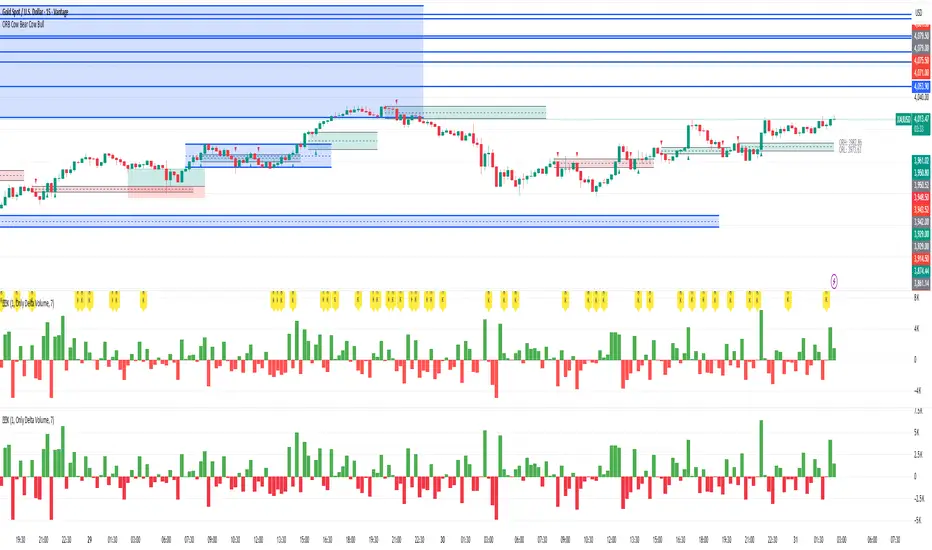
Buying/Selling PressureBuying/Selling Pressure - Volume-Based Market Sentiment
Buying/Selling Pressure identifies market dominance by separating volume into buying and selling components. The indicator uses Volume ATR normalization to create a universal pressure oscillator that works consistently across all markets and timeframes.
What is Buying/Selling Pressure?
This indicator answers a fundamental question: Are buyers or sellers in control? By analyzing how volume distributes within each bar, it calculates cumulative buying and selling pressure, then normalizes the result using Volume ATR for cross-market comparability.
Formula: × 100
Where Delta = Buying Volume - Selling Volume
Calculation Methods
Money Flow (Recommended):
Volume weighted by close position in bar range. Close near high = buying pressure, close near low = selling pressure.
Formula: / (high - low)
Simple Delta:
Basic approach where bullish bars = 100% buying, bearish bars = 100% selling.
Weighted Delta:
Volume weighted by body size relative to total range, focusing on candle strength.
Key Features
Volume ATR Normalization: Adapts to volume volatility for consistent readings across assets
Cumulative Delta: Tracks net buying/selling pressure over time (similar to OBV)
Signal Line: EMA smoothing for trend identification and crossover signals
Zero Line: Clear visual separation between buyer and seller dominance
Color-Coded Display: Green area = buyers control, red area = sellers control
Interpretation
Above Zero: Buyers dominating - cumulative buying pressure exceeds selling
Below Zero: Sellers dominating - cumulative selling pressure exceeds buying
Cross Signal Line: Momentum shift - pressure trend changing direction
Increasing Magnitude: Strengthening pressure in current direction
Decreasing Magnitude: Weakening pressure, potential reversal
Volume vs Pressure
High volume with low pressure indicates balanced battle between buyers and sellers. High pressure with high volume confirms strong directional conviction. This separation provides insights beyond traditional volume analysis.
Best Practices
Use with price action for confirmation
Divergences signal potential reversals (price makes new high/low but pressure doesn't)
Large volume with near-zero pressure = indecision, breakout preparation
Signal line crossovers provide momentum change signals
Extreme readings suggest potential exhaustion
Settings
Calculation Method: Choose Money Flow, Simple Delta, or Weighted Delta
EMA Length: Period for cumulative delta smoothing (default: 21)
Signal Line: Optional EMA of oscillator for crossover signals (default: 9)
Buying/Selling Pressure transforms volume analysis into actionable market sentiment, revealing whether buyers or sellers control price action beneath surface volatility.
This indicator is designed for educational and analytical purposes. Past performance does not guarantee future results. Always conduct thorough research and consider consulting with financial professionals before making investment decisions.

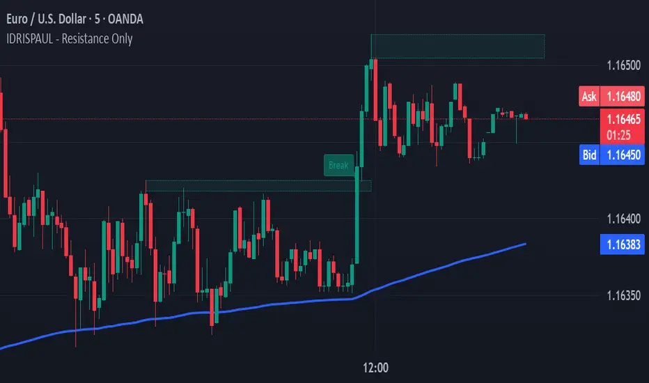
IDRISPAUL - Resistance OnlyThe script continuously scans recent price action to identify pivot highs that qualify as potential resistance zones. Once a resistance level is detected, the indicator:
Draws a resistance box around the identified zone.
Monitors for breakouts above that resistance.
Tracks potential retests and confirms valid retests when price action revisits the broken level.
Triggers alerts for each event: new resistance, breakout, potential retest, and confirmed retest.
All levels and labels automatically update as the chart evolves
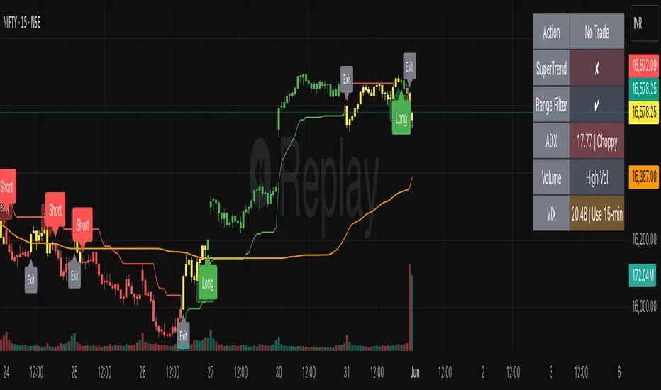
SmartTrend Pro - Options [V5.0 ]A Multi-filter trend-following system designed specifically OPTION SPREAD STRATEGY in NIFTY and Indian Indices - Works by combining price action, volatility, and market regime awareness to reduce whipsaws while capturing strong trends. The indicator dynamically adapts to market conditions using real VIX data and enforces disciplined entry/exit rules based on confirmed signals.
Adaptive Timeframe Guidance
Recommends 15-minute chart when VIX ≥ 13 (high volatility)
Recommends 45-minute chart when VIX < 13 (low volatility)
Uses real-time NSE:INDIAVIX data (daily close)
Whipsaw-Resistant Logic
SuperTrend (ATR 10, Multiplier 3.0) for stable trend direction
Range Filter (100-period smoothed median) to confirm price structure
2-bar confirmation required for all entries (avoids false breakouts)
ADX ≥ 25 ensures only strong trends are traded
Smart Trade Management
Exits based purely on price action (no premature exits due to volatility drops)
No forced reversals — positions held until trend truly end
Designed For
Traders who want fewer, higher-quality signals
Markets with volatile regime shifts (like NIFTY)
Avoiding choppy, sideways whipsaws without missing major moves
Philosophy
“Be patient in noise, aggressive in trend.”
This system stays out during uncertainty (yellow candles) and commits fully when all conditions align — letting winners run while cutting losers quickly.
How to Use
Apply to NIFTY futures or spot
Check dashboard:
If VIX ≥ 13 → use 15-min chart
If VIX < 13 → use 45-min chart
Only take trades when:
All ✔ align under “Long” or “Short”
Candle turns green/red (not yellow)
This indicator is not a black box — it’s a transparent, rule-based framework that puts you in control, with full visibility into why every signal appears (or doesn’t).
STRFV - Trend Chaser with No Trade ZoneA robust, multi-filter trend-following system designed specifically for NIFTY and Indian markets, combining price action, volatility, and market regime awareness to reduce whipsaws while capturing strong trends. The indicator dynamically adapts to market conditions using real VIX data and enforces disciplined entry/exit rules based on confirmed signals and official trading hours.
Adaptive Timeframe Guidance
Recommends 15-minute chart when VIX ≥ 13 (high volatility)
Recommends 45-minute chart when VIX < 13 (low volatility)
Uses real-time NSE:INDIAVIX data (daily close)
Whipsaw-Resistant Logic
SuperTrend (ATR 10, Multiplier 3.0) for stable trend direction
Range Filter (100-period smoothed median) to confirm price structure
2-bar confirmation required for all entries (avoids false breakouts)
ADX ≥ 25 ensures only strong trends are traded
Smart Trade Management
Entries only during NSE session (9:15 AM – 3:30 PM IST)
Exits based purely on price action (no premature exits due to volatility drops)
No forced reversals — positions held until trend truly end
Designed For
Traders who want fewer, higher-quality signals
Markets with volatile regime shifts (like NIFTY)
Avoiding choppy, sideways whipsaws without missing major moves
Philosophy
“Be patient in noise, aggressive in trend.”
This system stays out during uncertainty (yellow candles) and commits fully when all conditions align — letting winners run while cutting losers quickly.
How to Use
Apply to NIFTY futures or spot
Check dashboard:
If VIX ≥ 13 → use 15-min chart
If VIX < 13 → use 45-min chart
Only take trades when:
All ✔ align under “Long” or “Short”
“Session” = ✔
Candle turns green/red (not yellow)
This indicator is not a black box — it’s a transparent, rule-based framework that puts you in control, with full visibility into why every signal appears (or doesn’t).

SC_Reversal Confirmation 30 minutes by Claude (Version 1)📉 When to Use
Use this setup when the stock is in a downtrend and a bullish reversal is anticipated.
🔍 Recommended Usage This model is designed for pullback phases, where the asset is declining and a reversal is expected. It helps filter out weak signals and waits for technical confirmation before triggering an entry.
✅ Entry Signal Green triangles appear only when all reversal conditions are fully met. Entry may occur slightly after the bottom, but with a reduced likelihood of false signals.
📊 Suggested Settings Apply on a 30-minute chart using a 100-period Exponential Moving Average (EMA) based on close. Recommended for Cobalt Chart 0.
--------------------------------------------------------------------------------------
Dow Jones Trading System with PivotsThis TradingView indicator, tailored for the 30-minute Dow Jones (^DJI) chart, supports DIA options trading with a trend-following approach. It features a 30-period SMA (blue) and a 60-period SMA (red), with an optional 90-period SMA (orange) drawn from rauItrades' Dow SMA outfit. A bullish crossover (30 SMA > 60 SMA) displays a green "BUY" triangle below the bar for potential DIA longs, while a bearish crossunder (30 SMA < 60 SMA) shows a red "SELL" triangle above for shorts or exits. The background turns green (bullish) or red (bearish) to indicate trend bias. Pivot points highlight recent highs (orange circles) and lows (purple circles) for support/resistance, using a 5-bar lookback. Alerts notify for crossovers.

NASDAQ Trading System with PivotsThis TradingView indicator, designed for the 30-minute NASDAQ (^IXIC) chart, guides QQQ options trading using a trend-following strategy. It plots a 20-period SMA (blue) and a 100-period SMA (red), with an optional 250-period SMA (orange) inspired by rauItrades' NASDAQ SMA outfit. A bullish crossover (20 SMA > 100 SMA) triggers a green "BUY" triangle below the bar, signaling a potential long position in QQQ, while a bearish crossunder (20 SMA < 100 SMA) shows a red "SELL" triangle above, indicating a short or exit. The background colors green (bullish) or red (bearish) for trend bias. Orange circles (recent highs) and purple circles (recent lows) mark support/resistance levels using 5-bar pivot points.
S&P Trading System with PivotsThe S&P Trading System with Pivots is a TradingView indicator designed for the 30-minute SPX chart to guide SPY options trading. It uses a trend-following strategy with:
10 SMA and 50 SMA: Plots a 10-period (blue) and 50-period (red) Simple Moving Average. A bullish crossover (10 SMA > 50 SMA) signals a potential buy (green triangle below bar), while a bearish crossunder (10 SMA < 50 SMA) signals a sell or exit (red triangle above bar).
Trend Bias: Colors the background green (bullish) or red (bearish) based on SMA positions.
Pivot Points: Marks recent highs (orange circles) and lows (purple circles) as potential resistance and support levels, using a 5-bar lookback period.

Broad Market for Crypto + index# Broad Market Indicator for Crypto
## Overview
The Broad Market Indicator for Crypto helps traders assess the strength and divergence of individual cryptocurrency assets relative to the overall market. By comparing price deviations across multiple assets, this indicator reveals whether a specific coin is moving in sync with or diverging from the broader crypto market trend.
## How It Works
This indicator calculates percentage deviations from simple moving averages (SMA) for both individual assets and an equal-weighted market index. The core methodology:
1. **Deviation Calculation**: For each asset, the indicator measures how far the current price has moved from its SMA over a specified lookback period (default: 24 hours). The deviation is expressed as a percentage: `(Current Price - SMA) / SMA × 100`
2. **Market Index Construction**: An equal-weighted index is built from selected cryptocurrencies (up to 15 assets). The default composition includes major crypto assets: BTC, ETH, BNB, SOL, XRP, ADA, AVAX, LINK, DOGE, and TRX.
3. **Comparative Analysis**: The indicator displays both the current instrument's deviation and the market index deviation on the same panel, making it easy to spot relative strength or weakness.
## Key Features
- **Customizable Asset Selection**: Choose up to 15 different cryptocurrencies to include in your market index
- **Flexible Configuration**: Toggle individual assets on/off for display and index calculation
- **Current Instrument Tracking**: Automatically plots the deviation of whatever chart you're viewing
- **Visual Clarity**: Color-coded lines for easy differentiation between assets, with the market index shown as a filled area
- **Adjustable Lookback Period**: Modify the SMA period to match your trading timeframe
## How to Use
### Identifying Market Divergences
- When the current instrument deviates significantly above the index, it shows relative strength
- When it deviates below, it indicates relative weakness
- Assets clustering around zero suggest neutral market conditions
### Trend Confirmation
- If both the index and your asset are rising together (positive deviation), it confirms a broad market uptrend
- Divergence between asset and index can signal unique fundamental factors or early trend changes
### Entry/Exit Signals
- Extreme deviations from the index may indicate overbought/oversold conditions relative to the market
- Convergence back toward the index line can signal mean reversion opportunities
## Settings
- **Lookback Period**: Adjust the SMA calculation period (default: 24 hours)
- **Asset Configuration**: Select which cryptocurrencies to monitor and include in the index
- **Display Options**: Show/hide individual assets, current instrument, and market index
- **Color Customization**: Personalize colors for better visual analysis
## Best Practices
- Use on higher timeframes (4H, Daily) for more reliable signals
- Combine with volume analysis for confirmation
- Consider fundamental news when assets show extreme divergence
- Adjust the asset basket to match your trading focus (DeFi, L1s, memecoins, etc.)
## Technical Notes
- The indicator uses `request.security()` to fetch data from multiple symbols
- Deviations are calculated independently for each asset
- The zero line represents perfect alignment with the moving average
- Index calculation automatically adjusts based on active assets
## Default Assets
1. BTC (Bitcoin) - BINANCE:BTCUSDT
2. ETH (Ethereum) - BINANCE:ETHUSDT
3. BNB (Binance Coin) - BINANCE:BNBUSDT
4. SOL (Solana) - BINANCE:SOLUSDT
5. XRP (Ripple) - BINANCE:XRPUSDT
6. ADA (Cardano) - BINANCE:ADAUSDT
7. AVAX (Avalanche) - BINANCE:AVAXUSDT
8. LINK (Chainlink) - BINANCE:LINKUSDT
9. DOGE (Dogecoin) - BINANCE:DOGEUSDT
10. TRX (Tron) - BINANCE:TRXUSDT
Additional slots (11-15) are available for custom asset selection.
---
This indicator is particularly useful for cryptocurrency traders seeking to understand market breadth and identify opportunities where specific assets are diverging from overall market sentiment.

Leveraged ETF Volume Ratio3x/2x Long/short etf pairs for popular tickers, including TSLA, QQQ, META, PLTR... Extreme values indicate bullish/bearish sentiment.

Volume Heatmap + Buy/Sell splitits the most powerful volume based heatmap you can see on this platform. It tells you when the high volume is coming into the market with clear signs.
Sell - You will see the red bar below the split to confirm its a sell and the strength or the sell you can see above the split line in various colors e.g. lite green (low) to Dark red (extra high).
Buy - If there is a Buying trade being registered, it will appear above the spit line in opaque green with the heatmap colors to show the strength of volume.
This tool will help you identify the volume strength and based on that you can plan your trade.
PS, its always recommended to not to rely on a single oscillator and combine few. I would recommend you to use RSI and S/R lines with this for better decision.
Note, this tool has been put together for educational purposes and I do not take any responsibility of your trade.

10Y–2Y Treasury Yield Curve Spread & MES % Change📝 Description:
This indicator tracks the U.S. 10-Year minus 2-Year Treasury yield spread — a powerful macroeconomic signal often used by professional traders to gauge market sentiment and recession risk — and overlays an optional MES % change line to help intraday futures traders spot macro–price divergences in real time.
Features:
🏦 Plots the 10Y–2Y spread, with optional EMA smoothing.
📉 Highlights yield curve inversion (background turns red when spread < 0).
📊 Optional MES % change line from daily or RTH open for directional bias.
🔔 Alert conditions for:
Yield curve inversion / un-inversion.
Sudden spread spikes in basis points (customizable).
🧮 Optional correlation plot to visualize relationship strength between MES and the yield curve.
🧭 Z-score normalization allows both series to be viewed in one pane without scaling issues.
Why it matters:
A falling or inverted 2s10s spread often signals risk-off behavior and pressure on equities.
A steepening curve tends to support risk-on rallies.
Divergences between MES price action and the spread can provide early warning signals of reversals or fakeouts.
Best used with:
MES (MES1!) or MYM charts for intraday & swing bias.
Fed event days, CPI/NFP, or any macro-sensitive sessions.
VWAP or structure-based intraday trading strategies.
⚠️ Note: This indicator is for informational purposes only and does not constitute financial advice. Always combine macro context with your own trade plan and risk management.

Ultimate SMC Dashboard — Pro v2.1 (ICT/SMC)
🔍 1. General Objective of the Script
This script is a complete visual and algorithmic SMC (Smart Money Concepts) analysis system that:
* Automatically identifies market structures (BOS / CHoCH / Liquidity Grab).
* Detects and dynamically maintains Fair Value Gaps (FVG) according to ICT methodology .
* Draws and tracks the evolution of Order Blocks (OB) and Breaker Blocks (BRK) .
* Calculates MACD / Volume divergences .
* Analyzes trend, volume, and buyer/seller dominance .
* Displays a clear and dynamic dashboard directly on the chart.
* Builds the foundation for reversal / continuation probability models .
---
⚙️ 2. Input Parameters
The script is highly configurable. Inputs are organized by sections:
Structure (ICT)
* Pivot left/right (swing length) → determines the swing size for HH/LL detection.
* OB lookback → number of candles to look back for an Order Block after a BOS.
* Show BOS / CHoCH / Liquidity Grab → enables or disables structural elements.
Imbalances (FVG)
* Enables the display of Fair Value Gaps .
* Manages minimum size, transparency, and **dynamic reduction** when partially filled.
* Limits the maximum number of FVGs displayed simultaneously.
Order Blocks / Breakers
* Enables Order Blocks and Breaker Blocks .
* Defines their colors, opacity , and dynamic behavior .
* Automatically removes outdated OBs exceeding the maximum limit.
Signal & Probabilities
* Sets the lookback period for structure calculation.
* Calculates average volume (MA) to detect dominance and momentum.
* Defines the probability threshold for signals (not yet visible in this snippet).
RSI / EMA / Divergences / Sentiment
* Prepares additional indicator modules, such as:
* MACD divergence detection
* RSI / EMA visualization
* Market sentiment and funding metrics
---
🧠 3. Market Structure Logic (ICT Core)
a. Pivot Detection
Uses ta.pivothigh and ta.pivotlow to detect Higher Highs (HH) and Lower Lows (LL) .
b. Break of Structure (BOS)
A BOS occurs when price breaks a validated swing high or low:
* bullBOS → bullish break.
* bearBOS → bearish break.
c. Change of Character (CHoCH)
A CHoCH is detected when BOS direction changes (e.g., a bullish BOS followed by a bearish BOS).
d. Liquidity Grab
Detection of liquidity sweeps :
* grabUp : wick above the last high, closing below.
* grabDown : wick below the last low, closing above.
All these signals feed into the main trend bias (Bull / Bear / Flat).
---
🧱 4. Fair Value Gaps (FVG)
The FVG logic strictly follows ICT principles :
* Bullish FVG: if `low > high `
* Bearish FVG: if `high < low `
Each FVG becomes a dynamic box :
* Shrinks in real time as price partially fills it.
* Automatically deletes itself once fully closed.
* Color and opacity depend on direction (green = bullish, red = bearish).
This is one of the most complex parts of the code, managing:
* Arrays of box objects (`array`)
* Real-time updates for every candle
* Automatic cleanup to prevent chart overload
---
🧱 5. Order Blocks (OB) and Breaker Blocks
An Order Block is generated:
* After a BOS,
* By identifying the last candle opposite to the trend before the break.
Examples:
* Bullish BOS → Bullish OB = last red candle before the breakout.
* Bearish BOS → Bearish OB = last green candle before the breakdown.
Each OB:
* Is visualized as a colored rectangle (cyan or orange).
* Becomes inactive once mitigated (touched).
* Is removed and converted into a Breaker Block if invalidated (opposite side broken).
The system uses arrays similar to FVGs to maintain visual cleanliness and chart efficiency .
---
📊 6. Volume and Dominance
The script computes:
* A moving average (SMA) of volume.
* Whether the current volume is abnormally high or low .
* Whether candles are buyer- or seller-dominant .
Simplified display:
* 🔥 High Volume
* 📉 Low Volume
* 🟩 Buyers Dominant
* 🟥 Sellers Dominant
* ⚪️ Neutral
---
🧩 7. Textual Dashboard
Text variables such as:
* `struct_txt` → displays BOS, CHoCH, Grab info
* `fvg_txt` → “🟢 Open” or “🔴 Close”
* `ob_txt` → “🟩 Open” or “🟥 Close”
These feed a visual dashboard (not yet displayed in this excerpt), summarizing the entire market state in real time.
---
💡 8. Summary
The script:
* Observes market structure (ICT) .
* Automatically draws institutional imbalance and interest zones (OB, FVG).
* Dynamically manages their evolution.
* Provides visual structural, volume, and sentiment signals .
* Builds a complete foundation for a professional ICT/SMC dashboard .

Pullback Finder AutoPullback Finder Auto — Intraday Momentum Cooling Detector
Pullback Finder Auto is designed to find stocks that have made a strong intraday run from the open and are now cooling off while still positive — the classic pullback zone where continuation entries often form.
It automatically measures the percentage change from today’s open and highlights bars where:
the stock has already run at least a chosen amount (for example +10 % above its open), and
the current price is still up but within a defined pullback range (for example between +3 % and +8 % above the open).
When those two conditions are met, you’ll see green graphics on your chart:
Green triangle markers under the candle.
Optionally, small green PB labels such as “PB 5.2 %” showing the exact percentage from open when the setup occurs.
A green highlight in the sub‑window or line plot if you left the “Change from Open %” plot active.
These are your visual cues that a pullback has formed — a stock that previously ran and is now pulling back while holding strength.
How it works
The script continuously monitors:
• High % from Open = (high − open) / open × 100
• Current % from Open = (close − open) / open × 100
A “Pullback” condition triggers only if:
the high % is greater than or equal to your minimum run threshold, and
the current % sits between your minimum and maximum pullback percentages.
When both are true, the indicator plots the green triangle and optional label.
Default parameters
Min Run % = 10
Min Current % = 3
Max Current % = 8
Session Start = 09:30 – 16:00 US Eastern
All can be changed to fit different volatility levels.
Lower values catch smaller moves; higher values restrict signals to explosive runners.
Using it in real time
During live trading, Pullback Finder Auto updates with each candle.
When a bar first enters the target zone, a green triangle and PB label will appear immediately under that candle.
These are dynamic: if price moves out of the valid zone on the same bar, the marker may disappear.
You can create an alert on “Pullback Finder Auto – Pullback Candidate” to be notified whenever new triangles appear across your active symbols.
This works on any timeframe:
use shorter timeframes such as 1‑minute or 5‑minute charts for fast, intraday detection,
use longer timeframes for a broader view of the day’s market structure.
Using it on past data (scanning backwards)
When you scroll back through history, past green triangles remain visible at every bar where the condition was true at that time.
The PB labels next to those candles show exactly how far above the open the stock was trading during the historical setup.
Use this for visual back‑testing: study how price reacted after these pullback points, adjust the thresholds, and refine your criteria for different markets.
The grey or teal line under the chart (if enabled) shows the percent‑from‑open curve so you can see the full run‑and‑cool pattern leading into each triangle signal.
If you convert the indicator into a strategy, the same condition becomes historical entry points you can test with the Strategy Tester.
Summary
1. Pullback Finder Auto paints green triangles and PB labels whenever an intraday pullback fits your criteria.
2. It runs dynamically in real‑time and also preserves markers for historical review.
3. Adjust the thresholds to match volatility or timeframe.
4. Ideal for visual scanning, watchlist alerts, or integration into a lightweight screening strategy.

Overbought & Oversold by Vito_290📘 OB/OS Candle Color – Confluence + Volume (v6)
This indicator colors candles based on the confluence of overbought (green) and oversold (red) conditions, combining technical signals from price and volume to provide reliable, uncluttered visual readings.
🔹 What It Measures
RSI → classic strength/weakness extremes.
Stochastic %K → short-term oscillations.
Bollinger %B + Price Z-Score → statistical deviations from the mean.
MFI, CMF, Volume Z-Score, OBV Z-Score → intensity and direction of capital flow.
🔹 How It Works
Each metric produces an overbought or oversold signal.
The indicator counts how many conditions are simultaneously true.
If the count exceeds the user-defined threshold (Min Conditions), the candle is colored:
Green → Overbought
Red → Oversold
An optional EMA-based trend filter avoids counter-trend signals.
🔹 Why It’s Useful
A single RSI or isolated volume spike can be misleading.
This tool filters market noise by combining eight independent signals, giving a much stronger confirmation of market extremes.
🔹 Recommended Timeframes
Optimized for 15m, 30m, 1h, 4h, and 1D charts.
Adjust Min Conditions depending on timeframe:
15–30m → 4–5
1h → 3–4
4h–1D → 3
🔹 Usage Tips
In trend-following strategies → keep the EMA filter ON.
In mean-reversion setups → turn the filter OFF to catch short-term reversals.
Give more weight to signals with extreme volume spikes and price beyond Bollinger Bands.
This is not an automatic trading system, but a visual trigger to help identify overextended zones and improve entry/exit timing.

overbought & oversoldOverbought & Oversold
📘 OB/OS Candle Color – Confluence + Volume (v6)
This indicator colors candles based on the confluence of overbought (green) and oversold (red) conditions, combining technical signals from price and volume to provide reliable, uncluttered visual readings.
🔹 What It Measures
RSI → classic strength/weakness extremes.
Stochastic %K → short-term oscillations.
Bollinger %B + Price Z-Score → statistical deviations from the mean.
MFI, CMF, Volume Z-Score, OBV Z-Score → intensity and direction of capital flow.
🔹 How It Works
Each metric produces an overbought or oversold signal.
The indicator counts how many conditions are simultaneously true.
If the count exceeds the user-defined threshold (Min Conditions), the candle is colored:
Green → Overbought
Red → Oversold
An optional EMA-based trend filter avoids counter-trend signals.
🔹 Why It’s Useful
A single RSI or isolated volume spike can be misleading.
This tool filters market noise by combining eight independent signals, giving a much stronger confirmation of market extremes.
🔹 Recommended Timeframes
Optimized for 15m, 30m, 1h, 4h, and 1D charts.
Adjust Min Conditions depending on timeframe:
15–30m → 4–5
1h → 3–4
4h–1D → 3
🔹 Usage Tips
In trend-following strategies → keep the EMA filter ON.
In mean-reversion setups → turn the filter OFF to catch short-term reversals.
Give more weight to signals with extreme volume spikes and price beyond Bollinger Bands.
This is not an automatic trading system, but a visual trigger to help identify overextended zones and improve entry/exit timing.

ten2 Multi MAThis powerful all-in-one indicator allows you to display three Exponential Moving Averages (EMAs) and three Simple Moving Averages (SMAs) on your chart from a single script. Save indicator slots and get a comprehensive view of market trends across different timeframes. Every moving average is fully customizable in length, colour, and source, giving you complete control over your technical analysis setup.
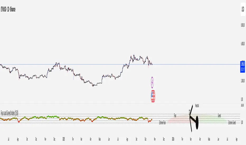
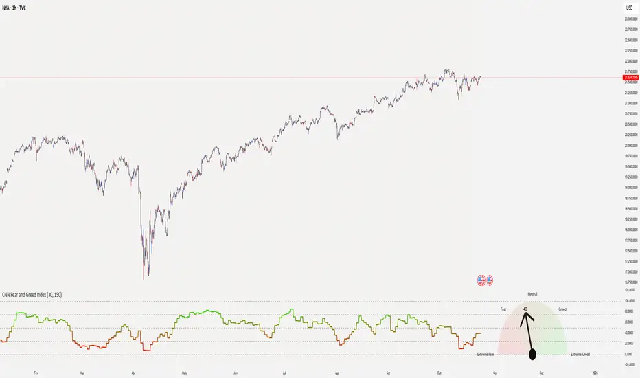
CNN Fear and Greed Index📊 CNN Fear & Greed Index — by @victhoreb
Tap into the emotional heartbeat of the U.S. stock market with this powerful CNN-inspired Fear & Greed Index! 🧠📉📈 Designed to mirror the sentiment framework popularized by CNN Business, this indicator blends 7 key market signals into a single score from 0 (😱 Extreme Fear) to 100 (🚀 Extreme Greed), helping you navigate volatility with confidence.
🧩 What’s Inside?
Each component captures a unique behavioral or macroeconomic force:
- ⚡ Market Momentum: Tracks how far the S&P 500 is from its 125-day average — a pulse check on trend strength.
- 🏛️ Stock Price Strength: Measures the NYSE Highs vs. Lows — are more stocks breaking out or breaking down?
- 🌊 Stock Price Breadth: Uses the McClellan Volume Summation Index to assess market-wide participation.
- ☎️ Put/Call Ratio: A 5-day average of the equity options market — are traders hedging or chasing?
- 🌪️ Volatility (VIX): Compares the VIX to its 50-day average — rising fear or calming nerves?
- 🛡️ Safe Haven Demand: Contrasts stock returns with bond returns — are investors seeking shelter or risk?
- 💣 Junk Bond Demand: Inverted high-yield spread — tighter spreads = more risk-on appetite.
🎯 Why Use It?
This index gives you a quantified view of Wall Street’s mood, helping you:
- Spot emotional extremes that often precede reversals
- Confirm or challenge your directional bias
- Stay grounded when the market gets irrational
🧭 Visual Sentiment Meter
A custom offset sentiment meter shows current positioning with intuitive labels:
- 😱 Extreme Fear
- 😨 Fear
- 😐 Neutral
- 😄 Greed
- 🚀 Extreme Greed
Color gradients and dynamic labels make it easy to interpret at a glance.
Ready to trade with the crowd—or against it? Add this indicator to your chart and let sentiment guide your strategy! 📈🧠
Crypto Fear and Greed Index📊 Crypto Fear & Greed Index — by @victhoreb
Decode the emotional pulse of the crypto market with this all-in-one Fear & Greed Index! 🧠💰 This custom-built indicator blends 7 powerful market signals into a single sentiment score ranging from 0 (😱 Extreme Fear) to 100 (🚀 Extreme Greed), helping you spot potential tops, bottoms, and trend shifts with clarity.
🔍 What’s under the hood?
Each component reflects a unique psychological or macroeconomic force:
- ⚡ Market Momentum: Measures how far BTC is from its 125-day average — are we overextended or undervalued?
- 📈 Crypto Price Strength: Tracks the dominance of altcoins (OTHERS.D) — rising dominance = growing risk appetite.
- 💵 Digital Dollar Dominance (USDT.D): A proxy for stablecoin demand — more USDT dominance = risk-off behavior.
- 🐦 Twitter Sentiment (LunarCrush): Captures real-time posts on TWITTER about Bitcoin — are the crowds euphoric or panicking?
- 🌪️ Volatility (VIX): Inverted VIX deviation — higher fear in traditional markets often spills into crypto.
- 🛡️ Safe Haven Demand: Compares BTC returns vs. US10Y bonds — are investors fleeing to safety or embracing risk?
- 🧨 Junk Bond Demand (BAMLH0A0HYM2): Inverted high-yield spread — tighter spreads = more greed in credit markets.
🎯 Why use it?
This index gives you a quantified view of market sentiment, helping you:
- Anticipate reversals during emotional extremes
- Confirm trend strength or weakness
- Stay objective when the market gets irrational
🧭 Visual Dashboard
A custom offset sentiment meter shows current positioning with intuitive labels:
- 😱 Extreme Fear
- 😨 Fear
- 😐 Neutral
- 😄 Greed
- 🚀 Extreme Greed
Color gradients and dynamic labels make it easy to interpret at a glance.
Ready to trade with the crowd—or against it? Add this indicator to your chart and let sentiment guide your strategy! 📈🧠