Sentiment

Intermarket Analysis ProIntermarket Analysis Pro Indicator
Overview
The Intermarket Analysis Pro is a sophisticated trading indicator designed for forex traders, integrating technical analysis with comprehensive macroeconomic insights. This tool features Exponential Moving Averages (EMA 10/20) for trend detection, a consolidated table combining timeframe biases, trading signals, and intermarket data, delivering a holistic view to optimize decision-making in volatile markets.
Usage Instructions
Installation: Access TradingView, navigate to the Pine Editor, paste the script, and save it as "Intermarket_Analysis_Pro". Apply it to your desired forex chart (e.g., EURUSD on a 5-minute timeframe).
Configuration:
EMA Settings: Select EMA Source as "close" for precise alignment with candle closes, adjust EMA 10 Period (default 10) and EMA 20 Period (default 20) to suit your strategy, and toggle Show EMA Value Labels or Show (B)/(S) Signal Labels for enhanced visibility.
Table Settings: Enable Show Combined Table, select Combined Table Position (e.g., "Bottom Right"), and choose Text Size (e.g., "Small") for optimal display.
Intermarket Parameters: Fine-tune Bias Threshold (default 0.3) and Score Change Threshold (default 10) to refine intermarket bias sensitivity.
Display Options: Switch between "Light" or "Dark" themes to match your chart environment.
Signal Interpretation:
EMA Indicators: A crossover of EMA 10 (orange) above EMA 20 (blue) signals a potential BUY, while a crossunder indicates a SELL. Confirm with "(B)" or "(S)" labels on the chart.
Combined Table: Analyze timeframe biases (e.g., "BULLISH" on 1m), logic signals (e.g., "BUY" on 5m), and intermarket trends (e.g., "EUR Rise (+30)") to align with market conditions.
Strategic Application: Utilize on lower timeframes (1m, 5m) for scalping or higher timeframes (1h, 4h) for swing trading. Ensure smooth scrolling to verify EMA and table synchronization with candles.
Alert Setup: Configure alerts for "Buy Signal" or "Sell Signal" on your preferred timeframe to receive real-time notifications.
Key Features
EMA 10/20: Provides customizable short-term trend analysis with optional value labels.
Unified Table: Merges SimpleBias (timeframe trends), Logic (trading signals), and Intermarket (global currency, index, and bond movements) into a single, scrollable interface.
Intermarket Insights: Evaluates 18 assets (e.g., DXY, SPX500, EUR, XAUUSD) for macroeconomic sentiment, updated hourly with color-coded change indicators.
Customization: Offers adjustable positions, sizes, and thresholds to adapt to individual trading preferences.
Market Context: Reflects current sentiment, such as a bullish EURUSD trend supported by weak NFP data and hawkish ECB policies (as of July 2025).
Best Practices
Timeframe Alignment: Match the chart timeframe with your analysis to ensure accurate EMA and table data representation.
Optimal Trading Hours: Maximize effectiveness during the NY session (08:00-17:00 EST) when intermarket activity is most pronounced.
Troubleshooting: If EMA lags during scrolling, disable labels or reduce additional indicators. Report discrepancies (e.g., "EMA 10 at 1.08840, candle at 1.08850") for further optimization.
Additional Notes
The Intermarket Analysis Pro is tailored for traders seeking to integrate global sentiment with technical signals. Test thoroughly on a demo account and adjust settings to align with your trading strategy. As of July 5, 2025, 04:04 AM WIB, the market indicates a bullish EURUSD outlook, with intermarket data reinforcing BUY opportunities on lower timeframes.


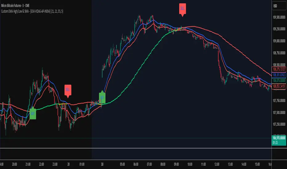
Custom EMA High/Low & SMA - [GSK-VIZAG-AP-INDIA] Custom EMA High/Low & SMA -
1. Overview
This indicator overlays a dynamic combination of Exponential Moving Averages (EMA) and Simple Moving Average (SMA) to identify momentum shifts and potential entry/exit zones. It highlights bullish or bearish conditions using color-coded SMA logic and provides visual Buy/Sell signals based on smart crossover and state-based logic.
2. Purpose / Use Case
Designed for traders who want to visually identify momentum breakouts, trend reversals, or pullback opportunities, this tool helps:
Spot high-probability buy/sell zones
Confirm price strength relative to volatility bands (EMA High/Low)
Time entries based on clean visual cues
It works well in trend-following strategies, particularly in intraday or swing setups across any liquid market (indices, stocks, crypto, etc.).
3. Key Features & Logic
✅ EMA High/Low Channel: Acts as dynamic support/resistance boundaries using 20-period EMAs on high and low prices.
✅ Timeframe-Specific SMA: A 33-period SMA calculated from a user-defined timeframe (default: 10-minute) for flexible multi-timeframe analysis.
✅ Signal Generation:
Buy: When SMA drops below EMA Low and close is above EMA High.
Sell: When SMA rises above EMA High and price closes below both EMAs.
Optionally, signals also fire based on SMA color changes (green = bullish, red = bearish).
✅ Strict or Loose Signal Logic: Choose between precise crossovers or broader state-based conditions.
✅ Debugging Tools: Optional markers for granular insight into condition logic.
4. User Inputs & Settings
Input Description
EMA High Length Period for EMA of high prices (default: 20)
EMA Low Length Period for EMA of low prices (default: 20)
SMA Length Period for Simple Moving Average (default: 33)
SMA Timeframe Timeframe for SMA (default: “10”)
Show Buy/Sell Arrows Enable visual arrow signals for Buy/Sell
Strict Signal Logic ON = crossover-based signals; OFF = state logic
Plot Signals on SMA Color Change Enable signals on SMA color shifts (Green/Red)
Show Debug Markers Plot small markers to debug condition logic
5. Visual Elements Explained
🔵 EMA High Line – Blue line marking dynamic resistance
🔴 EMA Low Line – Red line marking dynamic support
🟡 SMA Line – Color-coded based on position:
Green if SMA < EMA Low (Bullish)
Red if SMA > EMA High (Bearish)
Yellow otherwise (Neutral)
✅ BUY / SELL Labels – Displayed below or above candles on valid signals
🛠️ Debug Circles/Triangles – Help visually understand the signal logic when enabled
6. Usage Tips
Best used on 5–30 min timeframes for intraday setups or 1H+ for swing trades.
Confirm signals with volume, price action, or other confluences (like support/resistance).
Use strict mode for more accurate entries, and non-strict mode for broader trend views.
Ideal for identifying pullbacks into trend, or early reversals after volatility squeezes.
7. What Makes It Unique
Multi-timeframe SMA integrated with EMA High/Low bands
Dual signal logic (crossover + color shift)
Visually intuitive and beginner-friendly
Minimal clutter with dynamic signal labeling
Debug mode for transparency and learning
8. Alerts & Automation
The indicator includes built-in alert conditions for:
📈 Buy Alert: Triggered when a bullish condition is detected.
🔻 Sell Alert: Triggered when bearish confirmation is detected.
These alerts can be used with TradingView's alert system for real-time notifications or bot integrations.
9. Technical Concepts Used
EMA (Exponential Moving Average): Reacts faster to recent price, ideal for trend channels
SMA (Simple Moving Average): Smoother average for detecting general trend direction
Crossover Logic: Checks when SMA crosses over or under EMA levels
Color Coding: Visual signal enhancement based on relative positioning
Multi-Timeframe Analysis: SMA calculated on a custom timeframe, powerful for confirmation
10. Disclaimer
This script is for educational and informational purposes only. It is not financial advice. Always backtest thoroughly and validate on demo accounts before applying to live markets. Trading involves risk, and past performance does not guarantee future results.
11. Author Signature
📌 Indicator Name: Custom EMA High/Low & SMA -
👤 Author: GSK-VIZAG-AP-INDIA
ZY Legend İndikatörüZY Legend Indicator follows trend reversals and generates Long/Short signals from the best possible areas. It is used in scalp transactions (5-minute, 15-minute charts).

xGhozt Wickless Candle Streak ProbabilityThe xGhozt Wickless Candle Streak Probability is a custom Pine Script indicator designed to identify and quantify the occurrence of consecutive "wickless" candles of the same trend (either bullish or bearish).
Key Features:
Wickless Candle Detection: It first identifies candles that lack an upper or lower wick (meaning their open/close is equal to their high/low, respectively).
Consecutive Streak Tracking: The indicator tracks how many wickless bullish candles occur in a row, and similarly for wickless bearish candles.
User-Defined Streak Length: You can specify a Streak Length in the indicator's settings. This defines how many consecutive wickless candles are needed to register a "streak."
Probability Calculation: For the chosen Streak Length, the indicator calculates the historical probability (as a percentage) of encountering such a streak for both bullish and bearish wickless candles. This is done by dividing the number of times a streak of that length has occurred by the total number of candles scanned.
On-Chart Display: The results, including the total wickless candles, total scanned candles, and the calculated streak probabilities, are displayed in a convenient table directly on your chart.
Purpose:
This indicator helps traders and analysts understand the historical likelihood of sustained, strong directional moves as indicated by consecutive wickless candles. By quantifying these probabilities, it can provide insights into potential continuation patterns or extreme market conditions, which might be useful for developing trading strategies or confirming market biases.

Trading Sessions (Asia, Europe, US) [Moscow Time]Title:
Trading Sessions (Asia, Europe, US)
Description:
This indicator highlights the three major trading sessions — Asian, European, and US — based on Moscow Time (GMT+3). It's useful for identifying key market activity periods and understanding when volatility typically increases.
Asian Session: 03:00–10:00 MSK (Tokyo, Hong Kong, Sydney) — shown in blue
European Session: 10:00–17:00 MSK (London, Frankfurt) — shown in green
US Session: 17:00–00:00 MSK (New York, Chicago) — shown in red
The background shading dynamically adjusts to highlight each session on any timeframe.
This tool is perfect for traders who want to visually track global session activity in their local time zone.

BANKNIFTY Contribution Table [GSK-VIZAG-AP-INDIA]1. Overview
This indicator provides a real-time visual contribution table of the 12 constituent stocks in the BANKNIFTY index. It displays key metrics for each stock that help traders quickly understand how each component is impacting the index at any given moment.
2. Purpose / Trading Use Case
The tool is designed for intraday and short-term traders who rely on index movement and its internal strength or weakness. By seeing which stocks are contributing positively or negatively, traders can:
Confirm trend strength or divergence within the index.
Identify whether a BANKNIFTY move is broad-based or driven by a few heavyweights.
Detect reversals when individual components decouple from index direction.
3. Key Features and Logic
Live LTP: Current price of each BANKNIFTY stock.
Price Change: Difference between current LTP and previous day’s close.
% Change: Percentage move from previous close.
Weight %: Static weight of each stock within the BANKNIFTY index (user-defined).
This estimates how much each stock contributes to the BANKNIFTY’s point change.
Sorted View: The stocks are sorted by their weight (descending), so high-impact movers are always at the top.
4. User Inputs / Settings
Table Position (tableLocationOpt):
Choose where the table appears on the chart:
top_left, top_right, bottom_left, or bottom_right.
This helps position the table away from your price action or indicators.
5. Visual and Plotting Elements
Table Layout: 6 columns
Stock | Contribution | Weight % | LTP | Change | % Change
Color Coding:
Green/red for positive/negative price changes and contributions.
Alternating background rows for better visibility.
BANKNIFTY row is highlighted separately at the top.
Text & Background Colors are chosen for both readability and direction indication.
6. Tips for Effective Use
Use this table on 1-minute or 5-minute intraday charts to see near real-time market structure.
Watch for:
A few heavyweight stocks pulling the index alone (can signal weak internal breadth).
Broad green/red across all rows (signals strong directional momentum).
Combine this with price action or volume-based strategies for confirmation.
Best used during market hours for live updates.
7. What Makes It Unique
Unlike other contribution tables that show only static data or require paid feeds, this script:
Updates in real time.
Uses dynamic calculated contributions.
Places BANKNIFTY at the top and presents the entire internal structure clearly.
Doesn’t repaint or rely on lagging indicators.
8. Alerts / Additional Features
No alerts are added in this version.
(Optional: Alerts can be added to notify when a certain stock contributes above/below a threshold.)
9. Technical Concepts Used
request.security() to pull both 1-minute and daily close data.
Conditional color formatting based on price change direction.
Dynamic table rendering using table.new() and table.cell().
Static weights assigned manually for BANKNIFTY stocks (can be updated if index weights change).
10. Disclaimer
This script is intended for educational and informational purposes only. It does not constitute financial advice or a buy/sell recommendation.
Users should test and validate the tool on paper or demo accounts before applying it to live trading.
📌 Note: Due to internet connectivity, data delays, or broker feeds, real-time values (LTP, change, contribution, etc.) may slightly differ from other platforms or terminals. Use this indicator as a supportive visual tool, not a sole decision-maker.
Script Title: BANKNIFTY Contribution Table -
Author: GSK-VIZAG-AP-INDIA
Version: Final Public Release

Momentum Regression [BackQuant]Momentum Regression
The Momentum Regression is an advanced statistical indicator built to empower quants, strategists, and technically inclined traders with a robust visual and quantitative framework for analyzing momentum effects in financial markets. Unlike traditional momentum indicators that rely on raw price movements or moving averages, this tool leverages a volatility-adjusted linear regression model (y ~ x) to uncover and validate momentum behavior over a user-defined lookback window.
Purpose & Design Philosophy
Momentum is a core anomaly in quantitative finance — an effect where assets that have performed well (or poorly) continue to do so over short to medium-term horizons. However, this effect can be noisy, regime-dependent, and sometimes spurious.
The Momentum Regression is designed as a pre-strategy analytical tool to help you filter and verify whether statistically meaningful and tradable momentum exists in a given asset. Its architecture includes:
Volatility normalization to account for differences in scale and distribution.
Regression analysis to model the relationship between past and present standardized returns.
Deviation bands to highlight overbought/oversold zones around the predicted trendline.
Statistical summary tables to assess the reliability of the detected momentum.
Core Concepts and Calculations
The model uses the following:
Independent variable (x): The volatility-adjusted return over the chosen momentum period.
Dependent variable (y): The 1-bar lagged log return, also adjusted for volatility.
A simple linear regression is performed over a large lookback window (default: 1000 bars), which reveals the slope and intercept of the momentum line. These values are then used to construct:
A predicted momentum trendline across time.
Upper and lower deviation bands , representing ±n standard deviations of the regression residuals (errors).
These visual elements help traders judge how far current returns deviate from the modeled momentum trend, similar to Bollinger Bands but derived from a regression model rather than a moving average.
Key Metrics Provided
On each update, the indicator dynamically displays:
Momentum Slope (β₁): Indicates trend direction and strength. A higher absolute value implies a stronger effect.
Intercept (β₀): The predicted return when x = 0.
Pearson’s R: Correlation coefficient between x and y.
R² (Coefficient of Determination): Indicates how well the regression line explains the variance in y.
Standard Error of Residuals: Measures dispersion around the trendline.
t-Statistic of β₁: Used to evaluate statistical significance of the momentum slope.
These statistics are presented in a top-right summary table for immediate interpretation. A bottom-right signal table also summarizes key takeaways with visual indicators.
Features and Inputs
✅ Volatility-Adjusted Momentum : Reduces distortions from noisy price spikes.
✅ Custom Lookback Control : Set the number of bars to analyze regression.
✅ Extendable Trendlines : For continuous visualization into the future.
✅ Deviation Bands : Optional ±σ multipliers to detect abnormal price action.
✅ Contextual Tables : Help determine strength, direction, and significance of momentum.
✅ Separate Pane Design : Cleanly isolates statistical momentum from price chart.
How It Helps Traders
📉 Quantitative Strategy Validation:
Use the regression results to confirm whether a momentum-based strategy is worth pursuing on a specific asset or timeframe.
🔍 Regime Detection:
Track when momentum breaks down or reverses. Slope changes, drops in R², or weak t-stats can signal regime shifts.
📊 Trade Filtering:
Avoid false positives by entering trades only when momentum is both statistically significant and directionally favorable.
📈 Backtest Preparation:
Before running costly simulations, use this tool to pre-screen assets for exploitable return structures.
When to Use It
Before building or deploying a momentum strategy : Test if momentum exists and is statistically reliable.
During market transitions : Detect early signs of fading strength or reversal.
As part of an edge-stacking framework : Combine with other filters such as volatility compression, volume surges, or macro filters.
Conclusion
The Momentum Regression indicator offers a powerful fusion of statistical analysis and visual interpretation. By combining volatility-adjusted returns with real-time linear regression modeling, it helps quantify and qualify one of the most studied and traded anomalies in finance: momentum.

Tsallis Entropy Market RiskTsallis Entropy Market Risk Indicator
What Is It?
The Tsallis Entropy Market Risk Indicator is a market analysis tool that measures the degree of randomness or disorder in price movements. Unlike traditional technical indicators that focus on price patterns or momentum, this indicator takes a statistical physics approach to market analysis.
Scientific Foundation
The indicator is based on Tsallis entropy, a generalization of traditional Shannon entropy developed by physicist Constantino Tsallis. The Tsallis entropy is particularly effective at analyzing complex systems with long-range correlations and memory effects—precisely the characteristics found in crypto and stock markets.
The indicator also borrows from Log-Periodic Power Law (LPPL).
Core Concepts
1. Entropy Deficit
The primary measurement is the "entropy deficit," which represents how far the market is from a state of maximum randomness:
Low Entropy Deficit (0-0.3): The market exhibits random, uncorrelated price movements typical of efficient markets
Medium Entropy Deficit (0.3-0.5): Some patterns emerging, moderate deviation from randomness
High Entropy Deficit (0.5-0.7): Strong correlation patterns, potentially indicating herding behavior
Extreme Entropy Deficit (0.7-1.0): Highly ordered price movements, often seen before significant market events
2. Multi-Scale Analysis
The indicator calculates entropy across different timeframes:
Short-term Entropy (blue line): Captures recent market behavior (20-day window)
Long-term Entropy (green line): Captures structural market behavior (120-day window)
Main Entropy (purple line): Primary measurement (60-day window)
3. Scale Ratio
This measures the relationship between long-term and short-term entropy. A healthy market typically has a scale ratio above 0.85. When this ratio drops below 0.85, it suggests abnormal relationships between timeframes that often precede market dislocations.
How It Works
Data Collection: The indicator samples price returns over specific lookback periods
Probability Distribution Estimation: It creates a histogram of these returns to estimate their probability distribution
Entropy Calculation: Using the Tsallis q-parameter (typically 1.5), it calculates how far this distribution is from maximum entropy
Normalization: Results are normalized against theoretical maximum entropy to create the entropy deficit measure
Risk Assessment: Multiple factors are combined to generate a composite risk score and classification
Market Interpretation
Low Risk Environments (Risk Score < 25)
Market is functioning efficiently with reasonable randomness
Price discovery is likely effective
Normal trading and investment approaches appropriate
Medium Risk Environments (Risk Score 25-50)
Increasing correlation in price movements
Beginning of trend formation or momentum
Time to monitor positions more closely
High Risk Environments (Risk Score 50-75)
Strong herding behavior present
Market potentially becoming one-sided
Consider reducing position sizes or implementing hedges
Extreme Risk Environments (Risk Score > 75)
Highly ordered market behavior
Significant imbalance between buyers and sellers
Heightened probability of sharp reversals or corrections
Practical Application Examples
Market Tops: Often characterized by gradually increasing entropy deficit as momentum builds, followed by extreme readings near the actual top
Market Bottoms: Can show high entropy deficit during capitulation, followed by normalization
Range-Bound Markets: Typically display low and stable entropy deficit measurements
Trending Markets: Often show moderate entropy deficit that remains relatively consistent
Advantages Over Traditional Indicators
Forward-Looking: Identifies changing market structure before price action confirms it
Statistical Foundation: Based on robust mathematical principles rather than empirical patterns
Adaptability: Functions across different market regimes and asset classes
Noise Filtering: Focuses on meaningful structural changes rather than price fluctuations
Limitations
Not a Timing Tool: Signals market risk conditions, not precise entry/exit points
Parameter Sensitivity: Results can vary based on the chosen parameters
Historical Context: Requires some historical perspective to interpret effectively
Complementary Tool: Works best alongside other analysis methods
Enjoy :)

200 EMA Touch DetectorThis indicator give a alert when price touches the 200 ema that help for long entry.

Dashboard TrendsDashboard Trends – Multi-Timeframe VWAP + EMA Bias Indicator
The Dashboard Trends indicator is a powerful market sentiment tool that visually displays trend biases across multiple timeframes using a combination of:
Anchored Session VWAP with Deviation Bands
EMA(22) vs EMA(200) Trend Comparison
Custom Neutral Zone Logic
Multi-Timeframe Dashboard Table
1-Minute Precision Bias and VWAP Positioning
This tool is designed for day traders, scalpers, and swing traders who want a clean and fast way to assess the market's trend structure at a glance.
📊 Features
✅ 1. Anchored Session VWAP
Custom VWAP that resets at the start of each daily session.
Displays ±1σ, ±2σ, ±3σ standard deviation bands.
Tracks real-time price positioning relative to VWAP.
✅ 2. EMA Trend Bias
Uses EMA(22) and EMA(200) across multiple timeframes (1m, 10m, 30m, 4h, 1D).
A trend is:
Bullish if EMA(22) > EMA(200) + threshold
Bearish if EMA(22) < EMA(200) - threshold
Neutral within buffer zone
Choose between:
Fixed Threshold (% based)
Dynamic ATR-based Threshold for volatility adaptation
✅ 3. VWAP Bias Calculation
Measures price deviation from session VWAP within normalized range
Color-coded output for:
Green: Bullish bias
Red: Bearish bias
Gray: Neutral zone
✅ 4. Real-Time Dashboard Table
Updates every 10 bars
Displays market bias for:
1m, 10m, 30m, 4h, 1D, and VWAP trend zones
Color-coded cells for instant decision-making
📈 Suggested Trading Strategy
You can build rules around trend alignment and VWAP zones for effective entries and exits.
📌 Entry Rules:
Long Entry:
1m, 10m, 30m, and VWAP all show Bullish (green)
Price is above VWAP and holding above +1σ
Optional: Use pullback to EMA(22) on the 1m or 10m chart as a trigger
Short Entry:
1m, 10m, 30m, and VWAP all show Bearish (red)
Price is below VWAP and holding below -1σ
Optional: Use rejection at EMA(22) on the 1m/10m as confirmation
📌 Exit / Take-Profit:
Take profit at ±2σ or ±3σ levels
Trail stops based on price moving back into Neutral or opposite bias
📌 Stop-Loss:
Just below VWAP or the opposite side of ±1σ band (depending on entry direction)
Or use fixed ATR-based stop for dynamic positioning
⚙️ Settings Recommendations
For volatile markets (crypto, small caps): Enable Dynamic ATR Threshold
For stable markets (indices, large caps): Use Fixed Threshold = 0.05–0.10%
For scalping: Set neutral zone buffer (1m) to a tighter value like 0.05

Market Up and Low VolatilityThis indicator identifies uptrends in the customizable index (e.g. SP500) together with a customizable volatility index (e.g. VIX) being below a threshold such as 20.

Intra-bar Close/Open Gap [YuL]Just checking one idea: look at gaps between close and open bars on lower timeframe to try to estimate how much slippage exists there that may be a result of buying or selling pressure.
Perhaps it only useful in real time to see if situation of the current bar is changing.
Open to ideas and suggestions.


Intermarket Analisis V.1What is Intermarket Analysis?
Intermarket analysis looks at how various asset classes influence each other. The key idea is that markets are interconnected, and movements in one can signal or predict movements in another. For example:
Stocks and Bonds: Rising bond yields (e.g., US 10-year Treasury) often pressure stock prices downward.
Commodities and Forex: A rising US Dollar (USD) typically weakens gold (XAU/USD) prices due to their inverse relationship.
Forex and Equities: Strong economic data boosting equities might strengthen the USD.
This method helps you confirm trends, anticipate reversals, or avoid false signals in your EMA 10/20 crossover strategy.
Key Intermarket Relationships
USD Index (DXY) and Gold (XAU/USD):
Correlation: Inverse. When DXY rises (stronger USD), gold often falls, and vice versa.
Indicator: Track DXY on a separate chart. Use a 50-period SMA or RSI to spot overbought/oversold conditions in USD strength.
Application: If your EMA 10/20 gives a buy signal on gold but DXY is overbought (RSI > 70), it might be a false signal—wait for DXY to cool off.
US 10-Year Treasury Yields and Equities (e.g., S&P 500):
Correlation: Inverse. Higher yields increase borrowing costs, pressuring stocks.
Indicator: Use a 200-day EMA on yields (e.g., ^TNX) and compare with S&P 500’s 50-day EMA.
Application: If yields are trending up (above 200 EMA) while your EMA 10/20 signals a stock buy, consider it risky—cross-check with macro data.
Crude Oil (WTI/Brent) and Gold:
Correlation: Positive. Both are inflation hedges, so they often move together during economic uncertainty.
Indicator: Apply a MACD (12, 26, 9) on oil prices to confirm trend direction.
Application: If oil’s MACD shows a bullish crossover and your gold buy signal aligns, it strengthens the case for a trend.
Bond Yields and USD:
Correlation: Positive. Rising yields support a stronger USD.
Indicator: Use a Stochastic Oscillator (14, 3, 3) on DXY to spot momentum shifts.
Application: If Stochastic is overbought on DXY and yields are high, a gold sell signal from EMA 10/20 might be more reliable.
How to Apply Intermarket Analysis to Your EMA 10/20 Strategy
Your current strategy uses EMA 10/20 crossovers for entry/exit, with SL at swing low/high and no TP until an opposite crossover. Here’s how to integrate intermarket analysis:
Confirmation: Before acting on a buy signal (EMA 10 > EMA 20), check if DXY is weakening (e.g., below 50 SMA) or oil is rising (MACD bullish). This supports a gold uptrend.
Divergence Warning: If your EMA 10/20 buy signal occurs but DXY is trending up (strong USD) or yields are spiking, it might indicate a false breakout—hold off.
Macro Context: On July 02, 2025, 08:30 PM WIB, watch for upcoming US Jobless Claims (3-4 July). A weak report could boost gold and weaken USD, aligning with your buy signal.

IntermarketWhat is Intermarket Analysis?
Intermarket analysis looks at how various asset classes influence each other. The key idea is that markets are interconnected, and movements in one can signal or predict movements in another. For example:
Stocks and Bonds: Rising bond yields (e.g., US 10-year Treasury) often pressure stock prices downward.
Commodities and Forex: A rising US Dollar (USD) typically weakens gold (XAU/USD) prices due to their inverse relationship.
Forex and Equities: Strong economic data boosting equities might strengthen the USD.
This method helps you confirm trends, anticipate reversals, or avoid false signals in your EMA 10/20 crossover strategy.
Key Intermarket Relationships
USD Index (DXY) and Gold (XAU/USD):
Correlation: Inverse. When DXY rises (stronger USD), gold often falls, and vice versa.
Indicator: Track DXY on a separate chart. Use a 50-period SMA or RSI to spot overbought/oversold conditions in USD strength.
Application: If your EMA 10/20 gives a buy signal on gold but DXY is overbought (RSI > 70), it might be a false signal—wait for DXY to cool off.
US 10-Year Treasury Yields and Equities (e.g., S&P 500):
Correlation: Inverse. Higher yields increase borrowing costs, pressuring stocks.
Indicator: Use a 200-day EMA on yields (e.g., ^TNX) and compare with S&P 500’s 50-day EMA.
Application: If yields are trending up (above 200 EMA) while your EMA 10/20 signals a stock buy, consider it risky—cross-check with macro data.
Crude Oil (WTI/Brent) and Gold:
Correlation: Positive. Both are inflation hedges, so they often move together during economic uncertainty.
Indicator: Apply a MACD (12, 26, 9) on oil prices to confirm trend direction.
Application: If oil’s MACD shows a bullish crossover and your gold buy signal aligns, it strengthens the case for a trend.
Bond Yields and USD:
Correlation: Positive. Rising yields support a stronger USD.
Indicator: Use a Stochastic Oscillator (14, 3, 3) on DXY to spot momentum shifts.
Application: If Stochastic is overbought on DXY and yields are high, a gold sell signal from EMA 10/20 might be more reliable.
How to Apply Intermarket Analysis to Your EMA 10/20 Strategy
Your current strategy uses EMA 10/20 crossovers for entry/exit, with SL at swing low/high and no TP until an opposite crossover. Here’s how to integrate intermarket analysis:
Confirmation: Before acting on a buy signal (EMA 10 > EMA 20), check if DXY is weakening (e.g., below 50 SMA) or oil is rising (MACD bullish). This supports a gold uptrend.
Divergence Warning: If your EMA 10/20 buy signal occurs but DXY is trending up (strong USD) or yields are spiking, it might indicate a false breakout—hold off.
Macro Context: On July 02, 2025, 08:30 PM WIB, watch for upcoming US Jobless Claims (3-4 July). A weak report could boost gold and weaken USD, aligning with your buy signal.

TrendShield Pro | DinkanWorldTrendShield Pro is a powerful price action tool that combines momentum-based trend detection with an ATR-powered trailing stop system. Built using EMA and ATR logic, this indicator helps traders identify real trends, manage dynamic stop-loss levels, and react faster to momentum shifts — all with visual clarity.
🔍 Key Features:
✅ Momentum + Price Action Based Trend Detection
✅ Dynamic ATR Trailing Stop Line
✅ Real-Time Reversal Arrows and Diamond Alerts
✅ Optimized CandleTrack color theme (Green = Demand, Red = Supply)
✅ Fully customizable inputs
🧠 Why Use It?
Capture trends early with momentum-driven logic
Use trailing stops for exit strategy or re-entry zones
Stay on the right side of the market with visual confirmation
⚙️ Inputs:
EMA Period (for directional bias)
ATR Period (for volatility-based trailing stops)
Factor (stop distance control)
⚠️ Disclaimer:
This indicator is for educational and informational purposes only and should not be considered financial advice. Trading involves risk, and past performance does not guarantee future results. Always do your own research and consult with a licensed financial advisor before making any trading decisions. The creator of this script is not responsible for any financial losses incurred through the use of this tool.

BTC 4H Entrées/SortiesAnalysis: Input and output this script was created by ChatGPT. I allow myself to use this artificial intelligence, in order to find the most precise entry points and exit points possible in order to generate profits in complete transparency with you.

CandleTrack Pro | Pure Price Action Trend Detection CandleTrack Pro | Pure Price Action Trend Detection with Smart Candle Coloring
📝 Description:
CandleTrack Pro is a clean, lightweight trend-detection tool that uses only candle structure and ATR-based logic to determine market direction — no indicators, no overlays, just pure price action.
🔍 Features:
✅ Smart Candle-Based Trend Detection
Uses dynamic ATR thresholds to identify trend shifts with precision.
✅ Doji Protection Logic
Automatically filters indecision candles to avoid whipsaws and false signals.
✅ Dynamic Bull/Bear Color Coding
Bullish candles are colored green, bearish candles are colored red — see the trend instantly.
✅ No Noise, No Lag
No moving averages, no smoothing — just real-time decision-making power based on price itself.
📈 Ideal For:
Price action purists
Scalpers and intraday traders
Swing traders looking for clear visual bias
Anyone who wants a simple, no-nonsense trend indicator
📌 Follow me for more pure price action tools

RAHA Strategy - LongThe RAHA Long Strategy is based on a unique average formula called RAHA – an acronym for:
Roni's Adjusted Hybrid Average – a formula developed by Aharon Roni Pesach.
What is RAHA?
This is an adjusted hybrid average that gives different weight to outliers:
The extreme values (particularly high or low) receive a lower weight.
The calculation is based on the standard deviation and average of the data.
This results in a more sensitive but stable average that does not ignore outliers – but rather considers them in proportion.
The RAHA Long Strategy identifies a positive trend and enters when clear technical conditions are met, such as an upward slope of RAHA 40, RAHA 10 crossing above RAHA 20, and the absence of a sequence of 3 green candles.
Entry is also made in the exceptional case of a green candle below the Bollinger Band.
The position size is determined by 1% of the capital divided by the stop.
The exit is carried out by a stop below the low, or under additional conditions above the profit target (TP).
אסטרטגיית הלונג RAHA מבוססת על נוסחת ממוצע ייחודית בשם RAHA – ראשי תיבות של :
Roni's Adjusted Hybrid Average – נוסחה שפיתח אהרון רוני פסח.
מהו RAHA?
מדובר בממוצע היברידי מתואם המעניק משקל שונה לנתונים חריגים:
הערכים הקיצוניים (גבוהים או נמוכים במיוחד) מקבלים משקל נמוך יותר.
החישוב מבוסס על סטיית התקן והממוצע של הנתונים.
כך מתקבל ממוצע רגיש אך יציב יותר, שאינו מתעלם מהחריגים – אלא מתחשב בהם בפרופורציה.
אסטרטגיית הלונג RAHA מזהה מגמה חיובית ומבצעת כניסה כשמתקיימים תנאים טכניים ברורים, כמו שיפוע עולה של RAHA 40, חציית RAHA 10 מעל RAHA 20, והיעדר רצף של 3 נרות ירוקים.
הכניסה מבוצעת גם במקרה חריג של נר ירוק מתחת לרצועת בולינגר.
גודל הפוזיציה נקבע לפי 1% מההון חלקי הסטופ.
היציאה מבוצעת לפי סטופ מתחת לנמוך, או בתנאים נוספים מעל יעד הרווח (TP).


TICK ±1200 Intrabar MarkerMarks +1100 and -1200 NYSE TICK readings on any chart. Useful for TICK fades without having to look at the actual USI:TICK chart.

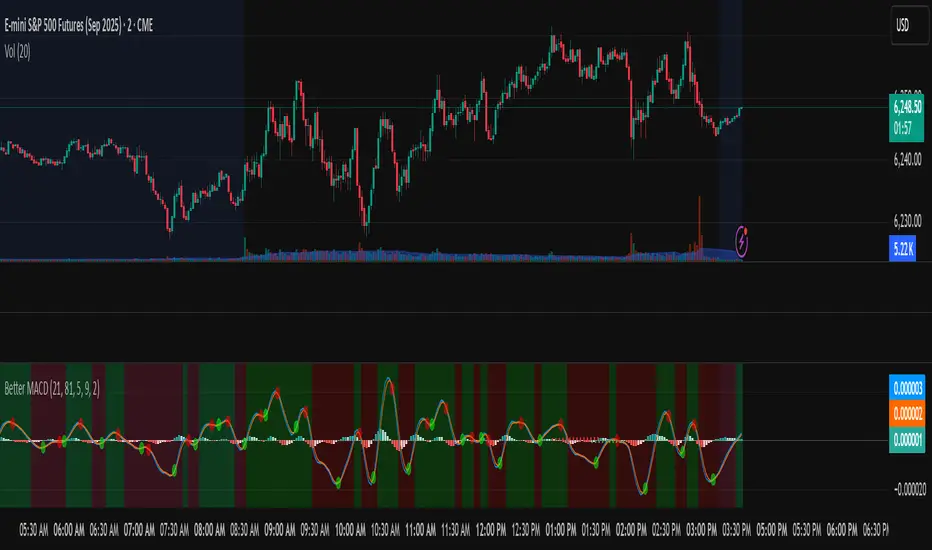
Better MACD📘 Better MACD – Adaptive Momentum & Divergence Suite
Better MACD is a comprehensive momentum-trend tool that evolves the traditional MACD into a multi-dimensional, divergence-aware oscillator. It leverages exponential smoothing across logarithmic rate-of-change of OHLC data, adaptive signal processing, and intelligent divergence detection logic to provide traders with earlier, smoother, and more reliable momentum signals.
This indicator is built for professional-level analysis, suitable for scalping, swing trading, and trend-following systems.
🧬 Core Concept
Unlike the classic MACD which subtracts two EMAs of price, Better MACD constructs a signal by:
Applying logarithmic transformation on the change between OHLC components (Close, High, Low, Open).
Using double EMA smoothing to filter noise and volatility, Triangular method. 1st to 2nd Smoothing.
Averaging and de-biasing the results through a custom linear regression model, 4th Smoothing.
Subtracting a fast SMA and slow SMA response to yield a dynamic MACD value, 3rd Smoothing.
The result is a smooth, adaptive, and high-resolution MACD-style oscillator that responds more naturally to trend conditions and price geometry.
🧠 Features Breakdown
1. 📈 Multi-Layer MACD Engine
Src1: Smoothed Log Rate-of-Change on Close
Src2: Smoothed Log Rate-of-Change on High
Src3: Smoothed Log Rate-of-Change on Low
Src4: Smoothed Log Rate-of-Change on Open
These are blended using highest high, lowest low, and average Close price over a configurable window for more complete trend detection. The open-based Src4 is subtracted using SMA.
2. 🧮 Signal Line
A fast EMA (signalLength) of the Better MACD value is used for crossover logic.
Crossovers of MACD and Signal line signal potential entries or exits.
3. 📊 MACD Histogram
Visualizes the difference between MACD and Signal line.
Dynamically color-coded:
Green/Light Green for bullish impulse
Red/Pink for bearish impulse
Width and color intensity reflect strength and momentum slope.
🎨 Visual Enhancements
Feature Description
✅ Ribbon Fill Optional fill between MACD and Signal line, colored by trend direction
✅ Zero-Line Background Background highlights above/below 0 to easily read bullish/bearish bias
✅ Crossover Highlights Tiny circles plotted when MACD crosses Signal line
🔍 Divergence Detection Suite
The script includes a full Divergence Engine to detect:
🔼 Bullish Regular Divergence (Price lower lows + Indicator higher lows)
🔽 Bearish Regular Divergence (Price higher highs + Indicator lower highs)
🟢 Bullish Hidden Divergence (Price higher lows + Indicator lower lows)
🔴 Bearish Hidden Divergence (Price lower highs + Indicator higher highs)
🧩 Divergence Modes:
Supports both Regular, Hidden, or Both simultaneously
Detects from either Close Price or Heikin Ashi-derived candles
Uses dynamic pivot tracking with configurable lookback and divergence sensitivity
Divergence lines are labeled, colored, and plotted in real-time
🔁 Styling & Customization:
Choose from Solid, Dashed, or Dotted line styles
Configure separate colors and widths for all divergence types
Control number of divergence lines visible or only show the most recent
Divergences update live without repainting
⚠️ Alerts
Alerts are built-in for real-time notification:
MACD Histogram reversals (rising → falling, or vice versa)
Divergence signals (all 4 types, grouped and individually)
Combines seamlessly with TradingView alerts for actionable triggers
🔧 Input Controls (Grouped by Purpose)
Better MACD Group
1st–4th Smoothing Lengths: Controls responsiveness of MACD core engine
Signal Length: Smoothness of signal line
Toggles for crossover highlights, zero cross fills, and ribbon fills
Divergence Settings
Enable/disable divergence lines
Choose divergence type (Regular, Hidden, Both)
Set confirmation requirements
Customize pivot detection and bar search depth
Styling Options
Colors, line widths, and line styles for each divergence type
Heikin Ashi Mode for smoother pivots and divergences
🧠 How to Use
✅ For Trend Traders:
Use MACD > Signal + Histogram > 0 → Bullish confirmation
MACD < Signal + Histogram < 0 → Bearish confirmation
Wait for pullbacks with hidden divergences to enter in trend direction
✅ For Reversal Traders:
Look for Regular Divergences at trend exhaustion points
Combine with price action (e.g., support/resistance or candle pattern)
✅ For Swing & Day Traders:
Enable Heikin Ashi Mode for smoother divergence pivots
Use zero line background + histogram color to time entries
📌 Summary
Feature Description
🚀 Advanced MACD Core Smoother, more reliable, multi-source-based MACD
🔍 Divergence Engine Detects 4 divergence types with pivot logic
🎯 Real-Time Alerts Alerts for histogram slope and divergences
🎛️ Deep Customization Full styling, smoothing, and detection controls
📉 Heikin Ashi Support Improved signal quality in trend-based markets