TOMMAR#TOMMAR #MultiMovingAverages #MMAR
Dear fellow traders, this is Tommy, and today I'd like to introduce you to the Multi-Moving Averages Ribbon (MMAR) indicator, which I believe to be one of the best MMAR indicators available on TradingView. Moving Averages is a popular technical analysis tool used to smooth out price data by creating an average of past price data points over a specified time period. They can be used to identify trends and provide a clearer view of price action, as well as generate buy and sell signals by observing crossovers between different moving average lines.
In the MMAR indicator, we have incorporated 12 different types of Moving Averages, including Simple Moving Averages (SMA), Exponential Moving Averages (EMA), Weighted Moving Averages (WMA), Hull Moving Averages (HMA), and Smoothed Moving Averages (SMMA), among others. This allows traders to choose the optimal type for their preferred trading commodities.
One common technique in technical analysis is using multiple Moving Averages with varying lengths, which provides a more comprehensive view of price action. By analyzing multiple Moving Averages with different timeframes, traders can better understand both short- and long-term trends and make more informed trading decisions. Some of the well-known combinations of multiple moving averages used by traders are (5, 9, 14, 21, 45), (6, 11, 16, 22, 51), [8, 13, 21, 55), (50, 100, 200), and (60, 120, 240).
Another way to gauge the strength of the market trend is to look for the arrangement of the Moving Averages. If they are in a sequential order, with the shortest on top and the longest on the bottom, it is most likely a bullish trend. On the other hand, if they are arranged in reverse order, with the shortest on the bottom and the longest on top, it is most likely a bearish trend. The 'Trend Light' in the indicator settings will automatically signal when the Moving Averages are in either an orderly or reverse arrangement.
Lastly, I have added a useful feature to the indicator: the 'MA Projection'. This feature projects and forecasts the Moving Averages in the future, allowing traders to easily identify confluence zones in future candlesticks. Please note that the projection levels may change in the case of extreme price action that significantly affects the Moving Averages.
This is free so any Tradingview users can use this indicator. Just search TOMMAR in the indicator section located on top of the chart.
#TOMMAR #MultiMovingAverages #MMAR
안녕하세요 트레이더 여러분, 토미입니다. 오늘 여러분들에게 소개드릴 지표는 다양한 길이의 이동평균선 조합을 사용할 수 있는 MMAR (Multiple Moving Averages Ribbon)입니다. 아마 제가 만든 MMAR 지표가 트레이딩뷰에서 가장 쓸만할 겁니다. 이동평균선, 줄여서 이평선은 말 그대로 특정 기간 범위 내의 주가들을 평균한 값들로 이루어진 선입니다. 제가 이평선 관련된 강의 자료는 예전에 올려드린 바 있으니 더 자세한 내용이 궁금하신 분들은 아래 링크/이미지 클릭하시길 바랍니다.
본 지표는 Simple Moving Averages (SMA), Exponential Moving Averages (EMA), Weighted Moving Averages (WMA), Hull Moving Averages (HMA), 그리고 Smoothed Moving Averages (SMMA) 등을 포함해 총 12개 종류의 이평선 지표를 사용할 수 있습니다. 또한 각 이평선의 길이들도 하나하나 일일이 설정하실 수 있습니다. 예를 들어 요즘에 자주 보이는 이평선들의 조합이 , , , , 그리고 등등이 존재하는데 여러분의 취향에 맞게 설정하여 사용하시면 됩니다.
몇 가지 주요 기능에 대해서 설명 드리겠습니다. 설정에서 ‘Trend Light’를 키면 이평선들의 정배열 혹은 역배열 여부를 쉽게 볼 수 있습니다. 이평선이 정배열일때는 맨 아래의 이평선에 초록불이, 역배열일때는 맨 위의 이평선에 빨간불이 켜지며 둘 다 아닐 땐 아무 불도 켜지지 않습니다. 또한 ‘MA Projection’을 키면 이평선들의 미래 예측 값들을 확장해줍니다. 당연히 가격 변동이 갑자기 크게 나오면 이평선 예측 확장 레벨들이 확 바뀌겠죠.
지표창에 TOMMAR 검색하시거나 아래 즐겨찾기 인디케이터에 넣기 클릭하시면 누구나 사용하실 수 있습니다~ 여러분의 구독, 좋아요, 댓글은 저에게 큰 힘이 됩니다.
ค้นหาในสคริปต์สำหรับ "细算江西救护车家长倒赚了四万三+-医疗花费13万(家长视频)++医保报"

Saty Pivot RibbonA 3 EMA Ribbon + Conviction EMAs system that simplifies measuring and using EMAs for trend and support/resistance . If you are familiar with using a faster EMA (8 or 9) with a pivot EMA (21) you should feel right at home.
Features include:
- 3 EMA Trend Ribbon (8, 21, 34 default)
- 2 color system for showing bullish trend (green + blue)
- 2 color system for showing bearish trend (red + orange )
- Ribbon folding visual indicates EMA crossover
- Conviction Arrows based on 13/48 EMA crossover
- 13/48 Conviction EMAs
- Time Warp: Warp the Ribbon into a different timeframe than the chart.
Inspired by Ripster EMA Clouds.

libcompressLibrary "libcompress"
numbers compressor for large output data compression
compress_fp24()
converts float to base64 (4 chars) | 24 bits: 1 sign + 5 exponent + 18 mantissa
Returns: 4-character base64_1/5/18 representation of x
compress_ufp18()
converts unsigned float to base64 (3 chars) | 18 bits: 5 exponent + 13 mantissa
Returns: 3-character base64_0/5/13 representation of x
compress_int()
converts int to base64

Price Correction to fix data manipulation and mispricingPrice Correction corrects for index and security mispricing to the extent possible in TradingView on both daily and intraday charts. Price correction addresses mispricing issues for specific securities with known issues, or the user can build daily candles from intraday data instead of relying on exchange reported daily OHLC prices, which can include both legitimate special auction and off-exchange trades or illegitimate mispricing. The user can also detect daily OHLC prices that don’t reflect the intraday price action within a specified percent deviation. Price Correction functions as normal candles or bars for any time frame when correction is not needed.
On the 4th of October 2022, the AMEX exchange, owned by the New York Stock Exchange, decided to misprice the daily OHLC data for the SPY, the world’s largest ETF fund. The exchange eliminated the overnight gap that should have occurred in the daily chart that represents regular trading hours by showing a wick connecting near the close of the previous day. Neither the SPX, the SP500 cash index that the SPY ETF tracks, nor other SPX ETFs such as VOO or IVV show such a wick because significant price action at that level never occurred. The intraday SPY chart never shows the price drop below 372.31 that day, but there is a wick that extends to 366.57. On the 6th of October, they continued this practice of using a wick that connects with the close of the previous day to eliminate gaps in daily price action. The objective of this indicator is to fix such inconsistent mispricing practices in the SPY, NYA, and other indices or securities.
Price Correction corrects for the daily mispricing in the SPY to agree with the price action that actually occurred in the SPX index it tracks, as well as the other SPX ETFs, by using intraday data. The chart below compares the Price Correction of the SPY (top) to the SPX (middle) and the original mispriced SPY (bottom) with incorrect wicks. Price correction (top) removes those incorrect wicks (bottom) to match the SPX (middle).
The daily mispricing of the SPY follows after the successful deployment of the NYSE Composite Index mispricing, NYA, an index that represents all common stocks within the New York Stock Exchange, the largest exchange in the world. The importance of the NYA should not be understated. It is the price counterpart to NYSE’s market internals or statistics. Beginning in 2021, the New York Stock Exchange eliminated gaps in daily OHLC data for the NYA by using the close of the previous day as the open for the following day, in violation of their own NYSE Index Series Methodology. The Methodology states for the opening price that “The first index level is calculated and published around 09:30 ET, when the U.S. equity markets open for their regular trading session. The calculation of that level utilizes the most updated prices available at that moment.” You can verify for yourself that this is simply not the case. The first update of the NYA price for each day matches the close of the previous day, not the “most updated prices available at that moment”, causing data providers to often represent the first intraday bar with a huge sudden price change when an overnight price change occurred instead. For example, on 13 Jun 2022, TradingView shows a one-minute bar drop 2.3%. With a market capitalization of roughly 23 trillion dollars, the NYSE composite capitalization did not suddenly drop a half-trillion dollars in just one minute as the intraday chart data would have you believe. All major US indices, index ETFs, and even foreign indices like the Toronto TAX, the Australian ASXAL, the Bombay SENSEX, and German DAX had down gaps that day, except for the mispriced NYSE index. Price Correction corrects for this mispricing in daily OHLC data, as shown in the main chart at the top of this page comparing the original NYA (top) to the Price Corrected NYA (bottom).
Price Correction also corrects for the intraday mispricing in the NYA. The chart below shows how the Price Correction (top) replaces the incorrect first one-minute candles with gaps (bottom) from 22 Sep 2022 to 29 Sep 2022. TradingView is inconsistent in how intraday data is reported for overnight gaps by sometimes connecting the first intraday bar of the day to the close of the previous day, and other times not. This inconsistency may be due to manually changing the intraday data based on user support tickets. For example, after reporting the lack of a major gap in the NYA daily OHLC prices that existed intraday for 13 Jun 2022, TradingView opted to remove the true gap in intraday prices by creating a 2.3% half-a-trillion-dollar one-minute bar that connected the close of the previous day to show a sudden drop in price that didn’t occur, instead of adding the gap in the daily OHLC data that actually took place from overnight price action.
Price Correction allows users to detect daily OHLC data that does not reflect the intraday price action within a certain percent difference by changing the color of those candles or bars that deviate. The chart below clearly shows the start of the NYSE disinformation campaign for NYA that started in 2021 by painting blue those candles with daily OHLC values that deviated from the intraday values by 0.1%. Before 2021, the number of deviating candles is relatively sparse, but beginning in 2021, the chart is littered with deviating candles.
If there are other index or security mispricing or data issues you are aware of that can be incorporated into Price Correction, please let me know. Accurate financial data is indispensable in making accurate financial decisions. Assert your right to accurate financial data by reporting incorrect data and mispricing issues.
How to use the Price Correction
Simply add this “indicator” to your chart and remove the mispriced default candles or bars by right clicking on the chart, selecting Settings, and de-selecting Body, Wick, and Border under the Symbol tab. The Presets settings automatically takes care of mispricing in the NYA and SPY to the extent possible in TradingView. The user can also build their own daily candles based off of intraday data to address other securities that may have mispricing issues.

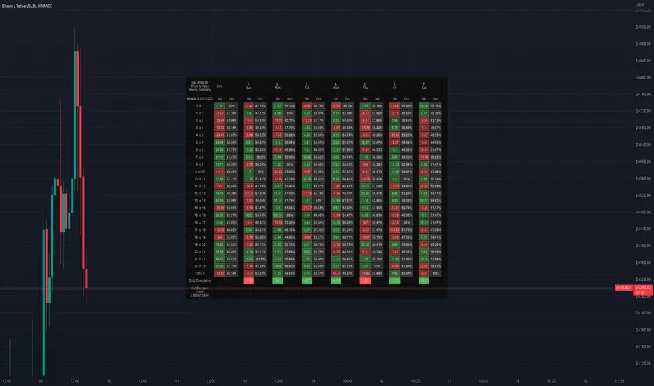
Bias AnalyzerName: Bias Analyzer
Category: Market Analyzer
Timeframe: 1H and 1D, depending on the Analysis type.
Technical Analysis: Usually when we think about a Trading System we start from an idea. This idea comes normally from observation and the study of the market.
Have we ever observed a market - for example Bitcoin - and thought that it increases at the start of a USA session? Great, this is a well-known category of Trading System and the purpose of the Bias Analyzer is to study these phenomena.
There are different types of Trading System that we can classify considering the market in-efficiency that we use to our advantage. In this case we make the Bias. Literally "inclination" or "presupposition" or precisely "tendency" of the price to go up or down in a temporal way.
The characteristics of the Bias depend on how much the Bias is persistent on the market since the analysed period. therefore we can consider:
Hourly Bias : analysing the hourly behaviours during the week. Trades normally last from a few hours to a few days.
Seasonal Bias : analysing the behaviour of the weeks in the monthly or annual context, evaluating the seasons.
Suggested usage: The possibilities of the tool are infinite, these are some scenarios of use:
Development of Intraday Trading Systems based on Hourly Bias with possible filters for specific days of the week.
Development of a Multi-day Trading System based on daily Bias with monthly analysis.
To identify the best day to execute our investment through Dollar Cost Average with a bit of healthy buy the dip
Main features:
Hourly Summary organized in Week
The cells contain the sum of the various price deltas for the single hour. The transparency indicates the frequency in which the candles close positive or negative. This information is available both in a synthetic way, as in the first column "Sum", and for each day of the week.
Hourly Details organized in different entry/exit
Shows the cumulative data of the various deltas, considering the purchase and the sale at certain times. In the rows are represented the buying hours and in the columns the selling hours.
Daily Summary organized in Months
The cells contain the summation of the various price deltas for the single day.
Hourly Details organized in different entry/exit
Allows to visualise the detailed analysis table, choosing to do it for all the months or for a specific month and shows the cumulative data of the various deltas, considering the purchase and the sale in certain days.
Configuration: You can configure the tool easily and completely.
Analysis
Calculate from Close to Open : this is the core of the whole analysis where the "Price Delta" to be calculated is defined. At this moment there is the possibility to calculate the distance between opening and closing.
Calculate in Percent or Cash : this allows to calculate the Price Delta in Percent or in Cash.
Analysis on 1H Timeframe
Show Hourly Summary on : allows to visualise the summary analysis table of the week. The cells contain the sum of the various price deltas for the single hour. The transparency indicates the frequency in which the candles close positive or negative. This information is available both in a synthetic way, as in the first column "Sum", and for each day of the week. At the bottom left there is also data which allows us to understand how many candles are being analysed. At the bottom of each day it is possible to visualise the cumulative data of the day. The position of the table is customizable.
Show Hourly Details of on : allows to visualise the detailed analysis table, choosing to do it for all days or for a specific day, and shows the cumulative data of the various deltas, considering the purchase and the sale at certain times. In the rows are represented the buying hours and in the columns the selling hours. For example, going to the table "All Days" we can see in the cell of row 13 and in column 22 the cumulative data of a possible buy on 13 and a sell at the end of 22. To facilitate the research of the values there is a configurable transparency system.
Analysis on 1D Timeframe
Show Daily Summary on : allows to visualise the summary analysis table of the month. The cells contain the summation of the various price deltas for the single day: The first row is the summation of all days of the month for all months in the analysis period, while the other rows represent the analysis for the various days of the individual months.
Show Daily Details of on : allows to visualise the detailed analysis table, choosing to do it for all the months or for a specific month and shows the cumulative data of the various deltas, considering the purchase and the sale in certain days. In the rows are represented the buying days and in the columns the selling days. For example, going to the table "All Months" we can see in the cell at row 1 and at column 3 the cumulative of a possible purchase on the 1st and the sale on the 3rd. To facilitate the research of the values, there is a configurable transparency system.
Table Layout
Size : allows to define the size of the text in the table.
Precision : it is possible to define the decimal precision of the calculations presented in the tables.
Transparency Factor : allows the application of a multiplication factor when the table calculates the transparency of detail tables.
Colours : allows to specify the colours of Profit, Loss and Neutral, besides to adapt a style coherent with the Dark Mode or Light Mode of Trading View
Volatility Filter
It is possible to directly apply a filter to the time series on which the delta is calculated. The volatility filter uses the ATR - an indicator that allows you to calculate the volatility in a given period. Briefly: the higher the ATR value, the higher the volatility. Therefore the filter works by comparing the volatility on two periods and indicates compression or expansion.
Backtest Dates
In order to facilitate the identification of in-sample and out-of-sample data, as well as the degradation of a given behaviour, it is possible to specify a period in which to do the analysis.
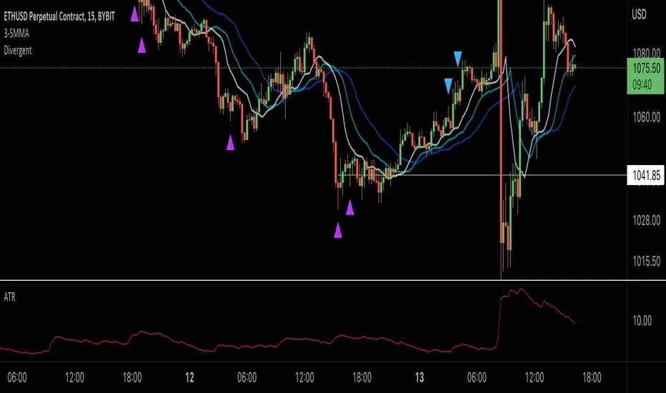
Williams Divergent Bar (First Wise Man)Based on Bill Williams' First Wise Man. Bull candles are marked with purple and Bear candles with blue.
Requirements:
- Candle height must be greater than ATR (filter out tiny Doji candles)
- Open and Close must be beyond the HL2 (midpoint) for either Bull or Bear scenarios
- Candle HL2 must be more than 1x ATR from the Alligator Jaw (13-period SMMA, pushed forward 8 periods). The dark blue line in my example.
- ATR is calculated using a 13-period RMA of the true range
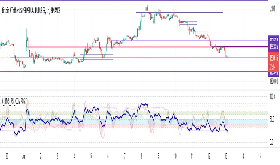
A_HMS_RSI_COMPOSITMy majic Macd Indicator with Ema base macd is My great Indicator that combine four ema base macd lines with its signal lines that show price gravity by best way , and one spatial chart that is the best part of this magic indicator that help you to trading without any problem
for better use note that:
green fill line is ema 66 and ema 199 macd and signal its name is macd very slow signal line
blue fill line is ema 19 and ema 66 macd and signal its name is macd normal signal line
red fill line is ema 9 and ema 19 macd and signal its name is macd very fast signal line
black line is ema 4 and ema 14 macd its name is macd main signal line
in all of this lines we can define divergence
when this lines crossing over and under from together each of this crossings give me some signals and because this signals very much we cant describe thats in some lines
but note that we in fact trade just by black line but short and long position determine by position of black line instead of other lines and positions of other lines from each ones
purple line is rsi line
red line is composite line
blue line is rmi line
red and Blue below line is Slow Stochastic lines
blue and orange line is Stochastic ema with ema12 - ema21
and third chart is a secret indicator that help more to determine best place to start trading
A_HMS_RSI is My great Indicator that RSI , RMI and , momentum of price movement by a histogram , that help you to trading without any problem
for better use note that:
blue line is rsi line with hl2 source and 14 length
low color line is rmi line with momentum 33
rmi of price with momentum 33 is a very good signal for long positions.
momentum histogram help us to define strong of price motion in each time
some futures is hidden by default:
composite red and green signal line
rmi of price with momentum 4
ema 13, 33 of rmi as signal line and rsi and composit
finaly u can change any colors from setting
in background we determine some filled zones for better use of Indicator
when composite line run away from histogram momentum increase rapidly
when composite and rsi line is in same way its time to get position .
rmi of price with momentum 20 is a very good signal for long positions.
some futures is hidden by default:
composite red and green signal line
rmi of price with momentum 20
ema 13, 33 of rmi as signal line
finaly u can change any colors from setting
and you can get stoch signals too
in background we determine some filled zones for better use of Indicator
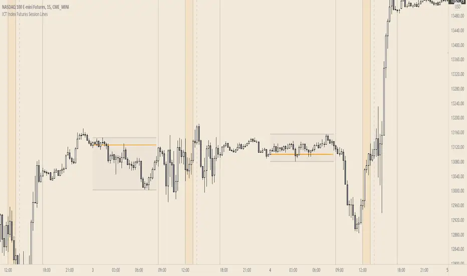
ICT Index Futures Session LinesICT Index Futures Session Lines
Description:
The script is based on one of ICT's concepts on trading Index Futures. The script lays out the daily range from an intraday basis.
Range:
00:00 - New York Midnight
08:30 – New York Open (News events come out)
12:00/13:00 - New York Lunch (No trade time period)
13:30 - (Algorithm)
16:30 - Close
* The open, high and low lines are plotted from 00:00 to 08:30
How To Use:
You will need to check the daily bias. Prior to 8:30 you are to look for previous swing points where liquidity may exist. During the open you want to see if a high or low is taken out, and then wait for an energetic break/displacement for a potential FVG/imbalance retracement entry.
Strategy is for LTF (1 to 15m)
Default time zone is set to America/New_York (UTC New York), so lines will be plotted correctly regardless of user’s local UTC chart setting.
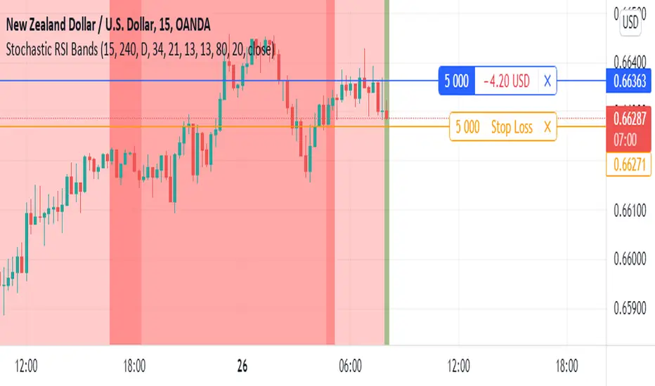
Stochastic RSI BandsStochastic RSI Bands by // © drbarry92064859
It is suggested to view this indicator on 15m or 5m timeframe with current Default Settings.
This indicator is based on the StochRsi.
It creates color bands based on the direction of multiple timeframe StochRsi.
When the MTF StochRsi's are opposed in direction it produces darker bands and when aligned in direction it produces light bands.
During Green Bands, price tends to be Bullish. During Red Bands, price tends to be Bearish.
During Medium toned Bands, price action tends to be in a correction in existing HTF trend, ranging, or getting ready for reversal.
During Light Bands, price tends to be in Trend in direction of color.
There is usually Dark Bands on either side of a light or medium toned band.
Best to enter in direction of current color, during the dark band after the medium toned bands
And exit in the dark band after the light toned band.
Brown bands tend to indicate reversal of direction and color.
I have experimented with all the timeframes and StochRSI settings and found the best settings to be as follows.
The Default settings are Middle Time Frame: 4H and Higher TimeFrame: D1.
The Default StochRSI settings are 34 RSI, 21 Stochastic, 13 smooth K and 13 smooth D.
It is suggested to use a lower timeframe such as 15m or 5m for entry.
You can experiment with different StochRSI and TimeFrame Settings.
SUGGESTED STRATEGY
Dark Bands after medium toned bands: Look for an entry on lower timeframe (15m or 5m) based on reversal candlestick formations or other indicators in direction of current color.
Light Bands: Do not enter during lighter bands. You should already be in trade during Light Bands
Light Band changes to Dark Band: Exit Trade if already in.
Look for general change of directional bias if a brown band occurs; however wait for dark band after the 2nd wide band following the brown band.
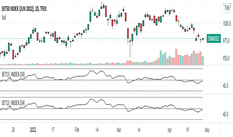
SET13_INDEXThe average RSI of top 13 marketcaptilization in SET50, as list by below.
1. PTT
2. AOT
3. ADVANC
4. CPALL
5. GULF
6. PTTEP
7. SCC
8. SCB
9. KBANK
10. BDMS
11. EA
12. OR
13. SCGP
Note that OR started trading on February 2021 so that the indicator will not appear before that period and
the top 13 marketcapiliation ranked on 22 February 2022 so pls becareful about look ahead bias.
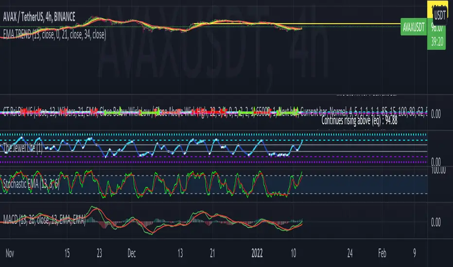
EMA TRENDThis EMA Trend indicator uses the 13 EMA, 21 EMA, and 34 EMA in the following color codes of Green for 13 EMA, Yellow for 21 EMA, and Red for 34 EMA lines to demonstrate overall trend when applied to the chart. Instead of just one EMA line, using three EMA lines to determine the trend. Use this indicator to in the following method. If the green angled up along with yellow and red, there is strong upward trend. If the green crosses below the yellow, trend is waning. If the red is on top of the yellow and green with downward slope, there is a strong downward trend.
Median Convergence DivergenceIntroduction
The Median Convergence Divergence (MCD) is a derivative of the Moving Average Convergence Divergence (MACD). The difference is the change in the use of the measure of central tendency. In MACD, moving average (mean) is used, whereas, in MCD, the median is used instead. The purpose of using the median is to eliminate the outlying values, which would be calculated for a moving average. The outliers would affect the value of the moving average.
For example: 3, 5, 7, 8, 5, 4, 2, 1, 6, 21, 8. The data set average is 6.3, whereas the median value is 5. There is a difference of about 23% in the example. The reason is the outlying value '21' in the data set.
As the markets are volatile, outlying values can always emerge. A moving average will consider those values; on the other hand, the median will ignore. If the strategy calls for a tool to ignore the outliers, the Median Convergence Divergence would be a great centered oscillator.
The default values have changed to suit the current trading days in a week. When the MACD was introduced, there would be six trading days in a week. Therefore, it used 12 (2 weeks), 26(4 weeks), and 9 ( 1.5 weeks). But now that there are five trading days per week. The default values are adapted to them. Feel free to change them as per your wish.
Recommended Settings
The current settings are set to be used for the Daily Time Frame: 5 day period for the fast line, a 20 day period for the slow line, and a 10 day period for the signal line. (5 days represent a trading week, 10 days is two weeks, and 20 days is 4 weeks or a month)
For the weekly charts, use 4 week period for the fast line, 13 week period for the slow line, and 8 week period for the signal line. (4 weeks represent a month, 8 weeks is two months, and 13 weeks is 3 months or quarterly)
And for monthly charts, use 3 month period for the fast line, 12 month period for the slow line, and 6 month period for the signal line. (3 months is quarterly, 6 months is bi-yearly, and 12 month is yearly)
It'll be challenging to measure for intraday since there are many different timeframes within intraday. The settings mentioned above should also be customized as per the requirements of the trading strategy.
Strategy
The strategy application is the same as the MACD, i.e., Signal Line Crossovers, Zero Line Crossovers, and Divergence.
Signal Line Crossovers: When the MCD line crosses above the Signal line, it's a bullish crossover. When the MCD line crosses below the Signal line, it's a bearish crossover.
Zero Line Crossovers: It's a bullish crossover when the MCD line crosses above the Zero line. When the MCD line crosses below the Zero Line, it's a bearish crossover.
Divergence: When price shows a lower low, but MCD shows a higher low, it's a bullish divergence. When the price shows a higher high but MCD shows a lower high, it's a bearish divergence.
Using other indicators in conjunction with the Median Convergence Divergence is recommended to take entry and exit signals.

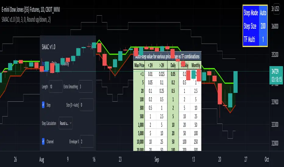
[RedK] Stepped Moving Average Channel (SMAC)The Stepping Moving Average Channel (SMAC) is not an indicator - It is more of a trading tool that was put together to enable a trader to take advantage of relatively fast price moves with quick incremental gain - maybe by exploiting opportunities to trade basic options (Calls, Puts) or to help with in/out-type swing trades. This is more a price-level visualization tool so please use it with this in mind, and not as a trading tool by itself.
While it looks very similar to a Donchian channel, SMAC plots a stepping channel of the moving average of the high & low prices (channel borders) - with an envelope that is at a user-specified % distance from the channel borders.
This setup, when combined with other Moving Averages and lower indicators, may make it easier for a trader to prepare for a trade with clear entry and exit price levels being planned upfront.
For example, a trader wants to capture 2% of the next move, will set the envelope to 2% and have clearer view of entry/exit price levels for such a scenario. once the trader receives confirmation (from other indicators or charts) that the price is heading in the way expected, the SMAC may make it simpler and quicker to estimate (and visualize) the entry/exit price levels and track the movement.
* The stepping feature helps remove price noise and the auto-stepping feature is designed to "snap to" those mental price levels that trader gravitate towards.
* The moving average type I used here is the Compound Ratio MA (CoRA_Wave) .
* This MA type was selected because it has a very high responsiveness and good smoothness, and tracks the price values very closely.
* The MA type can be replaced within the code with any other MA as preferred.
The auto-stepping feature:
----------------------------------
User can override the auto-stepping by entering a manual step value
when the auto-stepping is active, it will attempt to pick the best step size based on the underlying price range and the timeframe selected.
The step selection may not be ideal in some combination of value / TF - i will continue to improve these combinations
Stepping can also be completely disabled - this bring SMAC back to a regular (though highly responsive) Hi/Lo MA channel with envelope
The Excel table snippet in the chart above shows the various step value / TF combinations.
Also the stepping values can be further customized by changing the appropriate part in the script.
Other features:
--------------------
* Rounding Options: The stepping calculations uses one of 2 selectable methods:
1 -- regular rounding (uses the round() function): which rounds the price up & down depending on where it is compared to the half-step value
example: a value of 17 with a step of 10 will be rounded to 20. a value of 13 in that case will be rounded to 10
2 -- Whole Step (uses the int() function): this will only consider whole/fully completed steps - if the average (hi or low) does not explicitly exceed the next step level, we will not get that next value.
example: both values of 17 and 13 with a step of 10 will be rounded to 10.
* The "Quick Table":
The Quick Table shows on the top-left - and can be disabled in the script settings - It shows the currently selected stepping mode and value - since the auto-step changes dynamically with the selected chart timeframe, this makes it easier for the trader to view the active "configuration"
overall, i hope some traders find this quick utility useful - if not to use, maybe to inspire other ideas
- please feel free to use or customize in any way you need. Feel free to share feedback and observations.
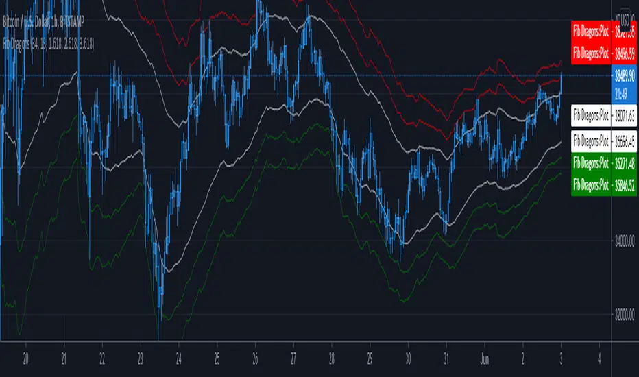
Fib DragonsCreates bands based on Fibonacci golden ratio numbers and EMA w/ATR
This allows for a faster reaction and significantly less lag than SMA w/ATR
EMA is set to 34 - Recommend range by taste 21, 34, 55, 62
ART is set to 13 - Recommend 13 or 21
Fib Bands are set to 1.618, 2.618, 3.618 however you can set to what works for you. I recommend keeping them at the golden ratios.
Based on indicator by rstraat
How to trade - Same rules apply
- Best to use in ranging market conditions
- Place on two different time frames such as the 15 min. and 60 min for intraday trading
- Take trades off either short or long term chart.
- Best trades occur when both charts show same trigger/condition.
- Trades are short term reversals in direction of major trend on longer term chart unless you expect a trend reversal.
- Determine which band is the limiting band for the volatility of the instrument.
- When the market closes outside of the limiting band then returns inside, take a long/short one tick above/below the high/low of the previous bar.
- Place stop below/above the low/high of the the recent swing low/high.
- Set targets at opposite band of chart
Use any oscillator you favor or see fit with this indicator or any other strategies that work for you.
4-Hour Stochastic EMA TrendThis trading strategy relies heavily on catching the trend. You
may have success using this strategy on as low as the one hour
chart or as high as the daily chart; however, I’ve had most
success trading it on the four hour chart. This strategy consists
of four indicators, which are:
1. 5 Period Exponential Moving Average (closed)
2. 15 Period Exponential Moving Average (closed)
3. 50 Period Exponential Moving Average (closed)
4. Stochastic indicator K=13 D=5 Smooth=5 (13,5,5) 80/20
Levels
Refer
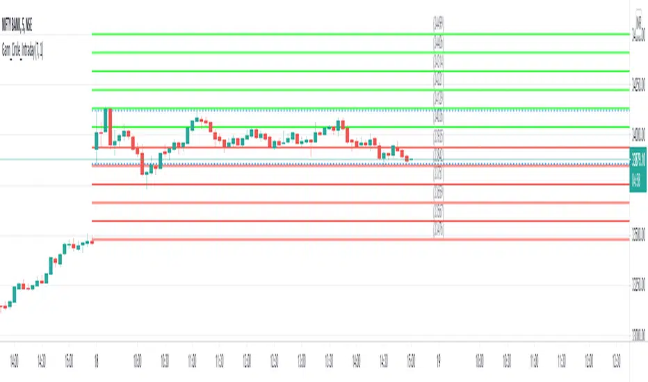
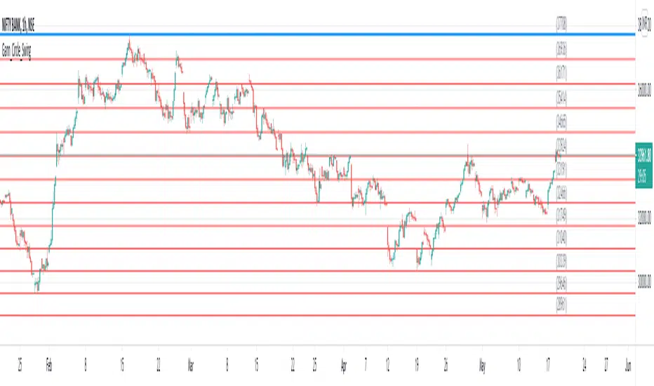
Gann Circle Intraday LevelsThis indicator is an intraday version of Gann Circle Swing Levels indicator. It further divides the Gann Circle into the Eighths in order to generate intraday Levels.
Introduction
This indicator is based on W. D. Gann's Square of 9 Chart and can be interpreted as the Gann Circle / Gann Wheel / 360 Degree Circle Chart or Square of the Circle Chart for intraday usage.
Spiral arrangement of numbers on the Square of 9 chart creates a very unique square root relationship amongst the numbers on the chart. If you take any number on the Square of 9 chart, take the square root of the number, then add 2 to the root and re-square it, resulting in one full 360 degree cycle (i.e. a 360 degree Circle) out from the center of the chart.
For example,
the square root of 121 = 11,
11 + 2 = 13,
and the square of 13 = 169
The number 169 is one full 360 degree cycle out (with reference to 121) from the center of the Square of 9 chart. If we further divide the circle in eight equal parts of 45 degree each, following intermediate resistance levels (ascending) would be generated:
127 (45 degree)
133 (90 degree)
139 (135 degree)
145 (180 degree)
151 (225 degree)
157 (270 degree)
163 (315 degree)
Similarly, if you take any number on the Square of 9 chart, take the square root of the number, then subtract 2 from the root and re-square it, resulting in one full 360 degree inward rotation towards the center of the chart.
For example,
the square root of 565 = 23.77,
23.77 - 2 = 21.77,
and the square of 21.77 = 473.93 (approximately equal to 474, which is directly below 565 on the Square of 9 chart)
The number 474 is one full 360 degree inward rotation (with reference to 565) towards the center of the chart. If we further divide the circle in eight equal parts of 45 degree each, following intermediate support levels (descending) would be generated:
553 (45 degree)
541 (90 degree)
529 (135 degree)
518 (180 degree)
507 (225 degree)
496 (270 degree)
485 (315 degree)
How to Use this Indicator ?
This indicator is designed to generate Gann Circle Intraday Levels based on HIGH and LOW of the opening bar for the day. You may use the bar interval (1 minute, 3 minutes, 5 minutes, 15 minutes etc.) which is suitable for the underlying instrument. Support and resistance lines for the day would be generated only after confirmation of the opening bar of the day.
Input :
Number of Gann Levels (Number of Gann Levels to be projected)
Color codes for the Support and Resistance Levels
Output :
Gann Support or Resistance Levels:
HIGH and LOW of the Opening bar for the day (dashed BLUE lines)
Support levels calculated with reference to the HIGH of the opening bar
Resistance levels calculated with reference to the LOW of the opening bar
Gann Circle Swing LevelsThis indicator is based on W. D. Gann's Square of 9 Chart and can be interpreted as the Gann Circle / Gann Wheel / 360 Degree Circle Chart or Square of the Circle Chart.
Spiral arrangement of numbers on the Square of 9 chart creates a very unique square root relationship amongst the numbers on the chart. If you take any number on the Square of 9 chart, take the square root of the number, then add 2 to the root and re-square it, resulting in one full 360 degree cycle (i.e. a 360 degree Circle) out from the center of the chart.
For example,
the square root of 121 = 11,
11 + 2 = 13,
and the square of 13 = 169
The number 169 is one full 360 degree cycle out (with reference to 121) from the center of the Square of 9 chart.
Similarly, if you take any number on the Square of 9 chart, take the square root of the number, then subtract 2 from the root and re-square it, resulting in one full 360 degree inward rotation towards the center of the chart.
For example,
the square root of 565 = 23.77,
23.77 - 2 = 21.77,
and the square of 21.77 = 473.93 (approximately equal to 474, which is directly below 565 on the Square of 9 chart)
The number 474 is one full 360 degree inward rotation (with reference to 565) towards the center of the chart.
How to Use this Indicator ?
This indicator is useful for finding coordinate squares on the Gann Circle that are making hard aspects to a previous position (such as a significant top or bottom) on the circle.
Input :
Swing Point (Significant price point, such as a top or a bottom)
Low / High ? (Is it a bottom or a top)
Number of Gann Levels (Number of Gann Cycles to be projected)
Output :
Gann Support or Resistance Levels (color coded as follows) :
Swing High or Swing Low (BLUE)
Support levels calculated with reference to the Swing High (RED)
Resistance levels calculated with reference to the Swing Low (LIME)
[SK] Custom Klinger OscillatorThis Custom Klinger Oscillator allows you to change the time frames for the Force Volume and Signal calculations to use instead of it's default values. Although the default Fibonacci values ( 34, 55 and 13 ) provide exceptional signals, you can now explore using lower Fibonacci numbers and get faster signals for your own adventures in the market.
This indicator adds conditional coloring of the Klinger line when over / under the signal along with a transparent fill cloud between both lines colored by the same condition. You can change colors to your preference on the style configurations.
--
Below is more information on the KIinger Oscillator from investopedia:
Interpretations for Price Direction
The Klinger Oscillator is fairly complex to calculate, but it's based on the idea of force volume, which accounts for volume, trend (positive or negative), and temp (based on multiple inputs and if/then statements). Using this data, the oscillator is created by looking at the difference between two exponential moving averages of force volume involving different time frames (typically 34 and 55). The idea is to show how the volume flowing through the securities is impacting its long-term and short-term price direction.
The Signal Line
A signal line (13-period moving average) is used to trigger buy or sell signals. This technique is very similar to signals that are created with other indicators such as the moving average convergence divergence (MACD). While these are the basic signals generated by these indicators, it's important to note that these techniques may generate a lot of trading signals that may not be as effective in sideways markets.
The Uptrend
When an asset is in an overall uptrend—such as when it is above its 100-period moving average and the Klinger is above zero or moving above zero—traders could buy when the Klinger oscillator moves above the signal line from below.
Klinger noted that when a stock was in an uptrend, and then dropped to unusually low levels below zero, and then moved above its signal line, this was a favorable long position to take.
The Downtrend
When an asset is in an overall downtrend, traders could sell or short-sell when the Klinger oscillator moves below the signal line from above. Klinger noted this was especially noteworthy when the indicator had seen an uncharacteristic spike above zero.
The zero line is also used by some traders to mark the transition from an uptrend to downtrend, or vice versa. While such signals won't always agree with price movements, a move above zero helps confirm a rising price, while a drop below zero helps confirm a falling price.
Klinger Oscillator and Divergence
The Klinger oscillator also uses divergence to identify when the indicator's inputs are not confirming the direction of the price move. It's a bullish sign when the value of the indicator is heading upward while the price of the security continues to fall. It is a bearish signal when the price is rising but the indicator is falling. Divergence can be coupled with signal line crossovers to generate trades. For example, if a bearish divergence forms, a sell or short-sell could be initiated the next time the Klinger crosses below the signal line.

conversion vaibhav all in one ema
plot(ema(close, 13), color=yellow, linewidth=3, title="13 Day EMA")
any upgradation change number

SMA + Trend Strength + Trailing Stop LossThe 'SMA + Trend Strength + Trailing Stop Loss' indicator was designed for swing trading long positions over the course of days/weeks. The benefit of the indicator is to identify areas where the market of a given asset is showing signs of a strong uptrend, divergences, and fear. A 13-bar simple moving average is color coded to four colors based on 5 given conditions at a time, which are represented as a trend meter on the bottom right of the screen. A trailing stop loss indicator is included to secure your profits or limit your loss in case the market reverses on you unexpected. Please use this indicator responsibly with proper risk management, and never rely on the indicator by itself for buy and sell signals.
When the simple moving average color is green, it means that at least 4 of 5 conditions are confirming a move upwards, this is when you can take an entry into a trade based on your entry strategy. As the trend continues, the color will eventually change to yellow signaling a divergence. This is when you can use your exit strategy to find a good point to sell. It is wise not to take new positions when the color is trending yellow.
If the color changes from yellow to orange, that is a warning sign that the trend is about to change or has begun to change. Prices may have already fallen. However, sometimes the color will change from yellow back to green signaling a continuation of the trend. You can either keep holding or take a new position in this instance.
When the color is red, this signals fear in the market, you should stay out of the market at first. However, as the market consolidates and the color starts changing back to orange, this is an opportunity to take a long position at a reasonably low price.
Simple Moving Average (13-Bar) Color Explanation:
The colors change based on 5 market conditions represented in the trend meter.
Green: Strong Uptrend
Yellow: Divergence Present
Orange: Warning
Red: Fear
Trend Meter Explanation:
The trend meter draws 5 arrows indicating bullish or bearish presence.
LL = Lower Lows - Detects when the market is trending with lower lows.
HH = Higher Highs - Detects when the market is trending with higher highs.
MA = SMA Direction - A formula is used to determine the direction of the SMA.
DI = Directional Index - Identifies when upwards momentum is trending.
RSI = Relative Strength Index - Identifies when the RSI is in an uptrend state.
Note: For advanced users, this indicator has a hidden DMI(4, 4, 4) and RSI(14) indicator used to determine the last two conditions. The Directional Index is based on a DI Plus momentum moving average to determine a momentum trend and the RSI trending over 50 will constitute an uptrend signal as below 50 it will point down.
Trailing stop loss:
The trailing stop loss is determined based on the lowest price of the last 8 bars.
A gray step-line is drawn at the suggested stop activation price.
A red step-line is drawn at the suggested stop limit price.
When the price breaches the trailing stop, a red X will appear below the bar.
You can turn each of these features on or off based on your preference. Happy trading!

[blackcat] L2 Ehlers Convolution IndicatorLevel: 2
Background
John F. Ehlers introduced Convolution Indicator in his "Cycle Analytics for Traders" chapter 13 on 2013.
Function
Since high correlation exists only at the market turning point, the convolution indicator is dependent on the lookback period used in the calculation. Assuming the two price segments have an equal time duration, the peak correlation occurs at half the lookback period of the indicator. For example, if a 13-bar period is used, the market peak would appear with a 7-bar delay. The same market peak would appear with a 19-bar delay if a 39-bar lookback period were used in the convolution computation.
Key Signal
Convolution --> Convolution array
Pros and Cons
100% John F. Ehlers definition translation of original work, even variable names are the same. This help readers who would like to use pine to read his book. If you had read his works, then you will be quite familiar with my code style.
Remarks
The 56th script for Blackcat1402 John F. Ehlers Week publication.
Courtesy of @RicardoSantos for RGB functions.
Readme
In real life, I am a prolific inventor. I have successfully applied for more than 60 international and regional patents in the past 12 years. But in the past two years or so, I have tried to transfer my creativity to the development of trading strategies. Tradingview is the ideal platform for me. I am selecting and contributing some of the hundreds of scripts to publish in Tradingview community. Welcome everyone to interact with me to discuss these interesting pine scripts.
The scripts posted are categorized into 5 levels according to my efforts or manhours put into these works.
Level 1 : interesting script snippets or distinctive improvement from classic indicators or strategy. Level 1 scripts can usually appear in more complex indicators as a function module or element.
Level 2 : composite indicator/strategy. By selecting or combining several independent or dependent functions or sub indicators in proper way, the composite script exhibits a resonance phenomenon which can filter out noise or fake trading signal to enhance trading confidence level.
Level 3 : comprehensive indicator/strategy. They are simple trading systems based on my strategies. They are commonly containing several or all of entry signal, close signal, stop loss, take profit, re-entry, risk management, and position sizing techniques. Even some interesting fundamental and mass psychological aspects are incorporated.
Level 4 : script snippets or functions that do not disclose source code. Interesting element that can reveal market laws and work as raw material for indicators and strategies. If you find Level 1~2 scripts are helpful, Level 4 is a private version that took me far more efforts to develop.
Level 5 : indicator/strategy that do not disclose source code. private version of Level 3 script with my accumulated script processing skills or a large number of custom functions. I had a private function library built in past two years. Level 5 scripts use many of them to achieve private trading strategy.
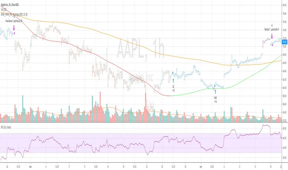
EMA_HMA_RSI_StrategyThis strategy BUYS when HMA is below EMA (default setting is 200) and HMA turning to green and RSI 13 is below 70
Adds to existing position when current price is below BUY price and RSI crossing above 30 or 40
Exits the long position when HMA crosses down EMA
when you select Take Profit setting , partial profits are taken when current price > BUY price and RSI 13 crossing down 80
Bar color changes to purple when RSI13 is above 80 (if only in Long position exists)
Tested for SPY QQQ AAPL on hourly and 30 mins chart
Warning : For educational purposes only
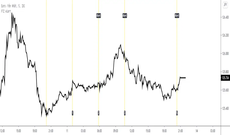
Fib Time Zone with Alert* Fib Time Zone with Alert will draw a series of vertical lines on chart. They are spaced at the Fibonacci intervals of 1, 2, 3, 5, 8, 13, 21, 34, 55 and 89. Trader defined the zero line and the 1 line, then Fib Time Zone with Alert auto draw the rest and display alert when price touch the line.
* Alert condition available in the Create Alert dialog box with title "Fib Time Zone Alert".
* Line 0 was defined by Date, Month, Year, Hour, Minute (use Exchange Timezone).
* Line 1 was defined by number of bars between Line 0 and Line 1.
* Line 2,3,5,8,13,21,34,55 and 89 auto draw.