Triple EMA By Ozy
**Triple EMA By Ozy**
The "Triple EMA By Ozy" is a visual indicator that offers traders a clear and concise view of three exponential moving averages (EMAs) at a glance. This tool combines three common EMAs (20, 50, and 200) and additionally calculates and displays the slope angle of each EMA, allowing for a more precise identification of the current trend's direction and strength.
**Key Features:**
1. **Three EMAs in One Indicator:** The 20, 50, and 200-period EMAs are popular among traders and are crucial for identifying short, medium, and long-term trends.
2. **Slope Angle:** The indicator calculates the slope angle for each EMA, which can be indicative of the trend's strength. A positive angle suggests bullish momentum, while a negative angle indicates bearish momentum.
3. **Clear Visual Indication:** The indicator uses colors to easily distinguish between EMAs and also to identify the direction of the slope angle (green for positive, red for negative).
**How to Use:**
- An increasing angle in the EMA20 may indicate the beginning of a new short-term upward trend.
- A decreasing angle in the EMA200 might signal a long-term downtrend gaining strength.
- Crosses between the EMAs can also be points of interest, like the golden cross (EMA50 crossing above the EMA200) or the death cross (EMA50 crossing below the EMA200).
**Triple EMA By Ozy**
El "Triple EMA By Ozy" es un indicador visual que proporciona a los traders una visión clara y concisa de tres medias móviles exponenciales (EMAs) en un solo vistazo. Esta herramienta combina tres EMAs comunes (20, 50 y 200) y, además, calcula y muestra el ángulo de inclinación de cada EMA para identificar con mayor precisión la dirección y la fuerza de la tendencia actual.
**Características principales:**
1. **Tres EMAs en un solo indicador:** Las EMAs de 20, 50 y 200 períodos son populares entre los traders y son esenciales para identificar tendencias a corto, mediano y largo plazo.
2. **Ángulo de inclinación:** El indicador calcula el ángulo de inclinación de cada EMA, que puede ser un indicativo de la fuerza de la tendencia. Un ángulo positivo sugiere un impulso alcista, mientras que un ángulo negativo indica un impulso bajista.
3. **Indicación visual clara:** El indicador utiliza colores para distinguir fácilmente entre EMAs y también para identificar la dirección del ángulo de inclinación (verde para positivo, rojo para negativo).
**Cómo usar:**
- Un ángulo creciente en la EMA20 puede indicar el comienzo de una nueva tendencia al alza a corto plazo.
- Un ángulo decreciente en la EMA200 puede ser una señal de una tendencia bajista a largo plazo que está ganando fuerza.
- Los cruces entre las EMAs también pueden ser puntos de interés, como el cruce dorado (EMA50 cruza por encima de la EMA200) o el cruce de la muerte (EMA50 cruza por debajo de la EMA200).
ค้นหาในสคริปต์สำหรับ "纳指ETF+加仓"

Leading Economic Indicator (LEI)The Leading Economic Indicator (LEI) is a groundbreaking technical indicator designed to serve as a comprehensive measure of the prevailing direction of economic trends in the United States. This unique index combines two key economic indicators: the Composite Leading Indicator (CLI) from the Organization for Economic Co-operation and Development (OECD) and the Purchasing Managers' Index (PMI) from the Institute for Supply Management (ISM).
The OECD Composite Leading Indicator (CLI) is a globally recognized indicator that assesses the future direction of economic trends by analyzing various leading economic factors. The ISM PMI, on the other hand, provides insights into the business activities of both the manufacturing and services sectors. LEI merges these critical indicators into a single, holistic indicator that empowers traders and investors to grasp the broader economic outlook and the performance of essential economic sectors simultaneously.
By taking into account the CLI and PMI, LEI offers a distinctive perspective, enabling a more accurate assessment of the potential direction of US financial markets.
Usage:
To utilize LEI effectively, it is recommended to apply it on a monthly timeframe (TF Monthly). This extended timeframe is particularly beneficial for investors with a medium to long-term horizon. By focusing on longer-term trends and market stability, LEI becomes an invaluable tool in your investment strategy.
One of the primary applications of LEI is to gauge the risk of market corrections in US financial markets, including the S&P 500, Nasdaq, and Dow Jones indices. Analysts often observe the crossing of the 5-period Simple Moving Average (SMA) with the 10-period SMA. When the 5-period SMA falls below the 10-period SMA, it serves as a potential warning signal for an impending market correction. This feature provides traders with an opportunity to exercise caution and make well-informed investment decisions.
LEI, with its unique blend of the OECD CLI and ISM PMI, provides a reliable tool for assessing the US economic climate, identifying trends, and making informed decisions in the financial markets. It stands as a reference indicator, capturing the essence of economic trends and providing valuable insights to traders and investors.
Sources:
- OECD Composite Leading Indicator (CLI): www.data.oecd.org
- Purchasing Managers' Index: ISM Report on Business (PMI) www.ismworld.org

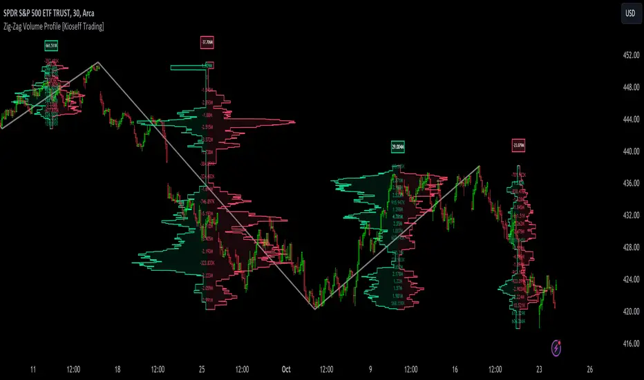
Zig-Zag Volume Profile (Bull vs. Bear) [Kioseff Trading]Hello!
Thank you @Pinecoders and @TradingView for putting polylines in production and making this viable!!
This script "Zig Zag Volume Profile" implements the polyline feature for Pine Script!
Features
Volume Profile anchored to zig zag trends
Bull vs Bear profiles!
Delta x price level
Standard POC and value area lines, in addition to separated POCs and value area lines for bull profiles and bear profiles
Up to 9999 profile rows per zigzag trend
Stylistic options for profiles
Configurable zig zag - profiles generated for small to large trends
Polylines!
This script generates Bull vs. Bear volume profiles for zig zag trends!
The zigzag indicator is configurable as normal; minor and major trend volume profiles are calculable. This indicator can be thought of as "Volume Profile/Delta for Trends''.
Up to 9999 volume profile levels (price levels) can be calculated for each profile, thanks to the new polyline feature, allowing for less aggregation / more precision of volume at price and volume delta.
Zig Zag Bull Vs Bear Profiles
The image above shows primary functionality!
Green profiles = buying volume
Red profiles = selling volume
Profiles are generated for each trend identified by the zigzag indicator.
The image above shows the indicator calculating volume delta for specific price blocks on the profile. Aggregate volume delta for the identified trend is displayed over the profile!
The image above shows Bull Profile POC lines and value area lines. Bear Profile POC lines and value area lines are also shown!
All colors and transparencies are configurable to the user's liking :D
Additionally, you can select to have the profiles drawn on contrasting sides. Bull Profile on left and Bear Profile on right.
For a more traditional look - you can select to draw the Bull & Bear profiles on the same x-point.
The indicator is robust enough to calculate on "long zig zags" and "short zig zags"; curved profiles can also be used!
The image above exemplifies usage of the indicator!
Bull & Bear volume profiles are calculated for trends on the 30-second timeframe.
The image above shows a more "utilitarian" presentation of the profiles. Once more, line and linefill colors/transparencies are all customizable; the indicator can look however you would like it to!
The image above shows key levels, the Bull vs. Bear profile, and volume delta for the current trend!
That's about it :D
This indicator is part of a series titled "Bull vs. Bear" - a suite of profile-like indicators I will be releasing over coming days. Thanks for checking this out!
Of course, a big thank you to @RicardoSantos for his MathOperator library that I use in every script.
If you have any suggestions please feel free to share!
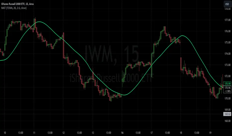
Moving Average TransformThe MAT is essentially a different kind of smoothed moving average. It is made to filter out data sets that deviate from the specified absolute threshold and the result becomes a smoothing function. The goal here, inspired by time series analysis within mathematical study, is to eliminate data anomalies and generate a more accurate trendline.
Functionality:
This script calculates a filtered average by:
Determining the mean of the entire data series.
Initializing sum and count variables.
Iterating through the data to filter values that deviate from the mean beyond the threshold.
Calculating a filtered mean based on the filtered data.
The filtered mean is then passed through a moving average function, where various types of moving averages like SMA, EMA, DEMA, TEMA, and ALMA can be applied. Some popular averages such as the HMA were omitted due to their heavy dependency on weighing specific data points.
Some information from "Time Series Analysis" regarding deviations
Definition of Anomaly: An anomaly or outlier is a data point that differs significantly from other observations in the dataset. It can be caused by various reasons such as measurement errors, data entry errors, or genuine extreme observations.
Impact on Mean: The mean (or average) of a dataset is calculated by summing all the values and dividing by the number of values. Since the mean is sensitive to extreme values, even a single outlier can significantly skew the mean.
Example: Consider a simple time series dataset: . The value "150" is an anomaly in this context. If we calculate the mean with this outlier, it is (10 + 12 + 11 + 9 + 150) / 5 = 38.4. However, if we exclude the outlier, the mean becomes (10 + 12 + 11 + 9) / 4 = 10.5. The presence of the outlier has substantially increased the mean.
Accuracy and Representativeness: While the mean calculated without outliers might be more "accurate" in the sense of being more representative of the central tendency of the bulk of the data, it's essential to note that anomalies might convey important information about the system being studied. Blindly removing or ignoring them might lead to overlooking significant events or phenomena.
Approaches to Handle Anomalies?
Detection and Removal
Robust Statistics
Transformation
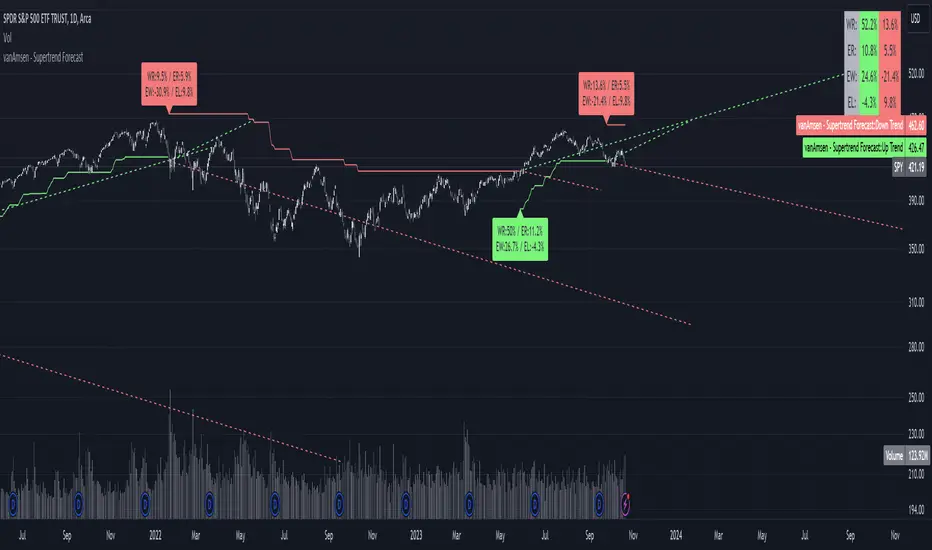
Supertrend Forecast - vanAmsenHello everyone!
I am thrilled to present the "vanAmsen - Supertrend Forecast", an advanced tool that marries the simplicity of the Supertrend with comprehensive statistical insights.
Before we dive into the functionalities of this indicator, it's essential to understand its foundation and theory.
The Theory:
What exactly is the Supertrend?
The Supertrend, at its core, is a momentum oscillator. It's a tool that provides buy and sell signals based on the prevailing market trend. The underlying principle is straightforward: by analyzing average price data and volatility over a period, the Supertrend gives us a line that represents the trend direction.
However, trading isn't just about identifying trends; it's about understanding their strength, potential profitability, and historical accuracy. This is where statistics come into play. By incorporating statistical analysis into the Supertrend, we can gain deeper insights into the market's behavior.
Description:
The "vanAmsen - Supertrend Forecast" isn't just another Supertrend indicator. It's a comprehensive tool designed to offer traders a holistic view of market trends, backed by robust statistical analysis.
Key Features:
- Supertrend Line: A visual representation of the current market direction.
- Win Rate & Expected Return: Delve into the historical accuracy and profitability of the prevailing trend.
- Average Percentage Change: Understand the average price fluctuation for both winning and losing trends.
- Forecast Lines: Project future price movements based on historical data, providing a roadmap for potential scenarios.
- Interactive Table: A concise table in the top right, offering a snapshot of all vital metrics at a glance.
Usage:
- The bullish Supertrend line adopts an Aqua hue, indicating potential upward momentum.
- In contrast, the bearish line is painted in Orange, suggesting potential downtrends.
- Customize your chart by toggling labels, tables, and lines according to preference.
Recommendation:
The "vanAmsen - Supertrend Forecast" is undoubtedly a powerful tool in a trader's arsenal. However, it's imperative to combine it with other technical analysis tools and sound risk management practices. It's always prudent to backtest strategies with historical data before embarking on live trading.
syminfo tableThis is nothing special, and it is not an indicator for investments.
I build this for my programming layout, so I can see all the output of the syminfo command.
Simply put...
It shows the commands on the left side,
and related outputs are on the right side.

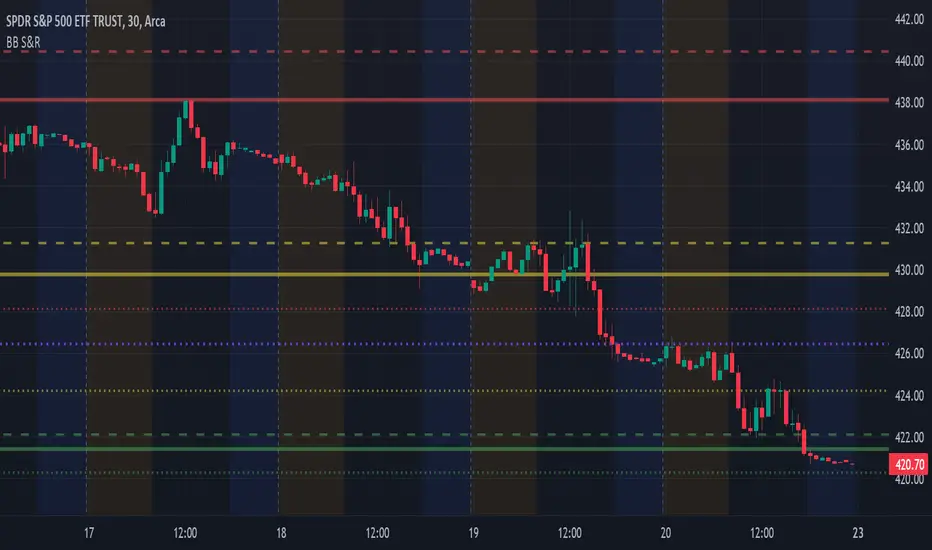
BB Support & ResistanceChoosing support and resistance can be time consuming and subjective. Personally, I don't want to spend too much time manually marking up charts. Credit to video I saw, forget the producer, that demonstrated how multi-time frame Bollinger Bands can act as support and resistance. I suggest reading up on Bollinger Bands (en.wikipedia.org) and how to trade them. This indicator draws support and resistance lines based on Bollinger Bands on three time frames. You can select 1 or all three time frames to display on your chart. Enjoy.
Drawdown Dynamics IndicatorDescription :
The Drawdown Dynamics Indicator is a straightforward tool that offers insights into three critical aspects of an asset’s financial performance: Total Max Drawdown, Rolling Period Max Drawdown, and Current Max Drawdown. Inside of the indicator, you can select to view either the rolling period max drawdown or the all-time max drawdown. This is represented by the gray line. The blue line represents the asset's current drawdown.
Rolling Period Max Drawdown is more about a snapshot view, highlighting the maximum loss from a peak to a trough for an adjustable rolling time frame. This is a feature not available with other indicators that exist on TradingView.
Total Max Drawdown gives a broad view, showcasing the all-time deepest decline in an asset’s value.
Current Max Drawdown offers a live update, focusing on the asset's present phase and how it's performing in real-time.
Practical Uses :
The utility of this indicator becomes evident when you start exploring the risks and performance metrics of assets. A notable use of this indicator is in comparing the drawdowns of a trading strategy against the inherent drawdowns of an asset. It helps in painting a clearer picture of risk and performance of both the asset and the strategy.
Risk Understanding : By comparing the strategy drawdown to the asset drawdown, traders get to understand if the risk they’re taking aligns with the asset’s natural risk behavior.
Evaluating Strategy’s Strength : If a strategy can weather the storms of the asset's natural drawdown phases and come out relatively unscathed, it can speak to its strength.
Performance Comparison : It also acts as a benchmark tool. Traders can pit different strategies against each other, using the asset’s drawdown as a baseline, to see which one manages risks better.
Disclaimer : This is not financial advice. Open-source scripts I publish in the community are largely meant to spark ideas that can be used as building blocks for part of a more robust trade management strategy. If you would like to implement a version of any script, I would recommend making significant additions/modifications to the strategy & risk management functions. If you don’t know how to program in Pine, then hire a Pine-coder. We can help!

Dynamic Sine Wave The Dynamic Sine Wave is designed to calculate a sine wave that reflects the oscillations between the highest high and lowest low points over a specified period, providing traders with a unique perspective on market trends.
Why a Sine Wave is Relevant:
A sine wave is relevant in this context because it is a mathematical function that represents periodic oscillations, making it suitable for capturing the cyclic nature of price movements in financial markets.
By using a sine wave, this indicator highlights the repetitive patterns of price highs and lows over a specified period, which can assist traders in identifying potential trend reversals or continuations.
The sine wave's amplitude and frequency are adjusted based on the highest high and lowest low points, ensuring that it adapts to market volatility and provides a dynamic representation of price action.
Overall, the "Dynamic Sine Wave" indicator offers a unique perspective on market dynamics, helping traders make informed decisions by visualizing the ebb and flow of prices.

Multiperiod Volume Pressure Indicator
Description:
The Volume Pressure Indicator is a powerful tool designed to assess market sentiment based on a combination of price and volume data. By analyzing buy and sell pressure within specific lookback periods, this indicator provides valuable insights into the intensity of market buying and selling activities. Traders can use this information to make informed decisions, especially during periods of price consolidation or trend reversal.
Key Features:
- **Multi-Period Analysis:** Utilizes multiple lookback periods (1, 2, and 4) to calculate buy and sell pressures, offering a nuanced view of market dynamics over different timeframes.
- **Pressure Calculation:** Computes buy and sell pressures based on price range and closing values, providing a comprehensive understanding of market participant behavior.
- **Color-Coded Bars:** Visualizes market sentiment by coloring bars according to the number of positive (buy pressure > sell pressure) periods observed within the specified lookback periods.
How to Use:
- **Color Coding:** Green bars represent periods where buy pressure dominates, indicating potential buying interest. Yellow bars suggest a balance between buy and sell pressures. Red bars signal periods dominated by sell pressure, indicating potential selling interest.
- **Lookback Periods:** Shorter lookback periods (e.g., 1) offer insights into immediate market sentiment, while longer periods (e.g., 4) provide a broader perspective. Analyzing multiple periods can help traders confirm trends and anticipate reversals.
Customization:
- **Lookback Periods:** Adjust the length of the lookback periods (1, 2, and 4) to match your trading style and timeframe preferences.
Disclaimer:
Trading involves risk, and past performance is not indicative of future results. Always conduct thorough analysis and apply proper risk management techniques before making trading decisions.
Usage Scenarios:
- **Trend Confirmation:** Use the indicator to confirm the strength of an ongoing trend. Consistent green bars can validate a bullish trend, while red bars may confirm a bearish trend.
- **Reversal Signals:** Look for transitions in bar colors to identify potential trend reversals. A shift from green to yellow/red or vice versa can indicate changing market sentiment.
- **Divergence Analysis:** Compare price movements with the indicator's bar colors. Divergence between price trends and bar colors may signal upcoming price movements.

DMI Based Overbought/Oversold SignalsDescription:
The Directional Movement Index (DMI) with Bollinger Bands and Moving Averages is a comprehensive technical analysis tool designed to assist traders in identifying potential market trends and reversal points. This indicator combines the power of DMI, Bollinger Bands, and Moving Averages to offer insights into market strength, volatility, and potential entry/exit points.
Key Features:
- **DMI Analysis:** Utilizes the DMI to evaluate the strength of bullish and bearish trends, aiding in trend identification and momentum assessment.
- **Bollinger Bands:** Implements Bollinger Bands on both +DI and -DI, enabling traders to gauge price volatility and potential overbought/oversold conditions.
- **Moving Averages Confirmation:** Utilizes Moving Averages for both +DI and -DI, confirming trend signals and providing additional context for trade decisions.
- **Color-Coded Signals:** Displays red boxes for potential bearish signals and green boxes for potential bullish signals, enhancing visual clarity.
How to Use:
- **DMI Signals:** Red boxes indicate potential bearish signals, suggesting caution or potential short opportunities. Green boxes suggest potential bullish signals, indicating possible long opportunities.
- **Volatility Assessment:** Bollinger Bands expansion (price moving away from the center line) can indicate increased volatility, potentially signaling significant price movements.
- **Trend Confirmation:** Moving Averages confirm the strength of the trend. When +DI or -DI is above its respective upper Bollinger Band and the Moving Average is also above, the trend is considered strong.
Customization:
- **DI Length:** Adjust the length of the Directional Index (DI) to fine-tune the sensitivity of trend signals.
- **Bollinger Bands Length:** Modify the length of Bollinger Bands to control the indicator's responsiveness to price volatility.
- **Bollinger Bands Multiplier:** Adjust the multiplier to widen or narrow the Bollinger Bands, affecting the sensitivity of overbought/oversold signals.
- **Moving Average Length:** Define the length of Moving Averages for additional confirmation of trend signals.
Disclaimer:
Trading involves risk, and past performance is not indicative of future results. Always conduct thorough analysis and apply proper risk management techniques before making trading decisions.

DMI Based Consolidation InidcatorDescription:
The Consolidation Indicator (DMI + MA) combines the power of the Directional Movement Index (DMI) and Moving Averages (MA) to help traders identify both trends and consolidation phases in the market. This versatile indicator provides valuable insights into the market's behavior, making it an essential tool for traders seeking to optimize their strategies.
Key Features:
- **Directional Movement Analysis:** Utilizes the DMI to assess the strength of bullish and bearish trends, helping traders identify trend direction and momentum.
- **Moving Average Confirmation:** Integrates Moving Averages to confirm trend signals, enhancing the reliability of trend identification.
- **Trend and Consolidation Recognition:** Displays +DI and -DI trends with color-coded boxes, allowing traders to distinguish between bullish, bearish trends, and consolidation phases.
How to Use:
- **Trend Identification:** +DI Trend box (green) indicates a bullish trend, suggesting potential buying opportunities. -DI Trend box (red) signifies a bearish trend, indicating potential selling opportunities.
- **Consolidation Phase:** When both boxes are white, the market is in a consolidation phase. During consolidation, prices often move within a range. Traders may consider range-bound strategies or wait for a clear trend signal.
Customization:
- **ADX Smoothing:** Adjust the ADX smoothing factor (lensig) to fine-tune the sensitivity of trend signals.
- **DI Length:** Set the length of the Directional Index (DI) to control the responsiveness of the indicator to price changes.
- **Moving Average Length:** Define the length of the Moving Averages for additional confirmation of trend signals.
- **Moving Average Type:** Choose from SMA, EMA, WMA, or VWMA to customize the Moving Averages based on your trading preferences.
Disclaimer:
Trading involves risk, and past performance is not indicative of future results. Always perform your analysis and consider risk management strategies before making trading decisions.

Support Resistance with Touch HighlightDescription:
Support Resistance with Touch Highlight is a powerful technical analysis tool designed to help traders identify key support and resistance levels in the market. Unlike traditional support and resistance indicators, this indicator utilizes a unique approach by considering multiple periods simultaneously, enhancing its accuracy and reliability.
Key Features:
- **Multi-Period Analysis:** The indicator analyzes multiple user-defined periods, allowing for a comprehensive view of support and resistance levels.
- **Average Calculation:** It calculates the average of the highest and lowest prices within the specified periods, providing a balanced representation of support and resistance zones.
- **Dynamic Highlighting:** Bars touching the support or resistance lines are highlighted, aiding traders in spotting potential reversal points.
- **Alert System:** Set custom alerts to be notified when the price touches the support or resistance lines, enabling timely decision-making.
Why It's Superior:
1. **Accuracy Through Multiple Periods:** By considering multiple periods, the indicator provides a more accurate depiction of support and resistance levels, minimizing false signals.
2. **Dynamic Highlighting:** The indicator dynamically highlights relevant bars, making it easy for traders to identify significant price interactions with support and resistance zones.
3. **Customizable Alerts:** Tailor alerts to your trading strategy, ensuring you never miss crucial market movements.
How to Use:
- **Support Zones:** Prices often bounce off the support line. Look for buying opportunities when the price touches or approaches the green support line.
- **Resistance Zones:** Prices tend to reverse near the resistance line. Consider selling or tightening stops when the price touches or nears the red resistance line.
Disclaimer:
Trading involves risk, and past performance is not indicative of future results. Always perform your analysis and consider risk management strategies before making trading decisions.

Breakout mode patterns [yohtza]This indicator detects three kinds of price action patterns:
ii - consecutive inside bars ( high and low inside of the previous bar), triangle on a lower timeframe
oo - consecutive outside bars ( high above the high of the previous bar and the low below the low of the previous bar), expanding triangle on a lower timeframe
ioi - inside outside inside, diamond pattern on a lower timeframe
Traders that trade these patterns are entering on breakouts above/below .When they appear in a trending market, they are good setups for both continuation and reversal swing trades. When they appear in ranging market, they are not nearly as powerful since most breakouts fail in this context. To achieve the highest probability, it is best to trade in the direction of the trend on the last bar in the pattern with a stop loss on the other side and going for a reward that is at least twice the risk.

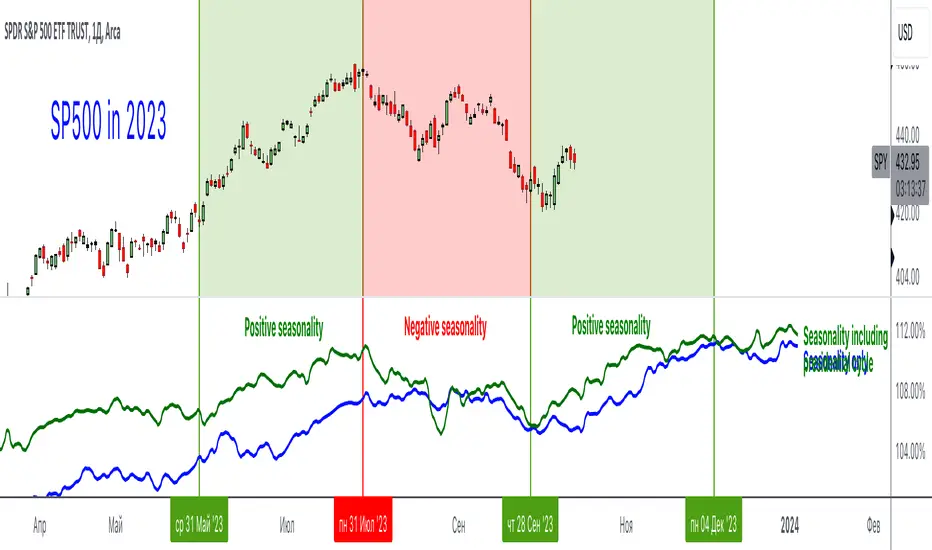
Seasonality and Presidential cycleAn incredibly useful indicator that shows seasonality and presidential cycles by indices, stocks and industries. Just type in a ticker and trade according to seasonal patterns
Blue line - seasonality excluding presidential cycles
Green line - seasonality taking into account presidential cycles
*Seasonal patterns over the last 10 years
This indicator uses the request.seed() function.
Requests data from a GitHub repository maintained by our team and returns it as a series.
Pine Seeds is a service to import custom data and access it via TradingView.
Use TradingView as frontend and use a GitHub repository as backend.
github.com
...
Rus: Невероятно полезный индикатор, который показывает сезонность и президентские циклы по индексам, акциям и отраслям. Просто вбейте тикер и торгуйте согласно сезонным паттернам
Синяя линия - сезонность без учета президентских циклов
Зеленая линия - сезонность с учетом президентских циклов
*Сезонные паттерны за последние 10 лет
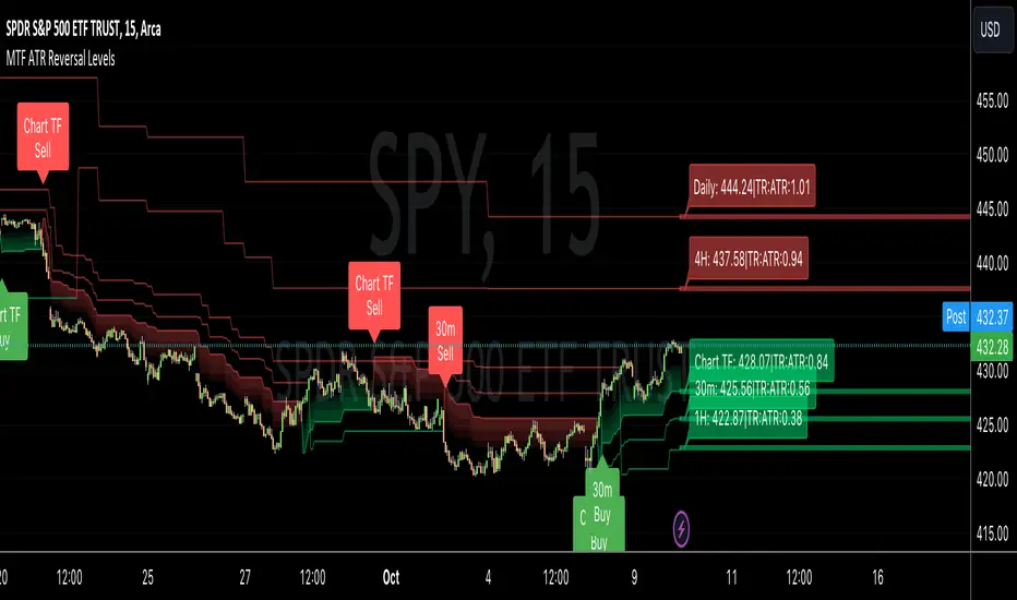
MTF ATR Reversal Levels (Open Source)
This is an open source version of the original I posted a couple of years ago.... Multitple TimeFrame Swingarm system borrowing from the Blackflag FTS indicator.
This throws up 5 resolutions of ATR thresholds, only showing the current bar level using a horizontal line across the full chart. I don't like the historical information charted, just need to know the current level for my trading purposes.
It will also give Sell/Buy alerts when the closing price exceeds one of those thresholds... essentially confirmation of a trend reversal.
On the primary resolution (defaulted to the current timeframe of the chart) it can show the fibonacci reversal levels using the ATR levels for that time resolution. This is if for the current trend.
I find it useful, so I thought I would share. Like all indicators, it'll work as long as you stick with a system, and let it work. :)