Chart-prepFxxDanny Chart-Prep
A practical multi-tool script for clean and structured chart preparation.
✨ Features
Weekly Close Levels
Automatically plots the previous week’s close and the week before that, with clear styling to distinguish current and past levels.
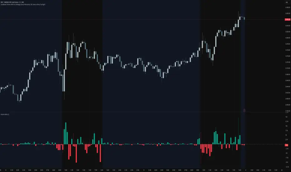
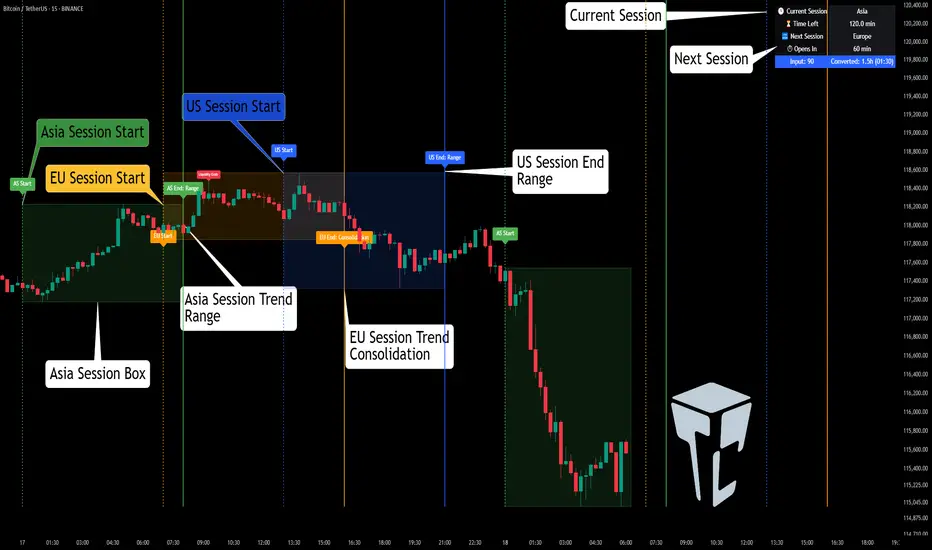
Trading Sessions
Colored session boxes for the three key market sessions:
Asia (20:00–23:00 UTC-4)
Europe (02:00–05:00 UTC-4)
New York (08:00–11:00 UTC-4)
Each session box automatically adapts to the session’s high/low range and only keeps the last 5 visible to avoid clutter.
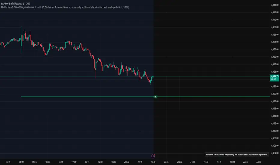
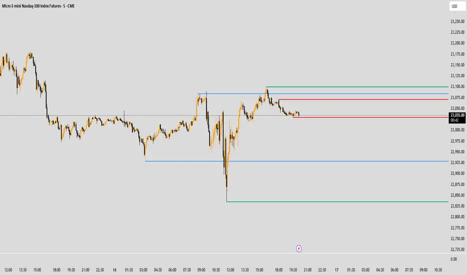
Previous Day’s High & Low
Plots the prior day’s high and low with lines that extend into the current session. Up to 10 days are kept on the chart.
Daily & Weekly Separators
Vertical lines to visually separate days (dotted) and weeks (solid, colored).
Anchored to a rolling price window so the Y-axis scaling stays clean and unaffected.
✅ Benefits
Stay focused with key price levels and session ranges marked automatically.
No need for manual drawing or constant adjustments.
Optimized performance – old objects are automatically removed.
No axis distortion from “infinite” lines or boxes.
อินดิเคเตอร์ Pine Script®