Stockbee ComboBearCustom indicator for identifying stocks that meet the Stockbee's ComboBear criteria. This can be used as a standalone indicator or use it to screen for stocks in Pine Screener.
ค้นหาในสคริปต์สำหรับ "screener"

ComboBearCustom indicator for identifying stocks that meet the Stockbee's ComboBear criteria. This can be used as a standalone indicator or use it to screen for stocks in Pine Screener.
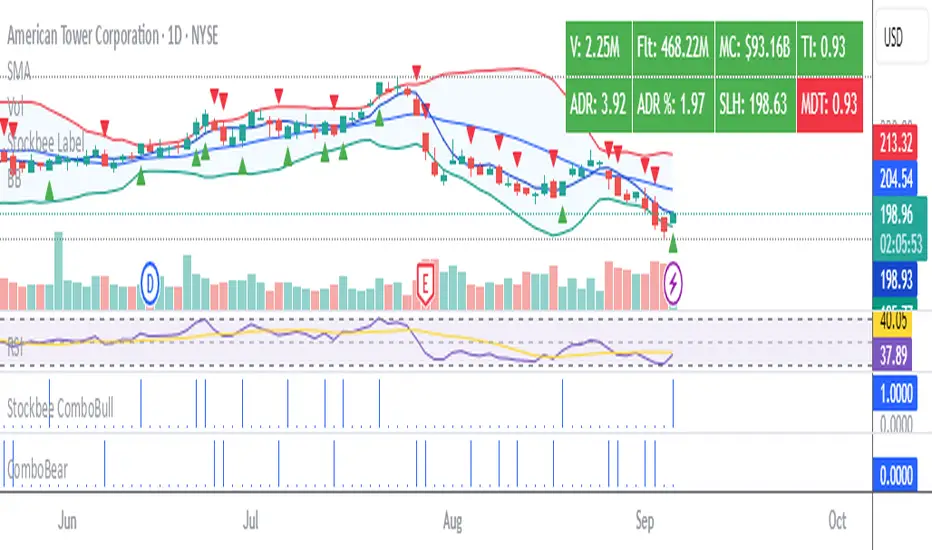
Stockbee ComboBullCustom indicator for identifying stocks that meet the ComboBull criteria. This can be used as a standalone indicator or use it to screen for stocks in Pine Screener.

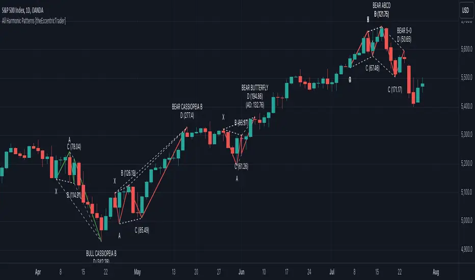
All Harmonic Patterns [theEccentricTrader]█ OVERVIEW
This indicator automatically draws and sends alerts for all of the harmonic patterns in my public library as they occur. The patterns included are as follows:
• Bearish 5-0
• Bullish 5-0
• Bearish ABCD
• Bullish ABCD
• Bearish Alternate Bat
• Bullish Alternate Bat
• Bearish Bat
• Bullish Bat
• Bearish Butterfly
• Bullish Butterfly
• Bearish Cassiopeia A
• Bullish Cassiopeia A
• Bearish Cassiopeia B
• Bullish Cassiopeia B
• Bearish Cassiopeia C
• Bullish Cassiopeia C
• Bearish Crab
• Bullish Crab
• Bearish Deep Crab
• Bullish Deep Crab
• Bearish Cypher
• Bullish Cypher
• Bearish Gartley
• Bullish Gartley
• Bearish Shark
• Bullish Shark
• Bearish Three-Drive
• Bullish Three-Drive
█ CONCEPTS
Green and Red Candles
• A green candle is one that closes with a close price equal to or above the price it opened.
• A red candle is one that closes with a close price that is lower than the price it opened.
Swing Highs and Swing Lows
• A swing high is a green candle or series of consecutive green candles followed by a single red candle to complete the swing and form the peak.
• A swing low is a red candle or series of consecutive red candles followed by a single green candle to complete the swing and form the trough.
Peak and Trough Prices
• The peak price of a complete swing high is the high price of either the red candle that completes the swing high or the high price of the preceding green candle, depending on which is higher.
• The trough price of a complete swing low is the low price of either the green candle that completes the swing low or the low price of the preceding red candle, depending on which is lower.
Historic Peaks and Troughs
The current, or most recent, peak and trough occurrences are referred to as occurrence zero. Previous peak and trough occurrences are referred to as historic and ordered numerically from right to left, with the most recent historic peak and trough occurrences being occurrence one.
Upper Trends
• A return line uptrend is formed when the current peak price is higher than the preceding peak price.
• A downtrend is formed when the current peak price is lower than the preceding peak price.
• A double-top is formed when the current peak price is equal to the preceding peak price.
Lower Trends
• An uptrend is formed when the current trough price is higher than the preceding trough price.
• A return line downtrend is formed when the current trough price is lower than the preceding trough price.
• A double-bottom is formed when the current trough price is equal to the preceding trough price.
Range
The range is simply the difference between the current peak and current trough prices, generally expressed in terms of points or pips.
Wave Cycles
A wave cycle is here defined as a complete two-part move between a swing high and a swing low, or a swing low and a swing high. The first swing high or swing low will set the course for the sequence of wave cycles that follow; for example a chart that begins with a swing low will form its first complete wave cycle upon the formation of the first complete swing high and vice versa.
Figure 1.
Retracement and Extension Ratios
Retracement and extension ratios are calculated by dividing the current range by the preceding range and multiplying the answer by 100. Retracement ratios are those that are equal to or below 100% of the preceding range and extension ratios are those that are above 100% of the preceding range.
Fibonacci Retracement and Extension Ratios
The Fibonacci sequence is a series of numbers in which each number is the sum of the two preceding numbers, starting with 0 and 1. For example 0 + 1 = 1, 1 + 1 = 2, 1 + 2 = 3, and so on. Ultimately, we could go on forever but the first few numbers in the sequence are as follows: 0 , 1, 1, 2, 3, 5, 8, 13, 21, 34, 55, 89, 144.
The extension ratios are calculated by dividing each number in the sequence by the number preceding it. For example 0/1 = 0, 1/1 = 1, 2/1 = 2, 3/2 = 1.5, 5/3 = 1.6666..., 8/5 = 1.6, 13/8 = 1.625, 21/13 = 1.6153..., 34/21 = 1.6190..., 55/34 = 1.6176..., 89/55 = 1.6181..., 144/89 = 1.6179..., and so on. The retracement ratios are calculated by inverting this process and dividing each number in the sequence by the number proceeding it. For example 0/1 = 0, 1/1 = 1, 1/2 = 0.5, 2/3 = 0.666..., 3/5 = 0.6, 5/8 = 0.625, 8/13 = 0.6153..., 13/21 = 0.6190..., 21/34 = 0.6176..., 34/55 = 0.6181..., 55/89 = 0.6179..., 89/144 = 0.6180..., and so on.
Fibonacci ranges are typically drawn from left to right, with retracement levels representing ratios inside of the current range and extension levels representing ratios extended outside of the current range. If the current wave cycle ends on a swing low, the Fibonacci range is drawn from peak to trough. If the current wave cycle ends on a swing high the Fibonacci range is drawn from trough to peak.
Measurement Tolerances
Tolerance refers to the allowable variation or deviation from a specific value or dimension. It is the range within which a particular measurement is considered to be acceptable or accurate. I have applied this concept in my pattern detection logic and have set default tolerances where applicable, as perfect patterns are, needless to say, very rare.
Chart Patterns
Generally speaking price charts are nothing more than a series of swing highs and swing lows. When demand outweighs supply over a period of time prices swing higher and when supply outweighs demand over a period of time prices swing lower. These swing highs and swing lows can form patterns that offer insight into the prevailing supply and demand dynamics at play at the relevant moment in time.
‘Let us assume… that you the reader, are not a member of that mysterious inner circle known to the boardrooms as “the insiders”… But it is fairly certain that there are not nearly so many “insiders” as amateur trader supposes and… It is even more certain that insiders can be wrong… Any success they have, however, can be accomplished only by buying and selling… hey can do neither without altering the delicate poise of supply and demand that governs prices. Whatever they do is sooner or later reflected on the charts where you… can detect it. Or detect, at least, the way in which the supply-demand equation is being affected… So, you do not need to be an insider to ride with them frequently… prices move in trends. Some of those trends are straight, some are curved; some are brief and some are long and continued… produced in a series of action and reaction waves of great uniformity. Sooner or later, these trends change direction; they may reverse (as from up to down), or they may be interrupted by some sort of sideways movement and then, after a time, proceed again in their former direction… when a price trend is in the process of reversal… a characteristic area or pattern takes shape on the chart, which becomes recognisable as a reversal formation… Needless to say, the first and most important task of the technical chart analyst is to learn to know the important reversal formations and to judge what they may signify in terms of trading opportunities’ (Edwards & Magee, 1948).
This is as true today as it was when Edwards and Magee were writing in the first half of the last Century, study your patterns and make judgements for yourself about what their implications truly are on the markets and timeframes you are interested in trading.
Over the years, traders have come to discover a multitude of chart and candlestick patterns that are supposed to pertain information on future price movements. However, it is never so clear cut in practice and patterns that where once considered to be reversal patterns are now considered to be continuation patterns and vice versa. Bullish patterns can have bearish implications and bearish patterns can have bullish implications. As such, I would highly encourage you to do your own backtesting.
There is no denying that chart patterns exist, but their implications will vary from market to market and timeframe to timeframe. So it is down to you as an individual to study them and make decisions about how they may be used in a strategic sense.
Harmonic Patterns
The concept of harmonic patterns in trading was first introduced by H.M. Gartley in his book "Profits in the Stock Market", published in 1935. Gartley observed that markets have a tendency to move in repetitive patterns, and he identified several specific patterns that he believed could be used to predict future price movements. The bullish and bearish Gartley patterns are the oldest recognized harmonic patterns in trading and all the other harmonic patterns are modifications of the original Gartley patterns. Gartley patterns are fundamentally composed of 5 points, or 4 waves.
Since then, many other traders and analysts have built upon Gartley's work and developed their own variations of harmonic patterns. One such contributor is Larry Pesavento, who developed his own methods for measuring harmonic patterns using Fibonacci ratios. Pesavento has written several books on the subject of harmonic patterns and Fibonacci ratios in trading. Another notable contributor to harmonic patterns is Scott Carney, who developed his own approach to harmonic trading in the late 1990s and also popularised the use of Fibonacci ratios to measure harmonic patterns. Carney expanded on Gartley's work and also introduced several new harmonic patterns, such as the Shark pattern and the 5-0 pattern.
█ INPUTS
• Change pattern and label colours
• Show or hide patterns individually
• Adjust pattern tolerances
• Set or remove alerts for individual patterns
█ NOTES
You can test the patterns with your own strategies manually by applying the indicator to your chart while in bar replay mode and playing through the history. You could also automate this process with PineScript by using the conditions from my swing and pattern libraries as entry conditions in the strategy tester or your own custom made strategy screener.
█ LIMITATIONS
All green and red candle calculations are based on differences between open and close prices, as such I have made no attempt to account for green candles that gap lower and close below the close price of the preceding candle, or red candles that gap higher and close above the close price of the preceding candle. This may cause some unexpected behaviour on some markets and timeframes. I can only recommend using 24-hour markets, if and where possible, as there are far fewer gaps and, generally, more data to work with.
█ SOURCES
Edwards, R., & Magee, J. (1948) Technical Analysis of Stock Trends (10th edn). Reprint, Boca Raton, Florida: Taylor and Francis Group, CRC Press: 2013.
All Chart Patterns [theEccentricTrader]█ OVERVIEW
This indicator automatically draws and sends alerts for all of the chart patterns in my public library as they occur. The patterns included are as follows:
• Ascending Broadening
• Broadening
• Descending Broadening
• Double Bottom
• Double Top
• Triple Bottom
• Triple Top
• Bearish Elliot Wave
• Bullish Elliot Wave
• Bearish Alternate Flag
• Bullish Alternate Flag
• Bearish Flag
• Bullish Flag
• Bearish Ascending Head and Shoulders
• Bullish Ascending Head and Shoulders
• Bearish Descending Head and Shoulders
• Bullish Descending Head and Shoulders
• Bearish Head and Shoulders
• Bullish Head and Shoulders
• Bearish Pennant
• Bullish Pennant
• Ascending Wedge
• Descending Wedge
• Wedge
█ CONCEPTS
Green and Red Candles
• A green candle is one that closes with a close price equal to or above the price it opened.
• A red candle is one that closes with a close price that is lower than the price it opened.
Swing Highs and Swing Lows
• A swing high is a green candle or series of consecutive green candles followed by a single red candle to complete the swing and form the peak.
• A swing low is a red candle or series of consecutive red candles followed by a single green candle to complete the swing and form the trough.
Peak and Trough Prices
• The peak price of a complete swing high is the high price of either the red candle that completes the swing high or the high price of the preceding green candle, depending on which is higher.
• The trough price of a complete swing low is the low price of either the green candle that completes the swing low or the low price of the preceding red candle, depending on which is lower.
Historic Peaks and Troughs
The current, or most recent, peak and trough occurrences are referred to as occurrence zero. Previous peak and trough occurrences are referred to as historic and ordered numerically from right to left, with the most recent historic peak and trough occurrences being occurrence one.
Upper Trends
• A return line uptrend is formed when the current peak price is higher than the preceding peak price.
• A downtrend is formed when the current peak price is lower than the preceding peak price.
• A double-top is formed when the current peak price is equal to the preceding peak price.
Lower Trends
• An uptrend is formed when the current trough price is higher than the preceding trough price.
• A return line downtrend is formed when the current trough price is lower than the preceding trough price.
• A double-bottom is formed when the current trough price is equal to the preceding trough price.
Range
The range is simply the difference between the current peak and current trough prices, generally expressed in terms of points or pips.
Retracement and Extension Ratios
Retracement and extension ratios are calculated by dividing the current range by the preceding range and multiplying the answer by 100. Retracement ratios are those that are equal to or below 100% of the preceding range and extension ratios are those that are above 100% of the preceding range.
Measurement Tolerances
Tolerance refers to the allowable variation or deviation from a specific value or dimension. It is the range within which a particular measurement is considered to be acceptable or accurate. I have applied this concept in my pattern detection logic and have set default tolerances where applicable, as perfect patterns are, needless to say, very rare.
Chart Patterns
Generally speaking price charts are nothing more than a series of swing highs and swing lows. When demand outweighs supply over a period of time prices swing higher and when supply outweighs demand over a period of time prices swing lower. These swing highs and swing lows can form patterns that offer insight into the prevailing supply and demand dynamics at play at the relevant moment in time.
‘Let us assume… that you the reader, are not a member of that mysterious inner circle known to the boardrooms as “the insiders”… But it is fairly certain that there are not nearly so many “insiders” as amateur trader supposes and… It is even more certain that insiders can be wrong… Any success they have, however, can be accomplished only by buying and selling… hey can do neither without altering the delicate poise of supply and demand that governs prices. Whatever they do is sooner or later reflected on the charts where you… can detect it. Or detect, at least, the way in which the supply-demand equation is being affected… So, you do not need to be an insider to ride with them frequently… prices move in trends. Some of those trends are straight, some are curved; some are brief and some are long and continued… produced in a series of action and reaction waves of great uniformity. Sooner or later, these trends change direction; they may reverse (as from up to down), or they may be interrupted by some sort of sideways movement and then, after a time, proceed again in their former direction… when a price trend is in the process of reversal… a characteristic area or pattern takes shape on the chart, which becomes recognisable as a reversal formation… Needless to say, the first and most important task of the technical chart analyst is to learn to know the important reversal formations and to judge what they may signify in terms of trading opportunities’ (Edwards & Magee, 1948).
This is as true today as it was when Edwards and Magee were writing in the first half of the last Century, study your patterns and make judgements for yourself about what their implications truly are on the markets and timeframes you are interested in trading.
Over the years, traders have come to discover a multitude of chart and candlestick patterns that are supposed to pertain information on future price movements. However, it is never so clear cut in practice and patterns that where once considered to be reversal patterns are now considered to be continuation patterns and vice versa. Bullish patterns can have bearish implications and bearish patterns can have bullish implications. As such, I would highly encourage you to do your own backtesting.
There is no denying that chart patterns exist, but their implications will vary from market to market and timeframe to timeframe. So it is down to you as an individual to study them and make decisions about how they may be used in a strategic sense.
█ INPUTS
• Change pattern and label colours
• Show or hide patterns individually
• Adjust pattern ratios and tolerances
• Set or remove alerts for individual patterns
█ NOTES
I have decided to rename some of my previously published patterns based on the way in which the pattern completes. If the pattern completes on a swing high then the pattern is considered bearish, if the pattern completes on a swing low then it is considered bullish. This may seem confusing but it makes sense when you come to backtesting the patterns and want to use the most recent peak or trough prices as stop losses. Patterns that can complete on both a swing high and swing low are for such reasons treated as neutral, namely all broadening and wedge variations. I trust that it is quite self-evident that double and triple bottom patterns are considered bullish while double and triple top patterns are considered bearish, so I did not feel the need to rename those.
The patterns that have been renamed and what they have been renamed to, are as follows:
• Ascending Elliot Waves to Bearish Elliot Waves
• Descending Elliot Waves to Bullish Elliot Waves
• Ascending Head and Shoulders to Bearish Ascending Head and Shoulders
• Descending Head and Shoulders to Bearish Descending Head and Shoulders
• Head and Shoulders to Bearish Head and Shoulders
• Ascending Inverse Head and Shoulders to Bullish Ascending Head and Shoulders
• Descending Inverse Head and Shoulders to Bullish Descending Head and Shoulders
• Inverse Head and Shoulders to Bullish Head and Shoulders
You can test the patterns with your own strategies manually by applying the indicator to your chart while in bar replay mode and playing through the history. You could also automate this process with PineScript by using the conditions from my swing and pattern libraries as entry conditions in the strategy tester or your own custom made strategy screener.
█ LIMITATIONS
All green and red candle calculations are based on differences between open and close prices, as such I have made no attempt to account for green candles that gap lower and close below the close price of the preceding candle, or red candles that gap higher and close above the close price of the preceding candle. This may cause some unexpected behaviour on some markets and timeframes. I can only recommend using 24-hour markets, if and where possible, as there are far fewer gaps and, generally, more data to work with.
█ SOURCES
Edwards, R., & Magee, J. (1948) Technical Analysis of Stock Trends (10th edn). Reprint, Boca Raton, Florida: Taylor and Francis Group, CRC Press: 2013.
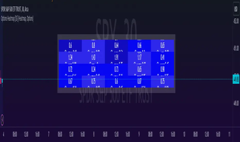
Options & Leveraged Shares Heatmap This is the leveraged share/option heatmap / screener.
Tradingview offers a few different tickers that have PTCR data on the daily timeframe. So I was able to pull those few tickers that display the PTCR data and format it into a heatmap.
I also had some room to add leveraged share data as well.
It is pretty self explanatory but I will go over it really briefly:
The timeframe is 1 D. This cannot be changed because this is the only timeframe available for the PTCR data.
It will pull the current day PTCR as well as the previous day PTCR and display the PTCR and change value.
The screening will be done according to the 1 day change.
You have the ability to select the option to sort by Max and Min or sort by heatmap:
Displaying max and min will show you the max positive and negative change among all the available tickers.
Max positive = bearish, as this indicates an uptick in Puts.
Max negative = bullish, as this indicates a decline in Puts.
If we flip over to the leveraged shares, it is the same:
To keep it consistent, the leveraged share ratio is displayed similar to PTCR. It is Sell to Buy ratio. The higher the ratio, the more selling and vice versa.
Thus, the same rules apply. Max positive = bearish and max negative = bullish.
If you want to display the heatmap, this is what it will look like:
The darker the blue, the higher the change in either a negative or positive direction. The same for the leveraged shares:
And that is the indicator.
Hopefully you find it helpful. I like to reference it at the end of each day to see how things are looking in terms of positioning for the following day.
Leave your comments/questions and suggestions below.
Safe trades!
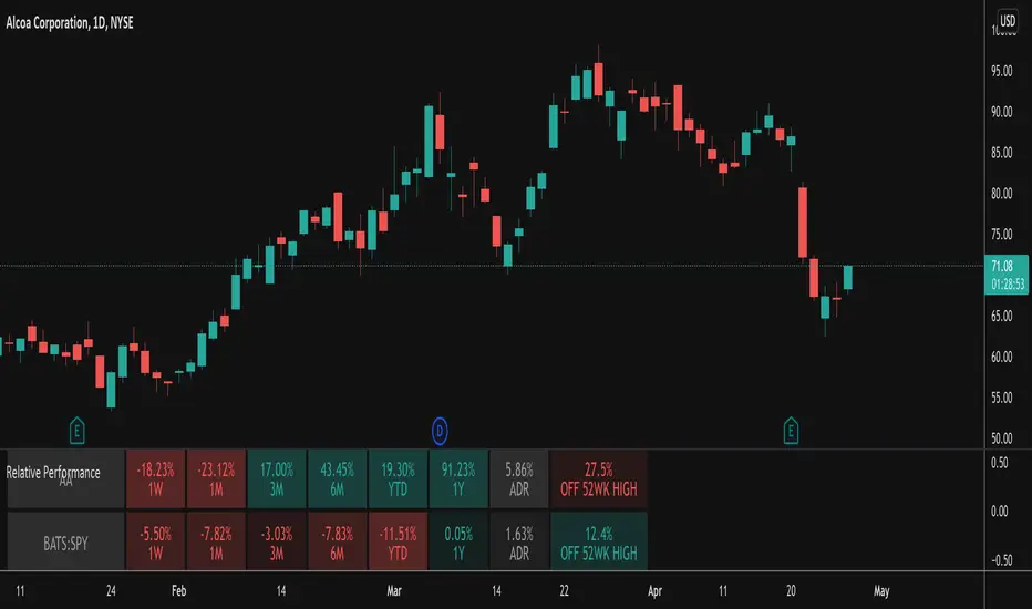
Relative PerformanceThis indicator takes the Performance Table from @BeeHolder and converts it to a Relative Performance table so you can compare the current chart vs. an Index (or whatever other ticker you want) to see the relative performance of one vs. the other. I also added a cell for ADR, which is also the same value as "Monthly Volatility" in the stock screener. This can be useful when screening stocks based on performance and volatility.
Technical Ratings on Multi-frames / Assets█ OVERVIEW
This indicator is a modified version of TECHNICAL RATING v1.0 available in the public library to provide a quick overview of consolidated technical ratings performed on 12 assets in 3 timeframes.The purpose of the indicator is to provide a quick overview of the current status of the custom 12 (24) assets and to help focus on the appropriate asset.
█ MODIFICATIONS
- Markers, visualizations and alerts have been deleted
- Due to the limitation on maximum number of security (40), the results of 12 assets evaluated in 3 different time frames can be shown at the same time.
- An additional 12 assets can be configured in the settings so that you do not have to choose each ticker one by one to facilitate a quick change, but can switch between the 12 -12 assets with a single click on "Second sets?".
- The position, colors and parameters of the table can be widely customized in the settings.
- The 12 assets can be arranged in rows 3, 4, 6 and 12 with Table Rows options, which can also be used to create a simple mobile view.
- The default gradient color setting has been changed to red/yellow/green traffic lights
ORIGINAL DESCRIPTION ABOUT TECHNICAL RATING v1.0
█ OVERVIEW
This indicator calculates TradingView's well-known "Strong Buy", "Buy", "Neutral", "Sell" or "Strong Sell" states using the aggregate biases of 26 different technical indicators.
█ WARNING
This version is similar, but not identical, to our recently published "Technical Ratings" built-in, which reproduces our "Technicals" ratings displayed as a gauge in the right panel of charts, or in the "Rating" indicator available in the TradingView Screener. This is a fork and refactoring of the code base used in the "Technical Ratings" built-in. Its calculations will not always match those of the built-in, but it provides options not available in the built-in. Up to you to decide which one you prefer to use.
█ FEATURES
Differences with the built-in version
• The built-in version produces values matching the states displayed in the "Technicals" ratings gauge; this one does not always.
• A strategy version is also available as a built-in; this script is an indicator—not a strategy.
• This indicator will show a slightly different vertical scale, as it does not use a fixed scale like the built-in.
• This version allows control over repainting of the signal when you do not use a higher timeframe. Higher timeframe (HTF) information from this version does not repaint.
• You can adjust the weight of the Oscillators and MAs components of the rating here.
• You can configure markers on signal breaches of configurable levels, or on advances declines of the signal.
The indicator's settings allow you to:
• Choose the timeframe you want calculations to be made on.
• When not using a HTF, you can select a repainting or non-repainting signal.
• When using both MAs and Oscillators groups to calculate the rating, you can vary the weight of each group in the calculation. The default is 50/50.
Because the MAs group uses longer periods for some of its components, its value is not as jumpy as the Oscillators value.
Increasing the weight of the MAs group will thus have a calming effect on the signal.
• Alerts can be created on the indicator using the conditions configured to control the display of markers.
Display
The calculated rating is displayed as columns, but you can change the style in the inputs. The color of the signal can be one of three colors: bull, bear, or neutral. You can choose from a few presets, or check one and edit its color. The color is determined from the rating's value. Between 0.1 and -0.1 it is in the neutral color. Above/below 0.1/-0.1 it will appear in the bull/bear color. The intensity of the bull/bear color is determined by cumulative advances/declines in the rating. It is capped to 5, so there are five intensities for each of the bull/bear colors.
The "Strong Buy", "Buy", "Neutral", "Sell" or "Strong Sell" state of the last calculated value is displayed to the right of the last bar for each of the three groups: All, MAs and Oscillators. The first value always reflects your selection in the "Rating uses" field and is the one used to display the signal. A "Strong Buy" or "Strong Sell" state appears when the signal is above/below the 0.5/-0.5 level. A "Buy" or "Sell" state appears when the signal is above/below the 0.1/-0.1 level. The "Neutral" state appears when the signal is between 0.1 and -0.1 inclusively.
Five levels are always displayed: 0.5 and 0.1 in the bull color, zero in the neutral color, and -0.1 and - 0.5 in the bull color.
█ CALCULATIONS
The indicator calculates the aggregate value of two groups of indicators: moving averages and oscillators.
The "MAs" group is comprised of 15 different components:
• Six Simple Moving Averages of periods 10, 20, 30, 50, 100 and 200
• Six Exponential Moving Averages of the same periods
• A Hull Moving Average of period 9
• A Volume-weighed Moving Average of period 20
• Ichimoku
The "Oscillators" group includes 11 components:
• RSI
• Stochastic
• CCI
• ADX
• Awesome Oscillator
• Momentum
• MACD
• Stochastic RSI
• Wiliams %R
• Bull Bear Power
• Ultimate Oscillator

ANTS MVP Indicator David Ryan's Institutional Accumulation🚀 ANTS MVP Indicator – David Ryan's Legendary Accumulation Signal
Discover stocks under heavy **institutional buying** before they explode — just like 3-time U.S. Investing Champion David Ryan used to crush the markets!
This is a faithful, open-source recreation of the famous **ANTS (Momentum-Volume-Price)** pattern popularized by David Ryan (protégé of William O'Neil / IBD / CAN SLIM fame). It scans for the classic 15-day "MVP" setup that often appears in early stages of massive winners.
Key Features:
• Colored "Ants" diamonds show signal strength:
- Gray: Momentum only (12+ up days in 15)
- Yellow: Momentum + Volume surge (≥20% avg volume increase)
- Blue: Momentum + Price gain (≥20% rise)
- Green: FULL MVP (all three!) – the strongest institutional demand signal!
• Toggle to show ONLY green ants for cleaner charts
• Position ants above or below bars
• Built-in alert for NEW green ants (copy the alert condition or use alert() triggers)
• Optional background highlight + label on the last bar for quick spotting
Why ANTS Works:
- Flags consistent up-days + volume explosion + solid price advance
- Often clusters before major breakouts (cup-with-handle, flat bases, etc.)
- Used by pros to find leaders early (think NVDA, TSLA, CELH runs)
- Great for daily charts + combining with RS Rating, earnings growth, and market uptrends
How to Use:
1. Add to daily stock charts
2. Watch for GREEN ants (full MVP) in bases or near pivots
3. Wait for volume breakout above resistance for entry
4. Set alerts for "GREEN ANTS MVP detected!" to catch them live
Fully open code – feel free to tweak thresholds (lookback, % gains, etc.)!
Inspired by public descriptions from IBD, Deepvue, and Ryan's teachings.
If this helps you spot winners, drop a ❤️ like, comment your biggest ANTS catch, and follow for more CAN SLIM-style tools!
Questions? Want screener tweaks or strategy version? Comment below!
#ANTS #DavidRyan #MVPPattern #InstitutionalAccumulation #CANSLIM #TradingView #MomentumTrading #StockScanner The time it takes for a stock to rise significantly after a green ANTS (full MVP) signal appears varies widely — there is no fixed or guaranteed timeframe. The ANTS indicator (developed by David Ryan) flags strong institutional accumulation over a rolling ~3-week (15-day) period, but the actual price breakout or major advance often comes later, after further consolidation or a proper setup.
Typical Timings from Real-World Usage and Examples
Short-term (days to weeks): Sometimes the green ants appear during or right at the start of a breakout — price can rise 10–30%+ in the following 1–4 weeks if momentum continues and volume supports it (e.g., Rocket Lab (RKLB) showed ANTS strength ahead of a powerful breakout in examples from IBD).
Medium-term (weeks to months): More commonly, green ants signal early accumulation while the stock is still building or tightening in a base (e.g., cup-with-handle, flat base, high tight flag, or pullback to 10/21 EMA). The big move (often 50–200%+) happens after the stock forms a proper buy point (pivot breakout on high volume), which can take 2–12 weeks after the first green ants.
Longer-term leaders: In historical CAN SLIM winners, ANTS often appeared during the stealth accumulation phase (before the stock became obvious), with the major multi-month/year run starting 1–6 months later once the market confirmed an uptrend and the stock broke out.
Key points from David Ryan/IBD sources:
ANTS is a demand confirmation tool, not a precise timing signal.
Many stocks with green ants are extended when the signal fires — wait for a pullback/consolidation before expecting the next leg up.
In strong bull markets, clusters of green ants over several bars increase the odds of an imminent or near-term move.
If no breakout follows within ~1–3 months (and market weakens), the signal may fizzle — cut losses or move on.
Bottom line: Expect 0–3 months for meaningful upside in good setups, but always wait for a classic buy point (breakout above resistance on volume) rather than buying the ants alone. Backtest examples (e.g., via TradingView replay on past leaders like NVDA, TSLA, or CELH during their runs) to see the lag in action.

Consecutive Lower Highs/Higher LowsThis indicator is a minimalist price-action tool designed to visualize Pullback depth and Trend Ignition directly on the chart. It eliminates the need to manually count candles, helping traders instantly identify "Green 2" pullback setups and "Red 1" trend continuations.
This tool is specifically designed to synchronize with MarketInOut or Finviz scanners that look for Lower Highs (Pullbacks) and Higher Lows (Trend).
How It Works
The indicator prints a simple count above or below the candles to visualize the current market structure:
1. The "Trap" / Pullback Count (Green Numbers)
Logic: Counts consecutive bars with Lower Highs.
Location: Appears above the candle.
Usage: Used to identify low-risk entry points in an existing uptrend. When you see a Green "2" or "3", it confirms the stock is in a controlled pullback (a "Quiet Trap") and may be ready for an entry if it breaks the previous high.
Default Setting: Starts counting at 2 (The classic "Green 2" setup).
2. The "Ignition" / Trend Count (Red Numbers)
Logic: Counts consecutive bars with Higher Lows.
Location: Appears below the candle.
Usage: Used to visualize trend strength. A Red "1" indicates the stock has made a higher low and is potentially resuming its uptrend ("Ignition"). It can also be used to manage trailing stops by exiting if the streak is broken.
Default Setting: Starts counting at 1.
Key Features
Zero Clutter: No moving averages, lines, or background shapes. Only the raw data you need to make a decision.
Dynamic Labels: Labels automatically adjust their distance from the candle based on volatility (ATR), ensuring they never overlap with the price action.
Scanner Sync: The input settings allow you to match the "Minimum Count" exactly to your screener settings (e.g., set Pullback minimum to 2 to match a lower_highs 2 scan).
Max History: Hard-coded to display the maximum allowable history (500 bars) for effective backtesting of your eye.
Settings
Minimum lower highs (Trap): Sets the threshold for showing Green numbers. (Default: 2)
Minimum higher lows (Ignition): Sets the threshold for showing Red numbers. (Default: 1)
Show Numbers: Toggles the visibility of the text labels.
Strategy Application
This script is ideal for Momentum Trap and Breakout traders (e.g., Minervini, Qullamaggie styles) who need to quickly verify if a stock meets the "2-day pullback" or "Trend Resume" criteria without manually checking High/Low values.

1M Weighted Deepsage ScreenerThis indicator applies the same core decision logic used by Deepsage AI to determine real-time market consensus on lower timeframes.
It combines multiple market dimensions into a single weighted score and classifies conditions as Strong Buy, Buy, Neutral, Sell, or Strong Sell.
All calculations are performed on the current chart timeframe (typically 1-minute), making the indicator highly responsive and well-suited for scalping and short-term market analysis.
Its purpose is not precise entries, but to reveal what the majority of signals are aligned with at any given moment.


Minervini Trend Template Screener (v5)This script is a screening tool based on Mark Minervini’s “Trend Template.”
It is designed to identify stocks that are in a strong, institutional-quality uptrend.
It checks whether:
Price is above the 50-day, 150-day, and 200-day moving averages
Moving averages are aligned 50 > 150 > 200, with the 200-day MA trending upward
Price is at least 30% above the 52-week low
Price is within 25% of the 52-week high
The stock shows strong relative performance vs a benchmark (e.g., SPY)
Only stocks that pass all conditions are highlighted, helping to focus on
high-quality trend leaders favored by momentum and growth investors.
このスクリプトは、**マーク・ミネルビニの「Trend Template(トレンド・テンプレート)」**に基づいて、
**強い上昇トレンドにある銘柄だけを自動で抽出(スクリーニング)**するためのものです。
主に以下を確認しています:
株価が 50日・150日・200日移動平均線の上 にある
50日 > 150日 > 200日 の並びで、200日線も上向き
株価が 52週安値から30%以上上昇している
株価が 52週高値から25%以内に位置している
ベンチマーク(例:SPY)と比べて 相対的に強い値動きをしている
すべての条件を満たした銘柄にだけシグナルを出し、
**「機関投資家が買いやすい、教科書的な強トレンド銘柄」**を見つける目的のスクリプトです。

15m RVOL + CPR Screener [AA37Amna5633]relvol and cpr table 4h 15mint relvol and cpr table relvol and cpr table relvol and cpr table relvol and cpr table


Multi Asset & Multi Timeframe Trend DashboardOverview
The Multi-Asset & Multi-Timeframe Trend Dashboard is a comprehensive visual data terminal designed to provide a bird's-eye view of market sentiment across five different assets and seven distinct timeframes simultaneously. By consolidating 10 core technical indicators into a single table, it eliminates the need for "chart hopping" and helps traders identify high-probability trend alignment.
How It Works
The dashboard evaluates each asset based on a Scoring System ($-10$ to $+10$). For every timeframe, the script analyzes the following 10 conditions:
Trend: EMA 20 > EMA 50Macro
Trend: EMA 50 > EMA 200
Position: Price > EMA 200
MACD: MACD Line > Signal Line
MACD Momentum: MACD Histogram > 0
RSI Momentum: RSI(14) > RSI SMA(14)
RSI Level: RSI(14) > 50
Stochastics: Stoch K > D
CCI: Commodity Channel Index > 0
Awesome Oscillator: AO > 0
Visual Logic & Features
Indicator Dots (■): Represent the 10 individual technical conditions. Green indicates a bullish state; Red indicates a bearish state.
Trend Arrows (▲/▼): Displays the aggregate directional bias of a timeframe based on the sum of the 10 dots.
Neutral State (✖): If indicators are split 50/50 (Score of 0), a grey cross is displayed to indicate total market indecision.
"ALL" Column: A macro-summary that aggregates scores across all four primary timeframes.
Volatility Marker (•): A dot appearing next to the symbol name indicates that current ATR is higher than the historical average (user-defined threshold).
Market Status Color: The symbol name background turns Green if the market is currently open and active, and Red if it is closed or stagnant.
Technical Implementation
This script utilizes request.security calls to fetch data across timeframes. To ensure performance and prevent repainting issues, all security calls are handled using the barstate.islast flag to only render the dashboard on the most recent bar.
How to Use
Alignment Trading: Look for "Full House" scenarios where all arrows (15m through Daily) are the same color.
Scalping Bias: Use the "Mini Timeframes" (1m, 3m, 5m) to find entries that align with the higher timeframe trend shown in the main table.
Volatility Filter: Only take trades when the volatility marker (•) is active to ensure there is enough "power" in the move.

Stock Expansion Pullback Screener (v6)Recommended Stock Settings for the Intraday momentum stocks:
➡️ Timeframe: 15m
➡️ ATR Mult: 1.3
➡️ Max bars: 10–15
➡️ Swing trading
➡️ Timeframe: 1H / 4H
➡️ ATR Mult: 1.5
➡️ Max bars: 20–30

KD Weekly Oversold Golden Cross (v6)KD Weekly Oversold Golden Cross (v6)
This is a screener for weekly KD indicator bullish crossovers at oversold levels, where the K value does not exceed 25.

HaP RSI ComboHaP RSI Combo
Description:
This script is a comprehensive RSI Screener designed to help traders monitor up to 200 symbols simultaneously across 5 different custom lists. It combines two powerful technical strategies: RSI Divergences and RSI Moving Average Crossovers. Instead of switching between charts, you can see all bullish and bearish signals in a single, organized table on your screen.
Key Features:
Mass Scanning:
Supports 5 Custom Lists.
Each list can hold up to 40 symbols.
Total capacity: 200 symbols scanned in real-time.
RSI Divergence Detection:
Detects Regular Bullish (PU) and Hidden Bullish (GPU) divergences.
Detects Regular Bearish (NU) and Hidden Bearish (GNU) divergences.
Fully customizable Pivot Lookback and Range settings to fine-tune sensitivity.
RSI & MA Crossover Strategy:
Scans for RSI crossing above or below a Moving Average.
Supports various MA types: SMA, EMA, SMMA (RMA), WMA, VWMA.
Customizable RSI and MA lengths.
Visual Dashboard:
Displays a clean table on the chart.
Green Column: Shows all Bullish signals (PU, GPU, RSI Buy).
Red Column: Shows all Bearish signals (NU, GNU, RSI Sell).
Adjustable text size and transparency settings.
Abbreviations Used in the Table:
PU: Regular Bullish Divergence (Positive Uyumsuzluk)
GPU: Hidden Bullish Divergence (Gizli Pozitif Uyumsuzluk)
NU: Regular Bearish Divergence (Negatif Uyumsuzluk)
GNU: Hidden Bearish Divergence (Gizli Negatif Uyumsuzluk)
AL/BUY: RSI Crossed Above MA
SAT/SELL: RSI Crossed Below MA
How to Use:
Open the indicator settings.
Select which list group you want to display (List 1, List 2, etc.).
Enter your favorite symbols (tickers) into the corresponding fields manually.
Adjust the timeframe and strategy parameters if needed.
Watch the table for real-time signals.
Note: Due to Pine Script request.security limits, ensure you are not exceeding the execution time limits if you add too many complex calculations, though this script is optimized for performance.

cd_VW_Cx IMPROVED - Quant VWAP System: Regime, Magnets & Z-ScoQuant VWAP System: Regime, Magnets & Z-Score Matrix
This indicator is a comprehensive Quantitative Trading System designed to move beyond simple support and resistance. Instead of static lines, it uses Statistical Probability (Z-Score) and Standard Deviation to define the current market regime, identify institutional value zones, and project high-probability liquidity targets.
It is engineered for Day Traders and Scalpers (Crypto & Futures) who need to know if the market is Trending, Ranging, or preparing for a Breakout.
1. The "Regime" System (Standard Deviation Bands)
The core engine anchors a VWAP (Volume Weighted Average Price) to your chosen timeframe (Daily, Weekly, or Monthly) and projects volatility bands based on market variance.
The Trend Zone (Inner Band / 1.0 SD): This is the "Fair Value" zone. In a healthy trend, price will pull back into this zone and hold. A hold here signals a high-probability continuation (Trend Following).
The Reversion Zone (Outer Band / 2.0 SD): This represents a statistical extreme. Price rarely sustains movement beyond 2 Standard Deviations without a reversion. A touch of this band signals "Overbought" or "Oversold" conditions.
2. Liquidity Magnets (Virgin VWAPs)
The script automatically tracks "Unvisited VWAPs" from previous sessions. These are price levels where significant volume occurred but have not yet been re-tested.
The Logic: Algorithms often target these "open loops." The script visualizes them as Blue Dashed Lines with price tags.
Smart Scaling (Anti-Scrunch): Includes a custom "Ghost Engine" that automatically hides or "ghosts" magnets that are too far away. This prevents your chart from being squashed (scrunched) on lower timeframes, keeping your candles perfectly readable while still tracking targets in the background.
3. The Quant Matrix (Dashboard)
A real-time Heads-Up Display (HUD) that interprets the data for you:
Regime: Detects Volatility Squeezes. If the bands compress, it signals "⚠ SQUEEZE", warning you to stop mean-reversion trading and prepare for an explosive breakout.
Bias: Color-coded Trend Direction (Bullish/Bearish) based on VWAP slope.
Signal: actionable text prompts such as "BUY DIP" (Trend Following), "FADE EXT" (Mean Reversion), or "PREP BREAK" (Squeeze).
4. Visual Intelligence
Bold Day Separators: Clear, vertical dotted dividers with Date Stamps to instantly separate trading sessions.
Dynamic Labels: Floating labels on the right axis identify exactly which deviation level is which, preventing chart confusion.
How to Use
Strategy A: The Trend Pullback (continuation)
Check Matrix: Ensure Bias is BULLISH (Green).
Wait: Allow price to pull back into the Inner Band (Dark Green Zone).
Trigger: If price holds the Center VWAP or the -1.0 SD line, enter Long.
Target: The next Liquidity Magnet above or the +2.0 SD band.
Strategy B: The Reversion Fade (Counter-Trend)
Check Matrix: Ensure price is labeled "EXTREME" or Signal says "FADE EXT".
Trigger: Price touches or pierces the Outer Band (2.0 SD).
Action: Enter counter-trend (Short) with a target back to the Center VWAP (Mean Reversion).
Strategy C: The Magnet Target
Identify a "MAGNET" line (Blue Dashed) near current price.
These act as high-probability Take Profit levels. Price will often rush to these levels to "close the loop" before reversing.
Settings
Anchor: Daily (default), Weekly, or Monthly.
Magnet Focus Range: Adjusts how aggressively the script hides distant magnets to fix chart scaling (Default: 2%).
Visuals: Fully customizable colors, label sizes, and dashboard position.

Quality Detector (Buffett Style) + Beta [Solid]This indicator acts as an on-chart fundamental screener, designed to instantly evaluate the quality and financial health of a company directly on your price chart.
The concept is inspired by "Buffettology" principles: looking for large, profitable companies with low debt. Additionally, it includes a Beta calculation to assess market volatility risk.
The tool displays a panel in the bottom-right corner featuring four key metrics and a final verdict.
How it Works & Metrics Used
The script retrieves quarterly fundamental data ("FQ") and performs calculations to verify if the asset meets specific criteria.
1. Market Cap (Size)
What it is: The total market value of the company's outstanding shares.
Goal: To identify established, large-cap companies.
Default Threshold: Must be greater than $10 Billion.
2. ROE - Return on Equity (Quality)
What it is: A measure of financial performance calculated by dividing net income by shareholders' equity.
Goal: To find companies that are efficient at generating profits from shareholders' capital.
Default Threshold: Must be higher than 15%.
3. Total Debt to Equity (Health)
What it is: A ratio indicating the relative proportion of shareholders' equity and debt used to finance a company's assets.
Calculation: This script manually calculates this ratio by fetching TOTAL_DEBT and dividing it by TOTAL_EQUITY from fundamental data to ensure robustness across different symbols.
Goal: To ensure the company is not overly leveraged.
Default Threshold: Must be lower than 1.5.
4. Beta (Risk/Volatility)
What it is: A measure of a stock's volatility in relation to the overall market (S&P 500).
Calculation: It is calculated by comparing the asset's returns against SPY (S&P 500 ETF) returns over a 252-day period (approx. 1 trading year).
Goal: To understand if the stock is more volatile (Beta > 1) or less volatile (Beta < 1) than the market.
Note: Beta does not affect the final "Quality" score but serves as an extra risk indicator, highlighting in orange if Beta > 1.
The Verdict (Scoring System)
The indicator assigns a score from 0 to 3 based on the first three fundamental metrics (Size, ROE, and Debt/Equity).
If a metric passes the threshold, it gets a green background and +1 point.
If it fails, it gets a red background.
Final Verdict:
💎 QUALITY GEM: The company passed all 3 fundamental checks (Score = 3/3).
⚠️ DISCARD: The company failed one or more fundamental checks.
Settings
You can customize the thresholds to fit your own investment strategy in the indicator settings:
Minimum Market Cap (in Billions).
Minimum ROE (%).
Maximum Debt/Equity Ratio.
Disclaimer: This tool is for informational and educational purposes only. It relies on third-party fundamental data which may sometimes be delayed or unavailable. Do not base investment decisions solely on this indicator.

TrendlinesDowntrend lines are one of the most important tools in technical analysis. A downtrend line is created by connecting a series of lower highs which forms a clear visual line where price repeatedly finds resistance. Traders use these lines to understand trend direction, time entries, plan exits, and quickly recognize when momentum is shifting.
This indicator automatically finds and maintains the strongest downtrend lines on any timeframe. It removes the guesswork and inconsistency that comes with manually drawing trendlines.
Unlike most other trendline indicators that just draw lines from swing highs to the current high, this indicator actively scans for new pivot highs, tests each potential line against live price action and only promotes a line to valid status once it has proven itself as a true trendline by price touching or respecting the line a user defined number of times, with the default set to three. This filters out noise and leaves only the most meaningful and reliable trendlines on your chart.
When price eventually breaks a respected downtrend line the indicator highlights the breakout immediately. Traders often use these moments for entries confirmation signals or to prepare for a potential shift in market behavior. The breakout alert is built directly into the indicator so you never miss an important move.
This indicator also works with the Pine Screener to find tickers with current valid trendlines.
How are trendlines determined?
The indicator begins by anchoring to the most recent pivot high. From there it draws a temporary line to the current bar and evaluates every bar between the two points.
Each time a high comes within a user selected buffer zone around that line it is counted as a touch. Once the required number of touches is confirmed and price has never exceeded the buffer to the upside the trendline becomes valid and is displayed on the chart as an active downtrend line.

Market Movers TrackerMarket Movers Tracker — Live Big-Move + Volume + Gap Screener (2025)
The cleanest, fastest, most beautiful real-time scanner for stocks, crypto, forex — instantly tells you:
• Daily / Session / Weekly % change
• HUGE moves (5%+) and BIG moves (3%+) with glowing background
• Volume spikes (2x+ average) with orange bar highlights
• Gap-up / Gap-down detection with arrows
• Live stats table (movable to any corner)
• “HUGE” / “BIG” / “Normal” status with emoji
• Built-in alerts for huge moves, volume spikes & gaps
Perfect for:
→ Day traders hunting momentum
→ Swing traders catching breakouts
→ Scalpers riding volume explosions
→ Anyone who wants to see the hottest movers at a glance
Works on ANY symbol, ANY timeframe.
Zero lag. Zero repainting. Pure price + volume truth.
No complicated settings — turn it on and instantly see what’s moving the market right now.
Not financial advice. Just the sharpest scanner on TradingView.
Made with love for the degens, apes, and momentum chads & volume junkies.
