Fundur - Easy ZonesFundur Easy Zones Trading Indicator
The Fundur Easy Zones trading indicator is designed to simplify market analysis by visually marking critical trading zones. This tool helps traders identify optimal buy and sell areas based on historical price action, making it easier to make informed trading decisions.
Calculation Methodology
The Easy Zones indicator employs pivot point calculations combined with price action analysis and the Average True Range (ATR) to determine key trading zones. These zones are calculated by analyzing market volatility and price movements within each timeframe, allowing the identification of significant discount and premium levels.
Pivot Points: The indicator calculates pivot points based on the average of high, low, and close prices from previous periods. These pivot points serve as the foundational levels from which discount and premium zones are derived.
Price Action Analysis: Historical price data is scrutinized to identify patterns and behaviors that signify potential reversal points. This analysis helps in pinpointing zones where the market is likely to experience significant support (discount) or resistance (premium).
Average True Range (ATR): ATR is used to measure market volatility. By incorporating ATR into the calculations, the indicator adjusts the zone boundaries to reflect current market conditions, ensuring that the zones remain relevant and accurate. Higher ATR values indicate greater volatility and wider zones, while lower ATR values result in narrower zones.
Discount and Premium Levels: Based on the pivot points and ATR, the indicator calculates various tiers of discount and premium levels. These tiers (D1, D2, D3 for discounts and P1, P2, P3 for premiums) represent increasing levels of price deviation from the mean, providing traders with clear entry and exit points.
Features Overview
Zones Settings:
Zones History Length: Adjust the number of historical zones displayed on the chart to analyze past price behavior.
Levels Line Width: Customize the thickness of the zone lines for better visibility.
Structure Settings:
Show Fair Value: Display the fair value zone, providing a visual reference for equilibrium price levels. The fair value is calculated based on the median price over the selected period.
DP (Discount and Premium) Settings:
Enable Discount and Premium Levels: Activate the display of critical buy (discount) and sell (premium) zones. These zones are determined using price deviation analysis from the mean, identifying significant discount (support) and premium (resistance) levels.
Tiered Levels: Visualize up to three levels of discount and premium zones, each with specific target prices (TP1, TP2, TP3), representing different levels of price deviation significance.
Highlight Buy and Sell Zones:
Enable Background: Highlight the background of buy and sell zones for enhanced clarity.
Label Settings:
Enable All Labels: Ensure all labels are visible for quick reference.
Show Descriptive Title: Display titles for each zone, making it easier to understand the context.
Show Take Profit Targets (TP): Clearly mark take profit targets within each zone.
Show Price: Display price levels for each zone for precise entry and exit points.
Symbols Settings:
Fair Value, Premium, and Discount Indicators: Customize symbols to represent gaining or losing fair value, premium, and discount levels, enhancing visual cues for market sentiment.
How to Use the Easy Zones Indicator
Identifying Entry Points:
Use the Discount Zones to identify optimal buy areas. The levels (D1, D2, D3) represent increasing levels of discount, with D1 being the least discounted and D3 the most.
Place buy orders at or near these zones to take advantage of potential price reversals.
Identifying Exit Points:
Use the Premium Zones to identify optimal sell areas. The levels (P1, P2, P3) represent increasing levels of premium, with P1 being the least and P3 the highest.
Place sell orders at or near these zones to maximize profits on upward price movements.
Using Fair Value:
The Fair Value Zone provides a balanced price level where the market is likely to return. Use this as a reference point for setting realistic entry and exit targets.
Strategic Planning:
Combine Discount and Premium Zones with the Fair Value Zone to create a strategic trading plan.
Monitor the zones for price reactions and adjust your trading strategy accordingly.
Best Practices
Historical Analysis:
Regularly review historical price actions within the marked zones to understand market behavior.
Customization:
Adjust the settings to suit your trading style and market conditions. Experiment with different zone lengths and line widths for optimal clarity.
Risk Management:
Always use stop-loss orders in conjunction with the identified zones to manage risk effectively.
By integrating the Fundur Easy Zones indicator into your trading strategy, you can enhance your market analysis, make more informed decisions, and ultimately improve your trading performance.
ค้นหาในสคริปต์สำหรับ "price action"

Indecisive and Explosive CandlesThe Explosive & Base Candle with Gaps Identifier is an indicator designed to enhance your market analysis by identifying critical candle types and gaps in price action. This tool aids traders in pinpointing zones of significant buyer-seller interaction and potential institutional activity, providing valuable insights for strategic trading decisions.
Main Features:
Base Candle Identification: This feature detects Base candles, also known as indecisive candles, within the price action. A Base candle is characterized by a body (the difference between the close and open prices) that is less than or equal to 50% of its total range (the difference between the high and low prices). These candles mark zones where buyers and sellers are evenly matched, highlighting areas of potential support and resistance.
Explosive Candle Identification: The indicator identifies Explosive candles, which are indicative of strong market moves often driven by institutional activity. An Explosive candle is defined by a body that is greater than 70% of its total range. Recognizing these candles helps traders spot significant momentum and potential breakout points.
Supply and Demand Zone Identification: Both Base and Explosive candles are essential for identifying supply and demand zones within the price action. These zones are crucial for traders to place their trades based on the likelihood of price reversals or continuations.
Gap Detection: The indicator also detects gaps, defined as the difference between the close price of one candle and the open price of the next. Gaps are significant because prices often return to these levels to "fill the gap," providing opportunities for traders to predict price movements and place strategic trades.
Visual Markings and Alerts: The indicator visually marks Base and Explosive candles as well as gaps directly on the chart, making them easily identifiable at a glance. Traders can also set customizable alerts to notify them when these key candle types and gaps appear, ensuring they never miss an important trading opportunity.
Customizable Settings: Tailor the indicator’s settings to match your trading style and preferences. Adjust the criteria for Base and Explosive candles, as well as how gaps are detected and displayed, to suit your specific analysis needs.
How to Use:
Add the Indicator: Apply the Explosive & Base Candle with Gaps Identifier to your TradingView chart.
Analyze Identified Zones: Observe the marked Base and Explosive candles and gaps to identify key areas of support, resistance, and potential price reversals or continuations.
Set Alerts: Customize and set alerts for the detection of Base candles, Explosive candles, and gaps to stay informed of critical market movements in real-time.
Integrate with Your Strategy: Use the insights provided by the indicator to enhance your existing trading strategy, improving your entry and exit points based on the identified supply and demand zones.
The Explosive & Base Candle with Gaps Identifier is an invaluable tool for traders aiming to refine their market analysis and make more informed trading decisions. By identifying critical areas of price action, this indicator supports traders in navigating the complexities of the financial markets with greater precision and confidence.
smart money - main trend and counter trendIn today's dynamic financial markets, keeping ahead requires more than just technical analysis.
Introducing the Smart Money indicator – a Pine Script tool made to discover the activity of market maker.
Smart Money is a helpful method for traders seeking a deeper understanding of market dynamics. This method shows the actions of big investors and large financial firms.
Keen traders pay close attention to what market makers do to stay ahead.
Trading strategies based on the Smart Money aim to align with the actions of these informed players.
Similar to the price action method, Smart Money method involves using classic concepts like supply and demand, price patterns, and support and resistance.
This indicator not only identifies usual parameters like Break of Structure (BOS), Change of Character (CHOCH), Inducement (IDM), Engineering Liquidity (Eng), and Order Blocks (OB), but also excels at uncovering these market events within counter-trend (internal trend).
Break of Structure (BOS)
BOS is formed when the price breaks the market structure (reliable support or resistance level) in the direction of the trend.
Change of Character (CHOCH)
CHOCH is formed when the price breaks the market structure in the opposite direction of the trend. This indicates a change in the market behavior. When traders can see these changes, they can adjust their strategies early on.
Inducement (IDM)
Inducement is a concept based on liquidity principles and technically is the last price pullback in the market structure.
IDM is the extreme point of the last pullback in the structure when the price makes a BOS or CHOCH. It's like a trap that makes traders jump into the market too early.
Engineering Liquidity (Eng Liq)
Also known as trend line liquidity and technically is the first extreme point in that trend.
Order Blocks (OB)
Order blocks are strategic market areas that indicate the final bearish or bullish activity before a significant price shift.
An Order Block is a handy tool that helps us see where the big guys are likely to put their money (potential reversal zones).
OB is determined based on the extreme points by considering last opposite candle (before a significant price movement) and fair value gaps.
This indicator has the ability to identify the decisional order block (the closest OB) and the extremum order blocks (the farthest OB).
Counter Trend
The standout feature of this indicator lies in its ability to detect and display all above features within internal trends.
Internal trends or counter trend, where the market moves against the main trend, are often challenging to navigate.
This comprehensive feature enables traders to navigate market complexities with confidence, identifying potential trend reversals and strategic entry points even when the broader trend suggests otherwise.
Some features of this indicator:
- Ability to identify BOS, CHOCH, IDM, Eng Liq and OBs in both main trend and counter trend.
- The text, color and size of each characteristic of the main trend and the counter trend are optional and you can manage their display type on the chart
- Ability to display swings with HH, LH, LL and HL labels
- Sending alarms when the price hits any of the levels (alarm levels are optional for both the main trend and the counter trend)
- Sending sweep alarms of each level (optional)
- Ability to display main structures and internal structures with desired color and thickness
- The possibility of displaying live and real-time structures
- Ability to see decision boxes
- Showing the structure trend by changing the background color

DWM S/R levels (blockFlow)What the script does:
This script dynamically identifies and displays support and resistance levels for daily, weekly and monthly timeframes. These levels are untapped , meaning the respective candle (daily/weekly/monthly) did not close below the support or above the resistance level. They serve as potential liquidity pools due to positions accumulated by traders around these points.
How It works:
The script calculates the levels based on historical price data. It uses a sophisticated algorithm to detect pivot points in the price action, which are then classified as either support or resistance levels. These levels are determined for daily (D), weekly (W), and monthly (M) timeframes and are drawn on the chart as horizontal rays. The script is configurable, allowing users to show or hide levels for each timeframe, adjust the sensitivity of level detection, and limit the lookback period to minimize clutter.
The algorithm works as follows:
* Pivot Point Detection and Integrity Check: The algorithm begins by identifying pivot points, which are potential turning points in price action across daily, weekly, and monthly timeframes. A critical part of this process is ensuring that these levels have not been breached - meaning, for support levels, the price has not closed below them, and for resistance levels, the price has not closed above them. This integrity check helps filter out levels that might have lost their significance for future price movements.
* Classification Based on Price Movement and Level Integrity: After identifying a pivot point, the script classifies it based on the direction of price movement and confirms that the level still holds, indicating it hasn't been breached. This approach ensures that the levels marked are current and relevant, reflecting areas where the market sentiment might shift, leading to potential entry or exit points for traders.
* Drawing and Adjusting Levels on the Chart: The script then draws horizontal rays to represent these levels of support or resistance that have maintained their integrity. It offers customization options for these lines and ensures they are dynamically updated with new market data.
* Minimizing Chart Clutter with Relevant Levels: To keep the chart focused and useful, the script includes features to hide levels that are no longer relevant or are significantly far from the current price. This decluttering is based on user-defined settings that allow traders to focus on the most actionable levels—those that have not been breached and are in close proximity to the current price.
* Efficiency in Handling Data and Levels: Through the use of efficient data structures and matrices, the script ensures that only levels that are currently valid and have not been breached are maintained and displayed. This efficiency is crucial for the script's performance, particularly when dealing with large volumes of historical data across multiple timeframes.
How to use It:
* Interpreting Levels: Once the script is active, it will display the calculated support and resistance levels on the overlay of your chart. These levels can guide entry and exit points, set stop-loss orders, or identify potential breakout or breakdown areas.
* Configure Settings: The out-of-box settings are usually fine but there are options to choose which levels to display (daily, weekly, monthly), set colors for each level, and define how far back in time the script should look to identify these levels. You can also hide distant levels to reduce clutter
What makes It original:
The originality of this script lies in its multifaceted approach to identifying support and resistance levels across different timeframes, all within a single indicator. It combines the practical utility of daily, weekly, and monthly levels with advanced customization options, such as the ability to minimize chart clutter through a percentage-based visibility threshold. Moreover, its built-in functionality to adjust the sensitivity of level detection and the capacity to limit historical lookback provide users with a highly tailored tool, making it a unique addition to any trader's arsenal.

Fourier Adjusted Volume Zone Oscillator [BackQuant]Fourier Adjusted Volume Zone Oscillator
Welcome to BackQuant's FSVZO, Primarily we decided to combine the Fourier analysis to a leading indicator concept. Since in concept it can be beneficial.
We also decided to add in the momentum velocity indicator as a point of confluence.
Which will be discussed later in how it can be used in a trading system. For now onto the boring stuff, please read all of this and enjoy!
Fourier ? What and Why:
Fourier transforms are a mathematical technique used for transforming signals between time and frequency domains. In the context of financial markets, this allows analysts to deconstruct price movements into constituent sinusoidal waves. By isolating these waves, traders can identify the dominant market cycles and trends hidden within the 'noise' of short-term price fluctuations.
Empirical Evidence and Benefits:
Cycle Identification: Empirical studies have shown that markets exhibit cyclical behaviors due to various economic, geopolitical, and psychological factors. Fourier filtering helps in pinpointing these cycles, even in seemingly random market movements.
Trend Detection: By highlighting dominant frequencies, traders can more accurately determine the prevailing trend direction, aiding in trend-following or contrarian strategies.
Volatility Clarity: Filtering out noise enhances the visibility of true market volatility, crucial for risk management and strategy adjustment.
Why the Volume Zone Oscillator (VZO) and Origins + Advantages:
The VZO was developed by Walid Khalil and David Steckler and introduced in the "Stocks & Commodities" magazine in 2009. It integrates volume with price movements to gauge the flow of buying and selling pressure. Unlike traditional volume indicators that solely quantify trading volume, the VZO interprets volume's impact on price direction, offering insights into the strength or weakness of a price trend.
Empirical Evidence and Benefits:
Market Sentiment: Volume is a key indicator of market sentiment. High volume accompanying price movements indicates strong sentiment, whereas low volume suggests a lack of conviction. The VZO makes this analysis quantifiable.
Overbought/Oversold Conditions: By quantifying where the current volume-weighted price is within its range, the VZO helps identify potential reversals, providing actionable signals for entering or exiting trades.
Trend Confirmation: The VZO's ability to confirm price trends with volume adds an extra layer of validation to trading signals, reducing the likelihood of false breakouts or breakdowns.
Why we Decided to Combine Them
The integration of Fourier filtering with the VZO offers a comprehensive view of the market by combining the geometric clarity of price movements with the psychological insights provided by volume analysis. This synergy allows for a more nuanced understanding of market dynamics.
Enhanced Signal Accuracy: The combination reduces the chances of false signals. Fourier filtering's trend and cycle identification, combined with the VZO's volume-based confirmation, can significantly enhance trading decision accuracy.
Market Turns and Continuations: Fourier analysis can indicate potential turning points or continuation patterns, which, when confirmed with volume analysis through the VZO, provides a robust signal for traders to act upon.
Adaptability: Both tools adapt well to various market conditions, making this combination versatile across different trading instruments and timeframes.
Empirical Evidence:
While specific empirical studies directly analyzing the combined effectiveness of Fourier filtering and VZO might be scarce, the foundational research supporting each method individually provides strong evidence of their validity. Academic and practical applications in financial markets have demonstrated the value of both Fourier analysis for cycle detection and volume-based oscillators like the VZO for assessing market strength and sentiment. Together, they offer a compelling toolkit for traders aiming to refine their market analysis and strategy execution.
USER INPUTS
Momentum Velocity Group
Show Confluence Momentum Velocity?: This toggle allows users to decide whether they want to display the momentum velocity indicator on their chart. It's designed to show the momentum of price movements, potentially indicating acceleration or deceleration in price trends.
Calculation Source: This setting lets users select the price data used for calculating the momentum velocity. Common options include the close, open, high, low, or an average of these prices. The choice depends on what aspect of price action the trader wishes to analyze.
Lookback Period: Determines the number of bars used to calculate the momentum. A longer period may smooth out the indicator, reducing sensitivity to recent price changes, while a shorter period may make the indicator more responsive to new information.
Use Adaptive Filtering?: Enables the use of adaptive filtering for the momentum calculation. This feature adjusts the indicator's sensitivity based on recent market volatility, potentially improving the indicator's responsiveness to market changes.
Adaptive Lookback Period: Specifies the period for the adaptive filter. This setting fine-tunes how rapidly the filter adjusts to changes in market conditions.
FSVZO Group
Show FSVZO?: This input controls whether the Fourier Smoothed Volume Zone Oscillator is displayed on the chart. It's the main feature of the script, combining Fourier analysis with volume data to provide insights into market dynamics.
Calculation Source for FSVZO: Similar to the momentum velocity calculation source, this setting allows users to choose the price data (close, open, high, low, or an average) that will be used for FSVZO calculations.
Calculation Period: Defines the length of the window for Fourier analysis and VZO calculation. This period can affect the sensitivity and smoothing of the indicator.
Show FSVZO Band Filler? (Ribbon): When enabled, this feature displays a filled area or ribbon on the chart, making it easier to visualize the oscillator's movement and trends.
Show FSVZO Moving Average (Ema)?: This toggle allows the display of an Exponential Moving Average (EMA) of the FSVZO, which can help smooth out its movements and provide a clearer trend direction.
MA Period: Specifies the length of the moving average applied to the FSVZO. Adjusting this period can affect the smoothness and lag of the trend indication.
Smooth VZO (Reduces noise, but increases its accuracy): Enables smoothing of the Volume Zone Oscillator to reduce noise and potentially increase the accuracy of its signals.
Smooth Period: Defines the smoothing period for the VZO, affecting how much noise reduction is applied.
UI Settings Group
Show Static Overbought and Oversold Levels?: Enables the display of predetermined levels that indicate overbought or oversold conditions, helping traders identify potential reversal points.
Show Adaptive Levels?: Allows the use of dynamic, market-condition-adjusted levels for overbought and oversold indicators, offering a more nuanced view of market extremes.
Show Detected Trend Shifts?: This setting controls the display of markers or indications when the script detects potential shifts in market trends, based on the oscillator's movements.
Trendshift Shader?: When enabled, this feature visually highlights areas on the chart where trend shifts are detected, improving the visibility of these important signals.
DIVERGENCES Group
Show Detected Divergences?: This option toggles the display of divergences between price action and the oscillator, which can signal potential reversals.
Use extra filtering when detecting divergences?: Enables additional criteria for identifying divergences, potentially improving the reliability of these signals.
Paint bars when Divergences are detected?: This feature changes the color of price bars when divergences are identified, making them stand out on the chart.
How to calculate divergences: Allows users to choose the method for calculating divergences, affecting the sensitivity and types of divergences that are identified.
Only calculate divergences on values absolutely greater than this: Sets a threshold for divergence calculation, focusing on more significant divergences and reducing noise.
Each input is designed to offer flexibility and control to the user, enabling a highly customizable experience tailored to individual trading strategies and market conditions.
How Can it Be Used in a Trading System
There are a few key ways it can be used, the main way is going to be the trend of the band/ ribbon. As that denotes the primary trend. Thus, if it were to trend up and reach the static overbought zone, there is a high probability of a reversion. This will also work well when it is in an extreme zone and there is a divergence.
Other ways of using it, it taking profit when there is an extreme background hue. Or potentially starting to get ready to buy on a higher timeframe if there is a extreme oversold background hue.
For more clear trends out of the FSVZO you may choose to use the moving average crossing the midline in confluence with the momentum velocity.
Please use with caution, nothing BackQuant or associated entities do are financial advice. please do not use this or any other indicator alone, they are not meant to be used in isolation.
Thus following all of the key points here are some sample backtests on the 1D Chart
Disclaimer: Backtests are based off past results, and are not indicative of the future.
This is using the Midline Crossover of the FSVZO:
INDEX:BTCUSD
INDEX:ETHUSD
BINANCE:SOLUSD
BigBeluga - Smart Money ConceptsSmart Money Concepts (SMC) is a comprehensive toolkit built around the around the principles of "smart money" behavior, which refers to the actions and strategies of institutional investors.
SMC transcends traditional technical analysis by delving deeper into this framework. This approach allows users to decipher the actions of these influential players, anticipate their potential impact on market dynamics, and gain insights beyond just price movements.
This all-in-one toolkit provide the user with a unique experience by automating most of the basic and advanced concepts on the chart, saving them time and improving their trading ideas.
🔹Real-time market structure analysis simplifies complex trends by pinpointing key support, resistance, and breakout levels.
🔹Advanced order block analysis leverages detailed volume data to pinpoint high-demand zones, revealing internal market sentiment and predicting potential reversals. This analysis utilizes bid/ask zones to provide supply/demand insights, empowering informed trading decisions.
🔹Imbalance Concepts (FVG and Breakers) allows traders to identify potential market weaknesses and areas where price might be attracted to fill the gap, creating opportunities for entry and exit
🔹Swing failure patterns help traders identify potential entry points and rejection zones based on price swings
🔹Liquidity Concepts, our advanced liquidity algorithm, pinpoints high-impact events, allowing you to predict market shifts, strong price reactions, and potential stop-loss hunting zones. This gives traders an edger to make informed trading decisions based on multi-timeframe liquidity dynamics
🔶 FEATURES
The indicator has quite a lot of features that are provided below:
Swing market structure
Internal market structure
Mapping structure
Discount/Premium zone
Adjustable market structure
Strong/Weak H&L
Sweep
Volumetric Order block / Breakers
Fair Value Gaps / Breakers (multi-timeframe)
Swing Failure Patterns (multi-timeframe)
Deviation area
Equal H&L
Liquidity Prints
Buyside & Sellside
Sweep Area
Highs and Lows (multi-timeframe)
🔶 BASIC DEMONSTRATION
The preceding image illustrates the market structure functionality within the Smart Money Concepts indicator.
Solid lines: These represent the core indicator's internal structure, forming the foundation for most other components. They visually depict the overall market direction and identify major reversal points marked by significant price movements (denoted as 'x').
Dotted lines: These represent an alternative internal structure with the potential to drive more rapid market shifts. This is particularly relevant when a significant gap exists in the established swing structure, specifically between the Break of Structure (BOS) and the most recent Change of High/Low (CHoCH). Identifying these formations can offer opportunities for quicker entries and potential short-term reversals.
Sweeps (x): These signify potential turning points in the market where liquidity is removed from the structure. This suggests a possible trend reversal and presents crucial entry opportunities. Sweeps are identified within both swing and internal structures, providing valuable insights for informed trading decisions.
🔶 USAGE & EXAMPLES
The image above showcases a detailed example of several features from our toolkit that can be used in conjunction for a comprehensive analysis.
Price rejecting from the bullish order block (POC), while printing inside a bullish SFP and internal structure turning bullish (Internal CHoCH).
The image further demonstrates how two bearish order blocks could potentially act as resistance zones when prices approach those levels. These areas might also offer attractive locations to place take-profit orders.
The price has reached our first take-profit level, but is exhibiting some signs of weakness, suggesting a potential pullback which could put the trade at higher risk.
On the other hand, the price action currently exhibits strong bullish sentiment, suggesting favorable entry points and a potential upward trend.
The price has now fully reached our take-profit zone and is also exhibiting bearish confluence, indicating a potential price reversal or trend shift.
🔶 USING CONFLUENCE
The core principle behind the success of this toolkit lies in identifying "confluence." This refers to the convergence of multiple trading indicators all signaling the same information at a specific point or area. By seeking such alignment, traders can significantly enhance the likelihood of successful trades.
In the image above we can see a few examples of the indicator used in confluence with other metrics included in the toolkit.
Liquidity Prints within order blocks
SFP close to the POC
Sweep in liquidity close to a fair value gaps
These are just a few examples of what applying confluence can look like.
🔶 SETTINGS
Window: limit calculation period
Swing: limit drawing function
Internal: a period of the beginning of the internal structure
Mapping structure: show structural points
Algorithmic Logic: (Extreme-Adjusted) Use max high/low or pivot point calculation
Algorithmic loopback: pivot point look back
Premium / Discount: Lookback period of the pivot point calculation
Show Last: Amount of Order block to display
Hide Overlap: hide overlapping order blocks
Construction: Size of the order blocks
Fair value gaps: Choose between normal FVG or Breaker FVG
Mitigation: (close - wick- avg) point to mitigate the order block/imbalance
SFP lookback: find a higher / lower point to improve accuracy
Threshold: remove less relevant SFP
Equal h&L: (short-mid-long term) display longer term
Any Alert(): Trigger alerts based on the selected inputs

Trend Follower All-In-One [LevelUp]LevelUp is an all-in-one collection of the most popular trend following tools merged into one indicator. LevelUp automates many aspects of technical analysis to find and highlight chart patterns and signals based on the principles of William O'Neil, Stan Weinstein, Jesse Livermore and other well-known trend followers.
The 10-EMA, 21-EMA and 50-SMA are foundational in LevelUp. LevelUp uses the term moving average alignment to refer to patterns that meet your specific requirements as it relates to moving averages and their relationship to price and one another. For example, you can request the start of MA alignment begin when the low is > 21-EMA, the 21-EMA is > 50-SMA and the 50-SMA is trending up.
LevelUp includes indicators for intraday, daily and weekly timeframes.
Key Features:
Daily Timeframe:
▪ Configure moving average alignment and preferred price action.
▪ Custom RS Line:
▪ Symbol overlays showing new RS highs.
▪ Custom moving average with optional cloud.
▪ View 10-week SMA on daily chart.
▪ Set exit criteria based on moving averages and % below entry.
▪ Stats table to simplify calculating entry/exit points.
▪ Signals table to quickly view if stock is trending up.
▪ Power trend tools and analysis.
Daily & Weekly Timeframe:
▪ Flat base detection with custom configuration.
▪ Consolidation detection with custom configuration.
▪ Highlight lower lows and lower closes (pullbacks).
▪ Highlight 52-week highs.
Weekly Timeframe:
▪ Customizable tight closes.
▪ Customizable up weeks.
Intraday Timeframe:
▪ View daily 10-EMA, 21-EMA and 50-SMA.
▪ 1-day and 2-day AVWAP.
▪ 5-day moving average.
All Timeframes:
▪ Marked highs/lows with lines showing support/resistance.
▪ Custom moving averages.
Daily Chart Examples
The following charts show a range of examples on customization and features in LevelUp when viewing a daily chart.
Weekly Chart Examples
Weekly charts are helpful for identifying longer-term trends and patterns. Trend followers often limit the number of indicators and signals on a weekly timeframe, making for a cleaner chart with less noise.
Intraday Chart Examples
Daily 10-EMA, 21-EMA and 50-SMA on an intraday chart.
AVWAP and marked highs/lows.
RS Line ~ Relative Strength
The RS Line compares a stock's performance to the S&P 500 index. A rising RS Line means the stock is outperforming the overall market. Another important signal is when the RS Line reaches a new high before price. When this occurs, it indicates strong demand for the stock and may precede a significant price increase as buyers accumulate shares. Both signals are customizable within LevelUp providing multiple visual cues when the required conditions are met.
LevelUp also adds a few unique visuals as it relates to the typical RS Line. Included are options to show symbols on the RS line that represent RS Line new high and RS Line new high before price. This provides an at-a-glance view of the trend. Additionally, LevelUp allows for custom moving averages to be applied to the RS Line as well as an optional cloud to help identify support/resistance levels.
Power Trends
When a power trend is active, there is a stronger than usual uptrend underway. The concept of a power trend was created by Investor's Business Daily (IBD) based on extensive backtesting and historical analysis.
A power trend by definition uses a major index, such as the Nasdaq Composite (IXIC), as the data source for determining a power trend's state, either off or on. The LevelUp indicator builds upon this concept by allowing the current active chart symbol to be the data source for the power trend.
What Starts A Power Trend:
▪ Low is above the 21-day EMA for at least 10 days.
▪ 21-day EMA is above the 50-day SMA for at least five days.
▪ 50-day SMA is in an uptrend.
▪ Close up for the day.
What Ends A Power Trend:
▪ 21-day EMA crosses under 50-day SMA and the close is below prior day close.
▪ Close below the 50-day SMA and low is 10% below recent high.
Important Note: The power trend as created by IBD uses the daily 21-EMA and 50-SMA. Hence, the power trend is only shown when on the daily timeframe.
AVWAP - Anchored VWAP
The Anchored Volume Weighted Average Price (AVWAP) , created by Brian Shannon, is used to assess the average price at which an asset has traded since a specific time, event or milestone. This could be the beginning of a trading day, the release of important news, or any other event deemed significant. By anchoring the VWAP to a specific point in time, it helps market participants analyze how prices have evolved relative to that anchor.
If a stock is above a rising AVWAP, buyers are in control, while a declining AVWAP indicates sellers are in control. By analyzing AVWAP, traders can make informed decisions on timing entries, managing losses and profits, or deciding to stay on the sidelines during periods of market indecision.
Tight Weeks And Up Weeks
William O'Neil primarily focused on weekly charts. Two common patterns he looked for were tight weeks and up weeks.
Tight weeks occur when there are small variations in price from one week to the next. This indicates a lack of supply and accumulation by institutions. You can configure the minimum number of weeks and the maximum % change in price from week to week.
Up weeks are defined as multiple weeks where each close is higher than the previous week. This pattern is often a signal of institutional buying. At a minimum, O'Neil looked for three weeks of upward price action. You can configure the minimum number of up weeks required.
Flat Base
A flat based is relatively tight price action within a range. A flat base takes 5+ weeks (25+ days) to form. Although flat bases are often found after a more significant advance in price, this isn't always the case. With that in mind, LevelUp does not currently have requirements for a prior uptrend while scanning for flat bases.
In a flat base, price declines should be no more than 15% from intraday peak to trough. This is an important distinction, as with a consolidation (see below) the maximum depth is based on the high of first bar that started the base.
Default Requirements:
▪ Daily minimum length: 25 days.
▪ Weekly minimum length: 5 weeks.
▪ Depth maximum: 15% (daily or weekly).
Consolidation
A consolidation differs from a flat base in that the former can be much deeper and last longer. In addition, the fluctuations in price of a flat base are often tighter than a consolidation.
Unlike a flat base, the maximum depth is calculated from the high at the start of the consolidation. The minimum length and maximum depth can be customized for all flat base and consolidation patterns.
Default Requirements:
▪ Daily minimum length: 30 days.
▪ Weekly minimum length: 6 weeks.
▪ Depth maximum: 35% (daily or weekly).
Pullback In Price And Potential Bounce
A pullback occurs when the price declines after an initial advance. This is normal price action as prior support levels are tested. Pullbacks also act as a way to shakeout weak holders before the primary trend resumes.
With LevelUp you specify the type of pullback to track: lower lows, lower closes or both. You also set the minimum number of bars required. Different values can be set for daily and weekly charts. Once your requirements are met, LevelUp will highlight the bar after the pullback is complete. This is often a potential entry/add point.
52-Week Highs
A 52-week high refers to the highest closing price within the past 52 weeks. Trend followers often use the 52-week high as a signal to identify assets with upward momentum, considering it as an indication of a potential trend continuation. This approach assumes that assets that have reached a 52-week high are more likely to experience further price appreciation.
52-week highs can be shown on both weekly and daily charts. You can set the location where the 52-week high symbol is shown: above the bar, below the bar, at the top of the chart or at the bottom of the chart.
Marked Highs And Lows
Marked highs/lows, often referred to as pivot highs/lows, can be helpful to find areas of potential support and resistance. As defined by William O'Neil, on a daily chart, a marked high is the highest high going back nine bars and forward nine bars. The number of days forward/backward is referred to as the period. The same concept applies to finding marked lows.
One benefit of LevelUp marked highs/lows is that you can customize the high and low periods on all timeframes.
There is an additional option when viewing marked highs/lows to see where a breakout occurs. The highlight is shown if the current bar high is above the most recent pivot high.
Comparing Stock Performance
With two or more copies of LevelUp installed, you can configure different settings and compare and contrast how indicators and signals perform relative to one another.
This is a great way to come up with your own custom layout for each timeframe, tailored to your preferences and trading style.
Stats And The Signals Table
The stats and signal tables can be very helpful to see price information and patterns at a glance. For example, you can quickly determine potential stoploss placement based on the distance to/from a moving average. The signals tables show the status of several key trend indicators, including 52-week highs, RS Line new high and RS Line new high before price.
Managing Long Term Trends
Depending on your trading style, there are many ways to take advantage of long term trends. For example, the chart that follows show how an uptrend can be a profitable trade whether holding for the duration or taking shorter term trades along the way.

ZenTrend Price CyclesZenTrend attempts to plot the cycles that occur as the price cycles between the top and bottom of long- and short-term price linear regression channels.
The indicator observes a fast (35-period) and a slow (100-period) linear regression channel and plots their slopes on an oscillator. When the slope of the fast channel crosses above or below the slope of the slow channel, a signal is plotted.
The red line is the slope of the fast channel; blue is the slope of the slow channel
A green dot and background indicates the slope of recent price action has crossed above the slope of long-term price action.
A red dot and background indicates the slope of recent price action has crossed below the slope of long-term price action.
A gray dot indicates the slope of recent price action is slowing. The difference between the long- and short-term slopes is narrowing.
Here are things I look for when observing price cycles
Where does the cross occur? Crosses high above or below the 'zero line' indicate a more extreme change in price channel slopes.
Flat line: crosses that occur while the lines are flat often indicate chop.
"Curve" of the line - a cross that occurs as the slope lines are starting to curve up/down indicates a sharper and more extreme change in price channel slope.

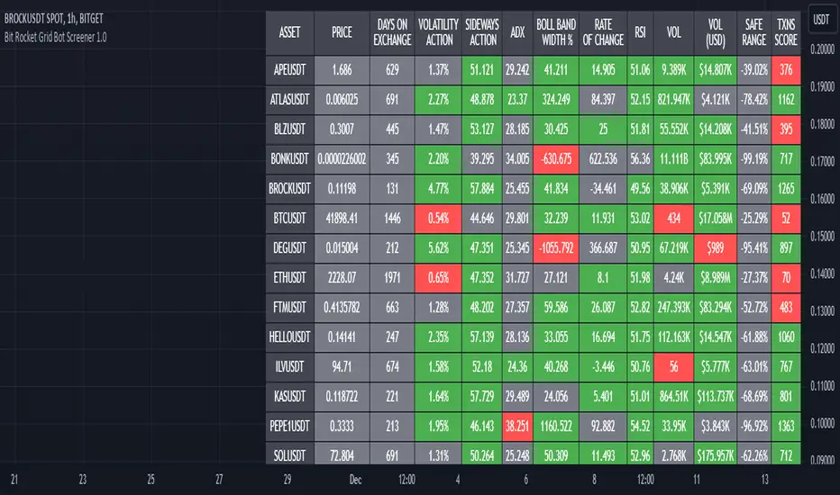
Bit Rocket Grid Bot Screener 1.0DESCRIPTION
A grid bot is an automated trading bot that is designed to execute buy and sell orders based on a pre-defined grid of prices. Grid bots operate within a specified price range, placing trades at set intervals above and below the current market price. The key idea behind a grid bot is to take advantage of price fluctuations and market volatility, not looking for trends or breakouts.
The optimal trading pair for a grid bot is one that exhibits frequent oscillations within a predictable range while demonstrating a slight upward trend. In simpler terms, it's a pair that consistently fluctuates within the same range.
The Grid Bot Screener serves as a valuable tool for identifying the most suitable trading pairs, by showing the indicators that matter the most for sideways Grid Bot trading. Most screeners look for trends, breakouts and use indicators that are used for assisting the trader with when to buy and sell. This indicator assists in the selection of pairs that are likely to yield the best results for high volatility sideways trading.
USAGE
This screener looks at volatility, sideways action, ADX, and other indicators that are most helpful when determining the amount and potential volatility, sideways action, and transactions for up to twenty pairs at a time.
Each indicator has a threshold that the user can set themselves, this way the user is in control when comparing or hunting for the optimal pairs.
User selects up to twenty pairs, sets thresholds if different than defaults, then sets length (how far back to look). Once this is set the user can quickly look and compare the results.
KEY INDICATORS
VOLATILITY ACTION - Percentage of Price Action Volatility; Temporal Volatility Trends; Elevated price action signifies accelerated price fluctuations, disregarding directional cues.
SIDEWAYS ACTION - The higher the value, the greater the horizontal movement; a robust trend, which is not our objective, provides no directional insight.
Values exceeding 45 indicate pronounced sideways activity, while lower values approaching zero signify a vigorous trend.
These values do not assist in determining the trend direction.
Higher values imply a more sideways orientation, whereas lower values indicate a more pronounced trend.
ADX - Does not indicate trend direction; instead measures trend strength.
An indicator for price range
Lower values signal a weak trend
Higher values denote a robust trend
Strategy: Look for values of 25 or lower which indicate a ranging or neutral trend.
TXNS SCORE – Transaction Activity.
TXNS indicator represents grid performance and serves as a direct measure of trading activity. TXNS accumulates the number of buy and sell actions, reflecting the user-defined grid percentage.
Elevated transaction numbers signify increased activity, leading to enhanced bot profitability.
NOTE: For an accurate representation of the actual number of transactions, use the Bit Rocket Transactions indicator on the 30min time frame.
CONFIRMATION INDICATORS
While the key indicators are generally reliable on their own, it's also valuable to assess how well the asset is performing and its historical trajectory. The confirmation indicators provide valuable insights into an asset's performance and direction, reinforcing the assessments made through the key indicators, again these indicators on their own are not enough they must be used in conjunction with the key indicators.
VOL - Trading Activity: For assets engaged in sideways trading, sufficient volume is necessary, but it doesn't need to be as high as you might expect.
VOL(USD) - USD-Based Activity: A high USD volume signifies strong market interest.
ROC - Rate of Change Percentage: This metric calculates the percentage change in price over a specified date range. Shows trend direction using price percentage.
• Avoid extremely high or extremely low values.
o Excessively high values may indicate overbought conditions with potential for a price correction.
o Very low values could imply waning interest and diminished asset value.
o Conversely, high values might indicate asset strength, while low values could suggest that the asset has reached a bottom and is unlikely to decrease further.
BOLLINGER BAND WIDTH PERCENT - Average MACD Percentage Width, percent is used with Bollinger bands to allow for comparison with other assets.
RSI - Buying and Selling Pressure Strength: When assessing RSI, look for a balance between buying and selling pressure while still maintaining high volatility and sideways strength. Key RSI levels to consider:
• 40-60: Neutral range, indicating equilibrium and stability.
• Above 70: Approaching overbought conditions.
• Below 30: Nearing oversold conditions.
These confirmation indicators provide valuable insights into an asset's performance and direction, reinforcing the assessments made through the key indicators.
ADDITIONAL INDICATORS
DAYS ON EXCHANGE – This metric reveals how long the crypto pair has been listed on the exchange. It serves multiple purposes, such as assessing the data's historical depth and indicating whether the crypto might be relatively new. Keep in mind that while the asset could exist for a while, it might not have been available on the exchange for an extended period.
PRICE – This merely states the current price, making it suitable for those focusing on price action, it is provided for informational value only.
SAFE RANGE – This percentage indicates the price movement range from the highest to the lowest within a specified data range. Use this to determine the upper and lower levels for setting up your grid range.
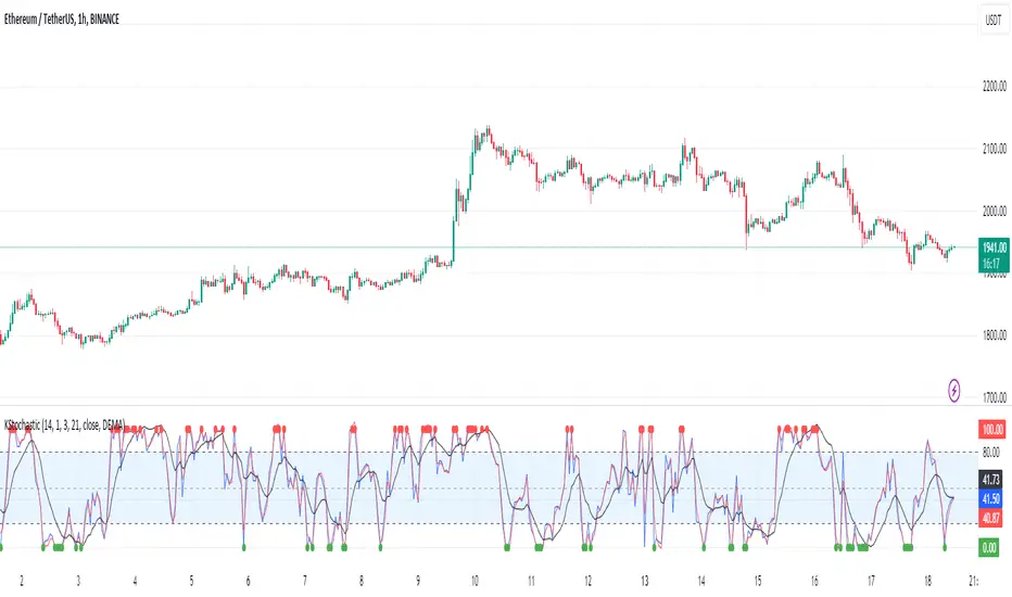
[KVA]K Stochastic IndicatorOriginal Stochastic Oscillator Formula:
%K=(C−Lowest Low)/(Highest High−Lowest Low)×100
Lowest Low refers to the lowest low of the past n periods.
Highest High refers to the highest high of the past n periods.
K Stochastic Indicator Formula:
%K=(Source−Lowest Source)/(Highest Source−Lowest Source)×100
Lowest Source refers to the lowest value of the chosen source over the past length periods.
Highest Source refers to the highest value of the chosen source over the past length periods.
Key Difference :
The original formula calculates %K using the absolute highest high and lowest low of the price over the past n periods.
The K Stochastic formula calculates %K using the highest and lowest values of a chosen source (which could be the close, open, high, or low) over the specified length periods.
So, if _src is set to something other than the high for the Highest Source or something other than the low for the Lowest Source, the K Stochastic will yield different results compared to the original formula which strictly uses the highest high and the lowest low of the price.
Impact on Traders :
Flexibility in Price Source :
By allowing the source (_src) to be customizable, traders can apply the Stochastic calculation to different price points (e.g., open, high, low, close, or even an average of these). This could provide a different perspective on market momentum and potentially offer signals that are more aligned with a trader's specific strategy.
Sensitivity to Price Action :
Changing the source from high/low to potentially less extreme values (like close or open) could result in a less volatile oscillator, smoothing out some of the extreme peaks and troughs and possibly offering a more filtered view of market conditions.
Customization of Periods :
The ability to adjust the length period offers traders the opportunity to fine-tune the sensitivity of the indicator to match their trading horizon. Shorter periods may provide earlier signals, while longer periods could filter out market noise.
Possibility of Applying the Indicator on Other Indicators :
Layered Technical Analysis :
The K Stochastic can be applied to other indicators, not just price. For example, it could be applied to a moving average to analyze its momentum or to indicators like RSI or MACD, offering a meta-analysis that studies the oscillator's behavior of other technical tools.
Creation of Composite Indicator s:
By applying the K Stochastic logic to other indicators, traders could create composite indicators that blend the characteristics of multiple indicators, potentially leading to unique signals that could offer an edge in certain market conditions.
Enhanced Signal Interpretation :
When applied to other indicators, the K Stochastic can help in identifying overbought or oversold conditions within those indicators, offering a different dimension to the interpretation of their output.
Overall Implications :
The KStochastic Indicator's modifications could lead to a more tailored application, giving traders the ability to adapt the tool to their specific trading style and analysis preferences.
By being applicable to other indicators, it broadens the scope of stochastic analysis beyond price action, potentially offering innovative ways to interpret data and make trading decisions.
The changes might also influence the trading signals, either by smoothing the oscillator's output to reduce noise or by altering the sensitivity to generate more or fewer signal
Including the additional %F line, which is unique to the K Stochastic Indicator, further expands the potential impacts and applications for traders:
Impact on Traders with the %F Line:
Triple Smoothing :
The %F line introduces a third level of smoothing, which could help in identifying longer-term trends and filtering out short-term fluctuations. This could be particularly useful for traders looking to avoid whipsaws and focus on more sustained movements.
Potential for Enhanced Confirmation :
The %F line might be used as a confirmation signal. For instance, if all three lines (%K, %D, and %F) are in agreement, a trader might consider this as a stronger signal to buy or sell, as opposed to when only the traditional two lines (%K and %D) are used.
Risk Management:
The additional line could be utilized for more sophisticated risk management strategies, where a trader might decide to scale in or out of positions based on the convergence or divergence of these lines.
Possibility of Applying the Indicator on Other Indicators with the %F Line:
Depth of Analysis :
When applied to other indicators, the %F line can provide an even deeper layer of analysis, perhaps identifying macro trends within the indicator it is applied to, which could go unnoticed with just the traditional two-line approach.
Refined Signal Strength Assessment :
The strength of signals from other indicators could be assessed by the position and direction of the %F line, providing an additional filter to evaluate the robustness of buy or sell signals.
Overall Implications with the %F Line :
The inclusion of the %F line in the K Stochastic Indicator enhances its utility as a tool for trend analysis and signal confirmation. It allows traders to potentially identify and act on more reliable trading opportunities.
This feature can enrich the trader's toolkit by providing a nuanced view of momentum and trend strength, which can be particularly valuable in volatile or choppy markets.
For those applying the K Stochastic to other indicators, the %F line could be integral in creating a multi-tiered analysis strategy, potentially leading to more sophisticated interpretations and decisions.
The presence of the %F line adds a dimension of depth to the analysis possible with the K Stochastic Indicator, making it a versatile tool that could be tailored to a variety of trading styles and objectives. However, as with any indicator, the additional complexity requires careful study and back-testing to ensure its signals are understood and actionable within the context of a comprehensive trading plan.
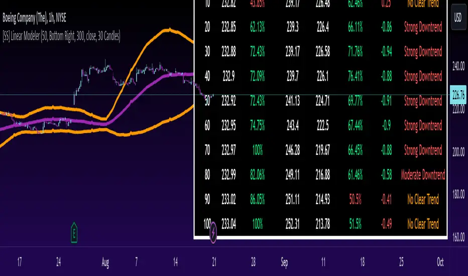
[SS] Linear ModelerHello everyone,
This is the linear modeler indicator.
It is a statistical based indicator that provides a likely price target and range based on a linear regression time series analysis.
To represent it visually, all the indicator does is it represents a linear regression channel and actually plots out the range at various points based on the current trend (see the chart below):
The indicator will perform the same assessment, but give you a working range and timeline for targets.
As well, the indicator will back-test the range and variables to see how it is performing and how reliable the results are likely to be.
General Functions:
In the chart above you can see all the various parameters and functions.
The indicator will display the most likely target (MLT) to be expected within the next pre-determined timeframe (by candles).
So for the first target, the indicator is saying within the next 10 candles, BA's MLT is 221.46 and based on BT results the reliability of this assessment is around 46%.
The indicator will also display the anticipated range at each designated timeframe.
In the chart above, we can see that at 20 candles, the likely range that BA should be trading in is 204 and 238 with a reliability of around 62% based on previous performance.
Plot Functions:
As this is performing a linear time series projection, you can have the indicator plot the projected ranges. Simply go to the settings menu and select the desired forecast length:
This will plot out the desired range and result over the specified time period. Here is an example of BA plotted over the next 50 candles on the hourly:
You can technically use this as an SMA/EMA type indicator, just keep in mind it may be a bit slower than a traditional EMA and SMA indicator, as it is processing a lot of data and plotting out forecasted data as opposed to an SMA or EMA.
If you wish to use it as an EMA or SMA, you can unselect the "Display Chart" Function to hide the table, and you can also select the "Plot Label" function. This will display the current projection analytics directly on your plotted line so you don't need to reference the table at all:
Tips on use:
I use this on the larger and smaller timeframes. On all timeframes, I will look to targets that display 90% to 100% in the BT results.
Bear in mind, this does not mean that we will 100% of the time hit this target, these targets can fail, it just means that there is a higher confidence of hitting this target than other, less reliable targets.
I will plot these targets out if they fall within the implied range of the timeframe I am looking at and will act on them according to the price action.
This is a great indicator to use in combination with other range based indicators. If you use the implied range from options to help guide your trading, you can see which targets are likely to be hit based on the current trend that fall within that implied range.
You can also assess the strength of the trends at various points in time and have an actionable range with a reliability reading at various points in time.
That is pretty much the bulk of the indicator.
Hopefully you find it helpful and useful.
As always, leave your questions and suggestions below.
Thanks for reading and checking it out!
TrapZone ProThis script combines the concepts of Price Action, Trend and Momentum to identify Price Zones (Red and Green filled areas) and Price Bars (Red, Green and Gray) where traders can get trapped in the Market.
It will clearly mark the bars which favor the prevailing Trend and those bars which just don't have the momentum anymore. TrapZone moves with the market trend and will often provide it support. As the TrapZone changes direction & its color, traders can change their trade bias.
Features:
Identify strong & weak price action - By leveraging a regression calculation of price movement on Y axis against the x axis, we identify the strength of current bars. Increasing relative strength of bars indicate Bullish (Green Bars) & Bearish (Red Bars) price movement, respectively. As the relative strength starts to decrease in Bullish or Bearish price action, the indicator immediately changes the color of these bars to Gray (by default). We call these TrapBars .
Current price trend - By using the highs and lows of price in multiple periods, we are calculating the trend of the price. The Bullish trend is shown by the Green zone and Bearish trend is shown by the Red zone. These zones are the shaded areas which are plotted on the chart. If the price is in these Zones, Longs or Short trades are not advised as that price action is weak. We call these TrapZones .
Strength of the Momentum - the thickness of the TrapZone shows the strength of the current Bullish or Bearish trend. That means the wider the shaded area grows the stronger is the current market momentum. A Flat TrapZone indicates sideways price action.
Knowing when NOT to Trade is as important as when to Trade. While this indicator is designed to avoid taking bad trades such as FOMO, Catching a Falling Knife or Fighting The Trend , it successfully reveals the good trade setups!
How these features of this indicator helps Traders avoids common mistakes:
FOMO or Fear of Missing Out - If a Trader Sees TrapBars in a Bullish or Bearish Trend, they will avoid entry as the price action is weak at that time. This will avoid late entries.
Catching a Falling Knife (a.k.a. Picking a Bottom) - When Red TrapZone is being plotted, Traders can avoid taking Long Entries hoping for a price reversal.
Fighting The Trend (a.k.a Picking a Top) - When Green TrapZone is being plotted, Traders can avoid taking Short entries hoping for a price reversal.
TrapZone Pro does all this in a single panel of the chart irrespective of the market or timeframe.
How to use TrapZone Pro indicator for trading [
A. Market Analysis
Green TrapZone is Bullish and traders should not take Shorts. If Green TrapZone is moving higher, Market is Strong
Red TrapZone is Bearish and traders should not take Longs. If Red TrapZone is moving Lower, Market is Strong
No trades when TrapBars are forming
No trades inside the TrapZone
B. Trade Guidance System
Establish Market Bias - Bullish or Bearish using the TrapZone Color
Only Enter Long in Long Color Bars i.e. Green by default
Only Enter Short in Short Color Bars i.e. Red by default
3 Classes of Trades are Possible Class A, B & C. A being the best Reward : Risk ratio and C being the least rewarding. So use trade size accordingly.
Class A - Best bars are always the first & Second, close to the TrapZone
Class B - Long Bar or Short Bar Forming after TrapBar away from the TrapZone in a Strong Market
Class C - Long Bar or Short Bar Forming after TrapBar close to the TrapZone in a Flat Market (identified by Flat TrapZone )
Take profits when Price moves away from the TrapZone & TrapBars start forming OR Your Target is hit !
See a few examples of Trade Classes & Entries/ Exits for a better understanding
Recommendations
Select Session to “Electronic Trading Hours” in chart settings so you can see the Post & Pre Market trading as well. You can change the color of these sessions to the same color as chart background, so it is not distracting.
Start by Trading in the Hourly or Daily time frame to get used to the new indicator and its Trade Guidance System .
Position Size is the best form of Risk Management. Have a fixed dollar loss per trade pre-determined and adjust the size based on market volatility.
Even though this indicator is designed to work on any market or timeframe, trade the markets that you are familiar with and timeframe that matches your lifestyle. Your understanding of the instrument's behavior and knowledge of what makes it move is valuable.
Basic Set-Up
Add the Indicator to the chart
Open Chart Settings and in Symbol Section
Switch off “ Borders ”
Switch off “ Wick ” or Change the colors to a same non-distracting color like Black or Gray
Open TrapZone Pro Settings
Set the colors for the “ Long Bars ”, “ Short Bars ” & “ No Entry Bars ” if you wish to change the default colors
Change “ TrapZone ” colors to your Taste or leave the defaults
Green for “Color 0” that represents Bullish Price Action
Red for “Color 1” that represents Bearish Price Action
Important Advice & Disclaimer: This indicator does not guarantee that you will make money. It is a tool that performs market analysis for you and presents it in a easy to consume fashion. Markets are truly random and can change direction on a dime. You must use prudent risk and money management strategy based on your investor profile, investment objectives and risk appetite.
To Get Access - See Author’s instructions below

Normalized Volume Rate of ChangeThis indicator is designed to help traders gauge changes in volume dynamics and identify potential shifts in buying or selling pressure. By normalizing the volume rate of change and comparing it to moving averages of itself, it offers valuable insights into market trends and can assist in making informed trading decisions.
Calculation:
The indicator calculates the Volume Rate of Change (VROC) by measuring the percentage change in volume over a specified length. This calculation provides a relative measure of how quickly the volume is increasing or decreasing. It then normalizes the VROC to a range of -1 to +1 by scaling it based on the highest and lowest values observed within the specified length. This normalization allows for easy comparison of the current VROC value with historical levels, enabling traders to assess the intensity of volume fluctuations.
Interpretation:
The main plot of the indicator displays the normalized VROC values as columns. The color of each column provides valuable information about the relationship between the VROC and the moving averages. Lime-colored columns indicate that the VROC is above both moving averages, suggesting increased buying pressure and potential bullish sentiment. Conversely, fuchsia-colored columns indicate that the VROC is below both moving averages, suggesting increased selling pressure and potential bearish sentiment. Yellow-colored columns indicate that the VROC is between the two moving averages, reflecting a period of consolidation or indecision in the market.
To further enhance interpretation, the indicator includes two moving averages. The Aqua line represents the faster moving average (MA1), and the Orange line represents the slower moving average (MA2). These moving averages provide additional context by smoothing out the VROC values and highlighting the overall trend. Traders can observe the interaction between the moving averages and the VROC to identify potential crossovers and assess the strength of trend reversals or continuations.
Colors:
-- Lime : The lime color is used to represent high volume rate of change above both moving averages. This color indicates a potentially bullish market sentiment, suggesting that buyers are dominant.
-- Fuchsia : The fuchsia color is used to represent low volume rate of change below both moving averages. This color indicates a potentially bearish market sentiment, suggesting that sellers are dominant.
-- Yellow : The yellow color is used to represent the volume rate of change between the two moving averages. This color reflects a transitional phase where neither buyers nor sellers have a clear advantage, signaling a period of consolidation or indecision in the market.
To provide additional visual cues for potential trade signals, the indicator includes lime-colored arrows below the price chart when there is a crossover upwards (MA1 crossing above MA2). This lime arrow indicates a potential bullish signal, suggesting a favorable time to consider long positions. Similarly, fuchsia-colored arrows are displayed above the price chart when there is a crossover downwards (MA1 crossing below MA2), signaling a potential bearish signal and suggesting a favorable time to consider short positions.
Applications:
This indicator offers various applications in trading strategies, including:
-- Trend Identification : By observing the relationship between the normalized VROC and the moving averages, traders can identify potential shifts in market trends. Lime-colored columns above both moving averages indicate a strong bullish trend, suggesting an opportunity to capitalize on upward price movements. Conversely, fuchsia-colored columns below both moving averages indicate a strong bearish trend, suggesting an opportunity to profit from downward price movements. Yellow-colored columns between the moving averages indicate a period of consolidation or uncertainty, signaling a potential trend reversal or continuation.
-- Confirmation of Price Moves : The indicator's ability to reflect volume dynamics in relation to the moving averages can help traders validate price moves. When significant price movements are accompanied by lime-colored columns (indicating high volume rate of change above both moving averages), it adds confirmation to the bullish sentiment. Similarly, fuchsia-colored columns accompanying downward price movements validate the bearish sentiment. This confirmation can enhance traders' confidence in the reliability of price moves.
-- Trade Timing : The indicator's moving average crossovers and the presence of arrows provide timing signals for trade entries and exits. Lime arrows appearing below the price chart signal potential long entry opportunities, indicating a bullish market sentiment. Conversely, fuchsia arrows appearing above the price chart suggest potential short entry opportunities, indicating a bearish market sentiment. These signals can be used in conjunction with other technical analysis tools to improve trade timing and increase the probability of successful trades.
Parameter Adjustments:
Traders can adjust the length of the VROC and the moving averages according to their trading preferences and timeframes. Longer VROC lengths provide a broader view of volume dynamics over an extended period, making it suitable for assessing long-term trends. Shorter VROC lengths offer a more sensitive measure of recent volume changes, making it suitable for shorter-term analysis. Similarly, adjusting the lengths of the moving averages can help adapt the indicator to different market conditions and trading styles.
Limitations:
While the indicator provides valuable insights, it has some limitations that traders should be aware of:
-- False Signals : Like any technical indicator, false signals can occur. During periods of low liquidity or in choppy markets, the indicator may generate misleading signals. It is essential to consider other indicators, price action, and fundamental analysis to confirm the signals before taking any trading actions.
-- Lagging Nature : Moving averages inherently lag behind the price action and volume changes. As a result, there may be a delay in the generation of signals and capturing trend reversals. Traders should exercise patience and avoid solely relying on this indicator for immediate trade decisions. Combining it with other indicators and tools can provide a more comprehensive picture of market conditions.
In conclusion, this indicator offers valuable insights into volume dynamics and trend analysis. By comparing the normalized VROC with moving averages, traders can identify shifts in buying or selling pressure, validate price moves, and improve trade timing. However, it is important to consider its limitations and use it in conjunction with other technical analysis tools to form a well-rounded trading strategy. Additionally, thorough testing, experimentation, and customization of the indicator's parameters are recommended to align it with individual trading preferences and market conditions.

Market Dynamics Pro [ChartPrime]ChartPrime Market Dynamics Pro is designed to cater to those traders who are more interested in market structures, price action and fundermentals. Analysing volume, key levels in the market, market phases and multi-timeframe can help a trader build a clearer and more actionable view of the market. ChartPrime performs analysis on data in a unique way therefore attempting to give insights into the market otherwise unseen.
Major Features:
Order blocks: The ChartPrime order blocks provide sleek and clear levels in the market where the price might find support and resistance. It is important to note this data isn't availible currently therefore these are derived from data outside of order books. Order blocks are segmented into 4 sections reflecting the volume at a given levels. Low, Medium, High and very high based on relevant and dynamic averages. This allows a trader to identify how significant a level is in the market in a simpler method. Bearish order blocks have a red color bias and bullish order blocks have a green color bias allowing a trader to identify what type of order block it is. The order blocks also dynamically show the remaining volume at that given level.
Pattern Detection: ChartPrime leverages unique pattern identification methods providing earlier and cleaner chart formations. Patterns are commonly used in trading to assess whether bulls or bears are performing optimally in a market or losing strength. ChartPrime identifies; Ascending wedges, descending wedges, symmetrical Triangles, H&S, iH&S, broadening wedges and double tops/bottoms. Patterns often have associated theory behind them for entries and targets that we suggest a trader covers before using this feature. ChartPrime also allow for the user to adjust where a pattern is drawn from. In pattern theory there are 2 main approaches to drawing a formation; from candle body and candle wick. ChartPrime allows for this to be adjusted by a user and also allow for alerts to be set on these patterns.
MTF SR: Taking into account multi timeframes when trading is a key idea. Having ideas of the larger market moves can provide deeper context when trading. ChartPrime Market Dynamics Pro allows for 3 varying SR plots from 3 varying user desired timeframes. These are graded via pivot analysis and grid analysis. This rank is on a 1-10 scale with 1 being the highest rank and 10 is the lowest.
Market Stucutures : These labels are commonly found and used by the Smart Money community. They denote a break of stucture and a chance of character. BOS are labelled when the price breaks a lower low or higher high (in the trending markets) and a CoC occurs when price breaks a trending market pivot. These break a market into clearer breakouts of price action and can help a trader deduce relevant moves. The indicator allows for the user to adjust the detection length of these structures.
Premium and Discount Zones: Premium and Discount zones are underpinned by a simple piece of logic. A premium zone is taken from a higher swing point and the discount from a lower swing point. Although a very generic approach this can show areas in the market that could see a reaction. An asset being in a discount zone implies the price is undervalued. An asset being in a premium zone implies the asset is overpriced or overextended. These are excellent when used in confluence with other SR methods. These naturally will have a delay as they are derived from swing points in a market but still are extremely relevant levels.
Fair Value Gaps: These are gaps in the market where price has seen a highly volatile move and they are assumed to act as magnets in the market. The price may come back and visit these 'gaps' after the move has occured. These are a common technique now used by traders and added to this toolkit for convinience.
Settings:
Order Blocks: Select the scale of the order blocks displayed
BoS/CoC: Toggle these on/off and adjust the lookback on these market structures
Premium/Discount Zones: Toggle on/off and adjust lookback
Enable FVG: Toggle on/off FVGs
Swing Levels: Enable basic swing levels in market
MTF Support/Resistance: Enable and select the relevant timeframe to obtain MTF SR levels on your chart. Up to 3 timeframes at a time.
Predictive Ranges: Toggle on/off
Trend Lines Detection: Toggle on/off trendlines
Wedge Detection: Adjust how patterns are detected; whether from wick or candle body
Toggles provided for relevant patterns.
Example usecases:
ChartPrime order blocks give a deeper insight into market support and resistance levels. Looking for order blocks labelled with High can indicate this level being a significant support or resistance in the market. Adding in further confluences here can assist further in deciding where the price may see a reaction. Take the screenshot below:
Adding in confluences from other timeframes can also help give a broader view. Using the multi time frame graded frame support and resistance levels we can use these to further assist us in finding significant levels in the market.
ChartPrime also provides breaker blocks. These are still significant levels in the market despite being "broken" prior. These too can be used in a classical manor and act as relevant areas in the market. These are particularly effective when used in confluence with Premium and discount zones. We can see in the example below price sees a strong reaction and bounces at these levels.
Market Dynamics Pro provides a comprehensive toolkit of unique features and mixes in the classical concepts allowing for a cleaner charting experience.
All content and indicators provided by ChartPrime are purely for informational & educational purposes only. Past performance does not guarantee future results.

Gaussian Fisher Transform Price Reversals - FTRHello Traders !
Looking for better trading results ?
"This indicator shows you how to identify price reversals in a timely manner." John F. Ehlers
Introduction :
The Gaussian Fisher Transform Price Reversals indicator, dubbed FTR for short, is a stat based price reversal detection indicator inspired by and based on the work of the electrical engineer now private trader John F. Ehlers.
The Fisher Transform :
It is a common assumption that prices have a gaussian / normal probability density function(PDF), i.e. a sample of n close prices would be normally distributed if the probability of observing a price value say at any given standard deviation range is equal to that probability in the case of the normal distribution, e.g. 68% off all samples fell within one standard deviation around the mean, which is what we would expect if the data was normal.
However Price Action is not normally distributed and thus can not be conventionally interpreted in this way, Formally the Fisher Transform, transforms the distribution of bounded ranging price action (were price action takes values in a range from -1 to 1) into that of a normal distribution, alternatively it may be said the Fisher Transform changes the PDF of any waveform so that the transformed output has n approximately Gaussian PDF, It does so through the following equations. taken directly from the work of John F. Ehlers - Using The Fisher Transform
By substituting price data in the above formulas, bounded ranging price actions (over a given user defined period lookback - this determines the range price ranges in, see the Intermediate formula above) distribution is transformed to that in the normal case. This means when the input, the Intermediate ,(the Midpoint - see formula above) approaches either limit within the range the outputs are greatly amplified, this amplification accentuates /puts more weight on the larger deviations or limits within the range, conversely when price action is varying round the mean of the range the output is approximately equal to unity (the input is approximately equal to the input, the intermediate)
The inputs (Intermediates) are converted to normal outputs and the nonlinear Transfer of the Fisher Transform with varying senesitivity's (gammas) can be seen in the graph / image above. Although sensitivity adjustments are not currently available in this script (I forgot to add it) the outputs may be greatly amplified as gamma (the coefficient of the Fisher Transformation - see Fish equation) approaches 1. the purple line show this graphically, as a higher gamma leads to a greater amplification than in the standard case (the red line which is the standard fisher transformation, the black plot is the Fish with a gamma of 1, which is unity sensativity)
Reversal plots and Breakouts :
- Support lines are plotted with their corresponding Fish value when there is a crossover of the Fish and Fish SMA <= a given standard deviation of Fish
- Resistance lines are plotted with their corresponding Fish value when there is a crossunder of the Fish and Fish SMA >= a given standard deviation of Fish
- Reversals are these support and resistance line plots
Breakouts and Volume bars :
Breakouts cause the reversal lines to break (when the high/low is above the resistance/support), Breakouts are more "high quality" when they occur conditional on high volume, the highlighted bars represent volume standard deviations ranging from -3 to 3. When breakouts occure on high volume this may be a sign of the continutaion of the trend (reversals would signify the start of a new trend).
Hope you enjoy, Happy Trading !
(be sure to rocket the script if you liked it, this helps me know which of my scripts are the most useful)

LT Elliott Wave 2.0LT Elliott Waves 2.0 Indicator:
According to Elliott Wave Theory, price moves in 5 waves in the direction of the major trend and moves in 3 waves (ABC) when it moves against the major trend. The key purpose and value of elliott wave theory (EWT) is to provide context for chart analysis. According to the book The Elliott Wave Principle by Frost & Prechter: “This context provides both a basis for disciplined thinking and a perspective on the market's general position and outlook.” The benefit of having context is that one can identify and anticipate changes in direction.
In Elliott Wave theory, waves 1, 3, 5 and C are impulse waves (a five wave pattern that makes progress) whereas waves 2, 4, A and B are corrective waves (a three wave pattern – or combination of three waves - that moves against the direction of the larger trend). Although wave A can also be formed of 5 waves, it is commonly formed of 3 waves. Here is a brief summary of the waves:
Wave 3 tends to be the strongest and most dynamic wave – it is usually (but not always) the longest wave but it is never the shortest. Wave 4 is a corrective wave that is typically composed of 3 smaller waves (ABC) and is notorious for being messy and unpredictable in nature. Wave 5 is the final wave before a significant correction or reversal in trend and is often accompanied by divergences (e.g. negative divergences in an uptrend) and exhaustions in momentum. It is also possible for a wave 5 to form after a “blow-off top” pattern. Wave 2 is composed of 3 smaller waves (ABC) and is a retracement of wave 1 – the retracement can be shallow to moderate (23.6% to 38.2%) or deep (50%, 61.8% to 78.6%). Wave 1 is the first wave of a trend and is composed of 5 smaller waves – it usually occurs after divergences (in the prior move) and extremes in both sentiment and momentum. For example, the wave 1 of an uptrend can often begin after capitulation in the price (after a major decline), extremely pessimistic sentiment, extremely oversold momentum readings, positive divergences and sometimes accompanied by a volume breadth thrust. Waves A and C are often equal in measure. Wave A can be formed of either 5 waves or 3 waves - but more commonly it is composed of 3 waves. Wave B is always corrective and composed of 3 smaller waves. Wave C is a five wave impulse pattern.
The Elliott Wave 2.0 (or EW2) chart indicator seeks to simplify elliott wave theory (EWT) in that its main purpose is to identify the potential major trends and corrections. The indicator takes a more simple and direct approach to EWT in that it focuses more on trying to identify whether price is trending or not, and if there is a trend, then the probable wave pattern. It does this by mainly using the structure of the price chart as well as other factors such as momentum, fibonacci retracements & extensions and the relationship of price to its key averages. The indicator then takes its best guess at whether price is in a trending environment, and if so, which wave it is probably forming. This means that the wave count can often depend on the chart timeframe chosen. For example, what may appear as a major downtrend on a lower timeframe chart may potentially be a corrective drop on a much higher timeframe, due to the different price structure of the charts. To keep things simple and to avoid complexity, the indicator does not display the minor sub-waves within the major waves.
The main feature and benefit of the Elliott Wave 2.0 (EW2) indicator is that it can remove most of the subjectivity in chart and wave analysis. It also allows for flexibility in that it allows the chartist to alter the wave count and the position of the wave counts if they choose to do so (within the parameters and rules set by the indicator). As with all of technical analysis, the wave counts shown by the elliott wave indicator are NOT certain or absolute – they are only a possibility or a probability. So the risk always exists of an alternative wave count. It is for the chartist to determine the probable wave counts and limit or control the risks based on their knowledge of technical analysis and risk management.
The settings of the Elliott Wave 2.0 indicator (EW2) are fairly self-explanatory but here is a brief summary:
In the Trend Analysis Switch, the indicator is set by default to a “moderate” trend setting in that it waits for moderately significant changes in momentum before a probable wave 5 is shown (i.e. the fifth wave within the elliott five wave pattern). So for example, in an uptrend, the indicator may show a probable “wave 3” (a blue-coloured wave 3) if the path of least resistance and the likely trend is still to the upside. Once a change in momentum and trend direction occurs, then the indicator may change the wave count to a “wave 5” (a green-coloured wave 5) provided the parameters for this wave count have been met. This default “moderate” setting can be changed by the user or chartist. So if the user wants to change the wave count from a probable “wave 5” to a potential “wave 3”, then it may be possible to do so by changing the trend analysis switch from “moderate” to “strict”. The indicator will likely then display a “wave 3” count until the price reverses some more and breaks below a key support level (assuming the prior trend was up), thus changing the wave count from a “wave 3” (in blue) to a probable “wave 5” (in green). (The opposite of this example applies in downtrends.)
If the chartist decides to delay the changing of the wave count, such as delaying the change of wave 3 to a wave 5, then the “strict” option can be enabled in the trend analysis switch. If the user prefers a slightly more aggressive (or quicker) change in the trend and wave count, then the “aggressive” option can be applied. This is provided the chartist decides it is reasonable or “logical” to make the change. The EW2 indicator will only make the change IF doing so is allowed within its set parameters and rules. The trend analysis switch settings (moderate, aggressive and strict) are largely based on the relative position of price to certain key averages and crossovers, such as both short-term & long-term moving averages which can act as support and resistance.
It is important to mention here is that if any changes are made to the settings of the EW2 indicator (such as moving or modifying the wave counts), it is essential to click on “Reset settings” when changing the chart to a different symbol or timeframe. So whenever a new chart symbol or timeframe is chosen, it is recommended to apply the “reset settings” function in the indicator defaults at the bottom left of the settings section. This will refresh the settings of the indicator back to defaults.
The Elliott Wave 2.0 indicator has greater flexibility options within the settings to change the positions of certain wave counts based on the structure of the chart. This can be achieved by manually moving the wave counts in the first top-section of the EW2 settings, where it says “Move Wave Forward/Back”. By clicking the up or down arrows (on the box provided) the position of the wave count can be moved, based on the zigzag patterns of the chart. So for example, if we wanted to move the position of the historical wave 5 (shown in green on the chart), then we would hover over the box next to “Move hist wave 5 forward/back” and click up or down on the arrows. Clicking the UP arrow would move the wave count position forward on the chart while clicking the DOWN arrow would move it backward. The same can be done with other waves such as the positions of waves 1, 2, 3 and 4 – provided this is permitted by the structure on the chart and the rules set by the indicator.
In the elliott wave indicator, the potential major wave counts are shown in blue and sometimes yellow. The blue wave counts have a slightly higher probability than the yellow as the yellow will need further confirmation by the price structure and momentum.
The starting point for the wave counts is shown as a green “wave 5” – this is referred to as the “historical wave 5” as it is the likely fifth wave of the prior wave (e.g. a prior impulse or corrective wave). The historical wave 5 is the starting point where the indicator starts “counting” the waves. The indicator makes its best guess as to where to start counting from the historical wave 5, but the user has the option to change its position, if required as per the parameters set by the indicator. As a general rule, in an uptrend, the green historical wave 5 should ideally be positioned at the lowest point on the chart (such as the lowest point in the past 300 bars). The opposite applies in downtrends where the historical wave 5 should ideally be at the highest point on the chart (e.g. in the past 300 bars). It should be noted that when the position of the green historical wave 5 is changed, this usually affects the entire wave count. The position of the historical wave 5 (green) can be changed in the settings of the elliott wave indicator (as discussed above). Additionally, if needed, we can also change the label of the green historical wave 5 within the settings to a pink “C-wave” (i.e. the “C-wave” of the prior corrective wave).
As mentioned, the EW2 indicator does its best to make the optimal “guess” as to the probable position of the wave counts, using the structure and momentum on the chart. However, just like any other chart indicator, it is not perfect and it can get the position wrong at times. This is to be expected as we are dealing with an uncertain, chaotic and probabilistic environment when doing chart analysis. Therefore, where it is deemed suitable, the position of the waves - such as waves 1, 2, 3, 4 and the historical wave 5 (or “C-wave”) – can be changed in the settings. The “wider jumps” option can be enabled in the settings for bigger skips in the position of the waves when toggling the positions using the up and down arrows.
The position of most waves can also be altered by modifying the major structure (in the zigzag) using the option in the settings called “Modify major structure”. Please note that using this can sometimes change the wave count as well. This specific setting provides a drop-down menu (labelled A to F) that allows several structures to be chosen in the zigzag (within certain limits). However, in the majority of cases, only the first four options (A, B, C and D) will be required to change the structure of the zigzag. Options C and D provide the greatest variability in the zigzag structure.
One useful method to remember is that often the most effective way to modify the wave count is to adjust the positions of waves 1 and 3 (assuming the starting position of the historical green wave 5 has been decided). As long as we can place wave 1 (and by default wave 2) to a reasonable or “logical” level, the remaining wave counts and projections can usually take care of themselves. Adjusting the position of wave 3 to a logical position can also be useful in this respect. A good way to correctly determine the “wave 1” and “wave 3” of an impulse is to look at its internal structure. If both are composed of five sub-waves (i.e. if each have an internal structure of five smaller waves) then the probability is higher that we have identified the waves 1 and 3 correctly, as both waves are impulsive. The same rule can apply for wave 5. Another rule to remember is that wave 3 can never be the shortest impulse wave but it is often the longest.
One of the new and major features of the Elliott Wave 2.0 indicator are the wave 3, wave 4 and wave 5 projections. The indicator uses a number of fibonacci extensions and ratios of certain waves (e.g. waves 1 and 2) to calculate the probable wave 3 projections as well as the potential wave 5 projections. The wave 3 projections are labelled as “3” and are shown as blue horizontal lines. Wave 5 projections are labelled as “5” and are shown as cyan, green, brown or purple lines. EW2 also makes use of mainly fibonacci retracements (such as the golden ratio) for calculating the probable wave 4 projections. Wave 4 projections are shown as “4” in orange, dark blue and red. Wave 4 has a number of alternate settings which make use of RSI momentum and fibonacci levels. The alternate settings for wave 4 can be used if the user believes that wave 3 has completed and that a wave 4 correction is likely in progress or coming to an end. The setting “Wave 5 in progress” can also be used for this purpose, if the chartist believes that the wave 4 has likely completed (or coming to an end) and that a potential “wave 5” is taking shape.
The “Logarithmic fibs” setting is an option for certain charts and timeframes that require a logarithmic chart to be used. For example, higher timeframe charts (such as weekly or monthly) and very volatile price charts may benefit from a logarithmic setting and therefore logarithmic fibonacci levels. Generally, if the chartist is using a log chart for a specific symbol (or timeframe), it would be preferable to apply logarithmic fibonacci levels as well. So this function can be selected in the EW2 settings accordingly.
While most wave projections (such as waves 3, 4 and 5) will show automatically on the chart, the user can decide to remove certain projections (e.g. waves 4 and 5) to reduce the amount of text or lines on a chart. This can be done by selecting the specific “Hide wave projections” function in the settings for the waves 4 and 5. Extra projections for waves 3, 4 or 5 can be shown by selecting the option for “More projections” for each specific wave.
Another useful feature is the “Wave 3 probability decrease level” function. This draws a horizontal magenta line at a specific fibonacci extension which can act as a key level of support (or resistance) for a probable wave 3. This could be helpful when a new trend is starting and we have the beginning of what appears to be a wave 3. For example, in a new uptrend, the probable wave 3 would have to stay above this key level (shown as a magenta line) if the probability of a wave 3 is going to remain high or intact. In other words, if price were to drop below this key level (in an uptrend) then the odds of a wave 3 would be lowered significantly and downside risk could increase. The opposite applies in downtrends.
The lookback period can be decreased to make the EW2 indicator focus on the much more recent data, such as the previous 100 bars. This can be done by selecting “Use short term” in the settings. This function can be used in situations where the trend may have changed very suddenly and the user wants to focus on the more immediate chart structure.
The setting also provides an “Aggressive wave 3” option for situations that may require the wave 3 to be shown sooner, such as at the start of a new trend. This option as well as others are included for further flexibility in the wave count. When this “aggressive wave 3” option enabled, the EW2 will display a yellow “wave 3” provided the conditions have been met based on fibonacci extensions.
As mentioned, the elliott wave indicator is programmed to look for and identify potential trending or impulsive patterns, and when appropriate, corrective ABC patterns. In this sense, we are looking to simplify elliott wave theory by taking a more flexible and common-sense approach to the wave patterns. So if the price action has broken key levels of support or resistance, momentum is increasing and price is moving deliberately in a specific direction, it becomes more likely that price is in a trending environment (rather than just a correction). Therefore, the EW2 indicator will likely start by showing the initial impulsive waves 1, 2 and 3 (in blue or blue/yellow) instead of the corrective waves ABC (in pink). However, the user has the choice to change the waves from 123 to ABC by selecting “ABC corrective waves” in the settings.
The EW2 indicator also allows the option to “reverse” the probable trend (and wave count) if required. For example, if the EW2 indicator is showing a probable wave 3 or wave 5 (in blue) and price begins to pullback or move in the opposite direction to the main trend of the wave 3 or 5 – e.g. if price starts to break key support levels (e.g. after an uptrend) and then reverse lower in the opposite direction to the primary trend - then the user has the option to change the wave count in the opposite direction (e.g. downward) a bit quicker. This can be achieved by selecting the option in the settings called “Reverse probable trend”. Applying this setting will reverse the original wave count of the primary trend as set by the indicator (e.g. from up to down or vice versa) provided it is permitted by the rules of the indicator. The colours of the wave counts will change to grey instead of blue. The user can also choose where to manually place the historical wave 5 (if required). However, although this “reverse” option is provided for extra flexibility, it should NOT be used very often. It should only be applied for certain special circumstances where it is deemed appropriate to change the wave count from an uptrend to a downtrend (or vice versa). The EW2 indicator does a reasonably good job on its own of identifying most trend changes without the need for this special “reverse trend” setting.
The chartist can apply other methods of chart analysis – such as trendline breaks, oscillators, regression channels, breaks of support/resistance – to determine when a probable wave (or wave count) has likely completed. For example, technical analysis methods such as trendline breaks and support/resistance breaks can be used by the chartist to determine the probability of whether wave 4 has potentially completed or not. In an uptrend, confirmation that a probable wave such as wave 4 has completed will not come until price has taken out the highs prior to the decline (i.e. the highs before the pullback in the probable “wave 4” correction). The same applies in reverse for a downtrend: confirmation that the probable wave 4 has completed will not come until price has taken out the lows prior to the rally (in a probable wave 4 correction).
It should be remembered that the appearance of the most recent wave counts (or wave labels) shown by the indicator, by themselves do NOT mean that the specific waves in question have definitely completed or finished. The same applies with wave projections as they do NOT imply that price has to necessarily move to those specific projection levels. They are merely to provide helpful guidance and education in chart analysis. Nothing in chart analysis is certain or definite as we are dealing with a system that is chaotic, unpredictable and probabilistic. The wave label itself is simply an indication that the most recent wave is probably still in progress, not necessarily that it has completed. Chartists can apply other technical analysis tools and methods (e.g. trend lines, support/resistance breaks, moving averages and regression channels etc.) to increase the probability of when a specific wave has probably completed. The same also applies to past or “completed” wave counts (or past wave labels): they do NOT mean that the specific waves have definitely completed or finished – it is merely a possibility or probability. So the risk always exists that the wave counts may potentially be wrong, and that an alternative wave count interpretation may exist.
In certain circumstances where there are volatile conditions and charts, it is possible that the elliott wave indicator may show an “unusual” wave count. For example, it is possible that the positions of certain wave counts (such as waves 1, 2, 3 and 5) may be in the “wrong” order. This happens rarely so it is not an issue that happens very often. However, if this issue occurs, the chartist can rectify the matter by applying one of the following options: (a) moving and adjusting the position of the historical wave 5 (in green) to a more logical position, (b) applying the “use short term” setting or (c) wait a bit longer until the volatility resolves itself in time. These options can usually resolve the issue and show the wave counts in a “proper” manner. Changing to a slightly lower (or higher) timeframe can also usually resolve this issue. If any changes are made to the settings of the indicator, please reset the indicator settings back to “default” when changing to a different symbol or timeframe.
The user can also choose to enable the zigzags of the waves to be shown on the chart. This can display the wave structures and zigzags, if enabled. By default it is set to off. As mentioned previously, it may also be a good idea to reset the settings of the indicators whenever a new chart or timeframe is chosen. This then refreshes the settings back to its default.
It is important to appreciate that the elliott wave indicator generally requires between 1,500 to 2000 bars of data on the chart in order to display the wave counts adequately and appropriately. So if a chart or timeframe has less than the minimum number of historical data or bars on the chart, the wave counts may not display properly or not appear at all. Certain chart symbols and timeframes (such as the monthly timeframe) may have very limited amount of data on them. Therefore, the elliott wave indicator will likely not appear on these charts or may not display properly. In these situations, a different chart symbol or a lower timeframe with more data on it can be chosen. For example, instead of a monthly timeframe, a weekly or daily timeframe can be chosen. Similarly, if a “study error” message appears on the EW2 indicator, this can be remedied by switching to a slightly lower (or higher) timeframe. However, usually such study errors are temporary and often get resolved after a brief time.
We have allowed for further flexibility in the EW2 indicator so that the user can move the wave counts manually, if required. The chartist can manually move the position of a wave count to a specific bar (or candle) on the chart if they choose to do so. For example, if we want to move the position of wave 1 to a specific bar in the past, we would first tick the box in the indicator settings called “Manually Place Wave 1”. Then we would use the “date range” tool to find out the distance of that past bar from the current bar (e.g. 50 bars) and then input that number (50) into the box next to “Manually Place Wave 1”.
Price action, markets and their charts are non-linear and chaotic, which means that they are subject to uncertainty, variable change and being unpredictable in nature. So we must maintain a probabilistic mindset and attitude to technical analysis. Nothing is certain. Therefore, no wave count is certain or “set in stone”. Wave counts, just like the actions and emotions of human beings, are subject to change. Elliott Wave theory, just like all of technical analysis is about what is possible, what is probable and what the risks are of a particular outcome. The advantage of elliott wave theory, as explained previously, is about gaining an understanding of context and the likely big picture. The indicator is provided in good faith but we do not vouch for its accuracy.
As mentioned previously, chartists should be aware of the probabilistic and uncertain nature of price action and the markets, and therefore prepare to limit and control any potential risks.
The chart indicator can be used on the charts of the majority of markets (e.g. stocks, indices, ETFs, currencies, cryptocurrencies, precious metals, commodities etc.) and any timeframe. Nothing in this indicator, its signals or labels should be construed as a recommendation to buy or sell any market (e.g. stocks, securities, indices, ETFs, currencies, cryptocurrencies, metals, commodities etc.). The indicator is provided solely for educational purposes, to gain a better understanding of technical analysis and elliott wave theory. It should be noted that the degree of noise and randomness increases significantly on lower timeframes. So the lower the timeframe that is chosen (e.g. 15-min or lower) the greater the degree of noise and randomness and therefore the higher the frequency of false signals or whipsaws. The indicator can be applied to candlestick charts and bar charts.
If you would like access, please send me a PM on Tradingview.

Buy Sell IndicatorThis Buy Sell Indicator uses price action calculations to determine the bullish or bearish nature of the current market and then calculates if the price action is strong enough to give a signal. The indicator is fully adjustable so you can fine tune it to fit your specific trading style with Scalp Mode, Swing Mode, Long Swing Mode and candle trailing length. It also has an automatic trailing stop loss and take profit features that can be customized.
For price action identification, scalp mode looks at the candle body, candle wicks and size of the body and wicks and compares all of that to the previous candle to see if it is bullish or bearish. Swing mode will compare the current candle to the last 2 candles and long swing mode will compare the current candle to the last 10 candles. It’s looking for higher highs & lower lows, if the candle body is large or small and much more.
There are also filters that prevent signals from being given when the candle is small or has not made a higher high or lower low compared to the previous candle and multiple other filters to help hold positions longer. Once the price action direction has been confirmed, then the script looks at a massive amount of other calculations to determine if a signal should be given or not. These calculations are made up of all of my best indicators combined into a master signal generator as well as more new calculations from things I have learned over time and tested extensively that have not been made available to the public until now.
Price action as well as many other factors will all have to be confirming the direction before a signal can come in, but it reacts very quickly so it can give early signals at the first sign of reversal. Fine tune your settings to match your trading style from within the input settings and then look for potential reversal areas and take signals that appear in that reversal area for the highest probability of winning trades. I decided not to include any support or resistance or similar tools in order to keep the indicator lightweight and respond as fast as possible as well as update the candles as quickly as possible. This also lets you keep your charts clean and only use the support & resistance tools that you prefer since everyone has a different trading style.
HIGHER TIMEFRAME AND/OR MARKET SCANNER
There is also a higher timeframe scanner available as a separate indicator titled Buy Sell Signal Scanner that you can find on my profile. It can be customized to show you up to 8 higher timeframes of your current ticker or any other ticker you like. This is useful for trading with the trend of the higher timeframes or you can set it to the same timeframe as your chart and scan other tickers that usually move together or opposite for extra confirmation. Each ticker/timeframe will be displayed in a table on the chart and colored green or red depending if it is currently bullish or bearish. If you are using a different timeframe than the current chart, then it will display the timeframe next to the ticker name.
HOW TO USE
CANDLES
The candles will paint blue or orange according to the price action detected. This can be customized or turned on/off and will follow the price action according to the trade mode settings. Using these candle colors helps to get rid of anxiety when watching candles come in that are in the opposite direction of your trade. I highly recommend using this feature as it helps you control your emotions much better during trading.
TRADE MODE
The trade mode settings let you choose between Scalp Mode, Swing Mode and Long Swing mode. They all use the same price calculations, but each mode has its own filters to hold through ranging price action in a slightly different way. You can also adjust the candle trailing length to make it hold positions even longer. The candle trailing length will not let a signal come in until there is a higher high or lower low than the previous X number of candles from this setting.
Scalp mode will get you in and out of positions the earliest. Swing mode will hold signals longer by filtering out ranging price action. Long swing mode uses even more filtering to hold positions even longer than swing mode and let price range more without calling out every move. Each one of these modes will also be affected by the candle trailing length.
It should be noted that using swing mode and long swing mode or increasing the candle trailing length will make the signals not perform as well when price action is whipsawing up and down and also will not have as early of entries and exits as scalp mode due to the range breaks that are needed for a signal to be given. That being said, it will hold positions much longer when markets are trending and still have great entries and exits, so use the longer settings when markets are trending and then switch to scalp mode when the market is chopping around and moving sideways for best results.
Scalp Mode
Swing Mode
Long Swing Mode
STOPLOSS
There is an automatic stoploss feature as well. It calculates the average candle height and adds/subtracts that from the highest high or lowest low of the past X number of candles according to your Stoploss Candle Trail Length. Use a lower number for a tight trailing stoploss and increase the number for a more loose stoploss. You can also customize the color of the stoploss line and label or turn it off if you prefer. The stoploss will update on every candle for proper trailing but it will not switch to an opposing signal until the candle closes with a new signal.
TAKE PROFIT
There is an automatic take profit level generator as well that also uses the average candle height for its calculations. There are 3 settings that let you set the average candle size multiplier for each take profit level. The default settings are evenly spaced at 3, 6 and 9 times the average candle height from where the most recent signal locked in at candle close. Adjust these numbers to suit your preference. You can also customize the color of the take profit lines and label or turn it off if you prefer. The take profit levels will not change to an opposing signal until the opposing signal is confirmed on the candle close.
Auto Stoploss & Take Profit
SIGNALS
The default signals are green and red arrows. The color can be adjusted in the settings or you can turn the bull or bear signals on or off if you only want entry signals for the direction of the trend.
VOLUME SPIKE SUPPORT & RESISTANCE
There are volume based auto support & resistance levels that are off by default, but can be turned on in the settings. It calculates the average volume over multiple periods and gets the average of that and then looks for volume spikes that were greater than the average, multiplied by the volume spike multiplier in the settings. If set to 3, then the volume spike will need to be 3 times or higher than the average volume bar for a level to show up. Increase or decrease this number to get more or less levels.
VOLUME WARNING
If volume is very low compared to normal, then a volume warning label will appear at the top of the chart letting you know that volume is very low and to trade with caution. I recommend not trading during those times though as price can whipsaw very easily.
ALERTS
There are also alerts that can be triggered for buy signals as well as sell signals. They are set to only send signals when the bar is confirmed so you won’t get alerts for signals that repaint while the candle is still open. You can use these alerts to send signals to your own trading bot if you choose to.
MARKETS
This buy sell indicator can be used on any market with price data such as stocks, crypto, forex and futures.
TIMEFRAMES
This buy sell indicator can be used on any timeframe.
PAIRINGS
We recommend pairing this Buy Sell Indicator with our Buy Sell Signal Scanner so you can check other timeframes and trade with the trend or use the scanner to look at other markets that move together or opposite of the ticker you are trading for extra confirmation of direction.

PriceCatch MDCPLevelsv1Hi TV Community!
I am sharing a script that is aimed at swing/positional traders who only take long positions.
This script helps you to get a view of price drops in percentage points from a recent major high an instrument has made. The high is captured using Modified Donchain Channel Calculation. When an instrument is going down, traders are always interested to know how much it has dropped in percentage terms and this script helps in addressing this requirement.
With this script, simply by looking at an instrument on the chart, you can tell how far down it is from its recent major high. So, if a fundamentally strong instrument has dropped 30% due to market dynamics, that might be a level for you to consider a buying opportunity.
SAMPLE CHARTS
User Configuration
Period
Set the Period (historical bars) for the script to find a major high. Intermediate highs that the instrument makes are ignored so as to give a longer duration price action range.
Drop percentages
Enter 5 levels of drop percentages as per your trading style / choice. Generally, the default setting of 10, 20, 30, 40, 50 are good with most instruments.
Locking Profits & Exiting positions
A difficult aspect of trading is locking profits and exiting positions when your trade is in profits. Most traders are reluctant to close their positions due to greed and hope or prematurely close them due to fear. In both cases the decision is based on emotion rather than on systematic rules. It is worth remembering that exits are equally important as entries.
PriceCatch MDCP Levels script also addresses this problem faced by traders and does so in a unique way. Specifically as many traders usually like to compare returns with other forms of investment such as Bank Fixed Deposit interest rates, this script helps you to enter current Fixed Deposit Interest Rate and then plots those levels also on the chart. So, when a trader takes an entry at the 30% drop level, the profit levels plotted on the chart helps the trader set proper targets to close the trade. For example, if you have entered 6.75 as FD rate, then the script will plot 6.75% gain level over 30% level to give you visual clue which serves to help you set your targets immediately after your buy trade has executed.
NOTE: If you wish to close a trade when price reaches 5% above buy price, you can enter 5 in the Current Bank FD Rate field. The idea of FD Rate is to give you satisfaction that the trade gave you profits equalling FD Rate for which you would have to normally wait 365 days if you had opened an FD instead of taking the trade.
Style Tab
From the style tab you can hide some levels that you do not wish to be shown on the chart.
Visibility
From the Visibility tab you can control on which time-frames only, this script displays the levels.
Advantages
For positional traders who trade only on fundamentally strong stocks, this script should be of use due to the way it helps you see price action and also enable you to take trades at potentially good levels.
NOTE:
As with any other indicator, please satisfy yourself thoroughly that it works for you before you decide to deploy PriceCatch MDCP Levels on your chart. The script is shared without any warranties that it will be of use to you. As a trader you are aware that trading is more about the trader than any strategy; trading involves financial risk and that you are solely responsible for your actions. If you agree to the above, please feel free to use PriceCatch MDCP Levels.
QUERIES / COMMENTS
Please feel free to reach out to me with any queries or comments. All the best with your trading.
Regards
PriceCatch
1 Minute Scalping IndicatorThis is a 1 Minute Scalping Indicator based purely on price action of the current candle compared to the previous candle so there is no lag from using other indicators. It works great on all timeframes, but is designed for getting in and out of positions quickly using the 1 minute chart. The candles will paint according to the direction the price is currently moving in, which is a great way to help reduce anxiety while watching the candles bounce back and forth.
HOW TO USE
It has Scalp Mode and Swing Mode. Both modes use the exact same price action parameters for signals, but Swing Mode will only give signals when the price action parameters are met AND the close is higher than the previous high for bull signals or when the close is lower than the previous low for bear signals.
This scalping indicator will show green up arrows when it detects bullish price action and red down arrows when it detects bearish price action. It will show a yellow arrow if the bullish/bearish price action conditions are met, but it detects a candle pattern that may be a weak signal such as small candle body, large wicks, etc. When this happens, make sure to wait for the next candle to show confirming price action before following the signal. You can also turn the signals off and use only the candle coloring if you prefer cleaner charts.
You can change the candle colors it uses within the input settings, as well as the color of the signal arrows to suit your preferences. You can also turn off the candle coloring if you prefer normal candles. If you are using the indicator’s candle coloring, make sure you go to your chart settings(gear icon top right) and in the symbol tab, turn off body, borders and wick for this to show up properly.
This scalper also includes alerts for bull and bear signals that can be set to alert you on any market and timeframe.
SCANNER
We also made a higher timeframe scanner that uses this same price action formula and shows you if higher timeframes are currently bullish or bearish in real time. It’s titled Higher Timeframe Price Action Scanner and can be found on our profile. I strongly recommend using both of these together to get an idea of the overall trend on longer timeframes. You can also use two of the scanners and set them to two tickers that move together or opposite of each other(like SQQQ and TQQQ) for even more market insight on your ticker's immediate direction.
MARKETS
This 1 Minute Scalping Indicator works well on any market such as stocks, crypto, forex, futures, etc.
TIMEFRAMES
This indicator is designed for scalping on the 1 Minute timeframe, but it works well on all timeframes, since it is using price action to give signals.
TIPS FOR BEST RESULTS
We recommend pairing this indicator with another support & resistance or moving average combo to find great entry areas and use the price action signals as confirmation when price bounces off of those areas. We also recommend using the Higher Timeframe Price Action Scanner with this so you can see the overall trend of higher timeframes on your chart and trade in the direction of the trend.
Scalp Mode
Swing Mode
Candle Coloring Only - No Signals - Scalp Mode
Candle Coloring Only - No Signals - Swing Mode

Improved Chaikin Money FlowChaikin Money Flow is a well-known Indicator for gauging buying/selling pressure. Marc Chaikin intended this to be used on the daily timeframe to capture the behavior of price action at or near the daily close when larger-scale actors influence the market. The calculation is straight forward as described within the built-in TradingView "CMF" indicator:
1. Period Money Flow Multiplier = ((Close - Low) - (High - Close)) /(High - Low)
2. Period Money Flow Volume = Period Money Flow Multiplier x Volume for the Period
3. Chaikin Money Flow = 21 Period Sum of Money Flow Volume / 21 Period Sum of Volume
There is, however, a problem with this algorithm: it does not account for daily gaps in price action. This leads to the indicator sometimes moving out-of-sync with price action and/or an under-emphasis of the magnitude change of the indicator relative to the change in price action. This is a significant problem for someone trying to read divergences against an underlying.
Note: I have never seen a published attempt to improve this indicator which is why I decided that there had to be a way to do it.
In order to mitigate this issue, I have taken the basic script provided by TradingView and made a key modification. If the open of a candle is outside the range of the previous candle, then the close of the previous candle is used as the "high" for the current candle (in the case of a gap down) or the "low" for the current candle (in the case of a gap up). However, if the close of the current candle exceeds the previous close, highs and lows for the current candle are calculated as normal. I believe this accounts for gaps in price action without significantly altering the original intent of the indicator.
I have made four other minor tweaks:
1. Default style is color coded area above and below the Zero Line
2. Range scaled to +/-100 instead of +/-1 (displays better on graph)
3. Set timeframe to Daily (as that is the timeframe for which this indicator was intended by Chaikin)
4. Length defaults to 21 (which is what Chaikin uses)
Trendmaster - Crypto On-Chain Metric BundleWhat it is:
The ‘Trendmaster Crypto On-Chain Metric Bundle’ is truly a one-of-a-kind bundle. It provides a complete insight into the on-chain dynamics of the entire Crypto asset class, with a multitude of different included indicators providing unique information and data points to give users an edge regardless of ticker, timeframe, or trading style.
What it Does:
Allows you to switch between several different metrics in one place and see specific combined metrics and look at the metrics to take contrarian positions
How to Use it:
Use these metrics to see the on-chain actions in cryptocurrency and play the contrarian. For example, when people are flooding into stablecoins as the price goes down you can see that as a potential buy indicator.
All metrics can be viewed with a Dashboard allowing the user to see all of the information in 1 place.
List of On-Chain Metrics:
To begin with, we have the ‘Trendmaster On-Chain Rating’ – which is our all-in-one, complete on-chain overview metric that can give you an instant insight into the fundamental and underlying strength of any given Crypto asset. It collates the key factors provided by all other indicators within the bundle, weighing in and condensing all of that information into a simple -5 to 5 scale; with a -5 indicating a completely bearish outlook on the asset, and a +5 representing truly great upcoming upside potential. As this indicator is taking into account large amounts of data and statistics to provide an on-chain overview, this value is best taken into consideration on higher timeframes such as the 4hour or daily to provide fundamentally strong buy or sell swing trade opportunities. Extreme rating signals on this indicator are rare but always worth taking into serious consideration.
Secondly, we have the ‘Collated Open Interest Oscillator’ – which gives us a peek into the current outlook of the derivatives market across a wide array of Crypto futures on a number of different exchanges. This indicator provides data on a 0-100 scale, with 100 indicating a substantial and sustained increase in open derivative positions in relation to the underlying market volume. A score of 100 can tell us that a huge amount of traders are trying to position themselves with high leverage in anticipation of a big move, and can often be compared to periods of extreme greed from market participants. On the contrary, a value of 0 shows us that the derivative market is decreasing in volume and therefore open interest is decreasing, which can be likened to periods of extreme fear. This data is only provided at daily intervals, but as incredibly high or low values on this indicator can have an almost instant impact, this indicator is best utilized for medium-term trading and investment decisions.
The ‘Social Sentiment Oscillator' analyses bullish and bearish narratives in relation to a number of large Cryptocurrencies and the market in general, across multiple social media platforms. Rather than a traditional 0-100 ‘Fear & Greed’ index that many may be familiar with, this indicator tracks the changing in sentiment across platforms on a -100 to 100 scale. A score of -100 may not necessarily indicate immediate extreme fear in the market, but instead a huge shift from an incredibly bullish narrative to an incredibly bearish one. Similar to a score of 100, this does not necessarily indicate that the current outlook on social media platforms is currently positive, but rather that a substantial amount of people are altering their views and have become more bullish on a short-term basis. This data is only provided at daily intervals, so make sure to keep an eye on price and sentiment divergences for the best swing trade opportunities to play contrarian to the majority.
Following this is the ‘Miner Confidence Metric’, which provides a long-term overview of the current Crypto miner's outlook. This simple -10 to 10 scale gives us an easy-to-follow bearish to the bullish sentiment of miners. This indicator takes into account the current hash rate, looking at both how it historically compares as well as its rate of decrease/increase; as well as on-chain miner movements to verify their stance on either holding onto their Crypto earnings or preferring to move their coins to exchanges to sell and cover their running costs. Generally speaking, miners can face difficulties operating during times of large market drawdowns, and may be forced into offloading and selling physical and virtual resources to remain afloat – this is indicated by a -10 value at the extreme end, and has historically provided outsized returns for long-term investors accumulating at their demise. Contrary to this, a score of 10 can indicate that miners are not only bullish on the future of crypto, but are likely also expanding operations in anticipation of higher prices in the future. This data is only provided at daily intervals, but on longer-term timeframes provide some of the best long-term accumulation opportunities available to market participants.
Next is the ‘Collated On-Chain Volume’ indicator, which simply monitors a variety of Cryptocurrencies and their underlying on-chain transactional usage. When collating these volumetric data it can provide invaluable insight into the current actions taken by market buyers and sellers and often larger players who can have a big influence on price. Typically when we see large spikes in on-chain usage it indicates substantial levels of accumulation or distribution, which can be made more obvious by observing where we currently are in a market cycle. Large spikes after large and extended periods of drawdown can represent coins transferring from retail to larger players who are often referred to as ‘smart money’; and with large on-chain volume following a substantial bull cycle, this may show us larger players distributing coins to retail. Data can only be fetched at daily intervals, but watch for big spikes to try and position yourself alongside the big players.
We also have the ‘Holder in Profit %’ which as it sounds, is just giving us a percentile value of Crypto traders, investors, and holders who are currently in profit on their positions. Historically speaking, when a majority are at a loss – and buying ‘when there is blood in the streets has been a profitable venture. Considering cutting some of your positions when market exuberance is in full effect and a vast majority of participants are reaping in easy profits. As data is only obtained at daily intervals, using this as a longer-term gauge for where we may be in a cycle is where it is most insightful.
The ‘Long/Short Ratio Crossover’ analyses the current disparity between traders who have positioned themselves in a long position on derivatives markets in comparison to those betting on prices going down. This indicator provides another impressive insight into the fallacy of the herd mentality, and how aiming to be on the opposite side of the masses can often be a profitable venture. A value of 100 can show us that an overwhelming majority of traders are predicting a price increase and are trying to position themselves accordingly, whereas a value of -100 indicates almost all derivative traders are trying to bet on a sizeable market downturn. This metric can be useful for both long-term positions and shorter-term scalping methods of trading and investing, updating on a per-candle basis.
Along with this, the ‘Retail Stablecoin Demand’ looks into the current demand for a number of Crypto stablecoins, aiming to mimic an underlying value close to that of traditional fiat currencies like the US Dollar. This is calculated by analyzing the short to mid-term rush to these ‘safer’ assets by retail traders. Traditionally people will exit their positions in favor of stable assets when they are either currently or are expecting to experience losses. Conversely, when users foresee upcoming profits they are likely to transition into a more ‘risk-on’ thesis and exit their stablecoins for more speculative assets. A value of 100 represents a huge demand for stablecoins, whereas a value of -100 shows that there is currently a lack of interest. Another indication providing a chance to profitably play the contrarian, with figures constantly updating to provide the functionality to all regardless of your trading methodology or investment philosophy.
Lastly the ‘Whale Bubbles’, display overlaying circles of varying size and opacity to represent on-chain activity by larger market players who are transferring a portion of their substantial holding, usually to exchanges to sell. These bubbles are placed over price action to clearly see the point at which the transaction occurred. We can also lower the minimum requirement of what is defined as a ‘whale movement’ by increasing the sensitivity within the indicator settings and subsequently increasing signal frequency. When whales begin to sell in numbers, it may be worth considering doing the same yourself!
We hope you can find utility in all of these indicators, and that in unison they can take your trading and investment to the next level. A majority of these indicators within the bundle can be tweaked and optimized within the bundle to further fine-tune and cater to your preferred trading and investing thesis. Check out our other resources and let us know what you’d like to see next!

CFB-Adaptive CCI w/ T3 Smoothing [Loxx]CFB-Adaptive CCI w/ T3 Smoothing is a CCI indicator with adaptive period inputs and T3 smoothing. Jurik's Composite Fractal Behavior is used to created dynamic period input.
What is Composite Fractal Behavior ( CFB )?
All around you mechanisms adjust themselves to their environment. From simple thermostats that react to air temperature to computer chips in modern cars that respond to changes in engine temperature, r.p.m.'s, torque, and throttle position. It was only a matter of time before fast desktop computers applied the mathematics of self-adjustment to systems that trade the financial markets.
Unlike basic systems with fixed formulas, an adaptive system adjusts its own equations. For example, start with a basic channel breakout system that uses the highest closing price of the last N bars as a threshold for detecting breakouts on the up side. An adaptive and improved version of this system would adjust N according to market conditions, such as momentum, price volatility or acceleration.
Since many systems are based directly or indirectly on cycles, another useful measure of market condition is the periodic length of a price chart's dominant cycle, (DC), that cycle with the greatest influence on price action.
The utility of this new DC measure was noted by author Murray Ruggiero in the January '96 issue of Futures Magazine. In it. Mr. Ruggiero used it to adaptive adjust the value of N in a channel breakout system. He then simulated trading 15 years of D-Mark futures in order to compare its performance to a similar system that had a fixed optimal value of N. The adaptive version produced 20% more profit!
This DC index utilized the popular MESA algorithm (a formulation by John Ehlers adapted from Burg's maximum entropy algorithm, MEM). Unfortunately, the DC approach is problematic when the market has no real dominant cycle momentum, because the mathematics will produce a value whether or not one actually exists! Therefore, we developed a proprietary indicator that does not presuppose the presence of market cycles. It's called CFB (Composite Fractal Behavior) and it works well whether or not the market is cyclic.
CFB examines price action for a particular fractal pattern, categorizes them by size, and then outputs a composite fractal size index. This index is smooth, timely and accurate
Essentially, CFB reveals the length of the market's trending action time frame. Long trending activity produces a large CFB index and short choppy action produces a small index value. Investors have found many applications for CFB which involve scaling other existing technical indicators adaptively, on a bar-to-bar basis.
What is Jurik Volty used in the Juirk Filter?
One of the lesser known qualities of Juirk smoothing is that the Jurik smoothing process is adaptive. "Jurik Volty" (a sort of market volatility ) is what makes Jurik smoothing adaptive. The Jurik Volty calculation can be used as both a standalone indicator and to smooth other indicators that you wish to make adaptive.
What is the Jurik Moving Average?
Have you noticed how moving averages add some lag (delay) to your signals? ... especially when price gaps up or down in a big move, and you are waiting for your moving average to catch up? Wait no more! JMA eliminates this problem forever and gives you the best of both worlds: low lag and smooth lines.
Ideally, you would like a filtered signal to be both smooth and lag-free. Lag causes delays in your trades, and increasing lag in your indicators typically result in lower profits. In other words, late comers get what's left on the table after the feast has already begun.
What is the T3 moving average?
Better Moving Averages Tim Tillson
November 1, 1998
Tim Tillson is a software project manager at Hewlett-Packard, with degrees in Mathematics and Computer Science. He has privately traded options and equities for 15 years.
Introduction
"Digital filtering includes the process of smoothing, predicting, differentiating, integrating, separation of signals, and removal of noise from a signal. Thus many people who do such things are actually using digital filters without realizing that they are; being unacquainted with the theory, they neither understand what they have done nor the possibilities of what they might have done."
This quote from R. W. Hamming applies to the vast majority of indicators in technical analysis . Moving averages, be they simple, weighted, or exponential, are lowpass filters; low frequency components in the signal pass through with little attenuation, while high frequencies are severely reduced.
"Oscillator" type indicators (such as MACD , Momentum, Relative Strength Index ) are another type of digital filter called a differentiator.
Tushar Chande has observed that many popular oscillators are highly correlated, which is sensible because they are trying to measure the rate of change of the underlying time series, i.e., are trying to be the first and second derivatives we all learned about in Calculus.
We use moving averages (lowpass filters) in technical analysis to remove the random noise from a time series, to discern the underlying trend or to determine prices at which we will take action. A perfect moving average would have two attributes:
It would be smooth, not sensitive to random noise in the underlying time series. Another way of saying this is that its derivative would not spuriously alternate between positive and negative values.
It would not lag behind the time series it is computed from. Lag, of course, produces late buy or sell signals that kill profits.
The only way one can compute a perfect moving average is to have knowledge of the future, and if we had that, we would buy one lottery ticket a week rather than trade!
Having said this, we can still improve on the conventional simple, weighted, or exponential moving averages. Here's how:
Two Interesting Moving Averages
We will examine two benchmark moving averages based on Linear Regression analysis.
In both cases, a Linear Regression line of length n is fitted to price data.
I call the first moving average ILRS, which stands for Integral of Linear Regression Slope. One simply integrates the slope of a linear regression line as it is successively fitted in a moving window of length n across the data, with the constant of integration being a simple moving average of the first n points. Put another way, the derivative of ILRS is the linear regression slope. Note that ILRS is not the same as a SMA ( simple moving average ) of length n, which is actually the midpoint of the linear regression line as it moves across the data.
We can measure the lag of moving averages with respect to a linear trend by computing how they behave when the input is a line with unit slope. Both SMA (n) and ILRS(n) have lag of n/2, but ILRS is much smoother than SMA .
Our second benchmark moving average is well known, called EPMA or End Point Moving Average. It is the endpoint of the linear regression line of length n as it is fitted across the data. EPMA hugs the data more closely than a simple or exponential moving average of the same length. The price we pay for this is that it is much noisier (less smooth) than ILRS, and it also has the annoying property that it overshoots the data when linear trends are present.
However, EPMA has a lag of 0 with respect to linear input! This makes sense because a linear regression line will fit linear input perfectly, and the endpoint of the LR line will be on the input line.
These two moving averages frame the tradeoffs that we are facing. On one extreme we have ILRS, which is very smooth and has considerable phase lag. EPMA has 0 phase lag, but is too noisy and overshoots. We would like to construct a better moving average which is as smooth as ILRS, but runs closer to where EPMA lies, without the overshoot.
A easy way to attempt this is to split the difference, i.e. use (ILRS(n)+EPMA(n))/2. This will give us a moving average (call it IE /2) which runs in between the two, has phase lag of n/4 but still inherits considerable noise from EPMA. IE /2 is inspirational, however. Can we build something that is comparable, but smoother? Figure 1 shows ILRS, EPMA, and IE /2.
Filter Techniques
Any thoughtful student of filter theory (or resolute experimenter) will have noticed that you can improve the smoothness of a filter by running it through itself multiple times, at the cost of increasing phase lag.
There is a complementary technique (called twicing by J.W. Tukey) which can be used to improve phase lag. If L stands for the operation of running data through a low pass filter, then twicing can be described by:
L' = L(time series) + L(time series - L(time series))
That is, we add a moving average of the difference between the input and the moving average to the moving average. This is algebraically equivalent to:
2L-L(L)
This is the Double Exponential Moving Average or DEMA , popularized by Patrick Mulloy in TASAC (January/February 1994).
In our taxonomy, DEMA has some phase lag (although it exponentially approaches 0) and is somewhat noisy, comparable to IE /2 indicator.
We will use these two techniques to construct our better moving average, after we explore the first one a little more closely.
Fixing Overshoot
An n-day EMA has smoothing constant alpha=2/(n+1) and a lag of (n-1)/2.
Thus EMA (3) has lag 1, and EMA (11) has lag 5. Figure 2 shows that, if I am willing to incur 5 days of lag, I get a smoother moving average if I run EMA (3) through itself 5 times than if I just take EMA (11) once.
This suggests that if EPMA and DEMA have 0 or low lag, why not run fast versions (eg DEMA (3)) through themselves many times to achieve a smooth result? The problem is that multiple runs though these filters increase their tendency to overshoot the data, giving an unusable result. This is because the amplitude response of DEMA and EPMA is greater than 1 at certain frequencies, giving a gain of much greater than 1 at these frequencies when run though themselves multiple times. Figure 3 shows DEMA (7) and EPMA(7) run through themselves 3 times. DEMA^3 has serious overshoot, and EPMA^3 is terrible.
The solution to the overshoot problem is to recall what we are doing with twicing:
DEMA (n) = EMA (n) + EMA (time series - EMA (n))
The second term is adding, in effect, a smooth version of the derivative to the EMA to achieve DEMA . The derivative term determines how hot the moving average's response to linear trends will be. We need to simply turn down the volume to achieve our basic building block:
EMA (n) + EMA (time series - EMA (n))*.7;
This is algebraically the same as:
EMA (n)*1.7-EMA( EMA (n))*.7;
I have chosen .7 as my volume factor, but the general formula (which I call "Generalized Dema") is:
GD (n,v) = EMA (n)*(1+v)-EMA( EMA (n))*v,
Where v ranges between 0 and 1. When v=0, GD is just an EMA , and when v=1, GD is DEMA . In between, GD is a cooler DEMA . By using a value for v less than 1 (I like .7), we cure the multiple DEMA overshoot problem, at the cost of accepting some additional phase delay. Now we can run GD through itself multiple times to define a new, smoother moving average T3 that does not overshoot the data:
T3(n) = GD ( GD ( GD (n)))
In filter theory parlance, T3 is a six-pole non-linear Kalman filter. Kalman filters are ones which use the error (in this case (time series - EMA (n)) to correct themselves. In Technical Analysis , these are called Adaptive Moving Averages; they track the time series more aggressively when it is making large moves.
Included:
Bar coloring
Signals
Alerts

Trend Friend - Swing Trade & Scalp Signals - Stocks Crypto ForexTREND FRIEND is a custom built, data driven algorithm that gives buy and sell signals when many different factors line up together on a single candle. It is designed to catch every move so you can expect early entries and exits across all of your favorite markets. Use scalp mode for early entries with lots of signals or swing mode for longer swings with fewer signals and long swing mode for really long swing trades with even less signals.
The best markets to use this indicator on are high volume tickers with a lot of price action as these markets have enough data to use to give the signals the algo needs to be able to detect highly probable moves in price. That being said, it works across all markets such as stocks, crypto, forex and futures and across all timeframes(on really long timeframes it may not give signals due to not having enough data to work with).
***MAJOR POINTS TO REMEMBER BEFORE USING THIS INDICATOR***
The algo is designed to catch major moves, so if a signal seems to come in late, it is highly likely the market is about to reverse so use caution when taking signals that seem late. This typically happens because the market is indecisive so always be careful in these situations and just wait for a better signal when markets are really decisive.
Always trade in the direction of the trend meaning the volume weighted moving average clouds. There is also a trend detection label and risk level label that you should follow to keep your trades as safe as possible. The safest way to do this is only trade short when the VWMA 100 is below the VWMA 500 and a Bear signal comes in very close to a VWMA line. Only trade long when the VWMA 100 is above the VWMA 500 and a Bull signal comes in very close to a VWMA line.
If price is between the moving averages, play the VWMA 100 and VWMA 500 as support and resistance and only take signals near one of the VWMAs with the plan of price returning to the other VWMA. If you are taking trades against the trend, like trying to buy the dips or sell the tops, wait for price to cross the VWMA 100 before following a signal.
If the VWMA 100 and VWMA 500 are close to each other and/or moving sideways, you can expect choppy price action and consolidation so use caution when taking trades during this time. It is better to wait for the price to hold above or below both VWMAs and stay supportive there before taking trades. Waiting for volume to increase is also a good way to avoid chop after the trend decides a direction.
This indicator will repaint sometimes before the candle has closed, so either wait for the candle to close with a signal before entering trades or only take signals before it closes on candles with good volume and technical analysis backing it.
***ALL THE FEATURES YOU NEED***
Trend Friend has multiple features designed to help you trade better and make decisions faster.
Buy & Sell Signals - When the algo detects all of our required parameters lining up on a single candle, Trend Friend will give Bull or Bear signals on the chart. Bull means upward price action is expected. Bear means downward price action is expected.
Take Profit Signals - When the price action makes a move that typically signals a reversal, a take profit signal will show up on the chart to help you get out of a trade before the next signal comes in.
Risk Levels For Signals
There is a risk detection system that tells you how risky each signal is as it comes in to help you stay out of dangerous trades. Wait for signals with low risk and you’ll be much safer than trying to take trades against the trend.
Alerts - There are options for alerts on buy signals, sell signals, take profit signals, price crossing the VWMA 100 and price crossing the VWMA 500. All of these can be controlled using tradingview alerts so you don't have to watch the charts and wait for things to happen. These alerts can also be used to send orders to trading bots if you choose.
Candles Painted Green Or Red According To Buy & Sell Pressure - By default, this indicator paints the candle sticks green, red or blue according to buy & sell pressure(DMI). You will need to turn off candle colors in your chart settings for this to appear correctly.
Percentage Updates - The table on the right has live percentage updates so you don’t have to measure out every move you are expecting. It will tell you the percentage from closest fibonacci levels, percentage away from the VWAP, percent gain or loss from the last signal entry and percentages from your own trades that can be configured in the settings. These help you always know how much more you can squeeze out of a trade and where your position stands without having to switch screens between Tradingview and your broker constantly.
Moving Average & VWAP Clouds - We included two color coded volume weighted moving averages(VWMA 100 and VWMA 500) and a color coded RMA 10 moving average. We also have a VWAP dotted line and cloud so you can easily see the trend direction on the chart at all times. The cloud and moving averages will turn green or red in real time depending on whether price is above or below each moving average or the VWAP respectively.
Trend Detection Label - The top label on the percentage update table tells you if the trend for this timeframe is Bullish or Bearish as well as when the trend is undecisive with choppy price action expected.
Chop & Low Volume Warning Labels - When price action is choppy or there is very low volume compared to historic candles, a warning label will appear at the top of the screen so you know to use caution and stay out of trades during these times.
Auto Fibonacci Levels - The chart will automatically populate fibonacci retracement and extension levels. The percentage update table will also give you real time updates on how far away the next fibonacci levels are from the current price.
Bounce Zone - We also included a very long term moving average cloud(EMA 1000 and EMA 2000) that shows as purple on the chart. When price enters that cloud, you can expect a reversal in that area. If price was trending above the cloud, expect that cloud to act as support. If price was trending below the cloud, expect that cloud to act as resistance. When price is trying to break through that cloud in either direction you can expect price action to be choppy and big moves to happen once price gets supportive in that zone and breaks out.
Margin Multiplier - If you are using margin to trade, our margin multiplier will multiply all of the percentage updates by the margin level you input in the settings tab so your percentages will reflect the percentages in your account.
***HOW TO USE***
Scalp, Swing And Long Swing Mode
You can choose from scalp mode, swing mode or long swing mode in the indicator settings. It is set to scalp mode by default. Scalpers will want to use the scalp mode as it provides early entries and exits and is designed to catch every move quickly. Swing mode is designed to catch almost every move and filter out some of the noise so it will have less signals than scalp mode. Long swing mode is designed to catch those lengthy moves and will hold positions the longest but give entries later than the other modes.
Try all three on a few charts and timeframes to see which setting matches your trading style the best. If you want more signals with any of the 3 modes, go to a lower timeframe. If you want less signals on any mode, go to a higher timeframe.
Bull & Bear Signals - When all of our algo parameters line up, a BULL or BEAR label will print on the chart. Bull labels will be colored green and bear labels will be colored red. Bull indicates a good place to enter a long trade because the algo is detecting patterns that indicate price should move upwards. Bear indicates a good place to enter a short trade because the algo is detecting patterns that indicate price should move downwards.
For best results using these signals, take trade signals that line up very closely with fibonacci levels or volume weighted moving averages or the vwap or any combination of them. It is also recommended to only take trades in the direction of the trend to avoid trading false reversals. Wait for low risk signals using our risk identifier and then enter the market. Waiting for good volume to come in will also help you avoid chop and catch those quick moves.
Also, make sure to check the percentage updates table to see if the expected move to the next fibonacci level is far enough away to make the risk to reward ratio worth taking the trade. Watch for signals when the VWMAs squeeze together after a wide gap and price breaks out with a corresponding signal as these can bring large, quick moves in price. Use caution when the VWMAs are close to each other and trending sideways as this usually brings choppy price action.
(The bull and bear signals can be turned on or off in the indicator settings input tab. Useful if you want to clean up the chart or only show bear or bull signals according to the trend.)
Take profit Signals - Take profit labels will show up on the chart when a reversal candle pattern or reversal indicator pattern is detected while a trade is still open. Use these signals as times that it may be a good point to exit the trade to avoid losses or reduced profits.
(The take profit signals can be turned on or off in the indicator settings input tab.)
Risk Level Label
Taking trades against the trend is dangerous because there are more false bottoms than there are actual bottoms. Our risk detection label is there to keep you from taking dangerous trades against the trend. The label will say Low Risk when the trend is in the same direction as the last signal given. The label will say Medium Risk when the trend is neutral because price likes to chop around during these times. The label will say High Risk when the trend is in the opposite direction as the last signal given.
Make sure you wait for the risk level detector to show Low Risk before taking trades or you may be buying a false bottom.
Candles Colored According To Buy & Sell Pressure - By default this indicator will paint the candlesticks green, red or blue depending on the buy & sell pressure for those candles using the Directional Movement Index or DMI. If buy pressure is higher than sell pressure, it will paint green. If Sell pressure is higher than buy pressure, it will paint red. If buy pressure is equal to sell pressure, it will paint blue. Use this to confirm which direction buying and selling is favoring and use a change in color trend to determine reversal points early. For this to work correctly you will need to go into chart settings(gear icon top right) and in the symbol tab turn off body, wicks and border.
(The buy & sell pressure candle coloring can be turned on or off in the indicator settings input tab.)
Auto Fibonacci - This indicator will automatically populate fibonacci retracement and extension levels for you. These levels are calculated using the previous high and low. You can switch the source between the previous day, week, month, quarter and year(the weekly setting is the default as it is great for day trading). The previous high and low levels will show as white(These are very important levels so watch for price to bounce off of the white lines). The percentage update table will also show the percentage gap from the current price and the next closest fibonacci level above and below, with labels telling you which fib levels they are.
(The fibonacci levels can be turned on or off in the indicator settings input tab.)
Volume Weighted Moving Averages With Clouds - The red or green moving averages should be treated as dynamic support and resistance as well as a visual way of telling current price trends. You can expect price to bounce off of these moving averages very often and quick moves usually happen when price breaks out of these moving averages.
The safest long trades you can take will be when the VWMA 100 is above the VWMA 500 and you get a BULL signal that is very close to the VWMA 100 or VWMA 500. The safest short trades you can take will be when the VWMA 100 is below the VWMA 500 and you get a BEAR signal that is very close to the VWMA 100 or VWMA 500.
When the moving averages squeeze together and price bounces between them, you can expect big moves in price when it breaks out. If price has been trending up and the moving averages squeeze together, expect the price to fall quickly once it breaks down from there. If price has been trending down and the moving averages squeeze together, expect the price to jump quickly once it breaks out from there.
These moving averages and the clouds associated with them will paint green when price is above them, indicating a bullish trend and they will change to red when price is below the moving averages, indicating a bearish trend.
You can also use the moving averages as support and resistance levels when markets are moving sideways. Since these are volume weighted moving averages, price tends to stick to them very well and paints a much clearer picture of what is going to happen than regular moving averages that don't take volume into account. Try it on a bunch of different timeframes and charts to see for yourself.
(The moving averages and clouds can be turned on or off in the indicator settings input tab.)
Bounce Zone - The bounce zone is a purple cloud that is made up of two very long term moving averages. When price is trending above this cloud and comes back down to it, you can expect the price to bounce back upwards in this zone. If the price is trending below this cloud and comes up to it, you can expect the price to bounce back downwards when it reaches this zone.
Sometimes price will break through this cloud and you will usually notice a lot of choppy price action and accumulation in this zone. When price does break out of it, you can expect fast, large moves. I also like to call this zone the safe zone because taking trades in this zone is typically a very safe place to enter trades depending on how the price is trending before it entered this zone. If you look at the cloud on any of your favorite charts, you will see that the cloud usually represents support and resistance areas quite well.
(The bounce zone can be turned on or off in the indicator settings input tab.)
Chop & Low Volume Warnings - When price is choppy, it can be a portfolio killer. When volume is low, it can give false signals or the market can reverse easily, so stay out of trades when these warning labels appear on your chart. If you were already in a trade when these warnings appear, keep a close eye on your trades and be ready to exit if things start to go the wrong way.
Long & Short Entry Calculator - Here you can enter your own entry price for short or long positions so that your actual P&L will be shown live on your chart. This eliminates the need to calculate percentages in your head or switch screens to your broker often or use the measuring tool to calculate your P&L. These will show as zero until a trade price is entered.
Margin Multiplier - If you use margin to trade, enter your margin multiplier in this input and all of the percentages in the percentage update table will reflect how far each level is based on your margin. So a 5x margin will multiply all percentages in the chart by 5 and so on. This way you don’t have to calculate everything in your head or switch between your chart and your broker constantly.
Customization - Go into the indicator settings and you can customize just about everything to suit your style. In the Input tab you can: turn the Bull or Bear labels off or on so you only get the signals that are going in the direction of the trend, turn on or off the moving average lines & clouds, turn on or off the vwap & clouds, set your fibonacci timeframe or turn them off completely and set your long or short entry price as well as your margin level for percentage updates according to your portfolio.
You can also easily customize: the moving average lines & clouds, the bounce zone lines and cloud, the vwap color and line style, the support and resistance line colors and thickness, the bull and bear label styles, the take profit label styles and more.
***MARKETS***
This indicator can be used as a signal on all markets, including stocks, crypto, futures and forex as long as Tradingview has enough data to support the calculations needed by the algo.
***TIMEFRAMES***
Trend Friend can be used on all timeframes.
***IMPORTANT NOTES***
For the buy & sell pressure colored candles to show up properly you will need to go to the chart settings(gear icon in top right corner) and in the symbol tab turn off body, wicks and border.
No indicator can be right 100% of the time and remember that past results do not guarantee future performance. You still need to make smart decisions when using this indicator to be successful. It is also important to note that markets with little volume and price action may not give very good signals due to many different parameters needing to line up on one candle for a signal to be given so use it on high volume tickers with lots of price action for best results.
***TIPS***
Try using numerous indicators of ours on your chart so you can instantly see the bullish or bearish trend of multiple indicators in real time without having to analyze the data. Some of our favorites are our Volume Spikes, Directional Movement Index + Fisher, Volume Profile with DMI, and MOM + MFI + RSI with Trend Friend. They all have real time Bullish and Bearish labels as well so you can immediately understand each indicator's trend.
