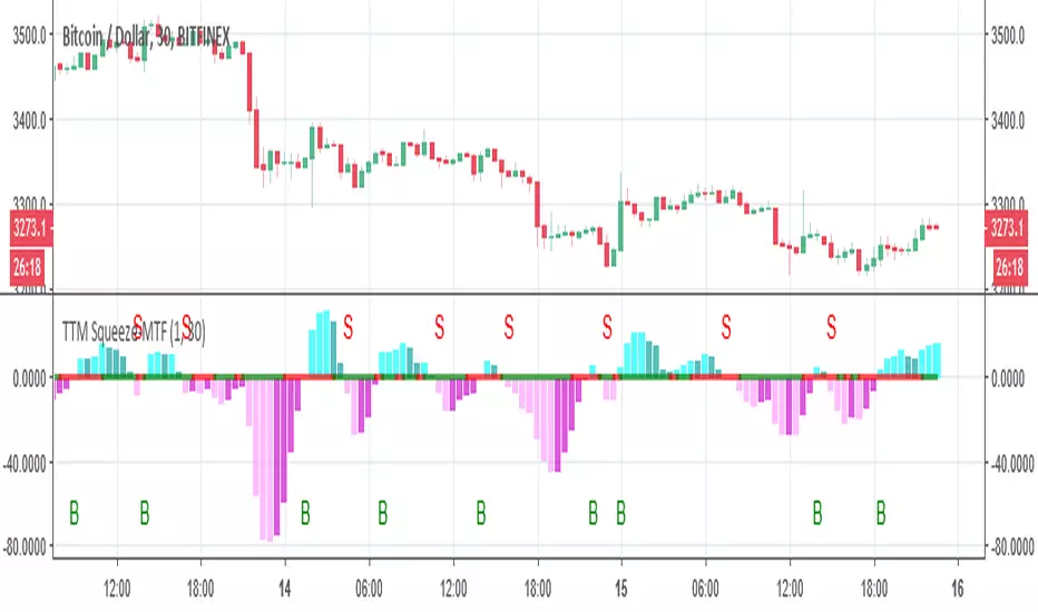
TTM Squeeze-MTFthe script based on
I just change it to be non repainting MTF and add signals
you can change the MTF by changing int2
ค้นหาในสคริปต์สำหรับ "mtf"
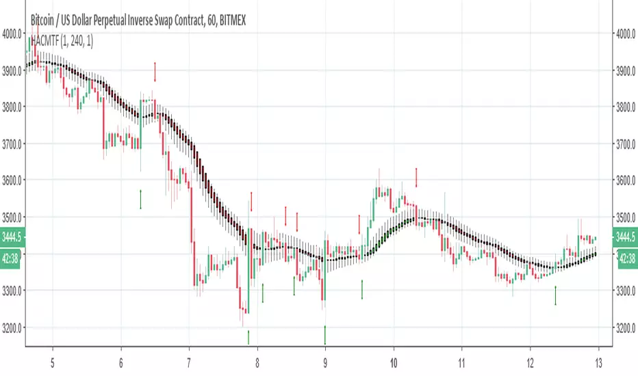
Heiken Ashi Candles MTFThis script allow you to get the HA candles in different MTF settings (MTF calculated as length not as time) . since we do not use security fuction we do not have repaint issue
Use the int2 to change the time frame
Up/Down Range Momentum MTFSo using the script of
and adding non repainting MTF function to it we create this momentum model
You can enter either at cross of blue line or at cross of 0 and vice versa at red line.
since it has MTF function you can look it on different time frames just set int 2 to the TF of your desire

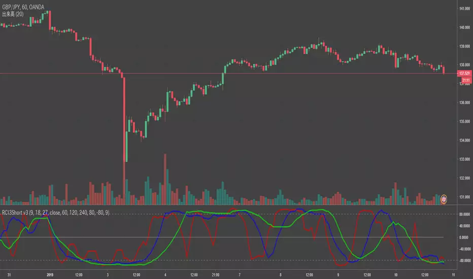
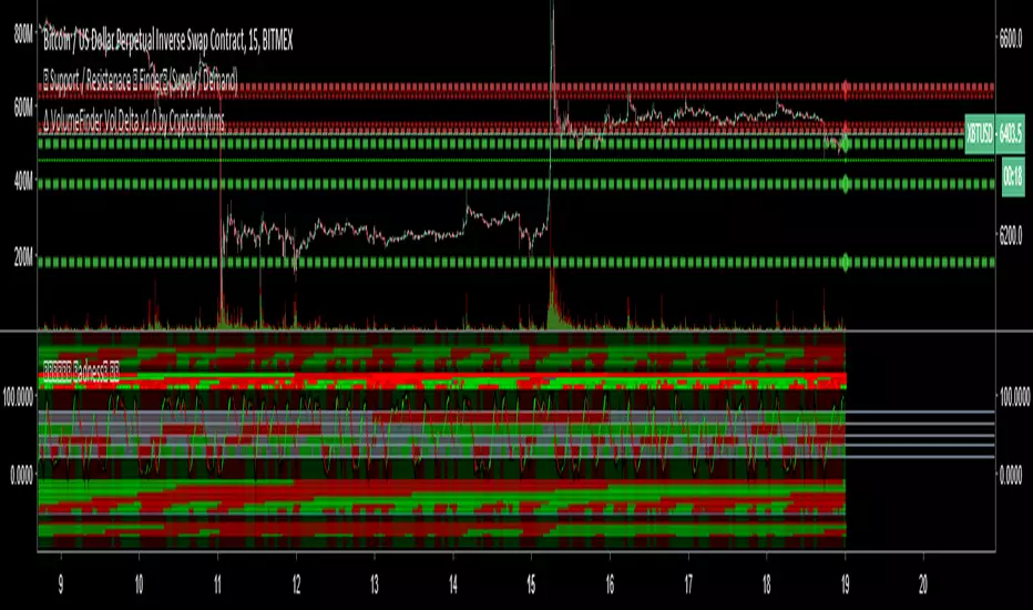
RCI3Short MTFFor RCI lover.
We are facing a timeout problem on smart phone apps of TV.
It looks like a staircase, but It frees us from timeout problems.
default MTF: 60 / 120 / 240
MTF line as middle/long lines
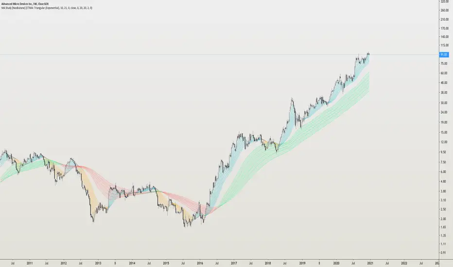
MA Study: Different Types and More [NeoButane]A study of moving averages that utilizes different tricks I've learned to optimize them. Included is Bollinger Bands, Guppy (GMMA) and Super Guppy.
The method used to make it MtF should be more precise and smoother than regular MtF methods that use the security function. For intraday timeframes, each number represents each hour, with 24 equal to 1 day. For daily, 3 is 3 day, for weekly, 4 is the 4 weekly, etc. If you're on a higher timeframe than the one selected, the length will not change.
Log-space is used to make calculations work on many cryptos. The rules for color changing Guppy is changed to make it not as choppy on MAs other than EMA. Note that length does not affect SWMA and VWAP and source does not affect VWAP.
A short summary of each moving average can be found here: medium.com
List of included MAs:
ALMA: Arnaud Legoux
Double EMA
EMA: Exponential
Hull MA
KAMA: Kaufman Adaptive
Linear Regression Curve
LSMA: Least Squares
SMA: Simple
SMMA/RMA: Smoothed/Running
SWMA: Symm. Weighted
TMA: Triangular
Triple EMA
VWMA: Volume Weighted
WMA: Weighted
ZLEMA: Zero Lag
VWAP: Vol Weighted Average
Welles Wilder MA
BottomFinder MTF Madness - 5x MTF Grid IndicatorsHello Again Trading View!
Bottom Finder Team here bringing another delicious indicator, this time to help spot those trends! This version is closed for Beta Testing with our subscribers only for the next few weeks. After beta improvements it will be released free to anyone who signs up as a free member on our site.
This is meant to be used on the 15m timeframe, and it looks up into higher TF's. It is meant to be maximized, so have this open in one tab and the chart on another. Dual Monitors are best. All options and Time frames are fully configurable inputs.
Indicators from top to bottom are:
1.)Polarity Filtration - 6 Timeframes
2.)Price Volume Trend - 4 Timeframes
3.)Stochastic RSI - 4 Timeframe Grid, and Current Timeframe in lines/ribbons
4.)MACD Crossovers - 8 Timeframes
5.)SuperTrend - 4 Timeframes
And last...
6.)Background Color indicator is up/down (green/red) price on 1 Hour Heiken Ashi candle chart.
No more swapping back and forth between timeframes!
For access to this and many other exclusive indicators - you can visit our telegram and ask about becoming a subscriber. All our paid indicators have a reasonable lifetime cap price. Once you reach it, indicator is yours for life - no more subscription.
ADX-DI MTF trend indication - JD version 2Version 2 added support for MTF, to see the trend direction on the lower or higher timeframe.
As an example to see the difference, the indicator is added three times, one time for the current TF, one set at the higher and one at the lower TF.
Cudo's to Chris Moody for the MTF-switching-code!!
JD.

BrainTrend MTF(Multi Time Frame ) No Repaint version
This is the NO REPAINT version with new algorithm, it also comes with alert.
In the original version, signal on current bar will always change until the Close price is fixed.
With this MTF version BrainTrend, you can apply any time frame of BrainTrend to your current chart.
As long as the selected MTF time frame is greater than the chart time frame.
BrainTrade is ideal for both day trading and position trading. BrainTrade help you to focus on the most essential information on markets. BrainTrade indicators provide market directions, provide trend and stops, provide buy and sell signals. With BrainTrade you now have immediate access to the river of information about the major trend changes, buy and sell signals, and stops for large number of market symbols. BrainTrade is revolutionizing the very nature of trading. People have lived for so long without information at their fingertips that they don’t realize what they’re missing.
Parameters available for you to adjust the BrainTrend Indicator.
timeframe: choos your desired timeframe.
stoch_period
stoch_max
stoch_min
atr_current_norm_factor
atr_before_norm_factor
atr_period
atr_before_step
Since there already are many explaination and details about this indicator, we don't repeat it here.
It works on all time frame and all markets(Stocks, Futures, Forex, Options,ETF, etc.)

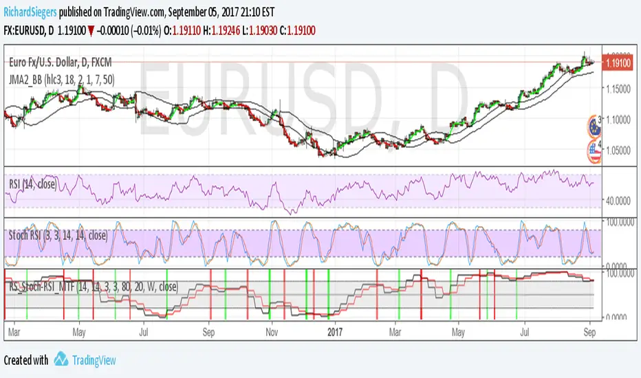
RS_Stoch-RSI_MTFmodification by Richard Siegers that turned stochastic mtf from ChrisMoody into stochastic-rsi mtf
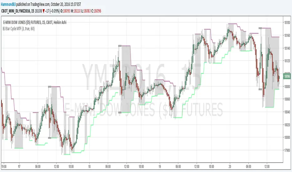
B3 Bar Cycle MTF (fix)Apologies, there was an error in printing for the thick gray boxes, happened when MTF was switched on. All better, and here is the details from before:
This is an interesting study that can be used as a tool for determining trend direction, and also could be a trailing stop setter. I use it as a gauge on MTF settings. If on, you can look at the bar cycle of the 1h while on the 15m giving you a lot of information in one tool. If a line is missing high or low, it is because it was broken, if both exist you are trading in range and cloud appears. If both sides break you get thick gray boxes above and below bar.
Get used to editing the inputs to suit your liking. Often 3-5 length and always looking at different resolutions to get a big picture story. You could put multiple instances of the study up to see them simultaneously. I based the idea off of Krausz's 3 day cycle which you can read about in his teachings. I tend to find it looking better using Heikin Ashi bar-style.
True Strength Indicator MTFHere is an example of a script showing a multi-time frame of TSI.
Chart below compares FX EURUSD Daily TSI to 1H TSI
Here is an updated version
study("True Strength Indicator MTF", shorttitle="TSI MTF")
resCustom = input(title="Timeframe", type=resolution, defval="60" )
long = input(title="Long Length", type=integer, defval=25)
short = input(title="Short Length", type=integer, defval=13)
signal = input(title="Signal Length", type=integer, defval=13)
price = close
double_smooth(src, long, short) =>
fist_smooth = ema(src, long)
ema(fist_smooth, short)
pc = change(price)
double_smoothed_pc = double_smooth(pc, long, short)
double_smoothed_abs_pc = double_smooth(abs(pc), long, short)
tsi_value = 100 * (double_smoothed_pc / double_smoothed_abs_pc)
tsi = security(tickerid, resCustom,tsi_value)
plot(tsi, color=black)
plot(ema(tsi, signal), color=red)
hline(0, title="Zero")

Turtle MTF Donchian plus ATR What you’re looking at
This indicator is a Turtle-style breakout system:
Donchian Channels = breakout levels (entry signals)
ATR = how far to place your Stop Loss and Take Profit (or Donchian exit if you turn that on)
And it can do it on a different timeframe than your chart (MTF).
Step-by-step: how it works
1) You choose your “Signal Timeframe”
In settings:
Signal Timeframe = 1 → signals are based on 1 minute
5 → based on 5 minute
60 → 1 hour
D → daily
✅ You can be on a 1m chart but set signals to D if you want only swing signals.
2) It builds the Donchian breakout levels
It calculates:
Donchian High = the highest high of the last entryLen candles (default 20), excluding the current candle
Donchian Low = the lowest low of the last entryLen candles, excluding current candle
Those two lines are your breakout “walls”.
3) It waits for a REAL breakout (fresh cross)
A long setup triggers only when:
price crosses ABOVE the Donchian High (not just stays above)
A short setup triggers only when:
price crosses BELOW the Donchian Low
✅ This reduces spam signals.
4) It calculates ATR on the same signal timeframe
ATR is volatility. Bigger ATR = bigger stop/target.
Defaults:
ATR length = 20
5) It creates your Entry / SL / TP levels automatically
When a LONG triggers:
Entry = Donchian High
Stop Loss = Entry − (SL mult × ATR)
(default SL mult is 2 → so 2×ATR stop)
Take Profit (if you’re using TP mode) = Entry + (TP mult × ATR)
When a SHORT triggers:
Entry = Donchian Low
Stop Loss = Entry + (SL mult × ATR)
Take Profit = Entry − (TP mult × ATR)
6) It prints it on the chart (easy mode)
When a signal happens it will:
Drop a label that says LONG or SHORT
Show the numbers:
Entry
SL
TP (or Donchian exit level)
Draw horizontal lines for Entry / SL / TP (latest signal only)
7) It can use “true Turtle exit” if you want
If you turn ON:
Use Turtle Exit Rule
Then it does NOT use a fixed TP.
Instead it says:
Long: exit when price breaks below the Donchian exit low (default exitLen = 10)
Short: exit when price breaks above the Donchian exit high
That’s the classic “let winners run” vibe.
8) Alerts (Option A)
You can set alerts for:
Turtle Long
Turtle Short
Those alerts are simple and reliable (no dynamic text).
How YOU would use it (quick examples)
If you trade 1m intraday
Chart: 1m
Signal Timeframe: 1
Try entryLen: 40–60 (less choppy than 20)
ATR: 14–20
SL: 2×ATR
If you want daily swings too
Chart: 1m (for execution)
Signal Timeframe: D (for direction/entries)
That gives you swing breakouts while you watch intraday.

RSI Divergence + MTF Table + Price Wicks Lines - V2This script combines a classic RSI divergence indicator with a multi–timeframe RSI dashboard.
Main features:
Detects and plots:
Regular bullish & bearish RSI divergence
Hidden bullish & hidden bearish RSI divergence
Dynamic RSI line color:
Green in strong bullish zone
Red in strong bearish zone
Yellow in neutral zone
Standard RSI levels:
70 / 30 overbought–oversold
50 midline with highlighted band
MTF RSI table:
Compact RSI dashboard on the right side of the chart
Timeframes: 1m, 5m, 15m, 30m, 1h, 4h, 8h, 12h, 1D (each can be turned on/off)
Background color highlights extreme RSI:
Red / orange for overbought
Lime for oversold
This tool is designed to help traders quickly see divergence signals on the current chart while also monitoring RSI conditions across multiple timeframes in one place.

RSI Divergence Indicator (Fixed RSI Color + MTF Table)This script combines a classic RSI divergence indicator with a multi–timeframe RSI dashboard.
Main features:
Detects and plots:
Regular bullish & bearish RSI divergence
Hidden bullish & hidden bearish RSI divergence
Dynamic RSI line color:
Green in strong bullish zone
Red in strong bearish zone
Yellow in neutral zone
Standard RSI levels:
70 / 30 overbought–oversold
50 midline with highlighted band
MTF RSI table:
Compact RSI dashboard on the right side of the chart
Timeframes: 1m, 5m, 15m, 30m, 1h, 4h, 8h, 12h, 1D (each can be turned on/off)
Background color highlights extreme RSI:
Red / orange for overbought
Lime for oversold
This tool is designed to help traders quickly see divergence signals on the current chart while also monitoring RSI conditions across multiple timeframes in one place.

SR Channel + EMA + RSI MTF + VolHighlightSR + Volume + RSI MTF – edited by Mochi
This indicator combines three tools into a single script:
SR Zones from Pivots
Automatically detects clusters of pivot highs/lows and groups them into support and resistance zones.
Zone width is tightened using a percentage of the pivot cluster range so levels are more precise and cleaner.
Each zone includes:
A colored box (SR area),
A dashed midline,
A POC line (price level with the highest traded volume inside the zone),
A label showing the zone price and distance (%) from current price.
Zone color is dynamic but simple and stable:
If price closes below the mid of the zone → it is treated as resistance (red).
If price closes above the mid of the zone → it is treated as support (green).
Box, lines, and label always share the same color.
Volume Inside the Zone + POC
Calculates buy/sell volume for candles whose close lies inside each zone.
Uses abs(buyVol − sellVol) / (buyVol + sellVol) to measure volume imbalance and control box opacity:
Stronger, more one‑sided volume → darker box (stronger zone).
POC is drawn as a thin line with the same color as the zone to highlight the best liquidity level for entries/TP.
Multi‑Timeframe RSI Dashboard
Shows RSI(14) values for multiple timeframes (1m, 5m, 15m, 30m, 1h, 4h, 8h, 1d), each can be toggled on/off.
Background color of each RSI cell:
RSI > 89 → red (strong overbought),
80–89 → orange (warning area),
RSI < 28 → lime (strong oversold),
Otherwise → white (neutral).
The goal of this script is to give traders a clear view of:
Key support/resistance zones,
Their volume quality and POC,
And multi‑TF overbought/oversold conditions via the RSI dashboard – all in one indicator to support retest/flip‑zone trading.

SR Channel + EMA + RSI MTF + VolHighlight - Edited by MochiSR + Volume + RSI MTF – edited by Mochi
This indicator combines three tools into a single script:
SR Zones from Pivots
Automatically detects clusters of pivot highs/lows and groups them into support and resistance zones.
Zone width is tightened using a percentage of the pivot cluster range so levels are more precise and cleaner.
Each zone includes:
A colored box (SR area),
A dashed midline,
A POC line (price level with the highest traded volume inside the zone),
A label showing the zone price and distance (%) from current price.
Zone color is dynamic but simple and stable:
If price closes below the mid of the zone → it is treated as resistance (red).
If price closes above the mid of the zone → it is treated as support (green).
Box, lines, and label always share the same color.
Volume Inside the Zone + POC
Calculates buy/sell volume for candles whose close lies inside each zone.
Uses abs(buyVol − sellVol) / (buyVol + sellVol) to measure volume imbalance and control box opacity:
Stronger, more one‑sided volume → darker box (stronger zone).
POC is drawn as a thin line with the same color as the zone to highlight the best liquidity level for entries/TP.
Multi‑Timeframe RSI Dashboard
Shows RSI(14) values for multiple timeframes (1m, 5m, 15m, 30m, 1h, 4h, 8h, 1d), each can be toggled on/off.
Background color of each RSI cell:
RSI > 89 → red (strong overbought),
80–89 → orange (warning area),
RSI < 28 → lime (strong oversold),
Otherwise → white (neutral).
The goal of this script is to give traders a clear view of:
Key support/resistance zones,
Their volume quality and POC,
And multi‑TF overbought/oversold conditions via the RSI dashboard – all in one indicator to support retest/flip‑zone trading.

SR + Volume + RSI MTF - edited by MochiSR + Volume + RSI MTF – edited by Mochi
This indicator combines three tools into a single script:
SR Zones from Pivots
Automatically detects clusters of pivot highs/lows and groups them into support and resistance zones.
Zone width is tightened using a percentage of the pivot cluster range so levels are more precise and cleaner.
Each zone includes:
A colored box (SR area),
A dashed midline,
A POC line (price level with the highest traded volume inside the zone),
A label showing the zone price and distance (%) from current price.
Zone color is dynamic but simple and stable:
If price closes below the mid of the zone → it is treated as resistance (red).
If price closes above the mid of the zone → it is treated as support (green).
Box, lines, and label always share the same color.
Volume Inside the Zone + POC
Calculates buy/sell volume for candles whose close lies inside each zone.
Uses abs(buyVol − sellVol) / (buyVol + sellVol) to measure volume imbalance and control box opacity:
Stronger, more one‑sided volume → darker box (stronger zone).
POC is drawn as a thin line with the same color as the zone to highlight the best liquidity level for entries/TP.
Multi‑Timeframe RSI Dashboard
Shows RSI(14) values for multiple timeframes (1m, 5m, 15m, 30m, 1h, 4h, 8h, 1d), each can be toggled on/off.
Background color of each RSI cell:
RSI > 89 → red (strong overbought),
80–89 → orange (warning area),
RSI < 28 → lime (strong oversold),
Otherwise → white (neutral).
The goal of this script is to give traders a clear view of:
Key support/resistance zones,
Their volume quality and POC,
And multi‑TF overbought/oversold conditions via the RSI dashboard – all in one indicator to support retest/flip‑zone trading.

RSI Monitor (High/Low) + MTF & Time FilterDual-Source RSI: Calculates RSI on the candle High (to detect selling pressure/overbought) and Candle Low (to detect buying pressure/oversold) rather than just the Close.
Multi-Timeframe (MTF) Dashboard: An on-screen table displays the Real-Time RSI High and Low values for your current chart plus two user-defined higher timeframes (e.g., 1H, 4H).
Session-Based Alerts: A built-in time filter restricts alerts to a specific trading window (e.g., 09:30–16:00), effectively blocking signals during low-volume overnight sessions.
Independent Alert Timeframe: You can configure alerts to monitor a specific timeframe (e.g., 60-min) regardless of the timeframe you are currently viewing.
Real-Time Execution: Alerts trigger immediately when levels are crossed (no bar-close confirmation required), ensuring you catch moves as they happen.

Scanner Pro MTF v9.3Manual Script Trading Scanner Pro MTF v9.3
How to Interpret Your New Tool
• Total Alignment (The Holy Grail): When you see the chart turn green (LONG) from 15m to D1, it's a high-probability signal that the cycle's bottom has been confirmed.
• Inside Bars (Yellow Dots): When they appear near a support level, they indicate indecision. If the next candle breaks upwards with high volume ('V' on the chart), it's your entry confirmation.
Here's an explanation of the symbols:
1. The Fuchsia Diamond (The "Little Squares")
This symbol represents a Squeeze (Volatility Compression).
• What it means: It appears when the Bollinger Bands move inside the Keltner Channels.
• Interpretation: It indicates that the market is in a period of extreme calm or accumulation. Historically, after a "Squeeze," an explosive price movement occurs.
• Use in your Roadmap: If Bitcoin reaches $59,000 and these fuchsia diamonds start appearing, get ready: the market is building energy for the next big surge.
2. The White "V" (Unusual Volume)
This signal appears at the top of the chart when there is a spike in volume.
• What it means: It is activated when the volume of the current candle is 50% higher than the average of the last 20 candles (volume > ta.sma(volume, 20) * 1.5).
• Interpretation: It confirms the intention. A breakout from support or resistance with a "V" is much more reliable than one without volume.
• Use in your Roadmap: If you see a strong green candle bouncing off a support level with a "V" above it, it's a sign that institutions ("Smart Money") are buying.
3. The Yellow Circle (Inside Bar)
This symbol appears above candles that are "trapped" within the range of the previous candle.
• What it means: The high of the candle is lower than the previous one, and its low is higher than the previous one.
• Interpretation: It is a sign of pause and indecision. The market is compressing the price into a narrow range.
• Strategy: Often, the price breaks out strongly after an Inside Bar. It's like a spring being compressed.
________________________________________
Trading Summary:
• Ideal Buy Signal: Price near support + Fuchsia Diamond (Squeeze) + Yellow Circle (Inside Bar) + Bullish breakout with a "V" (Volume).
• Confirmation: All of the above occurs while the chart in row D1 or H4 changes to LONG (Green).
• Ideal Sell Signal: Price near resistance + Fuchsia Diamond (Squeeze) + Yellow Circle (Inside Bar) + Bearish breakout with a "V" (Volume).
• Confirmation: All of the above occurs while the chart in row D1 or H4 changes to SHORT (Red).

Market Phase Dashboard MTFGetting into a trade is the easy part. if anyone out there could use a little assistance in knowing when to exit a trade this ones for you..
This is a Market Phase Dashboard MTF (Multi-Timeframe) that classifies market conditions into 4 distinct phases based on trend + momentum alignment. Here's what it does:
The 4 Market Phases:
CONTINUATION 🟢 - Uptrend (EMA rising) + Strong momentum (RSI > 55)
Translation: "Trend is strong, keep riding it"
SLOWING 🟠 - Two scenarios:
Uptrend but momentum fading (RSI ≤ 55), OR
Downtrend but momentum not fully committed (RSI ≥ 45)
Translation: "Trend losing steam, be cautious"
EXHAUSTION 🔴 - Downtrend (EMA falling) + Weak momentum (RSI < 45)
Translation: "Trend is dying, possible reversal coming"
NEUTRAL ⚪ - Anything that doesn't fit above (shouldn't happen much with these thresholds)
Multi-Timeframe View:
Shows phases for:
Chart TF - Whatever timeframe you're viewing (only updates on confirmed bar close)
5m - Always shows 5-minute phase
15m - Always shows 15-minute phase
Visual Cues:
Background color changes based on the live chart timeframe phase (updates in real-time, not waiting for bar close)
Table shows confirmed phases for all timeframes
Practical Use:
Helps you understand if different timeframes are aligned. For example:
All 3 showing CONTINUATION = strong aligned trend, high confidence trades
15m EXHAUSTION but 5m CONTINUATION = possible short-term bounce in downtrend
Mixed signals = choppy/transitional market, stay cautious
It's basically a trend health checker across multiple timeframes at a glance! I am also in the works of adding every higher time frame so that it will consist of 5 min all the way to the 12 mo time frame i will keep you guys updated as i update this indicator.

Unmitigated Cave Diving MTF High Low - BookMap Style Chart
Unmitigated Cave Diving MTF High Low - BookMap Style Chart
Introduction
This Pine Script indicator tracks unmitigated higher timeframe highs and lows with a session-aware approach, inspired by KinetiCapital's X D HL Targets.
Built for precision trading on instruments like NQ during extended trading hours (ETH), it visualizes support and resistance levels that have not yet been breached, helping traders identify key price zones for potential reversals or breakouts.
Core Features
The indicator monitors multi-timeframe levels (default 15-minute) and applies intelligent styling based on recency and survival duration:
Most Recent Levels: The 1st and 2nd most recent unmitigated highs and lows are highlighted with distinct colors and widths for quick visual identification
Session Age Tracking: Levels are categorized by how many full trading sessions (1800-1700 NQ ETH) they've survived unmitigated, with "old" levels receiving special highlighting once they exceed your defined threshold
BookMap-Style Visualization: Clean horizontal lines with optional price labels positioned above highs and below lows for minimal chart clutter
Real-Time Summary Table: Displays the four most recent levels with their prices, distance in points from current price, and session age
Mitigation Logic
Levels automatically update when price touches them - high levels are mitigated when price reaches or exceeds them, while low levels are mitigated when price touches or breaks below. Mitigated levels change to a neutral gray color and can optionally be deleted at session end to preserve chart memory.
This tool is particularly valuable for intraday traders who trade around key structural levels and need to understand which unmitigated zones represent the freshest or most significant price memory in the market.

Hybrid Strategy: Trend/ORB/MTFHybrid Strategy: Trend + ORB + Multi-Timeframe Matrix
This script is a comprehensive "Trading Manager" designed to filter out noise and identify high-probability breakout setups. It combines three powerful concepts into a single, clean chart interface: Trend Alignment, Opening Range Breakout (ORB), and Multi-Timeframe (MTF) Analysis.
It is designed to prevent "analysis paralysis" by providing a unified Dashboard that confirms if the trend is aligned across 5 different timeframes before you take a trade.
How it Works
The strategy relies on the "Golden Trio" of confluence:
1. Trend Definition (The Setup) Before looking for entries, the script analyzes the immediate trend. A bullish trend is defined as:
Price is above the Session VWAP.
The fast EMA (9) is above the slow EMA (21). (The inverse applies for bearish trends).
2. The Signal (The Trigger) The script draws the Opening Range (default: first 15 minutes of the session).
Buy Signal: Price breaks above the Opening Range High while the Trend is Bullish.
Sell Signal: Price breaks below the Opening Range Low while the Trend is Bearish.
3. The Confirmation (The Filter) A signal is only valid if the Higher Timeframe (default: 60m) agrees with the direction. If the 1m chart says "Buy" but the 60m chart is bearish, the signal is filtered out to prevent false breakouts.
Key Features
The Matrix Dashboard A zero-lag, real-time table in the corner of your screen that monitors 5 user-defined timeframes (e.g., 5m, 15m, 30m, 60m, 4H).
Trend: Checks if Price > EMA 21.
VWAP: Checks if Price > VWAP.
ORB: Checks if Price is currently above/below the Opening Range of that session.
D H/L: Warns if price is near the Daily High or Low.
PD H/L: Warns if price is near the Previous Daily High or Low.
Visual Order Blocks The script automatically identifies valid Order Blocks (sequences of consecutive candles followed by a strong explosive move).
Chart: Draws Green/Red zones extending to the right, showing where price may react.
Dashboard: Displays the exact High, Low, and Average price of the most recent Order Blocks for precision planning.
Risk Management (Trailing Stop) Once a trade is active, the script plots Chandelier Exit dots (ATR-based trailing stop) to help you manage the trade and lock in profits during trend runs.
Visual Guide (Chart Legend)
⬜ Gray Box: Represents the Opening Range (first 15 minutes). This is your "No Trade Zone." Wait for price to break out of this box.
🟢 Green Line: The Opening Range High. A break above this line signals potential Bullish momentum.
🔴 Red Line: The Opening Range Low. A break below this line signals potential Bearish momentum.
🟢 Green / 🔴 Red Zones (Boxes): These are Order Blocks.
🟢 Green Zone: A Bullish Order Block (Demand). Expect price to potentially bounce up from here.
🔴 Red Zone: A Bearish Order Block (Supply). Expect price to potentially reject down from here.
⚪ Dots (Trailing Stop):
🟢 Green Dots: These appear below price during a Bullish trend. They represent your suggested Stop Loss.
🔴 Red Dots: These appear above price during a Bearish trend.
🏷️ Buy / Sell Labels:
BUY: Triggers when Price breaks the Green Line + Trend is Bullish + HTF is Bullish.
SELL: Triggers when Price breaks the Red Line + Trend is Bearish + HTF is Bearish.
Settings
Session: Customizable RTH (Regular Trading Hours) to filter out pre-market noise.
Matrix Timeframes: 5 fixed slots to choose which timeframes you want to monitor.
Order Blocks: Adjust the sensitivity and lookback period for Order Block detection.
Risk: Customize the ATR multiplier for the trailing stop.
Disclaimer
This tool is for educational purposes only. Past performance does not guarantee future results. Always manage your risk properly.
