Previous 2Days High/LowTesting simple range of highs/lows of previous 2 days, for reference, working on every timeframe.
ค้นหาในสคริปต์สำหรับ "low"

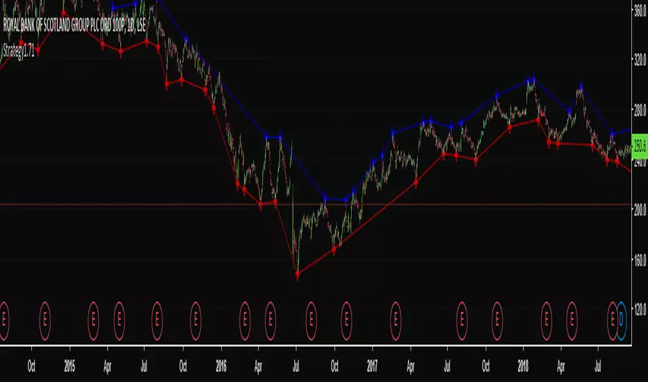
High & Low Pivot Strategy v1.0A system that determines what direction the market is trending by analysing previous high and low pivot points to set up an entry trade.
Previous High/Low Current OpenDisplays
Previous Monthly/Weekly/Daily High/Low over current prices
Current Monthly/Weekly/Daily Open over current prices

HI-LOW fibThis model show the price and its relation to fib levels in a diffrent way
also easy to put inside other indicator like rsi ,dmi stoch etc ...
the lines represents the fib level and the price will go from low to high fib and vice versa
so it a different way to look on the fibs in a graph

Is Open equal to High or LowMany people are watching opening price on each time axis. Opening price is very important.
This indicator displays OHLC Open as a line in multiple time frame.
If open is close to high or low, the color of the line changes.
The fact that they are close means the strength of the market flow and the firmness of that price range.
Note:
The color of the line will not be fixed until bar is closed.
And when using, please set arbitrary coefficient according to each market.
Coefficient e.g.
EURUSD: 0.00005
BTCUSD: 1
DJI: 5
BTCJPY: 100
USDJPY: 0.01
NI225: 2

Open = High or Low?Open = High or Low? (o=horl)
Coefficient e.g.
EURUSD: 0.0001
BTCJPY: 100
USDJPY: 0.01
BTCUSD: 1
Swing Highs and LowsSimple script to overlay swing highs and lows.
A Swing High (SH): a price bar high preceded by two lower highs (LH) and followed by two lower highs (LH).


Higher Lows / Lower Highs AlertsSet an alert with this indicator for greater than 0.99 which will notify you of when a higher low or lower high is printed on the chart
Consecutive Highs/LowsTrack consecutive new highs/lows outside the Donchian range. Fans of the oldschool Turtle Strategy should enjoy the visualization.
Same logic as my "Walking the Bands" script, just with Donchian breaks instead of Bollinger tags.

Multiple EMA 34(low-close-high)/89 by EricThis script supports for multiple EMA 34(low-close-high)/89 indicator.
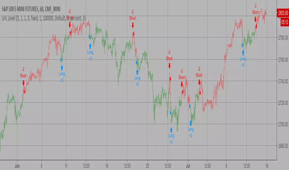
Last High and Low Level Backtest This script shows a high and low period value.
SelectPeriod - Day or Week or Month and etc.
LookBackPeriods - Shift levels 0 - current period, 1 - previous and etc.
You can change long to short in the Input Settings
WARNING:
- For purpose educate only
- This script to change bars colors.
Last High and Low Level Strategy This script shows a high and low period value.
SelectPeriod - Day or Week or Month and etc.
LookBackPeriods - Shift levels 0 - current period, 1 - previous and etc.
WARNING:
- This script to change bars colors

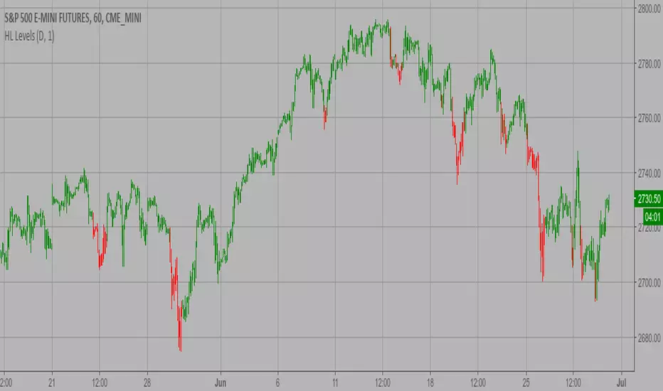
High and Low Levels Backtest This script shows a high and low period value.
Width - width of lines
SelectPeriod - Day or Week or Month and etc.
LookBack - Shift levels 0 - current period, 1 - previous and etc.
You can change long to short in the Input Settings
WARNING:
- For purpose educate only
- This script to change bars colors.

High and Low Levels Strategy This script shows a high and low period value.
Width - width of lines
SelectPeriod - Day or Week or Month and etc.
LookBack - Shift levels 0 - current period, 1 - previous and etc.
WARNING:
- This script to change bars colors.
Chad Swing High/Low (Prophet)Marks swing highs and lows (e.g: a high with a lower high on either side), to simplify counting CBLs.
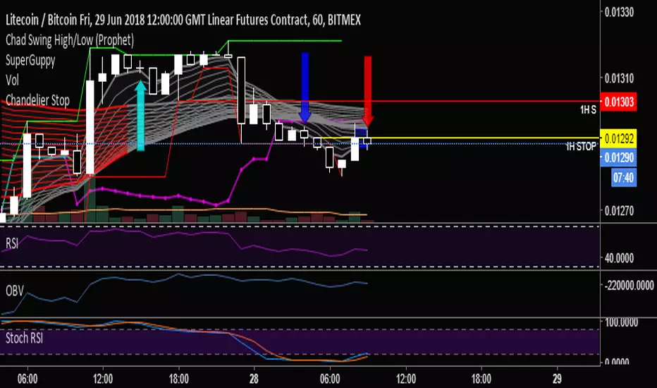
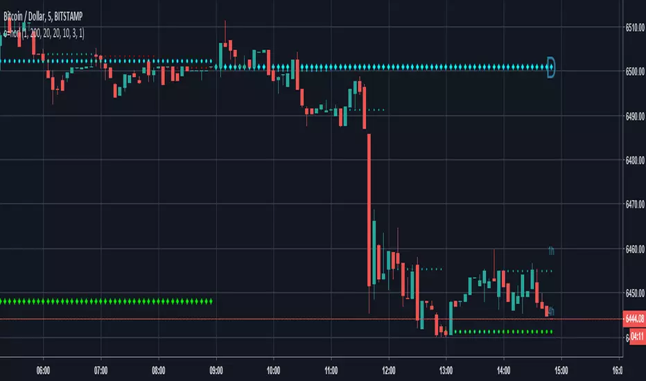
Chart Mojo Noiz Day High/LowThis is an intraday indicator that indicates days high, low, mid range (50%), and vwap. I use it on a 5 min chart or under. Its for range trading, also breakouts, and I use the zone between the 50% of range and vwap as a target during the day at certain times..it has "gravity" ..when traders unwind and or position ahead of something, news or certain time zones with tendencies etc price is drawn towards it. Thanks to Noiz for working on the script. Hope it gives you some Chartmojo.


