ian_Trado v15 Trend Entry Filter# 📈 ian_Trado v15 Trend Entry Filter (Pine Script v6)
The **ian_Trado v15** is a multi-factor **trend confirmation filter** for NASDAQ (NAS100), Dow Jones (DJ30), Gold (XAU), DAX, and USDJPY.
It combines **EMA structure**, **Donchian channel breakout**, **MACD histogram momentum**, **Volume confirmation**, and a **Range Compression Filter** to avoid entering during choppy or sideways markets.
✅ Designed for **bot deployment** (e.g., grid bots, long/short breakout bots) or **manual trading**.
---
## 🔍 How This Filter Works:
1. **EMA Trend Confirmation**
- Long Trend: EMA(1) > EMA(5) > EMA(60)
- Short Trend: EMA(1) < EMA(5) < EMA(60)
2. **Donchian Channel Width Expansion**
- Only allows trades when the **breakout width** exceeds a minimum threshold.
3. **MACD Histogram Slope Filter (Optional)**
- Confirms momentum building in the direction of the trend.
- Strict Mode: MACD histogram must consistently rise or fall over 3 bars.
4. **Volume Filter (Optional)**
- Ensures volume supports the move (filters out weak conditions).
5. **Range Compression Filter (Optional)**
- Avoids entries during sideways chop.
6. **Cooldown Control**
- Limits overtrading by requiring spacing between entries.
7. **Exit Conditions**
- Gray dot appears when trending conditions are no longer valid.
---
## ⚙️ Settings Explained:
| Setting | Description |
|:--------|:------------|
| **Cooldown Bars** | Minimum bars between consecutive entries |
| **Profit Target (%)** | Visual profit marker for exit tracking |
| **Donchian Channel Length** | Lookback period for detecting breakout width |
| **Minimum Donchian Width** | Threshold to confirm meaningful breakouts |
| **Volume Lookback Period** | Average volume validation window |
| **Box Range (Range Compression)** | Max allowed price range over lookback bars |
| **Range Compression Bars** | Number of bars to check for range compression |
| **Strict MACD Filter** | Use stricter MACD slope checks |
---
## 📊 Recommended Settings by Instrument (1H Chart):
| Asset | Min Donchian Width | Range Compression | Profit Target |
|:------|:-------------------|:------------------|:--------------|
| **NAS100** (Nasdaq) | 300–450 pts | 400 pts / 40 bars | 1.5% |
| **DJ30** (Dow Jones) | 400–600 pts | 500 pts / 40 bars | 1.0–1.5% |
| **XAU/USD** (Gold) | 10–15 pts | 8 pts / 30 bars | 0.8–1.2% |
| **DAX40** (Germany) | 200–300 pts | 250 pts / 40 bars | 1.0% |
| **USD/JPY** (Forex) | 0.5–0.8 pts | 0.4 pts / 40 bars | 0.5–0.8% |
---
## 🔔 Alerts Available:
- Long Entry
- Short Entry
- Exit Zone
> **Note:** Volume filter may be disabled if volume is unreliable (e.g., some forex pairs).
---
## 📅 Version:
- **ian_Trado v15** — April 2025
- Built with **Pine Script v6** for maximum stability
- Clean toggling and plotting logic (no `na` errors)
ค้นหาในสคริปต์สำหรับ "histogram"
Scalping 15min: EMA + MACD + RSI + ATR-based SL/TP📈 Strategy: 15-Minute Scalping — EMA + MACD + RSI + ATR-based SL/TP
This scalping strategy is designed for 15-minute charts and combines trend-following and momentum confirmation with dynamic stop loss and take profit levels based on volatility.
🔧 Indicators Used:
EMA 50 — identifies the main trend
MACD Histogram — confirms momentum direction
RSI (14) — filters overbought/oversold conditions
ATR (14) — dynamically sets SL and TP based on market volatility
📊 Entry Conditions:
Long Entry:
Price is above EMA 50
MACD histogram is positive
RSI is above 50 but below 70
Short Entry:
Price is below EMA 50
MACD histogram is negative
RSI is below 50 but above 30
🛑 Risk Management:
Stop Loss: 1×ATR (user-configurable)
Take Profit: 2×ATR (user-configurable)
These values can be adjusted in the script inputs depending on your risk/reward preference or market conditions.
⚠️ Notes:
Strategy is optimized for scalping fast-moving pairs (e.g. crypto, forex).
Works best in trending markets.
Use backtesting and forward testing before live trading.

Trend Strength MeterThe Trend Strength Meter (TSM) is a powerful and versatile indicator designed to help traders identify market trends, measure their strength, and detect potential reversals with ease. This indicator combines the power of moving averages, divergence detection, and a clean, customizable dashboard to provide actionable insights for traders of all levels.
How It Works
Trend Strength Calculation:
1. The TSM calculates the trend strength using the difference between two Exponential Moving Averages (EMAs): a fast EMA (default: 20) and a slow EMA (default: 50).
2. The difference is expressed as a percentage of the slow EMA, providing a clear measure of the trend's strength and direction.
Histogram Visualization:
1. A color-coded histogram visually represents the trend strength:
Green: Bullish trend
Red: Bearish trend
Gray: Neutral or no significant trend
2. A smoothed trend strength line (SMA of the trend strength) is also plotted for better clarity.
Divergence Detection:
1. The indicator detects bullish and bearish divergences using the RSI (Relative Strength Index) and price action.
2. Bullish Divergence: Price makes a lower low, but RSI makes a higher low, signaling potential upward momentum.
3. Bearish Divergence: Price makes a higher high, but RSI makes a lower high, signaling potential downward momentum.
=> Divergences are marked with arrows on the chart:
Green Arrow: Bullish divergence
Red Arrow: Bearish divergence
Dashboard:
1. A clean and informative dashboard displays key information:
Trend Strength Value: The current strength of the trend
Trend Direction: Bullish, Bearish, or Neutral
Last Signal: Buy, Sell, or None (based on divergence signals)
The dashboard is fully customizable and can be positioned anywhere on the chart (e.g., top-right, bottom-left, center, etc.).
Key Features
1. Trend Strength Measurement: Quickly identify the strength and direction of the trend.
2. Divergence Detection: Spot potential reversals before they occur with bullish and bearish divergence signals.
3. Customizable Dashboard: Move the dashboard to your preferred location on the chart for better visibility.
4. User-Friendly Design: Clean visuals and intuitive color coding make it easy to interpret market conditions.
5. Actionable Signals: Provides clear Buy/Sell signals based on divergence, helping traders make informed decisions.
How to Use
1. Trend Confirmation:
Use the histogram and trend strength value to confirm the current market trend.
Green bars indicate a bullish trend, while red bars indicate a bearish trend.
2. Divergence Signals:
Look for divergence arrows (green for bullish, red for bearish) to anticipate potential reversals.
Combine divergence signals with other technical analysis tools for higher accuracy.
3. Dashboard Insights:
Monitor the dashboard for real-time updates on trend strength, direction, and the latest signal.
Use the "Last Signal" (Buy/Sell) to validate your trading decisions.
4. Custom Settings:
Adjust the EMA lengths and divergence lookback period to suit your trading style and timeframe.
Position the dashboard anywhere on the chart for convenience.
Best Practices
1. Use the TSM in conjunction with other indicators or price action analysis for confirmation.
2. Test the indicator on different timeframes to find the one that works best for your strategy.
3. Always practice proper risk management when trading.
Disclaimer
This indicator is a tool to assist in technical analysis and should not be used as a standalone trading strategy. Past performance is not indicative of future results. Always conduct your own research and consult with a financial advisor before making trading decisions.

Beep BoopThe Beep Boop indicator is designed to simplify visual trading decisions by combining the concepts of MACD (Moving Average Convergence Divergence) and a customizable EMA trend filter. It provides clear visual cues to help traders quickly assess market momentum and the current trend direction.
### What Makes Beep Boop Unique?
This indicator uniquely modifies the standard MACD histogram to create a simplified binary visualization—highlighting either bullish or bearish momentum clearly. Rather than displaying traditional MACD bars of varying sizes, it assigns fixed positive or negative values to simplify interpretation:
- A positive histogram (fixed at 0.1) indicates bullish momentum.
- A negative histogram (fixed at 0.09) indicates bearish momentum.
Additionally, Beep Boop integrates a configurable EMA (Exponential Moving Average) to filter signals, allowing traders to identify stronger directional moves by comparing the current price action with the EMA trend line:
- Bullish bars (green) appear only when price action is above the EMA.
- Bearish bars (red) appear only when price action is below the EMA.
- Neutral bars (white) appear when price action is uncertain or mixed in relation to the EMA.
### How to Use Beep Boop?
1. Fast and Slow Lengths: Adjust these to configure the MACD calculation for different timeframes or market volatility.
2. EMA Trend: Change this parameter to fine-tune the sensitivity of the EMA filter based on your preferred trading style (short-term, swing, or long-term).
3. Simple or Exponential MA: Toggle between SMA (Simple Moving Average) or EMA calculations to personalize the responsiveness of the MACD and signal lines.
### Recommended Applications
- Trend-following strategies: Clearly identifies market direction for entries and exits.
- Momentum Trading: Provides simple momentum confirmation for scalping and short-term trading.
- Market Screening: Quickly filters assets based on bullish or bearish momentum strength.
This indicator offers traders a clean, straightforward method to gauge market conditions at a glance, simplifying the complexity inherent in traditional momentum and trend indicators.
Happy Trading!

RedK VADER - Volume-Accelerated Directional Energy RatioRedK VADER - Volume-Accelerated Directional Energy Ratio
Overview
RedK VADER is an indicator that analyzes market trends by calculating the energy ratio based on price movement and volume. It utilizes Zero Lag EMA smoothing to provide faster and more responsive signals.
Features
✅ Considers both price action and volume: Calculates the energy ratio of upward and downward movements to assess market strength.
✅ Zero Lag Smoothing: Uses EMA-based smoothing to minimize lag and improve responsiveness.
✅ Histogram Display: Helps visualize trend strength and potential reversals.
✅ Simple yet effective: Uses short-term and long-term energy differences to generate intuitive trade signals.
How to Use
📌 Blue Line (RedK VADER): Indicates trend direction and strength.
📌 Orange Line (Signal Line): A smoothed version of VADER; crossovers provide trade signals.
📌 Histogram (Green Bars): Represents the difference between VADER and the signal line. When crossing the zero line, it may indicate a trend reversal.
Trade Signals
🔵 Buy Signal: When RedK VADER crosses above the signal line.
🔴 Sell Signal: When RedK VADER crosses below the signal line.
⚡ Trend Strength: The larger the histogram bars, the stronger the trend.
Use this indicator to gain deeper market insights and enhance your trading decisions! 🚀
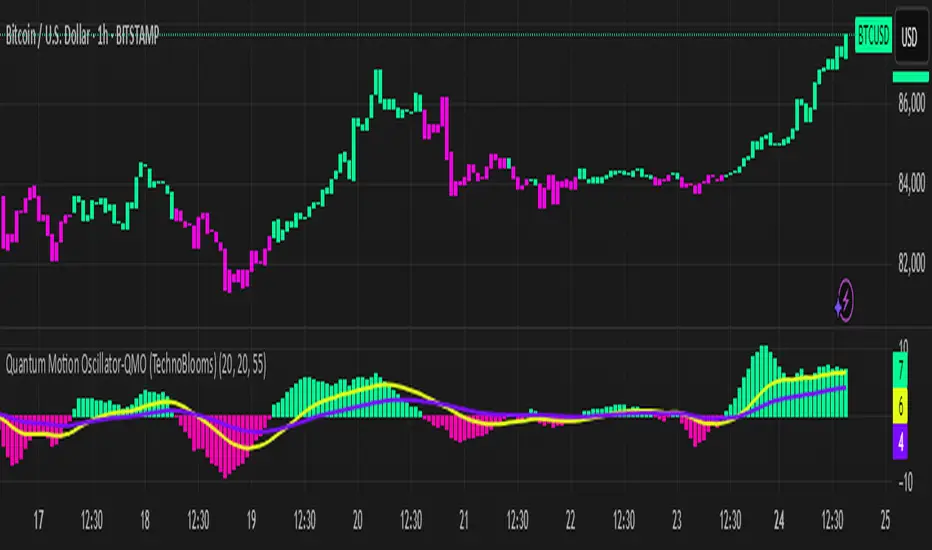
Quantum Motion Oscillator-QMO (TechnoBlooms)Quantum Motion Oscillator (QMO) is a momentum indicator designed for traders who demand precision. Combining multi-timeframe weighted linear regression with EMA crossovers, QMO offers a dynamic view of market momentum, helping traders anticipate trend shifts with greater accuracy.
This oscillator is inspired by quantum mechanics and wave theory, where market movement is seen as a series of probabilistic waves rather than rigid structures.
The histogram is plotted in proportion to the price movement of the candlesticks.
KEY FEATURES
1. Multi-Timeframe Histogram - Integrates 1 to 5 weighted linear regression averages, reducing lag while maintaining accuracy.
2. EMA Crossover Signal - Uses a Short and Long EMA to confirm trend shifts with minimal noise.
3. Adaptive Trend Analysis - Self-adjusting mechanics make QMO effective in both ranging and trending markets.
4. Scalable for Different Trading Styles - Works seamlessly for scalping, intraday, swing and position trading.
ADVANCED PROFESSIONAL INSIGHTS
1. Wave Dynamics and Market Flow - Inspired by wave mechanics, QMO reflects the energy accumulation and dissipation in price movements.
Expanding histogram waves = Strong momentum surge
Contracting waves = Momentum weakening, potential reversal zone.
2. Liquidity and Order Flow Applications - QMO works well alongside liquidity concepts and smart money techniques:
Combine with Fair Value Gaps & Order Blocks -> Enter when QMO signals align with liquidity zones.
Avoid False Moves - If price sweeps liquidity, but QMO momentum diverges, it is a sign of potential smart money manipulation.
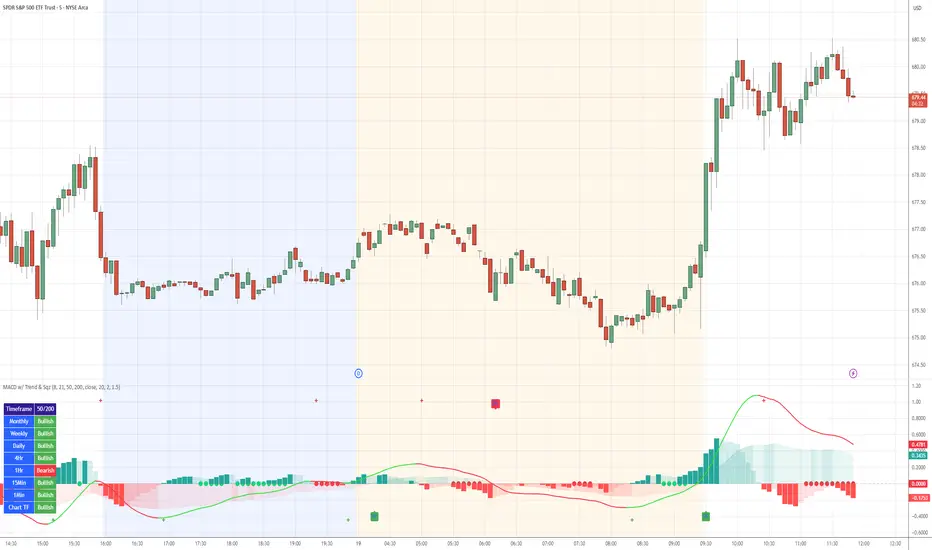
MACD with TrendIndicator Name: MACD with Trend & Multi-Timeframe Dashboard
Why Use This Indicator?
Two MACDs for Double Confirmation:
It integrates both a standard MACD (fast/slow lengths of your choice) and a Trend MACD (longer lengths). The standard MACD identifies short-term momentum shifts, while the Trend MACD helps confirm the higher-level market trend.
Multi-Timeframe 50/200 SMA Overview:
A built-in dashboard quickly shows whether the 50-period moving average is above or below the 200-period moving average across multiple timeframes (Monthly, Weekly, Daily, etc.). At a glance, you can see if higher timeframes agree with your immediate trading setup.
Clear Buy/Sell Signals:
The script plots buy arrows when the MACD histogram crosses from negative to positive, plus an additional label for the Trend MACD crossing. The same goes for sell signals if momentum flips from positive to negative. This clarity can reduce guesswork.
Customizable & Intuitive:
Easily adjust moving average types (SMA or EMA), lengths, and source inputs to suit different asset classes or personal preferences. Visual color coding helps you quickly interpret bullish vs. bearish conditions.
Recommended Trading Approach
Identify Overall Trend
Check the Trend MACD histogram and the multi-timeframe dashboard (50/200 SMAs). If you see bullish alignment on higher timeframes (e.g., Daily, Weekly) and the Trend MACD is above zero, you know the market environment is supportive for long trades.
Pinpoint Entry Using Standard MACD
Wait for the standard MACD histogram to cross above zero or for a labeled “Buy Signal.” This indicates short-term momentum turning bullish in sync with the broader trend. If the market is already trending up (confirmed by the dashboard), the probability of a successful long entry often improves.
Set a Stop-Loss & Take-Profit
While not included in the code, adding an ATR- or price-based stop-loss can protect against sudden reversals. A simple approach is risking 1–2% per trade and aiming for a 1.5–2× reward relative to that risk.
Monitor Sell Signals
If the short-term MACD crosses below zero—triggering a “Sell Signal”—and the Trend MACD also turns down (or the dashboard flips bearish), consider exiting the position or tightening stops. This alignment of short- and long-term indicators often signals a shift in momentum that could threaten your open profits.
Summary
The MACD with Trend & Multi-Timeframe Dashboard is a versatile, all-in-one toolkit. It combines the immediacy of short-term MACD signals, the validation of a longer-term trend oscillator, and the broader insight of multi-timeframe moving averages. Whether you are a swing trader looking for alignment across bigger trends or a shorter-term trader wanting clear momentum triggers, this indicator helps streamline decision-making and reduce noise.
Disclaimer: As with all technical analysis tools, there is no guarantee of success. Always combine indicator signals with sound risk management and a thorough understanding of market conditions
ROC + SMI Auto Adjust
This indicator combines the Rate of Change (ROC) and the Stochastic Momentum Index (SMI) with automatically adjusted parameters for different time frames (short, medium, long). It normalizes the ROC to match the SMI levels, displays the ROC as a histogram and the SMI as lines, highlights overbought/oversold zones and includes a settings table. Ideal for analyzing momentum on different time frames.
Key Features:
Automatic Parameter Adjustment:
The script detects the current chart time frame (e.g. 1-minute, 1-hour, daily) and adjusts the parameters for the ROC and SMI accordingly.
Parameters such as ROC length, SMI length and smoothing periods are optimized for short, medium and long term time frames.
Rate of Change (ROC):
ROC measures the percentage change in price over a specified period.
The script normalizes the ROC values to match the SMI range, making it easier to compare the two indicators on the same scale.
The ROC is displayed as a histogram, where positive values are colored green and negative values are colored red.
Stochastic Momentum Index (SMI):
SMI is a momentum oscillator that identifies overbought and oversold conditions.
The script calculates the SMI and its signal line, plotting them on the chart.
Overbought and oversold levels are displayed as dotted lines for convenience.
SMI and SMI Signal Crossover:
When the main SMI crosses the signal line from below upwards, it may be a buy signal (bullish signal).
When the SMI crosses the signal line from above downwards, it may be a sell signal (bearish signal).
Configurable Inputs:
Users can use the automatically adjusted settings or manually override the parameters (e.g. ROC length, SMI length, smoothing periods).
Overbought and oversold levels for SMI are also configurable.
Parameter Table:
A table is displayed on the chart showing the current parameters (e.g. timeframe, ROC length, SMI length) for transparency and debugging.
The position of the table is configurable (e.g. top left, bottom right).
How it works:
The script first detects the chart timeframe and classifies it as short-term (e.g. 1M, 5M), medium-term (e.g. 1H, 4H) or long-term (e.g. D1, W1).
Based on the timeframe, it sets default values for the ROC and SMI parameters.
ROC and SMI are calculated and normalized so that they can be compared on the same scale.
ROC is displayed as a histogram, while SMI and its signal line are displayed as lines.
Overbought and oversold levels are displayed as horizontal lines.
Use cases:
Trend identification: ROC helps to identify the strength of the trend, while SMI indicates overbought/oversold conditions.
Momentum analysis: The combination of ROC and SMI provides insight into both price momentum and potential reversals.
Time frame flexibility: The auto-adjustment feature makes the script suitable for scalping (short-term), swing trading (medium-term) and long-term investing.
Risk-Based Position Size ProRisk-Based Position Size Indicator
Overview:
The Risk-Based Position Size Indicator helps traders determine the appropriate position size for each trade based on their total capital and risk percentage. This indicator dynamically calculates position size using two different methods:
Wick Range (High - Low): Calculates position size based on the total range of the candlestick.
Candle Body (Close - Open): Calculates position size using only the body of the candlestick, ignoring wicks.
It provides a visual representation of position sizing as a histogram and adjusts dynamically based on price movement.
Key Features:
✅ Two Calculation Modes:
Wick Range (Red Bars) – Uses the entire candlestick range (High - Low).
Candle Body (Blue Bars) – Uses only the difference between Close and Open.
✅ Customizable Risk Settings:
Define Total Capital (default: $100,000).
Set Risk Percentage per trade (default: 1%).
✅ Automatic Position Sizing:
Adjusts position size dynamically for each candlestick.
Prevents division errors when the range is zero.
✅ Rounding Option:
Toggle rounding of position size for better readability.
✅ Clear Visual Representation:
Displayed as a histogram for easy interpretation.
Red bars for Wick Range, Blue bars for Candle Body calculations.
How to Use:
Add the indicator to your TradingView chart.
Set your Total Capital and Risk Percentage in the settings.
Choose a Calculation Method:
Wick Range: Uses High - Low for sizing.
Candle Body: Uses absolute difference of Close - Open.
If desired, enable Round Position Size for easier interpretation.
Observe the histogram bars to see the calculated position size for each candle.
This indicator is useful for risk management, ensuring that position sizes are aligned with account size and market volatility. 🚀
New Features & Fixes:
✅ User can select decimal precision (0 to 5 places) from the settings.
✅ If rounding is enabled, values are rounded based on the chosen precision.
✅ If rounding is disabled, original values are shown without forced rounding.
✅ Wick Range (Red) & Candle Body (Blue) are still plotted together.
Now, you have full control over how many decimal places to display! 🎯
WIG20 Total Value-Weighted VolumeThis Pine Script creates a custom indicator for TradingView that calculates and visualizes the total "value-weighted volume" of the 20 stocks in the WIG20 index (a major Polish stock market index). Here's a breakdown of what it does:
Functionality:
Stock Selection:
The script allows you to input the ticker symbols for the 20 stocks that make up the WIG20 index (e.g., "PKO" for PKO Bank Polski, "PKN" for PKN Orlen, etc.). These are customizable via input fields, so you can adjust them to match the current WIG20 constituents.
Data Retrieval:
For each of the 20 stocks, it fetches two pieces of data from the current chart timeframe (e.g., daily, hourly):
Volume: The number of shares traded (e.g., v01 for the first stock).
Average Price: The midpoint price of the candle, calculated as (open + close) / 2 (e.g., p01 for the first stock). This represents a typical price for that period.
Value-Weighted Volume Calculation:
For each stock, it multiplies the volume by its average price (e.g., vw01 = v01 * p01). This converts the raw volume (in shares) into a monetary value (e.g., in Polish złoty, PLN, assuming the prices are in PLN).
The result, called "value-weighted volume," reflects the total monetary amount traded for each stock rather than just the number of shares.
Total Value-Weighted Volume:
It sums the value-weighted volumes of all 20 stocks into a single value, totalValueVolume. This represents the combined monetary trading activity across the WIG20 index for each time period (e.g., each candle on the chart).
Statistical Analysis:
The script calculates a rolling mean and standard deviation of the totalValueVolume over a user-defined lookback period (default is 20 bars, adjustable via input).
It then computes a "3-sigma" threshold, which is the mean plus three times the standard deviation. This threshold identifies unusually high trading activity (statistically significant outliers).
Candle Direction:
It checks whether the current candle on the chart (e.g., the WIG20 index itself) is bullish or bearish:
Bullish: If the close price is higher than the open price (close > open).
Bearish: If the close price is lower than the open price (close < open).
Color-Coded Visualization:
The totalValueVolume is plotted as a histogram on the chart with dynamic colors:
Blue: If the value-weighted volume is below the 3-sigma threshold (normal trading activity).
Green: If the value-weighted volume exceeds the 3-sigma threshold and the candle is bullish (indicating unusually high buying activity).
Red: If the value-weighted volume exceeds the 3-sigma threshold and the candle is bearish (indicating unusually high selling activity).
Purpose:
What It Shows: The indicator highlights the total monetary trading volume across the WIG20 stocks, adjusted for each stock’s price, and flags periods of exceptional activity (above 3 sigma) with colors that indicate market direction (bullish or bearish).
Use Case: Traders or analysts might use this to:
Identify significant market events where trading volume spikes (e.g., news-driven moves).
Assess whether those spikes align with bullish (green) or bearish (red) sentiment, based on the WIG20 index’s price movement.
Compare monetary trading activity across different periods, rather than just share volume, which gives more weight to higher-priced stocks.
Key Features:
Customizable: You can tweak the stock symbols and lookback period to fit your needs.
Statistical Insight: The 3-sigma rule helps spot outliers in trading activity.
Visual Clarity: The histogram’s color changes make it easy to see when volume spikes occur and whether they’re tied to upward or downward price moves.
Example Output:
On a daily WIG20 chart, if one day’s total value-weighted volume is exceptionally high (above 3 sigma) and the WIG20 closes higher than it opened, the histogram bar for that day turns green. If it closes lower, it turns red. Otherwise, it stays blue.
In essence, this script transforms raw volume data into a price-adjusted, statistically informed indicator that visually emphasizes significant trading events with directional context!

Strength Measurement -HTStrength Measurement -HT
This indicator provides a comprehensive view of trend strength by calculating the average ADX (Average Directional Index) across multiple timeframes. It helps traders identify strong trends, potential reversals, and confirm signals from other indicators.
Key Features:
Multi-Timeframe Analysis: Analyze trend strength across different timeframes. Choose which timeframes to include in the calculation (5 min, 15 min, 30 min, 1 hour, 4 hour).
Customizable ADX Parameters: Adjust the ADX smoothing (adxlen) and DI length (dilen) parameters to fine-tune the indicator to your preferred settings.
Smoothed Average ADX: The average ADX is smoothed using a Simple Moving Average to reduce noise and provide a clearer picture of the overall trend.
Color-Coded Visualization: The histogram clearly indicates trend direction and strength:
Green: Uptrend
Red: Downtrend
Darker shades: Stronger trend
Lighter shades: Weaker trend
Reference Levels: Includes horizontal lines at 25, 50, and 75 to provide benchmarks for trend strength classification.
Alerts: Set alerts for strong trend up (ADX crossing above 50) and weakening trend (ADX crossing below 25).
How to Use:
Select Timeframes: Choose the timeframes you want to include in the average ADX calculation.
Adjust ADX Parameters: Fine-tune the adxlen and dilen values based on your trading style and the timeframe of the chart.
Identify Strong Trends: Look for histogram bars with darker green or red colors, indicating a strong trend.
Spot Potential Reversals: Watch for changes in histogram color and height, which may suggest a weakening trend or a potential reversal.
Combine with Other Indicators: Use this indicator with other technical analysis tools to confirm trading signals.
Note: This indicator is based on the ADX, which is a lagging indicator.

Professional GBP/JPY Analysis ToolThe foundation of professional trading begins with analyzing individual currencies first, not just currency pairs. By understanding the relative strength of each currency in the pair, traders can anticipate potential market moves with greater accuracy.
This indicator simplifies that process by:
Analyzing Individual Currency Strength:
The strength of GBP is calculated by averaging its performance across seven major GBP currency pairs:
GBP/EUR
GBP/USD
GBP/CAD
GBP/CHF
GBP/AUD
GBP/NZD
GBP/JPY
The strength of JPY is calculated by averaging its performance across seven major JPY currency pairs:
JPY/USD
JPY/CAD
JPY/EUR
JPY/GBP
JPY/AUD
JPY/NZD
JPY/CHF
The values are normalized to allow direct comparison on the same scale.
Identifying Correlation Between GBP and JPY:
The histogram displays the correlation between GBP and JPY strength:
Positive Correlation (Green): Both GBP and JPY are trending up or down together, indicating a less strong trend. This is a market condition to avoid, as both currencies are strengthening or weakening simultaneously.
Negative Correlation (Red): One currency is strong while the other is weak, indicating a stronger trend in GBP/JPY. This scenario presents a better trading opportunity, as you are trading one strong currency against one weak currency, amplifying the potential for a clearer price movement in GBP/JPY.
Visualizing Long/Short Bias:
GBP Strength > JPY Strength: Bullish bias for GBP/JPY (green background).
JPY Strength > GBP Strength: Bearish bias for GBP/JPY (red background).
This indicator equips traders with a deeper understanding of GBP/JPY dynamics by first breaking down the individual currencies. With insights into currency strength, their correlation, and the optimal conditions for trading, it provides a solid foundation for making informed trading decisions.
How to Use:
Check the Histogram for Correlation:
Wait for the histogram to be red. This indicates that GBP and JPY are moving in opposite directions, signaling a stronger trend where you're trading a strong currency against a weak one—a more favorable setup.
Align with Background Color for Confirmation:
Wait for the background color to match your trade plan:
Green Background: Confirms a bullish bias, supporting long positions on the GBP/JPY pair.
Red Background: Confirms a bearish bias, supporting short positions on the GBP/JPY pair.
By following these steps, you can identify stronger trade opportunities and align them with your strategy.

MACD Aggressive Scalp SimpleComment on the Script
Purpose and Structure:
The script is a scalping strategy based on the MACD indicator combined with EMA (50) as a trend filter.
It uses the MACD histogram's crossover/crossunder of zero to trigger entries and exits, allowing the trader to capitalize on short-term momentum shifts.
The use of strategy.close ensures that positions are closed when specified conditions are met, although adjustments were made to align with Pine Script version 6.
Strengths:
Simplicity and Clarity: The logic is straightforward and focuses on essential scalping principles (momentum-based entries and exits).
Visual Indicators: The plotted MACD line, signal line, and histogram columns provide clear visual feedback for the strategy's operation.
Trend Confirmation: Incorporating the EMA(50) as a trend filter helps avoid trades that go against the prevailing trend, reducing the likelihood of false signals.
Dynamic Exit Conditions: The conditional logic for closing positions based on weakening momentum (via MACD histogram change) is a good way to protect profits or minimize losses.
Potential Improvements:
Parameter Inputs:
Make the MACD (12, 26, 9) and EMA(50) values adjustable by the user through input statements for better customization during backtesting.
Example:
pine
Copy code
macdFast = input(12, title="MACD Fast Length")
macdSlow = input(26, title="MACD Slow Length")
macdSignal = input(9, title="MACD Signal Line Length")
emaLength = input(50, title="EMA Length")
Stop Loss and Take Profit:
The strategy currently lacks explicit stop-loss or take-profit levels, which are critical in a scalping strategy to manage risk and lock in profits.
ATR-based or fixed-percentage exits could be added for better control.
Position Size and Risk Management:
While the script uses 50% of equity per trade, additional options (e.g., fixed position sizes or risk-adjusted sizes) would be beneficial for flexibility.
Avoid Overlapping Signals:
Add logic to prevent overlapping signals (e.g., opening a new position immediately after closing one on the same bar).
Backtesting Optimization:
Consider adding labels or markers (label.new or plotshape) to visualize entry and exit points on the chart for better debugging and analysis.
The inclusion of performance metrics like max drawdown, Sharpe ratio, or profit factor would help assess the strategy's robustness during backtesting.
Compatibility with Live Trading:
The strategy could be further enhanced with alert conditions using alertcondition to notify the trader of buy/sell signals in real-time.

BTC Price Percentage Difference( Bitfinex - Coinbase)Introduction:
The BTC Price Percentage Difference Histogram Indicator is a powerful tool designed to help traders visualize and capitalize on the price discrepancies of Bitcoin (BTC) between two major exchanges: Bitfinex and Coinbase. By calculating the real-time percentage difference of BTC-USD prices and displaying it as a color-coded histogram, this indicator enables you to quickly spot potential arbitrage opportunities and gain deeper insights into market dynamics.
Features:
• Real-Time Percentage Difference Calculation:
• Computes the percentage difference between BTC-USD prices on Bitfinex and Coinbase.
• Color-Coded Histogram Visualization:
• Green Bars: Indicate that the BTC price on Bitfinex is higher than on Coinbase.
• Red Bars: Indicate that the BTC price on Bitfinex is lower than on Coinbase.
• User-Friendly and Intuitive:
• Simple setup with no additional inputs required.
• Automatically adapts to the chart’s timeframe for seamless integration.
Why Bitfinex Whales Matter:
Bitfinex is renowned for hosting some of the largest Bitcoin traders, often referred to as “whales.” These influential players have the capacity to move the market, and historically, they’ve demonstrated a high success rate in buying at market bottoms and selling at market tops. By tracking the price discrepancies between Bitfinex and other exchanges like Coinbase, you can gain valuable insights into the sentiment and actions of these key market participants.

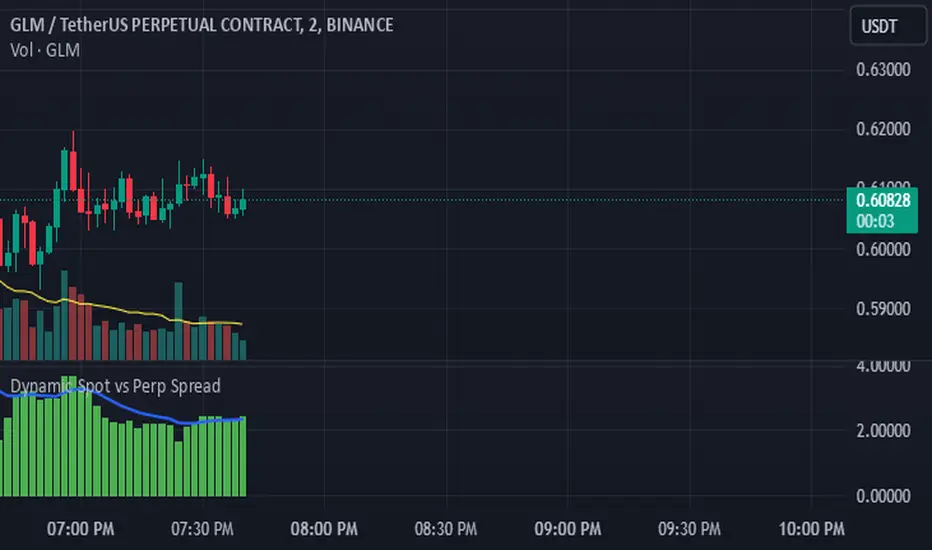
Dynamic Spot vs Perp Spread### **Description for TradingView Publication**
---
**Dynamic Spot vs Perp Spread**
(For USDT-Spot and USDT.P-Perp)
Summary of Usefulness:
This indicator is a valuable tool for traders who want to monitor and capitalize on the relationship between spot and perpetual futures (perp) prices. When the spot price exceeds the perp price, it's often a leading signal that the perp price will follow, creating potential trading opportunities. While this behavior doesn't happen every time, divergences between spot and perp prices can frequently signal significant market movements.
What it Does:
This indicator calculates and displays the price spread (percentage difference) between the spot price and perpetual futures (perp) price of a cryptocurrency asset. It dynamically adjusts to the instrument being viewed, ensuring that spot dominance (spot price higher) is plotted above the zero line and perp dominance (perp price higher) is plotted below the zero line. Additionally, the indicator accounts for symbols with multipliers (e.g., `1000SHIBUSDT.P`) to ensure accurate calculations.
Key features include:
- Automatic symbol detection and adjustment for Spot/Perp pairs.
- Dynamic handling of price multipliers for assets with prefixes like `1000`.
- Visualization of spread with a histogram and optional smoothing using an EMA (Exponential Moving Average).
- Configurable alerts for significant spread changes and spread flips.
- No repainting: the indicator uses the `barmerge.lookahead_off` setting to ensure stable, non-repainting values.
---
### **How to Use**
1. **Add the Indicator:**
- Search for "Dynamic Spot vs Perp Spread" in the TradingView Indicators library and add it to your chart.
2. **Understand the Visualization:**
- A positive spread (green histogram) indicates that the spot price is higher than the perp price (spot dominance).
- A negative spread (red histogram) indicates that the perp price is higher than the spot price (perp dominance).
3. **Customize Settings:**
- **EMA Length:** Use the input field to smooth the spread data over a chosen number of periods.
- **Alert Threshold:** Set a threshold to receive alerts when the spread exceeds a specific percentage.
4. **Receive Alerts:**
- Enable alerts for spread flips (when dominance shifts between spot and perp) or when the spread exceeds the defined threshold.
5. **Use Case Examples:**
- **Spot vs. Perp Arbitrage:** Traders can monitor significant deviations between spot and perp prices to identify potential arbitrage opportunities.
- **Market Sentiment Analysis:** Persistent spot dominance may indicate stronger buying interest in the spot market, while perp dominance may suggest futures market speculation.
---
### **Repainting Behavior**
This indicator **does not repaint** because it uses `barmerge.lookahead_off` for all calculations, ensuring that data from the comparison symbol (spot or perp) is locked to the currently completed candle. This means the values plotted and alerts triggered are reliable and do not change retrospectively.
Repainting occurs when an indicator uses future-looking or incomplete data for calculations. By design, this indicator avoids such practices, making it suitable for live trading and analysis.
---
DeepSignalFilterHelpersLibrary "DeepSignalFilterHelpers"
filter_intraday_intensity(useIiiFilter)
Parameters:
useIiiFilter (bool)
filter_vwma(src, length, useVwmaFilter)
Parameters:
src (float)
length (int)
useVwmaFilter (bool)
filter_nvi(useNviFilter)
Parameters:
useNviFilter (bool)
filter_emv(length, emvThreshold, useEmvFilter, useMovingAvg)
EMV filter for filtering signals based on Ease of Movement
Parameters:
length (int) : The length of the EMV calculation
emvThreshold (float) : The EMV threshold
useEmvFilter (bool) : Whether to apply the EMV filter
useMovingAvg (bool) : Whether to use moving average as threshold
Returns: Filtered result indicating whether the signal should be used
filter_adi(length, threshold, useAdiFilter, useMovingAvg)
ADI filter for filtering signals based on Accumulation/Distribution Index
Parameters:
length (int) : The length of the ADI moving average calculation
threshold (float) : The ADI threshold
useAdiFilter (bool) : Whether to apply the ADI filter
useMovingAvg (bool) : Whether to use moving average as threshold
Returns: Filtered result indicating whether the signal should be used
filter_mfi(length, mfiThreshold, useMfiFilter, useMovingAvg)
MFI filter for filtering signals based on Money Flow Index
Parameters:
length (int) : The length of the MFI calculation
mfiThreshold (float) : The MFI threshold
useMfiFilter (bool) : Whether to apply the MFI filter
useMovingAvg (bool) : Whether to use moving average as threshold
Returns: Filtered result indicating whether the signal should be used
detect_obv_states(obvThresholdStrong, obvThresholdModerate, lookbackPeriod, obvMode)
detect_obv_states: Identify OBV states with three levels (Strong, Moderate, Weak) over a configurable period
Parameters:
obvThresholdStrong (float) : Threshold for strong OBV movements
obvThresholdModerate (float) : Threshold for moderate OBV movements
lookbackPeriod (int) : Number of periods to analyze OBV trends
obvMode (string) : OBV mode to filter ("Strong", "Moderate", "Weak")
Returns: OBV state ("Strong Up", "Moderate Up", "Weak Up", "Positive Divergence", "Negative Divergence", "Consolidation", "Weak Down", "Moderate Down", "Strong Down")
filter_obv(src, length, obvMode, threshold, useObvFilter, useMovingAvg)
filter_obv: Filter signals based on OBV states
Parameters:
src (float) : The source series (default: close)
length (int) : The length of the OBV moving average calculation
obvMode (string) : OBV mode to filter ("Strong", "Moderate", "Weak")
threshold (float) : Optional threshold for additional filtering
useObvFilter (bool) : Whether to apply the OBV filter
useMovingAvg (bool) : Whether to use moving average as threshold
Returns: Filtered result indicating whether the signal should be used
filter_cmf(length, cmfThreshold, useCmfFilter, useMovingAvg)
CMF filter for filtering signals based on Chaikin Money Flow
Parameters:
length (int) : The length of the CMF calculation
cmfThreshold (float) : The CMF threshold
useCmfFilter (bool) : Whether to apply the CMF filter
useMovingAvg (bool) : Whether to use moving average as threshold
Returns: Filtered result indicating whether the signal should be used
filter_vwap(useVwapFilter)
VWAP filter for filtering signals based on Volume-Weighted Average Price
Parameters:
useVwapFilter (bool) : Whether to apply the VWAP filter
Returns: Filtered result indicating whether the signal should be used
filter_pvt(length, pvtThreshold, usePvtFilter, useMovingAvg)
PVT filter for filtering signals based on Price Volume Trend
Parameters:
length (int) : The length of the PVT moving average calculation
pvtThreshold (float) : The PVT threshold
usePvtFilter (bool) : Whether to apply the PVT filter
useMovingAvg (bool) : Whether to use moving average as threshold
Returns: Filtered result indicating whether the signal should be used
filter_vo(shortLength, longLength, voThreshold, useVoFilter, useMovingAvg)
VO filter for filtering signals based on Volume Oscillator
Parameters:
shortLength (int) : The length of the short-term volume moving average
longLength (int) : The length of the long-term volume moving average
voThreshold (float) : The Volume Oscillator threshold
useVoFilter (bool) : Whether to apply the VO filter
useMovingAvg (bool) : Whether to use moving average as threshold
Returns: Filtered result indicating whether the signal should be used
filter_cho(shortLength, longLength, choThreshold, useChoFilter, useMovingAvg)
CHO filter for filtering signals based on Chaikin Oscillator
Parameters:
shortLength (int) : The length of the short-term ADI moving average
longLength (int) : The length of the long-term ADI moving average
choThreshold (float) : The Chaikin Oscillator threshold
useChoFilter (bool) : Whether to apply the CHO filter
useMovingAvg (bool) : Whether to use moving average as threshold
Returns: Filtered result indicating whether the signal should be used
filter_fi(length, fiThreshold, useFiFilter, useMovingAvg)
FI filter for filtering signals based on Force Index
Parameters:
length (int) : The length of the FI calculation
fiThreshold (float) : The Force Index threshold
useFiFilter (bool) : Whether to apply the FI filter
useMovingAvg (bool) : Whether to use moving average as threshold
Returns: Filtered result indicating whether the signal should be used
filter_garman_klass_volatility(length, useGkFilter)
Parameters:
length (int)
useGkFilter (bool)
filter_frama(src, length, useFramaFilter)
Parameters:
src (float)
length (int)
useFramaFilter (bool)
filter_bollinger_bands(src, length, stdDev, useBollingerFilter)
Parameters:
src (float)
length (int)
stdDev (float)
useBollingerFilter (bool)
filter_keltner_channel(src, length, atrMult, useKeltnerFilter)
Parameters:
src (float)
length (simple int)
atrMult (float)
useKeltnerFilter (bool)
regime_filter(src, threshold, useRegimeFilter)
Regime filter for filtering signals based on trend strength
Parameters:
src (float) : The source series
threshold (float) : The threshold for the filter
useRegimeFilter (bool) : Whether to apply the regime filter
Returns: Filtered result indicating whether the signal should be used
regime_filter_v2(src, threshold, useRegimeFilter)
Regime filter for filtering signals based on trend strength
Parameters:
src (float) : The source series
threshold (float) : The threshold for the filter
useRegimeFilter (bool) : Whether to apply the regime filter
Returns: Filtered result indicating whether the signal should be used
filter_adx(src, length, adxThreshold, useAdxFilter)
ADX filter for filtering signals based on ADX strength
Parameters:
src (float) : The source series
length (simple int) : The length of the ADX calculation
adxThreshold (int) : The ADX threshold
useAdxFilter (bool) : Whether to apply the ADX filter
Returns: Filtered result indicating whether the signal should be used
filter_volatility(minLength, maxLength, useVolatilityFilter)
Volatility filter for filtering signals based on volatility
Parameters:
minLength (simple int) : The minimum length for ATR calculation
maxLength (simple int) : The maximum length for ATR calculation
useVolatilityFilter (bool) : Whether to apply the volatility filter
Returns: Filtered result indicating whether the signal should be used
filter_ulcer(src, length, ulcerThreshold, useUlcerFilter)
Ulcer Index filter for filtering signals based on Ulcer Index
Parameters:
src (float) : The source series
length (int) : The length of the Ulcer Index calculation
ulcerThreshold (float) : The Ulcer Index threshold (default: average Ulcer Index)
useUlcerFilter (bool) : Whether to apply the Ulcer Index filter
Returns: Filtered result indicating whether the signal should be used
filter_stddev(src, length, stdDevThreshold, useStdDevFilter)
Standard Deviation filter for filtering signals based on Standard Deviation
Parameters:
src (float) : The source series
length (int) : The length of the Standard Deviation calculation
stdDevThreshold (float) : The Standard Deviation threshold (default: average Standard Deviation)
useStdDevFilter (bool) : Whether to apply the Standard Deviation filter
Returns: Filtered result indicating whether the signal should be used
filter_macdv(src, shortLength, longLength, signalSmoothing, macdVThreshold, useMacdVFilter)
MACD-V filter for filtering signals based on MACD-V
Parameters:
src (float) : The source series
shortLength (simple int) : The short length for MACD calculation
longLength (simple int) : The long length for MACD calculation
signalSmoothing (simple int) : The signal smoothing length for MACD
macdVThreshold (float) : The MACD-V threshold (default: average MACD-V)
useMacdVFilter (bool) : Whether to apply the MACD-V filter
Returns: Filtered result indicating whether the signal should be used
filter_atr(length, atrThreshold, useAtrFilter)
ATR filter for filtering signals based on Average True Range (ATR)
Parameters:
length (simple int) : The length of the ATR calculation
atrThreshold (float) : The ATR threshold (default: average ATR)
useAtrFilter (bool) : Whether to apply the ATR filter
Returns: Filtered result indicating whether the signal should be used
filter_candle_body_and_atr(length, bodyThreshold, atrThreshold, useFilter)
Candle Body and ATR filter for filtering signals
Parameters:
length (simple int) : The length of the ATR calculation
bodyThreshold (float) : The threshold for candle body size (relative to ATR)
atrThreshold (float) : The ATR threshold (default: average ATR)
useFilter (bool) : Whether to apply the candle body and ATR filter
Returns: Filtered result indicating whether the signal should be used
filter_atrp(length, atrpThreshold, useAtrpFilter)
ATRP filter for filtering signals based on ATR Percentage (ATRP)
Parameters:
length (simple int) : The length of the ATR calculation
atrpThreshold (float) : The ATRP threshold (default: average ATRP)
useAtrpFilter (bool) : Whether to apply the ATRP filter
Returns: Filtered result indicating whether the signal should be used
filter_jma(src, length, phase, useJmaFilter)
Parameters:
src (float)
length (simple int)
phase (float)
useJmaFilter (bool)
filter_cidi(src, rsiLength, shortMaLength, longMaLength, useCidiFilter)
Parameters:
src (float)
rsiLength (simple int)
shortMaLength (int)
longMaLength (int)
useCidiFilter (bool)
filter_rsi(src, length, rsiThreshold, useRsiFilter)
Parameters:
src (float)
length (simple int)
rsiThreshold (float)
useRsiFilter (bool)
filter_ichimoku_oscillator(length, threshold, useFilter)
Ichimoku Oscillator filter for filtering signals based on Ichimoku Oscillator
Parameters:
length (int) : The length of the Ichimoku Oscillator calculation
threshold (float) : The threshold for the filter (default: average Ichimoku Oscillator)
useFilter (bool) : Whether to apply the filter
Returns: Filtered result indicating whether the signal should be used
filter_cmb_composite_index(src, shortLength, longLength, threshold, useFilter)
CMB Composite Index filter for filtering signals based on CMB Composite Index
Parameters:
src (float) : The source series
shortLength (simple int) : The short length for CMB calculation
longLength (simple int) : The long length for CMB calculation
threshold (float) : The threshold for the filter (default: average CMB Composite Index)
useFilter (bool) : Whether to apply the filter
Returns: Filtered result indicating whether the signal should be used
filter_connors_rsi(src, rsiLength, rocLength, streakLength, threshold, useFilter)
Connors RSI filter for filtering signals based on Connors RSI
Parameters:
src (float) : The source series
rsiLength (simple int) : The length for RSI calculation
rocLength (int) : The length for ROC calculation
streakLength (simple int) : The length for streak calculation
threshold (float) : The threshold for the filter (default: average Connors RSI)
useFilter (bool) : Whether to apply the filter
Returns: Filtered result indicating whether the signal should be used
filter_coppock_curve(src, roc1Length, roc2Length, wmaLength, threshold, useFilter)
Coppock Curve filter for filtering signals based on Coppock Curve
Parameters:
src (float) : The source series
roc1Length (int) : The length for the first ROC calculation
roc2Length (int) : The length for the second ROC calculation
wmaLength (int) : The length for the WMA calculation
threshold (float) : The threshold for the filter (default: average Coppock Curve)
useFilter (bool) : Whether to apply the filter
Returns: Filtered result indicating whether the signal should be used
filter_pmo(src, pmoLength, smoothingLength, threshold, useFilter)
DecisionPoint Price Momentum Oscillator filter for filtering signals based on PMO
Parameters:
src (float) : The source series
pmoLength (simple int) : The length for PMO calculation
smoothingLength (simple int) : The smoothing length for PMO
threshold (float) : The threshold for the filter (default: average PMO Oscillator)
useFilter (bool) : Whether to apply the filter
Returns: Filtered result indicating whether the signal should be used
filter_macd(src, shortLength, longLength, signalSmoothing, threshold, useFilter)
MACD filter for filtering signals based on MACD
Parameters:
src (float) : The source series
shortLength (simple int) : The short length for MACD calculation
longLength (simple int) : The long length for MACD calculation
signalSmoothing (simple int) : The signal smoothing length for MACD
threshold (float) : The threshold for the filter (default: average MACD)
useFilter (bool) : Whether to apply the filter
Returns: Filtered result indicating whether the signal should be used
filter_macd_histogram(src, shortLength, longLength, signalSmoothing, threshold, useFilter)
MACD-Histogram filter for filtering signals based on MACD-Histogram
Parameters:
src (float) : The source series
shortLength (simple int) : The short length for MACD calculation
longLength (simple int) : The long length for MACD calculation
signalSmoothing (simple int) : The signal smoothing length for MACD
threshold (float) : The threshold for the filter (default: average MACD-Histogram)
useFilter (bool) : Whether to apply the filter
Returns: Filtered result indicating whether the signal should be used
filter_kst(src, r1, r2, r3, r4, sm1, sm2, sm3, sm4, signalLength, threshold, useFilter)
Pring's Know Sure Thing filter for filtering signals based on KST
Parameters:
src (float) : The source series
r1 (int) : The first ROC length
r2 (int) : The second ROC length
r3 (int) : The third ROC length
r4 (int) : The fourth ROC length
sm1 (int) : The first smoothing length
sm2 (int) : The second smoothing length
sm3 (int) : The third smoothing length
sm4 (int) : The fourth smoothing length
signalLength (int) : The signal line smoothing length
threshold (float) : The threshold for the filter (default: average KST Oscillator)
useFilter (bool) : Whether to apply the filter
Returns: Filtered result indicating whether the signal should be used
filter_special_k(src, r1, r2, r3, r4, sm1, sm2, sm3, sm4, threshold, useFilter)
Pring's Special K filter for filtering signals based on Special K
Parameters:
src (float) : The source series
r1 (int) : The first ROC length
r2 (int) : The second ROC length
r3 (int) : The third ROC length
r4 (int) : The fourth ROC length
sm1 (int) : The first smoothing length
sm2 (int) : The second smoothing length
sm3 (int) : The third smoothing length
sm4 (int) : The fourth smoothing length
threshold (float) : The threshold for the filter (default: average Special K)
useFilter (bool) : Whether to apply the filter
Returns: Filtered result indicating whether the signal should be used
filter_roc_momentum(src, rocLength, momentumLength, threshold, useFilter)
ROC and Momentum filter for filtering signals based on ROC and Momentum
Parameters:
src (float) : The source series
rocLength (int) : The length for ROC calculation
momentumLength (int) : The length for Momentum calculation
threshold (float) : The threshold for the filter (default: average ROC and Momentum)
useFilter (bool) : Whether to apply the filter
Returns: Filtered result indicating whether the signal should be used
filter_rrg_relative_strength(src, length, threshold, useFilter)
RRG Relative Strength filter for filtering signals based on RRG Relative Strength
Parameters:
src (float) : The source series
length (int) : The length for RRG Relative Strength calculation
threshold (float) : The threshold for the filter (default: average RRG Relative Strength)
useFilter (bool) : Whether to apply the filter
Returns: Filtered result indicating whether the signal should be used
filter_alligator(useFilter)
Parameters:
useFilter (bool)
filter_wyckoff(useFilter)
Parameters:
useFilter (bool)
filter_squeeze_momentum(bbLength, bbStdDev, kcLength, kcMult, useFilter)
Parameters:
bbLength (int)
bbStdDev (float)
kcLength (simple int)
kcMult (float)
useFilter (bool)
filter_atr_compression(length, atrThreshold, useFilter)
Parameters:
length (simple int)
atrThreshold (float)
useFilter (bool)
filter_low_volume(length, useFilter)
Parameters:
length (int)
useFilter (bool)
filter_nvi_accumulation(useFilter)
Parameters:
useFilter (bool)
filter_ma_slope(src, length, slopeThreshold, useFilter)
Parameters:
src (float)
length (int)
slopeThreshold (float)
useFilter (bool)
filter_adx_low(len, lensig, adxThreshold, useFilter)
Parameters:
len (simple int)
lensig (simple int)
adxThreshold (int)
useFilter (bool)
filter_choppiness_index(length, chopThreshold, useFilter)
Parameters:
length (int)
chopThreshold (float)
useFilter (bool)
filter_range_detection(length, useFilter)
Parameters:
length (int)
useFilter (bool)

Custom AO with Open Difference**Custom AO with Open Difference Indicator**
This indicator, *Custom AO with Open Difference*, is designed to help confirm trend direction based on the relationship between the daily open price and recent 4-hour open prices. It calculates the Awesome Oscillator (AO) based on the difference between the daily open price and the average of the previous six 4-hour open prices. This approach provides insight into whether the current open price is significantly diverging from recent short-term opens, which can indicate a trend shift or continuation.
### Technical Analysis and Features
1. **Trend Confirmation**: By comparing the daily open with the mean of six previous 4-hour open prices, this indicator helps identify trends. When the current daily open is below the average of recent opens, the AO value will plot as green, signaling potential upward momentum. Conversely, if the daily open is above the recent average, the histogram will plot red, suggesting possible downward momentum.
2. **Non-Repainting**: Since it relies on completed 4-hour and daily open prices, this indicator does not repaint, ensuring that all values remain fixed after the close of each period. This non-repainting feature makes it suitable for backtesting and reliable for trend confirmation without fear of historical changes.
3. **AO Mean Calculation**: The indicator calculates the average of six previous 4-hour open prices, providing a smoothed value to reduce short-term noise. This helps in identifying meaningful deviations, making the AO values a more stable basis for trend determination than using just the latest 4-hour or daily open.
4. **Histogram for Visual Clarity**: The indicator is displayed as a histogram, making it easy to identify trend changes visually. If the AO bar turns green, it’s a signal that the 4-hour average is below the daily open, suggesting an uptrend or bullish momentum. Red bars indicate that the daily open is above the recent 4-hour averages, potentially signaling a downtrend or bearish momentum.
### Practical Application
The *Custom AO with Open Difference* is a versatile tool for confirming the open price trend without needing complex oscillators or lagging indicators. Traders can use this tool to gauge the market sentiment by observing open price variations and use it as a foundation for decision-making in both short-term and daily timeframes. Its non-repainting nature adds reliability for traders using this indicator as part of a broader trading strategy.

Relative Measured Volatility (RMV) – Spot Tight Entry ZonesTitle: Relative Measured Volatility (RMV) – Spot Tight Entry Zones
Introduction
The Relative Measured Volatility (RMV) indicator is designed to highlight tight price consolidation zones , making it an ideal tool for traders seeking optimal entry points before potential breakouts. By focusing on tightness rather than general volatility, RMV offers traders a practical way to detect consolidation phases that often precede significant market moves.
How RMV Works
The RMV calculates short-term tightness by averaging three ATR (Average True Range) values over different lookback periods and then normalizing them within a specified lookback window. The result is a percentage-based scale from 0 to 100, indicating how tight the current price range is compared to recent history.
Here’s the breakdown:
Three ATR values are computed using user-defined short lookback periods to represent short-term price movements. An average of the ATRs provides a smoothed measure of current tightness. The RMV normalizes this average against the highest and lowest values over the defined lookback period, scaling it from 0 to 100.
This approach helps traders identify consolidation zones that are more likely to lead to breakouts.
Key Features of RMV
Multi-Period ATR Calculation : Uses three ATR values to effectively capture market tightness over the short term. Normalization : Converts the tightness measure to a 0-100 scale for easy interpretation. Dynamic Histogram and Background Colors : The RMV indicator uses a color-coded system for clarity.
How to Use the RMV Indicator
Identify Tight Consolidation Zones:
a - RMV values between 0-10 indicate very tight price ranges, making this the most optimal zone for potential entries before breakouts.
b - RMV values between 11-20 suggest moderate tightness, still favorable for entries.
Monitor Potential Breakout Areas:
As RMV moves from 21-30 , tightness reduces, signaling expanding volatility that may require wider stops or more flexible entry strategies.
Adjust Trading Strategies:
Use RMV values to identify tight zones for entering trades, especially in trending markets or at key support/resistance levels.
Customize the Indicator:
a - Adjust the short-term ATR lookback periods to control sensitivity.
b - Modify the lookback period to match your trading horizon, whether short-term or long-term.
Color-Coding Guide for RMV
ibb.co
How to Add RMV to Your Chart
Open your chart on TradingView.
Go to the “Indicators” section.
Search for "Relative Measured Volatility (RMV)" in the Community Scripts section.
Click on the indicator to add it to your chart.
Customize the input parameters to fit your trading strategy.
Input Parameters
Lookback Period : Defines the period over which tightness is measured and normalized.
Short-term ATR Lookbacks (1, 2, 3) : Control sensitivity to short-term tightness.
Histogram Threshold : Sets the threshold for differentiating between bright (tight) and dim (less tight) histogram colors.
Conclusion
The Relative Measured Volatility (RMV) is a versatile tool designed to help traders identify tight entry zones by focusing on market consolidation. By highlighting narrow price ranges, the RMV guides traders toward potential breakout setups while providing clear visual cues for better decision-making. Add RMV to your trading toolkit today and enhance your ability to identify optimal entry points!

Price Action UltimateThe Price Action Ultimate indicator is an innovative tool designed to provide traders with a comprehensive view of price action based on either volume or touches. By default, the indicator displays touches, offering a unique perspective on price levels that have been frequently interacted with by the market.
At its core, the indicator divides the price range of a specified lookback period into a number of rows (default 25). For each row, it calculates either the volume traded or the number of times the price touched that level. This data is then visualized in two ways: as a histogram and as horizontal lines on the chart.
The histogram, displayed on the right side of the chart, represents the distribution of touches (or volume) across different price levels. Each bar in the histogram shows the number of touches and the percentage of total touches for that price level. The color of the bars ranges from a user-defined low activity color to a high activity color, providing a quick visual reference for the most active price levels.
The horizontal lines drawn across the chart represent the most significant levels based on touches (or volume). By default, the indicator displays the top 3 levels, but this can be adjusted. The thickness of these lines corresponds to the relative importance of each level - thicker lines indicate more touches or higher volume. This feature allows traders to quickly identify key support and resistance levels based on historical price action.
One of the most innovative aspects of this indicator is the option to fade older levels over time. When enabled, this feature gradually increases the transparency of lines as they age, with newer levels appearing more prominently. This helps traders focus on the most recent and relevant price action while still maintaining awareness of older, potentially significant levels.
The indicator offers flexibility in its display options. Users can choose to show levels based on volume, touches, or both. This allows traders to compare and contrast different perspectives on price action. Additionally, the indicator includes options to display a volume profile and a background fill for the analysis range, further enhancing its visual appeal and informational content.
What makes this indicator particularly valuable is its ability to provide a clear, uncluttered view of key price levels without relying on complex calculations or multiple indicators. It distills price action down to its essence - where price has spent the most time or where the most trading activity has occurred. This can be incredibly useful for identifying potential support and resistance levels, areas of consolidation, or possible breakout points.
For traders focused on price action strategies, this indicator offers a powerful tool to enhance their analysis. It provides a data-driven approach to identifying significant price levels, which can be used to inform entry and exit decisions, set stop losses, or anticipate potential market reactions.
This indicator is a tool to aid in market analysis and should not be used as the sole basis for trading decisions. Always combine multiple forms of analysis and practice proper risk management when trading. Past performance does not guarantee future results.

MACD Diff SignalWhen the MACD Absolute Histogram is above a threshold (set by nth lowest absolute histogram value in the rolling window) the indicator produces the MACD Histogram level, otherwise it produces 0. This Indicator is good for identifying bullish or bearish momentum.

BX-Volume Trend and OscillatorBX-Volume Trend and Oscillator (VTO)
This is my second indicator. I created this indicator for myself. I was inspired by the indicators created by Bjorgum, Duyck and QuantTherapy and decided to create multiple indicators that either work well combined with their indicators or something new that applies some of their indicator concepts. I decided to share this because I believe in learning and earing together as a community. I will later share the rest of the indicators I have created. If you guys have any questions or suggestions write them.
The BX-Volume Trend and Oscillator (VTO) is a comprehensive trading indicator designed to help traders identify trends, momentum shifts, and potential reversals by analyzing volume and price action through various metrics. This indicator combines relative volume analysis with custom Xtrender oscillators and moving averages to provide valuable insights into market behavior.
Image: BX-Volume Trend and Oscillator (VTO)
Features:
Relative Volume Analysis: Measures the current volume relative to the average volume over a specified period, helping traders understand if the current trading activity is unusually high or low.
Short-Term Xtrender Oscillator: This oscillator analyzes the difference between two short-term Exponential Moving Averages (EMAs) and smooths it with a custom RSI, highlighting short-term trends and potential reversal points.
Long-Term Xtrender Oscillator: Similar to the short-term oscillator but uses longer-term EMAs and RSI for identifying more sustained trends and shifts.
T3 Moving Average: A smoothed version of the Xtrender oscillator that helps in detecting trend changes more clearly.
Volume Trend Plot: Shows the smoothed relative volume to understand how trading activity aligns with the trend.
Visual Indicators: Uses colors and shapes to highlight significant changes and trends, such as circles to mark potential reversal points.
How to Use the Indicator
Analyze Relative Volume:
Relative Volume Plot: The smoothed relative volume is displayed in white, helping you assess if current trading volumes are above or below the historical average.
High Relative Volume: Indicates strong trading interest, which could support or contradict the prevailing trend.
Image above: is set to daily timeframe
Monitor Short-Term Xtrender Oscillator
Short-Term Xtrender: Plotted as a column histogram with colors changing from green to red based on the oscillator's movement and momentum. Green and lime colors indicate bullish trends, while maroon and red suggest bearish conditions.
Smoothed Short-Term Xtrender (T3): Plotted as a line that adjusts color based on the short-term Xtrender's trend. The line changes color to match the histogram's color, providing a clearer view of momentum shifts.
Reversal Markers: Small circles indicate potential short-term trend reversals, where changes in the T3 moving average suggest shifts in momentum.
Assess Long-Term Xtrender Oscillator:
Long-Term Xtrender: Plotted as a histogram, with color changes similar to the short-term Xtrender. It shows longer-term trends and shifts.
Color Indicators: Lime and green colors suggest an uptrend, while red and maroon indicate a downtrend.
Look for Zero Line Crossings:
The zero line serves as a reference point. Crossings above the zero line may indicate bullish trends, while crossings below may signal bearish trends.
Image above: is set to daily timeframe, and it showcases the Short-Term Xtrender (T3) applied.
Image above: is set to 8hr timeframe: Using the lower timeframe you can spot better details of pullbacks and potential reversals.
Example of Use:
Identify Trend and Momentum: Use the combination of the short-term and long-term Xtrender oscillators to gauge the prevailing market trend. For instance, if both oscillators are above zero and showing upward momentum, it suggests a strong bullish trend.
Spot Reversals: Observe the short-term Xtrender and its smoothed T3 version. If the T3 line changes direction and crosses through previous peaks and troughs, it could signal a potential reversal.
Volume Confirmation: Check the relative volume and its smoothed version to confirm the strength of price movements. Significant changes in volume can validate the trends indicated by the Xtrender oscillators.
By combining these elements, the BX-Volume Trend and Oscillator (VTO) provides a holistic view of market dynamics, helping traders make more informed decisions based on trend strength, potential reversals, and volume activity.
Lastly, my Scripts/Indicators/Ideas /Systems that I share are only for educational purposes!

GannLSVZO Indicator [Algo Alert]The Volume Zone oscillator breaks up volume activity into positive and negative categories. It is positive when the current closing price is greater than the prior closing price and negative when it's lower than the prior closing price. The resulting curve plots through relative percentage levels that yield a series of buy and sell signals, depending on level and indicator direction.
The Gann Laplace Smoothed Volume Zone Oscillator GannLSVZO is a refined version of the Volume Zone Oscillator, enhanced by the implementation of the upgraded Discrete Fourier Transform, the Laplace Stieltjes Transform. Its primary function is to streamline price data and diminish market noise, thus offering a clearer and more precise reflection of price trends.
By combining the Laplace with Gann Swing Entries and Exits (orange X) and with Ehler's white noise histogram, users gain a comprehensive perspective on volume-related market conditions.
HOW TO USE THE INDICATOR:
The default period is 2 but can be adjusted after backtesting. (I suggest 5 VZO length and NoiceR max length 8 as-well)
The VZO points to a positive trend when it is rising above the 0% level, and a negative trend when it is falling below the 0% level. 0% level can be adjusted in setting by adjusting VzoDifference. Oscillations rising below 0% level or falling above 0% level result in a natural trend.
ORIGINALITY & USFULLNESS:
Personal combination of Gann swings and Laplace Stieltjes Transform of a price which results in less noise Volume Zone Oscillator.
The Laplace Stieltjes Transform is a mathematical technique that transforms discrete data from the time domain into its corresponding representation in the frequency domain. This process involves breaking down a signal into its individual frequency components, thereby exposing the amplitude and phase characteristics inherent in each frequency element.
This indicator utilizes the concept of Ehler's Universal Oscillator and displays a histogram, offering critical insights into the prevailing levels of market noise. The Ehler's Universal Oscillator is grounded in a statistical model that captures the erratic and unpredictable nature of market movements. Through the application of this principle, the histogram aids traders in pinpointing times when market volatility is either rising or subsiding.
The Gann swings and the Gan swing strategy is developed by meomeo105, this Gann high and low algorithm forms the basis of the EMA modification.
DETAILED DESCRIPTION:
My detailed description of the indicator and use cases which I find very valuable.
What is oscillator?
Oscillators are chart indicators that can assist a trader in determining overbought or oversold conditions in ranging (non-trending) markets.
What is volume zone oscillator?
Price Zone Oscillator measures if the most recent closing price is above or below the preceding closing price.
Volume Zone Oscillator is Volume multiplied by the 1 or -1 depending on the difference of the preceding 2 close prices and smoothed with Exponential moving Average.
What does this mean?
If the VZO is above 0 and VZO is rising. We have a bullish trend. Most likely.
If the VZO is below 0 and VZO is falling. We have a bearish trend. Most likely.
Rising means that VZO on close is higher than the previous day.
Falling means that VZO on close is lower than the previous day.
What if VZO is falling above 0 line?
It means we have a high probability of a bearish trend.
Thus the indicator returns 0 and Strategy closes all it's positions when falling above 0 (or rising bellow 0) and we combine higher and lower timeframes to gauge the trend.
What is approximation and smoothing?
They are mathematical concepts for making a discrete set of numbers a
continuous curved line.
Laplace Stieltjes Transform approximation of a close price are taken from aprox library.
Key Features:
You can tailor the Indicator/Strategy to your preferences with adjustable parameters such as VZO length, noise reduction settings, and smoothing length.
Volume Zone Oscillator (VZO) shows market sentiment with the VZO, enhanced with Exponential Moving Average (EMA) smoothing for clearer trend identification.
Noise Reduction leverages Euler's White noise capabilities for effective noise reduction in the VZO, providing a cleaner and more accurate representation of market dynamics.
Choose between the traditional Fast Laplace Stieltjes Transform (FLT) and the innovative Double Discrete Fourier Transform (DTF32) soothed price series to suit your analytical needs.
Use dynamic calculation of Laplace coefficient or the static one. You may modify those inputs and Strategy entries with Gann swings.
I suggest using "Close all" input False when fine-tuning Inputs for 1 TimeFrame. When you export data to Excel/Numbers/GSheets I suggest using "Close all" input as True, except for the lowest TimeFrame. I suggest using 100% equity as your default quantity for fine-tune purposes. I have to mention that 100% equity may lead to unrealistic backtesting results. Be avare. When backtesting for trading purposes use Contracts or USDT.
Fine-tune Inputs: Gann + Laplace Smooth Volume Zone OscillatorUse this Strategy to Fine-tune inputs for the GannLSVZ0 Indicator.
Strategy allows you to fine-tune the indicator for 1 TimeFrame at a time; cross Timeframe Input fine-tuning is done manually after exporting the chart data.
I suggest using "Close all" input False when fine-tuning Inputs for 1 TimeFrame. When you export data to Excel/Numbers/GSheets I suggest using "Close all" input as True, except for the lowest TimeFrame.
MEANINGFUL DESCRIPTION:
The Volume Zone oscillator breaks up volume activity into positive and negative categories. It is positive when the current closing price is greater than the prior closing price and negative when it's lower than the prior closing price. The resulting curve plots through relative percentage levels that yield a series of buy and sell signals, depending on level and indicator direction.
The Gann Laplace Smoothed Volume Zone Oscillator GannLSVZO is a refined version of the Volume Zone Oscillator, enhanced by the implementation of the upgraded Discrete Fourier Transform, the Laplace Stieltjes Transform. Its primary function is to streamline price data and diminish market noise, thus offering a clearer and more precise reflection of price trends.
By combining the Laplace with Gann Swing Entries and with Ehler's white noise histogram, users gain a comprehensive perspective on volume-related market conditions.
HOW TO USE THE INDICATOR:
The default period is 2 but can be adjusted after backtesting. (I suggest 5 VZO length and NoiceR max length 8 as-well)
The VZO points to a positive trend when it is rising above the 0% level, and a negative trend when it is falling below the 0% level. 0% level can be adjusted in setting by adjusting VzoDifference. Oscillations rising below 0% level or falling above 0% level result in a natural trend.
HOW TO USE THE STRATEGY:
Here you fine-tune the inputs until you find a combination that works well on all Timeframes you will use when creating your Automated Trade Algorithmic Strategy. I suggest 4h, 12h, 1D, 2D, 3D, 4D, 5D, 6D, W and M.
When Indicator/Strategy returns 0 or natural trend, Strategy Closes All it's positions.
ORIGINALITY & USFULLNESS:
Personal combination of Gann swings and Laplace Stieltjes Transform of a price which results in less noise Volume Zone Oscillator.
The Laplace Stieltjes Transform is a mathematical technique that transforms discrete data from the time domain into its corresponding representation in the frequency domain. This process involves breaking down a signal into its individual frequency components, thereby exposing the amplitude and phase characteristics inherent in each frequency element.
This indicator utilizes the concept of Ehler's Universal Oscillator and displays a histogram, offering critical insights into the prevailing levels of market noise. The Ehler's Universal Oscillator is grounded in a statistical model that captures the erratic and unpredictable nature of market movements. Through the application of this principle, the histogram aids traders in pinpointing times when market volatility is either rising or subsiding.
The Gann swing strategy is developed by meomeo105, this Gann high and low algorithm forms the basis of the EMA modification.
DETAILED DESCRIPTION:
My detailed description of the indicator and use cases which I find very valuable.
What is oscillator?
Oscillators are chart indicators that can assist a trader in determining overbought or oversold conditions in ranging (non-trending) markets.
What is volume zone oscillator?
Price Zone Oscillator measures if the most recent closing price is above or below the preceding closing price.
Volume Zone Oscillator is Volume multiplied by the 1 or -1 depending on the difference of the preceding 2 close prices and smoothed with Exponential moving Average.
What does this mean?
If the VZO is above 0 and VZO is rising. We have a bullish trend. Most likely.
If the VZO is below 0 and VZO is falling. We have a bearish trend. Most likely.
Rising means that VZO on close is higher than the previous day.
Falling means that VZO on close is lower than the previous day.
What if VZO is falling above 0 line?
It means we have a high probability of a bearish trend.
Thus the indicator returns 0 and Strategy closes all it's positions when falling above 0 (or rising bellow 0) and we combine higher and lower timeframes to gauge the trend.
What is approximation and smoothing?
They are mathematical concepts for making a discrete set of numbers a
continuous curved line.
Laplace Stieltjes Transform approximation of a close price are taken from aprox library.
Key Features:
You can tailor the Indicator/Strategy to your preferences with adjustable parameters such as VZO length, noise reduction settings, and smoothing length.
Volume Zone Oscillator (VZO) shows market sentiment with the VZO, enhanced with Exponential Moving Average (EMA) smoothing for clearer trend identification.
Noise Reduction leverages Euler's White noise capabilities for effective noise reduction in the VZO, providing a cleaner and more accurate representation of market dynamics.
Choose between the traditional Fast Laplace Stieltjes Transform (FLT) and the innovative Double Discrete Fourier Transform (DTF32) soothed price series to suit your analytical needs.
Use dynamic calculation of Laplace coefficient or the static one. You may modify those inputs and Strategy entries with Gann swings.
I suggest using "Close all" input False when fine-tuning Inputs for 1 TimeFrame. When you export data to Excel/Numbers/GSheets I suggest using "Close all" input as True, except for the lowest TimeFrame. I suggest using 100% equity as your default quantity for fine-tune purposes. I have to mention that 100% equity may lead to unrealistic backtesting results. Be avare. When backtesting for trading purposes use Contracts or USDT.
