Prices Resistances/SupportsHi All,
it is always important to have easily marking the resistances and supports of each move cycles for the pairs. i had made this script to readily allow for these locals Resistances/Supports depending on Gann square of 9. hope it will be useful.
please don't hesitate to ask for trail permission :)
ค้นหาในสคริปต์สำหรับ "gann"

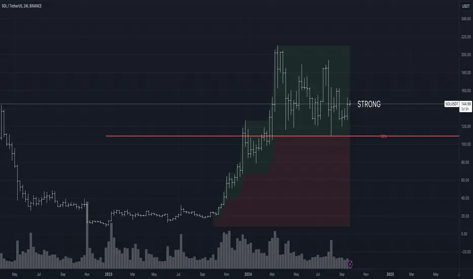
Strength/Weakness IndicatorThe Strength/Weakness Indicator is a customisable tool designed to help traders identify key areas of market strength and weakness based on the 50% Fibonacci retracement level .
█ Underlying Concept:
The concept behind this indicator draws heavily on the principles of Fibonacci retracement and WD Gann’s market theories , particularly the importance of the 50% level in signalling critical psychological areas of support and resistance. Historically, the 50% retracement level has been regarded as a key marker where markets either find new buyers/sellers or continue a trend. Gann himself placed significant emphasis on the halfway point of a previous market move as a critical level for market strength and reversal.
Strength : When an asset is trading above the 50% retracement level, it suggests that buyers are in control and that the market is showing strength. This is particularly useful for traders aiming to ride the continuation of an uptrend.
Weakness : Conversely, when the price falls below the 50% retracement level, it indicates that sellers are dominating, and the market is showing signs of weakness. This can be an early indication of a potential reversal or further decline.
█ Key Features:
1 — Multi-Timeframe Fibonacci Analysis :
This indicator supports up to two distinct retracement levels, allowing traders to analyse multiple timeframes simultaneously. Customise the look-back periods for each level to track the highest high and lowest low over your chosen period.
The tool is adaptable to short-term, swing trading, and long-term investing, making it useful across different trading styles.
2 — Dynamic Strength/Weakness Labelling :
The script dynamically calculates and displays whether the asset is “STRONG” or “WEAK” based on its position relative to the 50% retracement levels. If the price is above both levels, it is considered "VERY STRONG." Conversely, trading below both levels signals "VERY WEAK" conditions. This real-time feedback helps traders gauge market sentiment with ease.
3 — Customizable Visual Representation :
Both retracement levels are fully customisable, including line colours, styles, and thicknesses. The script offers custom background fills—highlighting areas of strength (green) and weakness (red)—to provide a clear visual aid for identifying key price zones.
Traders can modify the appearance of text labels (size, colour, position) and choose whether to extend lines left, right, both directions, or not at all.
4 — Cross-Timeframe Validation :
Traders can cross-reference price action between two timeframes to confirm trends. If both levels signal strength or weakness, it validates market momentum, increasing confidence in trade decisions.
5 — Strategic Decision-Making Aid :
The indicator aids in identifying support and resistance zones based on the 50% retracement level. Use it to time entries and exits effectively: price above the 50% level suggests potential trend continuation, while falling below may indicate reversal.
█ How It Works:
1 — Defining Custom Timeframes :
The trader selects custom time periods (days, weeks, months, or years) to calculate the highest high and lowest low, allowing precise control over the analysis.
2 — Calculating Strength/Weakness :
Once the 50% retracement level is calculated, the price’s position relative to it determines the market’s condition. Above 50% signals strength, below signals weakness.
3 — Comparing Multiple Timeframes :
Enable a second retracement level to compare different time periods. This feature is useful for spotting divergences between short-term and long-term trends or validating strength across timeframes.
█ How to Use:
1 — Assess Market Conditions :
If price trades above both 50% retracement levels, it indicates strong bullish momentum. Conversely, trading below both levels signals bearish conditions.
2 — Plan Entries/Exits :
Use the 50% level as a reference for support and resistance. Plan to enter when the price bounces off the 50% level, or exit if it breaks down below this critical level.
3 — Cross-Timeframe Analysis :
Validate the market trend by comparing retracement levels across different timeframes. This helps in confirming whether the trend is strong enough to justify holding a position.
█ Why This Indicator is Unique:
Comprehensive Multi-Timeframe Analysis : While most Fibonacci indicators focus on a single period, this tool provides a deeper understanding by allowing traders to compare price action across multiple timeframes.
Customizable and Dynamic : The real-time strength/weakness labeling, customizable background fills, and the ability to analyze two retracement levels simultaneously make this tool adaptable to any trading strategy.
Valuable for All Traders : Whether you are day trading, swing trading, or investing long-term, the Strength/Weakness Indicator offers clarity on key market levels and sentiment, improving decision-making for entries and exits.
Disclaimer : This script is for educational purposes and is not financial advice. Trading involves significant risk, so please consult a professional advisor before making investment decisions. For the best results, use this indicator alongside other technical analysis methods like trend lines or moving averages to help you confirm signals and make more informed decisions.
Planetary Speed█ OVERVIEW
This script is designed to measure the speed of planets from Mercury to Pluto by comparing longitude data across time.
Planetary Speed cycles are very important for those trading Gann theory / Time theory and for Astrology Traders alike. You can toggle the mode of the planet
from a heliocentric setting to a geocentric one. This script is especially important for those who want to research the market and observe the effects of planetary cycles.
Planetary Speed works better on markets that do not close at the moment and on selected time frames ( all the default tradingview timeframes except the monthly ).
This script can also plot 250 days of future data with ease.
█ Future Plans and upgrades to this script may include :
1. Capability to work on different markets that do not open 24/7.
2. Adding lunar and solar speed.
And more! Feel free to contact me with any feature that you would like to see in this script
█ How to use :
1. Open the settings.
2. Select the planet.
3. Choose between Heliocentric and Geocentric
Then Press OK & give the script a few seconds and you should be set. You can add this script to your chart more than once!
This script is coded as an addon to the Gann ToolBox package/scripts.

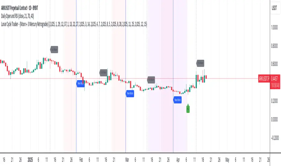
Lunar Cycle Tracker - (Moon + 3 Mercury Retrogrades)This script overlays the lunar and Mercury retrograde cycles directly onto your chart, helping traders visualize natural timing intervals that may influence market behavior.
Key Features:
🌑 New Moon & Full Moon Markers:
Vertical lines and labels indicate new and full moon events each month. You can fully customize their colors.
🌗 Last Quarter Moon Fill:
A soft pink background highlights the last quarter moon phase (from 7.4 days after the full moon to the next new moon).
🪐 Three Mercury Retrograde Zones:
Highlight up to three retrograde periods per year with customizable date inputs and background color. Great for spotting potential reversal or volatility windows.
Customization:
Moon event dates and colors
Manual input for Mercury retrograde periods (year, month, day)
Full compatibility with all timeframes (1H, 4H, daily, etc.)
Great for astro-cycle traders, Gann-based analysts, or anyone who respects time symmetry in the markets.
Fully customizable & works across all timeframes.
This tool was created by AngelArt as part of a larger astro-market model using lunar timing and planetary retrogrades for cycle-based market analysis.
Price & Time SquaredHi Traders..
This is one of Gann's trading method, called Price & Time Squared. When price & time meets, price will reverse."
as you see, those lines (past & future) represent the forecast of 'potential' swing (swing high/low or turning up/ down)
here are some examples:
Weekly
Daily
H1
M30
M15
M5
How to trade (very simple):
- if the trend is down and tomorrow there is a 'Price & Time Squared Line', we can prepare to take long position (combine with your favorite price action)
- if the trend is up and tomorrow there is a 'Price & Time Squared Line', we can prepare to take short position (combine with your favorite price action)
- stop loss if the chart makes Lower Low (for Long Position)
- stop loss if the chart makes Higher High (for Short Position)
you can use those lines as guidance in your trading (just like Traffic Light)
PS:
-if you see 2 or 3 lines close together, or 2 or 3 lines stack in 1 line (cluster), it means the Time Factor is 'Strong'
the stronger the cluster the stronger the Time Factor
- due to time delay & time lag, the turning can be +/- 1 bar
- PM for trial access
“Time is the most important factor of all and not until sufficient time has expired does any big move start up or down. The time factor will overbalance both space and volume. When time is up, space movement will start and large volume will begin, either up or down.

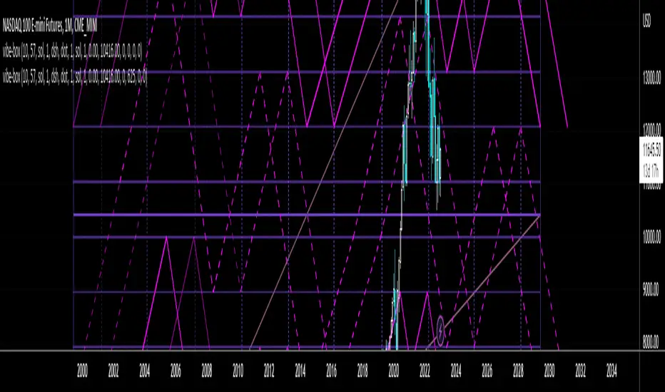
Vibration BoxFirst Public release of the Vibration Box
WARNING - THESE CYCLES CANNOT PREDICT PERFECT "UP & DOWN" MOTION
There is absolutely no guarantee that these cycles will predict perfect "up & down" motion for the markets
Please be aware that this tool is to be used with a robust risk management system
These cycles are representative of "circle geometry within a square of price & time"
Slowly, I will build up some ideas to go along with this script so that you can learn to apply it to many different markets in many different ways
Those familiar with the work of W.D. Gann should be able to utilize this tool in many different ways
Instructions:
Place the box down with 2 mouse clicks (first is for bottom left corner & second is for top right corner)
NOTE: DUE TO TRADINGVIEW LIMITATIONS
-There is a maximum of 12 divisions for your box/vibration (I will work on increasing this number)
-You MUST choose a coordinate that is within the price action that has already occurred
-You CANNOT initially place the box BEFORE THE FIRST BAR of data
-You CANNOT initially place the box BEYOND THE LAST BAR of data
THEN, ONCE YOU HAVE PLACED THE BOX FOR THE FIRST TIME
YOU CAN MANUALLY ADJUST THE DATES WITHIN THE SETTINGS TO PLACE THE BOX IN ANYWAY YOU WOULD LIKE!
HFD_LFD (Gann Square)this indicator predicts the next high and low price candle for the time frame that you selected. note that the pm input value that adjusts the range of this indicator. so I suggest a select the best number for your chart by try and error.
Good Trade
EK_Analysis

5WMAs based on GANN numbers 5 13 49 73 198Plots 5 Weighted Moving Averages of 5 13 49 73 198 with source (High+Low+Close)/3
A Cross Appears when 13 WMA Crosses 49 WMA

kosta script zidan groupit is just draw gann sq9 with other way you can define the low point and high point and it will draw the rest
i am only giving this to the first group and i am still working on it to make it better and i hope i can draw the chart as expected and learned
المجموعه الاولي لذيدان

AlgoCados x Gann Toolkit AnalysisAlgoCados x Gann Toolkit Analysis
The "AlgoCados x Gann Toolkit Analysis" is an advanced TradingView indicator combining the principles of W.D. Gann’s methodologies with the power of custom anchor points and time cycles. Tailored for traders seeking precision in market timing and price-level analysis, this toolkit integrates the Anchored Square of 9, customizable Gann Fans, and Time cycles. It offers unparalleled flexibility, allowing users to apply Gann’s techniques across different market assets and timeframes by squaring the chart, providing insights into support, resistance, and potential trend reversals.
CME_MINI:NQH2025
# Core Functionalities
# Gann’s Square of 9 Price Projections
This indicator applies Gann’s Square of 9 principles, allowing traders to anchor price projections at significant highs, lows, opens, or closes. By following the Gann Wheel methodology, it calculates critical support and resistance levels through angular shifts, providing accurate projections based on the chosen anchor point. Traders can adjust the anchor to align with various market conditions, refining their analysis according to their preferred starting price.
# Gann’s Cycles Time Projection
Incorporating Gann’s natural cycles of 144 and 360, this indicator utilizes bar index logic to project time cycles, best suited for unit-based timeframes (e.g., 1 minute, 1 hour, 1 day). These time projections are plotted dynamically, adapting in real time to new data and offering a structured view of Gann’s cyclical approach to market timing.
# Customizable Gann Fans
The toolkit includes a flexible Gann Fan module that lets traders scale ratios around a user-defined “1x1” ratio, making it adaptable across different assets and timeframes. With seven standard fan lines (1x1, 2x1, 4x1, 8x1, 1x2, 1x4, 1x8), each line is drawn dynamically based on the selected anchor point, providing insights into price action direction and potential support/resistance zones. These fans can be positioned for both bullish and bearish setups.
# Square of 4 Projections
By dividing Gann’s 360° cycles into four 90° segments, the indicator generates additional projections for more granular analysis. These divisions highlight key support/resistance levels, allowing traders to observe market responses at each 90° increment and identify potential reversal points. By default users will view larger cycles, up to 5760°, to capture significant long-term trends.
# Dynamic Labeling and Visualization
The indicator features customizable line styles (solid, dotted, dashed) and labeling options (Levels, Prices, Levels + Prices). This flexibility allows traders to create clear, structured chart visuals that reflect their analytical needs. Dynamic labels display degrees and prices for each projection, helping traders understand price movements at a glance.
CME_MINI:NQH2025
# Mathematical Foundation and Indicator Logic
# Anchor Point Calculation
The selected anchor (High, Low, Open, or Close) serves as the baseline for Gann calculations, determining all subsequent projections. Users can control the anchor time and adjust for offsets to optimize alignment with key market events.
# Angular Shifts and Square Root Scaling
Projections are calculated by applying angular shifts to the square root of the anchor price, with the toolkit generating both positive and negative deviations. This method reveals potential price levels by mapping out a series of support and resistance points based on Gann’s cyclic philosophy.
# Time Cycle Analysis_ 144 & 360 Cycles
Utilizing the bar index logic, the indicator plots time projections aligned with Gann’s 144 and 360 cycles, which apply best to unit-based timeframes like 1 minute, 1 hour, 1 day, etc. Time cycles are labeled and extended dynamically, ensuring the chart reflects real-time market shifts as new bars are added.
# Key Features and Customization Options
# Adjustable Angular Shifts and Cycles
Angular shifts from 360° to 5760° are available, offering detail from intraday to long-term trends. The Square of 4 cycles enhance analysis by dividing the 360° Gann Wheel into four equal parts, revealing critical resistance/support points within each cycle.
# Fully Customizable Projection Lines
Projection lines are customizable by style (solid, dotted, dashed) and color, ensuring a clear distinction between equilibrium, support, and resistance levels. The toolkit also includes separate settings for upper and lower deviations, allowing traders to focus on specific market directions.
# Flexible Input Settings for Time and Price
Users can set anchor points, time cycles, line styles, and labels with precision, tailoring the indicator to any asset, timeframe, or market condition.
# Dynamic Labeling and Offsets
Each projection line displays dynamic labels that show angular shifts and associated prices, enhancing readability and ease of analysis. Labels can be offset to avoid chart clutter, creating a clean and user-friendly chart.
CME_MINI:NQH2025
# Recommended Usage
# Time Cycles for Key Market Events
Anchor points should align with major highs or lows to reflect accurate time cycles. The toolkit’s flexibility in time cycle selection (1x1, 144, or 360 cycles) ensures precision in market timing analysis. Ideal for unit-based timeframes such as 1 minute, 1 hour, 1 day, 1 week, or 1 month.
# Price Levels with Gann Fans
Set anchor points on significant highs or lows to apply the Gann Fan tool effectively, projecting key price levels across multiple timeframes; the default fan is set on 1x1 (one price unit for one time unit), the ratio can be manually changed based on the chart specifics.
# Square of 4 Analysis
Dividing Gann Wheels into 90° segments allows traders to identify critical support and resistance levels within each 360° cycle. This feature is ideal for pinpointing intraday reversals or aligning with long-term trend cycles.
# Technical Overview
Indicator Name : AlgoCados x Gann Toolkit Analysis
Platform Compatibility : TradingView
Version : Pine Script v6
License: Mozilla Public License 2.0
Author : AlgoCados, © 2025
Overlay : True (overlays directly on price chart)
Core Functions : Anchored Square of 9, Customizable Gann Fans, and Time-Cycles projections
Customizable Settings : Anchor time/point, Angular shifts, Time cycles, Fan ratios, Label styles
Maximize Gann Analysis Precision with AlgoCados; Healthy with Your Trading!

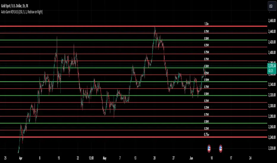
Auto Gann KEYLVLS "Auto Gann KEYLVLS" indicator can be a valuable tool for traders, especially those who employ Gann theory in their analysis. Here are some ways to effectively use this indicator:
Identifying Key Price Levels: Gann lines are known for their ability to identify key support and resistance levels. Use the plotted Gann lines to identify significant price levels where the market may react.
Confirmation of Trend Reversals: When price approaches a Gann line, observe how the price reacts. A bounce off a Gann line can confirm the continuation of the trend, while a break of a Gann line may indicate a potential trend reversal.
Entry and Exit Points: Gann lines can serve as entry and exit points for trades. Look for confluence between Gann lines and other technical indicators or patterns to identify high-probability trade setups.
Trading with the Trend: In an uptrend, consider buying opportunities near Gann support levels, while in a downtrend, look for selling opportunities near Gann resistance levels.
Risk Management: Use Gann lines to set stop-loss and take-profit levels. Place stop-loss orders below Gann support levels for long trades and above Gann resistance levels for short trades to manage risk effectively.
Timeframe Analysis: Utilize the flexibility of this indicator to plot Gann lines on different timeframes. Compare Gann lines across multiple timeframes to identify alignment or divergence, which can provide additional confirmation for trading decisions.
Combination with Other Indicators: Combine the information provided by Gann lines with other technical indicators, such as moving averages, RSI, or MACD, to strengthen your trading decisions.
Input Parameters:
The script defines several input parameters that control the behavior of the Gann lines, such as the number of weeks to look back for highs and lows, the number of Gann lines to plot, line extension settings, and options to show or hide specific Gann lines like .25, .37, .50, .63, and .75.
Auto Gann Functionality:
The script calculates the highest high and lowest low for the specified number of weeks, hours, and minutes.
It then calculates quartile levels (0.25, 0.50, 0.75) based on the weekly high and low.
Gann lines are drawn based on these levels, with options to extend them left and/or right.
Labels are added to the Gann lines indicating their values.
Weekly Gann Lines:
The script plots Gann lines and labels based on the weekly high and low levels.
Labels are added to these lines indicating their values.
Sub Gann Lines:
Additional Gann lines are plotted based on the weekly high and low levels, with subdivisions for lower timeframes like H4, H1, M15, and M1.
Label Management:
Labels are managed based on user preferences, including options to show labels once on the left side, redraw labels on the right side, or not show labels at all.
SCE GANN PredictionsThis is a script designed to give an insight on price direction from being above or below a GANN Value.
What Are GANN Waves?
The SCE GANN Predictions indicator is inspired by the work of W.D. Gann, a renowned trader who believed that price movements follow geometric and mathematical patterns. GANN waves use past price behavior—specifically momentum or "velocity"—to forecast where prices might head next.
How Does the Indicator Work?
Calculating Velocity
The script starts by measuring the "velocity" of price movement over a user-defined lookback period (denoted as n). This velocity is the average difference between the close and open prices over n bars. Think of it as the market’s speed in a given direction.
Predicting the Future Price
Using this velocity, the indicator estimates a future price after a specific time horizon—calculated as n + n*2 bars into the future (e.g., if n = 15, it predicts 45 bars ahead). It scales the velocity by a ratio (Gr) to determine the "end price." This is the raw GANN prediction.
Optimizing the Ratio (Gr)
The key to a good prediction is finding the right Gr. The script tests a range of Gr values (from Gr_min to Gr_max, stepping by Gr_step) and evaluates each one by calculating the sum of squared errors (SSE) between the predicted prices and the actual historical close prices. The Gr with the lowest SSE is deemed "optimal" and used for the final prediction.
Smoothing with an SMA
The raw GANN prediction is then smoothed using a simple moving average (SMA) over the lookback period (n). This SMA is plotted on your chart, serving as a dynamic trend line. The plot’s color changes based on the current price: teal if the close is above the SMA (bullish), and red if below (bearish).
Visuals
This example shows how the value explains price strength and changes color. When the price is above the line, and it’s green, we’re showing an up trend. The opposite is when the price is below the line, and it’s red, showing a down trend.
We can see that there may be moments where price drops under the value for just that one bar.
In scenarios with sideways price action, even though the price crosses, there is no follow through. This is a shortcoming of the overall concept.
Customizable Inputs
Timeframe: Choose the timeframe for analysis (default is 2 minutes).
Show GANN Wave: Toggle the GANN SMA plot on or off (default is true).
Lookback Period (Gn): Set the number of bars for velocity and SMA calculations (default is 15).
Min Ratio (Gr_min): The lower bound for the Gr optimization (default is 0.05).
Max Ratio (Gr_max): The upper bound for Gr (default is 0.2).
Step for Gr (Gr_step): The increment for testing Gr values (default is 0.01).
How to Use SCE GANN Predictions
Trend Direction
The colored SMA provides a quick visual cue. Teal suggests an uptrend, while red hints at a downtrend. Use this to align your trades with the broader momentum.
Crossover Signals
Watch for the close price crossing the GANN SMA. A move above could signal a buy opportunity, while a drop below might indicate a sell. Combine this with other indicators for confirmation.
Fine-Tuning
Experiment with the lookback period (Gn) and Gr range to optimize for your market. Shorter lookbacks might suit fast-moving assets, while longer ones could work for slower trends.
Like any technical tool, SCE GANN Predictions isn’t a crystal ball. It’s based on historical data and mathematical assumptions, so it won’t always be spot-on.

SW monthly Gann Days**Script Description:**
The script you are looking at is based on the work of W.D. Gann, a famous trader and market analyst in the early 20th century, known for his use of geometry, astrology, and numerology in market analysis. Gann believed that certain days in the market had significant importance, and he observed that markets often exhibited significant price moves around specific dates. These dates were typically associated with cyclical patterns in price movements, and Gann referred to these as "Gann Days."
In this script, we have focused on highlighting certain days of the month that Gann believed to have an influence on market behavior. The specific days in question are the **6th to 7th**, **9th to 10th**, **14th to 15th**, **19th to 20th**, **23rd to 24th**, and **29th to 31st** of each month. These ranges are based on Gann’s theory that there are recurring time cycles in the market that cause turning points or critical price movements to occur around certain days of the month.
### **Why Gann Used These Days:**
1. **Mathematical and Astrological Cycles:**
Gann believed that markets were influenced by natural cycles, and that certain dates (or combinations of dates) played a critical role in the price movements. These specific days are part of his broader theory of "time cycles" where the market would often change direction, reverse, or exhibit significant volatility on particular days. Gann's research was based on both mathematical principles and astrological observations, leading him to assign importance to these days.
2. **Gann's Universal Timing Theory:**
According to Gann, financial markets operate in a universe governed by geometric and astrological principles. These cycles repeat themselves over time, and specific days in a given month correspond to key turning points within these repeating cycles. Gann found that the 6th to 7th, 9th to 10th, 14th to 15th, 19th to 20th, 23rd to 24th, and 29th to 31st often marked significant changes in the market, making them particularly important for traders to watch.
3. **Market Psychology and Sentiment:**
These specific days likely correspond to key moments where market participants tend to react in predictable ways, influenced by past market behavior on similar dates. For example, news events or scheduled economic reports might fall within these time windows, causing the market to respond in a particular way. Gann's method involves using these cyclical patterns to predict turning points in market prices, enabling traders to anticipate when the market might make a reversal or face a significant shift in direction.
4. **Turning Points:**
Gann believed that markets often reversed or encountered critical points around specific dates. This is why he considered certain days more important than others. By identifying and focusing on these days, traders can better anticipate the market’s movement and make more informed trading decisions.
5. **Numerology:**
Gann also utilized numerology in his trading system, believing that numbers, and particularly certain key numbers, had significance in predicting market movements. The days selected in this script may correspond to numerological patterns that Gann identified in his analysis of the markets, such as recurring numbers in his astrological and geometric systems.
### **Purpose of the Script:**
This script highlights these "Gann Days" within a trading chart for 2024 and 2025. The color-coding or background highlighting is intended to draw attention to these dates, so traders can observe the potential for significant market movements during these times. By identifying these specific dates, traders following Gann's theories may gain insights into possible turning points, corrections, or key price movements based on the market's historical behavior around these days.
Overall, Gann’s use of specific days was based on his deep belief in the cyclical nature of the market and his attempt to tie those cycles to the natural laws of time, geometry, and astrology. By focusing on these dates, Gann aimed to give traders an edge in predicting significant market events and price shifts.
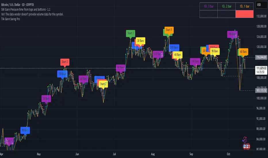
SW Gann Pressure time from tops and bottomsW.D. Gann's trading techniques often emphasized the significance of time in the markets, believing that specific time intervals could influence price movements. Here’s how the 30, 60, 90, 120, 180, and 270 bar intervals relate to Gann's rules:
1. **30 Bars**:
- Gann often viewed shorter time frames as critical for identifying short-term trends. A 30-bar interval can signify minor cycles or potential turning points in price.
2. **60 Bars**:
- This interval is significant as Gann believed in the importance of quarterly cycles. A 60-bar mark could indicate a completion of a two-month cycle, often leading to retracements or reversals.
3. **90 Bars**:
- Gann considered 90 days (or bars) to represent a quarter. This interval can signify a substantial shift in market sentiment or a pivotal point in a longer trend.
4. **120 Bars**:
- The 120-bar mark corresponds to about four months. Gann viewed longer intervals as more significant, often leading to major shifts in market trends.
5. **180 Bars**:
- A 180-bar period relates to a semi-annual cycle, which Gann regarded as critical for major support and resistance levels. Price action around this interval can reveal potential long-term trend reversals.
6. **270 Bars**:
- Gann believed that longer cycles, such as 270 bars (approximately nine months), could indicate significant market phases. This interval may represent major turning points and help identify long-term trends.
### Application in Trading:
- **Identifying Trends**: Traders can use these intervals to spot potential trend reversals or continuations based on Gann’s principles of market cycles.
- **Setting Targets and Stops**: Knowing where these key bars fall can help in setting profit targets and stop-loss orders.
- **Analyzing Market Sentiment**: Price reactions at these intervals can provide insights into market psychology and sentiment shifts.
By marking these intervals on a chart, traders can visually assess when price action aligns with Gann's theories, helping them make more informed trading decisions based on historical patterns and cycles.
Fair Value Gap Finder with Integrated Gann BoxTitle: Fair Value Gap Finder with Integrated Gann Box Analysis
Description:
The "Fair Value Gap Finder with Integrated Gann Box Analysis" is a unique technical indicator designed for traders who wish to incorporate the concepts of Fair Value Gaps (FVG) and Gann Box methodologies into their trading strategy. This tool is beneficial for both trend-following and scalping techniques across various markets and timeframes.
Functionality:
The indicator identifies Fair Value Gaps, which are areas on the chart where price has skipped a range, creating a 'gap'. Recognizing these zones can be crucial for understanding potential price support and resistance areas. Alongside FVG detection, this script employs Gann Box principles to project potential levels of interest. Gann Boxes are drawn automatically when an FVG is identified, providing additional insights based on W.D. Gann's theories, which relate to time and price symmetry.
Usage:
Upon detecting an FVG, the indicator will highlight the gap on the chart and overlay a Gann Box between the high and low points of the gap. Traders can use these zones to make informed decisions about entry and exit points, stop loss, and take profit levels. The script offers customization options for the appearance and behavior of the FVG boxes and Gann Lines, allowing users to adapt the tool to their preferences.
Originality:
What sets this indicator apart is the integration of FVG with Gann Box levels within a single tool, streamlining the analysis process. It takes the classic approach of identifying gaps and enriches it with the geometric significance of Gann's work, all while allowing users to visualize and interact with these levels in a user-friendly manner.
Open-Source Nature:
This script is open-source, making it a transparent solution for those who wish to understand the underlying calculations. While not all traders are versed in Pine Script, the logic of identifying FVGs and applying Gann Box levels is explained through the script's annotations and the user interface itself.
Instructions for Use:
Apply the script to your chart, and it will automatically detect FVGs.
Adjust the settings in the indicator's input menu to match your trading style and preferences.
Use the FVG and Gann Box levels as potential areas of interest for trade setups.
This script does not guarantee profits and should be used as part of a comprehensive trading plan. It is best used in conjunction with other analysis methods to confirm signals and strategies.

Square of Nine Levels [RC] Advance📐 Square of Nine Levels — Precision Market Geometry for Dynamic Price Targets
The Square of Nine Levels indicator is a powerful price-projection and level-mapping tool based on W.D. Gann’s legendary Square of Nine mathematical system. This indicator transforms market prices into geometric rotations and harmonic levels—revealing price zones where markets historically accelerate, pause, or reverse with uncanny accuracy.
Unlike static Fibonacci tools, Square of Nine levels expand radially around a chosen base price, creating concentric price cycles that align with vibrational mathematics, planetary motion analogies, and cyclical market resonance. When price interacts with these rotational degrees, traders often witness structural reactions that are invisible to standard indicators.
🧭 What This Indicator Does
Once a trader inputs (or clicks) a Base Price, the indicator automatically:
✔️ Computes Square of Nine projections in upward and downward directions
✔️ Plots concentric price circles (levels of expansion)
✔️ Highlights rotational harmonics and midpoint attractors
✔️ Shows Golden Ratio (0.618 / 0.382) cyclic divisions
✔️ Provides clear visual level markers & labels for analysis
✔️ Adjusts dynamically as price trends evolve
These levels act as mathematical magnets, where price frequently:
Finds hidden support or resistance
Creates fair value rejection zones
Forms breakout thresholds
Completes wave and time cycles
Resonates with prior swing pivots
🔍 Key Features
Feature Benefit
_________________________________________________________________________
Auto Square-of-Nine Level Calculation Zero manual computation—instant geometry
Adjustable Circles & Points Model Gann expansions as per your theory
Golden Ratio & Midpoint Zones Adds confluence for precision entries
Multi-color Cycle Layers Instantly differentiate price cycles
Minimal UI Designed for professional clean charts
🧠 Why the Square of Nine Matters
Gann believed that price does not move randomly—it rotates through degrees, harmonics, and vibrational frequencies. The Square of Nine captures this rotation mathematically:
Price in time equals price in space.
This tool reveals those rotational levels, allowing traders to anticipate when price is likely to pivot or continue—with mathematically predictable targets.
🎯 Best Use-Cases
Identifying major support/resistance levels
Timing cycle inflection points
Confluence with Wave Theory, SMC, FVGs, and geometry
Swing, positional, and index-level forecasting
If you trade using Gann methods, cycles, harmonics, Square of 9, or astro-geometry, this indicator becomes a foundational timing and projection engine.
🚀 Take Your Charting to the Next Dimension
The Square of Nine Levels is not just a level plotter—it is a market resonance system. Once you understand how price vibrates around these circles, you gain a structural edge that most traders never discover.

DarkPool's Gann High Low Activator DarkPool's Gann High-Low Activator.
It enhances the traditional trend-following logic by integrating Heikin Ashi smoothing, Multi-Timeframe (MTF) analysis, and volatility filtering. It is designed to filter out market noise and provide clearer trend signals during volatile conditions.
Underlying Concepts
Heikin Ashi Smoothing: Standard price candles can produce erratic signals due to wicks and short-term volatility. This script includes a "Calculation Mode" setting that allows the Gann logic to run on Heikin Ashi average prices. This smoothes out price data, helping traders stay in trends longer by ignoring temporary pullbacks.
Gann High-Low Logic: The core algorithm tracks the Simple Moving Average (SMA) of Highs and Lows over a user-defined period.
Bullish Trend: Price closes above the trailing SMA of Highs.
Bearish Trend: Price closes below the trailing SMA of Lows.
Volatility & Trend Filtering: To reduce false signals during sideways markets, this tool employs two filters:
ADX Filter (Choppiness): Uses the Average Directional Index to detect low-volatility environments. If the ADX is below the defined threshold (default 20), the indicator identifies the market as "choppy" and suppresses signals to preserve capital.
EMA Filter (Baseline): An optional Exponential Moving Average filter ensures trades are only taken in the direction of the longer-term trend (e.g., Longs only above the 200 EMA).
Features
Dual Calculation Modes: Switch between Standard price logic and Heikin Ashi smoothing logic.
Multi-Timeframe (MTF): Calculate the trend based on a higher timeframe (e.g., 4-Hour) while viewing a lower timeframe chart (e.g., 15-Minute).
Automated JSON Alerts: Generates machine-readable JSON alert payloads compatible with external trading bots and webhooks.
Live Dashboard: A data table displaying the current Trend State, Calculation Mode, ADX Value, and risk percentage.
How to Use
Buy Signal: Generated when the trend flips Bullish, provided the ADX indicates sufficient momentum and the price satisfies the EMA filter (if enabled).
Sell Signal: Generated when the trend flips Bearish, subject to the same momentum and trend filters.
Neutral State (Gray Cloud): When the cloud fill turns gray, the market is in consolidation. It is recommended to avoid entering new positions during this state.
Trailing Stop: The Gann Line serves as a dynamic trailing stop-loss level. A close beyond this line invalidates the current trend.
Settings Configuration
Calculation Mode: Select "Standard" for raw price action or "Heikin Ashi" for smoothed trend following.
Gann Length: Lower values (3-5) are suitable for short-term scalping; higher values (10+) are better for swing trading.
MTF Mode: Enable to lock the calculation to a specific higher timeframe.
ADX Threshold: Adjust based on asset volatility. Recommended: 20-25 for Crypto, 15-20 for Forex/Indices.
Disclaimer
This source code and the information presented here are for educational purposes only. This script does not constitute financial advice, trading recommendations, or a solicitation to buy or sell any financial instruments. Trading in financial markets involves a high degree of risk and may not be suitable for all investors. Past performance is not indicative of future results. The author assumes no responsibility for any losses incurred while using this indicator. Use this tool at your own discretion and risk.

QuantMotions - Pivot Timeline ProjectionQuantMotions – Pivot Timeline Projections is an advanced time-based forecasting tool that uses a unique Twin Pivot model to project future price-time structures.
It combines classical Gann principles with modern quantitative logic to generate highly precise time projections, dynamic angles, and future support/resistance timelines across multiple timeframes.
Whenever two matching pivots (High ↔ Low) of the same length are detected, the indicator calculates a true calendar-time angle and extends it forward, forming dynamic Gann-style fans that adapt to the market in real time.
Perfect for traders who want to integrate price + time forecasting into their strategy.
Key Features:
✔ Twin Pivot Detection
Automatically identifies valid pivot pairs of equal cycle length and opposite direction.
Once confirmed, the pivot becomes a time anchor for future projections.
✔ True Time-Based Angle Projections
Unlike standard Gann tools that rely on bar-counting, this indicator uses real calendar time (milliseconds) to calculate:
This produces significantly more accurate forecasting lines.
✔ Multi-Timeframe Pivot Cycles
Activate time cycles such as:
30M, 1H, 4H, 12H
1D, 7D, 30D
60D, 90D, 120D, 180D, 270D, 360D
Each cycle uses a dedicated color and projection style for clarity.
✔ Dynamic Support/Resistance Timefans
- Every confirmed pivot generates two future projections:
- The main time-angle projection (Gann-style forward fan)
- A secondary projection based on a fixed ratio (1/8), acting as dynamic future support
Both extend until the structure breaks based on ATR tolerance.
✔ ATR-Based Validation
Projection lines remain valid until price breaks them with a configurable ATR multiplier.
This removes noise and keeps only meaningful structures.
✔ Volume Delta Tracking (Optional)
Tracks up-volume and down-volume along the time cycle to validate directional bias.
Info labels show:
- cycle length
- angle
- delta volume
- delta percentage
Seconds-based volume tracking supported for Premium users.
✔ Smart Info Labels
Displays detailed pivot information only for the highest-timeframe pivot at each bar
→ ensures high usability without chart clutter.
🔷 Why This Indicator Is Special
This tool merges Gann angles, time cycles, and quantitative price action into a single engine.
It does not rely on static angles or simple bar offsets.
Instead, it uses:
- real time
- real slope
- real cycle symmetry
- real price movement
The result is a uniquely accurate forecasting model that is extremely difficult to replicate manually.
🔷 Perfect For
- Intraday traders
- Swing traders
- Index, Crypto, Metals, and FX traders
- Gann and cycle-based analysts
- Structure and trend change detection
- Time/price projection strategies
🔷 Inputs & Customization
- ATR break tolerance
- Multiple cycle activation toggles
- Custom color sets for each timeframe
- Second-based or standard timeframe volume tracking
- Enable/Disable info labels
🔷 Note
Some features (like seconds-based volume tracking) depend on TradingView Premium and additional broker data sources.
Loading times may vary when many long-term cycles are enabled simultaneously.
🔷 Access
This is an Invite-Only Script by QuantMotions.
Access is granted after purchase.
For more information, please visit the official product page or contact us directly.

Golden Ladder – Louay Joha (Wave & Gann Hi/Lo + ATR R-Levels)Overview
Golden Ladder is a momentum-and-structure tool that detects three-bar ladder waves and filters them with a Gann Hi/Lo regime guide (SMA-based). When a valid wave aligns with the current Hi/Lo bias and passes optional market filters (ADX, RSI, and proximity to recent extremes), the script prints BUY/SELL n labels (n = wave index) and draws a complete Entry / SL / TP1–TP4 ladder using ATR-based risk units (R) or fixed caps—configured for clarity and consistency. The script also keeps the chart clean: the last trade remains fully drawn while historical groups are trimmed to compact “ENTRY-only” stubs.
Why these components together (originality)
Three-bar ladder captures short-term momentum structure (progressively higher highs/lows for buys; the reverse for sells).
Gann Hi/Lo (SMA of highs/lows with a directional state) acts as a regime filter, reducing counter-trend ladders.
ATR-based R ladder turns signals into an actionable plan: a volatility-aware SL and TP1–TP4 that scale across instruments/timeframes.
Smart Entry filters (ADX strength, RSI extremes, and distance from recent top/bottom using ATR buffers) seek to avoid low-quality, stretched entries.
Slim history keeps only a short ENTRY stub for prior groups, so the signal you just got is always the most readable.
This is not a mere mashup; each layer constrains the others to produce fewer, clearer setups.
How it works (high-level logic)
Regime (Gann Hi/Lo):
Compute SMA(high, HPeriod) and SMA(low, LPeriod).
Direction state HLv flips when the close crosses above/below its track; one unified Hi/Lo guide is plotted.
Ladder signal (structure + confirmation):
BUY ladder: three consecutive green bars with rising highs and rising lows and HLv == +1.
SELL ladder: mirror conditions with HLv == -1.
Signals evaluate intrabar and are controlled by Smart Entry filters (ADX/RSI/extreme checks).
Risk ladder (R-based or capped):
Default: risk = ATR(atr_len) × SL_multiple and TPs in R.
Optional fixed caps by timeframe (e.g., M1/M5) using USD per point.
Longs: SL = entry – risk; TPi = entry + (Ri × risk).
Shorts: SL = entry + risk; TPi = entry – (Ri × risk).
All levels auto-reflow to the right as bars print.
Chart hygiene:
The latest trade shows ENTRY/SL/TP1–TP4 fully.
Older trades are automatically trimmed (only a short ENTRY line remains, with optional label).
Alerts:
BUY – Smart Entry (Tick) & SELL – Smart Entry (Tick) fire on live-qualified signals.
You can connect alerts to your automation, respecting your broker’s risk controls.
Inputs (English summary of UI)
Label settings: label size; ATR-based vs fixed-tick offsets; leader line width/transparency; horizontal label shift.
Gann Hi/Lo: HIGH Period (HPeriod), LOW Period (LPeriod).
Market filters: ADX (length, smoothing, minimum), RSI (length + caps), recent extremes (lookback + ATR buffer).
Entry/SL/TP Levels: TP1–TP4 (R), label right-shift, show last-trade prices on labels.
Fixed SL Caps: per-timeframe caps (M1/M5) via USD per point.
How to use
Apply on your instrument/timeframe; tune H/L periods and filters to your market (e.g., XAUUSD on M1/M5).
Favor signals aligned with the Hi/Lo regime; tighten filters (higher ADX, stricter RSI caps) to reduce noise.
Choose ATR-Risk or fixed caps depending on your preferences.
The drawing policy ensures the most recent trade remains front-and-center.
Notes & limitations
Signals can evaluate intrabar; MA-based context is inherently lagging.
ATR-based ladders adapt to volatility; extreme spikes can widen risk.
This is a technical analysis tool, not financial advice.
DCA Percent SignalOverview
The DCA Percent Signal Indicator generates buy and sell signals based on percentage drops from all-time highs and percentage gains from lowest lows since ATH. This indicator is designed for pyramiding strategies where each signal represents a configurable percentage of equity allocation.
Definitions
DCA (Dollar-Cost Averaging): An investment strategy where you invest a fixed amount at regular intervals, regardless of price fluctuations. This indicator generates signals for a DCA-style pyramiding approach.
Gann Bar Types: Classification system for price bars based on their relationship to the previous bar:
Up Bar: High > previous high AND low ≥ previous low
Down Bar: High ≤ previous high AND low < previous low
Inside Bar: High ≤ previous high AND low ≥ previous low
Outside Bar: High > previous high AND low < previous low
ATH (All-Time High): The highest price level reached during the entire chart period
ATL (All-Time Low): The lowest price level reached since the most recent ATH
Pyramiding: A trading strategy that adds to positions on favorable price movements
Look-Ahead Bias: Using future information that wouldn't be available in real-time trading
Default Properties
Signal Thresholds:
Buy Threshold: 10% (triggers every 10% drop from ATH)
Sell Threshold: 30% (triggers every 30% gain from lowest low since ATH)
Price Sources:
ATH Tracking: High (ATH detection)
ATL Tracking: Low (low detection)
Buy Signal Source: Low (buy signals)
Sell Signal Source: High (sell signals)
Filter Options:
Apply Gann Filter: False (disabled by default)
Buy Sets ATL: False (disabled by default)
Display Options:
Show Buy/Sell Signals: True
Show Reference Lines: True
Show Info Table: False
Show Bar Type: False
How It Works
Buy Signals: Trigger every 10% drop from the all-time highest price reached
Sell Signals: Trigger every 30% increase from the lowest low since the most recent all-time high
Smart Tracking: Uses configurable price sources for signal generation
Key Features
Configurable Thresholds: Adjustable buy/sell percentage thresholds (default: 10%/30%)
Separate Price Sources: Independent sources for ATH tracking, ATL tracking, and signal triggers
Configurable Signals: Uses low for buy signals and high for sell signals by default
Optional Gann Filter: Apply Gann bar analysis for additional signal filtering
Optional Buy Sets ATL: Option to set ATL reference point when buy signals occur
Visual Debug: Detailed labels showing signal parameters and values
Usage Instructions
Apply to Chart: Use on any timeframe (recommended: 1D or higher for better signal quality)
Risk Management: Adjust thresholds based on your risk tolerance and market volatility
Signal Analysis: Monitor debug labels for detailed signal information and validation
Signal Logic
Buy signals are blocked when ATH increases to prevent buying at peaks
Sell signals are blocked when ATL decreases to prevent selling at lows
This ensures signals only trigger on subsequent bars, not the same bar that establishes new reference points
Buy Signals:
Calculate drop percentage from ATH to buy signal source
Trigger when drop reaches threshold increments (10%, 20%, 30%, etc.)
Always blocked on ATH bars to prevent buying at peaks
Optional: Also blocked on up/outside bars when Gann filter enabled
Sell Signals:
Calculate gain percentage from lowest low to sell signal source
Trigger when gain reaches threshold increments (30%, 60%, 90%, etc.)
Always blocked when ATL decreases to prevent selling at lows
Optional: Also blocked on down bars when Gann filter enabled
Limitations
Designed for trending markets; may generate many signals in sideways/ranging markets
Requires sufficient price movement to be effective
Not suitable for scalping or very short timeframes
Implementation Notes
Signals use optimistic price sources (low for buys, high for sells), these can be configured to be more conservative
Gann filter provides additional signal filtering based on bar types
Debug information available in data window for real-time analysis
Detailed labels on each signal show ATH, lowest low, buy level, sell level, and drop/gain percentages

Volume Imbalances & Gann's Square IndicatorVolume Imbalances & Gann's Square Indicator:
This script is a comprehensive trading toolkit designed to help intraday and swing traders identify high-probability trade setups by combining the strengths of Gann's Theory, price-volume analysis, and multi-indicator signal confirmation in one indicator.
Key Features and Their Roles:
Gann’s S/R Levels:
Calculates main and auxiliary support/resistance lines using Gann’s “odd square” approach based on the current price. Levels are projected historically and into the future to clearly visualize critical zones for potential reversals and breakouts.
Volume*Price (VP) Spike Table:
Detects and displays real-time buy and sell volume spikes above a configurable threshold, highlighting large market transactions. The on-chart table summarizes recent major spikes with time and price for context, resetting every session.
Multi-EMA & VWAP Logic:
Integrates three customizable EMAs, VWAP, and Supertrend. Users can toggle signals from EMA crossovers, price-VWAP positioning, or Supertrend direction to match their preferred trading style and filter signals for trend or mean-reversion strategies.
Buy/Sell Labels and Signal Source Control:
Clearly plots buy/sell marker labels with customizable text, color, and size, based on the chosen signal source (EMA cross, VWAP, Supertrend). Labels offset from candles for easy visibility.
First Candle Range & Session Tools:
Plots the initial range (high, low, and midpoint) of a user-defined session, helping visualize and trade session breakouts or range retests. Session logic ensures all statistical tables and levels reset at session start.
Automated Risk/Reward Table:
Instantly calculates capital allocation, stop-loss, potential quantity, and two profit targets for both long and short trades. Helps traders plan size and risk per trade in compliance with risk management principles.
Highest/Lowest VP Markers:
Highlights the day’s peak and trough volume*price values for context on institutional buying or selling pressure.
Previous Day Range Plotter:
Draws previous session’s high/low levels for reliable reference zones and potential trade targets.
Integration Rationale:
All components are thoughtfully integrated to provide a holistic decision-making workflow:
Volume/price spikes act as momentum or liquidity signals.
Gann levels define the “where” for reaction or breakout trades.
Signal logics (EMA/VWAP/Supertrend) answer the “when,” enabling higher-confidence entries only when multiple conditions align.
How to Use:
Select your preferred inputs for EMAs, VWAP, and risk settings in the panel.
Analyze the chart for signals where buy/sell labels align with fresh VP spikes near Gann or previous day support/resistance.
Use the risk/reward table for strict money management.
Reference spike tables and session range for contextual confirmation.
Visuals and Chart Guidance:
The script displays only essential tables, lines, and labels described above.
All chart elements are explained in this description—no external scripts needed for interpretation.
Each table and marker is linked to actionable trading logic, eliminating clutter.
Closed-source Explanation:
The indicator uses session-based calculations, real-time data arrays, and proprietary math to unify Gann theory logic, large transaction detection, and multi-indicator confirmation. All major trade conditions have alert signals for ready integration with TradingView’s alert system.

Universal Gann Square & Cube LevelsUniversal Gann Square & Cube Levels - Dynamic Support/Resistance
Description:
📊 UNIVERSAL GANN LEVELS INDICATOR
This powerful indicator automatically plots Gann Square and Cube levels around the current stock price, providing dynamic support and resistance levels based on W.D. Gann's mathematical theories.
🎯 KEY FEATURES:
✅ Auto-Adaptive: Works for ANY stock price (₹20 to ₹100,000+)
✅ Real-time Detection: Uses current close price automatically
✅ Dual Level System: Square levels (black) + Cube levels (red)
✅ Customizable Range: Adjust percentage range (5% to 50%)
✅ Clean Display: Toggle square/cube lines independently
✅ Universal Compatibility: Works on all timeframes and instruments
📈 HOW IT WORKS:
Square Levels (Black Lines): Based on perfect squares (n²) around current price
Cube Levels (Red Lines): Based on perfect cubes (n³) around current price
Smart Range: Automatically calculates relevant levels within your specified percentage range
Info Display: Shows current price and level counts
⚙️ SETTINGS:
Price Range %: Control how many levels appear (default: 15%)
Show Square Levels: Toggle black square lines on/off
Show Cube Levels: Toggle red cube lines on/off
🔥 PERFECT FOR:
Day traders seeking precise entry/exit points
Swing traders identifying key support/resistance zones
Gann theory practitioners and students
Multi-timeframe analysis across all instruments
💡 USAGE TIPS:
Use 10-20% range for active day trading
Use 30-50% range for swing trading analysis
Watch for price reactions at square/cube intersections
Combine with volume analysis for confirmation
🌟 WHY THIS INDICATOR?
Unlike fixed Gann calculators, this indicator dynamically adapts to ANY price level, making it truly universal for Indian stocks, crypto, forex, and commodities.
⚠️ DISCLAIMER:
This indicator is for educational and informational purposes only. It is not financial advice and should not be considered as a recommendation to buy or sell any security. Trading involves significant risk of loss and may not be suitable for all investors. Past performance does not guarantee future results. Always conduct your own research and consult with a qualified financial advisor before making any investment decisions. The developer assumes no responsibility for any trading losses incurred through the use of this indicator.
📋 COMPATIBILITY:
All TradingView plans
All timeframes (1m to 1M)
Stocks, Crypto, Forex, Commodities
Mobile and desktop platforms
