Contrarian Scalping Entry Support v2.1This indicator is still making and testing now.
I don't recommend to use it without Pro / Prop TRADER.
// Copyright @ ALEX SHORT
// alpha tester : Norakichi Senpai (Santa Prop Norakichi Senpai)
// Special Thanks WBZ Trading Group
// This indicator support "Short term Fighting the tape Entry".
// Attension!!! I strongly reccomend to Verify effectiveness before "REAL TRADE".
// Note. Downtrend often continue compared to uptrend. So, you might have to change DFMA setting for it. Or you should change reasons/grounds for Scalping Long Entry in long DownTrend.
// Function1. Difference from moving average Arrow v 1.7 from SMA 200
// This indicator will plot chart Arrow above or below candle stick when DFMA marked over range.
// Function2. When price touch Quado_Bollinger band, background will change background and Circle Alert will plot above / below Candle stick.
ค้นหาในสคริปต์สำหรับ "entry"

LINEdicator - Trendanalysis toolThis indicator creates an trend channel based on an EMA/SMA combo and a Parabolc SAR indicator.
Watch for the peaks and the size of the red/green channel for possible trend change.
Can also be used as an Entry/Exit/Stop-Loss setting tool.

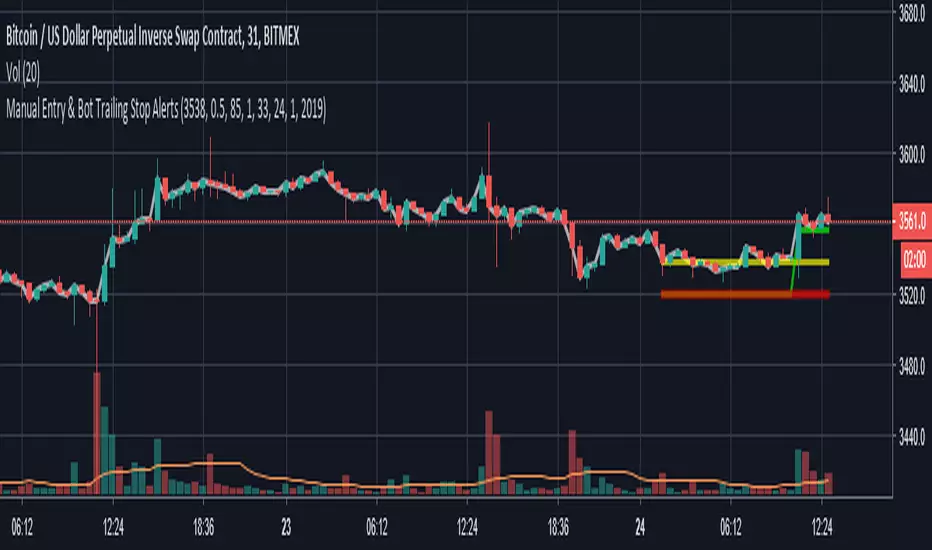
Manual Entry & Bot Trailing Stop AlertsHello all,
Another useful script & indicator with alerts enabled for trailing stoploss in your toolbox!
If you manually start a deal on a bot or even manual trade, you can set your chart time frame, enter the price and the time and date of your entry, then configure an Alert to fire using the “Close Long”/“Close Short” alert trigger.
This indicator features:
Definable Hard Stoploss by % - if price drops to hit this value, immediately trigger a close
Definable “Trail” value using Ticks (one Tick = lowest tradeable unit for your chart)
Supports Longs and Shorts!
Ideal for connecting to your 3commas BitMEX bots for EthUSD or XbtUSD
The indicator plots onto the chart various signals, Red is the Hard Stoploss value, Yellow is your Entry price, Green is the Trailing Stop and White is the live Price Tracker.
Please Note: When you add this indicator to your chart you need to click the Cog/Settings icon to configure it!
Let me know what you think!
Thanks,
Chris
Smoothed M-RSI Entry Signal + Trend Signaladded smoothing method to Multi RSI which algorithm is devised by Mr. Sixamon. based on these three RSI i build Entry signal which highlight one leg by fulfilling some condition that three RSI become above/below 50 and so on.
Anyway the main difference of this script from previous ver is that i imitated his algorithm as much as i can by checking RSI val, revised signal not to show many times within short period, and calculated RSI based on open price (not close price).
hope you could find some method by using this one.
M-RSI Entry Signal + Trend Signalthis function is the mixture of Multi RSI which is produced by Mr.sixamon with MA used for some conditions.
based on three different types of RSI, entry signal(diamond shape plot) and trend signal(background color) are created. in addition to RSI, i apply MA and open/close price to decide visible/invisible above signal. this one is much better than previous signals, but still needed to upgrade for higher accuracy.
THANKS!

3-10-16 MACD QUICK FIRE Crossover ENTRY TOOLINSPIRED FROM THE FAMOUS 3/10/16 SETTINGS OF IML CEO CHRIS TERRY WITH A ENTRY CANDLE PLOT HIGHLIGHTED ON THE CHART
SITEKONG ENTRYthis is an indicator to take the position of an entry on this indicator you can choose at a 15 minute time frame for more optimal results. happy trading
Feature
1. Bollinger Band Multiple
2. Auto Support Resistance
3. Trend Analisys With EMA
4. Macd

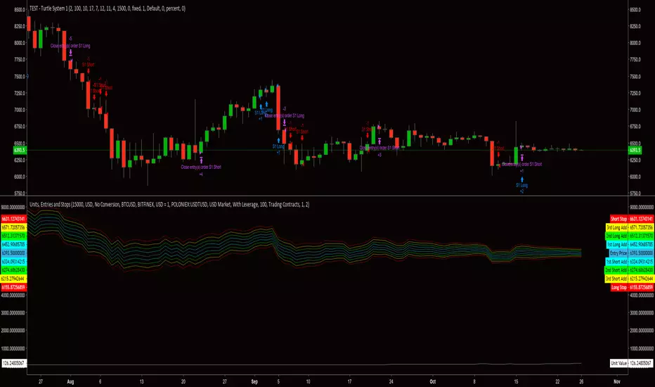
Order Size (Units) and Entry/Stop PricesThis is a risk management script derived from the Turtle trading system. I will define what is needed for each input and will also include a brief description about the intended implementation of the risk management strategy. The risk strategy can be used with any trading strategy. This script displays the order size as a unit. 1 unit is the intended size of an entry, first or adds. If trading contracts, Unit Value is presented in terms of number of contracts. If NOT, Unit Value is presented in terms of total cost for a unit in the currency of the market being traded.
::Inputs::
"Available Capital:" - This number should be the TOTAL amount of capital for use in trading account. DO NOT adjust for leverage. The default available capital is set at 15000.
"Account Currency:" - This should be the currency type for the amount entered into "Available Capital:".
"Does Account Currency Need To Be Converted?" - The currency type of "Available Capital:" must match the currency type of the market being traded. If the value of capital is not known for the market currency type, this option will perform the necessary calculation.
"Exchange used to derive BTC value" - This option is used to determine the exchange rate for currency conversions.
"Market Being Traded:" - This option reflects the trading pair of the asset being traded.
"Trading with leverage?" - This option will allow a user-specified constant value (i.e. leverage factor) to be used for calculating the account balance and number of units (i.e. order size). This is option is set to "No Leverage" by default, which will only allow the specified available capital to be used for balance and unit calculations.
"Amount of Leverage? (1-100)" - This number is the leverage factor being applied to the account per trade (e.g. 2.5, 5, 25, 50, 100). The default leverage factor is 100.
"Trading Contracts?" - This option will allow a user-specified value, for contracts, to be used when calculating unit value per order. This option is intended to be used when trading a derivative product (e.g. a contract.)
"Cost Per Contract" - This number should be equal to the value of the derivative, quoted in dollars. (e.g. Bitmex contracts are valued at $1, so the cost per contract = 1. Deribit offers contracts valued at $10, so the cost per contract =10.)
"Risk Percent" - This number should be the percent of capital you are willing to risk for each trade. (e.g. A $10,000 trading account using 2% risk would risk LOSING $20 on a trade.) Increasing or decreasing the risk amount will adjust stops and adds. This strategy would normally consider the total account equity when calculating the size of every new position. Currently, this indicator only calculates on the amount entered into the "Available Capital:" field. I plan to address this factor before implementing the script into the final complete trading strategy script. The default risk percent is set at 2.
Please remember, this indicator is technically in a testing phase. It makes up only a small piece of what will be a much more involved script.
***I am having some trouble with getting correct calculations when trading "BTC Market". I have yet to determine if the issue is due to the TradingView feeds or if the issue is in the actual code. I have, so far, calculated differences of 15-30% when comparing an asset value between it's trading pairs. I am always open to ideas and suggestions.***
Easy ma cross STUDYEasy ma cross STUDY
Best to use with small timeframes (for example 5m chart) and uptrend (refer to 1H or 4H chart).
You can set up Alerts from the Entry and Exit signals.
Play around with the settings of SMA1 and SMA2 for better results for you currency pair / time frame.
Always use stop loss!

LongSetups with Entry Signals and Trailing Stop(HA)High probable Long Setups for any time frame and asset.
75+ win rate
Trailing stop always used as exit point
To trade only with the trand - enable MAs in the Inputs tab
x - means Entry signal is active and waiting for long validation
B - on a closed bar is entry signal for long
C - on a developing bar is exit long signal
Green line - long validation line. must close above to go long
Pink line - trailing stop
On Long Entry alert - use Once Per Bar Close option.
On Long Exit alert (Trailing stop triggered) - use Once Per Bar option to trigger sooner and protect your capital.
Always do your own analysis and make trades on your own risk. Find a confluence point where everything aligns and make your own decision. Don't enter a trade because the indicator tells you so. You are free to make a copy of the script and change it to your own needs for your own personal use.
RSI/MFI - MTF - Entry signals/Trend colored bars - JD@version=2
This indicator is designed to give early entry signals as well as to follow trend moves, according to different settings.
The indicator shows a histogram of the RSI ro MFI in relation to an ema of the RSI or MFI.
The histogram is then smoothed to give early reversal/entry signals.
The actual RSI/MFI line with oversold/overbought indication can be displayed or omitted, as preferred.
in addition to the RSI/MFI line or as an alternative to it, the background colour can be set to change folowing the RSI/MFI signals.
The timeframe can be chosen. Higher timeframes (eg. 3h) tend to give less false signals.
version 5.
added support for custom Multiple Time Frame selection.
added option for choice of RSI or MFI as base indicator.
added option for price bar coloring according to the indicator. (deselecting "borders" in the "style" tab is recommended)
price bar coloring can be adjusted for different strategies:
1. following the slope of the histogram (for faster entry/exit signals)
2. according to positive or negative histogram (for longer moves)
3. according to pos. or neg. RSI/MFI (for longer term trend holds)
4. uptrend: biased towards faster buy signals and slower sell signals to stay in the uptrend
5. downtrend: biased towards faster sell signals and slower buy signals to stay in the downtrend
A longer timeframe (eg. 3x) is recommended for following trend moves.
try different strategies to see what works better for RSI or MFI.
JD.

Revolution Entry IndicatorSimple entry indicator where the entry is decided by the relative strength of each individual candle.

RSI-MTF-Histo-EntryThis indicator gives a histogram of RSI in relation to an ema of the RSI.
The histogram is then smoothed to reduce false signals.
The actualiteit RSI line with overbought/overvols signals can be added or omitted as preferred.
The background can be color coded if the RSI is above or below 50.
Version 2. Added support for MTF. Longer timesframes (1h-3h) tend to give better entry results.
As an example the indicator was added two times, one for the current timeframe and one for a longer timeframe.

Fibonacci Retracement (S)-Silver
The Automatic Fib Retracement - Silver -0.24% script indicates the 50-61.8% pullback region.
The lines of the upper and lower pivots, the support and resistance areas are also highlighted.
Customisable Fib Length - Time period over which max and min pivots are chosen.
Offsetfib - Automatically offsets the pivots and sell zone as your entry position
will be some time after the upper and lower pivots are set.
Works well when used in combination with an oscillator which highlights Divergence.
A strategy based off buying the 50-618 with a defined stop loss and target can be the basis of your strategy.
This tool will automatically plot those points but a defined Risk Management strategy will always be needed.
Works best in Bearish trends but will work on all timeframes (Bearish correction in an uptrend also possible).
Previous pivots shown but be careful to identify which of the several pivots you are using.
Start at a larger timeframe and move down. (Entries consistent on several timeframes are golden)
Pivots and retracements are dynamic. Be sure to note your entry and targets.

Fibonacci Retracement (L)-BronzeThe Automatic Fib Retracement - Bronze script indicates the 50% pullback line and upper 50% region.
The lines of the upper and lower pivots, the support and resistance areas are also highlighted.
Customisable Fib Length - Time period over which max and min pivots are chosen.
Offsetfib - Automatically offsets the 50% region and pivots as your entry position
will be some time after the upper and lower pivots are set.
Works well when used in combination with an oscillator which highlights Divergence.
A strategy based off buying the 50% with a defined stop loss and target can be the basis of your strategy.
This tool will automatically plot those points but a defined Risk Management strategy will always be needed.
Works best in Bullish trends but will work on all timeframes (Bullish correction in downtrend also possible).
Previous pivots shown but be careful to identify which of the several pivots you are using.
Start at a larger timeframe and move down as necessary.
Pivots and retracements are dynamic. Be sure to note your entry and targets.

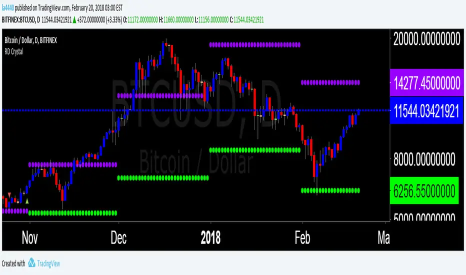
Red diamond Crystal Saves the effort to draw cumbersome harmonics.
Uses data available and applies appropriate calculations.
Pre plotted entry and exit points.
cheers
LA4440 ( Tradingview.com)
Daytrading Indicator for trend continuation entry
Daytrading Indicator for precise entry base in trend continuation pattern
VWAP Anomaly V1I made some late reading yesterday and discovered the importance of the VWAP indicator, above all the idea that when the current price exits it it will always bounce back. Therefore I decided to build an indicator which detects when the current price escapes the VWAP margin. The indicator shows this three things:
1) When the current price exits the VWAP margin.
2) The strength of a VWAP trend
3) VWAP bounce point (Blue dots which can be used as support or resistance)
By using the VWAP Anomaly V1 indicator, you can know if you find yourself in a reversal zone, and get a great entry point. Please, do have in mind no indicator is perfect, by using other indicator with the VWAP Anomaly Indicator your chances of success increase by a significant level. NOTE: Follow my predictions under your own risk

T3 Entry and ExitI made this indicator to give clear entry and exit signals plus give signals when I should add onto my trades with no repainting!! The bottom indicator is set to 34 (the default settings). This gives me my entries and exits as shown by the green and red arrow. I use a 14 period setting for my signals to add onto my trade. If I am in a long trade as shown in the chart above and the 14 period T3EE has a fast line cross under the slow line and then a cross back over and I have not had my signal to close trade yet on the 34 period T3EE I will add to my long position. I cut the size of they order in half with each addition to my position. So if I entered with 2 lots I would add 1 lot with my first signal to add (shown by orange arrow) and then .5 lots with the second signal to add to my position and so on until it is time to close the position. If you day trade avoid entering positions between 4pm est and 9pm est. and the larger the ranges and the more trendy the market the better. Good Luck!!!
If you have any questions let me know :)


Price Action + Support/Resistance with LabelsEntry Conditions:
Long Entry (BUY): Based on the bullish engulfing pattern and price being above the resistance level.
Short Entry (SELL): For demonstration, the short entry condition is set as price being below the support level and a bullish candle in the previous bar. You can modify this logic for your own use case.
Stop Loss and Take Profit:
Stoploss is plotted at the calculated stop loss level.
Target is plotted at the calculated take profit level.
Labels:
For long trades, labels are added with "BUY", "STOPLOSS", and "TARGET".
For short trades (if enabled), labels are added with "SELL", "STOPLOSS", and "TARGET".
Labels are placed using label.new at specific locations on the chart (above or below bars).
Alert Conditions:
Alerts are created for both long and short entry signals so you can get notified when the entry conditions are met.
How it works:
BUY label will appear below the bar when a long entry condition is met.
SELL label will appear above the bar when a short entry condition is met.
STOPLOSS and TARGET labels will appear at their respective levels when an entry signal is triggered.
The labels will appear on the chart to give you a clear visual cue of the entry, stop loss, and take profit levels.
How to Use:
Copy the script into your Pine Editor on TradingView and apply it to your chart.
Observe the labels that show up on the chart:
"BUY" will appear below the bar when long conditions are met.
"SELL" will appear above the bar when short conditions are met (if using short logic).
"STOPLOSS" will be plotted at the stop loss level.
"TARGET" will be plotted at the take profit level.
Optional Customization:
You can modify the short entry condition based on your preferred method.
You can adjust the length for the support/resistance calculation, the stopLossRR, and other parameters to fine-tune the strategy for Nifty 50 or any other asset.
Let me know if you have any further questions or need additional modifications!
