Tunable SWMADissected the standard SWMA function and added options for user to change just about every part of it. Weights ,Lookback ,Source can all be changed in the settings.
Green is the standard SWMA, Using the Input value selected.(MAs/LRC/VWAP)
Red is the tuned SWMA, with the option of applying a final Output filter (MAs/LRC/VWAP). Uses 8 datapoints instead of 4 for the default.
Customization can really help expand upon the standard SWMA I find. Enjoy tuning to your hearts content
ค้นหาในสคริปต์สำหรับ "curve"

Quantum Regression Oscillator [ICN]The Problem: The Lag of Standard Oscillators
Most traders rely on the Relative Strength Index (RSI) or MACD to gauge momentum. While these are legendary tools, they suffer from a critical flaw: Lag. They calculate what has happened, often giving signals after the move is already halfway done.
The Quantum Regression Oscillator (QRO) was built to solve this. It is not a simple average; it is a predictive engine.
The "Quantum" Math (How It Works)
Instead of using standard smoothing (like SMA or EMA) which drags data backward, the QRO uses Linear Regression Analysis on the RSI data itself.
Linear Regression Core : The script calculates the "Line of Best Fit" for momentum in real-time. This allows the oscillator to react to price changes faster than price itself in some instances, effectively "predicting" the next tick of momentum.
Dynamic Volatility Bands : Unlike fixed bands (e.g., 70/30 on RSI), the QRO uses standard deviation bands that expand and contract with market volatility. This means "Overbought" is not a fixed number—it adapts to the market's energy.
Visual Guide : Reading the Oscillator
1. The Quantum Line (The Main Curve)
What it is : The smooth, fast-moving line oscillating between 0 and 100.
How to read it:
Crossing Midline (50) : The baseline for trend. Above 50 is Bullish Momentum; Below 50 is Bearish Momentum.
Slope : Because it uses regression, the angle of the line is a signal itself. A sharp turn often precedes price action.
2. The Dynamic Bands (The Shaded Zones)
What they are: The Blue (Lower) and Red (Upper) zones.
How to read it:
Oversold (Blue Zone) : When the line enters the Blue zone, price is statistically overextended to the downside. This is a "Sniper Buy" zone.
Overbought (Red Zone) : When the line enters the Red zone, price is statistically overextended to the upside. This is a "Sniper Sell" zone.
3. Divergence Detection
The QRO is excellent at spotting divergences. If Price makes a Higher High but the QRO makes a Lower High (while in the Red Zone), a reversal is mathematically probable.
Integration with the ICN Suite
While this oscillator is powerful as a standalone tool, it is the "Engine" behind the Institutional Confluence Nexus .
Standalone : Use it to spot divergences and momentum shifts with zero lag.
With ICN : The main chart indicator reads data from this oscillator to generate "Sniper" and "Pullback" signals automatically.
Settings & Customization
QRO Length: The lookback period for the base RSI calculation.
Regression Length: The sensitivity of the linear regression curve (Lower = Faster/More Noise, Higher = Smoother/More Lag).
Smoothing: Additional filtering to remove market noise.
For Developers (Open Source)
I believe in the power of open-source education. Developers can view the source code to learn:
How to implement ta.linreg (Linear Regression) on top of other indicators.
How to create dynamic bands using ta.stdev (Standard Deviation).
How to create smooth color gradients using plot transparency.
Disclaimer:
This tool is a mathematical aid for technical analysis. It does not predict the future. Always use proper risk management.

Multi-Factor ConsensusMFC (Market Field Coherence)
A Triumph of Complexity: The Fusion of Three Professional Engines to Visualize the Unified
Mind of the Market
█ OVERVIEW: BEYOND THE INDICATOR
This is not another lagging indicator. This is a command suite.
MFC (Market Field Coherence) is not a single tool, but a seamless integration of three professional-grade, independent analytical engines fused into a singular, awe-inspiring system. It's a masterwork of signal processing and applied mathematics designed to visualize the invisible—the collective, underlying state of the market.
It moves beyond the simplistic analysis of individual price bars to measure something far more profound: the degree of emergent coherence across an entire ensemble of market oscillators. While traditional tools see the market as a series of disconnected data points, MFC sees it as a dynamic, fluctuating field of forces. By deploying its three specialized engines, MFC identifies moments of critical transition when disparate, chaotic market inputs converge into a single, unified, and tradable state of being. It measures the very instant the "noise" becomes a "symphony," and generates signals only when all three engines are in unanimous agreement.
█ A TRINITY OF SYSTEMS: THREE INDICATORS IN ONE
MFC's unparalleled precision comes from its unique tripartite architecture. It is not a monolithic tool. It is a fusion of three distinct, professional-grade analytical engines, each performing a critical and independent function. Their synergy is what produces the high-quality, filtered signals and the profound analytical clarity.
ENGINE 1: The Quantum Coherence Engine
The heart of the system. This is a pure regime-detection indicator. Its sole purpose is to perform the heavy lifting of converting the oscillator ensemble into complex-plane phasors and calculating the two most critical metrics: the Coherence Index (CI) and the Dominant Phase . It constantly works to answer the primary question: " How unified is the market, and in which direction is it leaning? "
ENGINE 2: The Multi-Layer Confirmation Matrix
A high CI from the first engine is not enough. This second, independent engine acts as the ultimate quality filter. It is, in essence, a sophisticated confirmation indicator that runs two rigorous, non-negotiable checks: the Phase-Lock Detector (is the alignment tight enough?) and the Pairwise Entanglement Web (is the alignment broad-based and not a fluke?). This is a purely logical system designed to reject ambiguity, eliminate false positives, and validate the findings of the Coherence Engine. It answers the crucial follow-up question: " Is this detected coherence real, or is it a statistical ghost? "
ENGINE 3: The Advanced Visualization Suite
Raw data is meaningless without interpretation. This third engine is a full-fledged visual indicator in its own right, dedicated to translating the abstract mathematics from the other two engines into an intuitive, multi-dimensional language. Featuring the revolutionary Circular Orbit Plot , the atmospheric Quantum Field Cloud , and deep-dive analytical grids, it allows you to see the market's state in a way that numbers alone never could. It answers the final question: " What does this confirmed state of coherence actually look like? "
An Ignition Signal only fires when all three of these independent systems reach a unanimous conclusion. This is the source of MFC's power and precision.
█ THE PHILOSOPHY & THEORETICAL FOUNDATION
MFC is built upon a synthesis of advanced mathematical frameworks, each chosen for its unique ability to extract a deeper layer of truth from market data. Their combination across the three engines creates a system far greater than the sum of its parts.
1. The Kernel: Gaussian-Weighted Smoothing for Intelligent Lag Reduction
Simple and Exponential Moving Averages are primitive tools. MFC's engines reject them. We employ a Gaussian Kernel for all internal smoothing. This "bell curve" weighting assigns the most significance to the most recent data, gracefully decaying influence for older data. The result is a beautifully smooth yet highly responsive measure of coherence, fundamentally reducing the lag that plagues other systems.
The formula for the weight w at a distance i from the center μ is:
w(i) = exp(- (i - μ)² / (2 * σ²))
2. The Lens: Sigmoid Normalization for Non-Linear State Definition
To compare an RSI of 80 to a MACD of 0.5, MFC utilizes the robust and mathematically elegant Sigmoid (Logistic) Function. Its non-linear, "S-shaped" curve squashes any input into a perfect, bounded range, creating extreme sensitivity near the neutral midpoint and gracefully compressing values at the extremes. This provides a crystal-clear distinction between "weak," "strong," and "extreme" conditions.
f(x) = 1 / (1 + exp(-k * x))
3. The Engine: Complex-Plane Phasors for Coherence Measurement
This is the heart of Engine 1. Each normalized oscillator is transformed from a single scalar value into a two-dimensional vector (a phasor) in the complex plane, capturing its magnitude (strength) and its phase angle (position and velocity).
Resultant Vector (R) = Σ e^(iφₙ) = Σ cos(φₙ) + i·Σ sin(φₙ)
The Coherence Index (CI) is the magnitude of this resultant vector, normalized by the number of oscillators N:
CI = |R| / N
This mathematical blending— Gaussian smoothing for clean data, Sigmoid normalization to define state, and Complex-Plane Analysis to measure collective coherence—is what allows MFC to generate insight that is simply impossible to achieve with conventional tools.
█ THE INPUTS MENU: YOUR COMMAND & CONTROL
Every parameter is exposed, allowing you to fine-tune MFC's three engines to any instrument, timeframe, or trading style. Here is an exhaustive guide:
Oscillator Settings (Engine 1)
Enable/Disable Toggles & Lengths: Construct the perfect ensemble for your market. Shorter lengths for scalping (e.g., 5m chart), longer lengths for swing trading (e.g., 4H chart). Disable any oscillator that consistently acts as an outlier to reduce noise.
Normalization Anchors: Define the "extreme" boundaries for the Sigmoid function. Widen these anchors (e.g., RSI 80/20) for highly volatile assets to better capture the larger price swings.
Coherence & Confirmation Settings (Engines 1 & 2)
CI Smoothing Window: Controls the Gaussian Kernel for the final Coherence Index. A short window (2-4) offers a fast reaction for scalpers. A longer window (5-10) creates a smoother CI line for swing traders.
Ignition Threshold: The CI level needed to activate a signal check. A lower threshold (0.70) generates more signals. A higher threshold (0.85) produces fewer, but extremely high-conviction signals.
Phase Lock Tolerance & Min Entangled Pairs: These are the core parameters for the Confirmation Engine (Engine 2). Use tighter tolerances (e.g., 25°) and a higher number of pairs (e.g., 5+) to demand an incredibly high standard for signal confirmation.
█ THE DASHBOARD: YOUR QUANTITATIVE READOUT
The dashboard provides a real-time, numerical dissection of the market field, summarizing the outputs of all three engines.
CI (Coherence Index): What it is: The master metric from Engine 1. How to interpret: < 40% (Chaos): The market is disjointed. 40-70% (Coherent): A regime is forming. > 70% (Ignition Zone): High consensus.
Dom Phase (Dominant Phase): What it is: The "average" direction from Engine 1. How to interpret: The arrow gives the immediate directional bias.
Field Strength: What it is: CI × Average Amplitude . How to interpret: Measures alignment with conviction. A high Field Strength is the signature of a powerful, aggressive trend.
Entangled Pairs & Phase Lock: What they are: The direct readouts from the Confirmation Engine (Engine 2). How to interpret: The 🔒 symbol and a high pair count are the final "green lights" before a signal can be generated.
State: What it is: A real-time classification of the market's condition based on the combined output of all engines. How to interpret:
🚀 IGNITION: All three engines are in unanimous, bullish/bearish agreement.
⚡ COHERENT: The trend is healthy and coherence is stable.
💥 COLLAPSE: The regime's integrity is compromised.
🌀 CHAOS: The market is unpredictable.
Collapse Risk: What it is: A 0-100% gauge measuring the rate of recent CI decay. How to interpret: A leading indicator for trend exhaustion. A value rising above 50% is a powerful signal to tighten stops.
█ THE VISUALS: THE ART OF ANALYSIS (ENGINE 3)
The Visualization Suite (Engine 3) translates the complex calculations into an intuitive visual language. Learning to read these displays is like learning to see the market in a new dimension.
The Circular Orbit Plot: The soul of MFC. A polar grid showing each oscillator as a labeled vector.
Angle = Phase, Length = Amplitude. Watch for Convergence: when scattered vectors cluster into a single quadrant, you are witnessing the birth of a new regime in real-time.
The Quantum Field Cloud: An atmospheric overlay on the price chart.
Color = Dominant Phase ( Green for bullish, Red for bearish). Opacity = Coherence Index . A dense, opaque cloud signifies an extremely strong, coherent regime.
The Entanglement Web Matrix & Phase-Time Heat Map: Deep-dive analytical tools. Use the Web to diagnose the quality and breadth of coherence. Use the Heat Map to identify historical patterns and pivotal moments of unified market phase.
█ THE DEVELOPMENT: A QUEST FOR TRUTH
MFC was not created to be just another tool. It was engineered to solve the fundamental ambiguity of technical analysis by creating a system of checks and balances between three specialized engines. I sought to replace subjective interpretation with objective, multi-stage mathematical measurement. The choice of Gaussian kernels, Sigmoid functions, and complex-plane analysis was a deliberate decision to embrace the multi-dimensional reality of market dynamics rather than simplifying it into a single, misleading number.
This is a tool for the discerning trader who understands that the market is not a random walk, but a complex, adaptive system. MFC provides a new set of senses to perceive the behavior of that system.
"The financial markets are generally unpredictable. So that one has to have different scenarios... The idea that you can actually predict what's going to happen contradicts my way of looking at the market."
— George Soros
MFC does not predict. It measures . Its three engines work in concert to provide a high-resolution image of the market's current state , allowing you to align yourself with moments of profound clarity and step aside during times of absolute chaos. Trade the coherence, not the forecast.
█ IMPORTANT WARNINGS & DISCLAIMER
This tool is designed for analytical and informational purposes. It identifies periods of high statistical confluence based on the behavior of technical oscillators. This is not a "signal" service and provides no financial advice.
RISK OF LOSS: All trading and investment activities involve substantial risk of loss. Do not trade with capital you cannot afford to lose.
NO GUARANTEE: This indicator does not guarantee profits or prevent losses. Past performance is not indicative of future results.
USE CONFIRMATION: "Ignition" markers denote a unanimous conclusion from all three internal engines, not explicit instructions to buy or sell. They should be used as one component within a comprehensive trading plan.
REGIME DEPENDENT: The effectiveness of this tool is dependent on market conditions. It performs best in markets with clear cyclical behavior.
Taking you to school. - Dskyz, Trade with probability. Trade with consensus. Trade with MFC.

Red Bull Wings [JOAT]RED BULL WINGS - Bullish-Only Institutional Overlay
Introduction and Purpose
RED BULL WINGS is an open-source overlay indicator that combines five distinct bullish detection methods into a single composite scoring system. The core problem this indicator solves is that individual bullish signals (patterns, volume, zones, trendlines) often disagree or fire in isolation. A bullish engulfing pattern means little if volume is weak and price is far from support. Traders need confluence across multiple dimensions to identify high-probability setups.
This indicator addresses that by scoring each bullish component separately, then combining them into a weighted WINGS score (0-100) that reflects overall bullish conviction. When multiple components align, the score rises; when they disagree, the score stays low.
Why These Five Modules Work Together
Each module measures a different aspect of bullish market structure:
1. Module A - Bullish Candlestick Engine - Detects classic reversal patterns (engulfing, marubozu, hammer, 3-bar cluster). These patterns identify WHERE buyers are stepping in.
2. Module B - PVSRA Volume Climax - Measures spread x volume to detect institutional participation. This tells you WHETHER smart money is involved.
3. Module C - Demand Zone Detection - Identifies and tracks order block zones where buyers previously overwhelmed sellers. This shows you WHERE institutional support exists.
4. Module D - Trendline Channel - Builds dynamic support/resistance from pivot points. This reveals the STRUCTURE of the current trend.
5. Module E - Ichimoku Assist - Optional filter using Tenkan/Kijun cross, cloud position, and Chikou confirmation. This provides TREND PERMISSION context.
The combination works because:
Patterns alone can fail without volume confirmation
Volume alone means nothing without price structure context
Zones alone are static without pattern/volume triggers
Trendlines alone miss the micro-level entry timing
When 3+ modules agree, the probability of a valid bullish setup increases significantly
How the Calculations Work
Module A - Pattern Detection:
Bullish Engulfing - Current bullish bar completely engulfs prior bearish bar:
bool engulfingCond = isBullish() and
isBearish() and
open <= close and
close >= open and
bodySize() > bodySize()
Marubozu - Strong body with minimal wicks (body >= 1.8x average, wick ratio < 20%):
float wickRatio = candleRange() > 0 ? (upperWick() + lowerWick()) / candleRange() : 0
bool marubozuCond = isBullish() and
bodySize() >= bodySizeAvg * i_maruMult and
wickRatio < i_wickRatioMax
Hammer - Long lower wick (>= 2.5x body), close in upper third, volume confirmation:
bool hammerWick = lowerWick() >= i_hammerWickMult * bodySize()
bool hammerClose = close >= low + (candleRange() * 0.66)
bool hammerVol = volume >= i_pvsraRisingMult * volAvg
3-Bar Cluster - Three consecutive bullish closes with increasing prices and volume spike:
bool threeBarBullish = isBullish() and isBullish() and isBullish()
bool increasingCloses = close > close and close > close
bool volSpike3Bar = volume >= i_pvsraRisingMult * volAvg or
volume >= i_pvsraRisingMult * volAvg
Module B - PVSRA Volume Analysis:
Uses spread x volume to detect climax conditions:
float spreadVol = candleRange() * volume
float maxSpreadVol = ta.highest(spreadVol, ADJ_PVSRA_LOOKBACK)
bool volClimax = volume >= i_pvsraClimaxMult * volAvg or spreadVol >= maxSpreadVol
bool volRising = volume >= i_pvsraRisingMult * volAvg and volume < i_pvsraClimaxMult * volAvg
Volume only scores when the candle is bullish, preventing false signals on bearish volume spikes.
Module C - Demand Zone Detection:
Identifies zones using a two-candle structure:
// Small bearish candle A followed by larger bullish candle B
bool candleA_bearish = isBearish()
bool candleB_bullish = isBullish()
bool newZoneCond = candleA_bearish and candleB_bullish and
candleB_size >= i_zoneSizeMult * candleA_size
Zones are drawn as rectangles and tracked for retests. Score increases when price is near or inside an active zone, with bonus points for rejection candles.
Module D - Trendline Channel:
Builds dynamic channel from confirmed pivot points:
float ph = ta.pivothigh(high, i_pivotLeft, i_pivotRight)
float pl = ta.pivotlow(low, i_pivotLeft, i_pivotRight)
Pivots are stored and connected to form upper/lower channel lines. The indicator detects breakouts when price closes beyond the channel with volume confirmation.
Module E - Ichimoku Assist:
Standard Ichimoku calculations with bullish scoring:
float tenkan = (ta.highest(high, i_tenkanLen) + ta.lowest(low, i_tenkanLen)) / 2
float kijun = (ta.highest(high, i_kijunLen) + ta.lowest(low, i_kijunLen)) / 2
bool tkCross = ta.crossover(tenkan, kijun)
bool priceAboveCloud = close > cloudTop
bool chikouAbovePrice = chikou > close
Module F - WINGS Composite Score:
All module scores are combined using adjustable weights:
float WINGS_score = 100 * (nW_pattern * S_pattern +
nW_volume * S_vol +
nW_zone * S_zone +
nW_trend * S_trend +
nW_ichi * S_ichi)
Default weights: Pattern 30%, Volume 25%, Zone 20%, Trend 15%, Ichimoku 10%.
Signal Thresholds
WATCH (30-49) - Interesting bullish context forming, not yet actionable
MOMENTUM (50-74) - Strong bullish conditions, multiple modules agreeing
LIFT-OFF (75+) - High-confidence bullish confluence across most modules
WINGS Badge (Dashboard)
The right-side panel displays:
WINGS Score - Current composite score (0-100)
Pattern - Active pattern name and strength, or neutral placeholder
Volume - Normal / Rising / CLIMAX status
Zone - ACTIVE if price is near a demand zone
Trend - Channel position or BREAK status
Ichimoku - OFF / Weak / Bullish / STRONG
Status - Overall signal level (Neutral / WATCH / MOMENTUM / LIFT-OFF)
Input Parameters
Module Toggles:
Enable Bullish Patterns (true) - Toggle pattern detection
Enable PVSRA Volume (true) - Toggle volume analysis
Enable Order Blocks (true) - Toggle demand zone detection
Enable Trendlines (true) - Toggle pivot channel
Enable Ichimoku Assist (false) - Toggle Ichimoku filter (off by default for performance)
Enable Visual Effects (false) - Toggle labels, trails, and visual elements
LIVE MODE (false) - Enable intrabar signals (WARNING: signals may repaint)
Pattern Engine:
Pattern Lookback (5) - Bars for body size averaging
Marubozu Body Multiplier (1.8) - Minimum body size vs average
Hammer Wick Multiplier (2.5) - Minimum lower wick vs body
Max Wick Ratio (0.2) - Maximum wick percentage for marubozu
Volume / PVSRA:
PVSRA Lookback (10) - Period for volume averaging
Climax Multiplier (2.0) - Volume threshold for climax detection
Rising Volume Multiplier (1.5) - Volume threshold for rising detection
Order Blocks:
Zone Size Multiplier (2.0) - Minimum bullish candle size vs bearish
Zone Extend Bars (200) - How far zones project forward
Max Zones (12) - Maximum active zones displayed
Remove Zone on Close Below (true) - Delete broken zones
Trendlines:
Pivot Left/Right Bars (3/3) - Pivot detection sensitivity
Min Slope % (0.25) - Minimum trendline angle
Max Trendlines (5) - Maximum pivot points stored
Trendline Projection Bars (60) - Forward projection distance
Ichimoku:
Tenkan Length (9) - Conversion line period
Kijun Length (26) - Base line period
Senkou B Length (52) - Leading span B period
Displacement (26) - Cloud displacement
WINGS Score:
Weight: Pattern (0.30) - Pattern contribution to score
Weight: Volume (0.25) - Volume contribution to score
Weight: Zone (0.20) - Zone contribution to score
Weight: Trend (0.15) - Trendline contribution to score
Weight: Ichimoku (0.10) - Ichimoku contribution to score
Lift-Off Threshold (75) - Score required for LIFT-OFF signal
Momentum Watch Threshold (50) - Score required for MOMENTUM signal
Visuals:
Signal Cooldown (8) - Minimum bars between labels
Show WINGS Score Badge (true) - Toggle dashboard
Show Wing Combos (true) - Show DOUBLE/MEGA WINGS streaks
Red Background Wash (true) - Tint chart background
Show Lift-Off Trails (false) - Toggle golden trail visuals
How to Use This Indicator
For Bullish Entry Identification:
1. Monitor the WINGS badge for score changes
2. Wait for MOMENTUM (50+) or LIFT-OFF (75+) signals
3. Check which modules are contributing (Pattern + Volume + Zone = stronger)
4. Use demand zones and trendlines as structural reference for entries
For Confluence Confirmation:
1. Use alongside your existing analysis
2. LIFT-OFF signals indicate multiple bullish factors aligning
3. Low scores (< 30) suggest weak bullish context even if one factor looks good
For Zone-Based Trading:
1. Watch for price approaching active demand zones
2. Look for pattern + volume confirmation at zone retests
3. Zone score increases with successful retests
For Trendline Analysis:
1. Monitor the pivot-based channel for trend structure
2. Breakouts with volume confirmation trigger TREND BREAK alerts
3. Price inside channel with bullish patterns = trend continuation setup
1M and lower timeframes:
Alerts Available
LIFT-OFF - High-confidence bullish confluence
MOMENTUM - Strong bullish conditions
Zone Retest - Bullish rejection from demand zone
Trendline Break - Breakout with volume confirmation
Individual patterns (Engulfing, Marubozu, Hammer, 3-Bar Cluster)
Volume Climax - Institutional volume spike
DOUBLE WINGS / MEGA WINGS - Consecutive lift-off signals
Repainting Behavior
By default, the indicator uses confirmed bars only (barstate.isconfirmed), meaning signals appear after the bar closes and do not repaint. However:
LIVE MODE - When enabled, signals can appear intrabar but may disappear if conditions change before bar close. A warning label displays when LIVE MODE is active.
Trendlines - Pivot detection requires lookback bars, so the most recent trendline segments may adjust as new pivots confirm. This is inherent to pivot-based analysis.
Demand Zones - Zones are created on confirmed bars and do not repaint, but they can be removed if price closes below the zone bottom (configurable).
Live Mode with 'Enable Visual Effect' turned off in settings:
Limitations
This is a bullish-only indicator. It does not detect bearish setups or provide short signals.
The WINGS score is a confluence measure, not a prediction. High scores indicate favorable conditions, not guaranteed outcomes.
Pattern detection uses simplified logic. Not all candlestick nuances are captured.
Volume analysis requires reliable volume data. Results may vary on instruments with inconsistent volume reporting.
Ichimoku calculations add processing overhead. Disable if not needed.
Demand zones are based on a specific two-candle structure. Other valid zones may not be detected.
Trendlines use linear regression between pivots. Curved or complex channels are not supported.
Timeframe Recommendations
15m-1H: More frequent signals, useful for intraday analysis. Higher noise.
4H-Daily: Best balance of signal quality and frequency for swing trading.
Weekly: Fewer but more significant signals for position trading.
Adjust lookback periods and thresholds based on your timeframe. Shorter timeframes may benefit from shorter lookbacks.
Open-Source and Disclaimer
This script is published as open-source under the Mozilla Public License 2.0 for educational purposes. The source code is fully visible and can be studied to understand how each module works.
This indicator does not constitute financial advice. The WINGS score and signals do not guarantee profitable trades. Past performance does not guarantee future results. Always use proper risk management, position sizing, and stop-losses. Test thoroughly on your preferred instruments and timeframes before using in live trading.
- Made with passion by officialjackofalltrades

Adjusted RSI - [JTCAPITAL]Adjusted RSI – is a modified and enhanced way to use the Relative Strength Index (RSI) combined with double normalization, adaptive exponential smoothing, and range compression to create a smoother, more readable, and more structurally consistent momentum oscillator for Trend-Following and momentum analysis.
This indicator is designed to solve several common RSI issues at once:
Excessive noise in raw RSI values
Inconsistent scaling across different market conditions
Difficulty identifying true momentum shifts versus random fluctuations
By re-centering, compressing, normalizing, and smoothing RSI data twice , this script produces a highly refined momentum curve that reacts smoothly while still respecting directional changes.
The indicator works by calculating in the following steps:
Raw RSI Calculation
The script begins by calculating a standard RSI using the selected RSI Length . This RSI is based on the closing price and measures relative strength by comparing average gains and losses over the defined period.
RSI Re-Centering
After the RSI is calculated, the script subtracts 50 from the RSI value.
This converts the RSI from its native scale into a centered oscillator ranging around 0 , making positive values bullish momentum and negative values bearish momentum.
Initial RSI Smoothing
The re-centered RSI is then smoothed using a Simple Moving Average (SMA) over the defined RSI Smoothing Length .
This step removes high-frequency noise and stabilizes short-term RSI fluctuations before further processing.
Range Compression (Clipping)
To prevent extreme outliers from dominating future calculations, the RSI values are clipped:
Values below -10 are forced to -10
Values above +10 are forced to +10
This creates a controlled and consistent RSI range, ensuring later normalization behaves reliably.
First Normalization (Min-Max Scaling)
The clipped RSI values are normalized over the selected Smoothing Length :
The lowest RSI value in the window is detected
The highest RSI value in the window is detected
Current RSI is scaled to a 0–100 range based on this dynamic range
This allows the indicator to adapt automatically to changing volatility and momentum environments.
First Adaptive Smoothing
The normalized RSI is then smoothed using a custom exponential smoothing formula controlled by the Smoothing Factor .
This smoothing behaves similarly to an EMA but allows explicit control over responsiveness.
Second Normalization
The smoothed values undergo a second min-max normalization over the same length.
This further stabilizes the oscillator and ensures consistent amplitude and structure, regardless of market regime.
Second Adaptive Smoothing
A second exponential smoothing pass is applied to the normalized data, further refining the curve and reducing residual noise.
Final Re-Centering
Finally, the indicator subtracts 50 from the smoothed normalized values, re-centering the oscillator around zero .
This produces the final Adjusted RSI line used for visualization and analysis.
Common interpretations for use include:
Bullish Momentum :
When the Adjusted RSI is above zero and rising, indicating strengthening bullish pressure.
Bearish Momentum :
When the Adjusted RSI is below zero and falling, indicating strengthening bearish pressure.
Momentum Shifts :
A change in slope (from falling to rising or vice versa) often signals an early momentum transition.
Divergences :
Differences between price direction and Adjusted RSI direction can highlight potential reversals.
Because the indicator is normalized and smoothed, it pairs exceptionally well with:
Trend filters (moving averages, trend lines)
Volatility filters
Higher-timeframe confirmation
Features and Parameters:
RSI Length
Defines the lookback period for the initial RSI calculation.
RSI Smoothing Length
Controls the SMA smoothing applied directly to the re-centered RSI.
Smoothing Length
Determines the lookback window used for both normalization passes.
Smoothing Factor
Controls the responsiveness of the adaptive exponential smoothing.
Lower values = smoother, slower reaction
Higher values = faster, more responsive reaction
Specifications:
Relative Strength Index (RSI)
RSI is a momentum oscillator that measures the speed and magnitude of recent price changes. By re-centering RSI around zero, the script converts it into a directional momentum oscillator that is easier to interpret for trend-following.
Simple Moving Average (SMA)
The SMA reduces short-term fluctuations in RSI, ensuring that only meaningful momentum changes proceed to later calculations.
Range Clipping
By limiting RSI values to a defined range, extreme spikes are prevented from skewing normalization. This keeps the indicator stable across different assets and timeframes.
Min-Max Normalization
Normalization rescales values into a fixed range (0–100), allowing momentum behavior to remain consistent regardless of volatility conditions.
Adaptive Exponential Smoothing
This smoothing technique gradually adjusts values toward new data based on the smoothing factor. It allows the indicator to remain smooth while still reacting to genuine momentum shifts.
Double Normalization and Double Smoothing
Applying normalization and smoothing twice significantly improves structural stability. The result is a refined oscillator that filters noise without sacrificing trend awareness.
Why This Combination Works
By combining RSI with controlled compression, adaptive smoothing, and dynamic normalization, this indicator transforms raw momentum data into a highly structured and trend-aligned oscillator. The result is an RSI-based tool that:
Reduces noise
Adapts to volatility
Maintains consistent scaling
Highlights true momentum direction
This makes the Adjusted RSI particularly effective for swing trading, trend confirmation, and momentum-based strategies across all markets and timeframes.
Enjoy!

Kernel Filter Histogram (RBF)The Kernel Filter Histogram (RBF) is a regime-detection and edge-confirmation tool built on Gaussian (RBF) kernel regression.
It is designed to identify when market conditions are favorable for participation and when traders should stay defensive.
Instead of reacting to price noise, this indicator measures the normalized slope of a smoothed kernel regression curve, converts it into a z-score, and displays it as a histogram representing directional edge pressure.
What It Measures
Underlying market regime (bullish, bearish, or neutral)
Strength and quality of directional momentum
Statistical edge expansion vs compression
When trend continuation is more likely vs chop
How It Works
Applies Nadaraya–Watson kernel regression using a Gaussian (RBF) kernel
Calculates the slope of the regression curve
Normalizes slope using ATR for cross-instrument consistency
Converts the result into a z-score to measure statistical deviation
Smooths the output into a readable histogram + signal line
Uses an optional threshold gate to filter low-quality conditions
Reading the Histogram
Green bars → Bullish regime / positive edge
Red bars → Bearish regime / negative edge
Gray bars → Neutral / low-edge environment
Above zero → Bullish pressure dominates
Below zero → Bearish pressure dominates
Threshold gating allows you to require minimum edge strength before treating signals as actionable.
Best Use Cases
Trade filter (only take longs when bullish, shorts when bearish)
Regime confirmation for existing strategies
Momentum quality assessment
Avoiding chop and low-probability setups
Multi-timeframe alignment tool
What This Is (and Is Not)
✔ IS: A high-quality regime and edge filter
✔ IS: Designed for professional trading systems
✔ IS: Instrument-agnostic and timeframe-agnostic
✖ NOT: A buy/sell signal generator
✖ NOT: A lagging moving average
✖ NOT: A beginner indicator
Recommended Usage
Use this indicator as a gatekeeper:
Only execute setups when the histogram confirms favorable regime conditions
Combine with your entry trigger, not instead of it
Works exceptionally well with trend-following, momentum, and mean-expansion systems

BTC - Cycle Integrity Index (CII) BTC - Cycle Integrity Index (CII) | RM
Are we following a calendar or a capital flow? Is the Halving still the heartbeat of Bitcoin, or has the institutional "Engine" taken over?
The most polarized debate in the digital asset space today centers on a single question: Is the 4-year Halving Cycle dead? While some market participants wait for a pre-ordained calendar countdown, the reality of 2026 suggests that visual guesswork is no longer sufficient. As institutional gravity takes hold, we cannot rely on the simple "Clock" of the past. Instead, we must audit the Integrity of the present.
The Cycle Integrity Index (CII) was engineered to move beyond simple price action and provide a clinical answer to the market's biggest mystery: "Is this trend supported by structural substance, or is it merely speculative foam?" By aggregating eight diverse Pillars into a single 0-100% score, this model uses Gaussian Distributions and Sigmoid Normalization to distinguish between professional accumulation and retail-driven chaos. We aren't guessing where we are in a cycle; we are measuring the internal health of the asset's engine in real-time.
Why these 8 Pillars?
The CII does not rely on a single indicator because the "New Era" of Bitcoin is multi-dimensional. To capture the full picture, I selected eight specific pillars that cover the three layers of market truth:
• The Capital Layer: Global Liquidity (M2) and ETF Flows (Wall Street Absorption).
• The Network Layer: Mining Difficulty and Security Backbone expansion.
• The Sentiment Layer: Long-Term Holder conviction, Valuation Heat (MVRV), and Corporate Adoption (MSTR). While alternatives like the Pi Cycle or RSI exist, they are often "one-dimensional." The CII is a synthesis—a modular engine where every part validates the others.
How the Calculation Works
The CII is a sophisticated model for Bitcoin. It aggregates 8 diverse pillars into a single 0-100% score in the following way:
• Mathematical Normalization: We don't just use raw prices. We use Gaussian Distributions to find "Institutional DNA" in drawdowns and Sigmoid (S-Curve) functions to score volatility and valuation.
• Dynamic Weighting: The index is modular. If a data source (like a specific on-chain metric) is toggled off, the engine automatically redistributes the weight among the active sensors so the final integrity score is always balanced to 100%.
• Multi-Source Integration: The script pulls from Global Liquidity (M2), ETF flows, Corporate Treasury premiums (MSTR), and Network Difficulty to create a truly "Full-Stack" view of the asset.
The 8 Pillars of Integrity
Pillar 1: Drawdown DNA The "Identity Crisis" Filter
• Concept: Audits the depth of corrections to distinguish between "Institutional Floors" and "Retail Panics."
• Logic: Historically, retail crashes reached -80%, while institutions view -20% to -25% as primary value entries.
• Implementation: Uses a Gaussian (Normal) Distribution centered at -25%. Scores of 10/10 are awarded for holding institutional targets; scores decay as drawdowns accelerate toward legacy "crash" levels.
Basis: DNA Drawdown
Pillar 2: Volatility Regime The "Smoothness" Audit
• Concept: Measures the "vibration" of the trend. High-integrity moves are characterized by "smooth" price action.
• Logic: Erratic volatility signals speculative bubbles; consistent "volatility clusters" indicate professional trend-following.
• Implementation: Calculates a Z-Score of the 14-day ATR against a 100-day benchmark. This is passed through a Sigmoid function to penalize "chaotic" price shocks while rewarding stability.
Basis: RVPM
Pillar 3: Liquidity Sync (Global M2) The Macro Heartbeat
• Concept: Audits whether price growth is fueled by monetary expansion or internal speculative leverage.
• Logic: True cycle integrity requires a positive correlation between Central Bank balance sheets and price action.
• Implementation: Aggregates a custom Global Liquidity Proxy (Fed, RRP, TGA, PBoC, ECB, BoJ). It measures the Pearson Correlation between BTC and M2 with a standardized 80-day transmission lag.
Basis: Liquisync
Pillar 4: ETF Absorption (Wall Street Entry) The "Cost Basis" Defense
• Concept: Tracks the aggregate institutional cost-basis since the January 2024 Spot ETF launch.
• Logic: Integrity is high when the "Wall Street Floor" is defended; it fails when the aggregate position is underwater.
• Implementation: A Cumulative VWAP engine tracking the "Big 3" (IBIT, FBTC, BITB). Scoring decays based on the percentage distance the price drifts below this institutional average entry.
Basis: Institutional Cost Corridor
Note: Turning this to OFF will significantly expand the timeframe of the indicator on the chart (otherwise it will just start in 2024)
Pillar 5: LTH Dormancy (Conviction) The HODL Floor Audit
• Concept: Monitors the conviction of Long-Term Holders (LTH) to identify supply-side constraints.
• Logic: Sustainable cycles require stable or increasing 1Y+ dormant supply; rapid "thawing" signals distribution.
• Implementation: Uses Min-Max Normalization on the Active 1Y Supply over a 252-day window. A score of 10/10 indicates peak annual holding conviction.
Basis: RHODL Proxy & VDD Multiple
Pillar 6: Valuation Intensity The MVRV Heat Map
• Concept: Measures market "overheat" by comparing Market Value to Realized Value.
• Logic: High integrity trends rise steadily; vertical spikes in MVRV indicate "speculative foam" and bubble risk.
• Implementation: Performs a Relative Rank Analysis of the MVRV Ratio over a 730-day window, passed through a high-steepness Sigmoid curve to identify extreme valuation anomalies.
Pillar 7: Miner Stress The Security Backbone
• Concept: Tracks Mining Difficulty to ensure network infrastructure is expanding alongside price.
• Logic: Difficulty expansion signals health; drops in difficulty (Miner Stress) signal capitulation and sell-side pressure.
• Implementation: Monitors the 30-day Rate of Change (ROC) of Global Mining Difficulty. Maintains a 10/10 score during expansion; decays rapidly during network contraction.
Pillar 8: Corporate Adoption The MSTR NAV Proxy
• Concept: Audits the MicroStrategy (MSTR) premium as a barometer for institutional demand.
• Logic: A high premium indicates a willingness to pay a "convenience fee" for BTC exposure; a collapsing premium signals waning appetite.
• Implementation: Calculates the Adjusted Enterprise Value (Market Cap + Debt - Cash) relative to the Net Asset Value (NAV) of its BTC holdings.
Note1: Debt and share parameters are user-adjustable to maintain accuracy as corporate balance sheets evolve.
Note2: I just included this because I was curious about the mNAV calculation I saw in other scripts, where the printed value often does not match exactly the propagated value from the MSTR page itself. Hence, for my live calculation, we calculate the Adjusted Enterprise Value to find the "Market NAV" (mNAV). Unlike simpler scripts that only look at Market Cap vs. Bitcoin holdings, our engine accounts for the Capital Structure . We explicitly factor in the corporate debt (approx. $8.24B long-term + $7.95B convertible notes) and subtract the cash reserves (approx. $2.18B) to find the true cost Wall Street is paying for the underlying Bitcoin. Since this will ran "old" very quickly, I recommend to update in the code by yourself from time to time, or just de-select this parameter.
Interpretation Guide
• Score 100% (The Perfect Storm): This represents a state of "Maximum Integrity." All 8 pillars are in perfect institutional alignment—liquidity is surging, conviction is at yearly highs, and price action is perfectly smooth. This is the hallmark of a healthy, structural parabolic run.
• 75% - 100% (High Integrity): Robust trend. Price is supported by structural demand and macro tailwinds.
• 35% - 75% (Equilibrium): Transition zone. The market is digesting gains or waiting for a new liquidity pulse.
• 0% - 35% (Fragile): Speculative foam. Structural support has failed.
• Score 0% (The Ghost Trend): Absolute structural failure. All pillars (liquidity, miners, LTH, ETFs) have broken down. Note: Due to the robust nature of the Bitcoin network, the index naturally floors around 20-30% during deep bear markets, as specific pillars (like Miner Security) rarely drop to zero.
To provide a complete experience, I have included the Cycle Triad —a visualization layer consisting of the Halving, Ideal Peak, and Ideal Low. It is important to understand the role of this feature:
• Benchmark Only (Not Calculated): The Triad is based purely on historical evidence from previous Bitcoin epochs. While the Halving is fixed anyway, the "Ideal Peak" or "Ideal Low" are not calculated or computed by the 8 pillars. These are user-adjustable temporal anchors drawn on the chart to provide a static map of the "Legacy 4-Year Cycle."
• The Temporal Audit: The power of the CII lies in comparing the Engine (the 8 Pillars) against the Clock (the Triad) . By overlaying historical time-windows on top of our integrity math, we can see if the "New Era" is currently ahead of, behind, or perfectly in sync with the past.
• The "Peak Divergence" Logic: Based on the specific models selected for this ECU—specifically Volatility Decay and Valuation Heat —traders will notice that a cycle peak often coincides with a low integrity score (Red Zone) . While the index measures structural health, a low score is a byproduct of a market that has become "too hot to handle."
• Regime Detection: Although the primary goal is to audit the "New Era," the CII is highly effective at detecting overheated regimes. When the score drops toward the 25–35% range, the structural floor is giving way to speculative foam—making it a dual-purpose tool for both cycle analysis and risk management.
Dashboard Calibration & Settings
Cycle Triad Calibration
• Ideal Peak/Trough Window: Defines the historical "Average Days" from a Halving to the cycle top and bottom. This sets the vertical anchors for the Halving, Peak, and Low labels.
• Show Cycle Triad: A master toggle to enable or disable the temporal lines and labels on your dashboard.
The CII Master ECU is fully modular. You can toggle individual pillars ON/OFF to focus on specific market dimensions, and calibrate the sensitivity of each sensor to match your strategic bias.
• P1: Drawdown DNA Lookback (Weeks): Defines the window for the "Rolling High." Inst. Target (%): The specific percentage drawdown you define as "Institutional Support" (e.g., -25%).
• P2: Volatility Regime Benchmark (Days): The historical window used to define "Normal" vs. "Abnormal" volatility.
• P3: Liquidity Sync Corr. Window (Bars): The lookback for the Pearson Correlation calculation. Transmission Lag (Bars): The delay (standard 80 days) for Central Bank M2 to hit price.
• P4: ETF Absorption FBTC Ticker: The data source for the ETF volume audit (Default: CBOE:FBTC).
• P5: LTH Dormancy LTH Source: The ticker for 1Y+ Active Supply (Default: GLASSNODE:BTC_ACTIVE1Y). Norm. Window: The lookback (252 days) used to rank current conviction.
• P6: Valuation Intensity MVRV Source: The ticker for the MVRV Ratio (Default: INTOTHEBLOCK:BTC_MVRV). Relative Window: The lookback (730 days) to calculate the valuation rank.
• P7: Miner Stress Mining Diff: The data source for Global Mining Difficulty (Default: QUANDL:BCHAIN/DIFF).
• P8: Corporate Adoption Shares (M) & BTC (K): The balance sheet parameters for MicroStrategy (MSTR). Update these as the company executes new purchases to maintain mNAV accuracy.
Operational Usage This index is best used on the Daily (D) (recommended - description for inputs optimized for this time-window) or Weekly (W) timeframes. While the code is optimized to fetch daily data regardless of your chart setting, the structural "Integrity" of a cycle is a macro phenomenon and should be viewed with a medium-to-long-term lens.
The Verdict: Is the 4-Year Cycle Still Alive?
Based on the data provided by the CII Master ECU, the answer remains a nuanced "Work in Progress." The evidence presents a fascinating conflict between legacy patterns and the new institutional regime:
• The Case for the Cycle: Historically, a local "Peak" in price corresponds with a "Local Low" in our integrity indicator (Red Zone). We observed this exact phenomenon in October 2025. When viewed through the lens of the "Ideal Peak" anchor, this alignment suggests that the 4-year temporal rhythm is still exerts a massive influence on market behavior.
• The Case for the New Era: While the timing of the October 2025 peak followed the legacy script, the intensity did not. Previous cycle tops produced far more aggressive and persistent "Red Zone" clusters. The relative brevity of the integrity breakdown suggests that the "Institutional Era" provides a much higher floor than the retail-driven bubbles of 2017 and 2021.
• The Institutional Floor: Our data shows that while "Tops" still resemble the 4-year cycle, the "Lows" now reflect a regime of constant institutional absorption. This suggests that the brutal 80% drawdowns of the past may be replaced by the "Institutional DNA" of Pillar 1.
Final Outlook: As we move through 2026, the ultimate test lies in the Q3/Q4 window. While classical theory demands a "Cycle Low" during this period, the CII will be our primary auditor. We cannot definitively say the cycle is dead, but we can say it has evolved. We will not know if the 4-year low will manifest until the model either flags a total structural breakdown or confirms that the institutional "Floor" has permanently shifted the rhythm of the asset.
Tags: Bitcoin, Institutional, Macro, On-chain, Liquidity, MSTR, ETF, Cycle
Note to Moderators: This script is a "Master Index" that aggregates several quantitative models I have previously published on this platform (including DNA Drawdown, RVPM, and Liquisync). I am the original author of the logic and source code referenced in the "Basis" sections of the description.

Adaptive Gaussian AFR# Adaptive Gaussian AFR (Average Filtering Range)
The **Adaptive Gaussian AFR** is a sophisticated trend-following overlay designed to provide a "cleaner" perspective on market structure. It synthesizes advanced signal processing with volatility-adjusted trailing logic to create a perpetual trend indicator that filters noise while maintaining extreme responsiveness during momentum breakouts.
## How It Works
This indicator combines three distinct mathematical principles to analyze and visualize price action:
### 1. 4-Pole Gaussian Smoothing
Standard moving averages often suffer from a trade-off between smoothness and lag. By employing a **4-pole Gaussian filter**, the indicator applies a bell-curve weighting to price data. This results in a curve that is mathematically smoother than an EMA but reacts more sharply to significant price shocks.
### 2. Adaptive Volatility Scaling
Unlike static indicators, this script utilizes a **Volatility Ratio** (comparing short-term ATR to long-term ATR).
- **Expansion:** When volatility spikes, the Gaussian filter automatically shortens its lookback to "catch" the breakout.
- **Contraction:** When the market consolidates, it lengthens the lookback to prevent "whipsaws" and false signals.
### 3. AFR (Average Filtering Range) Logic
The "step-ladder" behavior is driven by the AFR logic. It calculates volatility-based boundaries (using an ATR factor). The trend line only moves higher if the price exceeds the current floor, and only moves lower if the price breaks the ceiling, creating a "perpetual" support and resistance level.
## Visual Interface & Branding
The script features a high-visibility sentiment map using a custom brand color scheme:
- **Bullish State (Blue - rgb(45, 162, 252)):** Triggered when price is trading above the Adaptive Gaussian mean and the AFR floor.
- **Bearish State (Purple - rgb(113, 59, 249)):** Triggered when price breaks below the mean and the AFR ceiling.
- **Brand Candles:** Price bars are automatically colored to match the trend state for immediate visual confirmation.
## Why This is Unique
Most trend followers are "fixed"—they perform well in trending markets but fail in sideways chop. The uniqueness of the **Adaptive Gaussian AFR** lies in its ability to "breathe." Because the Gaussian engine is adaptive, it attempts to solve the "lag vs. noise" problem by becoming more rigid when the market is indecisive and more fluid when a trend is confirmed.
## Great inventions require great Care
**This is not a standalone trading system.** While the Adaptive Gaussian AFR provides a highly refined view of the trend, it should be used in conjunction with other analysis tools.
- **Lag:** Like all indicators based on historical data, the filter is inherently lagging and cannot predict future price movements.
- **No Standalone Use:** Do not use this as your sole reason for entering or exiting a trade. It is best used as a **Trend Filter** or a **Volatility-Adjusted Entry/Exit Strategy in confluence with other tools**.
- **Context Matters:** It does not account for fundamental news, higher-timeframe resistance, or volume profiles.
Enjoy!

Flux Portfolio Visualizer | GL0WDASHFlux Portfolio Visualizer | GL0WDASH
Flux Portfolio Visualizer lets you simulate and track the performance of a multi-asset portfolio directly on the chart.
Choose up to 10 assets, assign custom allocation weights, and set a start date to generate a real-time equity curve based on historical price data.
The script performs one-time proportional allocation at the start date and then tracks equity forward without rebalancing, giving you a realistic view of how your portfolio would have evolved over time. It also includes a maximum equity drawdown tracker and an optional level line for reference.
Features:
• Allocate to up to 10 assets with custom weight percentages
• Specify initial capital and simulation start date
• Real-time equity curve based on confirmed bars
• Maximum equity drawdown tracking + table display
• Optional horizontal reference line
• Designed for long-horizon allocation experiments
Great for:
• Passive portfolio stress-testing
• Comparing allocation strategies
• Evaluating long-term crypto/asset mixes
• Visualizing risk via max drawdowns
This tool does not execute trades or rebalance—its purpose is pure visualization, giving traders clarity about how portfolios behave under different allocation assumptions.
If you expand or modify the indicator, please credit the original author.

BTC - AXIS: Coppock + Williams %R CompositeTitle: BTC - AXIS: Coppock + Williams %R Composite | RM
Overview & Philosophy
AXIS (Advanced X-Momentum Intensity Score) is a specialized momentum composite designed to identify market structural shifts. In physics, an axis is the central line around which a body rotates; in this indicator, the Zero-Baseline acts as the AXIS for capital flow.
By fusing a slow-moving momentum engine ( Coppock Curve ) with a high-sensitivity tactical oscillator ( Williams %R ), this tool filters out the "market noise" that leads to overtrading and focuses on the high-conviction "Trend-Aligned Dips."
Methodology
Most indicators either suffer from too much lag (Moving Averages) or too much noise (Standard RSI). AXIS solves this through "Speed-Balanced Normalization."
1. Macro Engine (Coppock Curve): Named after Edwin Coppock, this component identifies major market bottoms by smoothing two separate Rates of Change (RoC). It is your structural compass.
2. Tactical Trigger (Williams %R): Created by Larry Williams, this measures the current close relative to the High-Low range.
• Re-centered Logic: Standard Williams %R oscillates between 0 and -100. Here, this is re-centered to oscillate around zero, ensuring it interacts mathematically correctly with the Coppock baseline.
3. The AXIS Score: The Composite line (Orange) is the weighted sum of these two engines. It provides a singular view of the market's "Net Momentum Intensity."
How to Read the Chart
🟧 The AXIS Composite (Orange Line): The primary signal line. It tracks the speed and exhaustion of the price by fusing macro and tactical data.
• Red Zone (> 150): Overheated. Short and long-term momentum are at extreme highs. Risk of a blow-off top or local reversal is high.
• Green Zone (< -150): Capitulation. The market is statistically exhausted. Historically, these zones represent high-conviction accumulation areas.
• Bullish Momentum (> 0): The market is rotating above the central Axis. Buyers are in control of the trend.
• Bearish Momentum (< 0): The market is rotating below the central Axis. Sellers are in control of the trend.
🟦 The Coppock Line (Blue): The macro filter. When Blue is above 0, the long-term trend is up.
🟥 The Williams %R Line (Red): The short-term cycles. Watch for divergences here to spot early trend fatigue.
Strategy: The "AXIS Alignment" Signal
The highest-conviction entry point—and the primary "Alpha" of this tool—occurs when:
The macro trend is Bullish ( Blue Line > 0 ).
The market experiences a correction, pushing the Orange (AXIS) Line into the Green Capitulation Zone.
The AXIS Score turns back upward.
This indicates that a short-term panic has been absorbed by a long-term bull trend—the ideal "Buy the Dip" scenario.
Settings
• Long/Short RoC: Standardized to 14/11 for cycle accuracy.
• Weighting: Allows you to prioritize trend (Coppock) or cycle sensitivity (%R).
• Visibility Toggles: Fully customizable display switches for each line.
Credits
• Edwin Coppock: For the foundation of long-term recovery momentum.
• Larry Williams: For the Percent Range methodology.
⚠️ Note: This indicator is optimized for the Daily (1D) Timeframe. Please switch your chart to 1D for accurate signal reading.
Disclaimer
This script is for research and educational purposes only. Past performance does not guarantee future results.
Tags
bitcoin, btc, axis, momentum, oscillator, coppock, williams r, on-chain, valuation, cycle, Rob Maths

Market Regime# MARKET REGIME IDENTIFICATION & TRADING SYSTEM
## Complete User Guide
---
## 📋 TABLE OF CONTENTS
1. (#overview)
2. (#regimes)
3. (#indicator-usage)
4. (#entry-signals)
5. (#exit-signals)
6. (#regime-strategies)
7. (#confluence)
8. (#backtesting)
9. (#optimization)
10. (#examples)
---
## OVERVIEW
### What This System Does
This is a **complete market regime identification and trading system** that:
1. **Identifies 6 distinct market regimes** automatically
2. **Adapts trading tactics** to each regime
3. **Provides high-probability entry signals** with confluence scoring
4. **Shows optimal exit points** for each trade
5. **Can be backtested** to validate performance
### Two Components Provided
1. **Indicator** (`market_regime_indicator.pine`)
- Visual regime identification
- Entry/exit signals on chart
- Dynamic support/resistance
- Info tables with live data
- Use for manual trading
2. **Strategy** (`market_regime_strategy.pine`)
- Fully automated backtestable version
- Same logic as indicator
- Position sizing and risk management
- Performance metrics
- Use for backtesting and automation
---
## THE 6 MARKET REGIMES
### 1. 🟢 BULL TRENDING
**Characteristics:**
- Strong uptrend
- Price above SMA50 and SMA200
- ADX > 25 (strong trend)
- Higher highs and higher lows
- DI+ > DI- (bullish momentum)
**What It Means:**
- Market has clear upward direction
- Buyers in control
- Pullbacks are buying opportunities
- Strongest regime for long positions
**How to Trade:**
- ✅ **BUY dips to EMA20 or SMA20**
- ✅ Enter when RSI < 60 on pullback
- ✅ Hold through minor corrections
- ❌ Don't short against the trend
- ❌ Don't sell too early
**Expected Behavior:**
- Pullbacks are shallow (5-10%)
- Bounces are strong
- Support at moving averages holds
- Volume increases on rallies
---
### 2. 🔴 BEAR TRENDING
**Characteristics:**
- Strong downtrend
- Price below SMA50 and SMA200
- ADX > 25 (strong trend)
- Lower highs and lower lows
- DI- > DI+ (bearish momentum)
**What It Means:**
- Market has clear downward direction
- Sellers in control
- Rallies are selling opportunities
- Strongest regime for short positions
**How to Trade:**
- ✅ **SELL rallies to EMA20 or SMA20**
- ✅ Enter when RSI > 40 on bounce
- ✅ Hold through minor bounces
- ❌ Don't buy against the trend
- ❌ Don't cover shorts too early
**Expected Behavior:**
- Rallies are weak (5-10%)
- Selloffs are strong
- Resistance at moving averages holds
- Volume increases on declines
---
### 3. 🔵 BULL RANGING
**Characteristics:**
- Bullish bias but consolidating
- Price near or above SMA50
- ADX < 20 (weak trend)
- Trading in range
- Choppy price action
**What It Means:**
- Uptrend is pausing
- Accumulation phase
- Support and resistance zones clear
- Lower volatility
**How to Trade:**
- ✅ **BUY at support zone**
- ✅ Enter when RSI < 40
- ✅ Take profits at resistance
- ⚠️ Smaller position sizes
- ⚠️ Tighter stops
**Expected Behavior:**
- Range-bound oscillations
- Support bounces repeatedly
- Resistance rejections common
- Eventually breaks higher (usually)
---
### 4. 🟠 BEAR RANGING
**Characteristics:**
- Bearish bias but consolidating
- Price near or below SMA50
- ADX < 20 (weak trend)
- Trading in range
- Choppy price action
**What It Means:**
- Downtrend is pausing
- Distribution phase
- Support and resistance zones clear
- Lower volatility
**How to Trade:**
- ✅ **SELL at resistance zone**
- ✅ Enter when RSI > 60
- ✅ Take profits at support
- ⚠️ Smaller position sizes
- ⚠️ Tighter stops
**Expected Behavior:**
- Range-bound oscillations
- Resistance holds repeatedly
- Support bounces are weak
- Eventually breaks lower (usually)
---
### 5. ⚪ CONSOLIDATION
**Characteristics:**
- No clear direction
- Range compression
- Very low ADX (< 15 often)
- Price inside tight range
- Neutral sentiment
**What It Means:**
- Market is coiling
- Building energy for next move
- Indecision between buyers/sellers
- Calm before the storm
**How to Trade:**
- ✅ **WAIT for breakout direction**
- ✅ Enter on high-volume breakout
- ✅ Direction becomes clear
- ❌ Don't trade inside the range
- ❌ Avoid choppy scalping
**Expected Behavior:**
- Narrow range
- Low volume
- False breakouts possible
- Explosive move when it breaks
---
### 6. 🟣 CHAOS (High Volatility)
**Characteristics:**
- Extreme volatility
- No clear direction
- Erratic price swings
- ATR > 2x average
- Unpredictable
**What It Means:**
- Market panic or euphoria
- News-driven moves
- Emotion dominates logic
- Highest risk environment
**How to Trade:**
- ❌ **STAY OUT!**
- ❌ No positions
- ❌ Wait for stability
- ✅ Protect existing positions
- ✅ Reduce risk
**Expected Behavior:**
- Large intraday swings
- Gaps up/down
- Stop hunts
- Whipsaws
- Eventually calms down
---
## INDICATOR USAGE
### Visual Elements
#### 1. Background Colors
- **Light Green** = Bull Trending (go long)
- **Light Red** = Bear Trending (go short)
- **Light Teal** = Bull Ranging (buy dips)
- **Light Orange** = Bear Ranging (sell rallies)
- **Light Gray** = Consolidation (wait)
- **Purple** = Chaos (stay out!)
#### 2. Regime Labels
- Appear when regime changes
- Show new regime name
- Positioned at highs (bullish) or lows (bearish)
#### 3. Entry Signals
- **Green "LONG"** labels = Buy here
- **Red "SHORT"** labels = Sell here
- Number shows confluence score (X/5 signals)
- Hover for details (stop, target, RSI, etc.)
#### 4. Exit Signals
- **Orange "EXIT LONG"** = Close long position
- **Orange "EXIT SHORT"** = Close short position
- Shows exit reason in tooltip
#### 5. Support/Resistance Lines
- **Green line** = Dynamic support (buy zone)
- **Red line** = Dynamic resistance (sell zone)
- Adapts to regime automatically
#### 6. Moving Averages
- **Blue** = SMA 20 (short-term trend)
- **Orange** = SMA 50 (medium-term trend)
- **Purple** = SMA 200 (long-term trend)
### Information Tables
#### Top Right Table (Main Info)
Shows real-time market conditions:
- **Current Regime** - What regime we're in
- **Bias** - Long, Short, Breakout, or Stay Out
- **ADX** - Trend strength (>25 = strong)
- **Trend** - Strong, Moderate, or Weak
- **Volatility** - High or Normal
- **Vol Ratio** - Current vs average volatility
- **RSI** - Momentum (>70 overbought, <30 oversold)
- **vs SMA50/200** - Price position relative to MAs
- **Support/Resistance** - Exact price levels
- **Long/Short Signals** - Confluence scores (X/5)
#### Bottom Right Table (Regime Guide)
Quick reference for each regime:
- What action to take
- What strategy to use
- Color-coded for quick identification
---
## ENTRY SIGNALS EXPLAINED
### Confluence Scoring System (5 Factors)
Each entry signal is scored 0-5 based on how many factors align:
#### For LONG Entries:
1. ✅ **Regime Alignment** - In Bull Trending or Bull Ranging
2. ✅ **RSI Pullback** - RSI between 35-50 (not overbought)
3. ✅ **Near Support** - Price within 2% of dynamic support
4. ✅ **MACD Turning Up** - Momentum shifting bullish
5. ✅ **Volume Confirmation** - Above average volume
#### For SHORT Entries:
1. ✅ **Regime Alignment** - In Bear Trending or Bear Ranging
2. ✅ **RSI Rejection** - RSI between 50-65 (not oversold)
3. ✅ **Near Resistance** - Price within 2% of dynamic resistance
4. ✅ **MACD Turning Down** - Momentum shifting bearish
5. ✅ **Volume Confirmation** - Above average volume
### Confluence Requirements
**Minimum Confluence** (default = 2):
- 2/5 = Entry signal triggered
- 3/5 = Good signal
- 4/5 = Strong signal
- 5/5 = Excellent signal (rare)
**Higher confluence = Higher probability = Better trades**
### Specific Entry Patterns
#### 1. Bull Trending Entry
```
Requirements:
- Regime = Bull Trending
- Price pulls back to EMA20
- Close above EMA20 (bounce)
- Up candle (close > open)
- RSI < 60
- Confluence ≥ 2
```
#### 2. Bear Trending Entry
```
Requirements:
- Regime = Bear Trending
- Price rallies to EMA20
- Close below EMA20 (rejection)
- Down candle (close < open)
- RSI > 40
- Confluence ≥ 2
```
#### 3. Bull Ranging Entry
```
Requirements:
- Regime = Bull Ranging
- RSI < 40 (oversold)
- Price at or below support
- Up candle (reversal)
- Confluence ≥ 1 (more lenient)
```
#### 4. Bear Ranging Entry
```
Requirements:
- Regime = Bear Ranging
- RSI > 60 (overbought)
- Price at or above resistance
- Down candle (rejection)
- Confluence ≥ 1 (more lenient)
```
#### 5. Consolidation Breakout
```
Requirements:
- Regime = Consolidation
- Price breaks above/below range
- Volume > 1.5x average (explosive)
- Strong directional candle
```
---
## EXIT SIGNALS EXPLAINED
### Three Types of Exits
#### 1. Regime Change Exits (Automatic)
- **Long Exit**: Regime changes to Bear Trending or Chaos
- **Short Exit**: Regime changes to Bull Trending or Chaos
- **Reason**: Market character changed, strategy no longer valid
#### 2. Support/Resistance Break Exits
- **Long Exit**: Price breaks below support by 2%
- **Short Exit**: Price breaks above resistance by 2%
- **Reason**: Key level violated, trend may be reversing
#### 3. Momentum Exits
- **Long Exit**: RSI > 70 (overbought) AND down candle
- **Short Exit**: RSI < 30 (oversold) AND up candle
- **Reason**: Overextension, take profits
### Stop Loss & Take Profit
**Stop Loss** (Automatic in strategy):
- Placed at Entry - (ATR × 2)
- Adapts to volatility
- Protected from whipsaws
- Typically 2-4% for stocks, 5-10% for crypto
**Take Profit** (Automatic in strategy):
- Placed at Entry + (Stop Distance × R:R Ratio)
- Default 2.5:1 reward:risk
- Example: $2 risk = $5 reward target
- Allows winners to run
---
## TRADING EACH REGIME
### BULL TRENDING - Most Profitable Long Environment
**Strategy: Buy Every Dip**
**Entry Rules:**
1. Wait for pullback to EMA20 or SMA20
2. Look for RSI < 60
3. Enter when candle closes above MA
4. Confluence should be 2+
**Stop Loss:**
- Below the recent swing low
- Or 2 × ATR below entry
**Take Profit:**
- At previous high
- Or 2.5:1 R:R minimum
**Position Size:**
- Can use full size (2% risk)
- High win rate regime
**Example Trade:**
```
Price: $100, pulls back to $98 (EMA20)
Entry: $98.50 (close above EMA)
Stop: $96.50 (2 ATR)
Target: $103.50 (2.5:1)
Risk: $2, Reward: $5
```
---
### BEAR TRENDING - Most Profitable Short Environment
**Strategy: Sell Every Rally**
**Entry Rules:**
1. Wait for bounce to EMA20 or SMA20
2. Look for RSI > 40
3. Enter when candle closes below MA
4. Confluence should be 2+
**Stop Loss:**
- Above the recent swing high
- Or 2 × ATR above entry
**Take Profit:**
- At previous low
- Or 2.5:1 R:R minimum
**Position Size:**
- Can use full size (2% risk)
- High win rate regime
**Example Trade:**
```
Price: $100, rallies to $102 (EMA20)
Entry: $101.50 (close below EMA)
Stop: $103.50 (2 ATR)
Target: $96.50 (2.5:1)
Risk: $2, Reward: $5
```
---
### BULL RANGING - Buy Low, Sell High
**Strategy: Range Trading (Long Bias)**
**Entry Rules:**
1. Wait for price at support zone
2. Look for RSI < 40
3. Enter on reversal candle
4. Confluence should be 1-2+
**Stop Loss:**
- Below support zone
- Tighter than trending (1.5 ATR)
**Take Profit:**
- At resistance zone
- Don't hold through resistance
**Position Size:**
- Reduce to 1-1.5% risk
- Lower win rate than trending
**Example Trade:**
```
Range: $95-$105
Entry: $96 (at support, RSI 35)
Stop: $94 (below support)
Target: $104 (at resistance)
Risk: $2, Reward: $8 (4:1)
```
---
### BEAR RANGING - Sell High, Buy Low
**Strategy: Range Trading (Short Bias)**
**Entry Rules:**
1. Wait for price at resistance zone
2. Look for RSI > 60
3. Enter on rejection candle
4. Confluence should be 1-2+
**Stop Loss:**
- Above resistance zone
- Tighter than trending (1.5 ATR)
**Take Profit:**
- At support zone
- Don't hold through support
**Position Size:**
- Reduce to 1-1.5% risk
- Lower win rate than trending
**Example Trade:**
```
Range: $95-$105
Entry: $104 (at resistance, RSI 65)
Stop: $106 (above resistance)
Target: $96 (at support)
Risk: $2, Reward: $8 (4:1)
```
---
### CONSOLIDATION - Wait for Breakout
**Strategy: Breakout Trading**
**Entry Rules:**
1. Identify consolidation range
2. Wait for VOLUME SURGE (1.5x+ avg)
3. Enter on close outside range
4. Direction must be clear
**Stop Loss:**
- Opposite side of range
- Or 2 ATR
**Take Profit:**
- Measure range height, project it
- Example: $10 range = $10 move expected
**Position Size:**
- Reduce to 1% risk
- 50% false breakout rate
**Example Trade:**
```
Consolidation: $98-$102 (4-point range)
Breakout: $102.50 (high volume)
Entry: $103
Stop: $100 (back in range)
Target: $107 (4-point range projected)
Risk: $3, Reward: $4
```
---
### CHAOS - STAY OUT!
**Strategy: Preservation**
**What to Do:**
- ❌ NO new positions
- ✅ Close existing positions if near entry
- ✅ Tighten stops on profitable trades
- ✅ Reduce position sizes dramatically
- ✅ Wait for regime to stabilize
**Why It's Dangerous:**
- Stop hunts are common
- Whipsaws everywhere
- News-driven volatility
- No technical reliability
- Even "perfect" setups fail
**When Does It End:**
- Volatility ratio drops < 1.5
- ADX starts rising (direction appears)
- Price respects support/resistance again
- Usually 1-5 days
---
## CONFLUENCE SYSTEM
### How It Works
The system scores each potential entry on 5 factors. More factors aligning = higher probability.
### Confluence Requirements by Regime
**Trending Regimes** (strictest):
- Minimum 2/5 required
- 3/5 = Good
- 4-5/5 = Excellent
**Ranging Regimes** (moderate):
- Minimum 1-2/5 required
- 2/5 = Good
- 3+/5 = Excellent
**Consolidation** (breakout only):
- Volume is most critical
- Direction confirmation
- Less confluence needed
### Adjusting Minimum Confluence
**If too few signals:**
- Lower from 2 to 1
- More trades, lower quality
**If too many false signals:**
- Raise from 2 to 3
- Fewer trades, higher quality
**Recommendation:**
- Start at 2
- Adjust based on win rate
- Aim for 55-65% win rate
---
## STRATEGY BACKTESTING
### Loading the Strategy
1. Copy `market_regime_strategy.pine`
2. Open Pine Editor in TradingView
3. Paste and "Add to Chart"
4. Strategy Tester tab opens at bottom
### Initial Settings
```
Risk Per Trade: 2%
ATR Stop Multiplier: 2.0
Reward:Risk Ratio: 2.5
Trade Longs: ✓
Trade Shorts: ✓
Trade Trending Only: ✗ (test both)
Avoid Chaos: ✓
Minimum Confluence: 2
```
### What to Look For
**Good Results:**
- Win Rate: 50-60%
- Profit Factor: 1.8-2.5
- Net Profit: Positive
- Max Drawdown: <20%
- Consistent equity curve
**Warning Signs:**
- Win Rate: <45% (too many losses)
- Profit Factor: <1.5 (barely profitable)
- Max Drawdown: >30% (too risky)
- Erratic equity curve (unstable)
### Testing Different Regimes
**Test 1: Trending Only**
```
Trade Trending Only: ✓
Result: Higher win rate, fewer trades
```
**Test 2: All Regimes**
```
Trade Trending Only: ✗
Result: More trades, potentially lower win rate
```
**Test 3: Long Only**
```
Trade Longs: ✓
Trade Shorts: ✗
Result: Works in bull markets
```
**Test 4: Short Only**
```
Trade Longs: ✗
Trade Shorts: ✓
Result: Works in bear markets
```
---
## SETTINGS OPTIMIZATION
### Key Parameters to Adjust
#### 1. Risk Per Trade (Most Important)
- **0.5%** = Very conservative
- **1.0%** = Conservative (recommended for beginners)
- **2.0%** = Moderate (recommended)
- **3.0%** = Aggressive
- **5.0%** = Very aggressive (not recommended)
**Impact:** Higher risk = higher returns BUT bigger drawdowns
#### 2. Reward:Risk Ratio
- **2:1** = More wins needed, hit target faster
- **2.5:1** = Balanced (recommended)
- **3:1** = Fewer wins needed, hold longer
- **4:1** = Very patient, best in trending
**Impact:** Higher R:R = can have lower win rate
#### 3. Minimum Confluence
- **1** = More signals, lower quality
- **2** = Balanced (recommended)
- **3** = Fewer signals, higher quality
- **4** = Very selective
- **5** = Almost never triggers
**Impact:** Higher = fewer but better trades
#### 4. ADX Thresholds
- **Trending: 20-30** (default 25)
- Lower = detect trends earlier
- Higher = only strong trends
- **Ranging: 15-25** (default 20)
- Lower = identify ranging earlier
- Higher = only weak trends
#### 5. Trend Period (SMA)
- **20-50** = Short-term trends
- **50** = Medium-term (default, recommended)
- **100-200** = Long-term trends
**Impact:** Longer period = slower regime changes, more stable
### Optimization Workflow
**Step 1: Baseline**
- Use all default settings
- Test on 3+ years
- Record: Win Rate, PF, Drawdown
**Step 2: Risk Optimization**
- Test 1%, 1.5%, 2%, 2.5%
- Find best risk-adjusted return
- Balance profit vs drawdown
**Step 3: R:R Optimization**
- Test 2:1, 2.5:1, 3:1
- Check which maximizes profit factor
- Consider holding time
**Step 4: Confluence Optimization**
- Test 1, 2, 3
- Find sweet spot for win rate
- Aim for 55-65% win rate
**Step 5: Regime Filter**
- Test with/without trend filter
- Test with/without chaos filter
- Find what works for your asset
---
## REAL TRADING EXAMPLES
### Example 1: Bull Trending - SPY
**Setup:**
- Regime: BULL TRENDING
- Price pulls back from $450 to $445
- EMA20 at $444
- RSI drops to 45
- Confluence: 4/5
**Entry:**
- Price closes at $445.50 (above EMA20)
- LONG signal appears
- Enter at $445.50
**Risk Management:**
- Stop: $443 (2 ATR = $2.50)
- Target: $451.75 (2.5:1 = $6.25)
- Risk: $2.50 per share
- Position: 80 shares (2% of $10k = $200 risk)
**Outcome:**
- Price rallies to $452 in 3 days
- Target hit
- Profit: $6.50 × 80 = $520
- Return: 2.6 × risk (excellent)
---
### Example 2: Bear Ranging - AAPL
**Setup:**
- Regime: BEAR RANGING
- Range: $165-$175
- Price rallies to $174
- Resistance at $175
- RSI at 68
- Confluence: 3/5
**Entry:**
- Rejection candle at $174
- SHORT signal appears
- Enter at $173.50
**Risk Management:**
- Stop: $176 (above resistance)
- Target: $166 (support)
- Risk: $2.50
- Position: 80 shares
**Outcome:**
- Price drops to $167 in 2 days
- Target hit
- Profit: $6.50 × 80 = $520
- Return: 2.6 × risk
---
### Example 3: Consolidation Breakout - BTC
**Setup:**
- Regime: CONSOLIDATION
- Range: $28,000 - $30,000
- Compressed for 2 weeks
- Volume declining
**Breakout:**
- Price breaks $30,000
- Volume surges 200%
- Close at $30,500
- LONG signal
**Entry:**
- Enter at $30,500
**Risk Management:**
- Stop: $29,500 (back in range)
- Target: $32,000 (range height = $2k)
- Risk: $1,000
- Position: 0.2 BTC ($200 risk on $10k)
**Outcome:**
- Price runs to $33,000
- Target exceeded
- Profit: $2,500 × 0.2 = $500
- Return: 2.5 × risk
---
### Example 4: Avoiding Chaos - Tesla
**Setup:**
- Regime: BULL TRENDING
- LONG position from $240
- Elon tweets something crazy
- Regime changes to CHAOS
**Action:**
- EXIT signal appears
- Close position immediately
- Current price: $242 (small profit)
**Outcome:**
- Next 3 days: wild swings
- High $255, Low $230
- By staying out, avoided:
- Potential stop out
- Whipsaw losses
- Stress
**Result:**
- Small profit preserved
- Capital protected
- Re-enter when regime stabilizes
---
## ALERTS SETUP
### Available Alerts
1. **Bull Trending Regime** - Market goes bullish
2. **Bear Trending Regime** - Market goes bearish
3. **Chaos Regime** - High volatility, stay out
4. **Long Entry Signal** - Buy opportunity
5. **Short Entry Signal** - Sell opportunity
6. **Long Exit Signal** - Close long
7. **Short Exit Signal** - Close short
### How to Set Up
1. Click **⏰ (Alert)** icon in TradingView
2. Select **Condition**: Choose indicator + alert type
3. **Options**: Popup, Email, Webhook, etc.
4. **Message**: Customize notification
5. Click **Create**
### Recommended Alert Strategy
**For Active Traders:**
- Long Entry Signal
- Short Entry Signal
- Long Exit Signal
- Short Exit Signal
**For Position Traders:**
- Bull Trending Regime (enter longs)
- Bear Trending Regime (enter shorts)
- Chaos Regime (exit all)
**For Conservative:**
- Only regime change alerts
- Manually review entries
- More selective
---
## TIPS FOR SUCCESS
### 1. Start Small
- Paper trade first
- Then 0.5% risk
- Build to 1-2% over time
### 2. Follow the Regime
- Don't fight it
- Adapt your style
- Different tactics for each
### 3. Trust the Confluence
- 4-5/5 = Best trades
- 2-3/5 = Good trades
- 1/5 = Skip unless desperate
### 4. Respect Exits
- Don't hope and hold
- Cut losses quickly
- Take profits at targets
### 5. Avoid Chaos
- Seriously, just stay out
- Protect your capital
- Wait for clarity
### 6. Keep a Journal
- Record every trade
- Note regime and confluence
- Review weekly
- Learn patterns
### 7. Backtest Thoroughly
- 3+ years minimum
- Multiple market conditions
- Different assets
- Walk-forward test
### 8. Be Patient
- Best setups are rare
- 1-3 trades per week is normal
- Quality over quantity
- Compound over time
---
## COMMON QUESTIONS
**Q: How many trades per month should I expect?**
A: Depends on timeframe and settings. Daily chart: 5-15 trades/month. 4H chart: 15-30 trades/month.
**Q: What's a good win rate?**
A: 55-65% is excellent. 50-55% is good. Below 50% needs adjustment.
**Q: Should I trade all regimes?**
A: Beginners: Only trending. Intermediate: Trending + ranging. Advanced: All except chaos.
**Q: Can I use this on any timeframe?**
A: Best on Daily and 4H. Works on 1H with more noise. Not recommended <1H.
**Q: What if I'm in a trade and regime changes?**
A: Exit immediately (if using indicator) or let strategy handle it automatically.
**Q: How do I know if I'm over-optimizing?**
A: If results are perfect on one period but fail on another. Use walk-forward testing.
**Q: Should I always take 5/5 confluence trades?**
A: Yes, but they're rare (1-2/month). Don't wait only for these.
**Q: Can I combine this with other indicators?**
A: Yes, but keep it simple. RSI, MACD already included. Maybe add volume profile.
**Q: What assets work best?**
A: Liquid stocks, major crypto, futures. Avoid forex spot (use futures), penny stocks.
**Q: How long to hold positions?**
A: Trending: Days to weeks. Ranging: Hours to days. Breakout: Days. Let the regime guide you.
---
## FINAL THOUGHTS
This system gives you:
- ✅ Clear market context (regime)
- ✅ High-probability entries (confluence)
- ✅ Defined exits (automatic signals)
- ✅ Adaptable tactics (regime-specific)
- ✅ Backtestable results (strategy version)
**Success requires:**
- 📚 Understanding each regime
- 🎯 Following the signals
- 💪 Discipline to wait
- 🧠 Emotional control
- 📊 Proper risk management
**Start your journey:**
1. Load the indicator
2. Watch for 1 week (no trading)
3. Identify regime patterns
4. Paper trade for 1 month
5. Go live with small size
6. Scale up as you gain confidence
**Remember:** The market will always be here. There's no rush. Master one regime at a time, and you'll be profitable in all conditions!
Good luck! 🚀

Dynamic Pivot Point [MarkitTick]Title: Dynamic Pivot Point MarkitTick
Concept
Unlike traditional Pivot Points, which plot static horizontal levels based on the previous period's High, Low, and Close, this script introduces a dynamic element by applying an Exponential Moving Average (EMA) to the calculated pivot levels. This approach allows the Support and Resistance zones to adapt more fluidly to recent price action, reducing the jagged steps often seen in standard multi-timeframe pivot indicators.
How It Works
The script operates in two distinct phases of calculation:
1. Data Extraction and Core Math:
The indicator first requests the High, Low, and Close data from a user-defined timeframe (e.g., Daily, Weekly). Using this data, it calculates the standard Pivot Point (P) alongside three levels of Support (S1, S2, S3) and three levels of Resistance (R1, R2, R3) using standard geometric formulas:
Pivot = (High + Low + Close) / 3
R1 = 2 * Pivot - Low
S1 = 2 * Pivot - High
(Subsequent levels follow standard Floor Pivot logic).
2. Dynamic Smoothing:
Instead of plotting these raw values directly, the script processes each calculated level (P, S1-S3, R1-R3) through an Exponential Moving Average (EMA). The length of this EMA is controlled by the Pivot Length input. This smoothing process filters out minor volatility and creates curved, dynamic trajectories for the pivot levels rather than static straight lines.
How to Use
Traders can use this tool to identify dynamic areas of interest where price may react.
The White Line represents the Central Pivot. Price action relative to this line helps determine the immediate bias (above for bullish, below for bearish).
Green Lines (Support 1, 2, 3) indicate potential demand zones where price may bounce during a downtrend.
Red Lines (Resistance 1, 2, 3) indicate potential supply zones where price may reject during an uptrend.
Because the levels are smoothed, they can also act as dynamic trend followers, similar to moving averages, but derived from pivot geometry.
Settings
Show Pivot Points: Toggles the visibility of the plot lines on the chart.
Pivot Length: Defines the lookback period for the EMA smoothing applied to the pivot levels. A higher number results in smoother, slower-reacting lines.
Timeframe: Determines the timeframe used for the underlying High/Low/Close data (e.g., selecting "D" calculates pivots based on Daily data while viewing a lower timeframe chart).
Disclaimer This tool is for educational and technical analysis purposes only. Breakouts can fail (fake-outs), and past geometric patterns do not guarantee future price action. Always manage risk and use this tool in conjunction with other forms of analysis.

Jurik Angle Flow [Kodexius]Jurik Angle Flow is a Jurik based momentum and trend strength oscillator that converts Jurik Moving Average behavior into an intuitive angle based flow gauge. Instead of showing a simple moving average line, this tool measures the angular slope of a smoothed Jurik curve, normalizes it and presents it as a bounded oscillator between plus ninety and minus ninety degrees.
The script uses two Jurik engines with different responsiveness, then blends their information into a single power score that drives both the oscillator display and the on chart gauge. This makes it suitable for identifying trend direction, trend strength, exhaustion conditions and early shifts in market structure. Built in divergence detection between price and the Jurik angle slope helps highlight potential reversal zones while bar coloring and a configurable no trade zone assist with visual filtering of choppy conditions.
🔹 Features
🔸 Dual Jurik slope engine
The indicator internally runs two Jurik Moving Average calculations on the selected source price. A slower Jurik stream models the primary trend while a faster Jurik stream reacts more quickly to recent changes. Their slopes are measured as angles in degrees, scaled by Average True Range so that the slope is comparable across different instruments and timeframes.
🔸 Angle based oscillator output
Both Jurik streams are converted into angle values by comparing the current value to a lookback value and normalizing by ATR. The result is passed through the arctangent function and expressed in degrees. This creates a smooth oscillator that directly represents steepness and direction of the Jurik curve instead of raw price distance.
🔸 Normalized power score
The angle values are transformed into a normalized score between zero and one hundred based on their absolute magnitude, then the sign of the angle is reapplied. This yields a symmetric score where extreme positive values represent strong bullish pressure and extreme negative values represent strong bearish pressure. The final power score is a weighted blend of the slow and fast Jurik scores.
🔸 Adaptive color gradients
The main oscillator area and the fast slope line use gradient colors that react to the angle strength and direction. Rising green tones reflect bullish angular momentum while red tones reflect bearish pressure. Neutral or shallow slopes remain visually softer to indicate indecision or consolidation.
🔸 Trend flip markers
Whenever the primary Jurik slope crosses through zero from negative to positive, an up marker is printed at the bottom of the oscillator panel. Whenever it crosses from positive to negative, a down marker is drawn at the top. These flips act as clean visual signals of potential trend initiation or termination.
🔸 Divergence detection on Jurik slope
The script optionally scans the fast Jurik slope for pivot highs and lows. It then compares those oscillator pivots against corresponding price pivots.
Regular bullish divergence is detected when the oscillator prints a higher low while price prints a lower low.
Regular bearish divergence is detected when the oscillator prints a lower high while price prints a higher high.
When detected, the tool draws matching divergence lines both on the oscillator and on the chart itself, making divergence zones easy to notice at a glance.
🔸 Bar coloring and no trade filter
Bars can be colored according to the primary Jurik slope gradient so that price bars reflect the same directional information as the oscillator. Additionally a configurable no trade threshold can visually mute bars when the absolute angle is small. This highlights trending sequences and visually suppresses noisy sideways stretches.
🔸 On chart power gauge
A creative on chart gauge displays the composite power score beside the current price action. It shows a vertical range from plus ninety to minus ninety with a filled block that grows proportionally to the normalized score. Color and label updates occur in real time and provide a quick visual summary of current Jurik flow strength without needing to read exact oscillator levels.
🔹 Calculations
Below are the main calculation blocks that drive the core logic of Jurik Angle Flow.
Jurik core update
method update(JMA self, float _src) =>
self.src := _src
float phaseRatio = self.phase < -100 ? 0.5 : self.phase > 100 ? 2.5 : self.phase / 100.0 + 1.5
float beta = 0.45 * (self.length - 1) / (0.45 * (self.length - 1) + 2)
float alpha = math.pow(beta, self.power)
if na(self.e0)
self.e0 := _src
self.e1 := 0.0
self.e2 := 0.0
self.jma := 0.0
self.e0 := (1 - alpha) * _src + alpha * self.e0
self.e1 := (_src - self.e0) * (1 - beta) + beta * self.e1
float prevJma = self.jma
self.e2 := (self.e0 + phaseRatio * self.e1 - prevJma) * math.pow(1 - alpha, 2) + math.pow(alpha, 2) * self.e2
self.jma := self.e2 + prevJma
self.jma
This method implements the Jurik Moving Average engine with internal state and phase control, producing a smooth adaptive value stored in self.jma.
Angle calculation in degrees
method getAngle(float src, int lookback=1) =>
float rad2degree = 180 / math.pi
float slope = (src - src ) / ta.atr(14)
float ang = rad2degree * math.atan(slope)
ang
The slope between the current value and a lookback value is divided by ATR, then converted from radians to degrees through the arctangent. This creates a volatility normalized angle oscillator.
Normalized score from angle
method normScore(float ang) =>
float s = math.abs(ang)
float p = s / 60.0 * 100.0
if p > 100
p := 100
p
The absolute angle is scaled so that sixty degrees corresponds to a score of one hundred. Values above that are capped, which keeps the final score within a fixed range. The sign is later reapplied to restore direction.
Slow and fast Jurik streams and power score
var JMA jmaSlow = JMA.new(jmaLen, jmaPhase, jmaPower, na, na, na, na, na)
var JMA jmaFast = JMA.new(jmaLen, jmaPhase, 2.0, na, na, na, na, na)
float jmaValue = jmaSlow.update(src)
float jmaFastValue = jmaFast.update(src)
float jmaSlope = jmaValue.getAngle()
float jmaFastSlope = jmaFastValue.getAngle()
float scoreJma = normScore(jmaSlope) * math.sign(jmaSlope)
float scoreJmaFast = normScore(jmaFastSlope) * math.sign(jmaFastSlope)
float totalScore = (scoreJma * 0.6 + scoreJmaFast * 0.4)
A slower Jurik and a faster Jurik are updated on each bar, each converted to an angle and then to a signed normalized score. The final composite power score is a weighted blend of the slow and fast scores, where the slow score has slightly more influence. This composite drives the on chart gauge and summarizes the overall Jurik flow.

UM VIX30-rolling/VIX Ratio oscillatorSUMMARY
A forward-looking volatility tool that often signals VIX spikes and market reversals before they happen. MA direction flips spotlight the moment volatility pressure shifts.
DESCRIPTION
This indicator compares spot VIX to a synthetic 30-day constant-maturity volatility estimate (“VIX30”) built from VX1 and VX2 futures. The VIX30/VIX Ratio reveals short-term volatility pressure and regime shifts that traditional VX1/VX2 roll-yield alone often misses.
VIX30 is constructed using true calendar-day interpolation between VX1 and VX2, with VX1% and VX2% showing the real-time weights behind the 30-day volatility anchor. The table displays the volatility regime, the VX1/VX2 weights, spot-term roll yield (VIX30/VIX), and futures-term roll yield (VX2/VX1), giving a complete, front-of-the-curve perspective on volatility dynamics.
Use this to spot early vol expansions, collapsing contango, and regime transitions that influence VXX, UVXY, SVIX, VX options, and VIX futures.
⸻
HOW IT WORKS
The script calculates the exact calendar days to expiration for the front two VIX futures. It then applies linear interpolation to blend VX1 and VX2 into a 30-day constant-maturity synthetic volatility measure (“VIX30”). Comparing VIX30 to spot VIX produces the VIX30/VIX Ratio, which highlights short-term volatility pressure and regime direction. A full term-structure table summarizes regime, VX1%/VX2% weights, and both spot-term and futures-term roll yields.
⸻
DEFAULT SETTINGS
VX1! and VX2! are used by default for front-month and second-month futures. These may be manually overridden if TradingView rolls contracts early. The default timeframe is 30 minutes, and the VIX30/VIX Ratio uses a 21-period EMA for regime smoothing. The historical threshold is set to 1.08, reflecting the long-run average relationship between VIX30 and VIX. All settings are user-configurable.
⸻
SUGGESTED USES
• Identify early volatility expansions before they appear in VX1/VX2 roll yield.
• Confirm contango/backwardation shifts with front-of-curve context.
• Time long/short volatility trades in VXX, UVXY, SVIX, and VX options.
• Monitor regime transitions (Low → Cautionary → High) to anticipate trend inflections.
• Combine with price action, NW trends, or MA color-flip systems for higher-confidence entries.
• MA red → green flips may signal opportunities to short volatility or increase equity exposure.
• MA green → red flips may signal opportunities to go long volatility, reduce equity exposure, or even take short-equity positions.
⸻
ALERTS
Alerts trigger when the ratio crosses above or below the historical threshold or when the moving-average slope flips direction. A green flip signals rising volatility pressure; a red flip signals fading or collapsing volatility. These can be used to automate long/short volatility bias shifts or trade-entry notifications.
⸻
FURTHER HINTS
• Increasing orange/red in the table suggests an emerging higher-volatility environment.
• SVIX (inverse volatility ETF) can trend strongly when volatility decays; on a 6h chart, MA green flips often align with attractive short-volatility opportunities.
• For long-volatility trades, consider shrinking to a 30-minute chart and watching for MA green → red flips as early entry cues.
• Experiment with different timeframes and smoothing lengths to match your trading style.
• Higher VIX30/VIX and VX2/VX1 roll yields generally imply faster decay in VXX, UVXY, and UVIX — or stronger upside momentum in SVIX.

Physics of PricePhysics of Price is a non-repainting kinematic reversal and volatility overlay. It models price as a physical object with position, velocity, and acceleration, then builds adaptive bands and a short-term predictive “ghost cone” to highlight where reversals are statistically more likely.
CONCEPT
Instead of using only moving averages, the core engine tracks a smoothed price (position), trend speed (velocity), and change in trend speed (acceleration). Standard deviation of the model error defines probabilistic bands around this kinematic centerline. When price stretches too far away and snaps back, the move is treated as a potential exhaustion event.
CORE COMPONENTS
– Kinematic centerline (Alpha–Beta–Gamma style filter) that bends with trend instead of lagging like a simple MA.
– Inner and outer bands based on the standard deviation of residuals between price and the kinematic model.
– Regime filter using R² and band width to avoid signals in chaotic or ultra-wide regimes.
– Optional RSI “hook” filter that waits for momentum to actually turn instead of buying into a falling RSI.
– Optional divergence add-on using kinematic velocity, so a marginal new price extreme with weaker velocity is recognized as a possible exhaustion pattern.
REVERSAL EVENTS AND SCORING
Raw events are detected when price wicks through the outer band and closes back inside (band hit with snap). These are plotted as diamonds and treated as candidates, not automatic trades.
Each event is then scored from 0 to 100 using several factors:
– How far price overshot the outer band.
– How strongly it snapped back inside.
– Whether an RSI hook is present (if enabled).
– Regime quality from the kinematic model.
– Basic kinematic safety to avoid the most aggressive “knife-catch” situations.
– Optional divergence bonus when price makes a new extreme but velocity does not.
Only events with a score above the chosen threshold become confirmed signals (triangles labeled PHYSICS REV).
GHOST CONE (PREDICTIVE BAND)
On the latest bar, the script projects a short-horizon “ghost cone” into the future using position, velocity, and a damped acceleration term. This creates a curved predictive band that visualizes a plausible short-term path and range, rather than a simple straight line. The cone is meant as context for trade management and risk, not as a hard target.
FILTERS AND OPTIONS
– Regime filter (R² and band width) can be tightened or relaxed depending on how selective you want the engine to be.
– RSI and volume filters can be toggled on for extra confirmation or off to see the raw kinematic behavior.
– An optional trend baseline (EMA) can be enabled to bias or restrict reversals relative to a higher-timeframe trend.
– Dynamic cooldown scales with volatility so the script does not spam signals in fast environments.
HOW TO USE
Physics of Price is primarily a mean-reversion and exhaustion tool. It works best in markets that respect ranges, swings, and two-sided order flow. Confirmed PHYSICS REV signals near the outer bands, with decent model health and a clean RSI hook, are the core use case. The bands and ghost cone can also be used as a context overlay alongside your own entries, exits, and risk framework.
This is an indicator, not a complete trading system. It does not use lookahead or higher-timeframe security calls and is designed for “once per bar close” alerts. Always combine it with your own risk management and confluence.

RSI-Adaptive T3 & SAR Strategy [PrimeAutomation]⯁ OVERVIEW
The RSI-Adaptive T3 and SAR Confluence Strategy combines adaptive smoothing with dynamic trend confirmation to identify precise trend reversals and continuation opportunities. It fuses the power of an RSI-based adaptive T3 moving average with the Parabolic SAR filter , aiming to trade in harmony with dominant momentum shifts while maintaining tight control through automatic stop-loss placement.
The RSI-Adaptive T3 is a precision trend-following tool built around the legendary T3 smoothing algorithm developed by Tim Tillson, designed to enhance responsiveness while reducing lag compared to traditional moving averages. Current implementation takes it a step further by dynamically adapting the smoothing length based on real-time RSI conditions — allowing the T3 to “breathe” with market volatility. This dynamic length makes the curve faster in trending moves and smoother during consolidations.
To help traders visualize volatility and directional momentum, adaptive volatility bands are plotted around the T3 line, with visual crossover markers and a dynamic info panel on the chart. It’s ideal for identifying trend shifts, spotting momentum surges, and adapting strategy execution to the pace of the market.
⯁ LOGIC
The T3 moving average length dynamically adjusts based on RSI values — when RSI is high, the smoothing period shortens to react faster; when RSI is low, the period increases for stability in slow markets.
A Parabolic SAR filter confirms directional bias, ensuring trades only occur in alignment with the broader market trend.
Long Entries: Trigger when the T3 curve crosses upward while the current price remains above the SAR — signaling bullish momentum alignment.
Short Entries: Trigger when the T3 crosses downward while the price remains below the SAR — confirming bearish trend alignment.
Stops: Dynamic stops are placed using the highest or lowest price over a set lookback period, adapting automatically to market volatility.
⯁ FEATURES
RSI-Adaptive T3 Filter: Adjusts smoothing in real time to market conditions, blending responsiveness with noise reduction.
SAR Confluence Check: Prevents counter-trend entries by confirming momentum direction via the Parabolic SAR.
Automatic Stop Placement: Uses recent highs or lows as stop-loss anchors, minimizing risk exposure.
Color-coded Visualization: The T3 line dynamically changes color based on slope direction, making momentum shifts visually intuitive.
Smoothed Trend Structure: Reduces market noise, allowing cleaner, more reliable trend recognition across different assets.
⯁ CONCLUSION
The RSI-Adaptive T3 and SAR Confluence Strategy delivers an advanced fusion of adaptive smoothing and structural confirmation. By combining RSI-driven reactivity with Parabolic SAR trend validation, this strategy offers a balanced approach to identifying sustainable momentum reversals while maintaining strong risk management through automatic stop levels. Ideal for traders who seek precision entries aligned with adaptive trend dynamics.
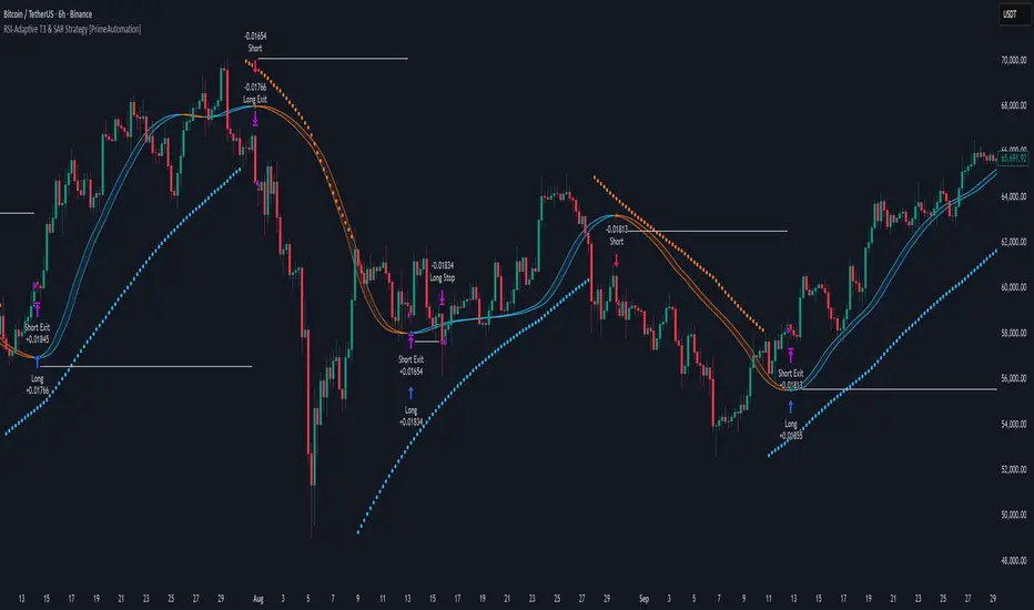
Coin Jin Multi SMA+ BB+ SMA forecast Ver2.02This script provides a complete trend-analysis system based on the
5 / 20 / 60 / 112 / 224 / 448 / 896 SMAs.
It precisely detects bullish/bearish alignment and automatically identifies
12 advanced trend-shift signals (Start, End, and Reversal).
Key Features:
● 9 SMA lines (including custom X1 & X2)
Each SMA supports custom color, width, and style (Line/Step/Circles).
● Bollinger Bands with customizable options
Fully adjustable length, source, width, style, fill transparency, and more.
● SMA Forecast (curved projection)
– Slope computed via linear regression
– Predicts up to 30 future bars
– Forced dotted style ensures visibility at all zoom levels
● 12 Advanced Trend Signals (alertcondition)
Automatically detects:
Start of full alignment (with/without SMA 896)
End of alignment
Bull ↔ Bear transitions
Perfect for momentum trading, trend-following, reversal detection, or automated alert systems.
● Labeling last value of each SMA
Each SMA prints a label such as "5", “20”, “60”, “896”, or custom lengths at the latest bar.
이 스크립트는 5 / 20 / 60 / 112 / 224 / 448 / 896 이동평균선을 기반으로
정배열·역배열 상태를 정밀하게 분석하고,
총 12가지 고급 추세 신호(시작·종료·전환) 를 자동으로 감지하는 통합 추세 분석 도구입니다.
주요 기능:
● 9개의 SMA 표시 (커스텀 X1, X2 포함)
각 SMA는 색상·굵기·형태(Line/Step/Circle)를 개별 설정할 수 있습니다.
● 볼린저밴드 표시 및 채우기 옵션
BB 길이, 소스, 타입, 두께, 투명도 등을 자유롭게 조절 가능.
● SMA Forecast (미래 방향 곡선 예측)
– 기울기 기반 선형회귀 슬로프 계산
– 곡선 형태로 미래 30봉까지 예측
– 점선(Dotted) 강제 적용으로 어떤 배율에서도 선명하게 표시
● 12가지 고급 추세 신호(alertcondition)
정배열·역배열의
Start (처음 완성될 때)
End (깨질 때)
Switch (전환)
을 모두 자동 탐지하여 트레이딩뷰 알림으로 받을 수 있음.
● SMA 마지막 가격 라벨 표시
각 SMA 끝 지점에 “5 / 20 / 60 / ... / 896” 식으로 라벨 표시.

Volatility-Targeted Momentum Portfolio [BackQuant]Volatility-Targeted Momentum Portfolio
A complete momentum portfolio engine that ranks assets, targets a user-defined volatility, builds long, short, or delta-neutral books, and reports performance with metrics, attribution, Monte Carlo scenarios, allocation pie, and efficiency scatter plots. This description explains the theory and the mechanics so you can configure, validate, and deploy it with intent.
Table of contents
What the script does at a glance
Momentum, what it is, how to know if it is present
Volatility targeting, why and how it is done here
Portfolio construction modes: Long Only, Short Only, Delta Neutral
Regime filter and when the strategy goes to cash
Transaction cost modelling in this script
Backtest metrics and definitions
Performance attribution chart
Monte Carlo simulation
Scatter plot analysis modes
Asset allocation pie chart
Inputs, presets, and deployment checklist
Suggested workflow
1) What the script does at a glance
Pulls a list of up to 15 tickers, computes a simple momentum score on each over a configurable lookback, then volatility-scales their bar-to-bar return stream to a target annualized volatility.
Ranks assets by raw momentum, selects the top 3 and bottom 3, builds positions according to the chosen mode, and gates exposure with a fast regime filter.
Accumulates a portfolio equity curve with risk and performance metrics, optional benchmark buy-and-hold for comparison, and a full alert suite.
Adds visual diagnostics: performance attribution bars, Monte Carlo forward paths, an allocation pie, and scatter plots for risk-return and factor views.
2) Momentum: definition, detection, and validation
Momentum is the tendency of assets that have performed well to continue to perform well, and of underperformers to continue underperforming, over a specific horizon. You operationalize it by selecting a horizon, defining a signal, ranking assets, and trading the leaders versus laggards subject to risk constraints.
Signal choices . Common signals include cumulative return over a lookback window, regression slope on log-price, or normalized rate-of-change. This script uses cumulative return over lookback bars for ranking (variable cr = price/price - 1). It keeps the ranking simple and lets volatility targeting handle risk normalization.
How to know momentum is present .
Leaders and laggards persist across adjacent windows rather than flipping every bar.
Spread between average momentum of leaders and laggards is materially positive in sample.
Cross-sectional dispersion is non-trivial. If everything is flat or highly correlated with no separation, momentum selection will be weak.
Your validation should include a diagnostic that measures whether returns are explained by a momentum regression on the timeseries.
Recommended diagnostic tool . Before running any momentum portfolio, verify that a timeseries exhibits stable directional drift. Use this indicator as a pre-check: It fits a regression to price, exposes slope and goodness-of-fit style context, and helps confirm if there is usable momentum before you force a ranking into a flat regime.
3) Volatility targeting: purpose and implementation here
Purpose . Volatility targeting seeks a more stable risk footprint. High-vol assets get sized down, low-vol assets get sized up, so each contributes more evenly to total risk.
Computation in this script (per asset, rolling):
Return series ret = log(price/price ).
Annualized volatility estimate vol = stdev(ret, lookback) * sqrt(tradingdays).
Leverage multiplier volMult = clamp(targetVol / vol, 0.1, 5.0).
This caps sizing so extremely low-vol assets don’t explode weight and extremely high-vol assets don’t go to zero.
Scaled return stream sr = ret * volMult. This is the per-bar, risk-adjusted building block used in the portfolio combinations.
Interpretation . You are not levering your account on the exchange, you are rescaling the contribution each asset’s daily move has on the modeled equity. In live trading you would reflect this with position sizing or notional exposure.
4) Portfolio construction modes
Cross-sectional ranking . Assets are sorted by cr over the chosen lookback. Top and bottom indices are extracted without ties.
Long Only . Averages the volatility-scaled returns of the top 3 assets: avgRet = mean(sr_top1, sr_top2, sr_top3). Position table shows per-asset leverages and weights proportional to their current volMult.
Short Only . Averages the negative of the volatility-scaled returns of the bottom 3: avgRet = mean(-sr_bot1, -sr_bot2, -sr_bot3). Position table shows short legs.
Delta Neutral . Long the top 3 and short the bottom 3 in equal book sizes. Each side is sized to 50 percent notional internally, with weights within each side proportional to volMult. The return stream mixes the two sides: avgRet = mean(sr_top1,sr_top2,sr_top3, -sr_bot1,-sr_bot2,-sr_bot3).
Notes .
The selection metric is raw momentum, the execution stream is volatility-scaled returns. This separation is deliberate. It avoids letting volatility dominate ranking while still enforcing risk parity at the return contribution stage.
If everything rallies together and dispersion collapses, Long Only may behave like a single beta. Delta Neutral is designed to extract cross-sectional momentum with low net beta.
5) Regime filter
A fast EMA(12) vs EMA(21) filter gates exposure.
Long Only active when EMA12 > EMA21. Otherwise the book is set to cash.
Short Only active when EMA12 < EMA21. Otherwise cash.
Delta Neutral is always active.
This prevents taking long momentum entries during obvious local downtrends and vice versa for shorts. When the filter is false, equity is held flat for that bar.
6) Transaction cost modelling
There are two cost touchpoints in the script.
Per-bar drag . When the regime filter is active, the per-bar return is reduced by fee_rate * avgRet inside netRet = avgRet - (fee_rate * avgRet). This models proportional friction relative to traded impact on that bar.
Turnover-linked fee . The script tracks changes in membership of the top and bottom baskets (top1..top3, bot1..bot3). The intent is to charge fees when composition changes. The template counts changes and scales a fee by change count divided by 6 for the six slots.
Use case: increase fee_rate to reflect taker fees and slippage if you rebalance every bar or trade illiquid assets. Reduce it if you rebalance less often or use maker orders.
Practical advice .
If you rebalance daily, start with 5–20 bps round-trip per switch on liquid futures and adjust per venue.
For crypto perp microcaps, stress higher cost assumptions and add slippage buffers.
If you only rotate on lookback boundaries or at signals, use alert-driven rebalances and lower per-bar drag.
7) Backtest metrics and definitions
The script computes a standard set of portfolio statistics once the start date is reached.
Net Profit percent over the full test.
Max Drawdown percent, tracked from running peaks.
Annualized Mean and Stdev using the chosen trading day count.
Variance is the square of annualized stdev.
Sharpe uses daily mean adjusted by risk-free rate and annualized.
Sortino uses downside stdev only.
Omega ratio of sum of gains to sum of losses.
Gain-to-Pain total gains divided by total losses absolute.
CAGR compounded annual growth from start date to now.
Alpha, Beta versus a user-selected benchmark. Beta from covariance of daily returns, Alpha from CAPM.
Skewness of daily returns.
VaR 95 linear-interpolated 5th percentile of daily returns.
CVaR average of the worst 5 percent of daily returns.
Benchmark Buy-and-Hold equity path for comparison.
8) Performance attribution
Cumulative contribution per asset, adjusted for whether it was held long or short and for its volatility multiplier, aggregated across the backtest. You can filter to winners only or show both sides. The panel is sorted by contribution and includes percent labels.
9) Monte Carlo simulation
The panel draws forward equity paths from either a Normal model parameterized by recent mean and stdev, or non-parametric bootstrap of recent daily returns. You control the sample length, number of simulations, forecast horizon, visibility of individual paths, confidence bands, and a reproducible seed.
Normal uses Box-Muller with your seed. Good for quick, smooth envelopes.
Bootstrap resamples realized returns, preserving fat tails and volatility clustering better than a Gaussian assumption.
Bands show 10th, 25th, 75th, 90th percentiles and the path mean.
10) Scatter plot analysis
Four point-cloud modes, each plotting all assets and a star for the current portfolio position, with quadrant guides and labels.
Risk-Return Efficiency . X is risk proxy from leverage, Y is expected return from annualized momentum. The star shows the current book’s composite.
Momentum vs Volatility . Visualizes whether leaders are also high vol, a cue for turnover and cost expectations.
Beta vs Alpha . X is a beta proxy, Y is risk-adjusted excess return proxy. Useful to see if leaders are just beta.
Leverage vs Momentum . X is volMult, Y is momentum. Shows how volatility targeting is redistributing risk.
11) Asset allocation pie chart
Builds a wheel of current allocations.
Long Only, weights are proportional to each long asset’s current volMult and sum to 100 percent.
Short Only, weights show the short book as positive slices that sum to 100 percent.
Delta Neutral, 50 percent long and 50 percent short books, each side leverage-proportional.
Labels can show asset, percent, and current leverage.
12) Inputs and quick presets
Core
Portfolio Strategy . Long Only, Short Only, Delta Neutral.
Initial Capital . For equity scaling in the panel.
Trading Days/Year . 252 for stocks, 365 for crypto.
Target Volatility . Annualized, drives volMult.
Transaction Fees . Per-bar drag and composition change penalty, see the modelling notes above.
Momentum Lookback . Ranking horizon. Shorter is more reactive, longer is steadier.
Start Date . Ensure every symbol has data back to this date to avoid bias.
Benchmark . Used for alpha, beta, and B&H line.
Diagnostics
Metrics, Equity, B&H, Curve labels, Daily return line, Rolling drawdown fill.
Attribution panel. Toggle winners only to focus on what matters.
Monte Carlo mode with Normal or Bootstrap and confidence bands.
Scatter plot type and styling, labels, and portfolio star.
Pie chart and labels for current allocation.
Presets
Crypto Daily, Long Only . Lookback 25, Target Vol 50 percent, Fees 10 bps, Regime filter on, Metrics and Drawdown on. Monte Carlo Bootstrap with Recent 200 bars for bands.
Crypto Daily, Delta Neutral . Lookback 25, Target Vol 50 percent, Fees 15–25 bps, Regime filter always active for this mode. Use Scatter Risk-Return to monitor efficiency and keep the star near upper left quadrants without drifting rightward.
Equities Daily, Long Only . Lookback 60–120, Target Vol 15–20 percent, Fees 5–10 bps, Regime filter on. Use Benchmark SPX and watch Alpha and Beta to keep the book from becoming index beta.
13) Suggested workflow
Universe sanity check . Pick liquid tickers with stable data. Thin assets distort vol estimates and fees.
Check momentum existence . Run on your timeframe. If slope and fit are weak, widen lookback or avoid that asset or timeframe.
Set risk budget . Choose a target volatility that matches your drawdown tolerance. Higher target increases turnover and cost sensitivity.
Pick mode . Long Only for bull regimes, Short Only for sustained downtrends, Delta Neutral for cross-sectional harvesting when index direction is unclear.
Tune lookback . If leaders rotate too often, lengthen it. If entries lag, shorten it.
Validate cost assumptions . Increase fee_rate and stress Monte Carlo. If the edge vanishes with modest friction, refine selection or lengthen rebalance cadence.
Run attribution . Confirm the strategy’s winners align with intuition and not one unstable outlier.
Use alerts . Enable position change, drawdown, volatility breach, regime, momentum shift, and crash alerts to supervise live runs.
Important implementation details mapped to code
Momentum measure . cr = price / price - 1 per symbol for ranking. Simplicity helps avoid overfitting.
Volatility targeting . vol = stdev(log returns, lookback) * sqrt(tradingdays), volMult = clamp(targetVol / vol, 0.1, 5), sr = ret * volMult.
Selection . Extract indices for top1..top3 and bot1..bot3. The arrays rets, scRets, lev_vals, and ticks_arr track momentum, scaled returns, leverage multipliers, and display tickers respectively.
Regime filter . EMA12 vs EMA21 switch determines if the strategy takes risk for Long or Short modes. Delta Neutral ignores the gate.
Equity update . Equity multiplies by 1 + netRet only when the regime was active in the prior bar. Buy-and-hold benchmark is computed separately for comparison.
Tables . Position tables show current top or bottom assets with leverage and weights. Metric table prints all risk and performance figures.
Visualization panels . Attribution, Monte Carlo, scatter, and pie use the last bars to draw overlays that update as the backtest proceeds.
Final notes
Momentum is a portfolio effect. The edge comes from cross-sectional dispersion, adequate risk normalization, and disciplined turnover control, not from a single best asset call.
Volatility targeting stabilizes path but does not fix selection. Use the momentum regression link above to confirm structure exists before you size into it.
Always test higher lag costs and slippage, then recheck metrics, attribution, and Monte Carlo envelopes. If the edge persists under stress, you have something robust.

VWAP Trend
**Overview**
The VWAP Trend indicator is a volume-weighted price analysis tool that visualizes the relationship between price and the anchored Volume Weighted Average Price (VWAP) over different timeframes. This script is designed to reveal when the market is trending above or below its volume-weighted equilibrium point, providing a clear framework for identifying directional bias, trend strength, and potential reversals.
By combining an anchored VWAP with exponential smoothing and a secondary trend EMA, the indicator helps traders distinguish between short-term price fluctuations and genuine volume-supported directional moves.
**Core Concept**
VWAP (Volume Weighted Average Price) represents the average price of an asset weighted by traded volume. It reflects where the majority of trading activity has taken place within a chosen period, serving as a critical reference level for institutions and professional traders.
This indicator extends the traditional VWAP concept by:
1. Allowing users to **anchor VWAP to different timeframes** (Daily, Weekly, or Monthly).
2. Applying **smoothing** to create a stable reference curve less prone to noise.
3. Overlaying a **trend EMA** to identify whether current price momentum aligns with or diverges from VWAP equilibrium.
The combination of these elements produces a visual representation of price’s relationship to its fair value across time, helping to identify accumulation and distribution phases.
**Calculation Methodology**
1. **Anchored VWAP Calculation:**
The script resets cumulative volume and cumulative volume–price data at the start of each new VWAP session (based on the selected anchor timeframe). It continuously accumulates the product of price and volume, dividing this by total volume to compute the current VWAP value.
2. **Smoothing Process:**
The raw VWAP line is smoothed using an Exponential Moving Average (EMA) of user-defined length, producing a cleaner, more stable trend curve that minimizes intraperiod noise.
3. **Trend Determination:**
An additional EMA is calculated on the closing price. By comparing the position of this EMA to the smoothed VWAP, the indicator determines the prevailing market bias:
* When the trend EMA is above the smoothed VWAP, the market is considered to be in an **uptrend**.
* When the trend EMA is below the smoothed VWAP, the market is classified as a **downtrend**.
**Visual Structure**
The indicator uses color dynamics and chart overlays to make interpretation intuitive:
* **Smoothed VWAP Line:** The main trend reference, colored blue during bullish conditions and orange during bearish conditions.
* **Price Fill Region:** The area between the smoothed VWAP and price is filled with a translucent color matching the current trend, visually representing whether price is trading above or below equilibrium.
* **Trend EMA (implicit):** Although not separately plotted, it drives the color state of the VWAP, ensuring seamless visual transitions between bullish and bearish conditions.
**Inputs and Parameters**
* **VWAP Timeframe:** Choose between Daily, Weekly, or Monthly anchoring. This determines the reset frequency for cumulative volume and price data.
* **VWAP Smoothing Length:** Defines how many periods are used to smooth the VWAP line. Shorter values produce a more reactive line; longer values create smoother, steadier signals.
* **Trend EMA Length:** Sets the period for the trend detection EMA applied to price. Adjust this to calibrate how quickly the indicator reacts to directional changes.
**Interpretation and Use Cases**
* **Trend Confirmation:** When price and the trend EMA both remain above the smoothed VWAP, the market is showing strong bullish control. Conversely, consistent price action below the VWAP suggests sustained bearish sentiment.
* **Fair Value Assessment:** VWAP serves as a dynamic equilibrium level. Price repeatedly reverting to this line indicates consolidation or fair value zones, while strong directional moves away from VWAP highlight momentum phases.
* **Institutional Benchmarking:** Because large market participants often benchmark entries and exits relative to VWAP, this indicator helps align retail analysis with institutional logic.
* **Reversal Detection:** Sudden crossovers of the trend EMA relative to the VWAP can signal potential reversals or shifts in momentum strength.
**Trading Applications**
* **Trend Following:** Use VWAP’s direction and color state to determine trade bias. Long entries are favored when the VWAP turns blue, while short entries align with orange phases.
* **Mean Reversion:** In ranging conditions, traders may look for price deviations far above or below VWAP as potential reversion opportunities.
* **Multi-Timeframe Confluence:** Combine the Daily VWAP Trend with higher anchor periods (e.g., Weekly or Monthly) to confirm larger trend structure.
* **Support and Resistance Mapping:** VWAP often acts as a strong intraday or session-level support/resistance zone. The smoothed version refines this behavior into a cleaner, more reliable reference.
**Originality and Innovation**
The VWAP Trend indicator stands apart from conventional VWAP scripts through several original features:
1. **Anchor Flexibility:** Most VWAP indicators fix the anchor to a specific session (like daily). This version allows switching between Daily, Weekly, and Monthly anchors dynamically, adapting to various trading styles and time horizons.
2. **Volume-Weighted Smoothing:** The use of an EMA smoothing layer over the raw VWAP provides enhanced stability without compromising responsiveness, delivering a more analytically consistent signal.
3. **EMA-Based Trend Comparison:** By introducing a second trend EMA, the indicator creates a comparative framework that merges volume-weighted price analysis with classical momentum tracking — a rare and powerful combination.
4. **Adaptive Visual System:** The color-shifting and shaded fill between VWAP and price are integrated into a single, lightweight structure, giving traders immediate insight into market bias without the clutter of multiple overlapping indicators.
**Advantages**
* Adaptable to any market, timeframe, or trading style.
* Provides both equilibrium (VWAP) and momentum (EMA) perspectives.
* Smooths out noise while retaining the integrity of volume-based price dynamics.
* Enhances situational awareness through intuitive color-coded visualization.
* Ideal for professional, swing, and intraday traders seeking context-driven market direction.
**Summary**
The VWAP Trend indicator is a modern enhancement of the classical VWAP methodology. By merging anchored volume-weighted analysis with smoothed trend detection and visual state feedback, it provides a comprehensive perspective on market equilibrium and directional strength. It is built for traders who seek more than static price references — offering an adaptive, volume-aware framework for identifying market trends, reversals, and fair-value zones with precision and clarity.

Central Limit Theorem Reversion IndicatorDear TV community, let me introduce you to the first-ever Central Limit Theorem indicator on TradingView.
The Central Limit Theorem is used in statistics and it can be quite useful in quant trading and understanding market behaviors.
In short, the CLT states: "When you take repeated samples from any population and calculate their averages, those averages will form a normal (bell curve) distribution—no matter what the original data looks like."
In this CLT indicator, I use statistical theory to identify high-probability mean reversion opportunities in the markets. It calculates statistical confidence bands and z-scores to identify when price movements deviate significantly from their expected distribution, signaling potential reversion opportunities with quantifiable probability levels.
Mathematical Foundation
The Central Limit Theorem (CLT) says that when you average many data points together, those averages will form a predictable bell-curve pattern, even if the original data is completely random and unpredictable (which often is in the markets). This works no matter what you're measuring, and it gets more reliable as you use more data points.
Why using it for trading?
Individual price movements seem random and chaotic, but when we look at the average of many price movements, we can actually predict how they should behave statistically. This lets us spot when prices have moved "too far" from what's normal—and those extreme moves tend to snap back (mean reversion).
Key Formula:
Z = (X̄ - μ) / (σ / √n)
Where:
- X̄ = Sample mean (average return over n periods)
- μ = Population mean (long-term expected return)
- σ = Population standard deviation (volatility)
- n = Sample size
- σ/√n = Standard error of the mean
How I Apply CLT
Step 1: Calculate Returns
Measures how much price changed from one bar to the next (using logarithms for better statistical properties)
Step 2: Average Recent Returns
Takes the average of the last n returns (e.g., last 100 bars). This is your "sample mean."
Step 3: Find What's "Normal"
Looks at historical data to determine: a) What the typical average return should be (the long-term mean) and b) How volatile the market usually is (standard deviation)
Step 4: Calculate Standard Error
Determines how much sample averages naturally vary. Larger samples = smaller expected variation.
Step 5: Calculate Z-Score
Measures how unusual the current situation is.
Step 6: Draw Confidence Bands
Converts these statistical boundaries into actual price levels on your chart, showing where price is statistically expected to stay 95% and 99% of the time.
Interpretation & Usage
The Z-Score:
The z-score tells you how statistically unusual the current price deviation is:
|Z| < 1.0 → Normal behavior, no action
|Z| = 1.0 to 1.96 → Moderate deviation, watch closely
|Z| = 1.96 to 2.58 → Significant deviation (95%+), consider entry
|Z| > 2.58 → Extreme deviation (99%+), high probability setup
The Confidence Bands
- Upper Red Bands: 95% and 99% overbought zones → Expect mean reversion downward as the price is not likely to cross these lines.
- Center Gray Line: Statistical expectation (fair value)
- Lower Blue Bands: 95% and 99% oversold zones → Expect mean reversion upward
Trading Logic:
- When price exceeds the upper 95% band (z-score > +1.96), there's only a 5% probability this is random noise → Strong sell/short signal
- When price falls below the lower 95% band (z-score < -1.96), there's a 95% statistical expectation of upward reversion → Strong buy/long signal
Background Gradient
The background color provides real-time visual feedback:
- Blue shades: Oversold conditions, expect upward reversion
- Red shades: Overbought conditions, expect downward reversion
- Intensity: Darker colors indicate stronger statistical significance
Trading Strategy Examples
Hypothetically, this is how the indicator could be used:
- Long: Z-score < -1.96 (below 95% confidence band)
- Short: Z-score > +1.96 (above 95% confidence band)
- Take profit when price returns to center line (Z ≈ 0)
Input Parameters
Sample Size (n) - Default: 100
Lookback Period (m) - Default: 100
You can also create alerts based on the indicator.
Final notes:
- The indicator uses logarithmic returns for better statistical properties
- Converts statistical bands back to price space for practical use
- Adaptive volatility: Bands automatically widen in high volatility, narrow in low volatility
- No repainting: yay! All calculations use historical data only
Feedback is more than welcome!
Henri
Dynamic ~ CVDDynamic - CVD is a smart, time-adaptive version of the classic Cumulative Volume Delta (CVD) indicator, designed to help traders visualize market buying and selling pressure across all timeframes with minimal manual tweaking.
Overview
Cumulative Volume Delta tracks the difference between buying and selling volume during each bar. It reveals whether aggressive buyers or sellers dominate the market, offering deep insight into real-time market sentiment and underlying momentum.
This version of CVD automatically adjusts its EMA smoothing length based on your selected timeframe, ensuring optimal sensitivity and consistency across intraday, daily, weekly, and even monthly charts.
Features
Dynamic EMA Length — Automatically adapts smoothing parameters based on the chart timeframe:
1–59 min → 50
1–23 h → 21
Daily & Weekly → 100
Monthly → 10
CVD Visualization — Displays cumulative delta to show the ongoing buying/selling imbalance.
CVD‑EMA Curve — Offers a clear trend signal by comparing the CVD line with its EMA.
Adaptive Color Logic — EMA curve changes color dynamically:
Green when CVD > EMA (bullish pressure)
Gray when CVD < EMA (bearish pressure)
How to Use
Use Dynamic - CVD to gauge whether the market is accumulating (net buying) or distributing (net selling).
When CVD rises above its EMA, it often signals consistent buying pressure and potential bullish continuation.
When CVD stays below its EMA, it highlights sustained selling pressure and possible weakness.
The dynamic EMA makes it suitable for scalping, swing trading, and longer-term trend analysis—no need to manually adjust settings.
Best For
Traders looking to measure real buying/selling flow rather than price movement alone.
Market participants who want a plug‑and‑play CVD that stays accurate across all timeframes.
Anyone interested in volume‑based momentum confirmation tools.
Disclaimer
This script is provided for educational and analytical purposes only. It does not constitute financial advice or a recommendation to buy or sell any asset. Past performance is not indicative of future results. Always perform your own analysis and consult a licensed financial advisor before making investment decisions. The author is not responsible for any financial losses or trading outcomes arising from the use of this indicator.

3D Candles (Zeiierman)█ Overview
3D Candles (Zeiierman) is a unique 3D take on classic candlesticks, offering a fresh, high-clarity way to visualize price action directly on your chart. Visualizing price in alternative ways can help traders interpret the same data differently and potentially gain a new perspective.
█ How It Works
⚪ 3D Body Construction
For each bar, the script computes the candle body (open/close bounds), then projects a top face offset by a depth amount. The depth is proportional to that candle’s high–low range, so it looks consistent across symbols with different prices/precisions.
rng = math.max(1e-10, high - low ) // candle range
depthMag = rng * depthPct * factorMag // % of range, shaped by tilt amount
depth = depthMag * factorSign // direction from dev (up/down)
depthPct → how “thick” the 3D effect is, as a % of each candle’s own range.
factorMag → scales the effect based on your tilt input (dev), with a smooth curve so small tilts still show.
factorSign → applies the direction of the tilt (up or down).
⚪ Tilt & Perspective
Tilt is controlled by dev and translated into a gentle perspective factor:
slope = (4.0 * math.abs(dev)) / width
factorMag = math.pow(math.min(1.0, slope), 0.5) // sqrt softens response
factorSign = dev == 0 ? 0.0 : math.sign(dev) // direction (up/down)
Larger dev → stronger 3D presence (up to a cap).
The square-root curve makes small dev values noticeable without overdoing it.
█ How to Use
Traders can use 3D Candles just like regular candlesticks. The difference is the 3D visualization, which can broaden your view and help you notice price behavior from a fresh perspective.
⚪ Quick setup (dual-view):
Split your TradingView layout into two synchronized charts.
Right pane: keep your standard candlestick or bar chart for live execution.
Left pane: add 3D Candles (Zeiierman) to compare the same symbol/timeframe.
Observe differences: the 3D rendering can make expansion/contraction and body emphasis easier to spot at a glance.
█ Go Full 3D
Take the experience further by pairing 3D Candles (Zeiierman) with Volume Profile 3D (Zeiierman) , a perfect complement that shows where activity is concentrated, while your 3D candles show how the price unfolded.
█ Settings
Candles — How many 3D candles to draw. Higher values draw more shapes and may impact performance on slower machines.
Block Width (bars) — Visual thickness of each 3D candle along the x-axis. Larger values look chunkier but can overlap more.
Up/Down — Controls the tilt and strength of the 3D top face.
3D depth (% of range) — Thickness of the 3D effect as a percentage of each candle’s own high–low range. Larger values exaggerate the depth.
-----------------
Disclaimer
The content provided in my scripts, indicators, ideas, algorithms, and systems is for educational and informational purposes only. It does not constitute financial advice, investment recommendations, or a solicitation to buy or sell any financial instruments. I will not accept liability for any loss or damage, including without limitation any loss of profit, which may arise directly or indirectly from the use of or reliance on such information.
All investments involve risk, and the past performance of a security, industry, sector, market, financial product, trading strategy, backtest, or individual's trading does not guarantee future results or returns. Investors are fully responsible for any investment decisions they make. Such decisions should be based solely on an evaluation of their financial circumstances, investment objectives, risk tolerance, and liquidity needs.
Dominant DATR [CHE] Dominant DATR — Directional ATR stream with dominant-side EMA, bands, labels, and alerts
Summary
Dominant DATR builds two directional volatility streams from the true range, assigns each bar’s range to the up or down side based on the sign of the close-to-close move, and then tracks the dominant side through an exponential average. A rolling band around the dominant stream defines recent extremes, while optional gradient coloring reflects relative magnitude. Swing-based labels mark new higher highs or lower lows on the dominant stream, and alerts can be enabled for swings, zero-line crossings, and band breakouts. The result is a compact pane that highlights regime bias and intensity without relying on price overlays.
Motivation: Why this design?
Conventional ATR treats all range as symmetric, which can mask directional pressure, cause late regime shifts, and produce frequent false flips during noisy phases. This design separates the range into up and down contributions, then emphasizes whichever side is stronger. A single smoothed dominant stream clarifies bias, while the band and swing markers help distinguish continuation from exhaustion. Optional normalization by close makes the metric comparable across instruments with different price scales.
What’s different vs. standard approaches?
Reference baseline: Classic ATR or a basic EMA of price.
Architecture differences:
Directional weighting of range using positive and negative close-to-close moves.
Separate moving averages for up and down contributions combined into one dominant stream.
Rolling highest and lowest of the dominant stream to form a band.
Optional normalization by close, window-based scaling for color intensity, and gamma adjustment for visual contrast.
Event logic for swing highs and lows on the dominant stream, with label buffering and pruning.
Configurable alerts for swings, zero-line crossings, and band breakouts.
Practical effect: You see when volatility is concentrated on one side, how strong that bias currently is, and when the dominant stream pushes through or fails at its recent envelope.
How it works (technical)
Each bar’s move is split into an up component and a down component based on whether the close increased or decreased relative to the prior close. The bar’s true range is proportionally assigned to up or down using those components as weights.
Each side is smoothed with a Wilder-style moving average. The dominant stream is the side with the larger value, recorded as positive for up dominance and negative for down dominance.
The dominant stream is then smoothed with an exponential moving average to reduce noise and provide a responsive yet stable signal line.
A rolling window tracks the highest and lowest values of the dominant EMA to form an envelope. Crossings of these bounds indicate unusual strength or weakness relative to recent history.
For visualization, the absolute value of the dominant EMA is scaled over a lookback window and passed through a gamma curve to modulate gradient intensity. Colors are chosen separately for up and down regimes.
Swing events are detected by comparing the dominant EMA to its recent extremes over a short lookback. Labels are placed when a prior bar set an extreme and the current bar confirms it. A managed array prunes older labels when the user-defined maximum is exceeded.
Alerts mirror these events and also include zero-line crossings and band breakouts. The script does not force closed-bar confirmation; users should configure alert execution timing to suit their workflow.
There are no higher-timeframe requests and no security calls. State is limited to simple arrays for labels and persistent color parameters.
Parameter Guide
Parameter — Effect — Default — Trade-offs/Tips
ATR Length — Smoothing of directional true range streams — fourteen — Longer reduces noise and may delay regime shifts; shorter increases responsiveness.
EMA Length — Smoothing of the dominant stream — twenty-five — Lower values react faster; higher values reduce whipsaw.
Band Length — Window for recent highs and lows of the dominant stream — ten — Short windows flag frequent breakouts; long windows emphasize only exceptional moves.
Normalize by Close — Divide by close price to produce a percent-like scale — false — Useful across assets with very different price levels.
Enable gradient color — Turn on magnitude-based coloring — true — Visual aid only; can be disabled for simplicity.
Gradient window — Lookback used to scale color intensity — one hundred — Larger windows stabilize the color scale.
Gamma (lines) — Adjust gradient intensity curve — zero point eight — Lower values compress variation; higher values expand it.
Gradient transparency — Transparency for gradient plots — zero, between zero and ninety — Higher values mute colors.
Up dark / Up neon — Base and peak colors for up dominance — green tones — Styling only.
Down dark / Down neon — Base and peak colors for down dominance — red tones — Styling only.
Show zero line / Background tint — Visual references for regime — true and false — Background tint can help quick scanning.
Swing length — Bars used to detect swing highs or lows — two — Larger values demand more structure.
Show labels / Max labels / Label offset — Label visibility, cap, and vertical offset — true, two hundred, zero — Increase cap with care to avoid clutter.
Alerts: HH/LL, Zero Cross, Band Break — Toggle alert rules — true, false, false — Enable only what you need.
Reading & Interpretation
The dominant EMA above zero indicates up-side dominance; below zero indicates down-side dominance.
Band lines show recent extremes of the dominant EMA; pushes through the band suggest unusual momentum on the dominant side.
Gradient intensity reflects local magnitude of dominance relative to the chosen window.
HH/LL labels appear when the dominant stream prints a new local extreme in the current regime and that extreme is confirmed on the next bar.
Zero-line crosses suggest regime flips; combine with structure or filters to reduce noise.
Practical Workflows & Combinations
Trend following: Consider entries when the dominant EMA is on the regime side and expands away from zero. Band breakouts add confirmation; structure such as higher highs or lower lows in price can filter signals.
Exits and stops: Tighten exits when the dominant stream stalls near the band or fades toward zero. Opposite swing labels can serve as early caution.
Multi-asset and multi-timeframe: Works across liquid assets and common timeframes. For lower noise instruments, reduce smoothing slightly; for high noise, increase lengths and swing length.
Behavior, Constraints & Performance
Repaint and confirmation: No security calls and no future-looking references. Swing labels confirm one bar later by design. Real-time crosses can change intra-bar; use bar-close alerts if needed.
Resources: `max_bars_back` is two thousand. The script uses an array for labels with pruning, gradient color computations, and a simple while loop that runs only when the label cap is exceeded.
Known limits: The EMA can lag at sharp turns. Normalization by close changes scale and may affect thresholds. Extremely gappy data can produce abrupt shifts in the dominant side.
Sensible Defaults & Quick Tuning
Starting point: ATR Length fourteen, EMA Length twenty-five, Band Length ten, Swing Length two, gradient enabled.
Too many flips: Increase EMA Length and swing length, or enable only swing alerts.
Too sluggish: Decrease EMA Length and Band Length.
Inconsistent scales across symbols: Enable Normalize by Close.
Visual clutter: Disable gradient or reduce label cap.
What this indicator is—and isn’t
This is a volatility-bias visualization and signal layer that highlights directional pressure and intensity. It is not a complete trading system and does not produce position sizing or risk management. Use it with market structure, context, and independent risk controls.
Disclaimer
The content provided, including all code and materials, is strictly for educational and informational purposes only. It is not intended as, and should not be interpreted as, financial advice, a recommendation to buy or sell any financial instrument, or an offer of any financial product or service. All strategies, tools, and examples discussed are provided for illustrative purposes to demonstrate coding techniques and the functionality of Pine Script within a trading context.
Any results from strategies or tools provided are hypothetical, and past performance is not indicative of future results. Trading and investing involve high risk, including the potential loss of principal, and may not be suitable for all individuals. Before making any trading decisions, please consult with a qualified financial professional to understand the risks involved.
By using this script, you acknowledge and agree that any trading decisions are made solely at your discretion and risk.
Do not use this indicator on Heikin-Ashi, Renko, Kagi, Point-and-Figure, or Range charts, as these chart types can produce unrealistic results for signal markers and alerts.
Best regards and happy trading
Chervolino