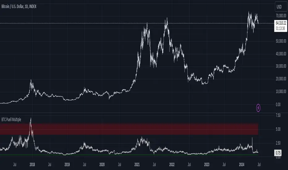
Bitcoin Fundamentals - Puell MultipleThis is an indicator that derives from Bitcoin Mining daily generated Income.
It does show a perfect track record on calling Bitcoin cycle tops and cycle bottoms.
For those of you willing to experiment, I've enabled the ability to set custom periods (365 by default).
The indicator includes custom alerts to notify the entry and the exit from OverBought (OB) & OverSold (OS) bands.
Credits: David Puell twitter.com
ค้นหาในสคริปต์สำหรับ "bitcoin"
FRM - Bitcoin Fee Ratio MultipleBitcoin Fee Ratio Multiple (FRM) is a BTC specific study that measures its strength as a Store of Value.
FRM may be a solid alternative to the Network Value to Transaction (NVT) indicator.
A low FRM suggests that Bitcoin can maintain its current security budget (miner revenue) without having to rely on an inflationary subsidy.
Conversely, a high FRM suggests that Bitcoin will require heavy inflation via block reward subsidies in order to maintain its existing security levels.
This means that in order to reach current security budget levels without block reward subsidies, transaction fee revenue for each chain has to grow as many times as the FRM indicator points.
We would naturally expect a strong inverse correlation between large price movements and FRM.
Strong price action in either direction is usually accompanied by a surge in volume →
More volume suggests more people are moving assets to exchanges →
More people transacting with crypto asset means higher transaction fee revenue →
Therefore, higher transaction fee revenue means lower FRM
In the long run the correlation between price and FRM would tend to disappear.
FRM for capped supply assets would continue to decline over time, eventually reaching something close to 1, the point at which transaction fee revenue makes up 100% of total miner revenue.
Some notes about NVT.
NVT is used to measure a chain’s strength as a payment network compared to its market value. A low NVT may suggest that a network is undervalued compared to the service it is providing as a settlement layer.
NVT and FRM will not always be correlated. A chain could feasibly have a high number of transactions and a low network value, and therefore a low NVT, while simultaneously having a high FRM depending on the current size of block rewards and average transaction fee.
Moreover, NVT is far easier to spoof than FRM: one merely need spam the network with low fee transactions. By contrast, significant manipulation of FRM would by definition require significant cost as FRM measures the aggregate value of transaction fees rather than count.
User notes:
This study only plots in Bitcoin charts.
It plots in Daily, Weekly and Monthly time frames.
It doesn't render in intraday charts.
Credit for this idea goes to Matteo Leibowitz: medium.com
Based on the story: medium.com
You're welcome to add it to your charts. Hope you find it useful!
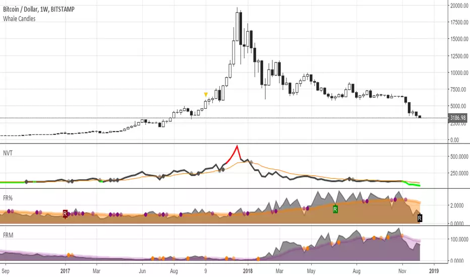
FR(%) - Bitcoin Fee RatioBitcoin Fee Ratio is a BTC specific study aiming to replace the ever-misleading ‘market capitalization’ (marketcap).
It answers to the following question:
“If block rewards disappeared tomorrow what percentage of economic volume would we have to pay in fees to replace them”
A low FR means that users can transact securely while simultaneously paying a minimal % of each transaction as a fee.
Conversely, a high FR means that users have to pay a high % of each transaction as a fee in order to transact securely.
User notes:
This study only plots in Bitcoin charts.
It plots in Daily, Weekly and Monthly time frames.
It doesn't render in intraday charts.
The FR value is expressed in relative (%) terms.
Credit for this idea goes to Matteo Leibowitz: medium.com
Based on the story: medium.com
You're welcome to add it to your charts. Hope you find it useful!
Bitcoin - NVT and Velocity [NeoButane]Different Bitcoin studies that include more than price. Averaging types are arithmetic, geometric, logarithmic, and something that's supposed to be harmonic.
This has:
NVT Ratio
NVT Signal
Velocity
Sources:
NVT - medium.com
Velocity - charts.woobull.com

Bitcoin Scalping PRO [PlungerMen] Hello!
Bitcoin Scalping PRO can use for every coin
Bitcoin Scalping PRO is available for all frames
Bitcoin Scalping PRO is a upgrade version of a Bitmex Scalping Pro
This Script is perfectly functional and works well by me and the best way to use this script is to use it with “Bitmex Long Short" script, both compliment for each other. the "Bitmex Long Short" script is Free, you can find it by searching “Bimex”
If you want to be more accurate and more efficient, more comfortable when you do not want to see too many other indicators, you can register for our Professional edition.
- The Professional Edition supports Level 1 and Level 2 commands ( display at chart : LONG+, long-, SHORT,+,short- ), which are very effective in allocating funds and optimizing your profits
Besides that,You will be supported by personal preferences, profit maximization
- Register for a Professional version will be used 2 Script, Bitcoin Scalping Pro and Bitmex Long Short Pro
- We will invite you to the signal channel Telgram with the announcement of the bottom and the peak of the BTC 0.60% -0.13% ,the big variable variable has exists
**We hope you enjoy this script. Your support will help us develop more good quality scripts in the future to serve the community **
**Remember, Like this script and posivite feedback if you are satisfied**
if you have any questions, post a comment ... below here
*********** Guide:
+ option for all frames : Click setting and input high and low for time inteval
+ hide wave trend : Click setting -> click Style --> Up trend Fill or Down trend fill
******
New features: this time we add two lines that can help traders trader safer. When the red line cross above the green line means we are in the downtrend and when the green line cross above the red line, which means we are in a uptrend. This new features will help traders do a safer trade at small time frame.
We have the Script free for the user pass, search keyword " Bitmex Scalping PlungerMen"
-->> 0.2 eth/1 month will be used 2 Script: Bitcoin Scalping Pro and Bitmex Long Short Pro <--

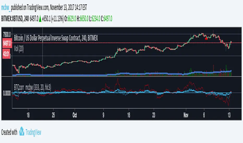
Bitcoin momentum correlation This is a pretty simple indicator, it measures the momentum of bitcoin as compared to usd,eur,eth,dash, and ltc, which you can see in all of the blue lines. If the red line is above zero then it means the overall value of btc is going up, opposite for down. The Ema_window controls how smooth the signal is. If you shorten the Ema_window parameter and open this on higher timeframe btc charts then the zero crossing gives pretty solid signals, despite being pretty choppy. A good way to interpret this is that if all the blue lines are moving in the same direction at once without disagreement, then the value of bitcoin has good momentum.
Mildly more technically:
Momentum is measured in the first derivative of an EMA for each ticker. To normalize the different values against each other they are all divided by their local maximums, which can be chosen in the parameter window, but shouldn't make a huge difference. All the checked values are then summed, as shown in the red line. To include a value into the red line simply keep it checked. Take a look at the script, it's kind of easy on the eyes.
It's pretty handy to look at, but doesn't seem too worthwhile to pursue much further. If someone wants much more out of the script then feel free to message me.
Remember rules #1 & #2
Don't lose money.
Happy trading
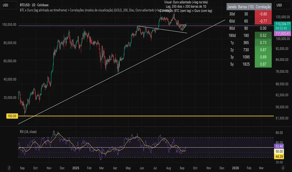
Bitcoin vs. Gold correlation with lagBTC vs Gold (Lag) + Correlation — multi-timeframe, publication notes
What it does
Plots Gold on the same chart as Bitcoin, with a configurable lead/lag.
Lets you choose how the series is displayed:
Gold shifted forward (+lag on chart) — shows gold ahead of BTC on the time axis (visual offset).
Gold aligned to BTC (gold lag) — standard alignment; gold is lagged for calculation and plotted in place.
BTC 200D Lag (BTC shifted forward) — visualizes BTC shifted forward (like popular “BTC 200D Lag” charts).
Computes Pearson correlations between BTC (no lag) and Gold (with lag) over multiple lookback windows equivalent to:
30d, 60d, 90d, 180d, 365d, 2y (730d), 3y (1095d), 5y (1825d).
Shows a table with the correlation values, automatically scaled to the current timeframe.
Why this is useful
A common macro claim is that BTC tends to follow Gold with a delay (e.g., ~200 trading days). This tool lets you:
Visually advance Gold (or BTC) to see that lead-lag relationship on the chart.
Quantify the relationship with rolling correlations.
Switch timeframes (D/W/M/…): everything automatically stays in sync.
Quick start
Open a BTC chart (any exchange).
Add the indicator.
Set Gold symbol (default TVC:GOLD; alternatives: OANDA:XAUUSD, COMEX:GC1!, etc.).
Choose Lag value and Lag unit (Days/Weeks/Months/Years/Bars).
Pick Visual Mode:
To mirror those “BTC 200D Lag” posts: choose “BTC 200D Lag (BTC shifted forward)” with 200 Days.
To view Gold 200D ahead of BTC: select “Gold shifted forward (+lag on chart)” with 200 Days.
Keep Rebase to 100 ON for an apples-to-apples visual scale. (You can move the study to the left price scale if needed.)
Inputs
Gold symbol: external series to pair with BTC.
Lag value: numeric value.
Lag unit: Days, Weeks, Months (≈30d), Years (≈365d), or direct Bars.
Visual mode:
Gold shifted forward (+lag on chart) → gold is offset to the right by the lag (visual only).
Gold aligned to BTC (gold lag) → standard plot (no visual offset); correlations still use lagged gold.
BTC 200D Lag (BTC shifted forward) → BTC is offset to the right by the lag (visual only).
Rebase to 100 (visual): rescales each series to 100 on its first valid bar for clearer comparison.
Show gold without lag (debug): optional reference line.
Show price tag for gold (lag): toggles the track price label.
Timeframe handling
The study uses the current chart timeframe for both BTC and Gold (timeframe.period).
Lag in time units (Days/Weeks/Months/Years) is internally converted to an integer number of bars of the active timeframe (using timeframe.in_seconds).
Example: on W (weekly), 200 days ≈ 29 bars.
On intraday timeframes, days are converted proportionally.
Correlation math
Correlation = ta.correlation(BTC, Gold_lagged, length_in_bars)
Lookback lengths are the bar-equivalents of 30/60/90/180/365/730/1095/1825 days in the active timeframe.
Important: correlations are computed on prices (not returns). If you prefer returns-based correlation (often more statistically robust), duplicate the script and replace price inputs with change(close) or ta.roc(close, 1).
Reading the table
Window: nominal day label (e.g., 30d, 1y, 5y).
Bars (TF): how many bars that window equals on the current timeframe.
Correlation: Pearson coefficient . Background tint shows intensity and sign.
Tips & caveats
Visual offsets (offset=) move series on screen only; they don’t affect the math. The math always uses BTC (no lag) × Gold (lagged).
With large lags on high timeframes, early bars will be na (normal). Scroll forward / reduce lag.
If your Gold feed doesn’t load, try an alternative symbol that your plan supports.
Rebase to 100 helps visibility when BTC ($100k) and Gold ($2k) share a scale.
Months/Years use 30/365-day approximations. For exact control, use Days or Bars.
Correlations on very short lengths or sparse data can be unstable; consider the longer windows for sturdier signals.
This is a visual/analytical tool, not a trading signal. Always apply independent risk management.
Suggested setups
Replicate “BTC 200D Lag” charts:
Visual Mode: BTC 200D Lag (BTC shifted forward)
Lag: 200 Days
Rebase: ON
Gold leads BTC (Gold ahead):
Visual Mode: Gold shifted forward (+lag on chart)
Lag: 200 Days
Rebase: ON
Compatibility: Pine v6, overlay study.
Best with: BTCUSD (any exchange) + a reliable Gold feed.
Author’s note: Lead-lag relationships are not stable over time; treat correlations as descriptive, not predictive.
Bitcoin Halving CountdownJust a simple Bitcoin halving countdown
Set up for the 2028 halving with the block height set at 1050000
Block height can be setup in the script settings for future halving
We don't have real time on-chain data on TradingView, so the script will update only once a day with a lag of one day (GLASSNODE data) until we get live data.
If you have any suggestions/questions leave a comment :)
Mescu

Bitcoin as Heikin Ashi Candles with Pivot PointsI use this Indicator to show me where Bitcoin is heading.
Most pine programmers are not aware of the possibility to combine Heikin Ashi Candles with Pivot Points that easy.
You can switch between Traditional, Fibonacci, Woodie, Classic, DM, and Camarilla as usual.
When on a Intraday Chart it will automaticly calculate daily Pivots for Haikin Ashi candles.
On the daily Chart it will calculate weekly Pivots, and when switching to monthly candles it will calculate Pivots for one year.
There is also an option where you can deactivate all support and resistance lines, except for today. Meaning you will see the Central Pivot Point on all previous days only.
This is a lagging indicator!
When you can see Altcoin correlation with BTC then both might get pretty strong leading indicators.
I am pleased to hear some advice/wishes to improve this script.
It is still in the beginning and some updates will follow, I promise.
Happy Trading!

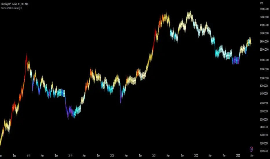
Bitcoin SOPR HeatmapSOPR (spent output profit ratio) is a metric, provided by Glassnode to measure if most BTC are moved in profit or in loss. The higher SOPR is, the more profits are realized (theoretically) and vice versa.
This indicator shows SOPR visually as a heatmap directly on the Bitcoin chart.
Cold temperatures (blue, purple) show bear markets. Bear market peaks should be visible in dark purple.
Hot temperatues (yellow, red) show bull markets. Hype phases should be visible in red.
I recommend to hide chart when using the indicator. Otherwise you can also enlarge the heatmap in the settings.
The indicator works best on BTCUSD standard charts on daily timeframe. Otherwise you will see an error message.
Bitcoin Long Time Cycle Detection (RGB Box)Hi!
I tried to analyze bitcoin's cycles since the beggining at INDEX:BTCUSD (on 1D timeframe) using some tools like Moving Averages and Ichimoku Cloud and Fibonacci Levels based on ATH prices of each cyle. Each cycle type is represented by colors:
1- Green is when the price is going to have a new ATH compared to the last ATH
2- Red is when the price is going to move down from the last ATH
3- Blue is when the price seems not going down anymore and moving up go get to the last ATH
The result is very interesting because each cycle has similar behaviours. The Main cycle is when there is a Green, Red and Blue and then there will be a Green again for the new cycle.
Logic of detecting Red part some times makes a Red between two Green s (which is normal but it makes a bit difference in the behaviour of the last part of that shorter Red part) so the valuable part is the Blue !
You can see the interesting noticable similarity of the Blue 's price movement and duration (written in the boxes).
What I understood from this model about each part was:
In the Greens, strongest candles of the whole market appear with higher volumes. which are the shortest parts too.
in the Reds, we see a lot of hammer candles here, price moves down step by step (unless it is going to have a NEW ATH which makes the duration of Red part vert shorter than the main Red parts before the Blue). Temporary resistances make some range channels but finally the price will go down a lot!
in the Blues, the main weak uptrend from the bottom which is finally going to see its last ATH price, but very slowly and weakly compared to the Green part. Some times there will be a lot of temporary downtrends too but in the end, price is going up. this part maybe the best time to buy for long time holding.
What makes this model interesting is that cycles match fundamental events like HALVING and periodic cycle analyses based on that.
In the last cylce we haven't seen the Blue Signal yet! so there should be alot of more patient till we say there will be no more down.
I hope it gives you more insight on the long term trend of crypto. I would be glad to hear your ideas to improve the model.

Bitcoin OnChain & Other MetricsHi all,
In these troubled times, going back to fundamentals can sometimes be a good idea 😊
I put this one up using data retrieved from “Nasdaq Data Link” and their “Blockchain.com” database.
Here is a good place to analyses some Bitcoin data “outside” its price action with 25 different data sets.
Just go to the settings menu and display the ones you are interested in.
If you want me to add more metrics, feel free to DM or comment below!
Hope you enjoy 😉

Bitcoin Best Value CorridorHere is my interpretation of the "Best Time To Buy" Bitcoin over its lifetime using a logarithmic regression trendline. The upper and lower lines are 10% deviations from the centre line. I calculated the trendline in excel and then coded my results into pine script.

Bitcoin Perpetual Swaps BasisThis is a simplified version of my Aggregated Perpetual Swaps Basis script.
Click the image to see more details on that indicator.
This version works only for bitcoin (the older script works for BTC and ETH) and a bunch of code has been trimmed down.
The purpose of this is to make the indicator a lot faster .
When I published the old one I noticed that it always took a long time to load which is incredibly frustrating to me.
I guess I propped too much stuff in one indicator.
So that's why I'm basically cutting it up into two, more code efficient pieces, but it does the same thing.
People who have access to the old indicator will also get access to this one.
Here's a list of contracts that I used to make the perps and spot indices.
These will be updated if needed (in case an exchange loses relevancy for example).
Perps:
Binance USDT margin
Binance coin margin
Bybit USDT margin
Bybit coin margin
FTX perp
Spot:
Coinbase USD
Bitfinex USD
FTX USD
Binance USDT
Bitcoin Price Bottom IndicatorThis Indicator flashes up on bottoms of each Bitcoin market cycle. It’s suggesting, that the price of BTC finds strong support at the 200W SMA . Thats why it’s not flashing up in the first cycle, because there was not enough price data at that moment.
This Indicator uses price data from the weekly timeframe so for the best experience USE WEEKLY TIMEFRAME .

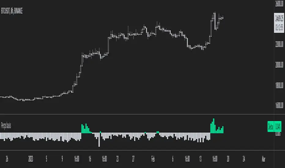
Bitcoin Perpetual SwapsThis script track most important Bitcoin Perpetual Swaps vs SPOT (Coinbase).
When strong green color emerge implies that Swaps are trading at premium to spot.
When strong red color emerge implies that Swaps are trading at discount to spot.
These information is useful because it give leading information towards where funding rates are heading.
When trading at premium it will push towards Positive Funding Rates (Longs pay Shorts)
When trading at discount it will push towards Negative Funding Rates (Shorts pay Longs)
It's can also be used to give identify potential local tops or bots when values get too extreme.

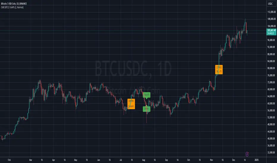
BITCOIN CME FUTURES GAPSDisplays information about Bitcoin CME Futures Gaps over BTCUSD (or XBTUSD) charts.
You can configure a threshold percentage to only display gaps whose size is greater than that percentage. The gap precentage is calculated based on the current close price.
Gaps up are displayed in Orange, gaps down in Green
Bitcoin Binance Sentiment IndexThe divergence of the price between the futures and spot markets for perpetual contracts could be a gauge of sentiment on a traded cryptoasset.
Sentiment analysis could be used to improve the the predictive value of technical and fundamental analysis.
The price of the perpetual contract is divided by the spot price for Bitcoin on Binance and two simple moving averages of this ratio are plotted together. For graphical purposes, the ratio between the two prices has been multiplied by 100. The moving averages were chosen arbitrarily and can be changed. Values above 100 mean that the average price of the futures over the last x periods was above the spot price over the same period. Conversely, values below 100 mean that the mean price of the futures over the last x periods was below the spot price over the same period. The indicator has been created for a daily timeframe.
This indicator is clearly intended for educational purposes only and does not constitute investment advice.
If you are interested in updates on this indicator or interested on sentiment analysis, put a like, subscribe or contact me in pm.
BIO

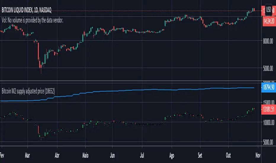
Bitcoin M2 supply adjusted priceThis script plots bitcoin candles adjusted by M2 supply (blue line), helping the trader to obtain insight of new support/resistance levels adjusted by M2 supply.
Note: As it was not possible to make the price adjust automatically by the last M2 value (pinescript limitation, I guess), the input parameter "M2Last" must be updated manually observing the last M2 value in blue curve.
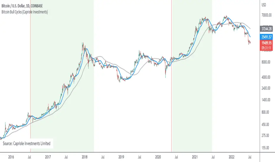
Bitcoin Bull CyclesA simple indicator that identifies the primary upswing of Bitcoin following each Halving, the "Bull Cycle".
A "Bull Cycle" is identified as the first period of positive momentum after each Halving date, defined as the 50 Daily Moving Average (DMA) being above the 200 DMA.
Bitcoin Cost Per Transaction (QUANDL:BCHAIN/CPTRA)Simple script that graphically represents the Bitcoin Cost Per Transaction.
Blockchain data made available at QUANDL.
Its logic is simple, search the data in the QUANDL database and plot it on the chart.

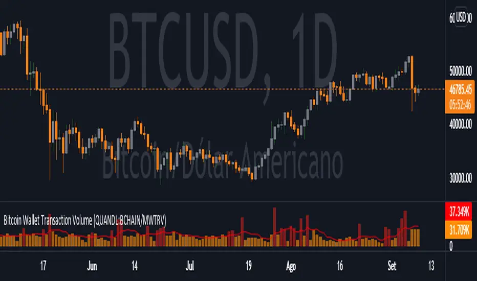
Bitcoin Wallet Transaction Volume (QUANDL:BCHAIN/MWTRV)Simple script that graphically represents the Bitcoin Wallet Transaction Volume .
Blockchain data made available at QUANDL .
Its logic is simple, search the data in the QUANDL database and plot it on the chart.
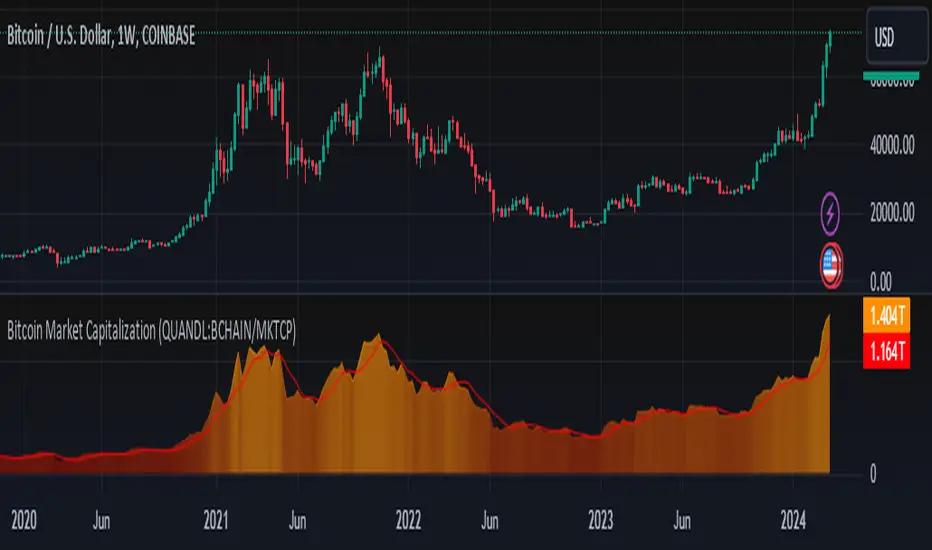
Bitcoin Market Capitalization (QUANDL:BCHAIN/MKTCP)Simple script that graphically represents the Bitcoin Market Capitalization
Blockchain data made available at QUANDL .
Its logic is simple, search the data in the QUANDL database and plot it on the chart.