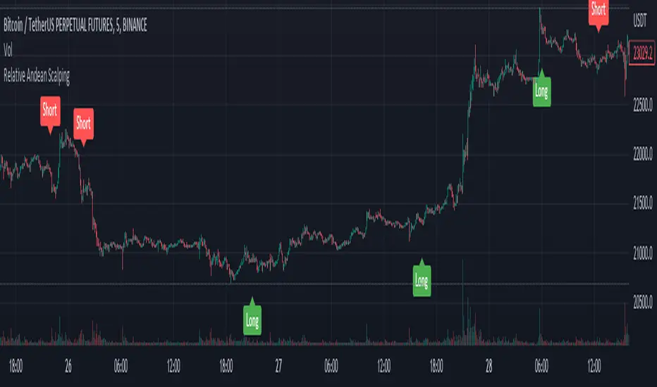
Relative Andean ScalpingThis is an experimental signal providing script for scalper that uses 2 of open source indicators.
First one provides the signals for us called Andean Oscillator by @alexgrover . We use it to create long signals when bull line crosses over signal line while being above the bear line. And reverse is true for shorts where bear line crosses over signal line while being above bull line.
Second one is used for filtering out low volatility areas thanks to great idea by @HeWhoMustNotBeNamed called Relative Bandwidth Filter . We use it to filter out signals and create signals only when the Relative Bandwith Line below middle line.
The default values for both indicators changed a bit, especially used linreg values to create relatively better signals. These can be changed in settings. Please be aware that i did not do extensive testing with this indicator in different market conditions so it should be used with caution.
ค้นหาในสคริปต์สำหรับ "band"
Range Bound Channel Index (RBCI) w/ Expanded Source Types [Loxx]Range Bound Channel Index (RBCI) w/ Expanded Source Types is a reversal and trend indicator. This version includes Bollinger bands to show trend exhaustion
What is Range Bound Channel Index (RBCI)?
Range Bound Channel Index (RBCI) is calculated by using a channel (bandwidth) filter (CF). Channel filter simultaneously fulfills two functions: removes low frequent trend formed by low frequent components of the spectrum; removes high frequency noise formed by the high frequent components of the spectrum.
When RBCI approaches its local maximum the prices approach upper border of the trading channel and when RBCI approach its local minimum the prices approach the lower border of the trading corridor.
Included:
-Toggle on/off bar coloring
-Loxx's Expanded Source Types

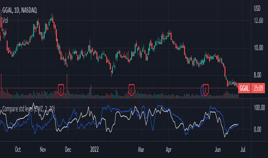
Compare std levelIt is used to compare symbol with different magnitudes and volatilities. It is compared by the level within its range of standard deviations.
Visually, we are comparing where the price is in its Bollinger Band , for each symbol.
100 means that the price is near the upper band. 0 means that the price is near the lower band
Bollinger CloudsThis indicator plots Bollinger Bands for your current timeframe (e.g 5 minutes) and also plots the Bollinger Bands for a higher timeframe (15 minutes for 5 minute timeframe). Then the gaps between the current and higher timeframe upper and lower bands is filled to create clouds which can be used as entry zones. Like Bollinger Bands, this indicator shouldn't be solely used for entries, use it in conjunction with other indicators.
Bollinger Band Timeframes
Current / Higher
1 minute / 5 minutes
3 minutes / 10 minutes
5 minutes / 15 minutes
10 minutes / 30 minutes
15 minutes / 1 hour
30 minutes / 2 hours
45 minutes / 1.5 hours
1 hour / 4 hours
2 hours / 8 hours
2.5 hours / 10 hours
4 hours / 1 Day
1 Day / 3 Days
3 Days / 9 Days
5 Days / 2 Weeks
1 Week / 1 Month

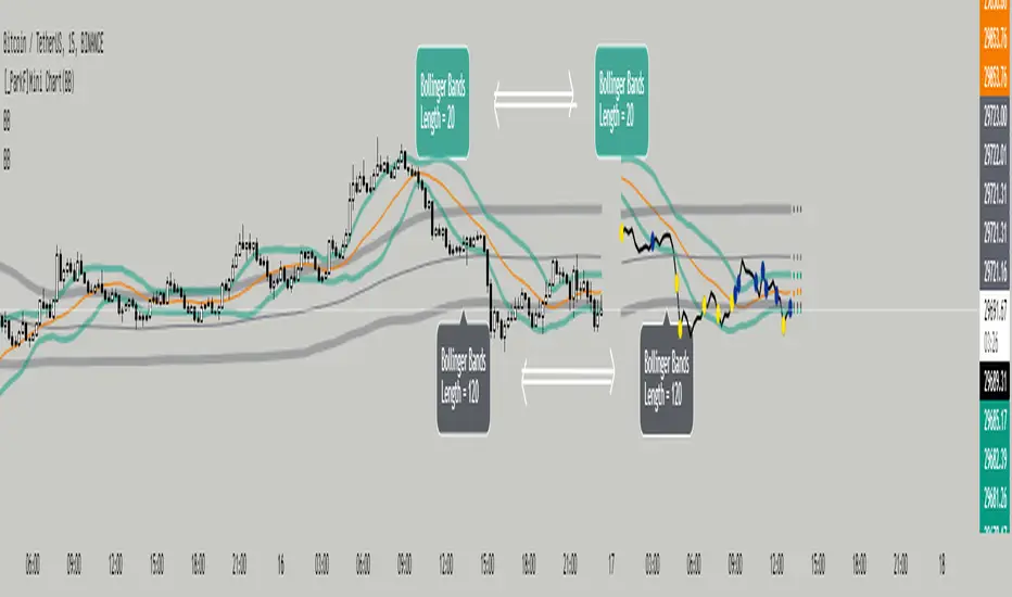
[_ParkF]Mini Chart(BB)Bollinger Bands of different lengths are displayed with a line chart in front of the candle.
A Bollinger band with a length of 20 and a Bollinger band with a length of 120 can be easily identified by the circle and color displayed whenever the line passes.
In the input menu, you can edit the length and deviation of the Bollinger band, the number of candles to be displayed in front, the thickness of the line, the color, and the color of the circle.
And the expected value of each Bollinger band was measured and displayed.
You can change the thickness and color of the displayed predictive circle in Predictive of the input menu.
-------------------------------------------------------------------------------------------------------------------------------------------------------------------------------------------------------------------------------------------
서로 다른 기간값을 가진 볼린저밴드를 캔들보다 앞쪽에 선 차트와 함께 표시하였습니다.
20의 기간값을 가진 볼린저밴드와 120의 기간값을 가진 볼린저밴드를 선차트가 크로스할 때 마다 표시되는 점과 색을 통해 쉽게 식별할 수 있습니다.
input 메뉴에서 볼린저밴드의 기간값과 편차, 앞 쪽에 표시될 캔들의 수와 선의 두께, 색상, 점의 색상을 수정할 수 있습니다.
그리고 각 볼린저밴드의 예상 값을 측정하여 표시하였습니다.
input 메뉴의 Predictive에서 표시된 Predictive circle의 두께와 색상을 변경할 수 있습니다.
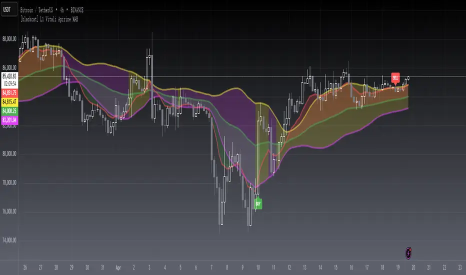
[blackcat] L1 Vitali Apirine MABLevel 1
Background
Vitali Apirine’s articles in the July & August issues on 2021, “Moving Average Bands”
Function
In “Moving Average Bands” (part 1, July 2021 issue) and “Moving Average Band Width” (part 2, August 2021 issue), author Vitali Apirine explains how moving average bands (MAB) can be used as a trend-following indicator by displaying the movement of a shorter-term moving average in relation to the movement of a longer-term moving average. The distance between the bands will widen as volatility increases and will narrow as volatility decreases.
Remarks
This is a Level 1 free and open source indicator.
Feedbacks are appreciated.
Volatility ChannelThis script is based on an idea I have had for bands that react better to crypto volatility. It calculates a Donchian Channel, SMMA-Smoothed True Range, Bollinger Bands (standard deviation), and a Keltner Channel (average true range) and averages the components to construct its bands/envelopes. This way, hopefully band touches are a more reliable indicator of a temporary bottom, and so on. Secondary coloring for strength of trend is given as a gradient based on RSI.

BB Order BlocksUsing the Bollinger Band to mark areas of Support and Resistance
The scrip finds the highest and lowest levels of the bands to mark up futures areas of interest.
If the High/Lows are being broken on the Bollinger band, or if the look back range has expired without finding new levels, the script will stop plotting them until new levels are found
I have found many combinations which work well
Changing the band length to to levels 20,50,100 or 200 seem to give interesting results
Aswell as this changing the standard deviation to 3 instead of 2 marks up key levels.
The look back range seems to show better levels on 50,100 and 200
Let me know any changes or updates you think you could make an impact , this was just a quick basic script I wanted to share.

Adaptive Trend Mapper-ATM (Arjo)Adaptive Trend Mapper (ATM) is a multi-factor trend, momentum, and compression-analysis tool designed to help traders visually map the strength and direction of market pressure.
Instead of simply combining existing indicators, ATM creates a new composite framework that blends momentum imbalance, directional strength, volatility contraction, and adaptive smoothing into a single, unified model.
Originality and usefulness
Adaptive Trend Mapper (ATM) does not replicate any one indicator.
It generates two custom indices— Bull Pressure Index and Bear Pressure Index —derived from a mathematical combination of RSI, inverse-RSI, and ADX. These indices behave differently from traditional oscillators:
They represent directional pressure on a 0–100 scale , not momentum.
They are designed to converge/diverge, forming a basis for the built-in Squeeze Detection Engine.
They can be optionally step-compressed , making the movement easier to read on fast or small charts.
The script also integrates a custom SuperSmoother trend model (not TradingView’s built-in function), which acts as an adaptive trend curve on the chart.
All calculations are combined intentionally—not as a mashup—to create a framework that allows traders to understand trend strength, compression phases, and micro-trend shifts in one place.
How the Indicator Works
1. Bull & Bear Pressure Indices:
These indices measure directional imbalance:
Bull Index = ADX strength weighted against inverse-RSI
Bear Index = ADX strength weighted against normal RSI
This produces two opposing pressure curves that rise or fall depending on whether buyers or sellers dominate.
You can optionally smooth these using:
SMA / EMA / WMA / RMA via the “Smoothing Settings” panel.
2. Squeeze & Compression Detection:
A squeeze is detected when:
ADX stays below a user-defined threshold
Bull–Bear Index difference shrinks
Average difference is falling (convergence)
This is a volatility-contraction model inspired by squeeze logic but applied to directional pressure, not Bollinger Bands/Keltner Channels .
3. Adaptive Trend Curve (SuperSmoother Engine)
The indicator applies a two-pole SuperSmoother filter to the price, then smooths it again using EMA.
The slope color flips between bullish and bearish and is displayed using:
A thin SuperSmoother curve
A thicker band for visual context
4. EMA-50 Trend Context:
An optional EMA-50 helps identify broad directional bias .
5. Step-Based Scaling
You can quantize the Bull/Bear indices using custom step intervals.
This makes the indicator easier to read on noisy intraday charts.
How to Use the Indicator
1. Trend Analysis
A rising Bull Index shows strengthening upward pressure
A rising Bear Index shows strengthening downward pressure
Wide divergence between the indices signals a strong trend
2. Compression / Squeeze Analysis
Yellow background = volatility compression + pressure convergence
Breakouts from this zone often precede directional expansion
3. Trendline Reading
SuperSmoother line color flip = micro trend shift
EMA-50 slope gives macro-trend direction
Perfect for combining trend and momentum maps on the same chart
4. Visual Interpretation
Cyan/teal → strong bullish pressure
Purple/red/orange → various levels of bearish control
Neutral/teal background → weak ADX
Yellow background → squeeze zone
Open-Source Notes
This script uses:
TradingView built-in RSI, ADX/DMI, and smoothing functions
A SuperSmoother implementation based on known DSP filter coefficients
All remaining logic, signal methods, composite indices, and compression model are original developments by ARJO .
The script is published open-source to comply with TradingView’s reuse policy.
Disclaimer
This tool is for educational and analytical purposes only.
It does not generate buy or sell signals.
Always use proper risk management.
Happy Trading (ARJO)

Grok/Claude MoneyLine Fusion * Grok/Claude X SeriesMoneyLine Fusion Indicator
This is a technical analysis indicator designed to help traders identify potential buy and sell opportunities in the market. It combines several well-known trading concepts into one unified tool, displaying visual bands on the chart and generating signals when multiple conditions align.
The Core Concept: The "Money Line"
At the heart of this indicator is something called the Money Line, which is essentially a smoothed trend line calculated using linear regression over the last 16 bars (by default). Think of it as a "best fit" line through recent prices that shows you the general direction the market is heading. The indicator colors this line green when the trend is rising, red when it's falling, and yellow when it's essentially flat or undecided.
The Dynamic Bands
Surrounding the Money Line are upper and lower bands that expand and contract based on market volatility. These bands use the ATR (Average True Range) to measure how much the price typically moves. Here's where it gets clever: the bands also factor in the ADX indicator (which measures trend strength). When the market is trending strongly, the bands widen more aggressively to account for bigger price swings. When the trend is weak, they stay tighter. This adaptive behavior helps the indicator adjust to different market conditions automatically.
The area between the bands is shaded in the trend color (green, red, or yellow) to give you a quick visual of the current market bias.
How Buy and Sell Signals Are Generated
The indicator doesn't just look at one thing — it requires multiple conditions to align before triggering a signal. This is designed to filter out false signals and only alert you when several factors agree.
Signal TypeRequired ConditionsBUYFisher Transform is below -2.0 (oversold), Aroon Up is low (below 20), Aroon Down is high (above 80), and optionally a positive TA ScoreSELLFisher Transform is above +2.0 (overbought), Aroon Up is high (above 80), Aroon Down is low (below 20), and optionally a negative TA Score
Fisher Transform is a mathematical technique that converts price data into a bell curve distribution, making extreme readings (overbought/oversold) easier to spot.
Aroon measures how long it's been since the highest high or lowest low. When Aroon Down is high and Aroon Up is low, it suggests recent price action has been dominated by lows — a potential reversal setup for a buy.
The indicator also prevents signal spam by requiring at least 5 bars between signals of the same type.
The TA Scoring System
Behind the scenes, the indicator calculates a composite score based on four different technical indicators:
MACD — Momentum and trend direction (scores -2 to +2)
DMI — Directional movement comparing buyers vs sellers (scores -2 to +2)
MFI — Money Flow Index, similar to RSI but incorporates volume (scores -2 to +2)
RSI — Classic overbought/oversold measure (scores -1 to +1)
These scores are added together, and the result is displayed in the info panel with labels like "very bullish," "slightly bearish," or "neutral." You can optionally require a minimum TA score before signals trigger, adding another layer of confirmation.
Visual Display Elements
The indicator offers several optional display features:
Shaded bands between upper and lower lines
Buy/Sell labels directly on the chart showing the entry price
Bright blue candle highlighting when a signal fires
Info panel in the corner showing the Money Line value, volatility percentile, RSI, and TA score
Score dots at the bottom of the chart (green for bullish, red for bearish, yellow for neutral)
Debug table for troubleshooting that shows real-time values of Fisher, Aroon, and signal conditions
In Summary
This indicator is essentially a multi-factor confirmation system. Rather than relying on a single indicator that might give many false signals, it waits until the trend direction (Money Line), momentum extremes (Fisher Transform), price cycle position (Aroon), and overall technical picture (TA Score) all point in the same direction. The adaptive bands help visualize where price "should" be trading given current volatility and trend strength. It's designed for traders who prefer fewer but higher-conviction signals.

🏛️ Inst. Value SuiteInstitutional Valuation Suite (IVS)
Executive Summary Traditional volatility indicators frequently exhibit limitations when applied to long-term secular growth assets. Because they calculate volatility in absolute currency units rather than percentage terms, standard deviation bands often distort or become obsolete during phases of exponential price expansion (e.g., significant capitalization shifts in Crypto or Growth Stocks).
The Institutional Valuation Suite addresses this latency by utilizing Geometric (Log-Normal) Standard Deviation. This methodology enables the model to adapt dynamically to the asset's price scale, providing statistically significant valuation zones regardless of price magnitude.
Operational Theory The model operates as a mean-reversion instrument, visualizing price action as a dynamic deviation from a "Fair Value" baseline. It quantifies statistical extremes to identify when an asset is overextended (Speculative Premium) or undervalued (Deep Discount) relative to historical volatility.
Key Features
1. Log-Normal Volatility Engine
Geometric Mode (Default): Calculates volatility in percentage terms. This is the requisite setting for assets exhibiting logarithmic growth, such as Cryptocurrencies and Technology equities.
Arithmetic Mode: Retains linear calculation methods for Forex pairs or range-bound assets where traditional standard deviation is preferred.
2. Valuation Heatmap
Visualizes valuation metrics directly onto price candles to mitigate subjective interpretation bias.
GREEN: Deep Value / Accumulation Zone (<−0.5σ).
ORANGE: Overvaluation / Premium Zone (>2.0σ).
RED: Speculative Anomaly Zone (>3.0σ).
3. Mean Reversion Signals
VALUE RECLAIM: Triggers when price re-enters the lower deviation band from below. This confirms support validation and filters out premature entries during high-momentum drawdowns.
TOP EXIT: Triggers when price breaks down from the upper speculative zone, signaling a potential trend exhaustion.
4. Statistical Dashboard
Displays a real-time Z-Score to quantify the standard deviations the current price is from its baseline.
>3.0: Statistical Anomaly (upper bound).
<−0.5: Statistical Discount (lower bound).
Configuration & Parameters
Per your requirements, the suggested code tooltips for your inputs are listed below.
Cycle Length
Determines the lookback period used to calculate the Fair Value baseline.
Crypto Macro: 200 (Approx. 4 Years).
Altcoins: 100 (Approx. 2 Years).
Equities (S&P 500): 50 (1 Year Trend).
Intraday: Set "Timeframe Lock" to "Chart".
Tooltip Text: "Sets the lookback period for the baseline calculation. Recommended: 200 for Crypto Macro, 50 for Equities, or adjust based on the asset's specific volatility cycle."
Timeframe Lock
Allows the user to fix the calculation to a specific timeframe or allow it to float with the chart.
Tooltip Text: "Locks the calculation to a specific timeframe (e.g., Daily, Weekly) to ensure baseline consistency when zooming into lower timeframes."
Technical Integrity
This indicator employs strict strict offset logic (barmerge.lookahead_on) to ensure historical data integrity. The signals rendered on historical bars are mathematically identical to those that would have appeared in a real-time environment, ensuring backtesting reliability.
Disclaimer: This script provides statistical analysis based on historical volatility metrics and does not constitute financial advice.

Institutional Valuation SuiteStandard volatility indicators often fail on long-term growth charts because they measure volatility in dollars rather than percentages. This causes bands to break or become irrelevant during exponential price moves (e.g., Bitcoin going from $1,000 to $100,000).
The Institutional Valuation Suite solves this by utilising Geometric (Log-Normal) Standard Deviation. This allows the model to adapt to the asset's price scale, providing accurate valuation zones regardless of price magnitude.
The model functions as a mean-reversion tool, visualizing price as an elastic band anchored to a "Fair Value" baseline. It identifies when the asset is statistically overextended (Bubble/FOMO) or undervalued (Deep Discount).
Key Features
1. Log-Normal Math Engine
Geometric Mode (Default): Calculates volatility in percentage terms. Essential for Crypto and Growth Stocks.
Arithmetic Mode: Available for Forex or range-bound assets where linear standard deviation is preferred.
2. Sentiment Heat map
Visualises valuation directly on the candles to remove interpretation bias.
GREEN: Deep Value / Accumulation Zone (< -0.5σ).
ORANGE: Overvalued / FOMO Zone (> 2.0σ).
RED: Speculative Bubble Zone (> 3.0σ).
3. Reversion Signals
"VALUE RECLAIM": Triggers when price re-enters the bottom band from below, filtering out "falling knife" scenarios.
"TOP EXIT": Triggers when price breaks down from the speculative top zone.
4. Statistical Dashboard
Displays the real-time Z-Score to quantify how "stretched" the price is relative to its baseline.
> 3.0: Statistical Anomaly (Top).
< -0.5: Statistical Discount (Bottom).
Optimisation Cheat Sheet
The "Cycle Length" input determines the lookback period for the baseline. Recommended settings:
Crypto Macro: 200 (Approx. 4 Years).
Altcoins: 100 (Approx. 2 Years).
Stocks (S&P 500): 50 (1 Year Trend).
Day Trading: Set "Timeframe Lock" to "Chart".
Technical Note
This indicator uses strict offset logic (`barmerge.lookahead_on`) to ensure historical consistency. The signals displayed on historical bars match exactly what would have appeared in real-time.
*Disclaimer: This script provides statistical analysis based on historical volatility and does not constitute financial advice.*

ATR STRUCTURE
So I can produce this
🟡 START = 662.63 ✳️ ATR ≈ 8.30 pts (0.5 ATR ≈ 4.15 • 1 ATR ≈ 8.30) 🙂📏
ATR bands (numeric)
🔼 START + 0.5 ATR = 662.63 + 4.15 = 666.78 (upper buffer / shelf)
🔼 START + 1 ATR = 662.63 + 8.30 = 670.93 (breakout band)
🔽 START − 0.5 ATR = 662.63 − 4.15 = 658.48 (near support)
🔽 START − 1 ATR = 662.63 − 8.30 = 654.33 (deeper stop zone)
— Priority level ladder (footprint‑first & ATR alignment) — (emoji = confidence • 🔥 = high • ✅ = footprint confirmed • 🟡 = medium)
🔥🟢 PM_LOW / D1 — ~659.95 → 660.50 ✅ (FOOTPRINT CONFIRMED)
Why: repeated 30m+1h absorption (sold‑into then bought up). DEEP confidence. 🧯🔁
🔥🔴 ORBH / U2 cluster — ~663.98 → 665.87 ✅ (FOOTPRINT SUPPLY)
Why: repeated rejections / sell MaxDelta rows on 30m & 1h. Treat as overhead supply / shelf. 🪓📉
🔥🟦 D3 / ORBL corridor — ~658.64 ✅ (TF confluence: 1h+4h MaxDelta)
Why: single‑row institutional sells map here; structural LVN / open‑range low. 🛡️📌
🟡⭐ START / U1 pivot zone — ~662.63 – 662.70 ✅ (session pivot, 1h absorption)
Why: session magnet—use for intraday bias pivot / quick confirms. 👀⚖️
🟡🔥 U4 / U5 upper HVN band — ~666.7 → 669.3 (ATR UPPER)
Why: strong HVN / stop‑run evidence on higher TFs — needs large buy MaxDelta to flip. 🚧🚀
⚪ D5 lower expansion support — ~654.3–656.7 (deeper target if sellers run)
Why: longer‑TF expansion area; lower immediate probability but high impact if hit. ⚠️📉

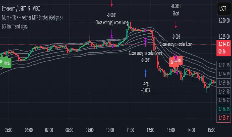
BG Trix Trend signalovides dynamic long and short signals based on a multi-timeframe candle averaging method. It calculates a four-step average of recent candles to determine the trend and changes candle color accordingly (green for upward, red for downward).
Features:
Multi-Timeframe Candle Analysis: Combines current and previous candle data to smooth price action.
Optional TRIX Filter: Adds a TRIX-based trend filter from a separate timeframe. Only triggers signals when TRIX confirms the trend.
Optional Keltner Channel Filter: Prevents signals when the price is inside the Keltner channel. Long signals only trigger above the upper band; short signals only trigger below the lower band. Separate MTF and MA type can be selected for the channel.
Visual Signals: Long and short signals are displayed as arrows on the chart. Candle color reflects trend direction.
Fully Customizable: Users can enable/disable TRIX and Keltner filters and select MA types and timeframes independently.
This indicator is ideal for traders who want clear trend signals while filtering out trades inside key price channels. No exit management is included—signals are purely for entry visualization.
Squeeze Go Momentum Pro [KingThies] █ OVERVIEW
The Squeeze Momentum Pro indicator identifies volatility compression phases and breakout opportunities by comparing Bollinger Bands to Keltner Channels. When price consolidates (squeeze), the bands contract inside the channels, signaling an imminent breakout. The momentum histogram shows directional bias, helping traders anticipate which way price will move when the squeeze releases.
This indicator displays in a separate panel below the price chart, providing clear visual signals without cluttering price action.
█ KEY FEATURES
Momentum Histogram
The histogram is the primary visual element, displaying momentum strength and direction with four distinct color states:
• Dark Green (#00C853) — Strong bullish momentum that is increasing. This signals strengthening upward pressure and potential continuation.
• Light Green (#26A69A) — Bullish momentum that is decreasing. Price remains in bullish territory but upward force is weakening.
• Dark Red (#D32F2F) — Strong bearish momentum that is increasing. This signals strengthening downward pressure and potential continuation.
• Light Red (#EF5350) — Bearish momentum that is decreasing. Price remains in bearish territory but downward force is weakening.
The color intensity provides immediate feedback on momentum strength and trend health.
Squeeze State Indicator
Colored dots on the zero line communicate the current volatility state:
• Orange Dots — Squeeze is ON. Bollinger Bands have contracted inside Keltner Channels, indicating consolidation and low volatility.
A breakout is building and traders should prepare for directional movement.
• Green Dots — Squeeze is OFF. Bollinger Bands have expanded outside Keltner Channels, indicating active momentum and higher volatility.
Price is moving with conviction in the current direction.
• Gray Dots — Neutral state. The bands are transitioning between squeeze states.
Release Triangles
Triangle shapes mark the exact bar when a squeeze releases, providing precise entry timing:
• Green Triangle Up — Bullish squeeze release. The squeeze has ended with positive momentum, suggesting a long setup opportunity.
• Red Triangle Down — Bearish squeeze release. The squeeze has ended with negative momentum, suggesting a short setup opportunity.
Information Panel
A compact dashboard in the top-right corner displays real-time trading intelligence:
• Squeeze Status — Current state: ON, OFF, or NEUTRAL with color coding
• Momentum Direction — Current bias: BULL or BEAR
• Momentum Value — Precise numerical reading of momentum strength
• Trading Signal — Actionable status: LONG SETUP, SHORT SETUP, WAIT, or MONITOR
Configurable Parameters
All calculation inputs are adjustable to match your trading style and timeframe:
• BB Length — Bollinger Bands period (default: 20)
• BB StdDev — Bollinger Bands standard deviation multiplier (default: 2.0)
• KC Length — Keltner Channels period (default: 20)
• KC ATR Multiplier — Keltner Channels range multiplier (default: 1.5)
• Momentum Length — Linear regression period for momentum calculation (default: 20)
Alert System
Four alert conditions notify you of critical trading opportunities:
• Bullish Squeeze Release — Squeeze has released with bullish momentum, indicating a potential long entry
• Bearish Squeeze Release — Squeeze has released with bearish momentum, indicating a potential short entry
• Squeeze Started — Volatility compression detected, prepare for upcoming breakout
• Squeeze Ended — Volatility expansion confirmed, breakout is active
█ TRADING METHODOLOGY
The indicator follows a clear four-step process for identifying and trading squeeze breakouts:
1 - Wait for Orange Dots . When orange dots appear on the zero line, a squeeze is building. This indicates price consolidation and declining volatility.
Do not enter trades during this phase. Instead, prepare by identifying key support and resistance levels and potential breakout directions.
2 - Watch for Release Triangle . When a triangle appears, the squeeze has released and a breakout is beginning. This is your entry signal.
The triangle color (green up or red down) combined with the histogram direction indicates the breakout direction.
3 - Confirm with Histogram Direction . Check the momentum histogram for directional confirmation:
• Green histogram + green triangle up = Go long. Bullish momentum supports upward breakout.
• Red histogram + red triangle down = Go short. Bearish momentum supports downward breakout.
4 - Monitor Momentum Intensity . Stay in the trade while histogram bars maintain their dark, intense color.
When colors lighten (dark green to light green, or dark red to light red), momentum is weakening and you should consider taking profits or tightening stops.
█ INTERPRETATION GUIDE
Squeeze Detection Logic
A squeeze occurs when Bollinger Bands contract inside Keltner Channels. This happens when:
• Standard deviation of price decreases (BB narrows)
• Price consolidates within a tight range
• Volatility compresses to unsustainable levels
The orange dots signal this condition, warning traders that explosive movement is imminent.
Squeeze Release Logic
A squeeze releases when Bollinger Bands expand outside Keltner Channels. This happens when:
• Price volatility increases sharply
• Price breaks out of consolidation
• Volume typically expands (check volume separately)
The green dots and release triangles signal this condition, indicating the direction and timing of the breakout.
Momentum Reading
The histogram uses linear regression to calculate momentum relative to the midpoint of the recent range:
• Above Zero : Price is trading above the range midpoint with bullish pressure
• Below Zero : Price is trading below the range midpoint with bearish pressure
• Increasing Bars : Momentum is strengthening in the current direction (darker color)
• Decreasing Bars : Momentum is weakening in the current direction (lighter color)
█ BEST PRACTICES
• Timeframe Selection — The indicator works on all timeframes but performs best on 15-minute to daily charts.
Lower timeframes may produce more false signals due to noise.
• Confluence Trading — Combine squeeze releases with support/resistance levels, trend lines, or other indicators for higher probability setups.
• Volume Confirmation — Check that squeeze releases occur with increasing volume. Low volume breakouts are more likely to fail.
• Multiple Timeframe Analysis — Check higher timeframes for overall trend direction. Trade squeeze releases that align with the larger trend.
• Parameter Adjustment — Increase BB and KC lengths for smoother signals on higher timeframes. Decrease for more sensitive signals on lower timeframes.
█ LIMITATIONS
• The indicator does not predict breakout direction before the squeeze releases. The momentum histogram provides bias but is not definitive until the breakout occurs.
• False breakouts can occur, particularly in choppy or low-volume market conditions. Always use proper risk management and stop losses.
• The indicator works best in trending markets. In deeply ranging markets with no clear direction, squeeze signals may be less reliable.
• Momentum calculations use linear regression which can lag during extremely fast price movements. Confirm signals with price action.
█ NOTES
This implementation uses linear regression for momentum calculation rather than simple moving averages, providing more responsive and accurate directional signals. The four-color histogram system gives traders nuanced feedback on momentum strength that binary color schemes cannot provide.
The indicator automatically adjusts to any symbol and timeframe without modification, making it suitable for stocks, forex, crypto, and futures markets.
█ CREDITS
Squeeze methodology inspired by John Carter's TTM Squeeze indicator. Momentum calculation and visual design optimized for modern trading workflows.

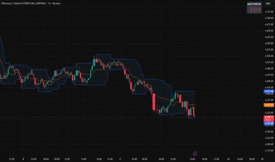
Donchian Channels + Avg Width % DashboardMeasures the average percentage width between the Donchian Channel’s upper and lower bands over a chosen period.
It quantifies how much the market has been moving relative to price — a direct gauge of realized volatility.
When the average width is small, price is range-bound and unlikely to reach fixed TP targets; when it expands, volatility is sufficient for trend or breakout trades.
Based on how fast your strategy is, set your TP% below the average percentage of the Band Width.