PCA-Risk IndicatorOBJECTIVE:
The objective of this indicator is to synthesize, via PCA (Principal Component Analysis), several of the most used indicators with in order to simplify the reading of any asset on any timeframe.
It is based on my Bitcoin Risk Long Term indicator, and is the evolution of another indicator that I have not published 'Average Risk Indicator'.
The idea of this indicator is to use statistics, in this case the PCA, to reduce the number of dimensions (indicator) to aggregate them in some synthetic indicators (PCX)
I invite you to dig deeper into the PCA, but that is to try to keep as much information as possible from the raw data. The signal minus the noise.
I realized this indicator a year ago, but I publish it now because I do not see the interest to keep it private.
USAGE:
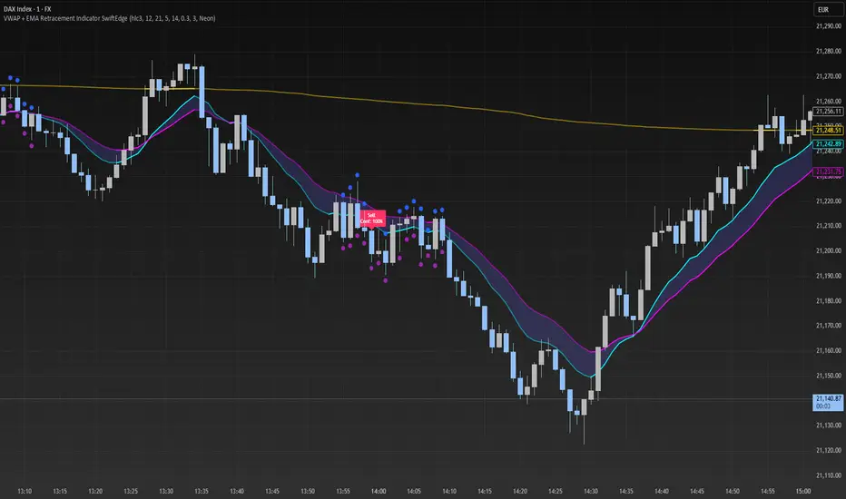
Unlike the Bitcoin Risk Long Term indicator, it does not make sense to change or disable the input indicators unless you use the 'Average Indicator' function. Because each input is weighted to generate the outputs, the PCX.
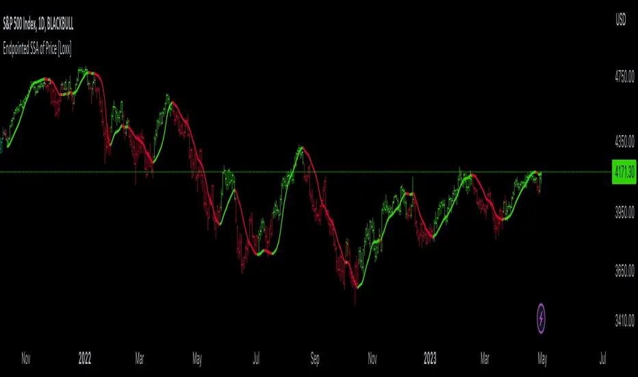
I extracted several courses (Bitcoin, Gold, S&P, CAC40) on several timeframes (W, D, 4h, 1h) of Trading view and use the Excel generated for the data on which I played the PCA analysis.
The results:
explained_variance_ratio: 0.55540809 / 0.13021972 / 0.07303142 / 0.03760925
explained_variance: 11.6639671 / 2.73470717 / 1.53371209 / 0.7898212
Interpretation:
Simply put, 55% of the information contained in each indicator can be represented with PC1, +13% with PC2, +7% with PC3, +3% with PC4.
What is important to understand is that PC1, which serves as a thermometer in a way, gives a simple indication of over-buying or over-selling area better than any other indicator.
PC2, difficult to interpret, is more reactive because precedes PC1, but can give false signals.
PC3 and PC4 do not seem relevant to me.
The way I use it is to take PC1 for Risk indicator, and display PC2 with 'Area'. When PC2 turns around and PC1 arrives on extremes, it can be good points to act.
NOTES :
- It is surprising that a simple average of all the indicators gives a fairly relevant result
- With Average indicator as Risk indicator, you can combine the indicators of your choice and see the predictive power with the staining of bars.
- You can add alerts on the levels of your choice on the Risk Indicator
- If you have any idea of adding an indicator, modification, criticism, bug found: share them, it’s appreciated!
---- FR ----
OBJECTIF :
L'objectif de cet indicateur est de synthétiser, via l'ACP (Analyse en Composantes Principales), plusieurs indicateurs parmi les plus utilisés avec afin de simplifier la lecture de n'importe quel actif sur n'importe quel timeframe.
Il est inspiré de mon indicateur 'Bitcoin Risk Long Term indicator', et est l'évolution d'un autre indicateur que je n'ai pas publié 'Average Risk Indicator'.
L'idée de cet indicateur est d'utiliser les statistiques, en l'occurence l'ACP, pour réduire le nombre de dimensions (indicateur) pour les agréger dans quelques indicateurs synthétiques (PCX)
Je vous invite à creuser l'ACP, mais c'est chercher à conserver un maximum d'informations à partir de la donnée brute. Le signal moins le bruit.
J'ai réalisé cet indicateur il y a un an, mais je le publie maintenant car je ne vois pas l'intérêt de le garder privé.
UTILISATION :
Contrairement à 'Bitcoin Risk Long Term indicator', il ne fait pas sens de modifier ou désactiver les indicateurs inputs, sauf si vous utiliser la fonction 'Average Indicator'. Car chaque input est pondéré pour générer les outputs, les PCX.
J'ai extrait plusieurs cours (Bitcoin, Gold, S&P, CAC40) sur plusieurs timeframes (W, D, 4h, 1h) de Trading view et utiliser les Excel généré pour la data sur laquelle j'ai joué l'analyse ACP.
Les résultats :
explained_variance_ratio : 0.55540809 / 0.13021972 / 0.07303142 / 0.03760925
explained_variance : 11.6639671 / 2.73470717 / 1.53371209 / 0.7898212
Interprétation :
Pour faire simple, 55% de l'information contenu dans chaque indicateur peut être représenté avec PC1, +13% avec PC2, +7% avec PC3, +3% avec PC4.
Ce qui faut y comprendre c'est que le PC1, qui sert de thermomètre en quelque sorte, donne une indication simple de zone de sur-achat ou sur-vente mieux que n'importe quel autre indicateur.
PC2, difficile à interpréter, est plus réactif car précède PC1, mais peut donner des faux signaux.
PC3 et PC4 ne me semble pas pertinent.
La manière dont je m'en sert c'est de prendre PC1 pour Risk indicator, et d'afficher PC2 avec 'Region'. Lorsque PC2 se retourne et que PC1 arrive sur des extrêmes, cela peut être des bons points pour agir.
NOTES :
- Il est étonnant de constater qu'une simple moyenne de tous les indicateurs donne un résultat assez pertinent
- Avec Average indicator comme Risk indicator, vous pouvez combiner les indicateurs de vos choix et voir la force prédictive avec la coloration des bars.
- Vous pouvez ajouter des alertes sur les niveaux de votre choix sur le Risk Indicator
- Si vous avez la moindre idée d'ajout d'indicateur, modification, critique, bug trouvé : partagez-les, c'est apprécié !
อินดิเคเตอร์ Pine Script®