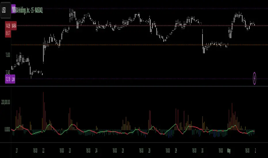
RedK_Supply/Demand Volume Viewer v1Background
============
VolumeViewer is a volume indicator, that offers a simple way to estimate the movement and balance (or lack of) of supply & demand volume based on the shape of the price bar. i put this together few years ago and i have a version of this published for another platform under different names (Directional Volume, BetterVolume) in case you come across them
what is V.Viewer
=====================
The idea here is to find a "simple proxy" for estimating the demand or supply portions of a volume bar - these 2 forces have the potential to affect the current price trend so we want an easy way to track them - or to understand if a stock is in accumulation or distribution - we want to do this without having access to Level II or bid/ask data, and without having to get into the complexity of exploring the lower timeframe price & volume data
- to achieve that, we depend on a simple assumption, that the volume associated with an up move is "demand" and the volume associated with a down move is "Supply". so we basically extrapolate these supply and demand values based on how the bar looks like - a full "green" price bar / candle will be considered 100% demand, and a full "red" price bar will be considered 100% supply - a bar that opens and closes at the same level will be 50/50 split between supply & demand.
- you may say this is a "too simple" of an assumption to make, but believe me, it works :) at least at the basic scenario we need here: i'm just exploring the volume movement and finding key levels - and it provides a good improvement compared to the classic way we see volume on a chart - which is still available here in VolumeViewer.
in all cases, i consider this to be work in progress, so i'd welcome any ideas to improve (without getting too complicated) - there's already a host of great volume-based indicators that will do the multi timeframe drill down, but that's not my scope here.
Technical Jargon & calculation
===========================
1. first we calculate a score % for the volume portion that is considered demand based on the bar shape
skip this part if it sounds too technical => if you're into coding indicators, you would probably know there are couple of different concepts for that algorithm - for example, the one used in Balance Of Power formula - which i'm a big fan of - but the one i use here is different. (how?) this is my own, ant it simply applies double weight for the "wick" parts of a price bar compared to the "body of the bar" -- i did some side-by-side comparison in past and decided this one works better. you can change it in the code if you like
2. after calculating the Bull vs Bears portion of volume, we take a moving average of both for the length you set, to come up with what we consider to be the Demand vs Supply - as usual, i use a weighted moving average (WMA) here.
3. the balance or net volume between these 2 lines is calculated, then we apply a final smoothing and that's the main plot we will get
4. being a very visual person, i did my best to build up the visuals in the correct order - then also to ensure the "study title" bar is properly organized and is simple and useful (Full Volume, Supply, Demand, Net Volume).
- i wish there was a way in Pine to hide a value that i still need to visually plot but don't want it showing its value on the study title bar, but couldn't find it. so the last plot value is repeated twice.
How to use
===========
- V.Viewer is set up to show the simplified view by default for simplicity. so when you first add it to a chart, you will get only the supply vs demand view you can see in the middle pane in the above chart
- Optional / detailed mode: go into the settings, and expose all other plots, you will be able to add the classic volume histogram, and the Supply / Demand lines - note these 2 lines will be overlay-ed on top of each other - this provides an easy way to see who is in control - especially if you change the display of these 2 lines into "area" style. This is what is showing in the lower pane in the above chart.
** Exploring Key Price Levels
- the premise is, at spots where there's big lack of balance, that's where to expect to find key price levels (support / resistance) and these price levels will come into play in future so can be used to set entry / exit targets for our trades - see the example in the AAPL chart where you can easily locate these "balance or reversal levels" using the tops/bottoms/zero-crossings from the Net Volume line
** Use for longer-term Price Analysis
- we can also use this simple indicator to gain more insights (at a high level) of the price in terms of accumulation vs distribution and if the sellers or buyers are in control - for example, in the above AAPL chart, V.Viewer tells us that buyers have been in control since October 19 - even during the recent drop, demand continued to be in play - compare that to DIS chart below for the same period, where it shows that the market was dumping DIS thru the weakness. DIS was bleeding red most of the time
Final thoughts
=============
- V.Viewer is an attempt to enhance the way we see and use Volume by leveraging the shape of the price bar to estimate volume supply & demand - and the Net between the 2
- it will work for stocks and other instruments as long as there's volume data
- note that V.Viewer does not track trend. each bar is taken in isolation of prior bars - the price may be going down and V.Viewer is showing supply going up (absorption scenario?) - so i suggest you do not use it to make decisions without consulting other trend / momentum indicators - of course this is a possible improvement idea, or can be implemented in another indicator, add in trend somehow, or maybe think of making this a +100 / -100 Oscillator .. feel free to play with these thoughts
- all thoughts welcome - if this is useful to you in your trading, please share with other trades here to learn from each other
- the code is commented - please feel free to use it as you like, or build things on top of it - but please continue to credit the author of this code :)
good luck!
-
ค้นหาในสคริปต์สำหรับ "accumulation"
stock gain% vs index gain %This shows the relative strength or weakness of a stock vs an index on any given candle price movement.
Negative stock candle and relative strength shows accumulation
Positive stock candle and relative weakness shows distribution
accumulation will plot an 'A'
distribution will plot a 'D'
MCI and VCI - Modified CCI FormulasFor private peeps only
- Takes a modified version of the CCI formula into 2 parts
VCI - Volume Channel Index (Yellow Histogram)
- Measures accurate accumulation and distribution levels and times
MCI - Modified Channel Index
- Measures (when compared to VCI) levels where clearly buys are interested vs not interested.
Example:
If VCI > MCI
- Shows buyer's are more than interested in buying, you've either hit a bottom or heavy resistance
if MCI > VCI
- Show's buyer's aren't interested and will most likely result in a dump/lower price
Great for monitoring accumulation and distribution, these auto buy and sells look for the transition points over 0, works on EVERY commodity/stock/FOREX/Crypto
Results are from trading 1 BTC x25 leveraging. Not all trades will get in if put in at limit, but it does survive with profits after the massive 0.075 fee (results shown are after fees)
Chaikin MF% (CMFP) w. Alerts, Bells & Whistles [LucF]This is Chaikin’s Money Flow indicator on a 0-100 scale with buy/sell signals, alerts and other bells & whistles.
It includes:
- a fast EMA (16 periods by default),
- a slow MA (64 periods by default),
- histograms,
- 3 different sorts of crosses,
- big swings identification,
- buy/sell signals on CMFP crossing back from outside user-defined levels,
- buy/sell signals on the slow MA pivots above/below user-defined levels,
- alerts on big swings and buy/sells.
This indicator started with @LazyBear code (VAPI) at:
@cI8DH then changed the scale to 0-100, which I find very useful:
I then added the rest.
The chart above shows both clean and busy versions of the indicator.
Note that the default length is 10 rather than the commonly used 20. I use CMFP in conjunction with VFI and like the fact that it is faster than VFI. The default inputs show the way I normally use this indicator, with the slow MA shown in histogram mode. I find it gives good context to the signal line. Crosses between the two are often useful.
The buy/sell signals aren’t the main attraction of this indicator, and nothing to write home about. Like the big swing markers, I think it’s more realistic to view them as pointers to potentially interesting areas on charts. Their nature makes them more suited to identifying reversals. They certainly aren’t reliable enough to turn this study into a strategy and I normally don’t use them. The levels pre-defined for the buy/sell signals on CMFP are most useful on short intervals. The buy/sell signals on the slow MA pivots work on a more complete range of intervals. Optimization for your specific instruments and intervals will improve their reliability.
As usual when defining alerts, be sure you already have defined proper inputs and that you are on the intended interval, as they will be used when triggering alerts.
Klinger Volume Oscillator (KVO) Backtest The Klinger Oscillator (KO) was developed by Stephen J. Klinger. Learning
from prior research on volume by such well-known technicians as Joseph Granville,
Larry Williams, and Marc Chaikin, Mr. Klinger set out to develop a volume-based
indicator to help in both short- and long-term analysis.
The KO was developed with two seemingly opposite goals in mind: to be sensitive
enough to signal short-term tops and bottoms, yet accurate enough to reflect the
long-term flow of money into and out of a security.
The KO is based on the following tenets:
Price range (i.e. High - Low) is a measure of movement and volume is the force behind
the movement. The sum of High + Low + Close defines a trend. Accumulation occurs when
today's sum is greater than the previous day's. Conversely, distribution occurs when
today's sum is less than the previous day's. When the sums are equal, the existing trend
is maintained.
Volume produces continuous intra-day changes in price reflecting buying and selling pressure.
The KO quantifies the difference between the number of shares being accumulated and distributed
each day as "volume force". A strong, rising volume force should accompany an uptrend and then
gradually contract over time during the latter stages of the uptrend and the early stages of
the following downtrend. This should be followed by a rising volume force reflecting some
accumulation before a bottom develops.
You can change long to short in the Input Settings
Please, use it only for learning or paper trading.
Klinger Volume Oscillator (KVO) Strategy The Klinger Oscillator (KO) was developed by Stephen J. Klinger. Learning
from prior research on volume by such well-known technicians as Joseph Granville,
Larry Williams, and Marc Chaikin, Mr. Klinger set out to develop a volume-based
indicator to help in both short- and long-term analysis.
The KO was developed with two seemingly opposite goals in mind: to be sensitive
enough to signal short-term tops and bottoms, yet accurate enough to reflect the
long-term flow of money into and out of a security.
The KO is based on the following tenets:
Price range (i.e. High - Low) is a measure of movement and volume is the force behind
the movement. The sum of High + Low + Close defines a trend. Accumulation occurs when
today's sum is greater than the previous day's. Conversely, distribution occurs when
today's sum is less than the previous day's. When the sums are equal, the existing trend
is maintained.
Volume produces continuous intra-day changes in price reflecting buying and selling pressure.
The KO quantifies the difference between the number of shares being accumulated and distributed
each day as "volume force". A strong, rising volume force should accompany an uptrend and then
gradually contract over time during the latter stages of the uptrend and the early stages of
the following downtrend. This should be followed by a rising volume force reflecting some
accumulation before a bottom develops.
WARNING:
This script to change bars colors.
Nifty 50 Logarithmic Rainbow (7 Bands)This description is written to be pasted directly into the "Description" field on TradingView when you publish or share the indicator. It explains the logic, how to read it, and the specific calibration for the Nifty 50.Description: Nifty 50 Logarithmic Regression Rainbow (Calibrated)OverviewThis indicator is a long-term valuation tool for the Nifty 50, inspired by the logarithmic regression models used by Benjamin Cowen for Bitcoin. Unlike standard linear trendlines, this model accounts for the exponential growth and diminishing volatility of a maturing stock index over decades.It is designed to help investors identify historical cycle extremes—distinguishing between "generational buying opportunities" and "overheated bubble territory."The MathematicsThe indicator uses a Power Law regression model based on over 30 years of Nifty 50 historical data (from 1990 to the present):$$\ln(\text{Price}) = a + b \cdot \ln(\text{Time} + \text{Offset})$ PSECZ:FIXED Parameters: The slope and intercept are hard-coded based on a best-fit analysis of the Nifty’s history, ensuring the bands remain stable and do not "jump" or repaint when you scroll through the chart.Time Offset: A specific 10,000-day offset is applied to the origin. This flattens the curve to perfectly match the Nifty's stable growth transition from the 1990s through the 2008 and 2020 cycles.How to Read the 7-Band RainbowThe chart is divided into 7 distinct color-coded zones:Red / Orange (Upper Bands): Cycle Peaks. Historically, when the Nifty enters these zones (like in 1992 and 2008), it is significantly overvalued and a correction or consolidation is likely.Yellow (Upper-Mid): Overheated. The index is trading above its fair value.Green / Cyan (Center Bands): Fair Value. This represents the "Mean" of the index. During healthy bull markets, the Nifty 50 spends the majority of its time oscillating within these zones.Blue / Purple (Lower Bands): Generational Value. These zones represent extreme undervaluation. Historically, these have aligned with major market bottoms, such as the 2003 accumulation phase, the 2008 crash bottom, and the 2020 COVID-19 lows.How to UseTimeframe: Optimized for Weekly (W) and Daily (D) views.Scale: IMPORTANT: You MUST enable Logarithmic Scale on your TradingView chart (click the 'Log' button in the bottom right) for the bands to display their intended geometric curves.Customization: You can adjust the Band Width in the settings to fine-tune how strictly the bands wrap around historical peaks and troughs.DisclaimerThis indicator is a mathematical model based on historical data. Past performance is not indicative of future results. It is intended for educational and macro-analysis purposes and should not be used as the sole basis for financial decisions.
Neeson Volatility Adaptive Tracker ProVolatility Adaptive Tracker Pro: A Comprehensive Multi-Method Trading System
Executive Summary
The Volatility Adaptive Tracker Pro (VAT Pro) represents a sophisticated fusion of proven technical analysis methodologies with innovative adaptations, creating a unique multi-signal trading system. Unlike single-purpose indicators, VAT Pro combines multiple analytical approaches into a unified framework that addresses the complex realities of modern financial markets. This system is designed for traders who recognize that no single method consistently outperforms, and that market conditions require adaptive, multi-faceted approaches.
Original Innovations: What Sets VAT Pro Apart
1. Hybrid Volatility Measurement System
Most volatility indicators fall into two categories: those based on standard deviation (like Bollinger Bands) or those based on average true range (ATR). VAT Pro introduces a third approach: a weighted volatility measurement system that gives greater importance to recent price movements while maintaining sensitivity to overall market conditions. This creates a dynamic volatility assessment that adapts more responsively to changing market environments than conventional methods.
2. Dual-Layer Signal Architecture
While most indicators generate single-type signals, VAT Pro implements a tiered signaling system that distinguishes between:
Primary trend-following signals (based on price crossing adaptive volatility bands)
Secondary volume-confirmed signals (requiring both price movement and exceptional volume)
This dual-layer approach recognizes that not all market moves have equal significance, and that volume confirmation often signals more substantial moves worthy of special attention.
3. State-Based Logic with Memory
Conventional indicators typically generate signals independently on each bar. VAT Pro introduces persistent state tracking that maintains awareness of whether the market is currently in a bullish, bearish, or neutral condition. This prevents signal redundancy, reduces false signals, and provides valuable context for interpreting current market conditions.
What VAT Pro Does: Comprehensive Market Analysis
Primary Functions
Trend Identification: Detects transitions between bullish and bearish market conditions using multiple confirmation criteria.
Volume Analysis: Identifies exceptional trading activity that often precedes or confirms significant price movements.
Volatility Assessment: Continuously measures market volatility and adjusts sensitivity parameters accordingly.
Visual Context Provision: Uses color-coded price bars, trend lines, and clear signal markers to provide immediate visual feedback.
Multi-Timeframe Compatibility: Functions effectively across various trading timeframes from intraday to positional trading.
Implementation Methodology: The Technical Framework
Core Analytical Approaches
Among the hundreds of available technical analysis methods, VAT Pro specifically implements and integrates:
A. Adaptive Volatility Channel System
This approach modifies the traditional volatility channel concept by:
Using weighted moving averages for volatility calculation rather than simple or exponential averages
Implementing asymmetric response to upward versus downward volatility
Maintaining dynamic channel width that adjusts based on recent market conditions
The system falls within the broader category of volatility-adjusted trend following but introduces unique adaptations that improve responsiveness while maintaining stability.
B. Volume-Price Confirmation Method
Within volume analysis, VAT Pro specifically employs:
Threshold-based volume spike detection (volume exceeding moving average by specified multiples)
Price-direction confirmation (requiring price movement in the expected direction)
Contextual filtering (only considering volume signals in specific market conditions)
This represents a specific implementation within the volume confirmation family of methods, distinguished by its customizable thresholds and filtering logic.
C. Trailing Stop with Adaptive Positioning
The system implements a specific variant of trailing stop methodology characterized by:
State-dependent positioning (different logic for trending versus ranging markets)
Volatility-adjusted distance (stop levels adapt to current market conditions)
Memory of previous positions (the system "remembers" previous trend states)
This approach represents an advanced form of trailing stop placement that combines elements of volatility adjustment with trend state awareness.
Calculation Philosophy: The Core Principles
1. Weighted Response Philosophy
VAT Pro operates on the principle that recent market action should have greater influence than distant history, but not to the exclusion of broader context. This is implemented through custom weighting algorithms that balance responsiveness with stability.
2. Multi-Factor Confirmation Principle
The system is built on the premise that multiple confirming factors (price action, volume, volatility) provide more reliable signals than single-factor approaches. This represents a practical implementation of convergence/divergence analysis across different market dimensions.
3. State Transition Logic
Rather than viewing each bar in isolation, VAT Pro analyzes sequences of price action to determine market states and state transitions. This recognizes that markets often move through identifiable phases (accumulation, trending, distribution, ranging) that require different analytical approaches.
4. Adaptive Sensitivity
The system automatically adjusts its sensitivity based on current market volatility, becoming more responsive in low-volatility conditions and more stable in high-volatility environments. This represents a practical implementation of volatility-adjusted trading logic.
Practical Application: How to Use VAT Pro
Initial Setup and Configuration
Parameter Customization: Begin with default settings, then adjust based on:
Your trading instrument's typical volatility characteristics
Your preferred trading timeframe
Your risk tolerance and trading style
Visual Configuration: Customize colors and display settings to match your charting preferences while maintaining clear signal visibility.
Trading Methodology Integration
VAT Pro supports multiple trading approaches:
For Trend Following:
Use primary signals when confirmed by overall market direction
Employ the adaptive line as a dynamic trailing stop
Monitor state transitions for trend continuation or reversal clues
For Breakout Trading:
Watch for high-volume signals at key price levels
Use volatility bands to identify potential breakout ranges
Employ volume confirmation to distinguish genuine breakouts from false moves
For Position Management:
Utilize the color-coded bar system for immediate trend awareness
Monitor multiple signal types for confirmation or warning signs
Adjust position sizes based on signal strength and market state
Signal Interpretation Framework
Primary Signal Interpretation:
Bullish signals suggest potential long opportunities
Bearish signals indicate potential short opportunities
Signal clustering often indicates stronger moves
Volume Signal Significance:
High-volume buy signals often precede sustained upward moves
High-volume sell signals frequently indicate distribution or panic selling
Volume signals without price confirmation require caution
Contextual Analysis:
Consider market state when interpreting signals
Evaluate signal strength based on recent volatility
Monitor multiple timeframes for confirmation
Performance Characteristics and Best Practices
Optimal Market Conditions
VAT Pro performs best in markets exhibiting:
Clear trending characteristics (for trend-following signals)
Occasional volatility expansions (for volume signals)
Reasonable liquidity (for accurate volume analysis)
Risk Management Integration
Use signal strength to adjust position sizing
Employ the adaptive line for stop-loss placement
Consider market state when determining risk levels
Complementary Tools
For best results, combine VAT Pro with:
Support and resistance analysis
Longer-term trend assessment
Fundamental analysis (for longer timeframes)
Market structure analysis
Conclusion: A Modern Multi-Method Approach
The Volatility Adaptive Tracker Pro represents a significant advancement in technical analysis tools by intelligently combining multiple proven methodologies into a coherent, adaptive system. Its original innovations in weighted volatility measurement, dual-layer signaling, and state-based logic address common limitations of conventional indicators while maintaining practical usability.
By specifically implementing adaptive volatility channels, volume-price confirmation, and state-aware trailing stops, VAT Pro provides traders with a comprehensive toolkit that adapts to changing market conditions while maintaining methodological rigor. This multi-method approach recognizes the complex reality of financial markets while providing clear, actionable signals based on sound technical principles.
Whether used as a primary trading system or as a confirming component within a broader strategy, VAT Pro offers sophisticated analytical capabilities in an accessible, visually intuitive format that supports informed trading decisions across various market conditions and timeframes.
Mobius Trend Pivot (NPR21 v6)Mobius Trend Pivot (NPR21 v6)
Overview
This indicator identifies trend pivots using higher highs with higher lows (bullish trends) and lower lows with lower highs (bearish trends). Originally created by Mobius (V01.01.29.2019) for ThinkOrSwim, this Pine Script conversion maintains the original logic while fixing critical rendering issues found in previous TradingView versions.
How It Works
The indicator tracks price trends over a user-defined lookback period (default n=5) to establish pivot points. When a valid trend pivot forms, the indicator plots:
Red zone (bearish): Upper pivot line with confirmation level below
Green zone (bullish): Lower pivot line with confirmation level above
White dashed lines: Risk-off levels for position management
Confirmation levels are calculated as a multiple (R_Mult, default 0.7) of the Average True Range at the pivot.
Trading Rules (from Mobius original code)
Entry: Trade when price crosses and closes outside the pivot confirmation line
Risk Management: Use the pivot line itself as your risk point - exit if crossed (avoid hard stops)
Risk-Off: Target an ATR multiple for initial profit taking to achieve a risk-free trade
Stop Management: Move mental stop to break-even once risk-off is achieved
Runner Management: Adjust mental stop to new support/resistance levels as they form
What Makes This Version Different
NPR21 v6 fixes critical bugs present in other TradingView versions:
✅ Consistent transparency - The red/green cloud fills maintain constant 85% transparency and no longer progressively darken over time
✅ No overlapping renders - Eliminated the issue where multiple indicator instances would layer on top of each other, creating visual clutter
✅ Proper memory management - Implements linefill deletion/recreation logic to prevent object accumulation
✅ Clean visual display - Matches the original ThinkOrSwim appearance with professional-looking zones
Key Features
Automatic pivot detection based on price structure
Dynamic support/resistance zones
Built-in risk management levels
Alert capability for pivot confirmation crossovers
Minimal lag - responds quickly to trend changes
Works on all timeframes and instruments
Settings
n (default 5): How many bars to look back for trend confirmation
R_Mult (default 0.7): Adjusts how far the confirmation lines sit from pivots
Lower n = more sensitive, more signals
Higher n = less sensitive, fewer signals
Color Scheme
Red lines/zones: Bearish pivots and short trade setups
Green lines/zones: Bullish pivots and long trade setups
White dashed lines: Risk-off target levels
Best Practices
Use 2+ contracts to implement the risk-off strategy
Combine with price action and volume for confirmation
Adjust n and R_Mult based on instrument volatility
Works best on liquid futures and forex pairs
Consider using higher timeframes for swing trades
Credits
Original indicator concept and logic: Mobius (ThinkOrSwim, January 2019)
Pine Script conversion and optimization: NPR21
Note: This indicator is for educational purposes. Past performance does not guarantee future results. Always practice proper risk management and position sizing.
BTC Accum/Dist BUY SELL PRO(ZeeShan)BTC Accum/Dist BUY SELL PRO is a volume-based indicator designed for Bitcoin. It uses Accumulation/Distribution with EMA cross and trend slope to highlight smart-money buying and selling zones, showing clear BUY/SELL arrows, trend background, and alerts.
AHR999 Index (Renewed)AHR999 Indicator
The AHR999 Indicator is created by a Weibo user named ahr999. It assists Bitcoin investors in making investment decisions based on a timing strategy. This indicator implies the short-term returns of Bitcoin accumulation and the deviation of Bitcoin price from its expected valuation.
When the AHR999 index is < 0.45, it indicates a buying opportunity at a low price.
When the AHR999 index is between 0.45 and 1.2, it is suitable for regular investment.
When the AHR999 index is > 1.2, it suggests that the coin price is relatively high and not suitable for trading.
In the long term, Bitcoin price exhibits a positive correlation with block height. By utilizing the advantage of regular investment, users can control their short-term investment costs, keeping them mostly below the Bitcoin price.
Weinstein Stage AnalysisWeinstein Stage Analysis
This is an enhanced version of Stan Weinstein's classic Stage Analysis, optimized for visual clarity on dark themes. The indicator instantly colors your candlesticks based on the current Weinstein Stage using a bright, fully opaque color scheme that stands out strongly even on dark charts.
Key Features:
- Uses Weekly 30-period SMA (customizable length) as the primary reference line
- Supports "Within Range %" parameter – set to 0% for super-strong stocks that must stay clearly above/below the MA
- Four distinct stages with vivid colors:
• Stage 1 (Accumulation) – Bright Cyan (#00FFFF) – Stock is basing or consolidating near the MA
• Stage 2 (Uptrend) – Bright Green (#00CD00) – Strong uptrend, price clearly above the weekly MA
• Stage 3 (Topping) – Bright Orange (#FFAA00) – Price is still above MA but weakening (potential distribution)
• Stage 4 (Downtrend) – Bright Red (#FF0000) – Strong downtrend, price clearly below the weekly MA
- Automatic stage transition logic with perfect color persistence (no flickering)
- Super visible on both light and dark themes – colors are 100% opaque and highly saturated
- Plots the Weekly 30 SMA as a thick white line for easy reference
How to Use:
1. Add to any chart (works best on daily or weekly timeframes)
2. For very strong momentum stocks, set "Within Range %" to 0% – this forces the indicator to only show Stage 2 when price is clearly above the MA
3. Use default 30-period length or adjust based on your preference
4. Watch for clean stage transitions – especially the switch from Stage 3 (orange) to Stage 4 (red) as a strong sell signal, or Stage 1 (cyan) to Stage 2 (green) as a powerful buy signal
Institutional Volatility Expansion & Liquidity Thresholds (IVEL)Overview
The IVEL Engine is an institutional-grade volatility modeling tool designed to identify the mathematical boundaries of price delivery. Unlike retail oscillators that use fixed scales, this script utilizes dynamic ATR-based multiples to map Institutional Premium and Discount zones in real-time.
How to Use
To maximize the effectiveness of the IVEL Engine, traders should focus on Price Delivery at the extreme thresholds:
Identifying Institutional Premium (Short Setup) : When price expands into the Upper Red Zone, it has reached a mathematical exhaustion point. Seek short-side entries when price shows signs of rejection from this level back toward the Fair Value Baseline.
Identifying Institutional Discount (Long Setup) : When price reaches the Lower Green Zone, it is considered "cheap" by institutional algorithms. Look for long-side absorption or accumulation patterns within this zone.
Mean Reversion Targets: The Fair Value Baseline (Center Line) acts as the primary magnetic target. Successful trades taken at the outer thresholds should use the baseline as the first objective for profit-taking.
Alerts & Execution Strategy
The IVEL Engine is designed for automated monitoring so you don't have to watch the screen 24/7. To set up your execution workflow:
Set the Alert : Right-click the indicator and select "Add Alert." Set the condition to "Price Crossing Institutional Premium" (Upper Red) or "Price Crossing Institutional Discount" (Lower Green).
Wait for the Hit : Do not market-enter as soon as the alert fires. The alert tells you price has entered a High-Probability Liquidity Zone.
Confirm the Rejection : Once alerted, drop down to a lower timeframe (e.g., 5m or 15m) and look for a "Shift in Market Structure" or an SMT Divergence.
Execute : Enter once the rejection is confirmed, targeting the Fair Value Baseline as your primary TP1.
Methodology
The script anchors to an EMA-based baseline and projects expansion bands that adapt to current market conditions.
Value Area : The blue inner region where the majority of trading volume occurs.
Liquidity Exhaustion : The red and green outer regions where the probability of "Smart Money" reversal is highest.
RS Score (1-100) vs NQ/ES/YM - TP# RS Score (1–100) vs NQ/ES/YM — How to Use & Interpret
## What this indicator is doing
It gives you a **single score from 1 to 100** that tells you whether a stock is acting like a **leader** or a **laggard** compared to the **overall U.S. market** (Nasdaq + S&P + Dow), using about **1 year of data**.
---
## The core idea: “Is this stock beating the market?”
This script compares your stock to a blended benchmark of:
* **Nasdaq futures (NQ)**
* **S&P futures (ES)**
* **Dow futures (YM)**
### Why that matters
A stock can be going up, but if the market is going up faster, the stock is **not a leader**.
This tool answers:
* “Is this stock outperforming the big market?”
* “Is it doing it consistently, or is it just wild and noisy?”
---
## What the 1–100 score means
Think of **50** as the “middle line.”
### The most important rule
* **Above 50 = outperforming the market blend**
* **Below 50 = underperforming**
* **Around 50 = roughly market-like**
### Easy interpretation bands
* **80–100 (Strong Leader):** stock is outperforming the market clearly and consistently
* **60–80 (Healthy):** generally outperforming, decent leadership
* **45–60 (Neutral-ish):** not special, close to market performance
* **30–45 (Weak):** lagging the market
* **1–30 (Very Weak):** strong underperformance
**Think “leaders live above 50,” and “real leaders tend to stay 70+.”**
---
## Why this score is “smarter” than just comparing returns
This script doesn’t just ask *“did it outperform?”*
It also asks *“did it outperform in a clean, steady way?”*
So it penalizes:
* choppy, unstable performance
* “one lucky spike” moves
That’s why it’s great for finding **higher-quality leadership**.
---
## Timeframe consistency: why it works on Daily, Weekly, Monthly
You added **Lock to last completed Daily bar**.
That means:
* it uses the **same daily reference point** no matter what chart timeframe you switch to
* your RS score won’t “walk around” just because the current day/week/month is still forming
**Practical meaning:**
If your score says 72, it should be 72 whether you’re looking at Daily, Weekly, or Monthly (as of the last completed day).
---
## The “RS New High” marker (NH) — what it’s telling you
The marker shows when your RS score hits a **new high** over your chosen lookback period (default ~252 trading days).
### In plain terms:
> “This stock is now showing its strongest relative performance vs the market (in about a year).”
### Why it’s powerful
A lot of the best leaders:
* show RS new highs **before** price breaks out
* or show RS new highs **during** breakouts
**So NH is a “leadership confirmation” signal.**
### How to use NH in real life
* **Best case:** RS hits a new high **while price is near breakout levels**
→ this often means institutions are accumulating and the stock is acting like a leader
* **Okay case:** price makes new highs but RS does not
→ stock is rising, but it’s not leading (could still work, but less attractive)
---
## Divergences: when RS and price disagree
This is one of the most useful ways to use RS.
### Bearish divergence (warning)
**Price makes a higher high, but RS makes a lower high.**
In simple terms:
> “The stock is still going up, but it’s losing leadership versus the market.”
This often shows up before:
* pullbacks
* breakout failures
* trend weakening
* rotation into stronger names
**It’s a caution sign, not an automatic sell.**
### Bullish divergence (early strength)
**Price makes a lower low, but RS makes a higher low.**
In simple terms:
> “The stock is holding up better than the market — strength is building underneath.”
This can happen before:
* reversals
* strong bounce setups
* early leadership emergence
---
## How to use this indicator in a simple trading workflow
### 1) Screening (finding leaders)
When scanning charts:
* Prefer stocks **above 50**
* Strong candidates are typically **70+**
* Bonus points if you see **NH markers** recently
**Quick rule:**
If RS < 50, it’s usually not worth your time unless you’re hunting deep value turnarounds.
---
### 2) Breakouts (confirming quality)
When a stock is near a breakout point:
* You want RS to be **rising**
* Ideally RS is near highs or prints **NH**
If price breaks out but RS is weak:
* it’s more likely to be a “meh breakout”
* sometimes it works, but it’s less “leader-like”
---
### 3) Managing positions (leadership health check)
If you’re already holding:
* RS staying high and rising = healthy leadership
* RS rolling over while price still rises = **possible early warning**
* RS plunging under 50 = the stock is now **lagging the market** (big red flag)
---
## Common “mistakes” and how to avoid them
### Mistake 1: Thinking RS > 50 means “guaranteed winner”
No — it means it’s acting **stronger than the market**, but price action still matters.
Use it with:
* trend structure
* volume/accumulation
* breakout levels
### Mistake 2: Overreacting to one divergence
One divergence is a warning.
You want confirmation like:
* failed breakout
* heavy sell volume
* loss of key moving averages
* repeated RS lower highs
### Mistake 3: Comparing RS values across totally different markets without context
RS works best when:
* comparing stocks within the same broad market environment
* keeping the same benchmark blend and same lookback
---
## Simple cheat sheet
* **RS > 50:** outperforming market (good)
* **RS 70–100:** leader zone
* **NH marker:** strongest relative strength in lookback window (leadership confirmation)
* **Price HH + RS LH:** bearish divergence (leadership weakening)
* **Price LL + RS HL:** bullish divergence (strength building)
Thank you!
Volatility Radar Volatility Radar
A comprehensive VIX-based dashboard for volatility regime analysis and trade bias confirmation. Designed for options traders who use VIX levels to inform directional bias and identify potential traps in market positioning.
Dashboard Columns
1. 10-Min Rule
Displays your current directional bias based on VIX zone positioning with time-based confirmation.
CALLS (Green): VIX is below the Bullish Chop level — conditions favor call buying / bullish stock positioning
PUTS (Red): VIX is above the Bearish Chop level — conditions favor put buying / bearish stock positioning
CHOP (Yellow): VIX is between the two chop levels — no clear directional edge
Confirmation Logic: The bias must hold for a configurable period (default: 10 minutes) before showing "✓ CONFIRMED". A countdown timer shows time remaining until confirmation. High-velocity moves (spikes or crushes) trigger immediate confirmation. If VIX touches a chop boundary, the timer resets.
2. VIX Levels
Displays four user-configurable VIX thresholds that define the volatility regime zones:
Bearish (Red): Extreme fear — VIX at or above this level signals high volatility / bearish stock conditions
Resist (Orange): Upper chop boundary — resistance level for VIX
Support (Yellow): Lower chop boundary — support level for VIX
Bullish (Green): Low fear — VIX at or below this level signals low volatility / bullish stock conditions
The current zone is highlighted based on where VIX is trading relative to these levels.
3. Options Flow
Displays net options flow sentiment to gauge market positioning. Supports both simulated and real-time OPRA data.
Simulated Mode (Default):
Net Val: Shows simulated flow based on candle direction (bullish candle = positive, bearish = negative) multiplied by volume
Sentiment: BULLISH, BEARISH, or NEUTRAL based on flow direction
- Header displays "Options Flow (Sim)"
Real-Time OPRA Mode:
Vol: Shows actual call and put volumes summed across strikes near ATM (e.g., "C:12.5K P:8.2K")
Sentiment: BULLISH if call volume > put volume, BEARISH if puts dominate
- Header displays "Options Flow 📡"
- Net flow calculated as: `Total Call Volume - Total Put Volume`
⚠️ OPRA Data Requirement
Real-time mode requires an active OPRA data subscription in TradingView. Without this subscription, the options volume data will not populate. Enable "Use Real-Time OPRA Data" in settings and configure the required parameters (see Settings section below).
4. Velocity
Monitors the speed of VIX movement to detect rapid regime changes.
STABLE (Gray): Normal VIX movement
⚡ SPIKE (Red): VIX increased by more than the velocity threshold (default: 0.40 points) over the last 5 bars — rapid fear increase
⚡ CRUSH (Green): VIX decreased by more than the velocity threshold over the last 5 bars — rapid fear decrease
Calculation: `VIX - VIX ` (current VIX minus VIX from 5 bars ago)
5. Trap Detect
Identifies potential positioning traps by comparing VIX regime with options flow direction.
CLEAN (Gray): No divergence detected — flow aligns with VIX regime
⚠️ TRAP (Orange): High VIX + Bullish Flow — warns of potential bull trap; smart money may be selling into retail call buying during elevated fear
🛡️ ABSORB (Yellow): Low VIX + Bearish Flow — institutional absorption pattern; put buying during low VIX may indicate smart money hedging or accumulation
Horizontal Level Lines
Four horizontal lines are automatically drawn on the chart at your configured VIX levels:
1. Green line: Bullish level
2. Yellow line: Bullish Chop (Support) level
3. Orange line: Bearish Chop (Resist) level
4. Red line: Bearish level
Settings
Display Settings
Table Position: Choose where the dashboard appears on your chart
Text Size: Tiny, Small, or Normal
Table Background / Transparency: Customize dashboard appearance
10-Minute Rule
Confirmation Minutes: Time required in a zone before bias is confirmed (default: 10)
Velocity Threshold: Points per 5-bar period to trigger spike/crush detection (default: 0.40)
VIX Levels
Bullish (Green): Low volatility threshold (default: 14)
Bullish Chop (Yellow): Lower chop boundary (default: 16)
Bearish Chop (Orange): Upper chop boundary (default: 20)
Bearish (Red): High volatility threshold (default: 25)
Options Flow Data
Use Real-Time OPRA Data: Toggle between simulated and real-time options data (default: off)
Ticker Override: Manual ticker symbol. Leave blank to auto-detect from chart. Examples: SPY, QQQ, SPXW, NDX. Note: SPX auto-converts to SPXW for options symbols.
Center/Anchor Price: Required for OPRA mode. Enter the current underlying price (e.g., 590 for SPY, 5900 for SPX). This determines the ATM strike for data fetching.
Expiry Date (YYMMDD): Options expiration date in YYMMDD format (e.g., 260117 for Jan 17, 2026). Leave blank to use today's date (0DTE).
Strikes Above/Below ATM: Number of strikes to scan on each side of center price (1-10, default: 5). Higher values capture more flow data but use more API calls.
Strike Step Auto-Detection:
- SPX/SPXW, NDX: $5 strikes
- VIX: $0.50 strikes
- SPY, QQQ, and others: $1 strikes
What's New in This Release
1. Real-Time OPRA Options Flow: New toggle to switch between simulated and real-time options data. When enabled with an OPRA subscription, fetches actual call/put volumes across up to 11 strikes around ATM.
2. Configurable Options Parameters: New settings for ticker override, center price, expiry date, and strike range for precise options data targeting.
3. Horizontal Level Lines: VIX threshold levels are now drawn directly on the chart as colored horizontal lines for quick visual reference
4. Reordered Settings: VIX level inputs now flow logically from Bullish to Bearish
Best Practices
1. Use on VIX chart: Apply this indicator directly to a VIX chart (CBOE:VIX) for best results
2. Wait for confirmation: Don't act on bias until the 10-minute rule confirms
3. Respect velocity signals: Spikes and crushes can indicate regime changes before price confirms
4. Watch for traps: Divergence between flow and VIX regime often precedes reversals
5. Customize your levels: Adjust VIX thresholds based on current market conditions and your trading style
6. OPRA Setup: If using real-time options data, ensure you:
- Have an active OPRA subscription in TradingView
- Set the correct Center/Anchor Price for the underlying you're tracking
- Update the expiry date if trading non-0DTE options
- Match the ticker to your target (SPY for SPY options, leave blank on VIX chart for VIX options)
Disclaimer
This indicator is for educational and informational purposes only. It is not financial advice. Options flow data is simulated by default; real-time OPRA data requires a separate TradingView subscription. Always do your own research and manage risk appropriately.
Quantum MACD📈 STRENGTHS:
1. Adaptability to Any Asset
Automatically adjusts overbought/oversold levels according to each asset's volatility
No manual level adjustment needed for different instruments
2. 4 Intelligent Zone Calculation Methods
Percentiles: Considers historical distribution of MACD values
Standard Deviation: Statistically justified levels
ATR: Accounts for market volatility
Bollinger Bands: Classic proven method
3. Enhanced Visualization
Gradient zone fill (intensity depends on distance to level)
Four histogram colors like in standard MACD
Clear solid divergence lines with markers
Information panel with key data
4. Multiple Signals and Alerts
Divergences (bullish/bearish)
Entry/exit from overbought/oversold zones
MACD and signal line crossovers
Strong signals (when approaching extreme levels)
5. Flexible Configuration
Ability to enable/disable any elements
Period adjustment for different methods
Color scheme selection
Sensitivity adjustment via multipliers
6. Professional Functions
Table with extended information
Signal strength calculation
Distance to level indicators
Display of historical MACD minimums/maximums
📉 WEAKNESSES:
1. High Complexity for Beginners
Many settings can confuse novice traders
Difficulty choosing optimal zone calculation method
Requires time to learn all functions
2. Possible Chart Overload
Multiple lines and fills can clutter the chart
Lines may overlap with many divergences
Information panel occupies screen space
3. Calculation Delays
Use of large periods (up to 500 bars) for calculations
Some methods (percentiles) require data accumulation
Possible lags on lower timeframes
4. Risk of Over-Optimization
Too fine-tuning for specific assets
Possibility of fitting parameters to historical data
Need to review parameters when trends change
5. Dependence on Chosen Method
Different methods can give contradictory signals
No single "perfect" method for all situations
Requires testing each method on specific assets
6. Pine Script Limitations
Inability to implement exact percentiles without arrays
Performance limitations with complex calculations
Some visual effects cannot be implemented perfectly
7. False Signals
In strong trends, indicator may remain in overbought/oversold zones for long periods
Divergences sometimes form late
Frequent line crossovers in sideways markets
⚖️ BALANCE OF STRENGTHS AND WEAKNESSES:
Who It's Suitable For:
✅ Experienced traders who need advanced analysis tools
✅ Analysts studying indicator behavior on different assets
✅ Swing traders working on medium timeframes
✅ Those trading multiple assets who need automatic adaptation
Who It's Not Suitable For:
❌ Beginners just starting with technical analysis
❌ Scalpers who need minimal delay
❌ Traders preferring minimalistic indicators
❌ Those wanting a "magic button" without configuration
💡 USAGE RECOMMENDATIONS:
Start Simple: Use only one zone calculation method (e.g., "Standard Deviation")
Test: Check each method on your asset's historical data
Simplify: Disable unnecessary visual elements for cleaner charts
Combine: Use this indicator with others (trend, volume-based)
Observe: Monitor indicator behavior in different market conditions (trend, range)
🎯 CONCLUSION:
Quantum MACD is a powerful professional tool for traders willing to invest time in learning and configuring it. It solves the key problem of standard MACD - static overbought/oversold levels.
Main Advantage: adaptation to any asset without manual adjustment.
Main Disadvantage: complexity for beginners and risk of chart overload.
The indicator performs best on daily and weekly timeframes when trading stocks, cryptocurrencies, and currency pairs with good liquidity.
Azamet StratejiAzamet Strategy: Multi-Timeframe Williams Vix Fix & RSI Bands System
This script is a comprehensive trend-following and reversal detection system designed to identify "Extreme Fear" (Bottoms) and "Extreme Euphoria" (Tops). It combines volatility-based indicators with momentum oscillators to provide a disciplined roadmap for medium to long-term investors.
Core Logic & Methodology:
Bottom Detection (WVF Green Zone): Utilizes the classic Williams Vix Fix algorithm to spot panic-selling events. Green bars on Weekly timeframes signal high-probability long-term accumulation zones.
Top Detection (Inverse WVF Yellow Zone): A custom "Inverse WVF" logic that measures how far price has surged from its recent lows. It highlights "Yellow" zones where market greed and euphoria are at peak levels.
Confirmed Exit Mechanism: To avoid exiting too early during strong bull runs, the strategy requires a minimum of 2 bars of euphoria (Yellow bars). The final "SELL" signal is triggered only after the euphoria fades (Yellow bars end), confirming a trend reversal.
RSI Bands Targeting: Integrated LazyBear RSI Bands visualize the price level where RSI would hit 70, providing a clear dynamic resistance target on the chart.
How to Use:
BUY: Look for "AL" labels following Green WVF bars on Weekly or Daily timeframes for staggered entries.
MONITOR: Prepare for profit-taking as the price approaches the Red RSI 70 Band.
SELL: The "SAT - TREND BİTTİ" (Trend Ended) label triggers the primary exit point after the Yellow exhaustion bars disappear.
Technical Parameters:
Lookback Period: 22 (Standard for WVF)
BB Length/StdDev: 20 / 2.0 (For volatility boundaries)
Confirmation Rule: Min. 2 Yellow bars before a sell trigger.
Momentum Indikator (Avg Volume)Momentum Indicator (Avg Volume)
1. Purpose of the Indicator
The WMT Momentum Indicator (Avg Volume) is designed to highlight strong price movements accompanied by increased trading volume.
It specifically filters for trading days where:
volume is increasing,
volume is above its average,
and the percentage price movement exceeds a defined threshold.
The goal is to identify momentum days early — both bullish and bearish.
2. Display & Visualization
Visualization: Histogram (columns)
Panel: Separate indicator window (overlay = false)
Y-Axis: Percentage price change compared to the previous close
Colors:
🟢 Green: Positive daily movement (Close ≥ Open)
🔴 Red: Negative daily movement (Close < Open)
Zero Line: Reference line separating positive and negative momentum
3. Input Parameters
Parameter Description Default
+/- Movement Threshold (%) Minimum absolute daily price movement in percent 4.0 %
Volume Average (Days) Period for the moving average of volume 20 days
4. Logic & Calculations
4.1 Volume Conditions
The indicator only considers days where:
Volume is higher than the previous day
volHigherPrev = volume > volume
Volume is above the moving average
avgVolume = ta.sma(volume, volLength)
volAboveAvg = volume > avgVolume
➡️ This ensures that only days with unusually high market participation are taken into account.
4.2 Price Movement
Percentage change vs. previous close
priceMovePct = (close - close ) / close * 100
Absolute movement
absMovePct = math.abs(priceMovePct)
Intraday direction
priceMoveDay = close - open
4.3 Direction Logic
Condition Meaning
priceMoveDay ≥ 0 Bullish day (green)
priceMoveDay < 0 Bearish day (red)
4.4 Main Condition (Signal Filter)
A bar is displayed only if all of the following conditions are met:
showBar =
volHigherPrev and
volAboveAvg and
absMovePct >= moveThreshold
➡️ Interpretation:
Only strong price movements with rising and above-average volume are visualized.
5. Color Logic
barColor =
showBar and volGreen ? color.green :
showBar and volRed ? color.red :
na
Color Meaning
Green Strong bullish momentum
Red Strong bearish momentum
No bar Conditions not met
6. Plot Description
Momentum Histogram
plot(
showBar ? priceMovePct : na,
style = plot.style_columns
)
Bars are plotted only when showBar = true
Bar height represents the percentage change vs. previous close
Direction and color indicate momentum direction
Zero Line
hline(0, "0-Line")
Visual separation between positive and negative momentum
Helps with quick interpretation
7. Typical Use Cases
Identifying breakout days
Confirming trend continuation
Detecting distribution or accumulation
Filtering for momentum trading & swing trading
Complementing price action or volume-based strategies
8. Practical Interpretation
Tall green bar:
→ Strong buying pressure, potential trend start or continuation
Tall red bar:
→ Strong selling pressure, possible trend exhaustion or short signal
No bars:
→ Market without relevant momentum (sideways / low volume)
Buy / Sell Volume LabelsINDICATOR NAME:
Buy/Sell Volume Labels
DESCRIPTION:
Buy/Sell Volume Labels displays real-time buying and selling volume with dynamic color-coded labels that highlight market dominance. The indicator automatically emphasizes the dominant side (buy or sell) with bright green or red backgrounds, while the non-dominant side fades to gray for instant visual clarity.
Key Features:
- Dynamic Color Coding: Dominant volume side displays in bright green (buy) or red (sell), non-dominant side in gray
- Trend Indicator: Optional "Bullish Trend", "Bearish Trend", or "Neutral" label shows current market bias
- Flexible Display Options: Choose to show percentages only, volume only, or both
- Customizable Position: Place labels anywhere on chart (top, center, bottom; left, center, right)
- Adjustable Size: Six size options from Tiny to Huge, including Auto
- Lookback Period: Calculate volume for current bar or sum across multiple bars
- Neutral Threshold: Define when market is considered neutral vs. trending
How It Works:
- The indicator calculates buying and selling volume based on where price closes within each bar's range. When buying volume dominates, the Buy label turns bright green with black text while the Sell label turns gray. When selling dominates, the Sell label turns bright red with white text while the Buy label turns gray. This makes it immediately obvious which side controls the market.
Perfect For:
- Day traders and scalpers on futures (/MNQ, /ES, /NQ)
- Identifying accumulation vs. distribution phases
- Confirming trend strength and reversals
- Quick visual assessment of market pressure
- All timeframes from tick charts to daily
Settings:
- Header location (9 positions)
- Display mode (Volume, Percent- age, or Both)
- Table size (Tiny to Huge + Auto)
- Lookback period (bars)
- Trend label toggle
- Neutral threshold percentage
Created by NPR21 for the TradingView community.
Penny Stock Short Signal Pro# Penny Stock Short Signal Pro (PSSP) v1.0
## Complete User Guide & Documentation
---
# 📋 TABLE OF CONTENTS
1. (#introduction)
2. (#why-short-penny-stocks)
3. (#the-7-core-detection-systems)
4. (#installation--setup)
5. (#understanding-the-dashboard)
6. (#input-settings-deep-dive)
7. (#visual-elements-explained)
8. (#alert-configuration)
9. (#trading-strategies)
10. (#risk-management)
11. (#best-practices)
12. (#troubleshooting)
13. (#changelog)
---
# Introduction
**Penny Stock Short Signal Pro (PSSP)** is a comprehensive Pine Script v6 indicator specifically engineered for identifying high-probability short-selling opportunities on low-priced, high-volatility stocks. Unlike generic indicators that apply broad technical analysis, PSSP is purpose-built for the unique characteristics of penny stock price action—where parabolic moves, retail FOMO, and violent reversals create predictable patterns for prepared traders.
## Key Features
- **7 Independent Detection Systems** working in concert to identify exhaustion points
- **Composite Signal Engine** that requires multiple confirmations before triggering
- **Real-Time Dashboard** displaying all signal states and market metrics
- **Automatic Risk Management** with dynamic stop-loss and profit target calculations
- **Customizable Sensitivity** for different trading styles (scalping vs. swing)
- **Built-in Alert System** for all major signal types
## Who Is This For?
- **Active Day Traders** looking to capitalize on intraday reversals
- **Short Sellers** who specialize in penny stocks and small caps
- **Momentum Traders** who want to identify when momentum is exhausting
- **Risk-Conscious Traders** who need clear entry/exit levels
---
# Why Short Penny Stocks?
## The Penny Stock Lifecycle
Penny stocks follow a remarkably predictable lifecycle that creates shorting opportunities:
```
PHASE 1: ACCUMULATION
└── Low volume, tight range
└── Smart money quietly building positions
PHASE 2: MARKUP / PROMOTION
└── News catalyst or promotional campaign
└── Volume increases, price begins rising
└── Early momentum traders enter
PHASE 3: DISTRIBUTION (YOUR OPPORTUNITY)
└── Parabolic move attracts retail FOMO buyers
└── Smart money selling into strength
└── Volume climax signals exhaustion
└── ⚠️ PSSP SIGNALS FIRE HERE ⚠️
PHASE 4: DECLINE
└── Support breaks, panic selling
└── Price returns toward origin
└── Short sellers profit
```
## Why Shorts Work on Penny Stocks
1. **No Fundamental Support**: Most penny stocks have no earnings, revenue, or assets to justify elevated prices
2. **Promotional Nature**: Many rallies are driven by promoters who will eventually stop
3. **Retail Exhaustion**: Retail buying power is finite—when it's exhausted, gravity takes over
4. **Float Dynamics**: Low float stocks move fast in both directions
5. **Technical Levels Matter**: VWAP, round numbers, and prior highs become self-fulfilling resistance
---
# The 7 Core Detection Systems
PSSP employs seven independent detection algorithms. Each identifies a specific type of exhaustion or reversal signal. When multiple systems fire simultaneously, the probability of a successful short dramatically increases.
---
## 1. PARABOLIC EXHAUSTION DETECTOR
### What It Detects
Identifies when price has moved too far, too fast and is likely to reverse. This system looks for the classic "blow-off top" pattern common in penny stock runners.
### Technical Logic
```
Parabolic Signal = TRUE when:
├── Consecutive green candles ≥ threshold (default: 3)
├── AND price extension from VWAP ≥ threshold ATRs (default: 1.5)
└── OR shooting star / upper wick rejection pattern forms
```
### Visual Representation
```
╱╲ ← Shooting star / upper wick
╱ ╲ (Parabolic exhaustion)
╱
╱
╱
══════════════ VWAP
╱
╱
```
### Why It Works on Penny Stocks
Penny stocks are notorious for parabolic moves driven by retail FOMO. When everyone who wants to buy has bought, there's no one left to push prices higher. The shooting star pattern shows that sellers are already stepping in at higher prices.
### Key Settings
| Parameter | Default | Range | Description |
|-----------|---------|-------|-------------|
| Lookback Period | 10 | 3-30 | Bars to analyze for pattern |
| Extension Threshold | 1.5 ATR | 0.5-5.0 | How far above VWAP is "parabolic" |
| Consecutive Green Bars | 3 | 2-10 | Minimum green bars for exhaustion |
---
## 2. VWAP REJECTION SYSTEM
### What It Detects
Volume Weighted Average Price (VWAP) is the single most important level for institutional traders. This system identifies when price tests above VWAP and gets rejected back below—a powerful short signal.
### Technical Logic
```
VWAP Rejection = TRUE when:
├── Candle high pierces above VWAP
├── AND candle closes below VWAP
├── AND candle is bearish (close < open)
└── AND rejection distance is within sensitivity threshold
```
### Visual Representation
```
High ──→ ╱╲
╱ ╲
VWAP ════════╱════╲═══════════
Close ←── Rejection
```
### Extended VWAP Signals
The system also tracks VWAP standard deviation bands. Rejection from the upper band (2 standard deviations above VWAP) is an even stronger signal.
### Why It Works on Penny Stocks
- Algorithms and institutions use VWAP as their benchmark
- Failed attempts to reclaim VWAP often lead to waterfall selling
- VWAP acts as a "magnet" that price tends to revert toward
### Key Settings
| Parameter | Default | Range | Description |
|-----------|---------|-------|-------------|
| Rejection Sensitivity | 0.5 ATR | 0.1-2.0 | How close to VWAP for valid rejection |
| Show VWAP Line | True | - | Display VWAP on chart |
| Show VWAP Bands | True | - | Display standard deviation bands |
| Band Multiplier | 2.0 | 0.5-4.0 | Standard deviations for bands |
---
## 3. VOLUME CLIMAX DETECTOR
### What It Detects
Identifies "blow-off tops" where extreme volume accompanies a price spike. This often marks the exact top as it represents maximum retail participation—after which buying power is exhausted.
### Technical Logic
```
Volume Climax = TRUE when:
├── Current volume ≥ (Average volume × Climax Multiple)
├── AND one of:
│ ├── Selling into the high (upper wick > lower wick on green bar)
│ └── OR post-climax weakness (red bar following climax bar)
```
### Visual Representation
```
Price: ╱╲
╱ ╲
╱ ╲
╱ ╲
╱
Volume:
▂▃▅▇██▇▅▃▂▁
↑
Volume Climax (3x+ average)
```
### Why It Works on Penny Stocks
- Retail traders pile in at the top, creating volume spikes
- Market makers and smart money use this liquidity to exit
- Once the volume spike passes, there's no fuel left for higher prices
- The "smart money selling into dumb money buying" creates the top
### Key Settings
| Parameter | Default | Range | Description |
|-----------|---------|-------|-------------|
| Volume MA Length | 20 | 5-50 | Period for average volume calculation |
| Climax Volume Multiple | 3.0x | 1.5-10.0 | Multiple of average for "climax" |
| Show Volume Bars | True | - | Visual volume representation |
---
## 4. RSI DIVERGENCE ANALYZER
### What It Detects
Bearish divergence occurs when price makes higher highs but RSI (momentum) makes lower highs. This indicates that momentum is weakening even as price pushes higher—a warning of imminent reversal.
### Technical Logic
```
Bearish Divergence = TRUE when:
├── RSI is in overbought territory (> threshold)
├── AND RSI is declining (current < previous < prior)
└── Indicates momentum exhaustion before price catches up
```
### Visual Representation
```
Price: /\ /\
/ \ / \ ← Higher high
/ \/
/
/
RSI: /\
/ \ /\
/ \/ \ ← Lower high (DIVERGENCE)
/ \
════════════════════ Overbought (70)
```
### Why It Works on Penny Stocks
- Penny stocks often push to new highs on weaker and weaker momentum
- Divergence signals that fewer buyers are participating at each new high
- Eventually, the lack of buying pressure leads to collapse
### Key Settings
| Parameter | Default | Range | Description |
|-----------|---------|-------|-------------|
| RSI Length | 14 | 5-30 | Standard RSI calculation period |
| Overbought Level | 70 | 60-90 | RSI level considered overbought |
| Divergence Lookback | 14 | 5-30 | Bars to look back for swing highs |
---
## 5. KEY LEVEL REJECTION TRACKER
### What It Detects
Identifies rejections from significant price levels where shorts are likely to be concentrated: High of Day (HOD), premarket highs, and psychological levels (whole and half dollars).
### Technical Logic
```
Level Rejection = TRUE when:
├── Price touches key level (within 0.2% tolerance)
├── AND candle is bearish (close < open)
├── AND close is in lower portion of candle range
│
├── Key Levels Tracked:
│ ├── High of Day (HOD)
│ ├── Premarket High
│ └── Psychological levels ($1.00, $1.50, $2.00, etc.)
```
### Visual Representation
```
HOD ─────────────────────────────────
╱╲ ← Rejection
╱ ╲
╱ ╲
╱
─────────────────────────────────
PM High ─────────────────────────────
```
### Why It Works on Penny Stocks
- **HOD**: The high of day is where the most traders are trapped long. Failure to break HOD often triggers stop-loss cascades
- **Premarket High**: Represents overnight enthusiasm; failure to exceed often means the "news" is priced in
- **Psychological Levels**: Round numbers ($1, $2, $5) attract orders and act as natural resistance
### Key Settings
| Parameter | Default | Range | Description |
|-----------|---------|-------|-------------|
| Track HOD Rejection | True | - | Monitor high of day |
| Track Premarket High | True | - | Monitor premarket resistance |
| Track Psychological Levels | True | - | Monitor round numbers |
---
## 6. FAILED BREAKOUT DETECTOR
### What It Detects
Identifies "bull traps" where price breaks above resistance but immediately fails and closes back below. This traps breakout buyers and often leads to accelerated selling.
### Technical Logic
```
Failed Breakout = TRUE when:
├── Price breaks above recent high (lookback period)
├── AND one of:
│ ├── Same bar closes below the breakout level
│ └── OR following bars show consecutive red candles
```
### Visual Representation
```
╱╲
╱ ╲ ← False breakout
Recent High ══╱════╲════════════════
╱ ╲
╱ ╲
╱ ╲ ← Trapped longs panic sell
```
### Why It Works on Penny Stocks
- Breakout traders enter on the break, providing exit liquidity for smart money
- When the breakout fails, these traders become trapped and must exit
- Their forced selling accelerates the decline
- Penny stocks have thin order books, making failed breakouts especially violent
### Key Settings
| Parameter | Default | Range | Description |
|-----------|---------|-------|-------------|
| Breakout Lookback | 5 | 2-15 | Bars to define "recent high" |
| Confirmation Bars | 2 | 1-5 | Bars to confirm failure |
---
## 7. MOVING AVERAGE BREAKDOWN SYSTEM
### What It Detects
Monitors exponential moving averages (EMAs) for bearish crossovers and price rejections. EMA crosses often signal trend changes, while rejections from EMAs indicate resistance.
### Technical Logic
```
MA Breakdown = TRUE when:
├── Bearish EMA cross (fast crosses below slow)
└── OR EMA rejection (price tests EMA from below and fails)
```
### Visual Representation
```
╱╲ ← Rejection from EMA
╱ ╲
EMA 9 ═══════════╱════╲═══════════
╲
EMA 20 ═══════════════════╲════════
╲
Bearish cross ↓
```
### Why It Works on Penny Stocks
- EMAs smooth out the noise and show underlying trend direction
- When fast EMA crosses below slow EMA, it signals momentum shift
- Rejected attempts to reclaim EMAs show sellers are in control
### Key Settings
| Parameter | Default | Range | Description |
|-----------|---------|-------|-------------|
| Fast EMA | 9 | 3-20 | Short-term trend |
| Slow EMA | 20 | 10-50 | Medium-term trend |
| Show EMAs | True | - | Display on chart |
---
# Installation & Setup
## Step 1: Access Pine Editor
1. Open TradingView (tradingview.com)
2. Open any chart
3. Click "Pine Editor" at the bottom of the screen
## Step 2: Create New Indicator
1. Click "Open" → "New blank indicator"
2. Delete any existing code
3. Paste the entire PSSP code
## Step 3: Save and Add to Chart
1. Click "Save" (give it a name like "PSSP")
2. Click "Add to chart"
3. The indicator will appear with default settings
## Step 4: Configure Settings
1. Click the gear icon (⚙️) on the indicator
2. Adjust settings based on your trading style (see Settings section)
3. Click "OK" to apply
## Recommended Chart Setup
- **Timeframe**: 1-minute or 5-minute for scalping, 15-minute for swing shorts
- **Chart Type**: Candlestick
- **Extended Hours**: Enable if trading premarket/afterhours
- **Volume**: Can disable default volume since PSSP tracks it
---
# Understanding the Dashboard
The real-time dashboard provides at-a-glance status of all systems:
```
┌─────────────────────────────────────────┐
│ 📊 SHORT SIGNAL DASHBOARD │
├─────────────────────────────────────────┤
│ Signal Strength: 5/7 │
├─────────────────────────────────────────┤
│ ─── ACTIVE SIGNALS ─── │
│ │
│ Parabolic Exhaustion 🔴 2.1 ATR │
│ VWAP Rejection 🔴 Above │
│ Volume Climax 🔴 4.2x Avg │
│ RSI Divergence ⚪ RSI: 68 │
│ Level Rejection 🔴 @ HOD │
│ Failed Breakout 🔴 │
│ MA Breakdown ⚪ Bullish │
├─────────────────────────────────────────┤
│ ─── RISK LEVELS ─── │
│ Stop: $2.45 T1: $2.10 T2: $1.85 │
└─────────────────────────────────────────┘
```
## Dashboard Elements Explained
### Signal Strength Indicator
| Rating | Signals | Color | Interpretation |
|--------|---------|-------|----------------|
| STRONG | 5-7 | Red | High-confidence short opportunity |
| MODERATE | 3-4 | Orange | Decent setup, consider other factors |
| WEAK | 1-2 | Gray | Insufficient confirmation |
| NONE | 0 | Gray | No short signals active |
### Signal Status Icons
- 🔴 = Signal is ACTIVE (condition met)
- ⚪ = Signal is INACTIVE (condition not met)
### Contextual Metrics
Each signal row includes relevant metrics:
- **Parabolic**: Shows ATR extension from VWAP
- **VWAP**: Shows if price is Above/Below VWAP
- **Volume**: Shows current volume as multiple of average
- **RSI**: Shows current RSI value
- **Level**: Shows which level was touched (HOD, PM High, etc.)
- **MA**: Shows EMA relationship (Bullish/Bearish)
### Risk Levels
When a composite short signal fires:
- **Stop**: Suggested stop-loss level (high + ATR multiple)
- **T1**: First profit target (1:1 risk/reward)
- **T2**: Second profit target (user-defined R:R)
---
# Input Settings Deep Dive
## Group 1: Parabolic Exhaustion
| Setting | Default | Conservative | Aggressive | Description |
|---------|---------|--------------|------------|-------------|
| Enable | True | True | True | Turn system on/off |
| Lookback Period | 10 | 15 | 5 | Bars analyzed for pattern |
| Extension Threshold | 1.5 | 2.0 | 1.0 | ATRs above VWAP for "parabolic" |
| Consecutive Green Bars | 3 | 4 | 2 | Minimum green bars required |
**Tuning Tips:**
- Lower thresholds = more signals but more false positives
- Higher thresholds = fewer signals but higher quality
- For very volatile penny stocks, consider higher thresholds
## Group 2: VWAP Rejection
| Setting | Default | Conservative | Aggressive | Description |
|---------|---------|--------------|------------|-------------|
| Enable | True | True | True | Turn system on/off |
| Rejection Sensitivity | 0.5 | 0.3 | 0.8 | ATR distance for valid rejection |
| Show VWAP Line | True | True | True | Display VWAP |
| Show VWAP Bands | True | True | True | Display deviation bands |
| Band Multiplier | 2.0 | 2.5 | 1.5 | Standard deviations for bands |
**Tuning Tips:**
- Tighter sensitivity (lower number) = must reject very close to VWAP
- Wider bands = less frequent upper band rejections but more significant
## Group 3: Volume Climax
| Setting | Default | Conservative | Aggressive | Description |
|---------|---------|--------------|------------|-------------|
| Enable | True | True | True | Turn system on/off |
| Volume MA Length | 20 | 30 | 10 | Baseline volume period |
| Climax Volume Multiple | 3.0 | 4.0 | 2.0 | Multiple for "climax" status |
| Show Volume Profile | True | True | True | Visual volume bars |
**Tuning Tips:**
- Higher multiple = only extreme volume spikes trigger
- Shorter MA = more responsive to recent volume changes
- For highly liquid stocks, consider higher multiples
## Group 4: Momentum Divergence
| Setting | Default | Conservative | Aggressive | Description |
|---------|---------|--------------|------------|-------------|
| Enable | True | True | True | Turn system on/off |
| RSI Length | 14 | 21 | 7 | RSI calculation period |
| Overbought Level | 70 | 75 | 65 | Threshold for "overbought" |
| Divergence Lookback | 14 | 20 | 10 | Bars for swing high detection |
**Tuning Tips:**
- Lower overbought threshold = more frequent signals
- Shorter RSI length = more responsive but noisier
## Group 5: Key Level Rejection
| Setting | Default | Description |
|---------|---------|-------------|
| Enable | True | Master toggle for level system |
| Track Premarket High | True | Monitor premarket resistance |
| Track HOD Rejection | True | Monitor high of day |
| Track Psychological Levels | True | Monitor round numbers |
**Tuning Tips:**
- Disable premarket tracking if stock doesn't have significant premarket activity
- Psychological levels work best on stocks under $10
## Group 6: Failed Follow-Through
| Setting | Default | Conservative | Aggressive | Description |
|---------|---------|--------------|------------|-------------|
| Enable | True | True | True | Turn system on/off |
| Breakout Lookback | 5 | 8 | 3 | Bars defining "recent high" |
| Confirmation Bars | 2 | 3 | 1 | Bars to confirm failure |
**Tuning Tips:**
- Shorter lookback = more breakouts detected but smaller significance
- More confirmation bars = higher confidence but later entry
## Group 7: Moving Average Signals
| Setting | Default | Conservative | Aggressive | Description |
|---------|---------|--------------|------------|-------------|
| Enable | True | True | True | Turn system on/off |
| Fast EMA | 9 | 12 | 5 | Short-term trend |
| Slow EMA | 20 | 26 | 13 | Medium-term trend |
| Show EMAs | True | True | True | Display on chart |
**Tuning Tips:**
- Standard 9/20 works well for most penny stocks
- Faster EMAs (5/13) for scalping, slower (12/26) for swing trading
## Group 8: Composite Signal
| Setting | Default | Conservative | Aggressive | Description |
|---------|---------|--------------|------------|-------------|
| Minimum Signals | 3 | 4-5 | 2 | Signals needed for trigger |
| Show Dashboard | True | True | True | Display signal table |
| Dashboard Position | top_right | - | - | Screen location |
**Tuning Tips:**
- **Minimum Signals is the most important setting**
- Higher minimum = fewer trades but higher win rate
- Lower minimum = more trades but more false signals
## Group 9: Risk Management
| Setting | Default | Conservative | Aggressive | Description |
|---------|---------|--------------|------------|-------------|
| Show Stop Levels | True | True | True | Display stop loss |
| Stop ATR Multiple | 1.5 | 2.0 | 1.0 | Stop distance in ATRs |
| Show Targets | True | True | True | Display profit targets |
| Target R:R | 2.0 | 1.5 | 3.0 | Risk:Reward for Target 2 |
**Tuning Tips:**
- Tighter stops (lower ATR multiple) = less risk but more stop-outs
- Higher R:R targets = bigger winners but fewer targets hit
## Group 10: Visual Settings
| Setting | Default | Description |
|---------|---------|-------------|
| Bullish Color | Green | Color for bullish elements |
| Bearish Color | Red | Color for bearish/short signals |
| Warning Color | Orange | Color for caution signals |
| Neutral Color | Gray | Color for inactive elements |
---
# Visual Elements Explained
## Chart Overlays
### VWAP Line (Blue)
- **Solid blue line** = Volume Weighted Average Price
- Price above VWAP = bullish bias
- Price below VWAP = bearish bias
- **Use**: Short when price rejects from above VWAP
### VWAP Bands (Purple circles)
- Upper band = 2 standard deviations above VWAP
- Lower band = 2 standard deviations below VWAP
- **Use**: Extreme extension to upper band signals potential reversal
### EMAs (Orange and Red)
- **Orange line** = Fast EMA (9-period default)
- **Red line** = Slow EMA (20-period default)
- **Use**: Bearish cross or price rejection from EMAs confirms short
### HOD Line (Red, dashed)
- Shows the current day's high
- **Use**: Rejection from HOD is a key short signal
### Premarket High (Orange, dashed)
- Shows premarket session high
- **Use**: Failure to break PM high often signals weakness
## Signal Markers
### Individual Signal Markers (Small)
| Shape | Color | Signal |
|-------|-------|--------|
| ▼ Triangle | Purple | Parabolic Exhaustion |
| ✕ X-Cross | Blue | VWAP Rejection |
| ◆ Diamond | Yellow | Volume Climax |
| ● Circle | Orange | RSI Divergence |
| ■ Square | Red | Failed Breakout |
### Composite Short Signal (Large)
- **Large red triangle** with "SHORT" text
- Only appears when minimum signal threshold is met
- This is your primary trading signal
## Risk Level Lines
### Stop Loss (Red line)
- Calculated as: Entry + (ATR × Stop Multiple)
- Represents maximum acceptable loss
- **RESPECT THIS LEVEL**
### Target 1 (Light green line)
- First profit target at 1:1 risk/reward
- Consider taking partial profits here
### Target 2 (Dark green line)
- Second profit target at user-defined R:R
- Let winners run to this level
## Background Coloring
### Light Red Background
- Appears when composite short signal is active
- Indicates you should be looking for shorts, not longs
### Light Purple Background
- Appears during extreme parabolic extension
- Warning of potential imminent reversal
---
# Alert Configuration
## Available Alerts
### 1. Composite Short Signal
**Best for**: Primary trading signal
```
Condition: Composite short signal fires
Message: "PSSP: Short Signal Triggered - {ticker} at {close}"
```
### 2. Parabolic Exhaustion
**Best for**: Early warning of potential top
```
Condition: Parabolic exhaustion detected
Message: "PSSP: Parabolic exhaustion detected on {ticker}"
```
### 3. Volume Climax
**Best for**: Blow-off top identification
```
Condition: Volume climax occurs
Message: "PSSP: Volume climax / blow-off top on {ticker}"
```
### 4. Strong Short Setup (5+ Signals)
**Best for**: High-confidence opportunities only
```
Condition: 5 or more signals active
Message: "PSSP: STRONG short setup on {ticker}"
```
### 5. Very Strong Short Setup (6+ Signals)
**Best for**: Maximum confidence trades
```
Condition: 6 or more signals active
Message: "PSSP: VERY STRONG short setup on {ticker}"
```
### 6. Failed Breakout
**Best for**: Bull trap identification
```
Condition: Failed breakout detected
Message: "PSSP: Failed breakout detected on {ticker}"
```
### 7. Key Level Rejection
**Best for**: Resistance level plays
```
Condition: Key level rejection occurs
Message: "PSSP: Key level rejection on {ticker}"
```
## Setting Up Alerts in TradingView
1. Right-click on the chart
2. Select "Add Alert"
3. Set Condition to "Penny Stock Short Signal Pro"
4. Choose your desired alert condition
5. Configure notification method (popup, email, webhook, etc.)
6. Set expiration (or "Open-ended" for permanent)
7. Click "Create"
## Alert Strategy Recommendations
### For Active Day Traders
- Enable: Composite Short Signal, Volume Climax
- Set to: Popup + Sound
- Check frequently during market hours
### For Swing Traders
- Enable: Strong Short Setup (5+), Very Strong Short Setup (6+)
- Set to: Email + Mobile Push
- Review at key times (open, lunch, close)
### For Part-Time Traders
- Enable: Very Strong Short Setup (6+) only
- Set to: Email + SMS
- Only trade highest-conviction setups
---
# Trading Strategies
## Strategy 1: The Parabolic Fade
**Setup Requirements:**
- Parabolic Exhaustion signal ACTIVE
- Extension from VWAP ≥ 2.0 ATR
- Volume climax or declining volume on push
**Entry:**
- Short on first red candle after signal
- Or short on break below prior candle's low
**Stop Loss:**
- Above the high of the parabolic move
- Maximum: 1.5 ATR above entry
**Targets:**
- T1: VWAP (take 50% off)
- T2: Lower VWAP band or LOD
**Best Time:** 9:30-10:30 AM (morning runners)
---
## Strategy 2: VWAP Rejection Short
**Setup Requirements:**
- VWAP Rejection signal ACTIVE
- Price came from below VWAP
- Rejection candle has significant upper wick
**Entry:**
- Short on close below VWAP
- Or short on break below rejection candle low
**Stop Loss:**
- Above VWAP + 0.5 ATR
- Or above rejection candle high
**Targets:**
- T1: Lower VWAP band
- T2: Prior support or LOD
**Best Time:** Midday (11:00 AM - 2:00 PM)
---
## Strategy 3: HOD Failure Short
**Setup Requirements:**
- Level Rejection signal ACTIVE (HOD)
- Multiple tests of HOD without breakthrough
- Volume declining on each test
**Entry:**
- Short on confirmed HOD rejection
- Wait for close below the rejection candle
**Stop Loss:**
- Above HOD + 0.25 ATR (tight)
- Clear invalidation if HOD breaks
**Targets:**
- T1: VWAP
- T2: Morning support levels
**Best Time:** 10:30 AM - 12:00 PM
---
## Strategy 4: Volume Climax Fade
**Setup Requirements:**
- Volume Climax signal ACTIVE
- Volume ≥ 3x average on green candle
- Followed by bearish candle or upper wick
**Entry:**
- Short on first red candle after climax
- Or short on break below climax candle low
**Stop Loss:**
- Above climax candle high
- Give room for volatility spike
**Targets:**
- T1: 50% retracement of the run
- T2: VWAP or start of the run
**Best Time:** First hour of trading
---
## Strategy 5: The Full Composite (High Conviction)
**Setup Requirements:**
- Composite Short signal ACTIVE
- Minimum 4-5 individual signals
- Clear visual of signal markers clustering
**Entry:**
- Short immediately on composite signal
- Use market order for fast-moving stocks
**Stop Loss:**
- Use indicator's automatic stop level
- Do not deviate from system
**Targets:**
- T1: Indicator's T1 level (1:1)
- T2: Indicator's T2 level (2:1)
**Best Time:** Any time with sufficient signals
---
# Risk Management
## Position Sizing Formula
```
Position Size = (Account Risk %) / (Stop Loss %)
Example:
- Account: $25,000
- Risk per trade: 1% = $250
- Entry: $2.00
- Stop: $2.20 (10% stop)
- Position Size: $250 / 10% = $2,500 worth
- Shares: $2,500 / $2.00 = 1,250 shares
```
## Risk Rules
### The 1% Rule
Never risk more than 1% of your account on any single trade. For a $25,000 account, max risk = $250.
### The 2x Stop Rule
If your stop gets hit twice on the same stock, stop trading it for the day. The pattern isn't working.
### The Daily Loss Limit
Set a maximum daily loss (e.g., 3% of account). Stop trading if hit.
### The Size-Down Rule
After a losing trade, reduce your next position size by 50%. Rebuild after a winner.
## Short-Specific Risks
### The Short Squeeze
- Penny stocks can squeeze violently
- ALWAYS use stops
- Never "hope" a position comes back
- Size appropriately for volatility
### The Hard-to-Borrow
- Check borrow availability before trading
- High borrow fees eat into profits
- Some stocks become HTB mid-trade
### The Halt Risk
- Penny stocks can halt on volatility
- Position size for worst-case halt against you
- Halts can open significantly higher
---
# Best Practices
## DO's
✅ **Wait for multiple signals** - Single signals have lower accuracy
✅ **Trade with the trend** - Short when daily trend is down
✅ **Use the dashboard** - Check signal count before entering
✅ **Respect stops** - The indicator calculates them for a reason
✅ **Size appropriately** - Penny stocks are volatile; position small
✅ **Trade liquid stocks** - Volume ≥ 500K daily average
✅ **Know the catalyst** - Understand why the stock is moving
✅ **Take partial profits** - Secure gains at T1
✅ **Journal your trades** - Track what works and what doesn't
✅ **Time your entries** - Best shorts often come 10:30-11:30 AM
## DON'Ts
❌ **Don't short strong stocks** - If it won't go down, don't force it
❌ **Don't fight the tape** - A stock going up can keep going up
❌ **Don't average up on losers** - Adding to losing shorts is dangerous
❌ **Don't ignore the dashboard** - It exists to help you
❌ **Don't overtrade** - Quality over quantity
❌ **Don't short into news** - Wait for the reaction first
❌ **Don't trade the first 5 minutes** - Too chaotic for reliable signals
❌ **Don't hold overnight** - Penny stock gaps can destroy accounts
❌ **Don't trade without stops** - Ever.
❌ **Don't trade on tilt** - After losses, take a break
## Optimal Trading Windows
| Time (ET) | Quality | Notes |
|-----------|---------|-------|
| 9:30-9:35 | ⭐ | Too volatile, avoid |
| 9:35-10:30 | ⭐⭐⭐⭐⭐ | Best shorts, morning runners exhaust |
| 10:30-11:30 | ⭐⭐⭐⭐ | Secondary exhaustion, HOD rejections |
| 11:30-2:00 | ⭐⭐ | Midday lull, lower quality |
| 2:00-3:00 | ⭐⭐⭐ | Afternoon setups develop |
| 3:00-3:30 | ⭐⭐⭐⭐ | End of day momentum |
| 3:30-4:00 | ⭐⭐ | Closing volatility, risky |
---
# Troubleshooting
## Common Issues
### "Signals aren't appearing"
- Check that the relevant system is enabled in settings
- Ensure minimum signals threshold isn't too high
- Verify the stock has sufficient volume for calculations
### "Too many false signals"
- Increase minimum signals threshold
- Use more conservative settings (see Settings section)
- Focus on stocks with cleaner price action
### "Dashboard not showing"
- Ensure "Show Signal Dashboard" is enabled
- Check that your chart has enough space
- Try a different dashboard position
### "VWAP line is missing"
- VWAP requires intraday timeframes (1m, 5m, 15m, etc.)
- VWAP resets daily; won't show on daily+ charts
- Ensure "Show VWAP Line" is enabled
### "Stop loss seems too tight/wide"
- Adjust Stop ATR Multiple in Risk Management settings
- Lower multiple = tighter stop
- Higher multiple = wider stop
### "Alerts not triggering"
- Verify alert is set to the correct indicator
- Check that alert hasn't expired
- Ensure notification settings are configured in TradingView
## Performance Optimization
If the indicator is slow:
1. Reduce the number of visual elements shown
2. Disable unused signal systems
3. Use on fewer simultaneous charts
4. Close unused browser tabs
---
# Changelog
## Version 1.0 (Initial Release)
- 7 core detection systems implemented
- Real-time signal dashboard
- Automatic risk management calculations
- 7 alert conditions
- Full visual overlay system
- Comprehensive input settings
## Planned Features (Future Updates)
- Scanner integration for multi-stock screening
- Machine learning signal weighting
- Backtesting statistics panel
- Volume profile analysis
- Level 2 data integration (if available)
- Custom timeframe VWAP options
---
# Support & Feedback
## Reporting Issues
When reporting issues, please include:
1. TradingView username
2. Stock symbol and timeframe
3. Screenshot of the issue
4. Your indicator settings
5. Steps to reproduce
## Feature Requests
We welcome suggestions for improving PSSP. Consider:
- What specific pattern are you trying to catch?
- How would this help your trading?
- Any reference examples?
---
# Disclaimer
**IMPORTANT: This indicator is for educational and informational purposes only.**
- Past performance does not guarantee future results
- Short selling carries unlimited risk potential
- Always use proper position sizing and stop losses
- Paper trade before using real capital
- The creator assumes no liability for trading losses
- Consult a financial advisor before trading
**Trade at your own risk.**
---
*Penny Stock Short Signal Pro v1.0*
*Pine Script v6*
*© 2025*
Sebastine All in One Indicator Sebastine All in One Indicator
Introduction
Markets speak in many dialects.
Sometimes they whisper through volume, sometimes they shout via momentum, at times they breathe through volatility, and occasionally they leave footprints in OBV, PVT, RSI, or TSI.
Most traders respond by stacking indicator after indicator—until the chart resembles a tangled fishing net.
This indicator was built to untangle that net.
Instead of plotting multiple indicators simultaneously, this tool lets you focus on one dimension of market behavior at a time, while preserving structure through a Darvas-style box framework.
The box logic used here is inspired by Darvas-style structural bounding, applied to non-price data such as volume, momentum, and volatility.
🔍 What This Indicator Does
• Combines Volume, OBV, PVT, RSI, Momentum, Volatility, TSI, and Supertrend
• Displays only one selected data stream at a time, reducing noise
• Wraps the selected indicator inside a dynamic Darvas-style box
• Highlights:
o Breakouts & breakdowns
o Compression (energy build-up)
o Structural shifts
o Momentum inflections
o Mean-reversion zones
Think of it as one lens, many filters—you rotate the lens, not clutter the chart.
🧠 How to Use It (Practical Insight)
• Volume / OBV / PVT → Institutional intent & accumulation/distribution
• Momentum / RSI / TSI → Strength, exhaustion, and early reversals
• Volatility → Expansion after contraction (the market’s deep breath)
• Supertrend (as data source) → Trend structure without price bias
The Darvas-style box adds context:
• Narrow boxes = stored energy
• Box expansion = energy release
• Source touching box edges = reaction zones
• Zero-line crossings = regime shifts (where applicable)
• 🎯 Who Is This For?
• Traders who want clarity over clutter
• Discretionary traders who adapt tools to market phase
• System builders seeking structure with flexibility
• Anyone who believes less noise = more signal
📝 Points to Note (Important for Proper Interpretation)
1. Color Coding & Structure
• The upper box line (green) represents the upper structural boundary
• The lower box line (red) represents the lower structural boundary
• The white step-line represents the selected source indicator (e.g., PVT, RSI, Momentum)
2. Pane Scaling & Visibility (Very Important)
• This indicator is designed for use in the bottom pane
• Different sources have very different numerical ranges:
o RSI is bounded between 0 and 100
o PVT, OBV, and Volume can have large absolute values
• Users should manually drag and scale the indicator vertically for optimal visibility
• This is intentional and preserves the raw integrity of each data source rather than force-normalizing it
3. Histogram for Comparative Insight
• A histogram of the selected source is included for quick visual comparison
• Helps identify expansion, contraction, acceleration, and divergence, especially during compression phases inside the box
📌 Recommended Usage (Clarity Over Clutter)
Although multiple sources are available, it is strongly recommended to use one chart with one selected source at a time for best clarity and analytical depth.
For first-time users, PVT (Price Volume Trend) is an ideal starting point.
It blends price movement and volume flow into a single continuous narrative and often reveals institutional participation earlier than price alone. PVT works especially well within the Darvas-style box framework.
Once comfortable, users may switch to RSI, Momentum, Volatility, OBV, or other sources—but always one at a time. This preserves the philosophy of focused observation rather than indicator overload.
🌱 Philosophy Behind the Tool
This indicator rewards patience and observation.Give it space.
It will quietly show when the market is gathering energy—and when it is ready to move.
Markets don’t change indicators. We change how we listen.
This indicator doesn’t predict. It reveals.
Think of it not as a dashboard, but as a rotating telescope—you change lenses, not skies.
Volume Buy/Sell Pressure with Hot PercentFULL DESCRIPTION (Condensed Version)
Volume Buy/Sell Pressure with Hot Percent
Professional volume analysis indicator revealing real-time buying and selling pressure with hot volume detection and customizable alerts.
Key Features:
Three-Layer Histogram - Visual breakdown: total volume (gray), buying pressure (bright green), selling pressure (bright red)
Flexible Display - Toggle between percentage view or actual volume counts for buying/selling pressure
Real-Time Metrics - Live buying/selling data, current bar volume, daily totals, 30-bar/30-day averages with comma formatting
Hot Volume Detection - Automatic alerts with white triangle markers when volume exceeds threshold
Customizable Labels - 4 sizes (Small/Normal/Large/Huge), 9 positions (all corners/centers/middles), toggle any metric on/off
Smart Color Coding - Green (high volume/buying dominant), Red (selling dominant), Orange (equal pressure), Gray (low volume). Black text on bright backgrounds for maximum contrast.
Alert Conditions:
Hot Volume: Triggers when volume exceeds moving average by specified percentage
Unusual 30-Bar Volume: Current bar significantly above 30-bar average
Unusual 30-Day Volume: Daily volume significantly above 30-day average
Settings:
Display - Toggle metrics, choose percentage/count display, select size and position
Volume - Set unusual volume threshold (default 200%), adjust average length (default 21)
Hot Volume - Choose SMA/EMA, set lookback period (default 20), define threshold (default 100%)
Perfect For:
Day traders scalping futures (MNQ, MES, MYM, MGC, MCL)
Swing traders identifying accumulation/distribution
Breakout traders needing volume confirmation
All timeframes - tick charts to daily/weekly
Use Cases:
Confirm trend strength with pressure alignment
Spot reversals when pressure diverges from price
Validate breakouts with hot volume alerts
Identify smart money through unusual volume
Track institutional activity at key levels
What Makes This Different:
Shows buying vs selling pressure WITHIN each bar using price range methodology. Most indicators only show total volume or simple up/down. This reveals actual pressure distribution regardless of bar direction. Three-layer design makes order flow instantly visible.
Pro Tips:
Use "Large" labels at 100% zoom
Enable volume count display for position sizing
Position labels in corners to avoid price overlap
Enable alerts during pre-market and news events
Watch for divergences: price up + selling pressure up = potential reversal
Compare to both 30-bar and 30-day for full context
Technical:
Pine Script v6
All timeframes and instruments
No repainting
Efficient code, minimal CPU
Three alert conditions
Works on futures, stocks, forex, crypto
Clean, professional presentation. Essential for volume analysis and order flow tracking.
Smart Fixed Volume Profile [MarkitTick]💡 This comprehensive analysis suite integrates Auction Market Theory, structural gap analysis, and statistical liquidity strain modeling into a single, cohesive toolkit. Designed for traders who require a granular view of institutional order flow, this indicator overlays a Fixed Range Volume Profile with intelligent price gap classification and a volatility-adjusted exhaustion detector. By combining these three distinct analytical dimensions, it allows users to identify value consensus, structural breakouts, and potential market turns driven by liquidity shortages.
✨ Originality and Utility
While standard Volume Profiles display where trading occurred, this script advances the concept by contextually analyzing *how* price arrived at those levels. It solves the problem of isolated analysis by fusing three disparate methodologies:
Contextual Integration: It does not merely show support and resistance; it qualifies moves using "Smart Gaps" (classifying gaps based on market structure) and "Liquidity Strain" (identifying unsustainable price velocity).
Institutional Footprint: The inclusion of an "Unusual Volume" highlighter within the profile bars helps traders spot hidden institutional accumulation or distribution blocks that standard profiles miss.
Hybrid Logic: By combining a fixed-time profile (anchored to specific dates) with dynamic, developing gap analysis, it provides both a static roadmap of the past and a dynamic interpretation of current price action.
🔬 Methodology and Concepts
• Fixed Volume Profile Engine
The core of the indicator constructs a volume distribution histogram over a user-defined time window. It utilizes a custom aggregation engine that:
Fetches higher-timeframe volume and price data to ensure accuracy.
Segments the price range into specific "bins" or rows.
Allocates volume to these bins based on price action within the bar, separating Buying Volume (Up bars) from Selling Volume (Down bars).
Calculates the Point of Control (POC) —the price level with the highest traded volume—and the Value Area , which contains 70% (customizable) of the total volume centered around the POC.
• Smart Gap Logic
The script systematically identifies price gaps and classifies them based on their location relative to market pivots (Highs/Lows):
Breakaway Gaps: Occur when price gaps beyond a significant structural pivot (Lookback High/Low), signaling a potential trend initiation.
Runaway Gaps: Occur within an existing trend without breaking structure, indicating trend continuation.
Exhaustion Gaps: Identified when a gap occurs late in a mature trend (measured by bar count since the last pivot) accompanied by a volume spike, suggesting the trend is overextended.
• Liquidity Strain Detector
This module utilizes a statistical approach to measure market stress. It calculates "Illiquidity" by analyzing the ratio of True Range to Volume (Price Impact).
It applies a Logarithmic transformation to normalize the data.
It calculates a Z-Score (Standard Deviation from the mean) of this impact.
If the Z-Score exceeds a threshold (e.g., 2.0 Sigma) while the trend opposes the price move, it triggers an exhaustion signal, indicating that price is moving too easily on too little volume (thin liquidity).
🎨 Visual Guide
• Volume Profile Elements
Histogram Bars: Horizontal bars representing volume at price. Cyan indicates bullish volume; Red indicates bearish volume.
Unusual Volume Highlight: Bars with volume exceeding the average by a set factor (default 2x) are highlighted with brighter, distinct overlays to denote institutional interest.
POC Line: A solid Yellow line marking the price level with the highest volume.
VAH / VAL Lines: Dashed Blue lines marking the Value Area High and Value Area Low.
Background Box: A grey shaded area encapsulating the entire time and price range of the profile.
• Smart Gap Boxes
Blue Box (Breakaway): Marks the start of a new structural move.
Orange Box (Runaway): Marks continuation gaps in the middle of a trend.
Red Box (Exhaustion): Marks potential trend termination points.
Dotted Lines: Extend from the center of gap boxes to serve as future support/resistance levels. These boxes are automatically deleted if price "fills" or violates the gap level.
Note: This tool incorporates core components from [ Smart Gap Concepts ], optimized for this specific strategy.
• Liquidity Signals
Green Label (SE): "Seller Exhaustion" – Appears below bars in a downtrend when selling pressure is statistically overextended.
Red Label (BE): "Buyer Exhaustion" – Appears above bars in an uptrend when buying pressure is statistically overextended.
Note: This tool incorporates core components from [ Liquidity Strain Detector ], optimized for this specific strategy.
📖 How to Use
• Interactive Range Selection: This indicator features a flexible, interactive input system. Upon adding the script to your chart, execution is paused until the analysis range is defined. You will be prompted to click on the chart twice: first to establish the Start Date and second to establish the End Date. Once these anchor points are confirmed, the indicator will automatically load the data and generate the profile for the selected specific period.
● Strategies for Optimal Anchoring
the optimal starting and ending points for high-probability setups:
Swing Highs and Lows (Trend Analysis):
Anchor the Start Date at a major structural swing high or low and the End Date at the current price using the Extend to Present feature. This identifies the "Fair Value" for the entire price move .
Consolidation/Range Anchoring:
Set the Start Date at the first bar of a sideways range and the End Date at the breakout candle. This reveals the high-node volume clusters that will act as future support or resistance.
Session-Based Anchoring (Intraday):
Align the Start Date with the session open (e.g., London or New York open) to track institutional flow for that specific day .
Event-Driven Anchoring:
Place the Start Date on a significant news event or a Breakaway Gap identified by the script's Gap Engine. This helps determine if the new volume supports the direction of the gap.
Correction Cycles:
During a pullback, anchor the Start Date at the start of the correction to find the Value Area Low (VAL), which often serves as a tactical entry point for a trend continuation.
• Identifying Value:
Use the Value Area to gauge market consensus. Acceptance of price within the VA indicates balance. A breakout above VAH or below VAL suggests the market is searching for new value. The POC often acts as a magnet for price correction.
• Trading Breakouts:
Watch for Breakaway Gaps (Blue) that align with a move out of the Volume Profile's Value Area. This confluence increases the probability of a sustained trend.
• Spotting Reversals:
Combine Exhaustion Gaps (Red) with Liquidity Strain Signals (SE/BE) . If price gaps up into a low-volume node on the profile and prints a "Buyer Exhaustion" signal, it suggests the move is unsupported by liquidity and liable to reverse.
• Support and Resistance:
The extended dotted lines from the Smart Gap boxes act as dynamic support/resistance. A retest of a "Runaway Gap" is often a viable entry point for trend continuation.
⚙️ Inputs and Settings
• Global Profile:
Start/End Date: Define the exact window for the volume profile calculation.
Extend to Present: If checked, the profile updates with live data beyond the end date.
• Profile Settings:
Number of Rows: Determines the vertical resolution (granularity) of the histogram.
Value Area %: Default is 70%, representing one standard deviation of volume distribution.
Placement: Position the profile on the Left or Right of the defined range.
• Liquidity & Gaps:
Unusual Threshold: Multiplier of average volume to highlight institutional bars (default 2.0x).
Structure Lookback: Adjusts the sensitivity of pivot detection for gap classification.
Stress Threshold (Sigma): The Z-Score limit for triggering Liquidity Strain signals (default 2.0).
🔍 Deconstruction of the Underlying Scientific and Academic Framework
• Auction Market Theory (AMT):
The script is grounded in AMT, which posits that the market's primary function is to facilitate trade. The Volume Profile visualizes this by displaying a bell curve of price distribution. The Value Area (typically 70%) corresponds to the First Standard Deviation in a normal Gaussian distribution, representing the area of "Fair Value" where buyers and sellers agree.
• Market Microstructure & Kyle’s Lambda:
The Liquidity Strain module draws conceptually from Kyle’s Lambda, a metric in market microstructure that measures market depth and price impact (Illiquidity). By calculating the ratio of price change (True Range) to Volume, the script approximates the "cost" of moving the market.
• Statistical Z-Score Normalization:
To make the liquidity data actionable, the script applies Z-Score normalization: Z = (X - μ) / σ . This converts raw illiquidity values into standard deviations from the mean. A Z-Score above +2.0 signifies a statistically significant anomaly—an outlier event where price moved excessively relative to the volume traded, often preceding a mean-reversion event.
⚠️ Disclaimer
All provided scripts and indicators are strictly for educational exploration and must not be interpreted as financial advice or a recommendation to execute trades. I expressly disclaim all liability for any financial losses or damages that may result, directly or indirectly, from the reliance on or application of these tools. Market participation carries inherent risk where past performance never guarantees future returns, leaving all investment decisions and due diligence solely at your own discretion.


