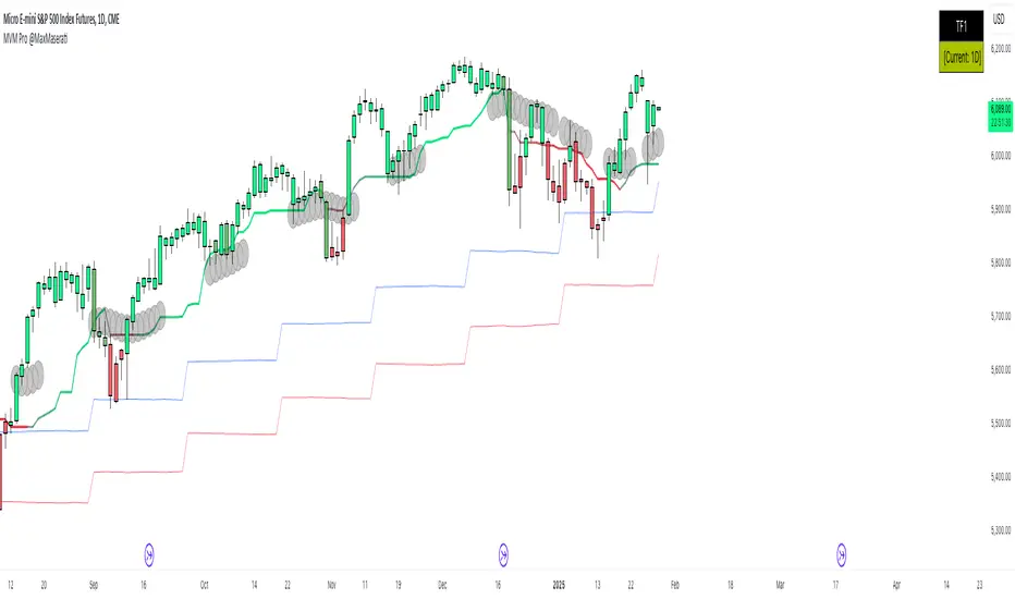
Market Volatility Momentum + Trend Filter Pro @MaxMaserati# 📊 Market Volatility Momentum + Trend Filter Pro
## 🎯 Overview
An enhanced version of the Market Momentum Indicator, combining the power of momentum analysis with adaptive volatility bands and trend filtering. This professional tool helps traders identify market direction and potential momentum shifts with greater precision.
## 🔄 Core Momentum Components
### 📈 Momentum Line
- Calculated using the midpoint between highest and lowest prices over 14 periods
- Provides a clear reference for price direction
- Acts as a dynamic support/resistance level
### 📉 Momentum Signal
- Offset from the Momentum Line by 0.25 tick size
- Creates a precise visual guide for momentum shifts
- Standard increment compatible with most markets
## 💫 Enhanced Features
### 🌊 Trend Filter
- Dynamic color-coding system showing trend strength
- Customizable length and damping parameters
- Visual identification of neutral market conditions
### 📊 Volatility Bands
- Adaptive bands that expand and contract with market volatility
- Choice between short-term and long-term trend adaptation
- Provides additional confirmation of trend strength
## 📝 Trading Signals
### 📈 Bullish Momentum
- Both momentum lines below price
- Enhanced by trend filter color confirmation
- Supported by volatility band positioning
### 📉 Bearish Momentum
- Both momentum lines above price
- Confirmed by trend filter color signals
- Reinforced by volatility band context
### ⚖️ Consolidation
- Momentum lines within price range
- Neutral trend indication with deep blue area
- Potential breakout preparation phase
## ⚙️ Multi-Timeframe Analysis
- Dual timeframe capability for comprehensive market view
- Custom timeframe selection with current chart reference
- Real-time timeframe display in top-right corner
## 🎨 Visual Features
- Dynamic bar coloring system reflecting trend strength
- Clear trend visualization through color gradients
- Optional line smoothing for reduced noise
- Customizable color schemes
## 💡 Tips for Usage
1. Monitor the position of price relative to momentum lines
2. Use trend filter colors for confirmation
3. Watch for convergence with volatility bands
4. Pay attention to neutral market signals
5. Utilize multi-timeframe analysis for better context
## ⚠️ Important Notes
- Originally designed without smoothing (smoothing optional)
- Best used with multiple timeframe analysis
- Provides clearest signals in trending markets
- Works effectively across all tradable assets
Note: Past performance doesn't guarantee future results. Always practice proper risk management and develop your trading plan.
ค้นหาในสคริปต์สำหรับ "Volatility"
Multi-Timeframe Volatility ATR - [by Oberlunar]This script (for now in beta release) is specifically designed for scalping or traders operating on lower timeframes (if you are in a timeframe of one minute wait one minute to collect statistics). Its primary purpose is to provide detailed insights into market volatility by calculating the ATR (Average True Range) and its percentage changes, allowing traders to quickly identify shifts in market conditions.
The ATR is calculated across six user-defined timeframes, which can include very short intervals such as 5 or 15 seconds. This setup enables real-time monitoring of volatility, which is critical for scalping strategies. The script collects a rolling history of the last five ATR values for each timeframe. These historical values are used to calculate percentage changes by comparing the current ATR with the oldest value in the history, offering a clear view of how volatility is evolving over time.
Percentage changes are displayed dynamically in a table, with color-coded feedback to indicate the direction of the change: green for increases, red for decreases, and gray for stability or insufficient data. This visual representation makes it easy to spot whether market volatility is rising or falling at a glance.
By progressively collecting data, the script becomes increasingly effective as more ATR values are accumulated. This functionality is especially useful for traders on lower timeframes, where rapid changes in volatility can signal breakout opportunities or shifts in market dynamics.
Soon I will update personalized ATR parameters, and lookback strategies for statistics.

Breadth of Volatility The Breadth of Volatility (BoV) is an indicator designed to help traders understand the activity and volatility of the market. It focuses on analyzing how fast prices are moving and how much trading volume is driving those movements. By combining these two factors—price speed and volume strength—the BoV provides a single value that reflects the current level of market activity. This can help traders identify when the market is particularly active or calm, which is useful for planning trading strategies.
The speed component of the BoV measures how quickly prices are moving compared to their recent average. This is done by using a metric called the Average True Range (ATR), which calculates the typical size of price movements over a specific period. The BoV compares the current price change to this average, showing whether the market is moving faster or slower than usual. Faster price movements generally indicate higher volatility, which might signal opportunities for active traders.
The strength component focuses on the role of trading volume in price changes. It multiplies the trading volume by the size of the price movement to create a value called volume strength. This value is then compared to the highest volume strength seen over a recent period, which helps gauge whether the current price action is being strongly supported by trading activity. When the strength value is high, it suggests that market participants are actively trading and supporting the price movement.
These two components—speed and strength—are averaged to calculate the Breadth of Volatility value. While the formula also includes a placeholder for a third component (related to fundamental analysis), it is currently inactive and does not influence the final value. The BoV is displayed as a line on a chart, with a zero line for reference. Positive BoV values indicate heightened market activity and volatility, while values near zero suggest a quieter market. This indicator is particularly helpful for new traders to monitor market conditions and adjust their strategies accordingly, whether they’re focusing on trend-following or waiting for calmer periods for more conservative trades.
Important Notice:
Trading financial markets involves significant risk and may not be suitable for all investors. The use of technical indicators like this one does not guarantee profitable results. This indicator should not be used as a standalone analysis tool. It is essential to combine it with other forms of analysis, such as fundamental analysis, risk management strategies, and awareness of current market conditions. Always conduct thorough research or consult with a qualified financial advisor before making trading decisions. Past performance is not indicative of future results.
Disclaimer:
Trading financial instruments involves substantial risk and may not be suitable for all investors. Past performance is not indicative of future results. This indicator is provided for informational and educational purposes only and should not be considered investment advice. Always conduct your own research and consult with a licensed financial professional before making any trading decisions.
Note: The effectiveness of any technical indicator can vary based on market conditions and individual trading styles. It's crucial to test indicators thoroughly using historical data and possibly paper trading before applying them in live trading scenarios.

Relative Measured Volatility (RMV) – Spot Tight Entry ZonesTitle: Relative Measured Volatility (RMV) – Spot Tight Entry Zones
Introduction
The Relative Measured Volatility (RMV) indicator is designed to highlight tight price consolidation zones , making it an ideal tool for traders seeking optimal entry points before potential breakouts. By focusing on tightness rather than general volatility, RMV offers traders a practical way to detect consolidation phases that often precede significant market moves.
How RMV Works
The RMV calculates short-term tightness by averaging three ATR (Average True Range) values over different lookback periods and then normalizing them within a specified lookback window. The result is a percentage-based scale from 0 to 100, indicating how tight the current price range is compared to recent history.
Here’s the breakdown:
Three ATR values are computed using user-defined short lookback periods to represent short-term price movements. An average of the ATRs provides a smoothed measure of current tightness. The RMV normalizes this average against the highest and lowest values over the defined lookback period, scaling it from 0 to 100.
This approach helps traders identify consolidation zones that are more likely to lead to breakouts.
Key Features of RMV
Multi-Period ATR Calculation : Uses three ATR values to effectively capture market tightness over the short term. Normalization : Converts the tightness measure to a 0-100 scale for easy interpretation. Dynamic Histogram and Background Colors : The RMV indicator uses a color-coded system for clarity.
How to Use the RMV Indicator
Identify Tight Consolidation Zones:
a - RMV values between 0-10 indicate very tight price ranges, making this the most optimal zone for potential entries before breakouts.
b - RMV values between 11-20 suggest moderate tightness, still favorable for entries.
Monitor Potential Breakout Areas:
As RMV moves from 21-30 , tightness reduces, signaling expanding volatility that may require wider stops or more flexible entry strategies.
Adjust Trading Strategies:
Use RMV values to identify tight zones for entering trades, especially in trending markets or at key support/resistance levels.
Customize the Indicator:
a - Adjust the short-term ATR lookback periods to control sensitivity.
b - Modify the lookback period to match your trading horizon, whether short-term or long-term.
Color-Coding Guide for RMV
ibb.co
How to Add RMV to Your Chart
Open your chart on TradingView.
Go to the “Indicators” section.
Search for "Relative Measured Volatility (RMV)" in the Community Scripts section.
Click on the indicator to add it to your chart.
Customize the input parameters to fit your trading strategy.
Input Parameters
Lookback Period : Defines the period over which tightness is measured and normalized.
Short-term ATR Lookbacks (1, 2, 3) : Control sensitivity to short-term tightness.
Histogram Threshold : Sets the threshold for differentiating between bright (tight) and dim (less tight) histogram colors.
Conclusion
The Relative Measured Volatility (RMV) is a versatile tool designed to help traders identify tight entry zones by focusing on market consolidation. By highlighting narrow price ranges, the RMV guides traders toward potential breakout setups while providing clear visual cues for better decision-making. Add RMV to your trading toolkit today and enhance your ability to identify optimal entry points!

Garman-Klass-Yang-Zhang Volatility EstimatorThe Garman-Klass-Yang-Zhang Volatility Estimator (GKYZVE) is yet another attempt to robustly measure volatility, integrating intra-candle and inter-candle dynamics. It is an extension of the Garman-Klass Volatility Estimator (GKVE) incorporating insights from the Yang-Zhang Volatility Estimator (YZVE) . Like the YZVE, the GKYZVE holistically considers open, high, low, and close prices. The formula for GKYZ is:
GKYZVE = 0.5 * σ_HL² + * σ_CC² + σ_OC²
Where:
σ_HL² is the variance based on the high and low prices (σ_HL² = (high - low)² / (4 * math.log(2))), weighted at 0.5.
σ_CC² is the close-to-close variance (σ_CC² = (close - close)²), weighted at (2 ln 2) -1 for the logarithmic distribution of returns and emphasizing the impact of day-to-day price changes.
σ_OC² is the variance of the opening price against the closing price (σ_OC² = 0.5 * (open - close)²), weighted at 1.
The GKYZVE differs from the YZVE by using fixed weighing factors derived from theoretical calculations, leaning heavier into the assumption that returns are log-distributed.
This script also offers a choice for normalization between 0 and 1, turning the estimator into an oscillator for comparing current volatility to recent levels. Horizontal lines at user-defined levels are also available for clearer visualization. Both options are off by default.
References:
Garman, M. B., & Klass, M. J. (1980). On the estimation of security price volatilities from historical data. The Journal of Business, 53(1), 67-78.
Yang, D., & Zhang, Q. (2000). Drift-independent volatility estimation based on high, low, open, and close prices. The Journal of Business, 73(3), 477-492.
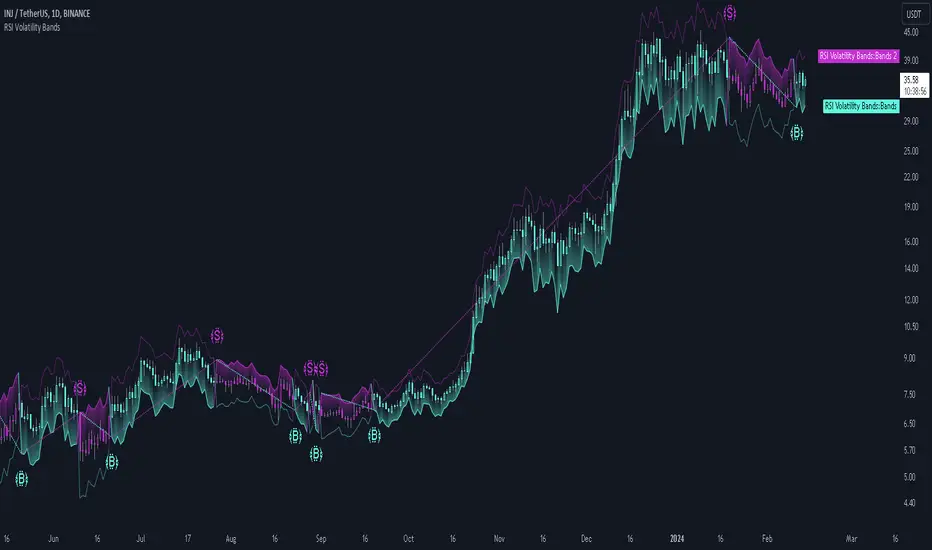
RSI Volatility Bands [QuantraSystems]RSI Volatility Bands
Introduction
The RSI Volatility Bands indicator introduces a unique approach to market analysis by combining the traditional Relative Strength Index (RSI) with dynamic, volatility adjusted deviation bands. It is designed to provide a highly customizable method of trend analysis, enabling investors to analyze potential entry and exit points in a new and profound way.
The deviation bands are calculated and drawn in a manner which allows investors to view them as areas of dynamic support and resistance.
Legend
Upper and Lower Bands - A dynamic plot of the volatility-adjusted range around the current price.
Signals - Generated when the RSI volatility bands indicate a trend shift.
Case Study
The chart highlights the occurrence of false signals, emphasizing the need for caution when the bands are contracted and market volatility is low.
Juxtaposing this, during volatile market phases as shown, the indicator can effectively adapt to strong trends. This keeps an investor in a position even through a minor drawdown in order to exploit the entire price movement.
Recommended Settings
The RSI Volatility Bands are highly customisable and can be adapted to many assets with diverse behaviors.
The calibrations used in the above screenshots are as follows:
Source = close
RSI Length = 8
RSI Smoothing MA = DEMA
Bandwidth Type = DEMA
Bandwidth Length = 24
Bandwidth Smooth = 25
Methodology
The indicator first calculates the RSI of the price data, and applies a custom moving average.
The deviation bands are then calculated based upon the absolute difference between the RSI and its moving average - providing a unique volatility insight.
The deviation bands are then adjusted with another smoothing function, providing clear visuals of the RSI’s trend within a volatility-adjusted context.
rsiVal = ta.rsi(close, rsiLength)
rsiEma = ma(rsiMA, rsiVal, bandLength)
bandwidth = ma(bandMA, math.abs(rsiVal - rsiEma), bandLength)
upperBand = ma(bandMA, rsiEma + bandwidth, smooth)
lowerBand = ma(bandMA, rsiEma - bandwidth, smooth)
long = upperBand > 50 and not (lowerBand < lowerBand and lowerBand < 50)
short= not (upperBand > 50 and not (lowerBand < lowerBand and lowerBand < 50))
By dynamically adjusting to market conditions, the RSI trend bands offer a unique perspective on market trends, and reversal zones.
LBR-Volatility Breakout BarsThe originator of this script is Linda Raschke of LBR Group.
This Pine Script code is the version 5 of LBR Paintbars for TradingView, called "LBR-Bars." It was originally coded for TradingView in version 3 by LazyBear. It is a complex indicator that combines various features such as coloring bars based on different conditions, displaying Keltner channels, and showing volatility lines.
Let me break down the key components and explain how it works:
1. Inputs Section: This section defines various input parameters that users can adjust when adding the indicator to their charts. These parameters allow users to customize the behavior and appearance of the indicator. Here are some of the key input parameters:
- Users can control whether to color bars under different conditions. For example,
they can choose to color LBR bars, color bars above/below Kelts, or color non-LBR
bars.
- Users can choose whether to show volatility lines or shade Keltner channels' area
with the Mid being the moving average on the chart.
- In the calculation of Keltner channels, users can set the length of the moving
average that the Keltner channels use as the mid and then set the Keltner multiplier.
If users want to use "True Range" to determine calculations, they can turn it on or
off; it defaults to off.
- Users can change the calculation of volatility lines and set the length for finding the
lowest and highest prices. The user sets the ATR length and multiplier for the ATR.
2. Calculation Section: This section defines the calculation of the upper and lower standard deviation bands based on the input parameters. It uses Exponential Moving Averages (EMAs) and optionally True Range to calculate these bands if turned on. These bands are used in the Keltner channel calculation.
3. Keltner Channel Section: This section calculates the upper, middle, and lower lines of the Keltner channels. It also plots these lines on the chart. The colors and visibility of these lines are controlled by user inputs.
4. Volatility Lines Section: This section calculates the upper and lower volatility lines based on the lowest and highest prices over a specified period and the ATR. It also checks whether the current close price is above or below these lines accordingly. The colors and visibility of these lines are controlled by user inputs.
5. Bar Colors Section: This section determines the color of the bars on the chart based on various conditions. It checks whether the current bar meets conditions like being an LBR bar, being above or below volatility lines, or being in "No Man's Land." The color of the bars is set accordingly based on user inputs.
This Pine Script creates an indicator that provides visual cues on the chart based on Keltner channels, volatility lines, and other customizable conditions. Users can adjust the input parameters to tailor the indicator's behavior and appearance to their trading preferences.
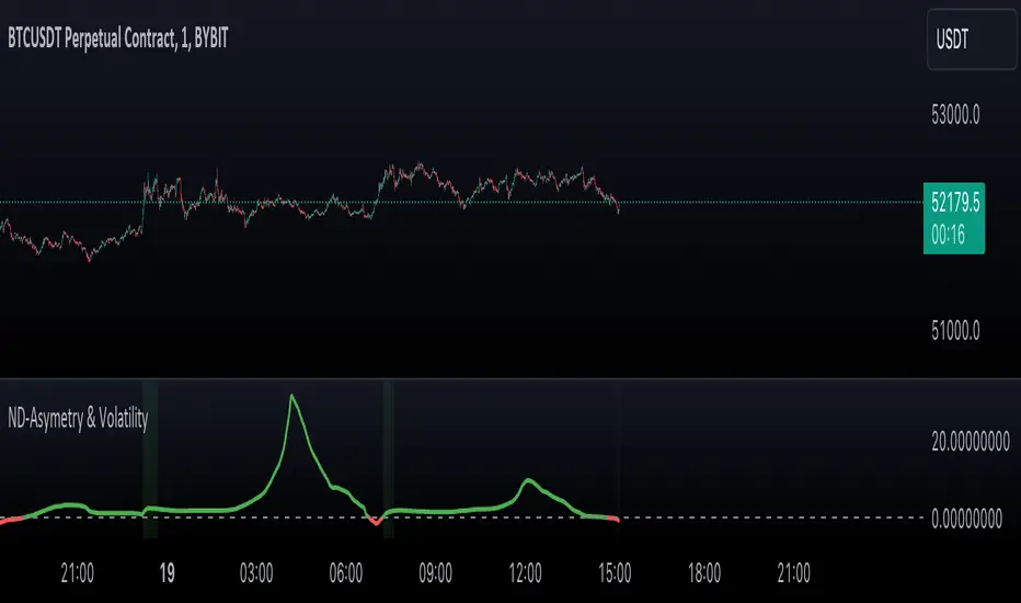
Normal Distribution Asymmetry & Volatility ZonesNormal Distribution Asymmetry & Volatility Zones Indicator provides insights into the skewness of a price distribution and identifies potential volatility zones in the market. The indicator calculates the skewness coefficient, indicating the asymmetry of the price distribution, and combines it with a measure of volatility to define buy and sell zones.
The key features of this indicator include :
Skewness Calculation : It calculates the skewness coefficient, a statistical measure that reveals whether the price distribution is skewed to the left (negative skewness) or right (positive skewness).
Volatility Zones : Based on the skewness and a user-defined volatility threshold, the indicator identifies buy and sell zones where potential price movements may occur. Buy zones are marked when skewness is negative and prices are below a volatility threshold. Sell zones are marked when skewness is positive and prices are above the threshold.
Signal Source Selection : Traders can select the source of price data for analysis, allowing flexibility in their trading strategy.
Customizable Parameters : Users can adjust the length of the distribution, the volatility threshold, and other parameters to tailor the indicator to their specific trading preferences and market conditions.
Visual Signals : Buy and sell zones are visually displayed on the chart, making it easy to identify potential trade opportunities.
Background Color : The indicator changes the background color of the chart to highlight significant zones, providing a clear visual cue for traders.
By combining skewness analysis and volatility thresholds, this indicator offers traders a unique perspective on potential market movements, helping them make informed trading decisions. Please note that trading involves risks, and this indicator should be used in conjunction with other analysis and risk management techniques.
Day of Week - Volatility Report█ OVERVIEW
The indicator analyses the volatility and reports statistics by the days of the week.
█ CONCEPTS
On business days and weekends, different market participants get involved in the markets. How does this affect the markets during the week?
Here are some ideas to explore:
When are the best days for trading?
Which day of the week is the market the most volatile?
Should you trade on business days? Is it worth trading during the weekend?
How does this relate to your most profitable trades?
Is there a confluence with the days having the highest win rate?
Which days of the week should you stop trading?
Ethereum
USDCAD
NZDUSD
█ FEATURES
Configurable outputs
Output the report statistics as mean or median.
█ HOW TO USE
Plot the indicator and visit the 1D, 24H, or 1440 minutes timeframe.
█ NOTES
Gaps
The indicator includes the volatility from gaps.
Calculation
The statistics are not reported from absolute prices (does not favor trending markets) nor percentage prices (does not depict the different periods of volatility that markets can go through). Instead, the script uses the prices relative to the average range of previous weeks (weekly ATR).
Trading session
The indicator analyses weekdays from the daily chart, defined by the exchange trading session (see Symbol Info).
Extended trading session
The indicator can include the extended hours when activated on the chart, using the 24H or 1440 minutes timeframe.
Overnight session
The indicator supports overnight sessions (open and close on different calendar days). For example, EURUSD will report Monday’s volatility from Sunday open at 17:00 to Monday close at 17:00.
This is a PREMIUM indicator. In complement, you might find useful my free Time of Day - Volatility Report .

Relative Bi-Directional Volatility RangeThe basic math behind this Indicator is very similar to the math behind the Relative Strength Index without using a standard deviation as used for the Relative Volatility Index. The Volatility Range is calculated by utilizing the highs and lows. However not in the same way as in the Relative Volatility Index. This approach leads to different values, but the overall result clearly reveals the intrinsic Volatility of the chart, so the user can be aware, when something fundamentally is going on behind the scenes. If the Volatility rises on positive and negative range (-100 to 100) it implies that something fundamental is changing.
An advantage of using this kind of calculation is the possibility of separating the data into positive (buy pressure) and negative (sell pressure) components. The bi-directional character shows a slightly overhang in one of the directions, which can be used to detect a trend. A Moving Average of the users choice shell smoothen the overhang of the Relative Bi-Directional Volatility and show a trend direction. Similar to the math of the Relative Strength Index as standard a Relative Moving Average is preferred. If the Moving Average is in the positive range (0 to 100) it indicates a bullish trend, else if the Moving Average is in the negative range (0 to -100) it indicates a bearish trend. External Indicators can use a provided Trend Shift Signal which switches from 0 to 1, if the trend becomes bullish or from 0 to -1, if the trend becomes bearish.
The user should know, that in this Indicator the starting point of the Moving Averages always begins at the first bar, because the starting progress is approximated appropriately. Most Moving Averages require a minimum number of bars to be calculated, which is chosen with the Moving Average Length. In this cases the length used will be automatically reduced in the background until the number of bars is sufficient to match the chosen length. So if data history is very short, the Indicator can be used never the less as good as possible.
It is feasible to switch the Indicator on a higher timeframe, while staying in a lower timeframe on the chart. This can be useful for making the indication cleaner, if the Moving Average is to choppy and shows too many false signals. On the other hand the benefit of a higher timeframe (or a higher Moving Average Length) is paid with higher latency of the signaling. So the user has to decide what the best setting in his case is.
This Indicator can be used with all kinds of charts. Even charts with percentage or negative values should work fine.
Parkinson's Historical Volatility Bands [Loxx]Parkinson's Historical Volatility Bands are constructed using:
Average as the middle line.
Upper and lower bands using the Parkinson's historical volatility (instead of "regular" Historical Volatility) for bands calculation.
What is Parkinson's Historical Volatility?
The Parkinson's number, or High Low Range Volatility developed by the physicist, Michael Parkinson in 1980, aims to estimate the Volatility of returns for a random walk using the High and Low in any particular period. IVolatility.com calculates daily Parkinson values. Prices are observed on a fixed time interval: n = 10, 20, 30, 60, 90, 120, 150, 180 days.
SH is stock's High price in t day.
SL is stock's Low price in t day.
High/Low Return (xt^HL) is calculated as the natural logarithm of the ratio of a stock's High price to stock's Low price.
Return:
And Parkinson's number: 1 / (4 * math.log(2)) * 252 / n * Σ (n, t =1) {math.log(Ht/Lt)^2}
An important use of the Parkinson's number is the assessment of the distribution prices during the day as well as a better understanding of the market dynamics. Comparing the Parkinson's number and periodically sampled volatility helps traders understand the tendency towards mean reversion in the market as well as the distribution of stop-losses.
The color of the middle line, unlike the bands colors, has 3 colors. When colors of the bands are the same, then the middle line has the same color, otherwise it's white.
Included
Alerts
Signals
Loxx's Expanded Source Types
Bar coloring

Directional Volatility Index (DVI) - SoldiDirectional Volatility Oscillator
What the DVI does is it measure 9 different volatility models based on their directional correlation and then scores that. While it calculated the volatility it also measures and scores 5 different indicators to find the likeliness of a retail position. That way the Oscillated value being plotted is that of an accurate modelled nature. This indicator aims to measure and score the directional volatility across the 9 different volatility models and then plots it as an oscillator. Included in that calculation is a measure of the likeliness of a retail traders position.
This can be used to gauge liquidity sweeps in a strategy like Smart Money Concepts. As, all the retail money is long - expect a sweep of the lows or equal highs. etc. more so you can also use this as a market meter like RSI , if the market is Over bought or Over sold, the DVI value will be over 100 or under -100 - or this tool can be used to gauge the underlaying trend!
Examples
Here is an example on BTCUSD - 1d
- as you can see there is significant trend when the DVI is crossed
Here is that same example on BTCUSD - 1d zoomed into 4h
- as you can see there is significant trend when the DVI is crossed

[CBB] Volatility Squeeze ToyThe main concept and features of this script are adapted from Mark Whistler's book "Volatility Illuminated". I have deviated from the use cases and strategies presented in the book, but the 3 Bollinger Bands use his optimized settings as the default length and standard deviation multiplier. Further insights into Mark's concepts and volatility research were gained by reading and watching some of TV user DadShark's materials (www.tradingview.com).
This script has been through many refinements and feature cycles, and I've added unrelated complimentary features not present in the book. The indicator is better studied than described, and unless you have read the book, any short summary of the material will just make you squint and think about the wrong things.
Here is a limited outline of features and concepts:
1. 3 Bollinger Bands of different length and/or deviation multiplier. Perhaps think of them as representing the various time frames that compression and expansion cycles and events manifest in, and also the expression of range, speed and price distribution within those time frames. You can gain insight into the magnitude of events based on how the three bands interact and stay contained, or not. If volatility is significant enough, all "time frames" represented by the bands will eventually record the event and subsequent price action, but the early signals will come from the spasms of the shortest, most volatile band. Many times the short band will contract again before, or just as it reaches a longer band, but in extreme cases, volatility will explode and all bands at all time frames will erupt in succession. In these cases you will see additional color representing shorter bands (lower time frame volatility in concept) traveling outside of longer bands. It is worth taking a look at the price levels and candles where these volatility bands cross each other.
2. In addition to the mean of the bands, there are a variety of other moving averages available to gauge trend, range, and areas of interest. This is accomplished with variable VWAP, ATR, smoothing, and a special derived loosely from the difference between them.
3. The bands are also used to derive conditions under which volatility is considered compressed, or in "squeeze" . Under these conditions the candles will turn yellow. Depending on your chart settings and indicator settings, these zones can be completely useless or drag on through fairly significant price action. Or, the can give you fantastic levels to watch for breakouts. The point is that volatility is compressed during these conditions, and you should expect the inevitable once this condition ends. Sometimes you can find yourself in a nice fat trend straight away, other times you may blow an account because you gorged your position based on arbitrary bar color. It's not like that. Pay attention to the highest and lowest bars of these squeeze ranges, and carefully observe future price action when it returns to these squeeze ranges. This info is more and more valuable at higher time frames.
The 3 bands, a smoothed long trend VWAP, and the squeeze condition colored bars are all active by default. All features can be shown or hidden on the control panel.
There are some deep market insights to mine if you live with this one for a while. As with any indicator, blunt "buy/sell here" approaches will lead to loss and frustration. however , if you pay attention to squeeze range, band/moving average confluence, high volume and/or large range candles their open/close behavior around these areas and squeeze ranges, you will start to catch the beginning of some powerful momentum moves.
Enjoy!

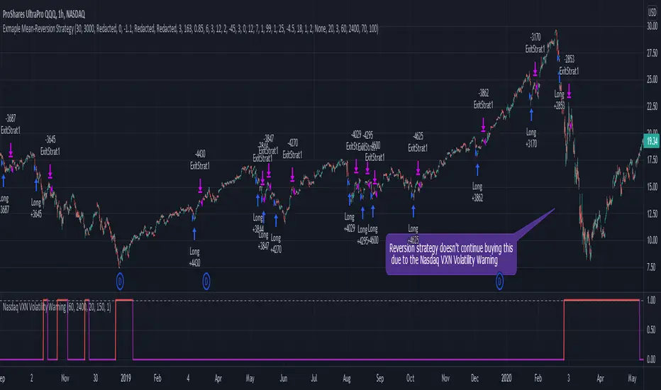
Nasdaq VXN Volatility Warning IndicatorToday I am sharing with the community a volatility indicator that uses the Nasdaq VXN Volatility Index to help you or your algorithms avoid black swan events. This is a similar the indicator I published last week that uses the SP500 VIX, but this indicator uses the Nasdaq VXN and can help inform strategies on the Nasdaq index or Nasdaq derivative instruments.
Variance is most commonly used in statistics to derive standard deviation (with its square root). It does have another practical application, and that is to identify outliers in a sample of data. Variance is defined as the squared difference between a value and its mean. Calculating that squared difference means that the farther away the value is from the mean, the more the variance will grow (exponentially). This exponential difference makes outliers in the variance data more apparent.
Why does this matter?
There are assets or indices that exist in the stock market that might make us adjust our trading strategy if they are behaving in an unusual way. In some instances, we can use variance to identify that behavior and inform our strategy.
Is that really possible?
Let’s look at the relationship between VXN and the Nasdaq100 as an example. If you trade a Nasdaq index with a mean reversion strategy or algorithm, you know that they typically do best in times of volatility . These strategies essentially attempt to “call bottom” on a pullback. Their downside is that sometimes a pullback turns into a regime change, or a black swan event. The other downside is that there is no logical tight stop that actually increases their performance, so when they lose they tend to lose big.
So that begs the question, how might one quantitatively identify if this dip could turn into a regime change or black swan event?
The Nasdaq Volatility Index ( VXN ) uses options data to identify, on a large scale, what investors overall expect the market to do in the near future. The Volatility Index spikes in times of uncertainty and when investors expect the market to go down. However, during a black swan event, historically the VXN has spiked a lot harder. We can use variance here to identify if a spike in the VXN exceeds our threshold for a normal market pullback, and potentially avoid entering trades for a period of time (I.e. maybe we don’t buy that dip).
Does this actually work?
In backtesting, this cut the drawdown of my index reversion strategies in half. It also cuts out some good trades (because high investor fear isn’t always indicative of a regime change or black swan event). But, I’ll happily lose out on some good trades in exchange for half the drawdown. Lets look at some examples of periods of time that trades could have been avoided using this strategy/indicator:
Example 1 – With the Volatility Warning Indicator, the mean reversion strategy could have avoided repeatedly buying this pullback that led to this asset losing over 75% of its value:
Example 2 - June 2018 to June 2019 - With the Volatility Warning Indicator, the drawdown during this period reduces from 22% to 11%, and the overall returns increase from -8% to +3%
How do you use this indicator?
This indicator determines the variance of VXN against a long term mean. If the variance of the VXN spikes over an input threshold, the indicator goes up. The indicator will remain up for a defined period of bars/time after the variance returns below the threshold. I have included default values I’ve found to be significant for a short-term mean-reversion strategy, but your inputs might depend on your risk tolerance and strategy time-horizon. The default values are for 1hr VXN data/charts. It will pull in variance data for the VXN regardless of which chart the indicator is applied to.
Disclaimer: Open-source scripts I publish in the community are largely meant to spark ideas or be used as building blocks for part of a more robust trade management strategy. If you would like to implement a version of any script, I would recommend making significant additions/modifications to the strategy & risk management functions. If you don’t know how to program in Pine, then hire a Pine-coder. We can help!
Squeeze Momentum + Volatility [LeonidasCrypto]Based on Squeeze Momentum indicator by LazyBear
This custom version of SQ is part of my Trading System.
How to use it.
Please read the description of the original author of this indicator here.
Volatility .
When the market is contracting or sideways usually you will see red or blue dots.
Blue dots. the market is in sideways and the volatility is low.
Red dots. the market is in the climax of volatility usually after of a big move this is a potential signal the peak of the move is near.
I added volatility to SQ because I consider volatility is a key factor for trading to anticipate the moves.

Smoothed Relative Volatility Index W/2 EMAThis script is a reboot of the relative volatility index that adds a smoothing factor to the indicator which eliminates a significant amount of the noise/signal ratio.
The relative volatility index is defined as the following from tradingism.com:
"Relative Volatility Index Definition
The relative volatility index (RVI) was developed by Donald Dorsey, who truly understood that an indicator is not the holy grail of trading. The RVI is identical to the relative strength index , except it measures the standard deviation of high and low prices over a defined range of periods. The RVI can range from 0 to 100 and unlike many indicators that measure price movement, the RVI does an exceptional job of measuring market strength.
Purpose of Relative Volatility Index
The relative volatility index was designed not as a standalone indicator, but as a confirmation for trading signals. The RVI is most widely used in conjunction with moving average crossover signals."
The rules of the RVI are to sell below the 50 line and buy above the 50 line. The 2 EMA's I added act as a "dynamic" 50 line and also provide crossover signals.
The smoothed relative volatility index included, is accompanied by the original relative volatility index as an option with its own EMA's.
The smoothing factor provides divergence signals and/or an added layer of confirmation from other indicators.
On the chart above is the smoothed relative volatility index above the original set to the same time period for comparison.

UCS_Price Action Normalized VolatilityFor Stock, Futures and Forex traders this may not be a replacement for MACD . But for an Option Trader, this would make sense 1000 times.
So, What is this?
This is the MACD for OPTIONS traders, remove the smoothness and adjust for volatility . Thats all it is.
Why is it important?
No one, ABSOLUTELY no one should be buying options in high volatility period for a long haul. So, this indicator takes that out of your guess work and only spits out price movement with relation to volatility .
You can use this exactly like a MACD for any options ( aka , volatility driven market).
Few things I have added, since I created and used it privately.
1. Chop Zone - Trade the Extremes of any Product
2. Buyers Zone - Shorts reconsider
3. Sellers Zone - Longs reconsider
Why did I create this?
Volatility dictates the market movement. That is an indepth conversation. If you are curious you can research on how shorts are squeezed, what are market makers obligations, how they maintain profitability. How NITE got burned, are some starting point for your own research.
So, if you are an options trader, I highly recommend to use this/test it and share your thoughts and how you use it.
- Good Luck Everyone.
Parkinson Historical VolatilityFirst off, a huge thank you to the following people:
theheirophant: www.tradingview.com
alexgrover: www.tradingview.com
NGBaltic: www.tradingview.com
The Parkinson Historical Volatility (PHV), developed in 1980 by the physicist Michael Parkinson, aims to estimate the volatility of returns for a random walk using the high and low in any particular period. An important use of the PHV is the assessment of the distribution prices during the day as well as a better understanding of the market dynamics. Comparing the PHV and a periodically sampled volatility helps traders understand the tendency towards mean reversion in the market as well as the distribution of stop-losses.
This script allows you to transform the volatility reading. The intention of this is to be able to compare volatility across different assets and timeframes. Having a relative reading of volatility also allows you to better gauge volatility within the context of current market conditions.
For the signal lie I chose a repulsion moving average to remove choppy crossovers of the estimator and the signal. This may have been a mistake, so in the near-future I might update so that the MA can be selected. Let me know if you have any opinions either way.
References
www.rdocumentation.org
www.ivolatility.com
Want to Learn?
If you'd like the opportunity to learn Pine but you have difficulty finding resources to guide you, take a look at this rudimentary list: docs.google.com
The list will be updated in the future as more people share the resources that have helped, or continue to help, them. Follow me on Twitter to keep up-to-date with the growing list of resources.
Suggestions or Questions?
Don't even kinda hesitate to forward them to me. My (metaphorical) door is always open.

@WACC Volatility Weighted PUT/CALL Positions [SPX]This indicator is based on Volatility and Market Sentiment. When volatility is high, and market sentiment is positive, the indicator is in a low or 'buy state'. When volatility is low and market sentiment is poor, the indicator is high.
The indicator uses the VIX as it's volatility input.
The indicator uses the spread between the Call Volume on SPX/SPY and the Put Volume.
This is pulled from CVSPX and PVSPX.
When volatility and put/call reaches a critical level, such as the levels present in a crisis or a sell off, the line will be green. See Sept 2015, 2008, and Feb 2018.
This level can be edited in the source code.
As the indicator is based on Put/Call, the indicator works best on larger time frames as the put/call ratio becomes a more discernible measure of sentiment over time.

Historical Volatility Strategy Strategy buy when HVol above BuyBand and close position when HVol below CloseBand.
Markets oscillate from periods of low volatility to high volatility
and back. The author`s research indicates that after periods of
extremely low volatility, volatility tends to increase and price
may move sharply. This increase in volatility tends to correlate
with the beginning of short- to intermediate-term moves in price.
They have found that we can identify which markets are about to make
such a move by measuring the historical volatility and the application
of pattern recognition.
The indicator is calculating as the standard deviation of day-to-day
logarithmic closing price changes expressed as an annualized percentage.

Historical Volatility Markets oscillate from periods of low volatility to high volatility
and back. The author`s research indicates that after periods of
extremely low volatility, volatility tends to increase and price
may move sharply. This increase in volatility tends to correlate
with the beginning of short- to intermediate-term moves in price.
They have found that we can identify which markets are about to make
such a move by measuring the historical volatility and the application
of pattern recognition.
The indicator is calculating as the standard deviation of day-to-day
logarithmic closing price changes expressed as an annualized percentage.

Volatility Cones **Volatility Cones - Interactive**
This indicator visualizes volatility cones based on historical or manual volatility and projects them up to 252 trading days into the future.
**Features:**
- Automatic start at the first trading day of the year (customizable)
- Volatility calculation from historical data or manual input
- Display of ±1σ, ±2σ, and ±3σ bands
- Projection of expected price movements based on volatility
**Use Case:**
Ideal for options traders and risk management to assess expected price movements over different time horizons.

Vasyl Ivanov | Volatility with MAThis indicator calculates and displays the volatility value for each bar.
The main line shows the relative range (spread) of the current bar compared to its closing price.
This allows you to quickly assess how much the price fluctuated within the bar relative to where it closed.
The Simple Moving Average (SMA) with a length of 9 smooths the main indicator values, helping to identify volatility trends and filter out random spikes.
Practical Application:
The indicator can be useful for assessing current market volatility and identifying periods with unusually wide or narrow ranges.
The smoothed line helps track medium-term changes in volatility and can be used to confirm trading signals related to range expansion or contraction.
