Adaptive Volatility Bands | AlphaNattAdaptive Volatility Bands (AVB) | AlphaNatt
Professional-grade dynamic bands that adapt to market volatility and trend strength, featuring smooth gradient visualization for enhanced chart clarity.
🎯 CORE CONCEPT
AVB creates self-adjusting bands around a customizable basis line, expanding during trending markets and contracting during consolidation. The gradient fill provides instant visual feedback on price position within the volatility envelope.
✨ KEY FEATURES
5 Basis Types: Choose between SMA, EMA, ALMA, KAMA, or VWMA for the centerline calculation
Adaptive Band Width: Bands automatically widen in strong trends and tighten in ranging markets
Smooth Gradient Fills: 10-layer gradient on each side for professional depth visualization
Multiple Volatility Metrics: ATR, Standard Deviation, or Range-based calculations
Squeeze Detection: Identifies Bollinger/Keltner squeeze conditions for breakout anticipation
Dynamic Color States: Cyan (#00F1FF) for bullish, Magenta (#FF019A) for bearish conditions
📊 HOW IT WORKS
The basis line is calculated using your selected moving average type
Volatility is measured using ATR, StDev, or Range
Trend strength is quantified via linear regression
Band width adapts based on normalized trend strength (when enabled)
Gradient layers create smooth visual transitions from bands to basis
Color state changes based on price position and basis direction
🔧 PARAMETER GROUPS
Basis Configuration:
Basis Type: Moving average calculation method
Basis Length (20): Period for centerline calculation
ALMA Settings: Offset (0.85) and Sigma (6) for ALMA basis
Volatility Settings:
Volatility Method: ATR, Standard Deviation, or Range
Volatility Length (14): Lookback for volatility calculation
Band Multiplier (2.0): Distance of bands from basis
Adaptive Settings:
Enable Adaptive (true): Toggle dynamic band adjustment
Adaptation Period (50): Trend strength measurement window
Squeeze Detection:
BB/KC Parameters: Settings for squeeze identification
Expansion Threshold: Multiplier for expansion signals
📈 TRADING SIGNALS
Long Conditions:
Price crosses above basis
Basis line is rising
Band color shifts to cyan
Short Conditions:
Price crosses below basis
Basis line is falling
Band color shifts to magenta
💡 USAGE STRATEGIES
Trend Following: Trade with the basis direction when bands are expanding
Mean Reversion: Fade moves to outer bands during squeeze conditions
Breakout Trading: Enter on expansion signals after squeeze periods
Support/Resistance: Use bands as dynamic S/R levels
Position Sizing: Wider bands suggest higher volatility - adjust size accordingly
🎨 VISUAL ELEMENTS
Gradient Fills: 10 opacity layers creating smooth band transitions
Dynamic Colors: State-dependent coloring for instant trend recognition
Basis Line: Bold centerline changes color with trend state
Band Lines: Outer boundaries with matching state colors
⚡ BEST PRACTICES
The AVB indicator works optimally on liquid instruments with consistent volume. The adaptive feature performs best in trending markets but can generate false signals during choppy conditions. Consider using alongside momentum indicators for confirmation. The gradient visualization helps identify price position within the volatility envelope at a glance.
🔔 ALERTS INCLUDED
Long/Short Signals
Squeeze Conditions
Expansion Breakouts
Band Touch Events
Version 6 | Pine Script™ | © AlphaNatt
ค้นหาในสคริปต์สำหรับ "Volatility"

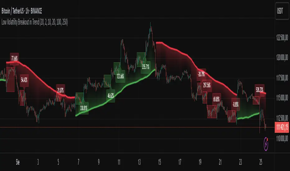
Low Volatility Breakout in Trend
█ OVERVIEW
"Low Volatility Breakout in Trend" is a technical analysis tool that identifies periods of low-volatility consolidation within an ongoing trend and signals potential breakouts aligned with the trend's direction. The indicator detects trends using a simple moving average (SMA) of price, identifies consolidation zones based on the size of candle bodies, and displays the percentage change in volume (volume delta) at the breakout moment.
█ CONCEPTS
The core idea of the indicator is to pinpoint moments where traders can join an ongoing trend by capitalizing on breakouts from consolidation zones, supported by additional information such as volume delta. It provides clear visualizations of trends, consolidation zones, and breakout signals to facilitate trading decisions.
Why Use It?
* Breakout Identification: The indicator locates low-volatility consolidation zones (measured by the size of individual candle bodies, not the price range of the consolidation) and signals breakouts, enabling traders to join the trend at key moments.
* Volume Analysis: Displays the percentage change in volume (delta) relative to its simple moving average, providing insight into market activity rather than acting as a signal filter.
* Visual Clarity: Colored trend lines, consolidation boxes (drawn only after the breakout candle closes, not on subsequent candles), and volume delta labels enable quick chart analysis.
* Flexibility: Adjustable parameters, such as the volatility window length or SMA period, allow customization for various trading strategies and markets.
How It Works
* Trend Detection: The indicator calculates a simple moving average (SMA) of price (default: based on the midpoint of high/low) and creates dynamic trend bands, offset by a percentage of the average candle height (band scaling). A price above the upper band signals an uptrend, while a price below the lower band indicates a downtrend. Trend changes occur not when the price crosses the SMA but when it crosses above the upper band or below the lower band (offset by the average candle height multiplied by the scaling factor).
* Consolidation Identification: Identifies low-volatility zones when the candle body size is smaller than the average body size over a specified period (default: 20 candles) multiplied by a volatility threshold — the maximum allowable body size as a percentage of the average body (e.g., 2 means the candle body must be less than twice the average body to be considered low-volatility).
* Breakout Signals: A breakout occurs when the candle body exceeds the volatility threshold, is larger than the maximum body in the consolidation, and aligns with the trend direction (bullish in an uptrend, bearish in a downtrend).
* Visualization: Draws a trend line with a gradient, consolidation boxes (appearing only after the breakout candle closes, marking the consolidation zone), and volume delta labels. Optionally displays breakout signal arrows.
* Signals and Alerts: The indicator generates signals for bullish and bearish breakouts, including the volume delta percentage. Alerts are an additional feature that can be enabled for notifications.
Settings and Customization
* Volatility Window: Length of the period for calculating the average candle body size (default: 20).
* Volatility Threshold: Maximum candle body size as a percentage of the average body (default: 2).
* Minimum Consolidation Bars: Number of candles required for a consolidation (default: 10).
* SMA Length for Trend: Period of the SMA for trend detection (default: 100).
* Band Scaling: Offset of trend bands as a percentage of the average candle height (default: 250%), determining the distance from the SMA.
* Visualization Options: Enable/disable consolidation boxes (Show Consolidation Boxes, drawn after the breakout candle closes), volume delta labels (Show Volume Delta Labels), and breakout signals (Show Breakout Signals, e.g., triangles).
* Colors: Customize colors for the trend line, consolidation boxes, and volume delta labels.
█ OTHER SECTIONS
Usage Examples
* Joining an Uptrend: When the price breaks out of a consolidation in an uptrend with a volume delta of +50%, open a long position; the signal is stronger if the breakout candle surpasses a local high.
* Avoiding False Breakouts: Ignore breakout signals with low volume delta (e.g., below 0%) and combine the indicator with other tools (e.g., support/resistance levels or oscillators) to confirm moves in low-activity zones.
Notes for Users
* On markets that do not provide volume data, the indicator will not display volume delta — disable volume labels and enable breakout signals (e.g., triangles) instead.
* Adjust parameters to suit the market's characteristics to minimize noise.
* Combine with other tools, such as Fibonacci levels or oscillators, for greater precision.
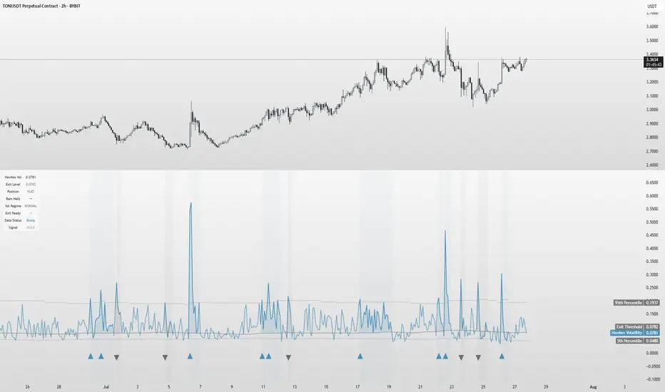
Hawkes Volatility Exit IndicatorOverview
The Hawkes Volatility Exit Indicator is a powerful tool designed to help traders capitalize on volatility breakouts and exit positions when momentum fades. Built on the Hawkes process, it models volatility clustering to identify optimal entry points after quiet periods and exit signals during volatility cooling. Designed to be helpful for swing traders and trend followers across markets like stocks, forex, and crypto.
Key Features Volatility-Based Entries: Detects breakouts when volatility spikes above the 95th percentile (adjustable) after quiet periods (below 5th percentile).
This indicator is probably better on exits than entries.
Smart Exit Signals: Triggers exits when volatility drops below a customizable threshold (default: 30th percentile) after a minimum hold period.
Hawkes Process: Uses a decay-based model (kappa) to capture volatility clustering, making it responsive to market dynamics.
Visual Clarity: Includes a volatility line, exit threshold, percentile bands, and intuitive markers (triangles for entries, X for exits).
Status Table: Displays real-time data on position (LONG/SHORT/FLAT), volatility regime (HIGH/LOW/NORMAL), bars held, and exit readiness.
Customizable Alerts: Set alerts for breakouts and exits to stay on top of trading opportunities.
How It Works Quiet Periods: Identifies low volatility (below 5th percentile) that often precede significant moves.
Breakout Entries: Signals bullish (triangle up) or bearish (triangle down) entries when volatility spikes post-quiet period.
Exit Signals: Suggests exiting when volatility cools below the exit threshold after a minimum hold (default: 3 bars).
Visuals & Table: Tracks volatility, position status, and signals via lines, shaded zones, and a detailed status table.
Settings
Hawkes Kappa (0.1): Adjusts volatility decay (lower = smoother, higher = more sensitive).
Volatility Lookback (168): Sets the period for percentile calculations.
ATR Periods (14): Normalizes volatility using Average True Range.
Breakout Threshold (95%): Volatility percentile for entries.
Exit Threshold (30%): Volatility percentile for exits.
Quiet Threshold (5%): Defines quiet periods.
Minimum Hold Bars (3): Ensures positions are held before exiting.
Alerts: Enable/disable breakout and exit alerts.
How to Use
Entries: Look for triangle markers (up for long, down for short) and confirm with the status table showing "ENTRY" and "LONG"/"SHORT."
Exits: Exit on X cross markers when the status table shows "EXIT" and "Exit Ready: YES."
Monitoring: Use the status table to track position, bars held, and volatility regime (HIGH/LOW/NORMAL).
Combine: Pair with price action, support/resistance, or other indicators for better context.
Tips : Adjust thresholds for your market: lower breakout thresholds for more signals, higher exit thresholds for earlier exits.
Test on your asset to ensure compatibility (best for markets with volatility clustering).
Use alerts to automate signal detection.
Limitations Requires sufficient data (default: 168 bars) for reliable signals. Check "Data Status" in the table.
Focuses on volatility, not price direction—combine with trend tools.
May lag slightly due to the smoothing nature of the Hawkes process.
Why Use It?
The Hawkes Volatility Exit Indicator offers a unique, data-driven approach to timing trades based on volatility dynamics. Its clear visuals, customizable settings, and real-time status table make it a valuable addition to any trader’s toolkit. Try it to catch breakouts and exit with precision!
This indicator is based on neurotrader888's python repo. All credit to him. All mistakes mine.
This conversion published for wider attention to the Hawkes method.
VWVI - Volume Weighted Volatility Index# 📊 Complete VWVI Indicator User Guide (Current Version)
## 🔍 **I. Core Principles**
### **VWVI's Unique Value**
VWVI isn't a simple volatility indicator, but a **volume-confirmed volatility strength indicator**:
- **Problems with traditional volatility indicators**: ATR, Bollinger Bands, etc. only look at price movements while ignoring volume
- **VWVI advantage**: Only fluctuations accompanied by high volume are considered "true volatility"
- **Core logic**: Fluctuations driven by large capital are more important than retail noise
---
## 🎨 **II. Detailed Explanation of Current Version Visual Elements**
### **1. Main Line Color System (Most Important Signal)**
```
🟢 Green main line (VWVI > 60):
├─ Meaning: High volatility + high volume = true trend
├─ Market state: One-way market, breakout market, trend acceleration
├─ Trading opportunity: Trend following, momentum trading
└─ Duration: Typically lasts several cycles
🟠 Orange main line (40 ≤ VWVI ≤ 60):
├─ Meaning: Medium volatility or mismatched volume
├─ Market state: Transition phase, direction pending
├─ Trading strategy: Wait-and-see, await clear signals
└─ Note: High probability of false breakouts
🔴 Red main line (VWVI < 40):
├─ Meaning: Low volatility + low volume = consolidation
├─ Market state: Sideways, range-bound, shrinking volume
├─ Trading opportunity: Range trading, mean reversion
└─ Feature: Price oscillates between support/resistance
```
### **2. Reference Line System (Auxiliary Judgment)**
```
🟢 Trend threshold line (default 60):
├─ Function: Watershed for trend confirmation
├─ Breakout upward: Trend begins confirmation
├─ Break downward: Trend weakening or ending
└─ Adjustment suggestion: Can adjust based on market characteristics (50-70)
🔴 Range threshold line (default 40):
├─ Function: Confirmation line for range-bound markets
├─ Break downward: Range-bound market confirmed
├─ Breakout upward: Range may be ending
└─ Adjustment suggestion: Can adjust based on volatility (30-50)
⚫ Center line (50):
├─ Function: Market neutral reference
├─ Above: Trend characteristics
├─ Below: Range characteristics
└─ Meaning: Long-term equilibrium position
```
### **3. Background Coloring System (State Identification)**
```
🟢 Light green background:
├─ Trigger: VWVI > trend threshold
├─ Meaning: Trend confirmation period
├─ Trading suggestion: Trend following strategy
└─ Risk: Possible reversal at trend end
🔴 Light red background:
├─ Trigger: VWVI < range threshold
├─ Meaning: Range-bound confirmation period
├─ Trading suggestion: Range trading strategy
└─ Opportunity: Look for support/resistance levels
🟩 Green background flashing:
├─ Trigger: VWVI breaks through trend threshold
├─ Meaning: Trend signal generated
├─ Action: Consider establishing trend positions
└─ Confirmation: Needs other indicators
🟥 Red background flashing:
├─ Trigger: VWVI breaks below range threshold
├─ Meaning: Range signal generated
├─ Action: Consider range trading strategy
└─ Confirmation: Observe persistence
```
### **4. Information Panel (Upper Right Corner)**
```
📊 Real-time data display:
├─ VWVI value: Current indicator reading
├─ Current state: Trend/Range/Neutral
├─ Volume status: Above/Below 20-day average
├─ Volatility strength: High/Low volatility
├─ Trend threshold: Current setting
└─ Range threshold: Current setting
```
---
## 📈 **III. Specific Usage Methods**
### **A. Trend Following Strategy**
```
🎯 Entry timing:
✅ VWVI breaks above 60 from below (green background flashing)
✅ Main line turns green and continues rising
✅ Volume status shows "above average"
✅ Volatility strength shows "high volatility"
📍 Position management:
- Continue holding: VWVI remains above 60
- Reduce position warning: VWVI starts declining but still >50
- Stop loss exit: VWVI breaks below 50 or turns orange
⚠️ Risk control:
- False breakout: VWVI quickly falls back after breaking 60
- Trend end: VWVI oscillates at high levels
```
### **B. Range Trading Strategy**
```
🎯 Confirm range:
✅ VWVI breaks below 40 (red background flashing)
✅ Main line turns red and lingers at low levels
✅ Volume status shows "below average"
✅ Volatility strength shows "low volatility"
📍 Trading strategy:
- Upper range: Look for resistance to short
- Lower range: Look for support to long
- Stop loss: Breakout beyond range boundaries
- Profit target: Near range midpoint
⚠️ Notes:
- False breakouts may occur at range end
- Abnormal volume spikes may signal trend change
```
### **C. State Transition Strategy**
```
🔄 Range→Trend transition:
- Observe: VWVI rises from <40 to 40-60 range
- Prepare: Orange main line phase preparation
- Confirm: Consider entry when breaking 60
- Verify: Whether volume expands simultaneously
🔄 Trend→Range transition:
- Warning: VWVI declines from >60 to 40-60 range
- Reduce position: Gradually reduce in orange phase
- Confirm: Switch to range strategy when breaking 40
- Observe: Whether it's a trend pullback
```
---
## ⚠️ **IV. Common Mistakes and Precautions**
### **❌ Common Mistakes**
1. **Mistake 1: Using VWVI alone**
- ❌ Wrong: Making trading decisions based solely on VWVI
- ✅ Correct: Combine with price action, support/resistance, other indicators
2. **Mistake 2: Ignoring volume confirmation**
- ❌ Wrong: Only looking at VWVI values, ignoring volume status
- ✅ Correct: VWVI signal + volume confirmation = more reliable signal
3. **Mistake 3: Overtrading**
- ❌ Wrong: Trading every color change
- ✅ Correct: Wait for clear state transition signals
4. **Mistake 4: Fixed thresholds**
- ❌ Wrong: Using 60/40 thresholds for all markets
- ✅ Correct: Adjust parameters for different products
5. **Mistake 5: Ignoring background information**
- ❌ Wrong: Not considering market environment and fundamentals
- ✅ Correct: Combine with market cycles and important events
### **⚡ Special Situation Handling**
```
🚨 Abnormal signal identification:
- VWVI spikes sharply >80: May indicate sudden events
- VWVI remains <20 long-term: Extreme market contraction
- Frequent oscillation near thresholds: Market indecision
- Volume-VWVI divergence: Requires caution
🎯 Optimal usage environment:
✅ Suitable: Actively traded mainstream products
✅ Suitable: Markets with sufficient historical data
✅ Suitable: Exchanges with accurate volume data
❌ Not suitable: Extremely low liquidity products
❌ Not suitable: Heavily manipulated small coins
❌ Not suitable: Newly listed products (insufficient data)
```
### **🔧 Parameter Optimization Suggestions**
```
📊 Parameter suggestions for different markets:
- BTC/ETH major coins: Keep default 14/60/40
- Altcoins: Can adjust to 10/65/35 (more sensitive)
- Stock market: Can adjust to 20/55/45 (more stable)
- Forex market: Can adjust to 21/58/42 (follow tradition)
⏱️ Different timeframes:
- 1-minute: Not recommended (too noisy)
- 5-15 minutes: Short-term trading, can adjust sensitivity
- 1-4 hours: Medium-term trading, keep defaults
- Daily: Long-term analysis, can be more conservative
```
**Summary: VWVI is a powerful market state identification tool, but requires correct understanding of its meaning, combination with other analysis methods, and avoidance of overtrading to maximize effectiveness.**
# 📊 VWVI指标完全使用指南(当前版本)
## 🔍 **一、指标核心原理**
### **VWVI的独特价值**
VWVI不是简单的波动率指标,而是**成交量确认的波动强度指标**:
- **传统波动率指标问题**:ATR、布林带等只看价格波动,忽略了成交量
- **VWVI的优势**:只有伴随大成交量的波动才被认为是"真实波动"
- **核心逻辑**:大资金推动的波动比散户噪音更重要
---
## 🎨 **二、当前版本视觉元素详解**
### **1. 主线颜色系统(最重要的信号)**
```
🟢 绿色主线 (VWVI > 60):
├─ 含义:高波动 + 高成交量 = 真实趋势
├─ 市场状态:单边行情、突破行情、趋势加速
├─ 交易机会:趋势跟随、动量交易
└─ 持续时间:通常持续数个周期
🟠 橙色主线 (40 ≤ VWVI ≤ 60):
├─ 含义:中等波动或成交量不匹配
├─ 市场状态:过渡阶段、方向待定
├─ 交易策略:观望、等待明确信号
└─ 注意:假突破高发区域
🔴 红色主线 (VWVI < 40):
├─ 含义:低波动 + 低成交量 = 震荡整理
├─ 市场状态:横盘、区间震荡、成交萎缩
├─ 交易机会:区间交易、均值回归
└─ 特征:价格在支撑阻力间反复
```
### **2. 参考线系统(辅助判断)**
```
🟢 趋势阈值线 (默认60):
├─ 作用:趋势确认的分水岭
├─ 突破向上:趋势行情开始确认
├─ 跌破向下:趋势减弱或结束
└─ 调整建议:可根据市场特性调整(50-70)
🔴 震荡阈值线 (默认40):
├─ 作用:震荡行情的确认线
├─ 跌破向下:震荡行情确认
├─ 突破向上:震荡可能结束
└─ 调整建议:可根据波动性调整(30-50)
⚫ 中线 (50):
├─ 作用:市场中性参考
├─ 上方:偏向趋势特征
├─ 下方:偏向震荡特征
└─ 意义:长期均衡位置
```
### **3. 背景着色系统(状态识别)**
```
🟢 淡绿色背景:
├─ 触发:VWVI > 趋势阈值
├─ 含义:趋势行情确认期
├─ 交易建议:趋势跟随策略
└─ 风险:趋势末期可能反转
🔴 淡红色背景:
├─ 触发:VWVI < 震荡阈值
├─ 含义:震荡行情确认期
├─ 交易建议:区间交易策略
└─ 机会:寻找支撑阻力位
🟩 绿色背景闪烁:
├─ 触发:VWVI突破趋势阈值瞬间
├─ 含义:趋势信号产生
├─ 行动:考虑建立趋势仓位
└─ 确认:需结合其他指标
🟥 红色背景闪烁:
├─ 触发:VWVI跌破震荡阈值瞬间
├─ 含义:震荡信号产生
├─ 行动:考虑区间交易策略
└─ 确认:观察是否持续
```
### **4. 信息面板(右上角)**
```
📊 实时数据显示:
├─ VWVI数值:当前指标读数
├─ 当前状态:趋势/震荡/中性
├─ 成交量状态:高于/低于20日均值
├─ 波动强度:高波动/低波动
├─ 趋势阈值:当前设置值
└─ 震荡阈值:当前设置值
```
---
## 📈 **三、具体使用方法**
### **A. 趋势跟随策略**
```
🎯 入场时机:
✅ VWVI从下方突破60(绿色背景闪烁)
✅ 主线变为绿色且持续上升
✅ 成交量状态显示"高于均值"
✅ 波动强度显示"高波动"
📍 持仓管理:
- 继续持有:VWVI保持在60以上
- 减仓警告:VWVI开始下降但仍>50
- 止损离场:VWVI跌破50或变为橙色
⚠️ 风险控制:
- 假突破:VWVI突破60后快速回落
- 趋势末期:VWVI在高位震荡
```
### **B. 震荡交易策略**
```
🎯 确认震荡:
✅ VWVI跌破40(红色背景闪烁)
✅ 主线变为红色且在低位徘徊
✅ 成交量状态显示"低于均值"
✅ 波动强度显示"低波动"
📍 操作策略:
- 区间上沿:寻找阻力位做空
- 区间下沿:寻找支撑位做多
- 止损设置:突破区间边界
- 利润目标:区间中轴附近
⚠️ 注意事项:
- 震荡末期可能出现假突破
- 成交量异常放大需警惕变盘
```
### **C. 状态转换策略**
```
🔄 震荡→趋势转换:
- 观察:VWVI从<40上升至40-60区间
- 准备:橙色主线阶段做好准备
- 确认:突破60时考虑入场
- 验证:成交量是否同步放大
🔄 趋势→震荡转换:
- 警告:VWVI从>60下降至40-60区间
- 减仓:橙色主线阶段逐步减仓
- 确认:跌破40时转为震荡策略
- 观察:是否为趋势中的回调
```
---
## ⚠️ **四、使用误区与注意事项**
### **❌ 常见误区**
1. **误区一:单独使用VWVI**
- ❌ 错误:仅凭VWVI做交易决策
- ✅ 正确:结合价格行为、支撑阻力、其他指标
2. **误区二:忽略成交量确认**
- ❌ 错误:只看VWVI数值,不看成交量状态
- ✅ 正确:VWVI信号+成交量确认=更可靠信号
3. **误区三:频繁交易**
- ❌ 错误:每次颜色变化都交易
- ✅ 正确:等待明确的状态转换信号
4. **误区四:固定阈值**
- ❌ 错误:所有市场都用60/40阈值
- ✅ 正确:根据不同品种调整参数
5. **误区五:忽略背景信息**
- ❌ 错误:不看市场环境和基本面
- ✅ 正确:结合市场周期和重要事件
### **⚡ 特殊情况处理**
```
🚨 异常信号识别:
- VWVI急剧飙升>80:可能是突发事件
- VWVI长期<20:市场极度萎缩
- 频繁在阈值附近震荡:市场犹豫不决
- 成交量与VWVI背离:需谨慎对待
🎯 最佳使用环境:
✅ 适用:活跃交易的主流品种
✅ 适用:有足够历史数据的市场
✅ 适用:成交量数据准确的交易所
❌ 不适用:极低流动性品种
❌ 不适用:操纵严重的小币种
❌ 不适用:新上市品种(数据不足)
```
### **🔧 参数调优建议**
```
📊 不同市场的参数建议:
- BTC/ETH主流币:保持默认14/60/40
- 山寨币:可调整为10/65/35(更敏感)
- 股票市场:可调整为20/55/45(更稳定)
- 外汇市场:可调整为21/58/42(跟随传统)
⏱️ 不同时间周期:
- 1分钟:不建议使用(噪音太大)
- 5-15分钟:短线交易,参数可调敏感
- 1-4小时:中线交易,保持默认
- 日线:长线分析,可调保守
```
**总结:VWVI是一个强大的市场状态识别工具,但需要正确理解其含义,结合其他分析方法,避免过度交易,才能发挥最大效用。**

Market Volatility and Price Momentum @MaxMaserati 2.0# Market Volatility and Price Momentum MaxMaserati 2.0 (MVPM 2.0)
## Overview
MVPM 2.0 is a premium multi-factor technical analysis system that combines momentum evaluation, volatility band analysis, trend filtering, and price action to identify high-probability trading opportunities. This advanced indicator uses a proprietary algorithm to measure market sentiment through four distinct technical components, providing clear visual signals through gradient bar coloring and special equilibrium markers.
## Key Features
### Multi-Factor Analysis System
The indicator evaluates four critical market components:
- **Momentum (M)**: Analyzes the relationship between momentum lines to detect directional bias
- **Volatility (V)**: Measures price position relative to adaptive volatility bands
- **Trend (T)**: Uses a sophisticated two-pole filter to determine trend direction
- **Price Action (P)**: Tracks price movement relative to momentum lines
### Innovative Tick-Based Calculation
- **Mathematical Precision**: Uses market-relevant tick size (0.25) as the foundational unit for indicator calculations
- **Configurable Tick Separation**: Adjust the number of ticks between momentum and signal lines (0.1-10.0) to fine-tune sensitivity
- **Adaptive Calibration**: Lower tick values create earlier, more sensitive signals; higher values provide stronger confirmation
- **Market-Specific Optimization**: Perfect for customizing across different instruments, timeframes, and volatility conditions
- **Technical Edge**: The tick-based approach ensures mathematically precise signals that respect each market's natural price structure
### Dual Volatility Band Modes
- **Long Term Trend Mode**: Volatility bands calculated independently from momentum lines, providing broader market context
- **Short Term Trend Mode**: Volatility bands anchored to momentum signal line, offering more precise trading ranges
### Visual Signals
- **Color-Gradient Bars**: Displays signal strength (1-4) through color intensity
- Deeper green/lime: Strong bullish conviction (more factors aligned)
- Deeper red: Strong bearish conviction (more factors aligned)
- Yellow: Market equilibrium (equal bullish and bearish factors)
- Black Circle Markers**: Special signals that appear at equilibrium of price which means ranging/consolidation/pause points
### Customizable Information Table
- **Fully Configurable Display**: Toggle individual rows on/off
- **Positioning & Sizing**: Adjust table location and size to fit your chart layout
## Price Position Interpretation
### Directional Bias Determination
- **Strong Bullish**: Price above all indicator lines (momentum, signal, and volatility bands)
- **Strong Bearish**: Price below all indicator lines
- **Consolidation/Neutral**: Price between indicator lines, especially within volatility bands
### Market Participation Assessment
- **Inside Volatility Bands**: Insufficient market participants to establish clear direction
- **Short-Term Volatility Mode Advantage**: More clearly defines the neutral zone where price is caught between momentum lines and volatility bands
- **Consolidation Identification**: When price fluctuates between all indicator lines, market is seeking equilibrium
Trading Strategies
Momentum Breakouts
Wait for price to break above/below all the lines with a body close. Green for Bullish and Red for Bearish
For Short Term Mode:
Look for the first retest of any of the indicator lines (momentum or signal lines)
Wait for a reaction with body close candle (a candle that remains green/red is significantly more reliable)
Confirm that the reaction candle's body closes below/above all indicator lines
Enter after this precise line test and reaction sequence
Bearish Example
Bullish example
For Long Term Mode:
Look for the first retest of the Bullish/bearish volatility lines without closing above/below these lines
Wait for a reaction with body close candle (a candle that remains green/red is significantly more reliable)
Confirm that the reaction candle's body closes below/above all indicator lines
Enter after this precise volatility band test and reaction sequence.
Bearish example
Bullish Example
NO ENTRY EXAMPLE
Volatility Band Mean Reversion
Identify when price is near or beyond volatility bands
Look for reversal candlestick patterns or divergence
Enter when price begins moving back toward momentum lines
Exit when price reaches the opposite volatility band or momentum line
Post-Breakout Continuation
After price crosses all indicator lines, wait for a pullback
Enter when price retests but respects any indicator line as support/resistance
Confirm with multi-factor alignment (3-4 strength) in the breakout direction
Trail stops behind retested indicator lines as trade progresses
Tick Optimization Strategy
Start with default tick separation (1.0)
For ranging markets: Increase tick separation (2.0-3.0) to reduce false signals
For trending markets: Decrease tick separation (0.5-0.8) for earlier entries
Fine-tune tick values for each specific instrument based on its volatility profile
Conclusion
MVPM 2.0 provides traders with a comprehensive market analysis system that identifies high-probability setups through multi-factor confirmation. The groundbreaking tick-based calculation method, dual volatility band modes, and price position analysis work together to create a powerful edge in any market condition.
By understanding the relationships between price and the indicator's lines, traders can precisely identify insufficient market participation zones, optimal breakout points, and high-probability continuation setups. The configurable tick separation feature allows for unprecedented customization, making this indicator adaptable to any trading style, instrument, or timeframe.
Whether you're a trend trader, reversal hunter, or breakout specialist, MVPM 2.0 delivers the technical precision and visual clarity needed for consistent trading performance across all market conditions.

DTT Yearly Volatility Grid [Pro+] (NINE/ANARR)Introduction :
This tool is designed to automate the Digital Time Theory (DTT) framework created by Ivan and Anarr and applies the DTT Yearly Volatility Grid to uncover swing trading opportunities by analyzing Time-based statistical market behavior across the 4H to Daily chart.
Description:
Built upon the proprietary Digital Time Theory (DTT) , this advanced version is tailored for traders seeking multi-day to multi-week moves . It equips swing traders with an edge by analyzing macro Time intervals and volatility behavior across higher Timeframes. Applicable to all major asset classes, including stocks, crypto, forex, and futures , this script breaks down the entire yearly range into Higher-Time Frame Time Models and statistical zones .
This version uses daily intervals to track broader volatility waves, highlight the DTT framework, and pinpoint premium/discount areas across swing cycles. Powered by Time-driven data insights, this tool assists traders in anticipating expansions, understanding long-range Time distortions, and positioning around statistically significant zones in the higher-Time frame narrative.
Key Features:
Time-Based Models and Macro Volatility Awareness:
Automatically populates the chart with DTT Yearly Time Models (4H, Daily), engineered to spotlight macro volatility events across broader market sessions. Helps swing traders identify potential inflection points, reversals, or trend continuation zones.
Average Model Range Probability (AMRP):
Measure the average volatility expected over higher Time-based models. Use AMRP Levels and Projections to assess the range potential of each Yearly Model Time window—vital for monitoring reversals, breakouts, or continuation plays across several sessions or weeks.
Digital Root Candles and HTF Liquidity Draws:
For DTT Yearly Models, the Digital Root Candles are calculated as a specific Daily candle, and can be viewed on the Daily or 4H Timeframe. Analysts can frame premium and discount zones, based on where price is trading in relation to the current or previous model's Digital Roots. These areas also act as anchors for institutional price movement, often serving as bases for accumulation/distribution periods or large impulse moves.
Extended Visualization:
Track and project prior model ranges (high, low, equilibrium) into the current swing window. This helps visualize macro support/resistance , range expansion, failure zones, and price gravitation levels for longer-term trade planning.
Lookback Periods and Model Count
Utilize adjustable lookback periods to control the number of past DTT Yearly Models displayed—ideal for swing traders and quarterly outlooks. Whether you’re reviewing one yearly model to focus on the present range or several months’ worth of data for backtesting and confluence, this feature keeps charts clean, structured, and aligned with your preferred historical perspective.
By tailoring how many previous Time-based models appear on the chart, traders can better visualize and backtest repeated behaviors, major volatility clusters, and how key levels evolve over Time.
Detailed Data Table:
View statistical AMRP data for multiple DTT Yearly Models in real-Time. The data table helps confirm whether current price movement exceeds, respects, or fails to reach historical volatility ranges—key for analyzing market compression or expansion phases.
Customization Options:
Toggle inner Time interval, calculate AMRP utilizing a custom model lookback, and display styles (solid/dotted lines), including color coordination per drawing. Easily customize your charts and settings to fit your swing trading system or macro analysis.
How Swing Traders Can Use DTT Yearly Volatility Grid Effectively
Identify Swing Premium and Discount Zones:
Use Root Candles and Yearly Time Model AMRP Zones to evaluate where price is positioned in the current Time Model. Using this tool, traders can plan trades with a longer term horizon for a minimum of 1 to 2-weeks or manage entries/exits around market structure shifts and liquidity pools
Expect Macro Volatility Shifts:
Use the HTF models to forecast when and which volatility models are historically known to create larger market impulses . These tools help spot periods of potential exhaustion or breakout, especially near key economic releases, quarterly closes , or macro liquidity zones .
Avoid Low Volatility Consolidations:
AMRP helps you detect when the market is compressing or coiling within a DTT Yearly Model. If price is trading between Digital Root Candles or the AMRP zones, analysts are likely to notice periods of consolidation, and the inability to reach their historical volatility averages.
Usage Guidance:
Add DTT Yearly Volatility Grid (NINE/ANARR) to your TradingView chart.
Make sure to be on the 4H, or Daily Timeframes depending on your asset class and analysis.
Use the DTT Model elements and the Data Table to track expansion zones, premium/discount extremes, and model range behavior.
Terms and Conditions
Our charting tools are products provided for informational and educational purposes only and do not constitute financial, investment, or trading advice. Our charting tools are not designed to predict market movements or provide specific recommendations. Users should be aware that past performance is not indicative of future results and should not be relied upon for making financial decisions. By using our charting tools, the purchaser agrees that the seller and the creator are not responsible for any decisions made based on the information provided by these charting tools. The purchaser assumes full responsibility and liability for any actions taken and the consequences thereof, including any loss of money or investments that may occur as a result of using these products. Hence, by purchasing these charting tools, the customer accepts and acknowledges that the seller and the creator are not liable nor responsible for any unwanted outcome that arises from the development, the sale, or the use of these products. Finally, the purchaser indemnifies the seller from any and all liability. If the purchaser was invited through the Friends and Family Program, they acknowledge that the provided discount code only applies to the first initial purchase of the Toodegrees Premium Suite subscription. The purchaser is therefore responsible for cancelling – or requesting to cancel – their subscription in the event that they do not wish to continue using the product at full retail price. If the purchaser no longer wishes to use the products, they must unsubscribe from the membership service, if applicable. We hold no reimbursement, refund, or chargeback policy. Once these Terms and Conditions are accepted by the Customer, before purchase, no reimbursements, refunds or chargebacks will be provided under any circumstances.
By continuing to use these charting tools, the user acknowledges and agrees to the Terms and Conditions outlined in this legal disclaimer.
สคริปต์แบบชำระเงิน

CAM| Bar volatility and statsCAPRICORN ASSETS MANAGEMENT
⸻
CAM | Bar Volatility and Stats Indicator
The CAM | Bar Volatility and Stats indicator is designed to track historical price movements, analyzing bar volatility and key statistical trends in financial instruments. By evaluating past bars, it provides insights into market dynamics, helping traders assess volatility, trend strength, and momentum patterns.
Key Features & Functionality:
✅ Volatility Analysis – Measures historical volatility by calculating the average price range per bar and displaying it in pips.
✅ Bull & Bear Bar Statistics – Tracks the number of bullish and bearish bars within a given lookback period, including their respective percentages.
✅ Consecutive Bar Sequences – Identifies and records the longest streaks of consecutive bullish or bearish bars, providing insights into market trends.
✅ Average Volatility by Trend – Computes separate volatility values for bullish and bearish bars, helping traders understand trend-based price behavior.
✅ Real-Time Labeling – Displays a live statistics summary directly on the chart, updating dynamically with each new bar.
Benefits for Traders:
📊 Enhanced Market Insight – Quickly assess market conditions, determining whether volatility is increasing or decreasing.
📈 Trend Strength Identification – Identify strong bullish or bearish sequences to improve trade timing and strategy development.
⏳ Better Risk Management – Use historical volatility metrics to fine-tune stop-loss and take-profit levels.
🛠 Customizable Analysis – Adjustable lookback period and display options allow traders to focus on the data that matters most.
This indicator is an essential tool for traders looking to refine their decision-making process by leveraging volatility-based statistics. Whether trading Forex, stocks, or commodities, it provides valuable insights into price action trends and market conditions.
⸻

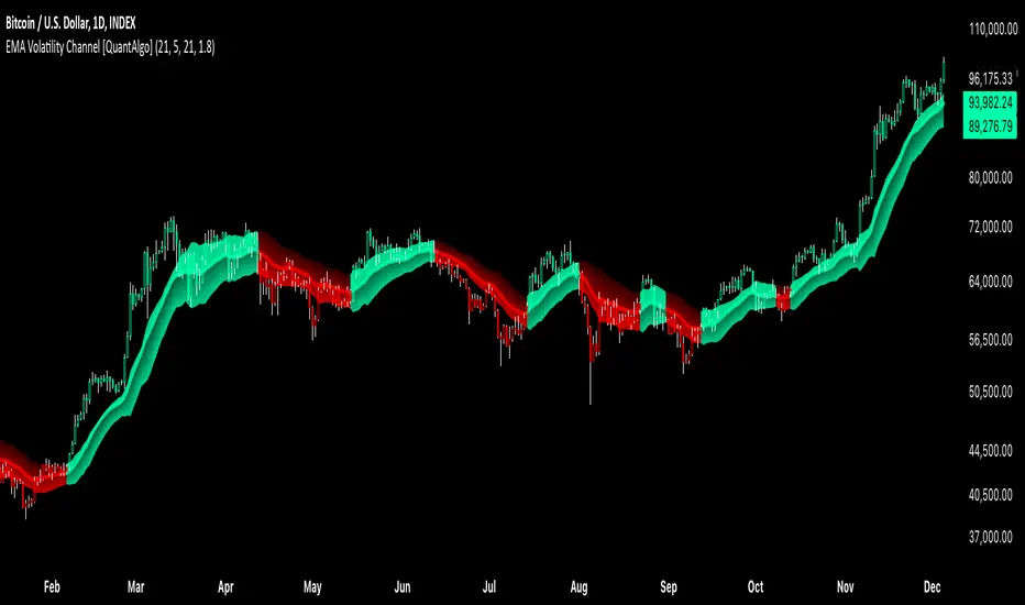
EMA Volatility Channel [QuantAlgo]EMA Volatility Channel 🌊📈
The EMA Volatility Channel by QuantAlgo is an advanced technical indicator designed to capture price volatility and trend dynamics through adaptive channels based on exponential moving averages. This sophisticated system combines EMA-based trend analysis with dynamic volatility-adjusted bands to help traders and investors identify trend direction, potential reversals, and market volatility conditions. By evaluating both price momentum and volatility together, this tool enables users to make informed trading decisions while adapting to changing market conditions.
💫 Dynamic Channel Architecture
The EMA Volatility Channel provides a unique framework for assessing market trends through a blend of exponential moving averages and volatility-based channel calculations. Unlike traditional channel indicators that use fixed-width bands, this system incorporates dynamic volatility measurements to adjust channel width automatically, helping users determine whether price movements are significant relative to current market conditions. By combining smooth EMA trends with adaptive volatility bands, it evaluates both directional movement and market volatility, while the smoothing parameters ensure stable yet responsive channel adjustments. This adaptive approach allows users to identify trending conditions while remaining aware of volatility expansions and contractions, enhancing both trend-following and reversal strategies.
📊 Indicator Components & Mechanics
The EMA Volatility Channel is composed of several technical components that create a dynamic channel system:
EMA Midline: Calculates a smoothed exponential moving average that serves as the channel's centerline, providing a clear reference for trend direction.
Volatility Measurement: Computes average price movement to determine dynamic channel width, adapting to changing market conditions automatically.
Smooth Band Calculation: Applies additional smoothing to the channel bands, reducing noise while maintaining responsiveness to significant price movements.
📈 Key Indicators and Features
The EMA Volatility Channel combines various technical tools to deliver a comprehensive analysis of market conditions.
The indicator utilizes exponential moving averages with customizable length and smoothing parameters to adapt to different trading styles. Volatility calculations are applied to determine channel width, providing context-aware boundaries for price movement. The trend detection component evaluates price action relative to the channel bands, helping validate trends and identify potential reversals.
The indicator incorporates multi-layered visualization with color-coded channels and bars to signal both trend direction and market position. These adaptive visual cues, combined with programmable alerts for channel breakouts, help traders and investors track both trend changes and volatility conditions, supporting both trend-following and mean-reversion strategies.
⚡️ Practical Applications and Examples
✅ Add the Indicator: Add the indicator to your TradingView chart by clicking on the star icon to add it to your favorites ⭐️
👀 Monitor Channel Position: Watch the price position relative to the channel bands to identify trend direction and potential reversals. When price moves outside the channel, consider potential trend changes or extreme conditions.
🔔 Set Alerts: Configure alerts for channel breakouts and trend changes, ensuring you can act on significant technical developments promptly.
🌟 Summary and Tips
The EMA Volatility Channel by QuantAlgo is a versatile technical tool, designed to support both trend following and volatility analysis across different market environments. By combining smooth EMA trends with dynamic volatility-based channels, it helps traders and investors identify significant price movements while measuring market volatility, providing reliable technical signals. The tool's adaptability across timeframes makes it suitable for both trend-following and reversal strategies, allowing users to capture opportunities while maintaining awareness of changing market conditions.
Statistical Volatility Injections [neo.|]Introduction:
The Statistical Volatility indicator is a versatile tool designed to help traders gauge market volatility over time. By analyzing historical data through a customizable lookback period, it highlights zones of high and low volatility using intuitive colored gradients. This indicator enables traders to make informed decisions by identifying patterns in price movement or volume fluctuations, helping to optimize entries, exits, and overall trading strategy.
Description:
Volatility plays a critical role in financial markets, influencing price movements and trader behavior. This indicator calculates historical volatility using two approaches:
Ranges: Evaluates the price movement by measuring the high-to-low range of candles relative to their closing price.
Volume: Considers trading activity by analyzing the volume associated with each candle.
By mapping out periods of high and low volatility, the indicator provides traders with actionable insights into time where potential breakouts, reversals, or consolidations are more likely to happen. High volatility zones may indicate strong market movements, while low volatility zones often precede significant price action, giving traders a valuable edge.
Key Features:
Compare time based volatility between assets:
Adaptive display will calculate intraday volatility when under the 1h timeframe, and weekly volatility if on the 1h timeframe or above:
OANDA:GBPJPY On the 5min timeframe:
OANDA:GBPJPY On the 1h timeframe:
Display modes allow the volatility to be viewed as ranges and as bars:
How It Works:
Data Collection: The script analyzes historical candles using the user-defined lookback period and calculation type.
Data Processing: Each candle’s volatility is calculated and stored, enabling comparisons across the selected timeframe.
Visual Representation: Using a gradient color scheme, the indicator overlays the results on your chart, highlighting areas of interest based on historical volatility levels.
How to Use:
Setup:
Add the indicator to your chart.
Adjust the lookback period, gradient colors, and choose your preferred calculation mode (Ranges or Volume).
Interpretation:
Look for red zones to identify high-volatility periods—potential breakout or reversal areas.
Use yellow zones to anticipate consolidation or low-activity phases.
Customization:
Enable "Display ranges" to see box height variations reflecting volatility intensity.
Use the "Use Table" feature to summarize volatility data for quick reference.
Advanced Settings:
Adjust style options such as color gradients and overlapping controls for a cleaner chart view.

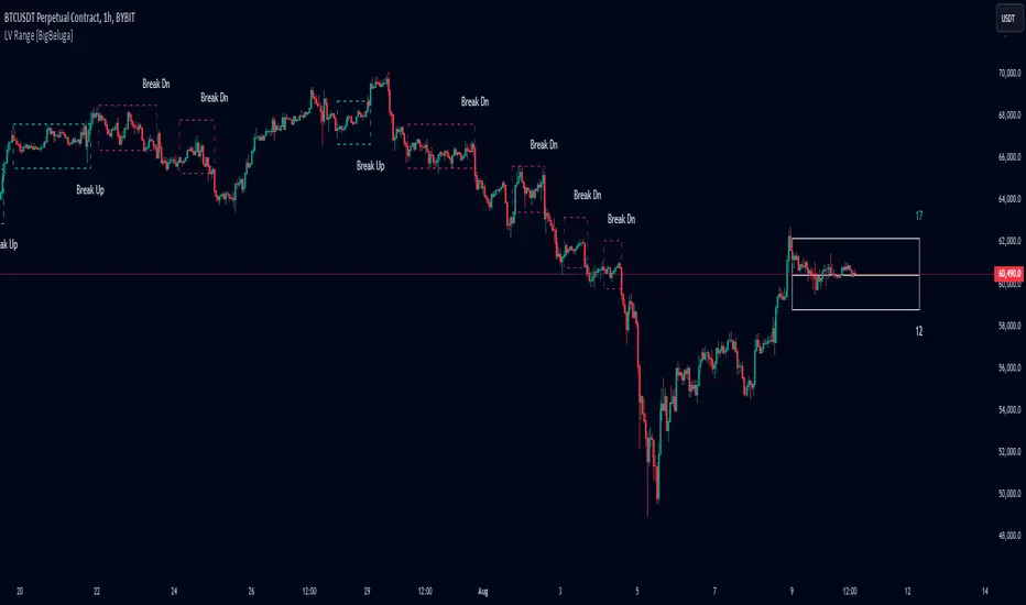
Low Volatility Range Breaks [BigBeluga]Low Volatility Range Breaks
The Low Volatility Range Breaks indicator is an advanced technical analysis tool designed to identify periods of low volatility and potential breakout opportunities. By visualizing low volatility ranges as ranges and tracking subsequent price movements, this indicator helps traders spot potential high-probability trade setups.
🔵 KEY FEATURES
● Low Volatility Detection
Identifies periods of low volatility based on highest and lowest periods and user-defined sensitivity
Uses a combination of highest/lowest price calculations and ATR for dynamic adaptation
● Volatility Box Visualization
Creates a box to represent the low volatility range
Box height is adjustable based on ATR multiplier
Includes a mid-line for reference within the box
● Breakout Detection
Identifies when price breaks above or below the volatility box
Labels breakouts as "Break Up" or "Break Dn" on the chart
Changes box appearance to indicate a completed breakout
● Probability Tracking
Counts the number of closes above and below the box's mid-line
Displays probability counters for potential upward and downward moves
Resets counters after a confirmed breakout
🔵 HOW TO USE
● Identifying Low Volatility Periods
Watch for the formation of volatility boxes on the chart
These boxes represent periods where price movement has been confined
● Anticipating Breakouts
Monitor price action as it approaches the edges of the volatility box
Use the probability counters to gauge the likely direction of the breakout
● Trading Breakouts
Consider posible entering trades when price breaks above or below the volatility box
Use the breakout labels ("Break Up" or "Break Dn") as a trading opportunity
● Managing Risk
Use the opposite side of the volatility box as a potential invalidation level
Consider the box height for position sizing and risk management
● Trend Analysis
Multiple upward breakouts may indicate a developing uptrend
Multiple downward breakouts may suggest a forming downtrend
Use in conjunction with other trend indicators for confirmation
🔵 CUSTOMIZATION
The Low Volatility Box Breaks indicator offers several customization options:
Adjust the volatility length to change the period for highest/lowest price calculations
Modify the volatility level to fine-tune the sensitivity of low volatility detection
Adjust the box height multiplier to change the size of volatility boxes
By fine-tuning these settings, traders can adapt the indicator to various market conditions and personal trading strategies.
The Low Volatility Range Breaks indicator provides a unique approach to identifying potential breakout opportunities following periods of consolidation. By visually representing low volatility periods and tracking subsequent price movements, it offers traders a powerful tool for spotting high-probability trade setups.
This indicator can be particularly useful for traders focusing on breakout strategies, mean reversion tactics, or those looking to enter trades at the beginning of new trends. The combination of visual cues (boxes and breakout labels) and quantitative data (probability counters) provides a comprehensive view of market dynamics during and after low volatility periods.
As with all technical indicators, it's recommended to use the Low Volatility Range Breaks indicator in conjunction with other forms of analysis and within the context of a well-defined trading strategy. While this indicator can provide valuable insights into potential breakouts, it should be considered alongside other factors such as overall market trends, volume, and fundamental analysis when making trading decisions.
Vola2vola volatility Trade & TrendHello everyone!
For those who remember Vola2vola volatility Trade & Trend script, we are excited to bring it back within the Myfractalrange Tradingview account!
If you already chose to have access to Vola2vola volatility indicator, this one is using the same formula but instead of having a separate indicator to display Volatility, Volatility has now been converted into price values, which makes it possible to visualise it on the ticker chart directly.
It is more volatile than Myfractalrange Trend but it will give you a complementary view on the asset current situation: Bullish/Bearish with an additional timeframe view named Trade.
As you know, Volatility is very important to assets and many people use it to trade. This tool automate the calculation of the volatility of every asset as well as provide an estimated value of its "Trend" and "Trade" projected onto price.
The idea in this script is to allow users to have an idea of the current volatility regime of the asset he is monitoring: Is its volatility Bullish or Bearish Trend, Bearish or Bullish Trade?
What are the data provided by the script:
- Trade : Trade is generated using an arbitrary and fixed look back period, it acts as a short-term Trend. It will give the user the possibility to know if the asset is still trending up or down short-term. Default colour is black
- Trend: Trend is also generated using an arbitrary and fixed look back period (20 times the one used for Trade), it acts as a longer-term view of the asset trendiness. It works the same way as Trade and will give the user the possibility to know if the volatility of the asset is trending a longer-term basis or not. Default colours are: red when the Trend of the asset is Bearish and green when the Trend of the asset is Bullish
Here are some of the questions you need to know the answer to before using this script:
- How do you define a "Bullish/Bearish Trade"? Volatility is Bullish Trade when Price is above Trade and it is Bearish Trade when Price is below Trade
- How do you define a "Bullish/Bearish Trend"? Volatility is Bullish Trend when Price is above Trend and it is Bearish Trend when Price is below Trend
- On which time frame should i use this script? You want to use the Daily time frame. Although, for short term moves in the volatility space, users could monitor the Hourly timeframe
Understanding the volatility of an asset, along with the bullish or bearish nature of its Trade and Trend, is crucial for investors. Assets that are Bullish Trend and Trade tend to appreciate in value, while those that are Bearish Trend and Trade tend to depreciate. Therefore, we recommend investors be aware of the volatility Trend and Trade situation of the asset they are holding in their portfolio.
Here are the different scenarios that you will encounter on a Daily timeframe and how to interpret them:
- Price is above Trade & Trend: It is the most Bullish set up for the price of an asset
- Price is below Trade & Trend: It is the most Bearish set up for the price of an asset
- Any other set up suggests uncertainty, caution is therefore recommended
These are some cases that you could experience while using this script:
1) Bullish set up on a daily timeframe:
In this example using AAPL, when it is Bullish Trend and Trade on a daily timeframe, the price of AAPL tends to appreciate
2) Bearish set up on a daily timeframe:
In this example using IWM, when it is Bearish Trend and Trade on a daily timeframe, the price of IWM tends to depreciate
The idea of opening this script is to give you another layer of confidence when using our other scripts, especially when using Myfractalrange Trend.
We hope that you will find these explanations useful, please contact us by private message for access.
Enjoy!
DISCLAIMER: No sharing, copying, reselling, modifying, or any other forms of use are authorised. This script is strictly for individual use and educational purposes only. This is not financial or investment advice. Investments are always made at your own risk and are based on your personal judgement. Myfractalrange is not responsible for any losses you may incur. Please invest wisely.
Keltner Channel Volatility FilterOVERVIEW
The Keltner Channel Volatility Filter indicator is a technical indicator that gauges the amount of volatility currently present in the market. The purpose of this indicator is to filter out with-trend signals during ranging/non-trending/consolidating conditions.
CONCEPTS
This indicator assists traders in capitalizing on the assumption that trends are more likely to start during periods of high volatility compared to periods of low volatility . This is because high volatility indicates that there are bigger players currently in the market, which is necessary to begin a sustained trending move.
So, to determine whether the current volatility in the market is low, the KCVF will grey out all bars whose average price is within the Keltner Channels.
If the average price breaks out of the Keltner Channels , it is reasonable to assume we are in a high-volatility period. Thus, this is the ideal time to enter a trending trade due to the assumption that trends are more likely to start during these high-volatility periods.
HOW DO I READ THIS INDICATOR
When the candles are greyed out, don't take any trend trades since the current volatility is less than the usual volatility experienced in the market.
When the candles aren't greyed out, take all valid with-trend trades since the current volatility is greater than the usual volatility experienced in the market.

Garman & Klass Estimator Historical Volatility Bands [Loxx]Garman & Klass Estimator Historical Volatility Bands are constructed using:
Average as the middle line.
Upper and lower bands using the Garman & Klass Estimator Historical Volatility (instead of "regular" Historical Volatility ) for bands calculation.
What is Garman & Klaus Historical Volatility?
Garman Klass is a volatility estimator that incorporates open, low, high, and close prices of a security. The Garman and Klass estimator for estimating historical volatility assumes Brownian motion with zero drift and no opening jumps (i.e. the opening = close of the previous period). This estimator is 7.4 times more efficient than the close-to-close estimator. Garman-Klass volatility extends Parkinson's volatility by taking into account the opening and closing price. As markets are most active during the opening and closing of a trading session, it makes volatility estimation more accurate. Garman and Klass also assumed that the process of price change is a process of continuous diffusion (geometric Brownian motion). However, this assumption has several drawbacks. The method is not robust for opening jumps in price and trend movements. Despite its drawbacks, the Garman-Klass estimator is still more effective than the basic formula since it takes into account not only the price at the beginning and end of the time interval but also intraday price extremums.
The Garman & Klass Estimator is as follows:
GKE = sqrt((Z/n)* sum((0.5*(log(high./low)).^2) - (2*log(2) - 1).*(log(close./open)).^2))
The color of the middle line, unlike the bands colors, has 3 colors. When colors of the bands are the same, then the middle line has the same color, otherwise it's white.
Included
Alerts
Signals
Loxx's Expanded Source Types
Bar coloring
Related indicators:
Parkinson's Historical Volatility Bands
High/Low Historical Volatility Bands [Loxx]High/Low Historical Volatility Bands are constructed using:
Average as the middle line.
Upper and lower bands using the Historical Volatility high/low (instead of "regular" Historical Volatility) for bands calculation.
What is Historical Volatility?
Historical Volatility (HV) is a statistical measure of the dispersion of returns for a given security or market index over a given period of time. Generally, this measure is calculated by determining the average deviation from the average price of a financial instrument in the given time period. Using standard deviation is the most common, but not the only, way to calculate Historical Volatility .
The higher the Historical Volatility value, the riskier the security. However, that is not necessarily a bad result as risk works both ways - bullish and bearish , i.e: Historical Volatility is not a directional indicator and should not be used as other directional indicators are used. Use to to determine the rising and falling price change volatility .
SH is stock's High price in t day.
SL is stock's Low price in t day.
High/Low Return (xt^HL) is calculated as the natural logarithm of the ratio of a stock's High price to stock's Low price.
Return:
And Parkinson's number: 1 / (4 * math.log(2)) * 252 / n * Σ (n, t =1) {math.log(Ht/Lt)^2}
An important use of the Parkinson's number is the assessment of the distribution prices during the day as well as a better understanding of the market dynamics. Comparing the Parkinson's number and periodically sampled volatility helps traders understand the tendency towards mean reversion in the market as well as the distribution of stop-losses.
The color of the middle line, unlike the bands colors, has 3 colors. When colors of the bands are the same, then the middle line has the same color, otherwise it's white.
Included
Alerts
Signals
Loxx's Expanded Source Types
Bar coloring
Related indicators:
Parkinson's Historical Volatility Bands
Historical Volatility Bands

[ADOL_]New Volatility Warning
ENG) The indicator is a new version of the volatility warning. Previous volatility warnings acted conservatively.
Therefore, there were intervals that were not shown even when volatility occurred.
Existing volatility warnings had a weakness in that they were only responsible for the time axis, which did not provide direction.
This is an upgraded version that compensates for weaknesses in frequency and direction that the previous version did not present.
It was created according to the basic principle of a chart that converges when it diverges, and when it diverges, it converges.
principle)
Spacing using standard deviation is used. In the section where volatility decreases, candle values converge to the average.
It is defined as the interval in which the separation is reduced. Existing intervals for volatility warnings have a yellow background,
The new section is initially set to a white background. The length of the ascending shot and the descending long is set to 7.
You can freely set the range from 7 to 40 and use it. Recommended values are short-term 7 and long-term 40 values.
principle example)
price + time
Comparison with the previous section
timeframes and alerts)
Applicable to all timeframes, an alert function has been added.
Alerts can be set for descending long and ascending shorts, long and short sections for direction indication, and volatility warning sections.
trading method)
It is the same as the existing method, and the standard of more sections is created and the direction is supplemented.
- Draw a trend line
The occurrence of volatility reflects the chart fundamentals of convergence and divergence.
It will help you determine whether you are breaking a trend line or not. meeting after a volatility warning
The trend line will be the timing interval with a high probability of a breakout.
- support/resistance
When volatility increases in the support/resistance section, the increased volatility
Breakthrough is more likely to occur. Find and trade horizontally.
reference)
It is not an indicator that guarantees absolute returns. You are solely responsible for any trading decisions you make.
How to use)
It is set to be available only to invited users. When invited, tap Add Indicator to Favorites at the bottom of the indicator.
Go to the chart screen, press the indicator at the top, and on the left tab, there is a Favorites tab. Add an indicator by clicking the indicator name in the Favorites tab.
----------------------------------------------------------------------------------------------------------------------------------------------------------------------------------------------------------------
KOR) 해당 지표는 변동성 경고의 새로운 버전입니다. 기존의 변동성 경고가 보수적으로 작동하였습니다.
따라서, 변동성이 발생함에도 나타내주지 못했던 구간들이 있었습니다.
기존의 변동성 경고는 방향성을 제시하지 못하는 시간축만 담당하는 약점이 있었습니다.
기존 버전이 제시하지 못한 빈도와 방향성의 약점을 보완한 업그레이드 버전입니다.
수렴하면 발산하고, 발산하면 수렴하는 차트의 기본원리에 맞춰 만들어졌습니다.
원리)
표준편차를 활용한 이격을 사용합니다. 변동성이 줄어드는 구간은 캔들의 값들이 평균에 수렴하여
이격이 줄어드는 구간으로 정의합니다. 변동성 경고에 대한 기존의 구간은 노란색 배경으로,
새로운 구간은 흰색 배경으로 초기 설정되어 있습니다. 오름숏과 내림롱의 길이는 7로 설정되어 있으며
7~40까지 자유롭게 범위를 설정하여 사용할 수 있습니다. 추천값은 단기 7과 장기 40 값입니다.
원리 예시)
가격 + 시간의 결합
기존구간과의 비교
타임프레임 및 얼러트)
모든 시간프레임에 적용 가능하며, 얼러트 기능이 추가되었습니다.
내림롱과 오름숏, 방향제시의 롱, 숏 구간, 변동성경고 구간에 얼러트를 설정할 수 있습니다.
매매방법)
기존의 방법과 동일하며, 더 많은 구간의 기준이 생기고 방향성이 보충됩니다.
- 추세선 긋기
변동성이 발생한다는 것은 수렴과 발산의 차트 기본원리를 반영합니다.
추세선을 이탈하는지 여부를 판단하는데 도움이 됩니다. 변동성 경고가 발생한 이후 만나는
추세선은 이탈할 가능성이 높은 타이밍의 구간이 됩니다.
- 지지/저항
지지/저항이 발생한 구간에서 변동성이 증가할 경우, 증가한 변동성으로 인해
돌파가 발생할 가능성이 높아집니다. 수평매물대를 찾아서 거래합니다.
참고)
절대수익을 보장하는 지표가 아닙니다. 귀하가 내리는 모든 거래 결정은 전적으로 귀하의 책임입니다.
사용방법)
초대된 사용자만 사용할 수 있도록 설정이 되어있습니다. 초대를 받을 경우, 지표 하단의 즐겨찾기에 인디케이터 넣기를 누릅니다.
차트화면으로가서 상단에 지표를 눌러 왼쪽탭에 보면 즐겨찾기 탭이 있습니다. 즐겨찾기 탭에서 지표이름을 눌러서 지표를 추가합니다.

GARCH Adaptive Volatility & Momentum Predictor
💡 I. Indicator Concept: GARCH Adaptive Volatility & Momentum Predictor
-----------------------------------------------------------------------------
The GARCH Adaptive Momentum Speed indicator provides a powerful, forward-looking
view on market risk and momentum. Unlike standard moving averages or static
volatility indicators (like ATR), GARCH forecasts the Conditional Volatility (σ_t)
for the next bar, based on the principle of volatility clustering.
The indicator consists of two essential components:
1. GARCH Volatility (Level): The primary forecast of the expected magnitude of
price movement (risk).
2. Vol. Speed (Momentum): The first derivative of the GARCH forecast, showing
whether market risk is accelerating or decelerating. This component is the
main visual signal, displayed as a dynamic histogram.
⚙️ II. Key Features and Adaptive Logic
-----------------------------------------------------------------------------
* Dynamic Coefficient Adaptation: The indicator automatically adjusts the GARCH
coefficients (α and β) based on the chart's timeframe (TF):
- Intraday TFs (M1-H4): Uses higher α and lower β for quicker reaction
to recent shocks.
- Daily/Weekly TFs (D, W): Uses lower α and higher β for a smoother,
more persistent long-term forecast.
* Momentum Visualization: The Vol. Speed component is plotted as a dynamic
histogram (fill) that automatically changes color based on the direction of
acceleration (Green for up, Red for down).
📊 III. Interpretation Guide
-----------------------------------------------------------------------------
- GARCH Volatility (Blue Line): The predicted level of market risk. Use this to
gauge overall position sizing and stop loss width.
- Vol. Speed (Green Histogram): Momentum is ACCELERATING (Risk is increasing rapidly).
A strong signal that momentum is building, often preceding a breakout.
- Vol. Speed (Red Histogram): Momentum is DECELERATING (Risk is contracting).
Indicates momentum is fading, often associated with market consolidation.
🎯 IV. Trading Application
-----------------------------------------------------------------------------
- Breakout Timing: Look for a strong, high GREEN histogram bar. This suggests
the volatility pressure is increasing rapidly, and a breakout may be imminent.
- Consolidation: Small, shrinking RED histogram bars signal that market energy
is draining, ideal for tight consolidation patterns.

VWAP and IVP Volatility Screener AlertVWAP and IVP Volatility Screener Alert is a multi-asset, institutional-grade market scanner that combines Auto-Anchored VWAP, Implied Volatility Percentile (IVP), Choppiness Index, Strike Price Structure, and Volume Profile (POC / Value Area) to generate high-probability trade signals across multiple symbols.
Designed for traders who rely on volatility regimes, VWAP interactions, trend confirmation, and strike-based price behavior, this tool automatically evaluates up to 10 assets simultaneously and displays actionable BUY/SELL conditions in a unified dashboard and screener panel.
Key Features
1. Multi-Asset Screener (10 Symbols)
Scans FX, indices, commodities, and metals. Displays RSI, ADX, trend, score, volatility regime, VWAP/POC/Value Area position, IVP, and Choppiness. Custom strike increments per asset.
2. Auto-Anchored VWAP System
Auto anchors by Session, Day, Week, Month, or Auto. Includes VWAP bands and bounce detection to show when price is Above, Below, or interacting with VWAP.
3. Volume Profile + POC / Value Area
Generates intraday/session POC, VAH, and VAL. Detects breaks, retests, and bounce signals.
4. IV Percentile (IVP) Engine
Converts realized volatility into IVP and classifies regimes (EXT.HI → EXT.LO). Supports Favorable, Extreme, and High-Volatility modes for different trading styles.
5. Choppiness Index (CHOP)
Identifies trending vs ranging conditions and feeds directly into scoring and alerts.
6. 11-Criteria Alert System
Alert logic includes RSI, ADX, trend, volume, VWAP, POC/VA, strike proximity, std-dev breaks, IVP, CHOP, and score thresholds. Supports Score-Based or Multi-Criteria modes.
7. Price-to-Strike Mapping
Rounds price to the correct strike ladder, detecting reversals, continuation, breakout levels, and helping frame stop-loss/TP zones.
8. Session-Aware Filtering
Filters signals for Asian, London, and NY sessions with custom timezone support.

ADR Daily Range + Volatility + KZs — SMC/ICT (@PueblaATH)ADR Daily Range + Volatility + KZs — SMC/ICT (@PueblaATH) is a complete intraday context and volatility HUD that plots market opens, killzones, previous period highs/lows, and a dynamic ADR/volatility dashboard. It is built to give SMC/ICT traders an at-a-glance view of when and where price is moving: sessions, overlaps, ranges, and distance to key levels, all on a single clean overlay.
What the Indicator Does
Market Opens (Tokyo, London, New York)
Professional-grade session open lines with:
Individually configurable open times per session and timezone.
Infinite vertical lines or height-limited extensions (custom tick offsets).
Fully styled labels: size, alignment, auto-background, manual background, and vertical offset.
Killzones & Session Overlaps
Precision-timed shaded boxes for:
Tokyo Killzone
London Killzone
New York Killzone
London–New York Overlap
Previous Period Levels (PDH/PWH/PMH & PDL/PWL/PML)
Robust daily/weekly/monthly high/low engine:
Accurate Previous Day / Week / Month Highs & Lows (Europe/Madrid reference).
Line length modes: infinite, N bars, or end-of-day projection.
Per-level colors + labeled markers placed to the right of price with custom horizontal/vertical spacing.
Timeframe & Weekend Filters
Keep charts clean by hiding components based on:
Custom timeframe ranges (hide opens or killzones on HTFs).
Weekend filters for opens, killzones, and ADR/table.
Optional override to display the HUD table across all timeframes.
Session Comparison Table (Top-Right HUD)
A compact, institutional-style session dashboard comparing:
Tokyo, London, New York — current open vs previous session and previous day.
Bullish/Bearish state with color-coded logic (+ optional ▲/▼ arrows).
Optional Δ% change column relative to previous day’s open.
ADR / Volatility Panel (24h Rolling Window)
A powerful real-time volatility module providing:
True 24-hour rolling high–low range.
SMA-based ADR calculation with automatic bar-count safety limits.
ADR% expansion metric with two thresholds + blinking color logic for volatility extremes.
Directional bias vs price 24 hours ago (Bullish/Bearish).
Optional metrics: distance to PDH/PDL (in price units) and absolute H–L / ADR values.
How to Use It
Set each session’s open time and killzone window according to your broker or desired timezone alignment.
Enable or disable session opens and killzones to frame the trading windows you prioritize (e.g., LDN Killzone or NY session expansion).
Activate key previous period levels (PDH/PDL, PWH/PWL, PMH/PML) and tune the line-length mode and label spacing to match your workflow.
Use timeframe & weekend filters to keep higher-timeframe charts clean while maintaining precise intraday visibility on lower timeframes.
Monitor the session comparison table to understand directional behavior relative to previous sessions and previous day opens.
Watch the ADR panel to classify the day as compressed, normal, or expanded—and anticipate potential reversion or continuation.
Originality & Credits Disclaimer
This indicator is an original work by @PueblaATH , created specifically for the tool ADR Daily Range + Volatility + KZs — SMC/ICT (@PueblaATH) and distributed under the MPL 2.0 license.
While the concepts implemented—session opens, killzones, ADR, and previous highs/lows—are public and widely known in the trading community, this script introduces a uniquely integrated framework that combines:
Multi-timezone session scheduling with dynamic TF/weekend filtering.
A modular PDH/PWH/PMH + PDL/PWL/PML engine with versatile projection and labeling controls.
A precise 24-hour volatility model tied to an ADR panel with extension thresholds, blinking alerts, and distance-to-PD metrics.
A multi-session comparative table that unifies Tokyo, London, and New York open data in real time.
This work does not reuse or repackage code from other authors. Any future adaptations from public sources will always include full, transparent credit and documentation.

Trendilo + Adaptive Volatility Prediction AlgorithmTrendilo + Adaptive Volatility Prediction Algorithm
Credit: Original Trendilo created by dudeowns. This version keeps the original trend logic and adds an algorithmic based volatility predictive method used in other proprietary, high end indicators I had created in the past.
Timeframe and Usage:
Designed for use on the 15m timeframe but can be used on any timeframe. Settings are available for tweaking and fine tuning based on your trading strategy and preferences.
Note: In my testing I've found the 3D to be HIGHLY effective as determining major volatile breakouts after periods of consolidation.
3 Day chart example
What this indicator shows:
• 📈 Trend Line: A simple line plot showing the general direction of price (up, down, or neutral).
• 🎨 Volatility Band: A colored visual layer that shows how tight or loose the market currently is.
Volatility Color Meanings:
• Transparent / Wide = Expanded (normal market movement)
• 🔵 Blue = Normal volatility
• 🟣 Purple = Compressed (price is tightening)
• 🔴 Red = Highly Compressed (strong pressure build-up)
• 💛 Yellow = Extremely Compressed (market is tightly coiled at a rare level)
How to interpret / use this indicator
This indicator does not predict direction. It shows how much volatile energy is building in the market for an upcoming move.
The stronger the compression (Purple > Red > Yellow), the bigger the volatility release tends to be relative to recent price action.
The yellow state is the most significant. It indicates the market is at extremely compressed levels and has enough energy stored for substantial and volatile movement.
Display Panel:
A small panel on the chart shows the current volatility condition in plain text for fast recognition.

VTTOS — Volatility & Trend Transition OscillatorShort Description (one-line summary)
Displays volatility-based trend transitions using EMA relationships and adaptive percentile thresholds.
Full Description
Overview
A framework for studying volatility transitions and market phase shifts through adaptive EMA relationships.
VTTOS (Volatility & Trend Transition Oscillator System) is a technical-analysis framework that displays market behavior through volatility dynamics and EMA-based motion.
It is designed to support technical analysis and enhance market context interpretation.
VTTOS uses percentile thresholds derived from past volatility ranges to help identify transitions between trending and ranging market phases.
The indicator is built for traders who prefer to interpret market structure through volatility expansion and contraction, using clear visual markers to highlight possible sequence changes.
________________________________________
What Makes This Script Distinct
VTTOS applies adaptive percentile thresholds calculated from recent Tug Line and Tanker Line movements.
These thresholds automatically adjust based on recent data, allowing the plotted tags to represent potential market phases dynamically.
The focus is not on the EMA lines themselves, but on how price interacts relative to the percentile thresholds.
This integrated approach provides a structured volatility-based framework for contextual analysis.
________________________________________
Core Components
• Tug Line – Represents relative volatility derived from smoothed EMA relationships.
• Tanker Line – A slower baseline signal reflecting broader directional pressure.
• Threshold Bands – Adaptive percentile levels computed from recent pivot ranges.
• Sequence Markers – Numbered, colored labels that display phase progressions within the current trend.
• Multi-Market Compatibility – Can be applied to any asset or timeframe.
________________________________________
How to Read It
• When the Tug Line crosses above or below the percentile thresholds, the oscillator enters a new phase.
• Colored sequence labels display ongoing trend transitions (e.g., blue → orange → green for uptrends, purple → orange → green for downtrends).
• Opposite-side conditions automatically reset sequences to maintain clarity during volatile periods.
________________________________________
Usage Notes
• VTTOS does not generate trade entries, exit signals, or financial recommendations.
• Red or green labels only display possible late-phase conditions within a trend.
• X labels indicate when the oscillator crosses the zero line, visually marking a potential phase transition.
• All visuals are intended for analytical and educational purposes only.
• Users are encouraged to integrate VTTOS within their own analytical or confirmation framework.
• Numerical labels are iterative and do not carry standalone predictive meaning.
• The distance between the Tanker Line and percentile bands can help display relative trend strength visually, but it should not be interpreted as a forecast or signal.
________________________________________
Access
This is an invite-only script.
Access is restricted to users who have been granted permission by the author.
To request access, please use the standard “Request access” button on the indicator’s TradingView page.
Approved users will find the indicator under Invite-only scripts in the TradingView Indicators panel.
________________________________________
Disclaimer
VTTOS is provided strictly for informational and educational purposes.
It does not constitute financial advice, investment guidance, or performance assurance.
All users should conduct independent analysis and manage their own risk responsibly.

Disparity Index with Volatility ZonesDisparity Index with Volatility Zones
is a momentum oscillator that measures the percentage difference between the current price and its simple moving average (SMA). This allows traders to identify overbought/oversold conditions, assess momentum strength, and detect potential trend reversals or continuations.
🔍 Core Concept:
The Disparity Index (DI) is calculated as:
DI = 100 × (Price − SMA) / SMA
A positive DI indicates the price is trading above its moving average (potential bullish sentiment), while a negative DI suggests the price is below the average (potential bearish sentiment).
This version of the Disparity Index introduces a dual-zone volatility framework, offering deeper insight into the market's current state.
🧠 What Makes This Version Unique?
1. High Volatility Zones
When DI crosses above +1.0% or below –1.0%, it often indicates the start or continuation of a strong trend.
Sustained readings beyond these thresholds typically align with trending phases, offering opportunities for momentum-based entries.
A reversal back within ±1.0% after exceeding these levels can suggest a shift in momentum — similar to how RSI exits the overbought/oversold zones before reversals.
These thresholds act as dynamic markers for breakout confirmation and potential trend exhaustion.
2. Low Volatility Zones
DI values between –0.5% and +0.5% define the low-volatility zone, shaded for visual clarity.
This area typically indicates market indecision, sideways price action, or consolidation.
Trading within this range may favor range-bound or mean-reversion strategies, as trend momentum is likely limited.
The logic is similar to interpreting a flat ADX, tight Bollinger Bands, or contracting Keltner Channels — all suggesting consolidation.
⚙️ Features:
Customizable moving average length and input source
Adjustable thresholds for overbought/oversold and low-volatility zones
Optional visual fill between low-volatility bounds
Clean and minimal chart footprint (non-essential plots hidden by default)
📈 How to Use:
1. Trend Confirmation:
A break above +1.0% can be used as a bullish continuation signal.
A break below –1.0% may confirm bearish strength.
Long periods above/below these thresholds support trend-following entries.
2. Reversal Detection:
If DI returns below +1.0% after exceeding it, bullish momentum may be fading.
If DI rises above –1.0% after falling below, bearish pressure may be weakening.
These shifts resemble overbought/oversold transitions in oscillators like RSI or Stochastic, and can be paired with divergence, volume, or price structure analysis for higher reliability.
3. Sideways Market Detection:
DI values within ±0.5% indicate low volatility or a non-trending environment.
Traders may avoid breakout entries during these periods or apply range-trading tactics instead.
Observing transitions out of the low-volatility zone can help anticipate breakouts.
4. Combine with Other Indicators:
DI signals can be enhanced using tools like MACD, Volume Oscillators, or Moving Averages.
For example, a DI breakout beyond ±1.0% supported by a MACD crossover or volume spike can help validate trend initiation.
This indicator is especially powerful when paired with Bollinger Bands:
A simultaneous price breakout from the Bollinger Band and DI moving beyond ±1.0% can help identify early trend inflection points.
This combination supports entering positions early in a developing trend, improving the efficiency of trend-following strategies and enhancing decision-making precision.
It also helps filter false breakouts when DI fails to confirm the move outside the band.
This indicator is designed for educational and analytical purposes and works across all timeframes and asset classes.
It is particularly useful for traders seeking a clear framework to identify momentum strength, filter sideways markets, and improve entry timing within a larger trading system.

Market Volatility KeyMarket Volatility Key is a compact dashboard tool designed to help traders quickly assess market conditions related to volatility, trend strength, and asset movement.
This indicator consolidates several key metrics into a color-coded table, providing traders with a real-time overview of the market’s volatility landscape. It is intended to complement existing trading strategies, particularly for trend-following and scalping approaches.
Key Features:
Choppiness Index (CHOP): Measures whether the market is trending or consolidating.
Average True Range (ATR): Customizable by timeframe, helping gauge volatility across different periods.
Volatility Index (VIX): Displays real-time VIX readings, often used as a "fear gauge" for market sentiment.
10-Year US Treasury Bond Yield (10Y): Shows current bond yield to monitor macroeconomic conditions.
Bitcoin (BTC/USD): Tracks price along with directional movement.
Dollar Index (DXY): Displays the strength of the US dollar.
MAG 7 Index: A custom average of Microsoft, Apple, Alphabet, Amazon, Tesla, Meta, and NVIDIA prices.
Visual Enhancements (April 2025 Update):
Directional Arrows: BTC, DXY, MAG7, VIX, and 10Y Bond rows now show ▲ (up), ▼ (down), or → (sideways) based on price movement.
Dynamic Value Colors:
Green for rising prices (BTC, DXY, MAG7, 10Y Bond)
Red for falling prices
For VIX, rising volatility is shown in red and falling volatility in green to better reflect market sentiment.
Customization Options:
Adjustable ATR timeframe
Adjustable table position (top, middle, or bottom right)
Selectable font size (small, medium, large)
Intended Use: This script provides a high-level visual summary of multiple market indicators in one place. It is designed to assist traders in recognizing potential changes in volatility and market sentiment without replacing other forms of technical or fundamental analysis.

Daily Volatility Range (DVR) [GIF]VIX as a Volatility Indicator:
The VIX is a measure of the market's expectation of volatility in the S&P 500 over the next 30 days, based on the prices of S&P 500 options.
The Rule of 16:
A VIX of 16 implies that the market expects the SPX to move up or down by roughly 1% on any given day.
If the VIX is 24, the expected daily move is around 1.5%, and with a VIX of 32, the expected move is around 2%.
The rationale for the rule is that the square root of the number of trading days in a year (approximately 252) is roughly 16.
Example:
If the VIX is at 20, the rule suggests that the SPX might see daily moves of around 1.25%.
Practical Application:
The rule of 16 can be used as a quick and easy way to estimate the potential daily volatility of the S&P 500 based on the VIX.
The Daily Volatility Range:
This indicator cross references the ticker on the chart with it's own volatility index (assuming it has one). Below are the indexes and stocks that have their own volatility index:
S&P 500
Nasdaq 100
Russell 2000
Dow Jones
TLT
Bitcoin
Gold
Crude Oil
Apple
Amazon
Google
IBM
Goldman Sachs
How I use the DVR:
Historic probabilities show that you will close the day within the DVR. However, there are times when those probabilities diminish greatly. One of those times is when you open in the RTH session outside of the DVR. If you open outside the DVR, you can look for the DVR to becomes support/resistance and stay extended outside the DVR. These days can often become muted as most of the most has happened before the market open. However, if we open outside the DVR and break back into range, it is highly probable that we will not break back into those extended ranges.
Indicator Options:
There are 2x and 3x DVR levels that can be plotted. During times of extreme volatility, it will become important to have these plotted.
There is the option to plot calculated pivot points. These are fib ranges that have historically been areas of consolidation or trend reversal. These are projections based on my own research and are not as important as the DVR levels themselves.
There is also an option to color the candles a specific color if the candle closes outside the DVR. This is to highlight the fact that price action has exceeded the range and caution should be taken.
If you have suggestions how to make this indicator better, please let me know in the comments and I will look into it. Thank you!
