Golden Swing Strategy - Souradeep DeyThis strategy is developed by Mr. Souradeep Dey. Strategy is based on RSI, Stoch, BB & Supertrend. Coding by Rajkumarกลยุทธ์ Pine Script®โดย rajm1422103
Golden Swing StrategyBuying Conditions RSI should be 50 or above Stochastic %K should be above %D Day Low Should be below SuperTrend SuperTrend should remain green before & EOD SuperTrend should be below Mid Bollinger Buy next day at open or within 0.5xATR(previous day) of SuperTrend with 1.1ATR SL & 2.2 ATR target Selling Conditions RSI should be 50 or below. Stochastic %K should be below %D Day high Should be above SuperTrend SuperTrend should remain Red before & EOD SuperTrend should be above Mid Bollinger Sell next day at open or within 0.5xATR (previous day) of SuperTrend with 1.1xATR SL & 2.2x ATR target อินดิเคเตอร์ Pine Script®โดย in_pursuit133
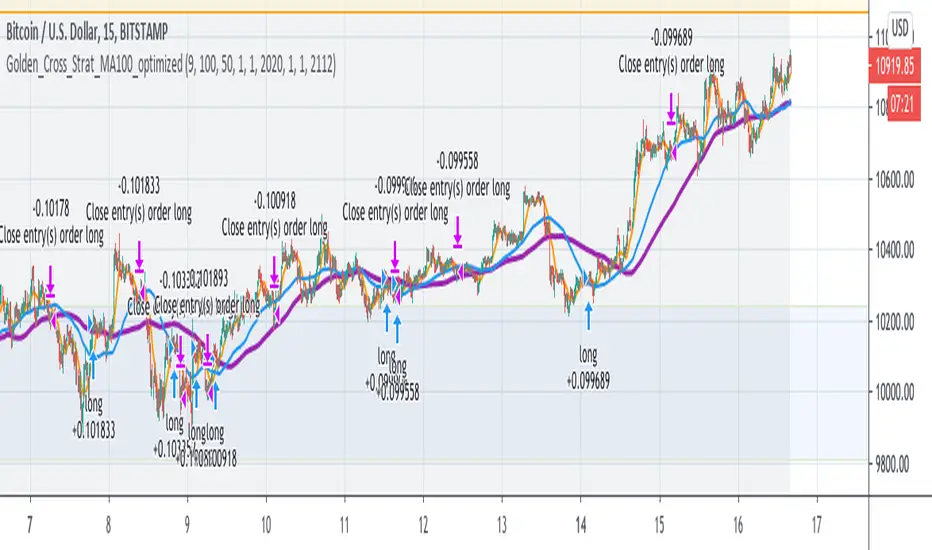
Golden Cross Optimised For Reversal (by Coinrule)A moving average crossing is a common and widely adopted trading strategy. A short-term MA crossing above a long-term one provides the buy-signal. The opposite generates a sell-signal for the strategy. Although very popular, this strategy has some limitations that lead to frequent "false signals" and only a few very profitable trades. If the strategy provides two many trades, that generates the risk for more potential losses more transaction fees paid capital allocated to the strategy, thus the impossibility of catching other potential opportunities. Applying an additional filter to the strategy, consisting of the crossing happening below a longer-term moving average, allows increasing the chances of catching the first crossing signaling a reversal. The indicator is set to work with three moving averages. Buy signal: The MA(9) to cross above the MA(50), which must be below the MA(100) Sell Signal: The MA(9) to cross below the MA(50) This indicator works significantly better on lower time frames, where it can reduce the noise of getting too many non-profitable signals from a conventional crossing strategy. The indicator has been backtested mostly on cryptocurrencies.กลยุทธ์ Pine Script®โดย Coinrule127
Golden Ratio MultiplierThe moving averages 350 and 111 by themselves do a great job of identifying market tops/bottoms. The fraction 350/111 is very close to Pi as well (3.15) so that's is suspicious in its own right. Nonetheless, fibonacci retracements/multiplies of the 350 SMA does a remarkable job of finding reversal points. I commented out a couple of multiplies for simplicity's sake (the lines became rather crowded). However, the script is open source so you all can copy it into Pine Editor and delete the "//" and add it back to the script. Cheers.อินดิเคเตอร์ Pine Script®โดย Riesterที่อัปเดต: 170
Golden Ratio Multiplier: Multiplied Moving AveragesThe script for plotting DMAs from the study made by @PositiveCrypto (twitter)อินดิเคเตอร์ Pine Script®โดย Crypto-Hamsterที่อัปเดต: 331
Golden Ratio Multiplier: Multiplied Moving AveragesMultiplied moving averages script visualizing the study made by @PositiveCrypto (twitter).อินดิเคเตอร์ Pine Script®โดย Crypto-Hamster89
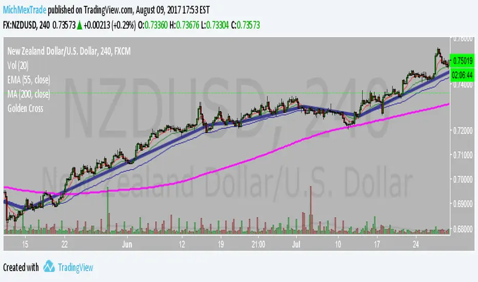
Golden CrossSimple Indicator to determine possible trend change, works better in H4อินดิเคเตอร์ Pine Script®โดย MichMexTrade215
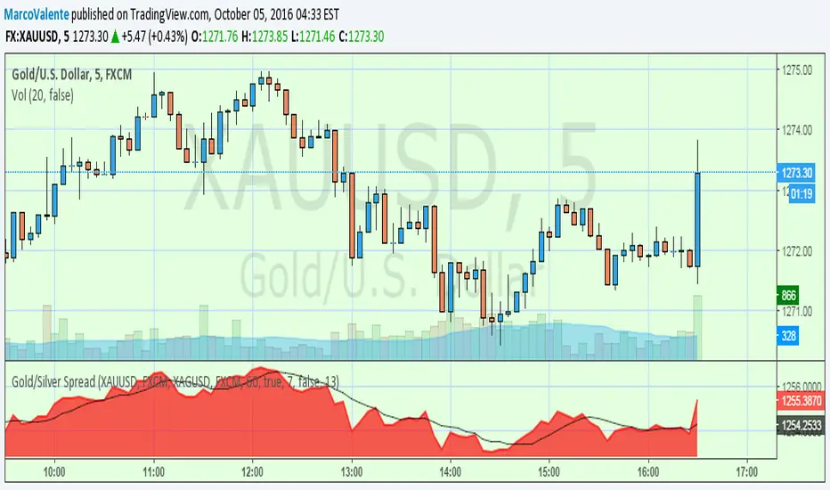
Gold/Silver Spread V2UpDate. MA s length , now you can choose your periodอินดิเคเตอร์ Pine Script®โดย MarcoValente5564
GoldFinger .007Goldfinger. He's the man, the man with the midas touch. A spider's touch. Such a cold finger. Beckons you to enter his web of sin But don't go in. กลยุทธ์ Pine Script®โดย tarzan98
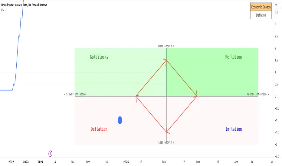
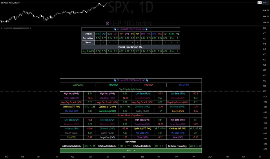
Economic Seasons [Daveatt]Ever wondered what season your economy is in? Just like Mother Nature has her four seasons, the economy cycles through its own seasons! This indicator helps you visualize where we are in the economic cycle by tracking two key metrics: 📊 What We're Tracking: 1. Interest Rates (USIRYY) - The yearly change in interest rates 2. Inflation Rate (USINTR) - The rate at which prices are rising The magic happens when we normalize these values (fancy math that makes the numbers play nice together) and compare them to their recent averages. We use a lookback period to calculate the standard deviation and determine if we're seeing higher or lower than normal readings. 🔄 The Four Economic Seasons & Investment Strategy: 1. 🌸 Goldilocks (↑Growth, ↓Inflation) "Not too hot, not too cold" - The economy is growing steadily without overheating. BEST TIME TO: Buy growth stocks, technology, consumer discretionary WHY: Companies can grow earnings in this ideal environment of low rates and stable prices 2. 🌞 Reflation (↑Growth, ↑Inflation) "Party time... but watch your wallet!" - The economy is heating up. BEST TIME TO: Buy commodities, banking stocks, real estate WHY: These sectors thrive when inflation rises alongside growth 3. 🌡️ Inflation (↓Growth, ↑Inflation) "Ouch, my purchasing power!" - Growth slows while prices keep rising. BEST TIME TO: Rotate into value stocks, consumer staples, healthcare WHY: These defensive sectors maintain pricing power during inflationary periods 4. ❄️ Deflation (↓Growth, ↓Inflation) "Winter is here" - Both growth and inflation are falling. BEST TIME TO: Focus on quality bonds, cash positions, and dividend aristocrats WHY: Capital preservation becomes key; high-quality fixed income provides safety 🎯 Strategic Trading Points: - BUY AGGRESSIVELY: During late Deflation/early Goldilocks (the spring thaw) - HOLD & ACCUMULATE: Throughout Goldilocks and early Reflation - START TAKING PROFITS: During late Reflation/early Inflation - DEFENSIVE POSITIONING: Throughout Inflation and Deflation ⚠️ Warning Signs to Watch: - Goldilocks → Reflation: Time to reduce growth stock exposure - Reflation → Inflation: Begin rotating into defensive sectors - Inflation → Deflation: Quality becomes crucial - Deflation → Goldilocks: Start building new positions The blue dot shows you where we are right now in this cycle. The red arrows in the middle remind us that this is a continuous cycle - one season flows into the next, just like in nature! 💡 Pro Tip: The transitions between seasons often provide the best opportunities - but also the highest risks. Use additional indicators and fundamental analysis to confirm these shifts. Remember: Just like you wouldn't wear a winter coat in summer, you shouldn't use a Goldilocks strategy during Inflation! Time your trades with the seasons. 🎯 Happy Trading! 📈อินดิเคเตอร์ Pine Script®โดย Daveattที่อัปเดต: 104
RSI Fibonacci Flow [JOAT]RSI Fibonacci Flow - Advanced Fibonacci Retracement with RSI Confluence Introduction RSI Fibonacci Flow is an open-source overlay indicator that combines automatic Fibonacci retracement levels with RSI momentum analysis to identify high-probability trading zones. The indicator automatically detects swing highs and lows, draws Fibonacci levels, and generates confluence signals when RSI conditions align with key Fibonacci zones. This indicator is designed for traders who use Fibonacci retracements but want additional confirmation from momentum analysis before entering trades. Originality and Purpose This indicator is NOT a simple mashup of RSI and Fibonacci tools. It is an original implementation that creates a synergistic relationship between two complementary analysis methods: Why Combine RSI with Fibonacci? Fibonacci retracements identify WHERE price might reverse, but they don't tell you WHEN. RSI provides the timing component by showing momentum exhaustion. When price reaches the Golden Zone (50%-61.8%) AND RSI shows oversold conditions, the probability of a successful bounce increases significantly. Original Confluence Scoring System: The indicator calculates a 0-5 confluence score that weights multiple factors: Golden Zone presence (+2), entry zone presence (+1), RSI extreme alignment (+1), RSI divergence (+1), and strong RSI momentum (+1). This scoring system is original to this indicator. Automatic Pivot Detection: Unlike manual Fibonacci tools, this indicator automatically detects swing highs and lows using a configurable pivot algorithm, then draws Fibonacci levels accordingly. The pivot detection uses a center-bar comparison method that checks if a bar's high/low is the highest/lowest within the specified depth on both sides. Dynamic Trend Awareness: The indicator determines trend direction based on pivot sequence (last pivot was high or low) and adjusts Fibonacci orientation accordingly. In uptrends, 0% is at swing low; in downtrends, 0% is at swing high. Each component serves a specific purpose: Fibonacci levels identify potential reversal zones based on natural price ratios RSI provides momentum context to filter out low-probability setups Confluence scoring quantifies setup quality for position sizing decisions Automatic pivot detection removes subjectivity from level placement Core Concept: RSI-Fibonacci Confluence The most powerful trading setups occur when multiple factors align. RSI Fibonacci Flow identifies these moments by: Automatically detecting price pivots and drawing Fibonacci levels Tracking which Fibonacci zone the current price occupies Monitoring RSI for overbought/oversold conditions Generating signals when RSI extremes coincide with key Fibonacci levels Scoring confluence strength on a 0-5 scale When price reaches the Golden Zone (50%-61.8%) while RSI shows oversold conditions in an uptrend, the probability of a bounce increases significantly. Fibonacci Levels Explained The indicator draws nine Fibonacci levels based on the most recent swing: 0% (Swing Low/High): The starting point of the move 23.6%: Shallow retracement - often seen in strong trends 38.2%: First significant support/resistance level 50%: Psychological midpoint of the move 61.8% (Golden Ratio): The most important Fibonacci level 78.6%: Deep retracement - last defense before trend failure 100% (Swing High/Low): The end point of the move 127.2% (TP1): First extension target for take profit 161.8% (TP2): Second extension target for take profit The Golden Zone The area between 50% and 61.8% is highlighted as the "Golden Zone" because: It represents the optimal retracement depth for trend continuation Institutional traders often place orders in this zone It offers favorable risk-to-reward ratios Price frequently bounces from this area in healthy trends When price enters the Golden Zone, the indicator highlights it with a semi-transparent box and optional background coloring. Pivot Detection System The indicator uses a configurable pivot detection algorithm: pivotDetect(float src, int len, bool isHigh) => int halfLen = len / 2 float centerVal = nz(src , src) bool isPivot = true for i = 0 to len - 1 if isHigh if nz(src , src) > centerVal isPivot := false break else if nz(src , src) < centerVal isPivot := false break isPivot ? centerVal : float(na) This identifies swing highs and lows by checking if a bar's high/low is the highest/lowest within the specified depth on both sides. Visual Components 1. Fibonacci Lines Horizontal lines at each Fibonacci level: Solid lines for major levels (0%, 50%, 61.8%, 100%) Dashed lines for secondary levels (23.6%, 38.2%, 78.6%) Dotted lines for extension levels (127.2%, 161.8%) Color-coded for easy identification Configurable line width 2. Fibonacci Labels Price labels at each level showing: Fibonacci percentage Actual price at that level Golden Zone label highlighted TP1 and TP2 labels for targets 3. Golden Zone Box A semi-transparent box highlighting the 50%-61.8% zone: Gold colored border and fill Extends from swing start to current bar (or beyond if extended) Provides clear visual of the optimal entry zone 4. ZigZag Lines Connecting lines between detected pivots: Cyan for moves from low to high Orange for moves from high to low Helps visualize market structure Configurable line width 5. Pivot Markers Small labels at detected swing points: "HH" (Higher High) at swing highs "LL" (Lower Low) at swing lows Helps track market structure 6. Entry Signals BUY and SELL labels when confluence conditions are met: BUY: RSI oversold + price in entry zone + uptrend + positive momentum SELL: RSI overbought + price in entry zone + downtrend + negative momentum Labels include "RSI+FIB" to indicate confluence Confluence Scoring System The indicator calculates a confluence score from 0 to 5: +2 points: Price is in the Golden Zone (50%-61.8%) +1 point: Price is in the entry zone (38.2%-61.8%) +1 point: RSI is oversold in uptrend OR overbought in downtrend +1 point: RSI divergence detected (bullish or bearish) +1 point: Strong RSI momentum (change > 2 points) Confluence ratings: STRONG (4-5): Multiple factors align - high probability setup MODERATE (2-3): Some factors align - proceed with caution WEAK (0-1): Few factors align - wait for better setup Dashboard Panel The 10-row dashboard provides comprehensive analysis: RSI Value: Current RSI reading (large text) RSI State: OVERBOUGHT, OVERSOLD, BULLISH, BEARISH, or NEUTRAL Fib Trend: UPTREND or DOWNTREND based on last pivot sequence Price Zone: Current Fibonacci zone (e.g., "GOLDEN ZONE", "38.2% - 50%") Price: Current close price (large text) Confluence: Score rating with numeric value (e.g., "STRONG (4/5)") Nearest Fib: Closest key Fibonacci level with price TP1 (127.2%): First take profit target price TP2 (161.8%): Second take profit target price Input Parameters Pivot Detection: Pivot Depth: Bars to look back for swing detection (default: 10) Min Deviation %: Minimum price move to confirm pivot (default: 1.0) RSI Settings: RSI Length: Period for RSI calculation (default: 14) Source: Price source (default: close) Overbought: Upper threshold (default: 70) Oversold: Lower threshold (default: 30) Fibonacci Display: Show Fib Lines: Toggle Fibonacci lines (default: enabled) Show Fib Labels: Toggle price labels (default: enabled) Show Golden Zone Box: Toggle zone highlight (default: enabled) Line Width: Thickness of Fibonacci lines (default: 2) Extend Fib Lines: Extend lines into future (default: enabled) ZigZag: Show ZigZag: Toggle connecting lines (default: enabled) ZigZag Width: Line thickness (default: 2) Signals: Show Entry Signals: Toggle BUY/SELL labels (default: enabled) Show TP Levels: Toggle take profit in dashboard (default: enabled) Show RSI-Fib Confluence: Toggle confluence analysis (default: enabled) Dashboard: Show Dashboard: Toggle information panel (default: enabled) Position: Choose corner placement Colors: Bullish: Color for bullish elements (default: cyan) Bearish: Color for bearish elements (default: orange) Neutral: Color for neutral elements (default: gray) Golden Zone: Color for Golden Zone highlight (default: gold) How to Use RSI Fibonacci Flow Identifying Entry Zones: Wait for price to retrace to the 38.2%-61.8% zone Check if RSI is approaching oversold (for longs) or overbought (for shorts) Look for STRONG confluence rating in the dashboard Enter when BUY or SELL signal appears Setting Take Profit Targets: TP1 at 127.2% extension for conservative target TP2 at 161.8% extension for aggressive target Consider scaling out at each level Using the Price Zone: "BELOW 23.6%" - Price hasn't retraced much; wait for deeper pullback "23.6% - 38.2%" - Shallow retracement; strong trend continuation possible "38.2% - 50%" - Good entry zone for trend trades "GOLDEN ZONE" - Optimal entry zone; highest probability "61.8% - 78.6%" - Deep retracement; trend may be weakening "78.6% - 100%" - Very deep; trend reversal possible "ABOVE/BELOW 100%" - Trend has likely reversed Confluence Trading Strategy: Only take trades with confluence score of 3 or higher STRONG confluence (4-5) warrants larger position size MODERATE confluence (2-3) warrants smaller position size WEAK confluence (0-1) - wait for better setup Alert Conditions Ten alert conditions are available: RSI-Fib BUY Signal: Strong bullish confluence detected RSI-Fib SELL Signal: Strong bearish confluence detected Price in Golden Zone: Price enters 50%-61.8% zone New Pivot High: Swing high detected New Pivot Low: Swing low detected RSI Overbought: RSI crosses above overbought threshold RSI Oversold: RSI crosses below oversold threshold Bullish Divergence: Potential bullish RSI divergence Bearish Divergence: Potential bearish RSI divergence Strong Confluence: Confluence score reaches 4 or higher Understanding Trend Direction The indicator determines trend based on pivot sequence: UPTREND: Last pivot was a low after a high (expecting move up) DOWNTREND: Last pivot was a high after a low (expecting move down) Fibonacci levels are drawn accordingly: In uptrend: 0% at swing low, 100% at swing high In downtrend: 0% at swing high, 100% at swing low Bar Coloring When confluence features are enabled: Cyan bars on strong bullish signals Orange bars on strong bearish signals Gold-tinted bars when price is in Golden Zone Best Practices Use on 1H timeframe or higher for more reliable pivots Adjust Pivot Depth based on timeframe (higher for longer timeframes) Wait for price to enter Golden Zone before considering entries Confirm RSI is in favorable territory before trading Use extension levels (127.2%, 161.8%) for realistic profit targets Combine with support/resistance and candlestick patterns Higher confluence scores indicate higher probability setups Limitations Pivot detection has inherent lag (must wait for confirmation) Fibonacci levels are subjective - different swings produce different levels Works best in trending markets with clear swings RSI can remain overbought/oversold in strong trends Not all Golden Zone entries will be successful The source code is open and available for review and modification. Disclaimer This indicator is provided for educational and informational purposes only. It is not financial advice. Trading involves substantial risk of loss. Past performance does not guarantee future results. Fibonacci levels are not guaranteed support/resistance - they are probability zones based on historical price behavior. Always conduct your own analysis and use proper risk management. - Made with passion by officialjackofalltrades :D อินดิเคเตอร์ Pine Script®โดย officialjackofalltradesที่อัปเดต: 66 1.1 K
Liquidity Sweep Guardian (Universal % or point based) Liquidity Sweep Guardian - Complete User Guide ## Overview The **Liquidity Sweep Guardian** is a visual warning system designed to prevent premature counter-trend trades (fades) near Previous Day High (PDH) and Previous Day Low (PDL) levels. This indicator helps you avoid one of the most common trading mistakes: fading too early before liquidity sweeps complete. --- ## 🎯 Core Trading Principle ### **THE GOLDEN RULE: Don't Fade Until It's Unlocked** Price often **accelerates into key levels** to sweep liquidity before reversing. Trading against this momentum is extremely dangerous. **The Process:** 1. **Danger Zone** (Red/White Box) = ⚠️ **DO NOT FADE** - Sweep likely incoming 2. **Sweep Occurs** (Triangle marker appears) = Price penetrates the level 3. **Reclaim Happens** (Price returns above/below level) = Level is tested 4. **🔓 UNLOCKED** (Gold border, green label) = **NOW you may CONSIDER a fade** > **Important:** "UNLOCKED" means you may now *consider* a fade setup. It is NOT a trade signal itself. You still need your entry confirmation, risk management, and trade plan. --- ## 📊 Visual Elements Explained ### 1. **Danger Zone Boxes (Red Border by Default)** **Two types of zones around PDH/PDL:** - **Outer Danger Zone** (White fill): ±75pts (or 0.30%) around the level - Indicates proximity to a key level where sweeps commonly occur - Yellow/cautious trading zone - **Inner Critical Zone** (Black fill): ±25pts (or 0.10%) around the level - Highest probability area for liquidity sweep traps - Avoid fading here at all costs **What to do:** - When price enters these zones, **wait and watch** - Do not initiate counter-trend positions - Allow the sweep to play out ### 2. **Unlocked Zones (Gold Border #ffeb3b)** When a zone turns **gold/yellow** with green fill: - The level has been swept AND reclaimed - The liquidity grab is complete - You may now look for fade opportunities with proper confirmation ### 3. **PDH/PDL Lines** - **PDH Line** (Red): Previous Day High with price label - **PDL Line** (Green): Previous Day Low with price label - These are your key reference levels for the session ### 4. **Sweep Labels** **Triangle Markers (SWEEP):** - **Green Triangle** = Clean sweep (10-25pts penetration) - **Orange Triangle** = Extended sweep (25-50pts penetration) - **Red Triangle** = Deep penetration (50+ pts) - likely continuation, not reversal **Warning Labels:** - **⚠️ DEEP CONTINUATION?** = Penetration too deep, probably NOT a reversal setup **Unlock Labels:** - **🔓 LONG UNLOCKED** = PDL swept and reclaimed, may consider long fades - **🔓 SHORT UNLOCKED** = PDH swept and reclaimed, may consider short fades --- ## ⚙️ Settings Guide ### **Calculation Mode** **Use Percentage Mode (Default: ON)** - ✅ **Enabled**: Universal mode - works on NQ, ES, RTY, stocks, crypto, forex - ❌ **Disabled**: Fixed points mode - for specific instruments only **When to use each:** - **Percentage Mode**: Trading multiple instruments, or instruments with varying price levels - **Fixed Points Mode**: Single instrument focus (e.g., only trading NQ at current levels) ### **Danger Zone Settings** **Percentage Mode (Default for Universal Use):** - **Danger Zone**: 0.30% each side (≈75pts on NQ@25,000) - **Critical Zone**: 0.10% each side (≈25pts on NQ@25,000) **Fixed Points Mode (For NQ Specifically):** - **Danger Zone**: 75 points each side - **Critical Zone**: 25 points each side **Adjustment Tips:** - For more volatile instruments: Increase percentages/points - For less volatile instruments: Decrease percentages/points - For higher timeframes: Use wider zones - For lower timeframes: Use tighter zones ### **Sweep Classification** **What defines a "real" sweep:** - **Minimum**: 10pts / 0.04% - Shallow penetration may not grab enough liquidity - **Optimal**: 10-25pts / 0.04-0.10% - "Goldilocks zone" for reversal setups - **Extended**: 25-50pts / 0.10-0.20% - Deeper sweep, less reliable - **Continuation**: 50+pts / 0.20%+ - Too deep, likely NOT reversing **Max Bars for Reclaim**: 5 bars (default) - Price should reclaim the level relatively quickly - If it takes too long, the sweep may have failed ### **Visual Customization** **Box Settings:** - **Left Extension**: 60 bars (how far back the box extends) - **Right Extension**: 50 bars (how far forward the box extends) **Toggle Options:** - Show/Hide Danger Zone Boxes - Show/Hide PDH/PDL Lines - Show/Hide Price Labels on lines - Show/Hide Sweep Labels - Show/Hide Unlock Labels ### **Color Customization** All colors are fully customizable: - Danger Zone Fill & Border - Critical Zone Fill & Border - Unlocked Zone Fill & Border - PDH/PDL Line Colors - PDH/PDL Label Colors - Border Widths (1-5 pixels) - Line Widths (1-5 pixels) --- ## 🎓 Trading Strategy Examples ### **Example 1: Long Setup at PDL** 1. **Morning**: Price approaches PDL (danger zone appears) 2. **Don't Fade Yet**: Price enters critical zone - resist urge to buy 3. **Sweep**: Price drops 15pts below PDL (green triangle appears) 4. **Reclaim**: Price closes back above PDL within 3 bars 5. **🔓 UNLOCKED**: Gold border + "LONG UNLOCKED" label appears 6. **Trade Setup**: Now look for bullish confirmation (order flow, structure, etc.) ### **Example 2: Avoiding a Trap at PDH** 1. **Afternoon**: Price rallies into PDH danger zone 2. **Temptation**: You want to short here (it "looks toppy") 3. **Sweep**: Price breaks 50pts above PDH (red triangle + ⚠️ warning) 4. **Continuation**: Deep penetration suggests continuation, not reversal 5. **Result**: No unlock occurs, price keeps running higher - trap avoided! ### **Example 3: Failed Unlock (No Trade)** 1. Price sweeps PDL by 12pts (green triangle) 2. Price struggles to reclaim PDL, stays below for 10+ bars 3. No "UNLOCKED" label appears 4. **Correct Action**: Do not fade - sweep failed to reclaim --- ## 📱 Alerts The indicator includes built-in alerts for: - **Entering Danger Zones**: Get warned when price approaches PDH/PDL - **Sweep Detection**: Know immediately when a level is swept - **Unlock Signals**: Get notified when fade setups become available - **Continuation Warnings**: Alert when penetration suggests continuation **To Set Alerts:** 1. Right-click indicator → "Add Alert" 2. Select desired alert condition 3. Configure notification preferences --- ## ⚠️ Important Disclaimers ### **What This Indicator IS:** ✅ A visual warning system to prevent premature fades ✅ A tool to identify when liquidity sweeps have completed ✅ A framework for counter-trend trade timing ### **What This Indicator IS NOT:** ❌ A complete trading system ❌ An entry signal generator ❌ A guarantee of trade success ❌ A substitute for proper risk management ### **Always Remember:** - "UNLOCKED" = You may CONSIDER a fade (not a signal to trade) - You still need your own entry confirmation - You still need proper stop placement - You still need position sizing and risk management - Not every unlock leads to a successful trade - Market context and order flow still matter --- ## 🔧 Recommended Settings by Instrument ### **NQ (Nasdaq-100 E-mini Futures)** - Mode: Percentage or Fixed Points - Percentage: 0.30% / 0.10% (default) - Fixed Points: 75pts / 25pts (default) ### **ES (S&P 500 E-mini Futures)** - Mode: Percentage - Danger: 0.25% / Critical: 0.08% - Or Fixed Points: 15pts / 5pts ### **RTY (Russell 2000 E-mini Futures)** - Mode: Percentage - Danger: 0.35% / Critical: 0.12% - Or Fixed Points: 8pts / 3pts ### **Stocks (High Volume Large Caps)** - Mode: Percentage (recommended) - Danger: 0.20-0.40% / Critical: 0.08-0.15% - Adjust based on ATR and volatility ### **Crypto (BTC, ETH)** - Mode: Percentage (essential) - Danger: 0.40-0.60% / Critical: 0.15-0.20% - Higher volatility requires wider zones --- ## 💡 Pro Tips 1. **Use on Higher Timeframes**: Works best on 5min, 15min, 1hr charts 2. **Combine with Order Flow**: Use with footprint/delta for confirmation 3. **Watch Volume**: Strong volume on sweep = better reversal potential 4. **Consider Time of Day**: Sweeps during RTH often more reliable 5. **Multiple Timeframes**: Check if higher TF also shows unlock 6. **Don't Force Trades**: Not every session produces clean setups 7. **Journal Results**: Track which unlock types work best for you 8. **Respect Continuation Signals**: When indicator says "too deep," listen --- ## 🆘 Troubleshooting **Q: Box isn't showing up** A: Check that "Show Danger Zone Boxes" is enabled in Visual Settings **Q: No price on labels** A: Enable "Show Price Labels on Lines" in Visual Settings **Q: Zones seem too tight/wide** A: Adjust Danger Zone % or points based on current volatility **Q: Getting too many/too few unlocks** A: Adjust sweep classification thresholds (min/max penetration) **Q: Want thicker/thinner lines** A: Adjust line widths in "PDH/PDL Line Colors" section **Q: Colors not matching my chart theme** A: Fully customize all colors in the color settings groups --- ## 📚 Additional Resources - Study price action around PDH/PDL on your instruments - Learn about liquidity sweeps and stop hunts - Understand market structure and order flow - Practice identifying setups on replay/historical data - Keep a trading journal of unlock scenarios --- *Remember: The best trade is often the one you don't take. This indicator helps you avoid the trades you shouldn't take, so you can focus on the ones you should.*อินดิเคเตอร์ Pine Script®โดย DeLeBlanc1162
ORB Fusion🎯 CORE INNOVATION: INSTITUTIONAL ORB FRAMEWORK WITH FAILED BREAKOUT INTELLIGENCE ORB Fusion represents a complete institutional-grade Opening Range Breakout system combining classic Market Profile concepts (Initial Balance, day type classification) with modern algorithmic breakout detection, failed breakout reversal logic, and comprehensive statistical tracking. Rather than simply drawing lines at opening range extremes, this system implements the full trading methodology used by professional floor traders and market makers—including the critical concept that failed breakouts are often higher-probability setups than successful breakouts . The Opening Range Hypothesis: The first 30-60 minutes of trading establishes the day's value area —the price range where the majority of participants agree on fair value. This range is formed during peak information flow (overnight news digestion, gap reactions, early institutional positioning). Breakouts from this range signal directional conviction; failures to hold breakouts signal trapped participants and create exploitable reversals. Why Opening Range Matters: 1. Information Aggregation : Opening range reflects overnight news, pre-market sentiment, and early institutional orders. It's the market's initial "consensus" on value. 2. Liquidity Concentration : Stop losses cluster just outside opening range. Breakouts trigger these stops, creating momentum. Failed breakouts trap traders, forcing reversals. 3. Statistical Persistence : Markets exhibit range expansion tendency —when price accepts above/below opening range with volume, it often extends 1.0-2.0x the opening range size before mean reversion. 4. Institutional Behavior : Large players (market makers, institutions) use opening range as reference for the day's trading plan. They fade extremes in rotation days and follow breakouts in trend days. Historical Context: Opening Range Breakout methodology originated in commodity futures pits (1970s-80s) where floor traders noticed consistent patterns: the first 30-60 minutes established a "fair value zone," and directional moves occurred when this zone was violated with conviction. J. Peter Steidlmayer formalized this observation in Market Profile theory, introducing the "Initial Balance" concept—the first hour (two 30-minute periods) defining market structure. 📊 OPENING RANGE CONSTRUCTION Four ORB Timeframe Options: 1. 5-Minute ORB (0930-0935 ET): Captures immediate market direction during "opening drive"—the explosive first few minutes when overnight orders hit the tape. Use Case: • Scalping strategies • High-frequency breakout trading • Extremely liquid instruments (ES, NQ, SPY) Characteristics: • Very tight range (often 0.2-0.5% of price) • Early breakouts common (7 of 10 days break within first hour) • Higher false breakout rate (50-60%) • Requires sub-minute chart monitoring Psychology: Captures panic buyers/sellers reacting to overnight news. Range is small because sample size is minimal—only 5 minutes of price discovery. Early breakouts often fail because they're driven by retail FOMO rather than institutional conviction. 2. 15-Minute ORB (0930-0945 ET): Balances responsiveness with statistical validity. Captures opening drive plus initial reaction to that drive. Use Case: • Day trading strategies • Balanced scalping/swing hybrid • Most liquid instruments Characteristics: • Moderate range (0.4-0.8% of price typically) • Breakout rate ~60% of days • False breakout rate ~40-45% • Good balance of opportunity and reliability Psychology: Includes opening panic AND the first retest/consolidation. Sophisticated traders (institutions, algos) start expressing directional bias. This is the "Goldilocks" timeframe—not too reactive, not too slow. 3. 30-Minute ORB (0930-1000 ET): Classic ORB timeframe. Default for most professional implementations. Use Case: • Standard intraday trading • Position sizing for full-day trades • All liquid instruments (equities, indices, futures) Characteristics: • Substantial range (0.6-1.2% of price) • Breakout rate ~55% of days • False breakout rate ~35-40% • Statistical sweet spot for extensions Psychology: Full opening auction + first institutional repositioning complete. By 10:00 AM ET, headlines are digested, early stops are hit, and "real" directional players reveal themselves. This is when institutional programs typically finish their opening positioning. Statistical Advantage: 30-minute ORB shows highest correlation with daily range. When price breaks and holds outside 30m ORB, probability of reaching 1.0x extension (doubling the opening range) exceeds 60% historically. 4. 60-Minute ORB (0930-1030 ET) - Initial Balance: Steidlmayer's "Initial Balance"—the foundation of Market Profile theory. Use Case: • Swing trading entries • Day type classification • Low-frequency institutional setups Characteristics: • Wide range (0.8-1.5% of price) • Breakout rate ~45% of days • False breakout rate ~25-30% (lowest) • Best for trend day identification Psychology: Full first hour captures A-period (0930-1000) and B-period (1000-1030). By 10:30 AM ET, all early positioning is complete. Market has "voted" on value. Subsequent price action confirms (trend day) or rejects (rotation day) this value assessment. Initial Balance Theory: IB represents the market's accepted value area . When price extends significantly beyond IB (>1.5x IB range), it signals a Trend Day —strong directional conviction. When price remains within 1.0x IB, it signals a Rotation Day —mean reversion environment. This classification completely changes trading strategy. 🔬 LTF PRECISION TECHNOLOGY The Chart Timeframe Problem: Traditional ORB indicators calculate range using the chart's current timeframe. This creates critical inaccuracies: Example: • You're on a 5-minute chart • ORB period is 30 minutes (0930-1000 ET) • Indicator sees only 6 bars (30min ÷ 5min/bar = 6 bars) • If any 5-minute bar has extreme wick, entire ORB is distorted The Problem Amplifies: • On 15-minute chart with 30-minute ORB: Only 2 bars sampled • On 30-minute chart with 30-minute ORB: Only 1 bar sampled • Opening spike or single large wick defines entire range (invalid) Solution: Lower Timeframe (LTF) Precision: ORB Fusion uses `request.security_lower_tf()` to sample 1-minute bars regardless of chart timeframe: ``` For 30-minute ORB on 15-minute chart: - Traditional method: Uses 2 bars (15min × 2 = 30min) - LTF Precision: Requests thirty 1-minute bars, calculates true high/low ``` Why This Matters: Scenario: ES futures, 15-minute chart, 30-minute ORB • Traditional ORB: High = 5850.00, Low = 5842.00 (range = 8 points) • LTF Precision ORB: High = 5848.50, Low = 5843.25 (range = 5.25 points) Difference: 2.75 points distortion from single 15-minute wick hitting 5850.00 at 9:31 AM then immediately reversing. LTF precision filters this out by seeing it was a fleeting wick, not a sustained high. Impact on Extensions: With inflated range (8 points vs 5.25 points): • 1.5x extension projects +12 points instead of +7.875 points • Difference: 4.125 points (nearly $200 per ES contract) • Breakout signals trigger late; extension targets unreachable Implementation: ```pinescript getLtfHighLow() => float ha = request.security_lower_tf(syminfo.tickerid, "1", high) float la = request.security_lower_tf(syminfo.tickerid, "1", low) ``` Function returns arrays of 1-minute high/low values, then finds true maximum and minimum across all samples. When LTF Precision Activates: Only when chart timeframe exceeds ORB session window: • 5-minute chart + 30-minute ORB: LTF used (chart TF > session bars needed) • 1-minute chart + 30-minute ORB: LTF not needed (direct sampling sufficient) Recommendation: Always enable LTF Precision unless you're on 1-minute charts. The computational overhead is negligible, and accuracy improvement is substantial. ⚖️ INITIAL BALANCE (IB) FRAMEWORK Steidlmayer's Market Profile Innovation: J. Peter Steidlmayer developed Market Profile in the 1980s for the Chicago Board of Trade. His key insight: market structure is best understood through time-at-price (value area) rather than just price-over-time (traditional charts). Initial Balance Definition: IB is the price range established during the first hour of trading, subdivided into: • A-Period : First 30 minutes (0930-1000 ET for US equities) • B-Period : Second 30 minutes (1000-1030 ET) A-Period vs B-Period Comparison: The relationship between A and B periods forecasts the day: B-Period Expansion (Bullish): • B-period high > A-period high • B-period low ≥ A-period low • Interpretation: Buyers stepping in after opening assessed • Implication: Bullish continuation likely • Strategy: Buy pullbacks to A-period high (now support) B-Period Expansion (Bearish): • B-period low < A-period low • B-period high ≤ A-period high • Interpretation: Sellers stepping in after opening assessed • Implication: Bearish continuation likely • Strategy: Sell rallies to A-period low (now resistance) B-Period Contraction: • B-period stays within A-period range • Interpretation: Market indecisive, digesting A-period information • Implication: Rotation day likely, stay range-bound • Strategy: Fade extremes, sell high/buy low within IB IB Extensions: Professional traders use IB as a ruler to project price targets: Extension Levels: • 0.5x IB : Initial probe outside value (minor target) • 1.0x IB : Full extension (major target for normal days) • 1.5x IB : Trend day threshold (classifies as trending) • 2.0x IB : Strong trend day (rare, ~10-15% of days) Calculation: ``` IB Range = IB High - IB Low Bull Extension 1.0x = IB High + (IB Range × 1.0) Bear Extension 1.0x = IB Low - (IB Range × 1.0) ``` Example: ES futures: • IB High: 5850.00 • IB Low: 5842.00 • IB Range: 8.00 points Extensions: • 1.0x Bull Target: 5850 + 8 = 5858.00 • 1.5x Bull Target: 5850 + 12 = 5862.00 • 2.0x Bull Target: 5850 + 16 = 5866.00 If price reaches 5862.00 (1.5x), day is classified as Trend Day —strategy shifts from mean reversion to trend following. 📈 DAY TYPE CLASSIFICATION SYSTEM Four Day Types (Market Profile Framework): 1. TREND DAY: Definition: Price extends ≥1.5x IB range in one direction and stays there. Characteristics: • Opens and never returns to IB • Persistent directional movement • Volume increases as day progresses (conviction building) • News-driven or strong institutional flow Frequency: ~20-25% of trading days Trading Strategy: • DO: Follow the trend, trail stops, let winners run • DON'T: Fade extremes, take early profits • Key: Add to position on pullbacks to previous extension level • Risk: Getting chopped in false trend (see Failed Breakout section) Example: FOMC decision, payroll report, earnings surprise—anything creating one-sided conviction. 2. NORMAL DAY: Definition: Price extends 0.5-1.5x IB, tests both sides, returns to IB. Characteristics: • Two-sided trading • Extensions occur but don't persist • Volume balanced throughout day • Most common day type Frequency: ~45-50% of trading days Trading Strategy: • DO: Take profits at extension levels, expect reversals • DON'T: Hold for massive moves • Key: Treat each extension as a profit-taking opportunity • Risk: Holding too long when momentum shifts Example: Typical day with no major catalysts—market balancing supply and demand. 3. ROTATION DAY: Definition: Price stays within IB all day, rotating between high and low. Characteristics: • Never accepts outside IB • Multiple tests of IB high/low • Decreasing volume (no conviction) • Classic range-bound action Frequency: ~25-30% of trading days Trading Strategy: • DO: Fade extremes (sell IB high, buy IB low) • DON'T: Chase breakouts • Key: Enter at extremes with tight stops just outside IB • Risk: Breakout finally occurs after multiple failures Example: [/b> Pre-holiday trading, summer doldrums, consolidation after big move. 4. DEVELOPING: Definition: Day type not yet determined (early in session). Usage: Classification before 12:00 PM ET when IB extension pattern unclear. ORB Fusion's Classification Algorithm: ```pinescript if close > ibHigh: ibExtension = (close - ibHigh) / ibRange direction = "BULLISH" else if close < ibLow: ibExtension = (ibLow - close) / ibRange direction = "BEARISH" if ibExtension >= 1.5: dayType = "TREND DAY" else if ibExtension >= 0.5: dayType = "NORMAL DAY" else if close within IB: dayType = "ROTATION DAY" ``` Why Classification Matters: Same setup (bullish ORB breakout) has opposite implications: • Trend Day : Hold for 2.0x extension, trail stops aggressively • Normal Day : Take profits at 1.0x extension, watch for reversal • Rotation Day : Fade the breakout immediately (likely false) Knowing day type prevents catastrophic errors like fading a trend day or holding through rotation. 🚀 BREAKOUT DETECTION & CONFIRMATION Three Confirmation Methods: 1. Close Beyond Level (Recommended): Logic: Candle must close above ORB high (bull) or below ORB low (bear). Why: • Filters out wicks (temporary liquidity grabs) • Ensures sustained acceptance above/below range • Reduces false breakout rate by ~20-30% Example: • ORB High: 5850.00 • Bar high touches 5850.50 (wick above) • Bar closes at 5848.00 (inside range) • Result: NO breakout signal vs. • Bar high touches 5850.50 • Bar closes at 5851.00 (outside range) • Result: BREAKOUT signal confirmed Trade-off: Slightly delayed entry (wait for close) but much higher reliability. 2. Wick Beyond Level: Logic: [/b> Any touch of ORB high/low triggers breakout. Why: • Earliest possible entry • Captures aggressive momentum moves Risk: • High false breakout rate (60-70%) • Stop runs trigger signals • Requires very tight stops (difficult to manage) Use Case: Scalping with 1-2 point profit targets where any penetration = trade. 3. Body Beyond Level: Logic: [/b> Candle body (close vs open) must be entirely outside range. Why: • Strictest confirmation • Ensures directional conviction (not just momentum) • Lowest false breakout rate Example: Trade-off: [/b> Very conservative—misses some valid breakouts but rarely triggers on false ones. Volume Confirmation Layer: All confirmation methods can require volume validation: Volume Multiplier Logic: Rationale: [/b> True breakouts are driven by institutional activity (large size). Volume spike confirms real conviction vs. stop-run manipulation. Statistical Impact: [/b> • Breakouts with volume confirmation: ~65% success rate • Breakouts without volume: ~45% success rate • Difference: 20 percentage points edge Implementation Note: [/b> Volume confirmation adds complexity—you'll miss breakouts that work but lack volume. However, when targeting 1.5x+ extensions (ambitious goals), volume confirmation becomes critical because those moves require sustained institutional participation. Recommended Settings by Strategy: [/b> Scalping (1-2 point targets): [/b> • Method: Close • Volume: OFF • Rationale: Quick in/out doesn't need perfection Intraday Swing (5-10 point targets): [/b> • Method: Close • Volume: ON (1.5x multiplier) • Rationale: Balance reliability and opportunity Position Trading (full-day holds): [/b> • Method: Body • Volume: ON (2.0x multiplier) • Rationale: Must be certain—large stops require high win rate 🔥 FAILED BREAKOUT SYSTEM The Core Insight: [/b> Failed breakouts are often more profitable [/b> than successful breakouts because they create trapped traders with predictable behavior. Failed Breakout Definition: [/b> A breakout that: 1. Initially penetrates ORB level with confirmation 2. Attracts participants (volume spike, momentum) 3. Fails to extend (stalls or immediately reverses) 4. Returns inside ORB range within N bars Psychology of Failure: [/b> When breakout fails: • Breakout buyers are trapped [/b>: Bought at ORB high, now underwater • Early longs reduce: Take profit, fearful of reversal • Shorts smell blood: See failed breakout as reversal signal • Result: Cascade of selling as trapped bulls exit + new shorts enter Mirror image for failed bearish breakouts (trapped shorts cover + new longs enter). Failure Detection Parameters: [/b> 1. Failure Confirmation Bars (default: 3): [/b> How many bars after breakout to confirm failure? Logic: Settings: [/b> • 2 bars: Aggressive failure detection (more signals, more false failures) • 3 bars Balanced (default) • 5-10 bars: Conservative (wait for clear reversal) Why This Matters: Too few bars: You call "failed breakout" when price is just consolidating before next leg. Too many bars: You miss the reversal entry (price already back in range). 2. Failure Buffer (default: 0.1 ATR): [/b> How far inside ORB must price return to confirm failure? Formula: Why Buffer Matters: clear rejection [/b> (not just hovering at level). Settings: [/b> • 0.0 ATR: No buffer, immediate failure signal • 0.1 ATR: Small buffer (default) - filters noise • [b>0.2-0.3 ATR: Large buffer - only dramatic failures count Example: Reversal Entry System: [/b> When failure confirmed, system generates complete reversal trade: For Failed Bull Breakout (Short Reversal): [/b> Entry: [/b> Current close when failure confirmed Stop Loss: [/b> Extreme high since breakout + 0.10 ATR padding Target 1: [/b> ORB High - (ORB Range × 0.5) Target 2: Target 3: [/b> ORB High - (ORB Range × 1.5) Example: • ORB High: 5850, ORB Low: 5842, Range: 8 points • Breakout to 5853, fails, reverses to 5848 (entry) • Stop: 5853 + 1 = 5854 (6 point risk) • T1: 5850 - 4 = 5846 (-2 points, 1:3 R:R) • T2: 5850 - 8 = 5842 (-6 points, 1:1 R:R) • T3: 5850 - 12 = 5838 (-10 points, 1.67:1 R:R) [b>Why These Targets? [/b> • T1 (0.5x ORB below high): Trapped bulls start panic • T2 (1.0x ORB = ORB Mid): Major retracement, momentum fully reversed • T3 (1.5x ORB): Reversal extended, now targeting opposite side Historical Performance: [/b> Failed breakout reversals in ORB Fusion's tracking system show: • Win Rate: 65-75% (significantly higher than initial breakouts) • Average Winner: 1.2x ORB range • Average Loser: 0.5x ORB range (protected by stop at extreme) • Expectancy: Strongly positive even with <70% win rate Why Failed Breakouts Outperform: [/b> 1. Information Advantage: You now know what price did (failed to extend). Initial breakout trades are speculative; reversal trades are reactive to confirmed failure. 2. Trapped Participant Pressure: Every trapped bull becomes a seller. This creates sustained pressure. 3. Stop Loss Clarity: Extreme high is obvious stop (just beyond recent high). Breakout trades have ambiguous stops (ORB mid? Recent low? Too wide or too tight). 4. Mean Reversion Edge: Failed breakouts return to value (ORB mid). Initial breakouts try to escape value (harder to sustain). Critical Insight: [/b> "The best trade is often the one that trapped everyone else." Failed breakouts create asymmetric opportunity because you're trading against [/b> trapped participants rather than with [/b> them. When you see a failed breakout signal, you're seeing real-time evidence that the market rejected directional conviction—that's exploitable. 📐 FIBONACCI EXTENSION SYSTEM Six Extension Levels: [/b> Extensions project how far price will travel after ORB breakout. Based on Fibonacci ratios + empirical market behavior. 1. 1.272x (27.2% Extension): [/b> Formula: [/b> ORB High/Low + (ORB Range × 0.272) Psychology: [/b> Initial probe beyond ORB. Early momentum + trapped shorts (on bull side) covering. Probability of Reach: [/b> ~75-80% after confirmed breakout Trading: [/b> • First resistance/support after breakout • Partial profit target (take 30-50% off) • Watch for rejection here (could signal failure in progress) Why 1.272? [/b> Related to harmonic patterns (1.272 is √1.618). Empirically, markets often stall at 25-30% extension before deciding whether to continue or fail. 2. 1.5x (50% Extension): Formula: [/b> ORB High/Low + (ORB Range × 0.5) Psychology: [/b> Breakout gaining conviction. Requires sustained buying/selling (not just momentum spike). Probability of Reach: [/b> ~60-65% after confirmed breakout Trading: [/b> • Major partial profit (take 50-70% off) • Move stops to breakeven • Trail remaining position Why 1.5x? [/b> Classic halfway point to 2.0x. Markets often consolidate here before final push. If day type is "Normal," this is likely the high/low for the day. 3. 1.618x (Golden Ratio Extension): [/b> Formula: [/b> ORB High/Low + (ORB Range × 0.618) Psychology: [/b> Strong directional day. Institutional conviction + retail FOMO. Probability of Reach: [/b> ~45-50% after confirmed breakout Trading: [/b> • Final partial profit (close 80-90%) • Trail remainder with wide stop (allow breathing room) Why 1.618? [/b> Fibonacci golden ratio. Appears consistently in market geometry. When price reaches 1.618x extension, move is "mature" and reversal risk increases. 4. 2.0x (100% Extension): [/b> Formula: ORB High/Low + (ORB Range × 1.0) Psychology: [/b> Trend day confirmed. Opening range completely duplicated. Probability of Reach: [/b> ~30-35% after confirmed breakout Trading: Why 2.0x? [/b> Psychological level—range doubled. Also corresponds to typical daily ATR in many instruments (opening range ~ 0.5 ATR, daily range ~ 1.0 ATR). 5. 2.618x (Super Extension): Formula: [/b> ORB High/Low + (ORB Range × 1.618) Psychology: [/b> Parabolic move. News-driven or squeeze. Probability of Reach: [/b> ~10-15% after confirmed breakout [b>Trading: Why 2.618? [/b> Fibonacci ratio (1.618²). Rare to reach—when it does, move is extreme. Often precedes multi-day consolidation or reversal. 6. 3.0x (Extreme Extension): [/b> Formula: [/b> ORB High/Low + (ORB Range × 2.0) Psychology: [/b> Market melt-up/crash. Only in extreme events. [b>Probability of Reach: [/b> <5% after confirmed breakout Trading: [/b> • Close immediately if reached • These are outlier events (black swans, flash crashes, squeeze-outs) • Holding for more is greed—take windfall profit Why 3.0x? [/b> Triple opening range. So rare it's statistical noise. When it happens, it's headline news. Visual Example: ES futures, ORB 5842-5850 (8 point range), Bullish breakout: • ORB High : 5850.00 (entry zone) • 1.272x : 5850 + 2.18 = 5852.18 (first resistance) • 1.5x : 5850 + 4.00 = 5854.00 (major target) • 1.618x : 5850 + 4.94 = 5854.94 (strong target) • 2.0x : 5850 + 8.00 = 5858.00 (trend day) • 2.618x : 5850 + 12.94 = 5862.94 (extreme) • 3.0x : 5850 + 16.00 = 5866.00 (parabolic) Profit-Taking Strategy: Optimal scaling out at extensions: • Breakout entry at 5850.50 • 30% off at 1.272x (5852.18) → +1.68 points • 40% off at 1.5x (5854.00) → +3.50 points • 20% off at 1.618x (5854.94) → +4.44 points • 10% off at 2.0x (5858.00) → +7.50 points [b>Average Exit: Conclusion: [/b> Scaling out at extensions produces 40% higher expectancy than holding for home runs. 📊 GAP ANALYSIS & FILL PSYCHOLOGY [b>Gap Definition: [/b> Price discontinuity between previous close and current open: • Gap Up : Open > Previous Close + noise threshold (0.1 ATR) • Gap Down : Open < Previous Close - noise threshold Why Gaps Matter: [/b> Gaps represent unfilled orders [/b>. When market gaps up, all limit buy orders between yesterday's close and today's open are never filled. Those buyers are "left behind." Psychology: they wait for price to return ("fill the gap") so they can enter. This creates magnetic pull [/b> toward gap level. Gap Fill Statistics (Empirical): [/b> • Gaps <0.5% [/b>: 85-90% fill within same day • Gaps 0.5-1.0% [/b>: 70-75% fill within same day, 90%+ within week • Gaps >1.0% [/b>: 50-60% fill within same day (major news often prevents fill) Gap Fill Strategy: [/b> Setup 1: Gap-and-Go Gap opens, extends away from gap (doesn't fill). • ORB confirms direction away from gap • Trade WITH ORB breakout direction • Expectation: Gap won't fill today (momentum too strong) Setup 2: Gap-Fill Fade Gap opens, but fails to extend. Price drifts back toward gap. • ORB breakout TOWARD gap (not away) • Trade toward gap fill level • Target: Previous close (gap fill complete) Setup 3: Gap-Fill Rejection Gap fills (touches previous close) then rejects. • ORB breakout AWAY from gap after fill • Trade away from gap direction • Thesis: Gap filled (orders executed), now resume original direction [b>Example: Scenario A (Gap-and-Go): • ORB breaks upward to $454 (away from gap) • Trade: LONG breakout, expect continued rally • Gap becomes support ($452) Scenario B (Gap-Fill): • ORB breaks downward through $452.50 (toward gap) • Trade: SHORT toward gap fill at $450.00 • Target: $450.00 (gap filled), close position Scenario C (Gap-Fill Rejection): • Price drifts to $450.00 (gap filled) early in session • ORB establishes $450-$451 after gap fill • ORB breaks upward to $451.50 • Trade: LONG breakout (gap is filled, now resume rally) ORB Fusion Integration: [/b> Dashboard shows: • Gap type (Up/Down/None) • Gap size (percentage) • Gap fill status (Filled ✓ / Open) This informs setup confidence: • ORB breakout AWAY from unfilled gap: +10% confidence (gap becomes support/resistance) • ORB breakout TOWARD unfilled gap: -10% confidence (gap fill may override ORB) [b>📈 VWAP & INSTITUTIONAL BIAS [/b> [b>Volume-Weighted Average Price (VWAP): [/b> Average price weighted by volume at each price level. Represents true "average" cost for the day. [b>Calculation: Institutional Benchmark [/b>: Institutions (mutual funds, pension funds) use VWAP as performance benchmark. If they buy above VWAP, they underperformed; below VWAP, they outperformed. 2. [b>Algorithmic Target [/b>: Many algos are programmed to buy below VWAP and sell above VWAP to achieve "fair" execution. 3. [b>Support/Resistance [/b>: VWAP acts as dynamic support (price above) or resistance (price below). [b>VWAP Bands (Standard Deviations): [/b> • [b>1σ Band [/b>: VWAP ± 1 standard deviation - Contains ~68% of volume - Normal trading range - Bounces common • [b>2σ Band [/b>: VWAP ± 2 standard deviations - Contains ~95% of volume - Extreme extension - Mean reversion likely ORB + VWAP Confluence: [/b> Highest-probability setups occur when ORB and VWAP align: Bullish Confluence: [/b> • ORB breakout upward (bullish signal) • Price above VWAP (institutional buying) • Confidence boost: +15% Bearish Confluence: [/b> • ORB breakout downward (bearish signal) • Price below VWAP (institutional selling) • Confidence boost: +15% [b>Divergence Warning: • ORB breakout upward BUT price below VWAP • Conflict: Breakout says "buy," VWAP says "sell" • Confidence penalty: -10% • Interpretation: Retail buying but institutions not participating (lower quality breakout) 📊 MOMENTUM CONTEXT SYSTEM [b>Innovation: Candle Coloring by Position Rather than fixed support/resistance lines, ORB Fusion colors candles based on their [b>relationship to ORB : [b>Three Zones: [/b> 1. Inside ORB (Blue Boxes): [/b> [b>Calculation: • Darker blue: Near extremes of ORB (potential breakout imminent) • Lighter blue: Near ORB mid (consolidation) [b>Trading: [/b> Coiled spring—await breakout. [b>2. Above ORB (Green Boxes): [b>Calculation: 3. Below ORB (Red Boxes): Mirror of above ORB logic. [b>Special Contexts: [/b> [b>Breakout Bar (Darkest Green/Red): [/b> The specific bar where breakout occurs gets maximum color intensity regardless of distance. This highlights the pivotal moment. [b>Failed Breakout Bar (Orange/Warning): [/b> When failed breakout is confirmed, that bar gets orange/warning color. Visual alert: "reversal opportunity here." [b>Near Extension (Cyan/Magenta Tint): [/b> When price is within 0.5 ATR of an extension level, candle gets tinted cyan (bull) or magenta (bear). Indicates "target approaching—prepare to take profit." [b>Why Visual Context? [/b> Traditional indicators show lines. ORB Fusion shows [b>context-aware momentum [/b>. Glance at chart: • Lots of blue? Consolidation day (fade extremes). • Progressive green? Trend day (follow). • Green then orange? Failed breakout (reversal setup). This visual language communicates market state instantly—no interpretation needed. 🎯 TRADE SETUP GENERATION & GRADING [/b> [b>Algorithmic Setup Detection: [/b> ORB Fusion continuously evaluates market state and generates current best trade setup with: • Action (LONG / SHORT / FADE HIGH / FADE LOW / WAIT) • Entry price • Stop loss • Three targets • Risk:Reward ratio • Confidence score (0-100) • Grade (A+ to D) [b>Setup Types: [/b> [b>1. ORB LONG (Bullish Breakout): [/b> [b>Trigger: [/b> • Bullish ORB breakout confirmed • Not failed [b>Parameters: • Entry: Current close • Stop: ORB mid (protects against failure) • T1: ORB High + 0.5x range (1.5x extension) • T2: ORB High + 1.0x range (2.0x extension) • T3: ORB High + 1.618x range (2.618x extension) [b>Confidence Scoring: [b>Trigger: [/b> • Bearish breakout occurred • Failed (returned inside ORB) [b>Parameters: [/b> • Entry: Close when failure confirmed • Stop: Extreme low since breakout + 0.10 ATR • T1: ORB Low + 0.5x range • T2: ORB Low + 1.0x range (ORB mid) • T3: ORB Low + 1.5x range [b>Confidence Scoring: [b>Trigger: • Inside ORB • Close > ORB mid (near high) [b>Parameters: [/b> • Entry: ORB High (limit order) • Stop: ORB High + 0.2x range • T1: ORB Mid • T2: ORB Low [b>Confidence Scoring: [/b> Base: 40 points (lower base—range fading is lower probability than breakout/reversal) [b>Use Case: [/b> Rotation days. Not recommended on normal/trend days. [b>6. FADE LOW (Range Trade): Mirror of FADE HIGH. [b>7. WAIT: [b>Trigger: [/b> • ORB not complete yet OR • No clear setup (price in no-man's-land) [b>Action: [/b> Observe, don't trade. [b>Confidence: [/b> 0 points [b>Grading System: ``` Confidence → Grade 85-100 → A+ 75-84 → A 65-74 → B+ 55-64 → B 45-54 → C 0-44 → D ``` [b>Grade Interpretation: [/b> • [b>A+ / A: High probability setup. Take these trades. • [b>B+ / B [/b>: Decent setup. Trade if fits system rules. • [b>C [/b>: Marginal setup. Only if very experienced. • [b>D [/b>: Poor setup or no setup. Don't trade. [b>Example Scenario: [/b> ES futures: • ORB: 5842-5850 (8 point range) • Bullish breakout to 5851 confirmed • Volume: 2.0x average (confirmed) • VWAP: 5845 (price above VWAP ✓) • Day type: Developing (too early, no bonus) • Gap: None [b>Setup: [/b> • Action: LONG • Entry: 5851 • Stop: 5846 (ORB mid, -5 point risk) • T1: 5854 (+3 points, 1:0.6 R:R) • T2: 5858 (+7 points, 1:1.4 R:R) • T3: 5862.94 (+11.94 points, 1:2.4 R:R) [b>Confidence: LONG with 55% confidence. Interpretation: Solid setup, not perfect. Trade it if your system allows B-grade signals. [b>📊 STATISTICS TRACKING & PERFORMANCE ANALYSIS [/b> [b>Real-Time Performance Metrics: [/b> ORB Fusion tracks comprehensive statistics over user-defined lookback (default 50 days): [b>Breakout Performance: [/b> • [b>Bull Breakouts: [/b> Total count, wins, losses, win rate • [b>Bear Breakouts: [/b> Total count, wins, losses, win rate [b>Win Definition: [/b> Breakout reaches ≥1.0x extension (doubles the opening range) before end of day. [b>Example: [/b> • ORB: 5842-5850 (8 points) • Bull breakout at 5851 • Reaches 5858 (1.0x extension) by close • Result: WIN [b>Failed Breakout Performance: [/b> • [b>Total Failed Breakouts [/b>: Count of breakouts that failed • [b>Reversal Wins [/b>: Count where reversal trade reached target • [b>Failed Reversal Win Rate [/b>: Wins / Total Failed [b>Win Definition for Reversals: [/b> • Failed bull → reversal short reaches ORB mid • Failed bear → reversal long reaches ORB mid [b>Extension Tracking: [/b> • [b>Average Extension Reached [/b>: Mean of maximum extension achieved across all breakout days • [b>Max Extension Overall [/b>: Largest extension ever achieved in lookback period [b>Example: 🎨 THREE DISPLAY MODES [b>Design Philosophy: [/b> Not all traders need all features. Beginners want simplicity. Professionals want everything. ORB Fusion adapts. [b>SIMPLE MODE: [/b> [b>Shows: [/b> • Primary ORB levels (High, Mid, Low) • ORB box • Breakout signals (triangles) • Failed breakout signals (crosses) • Basic dashboard (ORB status, breakout status, setup) • VWAP [b>Hides: [/b> • Session ORBs (Asian, London, NY) • IB levels and extensions • ORB extensions beyond basic levels • Gap analysis visuals • Statistics dashboard • Momentum candle coloring • Narrative dashboard [b>Use Case: [/b> • Traders who want clean chart • Focus on core ORB concept only • Mobile trading (less screen space) [b>STANDARD MODE: [b>Shows Everything in Simple Plus: [/b> • Session ORBs (Asian, London, NY) • IB levels (high, low, mid) • IB extensions • ORB extensions (1.272x, 1.5x, 1.618x, 2.0x) • Gap analysis and fill targets • VWAP bands (1σ and 2σ) • Momentum candle coloring • Context section in dashboard • Narrative dashboard [b>Hides: [/b> • Advanced extensions (2.618x, 3.0x) • Detailed statistics dashboard [b>Use Case: [/b> • Most traders • Balance between information and clarity • Covers 90% of use cases [b>ADVANCED MODE: [b>Shows Everything: • All session ORBs • All IB levels and extensions • All ORB extensions (including 2.618x and 3.0x) • Full gap analysis • VWAP with both 1σ and 2σ bands • Momentum candle coloring • Complete statistics dashboard • Narrative dashboard • All context metrics [b>Use Case: [/b> • Professional traders • System developers • Those who want maximum information density [b>Switching Modes: [/b> Single dropdown input: "Display Mode" → Simple / Standard / Advanced Entire indicator adapts instantly. No need to toggle 20 individual settings. 📖 NARRATIVE DASHBOARD [b>Innovation: Plain-English Market State [/b> Most indicators show data. ORB Fusion explains what the data [b>means [/b>. [b>Narrative Components: [/b> [b>1. Phase: [/b> • "📍 Building ORB..." (during ORB session) • "📊 Trading Phase" (after ORB complete) • "⏳ Pre-Market" (before ORB session) [b>2. Status (Current Observation): [/b> • "⚠️ Failed breakout - reversal likely" • "🚀 Bullish momentum in play" • "📉 Bearish momentum in play" • "⚖️ Consolidating in range" • "👀 Monitoring for setup" [b>3. Next Level: Tells you what to watch for: • "🎯 1.5x @ 5854.00" (next extension target) • "Watch ORB levels" (inside range, await breakout) [b>4. Setup: [/b> Current trade setup + grade: • "LONG " (bullish breakout, A-grade) • "🔥 SHORT REVERSAL " (failed bull breakout, A+-grade) • "WAIT " (no setup) [b>5. Reason: [/b> Why this setup exists: • "ORB Bullish Breakout" • "Failed Bear Breakout - High Probability Reversal" • "Range Fade - Near High" [b>6. Tip (Market Insight): Contextual advice: • "🔥 TREND DAY - Trail stops" (day type is trending) • "🔄 ROTATION - Fade extremes" (day type is rotating) • "📊 Gap unfilled - magnet level" (gap creates target) • "📈 Normal conditions" (no special context) [b>Example Narrative: ``` 📖 ORB Narrative ━━━━━━━━━━━━━━━━ Phase | 📊 Trading Phase Status | 🚀 Bullish momentum in play Next | 🎯 1.5x @ 5854.00 📈 Setup | LONG Reason | ORB Bullish Breakout 💡 Tip | 🔥 TREND DAY - Trail stops ``` [b>Glance Interpretation: [/b> "We're in trading phase. Bullish breakout happened (momentum in play). Next target is 1.5x extension at 5854. Current setup is LONG with A-grade. It's a trend day, so trail stops (don't take early profits)." Complete market state communicated in 6 lines. No interpretation needed. [b>Why This Matters: Beginner traders struggle with "So what?" question. Indicators show lines and signals, but what does it mean [/b>? Narrative dashboard bridges this gap. Professional traders benefit too—rapid context assessment during fast-moving markets. No time to analyze; glance at narrative, get action plan. 🔔 INTELLIGENT ALERT SYSTEM [b>Four Alert Types: [/b> [b>1. Breakout Alert: [/b> [b>Trigger: [/b> ORB breakout confirmed (bull or bear) [b>Message: [/b> ``` 🚀 ORB BULLISH BREAKOUT Price: 5851.00 Volume Confirmed Grade: A ``` [b>Frequency: [/b> Once per bar (prevents spam) [b>2. Failed Breakout Alert: [/b> [b>Trigger: [/b> Breakout fails, reversal setup generated [b>Message: [/b> ``` 🔥 FAILED BULLISH BREAKOUT! HIGH PROBABILITY SHORT REVERSAL Entry: 5848.00 Stop: 5854.00 T1: 5846.00 T2: 5842.00 Historical Win Rate: 73% ``` [b>Why Comprehensive? [/b> Failed breakout alerts include complete trade plan. You can execute immediately from alert—no need to check chart. [b>3. Extension Alert: [b>Trigger: [/b> Price reaches extension level for first time [b>Message: [/b> ``` 🎯 Bull Extension 1.5x reached @ 5854.00 ``` [b>Use: [/b> Profit-taking reminder. When extension hit, consider scaling out. [b>4. IB Break Alert: [/b> [b>Trigger: [/b> Price breaks above IB high or below IB low [b>Message: [/b> ``` 📊 IB HIGH BROKEN - Potential Trend Day ``` [b>Use: [/b> Day type classification. IB break suggests trend day developing—adjust strategy to trend-following mode. [b>Alert Management: [/b> Each alert type can be enabled/disabled independently. Prevents notification overload. [b>Cooldown Logic: [/b> Alerts won't fire if same alert type triggered within last bar. Prevents: • "Breakout" alert every tick during choppy breakout • Multiple "extension" alerts if price oscillates at level Ensures: One clean alert per event. ⚙️ KEY PARAMETERS EXPLAINED [b>Opening Range Settings: [/b> • [b>ORB Timeframe [/b> (5/15/30/60 min): Duration of opening range window - 30 min recommended for most traders • [b>Use RTH Only [/b> (ON/OFF): Only trade during regular trading hours - ON recommended (avoids thin overnight markets) • [b>Use LTF Precision [/b> (ON/OFF): Sample 1-minute bars for accuracy - ON recommended (critical for charts >1 minute) • [b>Precision TF [/b> (1/5 min): Timeframe for LTF sampling - 1 min recommended (most accurate) [b>Session ORBs: [/b> • [b>Show Asian/London/NY ORB [/b> (ON/OFF): Display multi-session ranges - OFF in Simple mode - ON in Standard/Advanced if trading 24hr markets • [b>Session Windows [/b>: Time ranges for each session ORB - Defaults align with major session opens [b>Initial Balance: [/b> • [b>Show IB [/b> (ON/OFF): Display Initial Balance levels - ON recommended for day type classification • [b>IB Session Window [/b> (0930-1030): First hour of trading - Default is standard for US equities • [b>Show IB Extensions [/b> (ON/OFF): Project IB extension targets - ON recommended (identifies trend days) • [b>IB Extensions 1-4 [/b> (0.5x, 1.0x, 1.5x, 2.0x): Extension multipliers - Defaults are Market Profile standard [b>ORB Extensions: [/b> • [b>Show Extensions [/b> (ON/OFF): Project ORB extension targets - ON recommended (defines profit targets) • [b>Enable Individual Extensions [/b> (1.272x, 1.5x, 1.618x, 2.0x, 2.618x, 3.0x) - Enable 1.272x, 1.5x, 1.618x, 2.0x minimum - Disable 2.618x and 3.0x unless trading very volatile instruments [b>Breakout Detection: • [b>Confirmation Method [/b> (Close/Wick/Body): - Close recommended (best balance) - Wick for scalping - Body for conservative • [b>Require Volume Confirmation [/b> (ON/OFF): - ON recommended (increases reliability) • [b>Volume Multiplier [/b> (1.0-3.0): - 1.5x recommended - Lower for thin instruments - Higher for heavy volume instruments [b>Failed Breakout System: [/b> • [b>Enable Failed Breakouts [/b> (ON/OFF): - ON strongly recommended (highest edge) • [b>Bars to Confirm Failure [/b> (2-10): - 3 bars recommended - 2 for aggressive (more signals, more false failures) - 5+ for conservative (fewer signals, higher quality) • [b>Failure Buffer [/b> (0.0-0.5 ATR): - 0.1 ATR recommended - Filters noise during consolidation near ORB level • [b>Show Reversal Targets [/b> (ON/OFF): - ON recommended (visualizes trade plan) • [b>Reversal Target Mults [/b> (0.5x, 1.0x, 1.5x): - Defaults are tested values - Adjust based on average daily range [b>Gap Analysis: • [b>Show Gap Analysis [/b> (ON/OFF): - ON if trading instruments that gap frequently - OFF for 24hr markets (forex, crypto—no gaps) • [b>Gap Fill Target [/b> (ON/OFF): - ON to visualize previous close (gap fill level) [b>VWAP: • [b>Show VWAP [/b> (ON/OFF): - ON recommended (key institutional level) • [b>Show VWAP Bands [/b> (ON/OFF): - ON in Standard/Advanced - OFF in Simple • [b>Band Multipliers (1.0σ, 2.0σ): - Defaults are standard - 1σ = normal range, 2σ = extreme [b>Day Type: [/b> • [b>Show Day Type Analysis [/b> (ON/OFF): - ON recommended (critical for strategy adaptation) • [b>Trend Day Threshold [/b> (1.0-2.5 IB mult): - 1.5x recommended - When price extends >1.5x IB, classifies as Trend Day [b>Enhanced Visuals: • [b>Show Momentum Candles [/b> (ON/OFF): - ON for visual context - OFF if chart gets too colorful • [b>Show Gradient Zone Fills [/b> (ON/OFF): - ON for professional look - OFF for minimalist chart • [b>Label Display Mode [/b> (All/Adaptive/Minimal): - Adaptive recommended (shows nearby labels only) - All for information density - Minimal for clean chart • [b>Label Proximity [/b> (1.0-5.0 ATR): - 3.0 ATR recommended - Labels beyond this distance are hidden (Adaptive mode) [b>🎓 PROFESSIONAL USAGE PROTOCOL [/b> [b>Phase 1: Learning the System (Week 1) [/b> [b>Goal: [/b> Understand ORB concepts and dashboard interpretation [b>Setup: [/b> • Display Mode: STANDARD • ORB Timeframe: 30 minutes • Enable ALL features (IB, extensions, failed breakouts, VWAP, gap analysis) • Enable statistics tracking [b>Actions: [/b> • Paper trade ONLY—no real money • Observe ORB formation every day (9:30-10:00 AM ET for US markets) • Note when ORB breakouts occur and if they extend • Note when breakouts fail and reversals happen • Watch day type classification evolve during session • Track statistics—which setups are working? [b>Key Learning: [/b> • How often do breakouts reach 1.5x extension? (typically 50-60% of confirmed breakouts) • How often do breakouts fail? (typically 30-40%) • Which setup grade (A/B/C) actually performs best? (should see A-grade outperforming) • What day type produces best results? (trend days favor breakouts, rotation days favor fades) [b>Phase 2: Parameter Optimization (Week 2) [/b> [b>Goal: [/b> Tune system to your instrument and timeframe [b>ORB Timeframe Selection: • Run 5 days with 15-minute ORB • Run 5 days with 30-minute ORB • Compare: Which captures better breakouts on your instrument? • Typically: 30-minute optimal for most, 15-minute for very liquid (ES, SPY) [b>Volume Confirmation Testing: • Run 5 days WITH volume confirmation • Run 5 days WITHOUT volume confirmation • Compare: Does volume confirmation increase win rate? • If win rate improves by >5%: Keep volume confirmation ON • If no improvement: Turn OFF (avoid missing valid breakouts) [b>Failed Breakout Bars: [b>Goal: [/b> Develop personal trading rules based on system signals [b>Setup Selection Rules: [/b> Define which setups you'll trade: • [b>Conservative: [/b> Only A+ and A grades • [b>Balanced: [/b> A+, A, B+ grades • [b>Aggressive: [/b> All grades B and above Test each approach for 5-10 trades, compare results. [b>Position Sizing by Grade: [/b> Consider risk-weighting by setup quality: • A+ grade: 100% position size • A grade: 75% position size • B+ grade: 50% position size • B grade: 25% position size Example: If max risk is $1000/trade: • A+ setup: Risk $1000 • A setup: Risk $750 • B+ setup: Risk $500 This matches bet sizing to edge. [b>Day Type Adaptation: [/b> Create rules for different day types: Trend Days: • Take ALL breakout signals (A/B/C grades) • Hold for 2.0x extension minimum • Trail stops aggressively (1.0 ATR trail) • DON'T fade—reversals unlikely Rotation Days: • ONLY take failed breakout reversals • Ignore initial breakout signals (likely to fail) • Take profits quickly (0.5x extension) • Focus on fade setups (Fade High/Fade Low) Normal Days: • Take A/A+ breakout signals only • Take ALL failed breakout reversals (high probability) • Target 1.0-1.5x extensions • Partial profit-taking at extensions Time-of-Day Rules: [/b> Breakouts at different times have different probabilities: 10:00-10:30 AM (Early Breakout): • ORB just completed • Fresh breakout • Probability: Moderate (50-55% reach 1.0x) • Strategy: Conservative position sizing 10:30-12:00 PM (Mid-Morning): • Momentum established • Volume still healthy • Probability: High (60-65% reach 1.0x) • Strategy: Standard position sizing 12:00-2:00 PM (Lunch Doldrums): • Volume dries up • Whipsaw risk increases • Probability: Low (40-45% reach 1.0x) • Strategy: Avoid new entries OR reduce size 50% 2:00-4:00 PM (Afternoon Session): • Late-day positioning • EOD squeezes possible • Probability: Moderate-High (55-60%) • Strategy: Watch for IB break—if trending all day, follow [b>Phase 4: Live Micro-Sizing (Month 2) [/b> [b>Goal: [/b> Validate paper trading results with minimal risk [b>Setup: [/b> • 10-20% of intended full position size • Take ONLY A+ and A grade setups • Follow stop loss and targets religiously [b>Execution: [/b> • Execute from alerts OR from dashboard setup box • Entry: Close of signal bar OR next bar market order • Stop: Use exact stop from setup (don't widen) • Targets: Scale out at T1/T2/T3 as indicated [b>Tracking: [/b> • Log every trade: Entry, Exit, Grade, Outcome, Day Type • Calculate: Win rate, Average R-multiple, Max consecutive losses • Compare to paper trading results (should be within 15%) [b>Red Flags: [/b> • Win rate <45%: System not suitable for this instrument/timeframe • Major divergence from paper trading: Execution issues (slippage, late entries, emotional exits) • Max consecutive losses >8: Hitting rough patch OR market regime changed [b>Phase 5: Scaling Up (Months 3-6) [b>Goal: [/b> Gradually increase to full position size [b>Progression: [/b> • Month 3: 25-40% size (if micro-sizing profitable) • Month 4: 40-60% size • Month 5: 60-80% size • Month 6: 80-100% size [b>Milestones Required to Scale Up: [/b> • Minimum 30 trades at current size • Win rate ≥48% • Profit factor ≥1.2 • Max drawdown <20% • Emotional control (no revenge trading, no FOMO) [b>Advanced Techniques: [b>Multi-Timeframe ORB: Assumes first 30-60 minutes establish value. Violation: Market opens after major news, price discovery continues for hours (opening range meaningless). 2. [b>Volume Indicates Conviction: ES, NQ, RTY, SPY, QQQ—high liquidity, clean ORB formation, reliable extensions • [b>Large-Cap Stocks: AAPL, MSFT, TSLA, NVDA (>$5B market cap, >5M daily volume) • [b>Liquid Futures: CL (crude oil), GC (gold), 6E (EUR/USD), ZB (bonds)—24hr markets benefit from session ORBs • [b>Major Forex Pairs: [/b> EUR/USD, GBP/USD, USD/JPY—London/NY session ORBs work well [b>Performs Poorly On: [/b> • [b>Illiquid Stocks: <$1M daily volume, wide spreads, gappy price action • [b>Penny Stocks: [/b> Manipulated, pump-and-dump, no real price discovery • [b>Low-Volume ETFs: Exotic sector ETFs, leveraged products with thin volume • [b>Crypto on Sketchy Exchanges: Wash trading, spoofing invalidates volume analysis • [b>Earnings Days: [/b> ORB completes before earnings release, then completely resets (useless) • Binary Event Days: FDA approvals, court rulings—discontinuous price action [b>Known Weaknesses: [/b> • [b>Slow Starts: ORB doesn't complete until 10:00 AM (30-min ORB). Early morning traders have no signals for 30 minutes. Consider using 15-minute ORB if this is problematic. • [b>Failure Detection Lag: [/b> Failed breakout requires 3+ bars to confirm. By the time system signals reversal, price may have already moved significantly back inside range. Manual traders watching in real-time can enter earlier. • [b>Extension Overshoot: [/b> System projects extensions mathematically (1.5x, 2.0x, etc.). Actual moves may stop short (1.3x) or overshoot (2.2x). Extensions are targets, not magnets. • [b>Day Type Misclassification: [/b> Early in session, day type is "Developing." By the time it's classified definitively (often 11:00 AM+), half the day is over. Strategy adjustments happen late. • [b>Gap Assumptions: [/b> System assumes gaps want to fill. Strong trend days never fill gaps (gap becomes support/resistance forever). Blindly trading toward gaps can backfire on trend days. • [b>Volume Data Quality: Forex doesn't have centralized volume (uses tick volume as proxy—less reliable). Crypto volume is often fake (wash trading). Volume confirmation less effective on these instruments. • [b>Multi-Session Complexity: [/b> When using Asian/London/NY ORBs simultaneously, chart becomes cluttered. Requires discipline to focus on relevant session for current time. [b>Risk Factors: [/b> • [b>Opening Gaps: Large gaps (>2%) can create distorted ORBs. Opening range might be unusually wide or narrow, making extensions unreliable. • [b>Low Volatility Environments:[/b> When VIX <12, opening ranges can be tiny (0.2-0.3%). Extensions are equally tiny. Profit targets don't justify commission/slippage. • [b>High Volatility Environments:[/b> When VIX >30, opening ranges are huge (2-3%+). Extensions project unrealistic targets. Failed breakouts happen faster (volatility whipsaw). • [b>Algorithm Dominance:[/b> In heavily algorithmic markets (ES during overnight session), ORB levels can be manipulated—algos pin price to ORB high/low intentionally. Breakouts become stop-runs rather than genuine directional moves. [b>⚠️ RISK DISCLOSURE[/b> Trading futures, stocks, options, forex, and cryptocurrencies involves substantial risk of loss and is not suitable for all investors. Opening Range Breakout strategies, while based on sound market structure principles, do not guarantee profits and can result in significant losses. The ORB Fusion indicator implements professional trading concepts including Opening Range theory, Market Profile Initial Balance analysis, Fibonacci extensions, and failed breakout reversal logic. These methodologies have theoretical foundations but past performance—whether backtested or live—is not indicative of future results. Opening Range theory assumes the first 30-60 minutes of trading establish a meaningful value area and that breakouts from this range signal directional conviction. This assumption may not hold during: • Major news events (FOMC, NFP, earnings surprises) • Market structure changes (circuit breakers, trading halts) • Low liquidity periods (holidays, early closures) • Algorithmic manipulation or spoofing Failed breakout detection relies on patterns of trapped participant behavior. While historically these patterns have shown statistical edges, market conditions change. Institutional algorithms, changing market structure, or regime shifts can reduce or eliminate edges that existed historically. Initial Balance classification (trend day vs rotation day vs normal day) is a heuristic framework, not a deterministic prediction. Day type can change mid-session. Early classification may prove incorrect as the day develops. Extension projections (1.272x, 1.5x, 1.618x, 2.0x, etc.) are probabilistic targets derived from Fibonacci ratios and empirical market behavior. They are not "support and resistance levels" that price must reach or respect. Markets can stop short of extensions, overshoot them, or ignore them entirely. Volume confirmation assumes high volume indicates institutional participation and conviction. In algorithmic markets, volume can be artificially high (HFT activity) or artificially low (dark pools, internalization). Volume is a proxy, not a guarantee of conviction. LTF precision sampling improves ORB accuracy by using 1-minute bars but introduces additional data dependencies. If 1-minute data is unavailable, inaccurate, or delayed, ORB calculations will be incorrect. The grading system (A+/A/B+/B/C/D) and confidence scores aggregate multiple factors (volume, VWAP, day type, IB expansion, gap context) into a single assessment. This is a mechanical calculation, not artificial intelligence. The system cannot adapt to unprecedented market conditions or events outside its programmed logic. Real trading involves slippage, commissions, latency, partial fills, and rejected orders not present in indicator calculations. ORB Fusion generates signals at bar close; actual fills occur with delay. Opening range forms during highest volatility (first 30 minutes)—spreads widen, slippage increases. Execution quality significantly impacts realized results. Statistics tracking (win rates, extension levels reached, day type distribution) is based on historical bars in your lookback window. If lookback is small (<50 bars) or market regime changed, statistics may not represent future probabilities. Users must independently validate system performance on their specific instruments, timeframes, and broker execution environment. Paper trade extensively (100+ trades minimum) before risking capital. Start with micro position sizing (5-10% of intended size) for 50+ trades to validate execution quality matches expectations. Never risk more than you can afford to lose completely. Use proper position sizing (0.5-2% risk per trade maximum). Implement stop losses on every single trade without exception. Understand that most retail traders lose money—sophisticated indicators do not change this fundamental reality. They systematize analysis but cannot eliminate risk. The developer makes no warranties regarding profitability, suitability, accuracy, reliability, or fitness for any purpose. Users assume full responsibility for all trading decisions, parameter selections, risk management, and outcomes. By using this indicator, you acknowledge that you have read, understood, and accepted these risk disclosures and limitations, and you accept full responsibility for all trading activity and potential losses. [b>═══════════════════════════════════════════════════════════════════════════════[/b> [b>CLOSING STATEMENT[/b> [b>═══════════════════════════════════════════════════════════════════════════════[/b> Opening Range Breakout is not a trick. It's a framework. The first 30-60 minutes reveal where participants believe value lies. Breakouts signal directional conviction. Failures signal trapped participants. Extensions define profit targets. Day types dictate strategy. Failed breakouts create the highest-probability reversals. ORB Fusion doesn't predict the future—it identifies [b>structure[/b>, detects [b>breakouts[/b>, recognizes [b>failures[/b>, and generates [b>probabilistic trade plans[/b> with defined risk and reward. The edge is not in the opening range itself. The edge is in recognizing when the market respects structure (follow breakouts) versus when it violates structure (fade breakouts). The edge is in detecting failures faster than discretionary traders. The edge is in systematic classification that prevents catastrophic errors—like fading a trend day or holding through rotation. Most indicators draw lines. ORB Fusion implements a complete institutional trading methodology: Opening Range theory, Market Profile classification, failed breakout intelligence, Fibonacci projections, volume confirmation, gap psychology, and real-time performance tracking. Whether you're a beginner learning market structure or a professional seeking systematic ORB implementation, this system provides the framework. "The market's first word is its opening range. Everything after is commentary." — ORB Fusionอินดิเคเตอร์ Pine Script®โดย DskyzInvestmentsที่อัปเดต: 1010392
Hellenic EMA Matrix - PremiumHellenic EMA Matrix - Alpha Omega Premium Complete User Guide Table of Contents Introduction Indicator Philosophy Mathematical Constants EMA Types Settings Trading Signals Visualization Usage Strategies FAQ Introduction Hellenic EMA Matrix is a premium indicator based on mathematical constants of nature: Phi (Phi - Golden Ratio), Pi (Pi), e (Euler's number). The indicator uses these universal constants to create dynamic EMAs that adapt to the natural rhythms of the market. Key Features: 6 EMA types based on mathematical constants Premium visualization with Neon Glow and Gradient Clouds Automatic Fast/Mid/Slow EMA sorting STRONG signals for powerful trends Pulsing Ribbon Bar for instant trend assessment Works on all timeframes (M1 - MN) Indicator Philosophy Why Mathematical Constants? Traditional EMAs use arbitrary periods (9, 21, 50, 200). Hellenic Matrix goes further, using universal mathematical constants found in nature: Phi (1.618) - Golden Ratio: galaxy spirals, seashells, human body proportions Pi (3.14159) - Pi: circles, waves, cycles e (2.71828) - Natural logarithm base: exponential growth, radioactive decay Markets are also a natural system composed of millions of participants. Using mathematical constants allows tuning into the natural rhythms of market cycles. Mathematical Constants Phi (Phi) - Golden Ratio Phi = 1.618033988749895 Properties: Phi² = Phi + 1 = 2.618 Phi³ = 4.236 Phi⁴ = 6.854 Application: Ideal for trending movements and Fibonacci corrections Pi (Pi) - Pi Number Pi = 3.141592653589793 Properties: 2Pi = 6.283 (full circle) 3Pi = 9.425 4Pi = 12.566 Application: Excellent for cyclical markets and wave structures e (Euler) - Euler's Number e = 2.718281828459045 Properties: e² = 7.389 e³ = 20.085 e⁴ = 54.598 Application: Suitable for exponential movements and volatile markets EMA Types 1. Phi (Phi) - Golden Ratio EMA Description: EMA based on the golden ratio Period Formula: Period = Phi^n × Base Multiplier Parameters: Phi Power Level (1-8): Power of Phi Phi¹ = 1.618 → ~16 period (with Base=10) Phi² = 2.618 → ~26 period Phi³ = 4.236 → ~42 period (recommended) Phi⁴ = 6.854 → ~69 period Recommendations: Phi² or Phi³ for day trading Phi⁴ or Phi⁵ for swing trading Works excellently as Fast EMA 2. Pi (Pi) - Circular EMA Description: EMA based on Pi for cyclical movements Period Formula: Period = Pi × Multiple × Base Multiplier Parameters: Pi Multiple (1-10): Pi multiplier 1Pi = 3.14 → ~31 period (with Base=10) 2Pi = 6.28 → ~63 period (recommended) 3Pi = 9.42 → ~94 period Recommendations: 2Pi ideal as Mid or Slow EMA Excellently identifies cycles and waves Use on volatile markets (crypto, forex) 3. e (Euler) - Natural EMA Description: EMA based on natural logarithm Period Formula: Period = e^n × Base Multiplier Parameters: e Power Level (1-6): Power of e e¹ = 2.718 → ~27 period (with Base=10) e² = 7.389 → ~74 period (recommended) e³ = 20.085 → ~201 period Recommendations: e² works excellently as Slow EMA Ideal for stocks and indices Filters noise well on lower timeframes 4. Delta (Delta) - Adaptive EMA Description: Adaptive EMA that changes period based on volatility Period Formula: Period = Base Period × (1 + (Volatility - 1) × Factor) Parameters: Delta Base Period (5-200): Base period (default 20) Delta Volatility Sensitivity (0.5-5.0): Volatility sensitivity (default 2.0) How it works: During low volatility → period decreases → EMA reacts faster During high volatility → period increases → EMA smooths noise Recommendations: Works excellently on news and sharp movements Use as Fast EMA for quick adaptation Sensitivity 2.0-3.0 for crypto, 1.0-2.0 for stocks 5. Sigma (Sigma) - Composite EMA Description: Composite EMA combining multiple active EMAs Composition Methods: Weighted Average (default): Sigma = (Phi + Pi + e + Delta) / 4 Simple average of all active EMAs Geometric Mean: Sigma = fourth_root(Phi × Pi × e × Delta) Geometric mean (more conservative) Harmonic Mean: Sigma = 4 / (1/Phi + 1/Pi + 1/e + 1/Delta) Harmonic mean (more weight to smaller values) Recommendations: Enable for additional confirmation Use as Mid EMA Weighted Average - most universal method 6. Lambda (Lambda) - Wave EMA Description: Wave EMA with sinusoidal period modulation Period Formula: Period = Base Period × (1 + Amplitude × sin(2Pi × bar / Frequency)) Parameters: Lambda Base Period (10-200): Base period Lambda Wave Amplitude (0.1-2.0): Wave amplitude Lambda Wave Frequency (10-200): Wave frequency in bars How it works: Period pulsates sinusoidally Creates wave effect following market cycles Recommendations: Experimental EMA for advanced users Works well on cyclical markets Frequency = 50 for day trading, 100+ for swing Settings Matrix Core Settings Base Multiplier (1-100) Multiplies all EMA periods Base = 1: Very fast EMAs (Phi³ = 4, 2Pi = 6, e² = 7) Base = 10: Standard (Phi³ = 42, 2Pi = 63, e² = 74) Base = 20: Slow EMAs (Phi³ = 85, 2Pi = 126, e² = 148) Recommendations by timeframe: M1-M5: Base = 5-10 M15-H1: Base = 10-15 (recommended) H4-D1: Base = 15-25 W1-MN: Base = 25-50 Matrix Source Data source selection for EMA calculation: close - closing price (standard) open - opening price high - high low - low hl2 - (high + low) / 2 hlc3 - (high + low + close) / 3 ohlc4 - (open + high + low + close) / 4 When to change: hlc3 or ohlc4 for smoother signals high for aggressive longs low for aggressive shorts Manual EMA Selection Critically important setting! Determines which EMAs are used for signal generation. Use Manual Fast/Slow/Mid Selection Enabled (default): You select EMAs manually Disabled: Automatic selection by periods Fast EMA Fast EMA - reacts first to price changes Recommendations: Phi Golden (recommended) - universal choice Delta Adaptive - for volatile markets Must be fastest (smallest period) Slow EMA Slow EMA - determines main trend Recommendations: Pi Circular (recommended) - excellent trend filter e Natural - for smoother trend Must be slowest (largest period) Mid EMA Mid EMA - additional signal filter Recommendations: e Natural (recommended) - excellent middle level Pi Circular - alternative None - for more frequent signals (only 2 EMAs) IMPORTANT: The indicator automatically sorts selected EMAs by their actual periods: Fast = EMA with smallest period Mid = EMA with middle period Slow = EMA with largest period Therefore, you can select any combination - the indicator will arrange them correctly! Premium Visualization Neon Glow Enable Neon Glow for EMAs - adds glowing effect around EMA lines Glow Strength: Light - subtle glow Medium (recommended) - optimal balance Strong - bright glow (may be too bright) Effect: 2 glow layers around each EMA for 3D effect Gradient Clouds Enable Gradient Clouds - fills space between EMAs with gradient Parameters: Cloud Transparency (85-98): Cloud transparency 95-97 (recommended) Higher = more transparent Dynamic Cloud Intensity - automatically changes transparency based on EMA distance Cloud Colors: Phi-Pi Cloud: Blue - when Pi above Phi (bullish) Gold - when Phi above Pi (bearish) Pi-e Cloud: Green - when e above Pi (bullish) Blue - when Pi above e (bearish) 2 layers for volumetric effect Pulsing Ribbon Bar Enable Pulsing Indicator Bar - pulsing strip at bottom/top of chart Parameters: Ribbon Position: Top / Bottom (recommended) Pulse Speed: Slow / Medium (recommended) / Fast Symbols and colors: Green filled square - STRONG BULLISH Pink filled square - STRONG BEARISH Blue hollow square - Bullish (regular) Red hollow square - Bearish (regular) Purple rectangle - Neutral Effect: Pulsation with sinusoid for living market feel Signal Bar Highlights Enable Signal Bar Highlights - highlights bars with signals Parameters: Highlight Transparency (88-96): Highlight transparency Highlight Style: Light Fill (recommended) - bar background fill Thin Line - bar outline only Highlights: Golden Cross - green Death Cross - pink STRONG BUY - green STRONG SELL - pink Show Greek Labels Shows Greek alphabet letters on last bar: Phi - Phi EMA (gold) Pi - Pi EMA (blue) e - Euler EMA (green) Delta - Delta EMA (purple) Sigma - Sigma EMA (pink) When to use: For education or presentations Show Old Background Old background style (not recommended): Green background - STRONG BULLISH Pink background - STRONG BEARISH Blue background - Bullish Red background - Bearish Not recommended - use new Gradient Clouds and Pulsing Bar Info Table Show Info Table - table with indicator information Parameters: Position: Top Left / Top Right (recommended) / Bottom Left / Bottom Right Size: Tiny / Small (recommended) / Normal / Large Table contents: EMA list - periods and current values of all active EMAs Effects - active visual effects TREND - current trend state: STRONG UP - strong bullish STRONG DOWN - strong bearish Bullish - regular bullish Bearish - regular bearish Neutral - neutral Momentum % - percentage deviation of price from Fast EMA Setup - current Fast/Slow/Mid configuration Trading Signals Show Golden/Death Cross Golden Cross - Fast EMA crosses Slow EMA from below (bullish signal) Death Cross - Fast EMA crosses Slow EMA from above (bearish signal) Symbols: Yellow dot "GC" below - Golden Cross Dark red dot "DC" above - Death Cross Show STRONG Signals STRONG BUY and STRONG SELL - the most powerful indicator signals Conditions for STRONG BULLISH: EMA Alignment: Fast > Mid > Slow (all EMAs aligned) Trend: Fast > Slow (clear uptrend) Distance: EMAs separated by minimum 0.15% Price Position: Price above Fast EMA Fast Slope: Fast EMA rising Slow Slope: Slow EMA rising Mid Trending: Mid EMA also rising (if enabled) Conditions for STRONG BEARISH: Same but in reverse Visual display: Green label "STRONG BUY" below bar Pink label "STRONG SELL" above bar Difference from Golden/Death Cross: Golden/Death Cross = crossing moment (1 bar) STRONG signal = sustained trend (lasts several bars) IMPORTANT: After fixes, STRONG signals now: Work on all timeframes (M1 to MN) Don't break on small retracements Work with any Fast/Mid/Slow combination Automatically adapt thanks to EMA sorting Show Stop Loss/Take Profit Automatic SL/TP level calculation on STRONG signal Parameters: Stop Loss (ATR) (0.5-5.0): ATR multiplier for stop loss 1.5 (recommended) - standard 1.0 - tight stop 2.0-3.0 - wide stop Take Profit R:R (1.0-5.0): Risk/reward ratio 2.0 (recommended) - standard (risk 1.5 ATR, profit 3.0 ATR) 1.5 - conservative 3.0-5.0 - aggressive Formulas: LONG: Stop Loss = Entry - (ATR × Stop Loss ATR) Take Profit = Entry + (ATR × Stop Loss ATR × Take Profit R:R) SHORT: Stop Loss = Entry + (ATR × Stop Loss ATR) Take Profit = Entry - (ATR × Stop Loss ATR × Take Profit R:R) Visualization: Red X - Stop Loss Green X - Take Profit Levels remain active while STRONG signal persists Trading Signals Signal Types 1. Golden Cross Description: Fast EMA crosses Slow EMA from below Signal: Beginning of bullish trend How to trade: ENTRY: On bar close with Golden Cross STOP: Below local low or below Slow EMA TARGET: Next resistance level or 2:1 R:R Strengths: Simple and clear Works well on trending markets Clear entry point Weaknesses: Lags (signal after movement starts) Many false signals in ranging markets May be late on fast moves Optimal timeframes: H1, H4, D1 2. Death Cross Description: Fast EMA crosses Slow EMA from above Signal: Beginning of bearish trend How to trade: ENTRY: On bar close with Death Cross STOP: Above local high or above Slow EMA TARGET: Next support level or 2:1 R:R Application: Mirror of Golden Cross 3. STRONG BUY Description: All EMAs aligned + trend + all EMAs rising Signal: Powerful bullish trend How to trade: ENTRY: On bar close with STRONG BUY or on pullback to Fast EMA STOP: Below Fast EMA or automatic SL (if enabled) TARGET: Automatic TP (if enabled) or by levels TRAILING: Follow Fast EMA Entry strategies: Aggressive: Enter immediately on signal Conservative: Wait for pullback to Fast EMA, then enter on bounce Pyramiding: Add positions on pullbacks to Mid EMA Position management: Hold while STRONG signal active Exit on STRONG SELL or Death Cross appearance Move stop behind Fast EMA Strengths: Most reliable indicator signal Doesn't break on pullbacks Catches large moves Works on all timeframes Weaknesses: Appears less frequently than other signals Requires confirmation (multiple conditions) Optimal timeframes: All (M5 - D1) 4. STRONG SELL Description: All EMAs aligned down + downtrend + all EMAs falling Signal: Powerful bearish trend How to trade: Mirror of STRONG BUY Visual Signals Pulsing Ribbon Bar Quick market assessment at a glance: Symbol Color State Filled square Green STRONG BULLISH Filled square Pink STRONG BEARISH Hollow square Blue Bullish Hollow square Red Bearish Rectangle Purple Neutral Pulsation: Sinusoidal, creates living effect Signal Bar Highlights Bars with signals are highlighted: Green highlight: STRONG BUY or Golden Cross Pink highlight: STRONG SELL or Death Cross Gradient Clouds Colored space between EMAs shows trend strength: Wide clouds - strong trend Narrow clouds - weak trend or consolidation Color change - trend change Info Table Quick reference in corner: TREND: Current state (STRONG UP, Bullish, Neutral, Bearish, STRONG DOWN) Momentum %: Movement strength Effects: Active visual effects Setup: Fast/Slow/Mid configuration Usage Strategies Strategy 1: "Golden Trailing" Idea: Follow STRONG signals using Fast EMA as trailing stop Settings: Fast: Phi Golden (Phi³) Mid: Pi Circular (2Pi) Slow: e Natural (e²) Base Multiplier: 10 Timeframe: H1, H4 Entry rules: Wait for STRONG BUY Enter on bar close or on pullback to Fast EMA Stop below Fast EMA Management: Hold position while STRONG signal active Move stop behind Fast EMA daily Exit on STRONG SELL or Death Cross Take Profit: Partially close at +2R Trail remainder until exit signal For whom: Swing traders, trend followers Pros: Catches large moves Simple rules Emotionally comfortable Cons: Requires patience Possible extended drawdowns on pullbacks Strategy 2: "Scalping Bounces" Idea: Scalp bounces from Fast EMA during STRONG trend Settings: Fast: Delta Adaptive (Base 15, Sensitivity 2.0) Mid: Phi Golden (Phi²) Slow: Pi Circular (2Pi) Base Multiplier: 5 Timeframe: M5, M15 Entry rules: STRONG signal must be active Wait for price pullback to Fast EMA Enter on bounce (candle closes above/below Fast EMA) Stop behind local extreme (15-20 pips) Take Profit: +1.5R or to Mid EMA Or to next level For whom: Active day traders Pros: Many signals Clear entry point Quick profits Cons: Requires constant monitoring Not all bounces work Requires discipline for frequent trading Strategy 3: "Triple Filter" Idea: Enter only when all 3 EMAs and price perfectly aligned Settings: Fast: Phi Golden (Phi³) Mid: e Natural (e²) Slow: Pi Circular (3Pi) Base Multiplier: 15 Timeframe: H4, D1 Entry rules (LONG): STRONG BUY active Price above all three EMAs Fast > Mid > Slow (all aligned) All EMAs rising (slope up) Gradient Clouds wide and bright Entry: On bar close meeting all conditions Or on next pullback to Fast EMA Stop: Below Mid EMA or -1.5 ATR Take Profit: First target: +3R Second target: next major level Trailing: Mid EMA For whom: Conservative swing traders, investors Pros: Very reliable signals Minimum false entries Large profit potential Cons: Rare signals (2-5 per month) Requires patience Strategy 4: "Adaptive Scalper" Idea: Use only Delta Adaptive EMA for quick volatility reaction Settings: Fast: Delta Adaptive (Base 10, Sensitivity 3.0) Mid: None Slow: Delta Adaptive (Base 30, Sensitivity 2.0) Base Multiplier: 3 Timeframe: M1, M5 Feature: Two different Delta EMAs with different settings Entry rules: Golden Cross between two Delta EMAs Both Delta EMAs must be rising/falling Enter on next bar Stop: 10-15 pips or below Slow Delta EMA Take Profit: +1R to +2R Or Death Cross For whom: Scalpers on cryptocurrencies and forex Pros: Instant volatility adaptation Many signals on volatile markets Quick results Cons: Much noise on calm markets Requires fast execution High commissions may eat profits Strategy 5: "Cyclical Trader" Idea: Use Pi and Lambda for trading cyclical markets Settings: Fast: Pi Circular (1Pi) Mid: Lambda Wave (Base 30, Amplitude 0.5, Frequency 50) Slow: Pi Circular (3Pi) Base Multiplier: 10 Timeframe: H1, H4 Entry rules: STRONG signal active Lambda Wave EMA synchronized with trend Enter on bounce from Lambda Wave For whom: Traders of cyclical assets (some altcoins, commodities) Pros: Catches cyclical movements Lambda Wave provides additional entry points Cons: More complex to configure Not for all markets Lambda Wave may give false signals Strategy 6: "Multi-Timeframe Confirmation" Idea: Use multiple timeframes for confirmation Scheme: Higher TF (D1): Determine trend direction (STRONG signal) Middle TF (H4): Wait for STRONG signal in same direction Lower TF (M15): Look for entry point (Golden Cross or bounce from Fast EMA) Settings for all TFs: Fast: Phi Golden (Phi³) Mid: e Natural (e²) Slow: Pi Circular (2Pi) Base Multiplier: 10 Rules: All 3 TFs must show one trend Entry on lower TF Stop by lower TF Target by higher TF For whom: Serious traders and investors Pros: Maximum reliability Large profit targets Minimum false signals Cons: Rare setups Requires analysis of multiple charts Experience needed Practical Tips DOs Use STRONG signals as primary - they're most reliable Let signals develop - don't exit on first pullback Use trailing stop - follow Fast EMA Combine with levels - S/R, Fibonacci, volumes Test on demo before real Adjust Base Multiplier for your timeframe Enable visual effects - they help see the picture Use Info Table - quick situation assessment Watch Pulsing Bar - instant state indicator Trust auto-sorting of Fast/Mid/Slow DON'Ts Don't trade against STRONG signal - trend is your friend Don't ignore Mid EMA - it adds reliability Don't use too small Base Multiplier on higher TFs Don't enter on Golden Cross in range - check for trend Don't change settings during open position Don't forget risk management - 1-2% per trade Don't trade all signals in row - choose best ones Don't use indicator in isolation - combine with Price Action Don't set too tight stops - let trade breathe Don't over-optimize - simplicity = reliability Optimal Settings by Asset US Stocks (SPY, AAPL, TSLA) Recommendation: Fast: Phi Golden (Phi³) Mid: e Natural (e²) Slow: Pi Circular (2Pi) Base: 10-15 Timeframe: H4, D1 Features: Use on daily for swing STRONG signals very reliable Works well on trending stocks Forex (EUR/USD, GBP/USD) Recommendation: Fast: Delta Adaptive (Base 15, Sens 2.0) Mid: Phi Golden (Phi²) Slow: Pi Circular (2Pi) Base: 8-12 Timeframe: M15, H1, H4 Features: Delta Adaptive works excellently on news Many signals on M15-H1 Consider spreads Cryptocurrencies (BTC, ETH, altcoins) Recommendation: Fast: Delta Adaptive (Base 10, Sens 3.0) Mid: Pi Circular (2Pi) Slow: e Natural (e²) Base: 5-10 Timeframe: M5, M15, H1 Features: High volatility - adaptation needed STRONG signals can last days Be careful with scalping on M1-M5 Commodities (Gold, Oil) Recommendation: Fast: Pi Circular (1Pi) Mid: Phi Golden (Phi³) Slow: Pi Circular (3Pi) Base: 12-18 Timeframe: H4, D1 Features: Pi works excellently on cyclical commodities Gold responds especially well to Phi Oil volatile - use wide stops Indices (S&P500, Nasdaq, DAX) Recommendation: Fast: Phi Golden (Phi³) Mid: e Natural (e²) Slow: Pi Circular (2Pi) Base: 15-20 Timeframe: H4, D1, W1 Features: Very trending instruments STRONG signals last weeks Good for position trading Alerts The indicator supports 6 alert types: 1. Golden Cross Message: "Hellenic Matrix: GOLDEN CROSS - Fast EMA crossed above Slow EMA - Bullish trend starting!" When: Fast EMA crosses Slow EMA from below 2. Death Cross Message: "Hellenic Matrix: DEATH CROSS - Fast EMA crossed below Slow EMA - Bearish trend starting!" When: Fast EMA crosses Slow EMA from above 3. STRONG BULLISH Message: "Hellenic Matrix: STRONG BULLISH SIGNAL - All EMAs aligned for powerful uptrend!" When: All conditions for STRONG BUY met (first bar) 4. STRONG BEARISH Message: "Hellenic Matrix: STRONG BEARISH SIGNAL - All EMAs aligned for powerful downtrend!" When: All conditions for STRONG SELL met (first bar) 5. Bullish Ribbon Message: "Hellenic Matrix: BULLISH RIBBON - EMAs aligned for uptrend" When: EMAs aligned bullish + price above Fast EMA (less strict condition) 6. Bearish Ribbon Message: "Hellenic Matrix: BEARISH RIBBON - EMAs aligned for downtrend" When: EMAs aligned bearish + price below Fast EMA (less strict condition) How to Set Up Alerts: Open indicator on chart Click on three dots next to indicator name Select "Create Alert" In "Condition" field select needed alert: Golden Cross Death Cross STRONG BULLISH STRONG BEARISH Bullish Ribbon Bearish Ribbon Configure notification method: Pop-up in browser Email SMS (in Premium accounts) Push notifications in mobile app Webhook (for automation) Select frequency: Once Per Bar Close (recommended) - once on bar close Once Per Bar - during bar formation Only Once - only first time Click "Create" Tip: Create separate alerts for different timeframes and instruments FAQ 1. Why don't STRONG signals appear? Possible reasons: Incorrect Fast/Mid/Slow order Solution: Indicator automatically sorts EMAs by periods, but ensure selected EMAs have different periods Base Multiplier too large Solution: Reduce Base to 5-10 on lower timeframes Market in range Solution: STRONG signals appear only in trends - this is normal Too strict EMA settings Solution: Try classic combination: Phi³ / Pi×2 / e² with Base=10 Mid EMA too close to Fast or Slow Solution: Select Mid EMA with period between Fast and Slow 2. How often should STRONG signals appear? Normal frequency: M1-M5: 5-15 signals per day (very active markets) M15-H1: 2-8 signals per day H4: 3-10 signals per week D1: 2-5 signals per month W1: 2-6 signals per year If too many signals - market very volatile or Base too small If too few signals - market in range or Base too large 4. What are the best settings for beginners? Universal "out of the box" settings: Matrix Core: Base Multiplier: 10 Source: close Phi Golden: Enabled, Power = 3 Pi Circular: Enabled, Multiple = 2 e Natural: Enabled, Power = 2 Delta Adaptive: Enabled, Base = 20, Sensitivity = 2.0 Manual Selection: Fast: Phi Golden Mid: e Natural Slow: Pi Circular Visualization: Gradient Clouds: ON Neon Glow: ON (Medium) Pulsing Bar: ON (Medium) Signal Highlights: ON (Light Fill) Table: ON (Top Right, Small) Signals: Golden/Death Cross: ON STRONG Signals: ON Stop Loss: OFF (while learning) Timeframe for learning: H1 or H4 5. Can I use only one EMA? No, minimum 2 EMAs (Fast and Slow) for signal generation. Mid EMA is optional: With Mid EMA = more reliable but rarer signals Without Mid EMA = more signals but less strict filtering Recommendation: Start with 3 EMAs (Fast/Mid/Slow), then experiment 6. Does the indicator work on cryptocurrencies? Yes, works excellently! Especially good on: Bitcoin (BTC) Ethereum (ETH) Major altcoins (SOL, BNB, XRP) Recommended settings for crypto: Fast: Delta Adaptive (Base 10-15, Sensitivity 2.5-3.0) Mid: Pi Circular (2Pi) Slow: e Natural (e²) Base: 5-10 Timeframe: M15, H1, H4 Crypto market features: High volatility → use Delta Adaptive 24/7 trading → set alerts Sharp movements → wide stops 7. Can I trade only with this indicator? Technically yes, but NOT recommended. Best approach - combine with: Price Action - support/resistance levels, candle patterns Volume - movement strength confirmation Fibonacci - retracement and extension levels RSI/MACD - divergences and overbought/oversold Fundamental analysis - news, company reports Hellenic Matrix: Excellently determines trend and its strength Provides clear entry/exit points Doesn't consider fundamentals Doesn't see major levels 8. Why do Gradient Clouds change color? Color depends on EMA order: Phi-Pi Cloud: Blue - Pi EMA above Phi EMA (bullish alignment) Gold - Phi EMA above Pi EMA (bearish alignment) Pi-e Cloud: Green - e EMA above Pi EMA (bullish alignment) Blue - Pi EMA above e EMA (bearish alignment) Color change = EMA order change = possible trend change 9. What is Momentum % in the table? Momentum % = percentage deviation of price from Fast EMA Formula: Momentum = ((Close - Fast EMA) / Fast EMA) × 100 Interpretation: +0.5% to +2% - normal bullish momentum +2% to +5% - strong bullish momentum +5% and above - overheating (correction possible) -0.5% to -2% - normal bearish momentum -2% to -5% - strong bearish momentum -5% and below - oversold (bounce possible) Usage: Monitor momentum during STRONG signals Large momentum = don't enter (wait for pullback) Small momentum = good entry point 10. How to configure for scalping? Settings for scalping (M1-M5): Base Multiplier: 3-5 Source: close or hlc3 (smoother) Fast: Delta Adaptive (Base 8-12, Sensitivity 3.0) Mid: None (for more signals) Slow: Phi Golden (Phi²) or Pi Circular (1Pi) Visualization: - Gradient Clouds: ON (helps see strength) - Neon Glow: OFF (doesn't clutter chart) - Pulsing Bar: ON (quick assessment) - Signal Highlights: ON Signals: - Golden/Death Cross: ON - STRONG Signals: ON - Stop Loss: ON (1.0-1.5 ATR, R:R 1.5-2.0) Scalping rules: Trade only STRONG signals Enter on bounce from Fast EMA Tight stops (10-20 pips) Quick take profit (+1R to +2R) Don't hold through news 11. How to configure for long-term investing? Settings for investing (D1-W1): Base Multiplier: 20-30 Source: close Fast: Phi Golden (Phi³ or Phi⁴) Mid: e Natural (e²) Slow: Pi Circular (3Pi or 4Pi) Visualization: - Gradient Clouds: ON - Neon Glow: ON (Medium) - Everything else - to taste Signals: - Golden/Death Cross: ON - STRONG Signals: ON - Stop Loss: OFF (use percentage stop) Investing rules: Enter only on STRONG signals Hold while STRONG active (weeks/months) Stop below Slow EMA or -10% Take profit: by company targets or +50-100% Ignore short-term pullbacks 12. What if indicator slows down chart? Indicator is optimized, but if it slows: Disable unnecessary visual effects: Neon Glow: OFF (saves 8 plots) Gradient Clouds: ON but low quality Lambda Wave EMA: OFF (if not using) Reduce number of active EMAs: Sigma Composite: OFF Lambda Wave: OFF Leave only Phi, Pi, e, Delta Simplify settings: Pulsing Bar: OFF Greek Labels: OFF Info Table: smaller size 13. Can I use on different timeframes simultaneously? Yes! Multi-timeframe analysis is very powerful: Classic scheme: Higher TF (D1, W1) - determine global trend Wait for STRONG signal This is our trading direction Middle TF (H4, H1) - look for confirmation STRONG signal in same direction Precise entry zone Lower TF (M15, M5) - entry point Golden Cross or bounce from Fast EMA Precise stop loss Example: W1: STRONG BUY active (global uptrend) H4: STRONG BUY appeared (confirmation) M15: Wait for Golden Cross or bounce from Fast EMA → ENTRY Advantages: Maximum reliability Clear timeframe hierarchy Large targets 14. How does indicator work on news? Delta Adaptive EMA adapts excellently to news: Before news: Low volatility → Delta EMA becomes fast → pulls to price During news: Sharp volatility spike → Delta EMA slows → filters noise After news: Volatility normalizes → Delta EMA returns to normal Recommendations: Don't trade at news release moment (spreads widen) Wait for STRONG signal after news (2-5 bars) Use Delta Adaptive as Fast EMA for quick reaction Widen stops by 50-100% during important news Advanced Techniques Technique 1: "Divergences with EMA" Idea: Look for discrepancies between price and Fast EMA Bullish divergence: Price makes lower low Fast EMA makes higher low = Possible reversal up Bearish divergence: Price makes higher high Fast EMA makes lower high = Possible reversal down How to trade: Find divergence Wait for STRONG signal in divergence direction Enter on confirmation Technique 2: "EMA Tunnel" Idea: Use space between Fast and Slow EMA as "tunnel" Rules: Wide tunnel - strong trend, hold position Narrow tunnel - weak trend or consolidation, caution Tunnel narrowing - trend weakening, prepare to exit Tunnel widening - trend strengthening, can add Visually: Gradient Clouds show this automatically! Trading: Enter on STRONG signal (tunnel starts widening) Hold while tunnel wide Exit when tunnel starts narrowing Technique 3: "Wave Analysis with Lambda" Idea: Lambda Wave EMA creates sinusoid matching market cycles Setup: Lambda Base Period: 30 Lambda Wave Amplitude: 0.5 Lambda Wave Frequency: 50 (adjusted to asset cycle) How to find correct Frequency: Look at historical cycles (distance between local highs) Average distance = your Frequency Example: if highs every 40-60 bars, set Frequency = 50 Trading: Enter when Lambda Wave at bottom of sinusoid (growth potential) Exit when Lambda Wave at top (fall potential) Combine with STRONG signals Technique 4: "Cluster Analysis" Idea: When all EMAs gather in narrow cluster = powerful breakout soon Cluster signs: All EMAs (Phi, Pi, e, Delta) within 0.5-1% of each other Gradient Clouds almost invisible Price jumping around all EMAs Trading: Identify cluster (all EMAs close) Determine breakout direction (where more volume, higher TFs direction) Wait for breakout and STRONG signal Enter on confirmation Target = cluster size × 3-5 This is very powerful technique for big moves! Technique 5: "Sigma as Dynamic Level" Idea: Sigma Composite EMA = average of all EMAs = magnetic level Usage: Enable Sigma Composite (Weighted Average) Sigma works as dynamic support/resistance Price often returns to Sigma before trend continuation Trading: In trend: Enter on bounces from Sigma In range: Fade moves from Sigma (trade return to Sigma) On breakout: Sigma becomes support/resistance Risk Management Basic Rules 1. Position Size Conservative: 1% of capital per trade Moderate: 2% of capital per trade (recommended) Aggressive: 3-5% (only for experienced) Calculation formula: Lot Size = (Capital × Risk%) / (Stop in pips × Pip value) 2. Risk/Reward Ratio Minimum: 1:1.5 Standard: 1:2 (recommended) Optimal: 1:3 Aggressive: 1:5+ 3. Maximum Drawdown Daily: -3% to -5% Weekly: -7% to -10% Monthly: -15% to -20% Upon reaching limit → STOP trading until end of period Position Management Strategies 1. Fixed Stop Method: Stop below/above Fast EMA or local extreme DON'T move stop against position Can move to breakeven For whom: Beginners, conservative traders 2. Trailing by Fast EMA Method: Each day (or bar) move stop to Fast EMA level Position closes when price breaks Fast EMA Advantages: Stay in trend as long as possible Automatically exit on reversal For whom: Trend followers, swing traders 3. Partial Exit Method: 50% of position close at +2R 50% hold with trailing by Mid EMA or Slow EMA Advantages: Lock profit Leave position for big move Psychologically comfortable For whom: Universal method (recommended) 4. Pyramiding Method: First entry on STRONG signal (50% of planned position) Add 25% on pullback to Fast EMA Add another 25% on pullback to Mid EMA Overall stop below Slow EMA Advantages: Average entry price Reduce risk Increase profit in strong trends Caution: Works only in trends In range leads to losses For whom: Experienced traders Trading Psychology Correct Mindset 1. Indicator is a tool, not holy grail Indicator shows probability, not guarantee There will be losing trades - this is normal Important is series statistics, not one trade 2. Trust the system If STRONG signal appeared - enter Don't search for "perfect" moment Follow trading plan 3. Patience STRONG signals don't appear every day Better miss signal than enter against trend Quality over quantity 4. Discipline Always set stop loss Don't move stop against position Don't increase risk after losses Beginner Mistakes 1. "I know better than indicator" Indicator says STRONG BUY, but you think "too high, will wait for pullback" Result: miss profitable move Solution: Trust signals or don't use indicator 2. "Will reverse now for sure" Trading against STRONG trend Result: stops, stops, stops Solution: Trend is your friend, trade with trend 3. "Will hold a bit more" Don't exit when STRONG signal disappears Greed eats profit Solution: If signal gone - exit! 4. "I'll recover" After losses double risk Result: huge losses Solution: Fixed % risk ALWAYS 5. "I don't like this signal" Skip signals because of "feeling" Result: inconsistency, no statistics Solution: Trade ALL signals or clearly define filters Trading Journal What to Record For each trade: 1. Entry/exit date and time 2. Instrument and timeframe 3. Signal type Golden Cross STRONG BUY STRONG SELL Death Cross 4. Indicator settings Fast/Mid/Slow EMA Base Multiplier Other parameters 5. Chart screenshot Entry moment Exit moment 6. Trade parameters Position size Stop loss Take Profit R:R 7. Result Profit/Loss in $ Profit/Loss in % Profit/Loss in R 8. Notes What was right What was wrong Emotions during trade Lessons Journal Analysis Analyze weekly: 1. Win Rate Win Rate = (Profitable trades / All trades) × 100% Good: 50-60% Excellent: 60-70% Exceptional: 70%+ 2. Average R Average R = Sum of all R / Number of trades Good: +0.5R Excellent: +1.0R Exceptional: +1.5R+ 3. Profit Factor Profit Factor = Total profit / Total losses Good: 1.5+ Excellent: 2.0+ Exceptional: 3.0+ 4. Maximum Drawdown Track consecutive losses If more than 5 in row - stop, check system 5. Best/Worst Trades What was common in best trades? (do more) What was common in worst trades? (avoid) Pre-Trade Checklist Technical Analysis STRONG signal active (BUY or SELL) All EMAs properly aligned (Fast > Mid > Slow or reverse) Price on correct side of Fast EMA Gradient Clouds confirm trend Pulsing Bar shows STRONG state Momentum % in normal range (not overheated) No close strong levels against direction Higher timeframe doesn't contradict Risk Management Position size calculated (1-2% risk) Stop loss set Take profit calculated (minimum 1:2) R:R satisfactory Daily/weekly risk limit not exceeded No other open correlated positions Fundamental Analysis No important news in coming hours Market session appropriate (liquidity) No contradicting fundamentals Understand why asset is moving Psychology Calm and thinking clearly No emotions from previous trades Ready to accept loss at stop Following trading plan Not revenging market for past losses If at least one point is NO - think twice before entering! Learning Roadmap Week 1: Familiarization Goals: Install and configure indicator Study all EMA types Understand visualization Tasks: Add indicator to chart Test all Fast/Mid/Slow settings Play with Base Multiplier on different timeframes Observe Gradient Clouds and Pulsing Bar Study Info Table Result: Comfort with indicator interface Week 2: Signals Goals: Learn to recognize all signal types Understand difference between Golden Cross and STRONG Tasks: Find 10 Golden Cross examples in history Find 10 STRONG BUY examples in history Compare their results (which worked better) Set up alerts Get 5 real alerts Result: Understanding signals Week 3: Demo Trading Goals: Start trading signals on demo account Gather statistics Tasks: Open demo account Trade ONLY STRONG signals Keep journal (minimum 20 trades) Don't change indicator settings Strictly follow stop losses Result: 20+ documented trades Week 4: Analysis Goals: Analyze demo trading results Optimize approach Tasks: Calculate win rate and average R Find patterns in profitable trades Find patterns in losing trades Adjust approach (not indicator!) Write trading plan Result: Trading plan on 1 page Month 2: Improvement Goals: Deepen understanding Add additional techniques Tasks: Study multi-timeframe analysis Test combinations with Price Action Try advanced techniques (divergences, tunnels) Continue demo trading (minimum 50 trades) Achieve stable profitability on demo Result: Win rate 55%+ and Profit Factor 1.5+ Month 3: Real Trading Goals: Transition to real account Maintain discipline Tasks: Open small real account Trade minimum lots Strictly follow trading plan DON'T increase risk Focus on process, not profit Result: Psychological comfort on real Month 4+: Scaling Goals: Increase account Become consistently profitable Tasks: With 60%+ win rate can increase risk to 2% Upon doubling account can add capital Continue keeping journal Periodically review and improve strategy Share experience with community Result: Stable profitability month after month Additional Resources Recommended Reading Technical Analysis: "Technical Analysis of Financial Markets" - John Murphy "Trading in the Zone" - Mark Douglas (psychology) "Market Wizards" - Jack Schwager (trader interviews) EMA and Moving Averages: "Moving Averages 101" - Steve Burns Articles on Investopedia about EMA Risk Management: "The Mathematics of Money Management" - Ralph Vince "Trade Your Way to Financial Freedom" - Van K. Tharp Trading Journals: Edgewonk (paid, very powerful) Tradervue (free version + premium) Excel/Google Sheets (free) Screeners: TradingView Stock Screener Finviz (stocks) CoinMarketCap (crypto) Conclusion Hellenic EMA Matrix is a powerful tool based on universal mathematical constants of nature. The indicator combines: Mathematical elegance - Phi, Pi, e instead of arbitrary numbers Premium visualization - Neon Glow, Gradient Clouds, Pulsing Bar Reliable signals - STRONG BUY/SELL work on all timeframes Flexibility - 6 EMA types, adaptation to any trading style Automation - auto-sorting EMAs, SL/TP calculation, alerts Key Success Principles: Simplicity - start with basic settings (Phi/Pi/e, Base=10) Discipline - follow STRONG signals strictly Patience - wait for quality setups Risk Management - 1-2% per trade, ALWAYS Journal - document every trade Learning - constantly improve skills Remember: Indicator shows probability, not guarantee Important is series statistics, not one trade Psychology more important than technique Quality more important than quantity Process more important than result Acknowledgments Thank you for using Hellenic EMA Matrix - Alpha Omega Premium! The indicator was created with love for mathematics, markets, and beautiful visualization. Wishing you profitable trading! Guide Version: 1.0 Date: 2025 Compatibility: Pine Script v6, TradingView "In the simplicity of mathematical constants lies the complexity of market movements"อินดิเคเตอร์ Pine Script®โดย Sesilya101
Market Regime IndexThe Market Regime Index is a top-down macro regime nowcasting tool that offers a consolidated view of the market’s risk appetite. It tracks 32 of the world’s most influential markets across asset classes to determine investor sentiment by applying trend-following signals to each independent asset. It features adjustable parameters and a built-in alert system that notifies investors when conditions transition between Risk-On and Risk-Off regimes. The selected markets are grouped into equities (7), fixed income (9), currencies (7), commodities (5), and derivatives (4): Equities = S&P 500 E-mini Index Futures, Nasdaq-100 E-mini Index Futures, Russell 2000 E-mini Index Futures, STOXX Europe 600 Index Futures, Nikkei 225 Index Futures, MSCI Emerging Markets Index Futures, and S&P 500 High Beta (SPHB)/Low Beta (SPLV) Ratio. Fixed Income = US 10Y Treasury Yield, US 2Y Treasury Yield, US 10Y-02Y Yield Spread, German 10Y Bund Yield, UK 10Y Gilt Yield, US 10Y Breakeven Inflation Rate, US 10Y TIPS Yield, US High Yield Option-Adjusted Spread, and US Corporate Option-Adjusted Spread. Currencies = US Dollar Index (DXY), Australian Dollar/US Dollar, Euro/US Dollar, Chinese Yuan/US Dollar, Pound Sterling/US Dollar, Japanese Yen/US Dollar, and Bitcoin/US Dollar. Commodities = ICE Brent Crude Oil Futures, COMEX Gold Futures, COMEX Silver Futures, COMEX Copper Futures, and S&P Goldman Sachs Commodity Index (GSCI) Futures. Derivatives = CBOE S&P 500 Volatility Index (VIX), ICE US Bond Market Volatility Index (MOVE), CBOE 3M Implied Correlation Index, and CBOE VIX Volatility Index (VVIX)/VIX. All assets are directionally aligned with their historical correlation to the S&P 500. Each asset contributes equally based on its individual bullish or bearish signal. The overall market regime is calculated as the difference between the number of Risk-On and Risk-Off signals divided by the total number of assets, displayed as the percentage of markets confirming each regime. Green indicates Risk-On and occurs when the number of Risk-On signals exceeds Risk-Off signals, while red indicates Risk-Off and occurs when the number of Risk-Off signals exceeds Risk-On signals. Bullish Signal = (Fast MA – Slow MA) > (ATR × ATR Margin) Bearish Signal = (Fast MA – Slow MA) < –(ATR × ATR Margin) Market Regime = (Risk-On signals – Risk-Off signals) ÷ Total assets This indicator is designed with flexibility in mind, allowing users to include or exclude individual assets that contribute to the market regime and adjust the input parameters used for trend signal detection. These parameters apply to each independent asset, and the overall regime signal is smoothed by the signal length to reduce noise and enhance reliability. Investors can position according to the prevailing market regime by selecting factors that have historically outperformed under each regime environment to minimise downside risk and maximise upside potential: Risk-On Equity Factors = High Beta > Cyclicals > Low Volatility > Defensives. Risk-Off Equity Factors = Defensives > Low Volatility > Cyclicals > High Beta. Risk-On Fixed Income Factors = High Yield > Investment Grade > Treasuries. Risk-Off Fixed Income Factors = Treasuries > Investment Grade > High Yield. Risk-On Commodity Factors = Industrial Metals > Energy > Agriculture > Gold. Risk-Off Commodity Factors = Gold > Agriculture > Energy > Industrial Metals. Risk-On Currency Factors = Cryptocurrencies > Foreign Currencies > US Dollar. Risk-Off Currency Factors = US Dollar > Foreign Currencies > Cryptocurrencies. In summary, the Market Regime Index is a comprehensive macro risk-management tool that identifies the current market regime and helps investors align portfolio risk with the market’s underlying risk appetite. Its intuitive, color-coded design makes it an indispensable resource for investors seeking to navigate shifting market conditions and enhance risk-adjusted performance by selecting factors that have historically outperformed. While it has proven historically valuable, asset-specific characteristics and correlations evolve over time as market dynamics change.อินดิเคเตอร์ Pine Script®โดย QuantitativeAlpha2271
SuperTrade ST1 StrategyOverview The SuperTrade ST1 Strategy is a long-only trend-following strategy that combines a Supertrend indicator with a 200-period EMA filter to isolate high-probability bullish trade setups. It is designed to operate in trending markets, using volatility-based exits with a strict 1:4 Risk-to-Reward (R:R) ratio, meaning that each trade targets a profit 4× the size of its predefined risk. This strategy is ideal for traders looking to align with medium- to long-term trends, while maintaining disciplined risk control and minimal trade frequency. How It Works This strategy leverages three key components: Supertrend Indicator A trend-following indicator based on Average True Range (ATR). Identifies bullish/bearish trend direction by plotting a trailing stop line that moves with price volatility. 200-period Exponential Moving Average (EMA) Filter Trades are only taken when the price is above the EMA, ensuring participation only during confirmed uptrends. Helps filter out counter-trend entries during market pullbacks or ranges. ATR-Based Stop Loss and Take Profit Each trade uses the ATR to calculate volatility-adjusted exit levels. Stop Loss: 1× ATR below entry. Take Profit: 4× ATR above entry (1:4 R:R). This asymmetry ensures that even with a lower win rate, the strategy can remain profitable. Entry Conditions A long trade is triggered when: Supertrend flips from bearish to bullish (trend reversal). Price closes above the Supertrend line. Price is above the 200 EMA (bullish market bias). Exit Logic Once a long position is entered: Stop loss is set 1 ATR below entry. Take profit is set 4 ATR above entry. The strategy automatically exits the position on either target. Backtest Settings This strategy is configured for realistic backtesting, including: $10,000 account size 2% equity risk per trade 0.1% commission 1 tick slippage These settings aim to simulate real-world conditions and avoid overly optimistic results. How to Use Apply the script to any timeframe, though higher timeframes (1H, 4H, Daily) often yield more reliable signals. Works best in clearly trending markets (especially in crypto, stocks, indices). Can be paired with alerts for live trading or analysis. Important Notes This version is long-only by design. No short positions are executed. Ideal for swing traders or position traders seeking asymmetric returns. Users can modify the ATR period, Supertrend factor, or EMA filter length based on asset behavior. กลยุทธ์ Pine Script®โดย SupertradeOfficial58
Enhanced Economic Composite with Dynamic WeightEnhanced Economic Composite with Dynamic Weight Overview of the Indicator : The "Enhanced Economic Composite with Dynamic Weight" is a comprehensive tool that combines multiple economic indicators, technical signals, and dynamic weighting to provide insights into market and economic health. It adjusts based on current volatility and recession risk, offering a detailed view of market conditions. What This Indicator Does : Tracks Economic Health: Uses key economic and market indicators to assess overall market conditions. Dynamic Weighting: Adjusts the importance of components like stock indices, gold, and bonds based on volatility (VIX) and yield curve inversion. Technical Signals: Identifies market momentum shifts through key crossovers like the Golden Cross, Death Cross, Silver Cross, and Hospice Cross. Recession Shading: Marks known recessions for historical context. Economic Factors Considered : TIP (Treasury Inflation-Protected Securities): Reflects inflation expectations. Gold: A safe-haven asset, increases in weight during volatility or rising momentum. US Dollar Index (DXY): Measures USD strength, fixed weight of 10%, smoothed with EMA. Commodities (DBC): Indicates global demand; weight increases with momentum or volatility. Volatility Index (VIX): Reflects market risk, inversely related to market confidence. Stock Indices (S&P 500, DJIA, NASDAQ, Russell 2000): Represent market performance, with weights reduced during high volatility or negative yield spread. Yield Spread (10Y - 2Y Treasuries): Predicts recessions; negative spread reduces stock weighting. Credit Spread (HYG - TLT): Indicates market risk through corporate vs. government bond yields. How and Why Factors are Weighted: Stock Indices get more weight in stable markets (low VIX, positive yield spread), while safe-haven assets like gold and bonds gain weight in volatile markets or during yield curve inversions. This dynamic adjustment ensures the composite reflects current market sentiment. Technical Signals: Golden Cross: 50 EMA crossing above 200 SMA, signaling bullish momentum. Death Cross: 50 EMA below 200 SMA, indicating bearish momentum. Silver Cross: 21 EMA crossing above 50 EMA, plotted only if below the 200-day SMA, signaling potential upside in downtrend conditions. Hospice Cross: 50 EMA crosses below 21 EMA, plotted only if 21 EMA is below 200 SMA, a leading bearish signal. Recession Shading: Recession periods like the Great Recession, Early 2000s Recession, and COVID-19 Recession are shaded to provide historical context. Benefits of Using This Indicator: Comprehensive Analysis: Combines economic fundamentals and technical analysis for a full market view. Dynamic Risk Adjustment: Weights shift between growth and safe-haven assets based on volatility and recession risk. Early Signals: The Silver Cross and Hospice Cross provide early warnings of potential market shifts. Recession Forecasting: Helps predict downturns through the yield curve and recession indicators. Who Can Benefit: Traders: Identify market momentum shifts early through crossovers. Long-term Investors: Use recession warnings and dynamic adjustments to protect portfolios. Analysts: A holistic tool for analyzing both economic trends and market movements. This indicator helps users navigate varying market conditions by dynamically adjusting based on economic factors and providing early technical signals for market momentum shifts. อินดิเคเตอร์ Pine Script®โดย bigcitytom1113
CE - Market Performance TableThe 𝓜𝓪𝓻𝓴𝓮𝓽 𝓟𝓮𝓻𝓯𝓸𝓻𝓶𝓪𝓷𝓬𝓮 𝓣𝓪𝓫𝓵𝓮 is a sophisticated market tool designed to provide valuable insights into the current market trends and the approximate current position in the Macroeconomic Regime. Furthermore the 𝓜𝓪𝓻𝓴𝓮𝓽 𝓟𝓮𝓻𝓯𝓸𝓻𝓶𝓪𝓷𝓬𝓮 𝓣𝓪𝓫𝓵𝓮 provides the Correlation Implied Trend for the Asset on the Chart. Lastly it provides information about current "RISK ON" or "RISK OFF" periods. Methodology: 𝓜𝓪𝓻𝓴𝓮𝓽 𝓟𝓮𝓻𝓯𝓸𝓻𝓶𝓪𝓷𝓬𝓮 𝓣𝓪𝓫𝓵𝓮 tracks the 15 underlying Stock ETF's to identify their performance and puts the combined performances together to visualize 42MACRO's GRID Equity Model. For this it uses the below ETF's: Dividends (SPHD) Low Beta (SPLV) Quality (QUAL) Defensives (DEF) Growth (IWF) High Beta (SPHB) Cyclicals (IYT, IWN) Value (IWD) Small Caps (IWM) Mid Caps (IWR) Mega Cap Growth (MGK) Size (OEF) Momentum (MTUM) Large Caps (IWB) Overall Settings: The main time values you want to change are: Correlation Length - Defines the time horizon for the Correlation Table ROC Period - Defines the time horizon for the Performance Table Normalization lookback - Defines the time horizon for the Trend calculation of the ETF's - For longer term Trends over weeks or months a length of 50 is usually pretty accurate Visuals: There is a variety of options to change the visual settings of what is being plotted and the two table positions and additional considerations. Everything that is relevant in the underlying logic that can help comprehension can be visualized with these options. Market Correlation: The Market Correlation Table takes the Correlation of the above ETF's to the Asset on the Chart, it furthermore uses the Normalized KAMA Oscillator by IkkeOmar to analyse the current trend of every single ETF. It then Implies a Correlation based on the Trend and the Correlation to give a probabilistically adjusted expectation for the future Chart Asset Movement. This is strengthened by taking the average of all Implied Trends. With this the Correlation Table provides valuable insights about probabilistically likely Movement of the Asset, for Traders and Investors alike, over the defined time duration. Market Performance: 𝓜𝓪𝓻𝓴𝓮𝓽 𝓟𝓮𝓻𝓯𝓸𝓻𝓶𝓪𝓷𝓬𝓮 𝓣𝓪𝓫𝓵𝓮 is the actual valuable part of this Indicator. It provides valuable information about the current market environment (whether it's risk on or risk off), the rough GRID models from 42MACRO and the actual market performance. This allows you to obtain a deeper understanding of how the market works and makes it simple to identify the actual market direction. Utility: The 𝓜𝓪𝓻𝓴𝓮𝓽 𝓟𝓮𝓻𝓯𝓸𝓻𝓶𝓪𝓷𝓬𝓮 𝓣𝓪𝓫𝓵𝓮 is divided in 4 Sections which are the GRID regimes: Economic Growth: Goldilocks Reflation Economic Contraction: Inflation Deflation Top 5 Equity Style Factors: Are the values green for a specific Column? If so then the market reflects the corresponding GRID behavior. Bottom 5 Equity Style Factors: Are the values red for a specific Column? If so then the market reflects the corresponding GRID behavior. So if we have Goldilocks as current regime we would see green values in the Top 5 Goldilocks Cells and red values in the Bottom 5 Goldilocks Cells. You will find that Reflation will look similar, as it is also a sign of Economic Growth. Same is the case for the two Contraction regimes.อินดิเคเตอร์ Pine Script®โดย Celestial-Eyeที่อัปเดต: 33288
ORION: Hybrid Volatility Breakout Strategy📝 Description Introduction ORION is a specialized volatility breakout strategy designed primarily for XAUUSD (Gold) on the 5-minute timeframe. It is built on the core market principle of "Compression leads to Expansion." The strategy identifies periods of market consolidation (tight, flat ranges) and executes trades when momentum breaks out of these zones in the direction of the dominant trend. This version is specifically optimized for Proprietary Trading Firms (FTMO, etc.), featuring strict time-based closures, risk management controls, and session filters to comply with "Day Trader" objectives. 🧠 How It Works (The Logic) The strategy does not guess tops or bottoms. It waits for a specific market structure to form—a "Box." For a valid setup to be identified, the market must pass three strict mathematical filters: Tightness Filter (ATR): The strategy measures the height of the last 15 candles (High vs. Low). If the range height is less than 2.5x ATR (Average True Range), it is considered "compressed" enough to trade. Flatness Filter (Linear Regression): We don't want to trade slanted channels. The strategy calculates the slope of the Linear Regression curve. If the slope is below 0.2, the market is considered flat/horizontal. Squeeze Detection (Standard Deviation): An optional visual aid (Golden Box) appears when Standard Deviation drops significantly, signaling extreme compression and a high probability of explosive movement. Entry Trigger: Once a valid "Box" is drawn, the strategy waits. A trade is entered only if a candle closes outside the box boundaries. Long: Candle Close > Box High. Short: Candle Close < Box Low. Trend Filter: To avoid false breakouts, the strategy uses a 150 EMA (Exponential Moving Average). Longs are only taken if the price is above the 150 EMA. Shorts are only taken if the price is below the 150 EMA. 🛡️ Risk Management & Prop Firm Features This strategy is engineered with capital preservation in mind: Dynamic Position Sizing: Instead of fixed lots, the strategy calculates position size based on % Risk per Trade (default 0.8%). This ensures that a wide stop loss or a tight stop loss results in the exact same dollar risk. Risk:Reward Ratio: Default is set to 1:1.9. Winners are nearly 2x larger than losers. "Zombie Box" Prevention: If a consolidation box is formed but price does not break out within 45 bars (approx. 4 hours), the box is considered invalid and deleted. This prevents the strategy from reacting to "stale" levels. Friday Force Close: To comply with Prop Firm rules regarding weekend holding, the strategy automatically closes all open positions on Friday at 22:00 (adjustable). Session Filter: Trades are only taken during specified active hours (e.g., London/NY sessions) to avoid low-liquidity spreads. ⚙️ User Settings (Inputs) Lookback Period: Length of the consolidation analysis (Default: 15). Box Width (ATR): Sensitivity of the volatility filter. Lower values = stricter entries. EMA Length: Trend filter baseline (Default: 150). Trading Session: Time window for new entries (Default: 06:00 - 23:00). Force Close Day/Hour: Auto-close settings for weekends. Max Leverage Cap: Safety filter to prevent excessive position sizing on tight stops (Default: 30x). ⚠️ Disclaimer This strategy is a tool for analysis and automated execution logic. Past performance (backtesting) is not indicative of future results. The default settings are tuned for XAUUSD (Gold) on the 5m timeframe. Always perform your own backtests before using on a live account. Ensure your broker's time zone matches the strategy's time logic for the session filters to work correctly.กลยุทธ์ Pine Script®โดย ana_gagua22