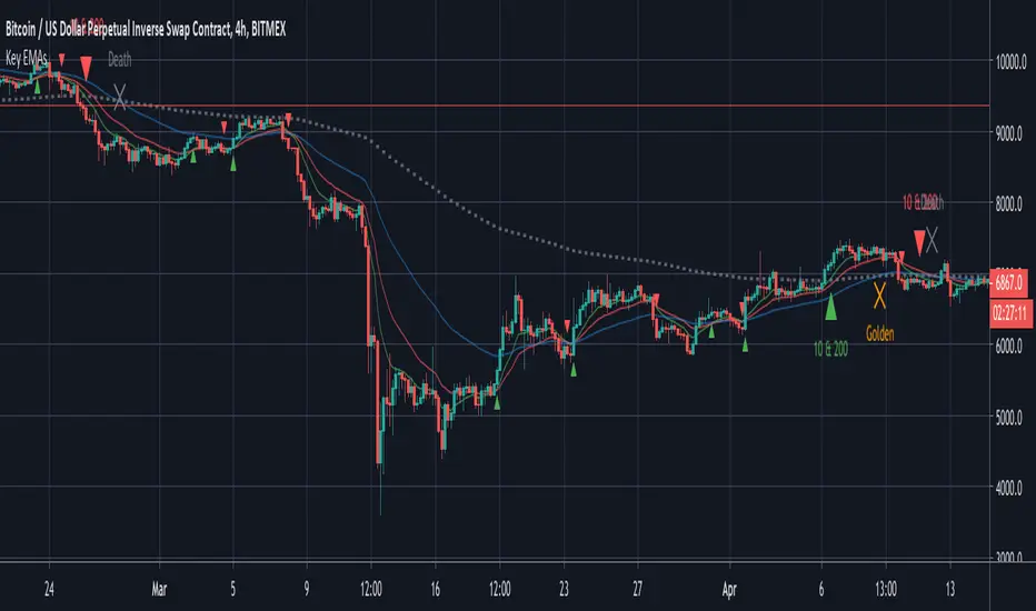
Key EMAsSimple trade helper script that plots: - 10 & 20 EMA crosses for fast moves - 10 & 200 EMA crosses for trends - 50 & 200 EMA golden and death crosses Alerts built in.อินดิเคเตอร์ Pine Script®โดย colinmckที่อัปเดต: 1010943
Moving Averages CrossThis Indicator helps you spot crosses between moving averages. Thought to combine short term and long term strategies. A complementary element for your trading tool belt. The First study (short term): Helps you visualise the relation between two simple moving averages (9,21) by default. The Second study (long term): Helps you identify the relation between three simple moving averages (50,100, 200) by default. Spot Golden Crosses and Death Crosses from far. อินดิเคเตอร์ Pine Script®โดย Laforge451ที่อัปเดต: 3354
Bollinger Band Strategy (Basic) Version 1 This strategy is for learning purposes only. Pay special attention to these strategies on longer aggregation periods (like 1 hr chart or more). Don't expect accurate results when you set a limit to 10 cents above your entry to be accurate. For example if you set the chart to 1 day, the price may move down and hit a stop 10 times then tag your limit. If this doesn't make sense, just don't use strategies here. Learn more first. That being said, I don't have specific recommendations for each aggregation period, backtesting isn't always perfect. Now then, this strategy can be used as the traditional BB method by setting the "Stop" and "Limit Out" to like 10000, check "Reversal Entry" and uncheck "Limit Time of Day" This will keep the strategy running just reverse your position when price crosses outside each band. INPUTS: Length - length of WMA that I used for mean of Bollinger Band (this may suppose to be SMA, too bad) Source - O-H-L-C basis for WMA Deviation - normal Standard deviation that would be set when using Bollinger Band Trailing stop check box - your stop value will be either a hard stop or trailing stop for an exit Stop - the stop value - remember you can set this really high and it won't stop out Limit Out - the limit value for exit Reversal Entry check box - This changes each entry from a reversal (traditional idea of BB) to enter a trend trade - hopefully version 2 will have choice to trend one direction and reversal in the other. Limit Time of Day - Especially when trading futures, you may want to only trade a specific time of day, when this box is checked, you can set the entry times below, exit will still only occur based on limit/stop or a flip entry order (the opposite entry condition is met) Tips: when I don't know a thing about a price range, like gold. I can set the limit out to 10000 and play with a trailing stop to get a better idea of what is even possible before tuning further. กลยุทธ์ Pine Script®โดย oldinvestor164
4 SMA Ribbon 22/50/110/200SMA ribbon including golden cross valuesอินดิเคเตอร์ Pine Script®โดย rknkr2241
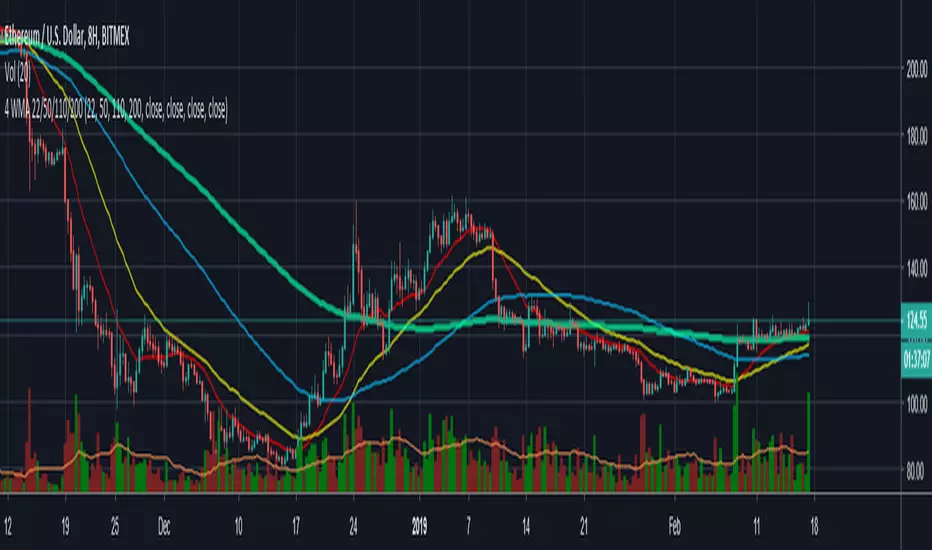
4 WMA Ribbon (22,50,110,200)4 WMA including 50 200 golden cross values included. enjoyอินดิเคเตอร์ Pine Script®โดย rknkr6667
Kringold2[WOZDUX] gold equivalentThe indicator is a tool for global analysis. The default is the price of gold. The price of the instrument from the main window is divided by the price of gold. The result is the price of the instrument in units of gold. The screen uses the Dow Jones index as an example. In the indicator window, the price of the index in units of gold or the so-called gold Dow Jones. The use of the gold equivalent makes it possible to see more truthful trends. The Indicator has the ability to change gold to any other equivalent. It is enough to change the name of the exchange and the name of the instrument in the options tool and exchange. In addition, in the settings, the second box on top allows you to view the graph in a linear or logarithmic scale. The first box at the top switches the line chart or the CCI =WT indicator to this chart. ------------------------------------------- Индикатор это инструмент для глобального анализа. По умолчанию используется цена золота. Цена инструмента из основного окна делится на цену золота. В результате получается цена инструмента в единицах золота. На экране для примера используется индекс Доу джонса. В окне индикатора цена индекса в единицах золота или так называемый золотой Доу Джонс. Использование золотого эквивалента дает возможность видеть более правдивые тенденции движения. В Индикаторе есть возможность поменять золото на любой другой эквивалент. Достаточно в опциях инструмент и биржа изменить название биржи и название инструмента. Кроме того, в настройках, второй бокс сверху дает возможность смотреть график в линейном или логарифмическом масштабе. Первый бокс сверу переключает линейный график или индикатор CCI =WT к данному графику.อินดิเคเตอร์ Pine Script®โดย wozdux1159
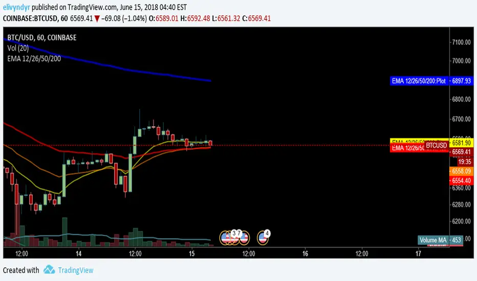
EMA 12/26/50/200Includes Coinbase EMAs alongside the standard golden/death cross watch EMAsอินดิเคเตอร์ Pine Script®โดย elivyndyr11293
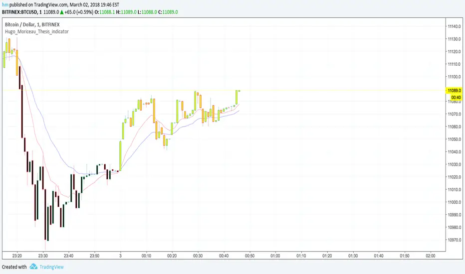
Macd_Reader_Signal_Moriceau_Thesis_indicatorThe idea is to create a MACD "Reader" that can tell you when you should buy (yellow candle sticks) and when to Sell (black one) you have also strong signal of with B and S write on graphic automatically. This indicator is set and back tested with BTCUSD and Gold. I used also for french equities and it works really good. Let me know if you want any change or have comments. Hugo Moriceauอินดิเคเตอร์ Pine Script®โดย Hugo_Sw_Trader55161
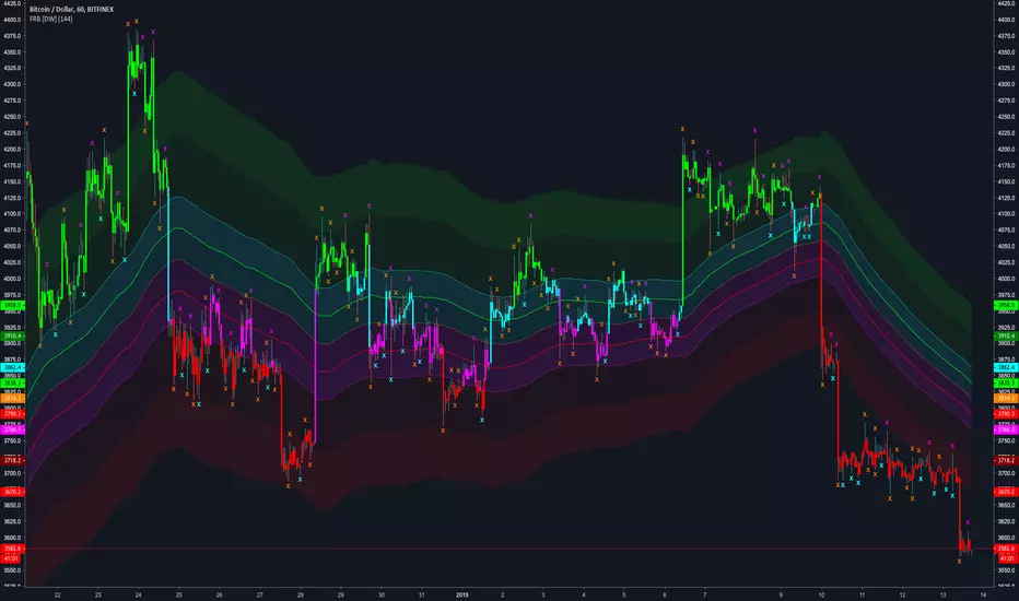
Fractal Regression Bands [DW]This study is an experimental regression curve built around fractal and ATR calculations. First, Williams Fractals are calculated, and used as anchoring points. Next, high anchor points are connected to negative sloping lines, and low anchor points to positive sloping lines. The slope is a specified percentage of the current ATR over the sampling period. The median between the positive and negative sloping lines is then calculated, then the best fit line (linear regression) of the median is calculated to generate the basis line. Lastly, a Golden Mean ATR is taken of price over the sampling period and multiplied by 1/2, 1, 2, and 3. The results are added and subtracted from the basis line to generate the bands. Williams Fractals are included in the plots. The color scheme indicated whether each fractal is engulfing or non-engulfing. Custom bar color scheme is included.อินดิเคเตอร์ Pine Script®โดย DonovanWallที่อัปเดต: 44646
Manus Gold Daily Range Choppy Filter### Manus Gold Daily Range Choppy Filter This indicator is designed to answer one simple but critical question **before trading begins**: **Is today a day worth trading, or is the market too choppy?** Instead of generating entries or signals, this tool acts as a **daily market condition filter**. It helps traders avoid low-quality sessions where breakouts fail and price action is dominated by noise and mean-reversion. --- ### 🔍 What the indicator does The script evaluates **market tradability once per day**, based on **yesterday’s completed data**, and then locks that decision for the entire trading day. It combines two independent concepts: #### 1️⃣ Choppiness Analysis (core logic) * Calculates the **Choppiness Index** on **1H and 4H timeframes** * Detects whether the market is: * **Trending / expanding** (low & falling choppiness) * **Range-bound / noisy** (high choppiness) * Optional requirement that choppiness must be **falling** (early expansion phase) #### 2️⃣ Daily Range Contraction (optional filter) * Detects **NR days** (narrowest range in N days) * Detects **ADR contraction** (yesterday’s range significantly smaller than normal) * Used to identify potential **breakout-ready environments** Both components are combined into a single **daily tradability decision**. --- ### 🟢 / 🔴 Output logic * **Green bar** → Market is considered **tradable** * **Red bar** → Market is **not tradable** (choppy / low quality) Important characteristics: * **Exactly one bar per day** * No intraday repainting * Decision is locked using **yesterday’s final data** * Designed to be used on **any intraday chart** --- ### 📊 Visual elements * Histogram bar (green / red) indicating daily tradability * Optional background highlight on the first bar of each new day * Optional table showing: * Choppiness values (1H / 4H) * Choppy / not-choppy status * Falling expansion state * DRB / contraction filter status --- ### 🎯 How to use it This indicator is **not a trading strategy** and does **not provide entries**. It is best used as: * A **pre-market filter** * A **“trade / no-trade” switch** * A **risk and expectation management tool** Typical usage: * Trade breakout and trend strategies **only on green days** * Reduce size or avoid trading entirely on red days * Combine with your existing setups (London Breakout, NY session, trend continuation, etc.) --- ### ⚠️ Notes * Designed and optimized for **Gold (XAUUSD)** but works on other instruments * Uses higher-timeframe context to protect against intraday noise * Especially useful for traders who struggle with **overtrading in ranges** --- ### ✅ Summary This indicator helps you **stay out of bad days**, not chase more trades. Sometimes, **the best trade is not trading at all**. อินดิเคเตอร์ Pine Script®โดย feiler_manuel1
Sessions Gold Sniper MGC1!Overview The MGC1! Sniper Time Zones is a specialized intraday precision tool designed for Gold futures traders (MGC/GC). It visually segments the trading day into four critical high-volatility windows based on ICT/SMC Killzones and Market Profile auction logic. Core Functionality The script automatically highlights specific time blocks on the chart to identify where "Smart Money" is likely to inject liquidity. It assists the trader in avoiding "chop" (low volatility periods) and focusing execution only during high-probability hours. Highlighted Sessions London Open (06:00 – 10:00): Captures the initial trend setting and European liquidity raids. Pre-NY Lunch (12:00 – 13:00): Monitors mid-day rebalancing or potential position squaring before the NY open. NY Open (14:00 – 16:00): The primary volatility window for ICT/SMC setups (Silver Bullet & Judat Swing). NY PM Session (16:30 – 18:00): Focuses on the afternoon expansion or daily close reversals. Key Features Dynamic Labels: Clear, top-aligned text labels identify each session, ensuring you never lose track of the current market context across any timeframe (M1 to H1). Customizable Aesthetics: Fully adjustable color palette via the settings menu to match any dark or light chart theme. Visual Scannability: Uses transparent background fills (bgcolor) to allow price action and candlesticks to remain the primary focus while providing structural time-context. Technical Setup Platform: TradingView (Pine Script v5). Timezone: Set to UTC+1 (Central European Time) by default to align with the MGC1! Sniper methodology.อินดิเคเตอร์ Pine Script®โดย caktrading0
Position Size Dashboard (Gold / Forex / Indices)A clean, MT5-accurate position sizing tool that instantly calculates lot size based on risk and stop-loss range. Designed for discretionary and prop-firm traders who want fast, no-nonsense sizing without manual math. Supports Gold (XAUUSD), Forex pairs, and Indices, with clear on-chart dashboard output. How to Use (Step-by-Step) Add the indicator to your chart Open Settings → Inputs Enter your Risk ($) (e.g., 100) Enter SL Range Forex → pips Gold / Indices → price points Enable or disable Gold / Forex / Indices rows as needed Choose dashboard position, colors, and text size Click OK → Lot size is calculated instantly and shown on chartอินดิเคเตอร์ Pine Script®โดย notpranesh3
Level 1 Gold - MAs & BiasLevel 1 Gold - MAs & Bias A clean trend bias indicator designed for the Level 1 Gold trading strategy. Features: EMA 5 (Orange) - Fast exponential moving average for momentum confirmation SMA 21 (Blue) - Slow simple moving average for trend direction Trend Bias Detection - Tracks the last EMA5/SMA21 crossover to determine trade direction: EMA5 crosses ABOVE SMA21 → "BUYS ONLY" (only take long trades) EMA5 crosses BELOW SMA21 → "SELLS ONLY" (only take short trades) Session Filter - Highlights invalid trading sessions (default: 06:00-16:00 UK time, avoids Monday AM and Friday PM) Crossover Markers - Green Circle (bullish cross), Red Circle (bearish cross) How to Use: Wait for an EMA5/SMA21 crossover to establish bias Only take trades in the direction of the bias Avoid trading during shaded (invalid) session times Look for breakouts across your horizontal support/resistance levels that align with the bias Settings: Moving average lengths (default: EMA 5, SMA 21) Session times and filters (customizable) Toggle visuals on/off Adjustable colors Best Used On: 1H timeframe for Gold (XAUUSD)อินดิเคเตอร์ Pine Script®โดย macztradezที่อัปเดต: 22589
EMA50 for Gold strategy TF 15MThis is a strategy for Gold in TF 15M using EMA50 of HTกลยุทธ์ Pine Script®โดย dranjumnm5
Hieu gold m2 1688This indicator compares global gold price dynamics with global M2 liquidity. The M2 aggregate is constructed from four major economies the United States, China, the Eurozone, and Japan which together account for roughly 80 percent of global GDP and the vast majority of global liquidity creation. By comparing gold with this core M2 proxy, the indicator highlights how changes in global liquidity influence long term gold valuation and macro cycles. It is designed for macro analysis rather than short term trading and focuses on trend and regime shifts in monetary conditions.อินดิเคเตอร์ Pine Script®โดย ankhang15684
Chart This in GoldProduces a historical line chart in the bottom pane to reflect how many units of spot gold (XAU) could be exchanged for one unite of the underlying asset.อินดิเคเตอร์ Pine Script®โดย cloudhidden1
XAUUSD Lot Size Calculator1. What This Indicator Does This tool is a Visual Risk Management System. Instead of using a calculator on your phone or switching tabs, it allows you to calculate the exact lot size for your trade directly on the TradingView chart by dragging lines. It automates the math for: Lot Size: How big your position should be to risk exactly X% of your account. Take Profit: Where your target should be based on your Risk-to-Reward ratio. Safety Checks: It warns you if your stop loss is too tight for the minimum lot size (0.01). 2. Visual Features 🔴 The Red Line (Stop Loss): This is your interactive line. You can grab it with your mouse and drag it to your desired invalidation point (e.g., below a support wick). 🟢 The Green Line (Take Profit): This line moves automatically. You cannot drag it. It calculates where your Take Profit must be to satisfy your Risk:Reward ratio (Default 1:1) based on where you placed the Red line. ⚫ The Info Table: A high-contrast black box in the corner that displays your calculated Lot Size, Risk amount, and Trade direction (Long/Short). 3. How to Use It (Step-by-Step) Step 1: Initial Setup When you first add the indicator to the chart, you need to tell it about your account: Double-click the Black Table (or the Red Line) to open Settings. Inputs Tab: Account Balance: Enter your current trading balance (e.g., 10,000). Risk %: Enter how much you want to lose per trade (e.g., 1.0%). Contract Size: Keep this at 100 for Gold (XAUUSD) or standard Forex pairs. Risk : Reward Ratio: Set your target (e.g., 1.0 for 1:1, or 2.0 for 1:2). Step 2: Planning a Trade Look at the chart and identify where you want to enter (current price) and where you want your Stop Loss. Find the Red Line on your chart. (If you don't see it, go to Settings and change "Stop Loss Level" to a price near the current candle). Click and Drag the Red Line to your specific Stop Loss price. Step 3: Reading the Signals Direction: If you drag the Red Line below the price, the table shows LONG. If you drag it above, it shows SHORT. Lot Size: Read the big green number in the table (e.g., 0.55). This is the exact lot size you should enter in your broker. TP Target: Look at the Green Line on the chart. That is your exit price. Step 4: The "Orange Warning" If you place your Stop Loss very close to the entry, or if your account is small, the math might suggest a lot size smaller than is possible (e.g., 0.004). The table text will turn ORANGE. The Lot Size will stick to 0.01 (the minimum). The "Risk ($)" row will show you the actual risk. (Example: Instead of risking your desired $100, you might be forced to risk $105 because you can't trade smaller than 0.01 lots).อินดิเคเตอร์ Pine Script®โดย Zeeshan_Miranที่อัปเดต: 71
Obsidians Gold RevengeMany traders (including institutional desks) track lunar cycles on Gold (XAUUSD) because of the psychological impact on market sentiment. The common theory—often attributed to methods like Gann analysis—is: 🌑 New Moon: Often correlates with Market Bottoms (Buy Signals) or "New Beginnings." 🌕 Full Moon: Often correlates with Market Tops (Sell Signals) or "Exhaustion." Here is a script that mathematically calculates the Moon Phase based on the lunar synodic month (approx. 29.53 days). It will plot these events on your chart so you can visually backtest if Gold respects these cycles. How to use this for testing Add it to your Chart: Apply it to the XAUUSD (Gold) chart. Timeframe: This works best on 4-Hour (4H) or Daily (1D) charts. (On 15m charts, the moon phase covers many candles, so the label will appear on the specific candle where the phase officially "switched"). What to look for: Look at the Dark Blue (New Moon) areas. Did price form a bottom or start a rally there? Look at the Yellow (Full Moon) areas. Did price peak and reverse downward there? Note: Lunar cycles are considered a "timing tool" rather than a directional indicator. They often indicate when a reversal might happen, but you should combine this with your Institutional Candle zones to confirm the direction! อินดิเคเตอร์ Pine Script®โดย LilyObsidianArc11
Multi-Indicator Trend-Following Strategy 1-minute Gold strategyTrend following using many indicators to provide accurate buy and sell signals on the 1-minute gold chartกลยุทธ์ Pine Script®โดย malkawiraafat14
Monthly Chart Gold/Silver Strategy - NDAThis a strategy for the Monthly Chart It indicates Buy & Sell points for trading Gold/Silver or other Precious Metals commodities or ETFs. Its a simple strategy based on the MACD and RSI indicators. I hope that you like it and find it useful อินดิเคเตอร์ Pine Script®โดย NeilA6370217
TQ Silver / Gold (Weekly Macro)This indicator tracks the Silver / Gold ratio on a weekly basis to determine whether silver is leading gold (risk appetite returning inside metals) or gold is leading silver (a more defensive precious-metals posture). Within the TQ Weekly Macro Framework, this indicator is designed to be used after confirming the broader macro environment using TQ Gold Trend (Weekly Macro), TQ Gold / DXY (Weekly Macro), and TQ Gold / SPY (Weekly Macro). Why Silver / Gold matters >When Silver / Gold rises, silver is outperforming gold — often associated with reflation, growth expectations, or broad risk appetite within precious metals. >When Silver / Gold falls, gold is outperforming silver — often associated with defense, uncertainty, or tighter financial conditions. >This ratio is not a timing tool — it is a regime and leadership indicator within the metals complex. How it works (regime rules) Using weekly data: Compute Silver ÷ Gold Apply a 30-week SMA Regime definitions: Bull: Ratio above a rising 30-week SMA (silver leading) Bear: Ratio below a falling 30-week SMA (gold leading) Neutral: Transition / range A clear label marks the current regime. How to use it in your system Use after confirming: TQ Gold Trend (Weekly Macro) TQ Gold / DXY (Weekly Macro) TQ Gold / SPY (Weekly Macro) > If Silver / Gold is Bull, metals participation is broadening and silver often has more upside torque. > If Silver / Gold is Bear, gold leadership is defensive and silver exposure may underperform. > Neutral often signals rotation or consolidation. Best timeframe Designed for weekly macro regime analysis.อินดิเคเตอร์ Pine Script®โดย tradingqueen183
TQ Gold / SPY (Weekly Macro)What this indicator does This indicator tracks the Gold/SPY ratio on a weekly basis to show whether gold is outperforming U.S. equities (risk assets). It helps you determine if the market is favoring hard money / defensive leadership vs risk-on equity leadership. Within the TQ Weekly Macro Framework, this indicator is intended to be used after confirming gold’s primary trend using TQ Gold Trend (Weekly Macro) and its monetary backdrop using TQ Gold / DXY (Weekly Macro). Why Gold/SPY matters Gold can rise during equity booms and during equity stress. The Gold/SPY ratio tells you which asset class is winning in relative terms. Rising Gold/SPY often signals defensive leadership, shifting macro preferences, or risk repricing, especially when aligned with TQ Gold Trend (Weekly Macro). How it works (regime rules) Using weekly data: Compute Gold ÷ SPY Apply a 30-week SMA Regime definitions: Bull: Ratio above a rising 30-week SMA (gold leading equities) Bear: Ratio below a falling 30-week SMA (equities leading gold) Neutral: Transition / range A clear label marks the current regime. How to use it in your system Use after TQ Gold Trend (Weekly Macro) and TQ Gold / DXY (Weekly Macro). > If Gold/SPY is Bull, gold is leading risk assets — metals tend to behave stronger and more “macro-relevant.” > If Gold/SPY is Bear, equities are winning — gold moves may be less dominant. > Neutral usually means rotation or consolidation. Best timeframe Designed for weekly macro regime analysis, not short-term trading.อินดิเคเตอร์ Pine Script®โดย tradingqueen182
TQ Gold / DXY (Weekly Macro)What this indicator does This indicator tracks the relative performance of gold versus the U.S. dollar using the Gold/DXY ratio. It helps determine whether gold’s strength is real (monetary) or merely nominal. Why Gold/DXY matters Gold rising with a rising dollar is not a strong signal. Gold rising against a weakening dollar signals monetary outperformance. This ratio filters out dollar noise and focuses on true purchasing-power strength. How it works The indicator calculates Gold ÷ DXY using weekly data. A 30-week SMA is applied to the ratio. Regimes are defined as: Bull: Ratio above a rising 30-week SMA (gold beating the dollar) Bear: Ratio below a falling 30-week SMA Neutral: Transition or range-bound periods A clear on-chart label shows the current regime. How to use it Use after confirming Gold Trend is Bull. When Gold/DXY is Bull, gold has a true monetary tailwind. When Gold/DXY is Bear, gold rallies are often fragile or dollar-driven. Neutral readings signal consolidation or regime change. Best timeframe Designed for weekly charts and macro analysis. Not intended for short-term trading signals.อินดิเคเตอร์ Pine Script®โดย tradingqueen182