Multi TimeFrame (MTF) Trend StrengthCalculate and display simple multi timeframe (3 timeframe) trend strength using heikin ashi.
Mtf
Papercuts Dual PSAR v01Dual PSAR is a trend following script that uses auto-higher timeframe calculation of the current timeframe to create a dual Parabolic Stop And Release.
This is useful because it can determine periods of transition or indecision and can flag those periods with which way it is learning even though it is undecided, what i call "Wait Zones".
When both PSARS are not in alignment, it uses the lower timeframe one to determine which way the wait zone is learning.
You can see below in the chart shows some good trends and some wait zones.
A wait zone can have bullish indication, but then still have a bearish continuation.
A wait zone can have bullish indication, and then enter a bull trend.
Typically I won't make trades in wait zones, and I will exit trades when entering one.
Just wanted to try this out and see how it did. Figured I'd share.

Tocorin_MTF_MA7 MAs (SMA or EMA) can be displayed in each period.
MTF display is performed only at 5m, 1h, and 4h.
The upper MAs to be displayed are as follows
5m: 1h, 4h, and 1D
1h: 4h and 1D
4h: 1D
The MA line style is stepline and circles to make it easier to see.
You can change it in the settings as you wish.
--
各時間足で 7本の MA(SMA or EMA) 表示が可能です。
5m, 1h, 4h の時だけ MTF 表示を行います。
表示する上位 MA は下記の通り
5m: 1h と 4h と 1D
1h: 4h と 1D
4h: 1D
見やすくするためにMA の線のスタイルを stepline と circles にしています。
設定で任意に変更してください。

Multi Time Frame (MTF) RSIThis script can display Multi time frame (MTF) Relative Strength Index (RSI) values. It works on any chart and appears at the top left of the screen.
1. It can plot values from 4 different time frames which can be customized.
2. Higher time frame indicates the main trend
3. Overbought and oversold levels are highlighted with different colours.

Crypto Scanner [MensaTrader]Market Scanner
By default set up to scan 7 Crypto Currencies on 3 different Time frames
Default assets are from Binance listing, but can be changed in settings.
First timeframe is set to Daily, (all timeframes can be changed in the settings), The RSI value for the Daily resolution is printed. The current conditions need it to be between the value of 40 and 50, If this condition is met then the box will light are green, if they are not they will stay red.
Second timeframe is set to 4 Hour, RSI for this timeframe and assset will also be printed here, the conditions for it are different though. Currently set up so if the RSI value is lower than 40 the box will light up green. This 40 value can be changed in the settings aswell.
Third timeframe is set to 1 Hour, This timeframe is looking for divergences. If a Divergence is found, the box will light up green and say "Bullish Divergence", This will stay green until either of the 2 invalidation conditions are met.
One condition is (For Bullish Divergence) to be cleared, If the recent Low where the divergence was formed gets taken out. Then the divergence sign will dissappear
Second condition is if the RSI Value climbs above 55, Then once again the Divergence sign will dissappear.
Use this to help scan multiple assets at once and find RSI values which suit your trading set ups.
I have tried to make as many options adjustable as possible including the Size of the Scanner, all in the settings.

Papercuts Super Trend MTF v02All my scripts are part of a suite called Papercuts .
This one uses one current timeframe supertrend and adds Four Automatic Higher Timeframe Supertrends based on those same parameters to help you determine larger trends while only needing a single chart. This works quite well on 5 and 15 minute charts and will look up in time. Confident trends can be identified by having two or more lines in the same direction.
When unified, the intensity of the glow should increase a trends confidence. Unify collapses the 3 highest timeframe supertrends into the first higher timeframe supertrend. Without Unify on, the overall trends are usually easier to see at just a glance. Higher timeframe supertrends can show support or resistance and act as stop loss limit ranges if you choose. Unify keeps things a bit cleaner and more compact.
V02 updated to fsecurity for no repainting and added a 3MA trend option as well.
Thanks to @Pinecoders for helping me better understand the security function!
Here is a view with Unify on....
Here is a view with Unify off...

MTF CandleLevelsIn the spirit of freedom from oppression on this day of July 4th, 2021 in the United States, I hereby release this flagship indicator "MTF CandleLevels" into the wild for any subscribing TV member on the planet to utilize. It's now one my few great gifts to the souls of humankind within the realm of trading on TV. TradingView continues to bless Pine Script by releasing supplemental upgrades, enough for me to develop this indicator beyond it's experimental phase to full potential, as I had always wished to design it from theory. Educationally while using it, you will witness how OHLC/HA candles are actually formed for charts. I like to think of it as a candle formation microscope anyone can learn from.
It is intended for any style of trading or skill level from newcomer to advanced. There are no requirements/prerequisites for you use it. Which means you don't have to wear a mouth muzzle, get multiple doses of the life endangering FrankenJabs, subserviently bow down to authoritarian demands of obedience, or learn the ancient mystical art of deception "Fau Chi" in order to employ it's inherent power. A little sprinkle of satire helps with a dry technical read :). You have the absolute freedom to utilize it any way you see fit! That's right, it's even your choice whether you use it or not. The unshackled empowerment of choice always equates to FREEDOM. I can't program these precious gems without it...
One thing you will have noticed is it's specifically published on a Heikin Ashi(HA) chart, while having immunity to the Heikin Ashi candle charts unique open/close behavior. This has been believed to be an impossibility until now. For members who don't know, HA candle charts have a different `open` and `close` from the `open` and `close` of the other ordinary OHLC candle charts. Regardless of "CandleLevels Mode" chosen in Settings, the indicator will display identical on either bar chart type, excluding Renko, Line Break, Kagi, Point&Figure, and Range candle charts of course. It's abilities supersede the simpler "Multi-Time Period Charts" built-in TV indicator with a completely different architecture. For those of you extremely curious about how I accomplished this indicators level of code complexity, it was immensely difficult taking over a year of effort for this one functional unit, and I will leave it at that...
This novel MTF technology displays OHLC/HA support and resistance levels that mimic the functionality of larger duration candle formations in real time. Basically explained, while charting on a shorter duration timeframe candle chart, you can see open, high, low, and close levels fluctuate in the larger duration timeframe. This reduces the need to jump back and forth to view price action on different chart sampling intervals. You may even use multiple sets of CandleLevels indicators over a wide variety of chosen timeframe options, along with everything else in between.
The CandleLevels behavior is chosen within the indicator "Settings" using a selection mode of either the standard OHLC candlestick formations or Heikin Ashi candlestick formations. Each mode has a multitude of uses depending on the users trading style or timeframe.
Visbility of CandleLevels will ONLY occur when it is set to a larger duration timeframe interval than the current chart sampling rate. For example, you may be using the 5 minute interval sampling rate on the chart, yet you can easily see the open, high, low, close ranges with a chosen 120 minute timeframe setting. The multiple time frame(MTF) settings are highly adjustable having intervals of seconds, minutes, days, a multiple of the chart interval, or the common input(type=input.resolution) function provided by Pine.
CandleLevels come with multiple color schemes to reduce color interference with other indicators in the overlay pane, including the intended use of multiple sets of CandleLevels. My basic color scheme selections can be overridden to choose any imaginable color you desire for your visual acuity. Also, there are additional controls available to fine tune a visually pleasing appearance depending on your preferences and viewable area. One last new hidden fine tune capability, not only for this indicator but all TV indicators, is the agility to use up/down arrow keys on the keyboard when an indicator setting is in focus after mouse selection. For example, when choosing line thickness, you can modify values/options by key stroke. Try it out, I'm sure you will find this useful for any indictor for eternity.
NOTICE: There is only 500 line drawings available, in total to display, at this current release. This equates to 83 sets of CandleLevels maximum.
Features List Includes:
Candle type selection
MTF controls for seconds, minutes, days, multiple-of, and TV input
Multiple color schemes with color overrides
Color opacity selector
Line thickness control
Enable/disable capable MTF interval display with positioning
When available time provides itself, I will consider your inquiries, thoughts, and concepts presented below in the comments section, should you have any questions or comments regarding this indicator. When my indicators achieve more prevalent use by TV members, I may implement more ideas when they present themselves as worthy additions. Have a profitable future everyone!
RISK DISCLAIMER:
My scripts, indicators, and studies are specifically intended for informational and educational use only. These use historical data points to perform calculations to derive real-time calculations. They do not infer, indicate, or guarantee future results or performance.
By utilizing this script/indicator/study or any portion of it, you agree to accept 100% responsibly and liability for your investment or financial decisions, and I will not be held liable for your subjective analytic interpretations incurring sustained monetary losses. The opinions and information visual or otherwise provided by this script/indicator is not investment advice, nor does it constitute recommendation.

MM MTF HeatmapThe MM Mtf HeatMap can scan multi symbol and multi timeframe on any given market
it detects trends with options on what type of trend detection moving average and smoothing type you prefer based on your backtest.
detects trends on four selectable timeframes
10 selectable symbols
Directions are simple
make sure you are using this on a lower timeframe your lowest selected timeframe is on. for example if your lowest timeframe is the 15min
make sure you are using current charts below the 15min like the 10 or 5min
selectable moving averages
are the
SMA
EMA
Tema
WMA
Hull
Variable
This HeatMap displays the trend overall market you are trading at one glance (Talk about top down analysis)
Enjoy happy Trading
Link below or PM us for access to this indicator Happy Trading
MTF VWAPA simple wavetrend oscillator based off WaveTrend Oscillator by @LazyBear to visualise 4 different timeframe vwap under 1 chart.
Timeframe can be changed in indicator settings in minutes. Unnecessary waves can be removed by unchecking said TF wave in Style settings.

RSI MTF TableRSI MTF covers the timeframes 1m, 5m, 15m, 1H, 4H and Daily
Works on any intraday chart and appears in bottom left of screen
Can customise colors and transparency

SMA 200 Ribbon MTF - Support and ResistanceThe SMA 200 is one of the most important and strongest support/resistance lines on any timeframe. This script pulls the SMA 200 line from multiple timeframes so traders can visually see price action bounce between support and resistance . The current timeframes SMA 200 is displayed in white and turns yellow to signify "pressure". Can be used on higher timeframes to find bull action. This indicator can also be used to filter out pumps and dumps as shown in example 3 and 4.
Example of indicator on 5 min timeframe. Candles bounce along SMA200 lines.
Example of indicator on daily timeframe . Lines turn green and price action pumps. Lines turn red and price action dumps.
Example 3: A clean crossover of lines usually signals a bullish pump.
Example 4: Tangled or messy lines tend to result in a dump as price action struggles to cross resistance. A pullback is required to "clean" the lines.
EMA Band can be turned on using "tickbox" in settings menu.

MTF GMMA with Display Timeframe ControlJapanese below / 日本語説明は下記
Multi time frame GMMA indicator that shows GMMA of the current timeframe and GMMA of upper time frame(MTF GMMA).
One of the GMMA’s advantages is to visualize trends showing multiple MAs of short term and long term. By providing both of MTF GMMA and the current timeframe’s GMMA, traders can grasp trends having upper timeframe’s perspectives.
How is it different from other MTF indicators?
Problems with other MTF GMMA indicators are;
-If you set higher timeframe GMMA , it will also be shown on further higher timeframes.
i.e. If you set 4hour GMMA on 1 hour or lower time frame charts, it will also appear on daily and weekly chart, which is not necessary.
To tackle these problems, this indicator has incorporated “display timeframe control” functions as follows.
-To show MTF GMMA on timeframe lower than the upper timeframe you set as MTF timeframe.
For example, if you select daily timeframe for MTF GMMA , the GMMA will be shown only on 4 hour or lower timeframes(1H, 30M, 15M, 5M, 1M).
Functions:
-One upper timeframe can be selected from monthly, weekly, daily, 4hour, 1hour, 30mins, 15mins and 5mins for MTF GMMA
-MA type can be selected from SMA/EMA
-MA period can be configured but common for current timeframe GMMA and MTF GMMA
-Both of current timeframe/MTF GMMA can be disabled when not necessary by ticking checkbox
How to use?
A suggested use of GMMA with MTF GMMA is trend following while price is above the current timeframe GMMA and MTF GMMA(buy the dips and sell the rips) and aim trend reversal when the current timeframe GMMA crosses MTF GMMA
Sample chart
1 hour chart with 1 hour GMMA(blue and yellow) and 4 hour GMMA(MTF GMMA, green)
——————————————————————————————
上位足のGMMA(MTF GMMA)と現在タイムフレームのGMMAの2つのGMMAを表示することのできるインジケーターです。
GMMAの一つのメリットは短期・長期のMAを複数表示することでトレンドを容易に可視化できることですが、上位足のGMMAを合わせて表示することで上位足の目線を保ったままトレンドを把握することができます。
他のマルチタイムフレームGMMAインジケーターとの違い
他のマルチタイムフレームGMMAのインジケーターでは、上位足のGMMAを表示すると、さらにその上位足でもそのGMMAが表示され、チャートが見にくくなるという問題に直面します。
例: 4時間足のGMMAを下位足で表示可能な様に設定すると、日足や週足でも表示されチャートが見にくくなる。
この問題に対して、このインジケーターでは、
・上位足のGMMAを表示する時間軸を制御することで上位足で不必要な情報を表示させない。
という機能を加えることでこの問題を解決しています。
具体的には、マルチタイムフレーム用に選択した上位足のタイムフレームより小さいタイムフレームでのみ上位足のGMMAが表示されるようになっています。
例えば、上位足として日足を選択した場合、日足のGMMAは4時間足、1時間足、30分足、15分足、5分足、1分足にのみ表示されます。
機能
-上位足のタイムフレートとして、月足、週足、日足、4時間足、1時間足、30分足、15分足、5分足を選択可能
-MAタイプはSMA/EMAから選択可能
-MAの期間は設定可能ですが、現在タイムフレームGMMAとMTF GMMAで共通
-現在タイムフレームGMMAとMTF GMMAは不要な時はチェックボックスで非表示可能
使い方
使い方の一つの例として、価格が現在タイムフレームGMMAとMTF GMMAの上にある間はトレンドフォロー(押し目買い/戻り売り)を、現在タイムフレームGMMAとMTF GMMAがクロスした時はトレンド転換を狙うということが挙げられます。
サンプルチャート
1時間足に4時間足のGMMA表示(青と黄色: 1HのGMMA, 緑: 4HのGMMA)

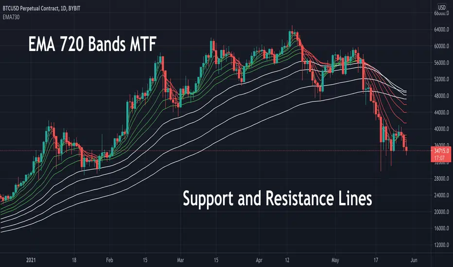
EMA 730 Ribbon MTF - Support and ReistanceThe EMA 730 line is a great way to show dynamic support and resistance . Price action travels "through" this line on each timeframe. This script pulls the EMA 730 Line from multiple timeframes so a trader can visually see price action bounce between support and resistance lines. Lower bands (white lines) can be turned off using "tickbox" in settings. EMA length can also be adjusted in settings. Some charts may work better with a length of 750.
Example of EMA Bands on lower timeframe.
[PX] MTF OverviewHello everyone,
the new table-functions came out, so I wanted to give it a try. With this indicator you can get an overview for your chart by looking at multiple timeframes and different type of indicators for each timeframe.
How does it work?
The indicator uses 3 different timeframes, which you can select in the settings-tab. For each timeframe it will look at the following indicators:
- Volume for the Volume column
- Relative Strength Index (RSI) for the Momentum column
- Average True Range (ATR) for the Volatility column
- Parabolic SAR (PSAR) for the Trend column
Increasing values will be shown in green, decreasing values in red. For the trend it prints a nice little symbol. I'm planning to add more indicators for each indicator category, so that you can choose, which indicators you want to use.
Hope that might be useful to some of you :)
Please click the "Like"-button and follow me for future open-source script publications.
If you are looking for help with your custom PineScript development, don't hesitate to contact me directly here on Tradingview or through the link in my signature :)


TDI Hedge Strategy
This is the incomplete version but upon multiple requests, I have released it early. All of the strategy and alert functions are yet to be written and I'll get around to it soon.
This indicator aims to be the best TDI indicator on TradingView. It is a strategy or study. It will have all of the filter, entry, and exit conditions for the strategies around the TDI.
What is implemented
MFI or RSI: the MFI is a much better TDI baseline than the RSI, in my opinion, and very effective
EMA or SMA used for the moving averages on fast, slow, and volatility band
Dynamic timeframe: set a factor of current timeframe and indicator will analyse higher timeframe automatically
Manual timeframe: set a higher timeframe to analyse different to currently viewed
Features for later
conditions for TDI filters/entries/exits
Strategy functions to use built-in strategy tester
BTE signal plot for Backtesting & Trading Engine
alerts
Enjoy!

EBB & Flow: a multi-EMA-based BB cloudIntro
This is an idea evolved out of the market maker method and EMA convergence, divergence, and mean reversion.
The market maker method informs us that the 5, 13, 50 and 200 EMAs are important to regulating price. Those EMA lengths are multiples of the 50 and 200 on lower major timeframes -- the 1 minute, 5, 15, 1H, 4H, 1D. I include the 21 because it is also a multiple and in crypto very often respected.
When market makers are testing price, they set their range and spike in the direction they test for liquidity. This can get chaotic. For instance, in a shorter time frame consolidation inside a bigger timeframe uptrend, it can be too easy to forget where you are in the many trends playing out.
When the EMAs are dragged over each other during normal price movement, you get these crisscrossing tracks of price, and the individual breaks can be hard to trace.
The range is what matters, ultimately, and the range is dynamic. In that case, the Bollinger Band is a great tool for detecting outliers in this case.
The Answer
So the answer this indicator seeks to give, is to look for outliers. This gives you a scalping strategy built on Traders Reality thinking and best put together with the PVSRA indicator, which I may include in this indicator just for the sake of concision, but they can work alongside each other or separately.
The key thing is the different EMA clouds, which are bollinger bands. Tight bands mean imminent breaks, favouring the trend. Vector candles out of a zone, pins to the low/high, etc. are all very relevant alongside this indicator.
You can also use it on its own and scalp the breaks of a cloud.
How it works
Each cloud is a standard deviation from their respective EMA, all in the same colour. The deviation multiple is 1.618 by default. Yes, fibonacci sequences are usually nonsense, but it works better with the BB than 2, 2.5 or 3.
Using just the clouds, you can see where each EMA is headed and how it behaves within the deviation of the others.
But that on its own isn't enough.
The indicator will also print snowflakes above and below the candle for notable outliers. It will be in the colour of the cloud it breaks, but only if that break is also breaking the smaller EMA clouds too.
The most snowflakes will be yellow because that's the 13 EMA. That one is dependent on nothing else and every break will print a snowflake. The 21 will be dependent on the 13. The 50 dependent on the 13 and 21 breaks. The 200 the most important.
For example, if the 200 EMA-BB or EBB is broken at the upper band, deviating by more than 162% of price over a 200 period EMA, and that break is not above the 50 EMA cloud, there will be no snowflake. However, if it exceeds the 13, 21, 50, and 200 clouds, then a purple snowflake will appear above the bar.
Any snowflake is an extreme in price. The purple is an especially good point of entry. That doesn't mean it is a perfect entry. You can build position from it, though, and be relatively certain of a price correction in the near future, because not only was this major EMA cloud violated, but all of the smaller ones too.
Reminder
You still need your PVSRA and candlesticks. This indicator on its own may have a nice hit rate for scalping and building position, as an alternative to the TDI or alongside it, but it is not enough on its own, just like the TDI.
Enjoy!

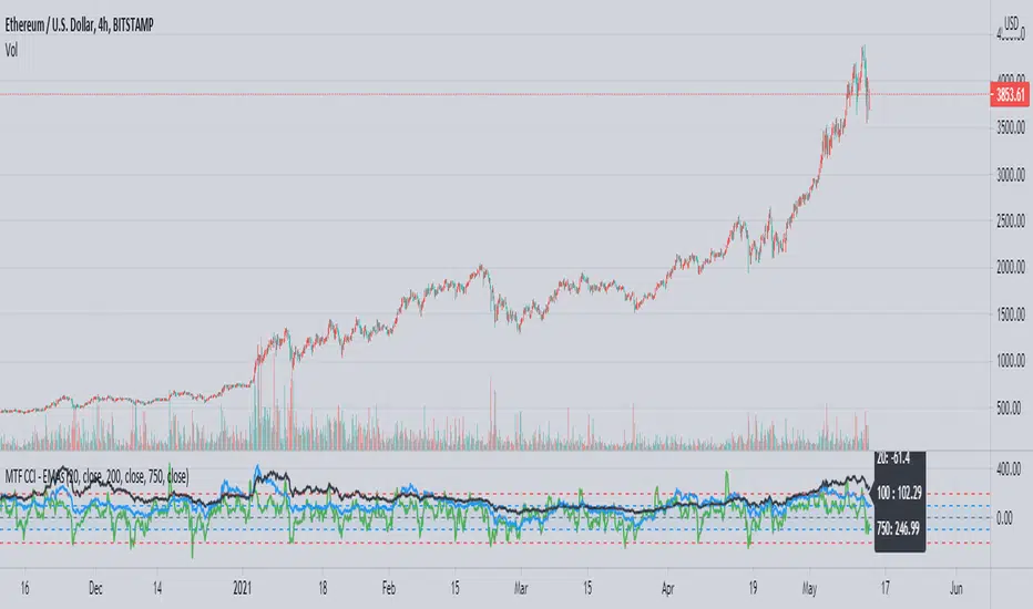
MTF CCI using EMAsThis is a CCI script adapted from 'CCI w EMA by Rick3712' which removes the EMA of the CCI and adds different sized CCI results to the same plot. An info box is also added for easy reference of current values.
CCI is a useful way to see the price's relation to moving averages in a different way, and being able to see the trend strength over time using the larger CCI allows a trader to make better informed decisions when reaching oversold or overbought conditions in relation to the shorter EMAs, such as the 20. You can also see patterns in a trend's strength easier by comparing the movements and levels to find likely areas of a pullback or buying opportunity.
In the example you can see a common level in ETH's parabolic movement on the 4h 750 EMA and 200 EMA that indicates a likely correction area.
MA-SS ( EMA SSL ) Indicator StrategyThis is the strategy script relating to the already-published MA-SS Indicator Study.
Backtest properties for the strategy tester results shown below are;
- 10k initial capital
- 50% of equity
- 0.0075% commission
- zero values on everything else
The MA-SS Indicator is a simple yet effective indicator using a combination of EMAs and SSL channel, utilising higher time frame data to help confirm trend/ price direction.
How does it work?
The Indicator consists of;
- 3 x EMAs – The 3rd EMA being a filter EMA
- Multi Time Frame EMA (This is an additional filter EMA which can be switched on and off)
- Multi Time Frame SSL Channel (This acts as a filter and can also be switched on and off)
The concept initially began as a simple EMA crossing indicator, but adding an MTF EMA plus a MTF SSL channel for additional filtering, helped to give a better indication of trend and ultimately filter out several bad trades.
- EXAMPLE: If price is …
o below the MTF EMA filter
o The MTF SSL Channel is red
o White and blue EMAs cross below the yellow (filter) EMA in the red SSL channel
> …a short is fired!
- (Opposite scenario for longs)
- Your stop loss would ideally be the top/ bottom of the SSL channel (either the MTF SSL channel or a standard SSL channel added manually to the chart), or, go for a clear pivot point or support/ resistance level.
- Take profit is yours to decide but I opt for a 1:1.5 risk/reward ratio. You could also use the MTF SSL channel to gauge when you should exit your trade (i.e. if you're in a long, wait for the SSL channel to flip red).
Any questions please fire away in the comments

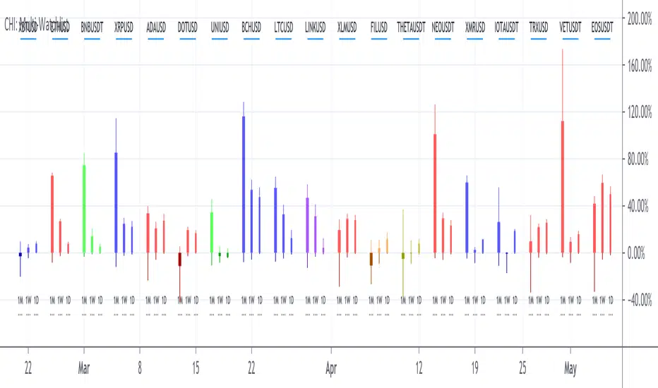
CH-I: Trend - Multi-Timeframe WatchlistWatchlists give only a flat perspective on changes in the market, as they show only the daily change of underlyings and give no comprehensible context to other underlyings and other timeframes to show the bigger picture.
With a cockpit showing price changes of different underlyings over several timeframes at the same time, a real understanding can be developed about shorter term momentum embedded into a longer term trend.
Look how major commodity currencies (in purple) have outrun other major currencies in recent months, but where the biggest losers in the last days as seen below. When now looking at the also displayed chart of the Norwegian Krone against the US Dollar, this gives more context, as the indication clearly shows, that commodity currencies in general have been rising for the last months and startet dropping recently.
By grouping related underlyings with the same kind of representation, it also becomes clear, in which of these sectors the action is gaining or losing momentum.
Here you can see how the major european markets (in green) are currently outperforming most other major markets with the major asian markets (in purple) being the laggards.
Another important benefit is the clear visibility of a shift in focus from one underlying or class of underlyings to another over time, which gives valuable insights into mode changes of differing markets to increase understanding of the current state of the relationships between different markets.
For more than half a year, mid and small caps have outperformed large caps in US equities, as much as Value caps have outperformed Growth caps. Here you see, how the outperformance of Value stocks has been maintained, but the focus shifted from smaller to bigger caps.
The indicator allows up to 20 individually selected ticker symbols classifiable into up to 6 separate groups with up to 12 different selectable time periods (including a custom time period) to be displayed.
The results can be displayed either only as a percentage change from start to end of the corresponding time period as well as additionally with highs and lows in the interval in a candlestick representation.
The output can be ordered by symbols as individually entered as well as by performance for a selectable time period.
For further convenience, a range of predefined sets of symbol is preconfigured to give insights into the development of markets for bonds, commodities, currencies, cryptos, equity markets and the economy without having to manually configure the corresponding symbols into the list of selectable symbols.
Additional details about Open, High, Low and Close values and the exact percentage changes as displayed as well as about selected symbols and allocated groups can be displayed by hovering the mouse over any time period or any symbol.
MA-SS ( EMA SSL ) Indicator StudyThe MA-SS Indicator is a simple yet effective indicator using a combination of EMAs and SSL channel, utilising higher time frame data to help confirm trend/ price direction.
How does it work?
The Indicator consists of;
- 3 x EMAs – The 3rd EMA being a filter EMA
- Multi Time Frame EMA (This is an additional filter EMA which can be switched on and off)
- Multi Time Frame SSL Channel (This acts as a filter and can also be switched on and off)
The concept initially began as a simple EMA crossing indicator, but adding an MTF EMA plus a MTF SSL channel for additional filtering, helped to give a better indication of trend and ultimately filter out several bad trades.
- EXAMPLE: If price is …
o below the MTF EMA filter
o The MTF SSL Channel is red
o White and blue EMAs cross below the yellow (filter) EMA in the red SSL channel
> …a short is fired!
- (Opposite scenario for longs)
- Your stop loss would ideally be the top/ bottom of the SSL channel (either the MTF SSL channel or a standard SSL channel added manually to the chart), or, go for a clear pivot point or support/ resistance level.
- Take profit is yours to decide but I opt for a 1:1.5 risk/reward ratio. You could also use the MTF SSL channel to gauge when you should exit your trade (i.e. if you're in a long, wait for the SSL channel to flip red).
I will also have a strategy script available for this indicator.
Any questions please fire away in the comments.

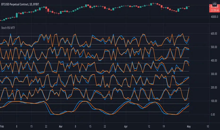
Stochastic RSI MTF - 6 TimeframesDisplays Stochastic RSI from 6 different timeframes.
Default timeframe settings: 5min, 15min, 30min, 1hr, 4hr, 1day.