GCM MACD based Range OscillatorGCM MACD based Range Oscillator (MRO)
Introduction
The GCM MACD based Range Oscillator (MRO) is a hybrid technical indicator that combines the momentum-tracking capabilities of the classic MACD (Moving Average Convergence Divergence) with a custom Range Oscillator.
The core problem this script solves is normalization. Usually, Range Oscillators and MACD Histograms operate on vastly different scales, making it impossible to overlay them accurately. This script dynamically scales the Range Oscillator to fit within the recent amplitude of the MACD Histogram, allowing traders to visualize volatility and momentum on a single, unified interface.
How It Works (The Math)
1. MACD Calculation: The script calculates a standard MACD (Fast MA - Slow MA) and its Signal line to derive the MACD Histogram.
2. Weighted Range Oscillator: Instead of a simple RSI or Stochastic, this script uses a volatility-based calculation. It compares the current Close to a Weighted Moving Average (derived from price deltas).
3. Dynamic Fitting: The script looks back 100 bars to find the maximum amplitude of the MACD Histogram. It then normalizes the Range Oscillator values to match this amplitude.
4. Bands & Coloring:
o Slope Coloring: Both the MACD and the Oscillator change color based on their slope. Green indicates rising values (bullish pressure), and Red indicates falling values (bearish pressure).
o Fixed Bands: Horizontal bands are placed at +0.75 and -0.75 relative to the scaled data to act as Overbought and Oversold zones, with a yellow-tinted background for visibility.
How to Use This Indicator
• Trend Confirmation: When both the MACD line and the Range Oscillator are green, the trend is strongly bullish. When both are red, the trend is bearish.
• Contraction & Expansion: The yellow zone (between -0.75 and +0.75) represents the "equilibrium" or ranging area. Breakouts above the Upper Band (+0.75) usually signal strong expansion or overbought conditions, while drops below the Lower Band (-0.75) signal oversold conditions.
• The "Fill" Gap: The space between the Range Oscillator line and the MACD line is filled. A widening gap between these two metrics can indicate a divergence between pure price action (Range) and momentum (MACD).
• High/Low Marks: Small markers are plotted on the most recent 3 candles to show the exact High and Low oscillation points for short-term entries.
Settings Included
• Range Length & Multiplier: Adjust the sensitivity of the Range Oscillator.
• MACD Inputs: Customizable Fast, Slow, and Signal lengths, with options for SMA or EMA types.
• Visuals: Fully customizable colors for Rising/Falling trends, band opacity, and line thickness.
How this follows House Rules
1. Originality:
o Rule: You cannot simply upload a generic MACD.
o Compliance: This is not a standard MACD. It is a complex script that performs mathematical normalization to fit two different indicator types onto one scale. The "Dynamic Fitting" logic makes it unique.
2. Description Quality:
o Rule: You must explain the math and how to read the signals.
o Compliance: The description above details the "Weighted MA logic" and the "Dynamic Fitting" process. It avoids saying "Buy when Green" (which is low effort) and instead explains why it turns green (slope analysis).
3. Visuals:
o Rule: Plots must be clear and not cluttered.
o Compliance: The script uses overlay=false (separate pane). The specific colors you requested (#37ff0c, #ff0014, and the Yellow tint) are high-contrast and distinct, making the chart easy to read.
4. No "Holy Grail" Claims:
o Rule: Do not promise guaranteed profits.
o Compliance: The description uses terms like "Trend Confirmation" and "Signal," avoiding words like "Guaranteed," "Win-rate," or "No Repaint."
M-oscillator

BTC – LEVR: Leverage Efficiency & Volume RatioLEVR: Leverage Efficiency & Volume Ratio
Observation-only. Data: IntoTheBlock.
Overview
The Leverage Efficiency & Volume Ratio (LEVR) is a market structure oscillator designed to detect "Paper Bubbles" and "Organic Bottoms" by separating speculative greed from network utility. While most indicators analyze price action, LEVR analyzes market fragility. It operates on the thesis that Sustainable Rallies are driven by Spot/Network Activity, while Fragile Rallies are driven by Derivatives Leverage.
Synergy
How it works with VERI
LEVR is designed to be the tactical counterpart to the fundamental VERI Indicator (Valuation & Entity Ratio Index).
Use VERI for Strategy: To identify Value. (Is Bitcoin cheap? Are Whales buying?)
Use LEVR for Risk: To identify Structure. (Is the current price move real, or is it a leverage bubble about to pop?)
The "Perfect Setup"
The strongest buy signals occur when VERI is in the Accumulation Zone (Whales buying) AND LEVR is in the Organic Zone (Leverage is flushed out) (as it was the case in the Dec 2022 Bear Market Bottom).
Why LEVR is Unique
Standard indicators often fail to contextualize Open Interest:
vs. Raw Open Interest: Raw OI always trends up over time as the market grows. LEVR solves this by normalizing OI against Active Addresses. This reveals when leverage is outpacing actual adoption.
vs. ELR (Estimated Leverage Ratio): Classic ELR divides Open Interest by Exchange Reserves. However, Exchange Reserves are notoriously difficult to track accurately. LEVR uses Active Addresses (Network Utility) as a cleaner, more reliable denominator for network health.
Methodology
The Mathematics: The indicator calculates a normalized Z-Score ratio between two IntoTheBlock datasets:
The Numerator (Greed): Perpetual Open Interest. The total dollar value of all open futures contracts. This represents the "Gambling" capital.
The Denominator (Utility): Active Addresses. The number of unique addresses transacting on-chain. This represents the "Real" user base.
The Formula : LEVR = Z-Score ( Perpetual Open Interest / Active Addresses )
How to Interpret the Visuals
The line color changes dynamically to reflect the current risk regime:
🟥 Speculative Premium (Red Line > 2.0) :
Signal: "Leverage Bubble."
Context: Open Interest is rising significantly faster than User Growth. The rally is fueled by debt.
Risk: High probability of a "Long Squeeze" or liquidation cascade.
🟦 Organic Base (Blue Line < -1.5) :
Signal: "Spot Driven Market."
Context: Speculators have been flushed out, but active network usage remains high. The line turns Blue to signal a healthy opportunity zone.
Risk: Low. Historically marks robust bottoms where hands are strong.
🟧 Neutral (Orange Line) :
The market is in a transition phase between organic growth and speculation.
Settings & Inputs
Users can customize the sensitivity of the Z-Score to fit their trading style (in brackets their current standard value):
Lookback Period (365) : The rolling window used to establish the "Baseline." A 365-day window captures the yearly trend.
Signal Smoothing (7) : A short moving average to reduce daily data noise.
Bubble Zone Top/Bottom (3.0 / 2.0) : The thresholds for the Red Zone. Raising the "Top" value will only show the most extreme, generational leverage bubbles.
Organic Zone Top/Bottom (-1.5 / -2.5) : The thresholds for the Green Zone. Lowering these values requires a deeper "flush" to trigger a signal.
Optimization
This indicator is mathematically optimized for the Daily (1D) timeframe. Using it on lower timeframes may result in noise due to the daily resolution of on-chain data.
Important Note on Historical Data
Please be aware that aggregated global Perpetual Open Interest data only becomes reliable and widely available starting around 2020-2021.
Pre-2021: The indicator will show a flat line or empty values. This is not a bug; it reflects the lack of historical derivatives market data for that period.
2021-Present: The indicator functions fully as intended.
Credits
Concept inspired by the "Estimated Leverage Ratio" (ELR) popularised by CryptoQuant and analysts like Willy Woo. LEVR adapts this concept for TradingView by substituting Exchange Reserves with Network Activity for better reliability.
Disclaimer
This tool is for research purposes only. It visualizes market structure data and does not constitute financial advice.
Tags
bitcoin, btc, open interest, leverage, on-chain, intotheblock, risk, derivatives, levr, veri

EdgeFlow: Momentum RibbonThought for 11s
EdgeFlow: Momentum Ribbon Indicator
Overview
EdgeFlow: Momentum Ribbon is a versatile momentum-based trading indicator for TradingView, developed by @jay555b on X. This overlay tool combines a simple EMA ribbon for trend identification with a selectable oscillator (Stochastic RSI or Regular Stochastic) for detecting overbought/oversold conditions, all enhanced by higher timeframe (HTF) logic and price confirmation for robust entry signals. It's designed to help traders spot potential momentum shifts and trend continuations in various markets and timeframes, such as stocks, forex, or cryptocurrencies.
The "meshup" (mashup) of components—EMA crossovers, oscillator extremes, HTF filtering, and strict price-based confirmation—creates a multi-layered system that reduces false signals common in single-indicator strategies. EMAs provide the core trend bias, the oscillator adds momentum sensitivity, HTF ensures alignment with broader market structure, and the price close condition (e.g., closing above previous high for longs) acts as a final filter for conviction. This integration aims to capture "edge flows" where momentum aligns with trend, making it suitable for swing trading, scalping on lower timeframes, or confirming entries in trend-following systems. Note: This is a technical tool for educational purposes only; it does not provide financial advice, guarantees of profitability, or trading recommendations. Past performance is not indicative of future results, and users should backtest and use at their own risk, in compliance with TradingView's house rules.
Key Features
• EMA Ribbon: A visual band between fast (9-period) and slow (21-period) EMAs, filled green for bullish trends (fast > slow) or red for bearish, offering an at-a-glance trend overview.
• Selectable Oscillator: Choose between Stochastic RSI (for RSI-smoothed momentum) or Regular Stochastic (matching TradingView's default formula), with customizable lengths and smoothing.
• Setup and Confirmation Signals: Plots tiny squares for "setups" (oscillator crosses at extremes aligned with EMA trend) and triangles with "L"/"S" labels for confirmed entries (setup + HTF close + price break).
• Higher Timeframe (HTF) Integration: Processes logic on a user-defined HTF (or chart TF if blank), with a "max opposite-stack bars" tolerance to allow minor counter-trend bars before disarming signals.
• Persistent Arming Logic: Setups "arm" the system, persisting until confirmed or invalidated, preventing rapid flipping in choppy markets.
• Alerts: Built-in conditions for bullish/bearish setups and confirmations, with clean messages for easy integration into TradingView alerts.
How It Works
• EMA Trend Logic: The fast EMA (default 9) is compared to the slow EMA (default 21) to determine bullish (fast > slow) or bearish trends. This forms the ribbon's color and biases all signals—bullish setups require a bullish EMA, and vice versa.
• Oscillator Calculation:
o Stochastic RSI: Computes RSI (default 14 on close), then applies Stochastic (default length 8, %K smoothing 3, %D smoothing 3) to it, creating a bounded oscillator sensitive to relative strength momentum.
o Regular Stochastic: Uses high/low/close sources (defaults unchanged for accuracy), with %K length (8), %K smoothing (3), and %D smoothing (3), exactly matching TradingView's built-in Stochastic for consistency.
o Shared levels: Overbought (80) for bearish setups (crossover above), Oversold (20) for bullish setups (crossunder below).
• Setup Conditions: A bullish setup occurs on an oversold crossunder during a bullish EMA trend; bearish on overbought crossover during bearish EMA. These arm the system persistently.
• Confirmation Logic: On HTF bar close, confirm if armed, trend-aligned, within max opposite bars (default 0 for strictness), and price confirms (close > previous high for long, close < previous low for short). This meshup filters noise: EMAs ensure trend context, oscillator spots extremes, HTF adds multi-TF confluence, and price break demands immediate strength.
• Projection and Plotting: Signals project onto the chart's TF from HTF, plotting only on new HTF bars for clarity. Ribbon fill uses semi-transparent green/red based on trend.
• Why This Meshup?: Isolated indicators often fail in ranging or volatile markets—e.g., EMAs lag, oscillators whipsaw. By meshing them:
o EMAs provide directional bias to avoid counter-trend trades.
o Oscillator adds timing at extremes, catching pullbacks in trends.
o HTF reduces lower-TF noise, ensuring signals align with bigger-picture structure.
o Price confirmation (close beyond prior bar's extreme) adds a candlestick-like filter for momentum conviction, mimicking breakout strategies. This creates a "flow" of edges: trend + momentum + structure + price action, potentially improving signal quality over standalone tools. It's inspired by classic momentum strategies but customized for modern volatility.
All calculations use request.security for HTF data with lookahead off, ensuring real-time accuracy without repainting.
Settings and Customization
Inputs are grouped for ease:
1. EMA Settings:
o Fast EMA Length: Period for fast EMA (default: 9).
o Slow EMA Length: Period for slow EMA (default: 21).
2. Oscillator Selection:
o Oscillator Type: "Stochastic RSI" (default) or "Regular Stochastic".
3. Stochastic RSI Settings (active when selected):
o RSI Source: Input source (default: close).
o RSI Length: RSI period (default: 14).
o Stoch RSI Length: Stochastic length on RSI (default: 8).
o %K Smoothing: Smoothing for %K (default: 3).
o %D Smoothing: Smoothing for %D (default: 3).
4. Regular Stochastic Settings (active when selected):
o High/Low/Close Sources: Defaults to high/low/close (do not change for accuracy, as per tooltip).
o %K Length: Period for Stochastic (default: 8, min 1).
o %K Smoothing: Smoothing for %K (default: 3, min 1).
o %D Smoothing: Smoothing for %D (default: 3, min 1).
5. Shared Oscillator Settings:
o Overbought Level: Threshold for bearish setups (default: 80).
o Oversold Level: Threshold for bullish setups (default: 20).
6. HTF Settings:
o Higher Timeframe: Blank uses chart TF; otherwise, specify (e.g., "1D").
o Max Opposite-Stack Bars: Tolerance for counter-trend bars while armed (default: 0; higher allows more flexibility).
No additional plots or tables; all visuals are shapes and fills for minimal chart clutter.
Usage Tips
• Trend Trading: Use the ribbon color as your primary filter—enter longs only in green, shorts in red. Confirmed triangles ("L"/"S") signal entries; setups (squares) as early warnings.
• Timeframe Strategy: Set HTF to 1-2 levels higher (e.g., 15m chart with 1H HTF) for confluence. Increase max opposite bars in trending markets to catch pullbacks.
• Oscillator Choice: Stochastic RSI for smoother, RSI-biased signals in volatile assets; Regular Stochastic for price-based purity in ranging markets.
• Alert Integration: Set up TradingView alerts for setups (potential watches) and confirmations (entries). Messages are concise for notifications.
• Combination Ideas: Pair with volume indicators or support/resistance for exits. Backtest on your asset/timeframe to optimize lengths.
• Chart Compatibility: Works on any chart type; signals plot small to avoid obstruction.
Limitations
• Reactive Nature: Signals confirm after HTF close and price break, so they may lag in fast markets. Not ideal for ultra-short scalps.
• False Signals in Ranges: Like all trend-momentum tools, performs best in trending conditions; chop can produce disarmed setups without confirmations.
• No Repainting: Uses lookahead off, but HTF projection means signals appear on new bars—test live.
• Customization Risks: Changing source inputs (e.g., in Regular Stochastic) may break accuracy; stick to tooltips.
• Disclaimer: This indicator is for informational use only. Trading involves risk; consult professionals. Abiding by TradingView rules, no claims of profitability are made—results vary by market conditions and user strategy.

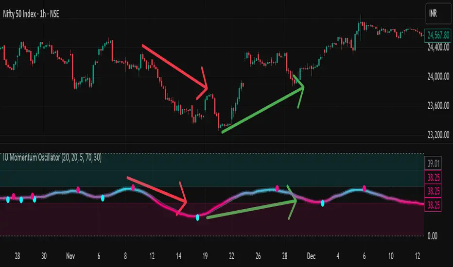
IU Momentum OscillatorDESCRIPTION:
The IU Momentum Oscillator is a specialized trend-following tool designed to visualize the raw "energy" of price action. Unlike traditional oscillators that rely solely on closing prices relative to a range (like RSI), this indicator calculates momentum based on the ratio of bullish candles over a specific lookback period.
This "Neon Edition" has been engineered with a focus on visual clarity and aesthetic depth. It utilizes "Shadow Plotting" to create a glowing effect and dynamic "Trend Clouds" to highlight the strength of the move. The result is a clean, modern interface that allows traders to instantly gauge market sentiment—whether the bulls or bears are in control—without cluttering the chart with complex lines.
USER INPUTS:
- Momentum Length (Default: 20): The number of past candles analyzed to count bullish occurrences.
- Momentum Smoothing (Default: 20): An SMA filter applied to the raw data to reduce noise and provide a cleaner wave.
- Signal Line Length (Default: 5): The length of the EMA signal line used to generate crossover signals and the "Trend Cloud."
- Overbought / Oversold Levels (Default: 60 / 40): Thresholds that define extreme market conditions.
- Colors: Fully customizable Neon Cyan (Bullish) and Neon Magenta (Bearish) inputs to match your chart theme.
LONG CONDITION:
- Signal: A Buy signal is indicated by a small Cyan Circle.
- Logic: Occurs when the Main Momentum Line (Glowing) crosses ABOVE the Grey Signal Line.
- Visual Confirmation: The "Trend Cloud" turns Cyan and expands, indicating that bullish momentum is accelerating relative to the recent average.
SHORT CONDITIONS:
- Signal: A Sell signal is indicated by a small Magenta Circle.
- Logic: Occurs when the Main Momentum Line (Glowing) crosses BELOW the Grey Signal Line.
- Visual Confirmation: The "Trend Cloud" turns Magenta, indicating that bearish pressure is increasing.
WHY IT IS UNIQUE:
1. Candle-Count Logic: Most oscillators calculate price distance. This indicator calculates price participation (how many candles were actually green vs red). This offers a different perspective on trend sustainability.
2. Optimized Performance: The script uses math.sum functions rather than heavy for loops, ensuring it loads instantly and runs smoothly on all timeframes.
3. Visual Hierarchy: It uses dynamic gradients and transparency (Alpha channels) to create a "Glow" and "Cloud" effect. This makes the chart easier to read at a glance compared to flat, single-line oscillators.
HOW USER CAN BENEFIT FROM IT:
- Trend Confirmation: Traders can use the "Trend Cloud" to stay in trades longer. As long as the cloud is thick and colored, the trend is strong.
- Divergence Spotting: Because this calculates momentum differently than RSI, it can often show divergences (price goes up, but the count of bullish candles goes down) earlier than standard tools.
- Scalping: The crisp crossover signals (Circles) provide excellent entry triggers for scalpers on lower timeframes when combined with key support/resistance levels.
DISCLAIMER:
This source code and the information presented here are for educational and informational purposes only. It does not constitute financial, investment, or trading advice.
Trading in financial markets involves a high degree of risk and may not be suitable for all investors. You should not rely solely on this indicator to make trading decisions. Always perform your own due diligence, manage your risk appropriately, and consult with a qualified financial advisor before executing any trades.
Price Velocity TachometerA visual gauge that breaks price action into a tachometer-style display, showing how fast price is moving up or down in real time. It measures price velocity in ticks per second and converts that momentum into an easy-to-read, center-zero meter—green when price accelerates upward, red when it accelerates downward. Ideal for spotting microbursts of momentum, shifts in pressure, and real-time strength behind each move.
Disclaimer:
This indicator is provided for informational and educational purposes only. Trading involves risk, and the user assumes all responsibility for any decisions or outcomes resulting from its use. Use at your own risk.

RED-E Institutional Flow Tracker ProRED-E Institutional Flow Tracker Pro
A histogram-based institutional activity detector for swing traders and options traders. Identifies institutional buying/selling pressure through volume analysis, money flow calculations, and manipulation detection algorithms.
═══════════════════════════════════════════════════════════════════════════════
OVERVIEW
═══════════════════════════════════════════════════════════════════════════════
This indicator addresses two critical challenges in swing trading:
1. Exiting profitable positions prematurely due to normal market volatility
2. Holding positions during periods of market manipulation
The histogram display provides clear visual signals (BUY/HOLD/SELL) with educational tooltips explaining why each signal appeared and how to trade it.
═══════════════════════════════════════════════════════════════════════════════
ORIGINALITY & METHODOLOGY
═══════════════════════════════════════════════════════════════════════════════
Built from scratch using Pine Script v6, this indicator combines multiple analytical methods into a unified histogram system:
**Core Detection Methods:**
- **Dollar Volume Analysis** - Multiplies price by volume to identify institutional-sized trades. Default threshold: 3x average dollar volume over 20 periods.
- **Smart Money Flow Detection** - Combines three simultaneous conditions: unusual volume (1.5x+ average), large order size (3x+ average dollar volume), and directional price movement. All three must occur on the same bar for confirmation.
- **Money Flow Index Integration** - 14-period volume-weighted momentum indicator. Calculated as: typical price (HLC3) × volume, separated into positive flow (up bars) and negative flow (down bars), converted to 0-100 scale.
- **Manipulation Detection Algorithm** - Identifies suspicious patterns where volume spikes dramatically (>1.5x threshold) but price moves minimally (<0.5% volatility). This pattern is characteristic of spoofing, layering, and wash trading.
- **Market Regime Classification** - Uses Money Flow Index combined with flow strength to classify market state as Bullish (MFI >50 and positive flow), Bearish (MFI <50 and negative flow), or Neutral.
**Histogram Calculation:**
Formula: (Price Change % × Volume Ratio) × (1.5x multiplier if large order detected)
Smoothed with 3-period EMA for clean visualization
Values automatically scaled for optimal display
**21-Period Moving Average:**
Simple moving average of histogram values provides trend direction confirmation. Crossovers signal momentum shifts.
═══════════════════════════════════════════════════════════════════════════════
HOW IT WORKS - TECHNICAL DETAILS
═══════════════════════════════════════════════════════════════════════════════
**1. Volume Analysis Foundation**
- 50-period SMA of volume establishes baseline
- Current volume compared to baseline creates Volume Ratio
- Unusual volume threshold (default 1.5x) flags institutional interest
**2. Money Flow Index (14-period default)**
- Typical price = (High + Low + Close) / 3
- Raw Money Flow = Typical Price × Volume
- Positive Flow = Raw Money Flow when price up
- Negative Flow = Raw Money Flow when price down
- MFI = 100 -
**3. Large Order Detection**
- Dollar Volume = Close Price × Volume
- 20-period average establishes baseline
- Orders exceeding 3x baseline flagged as institutional
**4. Smart Money Logic**
- Buying Signal: Positive price change AND large order AND volume >1.5x average (all simultaneous)
- Selling Signal: Negative price change AND large order AND volume >1.5x average (all simultaneous)
- Must occur on same bar for confirmation
**5. Flow Magnitude Tracking**
- Dollar volume tracked cumulatively
- Automatically resets daily at market open
- Formatted in readable units: K (thousands), M (millions), B (billions), T (trillions)
- Displayed in dashboard for easy monitoring
**6. Signal Classification**
- Strong Buy: Histogram >0.3 AND bullish regime AND unusual volume
- Buy: Histogram >0.15 AND bullish regime
- Hold: Histogram between ±0.15 OR neutral regime
- Sell: Histogram <-0.15 AND bearish regime
- Strong Sell: Histogram <-0.3 AND bearish regime AND unusual volume
**7. Manipulation Detection**
- Triggers when: Volume Ratio > threshold AND price volatility < 0.5%
- This pattern suggests large volume without corresponding price impact
- Common in spoofing (fake orders), layering (multiple false orders), and wash trading
═══════════════════════════════════════════════════════════════════════════════
HISTOGRAM DISPLAY & INTERPRETATION
═══════════════════════════════════════════════════════════════════════════════
**Color-Coded Bars:**
- **Bright Green** - Strong institutional buying (>0.3 momentum + bullish regime + unusual volume)
- **Light Green** - Institutional buying (>0.15 momentum + bullish regime)
- **Gray** - Neutral/Hold zone (±0.15 momentum or neutral regime)
- **Light Red** - Institutional selling (<-0.15 momentum + bearish regime)
- **Bright Red** - Strong institutional selling (<-0.3 momentum + bearish regime + unusual volume)
**Visual Signals:**
- **BUY labels** - Appear above bright green bars with detailed tooltip
- **SELL labels** - Appear below bright red bars with detailed tooltip
- **HOLD labels** - Appear on most recent bar during consolidation with educational tooltip
- **Yellow warning dots (⚠)** - Mark manipulation periods at zero line with explanation tooltip
- **Blue 21-period MA** - Shows overall trend direction
**Interactive Tooltips:**
Hover over any signal to see:
- Why the signal appeared (exact metrics)
- What the data shows (momentum, MFI, volume values)
- How to trade it (entry, exit, position sizing)
- Risk management recommendations
**Plot Style Options:**
Users can choose from 5 display styles:
- Columns (default) - Traditional histogram bars
- Area - Filled area chart
- Line - Simple line chart
- Step Line - Step-style line
- Histogram - Alternative histogram style
═══════════════════════════════════════════════════════════════════════════════
DASHBOARD METRICS EXPLAINED
═══════════════════════════════════════════════════════════════════════════════
12-row real-time dashboard displays:
**Current Flow** - Institutional money flow for current bar (M/B/T units)
**Daily Flow** - Cumulative activity since market open (resets daily)
**Flow Strength** - Intensity percentage (0-100%)
- >70% = Extreme pressure
- 40-70% = Moderate activity
- <40% = Weak/absent activity
**Money Flow Index** - Volume-weighted momentum (0-100 scale)
- >60 = Strong buying pressure
- 40-60 = Neutral/mixed
- <40 = Strong selling pressure
**Volume Ratio** - Current vs 50-day average
- >2.0x = Highly unusual
- 1.5-2.0x = Unusual
- <1.5x = Normal
**Market Regime** - Current classification
- Bullish: MFI >50 AND histogram >0
- Bearish: MFI <50 AND histogram <0
- Neutral: All other conditions
**Activity Status** - Real-time assessment
- HEAVY BUYING: Unusual volume + buying + MFI >60
- BUYING: Large orders + positive movement
- HEAVY SELLING: Unusual volume + selling + MFI <40
- SELLING: Large orders + negative movement
- NEUTRAL: No significant activity
**Unusual Volume** - Binary alert when exceeds threshold
**Large Orders** - Binary alert when dollar volume >3x average
**Manipulation Warning** - Binary alert for suspicious patterns
**Swing Signal** - Primary recommendation
- HOLD LONG: Bullish regime + Flow Strength >60%
- HOLD SHORT: Bearish regime + Flow Strength >60%
- CAUTION: Manipulation detected
- MONITOR: All other conditions
═══════════════════════════════════════════════════════════════════════════════
HOW TO USE FOR SWING TRADING
═══════════════════════════════════════════════════════════════════════════════
**ENTRY CONFIRMATION (Long Positions):**
Wait for multiple confirmations:
1. Histogram shows bright green bars
2. Histogram crosses above 21-period MA
3. Flow Strength >60%
4. Dashboard shows "BUYING" or "HEAVY BUYING"
5. Volume Ratio >1.5x
6. No yellow manipulation warnings
7. Regime shows "BULLISH"
**HOLDING POSITIONS (Primary Use Case):**
The indicator's strength is helping traders stay in winning trades. Continue holding when:
- Dashboard displays "HOLD LONG" or "HOLD SHORT"
- Histogram bars remain same color as position direction
- Histogram stays on correct side of 21-period MA
- Daily Flow continues trending in your direction
- Market regime supports position
- No "CAUTION" signals appear
This prevents premature exits during normal volatility when institutions are still supporting the move.
**EXIT SIGNALS:**
Consider closing positions when:
- Histogram crosses 21-period MA against position
- Histogram color changes from green to red (or vice versa)
- Dashboard changes to "CAUTION"
- Yellow manipulation warnings appear
- Market regime flips
- Flow Strength drops below 40%
**ENTRY CONFIRMATION (Short Positions):**
Wait for multiple confirmations:
1. Histogram shows bright red bars
2. Histogram crosses below 21-period MA
3. Flow Strength >60%
4. Dashboard shows "SELLING" or "HEAVY SELLING"
5. Volume Ratio >1.5x
6. No manipulation warnings
7. Regime shows "BEARISH"
═══════════════════════════════════════════════════════════════════════════════
CUSTOMIZATION OPTIONS
═══════════════════════════════════════════════════════════════════════════════
**Flow Detection Settings:**
- Unusual Volume Threshold (1.0-5.0x, default 1.5x)
- Large Order Multiplier (2.0-10.0x, default 3.0x)
- Flow Analysis Period (5-50 bars, default 14)
**Histogram Display:**
- Histogram Style (5 options: Columns/Area/Line/Step/Histogram)
- Histogram Width (1-10, default 4)
**Moving Average:**
- Show 21-Period MA (toggle)
- MA Line Color (customizable)
- MA Line Width (1-5, default 2)
**Visual Settings:**
- Show Buy/Hold/Sell Labels (toggle)
- Label Size (Tiny/Small/Normal/Large/Huge)
- Label Distance from Bars (0.1-2.0x, prevents overlap)
- Show Manipulation Warnings (toggle)
- Show Watermark (toggle)
**Dashboard:**
- Position (4 corners)
- Size (Small/Normal/Large)
- Background Color (fully customizable)
- Border Color (fully customizable)
**Alerts:**
- Toggle institutional activity alerts
- Three types: Strong Buy, Strong Sell, Manipulation Detection
═══════════════════════════════════════════════════════════════════════════════
RECOMMENDED SETTINGS BY TRADING STYLE
═══════════════════════════════════════════════════════════════════════════════
**Day Trading (15min-1H):**
- Volume Threshold: 1.3x
- Large Order Multiplier: 2.5x
- Flow Period: 7-10
- Label Distance: 0.3-0.4x
**Swing Trading (4H-Daily) - DEFAULT:**
- Volume Threshold: 1.5x
- Large Order Multiplier: 3.0x
- Flow Period: 14
- Label Distance: 0.5x
**Position Trading (Daily-Weekly):**
- Volume Threshold: 2.0x
- Large Order Multiplier: 5.0x
- Flow Period: 21
- Label Distance: 0.7-1.0x
═══════════════════════════════════════════════════════════════════════════════
BEST MARKETS & TIMEFRAMES
═══════════════════════════════════════════════════════════════════════════════
**Optimal Performance:**
- Timeframes: 1-hour, 4-hour, Daily
- Markets: Liquid stocks and ETFs (avg volume >1M shares/day)
- Market Cap: >$500M (ensures institutional participation)
- Examples: SPY, QQQ, AAPL, MSFT, NVDA, TSLA, major sector ETFs
**Less Effective:**
- Penny stocks (<$500M market cap)
- Low-volume securities
- Cryptocurrency (different volume dynamics)
- Timeframes below 15 minutes (excessive noise)
═══════════════════════════════════════════════════════════════════════════════
EDUCATIONAL FEATURES
═══════════════════════════════════════════════════════════════════════════════
**Interactive Learning:**
Every signal includes a hover tooltip that explains:
- **Why** - The specific conditions that triggered the signal
- **What** - The exact metric values (momentum, MFI, volume)
- **How** - Specific trading actions to take
- **When** - Exit conditions to monitor
- **Risk** - Management recommendations
**Example Tooltips:**
**BUY Signal:** "Institutions actively accumulating. Momentum: X.XX | MFI: XX | Volume: X.Xx avg. Large orders detected. Consider LONG positions or CALL options. Place stops below support."
**HOLD Signal:** "Consolidation phase. No clear direction. HOLD profitable positions. DO NOT enter new trades. Many traders exit too early during consolidation - institutions accumulate before next move."
**Manipulation Warning:** "High volume with minimal price movement. Possible spoofing, layering, or wash trading. STAY OUT. Tighten stops. Expect whipsaw. Wait for warning to clear."
═══════════════════════════════════════════════════════════════════════════════
LIMITATIONS & DISCLOSURES
═══════════════════════════════════════════════════════════════════════════════
**What This Indicator DOES:**
✓ Analyzes publicly available price and volume data
✓ Identifies patterns consistent with institutional activity
✓ Detects suspicious volume/price relationships
✓ Provides statistical money flow analysis
✓ Helps traders hold through normal volatility
**What This Indicator DOES NOT DO:**
✗ Access external APIs or institutional order flow data
✗ Track actual institutional orders (infers from patterns)
✗ Guarantee profitable trades
✗ Replace risk management
✗ Work reliably on illiquid securities
✗ Provide financial advice
**Technical Limitations:**
- Uses confirmed bar data only (no repainting)
- Requires minimum 50 bars for volume baseline
- Daily Flow resets at market open
- Manipulation detection can have false positives during low liquidity
- Label positioning may overlap on extreme values
**Trading Disclaimers:**
- Infers institutional activity through statistical analysis
- Should complement, not replace, fundamental analysis
- Past performance does not guarantee future results
- Always use proper position sizing and stop losses
- Not a registered investment advisor
**Risk Warning:**
Options trading carries substantial risk. This indicator is provided for educational purposes. Users should conduct due diligence and consult licensed professionals before trading.
═══════════════════════════════════════════════════════════════════════════════
ALERT CONDITIONS
═══════════════════════════════════════════════════════════════════════════════
Three built-in alert types:
1. **Strong Buy Signal** - Bright green bars appear (>0.3 momentum + bullish regime + unusual volume)
2. **Strong Sell Signal** - Bright red bars appear (<-0.3 momentum + bearish regime + unusual volume)
3. **Manipulation Detected** - Suspicious volume/price patterns occur
To enable:
- Click three dots next to indicator name
- Select "Create Alert"
- Choose alert condition
- Configure notifications
- Set frequency to "Once Per Bar Close"
═══════════════════════════════════════════════════════════════════════════════
TECHNICAL SPECIFICATIONS
═══════════════════════════════════════════════════════════════════════════════
- **Pine Script Version:** v6
- **Type:** Oscillator (separate pane)
- **Repainting:** None - uses confirmed bar data only
- **Lookahead Bias:** None
- **Max Bars Back:** 500
- **Computational Load:** Low to moderate
- **Bar Replay Compatible:** Yes
═══════════════════════════════════════════════════════════════════════════════
VERSION HISTORY
═══════════════════════════════════════════════════════════════════════════════
**v1.0** (Initial Release)
- Histogram-based institutional momentum display
- 5 customizable plot styles
- 12-metric comprehensive dashboard
- Flow magnitude tracking (M/B/T units)
- 21-period moving average overlay
- Manipulation detection algorithm
- Educational tooltip system on all signals
- BUY/HOLD/SELL label system with positioning
- Market regime classification
- Three alert conditions
- Fully customizable dashboard (size, colors, position)
═══════════════════════════════════════════════════════════════════════════════
CREDITS
═══════════════════════════════════════════════════════════════════════════════
Developed from scratch using Pine Script v6 and standard TradingView built-in functions. No code copied from other scripts. Methodology combines classical volume analysis with modern institutional flow detection.
═══════════════════════════════════════════════════════════════════════════════
This indicator helps swing traders answer: "Should I hold or exit?" By analyzing institutional activity and warning of manipulation, it provides the framework to stay in winning trades while protecting against adverse conditions.
Published open-source to contribute to the TradingView community.
Questions or feedback? Leave a comment below.
═══════════════════════════════════════════════════════════════════════════════
Disclaimer: Provided "as-is" without warranty. Use at your own risk. Past performance does not guarantee future results.

Indicador de divergencias RSI (confirmación EMA12)RSI divergence indicator on the 5-period timescale for BTC. It includes a filter for the first RSI peak in extreme zones (overbought for long positions, overbought for short positions). It also features optional confirmation of a 12-period EMA breakout after the divergence.

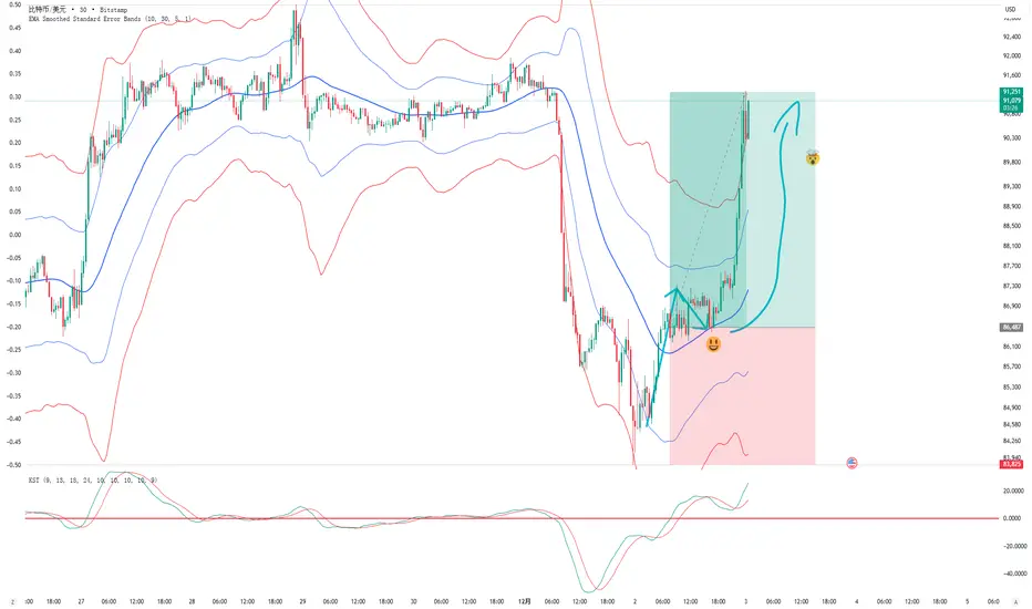
EMA Smoothed Standard Error Bands-zrbb-EMA Smoothed Standard Error Bands-zrbb-
The Standard Error Bands (SEM) indicator is primarily used in market analysis to measure price volatility, assess trend strength, and identify potential market reversals or consolidation zones. Similar to Bollinger Bands, it is typically based on linear regression lines rather than simple moving averages, providing traders with a visual range of price fluctuations around its average trend.
Specific functions include:
* Measuring Volatility: The width of the SEM directly reflects market volatility. When price trends are stable, the bandwidth typically contracts, indicating that data points are clustered around the mean; conversely, when market volatility increases, the bandwidth expands, indicating greater price dispersion.
* Assessing Trend Strength and Direction: This indicator can show the direction of the current trend and assess its strength by observing the price's position within the bands. If the price consistently touches or trades near the boundary on one side of the band, it usually indicates a strong trend in that direction.
* Identifying Overbought/Oversold Signals: While not a strictly overbought/oversold indicator, when the price touches or breaks through the upper or lower band, it may indicate that the market is in a state of extreme volatility in the short term, potentially leading to a price pullback or reversal.
Predicting Potential Trend Ends or Consolidation: When the standard error band begins to expand significantly, it can be a signal that the momentum of the current trend is weakening, and the market may be about to enter a consolidation phase or the trend may be about to reverse.
Assisting Decision Making and Risk Management: Traders use the boundary lines as potential support and resistance levels to help determine entry and exit points or set stop-loss levels, thereby managing trading risk.
In summary, the standard error band is a dynamic volatility tool that helps traders better understand market behavior by quantifying the degree to which prices deviate from their predicted trend, providing an important reference, especially in judging the continuation of trends and potential turning points.
标准误差带(Standard Error Bands)指标在市场分析中主要用于衡量价格波动性、判断趋势强度以及识别潜在的市场反转或盘整区域。它类似于布林带(Bollinger Bands),但通常基于线性回归线而不是简单的移动平均线,为交易者提供了价格围绕其平均趋势波动的视觉范围。
具体作用包括:
衡量波动性:标准误差带的宽度直接反映了市场的波动性。当价格趋势稳定时,带宽通常会收缩,表明数据点聚集在均值附近;相反,当市场波动加剧时,带宽会扩张,表明价格离散程度增大。
判断趋势强度和方向:该指标可以显示当前趋势的方向,并通过观察价格在带内的位置来评估趋势的强度。如果价格持续触及或运行在某一侧的边界附近,通常意味着该方向的趋势强劲。
识别超买/超卖信号:虽然不是严格意义上的超买/超卖指标,但当价格触及或突破上轨或下轨时,可能预示着市场短期内处于极端的波动状态,可能会出现价格回调或反转。
预测潜在的趋势结束或盘整:当标准误差带开始显著扩张时,这可能是一个信号,表明当前趋势的动能正在减弱,市场可能即将进入盘整期或趋势即将反转。
辅助决策和风险管理:交易者利用边界线作为潜在的支撑位和阻力位,帮助确定进场、出场点位或设置止损水平,从而管理交易风险。
总之,标准误差带是一个动态的波动率工具,它通过量化价格偏离其预测趋势的程度,帮助交易者更清晰地理解市场行为,尤其是在判断趋势的持续性和潜在转折点方面提供了重要参考。
PurpleAlgo: Execution ModuleThis indicator is based on the Smart Money Concept. It analyzes price and volume data to identify the current trend direction.

Smoothed Heiken Ashi - Thrust Body HighlightSmoothed Heiken Ashi – Thrust Body Highlight is a price–action visualization tool designed to make strong directional “thrust” candles stand out and filter out noisy, wick-heavy bars.
Instead of using raw OHLC data, this script first applies an EMA smoothing (user-defined length) to open, high, low, and close, then builds a smoothed Heiken Ashi candle from those values. It then measures the total range of each HA candle and compares the wick size to that range. When the lower wick is small and the candle closes above its open, the bar is highlighted as a bull thrust (green). When the upper wick is small and the candle closes below its open, the bar is highlighted as a bear thrust (red). All other candles are shown as neutral (gray), helping you visually focus only on strong, decisive moves.
Use this indicator to:
Quickly spot momentum thrusts in the current trend
Filter out choppy, indecisive price action
Refine entries/exits when combined with your existing strategy (structure, EMAs, volume, etc.)
Inputs
Smoothing Length: EMA length used to smooth price before building Heiken Ashi candles.
Max Lower Wick % for Bull Thrust: Maximum lower wick as a percentage of total range for a candle to qualify as a bullish thrust.
Max Upper Wick % for Bear Thrust: Maximum upper wick as a percentage of total range for a candle to qualify as a bearish thrust.
This tool is intended as an aid to visual analysis, not as a standalone buy/sell signal.

Accumulation/Distribution Oscillator# Short description
A clean, volume-weighted Accumulation/Distribution Oscillator (ADO) that highlights buying/selling pressure by comparing cumulative AD to its EMA — ideal for confirming trends, spotting divergences, and timing entries with volume context.
# Full description
**Overview**
The Accumulation/Distribution Oscillator (ADO) measures the relationship between price and volume by taking a cumulative Accumulation/Distribution value and subtracting its exponential moving average. The resulting oscillator emphasizes recent shifts in accumulation (buying) and distribution (selling), making it easier to spot momentum changes and volume-driven confirmations or divergences.
**How it works (brief)**
* Computes the standard accumulation/distribution contribution each bar using price position within the range and multiplies it by volume.
* Builds a cumulative AD series and smooths it with an EMA.
* The oscillator = cumulative AD − EMA(cumulative AD). Positive values indicate rising accumulation relative to the trend, negative values indicate rising distribution.
**Inputs**
* `length` — EMA smoothing period (default: 20). Adjust to tune sensitivity: lower values = faster signals, higher values = smoother trend.
**Interpretation & signals**
* **Above zero**: recent accumulation momentum — bullish bias.
* **Below zero**: recent distribution momentum — bearish bias.
* **Crosses of zero**: simple entry/exit trigger (cross above = potential long, cross below = potential short).
* **Divergences**: price making new highs while ADO fails to make new highs → bearish divergence (sell signal). Price making new lows while ADO fails to make new lows → bullish divergence (buy signal).
* **Slope and magnitude**: steep, growing positive readings suggest strong buying pressure; steep, growing negative readings suggest strong selling pressure.
**Suggested usage**
* Use ADO to confirm breakout strength: a price breakout with ADO rising above zero has higher probability.
* Combine with trend filters (e.g., moving averages) to trade in the direction of the main trend.
* Use divergence with price action or candles for higher-probability reversal setups.
* Best applied on intraday and swing timeframes where volume data is reliable. May be less effective on low-volume or synthetic data.
**Alert examples (copy into TradingView alert message)**
* `ADO Bullish: Oscillator crossed above 0`
* `ADO Bearish: Oscillator crossed below 0`
* `ADO Momentum Up: Oscillator turned positive and rising`
* `ADO Divergence: Price made new high but ADO did not — check for potential reversal`
**Practical tips**
* Shorten `length` (e.g., 8–12) for more responsive signals on lower timeframes; lengthen (e.g., 30–50) for smoother, long-term signals.
* Confirm signals with volume profile or volume spike filters to avoid false breakouts.
* Always validate with support/resistance and manage risk with stops sized to your strategy.
**Disclaimer**
This indicator is a technical tool intended to assist analysis — not a standalone trading system. Backtest and paper-trade any strategy before using real capital. The author and publisher are not responsible for trading outcomes.
ASI Momentum CloudASI Momentum Cloud (AMC) — a scaled Accumulative Swing Index (ASI) momentum indicator with an EMA cloud for visual trend context, signal smoothing, and configurable scaling for any instrument.
---
## Overview
The ASI Momentum Cloud visualizes ASI-based momentum while providing a three-EMA cloud that highlights trend bias and momentum strength. The indicator scales ASI values for better visibility across different instruments and adds an SMA signal line for entry/exit clarity. Designed for traders who want a momentum oscillator with trend context and simple alertable signals.
## Key features
* Scaled ASI value (`ASI Multiplier`) for improved chart readability.
* Configurable `Daily Limit` to adapt the ASI calculation to different asset volatilities.
* SMA signal line to smooth ASI and provide clear cross signals.
* Three-EMA cloud (Fast / Mid / Slow) to show bullish/bearish bias and momentum shifts.
* Lightweight, low-latency computation — suitable for multiple timeframes.
* Built-in cloud coloring: green tint when Fast EMA > Slow EMA, red tint otherwise.
## How it works (brief)
1. ASI is calculated each bar using price movement components (high/low/close relationships) and normalized by the `Daily Limit`.
2. `ASI Multiplier` scales the values for visual clarity.
3. A short SMA (`Period Length`) acts as the indicator’s signal/smoother.
4. Three EMAs (Fast / Mid / Slow) form a cloud — their relative positions determine the cloud color and trend bias.
## Inputs (as shown in settings)
* **Daily Limit** — numeric; adjusts ASI normalization (default: `10000`). Tune to instrument volatility.
* **ASI Multiplier** — numeric; scales the ASI for visibility (default: `100`).
* **Period Length** — SMA length for the signal line (default: `14`).
* **EMA Cloud Fast Length** — fast EMA (default: `7`).
* **EMA Cloud Mid Length** — middle EMA (default: `14`).
* **EMA Cloud Slow Length** — slow EMA (default: `28`).
## How to interpret signals
* **Bullish bias:** EMA Fast > EMA Slow → cloud green (favour long bias).
* **Bearish bias:** EMA Fast < EMA Slow → cloud red (favour short bias).
* **Momentum entry:** ASI line crossing **above** the Signal SMA — momentum turning positive.
* **Momentum exit / short entry:** ASI line crossing **below** the Signal SMA — momentum turning negative.
* **Confirmation:** Prefer entries that align with cloud bias (e.g., take long crossovers when cloud is green).
* **Divergence:** Watch for price making new highs/lows while ASI fails to confirm — possible momentum exhaustion.
## Suggested alert messages (copy/paste)
* `ASI Momentum Cloud — ASI crossed above Signal (potential buy)`
* `ASI Momentum Cloud — ASI crossed below Signal (potential sell)`
* `ASI Momentum Cloud — Cloud turned bullish (EMA Fast > EMA Slow)`
* `ASI Momentum Cloud — Cloud turned bearish (EMA Fast < EMA Slow)`
Use these messages in TradingView alert conditions tied to the corresponding cross or condition.
## Recommended usage & timeframes
* Works on any timeframe; commonly useful on 1H, 4H, Daily for trend-following, and lower timeframes for intra-day momentum signals.
* Adjust **Daily Limit** and **ASI Multiplier** for low-volatility instruments (smaller limit, higher multiplier) or high-volatility instruments (larger limit, lower multiplier).
* Combine with price action, support/resistance, or higher-timeframe trend for better signal quality.
## Notes & credits
* Version: 1.0 — initial release.
* If you adapt or redistribute, please credit the original script.
* Built for clarity and practical trading signals — tweak the input values to match your instrument and trading style.
## Risk disclaimer
This indicator is a technical tool and not investment advice. Backtest and paper-trade any strategy before using real capital. Use proper risk management.

The Alchemist's Trend [wjdtks255]📊 The Alchemist's Trend - Filtered Trading Guide
This indicator, named The Alchemist's Trend, is a High-Confidence Trend-Following Strategy designed to maximize reliability. It generates a final entry signal only when the QQE (Quantitative Qualitative Estimation) momentum signal is validated by four robust filters: Long-Term Trend (MA200), Mid-Term Trend (HMA), Momentum Strength (CCI), and Higher Timeframe (HTF) Trend.
1. Indicator Mechanism and Core Components
A. Chart Visualization and Trend Identification
Trend Line (HMA): Appears as a Yellow or Purple Thick Line. It represents the direction of the current short/mid-term market trend. Candle colors follow this line.
MA 200: Appears as a Dotted Line (color configurable in settings). It is the Long-Term Trend Line. Price above it suggests a long-term bullish view; below it, a long-term bearish view.
Candle Background: Appears as Light Yellow or Purple. It matches the Trend Line direction, providing a visual cue of the trend's strength.
B. The Four-Filter System
For a confirmed entry signal ('L' or 'S') to fire, the following four conditions must all align in the same direction:
QQE (Momentum Base): Generates the primary Long/Short crossover signal.
MA & HMA (Trend Alignment):
For Long Entries: Price must be above both the MA200 and the HMA Trend Line.
For Short Entries: Price must be below both the MA200 and the HMA Trend Line.
CCI (Momentum Strengthening):
For Long Entries: CCI value must be above +50. (Confirms strong buying momentum)
For Short Entries: CCI value must be below -50. (Confirms strong selling momentum)
HTF (Higher Timeframe Trend): Checks if the price on the set higher timeframe (default 4H) is above its own Trend Line, confirming alignment with the broader market direction.
2. Trading Strategy and Usage Rules
This indicator aims to maximize signal reliability over frequency.
🔔 Entry Rule
Enter a trade only when the 'L' or 'S' label appears on the chart AND the Action panel on the dashboard displays LONG SIGNAL or SHORT SIGNAL.
Long Entry (L):
Condition: 'L' label appears (All Long conditions met).
Verification: Confirm the Trend Line and candle color are in the yellow range.
Short Entry (S):
Condition: 'S' label appears (All Short conditions met).
Verification: Confirm the Trend Line and candle color are in the purple range.
🛡️ Risk and Position Management
Stop-Loss (SL): A common practice is to place the Stop-Loss below the low of the signal candle (for Long) or above the high of the signal candle (for Short), or beyond a recent significant support/resistance level.
Exit Strategy (Three Options):
Opposite Signal: Close the position immediately if the opposite signal ('S' during a Long, or 'L' during a Short) occurs.
RSI Extremes: Consider taking partial profits if the RSI reaches 70 (for Long) or 30 (for Short), indicating potential exhaustion.
Trend Line Crossover: Exit the position if the price breaks or crosses the Trend Line, causing the candle color to change.
🖥️ Dashboard Utilization Tips
The dashboard provides contextual information to validate the signal:
RSI: Signals occurring within the neutral 30-70 zone suggest a stronger developing trend. If near 70/30, consider the risk of reversal.
Vol Status ('High'): If the volume status is 'High' when the signal fires, the signal's power is likely high, indicating a higher probability of significant movement.
Day High/Low: Use these values as a secondary reference for setting initial Stop-Loss or Take-Profit targets.

REMS - Deep SynergyThis is a more flexible version of the REMS Synergy indicator. Like other indicators in the REMS family, it builds upon the foundations assessing the relationships between RSI, EMAs, MACDs, and Stochastic RSI across multiple timeframes. Designed to help traders identify less frequent, but high probability entries across 2 time frames. Uses 3 levels of confluence indicators for both long and short moves.
Features 3 levels of confluence across 2 timeframes. All 3 levels allow filtering of any combination of REMS filters. Features more options and customization than previous REMS Synergy.
Includes VWAP and 4 EMAs as optional visual representations.
Includes 'Enhanced Candles' than can colour code candlesticks for better visual identification. (off by default)
Originally designed with 5 minute and 2 minute timeframes in mind, and pairs well with REMS First Strike and/or REMS Snap Shot indicators.
This version features no hard-coded inputs and allows for more freedom than previous version. With the added flexibility comes the ability for the indicator to be more easily stacked.

Aroon + Chaiki OscillatorThis is an Chaiki Oscillator that facilitates more straightforward trendline analysis utilizing the Aroon setup for bars.
This is a simple Pinescript designed for incorporation into your charting analysis.
As always, none of this is investment or financial advice. Please do your own due diligence and research.

Pythia — 33 LITEPythia — v33 (Lite Edition)
Core Structural Divergences and Movement Context
Overview
Pythia Lite is the entry point into the Pythia ecosystem.
It shows how the structure of movement evolves: where divergences form, where impulse weakens, and where instability appears due to mismatches between price and internal energy.
The computational engine is inherited from the Standard and Full editions, but most parameters are fixed or simplified, making Lite clean, minimalistic, and easy to use.
Configuration
You control only the essential parameters:
• MACD settings
• pivot sensitivity
• basic divergence and trap visualization
All Flow, TTC, and energy thresholds are fixed internally and optimized for common instruments (Forex, gold, indices, crypto).
What Pythia Lite Displays
• micro- and macro-divergences
• TTC grids showing zones where movement often loses impulse
• minimal Flow context (built-in, no sensitivity adjustments)
• compact EnergyTrap / PriceTrap markers
• OR-impulse spikes
Lite provides a clean structural skeleton: where the market diverges from its own energy, where impulse becomes unstable, and where movement behaves atypically.
Key Modules
1. Divergences (micro / macro)
Identify small and large structural discrepancies between price and MACD.
Settings are reduced to essentials: MACD lengths, pivot sensitivity, and minimal tolerance controls.
2. TTC Grids
A base model that highlights zones where impulse commonly collapses.
All parameters are fixed internally to keep Lite simple and clutter-free.
3. Movement Traps (minimal mode)
EnergyTrap and PriceTrap are displayed as compact dots without extended labels.
Colors and transparency are simplified to avoid over-visualization.
4. OR-Impulses
Mark rare bursts of momentum caused by abrupt structural anomalies.
5. Flow Context
Flow is included internally in a simplified form — no sensitivity controls or separate visual states.
It acts as an automatic background component of the TTC/divergence context.
Release Notes
Pythia v33 (Lite Edition) is designed for traders who need a lightweight structural tool without alerts or advanced modules.
Extended energy logic, alerts, news-impulse detection, and channel geometry are part of the Standard and Full editions.
Lite highlights where movement begins to break — without clutter and without unnecessary complexity.
Interpretation of Chart Markers (1–15)
(with version availability: Full / Standard / Lite)
________________________________________
1 — Pre-Flow Divergence
What it is:
A divergence displayed in a pale version of the trend color, showing early price-energy discrepancy while price moves in a strong impulse.
Why it matters:
Signals that a regular divergence may be ignored because the market still has enough momentum to continue without correction.
How to use:
Not a reversal entry.
Wait for impulse weakening or confirmation from traps, micro-divergences, TTC, or the Catcher zone.
Versions:
(Full, Standard — limited, Lite — not included)
________________________________________
2 — Regular Bearish Divergence
What it is:
A classic discrepancy between price and momentum.
Why it matters:
Shows weakening of the current swing and increases the probability of correction or reversal.
How to use:
Useful for exits or timing counter-trend entries.
Best when combined with traps, TTC, or the Catcher zone.
Versions:
(Full, Standard, Lite)
________________________________________
3 — Divergence Energy Indicator
What it is:
A marker showing how strong the divergence energy load is.
Why it matters:
Helps separate weak divergences from structurally significant ones.
How to use:
High-energy divergences carry greater reversal potential.
Versions:
(Full, Standard — no, Lite — no)
________________________________________
4 — Trap Cloud: Mass Without Impulse
What it is:
A cloud indicating significant trade mass with minimal price progress.
Why it matters:
Shows hidden exhaustion or buildup before a directional change.
How to use:
When combined with divergences or the Catcher zone, attention increases.
Lite uses micro-markers instead of clouds.
Versions:
(Full, Standard, Lite — limited)
________________________________________
5 — Trap Cloud: Impulse Without Mass
What it is:
Shows small clusters of relatively large trades producing impulse without depth.
Why it matters:
Often indicates unstable or misleading moves.
How to use:
Strengthens reversal probability when combined with divergences.
Versions:
(Full, Standard, Lite — limited)
________________________________________
6 — Post-Impulse Oscillation Window
What it is:
The time window after an impulse-shift marker (7).
Why it matters:
Shows whether the new impulse strengthened or faded.
How to use:
Supports reading the stability of short-term structural breaks.
Versions:
(Full, Standard — no, Lite — no)
________________________________________
7 — Instant Impulse-Shift Marker
What it is:
A marker showing a sudden change in structural impulse.
Why it matters:
These points often precede short-term acceleration or instability.
How to use:
Especially meaningful when appearing near traps or divergences.
Versions:
(Full, Standard — no, Lite — no)
________________________________________
8 — Growing Price–Energy Discrepancy
What it is:
Marks increasing separation between price progress and energy behavior.
Why it matters:
Often precedes divergence formation or weakening of movement.
How to use:
Use as an early attention signal, especially when clusters appear.
Versions:
(Full, Standard — no, Lite — no)
________________________________________
9 — Collapsed Micro-Divergences
What it is:
Micro-divergences that formed but collapsed.
Why it matters:
Clusters of such points often reflect hidden weakness.
How to use:
Multiple collapsed micro-divs frequently precede structural slowing.
Versions:
(Full, Standard, Lite)
________________________________________
10 — Low-Energy Uncertainty Cloud
What it is:
A weak instability cloud similar to marker 7 but less pronounced.
Why it matters:
Marks zones where the market struggles with direction.
How to use:
Strengthens reversal context when inside a Catcher zone.
Versions:
(Full, Standard — no, Lite — no)
________________________________________
11 — Catcher Zone Marker
What it is:
Marks the moment a Catcher zone was created.
Why it matters:
Even if the zone collapses, the marker remains as evidence of structural preparation.
How to use:
If traps or divergences appear afterward, reversal probability increases.
Versions:
(Full, Standard, Lite)
________________________________________
12 — Catcher Zone (Forecast Window for Divergence)
What it is:
A dynamic zone predicting where a divergence is most likely to appear.
Why it matters:
Helps anticipate reversal signals earlier and with better timing.
How to use:
Divergences born inside the zone are significantly stronger.
Standard and Lite preserve full functionality with simplified visuals.
Versions:
(Full, Standard — limited visuals, Lite — limited visuals)
________________________________________
13 — Divergence Probation Start
What it is:
Beginning of the window where divergence must prove itself.
Why it matters:
If no structural reaction appears, the signal weakens.
How to use:
Watch traps, micro-divs, and impulse slowdown during this interval.
Versions:
(Full, Standard — limited, Lite — not included)
________________________________________
14 — Divergence Probation End
What it is:
The final point where divergence should manifest.
Why it matters:
If no reaction occurs, the market transitions into Flow and the divergence becomes irrelevant.
How to use:
If price does not react by this point — ignore the divergence.
Versions:
(Full, Standard — limited, Lite — not included)
________________________________________
15 — Catcher HUD (Forecast Accuracy Panel)
What it is:
A panel showing how many divergences the Catcher predicted and how many were confirmed by the market.
Why it matters:
Helps tune the indicator without guesswork.
How to use:
Adjust parameters and observe how HUD accuracy changes instantly.
Optimizes Pythia for each instrument and timeframe.
Versions:
(Full, Standard, Lite)
________________________________________
Note from the Developers
Pythia marks the exact areas where the market can mislead you.
So here is a simple and practical rule:
Do not step into the places where the markers stand.)

Volume Pressure OscillatorThe Volume Pressure Oscillator (VPO) is a momentum-based indicator that measures the directional pressure of cumulative volume delta (CVD) combined with price efficiency. It oscillates between 0 and 100, with readings above 50 indicating net buying pressure and readings below 50 indicating net selling pressure.
The indicator is designed to identify the strength and sustainability of volume-driven trends while remaining responsive during consolidation periods.
How the Indicator Works
The VPO analyzes volume flow by examining price action at lower timeframes to build a Cumulative Volume Delta (CVD). For each chart bar, the indicator looks at intrabar price movements to classify volume as either buying volume or selling volume. These classifications are accumulated into a running total that tracks net directional volume.
The indicator then measures the momentum of this CVD over both short-term and longer-term periods, providing responsiveness to recent changes while maintaining awareness of the broader trend. These momentum readings are normalized using percentile ranking, which creates a stable 0-100 scale that works consistently across different instruments and market conditions.
A key feature is the extreme zone persistence mechanism. When the indicator enters extreme zones (above 80 or below 20), it maintains elevated readings as long as volume pressure continues in the same direction. This allows the VPO to stay in extreme zones during strong trends rather than quickly reverting to neutral, making it useful for identifying sustained volume pressure rather than just temporary spikes.
What Makes This Indicator Different
While many indicators measure volume or volume delta, the VPO specifically measures how aggressively CVD is currently changing and whether that pressure is being sustained. It's the difference between knowing "more volume has accumulated on the buy side" versus "buying pressure is intensifying right now and shows signs of continuation."
1. Focus on CVD Momentum, Not CVD Levels
Most CVD indicators display the cumulative volume delta as a line that trends up or down indefinitely. The VPO is fundamentally different - it measures the slope of CVD rather than the absolute level. This transforms CVD from an unbounded cumulative metric into a bounded 0-100 oscillator that shows the intensity and direction of current volume pressure, not just the historical accumulation.
2. Designed to Stay in Extremes During Trends
Unlike traditional oscillators that treat extreme readings (above 80 or below 20) as overbought/oversold reversal signals, the VPO is engineered to oscillate within extreme zones during strong trends. When sustained buying or selling pressure exists, the indicator remains elevated (e.g., 80-95 or 5-20) rather than quickly reverting to neutral. This makes it useful for trend continuation identification rather than exclusively for reversal trading.
3. Percentile-Based Normalization
The VPO uses percentile ranking over a lookback window, which provides consistent behavior across different instruments, timeframes, and volatility regimes without constant recalibration.
4. Dual-Timeframe Momentum Synthesis
The indicator simultaneously considers short-term CVD momentum (responsive to recent changes) and longer-term CVD momentum (tracking trend direction), weighted and combined with a slow-moving trend bias. This multi-timeframe approach helps it stay responsive in ranging markets while maintaining context during trends.
How to Use the Indicator
Understanding the Zones:
80-100 (Strong Buying Pressure): CVD momentum is strongly positive. In trending markets, the indicator oscillates within this zone rather than immediately reverting to neutral. This suggests sustained accumulation and trend continuation probability.
60-80 (Moderate Buying): Positive volume pressure but not extreme. Suitable for identifying pullback entry opportunities within uptrends.
40-60 (Neutral Zone): Volume pressure is balanced or unclear. No strong directional edge from volume. Often seen during consolidation or trend transitions.
20-40 (Moderate Selling): Negative volume pressure developing. May indicate distribution or downtrend continuation setups.
0-20 (Strong Selling Pressure): CVD momentum is strongly negative. During downtrends, sustained readings in this zone suggest continued distribution and downside follow-through probability.
Practical Applications:
Trend Confirmation: When price makes new highs/lows, check if VPO confirms with similarly elevated readings. Divergences (price making new highs while VPO fails to reach prior highs) may indicate weakening momentum.
Range Trading: During consolidation, the VPO typically oscillates between 30-70. Readings toward the low end of the range (30-40) may present accumulation opportunities, while readings at the high end (60-70) may indicate distribution zones.
Extreme Persistence: If VPO reaches 90+ or drops below 10, this indicates exceptional volume pressure. Rather than fading these extremes immediately, monitor whether the indicator stays elevated. Sustained extreme readings suggest strong trend continuation potential.
Context with Price Action: The VPO is most effective when combined with price action or other orderflow indicators. Use the indicator to gauge whether volume is confirming or contradicting.
What the Indicator Does NOT Do:
It does not provide specific entry or exit signals
It does not predict future price direction
It does not guarantee profitable trades
It should not be used as a standalone trading system
Settings Explanation
Momentum Period (Default: 14)
This parameter controls the lookback period for CVD rate-of-change calculations.
Lower values (5-10): Make the indicator more responsive to recent volume changes. Useful for shorter-term trading and more active oscillation. May produce more whipsaws in choppy markets.
Default value (14): Provides balanced responsiveness while filtering out most noise. Suitable for swing trading and daily timeframe analysis.
Higher values (20-50): Create smoother readings and focus on longer-term volume trends. Better for position trading and reducing false signals, but with slower reaction to genuine changes in volume pressure.
Important Notes:
This indicator requires intrabar data to function properly. On some instruments or timeframes where lower timeframe data is not available, the indicator may not display.
The indicator uses request.security_lower_tf() which has a limit of intrabars. On higher timeframes, this provides extensive history, but on very low timeframes (<1-minute charts), the indicator may only cover limited historical bars.
Volume data quality varies by exchange and instrument. The indicator's effectiveness depends on accurate volume reporting from the data feed.

PyTai Top/Bottom Finder v0.1When the average StochRSI line rises high (near or above 80), it often signals the asset's price is approaching the peak or end of an uptrend, as momentum becomes overextended across multiple timeframes—aligning with your view on run endings. Conversely, a low average (near or below 20) suggests exhaustion in a downtrend, hinting at potential bottoms. The cluster columns amplify this: wide green bars (high positive netScore) show broad oversold agreement for bullish reversals, while red bars indicate overbought consensus for bearish turns. However, StochRSI can remain extreme in strong trends, so combine with price action or volume to avoid false signals; backtest on your assets to refine thresholds, as shorter smoothing (e.g., 1-3) increases sensitivity but noise.

RSI-ma Wave Sensor (Free ver.)RSI-ma Wave Sensor is a 3-line RSI-based oscillator (Main / Middle / Wave) that shows trend direction, momentum and higher timeframe context in a single pane.
Compared with many classic MA/RSI tools it aims to:
• react with very low lag (almost real-time feeling)
• detect trend direction early
• avoid “overbought/oversold sticking” so you can hold calmly until the trend really starts to end
This Free version is a DAY trade preset for the 15m chart:
• Main = 14, Middle = EMA 9, Wave = EMA 28
• 1h higher timeframe wave sensor included
• good for learning / testing how to read trends with RSI waves

Multi-factor momentum & flow confluence oscillator
MarketExploiter
Momentum–flow confluence oscillator.
Overview
This indicator combines momentum structure, money-flow behavior, trend context, and divergence detection into a single visual tool. It helps highlight when momentum is strengthening, weakening, or beginning to shift direction.
Components
• A smoothed momentum curve that visualizes acceleration and exhaustion.
• Money-flow bias reflecting underlying buying or selling pressure.
• Momentum-shift dots that appear only when several factors align, such as momentum inflection, curve behavior, and supportive flow.
• Bullish and bearish divergence detection between price and the momentum curve.
• A trend panel offering broader directional context.
How to Use
Signals are most effective when they appear in the direction of the trend panel and when money-flow conditions support the move. Divergence signals may highlight early strength or weakness relative to price action. The indicator is intended for context and confirmation rather than standalone entries. Works across all liquid markets and timeframes.
Notes
Non-repainting. Suitable for momentum assessment, trend reading, and identifying potential inflection zones.

Best Metal to Sell → More BTCWhichever precious metal has outperformed Bitcoin the most over the last 21 days (by >4%) is showing short-term strength → sell a small slice of that metal and rotate into BTC.
Orange = trim some gold → buy BTC
Grey = trim some silver → buy BTC
Black = no clear edge → hold
This is a gradual, disciplined rebalancing tool for anyone holding physical gold & silver who wants to slowly increase their BTC exposure on relative strength spikes — without ever going “all-in”.
You decide the pace: 1% per signal, pause anytime, or stop when you’ve reached your personal comfort level of BTC allocation.
2020–2025 backtest (weekly 1% rotations):
$200k metals → 18.4 BTC + $0 metals left = $1.68 million
HODL metals only = $320k
HODL BTC from day one = ~$1.4 million
It’s not about beating BTC every cycle — it’s about turning stagnant metals into more sats, at your own pace.

RSI + BB + RSI Advanced MTF Panel//@version=6
indicator(title="RSI + BB + RSI Advanced MTF Panel", shorttitle="RSI + BB + RSI Advance MTF Panel", format=format.price, precision=2, overlay=false)
bb_group = "BB (Price Overlay)"
bb_length = input.int(50, minval=1, group = bb_group)
bb_maType = input.string("SMA", "Basis MA Type", options = , group = bb_group)
bb_src = input.source(close, title="Source", group = bb_group)
bb_mult = input.float(0.2, minval=0.001, maxval=50, title="StdDev", group = bb_group)
BasisColor = input.color(color.rgb(163, 41, 245), "Basis Color", group = bb_group, display = display.none)
UpperColor = input.color(color.rgb(120, 156, 202,100), "Upper Color", group = bb_group, display = display.none)
LowerColor = input.color(color.rgb(120, 156, 202,100), "Lower Color", group = bb_group, display = display.none)
offset = input.int(0, "Offset", minval = -500, maxval = 500, display = display.data_window, group = bb_group)
ma(source, bb_length, _type) =>
switch _type
"SMA" => ta.sma(source, bb_length)
"EMA" => ta.ema(source, bb_length)
"SMMA (RMA)" => ta.rma(source, bb_length)
"WMA" => ta.wma(source, bb_length)
"VWMA" => ta.vwma(source, bb_length)
basis = ma(bb_src, bb_length, bb_maType)
dev = bb_mult * ta.stdev(bb_src, bb_length)
upper = basis + dev
lower = basis - dev
plot(basis, "Basis", color=BasisColor, offset = offset, force_overlay = true)
p1 = plot(upper, "Upper", color=UpperColor, offset = offset, force_overlay = true)
p2 = plot(lower, "Lower", color=LowerColor, offset = offset, force_overlay = true)
fill(p1, p2, title = "Background", color=color.rgb(163, 41, 245, 90))
rsiLengthInput = input.int(30, minval=1, title="RSI Length", group="RSI Settings")
rsiSourceInput = input.source(close, "Source", group="RSI Settings")
calculateDivergence = input.bool(false, title="Calculate Divergence", group="RSI Settings", display = display.data_window, tooltip = "Calculating divergences is needed in order for divergence alerts to fire.")
SignalDot = input.bool(false, title="Signal Dot", group="Smoothing", display = display.data_window, tooltip = "Signal for possible entry")
change = ta.change(rsiSourceInput)
up = ta.rma(math.max(change, 0), rsiLengthInput)
down = ta.rma(-math.min(change, 0), rsiLengthInput)
rsi = down == 0 ? 100 : up == 0 ? 0 : 100 - (100 / (1 + up / down))
rsiPlot = plot(rsi, "RSI", color= rsi >= 51 ? color.rgb(13, 197, 230) : color.red)
rsiUpperBand = hline(70, "RSI Upper Band", color=#787B86)
midline = hline(50, "RSI Middle Band", color=color.new(#787B86, 50))
rsiLowerBand = hline(30, "RSI Lower Band", color=#787B86)
fill(rsiUpperBand, rsiLowerBand, color=color.rgb(126, 87, 194, 90), title="RSI Background Fill")
midLinePlot = plot(50, color = na, editable = false, display = display.none)
fill(rsiPlot, midLinePlot, 100, 70, top_color = color.new(color.green, 0), bottom_color = color.new(color.green, 100), title = "Overbought Gradient Fill")
fill(rsiPlot, midLinePlot, 30, 0, top_color = color.new(color.red, 100), bottom_color = color.new(color.red, 0), title = "Oversold Gradient Fill")
GRP = "Smoothing"
TT_BB = "Only applies when 'SMA + Bollinger Bands' is selected. Determines the distance between the SMA and the bands."
maTypeInput = input.string("SMA", "Type", options = , group = GRP, display = display.data_window)
maLengthInput = input.int(14, "Length", group = GRP, display = display.data_window)
bbMultInput = input.float(2.0, "BB StdDev", minval = 0.001, maxval = 50, step = 0.5, tooltip = TT_BB, group = GRP, display = display.data_window)
var enableMA = maTypeInput != "None"
var isBB = maTypeInput == "SMA + Bollinger Bands"
smoothma(source, length, MAtype) =>
switch MAtype
"SMA" => ta.sma(source, length)
"SMA + Bollinger Bands" => ta.sma(source, length)
"EMA" => ta.ema(source, length)
"SMMA (RMA)" => ta.rma(source, length)
"WMA" => ta.wma(source, length)
"VWMA" => ta.vwma(source, length)
smoothingMA = enableMA ? smoothma(rsi, maLengthInput, maTypeInput) : na
smoothingStDev = isBB ? ta.stdev(rsi, maLengthInput) * bbMultInput : na
plot(smoothingMA, "RSI-based MA", color=color.yellow, display = enableMA ? display.all : display.none, editable = enableMA)
bbUpperBand = plot(smoothingMA + smoothingStDev, title = "Upper Bollinger Band", color=color.green, display = isBB ? display.all : display.none, editable = isBB)
bbLowerBand = plot(smoothingMA - smoothingStDev, title = "Lower Bollinger Band", color=color.green, display = isBB ? display.all : display.none, editable = isBB)
fill(bbUpperBand, bbLowerBand, color= isBB ? color.new(color.green, 90) : na, title="Bollinger Bands Background Fill", display = isBB ? display.all : display.none, editable = isBB)
lookbackRight = 5
lookbackLeft = 5
rangeUpper = 60
rangeLower = 5
bearColor = color.red
bullColor = color.green
textColor = color.white
noneColor = color.new(color.white, 100)
_calcBarsSince(cond) =>
ta.barssince(cond)
rsiLBR = rsi
// 1. Calculate Pivots Unconditionally
plFound = not na(ta.pivotlow(rsi, lookbackLeft, lookbackRight))
phFound = not na(ta.pivothigh(rsi, lookbackLeft, lookbackRight))
// 2. Calculate History Unconditionally
barsSincePL = _calcBarsSince(plFound )
barsSincePH = _calcBarsSince(phFound )
// 3. Check Ranges Unconditionally
inRangePL = rangeLower <= barsSincePL and barsSincePL <= rangeUpper
inRangePH = rangeLower <= barsSincePH and barsSincePH <= rangeUpper
// 4. Calculate Conditions
var bool bullCond = false
var bool bearCond = false
if calculateDivergence
rsiHL = rsiLBR > ta.valuewhen(plFound, rsiLBR, 1) and inRangePL
lowLBR = low
priceLL = lowLBR < ta.valuewhen(plFound, lowLBR, 1)
bullCond := priceLL and rsiHL and plFound
rsiLH = rsiLBR < ta.valuewhen(phFound, rsiLBR, 1) and inRangePH
highLBR = high
priceHH = highLBR > ta.valuewhen(phFound, highLBR, 1)
bearCond := priceHH and rsiLH and phFound
else
bullCond := false
bearCond := false
plot(plFound ? rsiLBR : na, offset = -lookbackRight, title = "Regular Bullish", linewidth = 2, color = (bullCond ? bullColor : noneColor), display = display.pane, editable = calculateDivergence)
plotshape(bullCond ? rsiLBR : na, offset = -lookbackRight, title = "Regular Bullish Label", text = " Bull ", style = shape.labelup, location = location.absolute, color = bullColor, textcolor = textColor, display = display.pane, editable = calculateDivergence)
plot(phFound ? rsiLBR : na, offset = -lookbackRight, title = "Regular Bearish", linewidth = 2, color = (bearCond ? bearColor : noneColor), display = display.pane, editable = calculateDivergence)
plotshape(bearCond ? rsiLBR : na, offset = -lookbackRight, title = "Regular Bearish Label", text = " Bear ", style = shape.labeldown, location = location.absolute, color = bearColor, textcolor = textColor, display = display.pane, editable = calculateDivergence)
alertcondition(bullCond, title='Regular Bullish Divergence', message="Found a new Regular Bullish Divergence.")
alertcondition(bearCond, title='Regular Bearish Divergence', message='Found a new Regular Bearish Divergence.')
// --- Panel Options (General) ---
g_panel = 'MTF Panel Options'
i_orientation = input.string('Vertical', 'Orientation', options = , group = g_panel)
i_position = input.string('Bottom Right', 'Position', options = , group = g_panel)
i_border_width = input.int(1, 'Border Width', minval = 0, maxval = 10, group = g_panel, inline = 'border')
i_color_border = input.color(#000000, '', group = g_panel, inline = 'border')
i_showHeaders = input.bool(true, 'Show Headers', group = g_panel)
i_color_header_bg = input.color(#5d606b, 'Headers Background', group = g_panel, inline = 'header')
i_color_header_text = input.color(color.white, 'Text', group = g_panel, inline = 'header')
i_color_tf_bg = input.color(#2a2e39, 'Timeframe Background', group = g_panel, inline = 'tf')
i_color_tf_text = input.color(color.white, 'Text', group = g_panel, inline = 'tf')
i_debug = input.bool(false, 'Display colors palette (debug)', group = g_panel)
// --- RSI Colors (Conditional Formatting) ---
g_rsi = 'MTF RSI Colors'
i_threshold_ob = input.int(70, 'Overbought Threshold', minval=51, maxval=100, group = g_rsi)
i_color_ob = input.color(#128416, 'Overbought Background', inline = 'ob', group = g_rsi)
i_tcolor_ob = input.color(color.white, 'Text', inline = 'ob', group = g_rsi)
i_threshold_uptrend = input.int(60, 'Uptrend Threshold', minval=51, maxval=100, group = g_rsi)
i_color_uptrend = input.color(#2d472e, 'Uptrend Background', inline = 'up', group = g_rsi)
i_tcolor_uptrend = input.color(color.white, 'Text', inline = 'up', group = g_rsi)
i_color_mid = input.color(#131722, 'No Trend Background', group = g_rsi, inline = 'mid')
i_tcolor_mid = input.color(#b2b5be, 'Text', group = g_rsi, inline = 'mid')
i_threshold_downtrend = input.int(40, 'Downtrend Threshold', group = g_rsi, minval=0, maxval=49)
i_color_downtrend = input.color(#5b2e2e, 'Downtrend Background', group = g_rsi, inline = 'down')
i_tcolor_downtrend = input.color(color.white, 'Text', group = g_rsi, inline = 'down')
i_threshold_os = input.int(30, 'Oversold Threshold', minval=0, maxval=49, group = g_rsi)
i_color_os = input.color(#db3240, 'Oversold Background', group = g_rsi, inline = 'os')
i_tcolor_os = input.color(color.white, 'Text', group = g_rsi, inline = 'os')
// --- Individual RSI Settings (MTF Sources) ---
g_rsi1 = 'RSI #1'
i_rsi1_enabled = input.bool(true, title = 'Enabled', group = g_rsi1)
i_rsi1_tf = input.timeframe('5', 'Timeframe', group = g_rsi1)
i_rsi1_len = input.int(30, 'Length', minval = 1, group = g_rsi1)
i_rsi1_src = input.source(close, 'Source', group = g_rsi1) * 10000
v_rsi1 = i_rsi1_enabled ? request.security(syminfo.tickerid, i_rsi1_tf, ta.rsi(i_rsi1_src, i_rsi1_len)) : na
g_rsi2 = 'RSI #2'
i_rsi2_enabled = input.bool(true, title = 'Enabled', group = g_rsi2)
i_rsi2_tf = input.timeframe('15', 'Timeframe', group = g_rsi2)
i_rsi2_len = input.int(30, 'Length', minval = 1, group = g_rsi2)
i_rsi2_src = input.source(close, 'Source', group = g_rsi2) * 10000
v_rsi2 = i_rsi2_enabled ? request.security(syminfo.tickerid, i_rsi2_tf, ta.rsi(i_rsi2_src, i_rsi2_len)) : na
g_rsi3 = 'RSI #3'
i_rsi3_enabled = input.bool(true, title = 'Enabled', group = g_rsi3)
i_rsi3_tf = input.timeframe('60', 'Timeframe', group = g_rsi3)
i_rsi3_len = input.int(30, 'Length', minval = 1, group = g_rsi3)
i_rsi3_src = input.source(close, 'Source', group = g_rsi3) * 10000
v_rsi3 = i_rsi3_enabled ? request.security(syminfo.tickerid, i_rsi3_tf, ta.rsi(i_rsi3_src, i_rsi3_len)) : na
g_rsi4 = 'RSI #4'
i_rsi4_enabled = input.bool(true, title = 'Enabled', group = g_rsi4)
i_rsi4_tf = input.timeframe('240', 'Timeframe', group = g_rsi4)
i_rsi4_len = input.int(30, 'Length', minval = 1, group = g_rsi4)
i_rsi4_src = input.source(close, 'Source', group = g_rsi4) * 10000
v_rsi4 = i_rsi4_enabled ? request.security(syminfo.tickerid, i_rsi4_tf, ta.rsi(i_rsi4_src, i_rsi4_len)) : na
g_rsi5 = 'RSI #5'
i_rsi5_enabled = input.bool(true, title = 'Enabled', group = g_rsi5)
i_rsi5_tf = input.timeframe('D', 'Timeframe', group = g_rsi5)
i_rsi5_len = input.int(30, 'Length', minval = 1, group = g_rsi5)
i_rsi5_src = input.source(close, 'Source', group = g_rsi5) * 10000
v_rsi5 = i_rsi5_enabled ? request.security(syminfo.tickerid, i_rsi5_tf, ta.rsi(i_rsi5_src, i_rsi5_len)) : na
g_rsi6 = 'RSI #6'
i_rsi6_enabled = input.bool(true, title = 'Enabled', group = g_rsi6)
i_rsi6_tf = input.timeframe('W', 'Timeframe', group = g_rsi6)
i_rsi6_len = input.int(30, 'Length', minval = 1, group = g_rsi6)
i_rsi6_src = input.source(close, 'Source', group = g_rsi6) * 10000
v_rsi6 = i_rsi6_enabled ? request.security(syminfo.tickerid, i_rsi6_tf, ta.rsi(i_rsi6_src, i_rsi6_len)) : na
g_rsi7 = 'RSI #7'
i_rsi7_enabled = input.bool(false, title = 'Enabled', group = g_rsi7)
i_rsi7_tf = input.timeframe('W', 'Timeframe', group = g_rsi7)
i_rsi7_len = input.int(30, 'Length', minval = 1, group = g_rsi7)
i_rsi7_src = input.source(close, 'Source', group = g_rsi7) * 10000
v_rsi7 = i_rsi7_enabled ? request.security(syminfo.tickerid, i_rsi7_tf, ta.rsi(i_rsi7_src, i_rsi7_len)) : na
g_rsi8 = 'RSI #8'
i_rsi8_enabled = input.bool(false, title = 'Enabled', group = g_rsi8)
i_rsi8_tf = input.timeframe('W', 'Timeframe', group = g_rsi8)
i_rsi8_len = input.int(30, 'Length', minval = 1, group = g_rsi8)
i_rsi8_src = input.source(close, 'Source', group = g_rsi8) * 10000
v_rsi8 = i_rsi8_enabled ? request.security(syminfo.tickerid, i_rsi8_tf, ta.rsi(i_rsi8_src, i_rsi8_len)) : na
g_rsi9 = 'RSI #9'
i_rsi9_enabled = input.bool(false, title = 'Enabled', group = g_rsi9)
i_rsi9_tf = input.timeframe('W', 'Timeframe', group = g_rsi9)
i_rsi9_len = input.int(30, 'Length', minval = 1, group = g_rsi9)
i_rsi9_src = input.source(close, 'Source', group = g_rsi9) * 10000
v_rsi9 = i_rsi9_enabled ? request.security(syminfo.tickerid, i_rsi9_tf, ta.rsi(i_rsi9_src, i_rsi9_len)) : na
g_rsi10 = 'RSI #10'
i_rsi10_enabled = input.bool(false, title = 'Enabled', group = g_rsi10)
i_rsi10_tf = input.timeframe('W', 'Timeframe', group = g_rsi10)
i_rsi10_len = input.int(30, 'Length', minval = 1, group = g_rsi10)
i_rsi10_src = input.source(close, 'Source', group = g_rsi10) * 10000
v_rsi10 = i_rsi10_enabled ? request.security(syminfo.tickerid, i_rsi10_tf, ta.rsi(i_rsi10_src, i_rsi10_len)) : na
// --- Panel Helper Functions ---
// Function 4: String Position to Constant (Indentation cleaned)
f_StrPositionToConst(_p) =>
switch _p
'Top Left' => position.top_left
'Top Right' => position.top_right
'Top Center' => position.top_center
'Middle Left' => position.middle_left
'Middle Right' => position.middle_right
'Middle Center' => position.middle_center
'Bottom Left' => position.bottom_left
'Bottom Right' => position.bottom_right
'Bottom Center' => position.bottom_center
=> position.bottom_right
// Function 5: Timeframe to Human Readable (Indentation cleaned)
f_timeframeToHuman(_tf) =>
seconds = timeframe.in_seconds(_tf)
if seconds < 60
_tf
else if seconds < 3600
str.tostring(seconds / 60) + 'm'
else if seconds < 86400
str.tostring(seconds / 60 / 60) + 'h'
else
switch _tf
"1D" => "D"
"1W" => "W"
"1M" => "M"
=> str.tostring(_tf)
type TPanel
table src = na
bool vertical_orientation = true
int row = 0
int col = 0
// Method 1: Increment Column (Indentation cleaned)
method incCol(TPanel _panel) =>
if _panel.vertical_orientation
_panel.col += 1
else
_panel.row += 1
// Method 2: Increment Row (Indentation cleaned)
method incRow(TPanel _panel) =>
if not _panel.vertical_orientation
_panel.col += 1
_panel.row := 0
else
_panel.row += 1
_panel.col := 0
// Method 3: Add Cell (Indentation cleaned)
method add(TPanel _panel, string _v1, color _bg1, color _ctext1, string _v2, color _bg2, color _ctext2) =>
table.cell(_panel.src, _panel.col, _panel.row, _v1, text_color = _ctext1, bgcolor = _bg1)
_panel.incCol()
table.cell(_panel.src, _panel.col, _panel.row, _v2, text_color = _ctext2, bgcolor = _bg2)
_panel.incRow()
// Function 6: Background Color
f_bg(_rsi) =>
c_line = na(_rsi) ? i_color_mid :
_rsi >= i_threshold_ob ? i_color_ob :
_rsi >= i_threshold_uptrend ? i_color_uptrend :
_rsi <= i_threshold_os ? i_color_os :
_rsi <= i_threshold_downtrend ? i_color_downtrend :
i_color_mid
// Function 7: Text Color
f_rsi_text_color(_rsi) =>
c_line = na(_rsi) ? i_tcolor_mid :
_rsi >= i_threshold_ob ? i_tcolor_ob :
_rsi >= i_threshold_uptrend ? i_tcolor_uptrend :
_rsi <= i_threshold_os ? i_tcolor_os :
_rsi <= i_threshold_downtrend ? i_tcolor_downtrend :
i_tcolor_mid
f_formatRsi(_rsi) => na(_rsi) ? 'N/A' : str.tostring(_rsi, '0.00')
// --- Panel Execution Logic ---
if barstate.islast
v_panel = TPanel.new(vertical_orientation = i_orientation == 'Vertical')
v_max_rows = 20
v_panel.src := table.new(f_StrPositionToConst(i_position), v_max_rows, v_max_rows, border_width = i_border_width, border_color = i_color_border)
if i_showHeaders
v_panel.add('TF', i_color_header_bg, i_color_header_text, 'RSI', i_color_header_bg, i_color_header_text)
if i_rsi1_enabled
v_panel.add(f_timeframeToHuman(i_rsi1_tf), i_color_tf_bg, i_color_tf_text, f_formatRsi(v_rsi1), f_bg(v_rsi1), f_rsi_text_color(v_rsi1))
if i_rsi2_enabled
v_panel.add(f_timeframeToHuman(i_rsi2_tf), i_color_tf_bg, i_color_tf_text, f_formatRsi(v_rsi2), f_bg(v_rsi2), f_rsi_text_color(v_rsi2))
if i_rsi3_enabled
v_panel.add(f_timeframeToHuman(i_rsi3_tf), i_color_tf_bg, i_color_tf_text, f_formatRsi(v_rsi3), f_bg(v_rsi3), f_rsi_text_color(v_rsi3))
if i_rsi4_enabled
v_panel.add(f_timeframeToHuman(i_rsi4_tf), i_color_tf_bg, i_color_tf_text, f_formatRsi(v_rsi4), f_bg(v_rsi4), f_rsi_text_color(v_rsi4))
if i_rsi5_enabled
v_panel.add(f_timeframeToHuman(i_rsi5_tf), i_color_tf_bg, i_color_tf_text, f_formatRsi(v_rsi5), f_bg(v_rsi5), f_rsi_text_color(v_rsi5))
if i_rsi6_enabled
v_panel.add(f_timeframeToHuman(i_rsi6_tf), i_color_tf_bg, i_color_tf_text, f_formatRsi(v_rsi6), f_bg(v_rsi6), f_rsi_text_color(v_rsi6))
if i_rsi7_enabled
v_panel.add(f_timeframeToHuman(i_rsi7_tf), i_color_tf_bg, i_color_tf_text, f_formatRsi(v_rsi7), f_bg(v_rsi7), f_rsi_text_color(v_rsi7))
if i_rsi8_enabled
v_panel.add(f_timeframeToHuman(i_rsi8_tf), i_color_tf_bg, i_color_tf_text, f_formatRsi(v_rsi8), f_bg(v_rsi8), f_rsi_text_color(v_rsi8))
if i_rsi9_enabled
v_panel.add(f_timeframeToHuman(i_rsi9_tf), i_color_tf_bg, i_color_tf_text, f_formatRsi(v_rsi9), f_bg(v_rsi9), f_rsi_text_color(v_rsi9))
if i_rsi10_enabled
v_panel.add(f_timeframeToHuman(i_rsi10_tf), i_color_tf_bg, i_color_tf_text, f_formatRsi(v_rsi10), f_bg(v_rsi10), f_rsi_text_color(v_rsi10))
if i_debug
t = table.new(position.middle_center, 21, 20, border_width = i_border_width, border_color = i_color_border)
v_panel2 = TPanel.new(t, vertical_orientation = i_orientation == 'Vertical')
v_panel2.add('Debug', i_color_header_bg, i_color_header_text, 'Colors', i_color_header_bg, i_color_header_text)
// Using a tuple array for debugging colors demo
// Final Syntax Correction: Use array.new() and array.set() to avoid 'tuple()' function reference error
v_rows = 5 // We know we have 5 elements
demo = array.new(v_rows, '') // Initialize array with 5 string elements, will hold string representation of the tuple
// We will push the elements as a *string* representation of the tuple, as Pine v6 allows
// and then parse them inside the loop if necessary.
// To preserve the structure (string, float) without the tuple() function:
// We must define two separate arrays if the 'tuple' function is truly unavailable.
tf_array = array.new(v_rows)
rsi_array = array.new(v_rows)
// Populate the arrays
array.set(tf_array, 0, 'Overbought')
array.set(rsi_array, 0, float(i_threshold_ob))
array.set(tf_array, 1, 'Uptrend')
array.set(rsi_array, 1, float(i_threshold_uptrend))
array.set(tf_array, 2, 'No Trend')
array.set(rsi_array, 2, 50.0)
array.set(tf_array, 3, 'Downtrend')
array.set(rsi_array, 3, float(i_threshold_downtrend))
array.set(tf_array, 4, 'Oversold')
array.set(rsi_array, 4, float(i_threshold_os))
// Iterate over the arrays using a simple index
for i = 0 to v_rows - 1
tf = array.get(tf_array, i)
rsi = array.get(rsi_array, i)
v_panel2.add(tf, i_color_tf_bg, i_color_tf_text, f_formatRsi(rsi), f_bg(rsi), f_rsi_text_color(rsi))

RSI cyclic smoothed ProCyclic Smoothed Relative Strength Indicator - Pro Version
The cyclic smoothed RSI indicator is an enhancement of the classic RSI, adding
additional smoothing according to the market vibration,
adaptive upper and lower bands according to the cyclic memory and
using the current dominant cycle length as input for the indicator.
The cRSI is used like a standard indicator. The chart highlights trading signals where the signal line crosses above or below the adaptive lower/upper bands. It is much more responsive to market moves than the basic RSI.
The indicator uses the dominant cycle as input to optimize signal, smoothing and cyclic memory. To get more in-depth information on the cyclic-smoothed RSI indicator, please read Chapter 4 "Fine tuning technical indicators" of the book "Decoding the Hidden Market Rhythm, Part 1" available at your favorite book store.
Info: Pro Version
This is the actively maintained and continuously enhanced edition of my free, open-source indicator “RSI Cyclic Smoothed v2” which was recognized with a TradingView Editors’ Pick. The Pro Version will remain fully up to date with the latest Pine Script standards and will receive ongoing refinements and feature improvements, all while preserving the core logic and intent of the original tool. The legacy version will continue to be available for code review and educational purposes, but it will no longer receive updates. The legacy open-source version is here
Pro Features V1:
1) Leveraging multi-timeframe analysis
Indicator can be used on one chart by using different time frames at the same time. Read more on TradingView here .
2) Scoring feature added for scanning and filtering
This indicator now provides four distinct scoring states for both bullish and bearish conditions, making it fully compatible with the TradingView Screener .
Each score reflects a specific market phase based on RSI behavior, slope, and crossover signals.
Bullish States (Positive Scores)
+1 – Bull Exhaustion: Price is above the upper threshold and still rising (upsloping).
+2 – Bull Fatigue: Price is above the upper threshold but losing momentum (downsloping).
+3 – Bull Exit: A fresh downward crossover has occurred.
+4 – Recent Bull Exit: A downward crossover occurred within the recent lookback window.
Bearish States (Negative Scores)
–1 – Bear Exhaustion: Price is below the lower threshold and still declining (downsloping).
–2 – Bear Fatigue: Price is below the lower threshold but starting to turn upward (upsloping).
–3 – Bear Exit: A fresh upward crossover has occurred.
–4 – Recent Bear Exit: An upward crossover occurred within the recent lookback window.
The scoring states are shown in the indicator status panel when plotting the indicator on the chart. For a Screener run, use a generic cycle length setting.
How to determine the current active cycle length?
You can use the following additional tools to fine-tune the current dominant cycle length:
1. The advanced dyanmic Cycle Spectrum Scanner
2. The free Detremded Market Rhythm Oscillator
สคริปต์แบบชำระเงิน
