MACD Forecast Colorful [DiFlip]MACD Forecast Colorful
The Future of Predictive MACD — is one of the most advanced and customizable MACD indicators ever published on TradingView. Built on the classic MACD foundation, this upgraded version integrates statistical forecasting through linear regression to anticipate future movements — not just react to the past.
With a total of 22 fully configurable long and short entry conditions, visual enhancements, and full automation support, this indicator is designed for serious traders seeking an analytical edge.
⯁ Real-Time MACD Forecasting
For the first time, a public MACD script combines the classic structure of MACD with predictive analytics powered by linear regression. Instead of simply responding to current values, this tool projects the MACD line, signal line, and histogram n bars into the future, allowing you to trade with foresight rather than hindsight.
⯁ Fully Customizable
This indicator is built for flexibility. It includes 22 entry conditions, all of which are fully configurable. Each condition can be turned on/off, chained using AND/OR logic, and adapted to your trading model.
Whether you're building a rules-based quant system, automating alerts, or refining discretionary signals, MACD Forecast Colorful gives you full control over how signals are generated, displayed, and triggered.
⯁ With MACD Forecast Colorful, you can:
• Detect MACD crossovers before they happen.
• Anticipate trend reversals with greater precision.
• React earlier than traditional indicators.
• Gain a powerful edge in both discretionary and automated strategies.
• This isn’t just smarter MACD — it’s predictive momentum intelligence.
⯁ Scientifically Powered by Linear Regression
MACD Forecast Colorful is the first public MACD indicator to apply least-squares predictive modeling to MACD behavior — effectively introducing machine learning logic into a time-tested tool.
It uses statistical regression to analyze historical behavior of the MACD and project future trajectories. The result is a forward-shifted MACD forecast that can detect upcoming crossovers and divergences before they appear on the chart.
⯁ Linear Regression: Technical Foundation
Linear regression is a statistical method that models the relationship between a dependent variable (y) and one or more independent variables (x). The basic formula for simple linear regression is:
y = β₀ + β₁x + ε
Where:
y = predicted variable (e.g., future MACD value)
x = independent variable (e.g., bar index)
β₀ = intercept
β₁ = slope
ε = random error (residual)
The regression model calculates β₀ and β₁ using the least squares method, minimizing the sum of squared prediction errors to produce the best-fit line through historical values. This line is then extended forward, generating a forecast based on recent price momentum.
⯁ Least Squares Estimation
The regression coefficients are computed with the following formulas:
β₁ = Σ((xᵢ - x̄)(yᵢ - ȳ)) / Σ((xᵢ - x̄)²)
β₀ = ȳ - β₁x̄
Where:
Σ denotes summation; x̄ and ȳ are the means of x and y; and i ranges from 1 to n (number of observations). These equations produce the best linear unbiased estimator under the Gauss–Markov assumptions — constant variance (homoscedasticity) and a linear relationship between variables.
⯁ Regression in Machine Learning
Linear regression is a foundational model in supervised learning. Its ability to provide precise, explainable, and fast forecasts makes it critical in AI systems and quantitative analysis.
Applying linear regression to MACD forecasting is the equivalent of injecting artificial intelligence into one of the most widely used momentum tools in trading.
⯁ Visual Interpretation
Picture the MACD values over time like this:
Time →
MACD →
A regression line is fitted to recent MACD values, then projected forward n periods. The result is a predictive trajectory that can cross over the real MACD or signal line — offering an early-warning system for trend shifts and momentum changes.
The indicator plots both current MACD and forecasted MACD, allowing you to visually compare short-term future behavior against historical movement.
⯁ Scientific Concepts Used
Linear Regression: models the relationship between variables using a straight line.
Least Squares Method: minimizes squared prediction errors for best-fit.
Time-Series Forecasting: projects future data based on past patterns.
Supervised Learning: predictive modeling using labeled inputs.
Statistical Smoothing: filters noise to highlight trends.
⯁ Why This Indicator Is Revolutionary
First open-source MACD with real-time predictive modeling.
Scientifically grounded with linear regression logic.
Automatable through TradingView alerts and bots.
Smart signal generation using forecasted crossovers.
Highly customizable with 22 buy/sell conditions.
Enhanced visuals with background (bgcolor) and area fill (fill) support.
This isn’t just an update — it’s the next evolution of MACD forecasting.
⯁ Example of simple linear regression with one independent variable
This example demonstrates how a basic linear regression works when there is only one independent variable influencing the dependent variable. This type of model is used to identify a direct relationship between two variables.
⯁ In linear regression, observations (red) are considered the result of random deviations (green) from an underlying relationship (blue) between a dependent variable (y) and an independent variable (x)
This concept illustrates that sampled data points rarely align perfectly with the true trend line. Instead, each observed point represents the combination of the true underlying relationship and a random error component.
⯁ Visualizing heteroscedasticity in a scatterplot with 100 random fitted values using Matlab
Heteroscedasticity occurs when the variance of the errors is not constant across the range of fitted values. This visualization highlights how the spread of data can change unpredictably, which is an important factor in evaluating the validity of regression models.
⯁ The datasets in Anscombe’s quartet were designed to have nearly the same linear regression line (as well as nearly identical means, standard deviations, and correlations) but look very different when plotted
This classic example shows that summary statistics alone can be misleading. Even with identical numerical metrics, the datasets display completely different patterns, emphasizing the importance of visual inspection when interpreting a model.
⯁ Result of fitting a set of data points with a quadratic function
This example illustrates how a second-degree polynomial model can better fit certain datasets that do not follow a linear trend. The resulting curve reflects the true shape of the data more accurately than a straight line.
⯁ What is the MACD?
The Moving Average Convergence Divergence (MACD) is a technical analysis indicator developed by Gerald Appel. It measures the relationship between two moving averages of a security’s price to identify changes in momentum, direction, and strength of a trend. The MACD is composed of three components: the MACD line, the signal line, and the histogram.
⯁ How to use the MACD?
The MACD is calculated by subtracting the 26-period Exponential Moving Average (EMA) from the 12-period EMA. A 9-period EMA of the MACD line, called the signal line, is then plotted on top of the MACD line. The MACD histogram represents the difference between the MACD line and the signal line.
Here are the primary signals generated by the MACD:
• Bullish Crossover: When the MACD line crosses above the signal line, indicating a potential buy signal.
• Bearish Crossover: When the MACD line crosses below the signal line, indicating a potential sell signal.
• Divergence: When the price of the security diverges from the MACD, suggesting a potential reversal.
• Overbought/Oversold Conditions: Indicated by the MACD line moving far away from the signal line, though this is less common than in oscillators like the RSI.
⯁ How to use MACD forecast?
The MACD Forecast is built on the same foundation as the classic MACD, but with predictive capabilities.
Step 1 — Spot Predicted Crossovers:
Watch for forecasted bullish or bearish crossovers. These signals anticipate when the MACD line will cross the signal line in the future, letting you prepare trades before the move.
Step 2 — Confirm with Histogram Projection:
Use the projected histogram to validate momentum direction. A rising histogram signals strengthening bullish momentum, while a falling projection points to weakening or bearish conditions.
Step 3 — Combine with Multi-Timeframe Analysis:
Use forecasts across multiple timeframes to confirm signal strength (e.g., a 1h forecast aligned with a 4h forecast).
Step 4 — Set Entry Conditions & Automation:
Customize your buy/sell rules with the 20 forecast-based conditions and enable automation for bots or alerts.
Step 5 — Trade Ahead of the Market:
By preparing for future momentum shifts instead of reacting to the past, you’ll always stay one step ahead of lagging traders.
📈 BUY
🍟 Signal Validity: The signal will remain valid for X bars.
🍟 Signal Sequence: Configurable as AND or OR.
🍟 MACD > Signal Smoothing
🍟 MACD < Signal Smoothing
🍟 Histogram > 0
🍟 Histogram < 0
🍟 Histogram Positive
🍟 Histogram Negative
🍟 MACD > 0
🍟 MACD < 0
🍟 Signal > 0
🍟 Signal < 0
🍟 MACD > Histogram
🍟 MACD < Histogram
🍟 Signal > Histogram
🍟 Signal < Histogram
🍟 MACD (Crossover) Signal
🍟 MACD (Crossunder) Signal
🍟 MACD (Crossover) 0
🍟 MACD (Crossunder) 0
🍟 Signal (Crossover) 0
🍟 Signal (Crossunder) 0
🔮 MACD (Crossover) Signal Forecast
🔮 MACD (Crossunder) Signal Forecast
📉 SELL
🍟 Signal Validity: The signal will remain valid for X bars.
🍟 Signal Sequence: Configurable as AND or OR.
🍟 MACD > Signal Smoothing
🍟 MACD < Signal Smoothing
🍟 Histogram > 0
🍟 Histogram < 0
🍟 Histogram Positive
🍟 Histogram Negative
🍟 MACD > 0
🍟 MACD < 0
🍟 Signal > 0
🍟 Signal < 0
🍟 MACD > Histogram
🍟 MACD < Histogram
🍟 Signal > Histogram
🍟 Signal < Histogram
🍟 MACD (Crossover) Signal
🍟 MACD (Crossunder) Signal
🍟 MACD (Crossover) 0
🍟 MACD (Crossunder) 0
🍟 Signal (Crossover) 0
🍟 Signal (Crossunder) 0
🔮 MACD (Crossover) Signal Forecast
🔮 MACD (Crossunder) Signal Forecast
🤖 Automation
All BUY and SELL conditions can be automated using TradingView alerts. Every configurable condition can trigger alerts suitable for fully automated or semi-automated strategies.
⯁ Unique Features
Linear Regression: (Forecast)
Signal Validity: The signal will remain valid for X bars
Signal Sequence: Configurable as AND/OR
Table of Conditions: BUY/SELL
Conditions Label: BUY/SELL
Plot Labels in the graph above: BUY/SELL
Automate & Monitor Signals/Alerts: BUY/SELL
Background Colors: "bgcolor"
Background Colors: "fill"
Linear Regression (Forecast)
Signal Validity: The signal will remain valid for X bars
Signal Sequence: Configurable as AND/OR
Table of Conditions: BUY/SELL
Conditions Label: BUY/SELL
Plot Labels in the graph above: BUY/SELL
Automate & Monitor Signals/Alerts: BUY/SELL
Background Colors: "bgcolor"
Background Colors: "fill"
Forecasting

Multi-Factor Trend Confluence Indicator (PTP V4)Disclaimer: This is a technical analysis tool for educational and informational purposes only. It does not constitute investment advice, financial solicitation, or a recommendation to buy or sell any security or instrument. Trading involves significant risk, and past performance is not indicative of future results. Use at your own risk.
KEY Features and Strategic Methodology
This is a comprehensive trend and confluence indicator built on multiple factors to identify potential pullbacks within an established trend.
• Core Trend Filter: Uses a long-term EMA to confirm the overall market bias.
• Fibonacci Pullback Logic: Identifies potential low-risk entry zones by calculating a 61.8% Fibonacci Retracement over a user-defined lookback period.
• Multi-Factor Confluence: A signal is generated only when the price touches the Fib zone AND the following factors align (You can edit the script to adjust the confluence conditions.):
o RSI is above 50.
o Positive DI is above Negative DI (DMI Bullish Crossover).
o Price is above the fast EMA.
• Consecutive Signal Counter: Includes a unique counter that highlights bars where the confluence conditions have been met for a minimum number of consecutive candles (4 by default), aiding in the validation of strong momentum entries.
• Moving Average Visualization: Plots and color-fills 10 WMA, 21 EMA, 42 EMA, and 200 EMA to provide a full market context and visualize momentum shifts.
1. Short-Term Momentum (WMA10 vs. EMA42 Fill)
This fill area highlights immediate price acceleration and momentum shifts:
• Green Fill (Bullish Momentum): WMA10 > EMA42.
• Red Fill (Bearish Momentum): WMA10 < EMA42.
2. Long-Term Market Context (EMA200 vs. EMA42 Fill)
This fill area defines the dominant backdrop of the market, essential for strategic positioning:
• Green Fill (Bullish Context): EMA200 < EMA42.
• Red Fill (Bearish Context): EMA200 > EMA42.
EMA200 Line Coloration
The EMA200 line color itself also provides a visual cue for the long-term context:
• Red Line: When EMA200 > EMA42 (Bearish Context).
• Green Line: When EMA200 < EMA42 (Bullish Context).
Customization
The indicator is highly customizable via the settings menu, allowing users to adjust lengths for EMA, RSI, DMI, Pivot Points, and the specific parameters for the Fibonacci Retracement Strategy (tolerance and candle limits).

Sylwia 9.1 Ultimate – Full MTF + TDI (mobile-flat)Pour tester le script de nombreux réglages dans les options

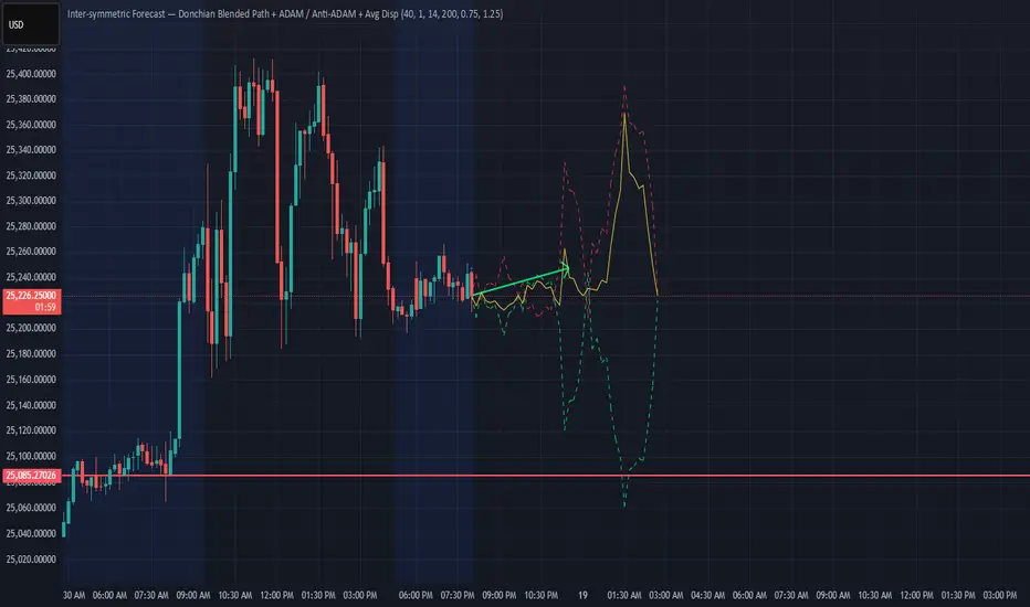
Donchian ForecastDonchian Forecast – multi-timeframe Donchian/ATR bias with ADX regime blending
Donchian Forecast is a multi-timeframe bias tool that turns classic Donchian channels into a normalized trend/mean-reversion “forecast” and a single bias value in .
It projects a short polyline path from the current price and shows how that path adapts when the market shifts from ranging to trending (via ADX).
---
Concept
1. Donchian position → direction
For each timeframe, the script measures where price sits inside its Donchian channel:
-1 = near channel low
0 = middle
+1 = near channel high
This Donchian position is multiplied by ATR to create a **price delta** (how far the forecast moves from current price).
2. Local behavior: trend vs mean-reversion around Donchian
The indicator treats the edges vs middle of the Donchian channel differently:
* By default, edges behave more “trend-like”, middle more “mean-reverting”.
* If you enable the reversed option, this logic flips (edges = mean-reverting, middle = trend-
like).
* This “local” behavior is controlled smoothly by the absolute Donchian position |pos| (not by hard zone switches).
3. Global ADX modulation (regime aware)
ADX is mapped from your chosen low → high thresholds into a signed factor in :
* ADX ≤ low → -1 (fully reversed behavior, more range/mean-reversion oriented)
* ADX ≥ high → +1 (fully normal behavior, more trend oriented)
* Values in between create a **smooth transition**.
* This global factor can:
* Keep the local behavior as is (trending regime),
* Flip it (range regime), or
* Neutralize it (indecisive regime).
4. Multi-timeframe aggregation (1x–12x chart timeframe)
* The script repeats the same logic across 12 horizons:
* 1x = chart timeframe
* 2x..12x = multiples of the chart timeframe (e.g., 5m → 10m, 15m, …; 1h → 2h, 3h, …).
* For each horizon it builds:
* Donchian position
* ATR-scaled delta (in price units)
* Locally + globally blended delta (after Donchian + ADX logic).
* These blended deltas are ATR-weighted and summed into a single bias in , which is then shown as Bias % in the on-chart table.
---
### What you see on the chart
* Forecast polyline
* Starting at the current close, the indicator draws a short chain of **up to 12 segments**:
* Segment 1: from current price → 1x projection
* Segment 2: 1x → 2x projection
* … up to 12x.
* Each segment is:
* Green when its blended delta is ≥ 0 (upward bias)
* Red when its blended delta is < 0 (downward bias)
* This is not future price, but a synthetic path showing how the Donchian/ATR/ADX model “expects” price to drift across multiple horizons.
* Bias table (top-center)
* `Bias: X.Y%`
* > 0% (green) → net upward bias across horizons
* < 0% (red) → net downward bias
* Magnitude (e.g., ±70–100%) ≈ strength of the directional skew.
* `ADX:` current ADX value (from your DMI settings).
* `ADXBlend:` the signed ADX factor in :
* +1 ≈ fully “trend-interpretation” of Donchian behavior
* 0 ≈ neutral / mixed regime
* -1 ≈ fully “reversed/mean-reversion interpretation”
---
Inputs & settings
Core Donchian / ATR
* Donchian Length – lookback for Donchian high/low on each horizon.
* Price Source – input series used for position inside the Donchian channel (default: close).
* ATR Length – ATR lookback for all horizons.
* ATR Multiplier – scales the size of each forecast step in price units (higher = longer segments / more aggressive forecast).
*Local behavior at high ADX
* Reversed local blend at high ADX?
* Off (default) – edges behave more trend-like, middle more mean-reverting.
* On – flips that logic (edges more mean-reverting, middle more trend-like).
* The actual effect is always modulated by the global ADX factor, so you can experiment with how the regime logic feels in different markets.
Global ADX blending
* DMI DI Length – period for the DI+ and DI- components.
* ADX Smoothing – smoothing length for ADX.
* ADX low (mean-rev zone) – below this level, the global factor pushes behavior toward reversal/range logic .
* ADX high (trend zone) – above this level, the global factor pushes behavior toward **trend logic**.
* Values between low and high create a smooth blend rather than a hard on/off switch.
---
How to use it (examples)
* Directional bias dashboard
* Use the Bias % as a compact summary of multi-horizon Donchian/ATR/ADX conditions:
* Consider only trades aligned with the sign of Bias (e.g., longs only when Bias > 0).
* Use the magnitude to filter for **strong vs weak** directional contexts.
* Regime-aware context
* Watch ADX and ADXBlend:
* High ADX & ADXBlend ≈ +1 → favor trend-continuation ideas.
* Low ADX & ADXBlend ≈ -1 → favor range/mean-reversion ideas.
* Around 0 → mixed/transition regimes; forecasts will be more muted.
* Visual sanity check for systems
* Overlay Donchian Forecast on your usual entries/exits to see:
* When your system trades **with** the multi-TF Donchian bias.
* When it trades **against** it (possible fade setups or no-trade zones).
This script does not generate entry or exit signals by itself. It is a contextual/forecast tool meant to sit on top of your own trading logic.
---
Notes
* Works on most symbols and timeframes; higher-timeframe multiples are built from the chart timeframe.
* The forecast line is a model-based projection, not a prediction or guarantee of future price.
* Always combine this with your own risk management, testing, and judgement. This is for educational and analytical purposes only and is not financial advice.
Smart Money Concepts Pro Smart Money Concepts Pro
A professional-grade framework for visualizing institutional price behavior through key Smart Money Concepts. It automatically maps structure shifts, imbalances, and liquidity events so traders can study how price develops around supply and demand.
Core Components
Market Structure (BOS / CHoCH) — Detects continuation and reversal breaks using pivot-based logic with a close-beyond threshold and configurable cooldown.
Order Blocks — Highlights institutional footprints validated by volume and distance filters; zones extend until mitigation.
Fair Value Gaps — Marks three-bar inefficiencies that meet a minimum gap size and optionally auto-remove once filled by a user-defined percentage.
Liquidity Sweeps — Identifies stop-hunt wicks exceeding a configurable extension beyond recent highs or lows.
Premium / Discount Zones — Defines equilibrium and price positioning within recent swing ranges.
Confluence Entries (optional) — Generates neutral BUY / SELL markers only when structure, zone, and directional context align.
Dashboard — Summarizes current structure bias, recent events, zone counts, and directional alignment in real time.
Why it’s distinct
All detections are governed by explicit thresholds—volume multipliers, minimum distances, and fill-percent logic—so each signal results from quantifiable structure rather than heuristic pattern matching. Automatic cleanup ensures charts remain clear as zones are mitigated or gaps filled.
Best use
Applicable across Forex, indices, crypto, and equities. Designed for study on 15 m – 1 D timeframes.
For optimal alignment, pin plots to the Right Scale after adding the script.
Disclaimer: This script is provided for educational and analytical purposes only. It does not constitute financial or investment advice.

Fibonacci Projection with Volume & Delta Profile (Zeiierman)█ Overview
Fibonacci Projection with Volume & Delta Profile (Zeiierman) blends classic Fibonacci swing analysis with modern volume-flow reading to create a unified, projection-based market framework. The indicator automatically detects the latest swing high and swing low, builds a complete Fibonacci structure, and then projects future extension targets with clear visual pathways.
What makes this tool unique is the integration of two volume-based systems directly into the Fibonacci structure. A Fib-aligned Volume Profile shows how bullish and bearish volume accumulated inside the swing range, while a separate Delta Profile reveals the imbalance of buy–sell pressure inside each Fibonacci interval. Together, these elements transform the standard Fibonacci tool into a multi-dimensional structural and volume-flow map.
█ How It Works
The indicator first detects the most recent swing high and swing low using the Period setting. That swing defines the Fibonacci range, from which the script draws retracement levels (0.236–0.786) and builds a forward projection path using the chosen Projection Level and a 1.272 extension.
Along this path, it draws projection lines, target boxes, and percentage labels that show how far each projected leg extends relative to the previous one.
Inside the same swing range, the script builds a Fib-based Volume Profile by splitting price into rows and assigning each bar’s volume as bullish (close > open) or bearish (close ≤ open). On top of that, it calculates a Volume Delta Profile between each pair of fib levels, showing whether buyers or sellers dominated that band and how strong that imbalance was.
█ How to Use
This tool helps traders quickly understand market structure and where the price may be heading next. The projection engine shows the most likely future targets, highlights strong or weak legs in the move, and updates automatically whenever a new swing forms. This ensures you always see the most relevant and up-to-date projection path.
The Fib Volume Profile shows where volume supported the move and where it did not. Thick bullish buckets reveal zones where buyers stepped in aggressively, often becoming retestable support. Thick bearish buckets highlight zones of resistance or rejection, particularly useful if projected levels align with prior liquidity.
The Delta Profile adds a second dimension to volume reading by showing where buy–sell pressure was truly imbalanced. A projected Fibonacci target that aligns with a strong bullish delta, for example, may suggest continuation. A projection into a band dominated by bearish delta may warn of reversal or hesitation.
█ Settings
Period – bars used to determine swing high/low
Projection Level – chosen Fib ratio for projection path
-----------------
Disclaimer
The content provided in my scripts, indicators, ideas, algorithms, and systems is for educational and informational purposes only. It does not constitute financial advice, investment recommendations, or a solicitation to buy or sell any financial instruments. I will not accept liability for any loss or damage, including without limitation any loss of profit, which may arise directly or indirectly from the use of or reliance on such information.
All investments involve risk, and the past performance of a security, industry, sector, market, financial product, trading strategy, backtest, or individual's trading does not guarantee future results or returns. Investors are fully responsible for any investment decisions they make. Such decisions should be based solely on an evaluation of their financial circumstances, investment objectives, risk tolerance, and liquidity needs.

Bappa - Dynamic VWAP Simple Vwap, just dynamic colour Coding added to sense whether VWAP is in uptrend or downtrend. Refer to colour code to enter Call side or Put side, it never disappoints you at any timeframe. Enjoy & happy Trading!!
Better results if used in conjuction with Pivots/ fractals indicator, named as Bappa EMA + BBW (V2) indicator.

SFP + Binance Hedge Direct (Full)RSI SFP + Binance Direct Auto-Trading (Hedge Mode)
RSI SFP + 币安直连自动交易脚本 (双向持仓模式)
🇨🇳 中文说明 (Chinese)
简介 / Introduction 这是一个专为 Binance Futures Signal Bot(币安合约信号机器人) 深度定制的 RSI SFP(假突破)策略脚本。它移除了对第三方中间商(如 WunderTrading)的依赖,实现了 TradingView 到币安的毫秒级直连下单,极大降低了滑点。
核心功能 / Key Features
SFP 针尖策略: 基于 RSI 背离 + 前高/前低假突破(Swing Failure Pattern)捕捉反转机会。支持 "触碰即入场" 或 "收线确认" 模式。
币安直连 (Binance Direct): 内置符合币安 Hedge Mode (双向持仓) 标准的 JSON 生成器。支持自动挂入 TP/SL (止盈止损) 单。
智能资金管理: 无需手动计算总金额。只需输入 本金 (Margin) 和 杠杆 (Leverage),脚本自动计算总名义价值 (Notional Value) 并发送给交易所。
多重过滤系统: 集成 布林带 (Bollinger Bands) 和 成交量 (Volume) 过滤器,有效过滤震荡中的假信号。
双重报警支持:
机器人端: 发送标准 JSON 指令,包含开单、金额、止盈止损价。
手机端: 通过隐藏绘图输出,支持发送清晰易读的文本消息(如 "BTC Long, Entry: 95000, TP: 96000")。
设置指南 / Setup Guide
参数设置:
在 🤖 Bot Connection 中填入币安提供的 signalId 和 uid。
在 Position & Money 中设置您的单笔本金和杠杆(如 1000 U, 100x)。
币安设置:
在币安创建信号机器人时,务必选择 Order Size 单位为 USDT。
报警设置 (双报警模式):
自动交易: 创建报警 -> 选择 Any alert() function call -> 填入 Webhook URL -> 消息框留空。
手机提醒: 创建报警 -> 选择 Bullish/Bearish Reversal -> 填入 {{plot("Alert_Entry")}} 等占位符 -> 发送到 App。
🇺🇸 English Description
Introduction This is a specialized RSI SFP (Swing Failure Pattern) strategy script tailored for the Binance Futures Signal Bot. It eliminates the need for third-party middleware (like WunderTrading), enabling direct, low-latency execution from TradingView to Binance with minimal slippage.
Key Features
SFP Strategy: Captures reversals based on RSI Divergence + Structure False Breakouts (Wick-based). Supports "Touch Only" or "Close Return" entry modes.
Binance Direct Integration: Built-in JSON generator strictly compliant with Binance Hedge Mode. Automatically attaches TP/SL (Take Profit & Stop Loss) orders directly to the entry signal.
Smart Money Management: No need to calculate position sizes manually. Simply input your Margin (USDT) and Leverage. The script auto-calculates the Total Notional Value to send to the exchange.
Advanced Filtering: Integrated Bollinger Bands and Volume filters to reduce false signals during choppy markets.
Dual Alert System:
For Bot: Sends raw JSON commands with execution details.
For Phone: Uses hidden plots to allow clean, human-readable text alerts (e.g., "BTC Long, Entry: $...", "TP: $...").
Setup Guide
Script Settings:
Paste your Binance signalId and uid in the 🤖 Bot Connection section.
Set your Margin and Leverage in Position & Money (e.g., 1000 USDT, 100x).
Binance Settings:
When creating the Signal Bot on Binance, ensure Order Size unit is set to USDT.
Alert Setup (Double-Alert Method):
For Auto-Trading: Create Alert -> Select Any alert() function call -> Check Webhook -> Leave Message empty.
For Phone Notification: Create Alert -> Select Bullish/Bearish Reversal -> Use placeholders like {{plot("Alert_Entry")}} -> Notify on App.
⚠️ Risk Warning
This script automates high-leverage trading. Ensure your Binance Futures account is set to Hedge Mode before running. Use at your own risk.

SPY Downside Risk - Bond Flow Indicator (Daily)## **SPY Downside Risk - Bond Flow Indicator**
### 📊 **Overview**
A professional bond market risk monitoring indicator that assesses SPY (S&P 500 ETF) downside risk by tracking Treasury yield spreads and credit spreads. The indicator provides two complementary display modes for comprehensive market analysis.
---
### 🎯 **Key Features**
#### **Mode 1: Spreads Analysis**
Monitor critical fixed-income risk indicators:
- **10Y-2Y Treasury Spread**
- 🔵 Blue Line (> 20bp): Normal economic expansion
- 🟠 Orange Line (0-20bp): Flight-to-safety sentiment emerging
- 🔴 Red Line (< 0bp): **Yield curve inversion - Recession warning**
- **HY-IG Credit Spread** (High Yield - Investment Grade)
- 🟣 Purple Line: Credit spread widening - Rising default risk
- 🟢 Green Line: Credit spread tightening - Risk appetite improving
#### **Mode 2: Bond ETFs Capital Flow**
Track capital movements across four major bond ETFs:
- **SHY** (🔴 Red): 1-3 Year Treasury - Short-term safety
- **TLT** (🟠 Orange): 20+ Year Treasury - Long-term safety
- **LQD** (🟡 Yellow): Investment Grade Bonds - Quality credit
- **HYG** (🔵 Blue): High Yield Bonds - Risk appetite
---
### 🔧 **Input Parameters**
| Parameter | Default | Description |
|-----------|---------|-------------|
| **Display Mode** | Spreads | Choose between "Spreads" or "Bond ETFs" view |
| **ROC Period** | 10 | Rate of change period (for Bond ETFs mode smoothing) |
| **10Y-2Y Threshold** | 20 bp | Spread narrowing threshold indicating safe-haven flows |
| **VIX Filter Level** | 18 | Volatility threshold for heightened market stress |
---
### 📈 **How to Use**
#### **Yield Curve Inversion Signal**
When 10Y-2Y spread inverts (< 0bp):
- Historically precedes recession within 6-24 months
- Equity markets may face correction in 3-12 months
- Consider defensive positioning (bonds, gold, utilities)
#### **Credit Spread Expansion**
When HY-IG spread rapidly widens:
- Corporate default risk increasing
- Capital flowing from risky assets to safety
- Potential equity market pullback ahead
#### **Capital Flow Analysis**
- **SHY ⬆️ + HYG ⬇️** = Risk-off mode, equity pressure mounting
- **HYG ⬆️ + SHY ⬇️** = Risk-on sentiment, bullish for equities
- **TLT surge** = Long rates falling, economic slowdown expected
- **LQD + HYG divergence** = Credit quality differentiation
---
### 📊 **Real-Time Debug Table**
Upper-right corner displays key metrics:
**Spreads Mode:**
- **10Y-2Y Spread**: Current yield curve spread (basis points)
- **Credit Spread**: HY-IG spread (basis points)
- **VIX**: Market volatility index
**Bond ETFs Mode:**
- **SHY Flow**: Short-term Treasury momentum (%)
- **HYG Flow**: High-yield bond momentum (%)
- **VIX**: Market volatility index
**Color Coding:**
- 🔴 Red = High risk / Inverted
- 🟠 Orange = Caution / Elevated
- 🔵 Blue/Gray = Normal conditions
---
### ⚠️ **Trading Signals**
#### **High Risk Scenarios**
1. **Yield curve inverted** (Red line < 0) + **VIX > 18** (Orange)
- Action: Reduce equity exposure, increase cash/bonds
2. **Credit spread widening** + **HYG Flow negative**
- Action: Avoid high-yield debt, favor quality bonds
3. **SHY Flow positive** + **SPY declining**
- Action: Flight-to-safety confirmed, defensive positioning
#### **Bullish Scenarios**
1. **Steep yield curve** (Blue line > 50bp) + **HYG Flow > 3%**
- Action: Risk-on environment, equity allocation appropriate
2. **Credit spread tightening** + **Low VIX** (< 15)
- Action: Favorable credit conditions, growth exposure
---
### 🔔 **Alert System**
**Built-in Alert:**
- **Treasury Spread Inversion Alert**: Triggers when 10Y-2Y spread crosses below 0
**How to Set Up:**
1. Click "Create Alert" in TradingView
2. Select condition: "Treasury Spread Inversion Alert"
3. Configure notification preferences
---
### 📚 **Data Sources**
**Treasury Yields** - Federal Reserve Economic Data (FRED):
- `DGS2`: 2-Year Treasury Constant Maturity Rate
- `DGS10`: 10-Year Treasury Constant Maturity Rate
**Credit Spreads** - FRED:
- `BAMLC0A1CAAAEY`: ICE BofA US Corporate Index Option-Adjusted Spread
- `BAMLH0A0HYM2`: ICE BofA US High Yield Index Option-Adjusted Spread
**ETF Data** - AMEX/NASDAQ:
- iShares 1-3 Year Treasury Bond ETF (SHY)
- iShares 20+ Year Treasury Bond ETF (TLT)
- iShares iBoxx $ Investment Grade Corporate Bond ETF (LQD)
- iShares iBoxx $ High Yield Corporate Bond ETF (HYG)
**Volatility** - CBOE:
- VIX Index (Volatility Index)
**Update Frequency**: Daily (FRED data typically 1-2 day lag)
---
### 💡 **Best Practices**
1. **Timeframe**: Use on **Daily charts** for optimal signal quality
2. **Confirmation**: Combine with SPY price action, volume, and momentum indicators
3. **Risk Management**: Signals are early warnings - adjust positions gradually
4. **Mode Switching**: Toggle between modes weekly to understand both spread dynamics and flow patterns
5. **Historical Context**: Review past inversion periods (2000, 2007, 2019) for signal validation
---
### 📖 **Interpretation Guide**
#### **Recession Probability Matrix**
| 10Y-2Y Spread | Credit Spread | VIX | Risk Level |
|---------------|---------------|-----|------------|
| < -20bp | Widening | > 25 | 🔴 Very High |
| -20bp to 0 | Widening | > 18 | 🟠 High |
| 0-20bp | Stable | 15-18 | 🟡 Moderate |
| > 20bp | Tightening | < 15 | 🟢 Low |
#### **Lead Times (Historical Average)**
- Yield curve inversion → Recession: **12-18 months**
- Credit spread surge → Equity peak: **3-6 months**
- Safe-haven flows → Volatility spike: **1-4 weeks**
---
### 🎓 **Educational Notes**
**Why Monitor Treasury Spreads?**
- Long-term rates reflect growth expectations
- Short-term rates reflect Fed policy
- Inversion = Market expects Fed to cut rates (recession ahead)
**Why Track Credit Spreads?**
- Measures corporate borrowing stress
- Leading indicator of credit cycle turns
- High correlation with equity risk premiums
**Why Bond ETF Flows Matter?**
- Real-time capital allocation signals
- Faster than spread movements
- Shows risk sentiment shifts
---
### ⚙️ **Technical Specifications**
- **Version**: PineScript v5
- **Type**: Indicator (Non-overlay)
- **Calculation**: Daily timeframe only
- **Lookback Period**: 10 bars (customizable for ETF mode)
---
### 🚨 **Risk Disclaimer**
**IMPORTANT NOTICES:**
1. **Historical Performance**: Past yield curve inversions don't guarantee future recession timing
2. **False Signals**: Brief inversions (<30 days) may not indicate recession
3. **Data Lag**: FRED economic data has 1-2 business day delay
4. **Complementary Tool**: Use alongside fundamental and technical analysis
5. **Not Financial Advice**: For educational and research purposes only
**This indicator does not:**
- Provide specific buy/sell signals
- Guarantee trading profits
- Replace professional financial advice
- Account for individual risk tolerance
---
### 📞 **Support & Updates**
- **Questions**: Contact via TradingView private message
- **Bug Reports**: Describe issue with screenshot and chart settings
- **Feature Requests**: Suggestions welcome for future versions
---
### 📋 **Version History**
**v1.0** (December 2025)
- Initial release
- Dual-mode display (Spreads + Bond ETFs)
- Real-time debug table
- Yield curve inversion alert
- VIX filter integration
---
### 📄 **License**
**Protected Script** - Source code is not publicly available. Authorized users only.
---
**DISCLAIMER**: This indicator is provided "as-is" for educational purposes. Trading and investing involve substantial risk of loss. Always conduct your own research and consult with a licensed financial advisor before making investment decisions.
---
**© 2025 | SPY Downside Risk Indicator | All Rights Reserved**

Physics of PricePhysics of Price is a non-repainting kinematic reversal and volatility overlay. It models price as a physical object with position, velocity, and acceleration, then builds adaptive bands and a short-term predictive “ghost cone” to highlight where reversals are statistically more likely.
CONCEPT
Instead of using only moving averages, the core engine tracks a smoothed price (position), trend speed (velocity), and change in trend speed (acceleration). Standard deviation of the model error defines probabilistic bands around this kinematic centerline. When price stretches too far away and snaps back, the move is treated as a potential exhaustion event.
CORE COMPONENTS
– Kinematic centerline (Alpha–Beta–Gamma style filter) that bends with trend instead of lagging like a simple MA.
– Inner and outer bands based on the standard deviation of residuals between price and the kinematic model.
– Regime filter using R² and band width to avoid signals in chaotic or ultra-wide regimes.
– Optional RSI “hook” filter that waits for momentum to actually turn instead of buying into a falling RSI.
– Optional divergence add-on using kinematic velocity, so a marginal new price extreme with weaker velocity is recognized as a possible exhaustion pattern.
REVERSAL EVENTS AND SCORING
Raw events are detected when price wicks through the outer band and closes back inside (band hit with snap). These are plotted as diamonds and treated as candidates, not automatic trades.
Each event is then scored from 0 to 100 using several factors:
– How far price overshot the outer band.
– How strongly it snapped back inside.
– Whether an RSI hook is present (if enabled).
– Regime quality from the kinematic model.
– Basic kinematic safety to avoid the most aggressive “knife-catch” situations.
– Optional divergence bonus when price makes a new extreme but velocity does not.
Only events with a score above the chosen threshold become confirmed signals (triangles labeled PHYSICS REV).
GHOST CONE (PREDICTIVE BAND)
On the latest bar, the script projects a short-horizon “ghost cone” into the future using position, velocity, and a damped acceleration term. This creates a curved predictive band that visualizes a plausible short-term path and range, rather than a simple straight line. The cone is meant as context for trade management and risk, not as a hard target.
FILTERS AND OPTIONS
– Regime filter (R² and band width) can be tightened or relaxed depending on how selective you want the engine to be.
– RSI and volume filters can be toggled on for extra confirmation or off to see the raw kinematic behavior.
– An optional trend baseline (EMA) can be enabled to bias or restrict reversals relative to a higher-timeframe trend.
– Dynamic cooldown scales with volatility so the script does not spam signals in fast environments.
HOW TO USE
Physics of Price is primarily a mean-reversion and exhaustion tool. It works best in markets that respect ranges, swings, and two-sided order flow. Confirmed PHYSICS REV signals near the outer bands, with decent model health and a clean RSI hook, are the core use case. The bands and ghost cone can also be used as a context overlay alongside your own entries, exits, and risk framework.
This is an indicator, not a complete trading system. It does not use lookahead or higher-timeframe security calls and is designed for “once per bar close” alerts. Always combine it with your own risk management and confluence.

Daily ATR Dashboard - NIRALADaily ATR Dashboard: Volatility at a Glance
What is this?
The "Daily ATR Dashboard" is a simple, non-intrusive utility tool designed for intraday traders. It places a clean information table in the top-right corner of your chart, displaying the Daily Average True Range (DATR) for the current session and the previous two days.
Why is it useful?
Understanding daily volatility is crucial for setting realistic targets and stop-losses.
Know the Range: Instantly see how much the instrument typically moves in a day.
Context: Compare today's volatility with yesterday's and the day before to gauge if the market is expanding (becoming more volatile) or contracting (consolidating).
Clean Charts: Instead of plotting a messy ATR line indicator below your price action, this dashboard gives you the raw data you need without cluttering your workspace.
Features:
Real-Time Data: The "Today" row updates in real-time as the current daily candle develops.
Historical Context: Automatically fetches and displays the final DATR values for the previous two sessions ("Yesterday" and "Day Before").
Highlighted Current Day: The current day's data is highlighted in yellow for immediate visibility.
Customizable: You can adjust the ATR length (default is 14) and the text size to fit your screen perfectly.
How to Read It:
Today: The current volatility of the ongoing daily session.
Yesterday / Day Before: The finalized volatility of past sessions.
Tip: If "Today's" ATR is significantly lower than the previous days, expect potential expansion or a breakout soon. If it is significantly higher, the market may be overextended.
Settings:
DATR Length: The lookback period for the ATR calculation (Default: 14).
Text Size: Adjust the size of the table text (Tiny, Small, Normal, Large).

CISD & Projections BossThis is a CISD (Change in State of Delivery) indicator with Fibonacci-style projections. Here's what it does:
Core Functionality
1. Pivot Detection
Uses Williams Fractal logic to identify swing highs and lows based on your specified pivot strength
Can use either candle bodies or wicks for calculations
2. CISD Detection
The indicator identifies "Change in State of Delivery" moments - institutional trading concept where:
For bullish CISD (CISD+): Finds a swing low, then looks backward to identify the preceding series of bearish candles. When price breaks above this bearish series, it marks a CISD+ (change from bearish to bullish delivery)
For bearish CISD (CISD-): Finds a swing high, then looks backward to identify the preceding series of bullish candles. When price breaks below this bullish series, it marks a CISD- (change from bullish to bearish delivery)
The CISD line is drawn from the start of the series to the breakout point at the series extreme (high for bullish, low for bearish).
3. Range Projections
Once a CISD is confirmed, the indicator:
Calculates the range of the broken series (high - low)
Projects multiples of that range as potential targets
Default levels are 1x, 1.5x, 2x, 2.5x, 3x, and 4x the series range
Bullish projections extend upward from the CISD+ line
Bearish projections extend downward from the CISD- line
Visual Elements
CISD lines (thick lines in blue for bullish, red for bearish)
Projection levels (thinner horizontal lines extending from the breakout point)
Labels showing the multiplier for each projection level
Optional pivot shapes to mark swing points
This is essentially tracking institutional "order flow changes" and projecting measured moves based on the size of the broken delivery pattern - very much in line with ICT (Inner Circle Trader) concepts.

CYCLE RESEARCH PRO - FIXEDCYCLE RESEARCH PRO – Fixed & Cleaned (2025 Edition)
The only public T+21 / T+35 / T+147 cycle tracker that actually works.
Features:
• Exact days since the legendary GME sneeze (28 Jan 2021)
• Highlights active T+21, T+35, and T+147 windows (± user-defined tolerance)
• Live countdown to next cycle date for all three
• FTD Proxy detector (extreme volume + true-range spike)
• Clean wide dashboard – no clutter
• Background glows when any cycle window is active
• Built-in alerts including the infamous “T+21 + FTD” combo
• 100 % non-repainting – uses only confirmed bars
• Zero errors, zero warnings, Pine v6 native
Made famous in the meme-stock wars.
Now cleaned, fixed, and ready for the next run.
Works on GME, AMC, BBBY, any stock or crypto.
Use it. Share it. Profit.
Not financial advice. Just math & cycles.
– Published with love for the apes, degens, and cycle chads everywhere

SSL ST Indicator - MTF SSL FilterPDF Title: SSL ST Indicator – Client Summary
Overview:
The SSL ST Indicator combines SSL (EMA-based support/resistance lines), HMA (Hull Moving Average), and optional multi-timeframe (MTF) SSL confirmation to provide precise trend-following signals, dynamic background zones, and visual entry/exit cues.
Key Features:
* Trend detection with SSL & Baseline EMA
* Optional HMA for trend strength
* Multi-Timeframe SSL filter for higher timeframe confirmation
* Dynamic background zones (green = bullish, red = bearish)
* Entry/exit labels & shapes
* Alert conditions for automated notifications
Visual Elements:
* Blue Line: SSL line
* Gray Line: Baseline EMA
* Orange Line: HMA line
* Green Background: Bullish Trend
* Red Background: Bearish Trend
* Green Triangle: Buy Signal
* Red Triangle: Sell Signal
* Yellow Cross: Exit Signal
Signal Logic:
* Buy: SSL crosses under baseline (filtered by MTF SSL if enabled)
* Sell: SSL crosses over baseline (filtered by MTF SSL if enabled)
* Exit: SSL crosses opposite trend or optional HMA slope changes
Usage Instructions:
1. Add the indicator to your chart.
2. Configure EMA/HMA lengths and optional MTF timeframe.
3. Enable background zones and labels for easy trend visualization.
4. Monitor triangles and crosses for trade signals.
5. Set alerts for automatic notifications.
Advantages:
* Fully aligned with candlesticks (no misalignment when scrolling)
* Multi-timeframe confirmation reduces false signals
* Visual trend zones improve market interpretation
* Alerts help automate monitoring and decision-making
Disclaimer
This strategy is provided strictly for educational and informational purposes only. It does not guarantee any profit, nor does it protect against losses of any kind. Financial markets are inherently unpredictable, and any market movement can only be assumed or estimated with a probability that is never guaranteed and can often be no better than a 50/50 chance.
By using this strategy, you acknowledge that all trading decisions are made solely at your own risk. I am not liable for any profits, losses, or financial consequences incurred by anyone using or relying on this strategy. Always perform your own research, manage your risk responsibly, and consult with a qualified financial advisor before trading.

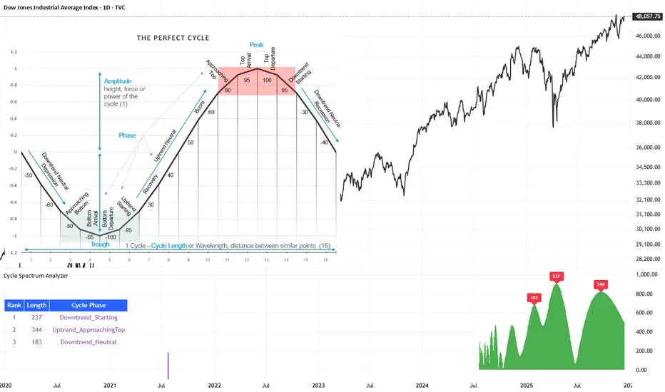
Cycle Spectrum AnalyzerCycle Spectrum Indicator — Short Description
This indicator computes a visual Fourier cycle spectrum from the input price data to reveal the market’s dominant cyclical behaviour. The price series is first detrended using a Hodrick–Prescott filter, after which a specialized Fourier analysis variant extracts the cycle components.
The resulting spectrum displays peaks that represent the dominant cycles present in the data, where each peak’s cycle length and amplitude indicate the strength and duration of the underlying rhythm. The most significant peaks are ranked, highlighting the top cycles currently driving market movement. Each detected cycle also includes a phase value, describing the cycle’s position at the most recent bar (e.g., topping, bottoming, rising, falling).
The indicator can be used to:
Identify the top 3 dominant cycles with their length and phase.
Analyze the current market state by interpreting these phases.
Feed the dominant cycle lengths—often half the primary cycle—into other technical indicators for improved parameter tuning.
Project cycles forward to estimate upcoming turning points and anticipate potential trend shifts.
Additional Explanation of the included visual example image
Left Area – The Theoretical “Perfect Cycle”
The left part of the illustration presents a theoretical, perfectly smooth sine-wave cycle. This serves as a reference model to explain the core cycle parameters:
Cycle Length – The full wavelength of one complete oscillation (from trough to trough or peak to peak).
Phase – The current position within that cycle, expressed both numerically and as an easy-to-read text label such as Bottom_Departure, Uptrend_Neutral, Approaching Top, or Top_Departure.
The diagram highlights visually how a cycle progresses through bottoming, rising, peaking, and declining phases, matching the phase descriptions used in the indicator’s output. This helps translate raw phase angles into intuitive market-state labels (e.g., recovery, boom, topping, recession).
Right Area – The Price Series Used for Analysis
On the right, the actual price chart (e.g., Dow Jones Industrial Average) is displayed. This is the dataset from which the Fourier cycle spectrum is computed.
At the bottom of this chart section, a purple bar indicates the amount of historical data included in the cycle analysis. Because Fourier-based methods depend strongly on sample size, this visual cue shows how far back the indicator collected and processed data before generating the spectrum.
Bottom Area – The Cycle Spectrum Output Pane
The lower pane contains the Cycle Spectrum Analyzer output:
It displays the cycle spectrum at the most recent bar, where each green peak corresponds to a detected cycle.
Peak height = amplitude (strength) of the cycle
Peak position (horizontal) = dominant cycle length
The largest peaks represent the strongest cycles currently present in the detrended price series.
Next to the spectrum, a ranked table lists the Top 3 dominant cycles, showing:
Rank (1 = strongest)
Cycle Length (in bars)
Phase Description (interpreting where that cycle is right now)
This concise summary allows users to quickly understand:
Which cycles are strongest,
How long they are,
And whether they are currently bottoming, topping, rising, or falling.
How the Indicator Works & How It Can Be Adjusted
Calculation Only at the Last Bar
The indicator performs its full Fourier-based cycle decomposition exclusively on the most recent bar. This ensures that the spectrum always reflects the current market state without repeatedly recalculating historical spectra. The result is an efficient, real-time snapshot of the dominant cycles influencing the price at the latest point in time.
Works on Any Symbol and Any Timeframe
Because the analysis operates directly on the provided price series, the indicator is compatible with all markets and all timeframes—stocks, indices, forex, crypto, futures, and intraday charts alike.
The detected cycle lengths always refer to the selected chart’s bar interval (e.g., 240-bar cycle on a 1h chart ≈ 240 hours; same cycle on a daily chart ≈ 240 days).
Adjustable Historical Lookback (Default: 1100 Bars)
The accuracy of cycle detection depends on the amount of historical data used. The indicator provides a parameter allowing you to specify how many past bars should be included in the Fourier calculation.
Standard value: 1100 bars
Increasing the lookback allows detection of longer cycles, but may dilute short-term characteristics.
Decreasing it focuses on shorter and medium-term cycles, increasing responsiveness but reducing visibility of long-duration rhythms.
By tuning this lookback parameter and choosing an appropriate timeframe, traders can adapt the cycle spectrum to match their analytical style—short-term, medium-term, or long-term cycle interpretation.
สคริปต์แบบชำระเงิน
Erken Yon Motoru v4 + RSI Diverjans (AyhanUzun550)English (short):
This indicator combines RSI, MACD and OBV (volume) into a single Early Direction Score (-100 to +100).
When the score crosses thresholds, it triggers “EARLY UP / EARLY DOWN” signals.
Uses Bollinger Band squeeze and an EMA trend filter to focus on strong moves only.
Detects bullish / bearish RSI divergences and labels them on the chart.
Shows a mini panel with score, RSI, volume flow, trend and last divergence, and supports alerts for all signals.

VIX vs VIX1Y SpreadSpread Calculation: Shows VIX1Y minus VIX
Positive = longer-term vol higher (normal contango)
Negative = near-term vol elevated (inverted term structure)
Can help identify longer term risk pricing of equity assets.

Time (H1/H4)On low-period time charts (such as 5 minutes), mark the 1-hour (H1) and 4-hour (H4) times with colored shaded boxes.
(H1/H4) ._.

XAUUSD 9/1 and 6/4 ZONE LINE (Buy zone and SELL zone)When trading the XAUUSD pair, I noticed that gold often reverses from price levels ending with the digits 9/1 and 6/4. Because of this pattern, I began drawing lines based on these price endings and integrating them into my trading strategy. When combined with other trading methods, these levels provided strong and consistent results.
Feel free to try it yourself — just make sure to analyze the market carefully before entering any trade!

BPR [Gold Group]✨ BPR Indicator – Gold Group
The BPR (Breakout–Pullback–Reversal) Indicator by Gold Group is a premium, research-based market tool designed to help traders identify high-probability trading opportunities with precision. Built on advanced price-action logic and institutional behavior analysis, this indicator highlights key market zones where smart-money activity is most likely to occur—allowing traders to enter the market with confidence and clarity.
🔍 What the BPR Indicator Does
Detects Breakout Zones where liquidity is taken and momentum shifts begin.
Marks Pullback Levels where the market retests institutional footprints.
Identifies Reversal Points with high accuracy for powerful entries.
Filters out market noise, showing only meaningful structure changes.
Works on all timeframes and all major assets such as Gold, Forex, NAS100, US30, Crypto.
🔥 Why This Indicator Is Important
Helps traders understand institutional price movement, not retail traps.
Reduces emotional decision-making by giving crystal-clear levels.
Increases trade accuracy by aligning entries with market structure shifts.
Saves time by automatically plotting areas where smart money reacts.
🎯 Why You Should Use It
Perfect for both beginners and professionals.
Suitable for scalping, intraday, and swing trading.
Developed and tested by Gold Group Research Team with proven performance.
Allows traders to stay ahead of manipulative moves and avoid fake breakouts

Prime-Time × Vortex (3/6/9) — Ace (clean v3)1️⃣ Prime-Time Index (PT)
A bar becomes Prime-Time when the count satisfies the formula:
4·n − 3 is a perfect square
This generates the sequence:
1, 3, 7, 13, 21, 31, 43, 57, 73, 91, …
These are time windows where price is more likely to form:
Shifts in market structure
Impulses
Reversals
Liquidity expansions
These PT bars are drawn as small circles above the candle.
If labels are enabled, the counter value (n) is also shown.
2️⃣ Vortex 3/6/9 Digital-Root Timing
Every bar also has a digital root, calculated from the counter:
If n → digitalRoot(n) = 3, 6, or 9,
the bar is considered a Vortex bar.
These moments often align with:
Swing highs / swing lows
Micro shifts
Mini-reversals
Minor liquidity grabs
When a Prime-Time bar is also a 3/6/9 bar → high-probability timing.
These bars are highlighted in green by default.
3️⃣ Filters & Display
You can customize:
Anchor time → when counting begins
Reset daily → restart counter each new trading day
Show only 3/6/9 → hides normal PT hits
Label offset → distance above the candle
Color themes
This makes the indicator usable on:
1Min
5Min
15Min
1H
Any timeframe you want
4️⃣ How To Apply It in Trading
Use it as a time confluence tool, not a signal generator.
✔ Best ways to use:
Look for MSS, sweeps, OB retests, FVG reactions when
they occur on or near a Prime-Time or 3/6/9 bar
Expect volatility increases after PT bars
Use 3/6/9 hits to anticipate internal turning points
Combine with:
Session High/Low
Killzones (London, NYO, PM)
Purge Protocol
MMXM Execution
✔ Example:
If price sweeps a level and prints a 3/6/9 vortex bar inside a PT window →
you have a very strong timing alignment for reversal.
5️⃣ Simple Summary
Feature Meaning
Prime-Time Hit (PT) Major time window where price often shifts
3/6/9 Vortex Bar Micro-timing for internal swings
PT + 3/6/9 together High-probability timing for entries
Reset Daily Perfect for intraday models like NYO & London
Anchor Time Defines the entire cycle structure

Hurst Exponent - Detrended Fluctuation AnalysisIn stochastic processes, chaos theory and time series analysis, detrended fluctuation analysis (DFA) is a method for determining the statistical self-affinity of a signal. It is useful for analyzing time series that appear to be long-memory processes and noise.
█ OVERVIEW
We have introduced the concept of Hurst Exponent in our previous open indicator Hurst Exponent (Simple). It is an indicator that measures market state from autocorrelation. However, we apply a more advanced and accurate way to calculate Hurst Exponent rather than simple approximation. Therefore, we recommend using this version of Hurst Exponent over our previous publication going forward. The method we used here is called detrended fluctuation analysis. (For folks that are not interested in the math behind the calculation, feel free to skip to "features" and "how to use" section. However, it is recommended that you read it all to gain a better understanding of the mathematical reasoning).
█ Detrend Fluctuation Analysis
Detrended Fluctuation Analysis was first introduced by by Peng, C.K. (Original Paper) in order to measure the long-range power-law correlations in DNA sequences . DFA measures the scaling-behavior of the second moment-fluctuations, the scaling exponent is a generalization of Hurst exponent.
The traditional way of measuring Hurst exponent is the rescaled range method. However DFA provides the following benefits over the traditional rescaled range method (RS) method:
• Can be applied to non-stationary time series. While asset returns are generally stationary, DFA can measure Hurst more accurately in the instances where they are non-stationary.
• According the the asymptotic distribution value of DFA and RS, the latter usually overestimates Hurst exponent (even after Anis- Llyod correction) resulting in the expected value of RS Hurst being close to 0.54, instead of the 0.5 that it should be. Therefore it's harder to determine the autocorrelation based on the expected value. The expected value is significantly closer to 0.5 making that threshold much more useful, using the DFA method on the Hurst Exponent (HE).
• Lastly, DFA requires lower sample size relative to the RS method. While the RS method generally requires thousands of observations to reduce the variance of HE, DFA only needs a sample size greater than a hundred to accomplish the above mentioned.
█ Calculation
DFA is a modified root-mean-squares (RMS) analysis of a random walk. In short, DFA computes the RMS error of linear fits over progressively larger bins (non-overlapped “boxes” of similar size) of an integrated time series.
Our signal time series is the log returns. First we subtract the mean from the log return to calculate the demeaned returns. Then, we calculate the cumulative sum of demeaned returns resulting in the cumulative sum being mean centered and we can use the DFA method on this. The subtraction of the mean eliminates the “global trend” of the signal. The advantage of applying scaling analysis to the signal profile instead of the signal, allows the original signal to be non-stationary when needed. (For example, this process converts an i.i.d. white noise process into a random walk.)
We slice the cumulative sum into windows of equal space and run linear regression on each window to measure the linear trend. After we conduct each linear regression. We detrend the series by deducting the linear regression line from the cumulative sum in each windows. The fluctuation is the difference between cumulative sum and regression.
We use different windows sizes on the same cumulative sum series. The window sizes scales are log spaced. Eg: powers of 2, 2,4,8,16... This is where the scale free measurements come in, how we measure the fractal nature and self similarity of the time series, as well as how the well smaller scale represent the larger scale.
As the window size decreases, we uses more regression lines to measure the trend. Therefore, the fitness of regression should be better with smaller fluctuation. It allows one to zoom into the “picture” to see the details. The linear regression is like rulers. If you use more rulers to measure the smaller scale details you will get a more precise measurement.
The exponent we are measuring here is to determine the relationship between the window size and fitness of regression (the rate of change). The more complex the time series are the more it will depend on decreasing window sizes (using more linear regression lines to measure). The less complex or the more trend in the time series, it will depend less. The fitness is calculated by the average of root mean square errors (RMS) of regression from each window.
Root mean Square error is calculated by square root of the sum of the difference between cumulative sum and regression. The following chart displays average RMS of different window sizes. As the chart shows, values for smaller window sizes shows more details due to higher complexity of measurements.
The last step is to measure the exponent. In order to measure the power law exponent. We measure the slope on the log-log plot chart. The x axis is the log of the size of windows, the y axis is the log of the average RMS. We run a linear regression through the plotted points. The slope of regression is the exponent. It's easy to see the relationship between RMS and window size on the chart. Larger RMS equals less fitness of the regression. We know the RMS will increase (fitness will decrease) as we increases window size (use less regressions to measure), we focus on the rate of RMS increasing (how fast) as window size increases.
If the slope is < 0.5, It means the rate of of increase in RMS is small when window size increases. Therefore the fit is much better when it's measured by a large number of linear regression lines. So the series is more complex. (Mean reversion, negative autocorrelation).
If the slope is > 0.5, It means the rate of increase in RMS is larger when window sizes increases. Therefore even when window size is large, the larger trend can be measured well by a small number of regression lines. Therefore the series has a trend with positive autocorrelation.
If the slope = 0.5, It means the series follows a random walk.
█ FEATURES
• Sample Size is the lookback period for calculation. Even though DFA requires a lower sample size than RS, a sample size larger > 50 is recommended for accurate measurement.
• When a larger sample size is used (for example = 1000 lookback length), the loading speed may be slower due to a longer calculation. Date Range is used to limit numbers of historical calculation bars. When loading speed is too slow, change the data range "all" into numbers of weeks/days/hours to reduce loading time. (Credit to allanster)
• “show filter” option applies a smoothing moving average to smooth the exponent.
• Log scale is my work around for dynamic log space scaling. Traditionally the smallest log space for bars is power of 2. It requires at least 10 points for an accurate regression, resulting in the minimum lookback to be 1024. I made some changes to round the fractional log space into integer bars requiring the said log space to be less than 2.
• For a more accurate calculation a larger "Base Scale" and "Max Scale" should be selected. However, when the sample size is small, a larger value would cause issues. Therefore, a general rule to be followed is: A larger "Base Scale" and "Max Scale" should be selected for a larger the sample size. It is recommended for the user to try and choose a larger scale if increasing the value doesn't cause issues.
The following chart shows the change in value using various scales. As shown, sometimes increasing the value makes the value itself messy and overshoot.
When using the lowest scale (4,2), the value seems stable. When we increase the scale to (8,2), the value is still alright. However, when we increase it to (8,4), it begins to look messy. And when we increase it to (16,4), it starts overshooting. Therefore, (8,2) seems to be optimal for our use.
█ How to Use
Similar to Hurst Exponent (Simple). 0.5 is a level for determine long term memory.
• In the efficient market hypothesis, market follows a random walk and Hurst exponent should be 0.5. When Hurst Exponent is significantly different from 0.5, the market is inefficient.
• When Hurst Exponent is > 0.5. Positive Autocorrelation. Market is Trending. Positive returns tend to be followed by positive returns and vice versa.
• Hurst Exponent is < 0.5. Negative Autocorrelation. Market is Mean reverting. Positive returns trends to follow by negative return and vice versa.
However, we can't really tell if the Hurst exponent value is generated by random chance by only looking at the 0.5 level. Even if we measure a pure random walk, the Hurst Exponent will never be exactly 0.5, it will be close like 0.506 but not equal to 0.5. That's why we need a level to tell us if Hurst Exponent is significant.
So we also computed the 95% confidence interval according to Monte Carlo simulation. The confidence level adjusts itself by sample size. When Hurst Exponent is above the top or below the bottom confidence level, the value of Hurst exponent has statistical significance. The efficient market hypothesis is rejected and market has significant inefficiency.
The state of market is painted in different color as the following chart shows. The users can also tell the state from the table displayed on the right.
An important point is that Hurst Value only represents the market state according to the past value measurement. Which means it only tells you the market state now and in the past. If Hurst Exponent on sample size 100 shows significant trend, it means according to the past 100 bars, the market is trending significantly. It doesn't mean the market will continue to trend. It's not forecasting market state in the future.
However, this is also another way to use it. The market is not always random and it is not always inefficient, the state switches around from time to time. But there's one pattern, when the market stays inefficient for too long, the market participants see this and will try to take advantage of it. Therefore, the inefficiency will be traded away. That's why Hurst exponent won't stay in significant trend or mean reversion too long. When it's significant the market participants see that as well and the market adjusts itself back to normal.
The Hurst Exponent can be used as a mean reverting oscillator itself. In a liquid market, the value tends to return back inside the confidence interval after significant moves(In smaller markets, it could stay inefficient for a long time). So when Hurst Exponent shows significant values, the market has just entered significant trend or mean reversion state. However, when it stays outside of confidence interval for too long, it would suggest the market might be closer to the end of trend or mean reversion instead.
Larger sample size makes the Hurst Exponent Statistics more reliable. Therefore, if the user want to know if long term memory exist in general on the selected ticker, they can use a large sample size and maximize the log scale. Eg: 1024 sample size, scale (16,4).
Following Chart is Bitcoin on Daily timeframe with 1024 lookback. It suggests the market for bitcoin tends to have long term memory in general. It generally has significant trend and is more inefficient at it's early stage.

Fast Autocorrelation Estimator█ Overview:
The Fast ACF and PACF Estimation indicator efficiently calculates the autocorrelation function (ACF) and partial autocorrelation function (PACF) using an online implementation. It helps traders identify patterns and relationships in financial time series data, enabling them to optimize their trading strategies and make better-informed decisions in the markets.
█ Concepts:
Autocorrelation, also known as serial correlation, is the correlation of a signal with a delayed copy of itself as a function of delay.
This indicator displays autocorrelation based on lag number. The autocorrelation is not displayed based over time on the x-axis. It's based on the lag number which ranges from 1 to 30. The calculations can be done with "Log Returns", "Absolute Log Returns" or "Original Source" (the price of the asset displayed on the chart).
When calculating autocorrelation, the resulting value will range from +1 to -1, in line with the traditional correlation statistic. An autocorrelation of +1 represents a perfect correlation (an increase seen in one time series leads to a proportionate increase in the other time series). An autocorrelation of -1, on the other hand, represents a perfect inverse correlation (an increase seen in one time series results in a proportionate decrease in the other time series). Lag number indicates which historical data point is autocorrelated. For example, if lag 3 shows significant autocorrelation, it means current data is influenced by the data three bars ago.
The Fast Online Estimation of ACF and PACF Indicator is a powerful tool for analyzing the linear relationship between a time series and its lagged values in TradingView. The indicator implements an online estimation of the Autocorrelation Function (ACF) and the Partial Autocorrelation Function (PACF) up to 30 lags, providing a real-time assessment of the underlying dependencies in your time series data. The Autocorrelation Function (ACF) measures the linear relationship between a time series and its lagged values, capturing both direct and indirect dependencies. The Partial Autocorrelation Function (PACF) isolates the direct dependency between the time series and a specific lag while removing the effect of any indirect dependencies.
This distinction is crucial in understanding the underlying relationships in time series data and making more informed decisions based on those relationships. For example, let's consider a time series with three variables: A, B, and C. Suppose that A has a direct relationship with B, B has a direct relationship with C, but A and C do not have a direct relationship. The ACF between A and C will capture the indirect relationship between them through B, while the PACF will show no significant relationship between A and C, as it accounts for the indirect dependency through B. Meaning that when ACF is significant at for lag 5, the dependency detected could be caused by an observation that came in between, and PACF accounts for that. This indicator leverages the Fast Moments algorithm to efficiently calculate autocorrelations, making it ideal for analyzing large datasets or real-time data streams. By using the Fast Moments algorithm, the indicator can quickly update ACF and PACF values as new data points arrive, reducing the computational load and ensuring timely analysis. The PACF is derived from the ACF using the Durbin-Levinson algorithm, which helps in isolating the direct dependency between a time series and its lagged values, excluding the influence of other intermediate lags.
█ How to Use the Indicator:
Interpreting autocorrelation values can provide valuable insights into the market behavior and potential trading strategies.
When applying autocorrelation to log returns, and a specific lag shows a high positive autocorrelation, it suggests that the time series tends to move in the same direction over that lag period. In this case, a trader might consider using a momentum-based strategy to capitalize on the continuation of the current trend. On the other hand, if a specific lag shows a high negative autocorrelation, it indicates that the time series tends to reverse its direction over that lag period. In this situation, a trader might consider using a mean-reversion strategy to take advantage of the expected reversal in the market.
ACF of log returns:
Absolute returns are often used to as a measure of volatility. There is usually significant positive autocorrelation in absolute returns. We will often see an exponential decay of autocorrelation in volatility. This means that current volatility is dependent on historical volatility and the effect slowly dies off as the lag increases. This effect shows the property of "volatility clustering". Which means large changes tend to be followed by large changes, of either sign, and small changes tend to be followed by small changes.
ACF of absolute log returns:
Autocorrelation in price is always significantly positive and has an exponential decay. This predictably positive and relatively large value makes the autocorrelation of price (not returns) generally less useful.
ACF of price:
█ Significance:
The significance of a correlation metric tells us whether we should pay attention to it. In this script, we use 95% confidence interval bands that adjust to the size of the sample. If the observed correlation at a specific lag falls within the confidence interval, we consider it not significant and the data to be random or IID (identically and independently distributed). This means that we can't confidently say that the correlation reflects a real relationship, rather than just random chance. However, if the correlation is outside of the confidence interval, we can state with 95% confidence that there is an association between the lagged values. In other words, the correlation is likely to reflect a meaningful relationship between the variables, rather than a coincidence. A significant difference in either ACF or PACF can provide insights into the underlying structure of the time series data and suggest potential strategies for traders. By understanding these complex patterns, traders can better tailor their strategies to capitalize on the observed dependencies in the data, which can lead to improved decision-making in the financial markets.
Significant ACF but not significant PACF: This might indicate the presence of a moving average (MA) component in the time series. A moving average component is a pattern where the current value of the time series is influenced by a weighted average of past values. In this case, the ACF would show significant correlations over several lags, while the PACF would show significance only at the first few lags and then quickly decay.
Significant PACF but not significant ACF: This might indicate the presence of an autoregressive (AR) component in the time series. An autoregressive component is a pattern where the current value of the time series is influenced by a linear combination of past values at specific lags.
Often we find both significant ACF and PACF, in that scenario simply and AR or MA model might not be sufficient and a more complex model such as ARMA or ARIMA can be used.
█ Features:
Source selection: User can choose either 'Log Returns' , 'Absolute Returns' or 'Original Source' for the input data.
Autocorrelation Selection: User can choose either 'ACF' or 'PACF' for the plot selection.
Plot Selection: User can choose either 'Autocorrelarrogram' or 'Historical Autocorrelation' for plotting the historical autocorrelation at a specified lag.
Max Lag: User can select the maximum number of lags to plot.
Precision: User can set the number of decimal points to display in the plot.
