3 Session ORB (Opening Range Breakout) [TickDaddy]The ORB, or Opening Range Breakout indicator. will show all 3 sessions and you can adjust the times.
Forecasting

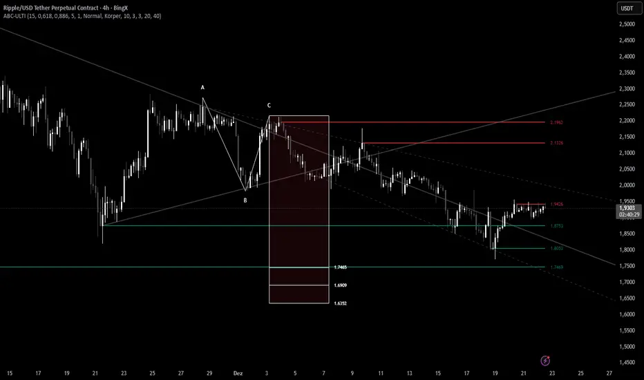
ABC Pro Ultimate S/RABC Pro Ultimate is a high-precision trading tool designed to identify harmonic ABC (Zigzag) patterns and combine them with institutional Support & Resistance levels. Unlike standard indicators that clutter your chart with noise, this script filters for high-relevance pivot points from the distant past to provide truly meaningful trade setups.
King Trade 4-hour buy/sell strategyThis is a buy/sell system for 4-hour candlestick charts. For best results, use it on Heiken Ashi candlestick charts.

cd_VW_Cx IMPROVED - Quant VWAP System: Regime, Magnets & Z-ScoQuant VWAP System: Regime, Magnets & Z-Score Matrix
This indicator is a comprehensive Quantitative Trading System designed to move beyond simple support and resistance. Instead of static lines, it uses Statistical Probability (Z-Score) and Standard Deviation to define the current market regime, identify institutional value zones, and project high-probability liquidity targets.
It is engineered for Day Traders and Scalpers (Crypto & Futures) who need to know if the market is Trending, Ranging, or preparing for a Breakout.
1. The "Regime" System (Standard Deviation Bands)
The core engine anchors a VWAP (Volume Weighted Average Price) to your chosen timeframe (Daily, Weekly, or Monthly) and projects volatility bands based on market variance.
The Trend Zone (Inner Band / 1.0 SD): This is the "Fair Value" zone. In a healthy trend, price will pull back into this zone and hold. A hold here signals a high-probability continuation (Trend Following).
The Reversion Zone (Outer Band / 2.0 SD): This represents a statistical extreme. Price rarely sustains movement beyond 2 Standard Deviations without a reversion. A touch of this band signals "Overbought" or "Oversold" conditions.
2. Liquidity Magnets (Virgin VWAPs)
The script automatically tracks "Unvisited VWAPs" from previous sessions. These are price levels where significant volume occurred but have not yet been re-tested.
The Logic: Algorithms often target these "open loops." The script visualizes them as Blue Dashed Lines with price tags.
Smart Scaling (Anti-Scrunch): Includes a custom "Ghost Engine" that automatically hides or "ghosts" magnets that are too far away. This prevents your chart from being squashed (scrunched) on lower timeframes, keeping your candles perfectly readable while still tracking targets in the background.
3. The Quant Matrix (Dashboard)
A real-time Heads-Up Display (HUD) that interprets the data for you:
Regime: Detects Volatility Squeezes. If the bands compress, it signals "⚠ SQUEEZE", warning you to stop mean-reversion trading and prepare for an explosive breakout.
Bias: Color-coded Trend Direction (Bullish/Bearish) based on VWAP slope.
Signal: actionable text prompts such as "BUY DIP" (Trend Following), "FADE EXT" (Mean Reversion), or "PREP BREAK" (Squeeze).
4. Visual Intelligence
Bold Day Separators: Clear, vertical dotted dividers with Date Stamps to instantly separate trading sessions.
Dynamic Labels: Floating labels on the right axis identify exactly which deviation level is which, preventing chart confusion.
How to Use
Strategy A: The Trend Pullback (continuation)
Check Matrix: Ensure Bias is BULLISH (Green).
Wait: Allow price to pull back into the Inner Band (Dark Green Zone).
Trigger: If price holds the Center VWAP or the -1.0 SD line, enter Long.
Target: The next Liquidity Magnet above or the +2.0 SD band.
Strategy B: The Reversion Fade (Counter-Trend)
Check Matrix: Ensure price is labeled "EXTREME" or Signal says "FADE EXT".
Trigger: Price touches or pierces the Outer Band (2.0 SD).
Action: Enter counter-trend (Short) with a target back to the Center VWAP (Mean Reversion).
Strategy C: The Magnet Target
Identify a "MAGNET" line (Blue Dashed) near current price.
These act as high-probability Take Profit levels. Price will often rush to these levels to "close the loop" before reversing.
Settings
Anchor: Daily (default), Weekly, or Monthly.
Magnet Focus Range: Adjusts how aggressively the script hides distant magnets to fix chart scaling (Default: 2%).
Visuals: Fully customizable colors, label sizes, and dashboard position.

Pre-Market + Daily + Weekly RTH Range Boxes📦 Pre-Market + Daily + Weekly RTH Range Boxes
This indicator automatically plots Pre-Market, Daily, and Weekly range boxes based strictly on US Regular Trading Hours (RTH).
What it does:
Pre-Market Box (04:00–09:30)
Captures the full pre-market high and low, then projects the range forward from the RTH open.
Daily RTH Box (09:30–16:00)
Tracks the previous day’s regular session high and low and plots the range starting at 04:00 the next day.
Weekly RTH Box (Mon–Fri, 09:30–16:00)
Accumulates the full weekly RTH range and plots it at 04:00 on Monday.

Pre-Market + Daily + Weekly REGULAR HOURS 📦 Pre-Market + Daily + Weekly RTH Range Boxes
This indicator automatically plots Pre-Market, Daily, and Weekly range boxes based strictly on US Regular Trading Hours (RTH).
What it does:
Pre-Market Box (04:00–09:30)
Captures the full pre-market high and low, then projects the range forward from the RTH open.
Daily RTH Box (09:30–16:00)
Tracks the previous day’s regular session high and low and plots the range starting at 04:00 AM the next day.
Weekly RTH Box (Mon–Fri, 09:30–16:00)
Accumulates the full weekly RTH range and plots it at 04:00 AM on Monday.

NeuralFlow Forecast Levels - User InputsThis is a companion indicator that plots AI-adaptive market equilibrium and expansion mapping levels directly on the SPY chart.
NeuralFlow Forecast Levels are generated through a Artificial Intelligence framework trained to identify:
Where price is statistically inclined to re-balance
Where expansion zones historically exhaust rather than extend
This is structure mapping, not prediction.
......................................................................................
What the Bands Represent?
AI Equilibrium (white core)
Primary weekly balance zone where price is most likely to mean-revert.
Predictive Rails (aqua / purple)
High-confidence corridor of institutional flow containment.
Outer Zones (green / red)
Expansion limits where continuation historically begins to decay.
Extreme Zones (top / bottom)
Rare deviation envelope where auction completion is statistically favored.
.The engine updates only when underlying structure changes —
not when candles fluctuate intraday.
.................................................................................................................
Usage Context
These levels are contextual reference zones, not entry signals. They are designed to answer:
Where does price matter?
Where does continuation weaken?
Where does balance statistically reassert itself?
Risk Disclaimer
Educational and analytical use only. Not financial advice.

TP & SL Indicator [TheScalpingAnt]
Overview
TP & SL Levels Clean is a precision trade-management tool designed to instantly plot professional-grade Take Profit and Stop Loss levels directly on your chart. Whether you are scalping, swing trading, or managing high-risk execution, this indicator removes guesswork by automatically calculating your SL and up to three configurable TP targets, displaying them with clean price labels on the right side of the chart.
This tool is built for traders who demand clarity, discipline, and execution accuracy.
Core Concepts
This indicator is designed around three key trading principles:
• Risk Management First
A clearly defined Stop Loss is essential in every professional trading strategy. The indicator ensures your SL is always visible and precise.
• Structured Profit Taking
Instead of randomly exiting trades, the tool delivers predefined TP targets to support scaling out and disciplined exits.
• Clean Visual Execution
Levels are displayed with bold lines and price tags, ensuring immediate readability without cluttering the chart.
LONG and SHORT trading directions are fully supported, ensuring it fits any trading style and asset class.
Key Features
• Automatically plots:
o Entry price level
o Stop Loss level
o TP1 (mandatory)
o TP2 (optional)
o TP3 (optional)
• Works for:
o LONG & SHORT positions
• Adjustable percentages for:
o SL %
o TP1 %
o TP2 %
o TP3 %
• Toggle ON/OFF visibility for TP2 & TP3
• Clean professional design
• Smart decimal precision based on instrument price
• Stable drawing logic using only the latest bar (no historical clutter)
• Precise price labels aligned on the right side of the chart
• Customizable line width
• Lightweight, fast, and optimized for performance
Customization & Flexibility
The indicator allows full personalization to match your trading strategy:
• Manually set Entry Price or let the indicator auto-detect from current price
• Choose Trade Direction: LONG or SHORT
• Define your exact:
o Stop Loss %
o Take Profit % levels
• Enable or disable TP2 and TP3 depending on your strategy
• Adjust line thickness
• Automatically adjusts price label decimal formatting for Forex, Crypto, Indices, and Stocks
This gives you total flexibility to adapt the tool to scalping, day trading, swing trading, or long-term positioning.
How to Use
1. Apply the indicator to your chart
2. Set:
o Entry Price (or leave 0 for automatic detection)
o Trade Direction (LONG / SHORT)
3. Define SL %, TP1 %, and optionally TP2 & TP3 %
4. Enable TP2 / TP3 toggles if needed
5. The indicator instantly plots:
o Entry line
o Stop Loss line
o Take Profit levels
6. Trade with visual confidence knowing your execution levels are clearly defined
Example Use Case
A trader plans a LONG position at 1.20000.
They configure:
• SL = -1.20%
• TP1 = +0.90%
• TP2 = +0.90% (optional)
• TP3 = +0.90% (optional)
The indicator immediately displays:
• Entry Reference Level
• Stop Loss Zone
• Profit Targets
This gives the trader an instant, structured trading framework without manual calculations, improving discipline and execution speed.
Settings Breakdown
Inputs:
• Entry Price (0 = auto)
• Trade Direction (LONG / SHORT)
• Stop Loss %
• TP1 %
• TP2 %
• TP3 %
• Toggle ON / OFF TP2
• Toggle ON / OFF TP3
• Line Width
• Built-in intelligent decimal formatting
Visuals:
• Bold colored levels
• Clear labels with precise price values
• Transparent clean UI
• Optimal spacing for visibility
Conclusion
TP & SL Levels Clean is built for serious traders who understand that consistent profitability comes from structured execution, not emotions. By combining clarity, flexibility, and professional visualization, this indicator helps you manage trades with precision and confidence.
If you are looking to simplify your workflow, improve discipline, and present professional execution management on your charts, this tool is for you.
Disclaimer
This indicator does not provide financial advice or guaranteed profits. It is a technical tool designed to support trade planning and execution. Trading involves risk, and users should always conduct their own analysis and manage risk responsibly

XAUUSD M15 FINALDetects when xausd enters a healthy directional phase during the NY session, and only flags entries with real momentum and controlled volatility.

XAUUSD M15 momentum realDetects when xausd enters a healthy directional phase during the NY session, and only flags entries with real momentum and controlled volatility.

XAUUSD M15 momentum real Detects when xausd enters a healthy directional phase during the NY session, and only flags entries with real momentum and controlled volatility.


Days Of The Week📌 Indicator Description
Days of the Week (Color + UTC-5 Auto) is a visual time-structure indicator designed to clearly separate trading days on the chart and highlight the day of the week using customizable colors.
It is especially useful for traders who analyze market behavior by weekday or who want a clean and intuitive way to identify weekly cycles, weekend transitions, and session-based structure.
🔹 Key Features
1. Automatic New York Timezone (UTC-5 / UTC-4 with DST)
The indicator automatically calculates time using the America/New_York timezone with full daylight saving time support.
This ensures that day changes, weekdays, and labels always align with the New York trading session regardless of the chart’s local timezone.
2. Day Separator Background (Vertical Highlighting)
A vertical background separator is drawn at the beginning of each New York trading day.
Users can independently customize:
-Weekday separator color
-Saturday separator color
-Sunday separator color
-Separator transparency
This makes weekends and weekly boundaries instantly visible on any timeframe.
3. Day-of-Week Text Labels at NY 09:00
At exactly 09:00 New York time, the indicator displays a text label at the bottom of the chart showing the current day of the week.
Sunday displays “Beginning of week – Sunday”
Monday through Friday display their respective weekday names
Saturday displays “Saturday”
This timing aligns with the New York session open, making it useful for intraday and session-based traders.
4. Separate Color Control for Weekdays vs Weekends
Text colors are fully customizable and separated into:
Weekday text color
Saturday text color
Sunday text color
Additionally, the script supports dark-background and light-background text modes, allowing the user to toggle which version is displayed depending on their chart theme.
5. Minimal, Non-Intrusive Design
No repainting
No future-looking logic
No impact on price data
Lightweight and optimized
The indicator is purely visual and does not interfere with other studies or trading systems.
🔹 Customization Options
Users can control:
Whether the day separator is shown
Separator colors for weekdays, Saturday, and Sunday
Separator transparency
Whether dark or light background text is displayed
Individual text colors for weekdays, Saturday, and Sunday
All settings update instantly from the indicator’s settings panel.

Continuous Round Number LevelsWhat the Indicator Does:
This indicator draws red horizontal lines on the chart at every round price level – that is, prices ending with 00, 000, or other round numbers according to the roundStep setting.
How It Works:
The indicator checks the visible price range on the chart, based on the number of bars defined (lookbackBars).
It calculates the nearest round price levels within this range – both the lowest and highest visible prices.
For each round level within the range, it creates a red horizontal line that extends both forward and backward across the chart (extend.both).
The lines update automatically when you scroll the chart or when the market price changes, so you always see the relevant round levels.
Benefits:
Provides a clear visual of round number levels, which often act as natural support or resistance zones in trading.
Lines are visible across the entire chart, making it easy to see where price may pause or reverse.
Adjustable for different assets by changing the roundStep.
Real-time updating ensures the lines always match the visible price range.
In short, this indicator makes it easy to identify natural support and resistance levels visually, with continuous lines across the chart, helping you make more precise trading decisions.
If you like, Your Majesty, I can also create an advanced version with Decision Zones around each round level, so you have safe entry zones for trades rather than just a single line.
Do you want me to do that?

deKoder | Business Cycle vs BitcoinThis indicator overlays Bitcoin's detrended momentum with the US ISM Manufacturing PMI (a key business cycle proxy) to visually dissect the relationship between crypto cycles and broader economic health.
Inspired by ongoing debates in crypto macro analysis (e.g., "Is there a 4-year halving cycle, or is it just the business cycle?" ), it highlights potential lead-lag dynamics - challenging the popular view that PMI strictly leads Bitcoin rallies and tops.
Key Features
• BTC Momentum Wave (Yellow/Orange Line):
Detrended deviation from Bitcoin's long-term "fair value" (24-month SMA).
Formula: ((close / sma(close, 24)) * 100 - 100) * 0.15
- Positive (yellow): BTC overvalued relative to trend | bullish momentum
- Negative (orange): Undervalued relative to trend | bearish momentum
• PMI Wave (Teal/Red Line):
ISM Manufacturing PMI centered at zero (raw PMI - 50, scaled ×3 for alignment).
- Positive (teal): Expansion (>50 raw) — economic tailwinds.
- Negative (red): Contraction (<50 raw) — headwinds, often linked to risk-off in assets.
• S&P 500 Momentum (White Line, Optional):
Similar deviation for SPX, showing how equities bridge BTC's volatility and PMI's smoothness.
• Divergence Highlights (Bar & Background Colors):
- Teal/Green Zones : BTC momentum positive while PMI negative → BTC signaling early recovery (potential lead by 1-3+ months at bottoms).
- Maroon/Red Zones : BTC momentum negative while PMI positive → BTC warning of rollovers (early bear signals).
- Neutral: No color — aligned cycles.
• Overlaid SMA on Price Chart :
24-month SMA for BTC (teal when price above, red when below) — quick fair value reference.
How to Interpret: Does BTC Lead the Business Cycle?
The chart flips the common meme ( "No 4-year cycle, it's just the business cycle" ) by visually emphasising BTC's potential as a forward-looking signal .
Historical cycles (2013–2025) show:
• BTC Leads at Bottoms : E.g., 2018–2019 and 2022 troughs — BTC momentum crosses positive 2–4 months before PMI, as speculative traders price in liquidity easing/recoveries ahead of manufacturing data.
• Coincident or BTC-Led at Tops : Peaks align closely (e.g., 2017, 2021), with PMI rollovers often coinciding or slightly leading the initial BTC euphoria fade. BTC then rolls over before PMI confirms later.
• Why? Markets are anticipatory (6–12 months forward), while PMI is a lagged survey snapshot. BTC, as a high-beta risk asset, amplifies early sentiment shifts before they hit factory orders/employment.
Inputs & Customization
• BTC Source (Default: BITSTAMP:BTCUSD)
• Fair Value MA Length (Default: 24 months)
• Show S&P (Default: False)
• PMI Multiplier (Default: 3.0)
• BTC Momentum Multiplier (Default: 0.15)
• Cap BTC Momentum at ±100 (Default: True)
• Toggle Early Cross Arrows, Bar/Background Deviation Colors, Difference Histogram

CRT Strategy Education v2Improvements — Description
🔴🟢 Large signal markers — Displayed directly on the chart at entry, stop, and target levels
Chart lines — Yellow = entry, Red = stop, Green = targets
“SIGNAL” block in the table — Highlights red/green when a trade is active
Risk:Reward — Automatic calculation with trade quality assessment
Current P/L — Shows real-time profit or loss
Hints — Guidance on what to do right now

NeuralFlow Forecast Levels | SPY WeeklyThis is a companion script that plots AI-adaptive market equilibrium & expansion mapping levels for SPY on chart.
NeuralFlow Forecast levels are generated though a Artificial Intelligence framework trained to identify where price is statistically inclined to re-balance and where expansion zones historically exhaust rather than extend.
What the Bands Represent
Band Layer Meaning
AI Equilibrium (white core) Primary weekly balance zone where price is most likely to mean-revert
Predictive Rails (aqua / purple) High-confidence corridor of institutional flow containment
Outer Zones (green / red) Expansion limits where continuation historically decays
Extreme Zones (top/bottom) Rare deviation envelope where auction completion is statistically favored
NeuralFlow operates Artificial Intelligence models trained specifically to map statistical re-balancing behavior, not trader predictions or sentiment. No discretionary drawing. No correlations. No lagging overlays.
This engine updates only when underlying structure changes — not when candles fluctuate intraday.
Risk:
Educational & analytical use only. Not financial advice

NeuralFlow Forecast Levels| NIFTY WeeklyThis is a companion script that plots AI-adaptive market equilibrium & expansion mapping levels on chart.
NeuralFlow Forecast levels are generated though a Artificial Intelligence framework trained to identify where price is statistically inclined to re-balance and where expansion zones historically exhaust rather than extend.
What the Bands Represent
Band Layer Meaning
AI Equilibrium (white core) Primary weekly balance zone where price is most likely to mean-revert
Predictive Rails (aqua / purple) High-confidence corridor of institutional flow containment
Outer Zones (green / red) Expansion limits where continuation historically decays
Extreme Zones (top/bottom) Rare deviation envelope where auction completion is statistically favored
NeuralFlow operates Artificial Intelligence models trained specifically to map statistical re-balancing behavior, not trader predictions or sentiment. No discretionary drawing. No correlations. No lagging overlays.
This engine updates only when underlying structure changes — not when candles fluctuate intraday.
Risk:
Educational & analytical use only. Not financial advice

Magical Lines (Dot-to-Dot)Fill the value of Support/Resistance as you like.
This Indicator calculates some Targets for you as Magical Lines.
This Indicator works with any Instruments such Stock/F&O/Index/Commodity.
Note: Use value of ORB 10-15 min or Nearest HH/HL/LH/LL as Support/Resistance.

Look Back Calculator Custom Lookbacks with Individual Colors (Accurate on All Timeframes)
A clean, monochrome-grey indicator that displays historical closing price levels from user-defined lookback periods.
Key Features:
• 4 Custom Hourly Levels (e.g., 1.5h, 3h, 6h, 9h or any value you choose) – fully accurate on 15-minute and lower timeframes
• 4 Custom Daily Levels (e.g., 20d, 40d, 60d, 90d or any number of days)
• Independent toggle for each level
• Individual color selection for every vertical line
• Table column backgrounds match the selected vertical line colors
• Optional candle highlighting (background/border/both) at lookback bars
• Dashed vertical lines at lookback points (toggleable)
• Current price row with automatic spanning
• Time row shown only for daily levels (cleaner layout for intraday)
• Alerts on price crossing any enabled level (with dynamic messages)
• Compact mode for shorter labels
Perfect for support/resistance analysis, order flow, or ICT/SMC concepts. Works seamlessly on any timeframe, including 15min charts.

Chartmojo Candle Lines ProjectorThis script uses the previous and current candles wicks and top and bottom of candle bodies to project direction at any given moment. It connects upper and lower wicks and candle bodies and projects forward as well. I think of the upper wicks as sells/resistance and the lower ones as buys/support. Same with the candle bodies. I personally use it to scalp and wait for say resistance on a chart, then rather than just selling the level I will short when all the lines turn down/red. it It's just part of a system with other correlation and indicators etc. For me it's easier than looking at the candles for these signals. it's direct graphic direction projection. Use at your own risk of course. It's meant to be used within and complement a broader system

Market Return Analyzerمؤشر محلل عوائد السوق يعرض أداء الأصل المالي عبر عدة فترات زمنية (يومي، أسبوعي، شهري، سنوي، وطويل الأجل) في جدول واضح وقابل للتخصيص مباشرة على الشارت، لمساعدة المتداول على اتخاذ قرارات أسرع وأكثر دقة
Market Return Analyzer displays multi-timeframe performance (Daily, Weekly, Monthly, YTD, and Long-Term returns) in a clean, customizable table directly on your chart.
Designed for traders and investors who want quick performance insights without clutter
