Institutional VWAP Pressure – 5M Execution With 15M HTF BiasHow Smart Money Fades Overextended Intraday Moves
Most intraday traders rely on lagging indicators, chasing breakouts or reacting emotionally to volatility spikes.
Institutional traders do the opposite: they fade inefficiencies, accumulate liquidity, and force price back toward VWAP — the intraday “fair value anchor”.
In this idea, I’ll show you how 5M execution timing combined with 15M VWAP bias creates one of the cleanest mean-reversion models you can trade.
🧩 Why VWAP Matters for Institutional Flow
Large players measure performance and position quality relative to VWAP.
When price stretches too far above or below VWAP:
liquidity becomes thin
market orders become inefficient
continuation becomes unlikely
reversion becomes the path of least resistance
This creates exploitable opportunities — if you know where to look.
⏱ Why the 5M Timeframe Is Ideal for Execution
Most intraday inefficiencies (liquidity grabs, stop runs, exhaustion wicks) occur on 1M–5M candles, not on higher timeframes.
On 5-minute, we see:
microstructure shifts
orderflow exhaustion
failed breakouts
aggressive wicks into VWAP extremes
momentum curls (stochastics turning)
These details are invisible on 15M, meaning the 5M chart is where the actual entries should be taken.
📊 Why 15M Should Be Your HTF Bias Layer
Before fading an extended move, you must know:
Is the session trending strongly?
Is VWAP sloping up or down?
Are we in a high-volume directional environment?
15M gives clarity that 5M alone cannot.
It filters out setups that would fail in trending conditions and ensures that reversion plays align with institutional behavior.
Think of 15M as your macro intraday compass.
🎯 The Institutional VWAP Pressure Setup
We use a combination of three factors:
1️⃣ VWAP Deviation Zones (Overextension)
Price must exceed a tolerance band (e.g., ±0.5%) from VWAP.
This marks inefficiencies where retail is trapped.
2️⃣ Volume Exhaustion (Weak Liquidity)
Continuation requires strong volume.
Reversion happens when volume drops below a threshold (e.g., 70% of average).
Weak volume = weak conviction = high reversion probability.
3️⃣ Momentum Reversal (Stochastics Curl)
Institutions don’t fade blindly — they wait for momentum to turn:
SHORT: Stoch turns down from high levels
LONG: Stoch turns up from depressed levels
This avoids early entries and aligns with microstructure shifts.
🔻 SHORT Conditions (5M Execution)
Price > VWAP + tolerance
Volume < 0.7 × average
Stoch turning down (momentum shift)
15M VWAP not trending strongly upward
This identifies weak, extended rallies likely to mean-revert.
🔹 LONG Conditions (5M Execution)
Price < VWAP − tolerance
Volume exhaustion (weak selling)
Stoch curling upward
15M VWAP not trending sharply downward
This captures panic-driven selling that institutions often buy.
🧠 Why This Works Consistently
Because the model isn’t based on patterns or random indicators — it’s based on how real liquidity is managed:
VWAP = institutional fair value
Extreme deviations = retail emotion
Low volume = lack of continuation
Stochastic curl = momentum turning
15M slope = session structure
You’re essentially trading the natural tendency of price to return to efficiency.
Candlestick analysis

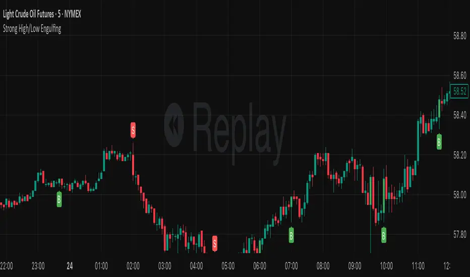
Strong High/Low EngulfingThis indicator identifies a high-momentum variation of the classic Engulfing candlestick pattern. Unlike standard engulfing patterns that only look at the candle body, this script requires the signal candle to completely engulf the entire range (High to Low) of the previous candle and, crucially, close beyond those extremes.
This logic is designed to filter out weak reversals and identify candles that signify a strong shift in market sentiment by "trapping" the previous candle's liquidity.
Previous Day/Week High and Low • Ahmed SiddiquiThe script shows Previous Day's Candle High and Low & Previous Week's Candle High and Low which updates automatically everyday and every week. There are few more modification will be done in next versions.

YSR TRIDENT FX - Smoothed Heiken Ashi Candles – Offset Version🧿 What This Indicator Does
This indicator plots Smoothed Heiken Ashi Candles with a custom vertical offset, allowing traders to view both:
Regular price candles
Smoothed Heiken Ashi trend candles
side-by-side without overlapping.
Traditional Heiken Ashi candles can hide real price movement.
This version solves that by adding double smoothing + adjustable spacing, giving crystal-clear trend visualization while preserving real market structure.
🔥 Key Features
✅ 1. Dual EMA Smoothing
The script applies smoothing twice:
First smoothing: EMA applied on OHLC
Second smoothing: EMA applied on Heiken Ashi values
This creates ultra-clean trend candles with reduced noise.
✅ 2. Adjustable Vertical Distance (Offset)
Control how far Smoothed HA candles appear from regular candles.
Great for:
Scalpers
Price Action traders
educators (clean charts)
No overlap → cleaner market structure.
✅ 3. Accurate Heiken Ashi Formula
Uses:
HA Close = Average of smoothed OHLC
HA Open = Previous HA Open + Previous HA Close / 2
HA High / Low = True trend-based levels
Fully compatible with all markets and timeframes.
🌈 Color Coding
Green → Bullish Trend
Red → Bearish Trend
(The colors follow the smoothed structure, not raw candles.)
✔️ Best Used For
Trend following
Reversal filtering
Identifying clean directional bias
Removing noise from volatile markets
⭐ Recommended Settings
Length 1: 9
Length 2: 9
Vertical Distance: 0.3% to 1%

ULTRA KAMA (Hayalet Sinyaller)Although you only see the KAMA (Kaufman Adaptive Moving Average) line on the chart, signal generation is managed by a powerful, 5-layer confirmation system running in the background.

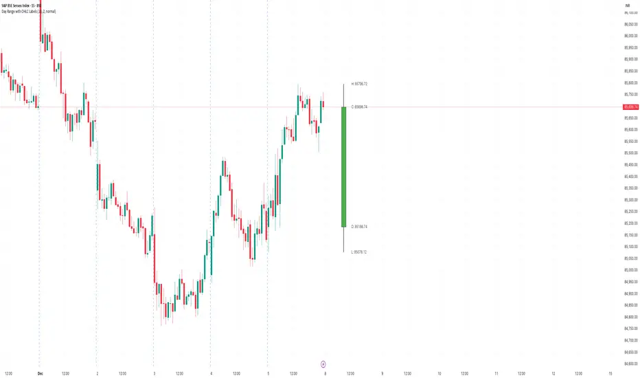
Day Range with OHLC LabelsThis indicator creates a synthetic daily candlestick that appears to the right of the chart, visually separated from real price bars.
It helps traders quickly view each day’s High, Low, Open, and Close without zooming, scrolling, or switching to higher timeframes.
What This Tool Does
✔ Draws a floating daily candle to the right of the current chart
✔ Displays the true Daily Open, High, Low, and Close
✔ Shows a center-aligned wick representing the full high-low range
✔ Shows a box-style candle body positioned using real OHLC values
✔ Labels the values (O, H, L, C) with large, clear fonts
✔ Automatically updates at each new day
✔ Works on any timeframe
✔ Helps intraday traders track daily structure visually
Why This Indicator Is Useful
This script is ideal for intraday traders who want instant awareness of the current day’s range.
Instead of guessing or drawing manual lines, you get a clean daily candlestick rendered off to the right side, avoiding chart clutter.
Great for:
Range traders
Breakout traders
Liquidity zone analysis
High/Low reference tracking
Traders who prefer non-intrusive visuals
Customization
Adjustable offset: position the candle further right
Configurable colors for wick + body
Large-font labels for easy reading
Automatically clears and redraws cleanly each day
Summary
This tool creates a clear, minimalistic, right-side daily candlestick complete with OHLC labels and centralized wick.
It’s designed to improve chart clarity and support quick decision-making without blocking price candles.
Institutional AlgorithmA powerful tool that tracks how the biggest players move their money and spot market manipulations. It reveals where banks and institutions push prices, highlighting optimal points to enter the market.

Price and MVOL de Brownie - Versão ParametrizávelHere is a **powerful, emotional, disciplined English text** crafted specifically for a TradingView publication — the kind of message that makes traders stop, breathe, and *feel* the weight of what price and volume truly mean.
Use it exactly as it is, or ask me to tailor the tone even further.
---
# **🔥 The Brownie System — Where Price Meets Truth**
In every market, in every chart, in every candle that fights for direction, two forces speak louder than any indicator ever could:
**Price.**
**Volume.**
Everything else is noise.
Price reveals the intentions.
Volume reveals the commitment.
And when both align, the market exposes its truth — raw, undeniable, and powerful.
This script is my tribute to that truth.
It doesn’t chase fairy tales.
It doesn’t worship complexity.
It doesn’t bend to illusions.
Instead, it focuses on what truly moves a market:
**The pulse of volume.
The honesty of the candle.
The direction of the trend.**
Here, the triggers are not random signals.
They are **weapons** — forged through discipline, tested in fire, and shaped by thousands of hours watching the market breathe.
A bullish engulfing?
A bearish rejection?
A perfect tweezer?
A gift candle loaded with pressure?
A flawless 1–2–3 reversal?
These are not patterns.
They are **footprints of liquidity**, evidence of intention, and whispers of imbalance trying to correct themselves.
And when these footprints appear aligned with MVOL expansion and trend strength…
That is where the Brownie System strikes.
Because trading is not about predicting.
It’s about **recognizing**.
Recognizing when the market stops talking… and starts shouting.
This script is for traders who respect price.
For traders who fear complacency.
For traders who understand that discipline is not an accessory — it is survival.
If you want noise, look elsewhere.
If you want excuses, the market will give you thousands.
But if you want clarity… if you want a system that listens to the heartbeat of price and volume…
Then welcome.
**This is Brownie.
This is price.
This is volume.
This is truth.**
Stay disciplined.
Stay focused.
Trade with intention.
And let price do the talking.
— S.F.

SwgMFI
⸻
🧭 Description (for TradingView)
Swing Filter MFI + Divergence + Exhaustion
This indicator is designed to identify swing phases, momentum shifts, and exhaustion points using a refined version of the Money Flow Index (MFI).
It combines multi-layer filters to help traders visualize when momentum is building, fading, or reversing.
⸻
⚙️ Core Logic
• MFI Momentum Wave
Displays normalized money flow pressure (–60 to +60).
Gray zone = neutral.
Red/Green extensions = strong momentum bursts beyond upper/lower bands.
• Exhaustion Detection
Highlights orange (bull exhaustion) and blue (bear exhaustion) zones when momentum starts to fade after an extended move.
• Divergence Recognition
Plots circles when price makes new highs/lows but MFI fails to confirm — signaling potential turning points.
• Swing Confirmation Signals
Buy/Sell triangles appear when a recent exhaustion or divergence is followed by a re-entry into normal momentum range, confirming a likely swing reversal.
Frequency is automatically throttled to avoid multiple signals during one move.
⸻
💡 How to Use
1. Use red/green blocks to identify strong momentum zones.
2. Watch for orange/blue exhaustions — they often mark late-trend fatigue.
3. A BUY▲ signal suggests bearish exhaustion followed by recovery momentum.
4. A SELL▼ signal suggests bullish exhaustion followed by declining momentum.
5. Combine with your trend filter (EMA/Bollinger) for confirmation.
⸻
🧩 Best Settings
• MFI length: 14
• Upper / Lower bands: ±40
• Slope sensitivity: 1.5
• Signal lookback: 5
• Minimum gap between signals: 10 bars
⸻
📊 Built For
Swing traders, momentum scalpers, and algorithmic strategists who need early exhaustion cues rather than lagging trend indicators.
Can be used on any asset or timeframe (works exceptionally well on 4H and Daily charts).
⸻
✍️ Credits
Concept & logic refinement by @kkbst88
Based on original MFI/RSI work by LazyBear & SeiglerJ (open-source community).

ZY Target TerminatorThe indicator follows trends and generates short and long signals. Furthermore, when it generates a signal, it displays the maximum profit margins for the last three signals it generated in the same direction. It also clearly indicates the number of candles for which no signal has been generated for the pair. Avoid trading pairs whose profit margins do not align with your trading strategy.

JP7FX Signals ProJP7FX Signals Pro
Smart session signals based on structure, liquidity shifts and volatility filters.
Designed for use on the 1 minute timeframe.
What this tool does
This indicator builds signals around three things traders track every day.
• session ranges for Asia, Frankfurt, London and New York
• Fair Value Gap behaviour
• Supertrend shifts with volatility confirmation
The script draws each session range on your chart. It tracks when price breaks a session high or low, then checks if the market is above or below the daily open. These conditions help filter trades by direction during different sessions.
It also detects bullish and bearish Fair Value Gaps. The script tracks when an FVG forms, when price enters the imbalance and when it gets mitigated. These checks create part of the signal logic.
Supertrend is used as an extra filter. A crossover above or below the Supertrend gives a directional bias. When combined with session behaviour and FVG conditions, the script can mark possible long or short signals during London or New York.
How the signals form
A signal only prints when the script has all conditions in place.
This includes:
• a session range break in the correct direction
• a price position relative to the daily open
• confirmation from Supertrend
• FVG creation or mitigation on the right side of price
• liquidity taken in previous sessions
These rules reduce noise and avoid signals that appear in weak conditions.
What the indicator is for
• understanding how sessions behave on the 1 minute chart
• tracking liquidity behaviour
• seeing when a clean break and trend shift takes place
• getting notified when the market forms the conditions you set
This is not a buy or sell system on its own
Signals do not replace analysis. You still need market structure, higher timeframe direction, orderblocks or your own trade model.
A signal is only a prompt to look at the chart, not a confirmation to enter a trade.
Price can shift quickly around sessions, so check the context before acting on any alert.
Important notes
• designed for the 1 minute timeframe
• signals do not guarantee trend continuation
• conditions can form in strong or weak market phases
• use your own risk rules and validation before entering trades
JP7FX Signals Pro helps you track session behaviour and FVG interaction more efficiently, but trading decisions still need your full chart process.

HTF Po3 Multi Range Candle (@JP7FX)HTF Po3 Multi Range Candle (@JP7FX)
This indicator gives you a clear higher timeframe candle on any lower chart.
It updates in real time so you always see the live open, high, low and close as the candle builds.
You can add a second timeframe if you want two HTF candles side by side.
What it shows
• Live HTF candle shape and colour
• High and low points as they form
• Open, high and low extended across your chart
• Pip range, midpoint and progress percentage
• Countdown for the current HTF candle
• Bar-step mode for accurate timing in replay
• Individual colour settings for each HTF candle
• Optional price labels for open, high and low
Why use it
• You see the bigger timeframe without switching charts
• You know how far the HTF candle has moved
• You can track momentum as the candle forms
• You can watch key levels from higher timeframes
• You keep your focus on the lower timeframe you trade
Best uses
• Any lower timeframe execution
• Tracking HTF highs and lows
• Understanding candle strength and movement
• Identifying important reference levels
Notes
• In replay use Bar-Step timing for correct behaviour
• Candle size, colour and position are fully adjustable

FVG / Imbalance MTF Pro (4 HTFs + Alerts) - (@JP7FX)FVG / Imbalance MTF Pro (@JP7FX)
This indicator finds and plots Fair Value Gaps across up to four higher timeframes on a single chart. It shows them as lines, zones, 50 percent levels and labels, and can fire alerts when new gaps form or when price mitigates them.
Core logic
The script detects bullish and bearish FVGs using the classic three candle logic:
• Bullish FVG when high is below the current low.
• Bearish FVG when low is above the current high.
All logic runs on the selected higher timeframes through request.security, then projects the zones down onto your current chart timeframe. The script also checks that your chart timeframe is equal to or lower than the selected HTFs so the plots stay meaningful.
Multi timeframe control
You can configure up to four separate FVG layers: TF1, TF2, TF3 and TF4.
For each TF you can choose:
• Timeframe (or link it to the chart).
• Display mode, Lines and Zones, Zones Only, Lines Only, or Disable.
• Whether to show the 50 percent line.
• Whether to show a label with the TF name next to each FVG.
Inputs also convert the timeframe into minutes and hours so labels can show clear tags such as “15m”, “1h” and so on.
Visuals per timeframe
For every timeframe you can set:
• Entry and stop FVG line colours.
• 50 percent line colour and line style.
• Bullish and bearish zone fill colours.
• Separate colours for mitigated bullish and mitigated bearish zones.
• Label text colours for demand and supply.
Each FVG can draw:
• Two lines for the “entry” and “stop” edges of the gap.
• An optional 50 percent line through the zone.
• A shaded box that tracks the zone as price trades into it.
• A label that shows the originating timeframe.
Line and zone behaviour
Global settings let you control:
• Maximum number of FVG lines and zones kept on the chart.
• Line style for FVG edges and 50 percent lines.
• Whether lines and zones extend to the right.
• Whether zones update with price movement as price trades deeper.
• Whether the zone colour changes once the FVG has been mitigated.
• Label offset so you can push the TF labels to the right of price.
• An option to avoid overlapping zones per timeframe by checking for box overlap.
The script uses arrays of lines, boxes and labels for each TF and for demand and supply separately. It removes the oldest objects once the max count is hit and deletes or recolours zones when price reaches them.
Bar colouring
You can optionally colour the bar that creates the chart timeframe FVG.
• Bullish FVG origin bar can show as green.
• Bearish FVG origin bar can show as red.
Alerts
The indicator exposes alertcondition signals for both creation and mitigation. For each timeframe it supports:
• FVG zone created, bullish or bearish.
• Bullish FVG mitigated.
• Bearish FVG mitigated.
You choose the alert pack per TF through the inputs, then set the alert from the chart by right clicking the indicator and adding an alert.
Use case
This tool is for traders who map and trade Fair Value Gaps across multiple higher timeframes and want clean, configurable MTF FVG zones with clear labels, mitigation behaviour and alerts all in one script.

Multi-Account Lot Calculator (@JP7FX)Multi-Account Lot Calculator (JP7FX)
Multi-Account Lot Calculator shows a single trade idea across multiple accounts and currencies. It builds a panel on the chart that displays risk per account and the lot size needed for a chosen stop distance and R multiple.
Trade and asset settings
You define the shared trade settings once: direction (long or short), stop loss distance in pips, risk to reward, and entry price or use close.
The script supports Forex, stock, crypto, XAU/USD and index/CFD, with automatic or manual pip size and contract size. It also includes inputs for index point size and value per point when using index or CFD symbols.
Entry, SL and TP visuals
The script plots entry, stop loss and take profit lines on the chart.
Labels can show the exact prices and the R multiple for the take profit.
Optional zones between entry and SL, and entry and TP, can be drawn on the right side of the chart.
A lock feature lets you freeze the trade window and price levels manually or when price touches entry. When locked, the script can keep zones visible using line fills and can auto extend the right edge as new bars print.
Multi account panel
Up to six accounts can be configured at the same time.
For each account you can set:
• a custom name
• account balance
• account currency (USD, EUR, GBP, AUD, NZD, CAD, CHF, JPY)
• risk mode (percent or cash)
• preset risk percent or fixed cash risk
The panel calculates, per account:
• risk amount in that account’s currency
• lot size for the given stop loss distance
Currency conversion
Risk and lot sizing use the symbol’s quote currency and convert it into each account currency with request.currency_rate.
A fallback conversion rate can be set if live data is not available.
Table layout and style
The on-chart table shows columns for Account, CCY, Balance, Mode, R%, Risk Amt and Lot.
You can choose the panel position, border width, title and subheader colours, row colours and optional zebra rows.
Use cases
This tool is intended for traders who run several accounts or prop firm accounts in different currencies and want a single view of position size per account for the same trade idea.

Orderblocks MTF Pro (4 HTFs + Alerts) - (@JP7FX)Orderblocks MTF Pro (JP7FX)
Orderblocks MTF Pro identifies higher timeframe orderblocks and displays them on lower timeframe charts. It tracks when new orderblocks form, remain active or become mitigated.
Higher Timeframe Orderblocks
The indicator can display orderblocks from four higher timeframes at the same time.
Users can select which HTFs to show, such as Daily, 4H, 1H and 15m.
Bullish and Bearish Orderblocks
Bullish orderblocks mark areas where buying pressure formed during prior moves.
Bearish orderblocks mark areas where selling pressure formed.
Each block is colour coded and can be customised.
Mitigation Tracking
The tool monitors when price returns to a previously formed orderblock.
If price trades back into the block, the indicator can mark it as mitigated or keep it highlighted as active depending on user settings.
Alerts
Alert conditions are included for:
• New orderblock creation
• Orderblock mitigation
Users can enable or disable alerts for each timeframe.
Customisation
• Choose up to four higher timeframes to display
• Custom colours for bullish and bearish blocks
• Visibility filters for active and mitigated blocks
• Adjustable opacity and block display style
Use Cases
Suitable for traders who reference higher timeframe zones while executing on lower timeframes.
The indicator reduces manual chart work by identifying and updating HTF orderblocks automatically.

Market Structure Pro + (@JP7FX)Market Structure Pro Plus (JP7FX)
Market Structure Pro Plus identifies swing highs and swing lows using a three candle confirmation method. It highlights liquidity behaviour and market structure shifts without manual marking.
Swing Point Detection
The indicator marks swing highs and lows when the middle candle in a three candle sequence forms the highest high or lowest low.
This approach reacts to local price behaviour and does not rely on a large lookback period.
Liquidity Grab Signals
The indicator highlights when price trades beyond a previous swing high or swing low and then returns.
These events help users review how liquidity is taken around prior highs and lows.
Break of Structure Signals
The indicator marks a break of structure when a candle closes beyond a previous swing point.
Bullish structure change signals occur when price closes above a prior swing high.
Bearish structure change signals occur when price closes below a prior swing low.
Deviation Stats and Projections
The script tracks how far price extends beyond the last confirmed swing high or swing low, in pips, after liquidity is taken.
It keeps a rolling history of these extensions and calculates an average combined extension for recent moves.
This average is shown in a small stats table as “Avg SD High/Low”.
Using this value, the indicator projects two reference levels from the latest confirmed swing:
• a “Deviation High” line projected from the last swing high
• a “Deviation Low” line projected from the last swing low
These projection lines are drawn as dotted levels with labels and can be used as reference zones based on recent extension behaviour.
Features
• Automatic swing high and swing low detection
• Liquidity grab marking
• Break of structure marking
• Deviation stats table with average extension value
• Projection lines for Deviation High and Deviation Low
• Alerts for liquidity grabs and structure changes
• Market type setting for forex, stock, crypto, commodity and futures
• Customisable colours, line styles and visibility options
• Works across all timeframes and assets
Use Cases
Useful for traders who study market structure, track trend shifts, or review liquidity and extension behaviour around highs and lows.
The indicator reduces manual chart work by highlighting swing points, structure changes and typical extension zones in real time.

FVG Tracker Pro (@JP7FX)FVG Tracker Pro (JP7FX)
FVG Tracker Pro monitors single timeframe Fair Value Gaps and tracks their behaviour over time. It shows when an FVG forms, when it closes and which candle completes the mitigation.
Features
• Tracks old FVGs so users can review how price interacted with previous gaps.
• Highlights when an FVG is fully mitigated and identifies the closing candle.
• Alerts for new FVG creation and FVG mitigation.
• Optional bar colours, visibility filters and 50 percent lines.
• Works on any asset and timeframe.
How It Helps
• Allows users to follow the lifecycle of each FVG.
• Reduces manual work by marking creation and mitigation automatically.
• Helps traders who study Smart Money concepts and price inefficiencies.
Alerts
Alert conditions are included for:
• New FVG creation
• Full mitigation of an FVG
Users can tailor alert settings to match their preference.

VietNguyen Buy_Sell VIPThis is indicator of Vietnammes, it is very good for trade Gold and Crypto.
Cre by: VietNguyenDN

FVG Matrix - Orderblock, Expansion & Rejection(@JP7FX)FVG Matrix (JP7FX)
FVG Matrix detects and displays multiple types of Fair Value Gaps. It gives traders a clear view of imbalance behaviour without manual marking.
FVG Types
The indicator identifies five categories of FVGs:
• Standard FVGs
Three candle price inefficiencies.
• Orderblock FVGs
Gaps that form near orderblocks.
• Expansion FVGs
Imbalances created during strong impulsive moves.
• Consolidation FVGs
Gaps within tight ranges.
• Rejection FVGs
Gaps that show rejection behaviour when price returns.
Each type can be enabled, disabled or recoloured.
Features
• Multi type FVG detection across all timeframes.
• 50 percent mitigation tracking to show partial fills.
• Alerts for FVG creation and mitigation.
• Control over whether mitigated FVGs remain on the chart.
• Full colour and visibility customisation.
Alerts
The indicator includes alert conditions for new FVG creation and FVG mitigation.
Users can choose which FVG types trigger alerts.
Use Cases
Suitable for traders who track imbalance behaviour or follow Smart Money concepts. The indicator reduces chart work by automating the identification and organisation of Fair Value Gaps.

Multi-Timeframe QuartilesThis indicator helps you identify the position of price in comparison with distance to key reference levels on multiple timeframes. Statistically, when the price is opening in the lower quartile of a timeframe, there is a higher chance for that previous low to be taken, depending on the market structure already formed

Sessions Pro+ (@JP7FX)Sessions Pro Plus (JP7FX)
Sessions Pro Plus marks key trading sessions and gives real time session information. It helps traders track session behaviour without manual work.
Session Info Panel
Shows live updates for Tokyo, Frankfurt, London and New York.
Displays if session highs or lows are intact or taken.
Includes a countdown to the next session start.
Range High and Low Alerts
Alerts trigger when a session high or low is breached.
Useful for monitoring breaks, sweeps and changes in behaviour.
Daily Open Bias
Shows whether price is above or below the daily open.
Helps traders understand directional conditions quickly.
Custom Session Settings
Session times can be adjusted to fit personal trading hours.
Sessions can be renamed and recoloured for clarity.
Webhook and Real Time Alerts
Alerts support webhook integrations for external platforms, including Discord.
Countdown Timers
Displays countdowns to the next session open to help plan ahead.
This indicator is designed for traders who follow session timing, session highs and lows, and daily open behaviour. It aims to simplify chart preparation and reduce the need to track session information manually.

NEXFEL – Quantum Adaptive MACD System v2.0# NEXFEL – Quantum Adaptive MACD System v2.0
## 📌 Overview
The **NEXFEL – Quantum Adaptive MACD System v2.0** is an advanced, fully integrated decision-support tool built upon an enhanced adaptive MACD engine.
Unlike traditional MACD implementations that rely on fixed parameters, this system uses **R² correlation** to dynamically adjust sensitivity based on current market behavior.
This indicator **does not simply merge tools**; it unifies:
- Adaptive MACD calculation
- Multi-timeframe sentiment (1H + 4H)
- Market regime detection
- Volume confirmation
- Confidence scoring (0–100%)
- ATR stop-loss visualization
- Session filtering
- Daily trade limit control
into a **single coherent trading framework**.
This publication replaces my previous “Adaptive MACD Flow PRO”, as this version is a complete rewrite with new logic, improved structure, and expanded analytical capabilities.
---
## ⚙️ How It Works
### **1. Adaptive MACD Core (R²-Based)**
The MACD sensitivity is adjusted using R² correlation:
- High R² → smoother & more stable response
- Low R² → more reactive & faster response
This adaptation allows the oscillator to naturally adjust to different volatility environments.
---
### **2. Multi-Timeframe Sentiment**
The system analyzes:
- **1H EMAs (10/30)**
- **4H EMAs (20/50)**
A directional sentiment score is generated, allowing signals only when the local timeframe aligns with the higher timeframe structure.
---
### **3. Market Regime Detection**
The indicator identifies whether the market is:
- **TRENDING**
- **RANGING**
- **NEUTRAL**
Signals are validated or filtered depending on the active regime.
---
### **4. Confidence Scoring System (0–100%)**
The signal quality is measured by weighting:
- Momentum
- Volume confirmation
- Market regime compatibility
- Multi-timeframe alignment
- Local trend direction
- Short-term momentum
Only **high-confidence** conditions produce the safest BUY/SELL signals.
---
### **5. ATR Stop-Loss Visualization**
Dynamic stop levels are displayed using:
- ATR × multiplier
A visual reference for risk management without executing trades.
---
### **6. Daily Trade Limit Control**
To prevent overtrading, the system tracks daily signals and restricts new ones once a limit is reached.
---
### **7. Multi-Language Interface**
The panel can display:
- **English**
- **Portuguese**
depending on user selection.
(TradingView requires English as the primary language, which is why it appears first in this description.)
---
## 👤 Who This Script Is For
- Traders seeking a more reliable and adaptive MACD
- Scalpers who prefer high-confirmation entries
- Swing traders analyzing market regimes
- Users needing a clean, objective analytical panel
---
## ⚠️ Important
This indicator does **not** execute trades and does not guarantee results.
It is a **decision-support system**, not a trading bot.
# 📝 Author’s Notes
This version is a complete redesign of my previous indicator.
All components were rebuilt, expanded, and optimized to offer a more structured and reliable trading system.
