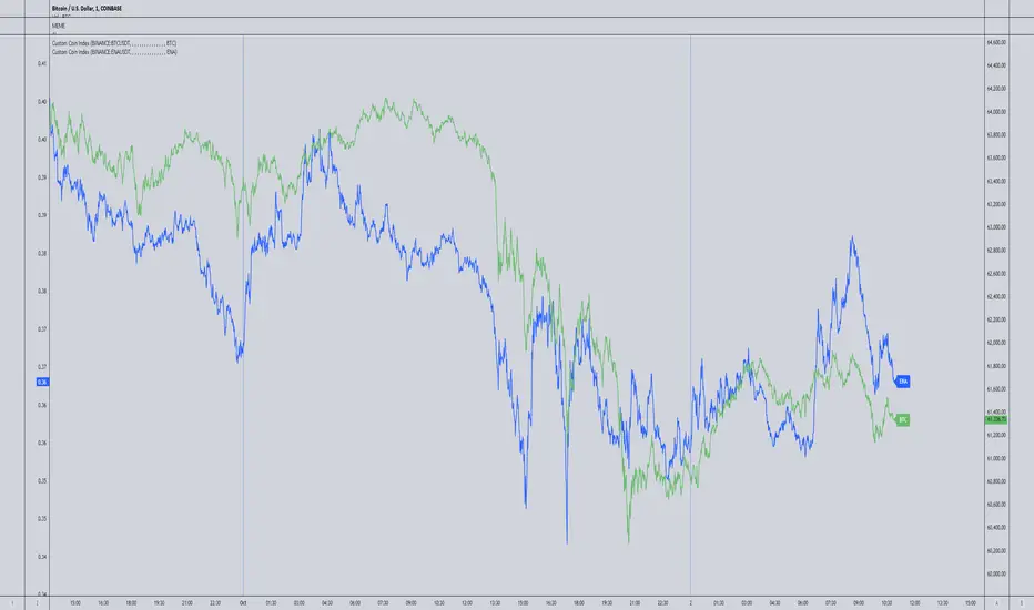
Spaghetti - Custom Cryptocurrency Index IndicatorDescription:
Spaghetti is a highly customizable cryptocurrency index indicator designed to let you track an average price of up to 15 different cryptocurrencies in one convenient line. Whether you're interested in a mix of meme coins, AI projects, or any other specific subset of coins, Spaghetti allows you to create your own personalized index.
Features:
Customizable Coin List: Input up to 15 different cryptocurrencies of your choice, allowing you to tailor the indicator to your preferred assets and strategies.
Dynamic Labeling: Features a label on the chart that displays a user-defined name, so you can personalize the indicator's label to match your theme or trading strategy.
Color Customization: The line color is fully customizable, enabling better visual integration with your charts.
Average Calculation: Calculates and plots the average price of all selected coins, providing an easy way to visualize overall market movement for your customized selection.
How to Use Spaghetti:
In the indicator settings, enter the tickers for up to 15 coins you want to include (e.g., BINANCE:BTCUSDT).
Customize the line color and the label text to match your style or preferences.
The indicator will plot the average price of all selected coins, with a dynamic label that follows the price for easy reference.
Spaghetti makes it easy to create and track custom crypto indices, providing a broader perspective of your selected market segments. Perfect for traders who want to stay on top of multiple assets without the clutter!
Spaghetti
Multi-Asset Performance [Spaghetti] - By LeviathanThis indicator visualizes the cumulative percentage changes or returns of 30 symbols over a given period and offers a unique set of tools and data analytics for deeper insight into the performance of different assets.
Multi Asset Performance indicator (also called “Spaghetti”) makes it easy to monitor the changes in Price, Open Interest, and On Balance Volume across multiple assets simultaneously, distinguish assets that are overperforming or underperforming, observe the relative strength of different assets or currencies, use it as a tool for identifying mean reversion opportunities and even for constructing pairs trading strategies, detect "risk-on" or "risk-off" periods, evaluate statistical relationships between assets through metrics like correlation and beta, construct hedging strategies, trade rotations and much more.
Start by selecting a time period (e.g., 1 DAY) to set the interval for when data is reset. This will provide insight into how price, open interest, and on-balance volume change over your chosen period. In the settings, asset selection is fully customizable, allowing you to create three groups of up to 30 tickers each. These tickers can be displayed in a variety of styles and colors. Additional script settings offer a range of options, including smoothing values with a Simple Moving Average (SMA), highlighting the top or bottom performers, plotting the group mean, applying heatmap/gradient coloring, generating a table with calculations like beta, correlation, and RSI, creating a profile to show asset distribution around the mean, and much more.
One of the most important script tools is the screener table, which can display:
🔸 Percentage Change (Represents the return or the percentage increase or decrease in Price/OI/OBV over the current selected period)
🔸 Beta (Represents the sensitivity or responsiveness of asset's returns to the returns of a benchmark/mean. A beta of 1 means the asset moves in tandem with the market. A beta greater than 1 indicates the asset is more volatile than the market, while a beta less than 1 indicates the asset is less volatile. For example, a beta of 1.5 means the asset typically moves 150% as much as the benchmark. If the benchmark goes up 1%, the asset is expected to go up 1.5%, and vice versa.)
🔸 Correlation (Describes the strength and direction of a linear relationship between the asset and the mean. Correlation coefficients range from -1 to +1. A correlation of +1 means that two variables are perfectly positively correlated; as one goes up, the other will go up in exact proportion. A correlation of -1 means they are perfectly negatively correlated; as one goes up, the other will go down in exact proportion. A correlation of 0 means that there is no linear relationship between the variables. For example, a correlation of 0.5 between Asset A and Asset B would suggest that when Asset A moves, Asset B tends to move in the same direction, but not perfectly in tandem.)
🔸 RSI (Measures the speed and change of price movements and is used to identify overbought or oversold conditions of each asset. The RSI ranges from 0 to 100 and is typically used with a time period of 14. Generally, an RSI above 70 indicates that an asset may be overbought, while RSI below 30 signals that an asset may be oversold.)
⚙️ Settings Overview:
◽️ Period
Periodic inputs (e.g. daily, monthly, etc.) determine when the values are reset to zero and begin accumulating again until the period is over. This visualizes the net change in the data over each period. The input "Visible Range" is auto-adjustable as it starts the accumulation at the leftmost bar on your chart, displaying the net change in your chart's visible range. There's also the "Timestamp" option, which allows you to select a specific point in time from where the values are accumulated. The timestamp anchor can be dragged to a desired bar via Tradingview's interactive option. Timestamp is particularly useful when looking for outperformers/underperformers after a market-wide move. The input positioned next to the period selection determines the timeframe on which the data is based. It's best to leave it at default (Chart Timeframe) unless you want to check the higher timeframe structure of the data.
◽️ Data
The first input in this section determines the data that will be displayed. You can choose between Price, OI, and OBV. The second input lets you select which one out of the three asset groups should be displayed. The symbols in the asset group can be modified in the bottom section of the indicator settings.
◽️ Appearance
You can choose to plot the data in the form of lines, circles, areas, and columns. The colors can be selected by choosing one of the six pre-prepared color palettes.
◽️ Labeling
This input allows you to show/hide the labels and select their appearance and size. You can choose between Label (colored pointed label), Label and Line (colored pointed label with a line that connects it to the plot), or Text Label (colored text).
◽️ Smoothing
If selected, this option will smooth the values using a Simple Moving Average (SMA) with a custom length. This is used to reduce noise and improve the visibility of plotted data.
◽️ Highlight
If selected, this option will highlight the top and bottom N (custom number) plots, while shading the others. This makes the symbols with extreme values stand out from the rest.
◽️ Group Mean
This input allows you to select the data that will be considered as the group mean. You can choose between Group Average (the average value of all assets in the group) or First Ticker (the value of the ticker that is positioned first on the group's list). The mean is then used in calculations such as correlation (as the second variable) and beta (as a benchmark). You can also choose to plot the mean by clicking on the checkbox.
◽️ Profile
If selected, the script will generate a vertical volume profile-like display with 10 zones/nodes, visualizing the distribution of assets below and above the mean. This makes it easy to see how many or what percentage of assets are outperforming or underperforming the mean.
◽️ Gradient
If selected, this option will color the plots with a gradient based on the proximity of the value to the upper extreme, zero, and lower extreme.
◽️ Table
This section includes several settings for the table's appearance and the data displayed in it. The "Reference Length" input determines the number of bars back that are used for calculating correlation and beta, while "RSI Length" determines the length used for calculating the Relative Strength Index. You can choose the data that should be displayed in the table by using the checkboxes.
◽️ Asset Groups
This section allows you to modify the symbols that have been selected to be a part of the 3 asset groups. If you want to change a symbol, you can simply click on the field and type the ticker of another one. You can also show/hide a specific asset by using the checkbox next to the field.

Sector Spaghetti [CE]Sector Spaghetti
An overlay indicator for multiple sectors that is configurable for multi asset configuration to track the returns of sectors in the market.
The tool provides three different viewing modes for returns; a rolling bar lookback, a specific data and time anchor, and a visible range.
Included is a pre built list of sectors created by none other than DaanCryptoTrades, the list includes a large range of sectors to cover the depth of the market as a whole.
Additionally a pre configured custom sectors list has been provided, we have included Daan's custom list within the custom sectors but provided the use of an additional feature "weight".
The weight feature is an intuitive method of applying importance to assets in there relevant sectors, we have used this as an opportunity to show the ability of creating market cap weighted sectors to balance the assets accordingly. This can provide useful in sectors where a low market cap + high beta asset could typically skew the results in one direction even if the remainder of the sector may be performing differently.
Non Market Cap:
Meme and Dex seem to be performing similarly
Market Cap:
Assets weighted via market cap shows relatively Meme sector is out performing
We have also added an optional table to the right of the screen so that the trader can clearly see outperforming assets. This table is toggleable using radio buttons within the Style menu. Updating the code we have provided users the ability to customize the table to further improve readability of the Text and reduce screen noise where needed.
To improve asset visibility, the script also calculates the 'long tail' of the list distribution and automatically lowers the visibility of clustered assets in the centre.
To Do
Alerts for sector performance

Spaghetti by RainbowLabsWhen I started trading, very few people gave me a hand or even a small piece of advice. One of them was @btc_charlie. From Charlie, I first saw the spaghetti chart, and he explained to me how it was useful in identifying which coin made the most sense to trade at a specific time.
In practice, it worked like this: in the "add" section, you add all the pairs you want and overlap them on the chart, creating the spaghetti chart. Although it worked, and still works, this way, I wondered if it would be better to write an indicator that does the same thing, maybe less invasive on the chart, that you can call as many times as you want and in different versions. In short, I tried to recreate the same thing but potentially better, let's see if I succeeded.
Introducing Spaghetti chart by RainbowLabs:
This indicator takes 20 different pairs as user input and works with any pair on any exchange provided the name is spelled correctly. In the settings, there are four columns: the first for the exchange, the second for the ticker, the third for the base pair, and lastly, the color. Again, it works with any pair on any exchange, but if you put something that does not exist or is misspelled, it will cause the script to error.
The second thing to do is to set when our spaghetti will be reset. By default, it resets every hour, but you can change it to any preferred timeframe in the menu, keeping in mind that we will write the timeframe in minutes, not alphanumeric. For example, 4h will not be four hours, but you will have to write 240.
In the settings, we can also change the position and size of the table.
How it works:
All pairs are reset when the timeframe defined by the user in the settings changes. The script then calculates the percentage difference from that moment onwards for each pair at the closing of the candle of the timeframe we are in. For example: by default, the timeframe resets every hour, so we will use it on one minute. It does not make sense on larger timeframes, and you will have to increase the reset timeframe.
How to use it:
Risk on\off BTC vs alts
As Charlie says in his tweet: "should I be risk on or off?" for SIX:ALTS rule might be ">70% of Alts recovering after a dip."
Identify a dip on bitcoin and compare what happens immediately after. If more than 70% of alts gain more than BTC, it may be better to remain positioned in alts. When the opposite happens, it is better to stay on BTC or stable.
Sell-off, Rally
During a significant sell-off or rally, it is important to analyze which coins were performing better or worse in the immediate past. It is statistically more profitable to trade those pairs that were over-performing, positively or negatively, just before the event.
Arbitrage and Triangular Arbitrage.
While it may be difficult to find large arbitrage opportunities in current market conditions, we can use tools to identify the best price of the same pair on multiple exchanges and compare it with one or multiple pairs on other exchanges. Having a comprehensive view of the market can be useful for anyone who is not using advanced trading bots to find arbitrage opportunities.
Quick Screener
You can add multiple spaghetti indicators to a single chart, and with the paid version of TradingView, you can use multiple layouts to plot as many coins on as many exchanges as you want. In the picture, you can see 240 pairs on four different exchanges all together. This feature allows you to quickly screen for potential trading opportunities and identify trends across multiple pairs and exchanges.
Known issues:
When the currency exchange rate is equal to 0.0000, the plotted line may not be visible.

Cuban's Open Interest Spaghetti [CE]Cuban's Open Interest Spaghetti is an indicator built for traders to track the open interest changes of highly correlated markets, spreads, and ecosystems.
The tool provides three different viewing modes for tracking open interest; a rolling bar lookback, a specific data and time anchor, and a visible range -- similar to the native Tradingview 'Compare' tool.
Included are pre-built lists for tracking the open interest of all 160+ Binance Futures assets, including custom fields for creating new spreads or watchlists. This gives the trader the ability to monitor the entire futures ecosystem within a single charting window.
We have also added an optional table to the right of the screen so that the trader can clearly see outperforming assets. This table is toggleable using radio buttons within the Style menu.
To improve asset visibility, the script also calculates the 'long tail' of the asset distribution and automatically lowers the visibility of clustered assets in the center.
While the Compare tool only allows for % returns and absolute value on the chart asset or separate scale, Cuban's Open Interest Spaghetti allows the trader to use a separate oscillator window with the open interest on a % scale. This gives the trader the ability to watch OI changes in real-time within any Tradingview window.
Within the user inputs, the user gains the ability to customize the following:
Lookback mode
Rolling lookback period
Timezone and time anchor
Percentage of assets highlighted
Dynamic label offset
Asset lists
TO DO:
Add % labels to assets in the tails of the distribution

Cuban's Ecosystem Spaghetti [CE]Cuban's Ecosystem Spaghetti is an overlay indicator for multiple assets to track the returns of highly correlated markets, spreads, and ecosystems.
The tool provides three different viewing modes for returns; a rolling bar lookback, a specific data and time anchor, and a visible range -- similar to the native Tradingview 'Compare' tool.
Included are pre-built lists for over 200+ Binance and Bybit Futures assets, along with custom watchlist support for as many assets as your browser can handle. This gives the trader the ability to monitor entire markets within a single charting window.
We have also added an optional table to the right of the screen so that the trader can clearly see outperforming assets. This table is toggleable using radio buttons within the Style menu.
To improve asset visibility, the script also calculates the 'long tail' of the list distribution and automatically lowers the visibility of clustered assets in the centre.
While the Compare tool only allows for % returns and absolute value on the chart asset or separate scale, Cuban's Ecosystem Spaghetti allows the trader to overlay the assets with their returns based on the current chart ticker price scale. This gives the trader the ability to watch asset movement in low timeframe, relative to their portfolio benchmark or merely, the asset of the day.
Within the user inputs, the user gains the ability to customize the following:
Returns lookback mode
Rolling lookback period
Timezone and time anchor
Percentage of assets highlighted
Dynamic label offset
Asset lists
TO DO:
Add additional viewing modes
Further optimization
