Price Projector [MacAlgo] Description:
Price Projector is a forward-looking visualization tool designed to help traders project potential future price movements based on historical drift data. By defining up to two anchor points and leveraging the average drift in price changes from each, the script draws forecast lines (Anchor 1 and Anchor 2) as well as an optional average projection (Anchor 3). Additionally, an optional shaded area around each projection can be displayed to convey a sense of uncertainty or variability in the future path.
Key Features:
1. Multiple Anchors
Specify up to two custom anchor points (by date/time). Each anchor gathers up to 500 bars of historical data from the time it is activated.
Optionally display a third “average” projection line that combines the drift from both anchors.
2. Dynamic Drift Calculation
For each anchor, the script measures the incremental price changes (delta percents) from bar to bar.
Positive and negative drifts are computed separately and averaged, capturing the general upward/downward trend from the chosen anchor point to the latest confirmed bar.
3. Growth Factor & Area Width
The Growth Factor (0–100) allows you to adjust how much the historical drift influences the projection.
The Area Width (0–100) expands or contracts the shaded region around the forecast line, highlighting potential upper and lower bounds.
4. Customizable Styling
Choose colors, transparency, and line width for each anchor’s forecast line.
Toggle an optional connector line that links the anchor’s first bar to its last bar, visualizing the range where data was collected.
Enable or disable a shaded area around each projection line for clearer visualization.
5. Automatic Forward Projection
Once the data is gathered, the script projects future bars (up to 500 bars ahead) using the average drift calculations.
The resulting lines and shaded areas help you quickly assess possible price paths.
How to Use:
1. Add the Indicator to Your Chart
In TradingView, open the Indicators menu, search for “Price Projector ,” and apply it to your chart.
2. Configure Anchor Points
In the indicator’s Inputs section, set the date/time for Anchor Point 1 and Anchor Point 2.
Once a bar’s time is greater than or equal to the anchor point, the script begins collecting data until the last confirmed bar.
3. Adjust Growth Factor & Area Width
Growth Factor modifies how strongly the historical drift influences future price estimates.
Area Width adjusts the size of the shaded range drawn around the projection line.
4. Styling & Display Options
You can pick the color, transparency, and line thickness for each anchor.
Toggle Execution Window Line to show or hide the connector line between the anchor’s initial bar and the final bar used in calculations.
Enable Show Area to fill the space around the forecast line, giving a visual sense of upper/lower bounds.
Turn on Show Anchor 3 Line to draw a combined average projection using data from both anchors.
5. Interpret the Forecast
Once the script processes historical data for each anchor, it will automatically draw forecast lines for Anchor 1, Anchor 2, and (optionally) the average Anchor 3.
Use these lines to gauge potential future price trends under the assumption that recent drift patterns continue.
Examples:
Here you can see all three Anchor Points. Anchor Point 3 is used as a balance between Anchor Point 1 and Anchor Point 2 by using the average of he two.
You can customize which Anchor Points you want to see on the chart, remove the area coloring, etc.
Conclusion:
Price Projector offers a straightforward way to visualize projected price paths based on historical drift from one or two anchor points. By adjusting the Growth Factor, Area Width, and styling options, you can tailor the display to match your preferences and gain deeper insight into potential price trajectories. As always, combine this tool with other forms of analysis and risk management to make more informed trading decisions.
Disclaimer:
This script is provided for informational and educational purposes only. It should not be construed as financial or investment advice. Past performance is not indicative of future results. Trading in financial markets involves significant risk of loss. Always conduct your own due diligence and consult a licensed financial professional before making any trading or investment decisions.
Historicaltrends
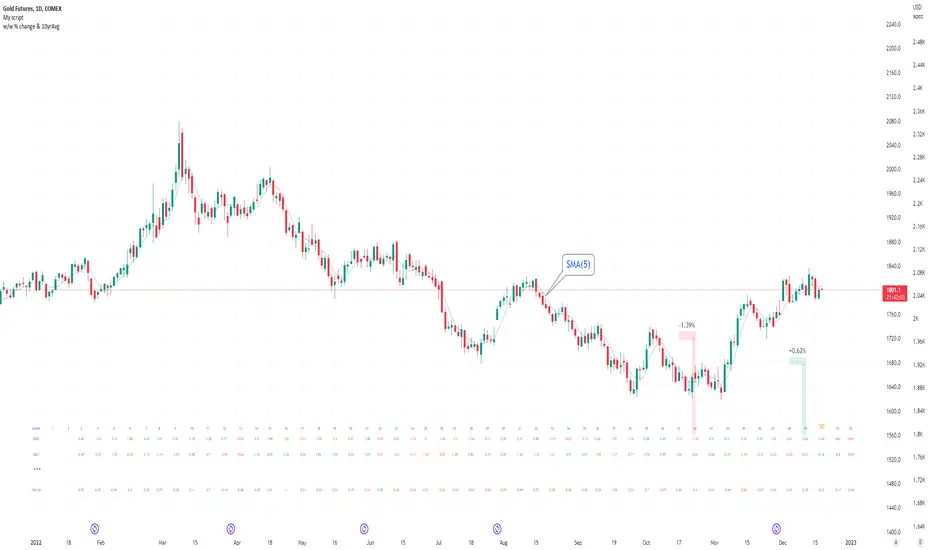
Seasonal tendency: week-on-week % change and 10yr Averages-shows week-on-week % change, and 10yr averages of these % changes
-scan across the 10yr averages to get a good idea of the seasonality of an asset
-best used on commodities with strong seasonal tendencies (Gold, Wheat, Coffee, Lean hogs etc)
-works only on daily timeframe
-by default it will compare SMA(length) in the following way, BTC: Sunday cf previous Sunday | ES/Gold: Monday cf previous Monday
-for most assets, 5 daily bars in a week (SMA(5)) => that's the default. For BTC can change this to 7.
~~inputs:
-change input year to show any previous decade of asset's history; the table will display over that year on the chart
-choose expression for Average of % change week on week: SMA, ohlc4, vwma, vwap (default SMA)
-choose number of daily bars in a week (i.e. SMA length)
-change label sizes/colors
~~notes:
-When applied to current year: will print the 10yr average for previous weeks in the year; 9yr average for future weeks in the year
-drawings and SMA plot on the above chart are just to show visually how the week's average is calculated, and how this lines up with the label
-current week of year will highlight in large font orange by default
-the first 2 weeks of the year are omitted because of a bug i can't figure out, which throws out bad numbers.
-cannot print all the values for each of previous 10yrs; 'code too long' error. Could likely do this via using matrices but would require a rewrite
17th Dec 2022
@twingall