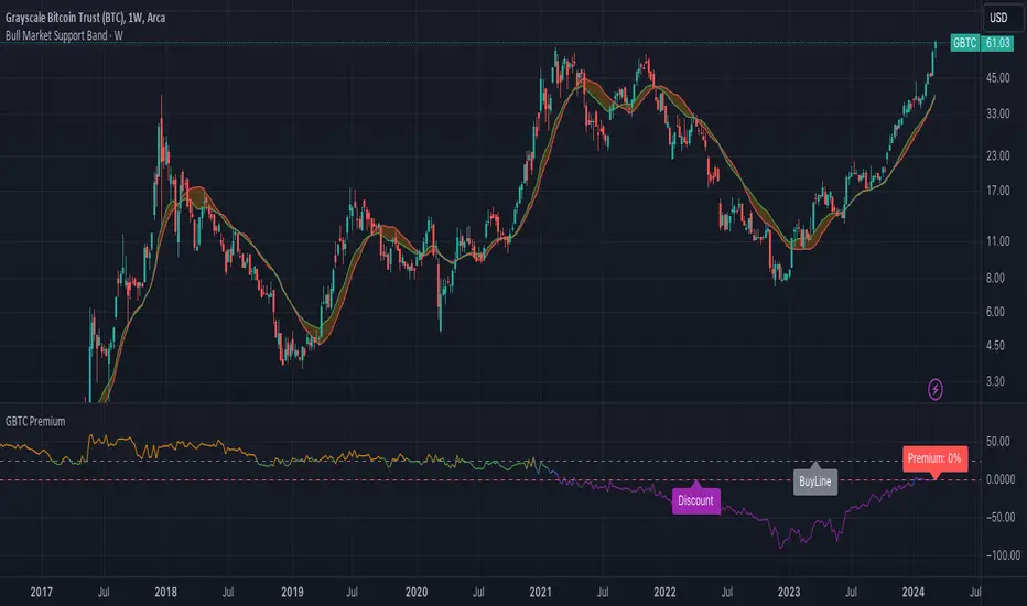
GBTC PremiumCalculates the historical and current premium/discount for a share of Grayscale GBTC vs. Bitcoin spot price. อินดิเคเตอร์ Pine Script®โดย WuTangFinancialBankที่อัปเดต: 2257
60-Day Accumulated Increasing RateIs this Bitcoin bull run still driven by new investors and new funds? Definitely. That’s why the 60-day accumulative increasing rate is so important and it can even determine everything. The only thing that can be trusted is the math. In history, each capital inflow uptrend bull run has ended once the 60-day accumulative increasing rate reached a high level and when the short-term euphoric investors push BTC price to rise at a fast speed and use up all kinds of leverages. At that point, there’s no time for new investors and new funds to flow in, thus the cryptocurrency market will crash from the global top. In that sense, the crashes on 4th September, 2017 and 19th May, 2021 didn’t end the bull run, instead,they lengthened the bull run span.The last bull run cycle (2017) might have ended prematurely when BTC reached $10,000, recording 150% accumulated increase over 60 days. Then BTC won’t be pumped up to $20,000 if the course wasn’t interrupted by September 4th, 2017 incident. Technical analysts(they are far from trustworthy, full of bollocks) call the correction of BTC: “consolidation or wipeout”, just like that diabetes is called as Liver Qi Stagnation, weight lossing, being thirsty and other symptoms. It’s quite fun to watch so many people explaining it in a false concept. Everyone knows what the maths is. That’s enough. PS: This indicator can only be applied to Bitcoin daily chart!อินดิเคเตอร์ Pine Script®โดย Crypto_YZ_118
Trendalix EntriesThis script is made to simplify the analysis of trends. It changes the mas based on whether you're looking at stocks or crypto. As these 2 markets currently move differently, they need a slightly different approach. Crypto trends: Can move much faster than stocks. Ideally the price should be bouncing above the williams alligators (about the 20-30 MAs). Stocks: These swing more than crypto so you need to get deep into these swing to be buying at the bottom of a move. The MAs are much larger, between the 50ma and 400ma. It's much more important here that the slower MAs are strong, i.e 200ma is above the 400ma, than it is that the faster MAs are okay. For stocks an entry and stop line is drawn. These are only visible when the market is sufficiently in a pullback.อินดิเคเตอร์ Pine Script®โดย MarkLudgateที่อัปเดต: 2286
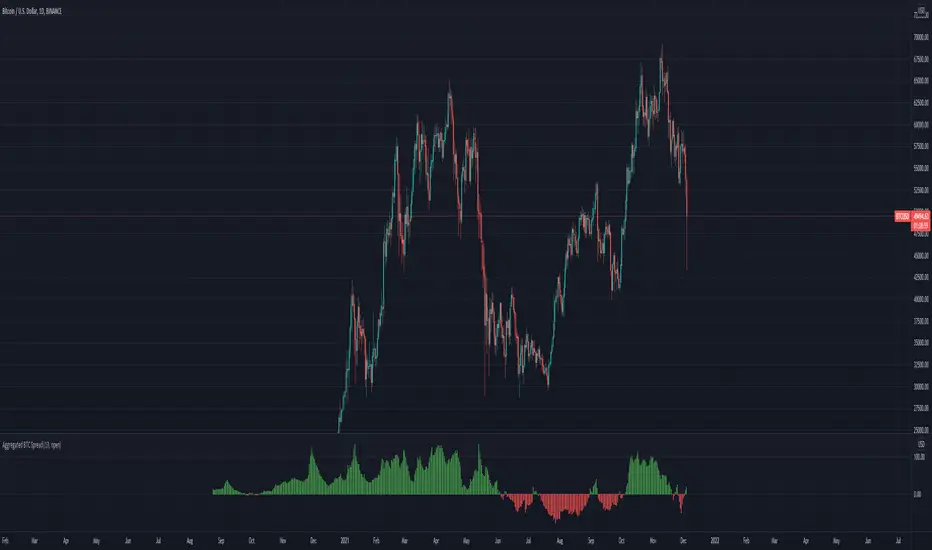
Aggregated BTC SpreadThis script is used to aggregate the bitcoin spread on futures contracts on different platforms. It works by averaging the for every selected exchange, and apply an EMA of . It is supporting Binance (USD / USDT) Okex FTX Huobi Deribit Ascendex CME (BTC1!) อินดิเคเตอร์ Pine Script®โดย megasyl2022126
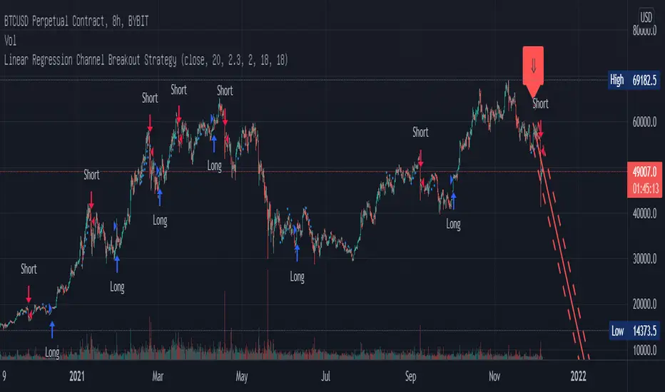
Linear Regression Channel Breakout StrategyThis strategy is based on LonesomeTheBlue's Linear Regression Channel Indicator. First of all, I would like to thank LonesomeTheBlue. Breaking the Linear Regression Channel to close the candle triggers a Long or Short signal. If the slope of the Linear Regression Channel is positive, it is Short when it breaks out the lower line, and when the slope is negative, it is Long when it breaks out the upper line. The default is optimized for 8-hour candles, and for other hour candles, find the optimal value yourself. Below is a description of LonesomeTheBlue's Linear Regression Channel. 이 전략은 LonesomeTheBlue의 Linear Regression Channel Indicator를 기반으로 만들어졌습니다. 우선 LonesomeTheBlue님께 감사의 말씀을 드립니다. Linear Regression Channel을 돌파하여 봉 마감하면 Long 또는 Short 신호를 트리거합니다. Linear Regression Channel의 기울기가 양인 경우 하단 라인을 돌파하면 Short이고 그 기울기가 음인 경우 상단 라인을 돌파하면 Long입니다. 기본값은 8시간봉에 최적화 되어 있으며, 다른 시간봉은 직접 최적값을 찾아보십시오. 아래는 LonesomeTheBlue의 Linear Regression Channel에 대한 설명을 퍼왔습니다. ________________________________________________ There are several nice Linear Regression Channel scripts in the Public Library. and I tried to make one with some extra features too. This one can check if the Price breaks the channel and it shows where is was broken. Also it checks the momentum of the channel and shows it's increasing/decreasing/equal in a label, shape of the label also changes. The line colors change according to direction. using the options, you can; - Set the Source (Close, HL2 etc) - Set the Channel length - Set Deviation - Change Up/Down Line colors - Show/hide broken channels - Change line width meaning of arrows: ⇑ : Uptrend and moment incresing ⇗ : Uptrend and moment decreasing ⇓ : Downtrend and moment incresing ⇘ : Downtrend and moment decreasing ⇒ : No trendกลยุทธ์ Pine Script®โดย chanu_lev10kที่อัปเดต: 1414669
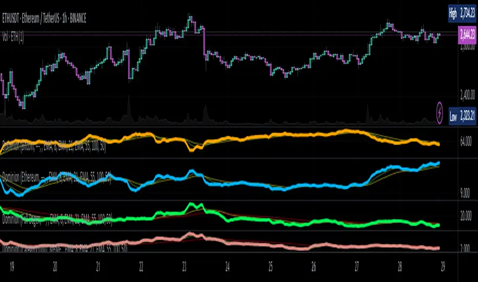
Dominion - Bitcoin Altcoin Dominance [mutantdog]A simple and easy reference tool displaying a plot of the market cap dominance values for several significant cryptocurrencies. The most widely used of these is bitcoin dominance (the top indicator shown above) which calculates the total market cap of bitcoin in relation to the total cryptocurrency market cap, displayed as a percentage. This is commonly used by traders to assess the strength of bitcoin in relation to the broader crypto market; increasing values being indicative of larger bitcoin moves and decreasing values often indicative of potential altcoin cycles. Likewise, ethereum dominance (the bottom indicator shown above) is frequently used as a means to indicate the strength of ethereum in relation to the broader crypto market. Included options for marketcap dominance values are: Bitcoin : CRYPTOCAP:BTC.D Ethereum : CRYPTOCAP:ETH.D Total DeFi (a composite of multiple top defi tokens): CRYPTOCAP:TOTALDEFI.D Stablecoins (shows the combined dominance values for usdt and usdc): CRYPTOCAP:USDT.D + CRYPTOCAP:USDC.D Flippening (shows the difference between bitcoin and ethereum dominance values): CRYPTOCAP:BTC.D - CRYPTOCAP:ETH.D When used in combination with each other, these can provide a good overview of the general flow of capital within the crypto market. Additional functionality: up to three optional moving averages with a choice of SMA, EMA, WMA and RMA for each. multi timeframe selector alert condition presets for various moving average crosses. Please be aware that, while useful as reference, dominance calculations are known to repaint frequently. As such the use of this indicator and its alerts should require caution.อินดิเคเตอร์ Pine Script®โดย mutantdogที่อัปเดต: 139
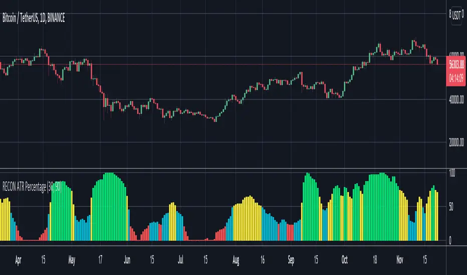
RECON ATR Volatility PercentageThe original Average True Range (ATR) indicator is a technical analysis indicator designed to measure volatility. The higher the ATR the higher the volatility. The RECON ATR Volatility Percentage indicator calculates the Average True Range (ATR) as a percentage. Suggested chart timeframes: 1h, 4h and 1D seem to produce the most useful intel but can be used on lower timeframes as well. The Recon ATR Volatility Percentage can be utilized for identifying trading pairs with a desired amount of volatility, for example deploying a grid trading strategy on pairs that are trending up with a high amount of volatility (say over 50%) might produce desirable results. It is important to note the ATR does not indicate price direction and can be high in both a rising or falling market. The ATR Length, Period Look Back Length parameters as well as the color of the columns can be configured per your specifications.อินดิเคเตอร์ Pine Script®โดย RECONTRADER99565
Swing Multi Moving Averages Crypto and Stocks StrategySimple and efficient multi moving average strategy combined with risk management and time condition. Indicators/ Tools used Multi selection moving average type like SMA , EMA , SMMA , VWMA , VIDYA , FRAMA , T3 and much more Limit 1 entry max per week, entry on monday exit on sunday or risk management tp/sl. Rules for entry: LONG:Close of the candle cross above the moving average while the previous close was below. All of this is happening during monday session. SHORT:Close of the candle cross below the moving average while the previous close was above. All of this is happening during monday session. Rules for exit: We exit either on sunday or if we reach tp/sl levels. Observations: I recommend use the strategy 2 types, one for long and another for short, using different parameters since long and short movements behave differently. For example for long we can use a shorter moving average longth and a higher tp/sl while for short we can use a bigger moving average length and a smaller tp/sl If you have any questions let me know !กลยุทธ์ Pine Script®โดย exlux22355
Ripple (XRP) Model PriceAn article titled Bitcoin Stock-to-Flow Model was published in March 2019 by "PlanB" with mathematical model used to calculate Bitcoin model price during the time. We know that Ripple has a strong correlation with Bitcoin. But does this correlation have a definite rule? In this study, we examine the relationship between bitcoin's stock-to-flow ratio and the ripple(XRP) price. The Halving and the stock-to-flow ratio Stock-to-flow is defined as a relationship between production and current stock that is out there. SF = stock / flow The term "halving" as it relates to Bitcoin has to do with how many Bitcoin tokens are found in a newly created block. Back in 2009, when Bitcoin launched, each block contained 50 BTC, but this amount was set to be reduced by 50% every 210,000 blocks (about 4 years). Today, there have been three halving events, and a block now only contains 6.25 BTC. When the next halving occurs, a block will only contain 3.125 BTC. Halving events will continue until the reward for minors reaches 0 BTC. With each halving, the stock-to-flow ratio increased and Bitcoin experienced a huge bull market that absolutely crushed its previous all-time high. But what exactly does this affect the price of Ripple? Price Model I have used Bitcoin's stock-to-flow ratio and Ripple's price data from April 1, 2014 to November 3, 2021 (Daily Close-Price) as the statistical population. Then I used linear regression to determine the relationship between the natural logarithm of the Ripple price and the natural logarithm of the Bitcoin's stock-to-flow (BSF). You can see the results in the image below: Basic Equation : ln(Model Price) = 3.2977 * ln(BSF) - 12.13 The high R-Squared value (R2 = 0.83) indicates a large positive linear association. Then I "winsorized" the statistical data to limit extreme values to reduce the effect of possibly spurious outliers (This process affected less than 4.5% of the total price data). ln(Model Price) = 3.3297 * ln(BSF) - 12.214 If we raise the both sides of the equation to the power of e, we will have: ============================================ Final Equation: ■ Model Price = Exp(- 12.214) * BSF ^ 3.3297 Where BSF is Bitcoin's stock-to-flow ============================================ If we put current Bitcoin's stock-to-flow value (54.2) into this equation we get value of 2.95USD. This is the price which is indicated by the model. There is a power law relationship between the market price and Bitcoin's stock-to-flow (BSF). Power laws are interesting because they reveal an underlying regularity in the properties of seemingly random complex systems. I plotted XRP model price (black) over time on the chart. Estimating the range of price movements I also used several bands to estimate the range of price movements and used the residual standard deviation to determine the equation for those bands. Residual STDEV = 0.82188 ln(First-Upper-Band) = 3.3297 * ln(BSF) - 12.214 + Residual STDEV => ln(First-Upper-Band) = 3.3297 * ln(BSF) – 11.392 => ■ First-Upper-Band = Exp(-11.392) * BSF ^ 3.3297 In the same way: ■ First-Lower-Band = Exp(-13.036) * BSF ^ 3.3297 I also used twice the residual standard deviation to define two extra bands: ■ Second-Upper-Band = Exp(-10.570) * BSF ^ 3.3297 ■ Second-Lower-Band = Exp(-13.858) * BSF ^ 3.3297 These bands can be used to determine overbought and oversold levels. Estimating of the future price movements Because we know that every four years the stock-to-flow ratio, or current circulation relative to new supply, doubles, this metric can be plotted into the future. At the time of the next halving event, Bitcoins will be produced at a rate of 450 BTC / day. There will be around 19,900,000 coins in circulation by August 2025 It is estimated that during first year of Bitcoin (2009) Satoshi Nakamoto (Bitcoin creator) mined around 1 million Bitcoins and did not move them until today. It can be debated if those coins might be lost or Satoshi is just waiting still to sell them but the fact is that they are not moving at all ever since. We simply decrease stock amount for 1 million BTC so stock to flow value would be: BSF = (19,900,000 – 1.000.000) / (450 * 365) =115.07 Thus, Bitcoin's stock-to-flow will increase to around 115 until AUG 2025. If we put this number in the equation: Model Price = Exp(- 12.214) * 114 ^ 3.3297 = 36.06$ Ripple has a fixed supply rate. In AUG 2025, the total number of coins in circulation will be about 56,000,000,000. According to the equation, Ripple's market cap will reach $2 trillion. Note that these studies have been conducted only to better understand price movements and are not a financial advice.อินดิเคเตอร์ Pine Script®โดย BobRivera9901010251
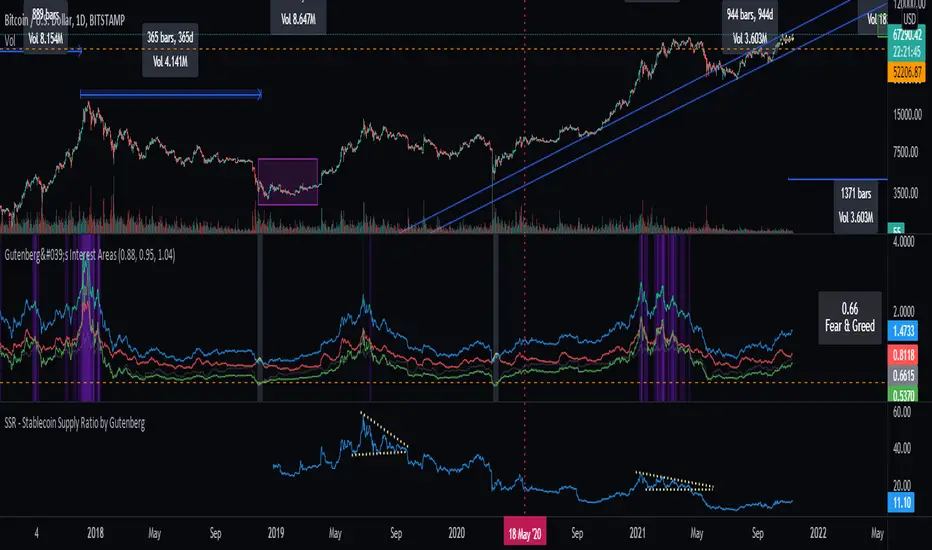
SSR - Stablecoin Supply Ratio - Bitcoin - CryptocurrencyThe Stablecoin Supply Ratio (SSR) is the ratio between Bitcoin supply and the supply of stablecoins, denominated in BTC. When the SSR is low, the current stablecoin supply has more "buying power" to purchase BTC. It serves as a proxy for the supply/demand mechanics between BTC and USD.อินดิเคเตอร์ Pine Script®โดย GutenbergNunes1414550
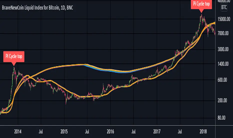
Pi Cycle Top Ribbon [Mamo]This is a modification on the original Pi Cycle Top Indicator by Philip Swift. It consists of 2 moving averages with one of them being multiplied by a chosen number. When the lower moving average crosses the higher (with multiple) moving average, the bull market top is indicated. The original indicator showed bull market tops within a 3 day accuracy. This version shows the exact tops on the exact day for 2013 and 2017. There are 7 different perfect solution shown as a band in this modified indicator. Each solution is a color pair and can be viewed separately by turning each combination off or on in the settings.อินดิเคเตอร์ Pine Script®โดย Mamocoin55342
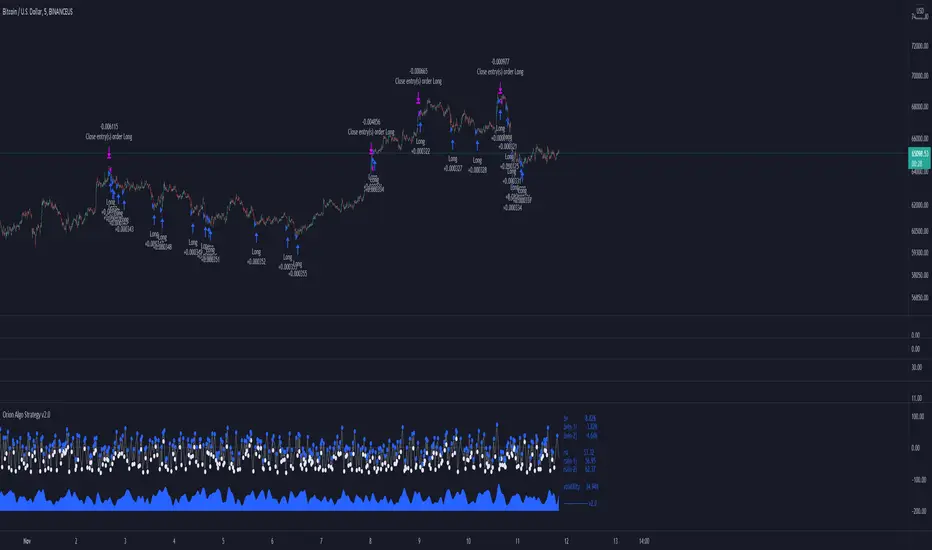
Orion Algo Strategy v2.0Hi everyone. I decided to make the latest Orion Algo open to people. I don't have enough time to work on it lately, so I figured it would be best that everyone can have it to work on it. I took out some stuff from the original but it should give an idea on how things work. I made two strategies with this so far so you can use that to come up with your own. I recommend the DCA strategy because it gives you the most bang for Orion Algo's buck. It's pretty good at finding long entries. Overall I hope you guys like this one. Also, Banano is the best crypto currency :) -INFO- Orion Algo is a trading algorithm designed to help traders find the highs and lows of the market before, during, and after they happen. We wanted to give an indicator to people that was simple to use. In fact we created the algorithm in such a way that it currently only needs a single input from the user. Since no indicator can predict the market perfectly, Orion should be used as just another tool (although quite a sharp one) for you to trade with. Fundamental knowledge of price action and TA should be used with Orion Algo. Being an oscillator, Orion currently has a bias towards market volatility . So you will want to be trading markets over 30% volatility . We have plans to develop future versions that take this into account and adjust automatically for dead conditions. Also, while there are some similarities across all oscillators, what sets ours apart is the prediction curve. The prediction curve looks at the current signal values and gives it a relative score to approximate tops and bottoms 1-2 bars ahead of the signal curve. We also designed a velocity curve that attempts to predict the signal curve 2+ bars ahead. You can find the relative change in velocity in the Info panel. The bottom momentum wave is based on the signal curve and helps find overall market direction of higher time-frames while in a lower one. Settings and How to Use them: User Agreement – Orion Algo is a tool for you to use while trading. We aren’t responsible for losses OR the gains you make with it. By clicking the checkbox on the left you are agreeing to the terms. Super Smooth – Smooths the main signal line based on the value inside the box. Lower values shift the pivot points to the left but also make things more noisy. Higher values move things to the right making it lag a bit more while creating a smoother signal. 8 is a good value to start with. Theme – Changes the color scheme of Orion. Dashboard – Turns on a dashboard with useful stats, such as Delta v, Volatility , Rsi , etc. Changing the value box will move the dashboard left and right. Prediction – A secondary prediction model that attempts to predict a reversal before it happens (0-2bars). This can be noisy some times so make your best judgement. Curve will toggle a curve view of the prediction. Pivots will toggle bull/bear dots. ∆v – Delta v (change in velocity). This shows momentum of the signal. Crossing 0 signals a reversal. If you see the delta v changing direction, it may signify a reversal in the several bars depending on the overall momentum of the market. Momentum Wave – Uses the signal as a macro trend indicator. Changes in direction of the wave can signify macro changes in the market. Average will toggle an averaging algorithm of the momentum waves and makes it easy to understand. -STRATEGIES- Simple - Just buy and sell on the dots DCA - Uses the settings in the script for entries. If a buy dot appears then it will buy, if the price goes below the percentage it will wait for another dot before entering. This drastically improves DCA potential.กลยุทธ์ Pine Script®โดย OrionAlgoที่อัปเดต: 5151 1.2 K
[DS]Bitcoin BTC ETH and others cryptos==DESCRIPTION - English version The purpose of this script is to show information on graph that can help your decision to buy and sell cryptos. The script is indicated for Position Trade (Long Term - Holder) and Swing Trade (Medium term). Position Trade it is recommended to use the Weekly (W) and Daily (D) charts, Swing trade to use the 4H and 2H charts. It is not advisable to use this indicator with graphic time frame less than 2 hours because the noise levels of information are very high. An alert function has been inserted in the indicator and to activate this function you will need configure it in the Tradingview. This alert will indicate the likely points of entry and exit of the asset. **DESCRIÇÃO - Versão em Português A proposta deste script é mostrar no gráfico informações que possam auxiliar a sua decisão de compra e venda de cryptos. Este script é indicado para negociação Position Trade (Longo Prazo - Holders) e Swing Trade (Médio prazo). Para Position Trade (Holders) é indicado utilizar os gráficos Semanal (W) e Diário (D), para Swing trade utilizar os gráficos 4H e 2H. Não é aconselhável utilizar este indicador com tempos gráficos menores que 2hs pois os níveis de ruídos nas informação são muito altos. Foi inserido no indicador uma função de alerta e para ativar esta função, você precisará configurá-la no seu Tradingview. Este alerta irá indicar os provaveis pontos de entrada e saída do ativo. ==================================================================================================== ** English Version ==================================================================================================== █ SETUP applied to Indicator The setup is based on the average 8, 21 and 56 of the weekly chart (taught on youtube channel: Augusto Backes) Price above the average 8 on the weekly, indicates that the market is UP trend, below the average 8 on the weekly that the market is DOWN trend RSI greater than 60% the market is UP trend RSI greater than 40% and lower 60% the market is in ACCUMULATION RSI less than 40% the market DOWN trend The weekly average 8 is represented in GREEN (Upward Trend) and RED (Downward Trend). The weekly average 21 is represented in LIGHT ORANGE The weekly average 56 is represented in LIGHT PURPLE The crossing of weekly averages 8 and 21 is represented with a GREEN (HIGH trend) and RED (LOW trend) cross - this signal is disabled on the graph but you can enable it by clicking on the graph setup █ FUNCTION USE (1) Average 8, 21 and 56 on Weekly - show the average 8, 21, 56 weekly on graphic (Average 8 in color red and green, 21 - light orange, 56 light purple) (2) Crossing of averages 8 and 21 Weekly - is not active but you can activate (3) Calculation of RSI (4) barcolor() - mark the candles with the green color (High market) and red color (Dow market) (5) alertcondition() - you can active this alert on Tadingview █ BUY AND SELL POINTS - likely points The indication of the BUY position is shown by a green arrow pointing upwards and the sell position by a red arrow pointing downwards. Buy and sell indications are obtained from the divergence in the market trend. █ THANK TO PineCoders for everything they do, all the tools and help they provide, and their involvement in making a better community. All PineCoders, Pine Pros and Pine Wizards, people who share their work and knowledge because of it and helping others, I am so happy and so grateful. █ NOTE This indicator is not a buy and sell recommendation, it indicates the most likely buy and sell points. Every purchase and sale decision is your responsibility ***************************************************************************************************** ** Versão em Português ***************************************************************************************************** █ SETUP aplicado no Indicador O setup está baseado na média 8, 21, e 56 do gráfico semanal Preço acima da média 8 no semanal indica que o mercado esta em tendência de ALTA, abaixo da média 8 no semanal que o mercado está em tendência de BAIXA RSI maior que 60% o mercado está em ALTA RSI maior que 40% e menor 60% o mercado está em ACUMULAÇÃO RSI menor que 40% o mercado está em BAIXA A média 8 semanal está representadas nas cores VERDE (Tendência de Alta) e VERMELHA (Tendência de Baixa). A média 21 semanal está representada na cor laranja claro A média 56 semanal está representada na cor roxa claro O cruzamento das médias 8 e 21 semanal esta representado com uma cruz VERDE (Tendência de ALTA) e VERMELHA (Tendência de BAIXA) - este sinal esta desativado no gráfico mas você pode ativá-lo clicando no setup do gráfico █ FUNÇÕES UTILIZADAS (1) Média 8, 21 e 56 no Semanal - mostra a média 8, 21, e 56 no gráfico (2) Cruzamento das médias 8 e 21 Semanal - não está ativo mas você pode ativá-lo (3) Cálculo do RSI (4) barcolor() - marca a vela (Candle) com a cor verde (Mercado em Alta) e a cor vermelha (Mercado em Baixa) (5) alertcondition () - você pode ativar o alerta no Tradingview █ PONTOS DE COMPRA E VENDA - prováveis pontos A indicação da posição de COMPRA é apresentada por uma seta na cor verde apontada para cima e a posição de VENDA por uma seta na cor vermelha apontada para baixo. As indicações de compra e venda são obtidas a partir da divergência na tendência do mercado. █ OBRIGADO PARA PineCoders por tudo o que fazem, todas as ferramentas e ajuda que fornecem, e seu envolvimento em fazer uma comunidade melhor. Todos os PineCoders, Pine Pros e Pine Wizards, pessoas que compartilham seu trabalho e conhecimento por causa dele e ajudando os outros, estou muito feliz e muito grato. █ NOTA Este indicador não é uma recomendação de compra e venda ele indica os pontos mais prováveis de compra e venda. Toda decisão de compra e venda é de sua responsabilidade อินดิเคเตอร์ Pine Script®โดย DalmarSantos1818707
Crypto Scannner for Traffic Lights StrategyI allways try to make trading easier. Developing Scripts for a quick backtest and improvement of a strategy, getting alerts for entry and exit a position. Loading data to a spreadsheet is also important and takes time. In this case finding good parameters in different markets or assets to enter in a position, is a bit exhausting. It is something you have to do everyday, and sometimes in different moments of the day. So I manage to develop a Screener, to take a quick look at specific hours, and tell if I have a buy or sell condition in an specific asset. Obviously this is not an alert to make a trade instantaneusly, but this help you filter a lot of information in matters of seconds. Then open those specific charts and make a better analisys. A few weeks ago, I published a scrpipt called "Traffic Lights Strategy", that uses 4 emas to get a buy or a sell condition. It is easy to understand and use, but if you don´t want to missed some opportunities, and don't want to be look at the screen in all the time looking for them, I have here a simple solution. This script works plotting 2 labels. The first one plots all the assets in which the condition is true (fastema > medema > slowema > filterema or fastema < medema < slowema < filterema) The second one plots the assets were the condition is true only if happened up to 5 candles back, so you can be in time to enter a trade. You can take the script and customize it for a different strategy or assets. I coded like this because I backtested this strategy in this specific assets, and statistics suggest that it might be profitable. I hope this works for you. In other time I'll try to code a script for the others strategies I published. อินดิเคเตอร์ Pine Script®โดย Trading_Solutions_11210
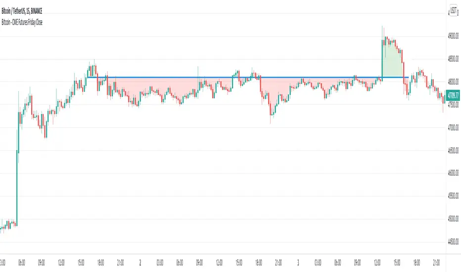
Bitcoin - CME Futures Friday Close This indicator displays the weekly Friday closing price according to the CME trading hours (Friday 4pm CT). A horizontal line is displayed until the CME opens again on Sunday 5pm CT. This indicator is based on the thesis, that during the weekend the Bitcoin price tends to mean reverse to the CME closing price of the prior Friday. The level can also act as support/resistance. This indicator gives a visualization of this key level for the relevant time window. Furthermore the indicator helps to easily identify, if there is an up or down gap in the CME Bitcoin contract. อินดิเคเตอร์ Pine Script®โดย UniqueChartsที่อัปเดต: 44303
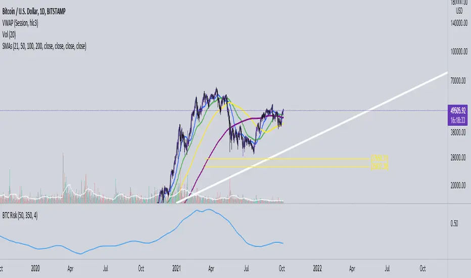
Bitcoin Risk Indicator (Daily)This indicator calculates the risk of buying and selling BTC, if the risk is reaching the upper boundaries of 0.8 to 1 then BTC is either getting close to a market cycle top or is far over extended. If BTC is below 0.4 then this inidicates the least amount of Risk to buy BTC.อินดิเคเตอร์ Pine Script®โดย PhilipMott11133
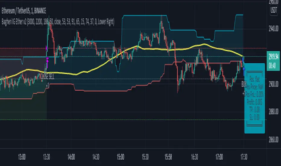
Bagheri IG Ether v2In this version, the winning ratio has been decreased, but the Risk to Reward Ratio (RRR) has been set to be better than the previous version. This is a technical trading strategy for Ethereum ( BINANCE:ETHUSDT ). We built and developed it on MetaEditor and optimized it with MetaTrader optimizer. The main indicators are Donchian Channel, Oscillator of ROC , Bears Power, Balance of Power , and Simple Moving Average ( SMA ). Default values in the input panel are the best combination of these indicators, but you can change any of them and try it for better results. Please notice that this strategy has been optimized on the 1-minute chart of Ethereum . For each position, you can see the Take Profit (TP) and Stop Loss (SL) levels. Also, you can find the values of mentioned TP and SL in points from the input panel of the script. Attention: The price of Ethereum has 2 decimal places. Therefore, 3000 points for TP means 30 USDT for trading 1 BINANCE:ETHUSDT .กลยุทธ์ Pine Script®โดย Bagheri_IG51
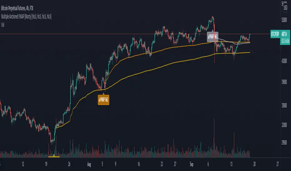
Multiple Anchored VWAP [Morty]The Anchored VWAP (aVWAP) indicator ties VWAP calculations to a specific price bar chosen by the trader. Anchored VWAP allows you to specify the price bar where calculations begin, making it easy to see whether the bulls or bears have been in charge since a very specific point in time. The starting price bar that is chosen generally marks a shift in market psychology, such as a significant high or low, earnings, news, or other announcements. The Anchored VWAP line is charted using price and volume data from that significant event onward. This indicator plots up to 4 aVWAP lines in the chart. Features: - plot up to 4 aVWAP lines - custom start date of aVWAP - custom line color - optional label of starting price bar - optional custom resolution ---------------------------------------------------- 锚定VWAP(aVWAP)指标将VWAP的计算与交易者选择的特定价格柱联系起来。锚定VWAP允许你指定计算开始的价格柱,使你很容易看到自一个非常具体的时间点以来,是牛市还是熊市在起作用。所选择的起始价格条通常标志着市场心理的转变,如一个重要的高点或低点、收益、新闻或其他公告。锚定VWAP线是使用从该重大事件开始的价格和成交量数据绘制的。 该指标在图表中最多绘制了4条aVWAP线。 特色: - 绘制多达4条aVWAP线 - 自定义aVWAP的开始日期 - 自定义线的颜色 - 可选的起始价格条的标签 - 可选的自定义分辨率 อินดิเคเตอร์ Pine Script®โดย M0rty1515 1.6 K
MACD + DMI Scalping with Volatility Stop by (Coinrule)Trend-following strategies are cool because they allow you to catch potential high returns. The main limit of such strategies are: False signals > the asset is not experiencing a strong trend. The strategy gets stuck with a sideways move or, worst, with the beginning of a downtrend. The sell signal may come later than the actual top, leading in some cases to turn a trade in profit into a loss. This strategy tries to address these limitations to develop a trading system that optimises the entry and closes trade once the profit achieves a pre-set level. ENTRY The trading system uses the MACD and the DMI to confirm when is the best time for buying. Combining these two indicators prevents trading during downtrends and reduces the likelihood of getting stuck in a market with low volatility. The system confirms the entry when: The MACD histogram turns bullish. When the positive DMI is greater than the negative DMI, there are more chances that the asset is trading in a sustained uptrend. EXIT The strategy comes with a fixed take profit combined with a volatility stop, which acts as a trailing stop to adapt to the trend's strength. Depending on your long term confidence in the asset, you can edit the fixed take profit to be more conservative or aggressive. The position is closed when: The price increases by 3% The price crosses below the volatility stop. The best time frame for this strategy based on our backtest is the 3-hr . The 4-hr can work well. In general, this approach suits medium to long term strategies The strategy assumes each order to trade 30% of the available capital to make the results more realistic. A trading fee of 0.1% is taken into account. The fee is aligned to the base fee applied on Binance, which is the largest cryptocurrency exchange. กลยุทธ์ Pine Script®โดย Coinrule11487
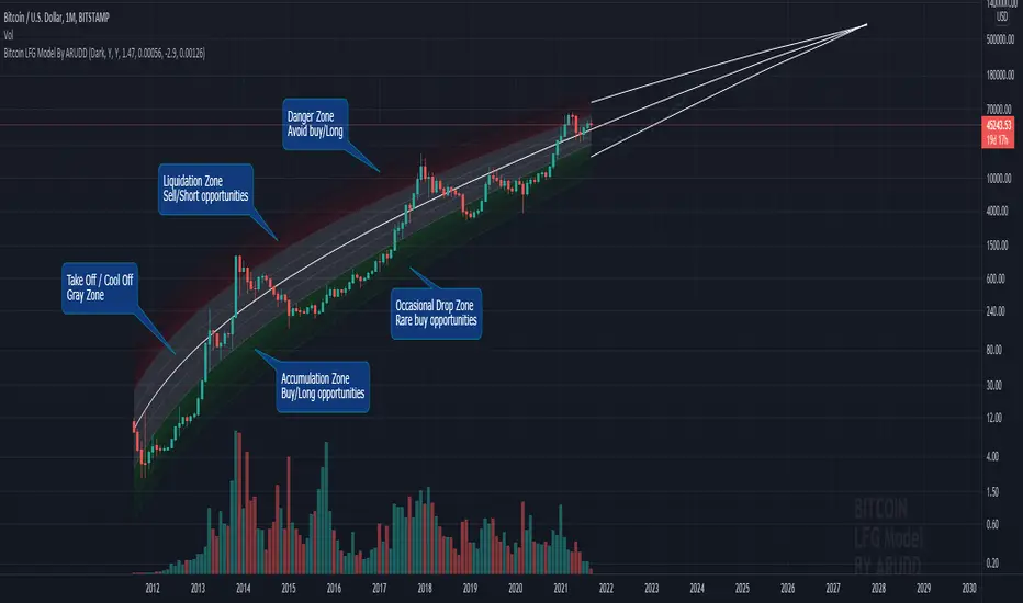
Bitcoin Logarithmic Fractal Growth Model By ARUDDThis model, which I'm calling the Logarithmic Fractal Growth Mode (L.F.G) , uses Bitcoin's mathematical monetary policy to evaluate the future possible price valuation. It takes into account fractal (and logarithmic) growth as well as how those who hold bitcoins might react to certain events such as changes in supply and demand. It also shows that it is mathematically logical that someday it must become stable. The information gained from knowing this helps people make more informed decisions when buying bitcoin and thinking of its future possibilities. The model can serve as some type of general guideline for determining how much bitcoins should be worth in the future if it follows a certain path from its current price. Modeling Bitcoin's money supply mathematically, and knowing that there is a finite number of them, makes this whole process much more rational than just thinking about the possibilities in pure subjective terms. Before going any further I want to say that no one can know with absolute certainty what will happen to bitcoins price in the future, but using mathematics gives us an idea of where things are headed. The results presented here are based on very reasonable assumptions for how bitcoin might continue to grow (and then level out) once there are over 21 million bitcoins in existence. The model shows that bitcoin's price can never go down to zero (thus creating the "death spiral" phenomenon), and as such, bitcoin has an extremely high probability of becoming stable as it approaches infinity. Conversely, this model also shows that at some point there is a high probability that bitcoin will not continue to grow exponentially forever. Credit goes to Quantadelic for the awesome original script. ARUDDอินดิเคเตอร์ Pine Script®โดย AriRudd1010 1.1 K
Dual MACD StrategyThis strategy Multi Time Frame Macd Indicator We take the first long position when we have a buy signal in Weekly Macd (Macd line crosses above Signal line). This open a trading window, showed with green background color We close the first position when either Weekly or Daily Macd give us a sell signal ((Macd line crosses below Signal line)) Enable Profit and Stop in strategy settings with different percentage to backtest the strategy. Also if it is better to use a Traditional Stop Loss or a Trailing Stop Loss based on a percentage from low prices Change macd resolution in settings for other time frames to test the strategy This Strategy was tested on Crypto Market with good results in assets as BTC, ETH, BNB, ADA, LTC, XLM, BCH, among others กลยุทธ์ Pine Script®โดย Trading_Solutions_11196
My 1st indicator- Log(price/20w sma)you may comment out outputs and change variable req for using in different timeframes because its suitable for only 20w sma and bitcoin only for understanding when to buy long term and sell too i recommend zooming out and making a trend line from tops back from 2013 in bitcoin-index chart pair it up with rsi and bam you have a very powerful indicator for bitcoin buys for long term This indicator gnerally provides confluence and i got the idea from , honourable, Benjamin Cowen's Youtube channel to make it Its not as colourful as his becoz as u see the name its my first indicator but i hope i improve myself :)อินดิเคเตอร์ Pine Script®โดย EdIrfan786xLin4423
Traffic Lights Strategy4HS Crypto Market Strategy This strategy uses 4 ema to get Long or Short Signals Length are: 4, 9, 18, 100 We take long positions when the order of the emas is the following: green > yellow > red (As the color of Traffic Lights) and they are above white ema (Used as a filter for long positions) We take short positions when the order of the emas is the following: green < yellow < red (As the color of inverse Traffic Lights) and they are below white ema (Used as a filter for short positions) Enable Long and/or Short Positions in settings Enable Profit and Stop in strategy settings with different percentage to backtest the strategy. Also if it is better to use a Traditional Stop Loss or a Trailing Stop Loss based on ATR Change ema filter resolution in settings for better strategy performance This Strategy was tested on Crypto Market with good results in assets as BTC, ETH, BNB, ADA, LTC, XLM, BCH, among others Feel free to optimize this strategy, optimizing its parameters. Each asset has its own "personality". กลยุทธ์ Pine Script®โดย Trading_Solutions_316